overview

sustainable food packaging.
4 Aces are committed to providing a supply chain that meets our customers’ expectations of quality, value and sustainability, with our environmental impact at the forefront of our thinking.
Partnerships
This value encompasses our relationships with customers, suppliers, and peers/colleagues. It reflects our collaborative approach to achieving common goals.
Responsible
This value focuses on our commitment to the environment, sustainability, accreditations, engagement, and education. It underscores our dedication to being responsible industry leaders.
Value Added
This value emphasises our commitment to commercial success, product quality, exceptional value, and going above and beyond for our stakeholders.
4 Aces are constantly assessing new materials and bespoke innovations, to provide our customers with all they require. With improved sourcing from markets closer to home and ongoing commitments to relevant memberships and environmental governing bodies, our drive for a sustainable future is a core value for us.
Brand archetype & Tone of voice
Archetypes: Tone of Voice:
The Sage
Traits: Wise, knowledgeable, insightful.
Goal: To provide valuable information, education, and guidance to customers, positioning the brand as a trusted authority.
The Caregiver
Traits: Compassionate, nurturing, supportive.
Goal: To demonstrate care, empathy, and a commitment to helping and serving customers’ needs. more serious than funny more formal than casual more respectful than irreverent
logos & marks
Primary logo
The main logo and the primary identifier of your business. In order for the logos to work seamlessly across all branded collateral they must be kept as they are in order to maintain brand consistency.
To be used with strap-line where possible and when the logo height exceeds 60px/20mm. All logos are to be used single colour in brand colours or monochrome depending on usage.
Logo clear-space 1/2 icon height
Minimum height 60px/20mm when used with strap-line
Strap-line to be used where possible


Secondary logo
This is the secondary logo and should be used in place of the primary logo in any instance where the primary logo cannot be used. It has been designed to hold a strong presence across all branded collateral.
To be used with strap-line where possible and when the logo height exceeds 150px/50mm. All logos are to be used single colour in brand colours or monochrome.
A stacked, more compact version of the primary logo.
Logo clear-space
1/2 icon height
Minimum height 150px/50mm when used with strap-line
Strap-line to be used where possible

The logo icon is the smallest representation of your brand. Used in instances where a brand mark is needed at a very small scale such as website favicons and other minute branded materials. Can also be used at large scale to enhance branded materials.
To be used where the primary or secondary logos won’t work or fit within the required space or platform.
A bold icon that illustrates the visual personality of the brand with eloquent simplicity.
Can be used as small as 20px/ 8mm in height
Logo clear-space 1/2 icon height
Social post big logo centred
Logo placement Logos & marks
Letter/flyer/poster logo placement options
headline/CTA example.
Conserror autes eum es mil id quidemodis exped quis
Social/web ad with CTA logo placement options

NEVER stretch or distort the logos in any way
Logo misuses Logos & marks
NEVER rotate the logos
NEVER change the size of any parts of the logos
NEVER apply drop shadows to logos
NEVER move any parts of the logos
NEVER use gradients over logos
colours
Full Palette
Primary Secondary
Tints
space
#101E46
#A74814
timberwolf HEX: #D8CBC0
Colours

typography
Outfit Light
Typography
TYPEFACE: OUTFIT
This will be your brand typeface and will be used for all text used within your branded materials. Varying weights allow for versatility and flexibility for use across any and all branded materials. The use of a single font family allows for a strong visual conformity and a clearer aesthetic tone throughout. Can be used lower-case in instances such as large titles and CTA’s.
The font family is available and free to download from Google fonts:
fonts.Google.com/specimen/Outfit
Aa
To be used for small text such as footnotes, T’s & C’s and disclaimers
ABCDEFGHIJKLMNOPQRSTUVWXYZ
abcdefghijklmnopqrstuvwxyz
0123456789 !@£$%^&*<;?
To be used for subheadings & all body copy
Outfit Regular
ABCDEFGHIJKLMNOPQRSTUVWXYZ
abcdefghijklmnopqrstuvwxyz
0123456789 !@£$%^&*<;?
To be used for large text such as headlines, titles & CTA’s
Outfit Medium
ABCDEFGHIJKLMNOPQRSTUVWXYZ
abcdefghijklmnopqrstuvwxyz 0123456789 !@£$%^&*<;?
To be used for highlighted text & secondary sub headings
Outfit Bold
ABCDEFGHIJKLMNOPQRSTUVWXYZ
abcdefghijklmnopqrstuvwxyz 0123456789 !@£$%^&*<;?
headline example.
Conserror autes eum es mil id quidemodis exped quis
Conserror autes eum es mil id quidemodis exped quis Explabo. Et doloreperunt
animolo riossit fugiae volorit, si volupta nus aut volorest alis aligent empelibus dolenditEt faccum nem cum volest voluptaspel int, velitiis si tem re quis magnim elest, voluptatet es ma veles sam, a serunti nenis itibus que aut Etur, te cuptatu
headline example.
Conserror autes eum es mil id quidemodis exped quis
Hierarchy & rules
Conserror autes eum es mil id quidemodis exped quis Explabo. Et doloreperunt animolo riossit fugiae volorit, si volupta nus aut volorest alis aligent empelibus dolenditEt faccum nem cum volest voluptaspel int, velitiis si tem re quis magnim elest, voluptatet es ma veles sam, a serunti nenis itibus que aut Etur, te cuptatu
headline example.
Conserror autes eum es mil id quidemodis exped quis
Conserror autes eum es mil id quidemodis exped quis Explabo. Et doloreperunt animolo riossit fugiae volorit, si volupta nus aut volorest alis aligent empelibus dolenditEt faccum nem cum volest voluptaspel int, velitiis si tem re quis magnim elest, voluptatet es ma veles sam, a serunti nenis itibus que aut Etur, te cuptatu
Typography
Image boxes should have the top left corner cut off where possible
CTA’s and headlines to be the largest, then logo, then body copy/info
Layouts should be simple and minimal, making use of negative space
Headlines and CTA’s are to be large and kept short, set in lower-case with a full stop at the end. It’s important to leave breathing space around headings to allow for a clean and minimal aesthetic and ultimate legibility.
Leading: Should be at least 120% of the point size. It can be more, but never less.
Alignment: CTA’s, headings and subheading should be centred. Body copy should be left aligned.
Kerning and Tracking: Ideal tracking should be set 0 but no more than +20, kerning should be set to ‘optical’.
Header/CTA’s: Outfit Medium, lower-case, centred with full stop, large pt size.
Subheading: Outfit Regular, sentence case, centred, 50-60% size of headline.
Body Copy: Outfit Regular, sentence case, range left, no smaller than 8pt.
T’s & Cs: Outfit Light, sentence case, range left, no smaller than 6pt.
iconography
Icons are only to be used when necessary. All icons must follow the same rules in order to maintain brand consistency. Icons used must be bold, using either thick lines or negative space. They must be compact, simple and highly legible. Here are some examples of how icons should look:
photography
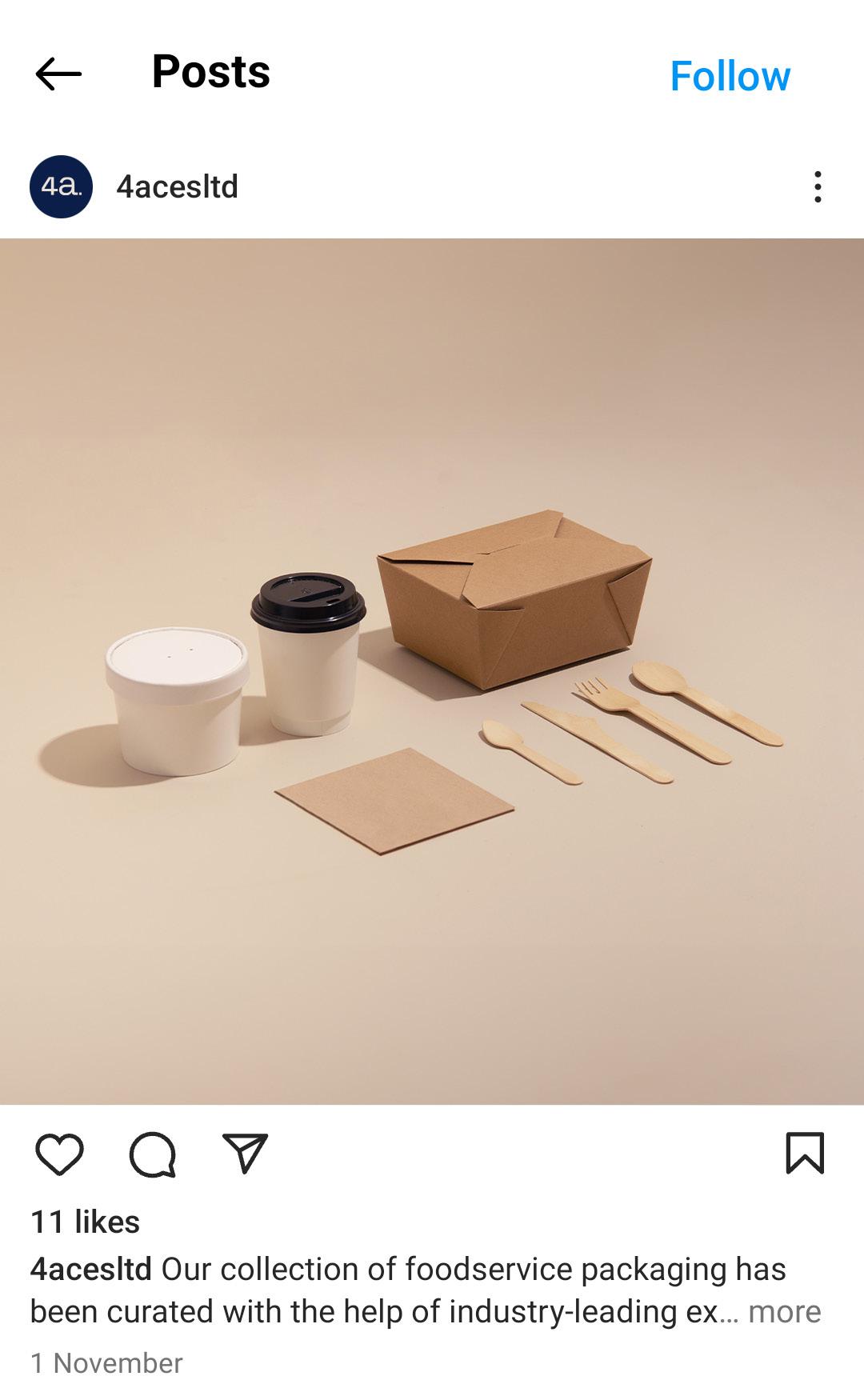
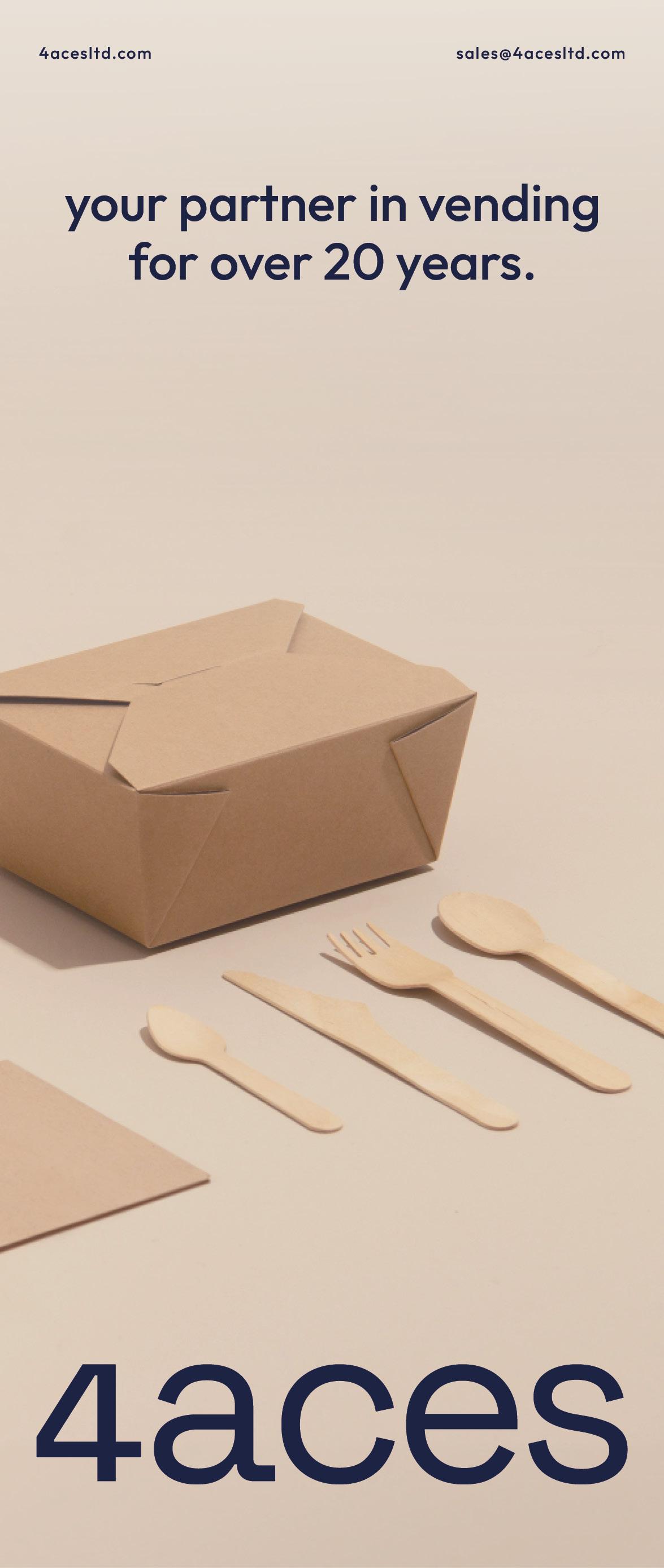
Product
Clean, minimal product imagery to be used in conjunction with lifestyle imagery across branded collateral and advertisements where necessary.
For product imagery to be on-brand it must align with the brands colour palette and be aesthetically warm, clean, minimal and appear professional. To be used when overlaid with copy where possible for stronger legibility.


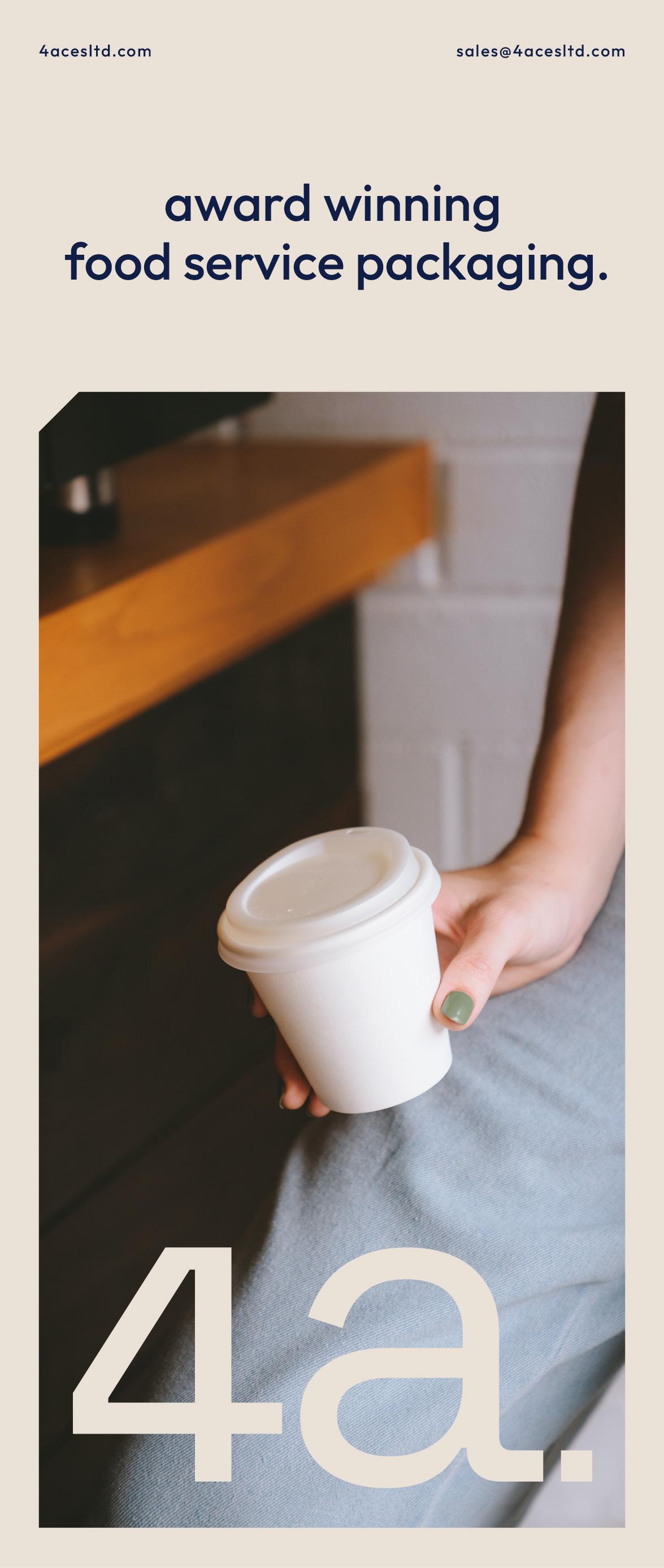
Lifestyle
Warm, candid lifestyle imagery to be used in conjunction with product imagery across branded collateral and advertisements where necessary.
Lifestyle imagery must align with the brands visual identity. Photography used must be warm, rich, bright and appear friendly, relaxed and authentic. To be used to add depth and visual diversity when used across branded collateral and advertisements.


creative examples