COTTON COMFORT LIVING
ASSISTED LIVING COMMUNITY
D e s i g n D e v e l o p m e n t ID 4388 Spring 2024 Dr. Guerrero C OTTON COMFO R T l i v i n g
Dr. Guerrero
What design features can ease the transition into assisted living communities for aging couples and widowers/widows with differing needs?
Cotton Comfort Living is to be Lubbock’s newest Assisted Living Community. It is tucked away off Avenue P and 130th St, on a 10-acre lot that is minutes away from the loop and Interstate 87. Cotton Comfort will home between 20-40 residents. Each resident will have their own apartment along with shared amenities like a community dining hall, library, movie theater, greenhouse, and more. Residents will also have their own personalized experience here at Cotton Comfort.
PROJECTSTATEMENT CONCEPTSTATEMENT RESEARCHQUESTION
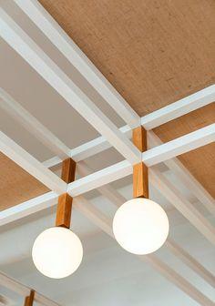
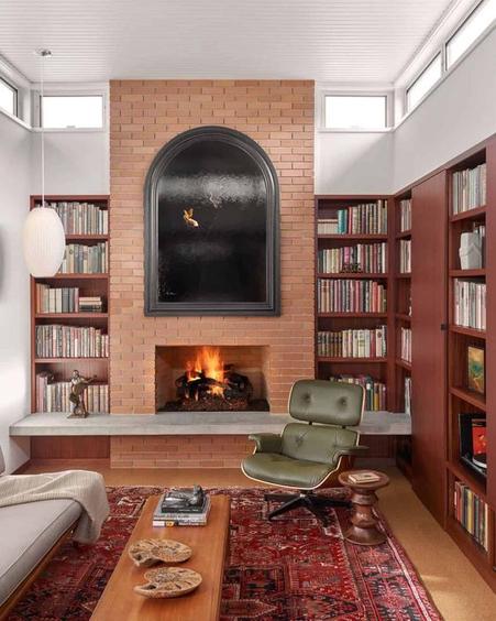
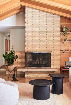
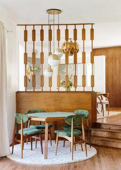
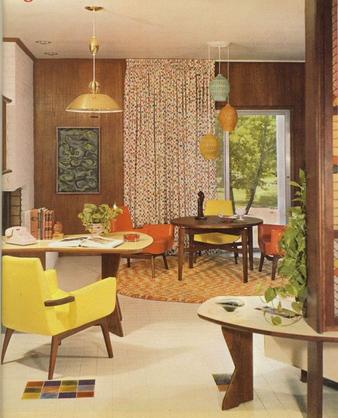
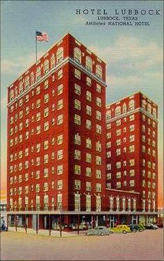
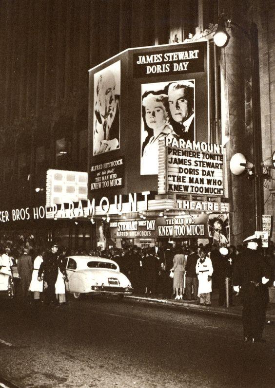
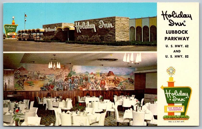
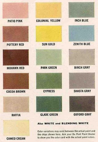
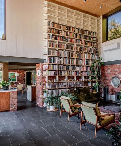
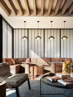
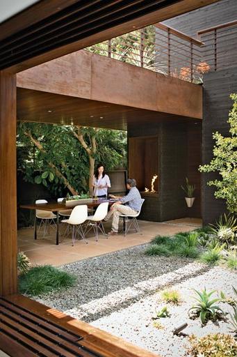
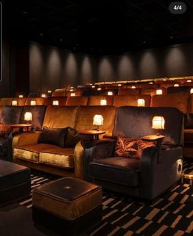
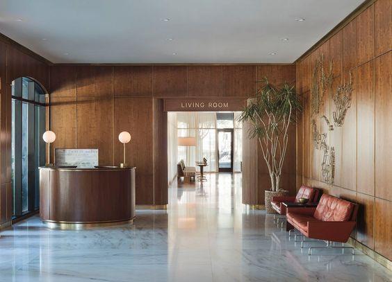
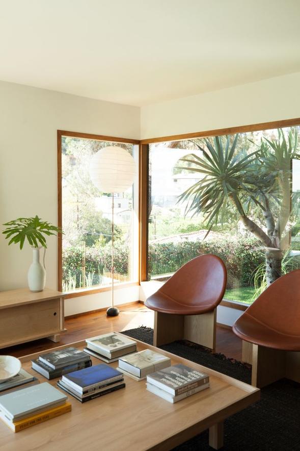
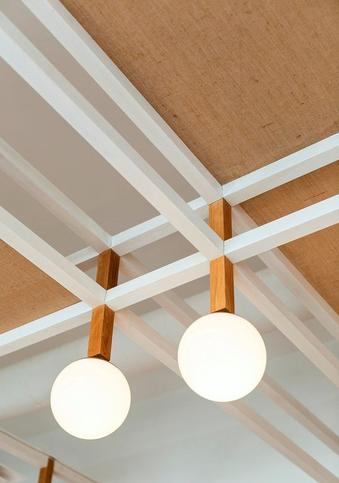
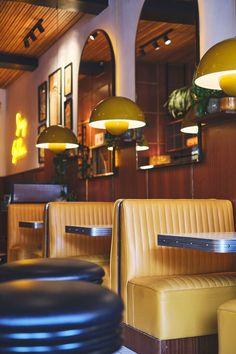
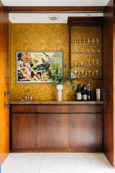
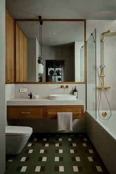
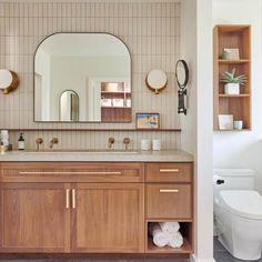
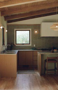
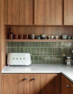
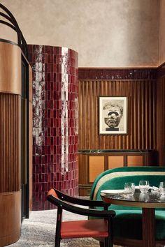
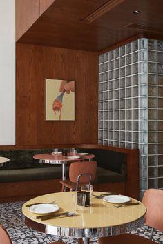
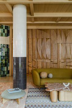
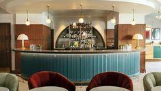
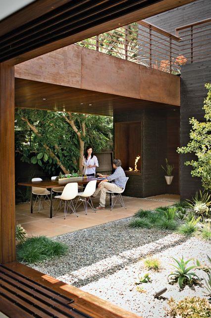
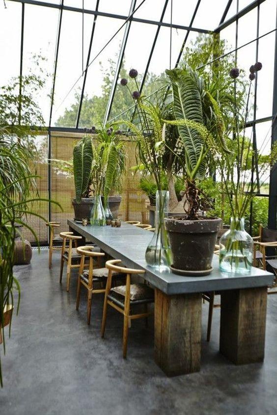
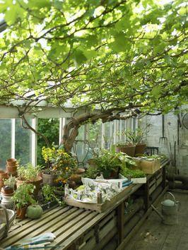
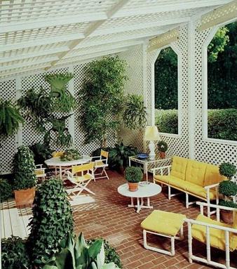
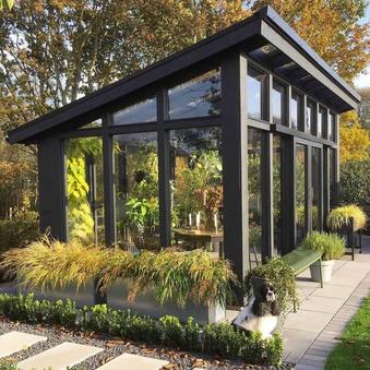
Cotton Comfort’s design is inspired by 1960s suburbia. Cotton Comfort will serve as a simple oasis away from the hustle and bustle for residents to relax with elements like wood paneling, sharp simple lines, lush greenery inside and out, muted colors, and more. Knowing the residents have lived through this time, the design will be modernized by not making the interiors too bright or outdated, while keeping in mind to not have too harsh of contracts in colors, texture, or lighting, and to choose materials and finishes that are slip-resistant and easy to navigate. Keeping things simple for the residents but staying in the wheelhouse to ensure the residents feel at home. Nature is important for well-being and healing, so views of nature and nature-like elements will be added throughout the design as well. The residents will feel the nostalgia here at Cotton Comfort.
C OTTON COMFO R T l i v i n g Abby Schlehuber
4388
ID
Spring 2024
COMPARATIVE CASESTUDY COTTONCOMFORT

116 residents 50 residents 24 residents 8-16 residents
Commercial Kitchen Residential Style Kitchen Residential Style Kitchen Residential Style Kitchen
This building is very repetitive. Its very easy to get lost because everything looks the same. There is furniture throughout the walking paths for a resident to stop and take a break while walking.
Something unique about Parkway Place is that the building is set back on the lot by a yard and parking. The large front yard I would imagine to be very inviting
Something that is very unique is that all the units open straight into all the public areas that are grouped together.
The building will have a few types of public areas that can be rearranged for the different activities. There will be a indoor and outdoor walking path that is inviting to the residents.
Circulation is linear, the entrance along with public areas such as the dining room, and living room/library are central with linear paths either way. The resident who lives at the end of the hall has a significantly longer path to the public areas than someone right off the public areas.
Almost an entire loop circulation when thinking about the front door. Will have to cut through the dining room to get back to the front door.
There is no specific circulation here, all of the apartments lead into the public area which has the kitchen, den, dining room, living room/library, and the front/back porches.
Having a specific path to the entrances/exits and the public areas with easy wayfinding. having the apartments grouped together so that a resident doesn’t get confused finding their apartment.
Brookdale Parkway Sonoma New Design
FINDINGS
FOR ASSISTED LIVING DESIGN

ASSESSABILITY
Easy-to-grab handles and knobs
Adjustable cabinetry in apartments
Illuminated electrical controls and switches
Barn doors when possible and light in weight and easy to open.
EASE TRANSITION
Have a customizable experience
Have space for personal items
Have privacy for residents
Residential looking with commercial performance materials and finishes.
Explore the needs of residents beforehand along with the family of the residents.
COLORS AND MATERIALS
Easily cleanable fabric and finishes
Non-slip floors and surfaces
Offer different types of firmness of seating
Have multiple paint colors in the interiors.
Residential feel with commercial performance materials.
MOBILITY
Zero threshold floors
Grab bars
Flooring that is nonslip and easy for residents to “shuffle” on. Room for two scooters/walkers to pass each other in the halls.
SAFE METHOD
Safety is having a space where users feel safe and want to enter. Attractiveness, having a space that people want to go.
Friendliness, having a space for interactions, and for privacy Efficiency, having open paths for a user who walks through space so travel is easy and quick.
WALKING PATHS
Many residents walk recreationally, the walking path should be convenient comfortable have handrails, have places to sit and rest, places where residents can people watch, be visually interesting, be biophilic, protected from the weather.
The major finings for the eight research summaries found.

SUMMARY
The narrative for assisted living needs to change. This is a place for the aging communities to live for a long period, why shouldn’t it be inviting and comfortable? It is not a place that makes your life harder its to make it easier.
2.
1. Have comfortable walking paths with places to take breaks.
3.
Traditional housing focuses on the average family, not on aging in place
SAFE Method
5.
4. Add Assecable electrical controls and switches.
Explore the needs and residential wishes of new generations of older individuals.
6. Privacy is needed in social spaces, and it has room for families in the apartments.
8.
Do not have a large contrast in lighting, large illuminated lightswitches, have each to access emergency buttons.
7. Change in hand dexterity and habitual speed reflects cognitive decline over time.
COTTONCOMFORT
CONCEPTIMAGERY


C OTTON COMFO R T l i v i n g
PROJECTIMAGERY


C OTTON COMFO R T
Primary
PRIMARY
UNDESIRED ADJACENCY FOR RESIDENTS AND FAMILIES
FOR ALL RESIDENTS
FOR ALL RESIDENTS
FOR ALL RESIDENTS
FOR ALL RESIDENTS
WHEN FAMILIES VISIT
1 BED, 1 BATH, LIVING, KITCHENETTE
FOR ALL RESIDENTS
FOR ALL RESIDENTS
FOR ALL RESIDENTS
OUTDOOR BUT PRIVATE VIEWS
FOR ALL RESIDENTS
FOR ALL RESIDENTS
FOR ALL RESIDENTS
LOTS OF STORAGE
LOTS
Secondary
SECONDARY ADJACENCY
Undesired
M
Adja
Ad
Ad RECEPTION OFFICES PUBLIC LIVINGROOM PUBLIC DININGROOM KITCHEN EVENT ROOM CAFE/COUNTER SERVICE FAMILY MEETING ROOMS RESIDENT APARTMENTS SALON LIBRARY GAMEROOM/CRAFTROOM
ROOMS
HOUSE MOVIE ROOM GREENHOUSE NURSES ROOM
ROOM HOUSEKEEPING STORAGE POOL STORAGE EVENT STORAGE EMPLOYEE BREAKROOM PRIVACYNOISELEVELSPLUMBING SPECIAL CONSIDERATIONS PUBLIC SEMI PRIVATE PRIVATE HIGH LOW SQUAREFEET 150 150 800 1000 600 500 220 150 1200 400 400 400 300 1300 400 400 200 600 600 1200 1200 100 N N N N Y N Y Y Y Y N Y N Y N Y Y Y Y Y Y Y
THERAPY
POOL
LAUNDRY
ADJACENCY
OF STORAGE
FEEL 400 EXTRA SQ FEET FOR HALLS, STAIRS, AND EVELEVATORS 34,270 SQ FT TOTAL Abby Schlehuber ID 4388 Spring 2024 Dr. Guerrero
LOUNGE

DENTAPARTMENT


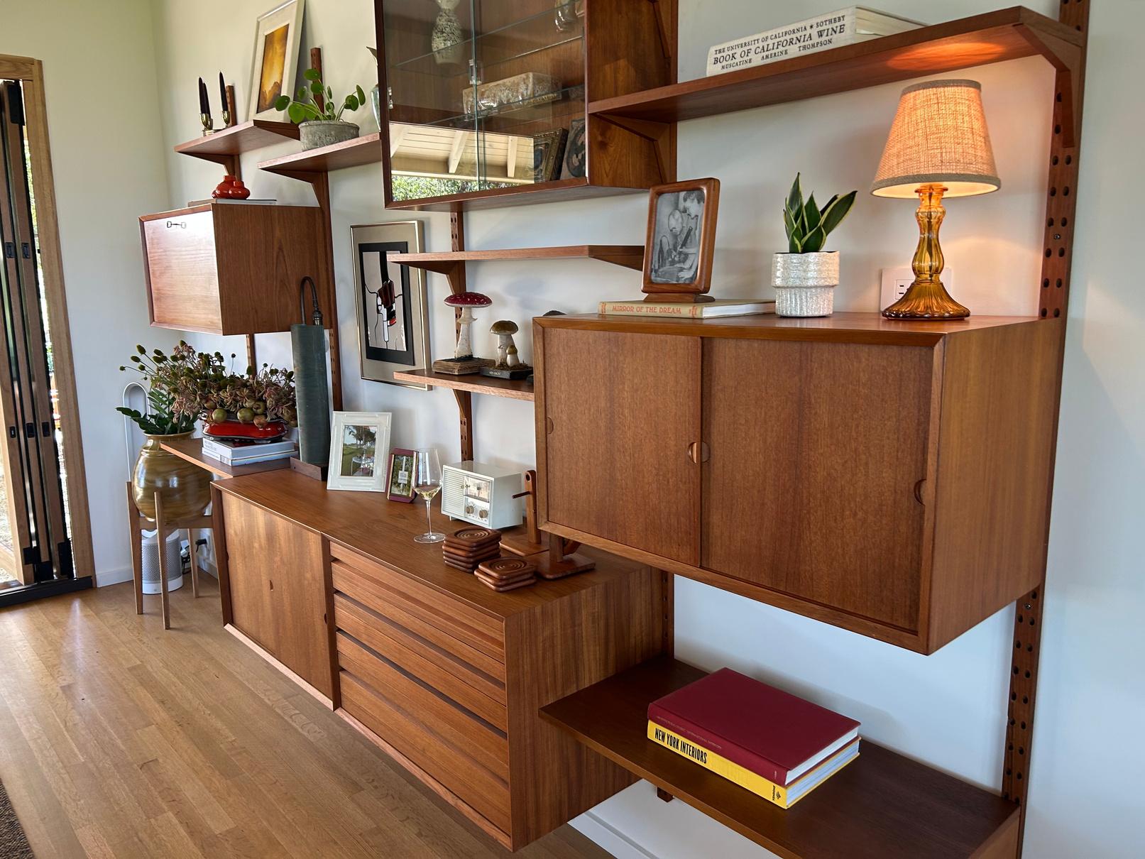
WALLUNIT
Made in Denmark, 1953.
Cado Royal Wall Unit in Teak
Designer: Poul Cadovius, 1911-2011
Born just outside of Copenhagen in 1911, Cadovius began manufacturing window treatments in the 1940s with his partner, Hother Brenner. He soon turned his focus from Venetian blinds to furniture, finding success designing svelte pieces in teak, a richly colored hardwood favored by the Danish mid-century modernists.
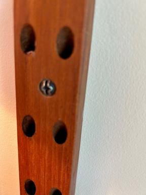
Most famous for his modular floating shelving system, Cadovius founded the furniture manufacturer Royal System with his designs, and in 1948 he produced the Royal System shelving unit a space-saving solution that underscored Cado's penchant for problem-solving in a multifunctional way. Rather than balancing shelves on wooden or metal legs, it held them to the wall with brackets. The Royal System proved to be especially popular and early models continue to be in demand. In 2018 this piece celebrated its 70th anniversary.


LOBBY


GREENHOUSE


LIBRARY

