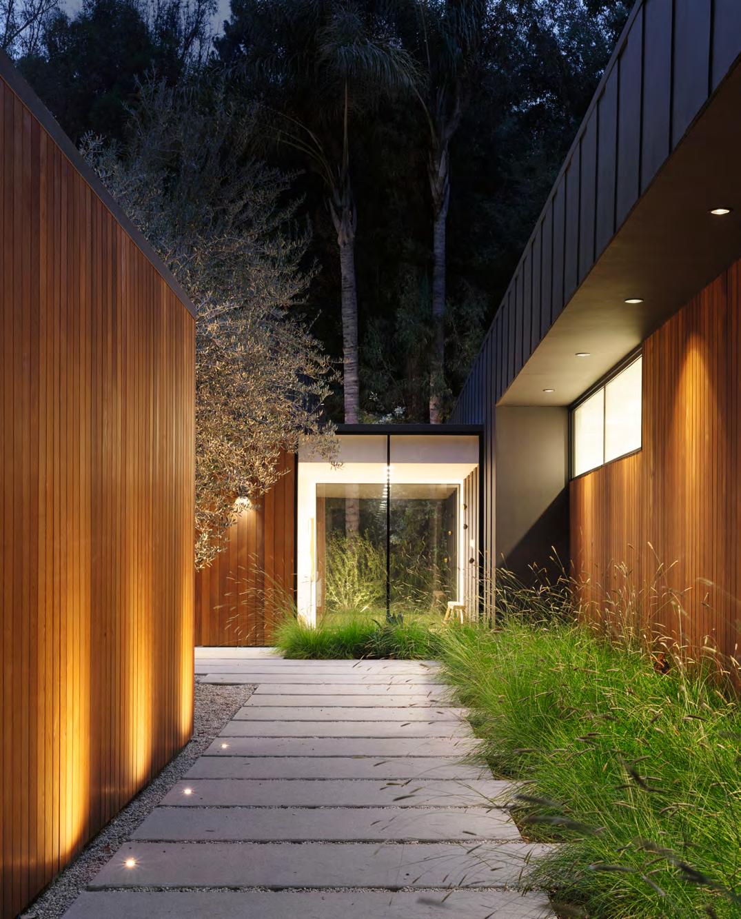
Architects at Home


The scale of the single-family house is a building form that allows, and in many cases encourages, the architect to develop and test an idea or ideas that include or expand their own awareness of light, space, form, and context.
Architects use the design of their own homes both as an experiment and as a representation of their own beliefs and ideals. Their grounding through education, study, and personal experiences may form a base or starting point, but the influences of their culture, lifestyle, and the environment of their upbringing naturally form the design elements in their architecture. Architects’ design positions are diverse, the context is diverse and cultures are varied. The customized house is a “one off,” an architect’s interpretation of design equated with the needs and values of their sense of a home. It is tailored to the architect’s own family’s program, and balanced by the architect’s personal design perspective.
The size of an architect’s own home is often an expression of their commitment to be more environmentally responsible and they scale the size of their home as a direct relationship to their needs. A home studio is where they can work and still be part of the family activities. The two-story living room with a mezzanine is being reduced in size or scale. A library of books may be replaced by the computer.
With the advent of the digital age, the future may be less defined. We can now be visually attached to our home without actually being there. Automation is changing the house in ways that we have not yet even thought of, and it will continue to do so. The new norm is change.
The rooms in a house are defined and your sense of the space reinforced by how the enclosure surfaces—the walls, floor, and ceiling—form and wrap the room or space.
The critical elements in defining or expressing a room are the floor and ceiling. Is the floor level, is the ceiling raised? A second critical element is the corners; the room is now contained, it has a boundary. Once the space is defined by the enclosure surfaces, the room is still not visible to the human eye without daylight or artificial light. How light is introduced into a room through openings in the exterior surfaces both defines the space and provides the room with its identity. By not placing the window on an axis with the door, this will initially contain your vision when you enter a room. You will experience the room before your eyes wander and recognize the architectural details or the furniture and other objects placed in the room. If you place windows in the corners of a room, a Frank Lloyd Wright trademark design element, as seen in the Freeman House, you eliminate one of the room’s defining elements, thereby expanding the dimensions of a room.
The vertical dimension is also important. A tall or two-story room lifts your eye upward. A light source from above also unconsciously lifts your eyes upward, similar to the light source in a Gothic cathedral. This effect can be achieved in a modest manner by designing the natural light to enter the room through a skylight. This light source with inclined walls reflects the descending light into the room. The most dramatic example is perhaps the Oculus, (open skylight), in the Pantheon, Rome, where a disc of light transverses the space during the day. This movement of light introduces a sense of mystery or evokes a feeling of emotion as the light source, the sun, travels across the sky. In an interview Ricardo Legorreta discussed how natural light together with vibrant colors in his houses were designed to evoke a feeling of emotion. This is just a small part of the architect’s vocabulary and dictionary of elements that create a room, a space, or a home.
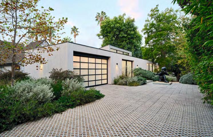
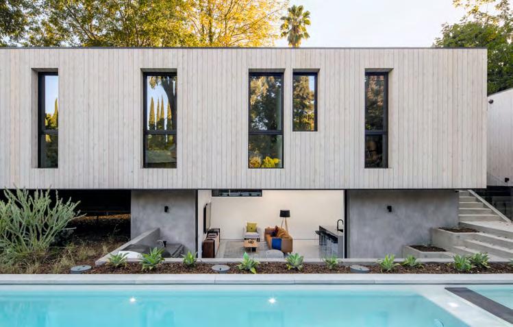
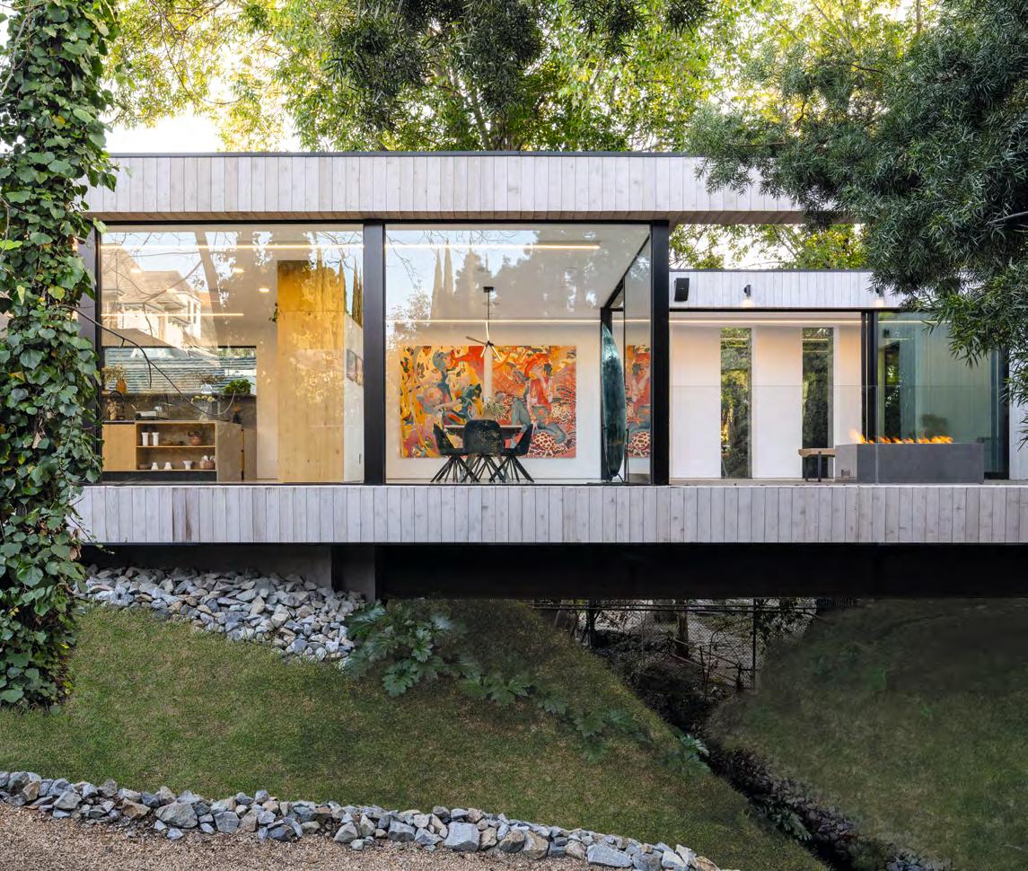
When designing his own residence, Dan Brunn took matters a step further, and created a one-of-a-kind “bridge house” that literally cantilevers over a natural stream. The design exemplifies Brunn’s signature minimalist aesthetic with a delightful choreography of light and volume that conveys drama and intrigue, while the design serves as a demonstration of innovative systems and forward-thinking processes.
Brunn found inspiration by the Vanderbilt family’s former waterfront retreat, the Breakers in Newport, Rhode Island, particularly with the motor court and entry. Reworking the design by starting with a motor court, Brunn determined to evolve the structure of the residence and to straddle the stream rather than base the whole house on one side of the site.
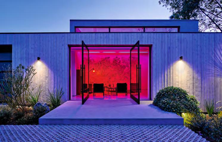
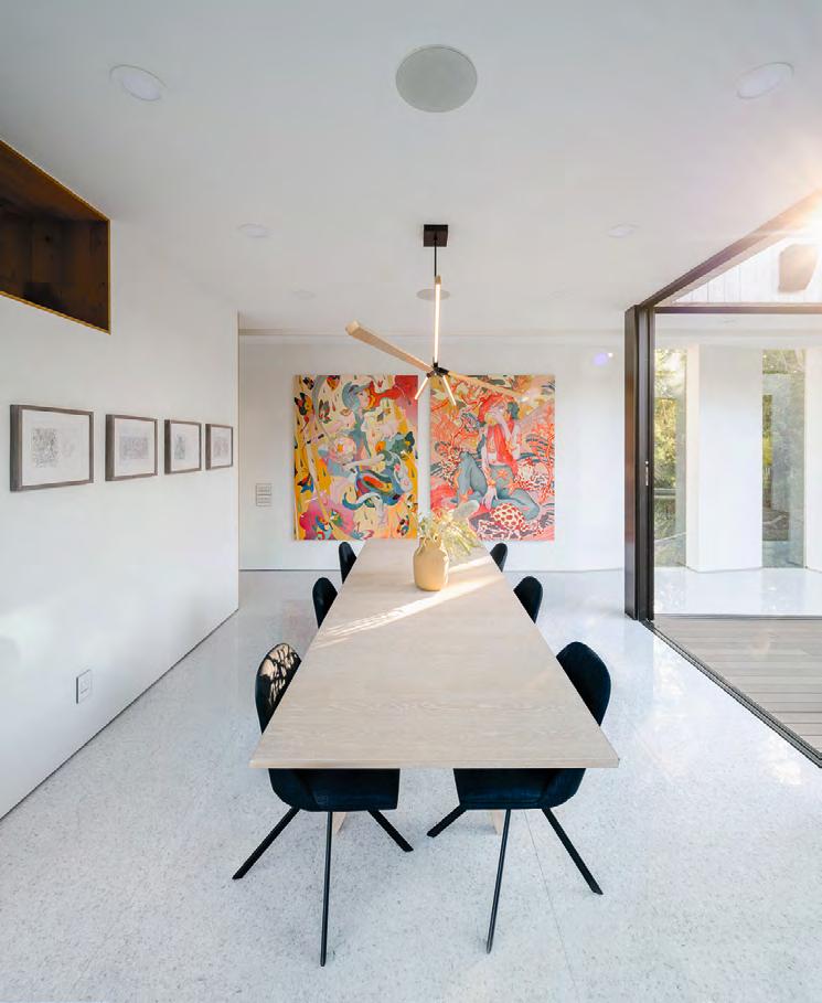
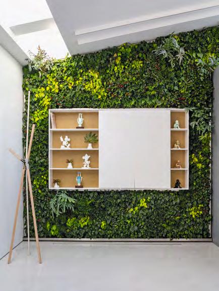
The waterway forms a natural division for public and private spaces in the residence, marking the point where one transitions into another. The public area in the front of the house comprises a double-height living room featuring a “Living Wall” of plants, dining room, kitchen, and den. Access to the outdoor terrace, with its lounge area and fire pit, is through floor-to-ceiling sliding glass doors, inviting the inside out, and the outside in. The exterior landscaping was carefully created to intertwine with the surrounding environment.
The private sector features a master suite with a walk-in closet and a sanctuary garden, as well as two bedrooms with a shared bathroom and one with an en suite.
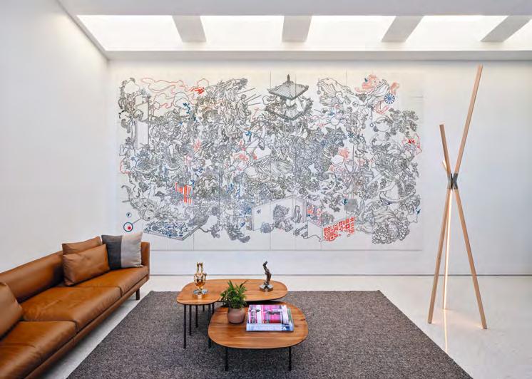
Brunn conceived of the home as a net-zero home, with placement carefully positioned to avoid unnecessary heat gain while its length allowed beneficial northern exposure. Recycled steel was employed in the BONE Structure design. As a bonus, the bridge system resulted in less land being impacted. The pool is heated by photovoltaic panels on the roof, and a state-of-theart home water system by Pentair with exceptional filtration. Bridge House is well-insulated, and internal air quality is enriched by the Living Wall of plants that helps to purify the interior air.

This home for Mark de Reus and his family celebrates the career of its architect, who incorporated lessons from thirty-five years of practice into this, his most personal work. The home explores themes common to the firm’s work as a whole—innovation, unpredictability, clarity of design, the use of natural materials, careful detailing and craftsmanship, and livability.
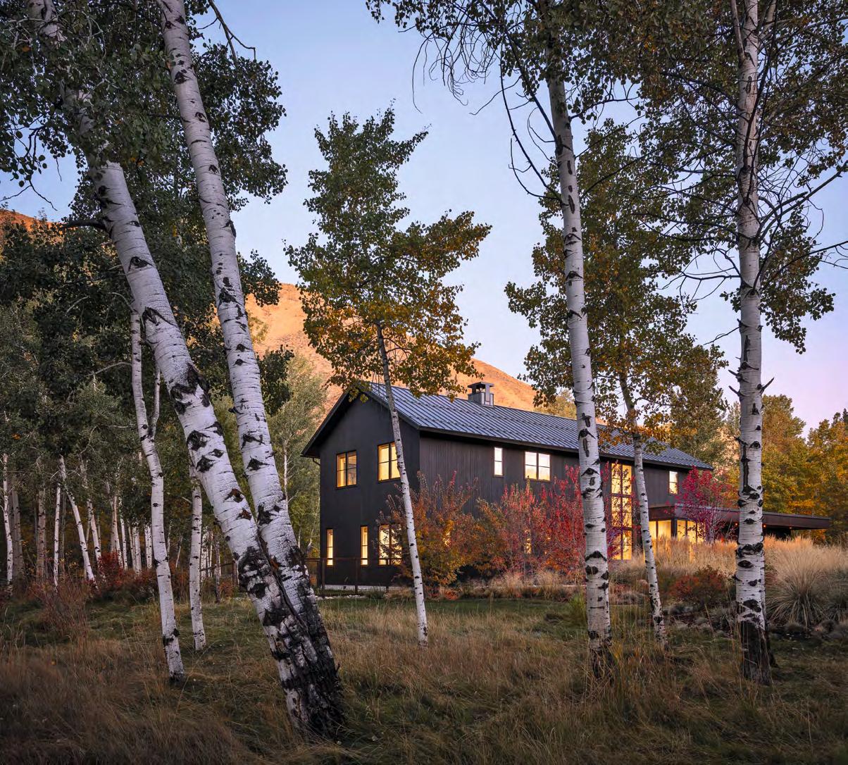
The home consists of the simple shapes of two practical building forms: a two-story agricultural barn form for the living areas, and an engaged flat-roofed structure for the garage, storage, and terrace. A two-story window lights the eastern entrance and stairway; it is designed to appear like a warm welcoming lantern on a dark night. Large windows on the western wall offer sunset views toward the Big Wood River at the rear of the lot.
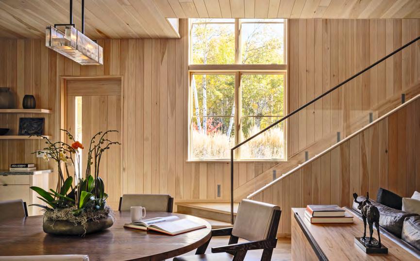


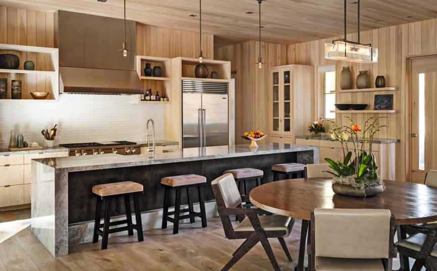
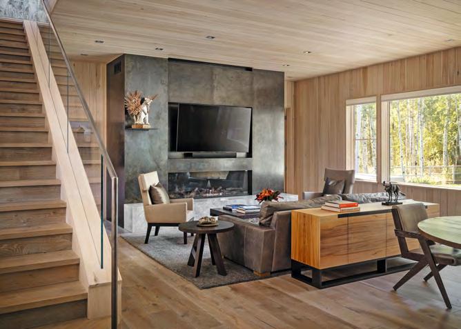
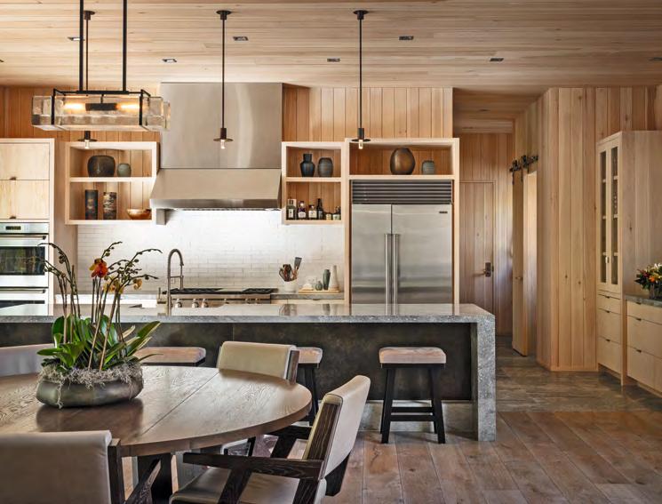
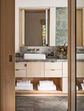
To harmonize and complement the aspen forest setting, de Reus chose dark colors for the building’s exterior: black-stained Douglas fir wood siding, graphite gray standing seam metal roof, black aluminum-clad windows, and black metal garage doors. The interior atmosphere is one of a modern cabin: with the use of rustic oak flooring, vertically applied white pine with a light finish that shows the grain but protects the wood from ultraviolet light.
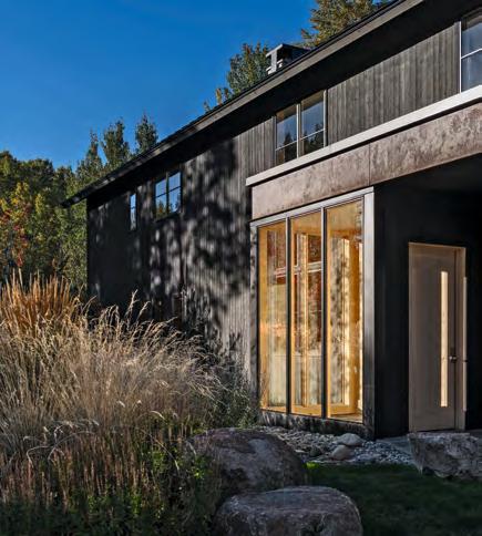

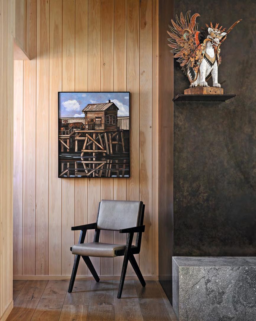
Some of Big Wood Residence’s details came as special requests from his family. De Reus’s wife wanted a barn door, which he included in the powder room and garage, and his daughter asked for a window seat in her bedroom. Some of Mark’s favorite details include the Alison Berger cast-glass dining light pendant, which speaks to the site’s history as a place where block ice was cut from the natural springs for the Sun Valley lodge; the Peter Zumthor–designed light pendants over the kitchen island; the use of blackened and rusted steel alongside natural granite. One prominent detail—a steel shelf projecting from the fireplace mantel—was designed for a sculpture of Balinese Singa that de Reus acquired when he lived in Indonesia.

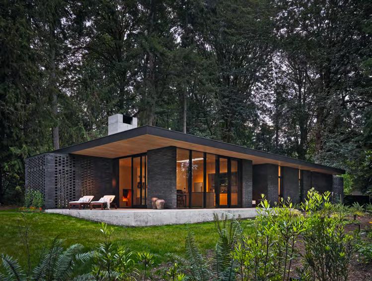
Located northwest of Seattle on the Kitsap Peninsula, this residence takes its place on a cherished piece of family property.
The program for the house was simple: three-bedrooms with space for playing music and drawing for a musician and an architect. The house is modest in size yet reaches into the landscape with a sheltering roof and screen walls to create usable outdoor spaces on all sides. The roof becomes an additional level for more occupiable outdoor space, including an elevated herb garden and star-gazing from the terrace.
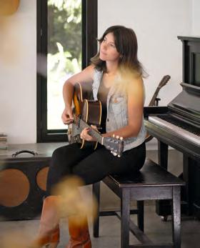
Inside, the site-cast fireplace and chimney acts as a totem marking the heart of the living space—a space for family gatherings and music to be played.
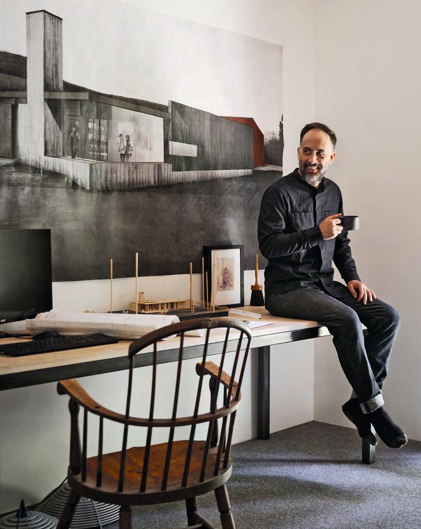
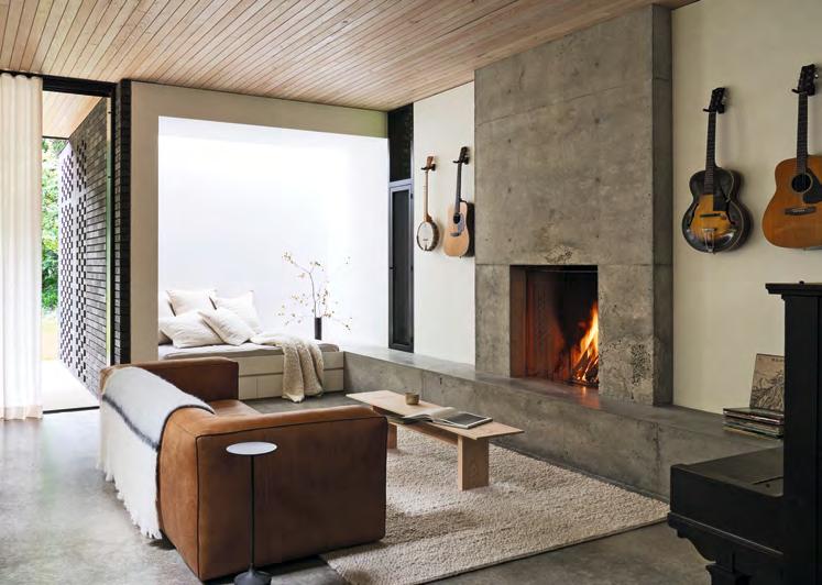

The design concept evolved out of a solid rectangular volume in a typical one-story “rambler” style, sliced through and perforated to let in light and provide natural ventilation while maintaining privacy where needed. The ground plane with a raised concrete base performs multiple tasks as structure, heating source (radiant hydronic piping), and finish surface (polished concrete slab). The roof plane creates a large sheltering overhang that shades and protects the windows and provides space for a roof terrace, solar panels, and herb garden. The roof plane is carved away in select areas to open large voids and slices of skylights to allow light to wash walls and penetrate the main spaces.
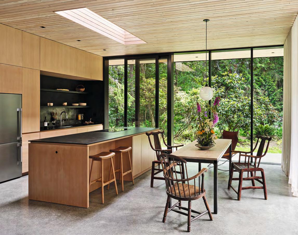
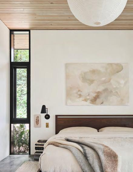

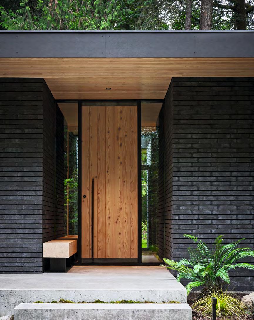
The concrete base and full height masonry walls create a material language of visual mass and permanence for the home. The masonry walls and deeply raked mortar joints are highly textured, countering the smooth finished concrete surfaces and lime painted walls. The designers selected low-maintenance materials that would change with age while timber was milled on the site. Douglas fir trees were cut and dried in situ, and used in the finish lid of the roof plane as well as the open kitchen shelves and coffee table. Cedar milled on-site was used to create the entry door, entry benches, and east privacy fence.
Brick screen walls extend out into the landscape creating semi-enclosed exterior rooms that filter light and views, dissolving the structure into the landscape.

My home is like a “new black sweater.” The original design has allowed the home to stand the test of time, while also continuing to change.
It sounds terribly egotistical, but I just love living there and couldn’t imagine now living anywhere else.
As a family, we feel connected to our environment and to each other within the home.
and Angela Jamison
Faced with no client except oneself, the project inevitably becomes a manifesto of sorts.
Front cover image: West Los Angeles House (Clive Wilkinson) Photography: Ema Peter
Back cover image: Laurel Hills Residence (David Thompson) Photography: Matthew Millman
