5 minute read
THE HOGARTH PRESS

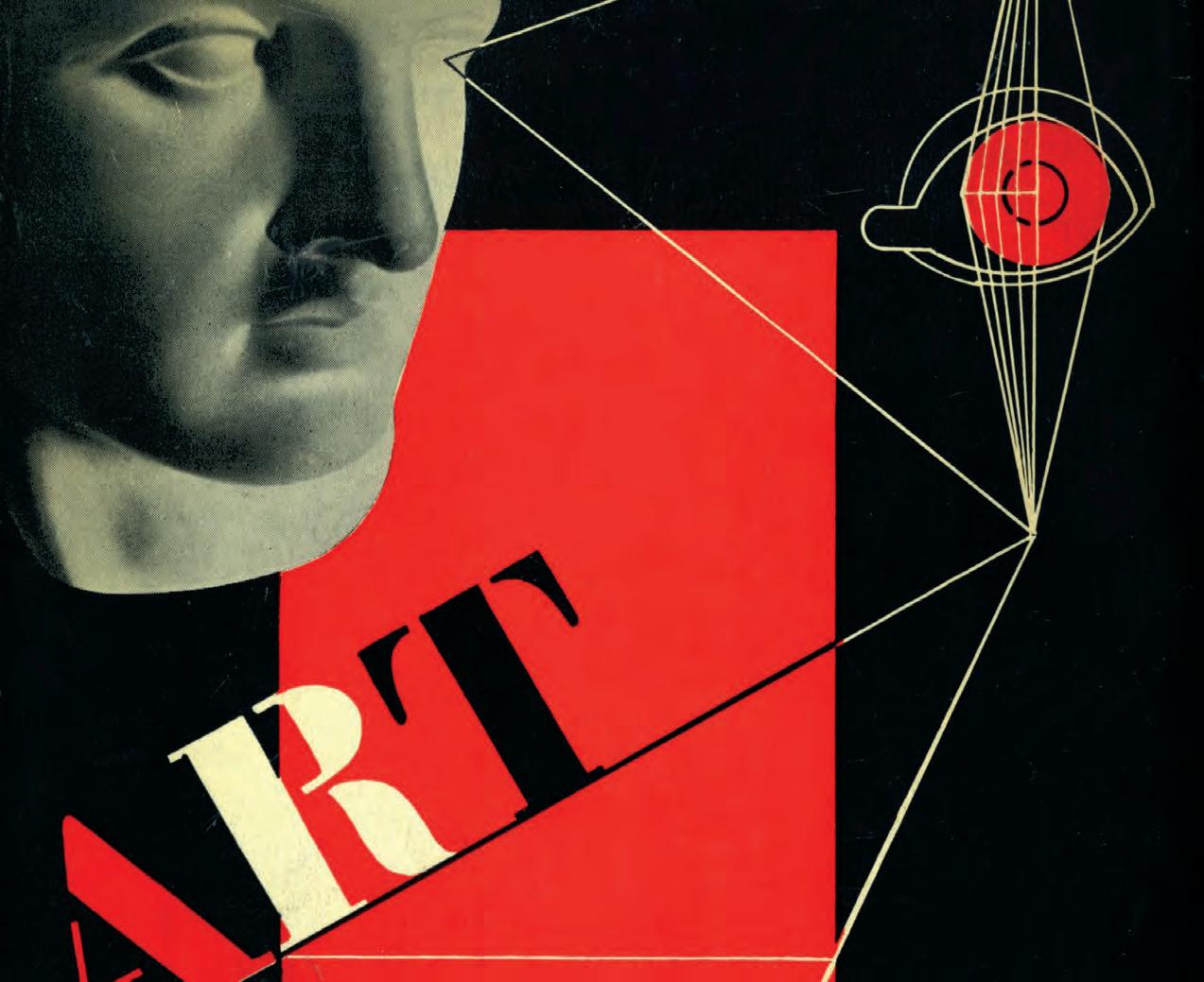
from Kauffer Covers

Opposite: Cover illustration for The Man Below, 1939, by H.T. Hopkinson. Sir Tom Hopkinson became better known as a journalist and the editor of Picture Post. Above: Kauffer’s, c.1928, logo for The Hogarth Press, although this version appears to have been used less frequently than Vanessa Bell’s design. THE HOGARTH PRESS A lthough Kauffer designed only a handful of book jackets for The Hogarth Press, it has been argued that he was key to its transformation from being just amateur to becoming professional. Elizabeth Gordon claimed that:
‘In including Kauffer’s work and name the Press added a different and yet compatible discourse about artistic purpose and productions’
– that Kauffer helped draw the Woolfs into the mainstream. Leonard and Virginia Woolf had taken up the craft of handprinting in 1915 as a way of Virginia relaxing from her intense brainwork in writing. They began hand-printing books, not in the elitist sense of the dozens of small private presses springing up in the early decades of the 20th century, but, at first, just as gifts for family and friends and then, as they declared on their fifth anniversary:
‘We aimed in the first place at producing works of genuine merit that could scarcely hope to secure publication through ordinary channels.’
Their intent was not so much moneymaking as missionary; but nevertheless The Hogarth Press in fact became something of a
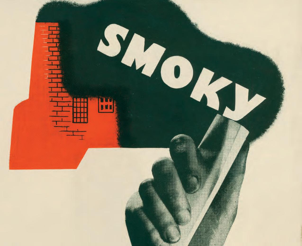
commercial success, particularly after its publication of Virginia’s Orlando, which immediately went into numerous impressions. Although they initially concentrated on literature, from the mid1920s the Press extended its range to non-fiction, social and economic topics. By the early 1930s the Woolfs had ceased handprinting; they were to combine the risk-taking of the private presses with the professional production of the commercial press. Exactly how and when Kauffer first met the Woolfs is not recorded, possibly through the covers he had done for the Lytton Strachey books early in the 1920s or via Roger Fry and Clive Bell. Fry, something of a Kauffer fan, was to become a close friend. In any case by the time the Woolfs were realizing that inadvertently they had morphed into professional publishers, high volume producers rather than a cottage industry, Kauffer had become a well known graphic designer through his commercial work for Frank Pick and others and therefore someone they might naturally turn to in their need. The Hogarth Press’s first book jacket, for Jacob’s Room in 1922, was designed by Virginia’s sister Vanessa Bell who also designed the Press’s ‘wolf’ logo – a wolf’s head in a medal. Kauffer was not only to provide covers for the Press but to design a more progressive logo albeit the Press would continue to use both, his and Vanessa’s. Kauffer’s first book jacket for the Woolfs was for George Rylands Words and Poetry in 1928 (sometimes misquoted as Words and Music). Rylands, a literary scholar and Fellow of King’s College, Cambridge, became better known as an actor and director and was a friend and confidante of Virginia’s. The jacket, in a turquoise blue on white has overlapping heads in profile, a device that Kauffer was to use a number of times for his covers – the heads with mouths open wide as if proclaiming, with, as the background, two blocks of colour, one white, one black. The lettering, in the same blue, is hand drawn in an art deco style with each letter split. There is no record as to what either author or publisher thought of it, although, at the time, the Press’s first ‘traveller’ (salesperson), taken on in 1928, reported that buyers generally showed resistance to anything ‘unconventional’. For whatever reason, possibly his too advanced style, Kauffer was not commissioned by the Press again until well into the 1930s. Between 1935 and 1940 he designed three jackets – Quack Quack in 1935, Smoky Crusade in 1937 and The Man Below in 1939. ‘Smoky Crusade’ is a autobiography of R.M.Fox, a socialist writer of the Irish troubles and a conscientious objector, as were several of the Bloomsbury Group. Quack Quack was by Leonard himself, who, being Jewish, had become acutely tuned to what was going on the Continent. Kauffer initially drew a design that Leonard said he liked a lot but felt rather too avant-garde for British tastes suggesting a photomontage instead. Kauffer obliged and added along with photographs of Hitler and Mussolini a grotesque head, leaving the browser still none the wiser as to what the title actually referred.
The Man Below is a first novel by H.T.Hopkinson. For this Kauffer seems to have returned to the double heads image of
Opposite: Photographic collage and illustration for Smoky Crusade, the autobiography of the journalist and historian R.M. Fox, 1937. (Reproduced with the permission of Simon Rendall, image provided by Victoria University Library, Toronto.

Opposite and above: Kauffer’s understandably anti-fascist montage for the cover of Leonard Wolff’s 1935 book Quack Quack. The cover features the belligerent looking Hawaiian war god Kuka’ilimoku in comparison with Mussolini and Hitler. Words and Poetry – this time the two heads, one in blue shadowing a black, suggesting two parallel tales to be told. Elizabeth Gordon in her chapter in Leonard and Virginia Woolf edited by Helen Southworth, argues that Kauffer’s relationship with The Hogarth Press not only coincided with ‘a shift in relation between the Press and the market’, but altered its relationship with the art world and book illustrators and designers. She further maintains that Kauffer, ‘by his aesthetic prescience’ connected the Press to ‘a new network of associations’. Evidence suggests that he may well have shifted the Woolf’s attitudes to more adventurous design and more risk-taking publishing choices, but that he was oft-times a shade too progressive for them to use, or too use without modification.