LIGHT COLOR TEXTURE

MDSzerbaty Associates Architecture The work of MDSA

Michael D. Szerbaty
Introduction
The projects presented in this monograph represent a wide range of type, scale, and context. They also vary widely in clientele, from the intimacy of a private residence, to public buildings, to structures that are not accessible to the public and can only be experienced from outside. They share a common ideal: the sophisticated and refined consideration of light, texture, and color, shown through detailing and execution.
Ours is a process of “Imagination through Collaboration.” MDSA gains strength from the diversity of our work. The firm believes that designing and constructing projects that vary in scale, scope, and budget enable a cross-fertilization of ideas used in concept, material usage, and detailing, allowing us to better explore new approaches to how people live, learn, work, and experience buildings. The variety of project types provides us with exposure to differing approaches and priorities among clients and users. Dialogue enables our imagination.
Our solutions are not preconceived design ideas; instead, they mature through a process of creative collaboration and exploration of how spatial and material solutions can respond to client needs. It is the firm’s belief that each project requires a nuanced approach to consistently yield innovative and responsive solutions to complex design issues.
Our approach is to explore the hierarchies and interplay inherent in any given program and site. We generate inventive spatial solutions through the interaction of these program and site elements, with results that achieve richness through the light, (infra)structure, and materials that shape them. MDSA thoughtfully weaves together pragmatic, creative, and economic concerns into good buildings. We excel in an environment that encourages multiple perspectives and varying commentary, which stimulates our drive to make better architecture.


We create buildings and interiors with presence—that have an integrity that speaks quietly and directly. Our spaces reveal themselves in layers to offer a richness of experience that continues over time. We bring an intensity of focus that extends from the overall concept to the fine details, energizing even routine spaces. That consistency means the entire project is responsive to the client’s needs and goals, and how the user experiences the spaces.
Of paramount importance to our design work is the careful composition and use of materials. We use materials not only for their sensory qualities of texture and color, but also inventively integrate them with adjacent elements with technical precision and detailing that yields a refined and sophisticated appearance. Our work carefully considers texture, color, and natural light. We seek to explore the inherent qualities of materials in their use and relationship in ways that may, at first sight, seem disparate with adjacent elements, but ultimately reveals a sophisticated and refined approach. We particularly pride ourselves upon technical precision, as well as knowledge and innovation in construction techniques and the assembly of building systems.
Whether it is through an open space, an unexpected jolt of texture or color, a plan that provides a sense of place, or a welcome wash of daylight, we infuse each space with vibrancy. It is with this insight and dedication that the work of the firm is pursued for its clients.

The Sixth Avenue Elementary School PS340M Manhattan, New York
Letting in the Light
In a dense, high-rise urban environment, multistory school buildings have a unique presence. Such schools rarely find themselves as stand-alone buildings; instead, they are part of a mixeduse program inside a new development or a major renovation.
Located at the bustling corner of the Avenue of Americas and 17th Street in Manhattan, the 95,000-square-foot PS340M involved converting the lower six floors and cellar of a 14-story building into a richly programmed Pre-K through Grade 5 school that serves 518 students. The original building, constructed as recently as 1989, served as a hospital. By condominium agreement the school exists at the lower floors while hospital administrative facilities remain at the top levels.

The school entrance faces north to 17th Street, open and inviting with an identifiable street presence. Passersby can look through a new, large glass surface to see the lobby’s main monumental stair element. The wall of the south-facing rear yard of the building has a large section removed, replaced by a glass curtain wall to bring much-needed natural light deep into the interior, something lacking in the original punched-window building. Light and street level views are introduced at the north-facing entry, contrasting it with direct sunlight and views to the south. The main stair at the street level (joining levels 1 and 2) is presented as a solid occupying the carved double-height lobby space. It is a major gathering area for students and parents during arrival and dismissal. In direct contrast, the communicating stair shifts to the rear of the building to connect floor levels 2-6 and is made open and transparent, filtering light from the new curtain wall as it continues to the upper levels. The plan and sectional shift allow for a variety of visual experiences, and an infusion of natural light and views of the city, while unifying the spaces of the school from top to bottom.

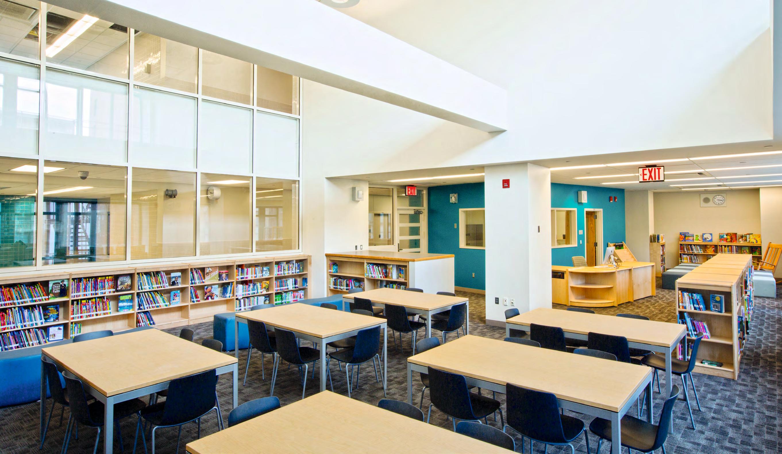
The distribution of program for the school is such that every other floor contains a major communal space—lobby/cafeteria, admin/ rooftop play yard, library, exercise room—that are created by carving openings in the floor to create double-height spaces. The Sixth Avenue Elementary School includes 21 new classrooms arranged along the quieter 17th Street side of the building. Specialized instructional areas for art, music, science, and a multipurpose room look over the Avenue of the Americas from the upper floors.