
Data Visualization Style Guide | Office of HIV/AIDS | 2024


Data Visualization Style Guide | Office of HIV/AIDS | 2024
a cheat sheet for effective plots
QUESTION: What question are you answering?
COMPARISON: Is the relationship clear?
I want to show the relationship between _________________ and _________________ .
MEANINGFUL: The visualization will be used to make the following point(s) ________________
AUDIENCE: Who is the primary audience and how will they use the visualization?
APPROPRIATE: Is the plot used appropriate for the relationship within the data?
Use the checklist below to help you created an effective plot. Refer to the Anatomy of a Plot section for specifics.
POSITION AND ARRANGEMENT TEXT
title conveys takeaway message
subtitle adds details to title message
Source Sans Pro or Gill Sans used throughout
consistent font sizes for each plot element
direct labels used in place of legend
legend integrated into title where appropriate


Despite gains in FY49, the number of positive patients identified through index testing fell in FY50Q1.


Index testing fell over 20% from FY49Q4 to FY50Q1
COLORS (OHA recommended palette)
SECONDARY COLORS PRIMARY COLORS

USAID COLORS (use for external facing plots)
PRIMARY COLORS

APPLYING PALETTES & COLOR RAMPS
numbers rounded, avoid false precision category labels abbreviated where needed
axis labels removed when direct labels used annotations provide clarifying details
chart text is consistently aligned data ordered in an intentional manner
axis lines start at appropriate values
axis intervals consistent and evenly spaced
small multiples show data across categories
all graphics are two dimensions (no-3D)
plot is void of border and thick lines plot is free from decoration (chart junk)
unnecessary tick marks and lines removed
COLOR (see color section for details)
color use is intentional and consistent reference lines or areas used to provide context single x- and y-axis used (avoid dual axes)
text color sufficiently contrasts with background
approved colors applied throughout
annotation colors are subtle (no colored boxes)
color gradients applied appropriately
Aaron Chafetz (achafetz@usaid.gov)
High level metric that shows progress towards a target or major milestone. Use: 95-95-95 cascade summary KEY PERFORMANCE INDICATORS (KPIS) 42%
Comparison of the differences in size of a metric across many categories. One of the most effective plots. Compare positivity across partners MAGNITUDE
CHANGE OVER TIME
Trends in data over a period of timedays, months, quarter, or years. Annotate major events to enhance. Testing positivity across months
Summarize rankings between categories across time. Works well when changes are stark. Change in budget levels across periods
Distance from a particular point - i.e. using a zero baseline or showing deviations from an average point. Show deviation of results from an operating unit average
Compare a potential relationship between two variables. Marks can encoded by size or color to represent a third variable. Performance metric versus dollars expended
PART-TO-WHOLE
Breaking down a category into subcomponents and showing component parts. Use instead of a pie graph. Partner share of an achievement goal
Maps convey geographic patterns of data using coordinates or polygons. Useful for showing spatial correlations. Show treatment coverage by district
Breaking a plot that contains multiple categories into mutliple plots can make it easier for comparsison. Compare trends by partner across time
Present detailed values. When properly formatted, tables reveal patterns. Use sparklines to plot values presented. Summarize details of achievement over time
Use colors to differentiate categories or encode values. Apply colors in a meaningful manner. We recommend the following color-blind friendly palette for categorical data. discrete or categorical encode with discrete colors Use: target achievement by funding agency continuous encode with quantitative palette scatter plot comparing site level indicators
Color encoding should be based the type of data plotted.
OHA recommended colors
diverging (deviations) encode with divergent palette districts above/below country average for an indicator
Use icons to reinforce a topic or theme. Use consistent colors, strokes, and sizing as other visuals in a plot.
TIPS AND RESOURCES FOR EFFECTIVE PLOTS
less clutter yields more effective plots get it right in black and white, then add color
ADDITIONAL RESOURCES
the chart doctor from Financial Times
do not make the reader work to see the point Fundamentals of Data Visualization (2019, Wilke)
Visual Vocabulary from Financial Times
Welcome to USAID’s Office of HIV/AIDS (OHA) data visualization style guide. The purpose of this product is to provide OHA with a set of guide rails on how to present data in-line with an overall vision so that visualizations have a common look and feel. OHA-produced visualizations do not need to all be identical, but they should appear as if they belong to the same family. This common appearance is achieved through the use of a set of elements belonging to an organization’s graphical style. For example, by using the same typeface, size, color schemes, graphical elements, annotation patterns, and placement options, different users can create graphics grounded in a base style, while still allowing for creative flexibility. Think of organizations like FiveThirtyEight, Financial Times, or BBC which have such distinctive styles that even on their own in the wild, you can clearly identify their origin.
Creating a consistent look and feel for graphics has at least three organizational benefits. First, product creators can spend more time focusing on graphical content and messaging as the style elements are predefined for them. Second, a regular consumer of OHA’s analytic products will be able to more easily read and interpret the graphical content based on familiarity of its preset guidelines. Finally, product consumers will come to recognize OHA graphical products based on their style and may place more trustworthiness in them due to their familiarity with the product. At the end of the day, we want to create and disseminate visualizations that are consistent, trustworthy, and identifiable as belonging to OHA.
The motivation for creating this style guide came from an assessment of one of our office’s data review presentations, which documented that over 100 different colors were used for encoding data or annotations in visualizations contained in the review. The result not only is a set of graphics that lack a standard look and forces a user to reorient themselves each time, but also a brand that is unmemorable, unrecognizable and, potentially, not as trusted as a more polished product would be. This style guide serves as a tool to define and enhance brand cohesion. It is designed to save you and your OHA colleagues time in the long run by reducing the number of decisions you make about chart size, graphical elements, which font, font sizes, etc.
This style guide is meant to provide clear recommendations on nearly every aspect of data visualizations. The guide can also help improve your data visualization skills as the recommendations contained within are built on the foundation of tested visualization principles. Lastly, a cohesive look for all our charts will improve our professionalism and help communicate messages to stakeholders more effectively.
This guide should not be viewed as a software specific tool that will tell you how to create visualizations, but rather a tool that lays out the foundational elements of the OHA brand. Because of the diversity of products used/created across the office, from exploratory dashboard to static communication pieces, there is no one size fits all solution to data visualization creation. Instead, this document is simply a guide complete with examples that are to be emulated. The chart types presented herein are not meant to be exhaustive. A situation may call for the use of a bee-swarm diagram or bump chart, which are not touched on in this guide. These principles are put forth to illustrate a stylistic approach that is consistent, identifiable and built on industry best practices. Our hope is that this guide provides you the stylistic rationale that is to be applied to these types of visualizations and beyond.
We released our first OHA Data Visualization Style Guide in February 2021. While the core set of data visualization principles have not fundamentally changed since that time, we want to keep this guide fresh, target some missing pieces from our original version, and cite more research behind our choices.
-
Aaron Chafetz, Tim Essam, Amanda Makulec, and Karishma Srikanth
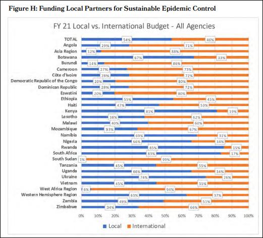
To give you a sense of the value of applying data visualization principles, let’s look at an example coming from the 2022 PEPFAR Annual Report to Congress One of the sections, emphasizes “PEPFAR has prioritized, and made significant progress toward, transitioning a substantial majority of our funding by agency to local partners” and provide a supporting visual (Figure H to the right).
Problematically, the stacked bar chart does not show progress, nor does it amplify the statement/purpose from above; rather, the chart simply lists out the data by country and leaves the reader to explore and interpret for themselves. Data and data visualization can be powerful when we seek to apply data visualization principles. We can go through a number of steps to improve the visualization seen in the remake below the original.
• Sorting the data is an incredibly powerful step towards creating a more understandable visualization, helping illuminate patterns or takeaway messages. Next we can start to use color intentionally
• Applying color strategically will also help. We can and should move away from the default platform provided colors and use color to direct the readers’ focus. For us, that’s the local share of funding is key, so we’ll make that the bold color.
• Decluttering and focusing the attention on the data is key. We can do this by grouping like objects (in this case, group countries who have reached the 70 percent goal versus those who have not), dropping the international funding bar, and limiting axis text.
• Relying on annotations to help reinforce the take-away message. These annotations provide a host of context. We can add anchor points, use informative titles and subtitles, and further enhance with brief notes within the visual to hammer home our main point.
The difference between the starting visual in the report and the remake is striking. It’s abundantly clear in the remake version what is important and what the takeaway message is since the extraneous clutter has been eliminated and remaining material focused. In the next few sections, we will cover the principles which we’ve grouped into four main categories: Show the data, Be intentional, Provide Context, Rely on Visual Hierarchy.
Before diving into colors and stylistic decisions, it is important to lay out the standard graphical terminology as it relates to data visualization. The default visual size should be 5.625” x 10” to fit the dimensions of a 16:9 slide.
Title
Conveys the take-away message you want the audience to come away with. Avoid descriptive titles, focusing instead on the purpose. Should be written in all upper case letters. Left-aligned on the plot with the left most y-axis label.
Subtitle
Provides additional contextual information not covered in the title. Smaller in size, not bolded or italicized, and may be a lighter color than the title.
Legend
Mapping between colors/sizes and values used in a graph. Where possible, incorporate into direct labeling, e.g. adding the label to the end of a line, or graph title/subtitle, e.g. coloring the elements in the title the same color as the category.
Axis/Grid
• Thin and dark in appearance so as not to detract attention from the information in the visual.
• Text should always, always, always be horizontal as opposed to vertical or at a 45 degree angle.
• Values use a comma separator and limit the use of decimal places.
• If directly labeling values on the chart elements, remove axis text.
• Remove axis ticks as they detract more than they add.
• Axis titles/labels should be used sparingly and should be added only when it’s unclear what the values are.
Annotation
Provides contextual information beyond the values stored in the graph. Draws the reader’s eye to important information, such as highlighting outliers, important countries/partners, and helps tell a story about the data. Annotations include direct labels of data elements and longer comments about the context
TITLE The title and subtitle should be left aligned and align with the y-axis
Subtitle The graph title should be in all caps and provide the takeaway message for the audience. The subtitle can provide additional context, including axis labels, period, or an integrated legend
Numbers should include thousand separator
Bar charts must start at zero, whereas this is not necessary for other chart types
Gridlines, when incorporated, should be a faint gray, not attracting attention away from the focal parts of the visual
An annotation for a data point. This is an outlier.
Annotations are a thin stroke, not boxed. And should be complete sentences. Add context to a data point. Use swoopy arrows to connect annotation to data.
Data source and any notes should be included in the lower right hand corner
FY50Q1 FY50Q2 FY50Q3 FY50Q4
Axis text should always be horizontal to make them easier to read
Data source (date) | reference id
or data. Instead of directly labeling every point or column, labels should only highlight the important elements of the visual. Contextual annotation is highly encouraged and should be written in thin and light typeface so as not overpower or detract from the data in the visual. Avoid boxes around annotations.
Caption
Contains information about the plot that is critical for integrity and transparency, located in the lower right-hand corner of the visual in a light shade of gray. This footer can include:
• Data Source
• Notes and Caveats:
• Any nuances, limitations, or context that is necessary for interpretation of the plot
• Reference ID for source code
With the terminology in mind and some basic stylistic choices, the next few pages will lay out OHA’s chart principles, which present best practices and should be emulated whenever possible. To help convey each topic, we have briefly described the principle and provided a less idea example (typically found in “the wild”) and then an improved version that incorporates this concept (adopted from the framework Lisa Charlotte Muth uses in her Data Vis Do’s and Don’ts series on the Datawrapper blog). When working with data, start by explore the data and then sketch out rough ideas on paper before diving directly into a visualization software. These steps help create a keen
Plot is void of borders and thick or unnecessary lines
Avoid clutter that distracts from your visualization by removing tick marks and unneeded lines, maximizes the data-ink ratio as Edward Tufte (2001) would say. Borders and thick lines draw the audience attention away from the data encoded lines or bars. This also includes annotation boxes and thick arrow lines, which add more clutter than actual value.
understanding of the data’s characteristics and then get the (directed) creative juices flowing without inhibiting you by the defaults of your visualization software. Chart principles are grouped into four larger categories that embody our main guiding vision when creating any visualization: show the data; be intentional; provide context; and rely on the visual hierarchy. Applying the principles laid out over the next few pages is an iterative process and does not happen all at ones. Good visuals take time and go through a series of revisions.
Plot is free from decoration (chart junk)
Reduce visual clutter in your plot in order to maximize the data-ink ratio and show the data, particularly through use of focused color and annotation. Chart junk include unnecessary colors or even images added to a plot, bold lines for border or grids, large legends, etc. This technique significantly improves audiences’ recall of the data and take-away message (Ajani et al 2021). Showing the data by decreasing the distance of comparable data element also improves readers ability to compare changes as seen in the example provided here (Lovette and Franconeri 2017).
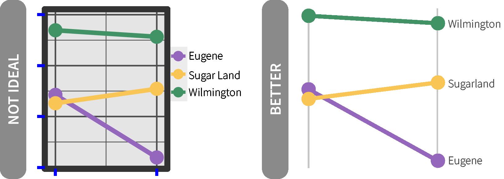
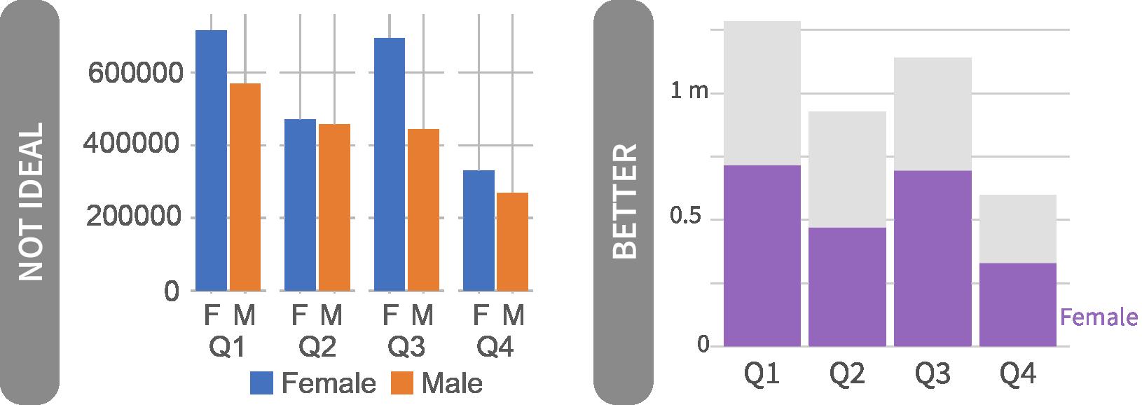
All graphics are two dimensions (no-3D)
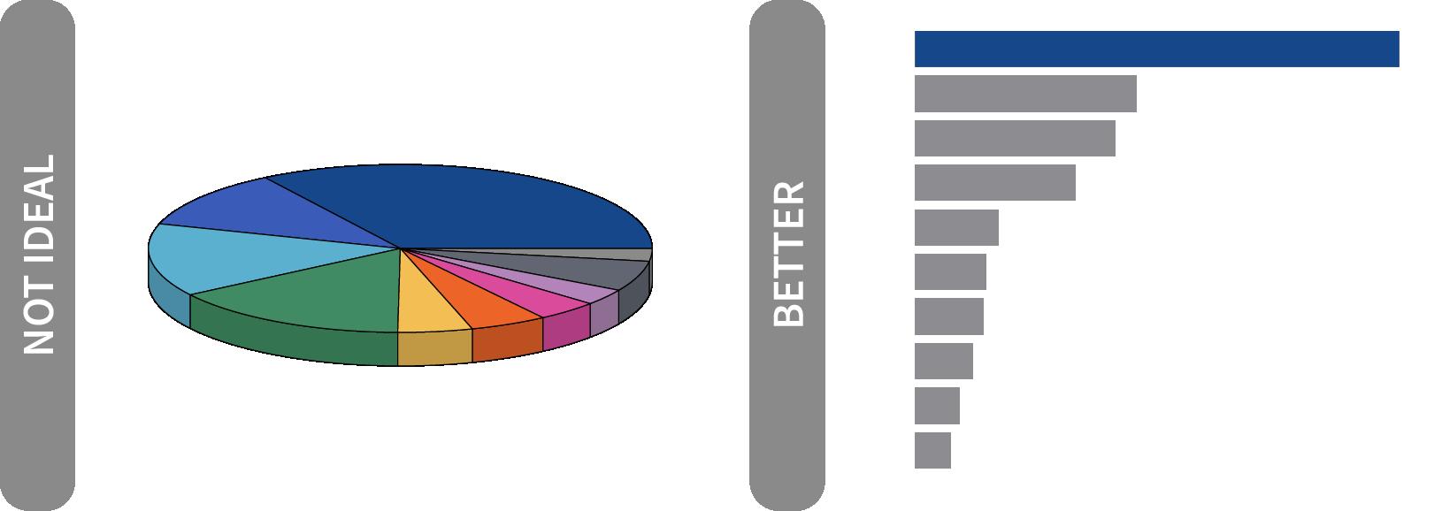
Three-dimensional (3-D) graphs should be avoided. A 3-d graphic distorts the representation or encoding of the data, making it more challenging to interpret or even misleading (Cleveland and McGill 1984, Skau and Kosara 2016). If additional dimensions are need, size (e.g. size of a dot on a scatter plot) and/or color can be used to encode the data.
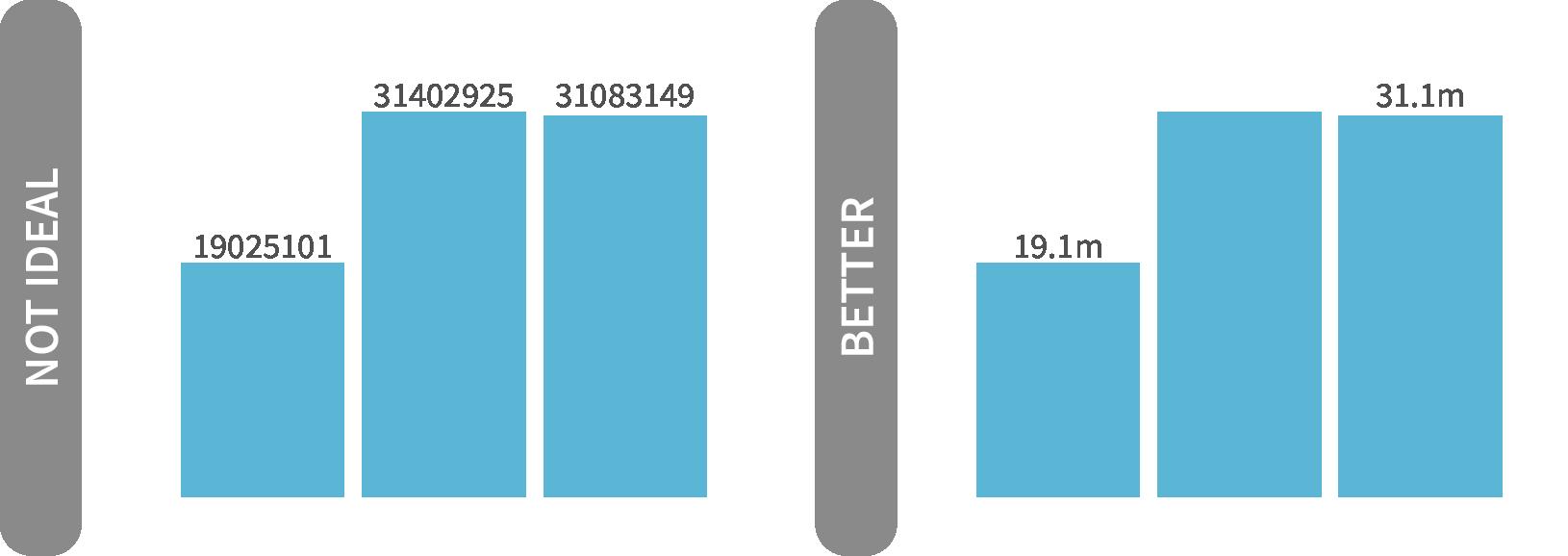
Clean numbers
Round numbers to minimize clutter, improve memorability, and avoid false precision, e.g. “positivity is 2.0832%” (Kahneman 2011, Few 2012). Commas for thousands/millions separator should always be added to make numbers more legible to the reader. If you need precise numbers, consider using a wellformatted table instead of a graph.
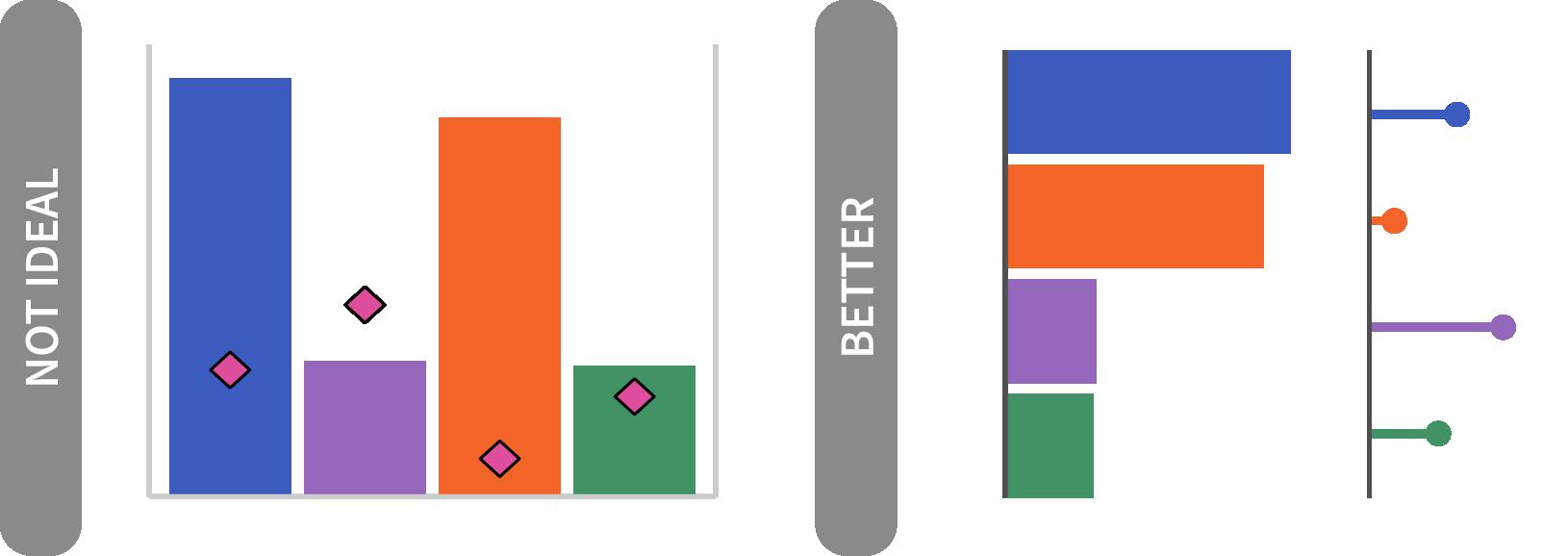
Avoid dual axes plots
Dual axes are difficult for a reader to interpret. “The scales of dual axis charts are arbitrary and can therefore (deliberately) mislead readers about the relationship between the two data series” (Muth 2018). Consider better alternatives such as using two side by side graphs or incorporating one data series into axis text, as these will be easier for the audience to interpret. Furthermore, having multiple plots in a dashboard make it easier for a user to sort of different criteria.
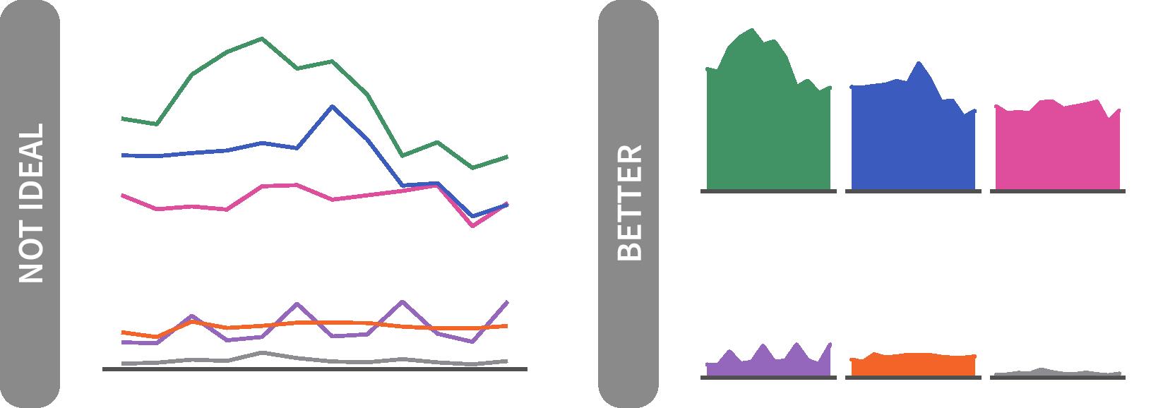
Small multiples show data across categories
Reduce chart clutter by breaking out each category into its own graph and displaying these in a strategically ordered grid. A small multiples structure allows the viewer to see each category’s data on its own and compare that to the data in other categories. This structure works well for indicator achievement across partners / agencies. If you are having a hard time seeing individual data points in your visualization, known as overplotting (Tufte 2001), small multiples is a great technique to overcome this issue.
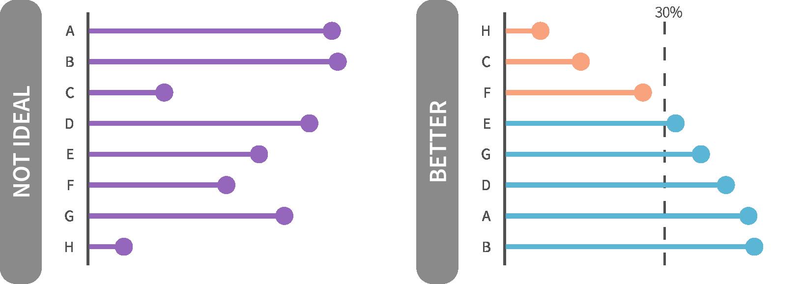
Data ordered in an intentional manner
The default ordering for graphs often is alphabetical, which should be avoided. Graphs and tables should be ordered strategically, usually based on a quantitative value associated with a set of categories, to improve comprehension (Cleveland and McGill 1984). For instance you may want to order on a particular category or value, helping convey a focus or underlying purpose.
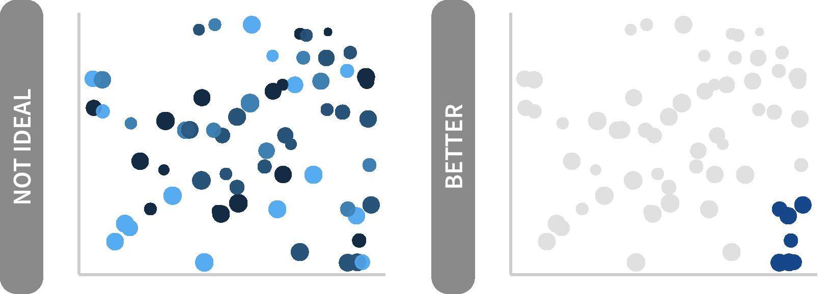
Color use is intentional and consistent
Use color sparingly; it should be used to convey a message (Evergreen 2016). Thought should go into each color used, not just applying the software default palette. Use it to highlight the most important groups -- gray out the rest or mute the colors if they are absolutely necessary (Few 2012, Cairo 2013). This consistency with color assists in creating trust or accountability and feeds into the office’s visual branding. If in doubt, get it right in black and white -- then add color judiciously.
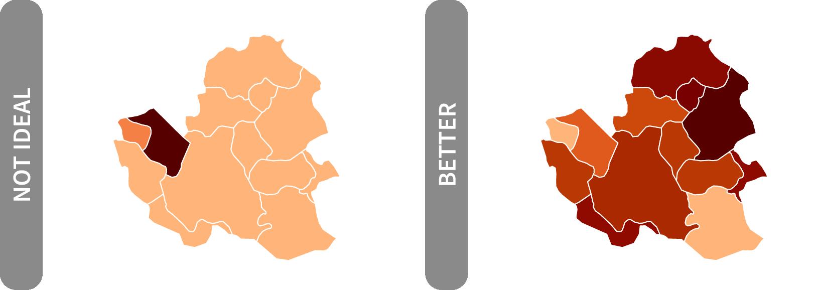
Color gradients applied appropriately
Ensure there is enough contrast between different steps of lightness and saturation when using a continuous or diverging color palette. The OHA continuous palettes have been designed to optimize the steps between colors for 11 colors. If you use fewer colors, you can make your own adjustments to create greater differences using tools like chroma.js. If you can, plot a histogram of the data being visualized. If the histogram is stacked at the tails (data are skewed) a statistical transformation may be needed to normalize the data for the better color encoding. Be sure any transformations are noted in the visualization.
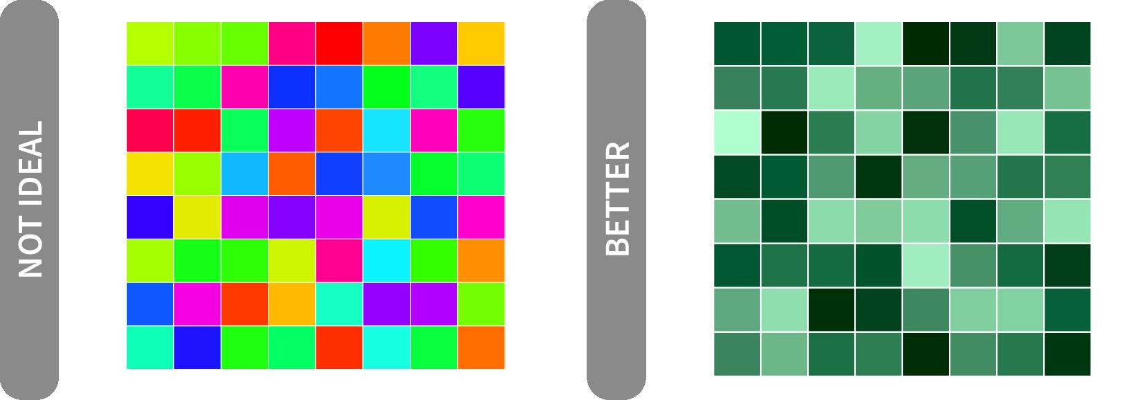
colors applied throughout
Use the specified OHA colors that are color-blind safe and chosen with care. The OHA categorical color wheel and/or sequential palettes in the Color section will assist in this effort. If plot will be produced for external engagement, USAID branding colors found on page 14 from the Agency’s Graphic Standards Manual should be the default.
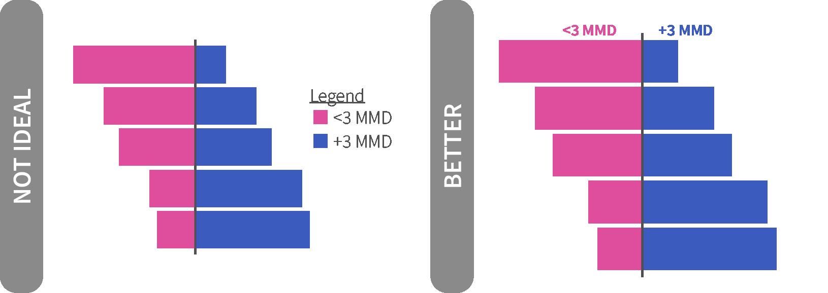
or directly labeled legends
Legends take up valuable real estate and make the audience work to flip between the legend and the plot. A better practice is to label elements directly or to integrate your legend into your title where appropriate (Evergreen 2016, Few 2012, Knaflic 2015). This structure is similar with axis text. You can directly label your bars. If you do so, you should remove your axis text when direct labels are used.
Category labels abbreviated where needed
Avoid clutter or taking up ample space by abbreviating labels. Not every data point or bar needs to be labeled, but for those that are, think about abbreviated labels that are still informative. For example, abbreviating the Democratic Republic of the Congo to DRC. Abbreviations should be known by the audience. For example, using the country’s 3-letter ISO code can take up significantly less space, but may confuse your audience (e.g. DRC’s ISO code is COD and South Africa’s is ZAF).
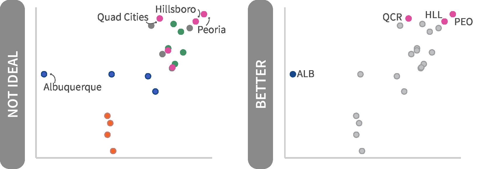
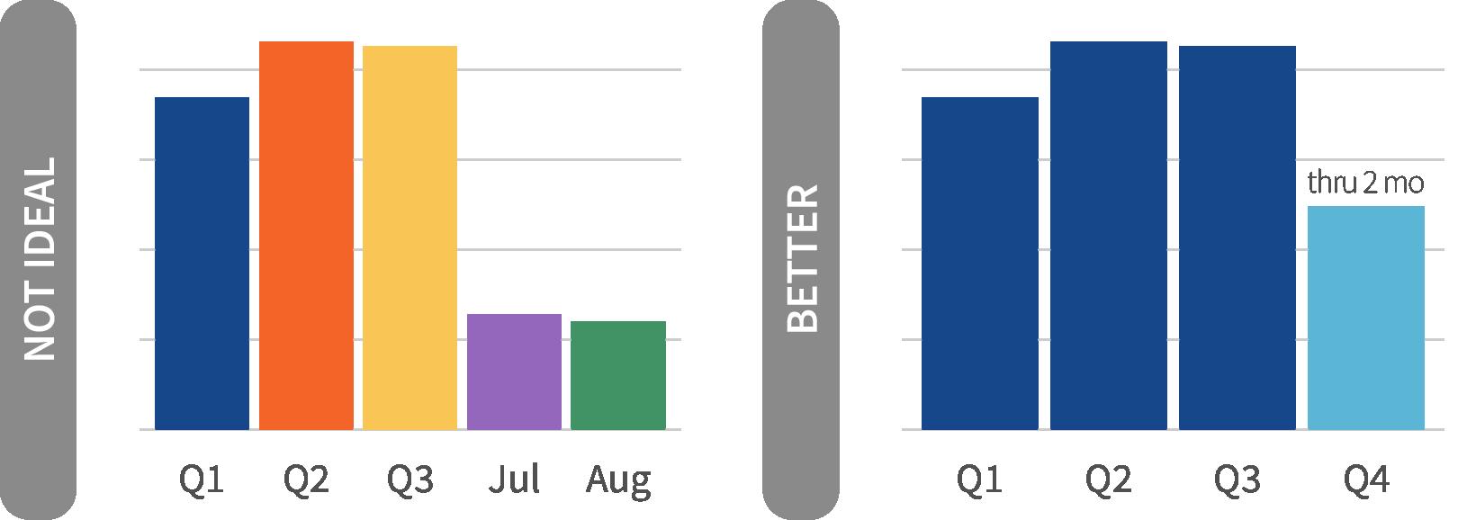
Chart text consistently aligned, axis intervals consistently spaced
Having good chart hygiene will convey that care was taken in creating the plot and improve trust and legibility for your audience. Avoid mixing or changing axis intervals unless the data requires a statistical transformation. If using a logarithmic scale, be clear what each tick represents (think of the COVID-19 plots from Financial Times).
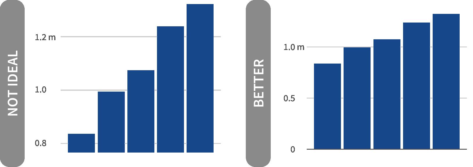
Axis lines start at appropriate values
Bar and area charts should always start at zero (Cleveland and McGill 1984). With bar charts, our mind judges the length in order to make a comparison to the other bars. If the lengths are truncated, data are not encoded correctly and can mislead the audience (Few 2012). If using a truncated starting point, be clear in the chart description and provide annotation to explain the decision.
Title conveys takeaway message
All plots should have purpose and/or answer a question, which should be conveyed in the title (Knaflic 2015, Few 2012) Data do not speak for themselves! This emphasizes the take-away message for the audience, not simply a description of what data are plotted along the axes. Clearly state the main point of the graph and resist purely descriptive titles (e.g. “TESTS BY QUARTER”)
Subtitle adds context
Subtitles convey additional information not contained in the title. These are typically written as a full sentence describing what is going on or providing additional context. They can also house an axis title or integrated legend.


Reference lines/areas used to provide context
Extra information can be provide to your visualization by adding reference lines or areas, as a point of comparison, such as an average line, or shaded background area to denote a particular period. These lines or areas should also be labeled to make it clear to the reader what they are looking at and what context this provides.
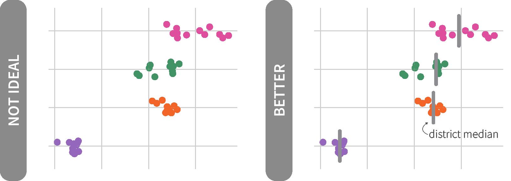
Annotations provide clarifying details
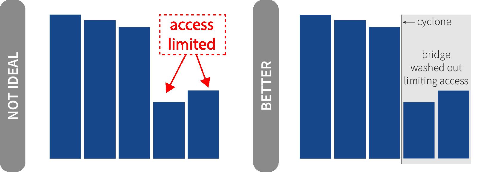
Annotations give explanatory information directly within the visualization to provide the audience with context not found in the numbers or title. Additionally they help the reader retain your message (Ajani et al 2021). Avoid boxing in a region of that graph that is important -- instead use color encoding to highlight important areas (events or periods of time) combined with annotation. Thin, gray arrows are good to pair with annotations; avoid thick red boxes/arrows as these detract from the overall visual hierarchy.
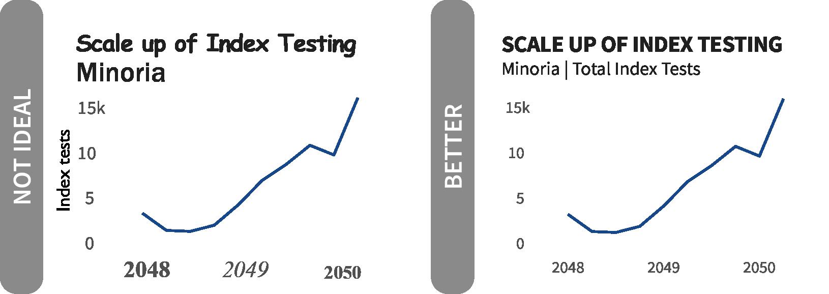
Consistent typeface and sizing
Using the same font across visualizations will convey uniformity and care put into the work. OHA uses Source Sans 3 as the primary typeface. Arial or Gill Sans are alternatives if Source Sans 3 is not available (page 13). Text sizing, not just typeface, should be used consistently for each plot element to convey hierarchy and importance (Knaflic 2015, Few 2012).
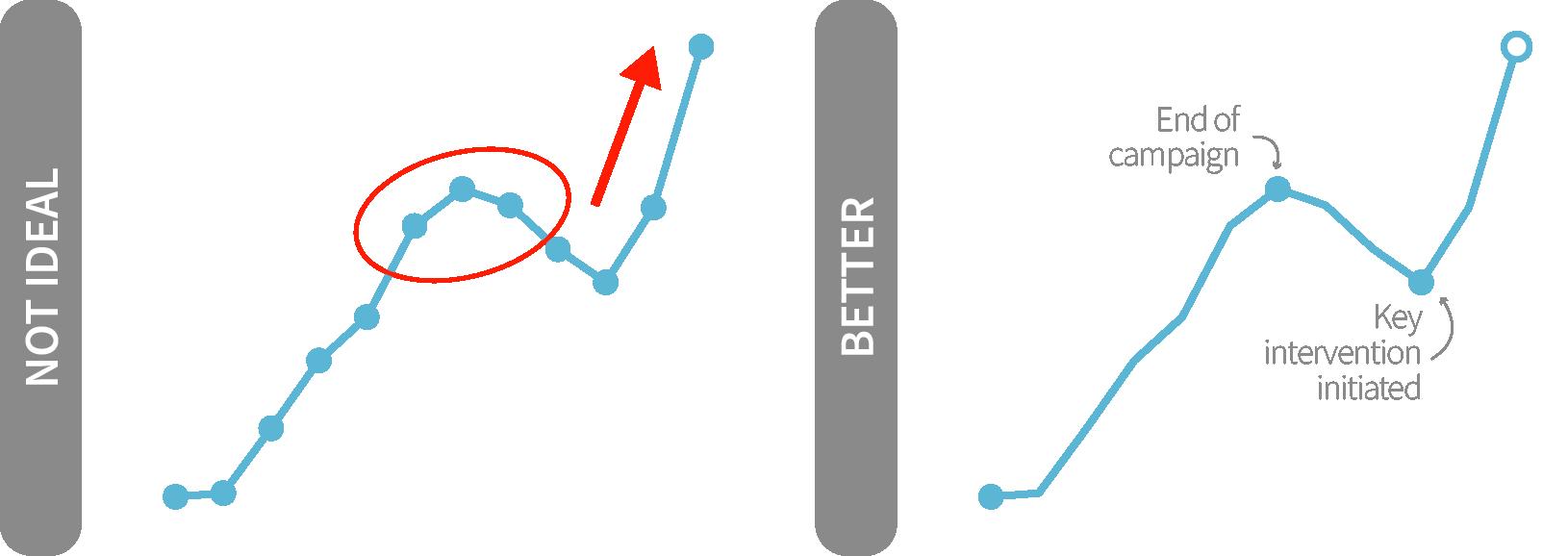
Annotation colors are subtle
Annotations provide additional context but should not detract from the overall visual. Annotations can come in many forms including text, shaded areas, or arrows. Avoid large, colored boxes or arrows as call outs. The audience should be able to decipher the key message from the title; these annotations only help guide the audience to see what is expressed in the title or denote additional context.
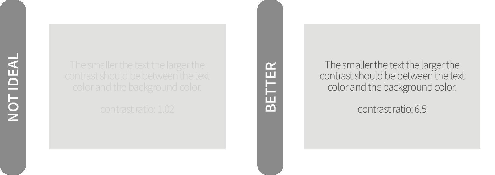
Text color sufficiently contrasts with background
Ensure that your text is legible and stands out from the plot or slide background. Your audience should be able to clearly read the titles, annotations, or labeling in the plot to extract the pertinent information. If the text cannot be read, it is clutter. “The contrast ratio between background and foreground should be at least 2.5 for big text and at least 4 for small text” which you can test with the Color Contrast Check Tool (Muth 2018).
Font, or typeface, can convey ample information to the audience and create a sense of brand consistency. The primary typeface for OHA is Source Sans 3 (formerly Source Sans Pro) family for visualizations. If Source Sans 3 is not available, Arial or Gill Sans MT, can be used as an alternative. All are part of the USAID branding typography.
The visual below provides the topographic attributes associated with each chart elements. Use the following elements to structure your visual to match OHA’s guidelines. As with color and other elements, these are guides not binding; artistic license can be taken, but know that the less the guidelines are adhered to, the less the visualization will look like a standard OHA product.
Subtitle sentence, tends to include legend
1 Item 2
size: 11
color : Matterhorn (#505050)
style: sentence case
Annotation Layer
color : Whisper (#EBEBEB)
Annotation text detailing something noteworth for context
size: 9
size: 14
color : Nero (#202020)
style: upper case
family: bold
size: 12
color : Nero (#202020)
style: sentence case
Source Sans 3 does not come standard on PCs or Macs, but it is accessible from Google Fonts. For USAID users, M/CIO has added Source Sans Pro to Software Center, so you will just need to navigate there and select “Install” one time. When working on non-GFE, you can add this typeface by installing directly from Google Fonts. Search for “Source Sans 3” and then click on the “Download family” in the upper right hand corner. When downloaded, unzip the folder, right click on one of the typefaces in the folder and select “Install.” The typeface should now be available for use across your machine.
Direct Labeling
color : Matterhorn (#505050)
size: 10
color : Matterhorn (#505050)
style: sentence case
size: 10
color : Matterhorn (#505050)
style: sentence case
Axis Title (typically incorporated into title or subtitle)
size: 11
Typeface
Primar y: Source Sans 3
Alternatives: Arial or Gill Sans
color : Matterhorn (#505050)
style: title case
Gridlines
color : Light Gray (#D3D3D3)
size: 9
color : Suva Gr y (#909090)
style: sentence case
The USAID Graphics Standard Manual lays out the two colors found in the agency’s logo as the primary branding color palette, USAID Blue and USAID Red. These colors are used to “reinforce that the aid is From the American people” but provide a limited range of colors to work with for data visualization.
OHA has developed an offshoot of these colors for visualization, expanding the number of categorical colors to choose from and creating a color-blind friendly palette (508 compliant). We started with primary USAID Blue and used a combination of platforms (Adobe Color, Viz Palette , Coolors, Behance, chroma.js and Adobe Illustrator), to identify and then modifying an offshoot categorical palette. The USAID Red was dropped due to high saturation and often negative connotations associated with its use in Western culture to mean threat or danger. From there, we expanded the identified colors into a full palette of categorical and continuous/sequential colors using tints. We finally revisiting the USAID Blue, dropping the saturation roughly 20 percent to reduce the stark contrast when used to other graphic elements in the visualization.
In addition to the color encoding for the visuals, we have also identified an assortment of grays to be used for the chart elements. The application of these specific colors for the chart elements further enhances the visual’s look and feel as an OHA product.
Strategic use of the OHA palette allows for consistent branding and reduces the time needed to think through color choices in every visualization. That said, colors should be used meaningfully and thought should be given to how these standard colors accentuate the visual/message. If in doubt of what colors to use, try creating a visualization in black and white first. Then, add color to specific elements one at a time until data are sufficiently encoded to reinforce the message.
Outside of the visualization, default to using the USAID branding color palette and prescribed typeface for all banners, text, and text boxes. The USAID colors are available for use in graphs and charts, however the OHA palette is specifically for use in data visualization products (charts, graphs, visuals etc.).
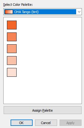
If you need to encode quantitative data, the continuous palettes below were developed by using decreasing tints of the primary color using Adobe Illustrator. For more precise continuous color ramps, a tool like chroma.js can provide even breaks of lightness (a diverging palette between #12121 and #F5F5F5 centered around the specific OHA color) or saturation (a sequential ramp using the diverging palette first to determine the max and min lightness values). See the City Intelligence Data Design Style Guide for guidance on these approaches. You can find our sequential ramps in our R package, glitr, OHA Tableau Preference (tps) file, and Excel Theme Colors (xml) files
#BDE1EE
For categorical/discrete colors, the color cubes at the top of the graphic below provides the suggested color ordering. For example, if you chose to make Electric Indigo your starting color, the next color you would use would be Orchid Bloom followed by Sun Kissed. Slate can always be used with any palette as a fill or stroke for secondary or tertiary data elements. Slate is not a starting color and as a result does not have its own categorical color palette. Each of the categorical palette have been checked for color blindness accessibly via the Adobe Colors Accessibility Tools
Where possible, use the primar y colors and tints for uniform look and feel across products. Secondar y colors can be applied as recommended in the symbolog y section or as needed.
#627CCB
#E571B0
#FAD177
#67A784
#9F8BD0
#F58353
#899DD8
#EB95C4
#FBDC99
#8DBDA2
#B7A8DC
#F8A27E
#B1BDE5
#F2B8D7
#FDE8BB
#B3D3C1
#CFC5E7
#FAC1A9
#DEF0F7
#E8E8E9
#D8DEF2
#F8DCEB
#FEF3DD
#D9E9E0
#E7E2F3
#FDE0D4
In the previous section, we recommended the ordering for applying categorical colors in a graphic. There are a few cases in which having standard colors used across the OHA brand can help an audience more easily identify what they’re looking at since they come up time and again. Below we have laid out the three areas of recommended color assignments: agency, sex, and target achievement.
These colors are meant to be guides to help provide uniformity across OHA products, but are not the sole options as the purpose of the visualization should be the primary driving force to determine what colors should be used. For example, a visual may be showing that an agency is falling behind on a given indicator compared with sister agencies. Rather than using the recommended agency colors, it would be preferable to highlight the poor results using Tango, compared with the other agency’s data element colored with Slate
The color encodings for sex are inspired by the work of The Telegraph (2017), who drew their vision from the signage in UK’s women’s suffrage movements. These colors help us move beyond the stereotypical boy/blue and girl/pink.
For target achievement, we have strayed from the standard PEPFAR Panorama system colors for a number of reasons: (a) the colors are not color blind safe, (b) they are lifted directly from default Excel colors, and (3) they are too highly saturated. When presenting on target achievement, not every color needs to be used; instead use the specific colors to draw your readers’ attention to what you are trying to get across.
When creating a plot, the default starting point should be to use the primary color - Midnight Blue, Viking, and Slate. However, in the event that you need to represent more than 1 or 2 categories with colors, you should use the secondary palette and not mix it with any colors from the primary palette. Since the primary palette will largely be tied with USAID or key elements and show up frequently, we want to avoid the user associating a category in a larger set of categories as more tied with USAID or key element we have been visualizing.
USAID
Midnight Blue #15478A
CDC
Viking (60%) #9DD3E6
Peace Corps Other
Lavender Haze (60%) #B7A8DC Slate (60%) #BABABD
Female
Lavender Haze #876EC4
Male
Hunter #419164
DoD
Hunter (60%) #8DBDA2
Unknown
Slate (60%) #BABABD
< (T-25%) (T-25%) - (T-10%) >(T+10%) (T-10%) - (T+10%)
Tango (60%) #F8A27E
Sun Kissed (60%) #FBDC99
Viking #5BB5D5
Electric Indigo (80%) #697EBC
Quarterly Target (T)
So for that reason, when you plot with the primary palette, you should not be using any colors from the secondary palette and vice versa. The exception to this guideline of keeping the primary and secondary palettes separate would be when you are encoding based on the recommendations in the in color symbology section - encoding by agency or target achievement
One additional point for awareness - you should avoid using tints for any annotation text as the contrast ratio of the text against the background is likely to not meet accessibility guidelines.
As mentioned earlier, color should be applied to the extent to which it adds value. A good way to apply this principle is to start plotting in black and white and then adding color strategically. Even with access to a large palette of branding colors, it does not mean many or all should be used in a single visual. Color should be used to draw the focus and attention of the audience, not to overwhelm them. Gray is your friend as it helps provide context through additional data elements as a secondly layer that is not immediately calling the audience’s attention away from the central point the visual is trying to convey. This consistency with color assists in creating trust or accountability and feeds into the office’s visual branding.
We can look to the example visuals on this page for how to appropriately apply the OHA color palette. The visual in the top left (“No Ideal”) has each bar, a separate category, encoded with a different color. Using different colors for different groups might be more applicable for a line graph where the lines may overlap, but in the case of a bar chart, coloring based on the categories likely does not provide a lot of value or memorability. Sticking with one color, like in the middle left example (“Better’), is a better option since it is focused on “showing” the data. The visual can be further improved by using color to highlight the primary category of interest and encoding the rest of the data elements gray so as to provide context but not detract from the key message (“Even Better”).
The additional three graphs on the far right side apply recommended color encoding from the previous page. Applying these recommended colors creates consistency across our produces, making it easier for the audience to quickly associate the values with particular groups.
As we design graphics and visualizations, we need to be mindful “of how data products can fail to use an equity lens.” In The Urban Institute’s Do No Harm Series, data visualization experts including Jon Schwabish and Alice Feng, explore applying equity awareness in data visualization and building more inclusive graphics. We, the designers, have a responsibility to be thoughtful creators of visualizations as our choices on such things as color, ordering, and grouping of data can mislead or perpetuate stereotypes. In addition, an overreliance on summary statistics can mask wide disparities in the underlying distributions.
In OHA, we often work with data that represents people and moments of health care seeking or diagnosis that can be challenging and stigmatizing, particularly in environments where key populations are discriminated against or criminalized through policy.
Adapted from the original Applying Racial Equity Awareness in Data Visualization (2021) installment of the Do No Harm series, consider the following guiding principles:
• Have empathy! Understand and communicate as best you can with the communities and populations you are representing; do not forget that there are people behind the data points.
• Not every data point needs to be a visualization. Consider bring in stories and/or pictures to help connect the audience with the topic and takeaway message.
• Be up front and communicate uncertainty with the data. Small sample/population sizes or large error bands on a point estimate should be noted so as to not improperly inform decision makers. Remember that when we plot and communicate data in charts and graphics, we reinforce its importance and lead our readers towards making comparisons and inferences.
• Take an active role in ordering data. The first row readers see “can affect how readers perceive the relationships or hierarchy between groups.” We want to avoid order that reinforce “white” or “male” categories as norms. Make deliberate decisions in the sort order in your data; while this may mean ‘white’ is listed first in a chart with data disaggregated by race/ethnicity if the value is the largest/ smallest and would be sorted first, we shouldn’t give dominant groups the first position by default.
• Consider missing groups, including who may not be represented in your dataset. Be mindful of monitoring data quality for completeness in addition to accuracy and timeliness. Recognize why some groups may be harder to reach or survey, resulting in their exclusion. Consider how grouping data together may mask variation of subgroups - the underlying distributions are important to understand.
• Be purposeful with color and icons. We want to avoid using colors or icons that reinforce stereotypes.
The Do No Harm series is recommended reading in its entirety, as it provides clear and direct recommendations and visual examples of these principles in practice.
In additional considering issues of stereotyping and representation, we must be mindful of accessibility requirements in crafting data visualizations. Charts and graphs are, in their own way, accessibility tools: they allow us to see patterns in hundreds, thousands, and even millions of records in a data set that would be impossible to use to read and mentally calculate. Materials created by the US government are beholden to the standards set forth in Section 508, but compliance should not be the sole motivator for creating more accessible graphics. Consider ‘little a’ accessibility and the ways inclusive design practices can make charts more usable for everyone - not just those who need accommodations.
While there are many nuances to accessibility in the world of data visualizations and particularly in interactive tools like dashboards, you can improve the accessibility of your graphics in four key ways.
Include a key headline (title) and captions on your chart to address gaps in graphicacy (the skill of reading charts and graphs).
Write and tag alt text for your chart when including the graphic in widely circulated documents; alt text tagging is required in public facing government documents in accordance with section 508. To write alt text for a chart or graph, think about what it is that someone who cannot see the chart would need to know. A framework, from data visualization expert Amy Cesal (2020), for chart alt text is: “<Chart type> of <type of data> where <reason for including the chart>.” Include a link to the data source if feasible. Remember that the aim is to give the person using a screen reader to review the document the key information - you don’t have to describe every mark or feature on the chart.
Ensure there is adequate contrast between foreground and background colors, and between different hues or saturations. Examples of where you may want to be particularly mindful of common contrast issues include:
• Text elements - When adding chart titles, captions, footnotes, and other text elements, avoid light gray on white backgrounds which can be challenging to read.
• Data labels on bars or other graphic objects - Ensure labels are readable against the background color (dot, bar, etc.). On charts with multiple colors encoding categories or different values, you may need to use different colors for labels across the marks.
• Graphic objects - Ensure you have a 3:1 contrast ratio between different colors on graphic objects (for example, two colors used on the same chart) and the same minimum contrast ratio between the fill in a graphic object (bar, bubble, etc.) and the background color.
Read more about creating high contrast visualizations to learn more about the practical tactics for improving contrast in your visualizations. The WebAIM Contrast Checker can be a helpful tool for assessing contrast levels, particularly on text elements.
In addition to checking color contrasts, ensure colors are accessible to colorblind audiences. Red-green colorblindness impacts approximately 1 in 12 men and 1 in 200 women, making many of the “stoplight colors” commonly used in global health programs challenging for some audiences to differentiate. To assess colorblind accessibility, use the recommended color palettes included in this style guide, and leverage tools like Adobe Color.
Key Populations
When presenting information comparing different groups, we can unintentionally reinforce biases and stereotypes about groups of people. When communicating data about key populations who may already face overt stigma and discrimination, we must be even more mindful of how we represent information about health outcomes and other information. Where sample sizes make representing disaggregated data, rather than aggregate statistics, consider the learning and recommendations from Unfair Comparisons: How Visualizing Social Inequality Can Make it Worse when crafting charts
Using inclusive language
Text plays an important role in our data visualizations. When crafting new charts, ensure you’re aligning to updated USAID standards for language use (check out Bureau for Global Health’s `Power of Words` Language Guide for me). Specific examples to be mindful of include:
• Refer to our missions not the ‘field’, which shows respect for our colleagues as equals
• Refer to positivity not ‘yield’, which centers positive test results in a more human-centered light
Icons provide visual cues to readers around the topic of your visualization. On a chart, specific ways icons can enhance your visualization include: limiting text used, visually enhancing legends, tables, or text, indicating direction of change between two points (e.g. arrows up or down), and creating a recognizable visual cue to readers across charts (e.g. using a pill icon to reference that a metric is related to treatment).
Icons can also be used to visualize data in isotype charts, which use repeating icons representing a topic and vary the color or pattern to represent data. Using a series of icons or shapes instead of a filled bar, for example, can keep the visual precision of the encoding of length while also representing the underlying number of people or items represented in the data. In addition, research (Haroz et al 2015) has found that icons used in isotype charts can make information more memorable, which can enhance the recall of your key message for your audience.
A common mistake when incorporating icons into charts or slide decks is using too many different icons that are not visually consistent in their design features. When selecting icons to incorporate into a chart, think big picture: where is this chart being used and how are icons being used across a document or dashboard?
When selecting icons, select a group of icons that have the same design aesthetic. Specific features to consider include:
• Filled or outline - is the shape of the icon created only with an outline (like in a coloring book) or filled in with a color?
• Sharp corners or rounded edges - are the lines or outline of the shape on the icon sharp points or is the shape softened by rounding off any corners?
• Background shape - are the icons layered onto a background
shape, like a filled circle, to create a sense of visual consistency or are the icons floating without a background? Using a filled shape in the background can be particularly helpful when you have a specific set of icons you want to use that don’t align to the above recommendations on visual consistency (all filled or all outline, for example).
• Color - what color are the icons you’re using? Consider if the icons will be re-colored to represent different quantities of information (as in an isotype chart) or be layered onto a light or dark background, where you’ll need adequate contrast for someone to see the icon.
• Simple or complex - are the icons going to be very small on the chart or display or used as larger visual embellishment? The smaller the icons, the simpler they need to be in order to be discernible to the reader.
UN OCHA released updated Humanitarian Icons in May 2020 that are applicable to our work in the development and health space. Additional free health icons, like the ones found above, can be found on Health icons. Another great resource for high quality icons can be found at the Noun Project (be sure to cite and/or follow their licensing agreements). The Noun Project’s Pro subscription also allows for editing colors and background shapes of icons within the platform, which can be helpful for creating a cohesive set of icons for a dashboard or report. When combining icons in a product, be consistent and use comparable sizes, shapes, fills, colors and details as noted above.
Example 1: Comparing Trends Between Groups - Stacked bar charts can pack a lot of data into a single graphic but it makes it more difficult to read and compare data. Major problems arise from the fact each stacked segment does not have the same baseline and the categories and colors can quickly overwhelm a reader. For example, in the ‘Not Ideal’ visual below, it is challenging to judge how the Bulls’ results (orange bar) have trended since there is not a common
baseline for this element. This lack of a baseline is also problematic for stacked area chart, where it is difficult to quickly discern whether a category increased or rather the areas below it did. A better alternative to stacked bar charts (with more than two stacks) is to break it into small multiples. This structure makes each group’s trends much clearer since each group is separated out and has their own zero baseline (useful for bar charts).
Source: FY50Q1c MSD | Ref id: 1251f63e Each categor y broken out so all have a zero base line to judge length
Example 2: Dual axis - Dual axis charts are frequently found in our work. The idea of a dual axis plot may seem to make a lot of sense, as you are squeezing more data points into the same graphic. More data points can mean more clutter and make it more difficult for the audience to interpret. It is not always immediately clear which axis relates to which data points. More concerning, however, is that our eyes and brain want to make sense of the relationship
occurring in the plot and can falsely ascribe meaning to the intersection of the points on either axis. In the ‘Not Ideal’ example, we may make assumptions about the last period where the points are now “above” the bars. One alternative is to break the graph into two plots and place them side by side. By clearly separating out the data, you can more clearly articulate the purpose to your audience and keep them from making judgments about intersection points.
Example 3: Trends over time with multiple groups - Including many lines in the same line graph is often referred to as a “spaghetti plot.” The different lines create clutter and can make it difficult to track one line across the plot. One alternative would be to convert this to small multiples, breaking out each line into its own graph. Another, like the remake, would be to include all the lines as a faint gray, but only call out one focal trend using a bold color and thicker
stroke. This setup will draw attention to the line of interest, while the others fade into the background but still provide context. The remake also benefits from a legend integrated into the title and limited labeled data points help emphasize the point made in the title. If needed, lines can be directly labeled to highlight important categories that in the plot, but do not necessarily need to be colored. Annotation text color may benefit from matching the line color.
Thousands seperator missing in y-axis values
Default colors used without purpose Text direction should always been horizontal
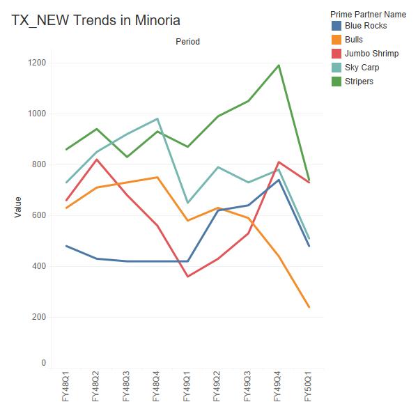
Legend integrated into informative title
Too many overlapping lines. No integration with legend
Limited direct labeling of data points to emphasize takeaway
810
Color used for emphasis and de-emphasis
Source: FY50Q1c MSD | Ref id: 1251f63e
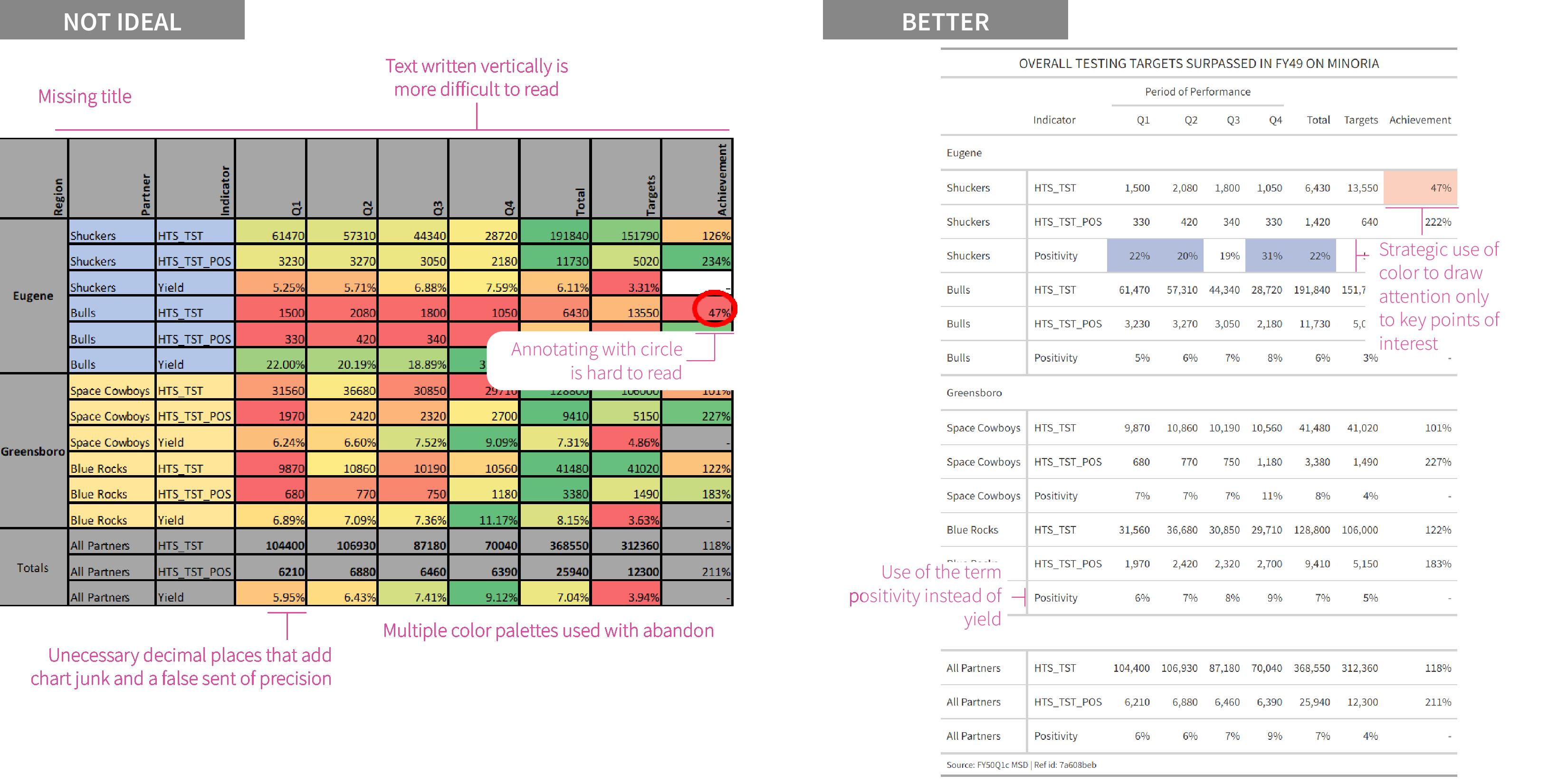
Example 4: Data Tables - Tables are another important visualization, allowing you to convey precise information. Tables need to follow data visualization principles as well or can suffer from information overload. As with a graph, the key message and takeaways should be clear to the intended audience. Too often data dense tables are included so the audience can “see all the data”. As with graphs, only the pertinent information that helps make your point
should be shared (and be legible). Color should be used sparingly, text should be horizontal and the title should be informative. Numbers should be right aligned for readability and formatted, through use of thousands separators or percent signs, and should have an appropriate amount of decimal places so as to avoid false precision. A good resource to review on design principles for tables is Jon Schwabish’s (2020) Ten Guidelines for Better Tables
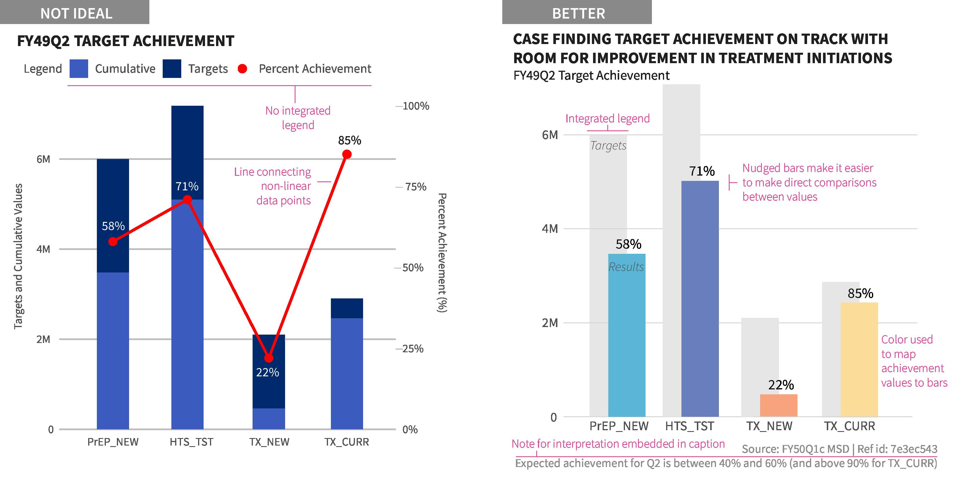
Example 5: Target Achievement - One of the most common visuals we see in PEPFAR are plots related to target achievement. There are a wide variety of ways to do this - bar charts, stacked bar charts, lollipop charts, bullet charts., etc. As with any plot, the “right” choice depends on what you are trying to show - just percentages of achievement or the magnitude of the results and/or target. Frequently we see achievement plots like the ‘Not Ideal’ example below which suffers from issues we have seen earlier - colors are not informative or
easy to read, lack of integrated legend, dual axis - as well as a new on where the distinct achievement points have been connected into a line, where no “trend” exists. In the remake, targets are subtly provided as offset, light gray bars in the background and each indicator’s result bar is shaded by the achievement “bucket” it falls into as well as labeled with the achievement percent. Magnitude of the results and targets is captured by the bars in comparison to the axis, but not individually labeled as that would likely create too much clutter.
This guide establishes the foundations (data viz principles) and definitions (what hex colors to use when), but is steers clear of the application in specific software. To take this from theory to practice, we need to open up some visualization software and translate these principles there. We have developed resources within the main applications used by OHA - R, Tableau, and Excel.
The development of this written style guide originated from work on a custom R package for data visualization to simplify, streamline, and standardized our work. This software has the most robust support in mapping the elements listed in this guide into application. Inspired by the BBC’s bbplot R package, we have developed our own packaged, glitr, including the color palettes, styles, fonts, and other parts of this style guide. The package builds upon all the work put into ggplot2 and applies the USAID OHA themes within that framework. For more information about the package, functions, and installation can be found at usaid-oha-si.github.io/glitr
Recognizing that not everyone who creates charts use R, we first translated our work into this guide and then created resources to support both Excel and Tableau. The support for both of these software is limited to providing the color palettes for access directly in these programs.
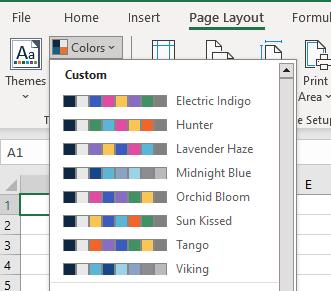
For Excel, we have created a theme file (.xml) which contains the various categorical color palettes for OHA. After you download the file, you will copy each of the themes over to your Microsoft Templates folder, which will make the themes available across the whole suite of MS products. The instructions can be found in the README in the zipped folder.
To get the OHA colors into Tableau products, you will need to download a Preference file, which can either replace your existing Tableau Preference file (.tps) or whose contents will be copied and pasted into an edited one you might have. In addition to containing the categorical palette, the file also contains the full set of sequential palettes for each color.

• Ajani, K., E. Lee, C. Xiong, C.N. Knaflic, W. Kemper, S. Franconeri (2021). Declutter and Focus: Empirically Evaluating Design Guidelines for Effective Data Communication. IEEE Transactions on Visualization and Computer Graphics.
• Brondbjerg, M. (2019). City Intelligence Data Design: Data Visualization and Information Design Guidelines. London City Intelligence.
• Cairo, A. (2013). The Functional Art: An Introduction to Information Graphics and Visualization.
• Cesal, A. (2020). Writing Alt Text for Data Visualization. Nightingale.
• Cleveland, W. and R. McGill. (1984). “Graphical Perception: Theory, Experimentation, and Application to the Development of Graphical Methods.” Journal of the American Statistical Association, 79(387), 531-554.
• Cohen C, R. Scott, and E. Kempster. (2017). Women Mean Business. The Telegraph.
• Evergreen, S. (2016). Effective Data Visualization: The Right Chart for the Right Data. Thousand Oaks, CA: SAGE Publications.
• Few, S. (2012). Show Me the Numbers: Designing Tables and Graphs to Enlighten. Burlingame, CA: Analytics Press.
• Financial Times Visual & Data Journalism team. Coronavirus tracker: the latest figures as countries fight the Covid-19 resurgence
• Haroz, S, R. Kosara, and S. Franconeri. (2015). ISOTYPE Visualization - Working Memory, Performance, and Engagement with Pictograms.
• Holder, E. (2022). “Unfair Comparisons: How Visualizing Social Inequality Can Make It Worse.” Nightingale, Journal of the Data Visualization Society.
• Kahneman, D. (2011). Thinking, Fast and Slow. New York: Farrar, Straus and Giroux.
• Knaflic, C. N. (2015). Storytelling with Data: A Data Visualization Guide for Business Professionals. Wiley.
• Lovett, A. and S, Franconeri L. (2017). Topological Relations Between Objects Are Categorically Coded. Psychological Science.
• Muth. L. (2018). An alternative to pink & blue: Colors for gender data. Datawrapper.
• Muth, L. (2018). What to consider when choosing colors for data visualization. Datawrapper.
• Muth, L. (2018). Why not to use two axes, and what to use instead Datawrapper.
• Muth, L. (2020). How to pick more beautiful colors for your data visualizations. Datawrapper.
• Schwabish, J. (2014). “An Economist’s Guide to Visualizing Data.” Journal of Economic Perspectives, 28 (1): 209-34.
• Schwabish, J. (2020). “Ten Guidelines for Better Tables.” Journal of Benefit-Cost Analysis, Cambridge University Press.
• Schwabish, J. and A. Feng. (2021) Do No Harm Guide: Applying Equity Awareness in Data Visualization. The Urban Institute.
• Skau, D. and R. Kosara. (2016). Arcs, Angles, or Areas: Individual Data Encodings in Pie and Donut Charts. Computer Graphics Forum, 35(3), 121-130.
• Tufte, E. (2001). The Visual Display of Quantitative Information Graphic Press.
• USAID. (2020). USAID Graphic Standards Manual and Partner CoBranding Guide
• Adobe Color
• BBC Audiences Tableau Style Guide - BBC
• Behance
• chroma.js
• Chartable Blog - Datawrapper
• Coolors
• Data Visualization Society
• Evergreen Data Blog - Stephanie Evergreen
• Financial Times Chart Doctor - FT Visual & Data Journalism
• Fundamentals of Data Visualization - Claus Wilke
• Health Icons
• Humanitarian Icons - UNOCHA
• Nightingale: The Journal of the Data Visualization Society
• The Noun Project (Icons)
• PolicyViz Blog - Jonathan Schwabish
• ‘Power of Words’ Language Guide (updated 2023) - USAID Bureau for Global Health
• Practical Typography - Matthew Butterick
• Story Telling With Data Book and Blog - Cole Nussbaumer Knaflic
• Ten Guidelines for Better Tables - Jonathan Schwabish
• Urban Institute Data Visualization Style Guide - The Urban Institute.
• WebAIM Contrast Checker
• Why does Data Vis need a style guide? (recording) - Amy Cesal
• Visualizing Data Blog and Book - Andy Kirk
A big thanks to our colleagues who supported this effort, through reviewing the material, making suggestions, and providing feedback to the both the current and original versions of this guide - Jessica Rose, Bourke Betz, Gina Sarfaty Katya Noykhovich, Ben Kasdan, Ivana Ferrer, Amy Wasserbach, Jessica Stephens, and Noah Bartlett, .
This work could not have happened but for the work from the data visualization community - of experts, practitioners, bloggers, book writers, and newsrooms – that we read, study, and gain inspiration from. We started off with the first version in 2020 wanting to build something in the vain of Urban Institute’s Data Visualization Style Guide by Ben Chartoff and Jonathan Schwabish, and stumbled upon the many organizational style guides out there. In the end, we drew a great deal of inspiration from Mike Brondbjerg’s Data Visualization and Information Design Guidelines at London’s City Intelligence for the design and structure of this guide as well as his great categorical color wheel. Another big source of inspiration came from the incredible Chartable blog, written by Lisa Charlotte Rost and others on the Datawrapper team. Our remakes in the Chart Principles section were modeled after their “Thoughts & How To’s” blog series.
An additional thanks is due to the critical feedback and support on the content itself and the ceaseless InDesign questions to our external colleagues, Jordan Chafetz and Laura Hughes.
Aaron Chafetz achafetz@usaid.gov
Tim Essam tessam@usaid.gov
Amanda Makulec amakulec@usaid.gov
Karishma Srikanth ksrikanth@usaid.gov
Disclaimer: The findings, interpretation, and conclusions expressed herein are those of the authors and do not necessarily reflect the views of United States Agency for International Development. All errors remain our own.