
+
DALLAS + ARCHITECTURE
CULTURE Vol. 38 No.1
2 COLUMNS // aiadallas.org
AIA Dallas Columns
Vol 38, No. 1
VIBE
People and places are constantly changing. A reality that is influenced by perception, bias, and the energy they radiate.
How do atmosphere and emotions shape us?
What are our responses to the world around us?
HARMONY THROUGH VIBRATIONS
A NOTE FROM THE EDITORS: Like many nonprofit efforts, Columns has been impacted by the ongoing pandemic in myriad ways – shifting processes, increasing costs, and materials shortages among them. However, the volunteer nature of producing our magazine has unique challenges, and much of this content was produced in 2021. We are issuing content as-is and look forward to new ways of delivering more timely content and memorializing the awards, projects, and people of AIA Dallas and our community as Columns enters its next evolution.
Cover Photography: Michael Cagle
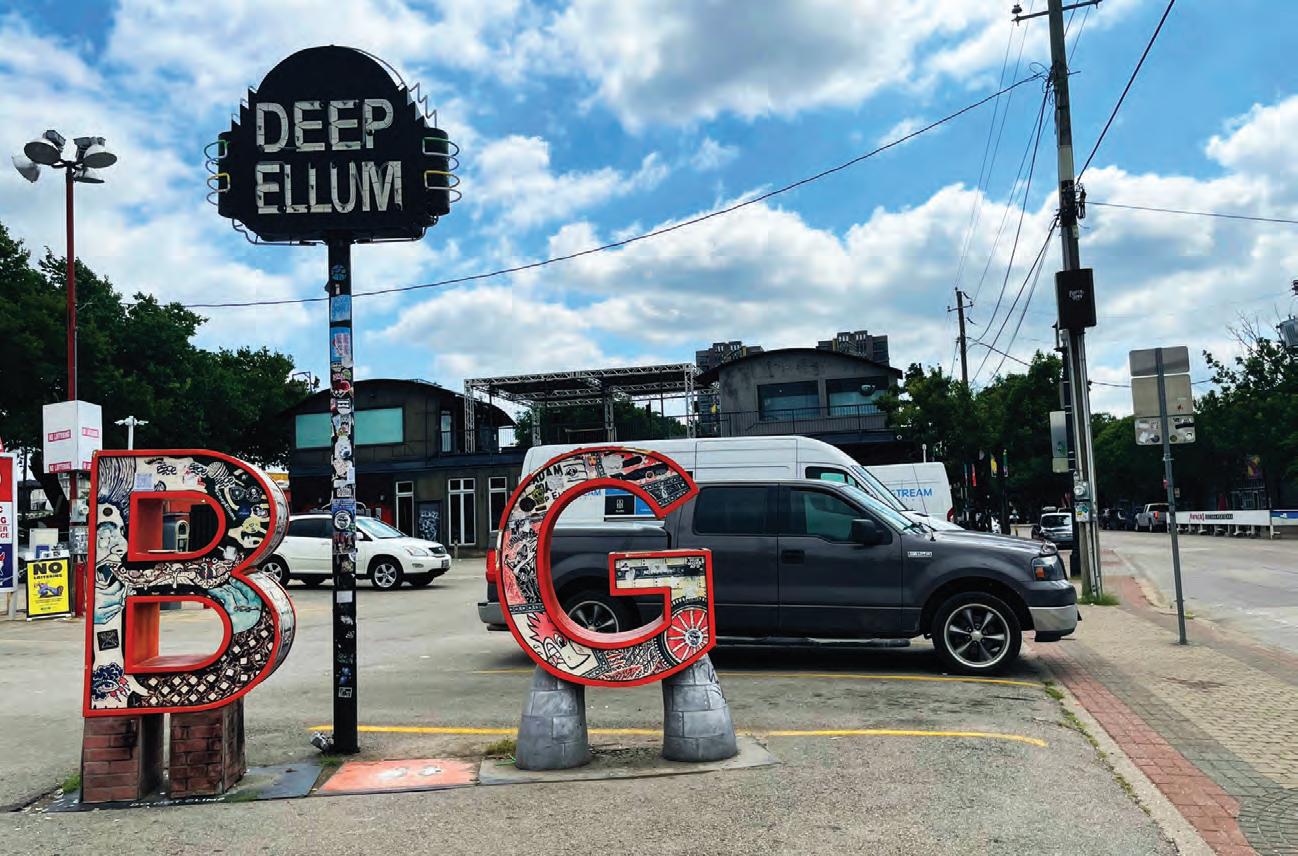
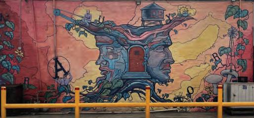
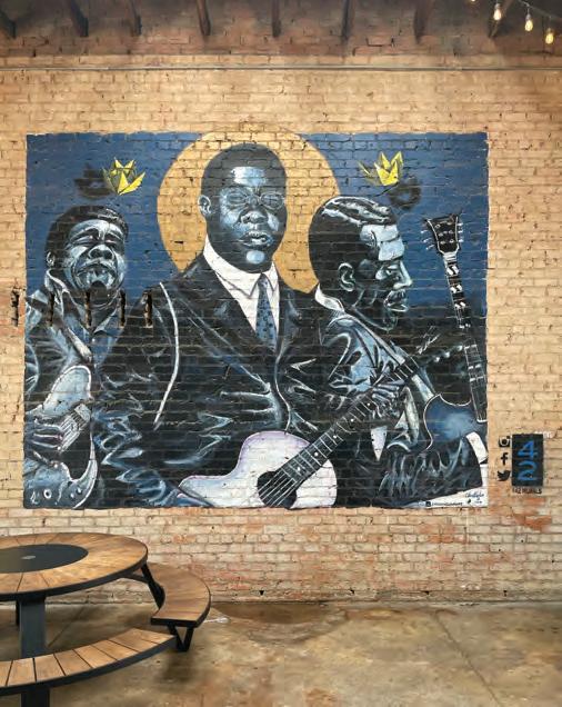
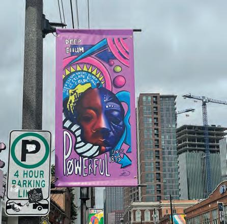
ON THE COVER: Colorful illuminated signs and painted murals enrich the urban fabric on Elm Street. Paired with the variety of music, rumble of motorcycles, and hum of conversations, Deep Ellum is the soul of Dallas. Its vibe is palpable and dates back to the establishment of the city. Here, the Black community thrived early on, and the neighborhood’s hotbed of blues and jazz continues to influence and inspire all those who visit its streets.
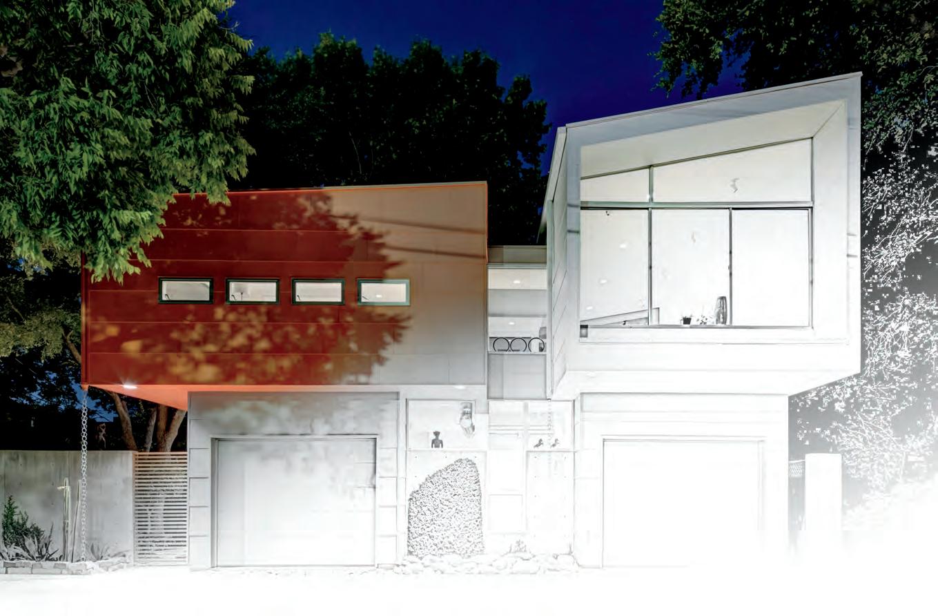
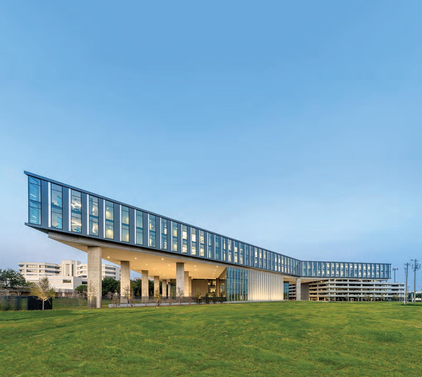
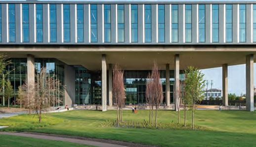
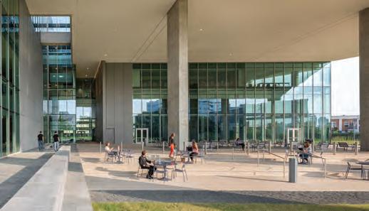
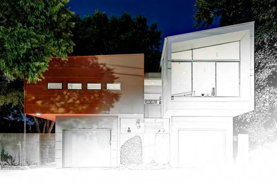
2 COLUMNS // aiadallas.org Baylor Scott & White Health Administrative Center 2020 AIA Dallas Built Design Awards, Honor Award Winner Dallas | Boston | Austin | www.lafp.com
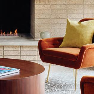
Brick Makes Any Era
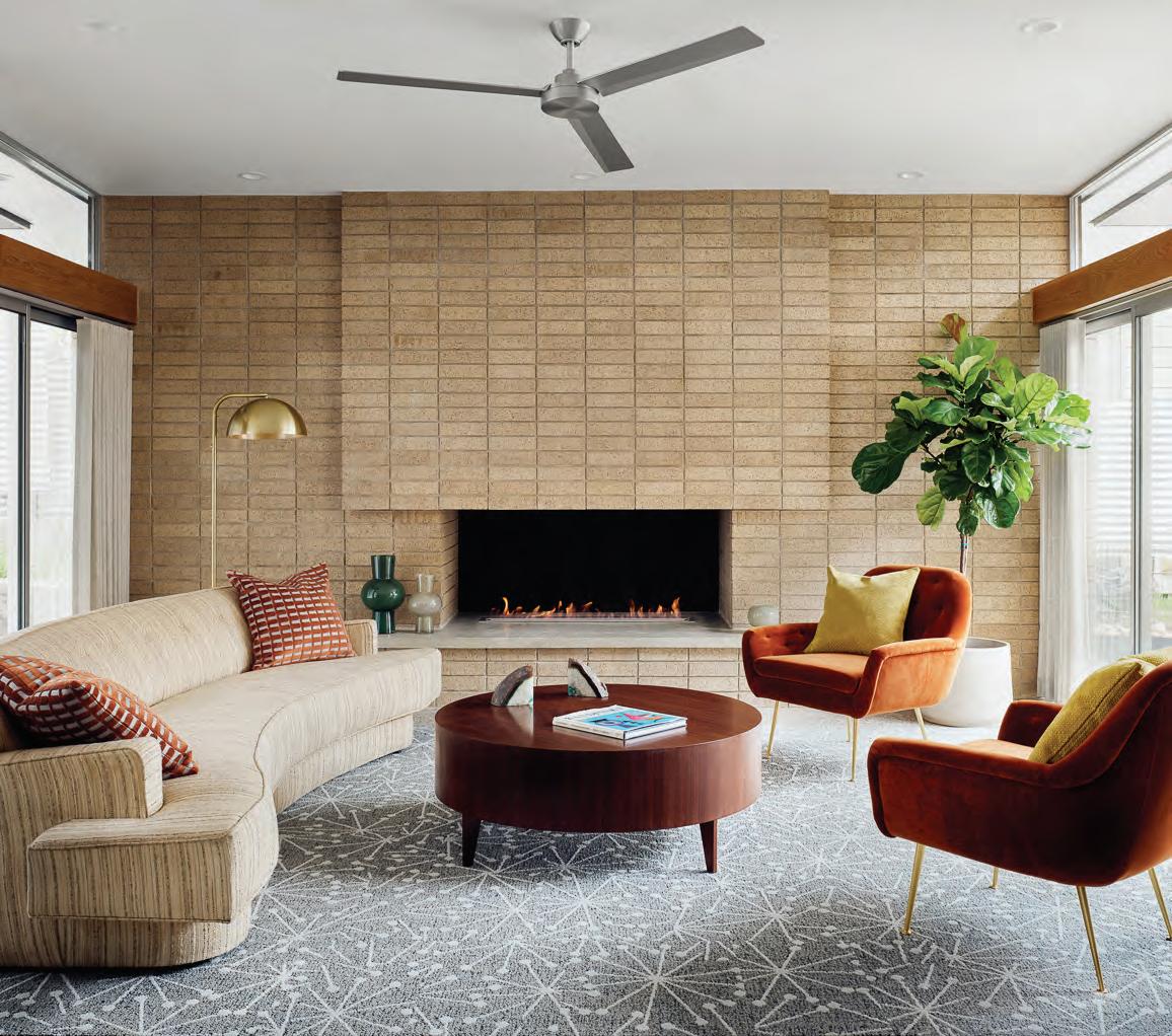
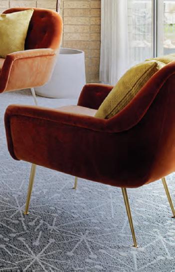
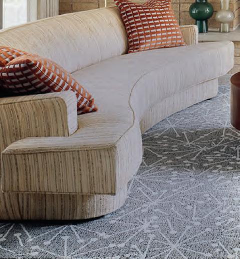
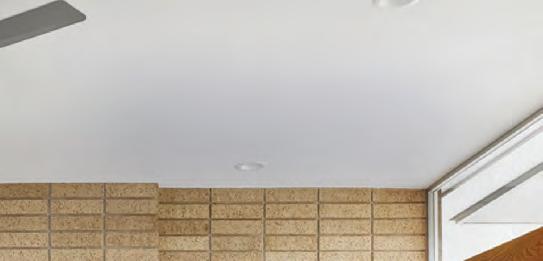
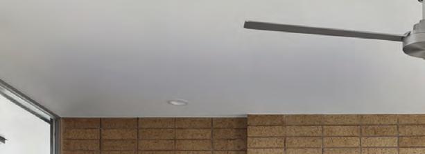
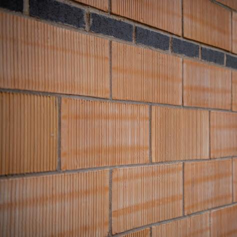
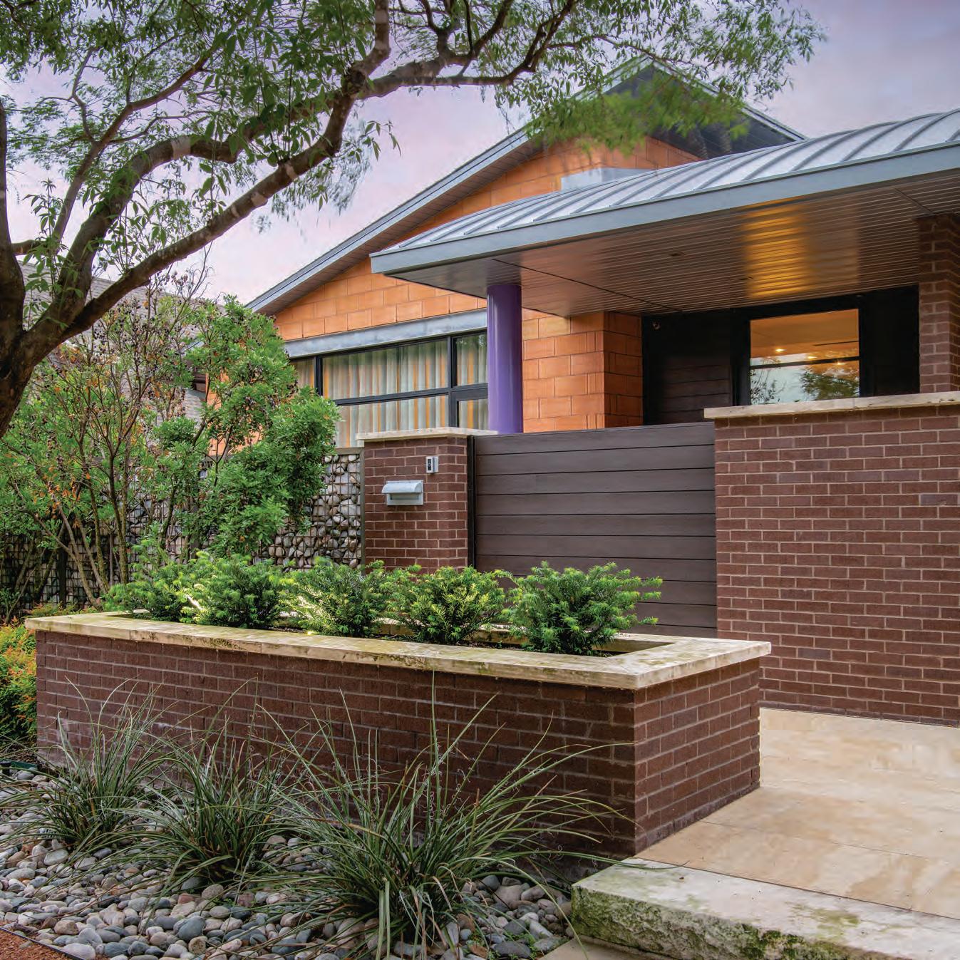
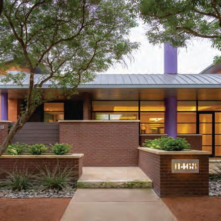
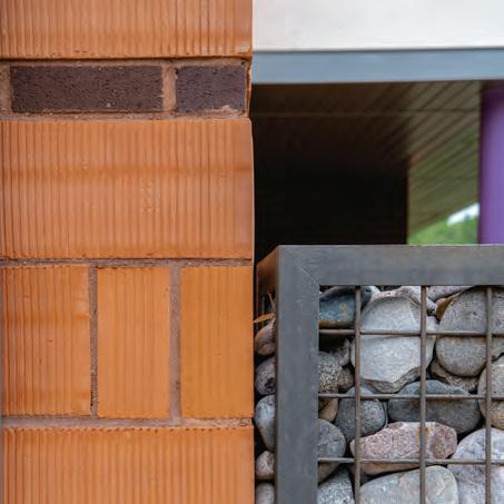
Midcentury made the neighborhood, and provided the design framing for this inspired new architecture. Acme Brick was primary aesthetic finish and delineating material to organize the residence‘s entry sequence and circulation, focused on natural light and a courtyard with preserved oaks. The strong north-south brick axis supports terraced zones that maintain perspective while subtly reducing the apparent scale and conserving the site‘s natural resources. Today, as it has been since midcentury and long before, Acme Brick continues masonry building tradition with unmatched beauty and durability. Please let us provide options that grace any era, with the reliable long-term life cycle value of Acme Brick.
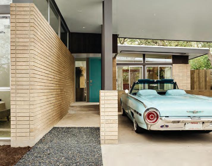
Brick was a natural and easy selection for its timelessness, orthogonal lines, and crisp detail. It relates to context very well, appears hand-made, and has a feeling of material mass. In this project, the brick spine leads from outside to inside, allowing us to establish the wayfinding experience. The continuation of brick with level mortar joints had a way of offering rhythm through the house as well as helping break down the scale. The earthy texture helped us tie the design to our natural context. Acme staff has always been wonderful, responsive, and informative. When considering brick, Acme is first on our list.”
—


Mark Odom, AIA
architect Mark Odom Studio, Austin structural PCW Construction civil Thrower Design, Neslie Cook builder Doug Cameron, ESS Design+Build landscape Mark Odom Studio, ESS Design+Build interiors Mark Odom Studio, Ruby Cloutier photos Casey Dunn

From the earth, for the earth.®
LEED-accredited engineers and full-service support






3 COLUMNS // aiadallas.org
Acme Brick Hensley Gray King Size Velour
Nominee, 2021 Brick Industry Association "Brick in Architecture Awards" Competition
Austin
“



5 COLUMNS // aiadallas.org METRO BRICK+STONE metrobrick.com 972.991.4488
A SPECIALIST APPROACH TO RISK
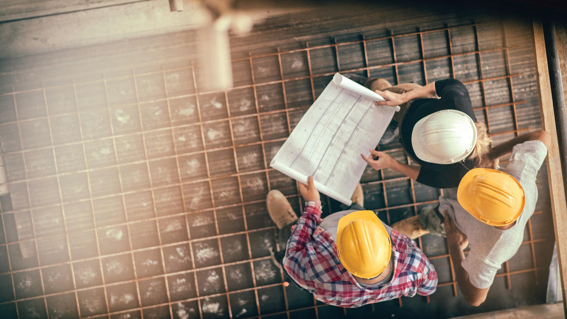
Design professionals face a multitude of ever-changing challenges, from contract clauses to an increasing emphasis on sustainability and new technologies.
Our Architects & Engineers (A&E) practice understands the complex risks that design professionals encounter daily and offers insurance products and consulting to help address the diverse exposures you face.
riskstrategies.com/learnmore
6 COLUMNS // aiadallas.org
A publication of AIA Dallas with the Architecture and Design Foundation
325 N. St. Paul Street, Suite 150 Dallas, TX 75201 214.742.3242

www.aiadallas.org
www.dallasadex.org
AIA Dallas Columns Vol. 38, No. 1
Editorial Team
James Adams, AIA | Editor in Chief
Katie Hitt, Assoc. AIA | Managing Editor
Jenny Thomason, AIA | Editor
Julien Meyrat, AIA | Editor
Lisa Lamkin, FAIA | Editor
Frances Yllana | Design Director
Linda Stallard Johnson | Copy Editor
Blanks Printing | Printer
Columns Committee
Luke Archer, AIA
Ashlie Bird, Assoc. AIA
Lisa Casey, ASLA
Cayce Davis
Nate Eudaly, Hon. AIA Dallas
Eric Gonzales, AIA
Unmesh Kelkar, Assoc. AIA
Alison Leonard, AIA
Alexis McKinney, AIA
Ricardo Munoz, AIA
Terry Odis
David Preziosi, FAICP
Ben Reavis, AIA
Sarah Schleuning
Janah St. Luce, AIA
Columns Advisory Board

Jon Altschuler
Paul Dennehy, FAIA
Steven Fitzpatrick, AIA
Bradley Fritz, AIA
Rachel Hardaway
Vince Hunter, AIA
Patricia Magadini, AIA
Nancy McCoy, FAIA
Yen Ong, FAIA
Lucilio Peña
Anna Procter, Hon. AIA Dallas
Meloni Raney, AIA
Leslie Reed Nunn
Gerry Renaud, AIA
Evan Sheets
Ron Stelmarski, FAIA
Brandon Stewart, AIA
Dylan Stewart, ASLA
Lily Weiss
Jennifer Workman, AIA
COLUMNS’ MISSION
The mission of Columns is to explore community, culture, and lives through the impact of architecture.
ABOUT COLUMNS
Columns is a publication produced by the Dallas Chapter of the American Institute of Architects with the Architecture and Design Foundation. The publication offers educated and thought-provoking opinions to stimulate new ideas and advance the impact of architecture. It also provides commentary on architecture and design within the communities in the greater North Texas region. Send editorial inquiries to columns@aiadallas.org.
TO ADVERTISE IN COLUMNS
Contact Jody Cranford, 800-818-0289 or jcranford@aiadallas.org.
The opinions expressed herein or the representations made by advertisers, including copyrights and warranties, are not those of AIA Dallas or the Architecture and Design Foundation officers or the editors of Columns unless expressly stated otherwise.

©2022 The American Institute of Architects Dallas Chapter. All rights reserved. Reproduction in whole or in part without written permission is strictly prohibited.

2022 AIA Dallas Officers
Ben Crawford, AIA | President
Kate Aoki, AIA | President-Elect
Charles Brant, AIA | VP Treasurer
Peter Darby, AIA | VP Programs
AIA Dallas and Architecture and Design Foundation Staff
Zaida Basora, FAIA | Executive Director
Conleigh Bauer | Membership Manager
Cathy Boldt | Professional Development Manager
Cristina Fitzgerald | Operations Director
Preston Fitzgerald | AD EX Coordinator
Rebecca Guillen | Program Coordinator
Katie Hitt, Assoc. AIA | AD EX Managing Director
Elizabeth Jones, Assoc. AIA | Marketing Manager
Liane Swanson | Marketing Coordinator
7 COLUMNS // aiadallas.org
Optimizing the Built Environment www.airengineeringandtesting.com Office 972.386.0144 www.tcfbp.com 972.388.5558 • AIA Training
HVAC Testing / Adjusting / Balancing
Duct Testing
Building Commissioning
Air Quality Testing
Green Program Administration
Energy Code Inspection
Energy Modeling / Energy Star www.facilityperformanceassociates.com Office 972.388.5559 oldnerlighting.com
•
•
•
•
•
•
•
IN THIS ISSUE - VIBE
Stay In

8 COLUMNS // aiadallas.org
1 3 EDITOR’S NOTE 29 IN CONTEXT What is it? Where is it? 34 DIALOGUE Don’t Kill the Vibe: Gentrification in Dallas Neighborhoods 39 PROFILE Al Hernandez, AIA, 2021 AIA Dallas President 41 LOST + FOUND The Longhorn Ballroom: 70 Years of Western Vibes 44 DETAIL MATTERS Party in Front, Business in Back: Hotel Revel 47 PROFILE Mattia Flabiano, AIA, 2021 – 2022 Architecture and Design Foundation President 50 PUBLIC ARTS Zest, Zeal, Verve: CityLab 52 STORYTELLING Dallas’ Crystal Palace: The Infomart 54 DETAIL MATTERS Radial Triumph at the Malone Cliff Residence 57 INDEX TO ADVERTISERS 60 LAST PAGE Sketching Kaleidoscope: Viewing Dallas Through a Different Lens
Photo by Dror Baldinger, FAIA
15 Let’s
Repositioning residences in the wake of the pandemic 19 A Blues for Deep Ellum The times, they are a changin’ 25 Towards Universal Design Over 30 years of ADA and onward 30 The Perks of New Parks Little moments of joy in an evolving urban landscape READ COLUMNS ON THE GO: WEB aiadallas.org/v/columns-magazine FLIPBOOK MAGAZINE issuu.com/aiadallas
CONTRIBUTORS
Luke Archer, AIA
Luke is husband to Michelle, a father to Georgie, and a project architect at Omniplan. He holds a master’s degree in architecture from Texas Tech University and has over fifteen years of experience ranging from senior living and multifamily to medical office and single family. He has an eye for design but enjoys spending time getting lost in the technical weeds. As the son of an architect and teacher he enjoys learning about architecture and sharing it with anyone who will listen.
Lisa Casey, ASLA
Lisa is an associate at Studio Outside and a licensed landscape architect. She focuses on design that brings wholeness for people and places with an emphasis on placemaking and children’s outdoor environments in civic and mixed-use spaces. She draws design inspiration from extensive travel in Europe and the U.S. with a sketchbook in hand. She had the honor to serve as AIA Dallas Communities by Design Chair in 2020 and received the Outstanding Service Award for her work with the national ASLA in 2018.
Terry Odis
Terry is a project manager from Dallas by way of Chicago. In addition to architecture, he uses writing to explore the world around him, and has since embraced his unique writing, performance, teaching, and corporate experience to entertain, inform, and organize events nationwide. He is an HBCU alumnus, has published two books of poetry, and has fifteen years of professional experience. He is a husband, father, mentor, and poet.

Lauren Taylor, CRC, LPC-A
Lauren is a Licensed Professional Counselor Associate (LPC-A) and a Certified Rehabilitation Counselor (CRC) at New Patterns Consulting. She received a master’s degree from the University of North Texas in rehabilitation counseling. She was born with Muscular Dystrophy and has used a power chair for mobility since the age of three. Lauren was appointed to the Texas Board of Architectural Examiners in 2021, serving as the disabilities representative to ensure accessibility everywhere.
DEPARTMENT CONTRIBUTORS
Andrew Barnes, AIA Detail Matters
Conleigh Bauer In Context
Nate Eudaly, Hon. AIA Dallas Dialogue
Maria Gomez, AIA Profile

Emily Henry, ASLA Profile
Katie Hitt, Assoc. AIA Last Page
Alison Leonard, AIA Storytelling
Ricardo Munoz, AIA Detail Matters
David Preziosi, FAICP Lost + Found
Alexander Quintanilla, AIA Public Arts

9 COLUMNS // aiadallas.org
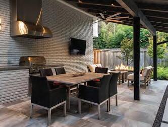
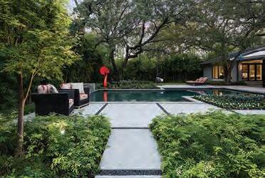
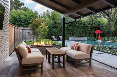
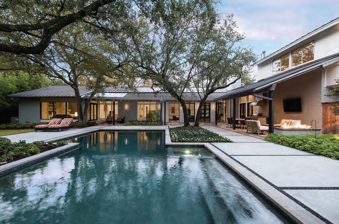
Bonick Landscaping was essential to the successful transformation of our home and grounds. We love to relax and enjoy the park-like setting Bonick created. We are very pleased with the final product.”

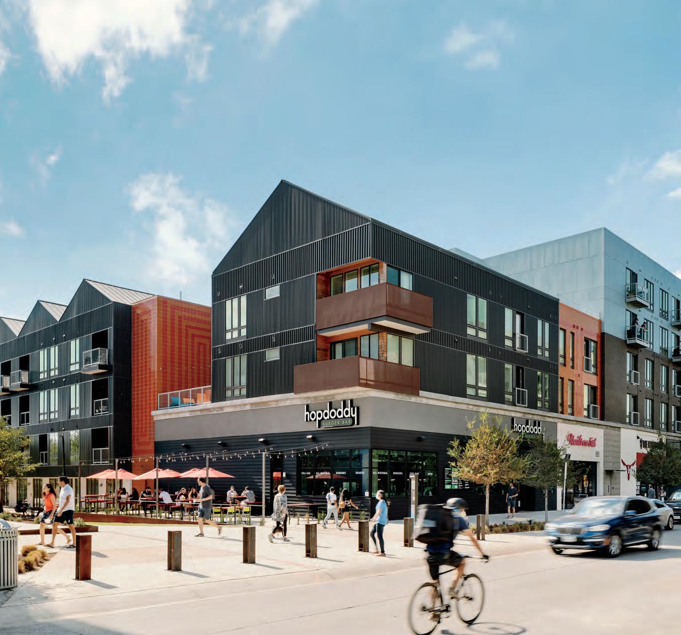 —Jean and Dave
10 COLUMNS // aiadallas.org LANDSCAPE DESIGN | CONSTRUCTION | POOL CONSTRUCTION GARDEN CARE | POOL CARE AND SERVICE | COLLABORATIVE PROJECTS Start your dream today | 972.243.9673 DESIGN | CONSTRUCT | MAINTAIN bonicklandscaping.com
DREAMS DWELL AT HOME “ ELEVATE YOUR OUTDOOR ESCAPE
DECADENT
JHP is an award-winning architecture, planning, and urban design firm practicing nationally from its home in Dallas, Texas since 1979. We take a holistic approach to tailoring each project to meet and exceed the communities’ needs. Our team emphasizes People Over Places, recognizing that our obligation is to those who live with - and within - our decisions. Our goal is to be architects of place and community.

|
TX
11 COLUMNS // aiadallas.org jhparch.com
214.363.5687
SALTILLO
Austin,
PLAZA
|


Try it for yourself at clientpay.com ARCHITECT FIRM LOGO Client Invoice #0123-A TOTAL: $3,000.00 Your Client **** **** **** 9995 *** 22% increase in cash flow with online payments Offer clients multiple convenient payment options 62% of bills sent online are paid in 24 hours Data based on an average of firm accounts receivables increases using online billing solutions. ClientPay is a registered ISO/MSP of Fifth Third Bank, N.A., Cincinnati, OH, and Synovus Bank, Columbus, GA. ClientPay is also a registered ISO/MSP of the Canadian branch of U.S. Bank National Association and Elavon Trusted by more than 150,000 professionals, ClientPay is a simple, web-based solution that allows you to securely accept client credit and eCheck payments from anywhere. – CoXist Studio We are getting
are
ways to accept payments.
paid twice as fast...and there
multiple
EDITOR’S NOTE Good Vibrations

A picture is worth a thousand words. Conversely, photos never do justice to the experience nor the moment. The vibes of energy and the emotions we experience are influenced by the intricate dynamics of any place. Design is usually centrally involved as we spend most of our time within the built environment. Here the complexity of successful architecture is best observed. Here we are energized, moved, inspired, and sheltered. Here we reflect on our own lives.
In this issue, vibe as a concept and as state or wellness is explored. We discuss this through a conversation on gentrification in Dallas neighborhoods in Dialogue, and we retrospect the impacts of the pandemic on our home life in “Let’s Stay In.” The value of the urban landscape that connects us and a dive into the history and future of Deep Ellum are topics also explored within “The Perks of New Parks” and “A Blues for Deep Ellum.” And while the 30th anniversary of the American with Disabilities Act has passed, “Towards Universal Design” revisits this topic and the case for equitable vibes for everyone.
This issue, while not the last I have worked on, is the last issue for me as Editor in Chief. The past 12 years working on Columns, starting as a book critic, have been a privilege and
a pleasure. Through the volumes of Columns, lessons on our community, our culture, and many different perspectives have been taught.
During my tenure, we have identified many impactful volunteers to lead us in the future.
Jenny Kiel Thomason, AIA now leads the publication. Her vision, underway since the spring of 2022, has been to keep the publication agile in a digital age. I encourage you to not only read Columns, but to engage with its editorial team. Our community is one of hope and opportunity, and we need all voices to be heard.

We hope this issue brings you good vibes.
James Adams, AIA Editor in Chief Emeritus James.adams@corgan.com

13 COLUMNS // aiadallas.org
“We perceive atmosphere through our emotional sensibility – a form of perception that works incredibly quickly, and which we humans evidently need to help us survive.”
Peter Zumthor, Hon. FAIA
KIRK HOPPER FINE ART DESIGNER SERVICES

Consult with designers
Client collections
Special discounts and incentives offered to interior designers
Visit us at our new location in the Dallas Design District

1426 N. Riverfront Blvd Dallas, Texas 75207 214-760-9230
Tuesday to Friday, 11 to 5 Saturday, 12 to 5 kirkhopperfineart.com
14 COLUMNS // aiadallas.org
Floyd
Winter in Chicago 2010, oil on
80” x 65”
Newsum, Remembering
paper,
LET’S STAY IN
REPOSITIONING RESIDENCES IN THE WAKE OF THE PANDEMIC
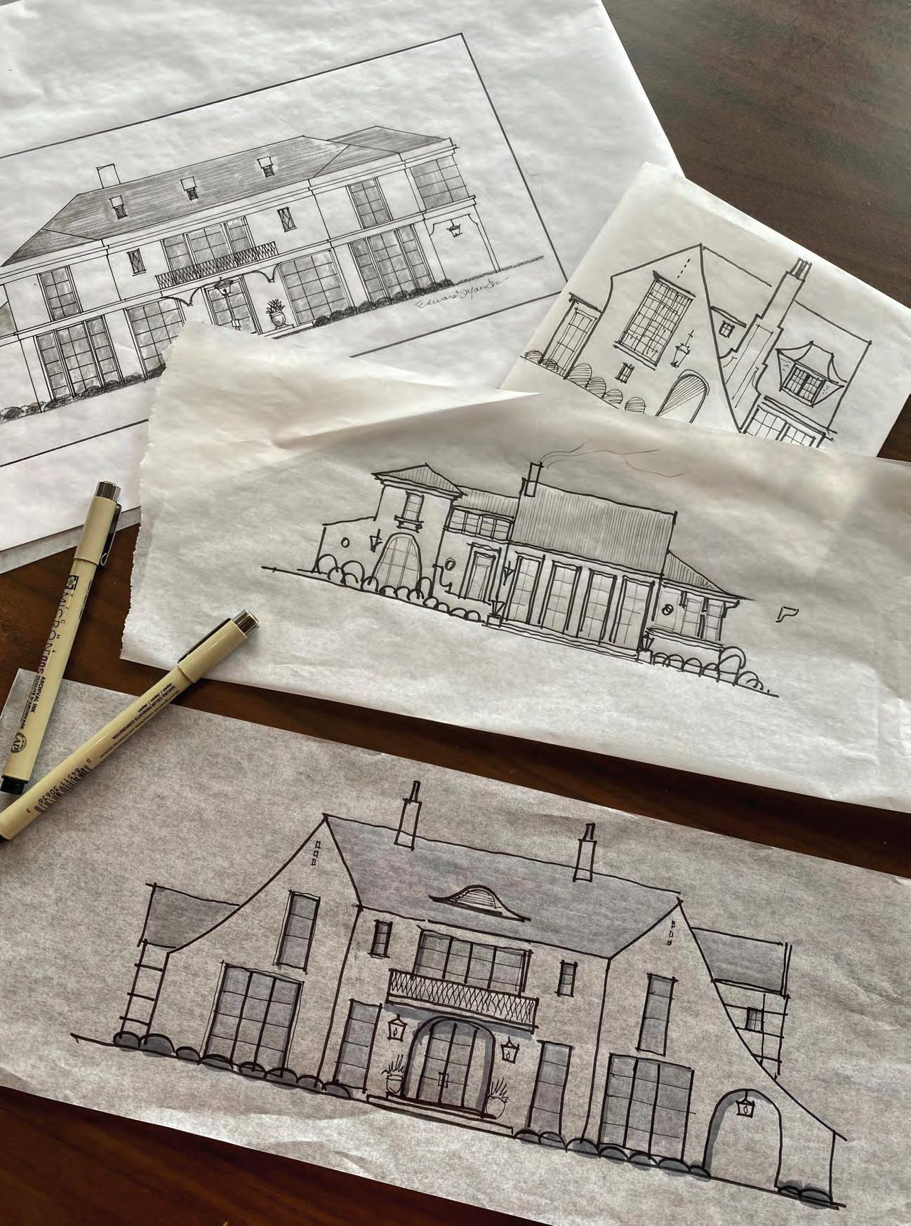 by Luke Archer, AIA
If you live in Dallas or surrounding areas and get out of town for a weekend you may be reminded that the way we live differs from other places. Look to the west while driving up the tollway past Legacy, and you’ll see pockets of urban environments popping up around seedling communities that are now saplings.
The way we live seems to be shifting, post-COVID, but where are we now? Where are we going? What is next? What is here to stay?
Credit: Maestri Studio
After talking to a handful of Dallas-area architects, it appears that changes are happening, especially in how community is being created at all levels — maybe a necessity after a year of staying in. I spoke with Blane Ladymon, AIA of Domi Works, Thad Reeves, AIA of A. Gruppo Architects, Eddie Maestri, AIA of Maestri Studio, Joshua Nimmo, AIA of Nimmo Architecture, Laura Juarez Baggett, AIA of LJB Studio, Bang Dang of Far+Dang, Robert Meckfessel, FAIA of DSGN, and Jonathan Brown, AIA of JHP Architecture/Urban Design.
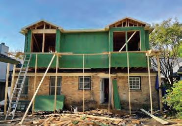
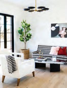
Working from home for those of us who didn’t plan on it gave thought to what your next renovation might need to keep yourself productive. Here are the pandemic-inspired trends that might be here to stay.
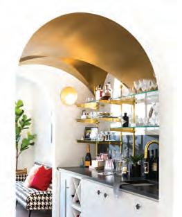
“Currently on my residential design/ build projects, we are being asked to have two separate office areas in the home. Before the pandemic, it was common to have one dedicated home office. On some of the bigger homes, we are being asked for a separated kids’ schoolwork area away from the playroom. No one wants to be overheard on a Zoom/teleconference phone meeting.”
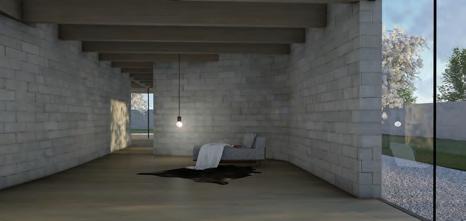
“Pre-pandemic, we noticed children have been wanting smaller sleeping spaces and larger communal areas. No TV in bedrooms. This has driven a hierarchy of spaces that is breaking up the open plan. Separation and privacy for families has become desirable. Post-pandemic has reinforced this as well. Pocket offices are more than a workstation off the kitchen, less than a full-blown room the size of a full office.“
A refocus of having friends over to your home and keeping the TV off are entertainment trends that Eddie Maestri has embraced.
“We are seeing a shift in how our clients live and entertain. The formal living room is back, but as a casual nod to the rooms our grandparents used to entertain in. The stuffiness of those rooms is replaced with bar carts, cocktail tables, conversation pieces, and we have even added shuffleboard into the mix.”
Eddie Maestri, AIA | Maestri Studio
The return of the formal living room could be a response to people needing a sense of community at home, formally casualizing our social circles. Joshua Nimmo created a “consumption room” as a place to focus without distractions to let a client evaluate what really matters:
“It isn’t a decadent space; it will be for consuming information, news, reading, and scrolling. This particular client had an interest in a home that wasn’t a contiguous space. We gave them strong connections and transitions from space to space while managing to not segment or cut the home up too much. Organic and broad connections from room to room allowed for this consumption room or purposed space to still feel as part of the whole.”
|
16 COLUMNS // aiadallas.org
Blane Ladymon, AIA | Domi Works
Thad Reeves, AIA | A. Gruppo Architects
Photo by Blane Ladymon // Projects by Domi Works
Photos provided by Joshua Nimmo // Projects by Nimmo Architecture
Photos by Jenifer McNeil Baker // Projects by Maestri Studio
Joshua Nimmo, AIA
Nimmo Architecture
Multiple architects have been seeing clients asking for a second bedroom suite in addition to the primary. This could be a response to an aging in place move, bringing older parents into the home to have a closer connection later in life. This has also been with thoughts of live-in caretakers or just elongated stays from friends. This is another move toward building communities at a personal scale:
“This idea of a second primary suite is becoming more commonplace. … Couples have been sleeping in separate beds for some time either for health reasons, insomnia, or just because that’s what they have always done. So we no longer deny how they live or will live when one’s health starts to deteriorate, and we provide separate suites, two bedrooms, that have a shared communal place for them to come together.”
This community of spaces, not to mention this community of architects pushing the profession forward in Dallas, is shaping up as a healthy response to examining how we live.
The architects pushing these limits have the opportunity to do so in Dallas because of the lack of historical context that may limit them elsewhere. Dallas has homes that are midcentury modern that many still love, and Swiss Avenue is its own thing entirely. But opportunities for individualism have shown us a community of people who appreciate the modern architecture of their home beyond our design community.
Diane Cheatham, DSGN, and a handful of architects have championed this community and facilitated design-forward thinking over 12-plus years with Urban Reserve. These smaller, sometimes irregular-shaped lots have been great examples of custom home designs responding to their environment.
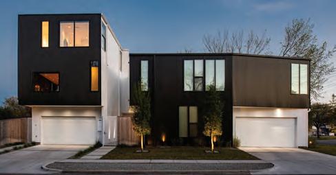
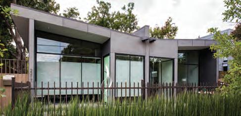
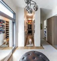
Urban Reserve’s upcoming sibling, Urban Commons, aims for a repeat of success with goals of affordability and minimal footprints.

“We achieved a cohesive public realm with walkable streets, parks and parklets, mews, commons at Urban Reserve with the design of the street that knits the homes together. At Urban Commons, we are taking that one step further, breaking the overall 80 lots into clusters of six to 10 organized around a pocket park (a common), each cluster designed by one architect and constructed by one builder. Most of those commons are connected to the others with a woonerf (a street of pedestrians, bicyclists, and slow-driving cars) on one end — usually the north end — and the creek trail on the other, usually the south.”
Robert Meckfessel, FAIA | DSGN
Our open plan concept that has blended kitchens, living, and dining rooms has served us well since the ’50s, but is it here to stay? Food delivery services blew up when we couldn’t go to our neighborhood spots. The kitchen could be at a precipice to a chopping block. Almost everyone I spoke with is rethinking kitchens in some way.
Of all the primarily single-family architects we spoke with, it seems that Dallas is pushing the boundaries with modern and contemporary.
“The compact, modern, and more efficient dwelling unit has had a surge in demand in the last decade or so, especially in East Dallas, driven partly by residents migrating to the city from the East and West Coasts. These new residents bring with them an acquired taste for smaller, modern homes near the more urban locations of a city. The recent rise in young architects willing to work within somewhat tight construction budgets and sometimes difficult site constraints to make intriguing architecture has helped to feed this demand.”
17 COLUMNS // aiadallas.org
Laura Juarez Baggett, AIA | LJB Studio
Bang Dang | Far+Dang
Photos provided by Laura Juarez Baggett // Projects by Laura Juarez Baggett Studio
Photos by Robert Yu // Projects by Far+Dang
Jonathan Brown, AIA of JHP Architecture has seen a surge in a new building type since COVID-19: Built-to-Rent. Here is what he had to say:
“While homeownership has long been associated as the most concrete manifestation of the American dream, the sharp downturn in the economy over a decade ago and the housing crisis that followed redefined that dream for many people, especially the millennials. As an extension of this shift, millennials are more fluid in their life choices, less anchored to specific locations to live and work, and embracing a zest for experiential living that isn’t defined by the ownership of things. This set the groundwork for the unprecedented explosion of high-density residential development we’ve seen across the nation. However, it wasn’t the low rent, suburban apartment typology of the past; this initiative embraced a much larger communitybuilding world vision, inspired often by Jane Jacobs or Christopher Alexander. It looked toward historical precedents overseas and transformed every aspect of our cities, from the downtowns to the suburbs by embracing density, walkability, and a mix of uses.
This was also a cultural transition as well. Millennials often became viewed as a commodity, particularly in the housing markets from their choice of student housing at university, into their apartment flats as they followed their entry-level employment and as they upgraded their lives with their first promotions. Now as they transition to family life, they are understandably weary of midnight elevator rides to walk their dogs and need somewhere safe and fun for their kids to roam.
We are seeing the emergence of a single-family for rent typology as a next step, embracing fluid, experiential living in a different housing option. A client characterized this as “horizontal multifamily,” and, in truth, that is a far more appropriate moniker. For both JHP and our clients, it begins with place-making, regardless of typology. Here, that focus on community building has driven us to reconsider what a singlefamily urban plan is, deconstructing what historical low-density housing models like row houses, bungalows and granny flats are and overlaying communal amenity packages to knit it all together. In this, we’re devising a unique typology that is no longer rooted in the tired suburban housing model but will instead be responsive to a new generation of residents with fresh, vibrant lifestyles.
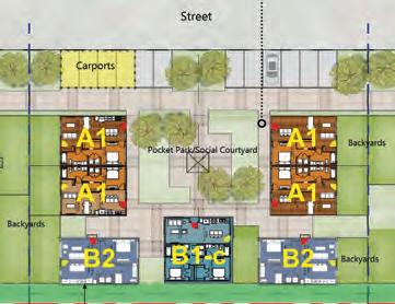
Our focus isn’t to look inward and simply create a haven for the nuclear family but consider that basic social unit as an interconnected piece in a greater tapestry of communal interaction. One of the primary building blocks is the housing cluster. By disconnecting the car from the home, we arrange the residences around a social courtyard as a central entry point. This individual semi-private space, belonging to each cluster of homes, offers casual interactions and opportunities for connecting. Instead of a bold, urban residential roof lounge atop an urban midrise, this is a sensitive, intimate space to socialize in, watch kids play and is directly reflective of where this clientele is in their lives, what they need, and what they value.
It’s an exciting time and an opportunity to forge a new way of living. Expectations haven’t been established, residents are diverse and engaged in ways the market has never seen. With decades of successful urban residential development having elevated place-making and community building as a design framework, there is a robust track record to draw on amidst this new frontier.”
The feeling that Dallas homeowners are looking for most is a sense of community. When you approach that idea at scale, from how a rethinking of space use connects us at home, to how a neighborhood can best serve its inhabitants to rethinking housing for millennials, Dallas is poised for a wave of success stories.
18 COLUMNS // aiadallas.org
Luke Archer, AIA is a project architect at Omniplan.
Project by JHP Architecture / Urban Design
A BLUES FOR DEEP ELLUM
The Times, They are a Changin’
By Terry Odis
It was fall of 2012, and I was in Deep Ellum, cruising down Elm Street on a clear Wednesday evening. I was looking for the Prophet Bar, where RC and the Gritz (Erykah Badu’s band) hosted a weekly jam session with poetry/music open mic.
Engaged in the insane task of securing street parking, I sat at the Good-Latimer light scanning a full block ahead of me, looking for anything that resembled open space. The car in front of me made a quick right into the gravel lot next to the Union Bankers Building, a place I’d later discover was designed by William Pittman, nephew of Booker T. Washington. I mimicked that right turn, placed my dusty Jeep into park, and this vacant lot became my de facto free Deep Ellum parking for the next few years.
I hustled across the street and toward the Prophet Bar. I felt its soulful, familiar vibe before I saw it, the brick building’s mouth spewing people and soul music.
The place was my culture brought to life, given a heartbeat, lungs, and mouth. The city’s best singers, assembled from pulpits and acoustically sound showers, were in that shotgun room. The drinks were cheap and the bartenders heavy-handed.
That Wednesday night, I found my tribe in Dallas, and for nine years I’d find myself as both a spectator and performing artist in Deep Ellum in venues from the Prophet Bar all the way east to the Sons of Hermann Hall.
And it felt good to be another artist here, stitched into a patchwork quilt called Deep Ellum.
But the times, they are a-changing. The patchwork of Deep Ellum is morphing by the minute.
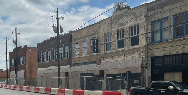
And the Prophet Bar is closed.
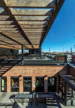
Harlowe is an adaptive reuse project that blends new construction within existing masonry building shells. The view looking east displays the new rooftop patio structure spanning across existing buildings and courtyard below.
19 COLUMNS // aiadallas.org
/ Photo by Daniel Driensky
Photo by Terry Odis
Stephanie Hudiburg, executive director of the Deep
“We are the No. 1 entertainment district in the region,” says Stephanie Hudiburg, executive director of the Deep Ellum Foundation, which preserves the elements vital to the character and safety of the area. “Even back in 2018, you could feel that the neighborhood was at a tipping point where it’s not exactly clear what’s going to happen with how the neighborhood is growing. Between 2018 and 2020, the residential community has grown 75%. How is it that this place grows and evolves while maintaining what makes it special to begin with? And continues to grow and be a leader in spaces like entrepreneurship and also arts and culture?”
For those of y’all not from Texas, Deep Ellum is our cool, eclectic aunt of a neighborhood who always has the coolest stories. All her friends are artists, and she’s witnessed legendary bands in their early days. She is heavily tattooed, highly opinionated and loves openly, mostly. Aunt Deep Ellum has calloused hands and a manicure. She’s been married and divorced 10 times at least, each time changed in the way that marriage requires accommodation and compromise. She kicked a mean dope habit once, may or may not be homeless, dances when she walks and sings when she talks. Yeah. She’s that kind of neighborhood.
“Deep Ellum has reinforced to me the fact that people are more important than anything. People of all walks of life are there, and it’s just exciting to be able to mix with many people who are different, but we’re all the same because we’re people,” says Scott Rohrman, who heads 42 Real Estate and is one of the stakeholders making sure Deep Ellum’s commerce remains active. “Designing a real estate project, taking into account everybody that will use the building instead of a select few, has reinforced something that I’ve known deep down.”
The challenge lies in maintaining a similar scale between the buildings, who gets to inhabit and operate them, old and new character, the tall and short as Deep Ellum matures against the looming multistory office buildings, hotels, and residential towers. Deep Ellum’s portion of skyline mimics a heavy beating pulse, its dancing now frantic with 10- and 20-story buildings, as the city reaches for the heavens.
Deep Ellum began in 1873 with the rumblings of a train line east of downtown and with hardworking people with culture rolling heavy on their tongues, centered on Elm Street. African Americans and European immigrants stretched the threelettered Elm into Ellum to fit the souls of several thousand people in its name, the way people stretch food, shelter, energy. The magic of Deep Ellum is rooted in survival, a reliance on community to get by. What manifested from the stretching is common of miracles that arise from struggle: Community. Art. Commerce.
Commerce and a concentration of skilled, underpaid labor attracted investors like Robert S. Munger and his Continental Gin Co. and an early Ford Model T plant. The Pittman, once the Union Bankers Trust Building designed by William Sydney Pittman, was a cultural center and home to many Black lawyers and doctors. This is how Deep Ellum danced into the 1900s, with self-made shoes and its own tune.
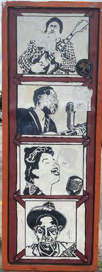
In the 1920s, imagine the streets of Deep Ellum scored with the blues. Mythical musical legends stepping off of a train and into a lounge for a gig. Somebody’s auntie laughin’ at the jokes of somebody’s uncle, carefree and closed-eyed. Conversation in a chorus of language. Streetcar bells. The smell of engines and grease and certainly something edible in the air.
Looming always is innovation. How ironic it is that the very Ford factory that employed hundreds of its residents quite likely led to Deep Ellum’s decline, with the advent of highways and eminent domain and neighborhood splicing and the creation of the suburbs and desegregation.
“You know, 345 goes right through what used to be the heart of Deep Ellum. We’re painfully aware that people have not forgotten this history,” says Hudiburg of the short interstate dividing the neighborhood from downtown.
This makes me consider what the Elm street terminus looked like before the Pittman, before Central Expressway, before the Sheraton, when Deep Ellum and downtown shared no physical barrier. It made me consider what it will look like when I am 50 and still walking Elm.
“We’re scratching the surface on a lot of this, but this is a long-term process of continual engagement and advancement,” Hudiburg says.
Downtown climbs and rises like a well-dressed suitor from good stock. Deep Ellum is well-traveled, creative. and intriguing. Deep Ellum’s got all the corporate suits laying gifts at her feet, the poets writing sonnets, and the bards musing.
The place ain’t all magical though, as big city problems such as drugs and homelessness occasionally overtake Ellum. The city responds to those problems in big city ways – either with a Band-Aid over a gunshot wound or with an ant to a sledgehammer. None of this can stop the vibe.
It is 2020, and it’s date night. My wife and I are cruising down Elm Street sans offspring, and we are feeling free. It’s been a while since I’ve been in Deep Ellum, and even longer since I’ve claimed my old space behind the Union Bankers Trust Building. I cross Good-Latimer to discover that my space has been replaced by a revitalized Union Bankers Trust, now called the Pittman hotel. It looks nice, really nice It looks like a place that artist me couldn’t afford, but architect me could. While I’m glad the building has new life, it’s heartbreaking that just across
20 COLUMNS // aiadallas.org
How is it that this place grows and evolves while maintaining what makes it special to begin with? And continues to grow and be a leader in spaces like entrepreneurship and also arts and culture?
Ellum Foundation
21 COLUMNS // aiadallas.org
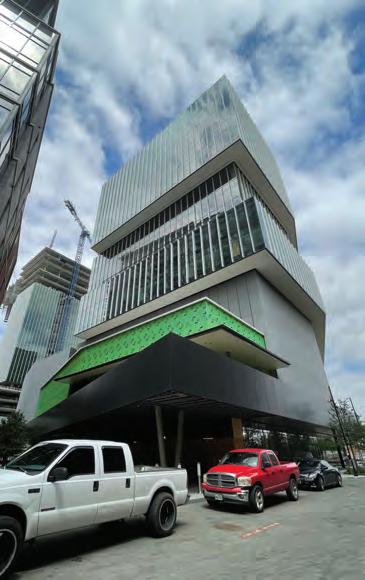
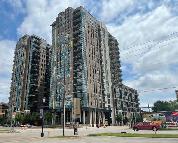
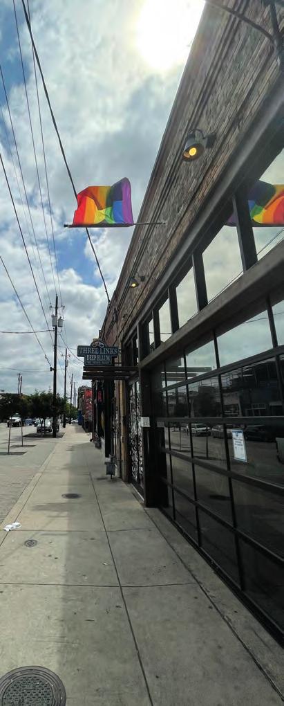
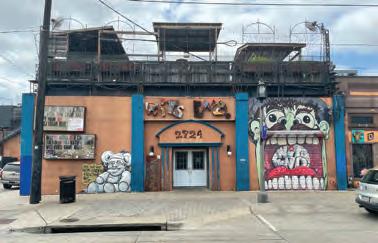
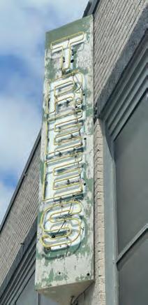
Deep Ellum today. / Photos by Terry Odis
The magic of Deep Ellum is rooted in survival, a reliance on community to get by. What manifested from the stretching is common of miracles that arise from struggle: Community. Art. Commerce.
the street there is no humming from the Prophet Bar, its eyes black, mouth closed.
As we cruise down Commerce hunting for parking, it appears the tide is rising on all sides of Deep Ellum, its skyline spiking at the edges like a pulse. We parked at the Henry for free because it is against my religion of starving artistry to ever pay for parking in Deep Ellum.
There is still the feeling of life happening ahead of you, behind you, around you, over you at rooftop bars and piano rooms. Somewhere, a youth open mic has a room buzzing, 500 kids strong. On another corner, a man sells hot dogs and handmade jewelry. The vibe lies in the cadence of footsteps on the sidewalk, jaywalking across Commerce, hearing a band jam, then rock a few doors away, then salsa music. A digital coin jungle constantly sounds. At Quixotic World, a poetic theater has just let out. At Off the Record, a DJ begins his playlist. Multiple barbecue joints stoke smokers and season meat. While I wouldn’t be caught dead in High and Tight, Deep Vellum Books has taken my money and hosted my youth’s open mics. While the general consensus is that everything in Deep Ellum ain’t for everybody, I would hope that there is a place here for anybody. My wife and I camp out at a longtime Lebanese spot off Commerce, flirting like young adults, except with money.
A vibe there is here indeed, young Padawan. And none of it is accidental.
“I lived in Deep Ellum for a few years. When I was first established down here, it was just really artistry and freespirited. We made it poppin’,” says Cody McDonald, a former resident. “We were throwing parties. It was all about the people, the vibes, the love. That was a legendary time in Deep Ellum.
Those were the good days. But any time an area is growing and poppin’ you gotta be mindful of the darker elements. People out selling. Being belligerent, wildin’ out. It’s getting really ... corporate, and there’s a heavy, heavy police presence.”
“I think the stakeholders coming down here are important, because without them experiencing Deep Ellum,” Rohrman says, “it doesn’t make sense to have it. However, that can’t rule the day. You also have to have a good community for the employees, the bartenders, the waiter and waitresses, the employees.
“And Deep Ellum’s not perfect in that respect, but we work really hard to make sure the people who work at these businesses feel like they are a part of the place, part of the community, and not second-class citizens,” he says.
Then there are the business owners, most of them running small enterprises “who put their life savings into their businesses,” Rohrman says. “So we really worked hard to not have a typical landlord/tenant relationship, but rather a winwin partnership. We went into every negotiation wondering how we can walk out of here with a solution that helps everybody. We’re all in this together.”
New communities and stakeholders have arisen like Deep Ellum’s perimeter, like new members of a century-old chorus. The silent conductors of the complex Deep Ellum symphony are well aware of the gravity of maintaining such a sacred vibration, each one coordinating their sections. Each section’s reception rests in the taste of the consumers, who reflect the ever-widening spectrum of Dallas’ population.
With a background in public policy, Hudiburg of the Deep Ellum Foundation is confident that steps have been taken
22 COLUMNS // aiadallas.org
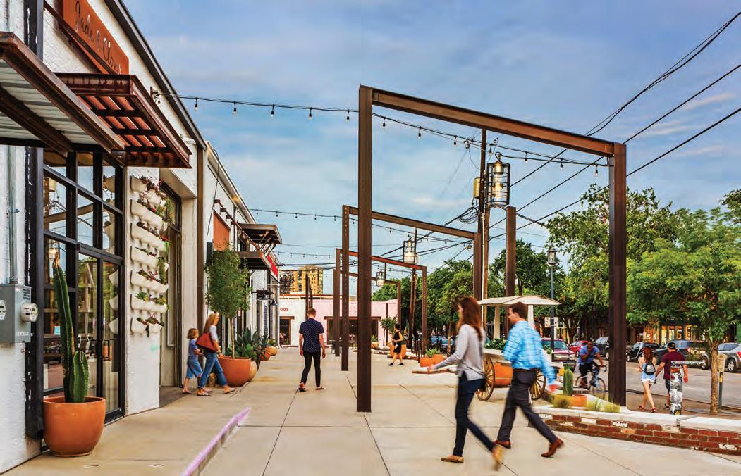
With a vision to transform uninviting storefronts into a vibrant streetscape, LandDesign worked collaboratively with the architect, GFF, and the developer, Asana Partners, to create a one-of-kind space reflective of the edgy, eclectic style of the Deep Ellum neighborhood. Inspired by the historic, industrial atmosphere, steel beam structures and reclaimed brick generate a rhythm of patterns and spaces to guide pedestrians along the site, while planting and soft materials create balance and invite visitors to linger. / Photo by Denise Retallack
to preserve the elements vital to Deep Ellum’s existence, character, and safety.
“We’ve really tried to take it upon ourselves to engage our stakeholders, the residents, and property and business owners. To do that we needed to take a step back, reflect, get everybody’s input, and make a plan. So we went through a yearlong process to create the Deep Ellum Public Improvement District Strategic Plan 2019-2025,” Hudiburg says. “It lays out our mission, identifies the greatest challenges and opportunities, and what it is that people love about Deep Ellum.”
“We need more than the normal level of city services,” says Hudiburg, and the foundation coordinates efforts among Deep Ellum’s stakeholders and raises concerns to City Hall and at the regional and state levels.
“There’s also more commonality between the stakeholders than one would think,” she says. “One of the top three things that came back is a concern for neighborhood identity. Where is there going to be space for artists and musicians as the area continues to grow? How do we preserve Deep Ellum’s history? How do we ensure the very thing that made this neighborhood special continues to have a space as all these other business entities are drawn to Deep Ellum?”
“We made a cultural plan for the district, which includes uplifting artists by putting money in their pockets, putting the neighborhood’s history on display for people to see. In 2020 we applied to the state to become a recognized cultural district, and that was an effort from our cultural committee. That’s Will Evans from Deep Vellum Books, that’s Frank Campagna of Kettle Art Gallery, and also people from our development community,” Hudiburg says.
For the vibe to be maintained, must it pay homage to its roots?
“We are also building what we call the Dallas Cultural Trail by connecting the Arts District and Fair Park to highlight our historical sites, art galleries, and music venues, all these things that create the culture of Deep Ellum. We want that person there for the ice cream shop or the office building to also walk down the street and have at their fingertips the ability to learn that there’s a lot more history to this place,” Hudiburg says. “Now we are going for National Register for Historic Places certification, and Preservation Dallas has really been a leader and great partner in helping us with that. We did a partnership with the city of Dallas. We were able to do an assessment to confirm the number of historic buildings that we have and we have well over enough to apply for national register status.”
I wonder if the Union Bankers Building was considered. Did the same conversation and planning occur before Ford’s Model T plant was opened on Commerce Street? Is Deep Ellum in its own cycle with the stakeholders that be?
So many factors. So much at stake.
“Great cities are cities that have become great through trial and error,” says Rohrman. “My hope is that the district continues on an upward trajectory. Hines just built an office building. Westdale is building the Epic, so we’re getting more residential, more office and the hope is that it matures and
really becomes a self-sustaining community but yet is open for people who don’t live and work there to come and play as well. What we were excited about is that we feel like Deep Ellum still maintains a human scale, and when you walk through you don’t feel overpowered by the buildings and the architecture, but you feel like a part of it. The concept is how we make a walking neighborhood, and not just focus on my plot of land, but also how my plot interacts with the properties across the street. We spent more money for Radiator Alley than anything, but it was so important for us to connect Elm Street to Main so that you didn’t have to walk to the end of the block,” Rohrman says.
“We have a vision for what the transportation and mobility could and would look like in Deep Ellum and we’re involved with the city with that. For example, Commerce Street is a really fast street and we’re part of an effort to raise money to make it flow more like Elm Street with wider sidewalks, street trees, acorn lighting, etc. Adding a bike lane and maybe even a trolley car, or a D2 train option,” says Hudiburg.
But still, my free parking spot is gone.
I came back alone to Deep Ellum a week after our date. I wouldn’t call it mourning, but my soul was heavier than usual. A construction fence made the entire south facade of Good Latimer inaccessible. Even though the Pittman and the neighboring Hamilton high-rise trade the traffic on the street between them secretly, the pulse is scary low. Maybe it’s just because it’s 11 a.m. Maybe it is the shadow from a rising tide of masonry and glass, some 20 stories above me.
As there is in a chorus, there is a certain vibe that persists. Some parts reduce or even drop out, while others take the solo. Discord still stands to harsh the Deep Ellum vibe. A string can be loosened out of tune or come undone completely. This blues in deep Ellum rings true, and comes from a place; maybe the past? A lick from Blind Lemon’s guitar? Maybe the present? Some poet’s ode to the place? Or perhaps, as always, the future?
The stakeholders are painfully aware of the largeness of the task but seem as committed as ever, motivated by hoping to contribute a lasting verse.
The more aware I become of the rich history of Deep Ellum, the more value I find in paying homage to it. I do think that to truly honor it is to ensure that those notes also are carried on as loud as the new ones. The efforts and ingenuity of those who came before, especially the unsung heroes of the area, should be honored. Also, we must mind missteps.
Just because you can no longer see the tracks, we must not forget that a train once ran through Deep Ellum, one that brought with it culture, food, music, industry, layered too thick into the concrete for it not to hum. There is still the echo of people’s stories who have walked on and slept in these streets. Though the businesses have come and gone, new life arrives to occupy many of the structures. The buildings are there like children with their grandparents’ faces.
Deep Ellum is ever changing. And while she waits on no man, there are some patches in her quilt that cannot be replaced.
23 COLUMNS // aiadallas.org
Terry Odis is a project manager at DFW Airport.
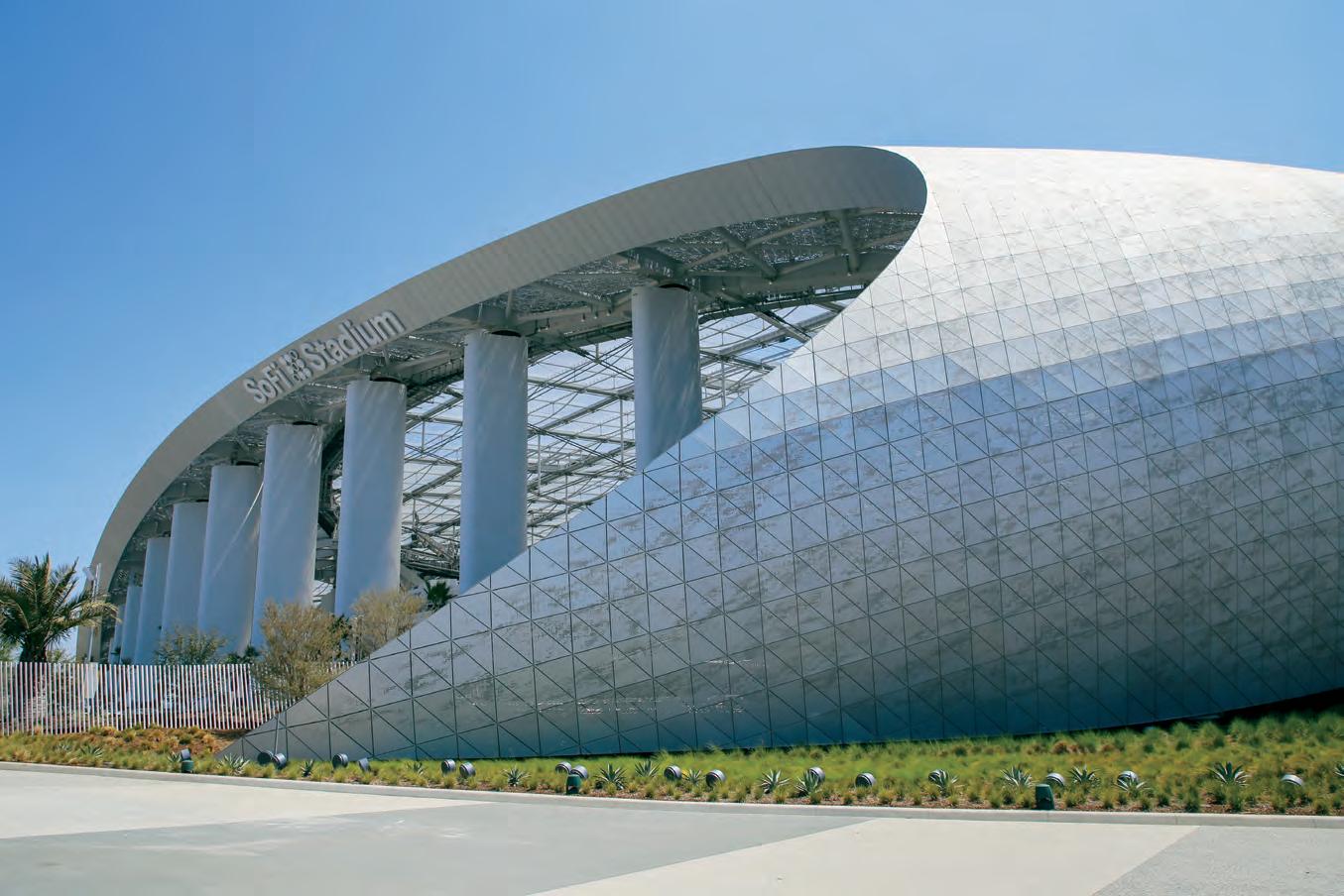
24 COLUMNS // aiadallas.org ^ Beauty + Performance www.hksinc.com SOFI STADIUM AND ENTERTAINMENT DISTRICT AT HOLLYWOOD PARK, INGLEWOOD, CALIFORNIA
TOWARDS UNIVERSAL DESIGN

30+ Years of ADA and onward
By Lauren Taylor, CRC, LPC-A
Without memories, we would not grow. We would not love. We would not persevere. Memories are what fuel our passions, because we would not continue to do something if we could not remember what it felt like. But memories also fuel change, because we would not experience motivation if we could not remember pain, suffering, or discord.
In 2021, we celebrated the 30th anniversary of the Americans With Disabilities Act (ADA). For those who do not know, the ADA is the legislation that grants Americans with disabilities their equal civil rights. You read that correctly: People with disabilities have only had equal rights as American citizens for a little over 30 years.
As a person living with a disability who was born after the ADA came into force, I feel there is still so much more to be done in making our world more accessible. However, for the people with disabilities who have lived much of their lives before the ADA, this legislation has been something of a miracle. This is why memory is so important.
But it is also important to not let that memory become a stopping point and instead let it fuel further change toward true equality. The ADA was never meant to be the endall, be-all for the inclusion of people with disabilities. It was the only foundation to build and grow from.
Before I get too far along, I would like to introduce myself so you have a better idea of my perspective while reading this article. My name is Lauren, I am 26 years old, and I was born with muscular dystrophy. All you really need to know about MD is that my muscles are about as strong as a toddler’s, so I use a power chair to get around. I got my first power chair when I was 3 years old, so I have been confronted with inaccessibility for most of my life. Fast-forward 20 years, and I received my bachelor’s in rehabilitation studies; in earning that degree, I learned more about the disability community as a whole outside of my own experiences. While working on my master’s degree in rehabilitation counseling, I became Ms. Wheelchair Texas in 2019, which is an advocacy title – not a beauty pageant! – that enabled me to travel the state of Texas, educating others on disability and my platform, universal design.
25 COLUMNS // aiadallas.org
If your business is inaccessible, you lose the business of 26% of the American population.
If your business is accessible, you gain the business of that 26%.
WHAT IS UNIVERSAL DESIGN?
Universal design is the ultimate goal for architectural accessibility. The aim of universal design is to simply make something or somewhere usable by everyone simultaneously, regardless of ability. The easiest example is a ramp. Everyone can use a ramp, whether they are on wheels, on foot, pushing a stroller or grocery cart, or on a skateboard. But not everyone can use stairs. Essentially, universal design is designing for disability first, because able-bodied people can use both accessible and inaccessible spaces, while people with disabilities can only use accessible spaces. My question has always been: If you can make spaces everyone can use, why make spaces only some people can use instead?
Answers to that question usually include that accessibility equates to ugly, costly, and unnecessary. Well, I disagree. Making something accessible does not mean slapping a big obnoxious blue handi-man symbol on everything. Accessibility actually looks like zero entry thresholds, open floor plans, and wide doorways, all of which are desired features in a home. Making something accessible from the start also eliminates all the costs of making it accessible later. So it is more cost effective to implement universal design in blueprints for infrastructure. Lastly, making something accessible for people with disabilities only increases your market of people who can frequent your business.
People have long tried to justify their lack of accessibility by saying that there aren’t enough people with disabilities coming to their business to make accommodations worth the time, money, or effort to install them. But the reality is that there are plenty of people with disabilities out there, but they avoid places inaccessible to them. I like to say, “If you build it, we will come.” It is a simple cause and effect relationship. If your business is inaccessible, you lose the business of 26% of the American population. If your business is accessible, you gain the business of that 26%. Easy peasy, lemon squeezy.
DESIGN ELEMENTS
Now that I have shown the sense of designing for disability first, let’s talk about the specifics of what makes universal design unique.
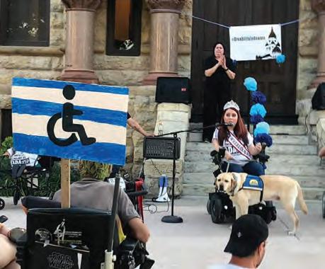
For a design to be universally accessible, it must be equitable, flexible, simple, and perceptible. It must have a tolerance for error, require little physical effort, and it must have appropriate size and space that can be accessed regardless of approach. This sounds complicated, but let’s break it down.
Equitable means that the space or object must be usable regardless of ability. Ramps are the perfect example as they provide equal access to any user.
Flexible means that the space or object must be usable in different ways to accommodate different abilities. For example, a table with removable chairs allows someone to sit where they like, regardless of using their legs, a wheelchair, or a scooter for mobility. Places with fixed seating, like lecture halls and movie theaters, often cause accessibility issues because of a lack of flexibility.
Simple and perceptible designs mean that it is easy to understand how to use the space or object. The push plate button that opens automatic doors is simple: You push the button and the door opens. Making something accessible should not mean sending someone on a wild goose chase to figure out how to access a place or how something works.
26 COLUMNS // aiadallas.org
Photo credit: Lauren Taylor
For a design to be universally accessible, it must be equitable, flexible, simple, and perceptible. It must have a tolerance for error, require little physical effort, and it must have appropriate size and space that can be accessed regardless of approach.
Tolerance for error means there are procedures to catch mistakes. For example, when shopping online, a consumer typically presses some kind of “complete purchase” button to buy the items in the cart. If it had tolerance for error, it would show a message asking whether the consumer is sure about purchasing the items and asking the buyer to select “confirm” or “cancel.” For a consumer who is blind or whose hands tremor, this tolerance for error could prevent the shopper from purchasing things without even knowing it.
Low physical effort means that it does not take much force to use something. I am sure you have all encountered an unnecessarily heavy door. You might have been able to open it using a bit more strength than usual. But for someone with limited arm strength or who uses a service dog to open doors, that heavy door becomes a brick wall.
Size and space for approach means that a person has plenty of room to approach something and easily access the necessary functions of the space. For example, elevator buttons are usually at a great height for people sitting or standing, but are out of reach when a trash can is placed in front of them. Another important aspect of this design principle is, for example, having knee clearance under a checkout counter or a bar so those who are seated can easily pull under the surface to reach everything on top.
WHY UNIVERSAL DESIGN?
When something is made accessible, it usually means there is a separate point of access for people with disabilities because of the main entrance being inaccessible. While I am grateful for access in general, it can be exhausting to be seen as separate. Common occurrences of “separate accessibility” that people with disabilities experience include difficulty finding housing because homes aren’t built with accessibility in mind, having to use a service elevator alongside garbage troughs to get upstairs, going through the kitchen in back of restaurants to get to the dining area, and having to circle buildings to find the one designated accessible entrance. The list goes on.
Too often people with disabilities are an afterthought because they live in a world not built with them in mind. The ADA helped raise awareness of these issues and sparked the idea of a separate kind of inclusion. But the ADA did not provide a solution to create a fully integrated society.

Universal design is that solution. It solves the mystery and cost of accommodations because accommodations are no longer needed. Universal design creates a world that welcomes everyone and excludes no one. It creates a symbiotic space for people with and without disabilities to thrive in together.
Memor y of the ADA makes me all the more grateful it exists, so that people like me can have a voice to speak on these issues with you and help everyone grow together toward a greater design – a universal design.
27 COLUMNS // aiadallas.org
Lauren Taylor is a Licensed Professional Counselor Associate (LPC-A) and a Certified Rehabilitation Counselor (CRC) at New Patterns Counseling.
Photo credit: Lauren Taylor
Universal design creates a world that welcomes everyone and excludes no one. It creates a symbiotic space for people with and without disabilities to thrive in together.
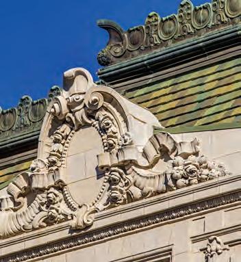
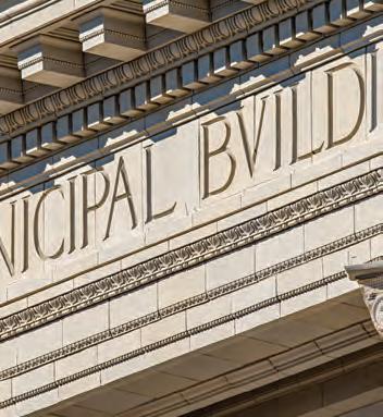
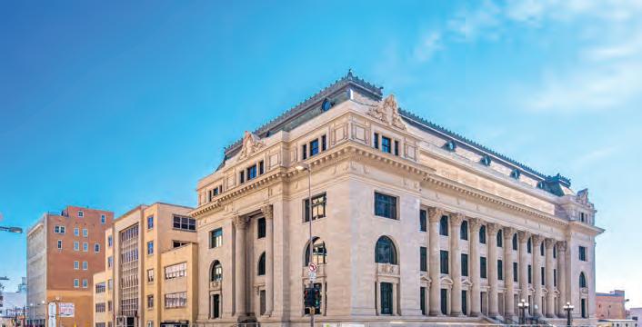



Can You Identify This North Texas Space?
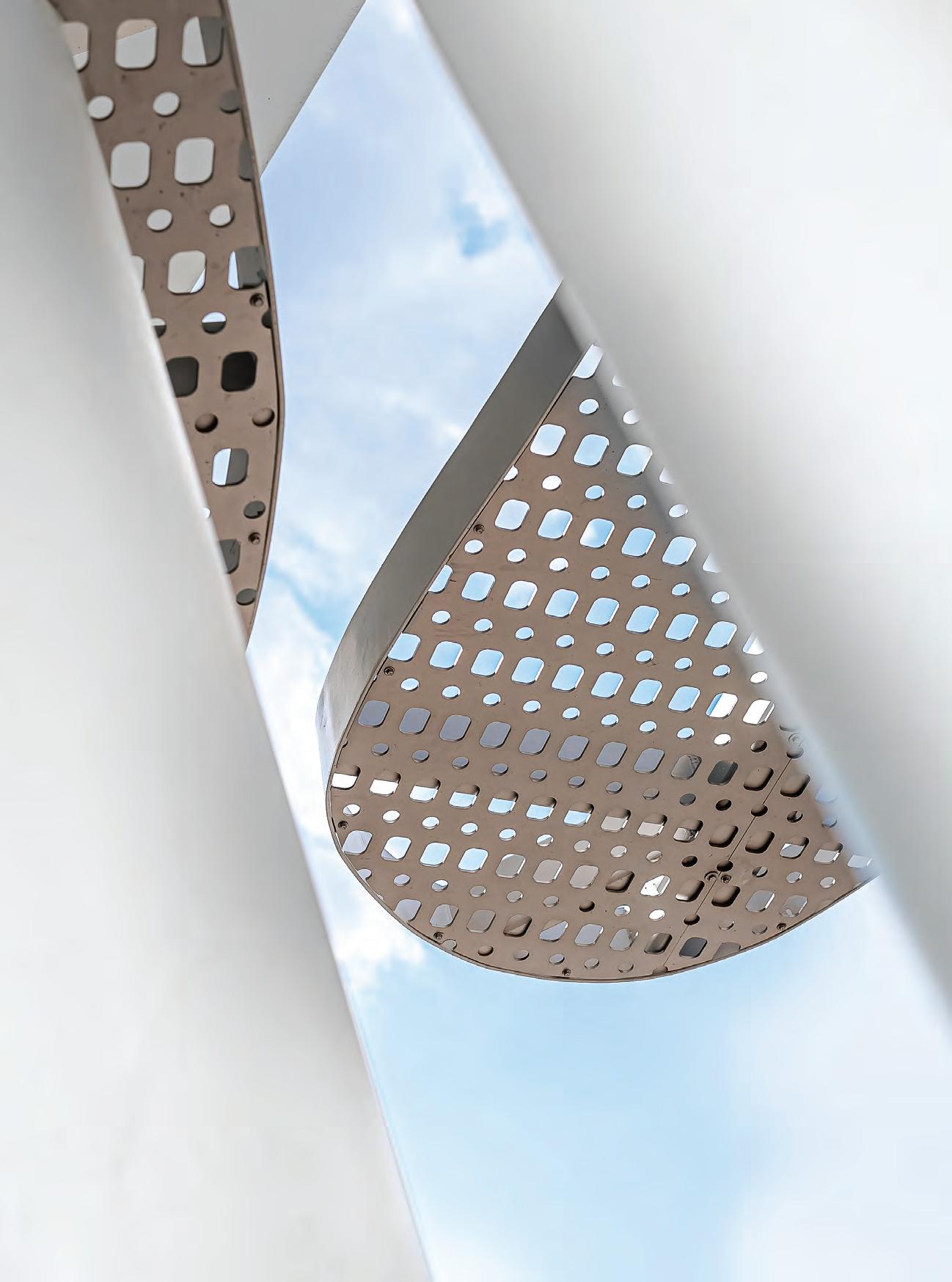
Find the what, where, and more on page 59.
by Conleigh Bauer
IN CONTEXT
Photo
30 COLUMNS // aiadallas.org
Credit: Better Block
The Perks of New Parks
LITTLE MOMENTS OF JOY IN AN EVOLVING URBAN LANDSCAPE
By Lisa Casey, ASLA
In March 2020, vibrations of the Earth eased. Anthropogenic activity generates a hum within the Earth’s crust so that “every day as we humans operate our factories, drive our cars, even simply walk on our sidewalks, we rattle the planet,” says Nicholas Christakis in the book Apollo’s Arrow.
Our very presence causes vibrations discernible to seismologists. Then we were still. During the COVID-19 pandemic, that pause was a window within which priorities changed, urban experiments happened, and unforeseen forces such as work from home influenced the built environment of Dallas and neighboring cities.
Parks make up one type of infrastructure that proved vital during the pandemic. “Parks functioned as a flex space that could support some footprints that couldn’t safely be held indoors anymore,” says Jenn Carlson, AIA of HKS.
With all of the focus on working from home, there was little conversation about the substantial uptick in park use. Carlson, Abel Clutter of Page, and Erick Sabin of LRK – all members of the AIA Dallas Communities by Design Committee – decided to start a dialogue with a survey of AIA members and others in the community titled “Get Outside.” Its intent was to show that people were using parks differently and at a higher rate. Although the survey does not fully reflect Dallas’ diverse population, it still provides an informal snapshot from over 100 respondents. The responses reveal a 10% increase in daily park use and a 26% increase in park use of three to five times a week.
Have Dallas residents sustained that higher park usage? Robert Kent of the Trust for Public Land said he and his wife walked every evening to wind down after a day of working from home in summer 2020. But after returning to the office, they had to be intentional about leaving work on time to keep up their routine.
The increase in outdoor exercise has enough benefits that, ironically, “a health crisis may be leading to some significant health benefits for folks,” says Kent, whose organization works to make sure that Americans have access parks and the outdoors nearby.
Kent suggests that small changes, such as a fraction of the population walking 20% more, will have outsized community health outcomes. But the sharp uptick in park use could well be followed by a slow descent back to the average, although Kent is optimistic that the new average will stick at a little higher than previously.
The pandemic pause gave greater urgency and awareness to the
31 COLUMNS // aiadallas.org
issues of inequality as well. “The last year revealed for a lot of majority groups how life is for minority groups, not just race, but income,” Kent said.
In 2021, the Trust for Public Land, or TLP, added equity as a key metric alongside acreage, investment, amenities, and access for its ParksScore, which ranks park systems for the 100 largest cities in the U.S. each year. Plano placed an impressive 15th, but the rest of North Texas is far behind, with Dallas ranking 50th and Arlington, Fort Worth, Garland, and Irving placing in the bottom 25%.
The North Texas chapter of TLP has already been working to increase access to parks through projects such as Dallas’ Five Mile Creek Greenbelt and Alice Branch Creek. But heightened awareness of equity “brought more urgency to the work for the decision-makers that help make these types of efforts happen,” Kent said. “The generation of kids that don’t have access to parks and green space within walking distance of their home … can’t wait 10 years.” The question for TPL and similar nonprofits is how parks can be become an “engine for equity,” he said.
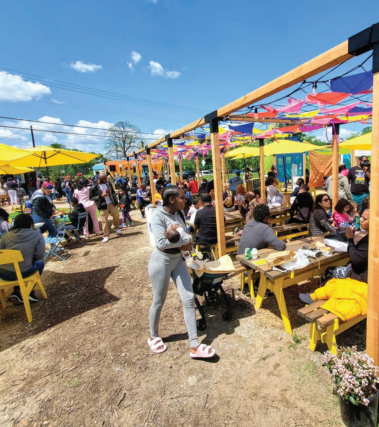
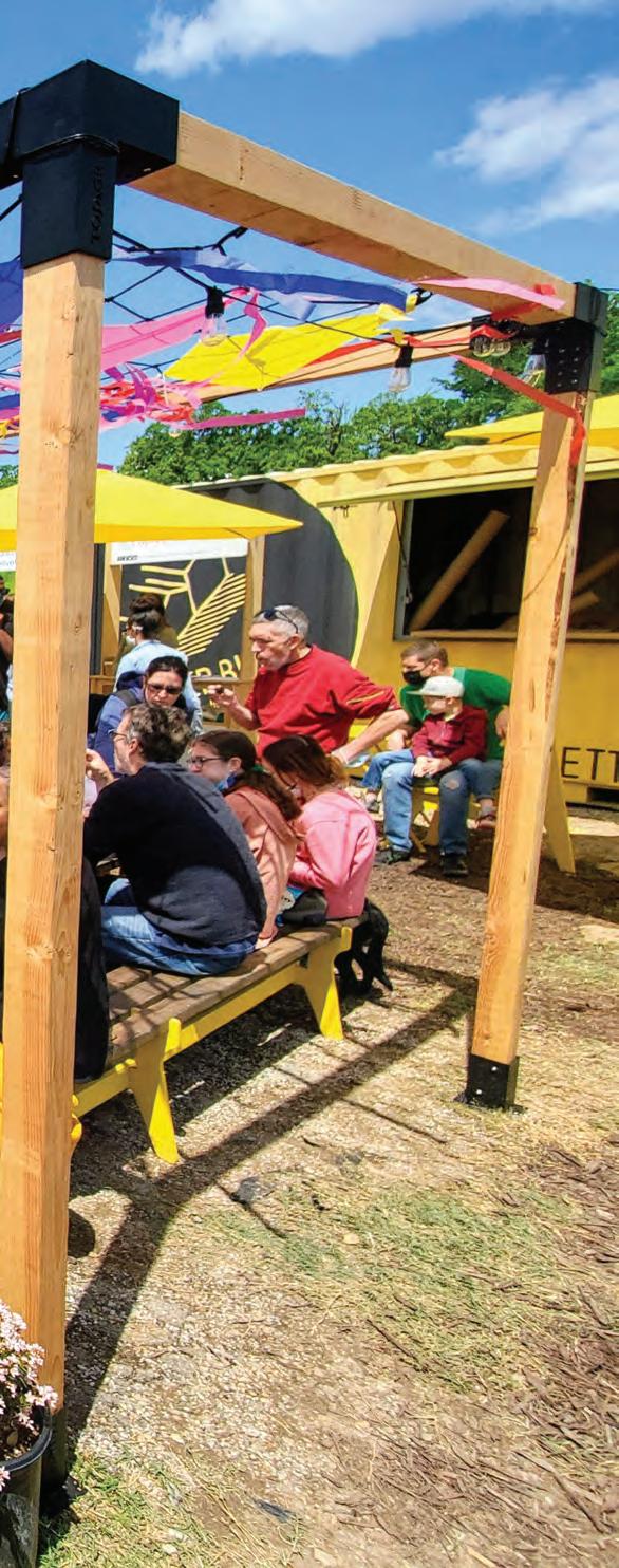
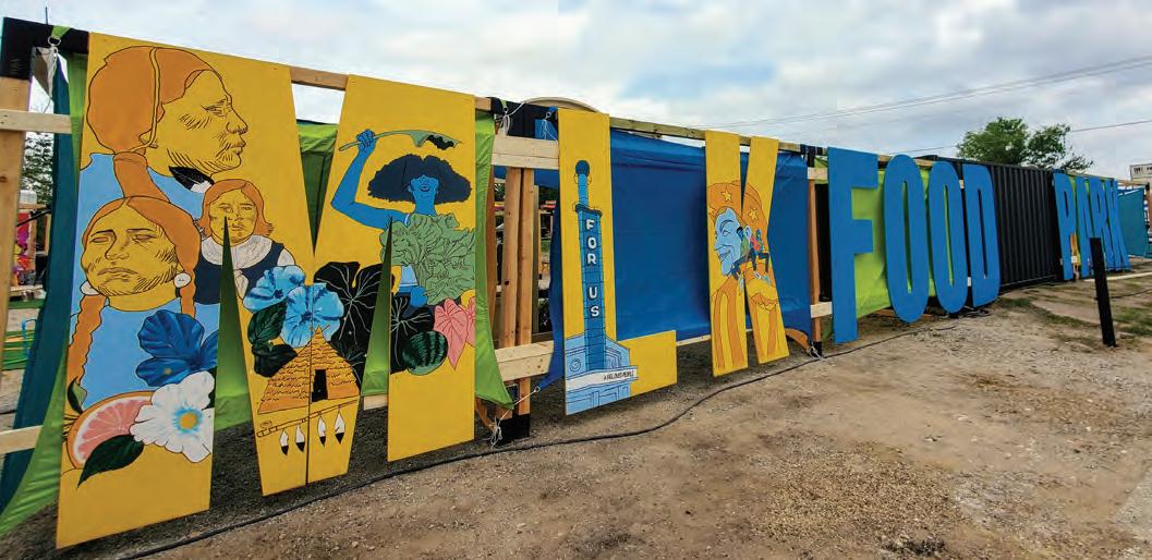
In spring 2021, the Better Block, which promotes vibrant neighborhoods, and The Real Estate Council’s Dallas Catalyst Project also highlighted inequity amid the pandemic with the MLK Food Truck Park. The event had been planned as a Complete Streets demonstration for spring 2020, but was delayed a year by COVID-19, then changed entirely to focus on food and highlight the pandemic’s impact on small food vendors.
“People said no one would come to South Dallas, but we had 5,500 people in nine days,” said Krista Nightengale, Hon. AIA Dallas of Better Block. The pop-up event transformed an empty lot into a small market with booths, a stage, seating, abundant shade, and mulch to minimize mud from spring rainfall. When I visited on a late Saturday morning, an energetic jazz band was in full swing. With barbecue from Holy Smokes and sweets from Brown Suga Vegan bakery, it was a good time. South Dallas vendors said that the park provided greater visibility for their brands.
It also illustrated the barriers to mobile food vending. Nightengale said a food trailer or push cart requires capital of $25,000 to $30,000, and a food truck will cost $50,000 to $200,000. Similar to those of other cities, the Dallas ordinance required that food trucks start from and return to an approved commissary each day for vehicle service and sanitation, and be parked at the commissary for a minimum of five hours overnight.
But there are no commissaries in South Dallas, which adds to driving time and gas costs for food trucks to serve that area. The ordinance, which Nightengale noted was about 10 years old and was due for an update, also limited the food types. A freshly prepared chicken salad is not possible as no vegetables can be chopped in a food truck and no chicken can be grilled. Chicken must be breaded and can only go from the freezer to the frier. Certainly, food safety is paramount, but cities such as Austin, Portland, Cleveland, and Nashville have adapted ordinances, leading to stronger mobile food cultures. In May 2022, an updated ordinance was passed by the City of Dallas.
Another program that pivoted to support the restaurant sector during the pandemic was downtown Dallas’ PARK(ing) Day, led by Downtown Dallas Inc., or DDI. The program invited
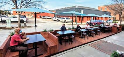
participants to partner with a local business and submit ideas digitally of how businesses could use the temporary parklet program that the city started in April 2020. (Parklets are set up for a short time in curbside parking places to provide amenities to pedestrians.) AIA Dallas’ Communities by Design with Peter Darby, AIA of Darby Architecture and Andrew Wallace, Assoc. AIA of Architexas reached out to Adrian Busby-Cotten of the Pegasus City Brewery, which opened its second location at the Dallas Power and Light Building in the fall of 2020. They proposed a biergarten with five 9-by-9-foot modular booths that could be manufactured off-site and delivered in a flat form and then literally popped up. The brewery sets aside defective cans that cannot be used for beer production; these leftover cans could fill low wood shelves of the booths to provide a screen from the street. With the foundation made of wooden pallets that the beer cans are delivered on, it has a sustainable sensibility. Wallace added that Adrian’s “whole philosophy for the brewery was picking up these landmarks in Dallas and really highlighting” them. It resonated with DDI as well since the design won the Most Creative Award.
Doug Prude of DDI said, “The first goal of PARK(ing) Day is to get cities to really look at these [parking] spaces” and recognize that “you don’t need to reserve this for a car; we can actually use it for other things.”
In addition to the concepts for PARK(ing) Day, restaurants primarily in downtown, Deep Ellum, and Uptown took advantage of the city’s temporary parklet program to expand their restaurant footprint and safely serve customers outside. Nightengale said parklets also provided a walkability component in slowing traffic and making spaces more pedestrian-friendly. “A coffee shop we’ve been talking to about doing a parklet … has maybe four seating spaces inside. A parklet would literally quadruple that.”
One benefit of the pandemic was cities becoming more open to experimentation and embracing pilot programs like the temporary parklets, Nightengale said. The City of McKinney not only established a temporary parklet program but used CARES Act funding to commission Better Block to produce two modular, adaptable parklets. Any restaurant can apply for use of the parklets.
The City of Dallas expanded the temporary park program with the idea of Street Seats, a more permanent program with a longer permit provided. Better Block worked with the city to create 14 iterations of two parklet designs for restaurants. Since the design has been reviewed and approved through all city departments, restaurants owners can have some confidence that the 90-day permitting process will be successful. The costs are estimated to run $6,000 to $17,000 for a 10-by-6-foot parklet.
Other cities turned to shared street programs so neighborhoods would have more room for pedestrians. Chicago, Toronto, and Oakland, Calif., have had robust programs in place for residential areas. Within Texas, Nightengale said that Austin’s program “was a little slower to start. They finally got a program in place and then they said they were taking it away.”
Within Dallas, a similar program was limited to a short, small pilot of closing down one neighborhood block for up to 10 applicants for thirty days. Although there appeared to be sustained interest, the pilot has not been continued to date.
32 COLUMNS // aiadallas.org
Nightengale said people realized that the block party permit process is not always sensible, which has led to interest in improving the process.
Across the pond, London, which experienced some of the most stringent lockdowns, dominated the scene of block parties and play streets. Before the pandemic, the nonprofit London Play, which aims to make London the most playful city in the world, had supported the creation of over 150 play streets across the 33 boroughs over the span of a decade. However, with the lockdown, play streets were “mothballed in one sense because mixing wasn’t allowed” said Paul Hocher of London Play.
Fiona Sutherland said the organization did provide guidance of ways to reframe play streets “as a safe space on their doorstep” for children to play without coming in contact with other households. Sutherland said that London Play’s perspective was that “kids have been hammered by this pandemic. They’ve been taken out of school away from each other, locked in incarceration in flats with parents who are under stress and potentially ill family members. They need more than ever to get out and play, and play streets are actually the safest option for them.” One upside is that the suffering of children during the lockdown boosted awareness of kids’ need to play, with more calls for design professionals to consider the urban fabric with the lens of providing incidental places for children to play throughout the whole city.
Additionally, London Play provided the play street carousel, “a suitcase full of art materials and a video recorder and a sound recorder. And the aim is for people to pass that from household to household on a single street and collect examples of games that people played from different cultures, from different generations.”
These types of community connection are similar to what Carlson of HKS recalls about the COVID-19 shutdowns. “Something I loved about the pandemic was being forced to spend a lot more time in my community instead of downtown in my office,” she said. “I hope that we embrace those little moments of joy – how can design continue to foster connection and connectivity?”
The future of work and its influence on downtown Dallas has implications that will play out slowly in the next several years. Survey data showed that tiny offices were back to business as usual early in the pandemic, Prude said. Small firms followed, although many piloted the concept of three days in the office. For the large companies downtown, there were simply less people per square foot, as some opted to work from home and some came into the office.
But Jon Altschuler of Altschuler + Co. said that most predictions about the future of work during the middle of the pandemic were wildly inaccurate. Corporate tenants are “saying, at least for a segment of their workforce, this remote style of working is effective for the employee and cost-effective for the company.”
Because office leases move at a slower pace with timeframes of five to 15 years, companies may be making longer-term moves, which will play out over the next several years in the downtown office sector. Altschuler said that office towers missed capitalizing more on including outdoor space as part of the office environment, and amenities such as the new West End Square add critical value.
Cataclysmic change can appear in an instant as it did in March 2020. Christakis captures what we know now as this: “While the way we have come to live in the time of the COVID-19 pandemic might feel alien and unnatural, it is actually neither of these things. Plagues are a feature of the human experience. What happened in 2020 was not new to our species. It was just new to us.”
A little-known connection between the vibe of the Roaring ’20s was not only the conclusion of World War I, but also the relief from the Spanish flu pandemic. We are now on the other side of the pandemic and keenly aware of, as Carlson phrased it, “those little moments of joy” and the influence they will have on the built world around us in the years to come.
33 COLUMNS // aiadallas.org
Lisa Casey, ASLA is an associate and landscape architect at Studio Outside.
Designed by the Better Block as part of The Real Estate Council’s Dallas Catalyst Project, the MLK Food Park was a pop-up park created in a vacant lot in the Forest District of South Dallas. / Credit: Better Block // Better Block designed and fabricated this 36-foot parklet for McKinney, TX. Each parklet is comprised of 12 modular platforms that can be rearranged to fit the needs of the businesses they’ll sit in front of. / Credit: Better Block
Don’t Kill the Vibe GENTRIFICATION
IN DALLAS NEIGHBORHOODS
The AIA Dallas Columns Dialogue took on the effects of gentrification and the changing vibe in three key neighborhoods in Dallas. Nate Eudaly, Hon. AIA Dallas moderated the discussion with Patrick Kennedy of Bishop Arts and Oak Cliff, Tanya Ragan of the West End, and Jon Hetzel of Deep Ellum, all experts and leaders in their neighborhoods.
Kennedy is a partner in Space Between Design Studio, an urban design and landscape architecture company. He is on Dallas Area Rapid Transit board and teaches master’s classes in sustainable development at the Southern Methodist University. He resides and owns property in Bishop Arts.
Hetzel is a partner with Madison Partners, a local real estate development manager and brokerage and long-term holders of primarily infill property. He is president of the Deep Ellum Foundation, which manages the Public Improvement District, and chair of the Deep Ellum tax increment finance board.
Ragan is president of Wildcat Management, involved in the revival of the Dallas West End, the oldest downtown neighborhood.
These neighborhoods have gone through lots of changes in the last four or five, six decades. When change happens, it often brings great positives but also challenges, affecting an area’s vibe. Talk about your neighborhood over the last decades.
JH: Deep Ellum is always changing, going back to the 1800s when it was a freedman’s colony, through its industrial period (Ford built cars there from 1915 to 1970), the grunge rock of
the ’90s, and the downswing in the 2000s. It has a lot of history that needs to be preserved and maintained -- particularly cultural history around blues music and arts. Deep Ellum has the issue of getting stuck in a boom-and-bust cycle, and a lot of that has to do with being too intensely focused on one use. In our case, it was entertainment.
It is the inverse issue that downtown areas have experienced when they were too heavy into office and didn’t have a proper mix of other uses. So those neighborhoods peaked during the day and had nothing going on at night. Deep Ellum was the exact opposite. And every 10 years or So things get a little too wild and crazy, and people are scared to come down.
TR: The West End, throughout the ’80s into the early ’90s, was known specifically as an entertainment district. The West End had an identity crisis when it went from an entertainment district with little to no residential, no office, and a place that thrives on tourism to a shift in the early ’90s, when there became safety concerns. It reverted to a bit of a sleepy neighborhood and became much more dependent on that tourism.
In the last seven years a lot of young people have moved to Dallas, and we’ve seen explosive growth downtown with a
34 COLUMNS // aiadallas.org
residential population. Our downtown -- previously sleepy after 5 o’clock -- became active. Before, there were only a few property owners holding real estate that had been in their families for decades. We are now seeing a lot of investment in this neighborhood with new owners, young owners like me, local people, but also institutional investors that bring a lot of capital and opportunity to pump investment into the neighborhood. There’s a lot of character in this neighborhood that you don’t see in other parts of our city or even downtown.
PK: In Oak Cliff, the story begins in the 1910s and 1920s. Bishop Arts started as Dallas Land and Loan, the neighborhood’s original name. It was built as a streetcar suburb, with a private streetcar. The neighborhood really changed in the 1970s during busing, which led to white flight and disinvestment through the ’70s and ’80s. This neighborhood and Uptown were probably two of the roughest areas in Dallas in the 1980s. Some of that disinvestment meant that there was opportunity for repopulation, so there was a pathway for, largely, Latinos buying affordable homes. Now family homes that were $20,000 or $30,000 are selling for almost 10 times that. In the meantime, in the early 2000s, the city led a streetscape effort, which added brick sidewalks and street trees.
People like Jim Lake and Dave Spence bought up some of the old retail buildings to fix them up and preserve them, which was fortunate because we probably would have lost them. Then the area went through parking reform, to eliminate or drastically reduce the required amount of parking for a business, to get some businesses and restaurants into those buildings. By doing so, they didn’t have to knock down the buildings next door to have off-street parking. In 2011, the entire area went through a rezoning and essentially created the Wild West where you can do almost anything you want that’s under four stories. Since then, there’s been a lot of demolition and reconstruction. So we’re seeing residential start to come in, which is needed. The area has worked as an incubator for local businesses, similar to Deep Ellum, where once the businesses are successful here, they franchise out, such as Emporium Pies. And the next big development in Collin County will want the Emporium Pies or whatever else, which means we get fewer business and visitors coming in from afar. We have to replace those customers with more rooftops nearby. That’s slowly starting to happen.
On Bishop Arts, you mentioned that people bought these houses for $20,000 or $30,000, and now they’re appraised at 10 times that, which is great if you’re selling. When your property taxes increase so significantly, how can you maintain diversity without forcing out long-term owners who can’t afford the higher taxes? Talk about the changing demographics and mix of Bishop Arts.
PK: The rising assessments are a big issue. And those that were empowered through their homeownership benefit by this rising tide. Those in low-income apartments are the ones displaced. That’s the negative side of gentrification; we don’t have opportunities to relocate those people to stay in the neighborhood, into affordable housing. I think the intent of the rising tax credit and tax rates is to densify the neighborhood,
and that’s why it’s been rezoned for up to four stories. When we bought, we thought there was going to be fixer-upper, missing middle housing coming in. We see some of that, but we didn’t expect entire blocks to be taken down by one buyer. There’s a lot of that happening. That becomes one of the challenges we’re going to have as a city because we need a lot more investment and reinvestment into a number of neighborhoods. We’re in a good place being sort of behind on the timeline, compared to Austin or other cities on gentrification. Hopefully we’ll get the policies in place that ensure everybody wins. From a demographic standpoint, obviously, it’s higher-income buyers coming in; we’ve got townhomes going for $500,000$700,000. In a way, it’s like the middle class and upper middle class coming back to a neighborhood they left long ago. But how do we maintain the diversity we have now both from a customer base and a residential base?
What percentage of Deep Ellum is now residential, and how is that changing? And how is the boom cycle in Deep Ellum impacting the mix of demographics as well as retail, residential?
JH: In Deep Ellum I wouldn’t say displacement is a non-issue. But it’s certainly not as big of an issue as in areas like Bishop Arts. Residential population has been, over the last 50 years, fairly low in apartments and not in any real risk of being torn down – they’re either newer ones or historic buildings. Deep Ellum is experiencing a rise in rental rates, but that’s true of anywhere in infill Dallas. It’s a hotter neighborhood than your average bear. But because we do have higher-end multifamily development going on, it’s sucked some of the pressure off the existing residential stock. So those who want the highly amenitized high-rise units have those available.
But we also are mindful that as a neighborhood, some part of the energy and the vibe that was so important is the fact that we did have bartenders and artists and people of that sort living in Deep Ellum, and we would hate to lose that. It would be negative for the area and negative for the city. There are a couple things to consider when we talk about housing affordability: transportation and income. When you compare affordability, you must not only factor in rent, but the cost of car ownership. Somebody is living and working in Deep Ellum, they might be able to afford higher rent because they’re walking to their job. So that is a good side of densifying your city.
What do we do to help boost incomes? What do we do to have more walkable urban neighborhoods where a car’s not necessary? If we have hundreds of thousands of people moving here every couple of years, you have to build the housing supply or it’s going to raise prices dramatically for everybody else. We only have a couple of truly walkable, mixed-use districts. And when everybody wants to be in these couple nodes that are already zoned for mixed-use, have streetscapes done to be pedestrian-oriented, of course, prices are going to be insane. As a city, we need to think about what do we want to do.
TR: To add on to what Jon was stating, there’s this interesting dynamic in Dallas, and I can say that because I’m a transplant. It’s my home now. Dallas seems to have this mindset that things are a certain way, and this is how you’re going to like
35 COLUMNS // aiadallas.org
DIALOGUE
it, and you’re just going to take it. And then you’ve got young people moving to the city or coming from other parts of the country that have their own expectations. And they’re saying, well, I don’t want to have a car. I like taking DART and living someplace like West End. This is cool; there are all these historic buildings, there’s character, I can walk outside my door and have this new park and restaurants and bars. That is a challenge with some of these areas we’re discussing today. A difficult conversation is the idea of perception, but also in really understanding and listening to what people moving to our downtown clearly are saying they want.
The West End is a perfect example of that, being known as a tourist destination or an entertainment district; We flash forward to today, and it is truly a neighborhood with a growing residential population. And that population, they want to work in the area, they want to live in the area, they want to play in the area. To Patrick’s comments earlier about Bishop Arts, it really takes people coming to the neighborhood who are willing to put the money behind improving transportation and improving lighting and security and safety. And I know that those are programs that have been put in place with all with all three of our neighborhoods. They’ve been incredibly successful and impactful in changing the direction of our neighborhoods. We’re talking about this concept of vibe and kind of is somewhat intangible but reflects all these things we’re talking about. So back to Jon for a minute. In Deep Ellum, describe the vibe back in the 80s 90s and how it has developed in the 21st Century. What impact did the Great Recession have, and how would you describe the vibe in Deep Ellum today?
JH: Sure, today, the vibe is obviously very different than it’s been in the past and I think most people would consider it a good thing. Obviously, there are those that really enjoyed when Deep Ellum was a ghost town and there were a couple of grungy bars. They could go to find a parking space easily but today it is still, the core Deep Ellum is still the old historic stock of one to two story buildings. Very, very few of them have been torn down in the last 20 to 30 years and that that was intentional. And that was largely done through zoning code, we made it so if you kept an old building, that you didn’t have a parking requirement, so we were encouraging people to activate old buildings without tearing down other buildings to do so. But if you build something new, you would have a parking requirement, you’d have some pretty strict design point standards. We didn’t want to stop development but we needed a better mix of uses, more density, but we wanted to do a carrot/stick approach to encourage people to use their old buildings. So if you walk down Main, Commerce and Elm you’ll find 90% of the businesses are locally owned and with a much higher mix of retail than in the past. You know, in the 80s and 90s and early 2000s. It was mostly empty building, bars, empty building, live music venue, empty building, bar, bar, bar, live music venue, tattoo parlor, and tattoo parlor. Now you might have a pie shop next to a pizza place next to soft goods store next to a barbershop next to a barber college. It’s similar to Bishop Arts, very much an incubator neighborhood, though as rents go up, that’s been trickier to accomplish with the
development happening in what I call kind of a bowl pattern. The vibe is still if you come down here on a Saturday night, you’re going to find a lot of people looking to have a good time — that part hasn’t changed. But the big difference is coming down here in the middle of the day, on a Thursday or a Saturday, you’re going to find moms with strollers walking around, which was a new thing Deep Ellum. Now it’s much more there’s something here for everybody, not just partygoers. Patrick, what about Bishop Arts over the same timeframes. How’s the vibe? How would you characterize it from the ‘90s through today?
PK: Knowing the history of the neighborhood, my guess — I didn’t live here in the ‘90s — is that there wasn’t much of a vibe at all. There wasn’t really any activity; there were many businesses in retail buildings. But that’s changed, and the scene is largely music based, which is evolving. It’s very new, but it’s one of the few places in town where buskers will set up on every single corner, and you’re going to hear different music as you walk down the street. I sense that it’s something that’s going to stick.
The other really interesting thing is a lot of the new business owners are also moving in as residents, they walk to work, which is fun. And it means you get to know the business owners really well because they’re also your neighbors. We haven’t been like Deep Ellum, where it’s gone through phases with different sorts of personalities to the neighborhood. It’s pretty exciting to be part of it evolving into a complete neighborhood where we’ve got every need covered within walking distance. It’s probably going to be here very soon since grocery stores are eyeing the area.
Tanya, describe the changing vibe in the West End.
TR: Seven years ago, you had a situation where buildings that had been owned by property owners for decades had a high level of vacancy. You had property owners who, frankly, had seen the district thriving during the entertainment years and more recently just didn’t want to stick a dime into their properties. So they sat there, they declined, we had a lot of chain restaurants and really focused solely on tourism.
The last five years, there has been an incredible transformation where you’ve seen new property owners, both institutional and local, make incredible investments in the neighborhood, a tremendous amount of improvements to these buildings, bringing in residential population, additional offices. We’ve seen a number of local businesses open in the neighborhood, where you walk through our streets, you don’t see all these chain restaurants. What’s happened organically over the last few years is a real collaboration between all the stakeholders, and it’s been just incredible to experience and watch the neighborhood become cohesive, collaborative. That is what’s led to the live-work-play evolution where you have residents who live in the neighborhood and who work in the neighborhood.
You have a growing innovation district, a smart cities neighborhood. We have area Wi-fi, we have a new park that’s completely green. We have young startups and companies that want to be in a very collaborative environment. West End was
36 COLUMNS // aiadallas.org
It really takes people coming to the neighborhood who are willing to put the money behind improving transportation and improving lighting and security and safety.
experiencing the revival, but we were still really in the midst of an identity crisis. Well, we are historic, we are touristy, we are innovation. But you know, we didn’t completely understand it. With COVID, what we saw happen behaviorally, organically was the tremendous amount of movement in the neighborhood. Pre-COVID, it was difficult to bring people over from Victory or American Airlines or from the core; they didn’t see the vibe over here as attractive enough or interesting enough. What took place over the course of COVID is, suddenly, we began pulling people from these other neighborhoods to support our small businesses; they were coming over with the new park. And it’s been so interesting to see not only the vibe change in the last five years, but over the course of COVID.
Now those behaviors are engrained where people walk over with their dogs or people come over with strollers to go to the park. And there is a level of movement as a neighborhood with a true neighborhood vibe that, frankly, didn’t really exist in this way, pre-COVID. To go one step further to talk about perceptions or identity crisis: We’re much more solid with where we’re going as a neighborhood.
Let’s talk about how the city of Dallas and other municipalities can help your neighborhood grow and develop in a positive fashion?
PK: There’s a number of things we’re going to need City Hall’s help with from an investment standpoint and a policy standpoint, one of which is going to be managing the curb. We don’t want to be completely invaded by cars looking for free parking. Pricing and parking will be a big thing. I think the minimum parking requirements and eliminating those because parking is defining all of the residential construction and design, too, and it would allow us to have creative infill housing. And then we’re going to need public space. It’s an issue in any of the hot neighborhood markets that every investor and developer is going to want to maximize their square footage. Preserving opportunities for public space will be important. Someday maybe we end up closing some streets to do that.
And lastly, I think delivering mixed-income housing. The real opportunity is where we already have public land, which is schools and libraries. So instead of being single-purpose school with students and trailers, maybe the market will build a new school with further rights to do 250 mixed-income units on top of that or a library with mixed-income units on top.
TR: One challenge, with the number of relocations and companies looking at moving their businesses here, Dallas has a real disadvantage with customer service with being easy to work with. This isn’t politically correct but is something that as a city, we need to figure out. Less layers of red tape, less difficulty getting answers, and more assistance with moving some of these conversations forward.
We need less of a one-size-fits-all approach. What works downtown and what works in North Dallas isn’t the same as what should work in South Dallas -- they’re all completely
different. So whether that’s transportation, whether that’s going through economic development, how the incentives are structured, whether it’s working hand in hand with local developers to spur development, we need to revisit our policies.
Things they’re doing a good job on regards safety. We’ve worked very, very closely in this neighborhood with the city on policing, on lighting, on replacing lighting around DART, and safety perception issues revolving around public transportation in the area. We need more communication that crosses jurisdictions — we’ve got the city, we’ve got DART, we’ve got city police, we’ve got DART police. We’ve come a long way in the last few years, but we’ve got more work to do.
JH: I couldn’t agree with Patrick more about managing the curb. Deep Ellum instituted the first consolidated rideshare pickup/drop-off zones in the city. The street congestion from double parking, particularly with us going two way in narrowing our streets, was causing massive issues. The more we can manage the curb properly, the better a neighborhood is going to function, particularly as it becomes more pedestrianized.
Cit y land is a huge opportunity. It’s hard for private developers to build affordable housing when they’re doing condominiums and high-rises. Just the cost to construct the units are $200,000 to $400,000 a unit and you cannot lease that cheaply enough to make it worth the cost to build it — not even factoring in land prices. But when you have city land, opportunities open up, particularly in Deep Ellum. There’s Patrick’s baby, I-345 potentially coming down or being decked. Can’t forget about transportation, particularly for neighborhoods like Deep Ellum, hugged by major transportation on all our sides. Green space.
Look out 15 to 20 years and what do you hope your neighborhood will look like?
JH: A better version of what it is today. We retain our historic core, and the culture is still there. And that we make sure it continues to develop as a dense, walkable neighborhood.
TR: We continue to see the diversification happening over here with people living and working and playing. It has so much potential from what you can pay for rent over here, whether it’s office, whether it’s for living, it’s very affordable. Organically you see that happening now. But in 15 years, even more so.
PK: I suspect this neighborhood will live up to how Jon describes the future of Deep Ellum, which is a dense, walkable neighborhood. I look at the Ballard and Fremont neighborhoods in Seattle, and that is we’re headed toward in growth. I hope we can achieve those goals in diversity of housing, diversity of demographics. I hope it’s really a better version of what it is now.
Discussion moderated by Nate Eudaly, Hon. AIA Dallas, executive director of the Dallas Architecture Forum.
37 COLUMNS // aiadallas.org

AL HERNANDEZ , AIA
Alejandro Hernandez, AIA, NCARB is a principal at Stantec Architecture Inc. and is their Texas architecture discipline leader. Al served as 2021 AIA Dallas president and is beloved around the chapter for his enthusiasm and passion. Al is an engaged leader actively coaching and supporting the career development of younger generations through service on the Dallas ACE Mentor Executive Board and on the AIA Dallas Board of Directors, among others. When Al isn’t running teams or designing tomorrow’s education facilities, he’s spending time with his family, who loves to travel and explore the outdoors. Here, 2020 AIA Dallas president Maria Gomez, AIA visits with Al about his inspiration and path to Dallas, as well as their shared Colombian heritage.
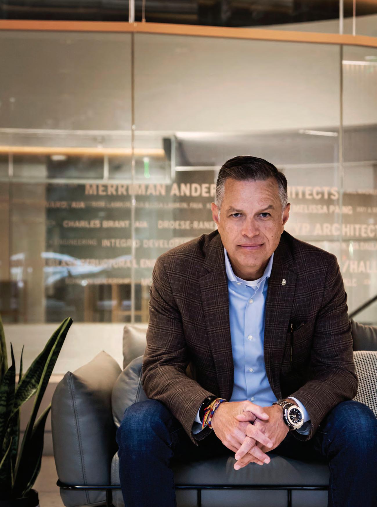
PROFILE
Photo by Liane Swanson
It’s such a great thing to have the connection that we have with having grown up in the same country with a lot of things that are similar. Share a little bit about growing up?
My dad was in the military. He’s a colonel retired from the Colombian army. So we moved all over the place. I think my mom counted about 17 deployments, a couple abroad. But very fun young years, getting to know lots of different cultures and exposed to other things. I was involved in the Boy Scouts. And being the son of the army colonel, I was dreaming on becoming a navy officer.
At what point did you want to become an architect?
The biggest influence was my teacher in high school. The last two years of high school, I took architectural drafting, taught by an architect. It was more like a studio, so it was very fun. We had to do lots of research on why we were doing what we were doing and talk about context. And we did models. All the drafting back then was by hand. But I fell in love with that.
I did go to the naval academy after high school. But about a year and a half later, I realized that my thing was architecture and decided to call it quits.
How did your parents feel about this change?
They were definitely not fond of it. My older brother was already in his senior class in the equivalent of West Point. And my little brother was about to enter the air force. So I was breaking the rules.
Why and when did you decide to move to the U.S.?
That was a tough decision that my wife and I made over 20 years ago now. We did it for our daughter Manuela. Manuela was diagnosed with a severe case of autism. We thought the opportunities for her for a better future were higher here in the States. She was 3 years old back then. And we were young and crazy. We really didn’t think it through. It took about only six months between the date that we decided to do it and the day we landed in Tampa.
So you moved to Tampa first. How did you come to Dallas?
We landed there and went through all the craziness of becoming legal residents to the United States. I couldn’t find a job because first the paperwork was in the process. And also my English was terrible. I finally found a job, and everything was going very well. Then the bubble burst in 2007 or so, and my employer started making staff reductions, and they held on to me as long as they could. At the beginning of May 2008, they had to let me go. I couldn’t find a job in Tampa, so I expanded the search. I told my wife we had to consider moving out of the state. She said, ‘Well, why don’t you look in Dallas, where my sister lives?’ So, I started applying remotely, trying to land interviews. It was nearly impossible to get an interview. On July 5, I packed my computer, my suit and ties in my car, and I drove from Tampa Bay to Dallas to start applying in person. And I started knocking on every door and put in my resume across the entire DFW area. On July 21, 2008, I received the offer from SHW, now Stantec. The family joined me on Aug. 8, and here we are.
In Colombia, professional interactions are more formal. How did working in Colombia differ from working in the U.S.?
What I found different is how the residential market is not in tune with architects here in the States. I feel that we as architects, when it comes to the residential, we have an eye on the custom high-end residence. But the rest of the world, if it’s not a high-rise downtown, it is not for us. It’s more developers covering the suburbs of North
America without an eye of an architect, without the influence of an educated professional in creating dwellings. We take the suburbs, and there is this sprawl of housing that we live in. We sort of turn a blind eye to what’s happening there. And of course, now it has grown so much.
Why that is the case here, and not in places like Colombia, is here you don’t need an architect. In Colombia, if you’re going to build a house and you’ve got a permit for the house, you’ve got to have a set of drawings that are signed and sealed by an architect. And I think it would have made a big difference in the U.S.
Now, from the other perspective, the cost of housing would be impacted by having that professional engaged in every house. But it certainly has impacted the way houses, developments, and cities look because of that, so that’s a great point. When did you decide to join the AIA?
I joined in Tampa Bay as soon as I could. I was not licensed yet here in the States. I was still going through all the craziness of the transcripts and stuff. So, I joined as an associate, and I remember going to the events without knowing everybody. I just saw in the calendar there was an event, somebody will share a project or something, and I will put on my best shirt and go there and start trying to engage in conversations here and there. My wife used to say, ‘How can you just show up somewhere where you don’t know anybody just to talk,’ and I’m like we must somehow meet people.
I ended up moving to DFW, and soon after I was going to some events trying to engage. About two years later, I was a member of the Latinos in Architecture (LiA), a newly formed network. And a little down the road, I became a chair for LiA. And somehow Zaida [Basora] discovered me and started inviting me to places and committees and the board and the Texas Society of Architects, and here we are – very, very involved since then.
You make it sound easy, but I know it’s been a lot of work. The first time I met you, you were still chairing the LiA Network. And I remember a lot of people showing up for events, and you told me, ‘Maria, it’s so easy. You just have to put some Latin music on if people want to dance.’
That’s what networking is about, helping people with the experience. One of the things I appreciated about the AIA is there has been a very concerted effort in making it a lot more approachable. The first time I went to the AIA in the early 2000s, it felt like a club many people didn’t belong to, including me. And slowly I started to get engaged. I’ve noticed through the years how much more open and welcoming it is. It’s moving in a great direction.
What do you think is the most compelling reason for members to join and engage in our chapter?
I’m one of those who get paid to do what I love. Architecture is my passion. AIA is that stage where I get to share with colleagues and peers about what we do, celebrate great design, learn, mingle, write. AIA, for me, is the architect’s playground. And the AD EX is our clubhouse, our treehouse. What is the most compelling for me is, ‘Hey, would you like to share and talk about what you love, what your passion is, and learn and share ideas?’ And AIA gives us this great stage to celebrate what we do.
Interview conducted by Maria Gomez, AIA, principal at GFF. It has been edited for brevity and clarity.
40 COLUMNS // aiadallas.org
At Corinth Street and Riverfront Boulevard, just south of downtown Dallas and near the Trinity River, is one of the more, shall we say, unique buildings in Dallas.
Before you even get to the building, you are greeted by one of Dallas’ most iconic signs, in the shape of a barn with an enormous longhorn steer set beneath it. Once past the sign, you see nearly 25-feet of a faux facade, a Western-themed bonanza that fronted one of the most famous music venues and honky-tonks in Texas – the Longhorn Ballroom.
The Longhorn Ballroom’s history is as fascinating as the exterior is kitschy. The building was called the “Astrodome of Country and Western Music” by the Dallas Times Herald in 1968 for its sheer size. Then there were the colorful owners and managers who ran the venue over the years. During its heyday, the Longhorn welcomed an impressive array of musical acts to its famous stage. While known for country-western, it also hosted musical genres from blues to punk rock. The Longhorn was certainly no ordinary honky-tonk!
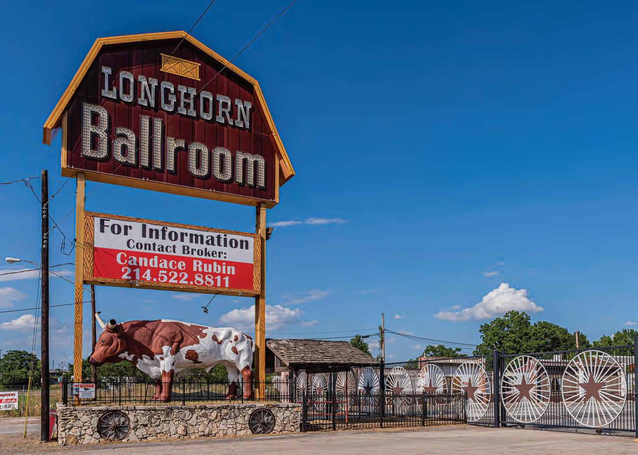
In 1950, millionaire O.L. Nelms erected the building that would become the Longhorn specifically for Bob Wills and his Texas Playboys, with the venue named Bob Wills Ranch House. Wills, a renowned entertainer known as the “Father of the Western Swing,” played there on a regular basis with his band, and he even kept his famous horse, Punkin, in a special stall inside the building.
The Ranch House was simple in construction, with three large, connecting side gable roofs supported by a metal truss system to cover the 23,000 square feet of interior space. The venue could seat 2,000 and had a 4,000-square-foot dance
floor. The exterior was also simple, with a plain stucco facade featuring a stone veneer water table and stone veneer surrounds around the exterior doors. Patrons entered the establishment under a barrel-vaulted canvas canopy that extended from the building and bore “Bob Wills Ranch House” in lettering. The westernization of the front of the building would come later.
Wills was better with music than he was with managing the Ranch House, and it reverted back to Nelms in 1952 over financial issues. The infamous Jack Ruby then leased the building and tried his hand at running the club, bringing in rhythm and blues singers before returning to country-western acts. Ruby also brought in Douglas “Dewey” Groom to fill the club and run the door after Groom’s success with running the Longhorn Ranch in downtown Dallas. Just like Wills, Groom was a country-western musician with his own band who played regularly at the Ranch House.
Groom gave up management in 1954 and left the nightclub business to try barbering, which didn’t last long. He returned in 1958 to the Ranch House, leasing the space from Nelms. At that time, Groom renamed the venue the Longhorn Ballroom and ramped up the business, bringing in well-known acts and attracting national attention.
In 1967, Nelms offered Groom an opportunity he couldn’t pass up — a chance to buy the club for $350,000 with no money down. Groom jumped at the chance and sunk $250,000 of his own money into the building and business operations. That is
41 COLUMNS // aiadallas.org LOST + FOUND
By David Preziosi, FAICP
Photo by Michael Cagle
when the ballroom got its Western-themed look that became emblematic. To achieve the new look, the front was clad in cedar board and batten siding, faux windows with painted curtains, and a fake saloon and livery stable appended to the facade. Murals by former vaudeville artist Lillian Murphy were also incorporated into the design.
The 50-foot-tall Longhorn Ballroom sign was installed in 1968. The sign included a longhorn steer that, according to Longhorn Ballroom, was the world’s largest replica at 14 feet high and 21 feet long with a whopping 18-foot horn spread. The steer was corralled in an iron fence on top of a limestone wall with inset wagon wheels. Above the longhorn was a sign board to advertise the acts performing there and the barn-shape top with the words Longhorn Ballroom emblazoned in lights.
Over the years, Groom built Longhorn Ballroom into one of the greatest country-western venues of its day. The artists that played there represented the best: Loretta Lynn, Merle Haggard, Conway Twitty, George Jones, Ray Price, Charley Pride, Tammy Wynette, and Willie Nelson, a personal friend of Groom’s who played there monthly. The place was so wellknown on the country-western circuit that Conway Twitty said, “You are never worthy of the Grand Ole Opry unless you have played the Longhorn.”
Groom also leased the venue to other promoters who brought in jazz, blues, and R&B performers such as B.B. King, Lionel Hampton, Nat King Cole, Al Green, Otis Redding, Ray Charles, and James Brown. By the late 1970s, the venue opened up to other popular music, including the Sex Pistols, whose
notorious event in 1978 gained worldwide attention when band member Sid Vicious performed with a bloodied face.
By the 1980s, business was still good but Groom was getting up in years. He spent almost every night at the Longhorn, which took a toll on his health. In 1986 he sold the place to Ira Zack, who painted over the murals, added copious amounts of neon to the interior, jettisoned the original wagon wheel light fixtures, sunk the dance floor, and added more stage lighting and a new sound system. The new direction also included a different spectrum of music with George Thorogood and the Destroyers, the Red Hot Chili Peppers, Georgia Satellites, and more. Zack committed suicide not long after the purchase, and the management of the club fell apart. The building was foreclosed on in 1987.
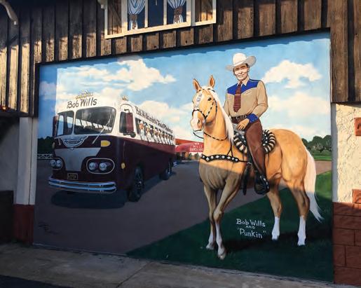
Fred Alford purchased the building later that year, reopening it on New Year’s Eve. He returned the venue to its countrywestern roots and put his own stamp on it with antiques, a larger stage, and new sound and video systems. Loretta Lynn, Waylon Jennings, and Johnny Cash played there, and Alford started a Texas Walk of Stars honoring singers that included Ray Wylie Hubbard, Michael Martin Murphey, and Johnny Rodriguez.
In 1989, the Longhorn made its TV debut in Aerosmith’s video “What it Takes.” In the video, Aerosmith makes a surprise appearance at the club, performing before a rowdy crowd that gets out of hand.
Alford sold the property in 1989 to Jeff Chapman, Jimmy Francis, and Mark Francis, who ran the Longhorn until 1996, when it sold to Raul and Rosalinda Ramirez, who had operated the neighboring Raul’s Corral Mexican Restaurant since 1984.
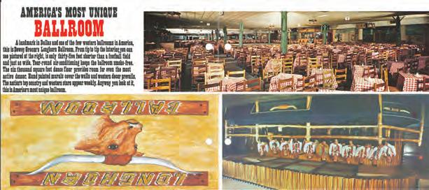

42 COLUMNS // aiadallas.org
Top and right: Images from a vintage brochure advertising “America’s most unique ballroom,” the Longhorn Ballroom. / Credit: Preservation Dallas // Left: Stylle Read’s murals pay tribute to the Longhorn Ballroom’s beginnings. / Credit: Preservation Dallas
As with past owners, they made some changes and brought in more of a Hispanic flavor in their remodeling, including stuccoing the entrance. The focus was more on Texas and Mexican artists, including Selena, who performed there many times. They also rented the space for quinceañeras and Cinco de Mayo celebrations.
In 2017, Jay LaFrance bought the property to save the legendary landmark from being lost to new development and to make it a premier entertainment venue again. LaFrance removed years of alterations to get closer to the Longhorn’s 1967 appearance. The red and pink paint on the cedar and stucco siding was carefully removed, the original cedar wood stain returned and the stucco entrance reclad in cedar. He brought in legendary muralist and music historian Stylle Read to create new murals that stayed true to the originals and even featured Bob Wills and Dewey Groom.
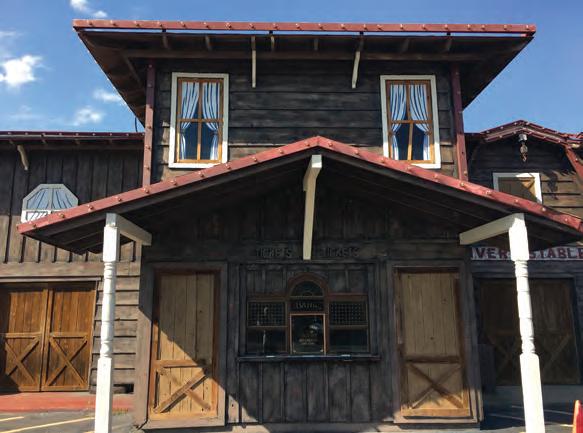
Inside, the Saltillo tile floors from the last remodel were removed and the antique bar restored. The wagon wheel chandeliers, found on the site, were restored along with an original 1960s sign reading “Howdy Pardner, A Big Texas Welcome to the Longhorn Ballroom.”
The iconic Longhorn Ballroom sign also needed attention after the barn portion of it blew off in a storm in 2005. The missing part was also found on the site, restored, and reinstalled.
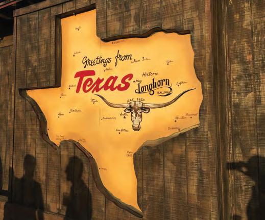
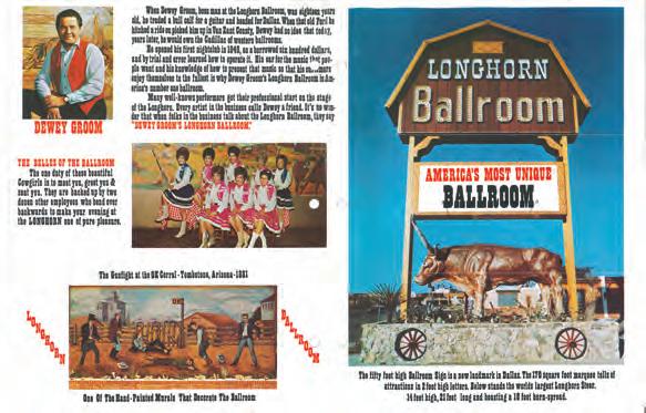
LaFrance’s work won a Preservation Achievement Award from Preservation Dallas — so far the only one given for the restoration of a faux facade.
COVID-19 unfortunately took its toll on the Longhorn Ballroom in 2020 with the required closure of business and event spaces. With no musical acts, weddings, or conferences to support it, the venue went into foreclosure again. In the summer of 2020, the property sold at auction, to new owners who had no plans for the site or saving the Longhorn. However, its future began looking brighter as developer Edwin Cabaniss purchased the venerable institution in the fall of 2021. He has extensive experience with historic musical venues such as the Kessler in Oak Cliff and The Heights Theater in Houston. After a restoration, the Longhorn reopened to great fanfare in March 2023, with Asleep at the Wheel as the first headliners of the new era. Cabaniss’ big plans for the Longhorn and the property have brought the legendary Longhorn Ballroom back to life with more amazing music, boot scooting, and patrons having a good ol’ time in one of Dallas’ most unique entertainment venues.
The Longhorn Ballroom is now under review for the National Register of Historic Places, and it has certainly had a legendary history. Like many of the musicians who have graced its stage, it’s had its share of ups and downs through over 70 years of multiple owners and changes. While the building is more kitsch than good design, it is still important for its cultural significance and the musical talent who took its stage.
43 COLUMNS // aiadallas.org
David Preziosi, FAICP is executive director of the Texas Historical Foundation.
Credit: Preservation Dallas
By Andrew Barnes, AIA
PARTY IN FRONT, BUSINESS IN BACK: HOTEL REVEL
The 1165 8th Avenue building in Fort Worth’s Near Southside district is a surprise. Sitting along a street lined with buildings that feel as familiar and unsurprising as the heat of a Texas summer, 1165 stands out from blocks away. The large steel fins, the singular expression, give the building its identity. The project’s siting and orientation — up against the street — is commendable, helping establish an urban edge in this popular, relatively dense district.
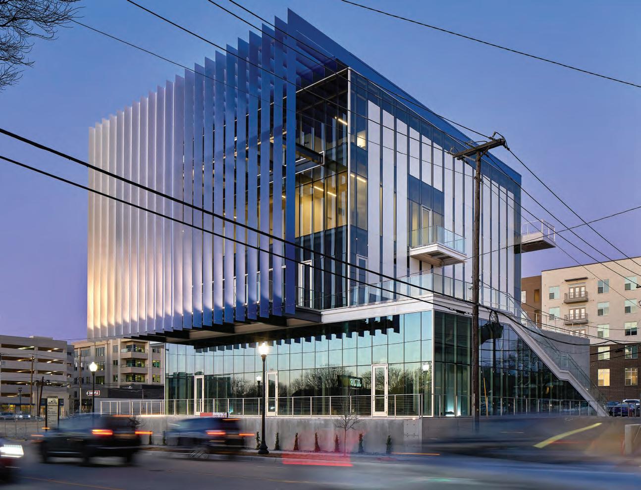
44 COLUMNS // aiadallas.org DETAIL MATTERS
Photos by Dror Baldinger, FAIA
The building undeniably commands attention as it faces the street, with the all-glass facade protected behind layers of terraces and the prominent fins. It is a building that demands another look; a passerby cannot fully understand it with a casual glance or a quick drive past.
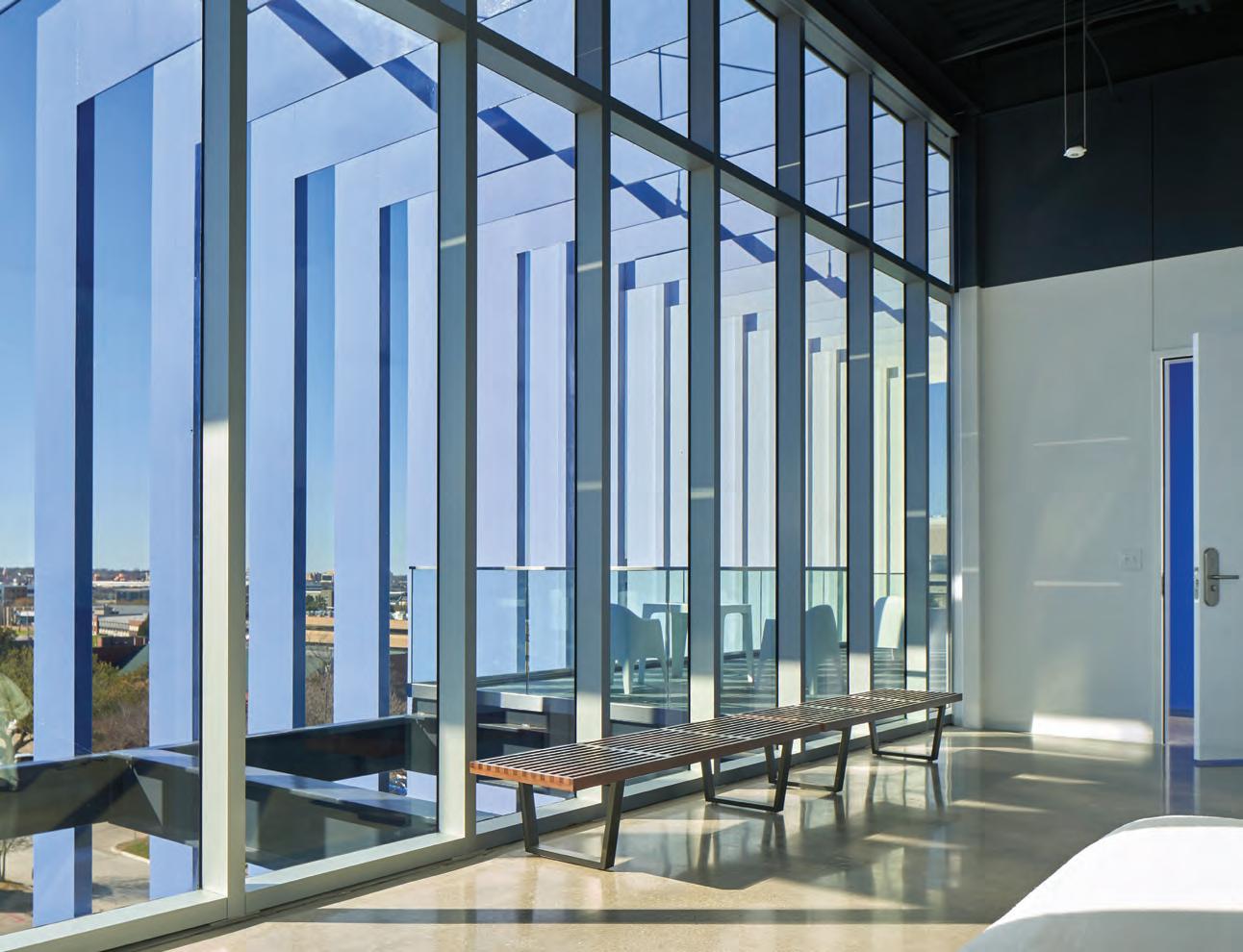
With the detail and drama of the front, the rear facade is relatively utilitarian as it looks onto the parking lot that serves the building. Dominated by an exterior exit stair, the mostly concrete facade, and its few windows welcome most of the project’s visitors, who come by car.
But the building ’s front-to-back imbalance of detail and articulation does not diminish the elaborate and sophisticated structure of the front facade, with the fin-terrace-curtain wall sequence. The plates that comprise the fins, welded together and ground so smoothly that the joint is impossible to see, are stabilized by the tubes to which they are welded on the backside. The welds are pristine, and even when stitch welds are used in lieu of continuous, their precision and regularity should be enough to satisfy even the most meticulous of detail-oriented architects; I’m looking at you, Ben Reavis.
The open metal grating that forms the floors of the terraces provides an interesting view up through the terraces all the way to the top of the fins. But as my wife would remind me, a man must have designed it as it is not a friendly treatment for women who might be wearing skirts or dresses.
At the top, the fins turn 90 degrees and run horizontally. The outermost fins continue for the entire length of the building, forming a band above the perfectly smooth curtain wall. This horizontal steel continuation of the fin is also perfectly in plane with the glass below and is one of the most impressive details of the project, bringing disparate systems in perfect alignment.
Overall, Ibañez Shaw has created an impressive edifice, with a materiality usually reserved for projects like museums yet somehow employed in a spec office and retail building. If you are driving down 8th Avenue and find the prominent blue-to-white gradient of fins beckoning you, stop by and take a look — and get a drink at the hotel bar, also designed by Shaw.
Andrew Barnes, AIA is co-founder of Agent Architecture.
45 COLUMNS // aiadallas.org
UNIQUE. DISTINCT. FACADES.
Williston Basin International Airport
Location: Williston, ND
Architect: Alliiance
Dri-Design Metal Wall Panels are available in a nearly unlimited palette of colors, materials, finishes and textures, making them a unique offering among other facades. However, what makes Dri-Design distinct, is that it provides this unique range of design options, in a system that installs and performs even better than it looks. A combination of form and function that is truly distinct.
• No sealants, gaskets or butyl tape means no streaking and no maintenance for owners.
• Not laminated or a composite material, so panels will never delaminate.
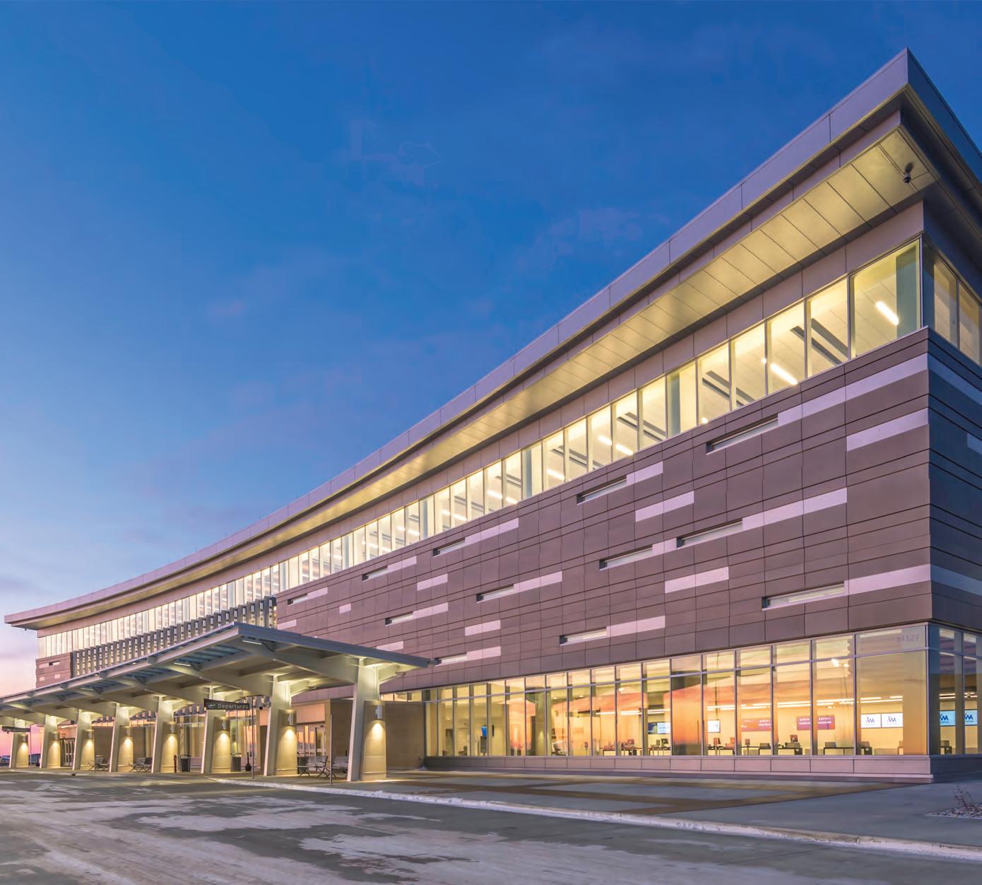
• At Dri-Design, we have a strict policy of recycling and creating products that the world can live with.
• Fully tested to exceed ASTM standards and the latest AAMA 508-07.
• Available in a variety of materials and colors.
• Non-combustible and NFPA-285 compliant.
616.355.2970 // DRI-DESIGN.COM
MATTIA FLABIANO, AIA

Mattia Flabiano, III, AIA, ACHA is president and senior principal at Page, where he has practiced since 1980. His experience at Page prepared him with the leadership skills which have allowed him to take on positions with many organizations both within and outside the profession, including as the 2021 and 2022 president of the Architecture and Design Foundation. Here, past Foundation president Emily Henry, ASLA visits with Mattia about his background, inspiration, and what he envisions for our city.

PROFILE
Photo by Liane Swanson
Where did you grow up?
I was born and raised in Dallas and am the oldest of four boys of an Italian family. My grandfather immigrated to New York in 1921 from Canada and started a terrazzo business in Dallas. My brothers and I all went to Hillcrest High School in Dallas, and, besides my move to College Station for college, I never left Dallas. I ventured off from our family business to become an architect and now live in my family heirloom house, aka the House of Terrazzo, in North Dallas. I have proudly worked at one firm for 40-plus years and although I haven’t lived in any other state, I have he has traveled all over the world representing Page. What inspired you to practice architecture?
Starting at 12 years old, I worked alongside my father, uncle, and grandfather laying terrazzo. I worked all throughout high school, college through holidays and summers. The more experience I had in the field, the more I was inspired to be the one designing the whole building versus focusing on just one detail of the building.
My career at Page started in 1980 after I graduated from Texas A&M. At the time, Page focused primarily on health care work. I learned everything I know about health care planning from my mentor, Kang Wei, until he retired about 10 years ago. Eventually, Page began to diversify into all mission critical work around 1985 and became increasingly more diverse in various project types. Now I act primarily as a generalist. I run the Dallas office, sit on the board of directors, which drives the business strategy and goals for the firm – over 700 people – as well as lead many of the business development pursuits and strategies for project interviews.
When do you feel most energized or excited about your work?
I feel most excited when developing a strategy for our clients and for a project pursuit. No matter the size of the project, I like to act as a live wire Energizer bunny that pumps up the team and prepares the pursuit approach with great enthusiasm.
I am also energized when serving on various boards that share my passions and values. I’ve been the chair of the Board of Directors and the Board of Governors for Downtown Dallas Inc., I’m the immediate past president of the Architecture and Design Foundation, I sit on the AIA Dallas Board, and I just stepped down from ArchiPAC, which lobbies to help push AIA’s strategic missions forward – climate change, resilience, small businesses, etc. – at the national level. I also represent Page on the AIA Large Firm Roundtable, including the Diversity, Equity, and Inclusion Committee, and finally, I serve on the Advisory Council at Texas A&M College of Architecture and chair the Equity, Diversity, and Inclusion Committee.
What drew you to participate on the Architecture and Design Foundation Board?
I am inspired to develop a message that energizes and activates our members and community. This started nationally with my involvement in ArchiPAC, and then Joe Buskuhl approached me to get more involved locally. I really like that the Architecture and Design Foundation is outwardly focused. It is a powerful way to educate the community about the relevancy of architecture and
design in our communities. I get excited about reinvesting in my community and supporting programs and events. Although I grew up in Dallas, most of what I learned about the communities in our city was through my involvement in the Landmark Commission (15 years). This taught me important lessons about how to bridge the gap between growing communities alongside development without ripping the heart out of the existing neighborhoods. This has driven me to communicate why architecture and design is critically important in helping to solve these issues.
I noticed that you are involved in a lot of Diversity, Equity, and Inclusion subcommittees. What inspired that?
Whitney Young Jr. came before AIA in the 1970s and shared that only 2% of architects are Black. Fifty years later, we still have the same problem. We need to change this. We need to be purposeful and set tangible goals to increase diversity within the architecture community. The 2030 challenge was established to double the number of Black architects by the year 2030. The investment starts with exposing parents and children to the profession and support their education through programs and scholarships. Ultimately, the hope is that this will influence kids that this is a viable profession, and you can utilize this degree to give back to your community. Architecture impacts so many people through planning, housing, etc., and empowers creating vibrant communities that can sustain themselves economically and socially while celebrating diversity and inclusion. It makes me excited.
What do you believe is Dallas’ greatest asset? Greatest challenge?
Dallas’ greatest untapped asset is the Trinity River corridor. Other cities such as Tulsa have capitalized on a similar asset and created an unbelievable public realm for the community to gather and enjoy a variety of amenities.
Dallas has a strong can-do business community that strengthens our city. We need to ensure that we capitalize on this momentum and promote businesses without leaving the community behind. The fact that we have food deserts in our city is almost criminal, especially with the economic growth we have seen over the last 40 years. Dallas’ greatest challenge to balance those two.
If you could have any superpower, what would it be?
Unlimited empathy. You don’t see that one in the movies, but it’s lacking in our world today across the board.
What do you hope your legacy will be when you are gone?
To have made an impact, specifically with all the organizations in which I have been involved. I spent time and energy to expand the influence of these organizations, whether funding strategies or my efforts allow the board and Foundation to focus on programs, scholarships, and the highest need.
Interview conducted by Emily Henry, ASLA, director of business development at Studio Outside. It has been edited for brevity and clarity.
48 COLUMNS // aiadallas.org
CALL FOR AUTHORS + CONTRIBUTORS
Have an idea for an issue we haven’t covered? Looking for a chance to contribute an article? Interested in publishing your art or photography?
Share your interest with the editors by sending an email to jenny@kielarch.com
Over the years, the mission of Columns has evolved as it has transformed from an industry-only publication, to one that examines our communities through the lens of architecture and design. Columns allows readers to learn more about the past, present, and future of where Dallas, architecture, and culture intersect, and how they can engage in the conversation.
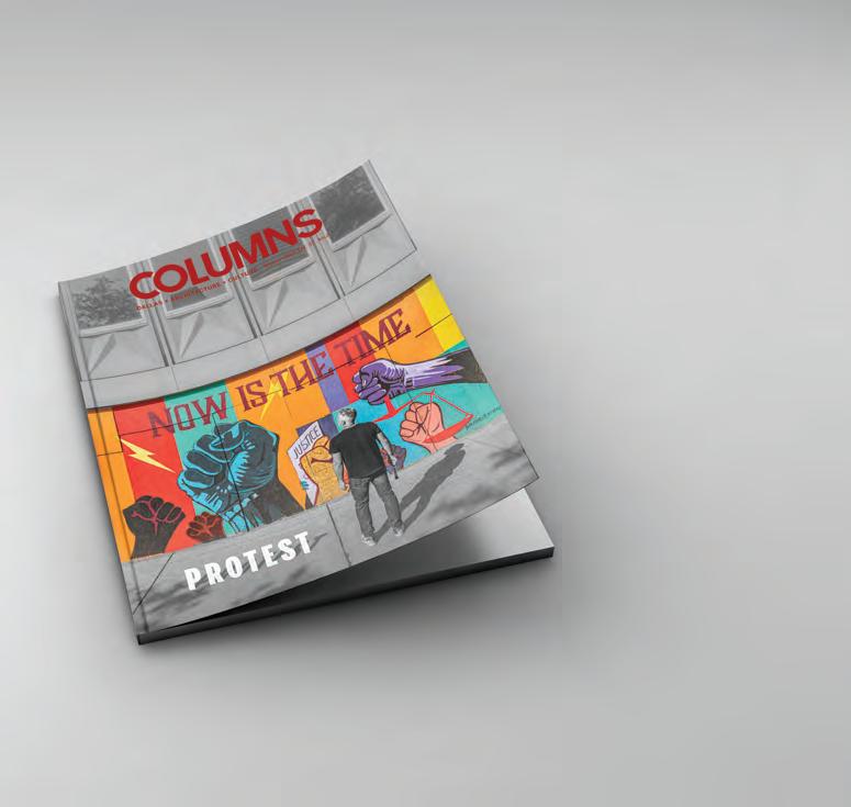
Be Part of the Conversation.
Columns Needs More Voices and More Content
49 COLUMNS // aiadallas.org
ZEST, ZEAL,VERVE
A
HIGH SCHOOL’S JOURNEY FROM BLIGHT TO BRIGHT
By Alexander Quintanilla, AIA
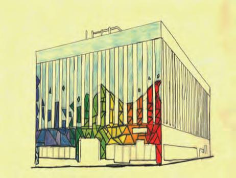
“When looking at the mural the first three words that come to mind are colorful, geometric, and energetic — words that would not typically be used to describe a building in downtown Dallas, and on top of that, a school in downtown Dallas.”
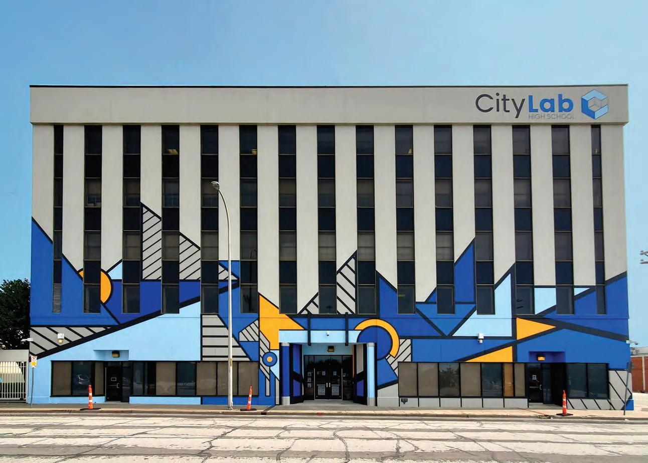
50 COLUMNS // aiadallas.org
PUBLIC ARTS
Imagine stepping back in time to when you were in high school. Hopefully you were proud of the way your high school looked; maybe it had a brick facade with the school’s name carved in stone on the front or maybe it had a large football stadium that everyone talked about.
One thing is for sure: CityLab students are proud of theirs. Why? Because they designed a striking mural on the front of their school. And because this mural tells a story.
Constructed in 1977, the unassuming five-story, cement block building at 922 S. Ervay in Dallas did little to add to the neighborhood around it. The L-shaped seriously lacked character, with blank walls on four of its six sides. When it became CityLab High School in 2017, it failed to reflect the pioneering spirit of its bright young students, staff, and teachers.
When the proposal to liven up the building with a student-designed mural across the front arose, it received funding from the CityLab HS Foundation, an independent nonprofit group that advocates for the school, as well as from Downtown Dallas Inc.’s Matching Grant, which funds improvements to public spaces throughout the city’s center.
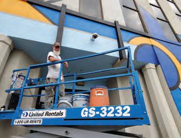
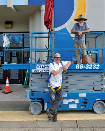
With funding secured, CityLab students set off to design a unique mural for their school. Led by former teacher and school co-founder Peter Goldstein, AIA, and by Janeil Engelstad and Delaney Smith of Making Art with Purpose (MAP), the students each hand-drew colored perspective renderings. Each proposal included a mural title and a narrative explaining the design. There were several extraordinary proposals, making it difficult to choose just one. After several iterations, the final design featured geometric shapes of blue, yellow and black, rising from the ground plane and dissipating near the third floor. The mural is titled “Zest/Zeal/Verve,” because, in the words of CityLab HS graduate Dylan Zarrabi: “When looking at the mural the first three words that come to mind are colorful, geometric, and energetic – words that would not typically be used to describe a building in downtown Dallas, and on top of that, a school in downtown Dallas. ... When looking at the three words for our art piece, one thing is clear – these words all share a similar meaning, and that meaning is ‘full of life.’ My view is that the mural creates a sense of curiosity and interest about the school while simultaneously reinforcing the idea that CityLab is a new school and that it is not only an architecture school, but an environment where young minds thrive, and innovation is not resisted but is instead encouraged.”
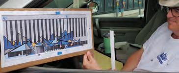
The next task for the students was to submit the design to City Hall for approval. Their proposal needed to comply with requirements for Dallas’ Special Purpose Sign District, an area in downtown where regulations for signs, banners, and murals are more restrictive. After navigating through the different processes, applications, and city departments, the students obtained a Certificate of Appropriateness for their mural.
As time came to finally paint the school walls, Eyecon Studios of Dallas joined the project. Eyecon also painted The Storm at Crockett and San Jacinto streets as well as the side of Bishop Street Market in Bishop Arts, among others. Led by Chris Arnold, the team carefully replicated the student’s work. Day by day, students could slowly see their mural come to life. Finally, in early September 2020, the mural was completed. It had been a long journey for the students and the teams involved, but the work was well worth it. A forgettable building now stands a proud contributor to the surrounding neighborhood. More important, it tells a story about the bright young minds who occupy it every day.
51 COLUMNS // aiadallas.org
Alexander Quintanilla, AIA is the founder of Q Architecture + Design.
Credit: CityLab High School
DALLAS’ CRYSTAL PALACE: THE INFOMART
By Alison Leonard, AIA
At the corner of Oak Lawn Avenue and Stemmons Freeway stands a Dallas landmark: the Infomart. You don’t have to be an art and architecture enthusiast to see its resemblance to London’s Crystal Palace. But why place a 1.6 million-square-foot massive structure with Victorian styling at the south end of Dallas Market Center?
It started in the mid-1980s with a big tech idea and a creative interpretation of that vision for the future.
In 1983, technology was just starting to blossom, with the first Motorola mobile phones hitting the market, the first release of Microsoft Word, Mario Bros. playing on home Atari 2600 systems, and the IBM PC/XT sporting up to a whopping 640 KB of RAM.
The average household income in the U.S. was less than $25,000 a year then. At the same time, the Infomart construction cost neared $90 million — but that wasn’t an issue for Trammel Crow, Sr.
Trammell Crow Sr. was a visionary way before his time. In the 1960s, he told his friend Ross Perot about his idea for a technology marketplace, but the timing didn’t seem right. Fast-forward 20 years, and computers were becoming mainstream as demand grew and software prices dropped. Dallas was ranked as the fifth largest computer market in the U.S., and Apple manufactured more products in Dallas than in California.
One of the largest buildings in Dallas and one of the world’s first information processing marketing centers, the Infomart’s steel frame and curtain wall construction spans seven floors and over 18 acres on the Dallas Market Center site. In 1985, the building was the largest under construction in the Southwest and housed hospital-grade power supplied by four electric feeds and six interior transformer stations. The bandwidth capacity for the tenant fiber providers was somewhere near 26 trillion bytes per second. Yup, you read that right — 26 trillion.
Crow envisioned the center as a hub for conferences, seminars, and meetings. He wanted it to be a place to learn, where products were displayed but also challenged and innovated. In addition to the 910,000 square feet of retail showrooms, there was a large auditorium and several conference and seminar spaces for ongoing educational events. The expansive seven-story atrium ties the entire building together and extends the entire 400-foot length of the building. The structure was also built to handle a significant expansion to 15 stories in the future.
Fort Worth architect Martin Growald and team designed the Infomart. Multiple designs, including brick and brownstone, and stacking vocabulary were shared, but the team settled on a
familiar, elegant concept intended to be a modern interpretation of the famous Crystal Palace in London.
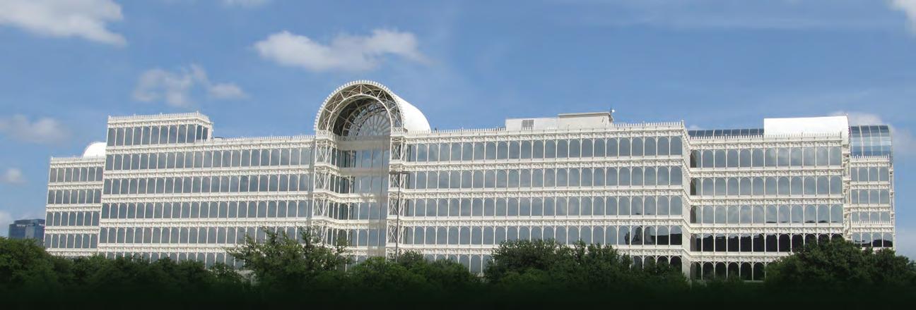
The Crystal Palace, built in 1851 for the Great Exhibition of technology and arts, had over 300,000 glass panels and was supported by 3,800 tons of wrought and cast iron and towering at 108 feet tall. Engineer Joseph Paxton, inspired by the delicate structure of a giant water lily, incorporated new modular design concepts for the building to be assembled and then reassembled elsewhere in record time.
“What do you house the future of technology in? That was the design challenge,” Chandler Growald, one of Martin’s sons and an architect, recalls. He remembers working as a teenager on the Infomart design with his brother at his father’s office and the numerous renderings drawn through a large-scale process way before the time of Revit.
Fred Fernandez, one of the 20 architects that worked under Growald for over five years on the project, said the team created hand-drawn, layered elevations with pen on mylar to study the building proportions, mechanics, and technology.
“The design was meant to be friendly and delicate. We had a half-size set of the original Crystal Palace drawings, so the design is historically correct,” Fernandez said.
Chandler Growald said his father admired the recognizable glass hero.
“The palace represented the future of technology for that time, during the Industrial Revolution. In the ’80s, there was apprehension about new technology coming into the marketplace. The similarities to the Crystal Palace are tied to the past and to what the project team felt would be a new era for the computer age. The design draws you back to a more comfortable time, and the Crows thought this concept was brilliant for the iconic project.”
Chandler Growald applauded the working components of the building like the inner workings of escalators. He was impressed by the double and triple height spaces and the atrium’s oak blend floor. And one of the most commendable building details that few people know? “The curtain wall facade is made of recycled materials — beer cans to be specific,” Chandler said.
But the glass mega-structure was not loved by all. Referred to as “a big glass soap bubble” and “a glass monster” by some 19th-century architects, the Crystal Palace came under similar skepticism as its modern-day doppelganger.
Tragically, the Crystal Palace was destroyed by fire in 1936. Many in Dallas know the Infomart well and either love or hate its Post-Modernist presence. Often described as “beautiful,”
52 COLUMNS // aiadallas.org STORYTELLING
“offensive,” “witty,” and “with delicate contrast to the Black Box Trade Center next door,” one prominent theme is the glazing. The Crystal Palace had clear glazing allowing expression of the structure, while the Infomart has mirrored glass, most likely to minimize the heat load. Martin Growald was quoted in 1984, saying, “The Infomart is a trade mart, a concept old in Western society but brought to the zenith of perfection by the Crow companies, and in this case, bringing the concept together with the most exciting, effervescent creation in the history of mankind — the computer.”
“One thing I always admired about my dad was how he focused on a problem and solved it,” Chandler Growald said.
In addition to the Infomart, Martin Growald designed some of the best-known projects in North Texas, including One Main Place in Dallas, Tandy Center in Fort Worth, and the award-winning Dallas Communication Complex in Las Colinas. Growald was born in Massachusetts and grew up in Fort Worth. After playing football in high school, he attended Kilgore Junior College and went on to the University of Virginia on a football scholarship. That’s where he became interested in architecture, finishing first in his class and at one point living in Thomas Jefferson’s Monticello.
Growald continued to Harvard for his master’s degree and again finished first in his class. Later, he worked as architect and futurist Buckminster Fuller’s assistant, then scored a job at Skidmore Ownings Merrill in New York City. After working for clients such as Chase Manhattan CEO David Rockefeller on the banker’s Uptown office, the federal government on the Pennsylvania Avenue master plan, Henry Ford, and Aristotle Onassis, he went home to Fort Worth to work for the Crows, Clint and John Murchison, and the Bass Brothers. He’s also responsible for most of the trees and brick paving in downtown Fort Worth today.
Fernandez recalled Growald as a sometimes difficult taskmaster and an overachiever but a man also generous with his time and money. “Martin would entertain any visitors that were interested in design or just in seeing our workspace. He loved to talk about architecture. He was a great mentor and friend to me. I remember when I went on a vacation to NYC, he took care of part of it.” And Growald gave impressive and clever client presentations, he said.
“We were working on the Will Rogers Auditorium feasibility study, and I drew a large-scale section perspective — probably 24 by 36. He asked me to create a pull-apart model of the space,” he said.
Fernandez had some help, but the request was met. “I can remember him renting out space in a tower way above a project site to be able to show the client the project and then exactly where it would go through the window. Another time for an Arts District project, we presented a series of sketches on a brown paper scroll, all continuously drawn, and then we unrolled the paper at the meeting. It wasn’t uncommon for us to have one-fourth-inch polystyrene models of buildings and their sites.”
For the vintage T&P warehouse building, Growald contributed to the avante-garde growth spurt in downtown Fort Worth. In 1971, Growald’s friend Jack Schutts introduced him to Charles and Anne Tandy, whose Fort Worth-based Tandy Corp. retail empire included RadioShack, Color Tile, and other big names. They asked him to design the Tandy Center, a city
within a city, at a time when Fort Worth was enduring an image crisis. The building featured two towers, retail mall space, an ice-skating rink, and offices, as well as the signage that spelled out the building name in lightbulbs. After construction on the center was completed and earning two major awards, Growald did some small projects for Neiman Marcus. Then one day, after a six-month dialogue and years of trying to meet Trammell Crow Sr., Growald called Junior, who spontaneously told him to “come on over at 6.” The rest is history, and it includes Growald completing eight buildings for the Crows.
Whether you like the Infomart’s aesthetics or not, the building has served a distinct purpose and remains at the center of a growing technology powerhouse. The concept started a nationwide trend, with similar facilities popping up in Boston, San Francisco, and New York City in the late ’80s and early ’90s. Over the last decade, the building has been largely converted to data center uses after struggling to fulfill its original vision for retail and conferences.
Now data centers are commonplace in response to consumer demand and continuing to evolve — with a high price tag. In 2020, California-based Equinix, one of the largest data center firms in the world, paid a record $800 million for the Infomart, among the largest property acquisitions in North Texas. According to Equinix, the Infomart building is the fifth densest hub in the United States for banking, commerce, telecommunications, energy, medical research, and health care, along with transportation companies. With a growing need for more capacity, the campus recently completed a $142 million addition. DA11, the four-story, stateof-the-art center, is the first phase for the International Business Exchange (IBX) data center and its 5G and Edge Proof of Concept Center (POCC). Plans call for additional phases to double the size and capability of the space. Designed by Gensler and built by DPR Construction, the building is a striking contrast to the Infomart with solid, precast concrete walls that allow the form to follow function.
Growald was not a familiar figure in the DFW socialite scene. The father of three preferred to spend his time working and reading books on a small ranch he owned near Crowley with his wife, Laurie.
Growald said that successful architects need three things. “First, he’s got to have great ideas. Over and over and over again. Without great ideas, he’s dead in the water. But after those great ideas, he’s got to have someone to tell them to. He’s got to have a client. And after he has the client, he’s got to be able to create this vision for the future. The essence of success -- in architecture or any other field -- is to have a vision. He imagines this building in its finished state. When a client and an architect and a good idea occur, and the vision is there to be shared, it is magic. It is the elixir of pleasures, the ultimate elixir of pleasures. It is better than wine, better than women, better than anything. It is the most heady experience imaginable,” Growald said in 1984. Perhaps when you drive along Interstate 35 East past the Infomart, you will see the building a little differently. Maybe you’ll think of Martin Growald, his magic, and smile.
53 COLUMNS // aiadallas.org
Alison Leonard, AIA is vice president at Blue Cottage of CannonDesign.
“
MALONE CLIFF HOME
Like the steps at the Campidoglio,”
the client told Bill Booziotis, FAIA when referring to the central staircase in the home he was designing for her. The home, sited on Malone Cliff near Sylvan Avenue, is laid out with thoughtful considerations such as this one.
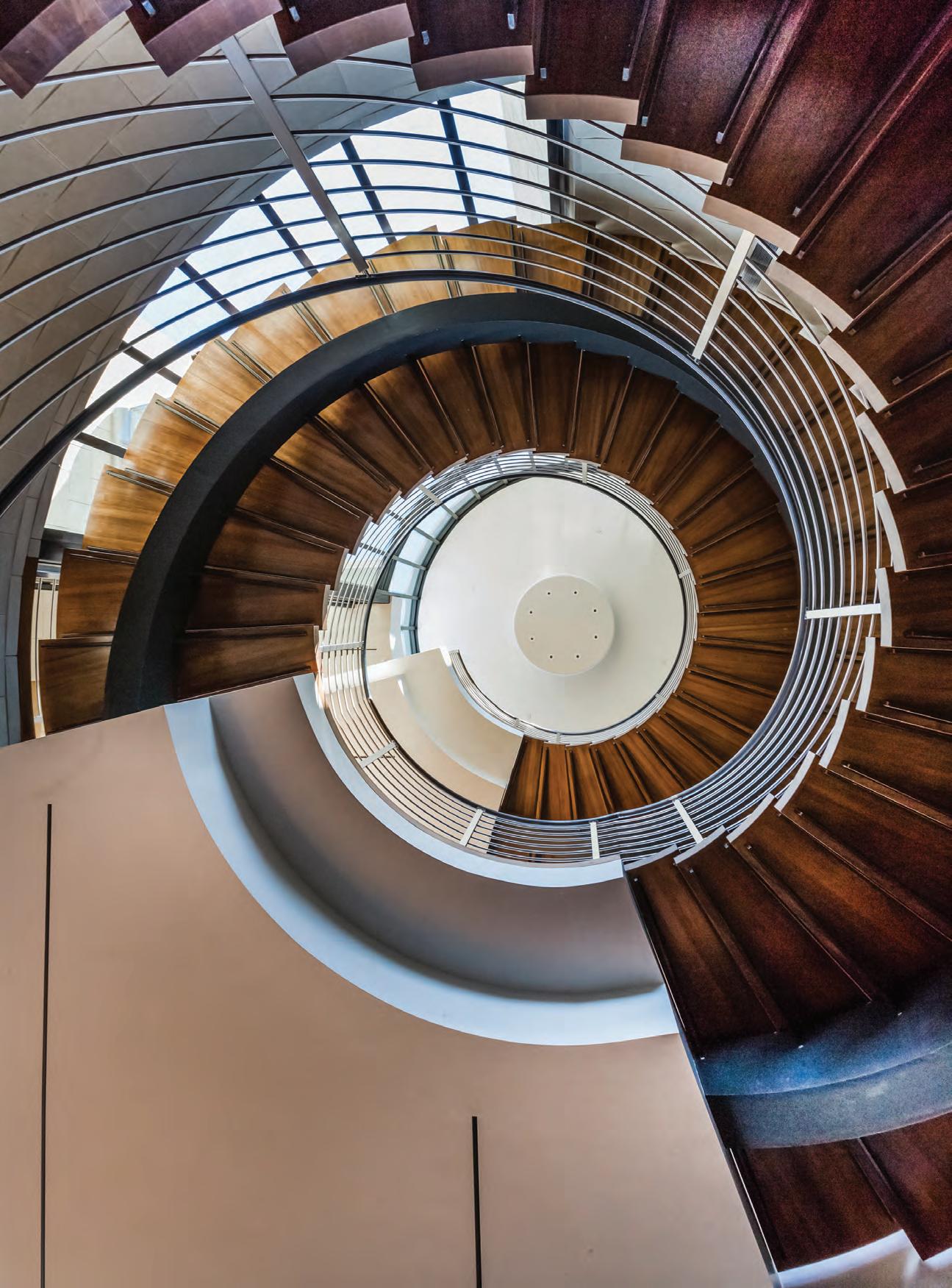 By Ricardo Muñoz, AIA
DETAIL MATTERS
The project began when the architect sketched a few ideas for a new home as a way to keep occupied while on a long trip to Norway and the Arctic Circle. The client had mentioned to Bill that were she to build a home, she wanted him to design it. This trip, a cruise, was the perfect opportunity to develop concepts.
When Bill returned from the journey, he presented different ideas, but one in particular worked well with the site and the views it offered. On Malone Cliff, the view of the Dallas skyline is east and slightly north, and the design concept made sure to take advantage of this. In plan, four piers, radiating from a single point, frame three connected spaces that all have large curtainwalls with views to the north and east. These piers not only help spatially frame the spaces, but they also act as structure and are made of concrete faced with Kansas limestone. The piers allow for uninterrupted interior spaces but also support cantilevers out from the cliff, the largest one 17 feet in depth. Bill’s desire to keep the floor assemblies thin at 10 inches in depth and flat underneath, with no drop beams, adds to the cantilevers’ dramatic effect.
From the exterior, on the south side of the project, the central stair of the home is expressed through a circular clerestory that takes on the dimension of the radial treads below. The shallow rise of the treads draws inspiration from the steps in Rome leading from the Piazza d’Aracoeli up to the Piazza di Campidoglio. The central stair, 20 feet in diameter, allows for light to enter from the clerestory and travel down to the lowest level as the treads stop short of meeting at the center. The treads also do not touch the outer perimeter, as they are supported by steel tapered bars perpendicular to a central box steel stringer that is only supported at two points (one at each floor).
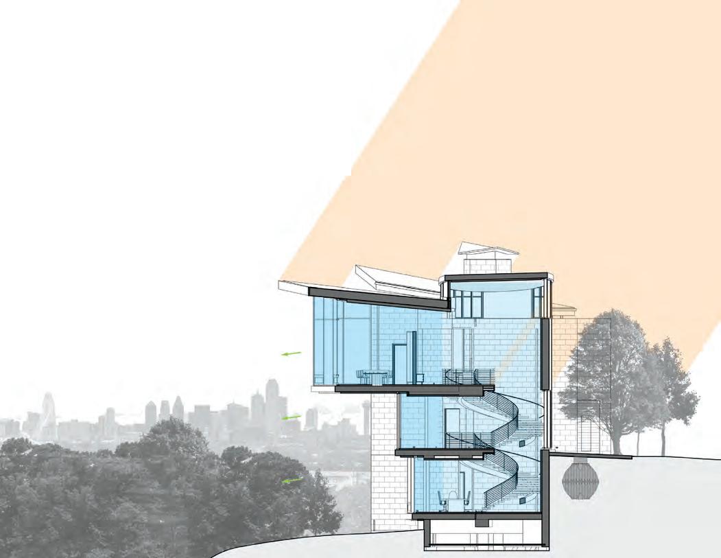
As an avid traveler, Bill gained a knowledge of the natural and built environment around the world that undoubtedly served as a deep reservoir of ideas and beliefs. The care and detail with which he designed this home demonstrate an understanding of space, structure, and light by an architect distinctly informed by experience and knowledge.
Ricardo Muñoz, AIA worked for Booziotis and Company Architects in 2006-2008 and partially credits his passion for traveling to Bill. Ricardo is associate principal at Page.
PROJECT TEAM
ARCHITECT: Booziotis & Company Architects

CONTRACTOR: Sebastian Construction Group
LANDSCAPE ARCHITECT: Kevin Sloan Studio
LIGHTING: Oldner Lighting
MEP ENGINEER: Dale W. Caffey Consulting Engineers
STRUCTURAL ENGINEER: Datum Engineers
Photos by Charles Davis Smith, FAIA
55 COLUMNS // aiadallas.org
Design Assist
With in-house Revit and CAD capabilities, BakerTriangle can provide advice and design influence early in the planning process. Budgeting efforts can be combined with design input to help provide the owner with the most efficient products and design.
Multi-Scope Approach
In an effort to provide better service to our clients, BakerTriangle offers drywall, acoustical, plaster, thin veneer, metal panel, plaster, and prefabrication packages to make the buying and on-site coordination process easier.

Prefabrication

Our prefabrication efforts span from interior drywall methods to prefabricated interior components and load bearing systems, with a heavy focus on exterior skin panelization. Build smarter. It’s not a product, it’s an approach.
Work with Experience. Work with Confidence. Work with BakerTriangle.

56 COLUMNS // aiadallas.org
Columns 2021.indd 1 12/4/2020 10:18:07 AM
INDEX TO ADVERTISERS
Risk Strategies 6 www.risk-strategies.com
SEDALCO Construction Services 58 www.sedalco.com

StazOn Roofing 57 www.stazonroof.com
TKO Associates Inc. 28 www.tkoassoc.com
WHY ADVERTISE?
Advertising in Columns means your firm will be well positioned to get in front of an array of subscribers, readers, and leaders who have come to rely on the premier publication in North Texas devoted to art and architecture.
Contact Jody at 800.818.0289 or jcranford@aiadallas.org.
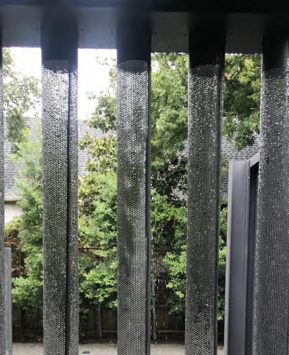
57 COLUMNS // aiadallas.org Acme Brick 3 www.brick.com Baker Triangle 56 www.bakertriangle.com Blackson Brick Co. OBC www.blacksonbrick.com Bonick Landscaping 10 www.bonicklandscaping.com Brandon Stewart Realtor 14 www.mod214.com Centre for Building Performance 7 www.centreforbuildingperformance.com Click Engineering 56 www.clickeng.com ClientPay 12 www.clientpay.com Davis-Hawn Lumber Company 58 www.davis-hawn.com DRI-Design 46 www.dri-design.com Eggersmann Kitchens | Home Living IBC www.eggersmannusa.com Glasshouse 38 www.glasshouseproducts.com Hartman Construction Inc. IFC www.larryhartmaninc.com HKS 24 www.hksinc.com Hossley Lighting and Power Solutions 4 www.hossleylps.com Hunt & Joiner Inc. 49 www.h-jinc.com JHP Architecture/Urban Design 11 www.jhparch.com JQ Engineering 28 www.jqeng.com Kirk Hoppper Fine Arts Studio 14 www.kirkhopperfineart.com L.A. Fuess Partners, Inc. 2 www.lafp.com Metro Brick & Stone Co. 5 www.metrobrick.com Oldner Lighting LLC 7 www.oldnerlighting.com Riddell Plumbing 57 www.riddellplumbing.com
2019 Summer Power - Riddell HOME Tour Ad_Layout 1 9/13/2019 12:21 PM P StazOnRoofing Est . 1980 CELEBRATING 40YEARS 214.357.0300 StazOnRoof.com ¼ page: 3.625 x 4.875”
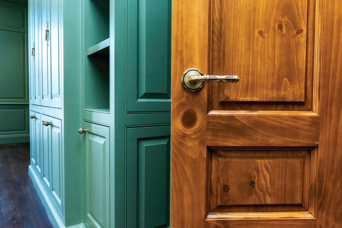
58 COLUMNS // aiadallas.org D DAVIS HAWN LUMBER & ARCHITECTURAL MILLWORK Dallas, Texas SINCE 1973
HILLCREST VILLAGE GREEN
Once upon a time, in Far North Dallas, an aging parking lot sat confined by a nondescript strip mall. Now in its place sits a welcoming green space embraced by invigorated retail. No remnants of the decaying lot remain. Instead, a new community gathering place brings together the best of public and private collaboration.
Hillcrest Village Green was a joint effort between SHOP Development and the City of Dallas. The city purchased the center lot from SHOP Development for the new park, which is within walking distance of several apartment complexes and two large churches. Although there are smaller parks nearby, the city recognized the need for a larger space capable of hosting programming and community events. In addition, the parkactsasanexus,withextensivepublicsidewalksstretching out into the community and increasing walkability.
Despite the division in ownership, the campus design flows seamlessly between public and private thanks to close coordination between Omniplan and TBG. Omniplan masterplanned the site and oversaw the retail renovation. TBG designed the park itself, including the landscaping, play area, and shade structure. Their designs intentionally reference and complement each other to create a cohesive experience for guests. Correlating aesthetics, like the park’s warm red
tiles and the structures’ terracotta roof, and complementary spatial design, including placing trees to maximize visibility from patio to playground, stitch the two spaces together.
Omniplan brought the retail structures “into the new century” with an updated facade and new architectural elements. Strategic color selection raises the heavy bulkheads visually to create a more inviting experience. Demolition of the entire north side structure opens the space, creates security for the play area, and replenishes parking once provided by the center lot.
The classic facade provides a clean backdrop for the TBG’s vibrant park design. Strong right angles define the park edge and impress down the promenade. The zigzag motif is reflected in benches, tile, pavers, and landscaping. Warm reds and tans dominate the main scheme but shift to cooler tones in the northern play area. Similarly, the angular pattern gives way to organic shapes to create a bio-referential oasis. The canopy of the shade structure mimics large tropical leaves. The climbing structure bends and slopes, highlighting natural elements of wood and rope. This stark visual transition creates just one of many sensory moments intended to delight visitors.
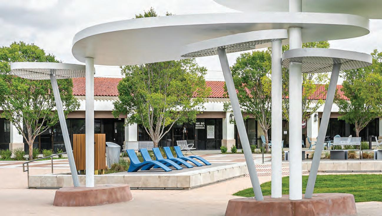
59 COLUMNS // aiadallas.org
Conleigh Bauer is membership manager at AIA Dallas.
IN CONTEXT
Photo by Conleigh Bauer
Residence of Virginia Savage McAlester, Hon. AIA by Alexander Quintanilla, AIA
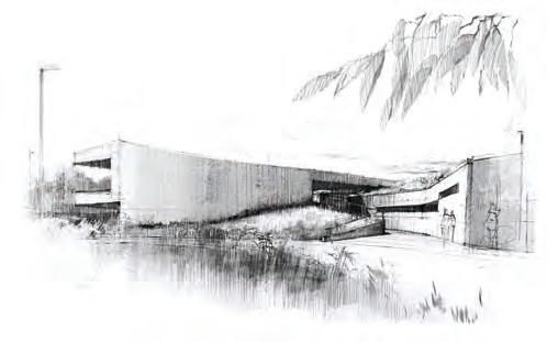
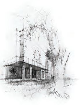
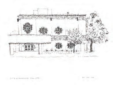
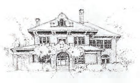
Sketching Kaleidoscope:
Viewing Dallas Through a Different Lens
In 2021, AIA Dallas, the Architecture and Design Exchange (AD EX), and the DFW Chapter of the National Organization of Minority Architects (DFW NOMA) came together to collaborate on a four-month long series of on-location meetups to sketch and learn about the diverse cultural history of Dallas. Each month’s free field sketching meetup featured a location of significance for Women’s History, Environmental Justice, Hispanic Heritage, and Juneteenth.
In addition to sharpening sketching skills, these events highlighted the cultural and historical context that created our current architectural and urban landscape. The Sketching Kaleidoscope series culminated in an exhibition of selected works over the summer of 2021. Pictured here are a sampling of sketches from the show.
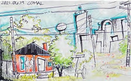
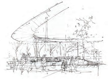
Compiled by Katie Hitt, Assoc. AIA, managing director at the Architecture and Design Exchange.
Want to join in? Post a photo of your sketch on Facebook, Instagram, or Twitter and tag @dallasadex and use the hashtag #ArchKScope to share your work with us.
Trinity River Audubon Center
Above: by Rafael Cordero, Assoc. AIA
Left: by Alexander Quintanilla, AIA
Anita Martinez Recreation Center
Above: by Alexander Quintanilla, AIA
Left: by Rafael Cordero, Assoc. AIA
In addition to the four meetup locations, participants were encouraged to sketch additional venues that fit within the theme, as featured here – Pacific Plaza by Moh’d Bilbeisi
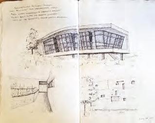
60 COLUMNS // aiadallas.org
LAST PAGE
Eloise Lundy Recreation Center by anonymous artist
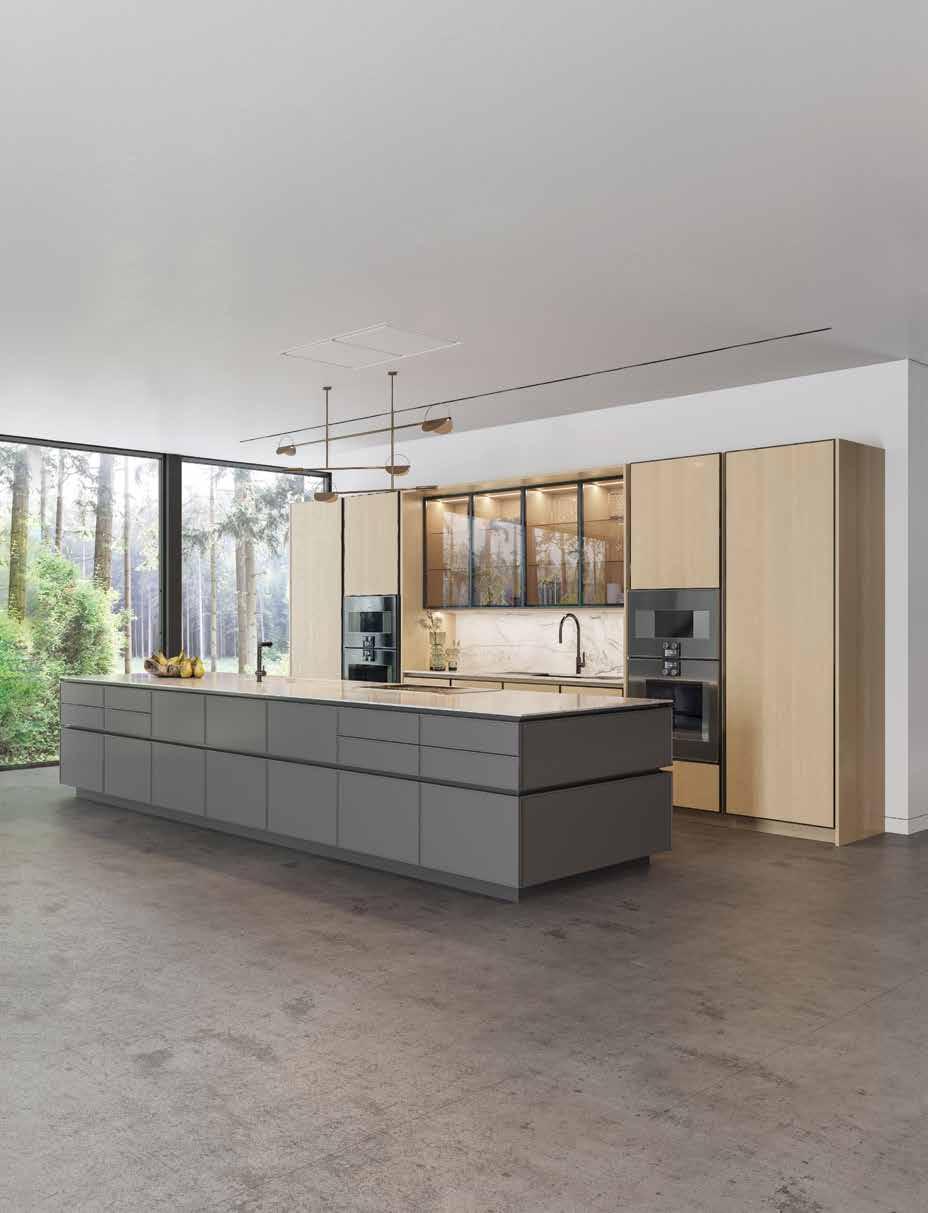
why settle for ordinary when you can experience excellence eggersmann since 1908 new york | dania beach | naples | houston | dallas | chicago | los angeles | toronto | pittsburgh | scottsdale | sand city | maui | los cabos eggersmann Kitchens | Home Living eggersmann USA | 1616 Hi Line Dr, Suite 100 | Dallas, TX 75207 | 214.741.1100 eggersmannusa.com
BLACKSON BRICK CO.
NATURAL STONE IS
MOTHER NATURE’S ARTWORK
EACH WORK IN EARTH’S COLLECTION OF NATURAL STONE BEGAN FROM A MOMENT OF INSPIRATION.
AESTHETIC AND LONG-LASTING, NATURAL STONE‘S ENERGY EFFICACY, UNIQUENESS, AND WORKABILITY MAKES IT KEY TO SUSTAINABLE ARCHITECTURE.
TOUR THE BLACKSON BRICK SHOWROOM TO FULLY APPRECIATE OUR HIGH-QUALITY OFFERING AND THE BEAUTY OF OUR NATURAL STONE.
 Build Green, Build Better: Blackson Brick.
@BLACKSONBRICK
BLACKSONBRICK.COM


 —Jean and Dave


 by Luke Archer, AIA


 By Ricardo Muñoz, AIA


 Build Green, Build Better: Blackson Brick.


