
30 minute read
IN CONTEXT What is it? Where is it?
Can You Identify This North Texas Space?
Find the what, where, and more on page 59. Photo: Michael Cagle
Advertisement
BOOK OF SHAPES
By Ricardo A. León, Assoc. AIA
I don’t think I have experienced space quite like the desert.
In my final year of graduate school, my studio had the opportunity to journey through Namibia in search of dunes and dead trees. You would think that an architecture studio would want to visit a significant city to check off a bucket list of buildings bookmarked on our phones or mentioned in textbooks.
So instead of the Nakagin Capsule Tower or São Paulo Museum of Art, we embraced a remote landscape and a new sense of scale. Our studio professors encouraged constant
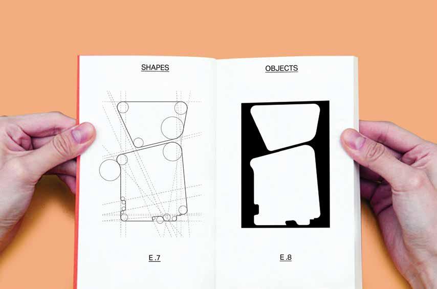
Excerpt from the book of shape studies. On the left are grid formations acting as a “site” to react with shape notations. The resulting figure-ground object is on the right. documentation of our “obsessions,” curiosities that drive our design process and influence our decisions in the form of drawings. During an exercise where the obsessions were pinned anonymously to the wall, my studio mates easily matched them to the owner.
My obsession, on the surface, was simple: shape. From minimal circles to detailed blobs, I decided that those doodles in every notebook and birthday card from as far back as I can remember would not get away from me just yet. But while driving through narrow dirt roads in one of the least populated countries in the world, my friend pointed out a majestic hill with a wonderful round top and said, “Hey, look, one of your shapes.” As we laughed it off, I learned a simple lesson on how
those drawings were not only notations used in my design process, but also a lens to view the world.
Drawings in the broadest sense are lines or marks on a surface. Each mark and its place on the flat plane inform the steps that follow. Even simple gestures evoke meaning; for example, several dense markings that contrast with the page magically make the white space of the paper as important as the markings, also known as a figure-ground.
Centuries of techniques, cultural ideas of images, and technology have steered this form of communication into a multitude of areas worthy of exploration.
For architects, though, the drawing is especially crucial as the primary vehicle that makes an idea manifest. Any building you see came from specific drawings, interpreted and used to guide its construction. But latent in the romantic napkin sketch, “architectural drawing” is more than meets the eye. I stop short of calling architectural drawing “art,” as art has its lineage, cultural importance, and intent that, although it might look the same, is curiously different. If art asks questions, architectural drawing seeks to establish answers.
The critical difference between an architectural drawing and a painting is that an architectural drawing is almost always about something else — a concept, a detail, a process, or a proposal that encourages the viewer to question every mark

and contextualize it against a broader idea. Interestingly, at its very best, architectural representation operates somewhere in between asking questions and finding answers.
When I was a student in New York City, perhaps no work influenced my approach to this theory more than Bernard Tschumi’s Manhattan Transcripts. Tschumi developed The Manhattan Transcripts as a collection between 1976 and 1981, when he said, “Architecture is not simply about space and form, but also about event, action, and what happens in space.” Arranged on a grid meant to be read linearly like frames of a film, the drawings depict a specific encounter in the city, organized into four separate categories – the park, the street, the tower, and the block.
What makes these drawings unique is they do not represent a specific structure or space, but instead begin to map a relationship between the person and the city. Using several forms of notation, including plan, section, orthographic projections and mapping to define the setting as well as the characters inhabiting it, several protagonists move in and out of the drawings like a play. The exciting thing is how fascinated Tschumi is with “normal” situations. At the same time, he captures the complicated relationship of an individual exploring the city in addition to the relationship between spaces and their use.
Plan and section collage/color study composed of various objects from the book of shapes.
Drawings of buildings become distorted, recognizable elements repeat but shift, and the figure-ground transforms like a frame in a film. Each sequence flows into the next, like the musical notation of a film score marking the passing of time. While the drawing does provide a stage to where the viewer is, new questions begin to occur as the sequence continues.
I always find myself captivated by that process of distilling the energy and chaos of New York City into a drawing, and arriving at a new understanding of the city. The final series could never have been imagined without establishing rules, reacting against constraints, obsessive documentation, and letting the exercise take its own course to arrive at new questions to respond and learn from. In a similar sense, the design and construction of buildings are quite literally set in stone, but the people who inhabit them always change their use, intent, and cultural identity.
I am reminded of the Exquisite Corpse game that every architecture student encounters in some form and made famous by John Hedjuk, Colin Rowe, and the rest of the University of Texas architecture professors dubbed the Texas Rangers. In the game, one person makes a mark on a paper, and the next person follows up with a new mark reacting to the previous. After several turns and introducing different lines, shapes, and scribbles of varying complexity, the drawing
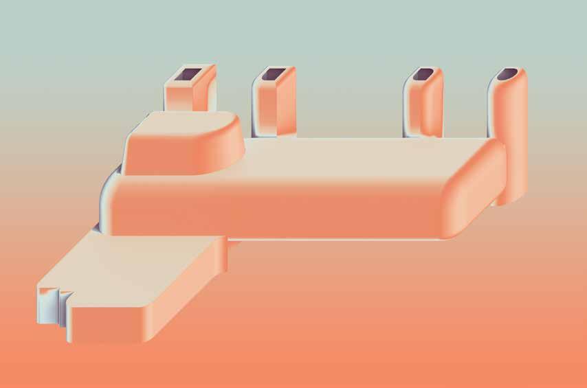
Oblique drawing of 3D form with the applied collage/color study. The object must remain scaleless and abstract to continue iterations. is something unimagined in the mind but a result of making.
In my fervent study of shapes, drawings led to strange adjacencies, which led to inventive organizational strategies, which led to buildings — or something like them, which in turn led only to questions. After setting rules on how to alter one shape to the next, the architectural work developed and I could react with a new set of rules, playing my own iterative game. Each building evolved in the process like characters in a movie. In studio, my professor would ask: “How do I make a drawing? How does it make me feel? How do I want others to think about it? What is the physical experience of the space I am depicting in addition to the emotional or intellectual experience?”
This exercise of not knowing where the drawing would take me was powerful. It is a personal endeavor, but one so critical to any architect. It has been said that the drawing is the primary site where an architectural idea reveals itself. While that may be true, drawings can capture concepts that spark curiosity. Drawing this curiosity certainly provides a way of looking at the world but also a platform to make the world. What could be more wondrous than that?
Ricardo A. León, Assoc. AIA is a designer at Omniplan and 2020 chair of the AIA Dallas Ken Roberts (KRob) Memorial Delineation Competition
By David Preziosi, FAICP

With so much posting of travel photos to social media, who takes the time to find, write and mail a postcard these days? However, through most of the 20th century, postcards were a popular way to let people know about your travels and send images of the amazing places you were visiting.

Originating in Europe, postcards gained favor in the 1880s as printing processes improved and beautiful images could be easily reproduced for mailing.
In the U.S., the first commercially produced souvenir postcards were made for the 1893 World’s Columbian Exposition in Chicago. The series of novelty postcards depicted the pavilions and grounds of the fair. They were a sensation and helped build the postcard industry across the country.
Postcards grew even more in popularity with the turn of the century, especially with trips becoming easier and more affordable. The inexpensive cards gave travelers a way to document their journeys and let friends and family know where they were visiting. All sorts of postcard types were created, from linen to photo chromes, and they featured a wide range of images, including individual buildings, landscapes, streetscapes, and aerial views.
In the 21st century, smartphones and social media have captured the postcards’ old market. Today, it is much harder to find postcards when traveling, especially in smaller, less touristy destinations. Now it’s a given that people prefer posting travel images to Facebook or Instagram, reaching a wider audience and getting the immediate gratification of counting up the “likes” from the posts.
Thankfully, with the plethora of postcards produced in the last century, many survive today — even very early ones. They provide an excellent insight into how cities developed when compared with others of the same views from differing times.
The postcards of Dallas are no exception, and it is fascinating to look at the views of the city from the early 1900s to today to see how the city has evolved. It is especially fun to see the colorful renderings of the early linen postcards — which often took quite a bit of artistic license — and compare them to more modern, dramatic photo postcards of the city that don’t add flourishes.
Postcard images courtesy of Preservation Dallas
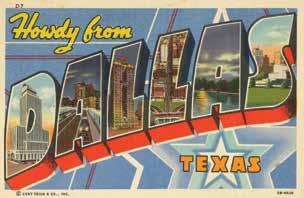
There are many “Greetings from” postcards of cities from around the country, but Dallas offered its own twist with “Howdy from,” as evidenced by this fun collage postcard from the mid-1940s.
Each letter features a facet of Dallas: the Mercantile Bank Building in the D, the Houston Street Viaduct in the A, the Magnolia Building with Pegasus in the first L, Dealey Plaza and Main Street in the second L, White Rock Lake in the last A, and a view of downtown in the S.
THE TRIPLE UNDERPASS
The Triple Underpass project of the 1930s was a massive Works Progress Administration undertaking to create a suitable entrance to downtown Dallas from the west. It required the removal of several blocks of buildings and the regrading and curving of Commerce and Elm streets into the underpass, originally called the Elm-Main-Commerce Subway. The project also created Dealey Plaza, which opened in 1936 as the gateway to the commercial core of the city extending east from the plaza, as depicted on this postcard from circa 1937.
It is an interesting “Art-Colortone,” colorized to make buildings look lively; some artistic license was taken as the Texas School Book Depository shows up in cream instead of the actual brick red, along with other buildings with strange colors. Dealey Plaza is prominent at the bottom of the card in green; it did not get its colonnades, pergolas, and reflecting pools until between 1938 and 1940. To the right of Dealey Plaza is the U.S. Post Office Terminal Annex, finished in 1937. At the top center of the image you can see the Adolphus Hotel,

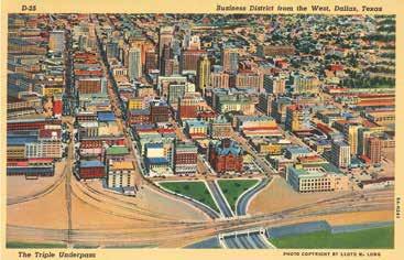
the Magnolia Building, and the now-gone Baker Hotel. Just above those buildings is the old Municipal Building from 1914, which formed the edge of business district at that time. At the bottom left of the card, the railroad lines are prominently shown going through the warehouse district, now the West End, and at the bottom they head across the Triple Underpass bridge to Union Station, not pictured on the card.
TEXAS CENTENNIAL EXPOSITION
This wonderful postcard image was created to promote the Texas Centennial Exposition in 1936, which was described on the back of the card as “celebrating Texas’ 100th birthday and commemorating its glamourous past and its achievements subsequent to the birth of the Republic of Texas in 1836.” It was a wonderful way to show the massive size of the Exposition and the many attractions it had to offer. Although a wonderful depiction of the grounds, it also has some variations from what was actually built as the artist must have had earlier drawings of the site to use. This is evidenced by the State of Texas building (Hall of State) that has wings that extended toward the Esplanade on card, which was an earlier design for the building that had to be scaled back. The U.S. Government building (Tower building) had a much different shape than depicted on the card. It also doesn’t show its signature tower, which was the tallest feature at the Exposition. Below that was the Ford Motor Co. building, which ended up being much larger than on the card and also of a different shape. The Cotton Bowl is at the center of the image with the race track to the right and at the edge of the Exposition grounds. The buildings built along the Midway, below the Cotton Bowl and race track, were also quite different with buildings that

don’t match what was constructed and attractions not depicted such as the Normandy and the roller coaster. Nonetheless, the postcard would have been an incredible way to visualize the Exposition in all its grandeur in an effort to attract visitors.
HOUSTON STREET VIADUCT
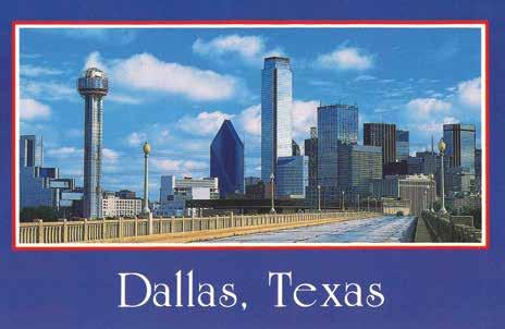
These postcard images together are quite striking as they show the changes in Dallas in only 50 years from basically the same perspective.

The Houston Street Viaduct opened in 1911 and was an incredible way to enter Dallas from Oak Cliff over the Trinity River. It was celebrated as one of the longest bridges with reinforced concrete arches. The historic postcard image from the mid-1930s clearly shows the tallest building in Dallas at the time, the 29-story Magnolia Building with its “Flying Red Horse” as the postcard described it, which was visible at night from many miles away with its glowing red neon. The modern card is from 1986 from the same bridge with a dramatically different view of downtown showing the shiny glass skyscrapers that replaced masonry buildings. The Magnolia Building ceded its title as the tallest building in Dallas in the 1940s. Now the crown belongs to the Bank of America building, which was completed, along with Fountain Place, in 1986.
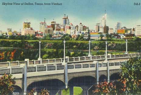
Here is another depiction of the Houston Street Viaduct, albeit there was great deal of artistic license taken with this image from the 1940s. The bridge is not at the correct angle, as it should be heading toward the left of the Magnolia Building in the center top of the image. The middle ground of the card is a depiction of the Trinity River levee. The tallest building in the image is the 31-story Mercantile Building built in 1942. Several of the buildings in the image have been replaced with modern towers; however, surviving buildings include the Adolphus to the left of the Magnolia Building, the Dallas Power and Light building and the Butler Building before its reskin, to the right of the Mercantile.

A GROWING CENTRAL BUSINESS DISTRICT
Unlike the colorful Art-Colortone postcards of earlier years, this photo postcard from 1953 shows the “ever-growing big “D” skyline” as proclaimed on the card in its true, and very red and brown, coloration. The white building towards the top center is the Mercantile. Below that to the right is another tall white building, the Rio Grande National Life Insurance building which was built around 1950 and demolished not much later to make way for the Renaissance Tower completed in 1973. The tower under construction to the left of the Mercantile is the 36-story Republic Bank tower, which opened in 1955. The other prominent tall white building below that is the 21-story Fidelity Union Life Insurance building which opened in 1952. It received a 31-story addition in 1959-1960 and is now the Mosaic Apartments.
THEATER ROW
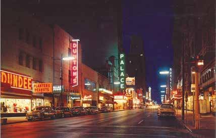
Theater Row along Elm Street was a major attraction in downtown Dallas, especially at night as the neon signs lit up, calling people to movies, restuarants, and shops.
The back of the card from the 1930s says “The metropolitan atmosphere prevailing here is reminiscent of New York-Skyscrapers, a business bustle and volume of traffic.” It clearly shows the variety of movie houses and businesses in the stretch of Elm Street from Akard Street to Harwood Street. The photo postcard from the 1950s described Elm Street as “the ‘Great White Way’ of the southwest.” Twenty years later, another card shows that several of the movie theaters are gone, including the Rialto and Capitol, and the street went from two-way to one-way. The Tower Petroelum building is the tall building in the background and had its own theater at one time. The only theater from Theater Row to survive today is the Majestic, which is the farthest block of Elm Street pictured on the cards. By the 1950s, Theater Row started to lose its luster in favor of suburban cinemas, and many of the theaters closed and were replaced by other businesses. Eventually those buildings gave way to skyscrapers such as Thanksgiving Tower, LTV, and 1700 Pacific.

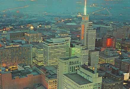
According to the back of this postcard from the mid-1960s, it shows: “A panoramic view towards the Trinity River taken after the lights go on in the skyscrapers of a typical downtown section of the big metropolis.”
Once again, the Mercantile figures prominently in the image with its neon sign, clock, and spire lit up, alerting people of changing weather by the color it turned. To the left of the Mercantile is the Continental Building and to the left of that is the Statler Hilton. Also visible at the bottom left corner of the image is the 1925 White-Plaza Hotel, which was the first Hilton Hotel built in Dallas. To the right of that the large red brick wall is the back of the Titche-Goettinger Department Store. Below Titche-Goettinger is the Tower Petroleum building and its Corrigan Tower addition. Above the Mercantile, the round dome building is the 1957 City Auditorium before the Convention Center and its City Hall neighbor were built. Who knows how much longer postcards will be around, especially in an age of instant posting of images of your travels on social media. Thank goodness for the popularity of early postcards. They give us a great snapshot of the different eras, including showing how far Dallas has come and what has been lost to get where it is today.
This postcard from the 1990s shows downtown with its multitude of shiny glass skyscrapers in contrast with the low masonry buildings of the West End. It also prominently showcases the highways at the bottom of the card, the vast Trinity River and levee system with the Cedars, Deep Ellum, and South Dallas in the background fading off into the distance. The back of the postcard sums up the image Dallas wanted to proclaim to visitors from the early postcards of 1930s to those of the 1990s:
“Rising dramatically from the vast Texas plains, modern Dallas proclaims its beauty and cosmopolitan atmosphere. Sparkling in the warm friendly Texas sunshine, Dallas is a city of beauty,


progress and charm.” David Preziosi, FAICP is executive director at Preservation Dallas.
Have a favorite postcard image of Dallas? Share it with us on Instagram: #ColumnsPostcards
THE WONDER YEARS
NURTURING POTENTIAL

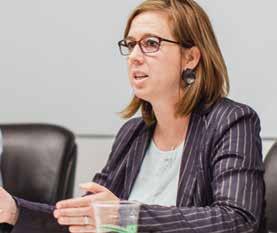
By Lisa Lamkin, FAIA and Anne Hildenbrand, AIA, ALEP A diverse group of educators, architects, and designers recently met to discuss why wonder is an essential element for creativity and how it can be nurtured at school and in the workplace.
Participants included:: Don Gatzke, FAIA, professor at the University of Texas at Arlington / Oswaldo Rivera Ortiz, Assoc. AIA, Dallas ISD teacher / Lester Ortley, Garland ISD teacher / Monica Ramirez, Dallas ISD director of early learning / Megan David, territory manager at VS America / Michael Nelson, interiors manager at BRW Architects


How we learn and what we learn is important. We all learn differently.
ON DIFFERENT LEARNING STYLES
There are so many different modes of learning. There’s the auditory learner who needs to be listening to things. There’s a kinesthetic learner who needs to be touching things because that makes a connection to the brain, and the brain’s making all these synapses and things happen. You have the visual learner who needs to see the things — and they need to see bright colors. So thinking about your multidimensional learners that you have, you have to set up those spaces for all of the learners because you don’t know at what age or stage the light bulb is going to come on, they are going to connect and those students are going to understand, be able to comprehend. Their cognitive development really begins to develop very young, from birth to 5 — they’re like sponges with the most opportunity for building capacity.
Things that we thought were joyful and nurturing and appropriate for the early childhood learner, they’re now in the workplace because there’s something about the different kind of environments that opens up the creative spirit or perhaps creates the conversation of the adjacent possible. That makes a more creative environment because those different kinds of learners can all excel. There’s a lot of research about furniture, particularly focused on the kinesthetic learner. Many of us remember well back in the “sage on the stage” era of teaching where chairs were all equally uncomfortable — which didn’t do justice to anyone, even the introverted students who were more compliant with that approach.
I think if you look at how children do homework, it’s a probably a little more illustrative. You send them home, say this is your homework for tomorrow. So they go home to an environment in which they aren’t necessarily structured. So not every child’s going to go right to the kitchen table to do their homework. Some will go to the desk in their bedroom, some will end up in the living room on the floor, some will curl up on the sofa. Whatever is going to work for them that day is the mode of operation for doing homework. And I think it’s the same. It should be probably heading that way in the classroom and the workplace.
We have an increasingly diversified student body. When I was young, the “dumb” kids, who didn’t fit the rigid norms, just disappeared. Our objectives are now to keep everybody in school and get them through an educational program. So that means kids on the autism spectrum, and behavioral and physical challenges. We’re talking about a much more complicated group of individuals than in the past. Even when you say, well, every kid is a little different, the “little” is really big.
ON SOCIAL AND EMOTIONAL LEARNING
Virtual experiences for young children should never replace actual kinesthetic. There’s so much research about the human touch and just feeling — children feeling secure, and just the voice, some body language, everything that children are developing — the virtual experience will never replace or be as suitable. [The virtual experience] already has replaced the kinesthetic! Because if I see a couple of 8-year-old boys out on the street in my neighborhood, I start to think something must be wrong ...
We’re worried about the future because it’s not re-creating our past and looking like our past. And a big part of that, too, is the new social and emotional learning movement that’s sweeping the stage, sweeping across the nation that we’re now creating environments in classrooms for children who come from trauma, from homes where they’re not being nurtured, where they’re not receiving interaction. Now we have to create an actual space in the classroom to support this — the management and the development of the children who come in, who are throwing chairs across the room at 4 years old — we definitely see this movement happening. … At the same time, the classroom has to start becoming a place to nurture what did happen in the home from zero to 5. And so those spaces are being created. We have calming corners, different pods, different circles. That’s where you learn to do conflict resolution. That’s where you solve your problems. And that’s where you make friends.
The children are on the street and having conflict and those kinds of things with their friends. Lots of things are happening when children are playing. There, all of the different modes of learning are happening. There’s the kinesthetic, there’s the visual, there’s the auditory, those things are happening. But also we think about when you’re touching things, the experiences that you’re having — whether something’s hot, whether something’s cold — all of those things have a lot to do with brain development very early on. They have lot to do with cognitive development as well, which is happening while children are exploring and they’re playing. And there’s different textures happening in the classroom. So it’s not just individual play, but it’s also playing with someone else. And then there’s that camaraderie. There’s the conflict resolution. There is lots of research about the purpose of play and making it purposeful. That’s the time when you can have those conversations and you
can do some higher order thinking questions. You can become very scripted, or you can be very on the surface. But if you’re not doing those things, children aren’t developing language. They’re not talking about things — they’re not.

ON ENVIRONMENTAL ELEMENTS
Twentieth-century architecture was sort of the obsession with the fit of the space to the activity, the hand in the glove — you can make a very strong argument that it’s actually the loose fit, or the conflict between the environment and the activity that is the catalyst for a kind of creative inhabitation of space.”
We are seeing in certain schools that people keep, in a way, bumping up against the environment. And then they’ve got to figure out how to manipulate it in order to use it. And that becomes a kind of sense of wonder and experimentation in and of itself.
They’re shaping their environment daily, and it’s changing daily, because they might have a group project one day, or they need their retreat for 30 minutes.”
How do they react to that environment having different options — them having the choice? Are there kids that need the structure? Are they failing in these environments? Or are they figuring it out?
By nature, people are very adaptable to our environments. That’s why we’re by far the most successful in what we do is because we have to learn how to adapt. The people that are more adaptable are usually more successful. So I think people will function in whatever space you give them. But why not give them a space where they can be better? And feel better? Because if I’m in a space where I’m miserable, yes, I can cope and I can produce something, but I could produce it so much better if I actually enjoyed the space. How can we make this space better for learners? … How do we make it adaptable, flexible, bringing in natural light — there’s so many things we can do.

ON THE EVOLUTION OF LEARNING
Maybe it’s not so much the environment, it’s not so much the layout, but it’s the people leading. You can have a space that is great, but if the teacher or the curriculum or the leadership is not utilizing it in the way it was designed for, or not creating those conditions where that friction creates wonder, then it is a waste of time.
We don’t stop learning when we enter the workforce. Teaching has evolved: In lieu of teaching subject matter, we give them the tools to learn. … Teaching a student how to learn, providing a space for them to explore that simple notion of how we acquire information, I think, is a critical role of being a teacher today.
Employers are looking for people who can solve problems, not people who just know how to do math – that’s a calculator.
But the people you are describing can also do the math. … We talk about living in an interdisciplinary world in which boundaries of knowledge are not in silos and not divided up, and we’ve got to teach interdisciplinary. But before you could have interdisciplines, you have to have disciplines. … You put eight people in a room, all of whom know nothing or know the same thing, you’re not going to get genius out of it. It’s when you put eight different people who know eight different things that then something interesting might come out of it.
I think that with project-based learning — bringing students together so that they understand that they have a role gives them purpose, gives them importance, gives them a sense of wonder. … I have noticed that I am a better teacher because of the environment that I’m in. And so it is not just simply that the environment can help the student, but it can help the teacher. … I noticed in this environment that there is more

collaboration, there is more exploration – including my own exploration as a teacher.
Many students are struggling because they don’t understand the protocols. I had a professor in an architecture school that gave me a quote once. He said: Often we’re given limits and we seek freedom. But more often, we’re given freedom and we seek the limits. And for some of our students, that’s really true. They need those boundaries, they need those bumpers. And I think maybe I should say for the whole school, I am struggling. My first experience of being able to control my environment was in architecture school where I was given a desk. And I was given a desk next to someone else. And that desk taught me socialization, it taught me a lot of things because I had to work with my neighbors and we shared ideas. Finding that freedom at 11th or 12th grade, I’m not sure that they all have the maturity to handle that responsibility.
Or is it because we’re hybrids? With a foot in each camp?
We’ve set up an environment that has restrictions, but with liberties or with freedom. Because it’s kind of a choice where they want to go to the centers. But the teacher plays a really big role in facilitating that and scaffolding for their learners on a daily basis, because a student may come in one day and work really well in this, doing and touching. And then the next day, you just want to be alone. They don’t want to be with the other kids. Things are happening in their lives that every day are different. So we do a lot of teacher training with the group setup. It’s not just you set up and come in because we’ve also had to switch some of our schools for the flex spacing where they can sit on the floor, and the teacher comes in and says, “I can’t teach with this furniture.” And it’s because their mindset is very traditional and they don’t have any formal training on how to make these flex spaces work for their students. What we see a lot is really interesting in our pre-K is that by about December, these students are pretty much running the classroom, the teacher’s facilitating. They know where to go. They know where to move their nameplate. It’s very much choice-based in our pre-K classrooms. Across the hall in a kindergarten classroom, nobody’s moving for most of the day. So you go from a choice area — give them these opportunities to become independent — and then you move into a very restricted place. Maybe they move across town to a personalized learning school. It looks a lot different. Or to tech school itself. When you get them all in high school, they probably had many different experiences. So adapting to one or the other, there’s just lots of back and forth with them, but it’s confusing for the student to go from one environment to another environment.
Are the pre-K students the new normal? Are they going to take over kindergarten at some point? I think it’s very challenging for the students to be present and to listen to learn when they’re stressed out by trying to figure out, “How am I going to learn in this environment? Or how am I going to learn this way when last year was so different?”
The sense of students being in competition with each other, I think, is almost completely gone. They do see it as they’re in an experience together and that they can achieve more if they’re doing it collaboratively.
ON THE SHIFT TO VIRTUAL LEARNING
Now, as things have moved on to the computer and everything is in the “magic box” that moves with the students from home to the studio space, that is actually not the same but we’re making it work. I think there could be many of improvements in it, but it’s not being used the same way. Students aren’t enhancing and personalizing their spaces in the same way.
But I think that’s absolutely true in the workplace, too. It needs to take time, because of the people who have feet in both camps, but with the laptops, probably 80% of our workforce, are very portable. You can pick it up and move it anywhere so the physical office is not as personalized.
Virtual experience is already there, right? It gives you that exploration in real time, or, you know, you can do a conference with Africa and plan with them there. Does this mean that education will have a match.com element? Personalization of the team experience through virtual tools?
It has already changed. Look at the tool throughout human history. The tools we have chosen to pick up and use and favor have shaped our culture in our environment. It’s just different tools.
There’s something irreplaceable about the real experience, the wonder and surprise that we as humans strive for can’t be created for the virtualization of that experience.
If I let my imagination run with me on this, we end up with a very different set of architectural principles, underlying design of most everything we do. And if you put that together with some of the changes in technology that are going to come, we’re going to grow buildings, buildings are going to become biological, they’re going to become biomorphic. They’re going to become genetically constructed and epigenetic, where they will respond, because that has almost nothing to do with certainly the architectural principles that I learned — the simplification and minimalization of 20thcentury modern architecture.
The comments have been edited for clarity and brevity. Lisa Lamkin, FAIA is principal at BRW Architects. Anne Hildenbrand, AIA, ALEP is associate principal at BRW Architects.


