DALLAS + ARCHITECTURE + CULTURE Vol. 37 No.3
GLOBAL
2 COLUMNS // aiadallas.org
AIA Dallas Columns Vol 37, No. 3
GLOBAL
Shelter, a fundamental need, is the basis of the built environment. Architecture fulfills this need and elevates it further, manifested in endless styles and solutions throughout the world. This diversity tells each community’s story of varied conditions, traditions, and ingenuity. What can we learn from this, and what can we share?
IMPORTING AND EXPORTING CULTURE
A NOTE FROM THE EDITORS: Like many nonprofit efforts, Columns has been impacted by the ongoing pandemic in myriad ways – shifting processes, increasing costs, and materials shortages among them. However, the volunteer nature of producing our magazine has unique challenges, and much of this content was produced in 2020 and 2021. We are issuing content as-is and look forward to new ways of delivering more timely content and memorializing the awards, projects, and people of AIA Dallas and our community as Columns enters its next evolution.
Cover Photography: Michael Cagle
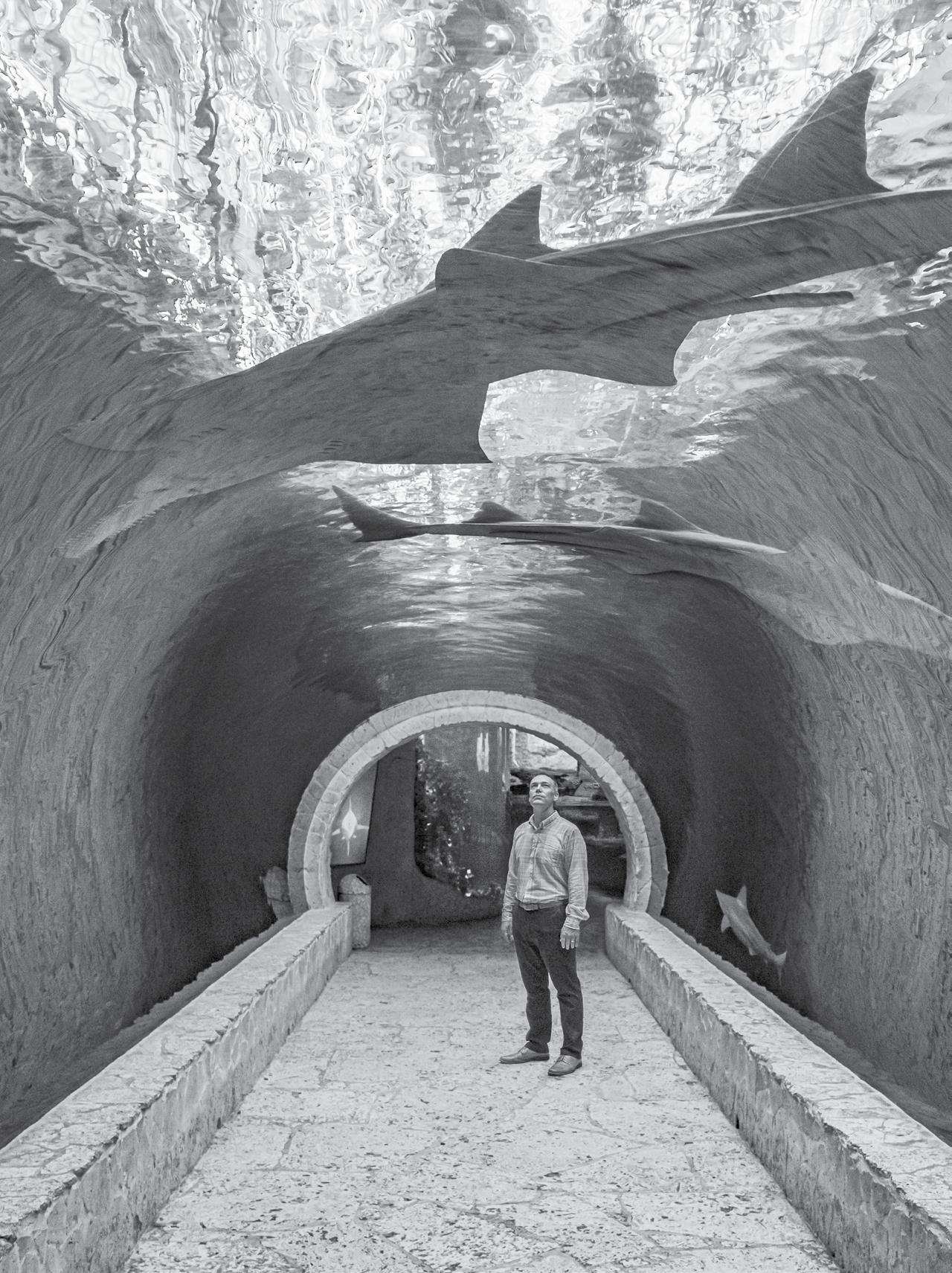
ON THE COVER: Cory Dear, AIA stands beneath the shark tunnel in the lowest levels of the Dallas World Aquarium. Nestled within the West End Historic District — an early site of enterprise in what now is the global economy of Dallas-Fort Worth — the aquarium reflects the determination and imagination of our community. Here, a thoughtfully crafted open environment “rainforest” hosts an avian and animal collection of specimens from all over the world.
Texas Excels


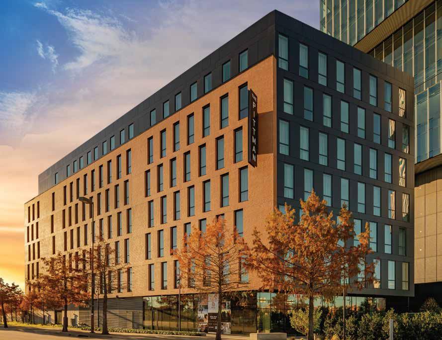
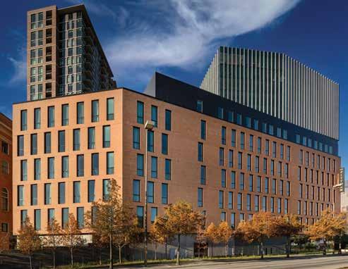
Architects Win National Brick Design Awards


2 COLUMNS // aiadallas.org
From the earth, for the earth.® LEED-accredited engineers and full-service support Case Study Library See our case studies at brick.com/casestudy details, descriptions, and photography.
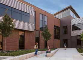
Best in Class Commercial St. Vincent Austin architects Lake|Flato Architects, San Antonio / Austin general contractor Sabre Commercial, Austin masonry contractor Parker Stone, Austin
Raise a flag for Texas architects and architecture recognized nationally in the Brick Industry Association’s "Brick in Architecture Awards." Creativity and command of brick’s wide palette of colors, shapes, and sizes were the keys to winning praise from an esteemed panel of jurors. Long-term life cycle value: long may it wave across the land in
time-honored brick buildings. Whether standing proud and beautiful from a past century or freshly receiving a top award today, projects with Acme Brick endure. Architects rely on our range of options and experienced, responsive representatives—from concept through construction to owner satisfaction and award recognition.



3 COLUMNS // aiadallas.org
Chad M. Davis, AIA
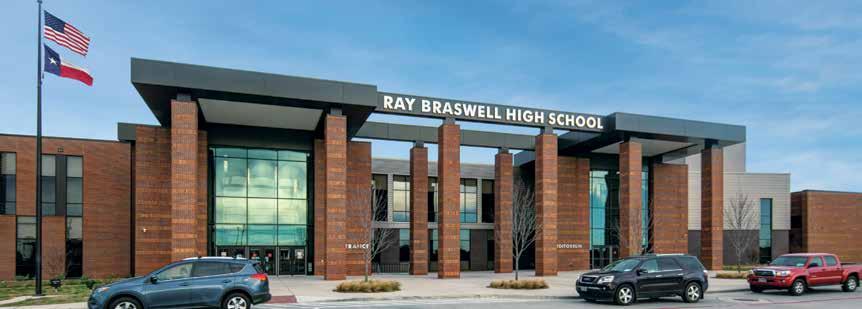
Gold Education K–12
Ray Braswell High School Denton ISD architects VLK Architects, Fort Worth general contractor Balfour Beatty US masonry contractor DMG Masonry, Arlington
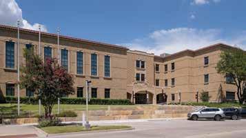
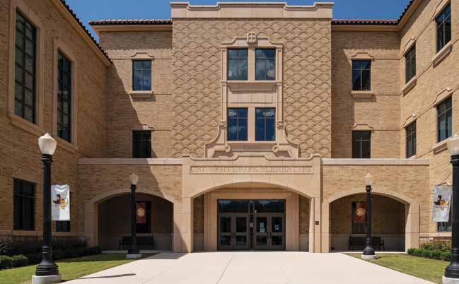
Silver Education K–12
University Park Elementary School architects Stantec, Dallas general contractor Balfour Beatty, Dallas masonry contractor Skinner Masonry, Mesquite



4 COLUMNS // aiadallas.org @MLINTERIORSTEXAS MODERNLUXURYINTERIORS.COM BY THE PUBLISHERS OF HOUSTON AND MODERN LUXURY DALLAS MAGAZINES HAUTE LIVING COVETABLE COLLECTIONS, SHOWROOM UPDATES & PROPERTIES APLENTY DESTINATION WOODLANDS WHAT’S NEW & NOW SKY-HIGH SANCTUARIES TRANSFORM YOUR HOME INTO THE ULTIMATE OASIS HOME FRONT THE MOST SERENE ABODES TO SNATCH UP NOW FROM THE PUBLISHERS OF MODERN LUXURY DALLAS Look for the current issue of Texas’ leading luxury design magazine on newsstands now. TO ADVERTISE IN THE NEXT ISSUE CONTACT PUBLISHER HEATHER NOLAND | HNOLAND@MODERNLUXURY.COM EXPLORE THE DIGITAL EDITION AND SUBSCRIBE TO THE PUBLICATION AT MODERNLUXURYINTERIORS.COM/TEXAS MODERNLUXURY.INTERIORSTEXAS @MLINTERIORSTEXAS


A publication of AIA Dallas with the Architecture and Design Foundation
325 N. St. Paul Street, Suite 150 Dallas, TX 75201 214.742.3242
www.aiadallas.org
www.dallasadex.org
AIA Dallas Columns Vol. 37, No. 3
Editorial Team
James Adams, AIA | Editor in Chief
Katie Hitt, Assoc. AIA | Managing Editor
Jenny Thomason, AIA | Editor
Julien Meyrat, AIA | Editor
Lisa Lamkin, FAIA | Editor
Frances Yllana | Design Director
Linda Stallard Johnson | Copy Editor
Blanks Printing | Printer
Columns Committee
Luke Archer, AIA
Ashlie Bird, Assoc. AIA
Lisa Casey, ASLA
Cayce Davis
Nate Eudaly, Hon. AIA Dallas
Eric Gonzales, AIA
Unmesh Kelkar, Assoc. AIA
Alison Leonard, AIA
Alexis McKinney, AIA
Ricardo Munoz, AIA
Terry Odis
David Preziosi, FAICP
Ben Reavis, AIA
Sarah Schleuning
Janah St. Luce, AIA
Columns Advisory Board
Jon Altschuler
Paul Dennehy, AIA
Steven Fitzpatrick, AIA
Bradley Fritz, AIA
Rachel Hardaway
Vince Hunter
Patricia Magadini, AIA
Nancy McCoy, FAIA
Yen Ong, AIA
Lucilio Pena
Anna Procter, Hon. AIA Dallas
Meloni Raney, AIA
Leslie Reed Nunn
Gerry Renaud, AIA
Evan Sheets
Ron Stelmarski, FAIA
Brandon Stewart, AIA
Dylan Stewart, ASLA
Lily Weiss
Jennifer Workman, AIA
COLUMNS’ MISSION
The mission of Columns is to explore community, culture, and lives through the impact of architecture.
ABOUT COLUMNS
Columns is a publication produced by the Dallas Chapter of the American Institute of Architects with the Architecture and Design Foundation. The publication offers educated and thought-provoking opinions to stimulate new ideas and advance the impact of architecture. It also provides commentary on architecture and design within the communities in the greater North Texas region. Send editorial inquiries to columns@aiadallas.org.
TO ADVERTISE IN COLUMNS
Contact Jody Cranford, 800-818-0289 or jcranford@aiadallas.org.

The opinions expressed herein or the representations made by advertisers, including copyrights and warranties, are not those of AIA Dallas or the Architecture and Design Foundation officers or the editors of Columns unless expressly stated otherwise.
©2021 The American Institute of Architects Dallas Chapter. All rights reserved. Reproduction in whole or in part without written permission is strictly prohibited.
2022 AIA Dallas Officers
Ben Crawford, AIA | President
Kate Aoki, AIA | President-Elect
Charles Brant, AIA | VP Treasurer
Peter Darby, AIA | VP Programs
AIA Dallas and Architecture and Design Foundation Staff
Zaida Basora, FAIA | Executive Director
Conleigh Bauer | Membership Manager
Cathy Boldt | Professional Development Manager
Cristina Fitzgerald | Operations Director
Preston Fitzgerald | AD EX Coordinator
Rebecca Guillen | Program Coordinator
Katie Hitt, Assoc. AIA | AD EX Managing Director
Elizabeth Jones, Assoc. AIA | Marketing Manager
Liane Swanson | Marketing Coordinator
7 COLUMNS // aiadallas.org Experience, Quality, and Reliability 214.357.0300 StazOnRoof.com C elebrating oldnerlighting.com
IN THIS ISSUE - GLOBAL

8 COLUMNS // aiadallas.org
13 EDITOR’S NOTE 25 IN CONTEXT What is it? Where is it? 35 DIALOGUE A Walk in the Parks: Design strategies for an increasingly outdoors community 39 LOST + FOUND The Magnolia Lounge: Dallas showcases the International Style 42 DETAIL MATTERS Details of Dilbeck 45 PUBLIC ARTS A structural expressionism homage to Bryan Tower 46 DIALOGUE Perspectives on migrating to Dallas from abroad 50 PROFILE Dan Noble, FAIA, president and CEO of HKS 52 POINT/COUNTERPOINT Dallas architecture: Does it exist and who should be designing it? 55 GALLERY Built Design Awards 60 STORYTELLING Rick Lowe’s Project Row Houses 62 INDEX TO ADVERTISERS 65 LAST PAGE The Leaning Tower of Dallas
14
All the world’s a stage. Dallas, what’s your role? 17 Architectural Fuel The boom, bust, and beyond of Dallas in the ‘80s 20 The Thin Red Line How fire lanes shape our modern cities 26 The Emotional Impact of Safety Balancing technology and psychology in design innovation 30 The New Age of Security Technology in a post-pandemic world READ COLUMNS ON THE GO: WEB aiadallas.org/v/columns-magazine FLIPBOOK MAGAZINE issuu.com/aiadallas Download the Issuu app for your iPhone/Android
Photo:: Menary Studio
The World Class City
CONTRIBUTORS
Samantha Flores, AIA, NCARB, RID


Samantha is the director of HUGO, a research and innovation team at Corgan that identifies technology disrupters and shifts in human behavior. HUGO examines the various impacts these innovations will have on the user experience and built environment through focused research and experimentation. Prior to HUGO, Samantha spent six years as an architect and experiential design specialist in aviation architecture.
Lance Josal, FAIA
After nearly two decades in the C-suite and 40 years in professional practice, Lance established 11AD to provide executivelevel advice to A/E firms interested in strengthening the health of their businesses. A strong and skillful leader, Lance played an integral role in guiding CallisonRTKL’s expansion into new and emerging markets. He served as the firm’s president and CEO from 2009 to 2019.
Alison Leonard, AIA, EDAC
Originally from upstate New York, Alison holds an architecture degree from Roger Williams University in Rhode Island. She is a licensed architect and certified evidence-based designer. A nationally recognized leader in behavioral healthcare planning and design, she is associate vice president at CannonDesign in Dallas. When not working, she is most likely outside with her husband, toddler son, and French bulldog.
Thom McKay
Thom is a creative, collaborative, strategic marketing, and communications professional who has been working in the A/E/C industry for more than three decades. He was corporate marketing and communications officer of CallisonRTKL, the global architecture, design and planning practice. He is a frequent author, ghost writer, and speaker on marketing and design.
Gavin Newman
A native of Mesquite, Gavin learned architecture and placemaking at Tulane University in New Orleans. Now back home, he is a project coordinator at GFF, contributing to mixed-use housing, site planning, and master planning.
David Whitley, Assoc. AIA
David, a graduate of the University of Texas and Cornell University, owns DRW Planning Studio, a Dallas-based urban planning firm. He has over 20 years of urban planning and design experience, with a background in public policy and developmentrelated disciplines. He lives in East Dallas with his wife, two daughters, and lazy dog.
DEPARTMENT CONTRIBUTORS
Seth Atwell, ASLA Public Arts
Henry Dalton, ASLA Public Arts
Douglas Dover Profile, Storytelling

Nate Eudaly, Hon. AIA Dallas Dialogues
Nancy McCoy, FAIA, FAPT Lost & Found
Patrick Nedley Point/Counterpoint
Anna Procter, Hon. AIA Dallas Last Page
Shahad Sadeq, Assoc. AIA In Context
Janet Spees, Assoc. AIA Detail Matters
9 COLUMNS // aiadallas.org


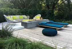

10 COLUMNS // aiadallas.org LANDSCAPE DESIGN | CONSTRUCTION | POOL CONSTRUCTION GARDEN CARE | POOL CARE AND SERVICE | COLLABORATIVE PROJECTS Start your dream today | 972.243.9673 DESIGN | CONSTRUCT | MAINTAIN bonicklandscaping.com Bonick created a truly serene place of beauty and harmony with nature where we can disconnect, reflect and restore the balance in our lives.” Julie and Eliot DECADENT DREAMS DWELL AT HOME “ ELEVATE YOUR OUTDOOR ESCAPE ________


11 COLUMNS // aiadallas.org METRO B R I C K + S T O N E m e t r o b r i c k . c o m 9 7 2 .9 9 1 . 4 4 8 8


12 COLUMNS // aiadallas.org
EDITOR’S NOTE The Global Village
When the world began to lock down in the spring of 2020, the ease of communication through technology remained. This also reinforced the notion that we are a global village in many ways even when we don’t act like it.
The less desirable human tendencies reinforced xenophobia, alienation, prejudice, and selfishness. While these are not new problems, they have the ability to spread more rampantly in the meme age of social media.
However, the pandemic also challenged us to become more resourceful and resilient. It has given us the opportunity to listen and learn from our neighbors. A village must rally its people to work together in recognition of their strengths and despite their weaknesses.
A community’s architectural vernacular demonstrates what makes it special. Architects have a responsibility to understand the stylistic influences of a region in their design; they can also mimic solutions from afar resulting in better built environments.
In this issue of Columns, we explore the role of North Texas in a global community and the impacts architects can have locally and afar. The topics range from unpacking Dallas’ desire to be a world-class city to examining the evolution and impact of fire lanes on modern city development. The
magazine also explores the subject of security through thought pieces on the emotional impact of safety and the role of technology in a post-pandemic world.
In Dialogues we delve into the role of local and remote architects in shaping Dallas and the perspective of architects who have migrated to Big D from other parts of the world. We also profile Dan Noble, FAIA, chief executive of HKS Inc., one of the world’s largest global architectural practices.

We hope you find value as you read through the content. As always, we welcome your feedback.
 James Adams, AIA Editor in Chief james.adams@corgan.com
13 COLUMNS // aiadallas.org
Photo: Kurt Griesbach
“There are no passengers on spaceship Earth. We are all crew.”
Marshall McLuhan
By David Whitley, Assoc. AIA
ALL THE WORLD’S A STAGE. DALLAS, WHAT’S YOUR ROLE?
To many, the term global city conjures up images of diverse, cosmopolitan hubs of activity and commerce — the important places on the world stage that are key connecting points of trade and culture. Without these cities, links in the international economic system break down, gears grind inefficiently, and our collective economic well-being degrades. That’s not to mention the color of our world would be dulled without these repositories of culture.
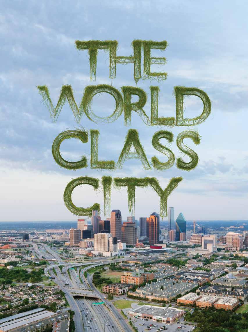
To be a global city is to be inextricably and integrally tied to the well-being of our planet, to be a crucial part of what makes world societies hum, and to define the tenets of our existence as a civilization. Clearly, achieving this status is no small feat, nor is holding this status a small responsibility.

The Brookings Institution, a renowned public policy think tank, launched its Global Cities Initiative in 2011 in partnership with JP Morgan Chase. This effort seeks to help cities and metropolitan areas to more effectively hang their shingle in the global marketplace. These experts outline guidance on how to distinguish yourself in the world market, define your competitive advantages, and maximize the benefit to your local economy.
A quick assessment of Dallas’ advantages yields a treasure trove of assets put into place over several generations. Step back and take them in as a collective portfolio, it is clear that the tracks laid for Dallas and our region over the generations have led to a pretty direct path to becoming a global city.
As Dallas jetted up the ranks of large American cities in the last part of the 20th century, it began to nudge into queue as a global center. But the groundwork was laid in the early 1870s, when a series of deft decisions and a little cajoling by city leaders resulted in Dallas being at the convergence of railroad lines. The primary north-south and east-west rail lines through the state — the Houston & Central Railway (now Union Pacific) and the Texas-Pacific Railway — crossed each other in Dallas, solidifying the city’s place as a hub for commerce.
This was essential because most bustling metropolises relied upon port access as points of origin for their commerce. Being landlocked, Dallas needed intersecting railroads as an inland tactical advantage to get itself on the map. In 1914, Dallas won another major coup by landing the headquarters of the 11th Federal Reserve District, wrangling it away from clear favorite New Orleans. Dallas’ banking and finance industry were in growth mode, whereas NOLA was on cruise control. The choice to place the Fed in Dallas ensured the city’s place as a financial center for generations and served as another asset driving growth and development in the region.
By the middle decades of the 20th century, America shifted its focus on transportation infrastructure to the development of an interstate highway system. The region successfully attracted strategic infrastructure investment, and today may be the only metro in the nation with four interstate highways
crisscrossing the region, providing multiple direct connections to trade throughout the continent.
By 1974, the city turned its eyes to the sky and joined with Fort Worth to build Dallas/Fort Worth International Airport. This milestone was decades in the making, going back to the early 1920s. Today, DFW has routes to nearly 260 domestic and international destinations. The annual economic benefit to the region is in the tens of billions of dollars, plus an untold benefit in corporate relocations.
Investment in the Inland Port in the southern reaches of Dallas has continued to boost the region’s logistical advantages. To understand the scale and economic benefit to the area, just look at the line of trucks emblazoned with the Amazon logo stacked up on the Interstate 20 service road in southern Dallas. The Inland Port is a continuation of a series of investments taking advantage of the city’s central location in the country.
Many generations of arm wrestling squeezed out more than our share of growth to become the roaring bastion of commerce springing from the Blackland Prairie of Texas. The sheer size of the population and economy has grown into a metropolitan area that is certainly global in scale and has a gravitational pull that continues to attract growth and investment. According to the North Central Texas Council of Governments, the population of Dallas-Fort Worth is about 7.5 million, making it larger than 37 states, including nearby Louisiana, Oklahoma, New Mexico, and Arkansas.
Dallas-Fort Worth makes up 30 percent of the Texas economy at 4.8 million jobs. By 2045, the North Central Texas Council of Governments forecasts, the region will have 11.2 million people and 7 million jobs. The metro’s GDP in 2018 was nearly $470 billion. This would outrank all but 26 or so countries in the world.
So here we are. These data tell us that we have pulled ourselves up onto the global stage, and we are not likely to be knocked off anytime soon. However, we cannot rest on the laurels of the many advantages that our region has accumulated over the generations. We cannot expect to maintain our position in the world without continued effort.
So now what? How will we use this platform not only for our benefit, but for the benefit of others? Like those generations that came before us, are we going to lay groundwork for the generations to come? The way in which our political and corporate systems address these questions will serve as
15 COLUMNS // aiadallas.org
leverage to keep us climbing up the ranks of global cities not only as an economic engine, but also as an engine for cultural innovation and equitable opportunities.
Dallas has reached a stage where it needs to be “full of wise saws and modern instances,” to pull from Shakespeare. Dallas can position itself as a leader that balances experience with innovation to improve justice and equity among its population. In driving our economic strength forward as a global city, we cannot focus only on the next big thing, but also on economic access at the individual level. By stretching our aspirations to not only the overly ambitious and borderline impossible projects, but to enable the very least of us to have opportunities, we can provide an egalitarian example of what a global city should be. And where the economic data are not only measured in the billions of dollars, but also at the level of balancing a monthly household budget.
There is a clear sense that the trajectory of today’s civic policies is to broaden the perspective through which we make public investment decisions. Single purpose investments are inefficient and ineffective at truly addressing public needs. Public expenditures should be graded and prioritized by their performance across a broad spectrum of criteria to ensure that the dollars are spent wisely and to the maximum benefit. Key plans and policies must not only pile on large-scale investments that increase our logistical advantages within the nation and among our peer cities to pay dividends for generations to come, but also to deepen the impact within our local communities.
The Connect Dallas: Strategic Mobility Plan developed by the City of Dallas sifts transportation investment decisions based on how they perform under six key principles:
• Aligning with economic and workforce development goals.

• Supporting diversified and affordable housing options.
• Leveraging the innovation economy.
• Being kind to the environment.
• Improving equitable access to jobs, services, and opportunities.
• Improving safety for all transportation modes. Transportation metrics are no longer solely about minutes of delay and level of service. Looking at transportation investment through this broader lens, a different picture
emerges of how we should approach infrastructure development over the next generation. The small-scale project that solves how best to connect individuals to grocery stores and jobs by foot or by bike ranks well against the major investments that have regional or national implications. Better yet, it pushes us to pursue projects that do both. An example: How can the Inland Port immediately benefit its surrounding community? How can streetscapes in the Medical District be reformatted to improve public and environmental health?
The freshly minted Comprehensive Environmental and Climate Action Plan developed by the City of Dallas also holds equity and inclusion as core values. Poor air quality and other environmental challenges disproportionately affect vulnerable communities within our city that are least able to battle these detrimental conditions. Further, the linkages of the environment, equity, access to sustainable transportation options, and improving public health underpin the goals and objectives of the plan. Addressing our city’s environmental challenges also means addressing our city’s social and economic challenges.
As we approach the middle of the 21st century, how can we think broadly and demand comprehensive, inclusive approaches to shaping our city through thoughtful and equitable planning and investment? Looking at the horizon, how can we address the challenges to maintaining our global relevance? As we plan for the future, our expectations will and should change. It is not about how we will keep up as a city, but how we will lead.
As a global city, we have a responsibility to chart the course for others to follow. Today’s decisions and investments should advance an agenda that is increasingly ambitious on multiple levels. Are we making Dallas a more just and equitable city? Are we making Dallas a more sustainable city? Are we making Dallas a more innovative city? If we continually ask ourselves these questions and critically reflect on the progress, the answer to whether Dallas is a global city will take care of itself — or may even be irrelevant.
16 COLUMNS // aiadallas.org
David Whitley, Assoc. AIA is the owner of DRW Planning Studio.
Special thanks to Sandy Wesch from the North Central Texas Council of Governments who contributed her expertise to this article.
By Lance K. Josal, FAIA & Thom McKay
The 1980s were a heady time for Texas architects. The great titans of the industry — firms like HKS, CRS, and 3DI — were bustling at a pace not seen since the 1950s, thanks to a post-Vietnam economy fueled mostly by, well, the fuel industry. Dallas boomed and set the stage for the largest expansion, and international diaspora, of architecture practices the country had ever seen.

We had the great fortune to be among the many that surfed the crest of the wave, and it’s easy to draw parallels with what the industry faces in our peri-pandemic COVID-19 world.
First, a bit of background.
Throughout the 1970s, turmoil in the Middle East caused oil-dependent nations like the United States no small measure of political and economic discomfort. In 1979, OPEC reduced the flow of oil into North America, and suddenly the evening news was filled with images of Chevy Caprice station wagons lined up bumper to bumper at gas stations. Inflation and sky-rocketing energy costs sent the country, especially the Northeast and more industrial Upper Midwest, into malaise.
By the time of the coin flip of Super Bowl XIV in January 1980, the country was in a rough place. In Iran, a major oil producing nation, 52 American diplomats and citizens were being held hostage. Amid economic uncertainty, unemployment had begun creeping toward double digits. (It reached 10.8% in December 1982.) People found themselves out of work, including President Jimmy Carter.
But things were different in Texas. The price of crude went from $3.39 per barrel in 1970 to $37.42 in 1980, more than quintupling the bank account of anyone even remotely related to the oil industry. While the Sun Belt
saw unprecedented growth, Texas was by far the greatest beneficiary. Houston nearly doubled in size between 1970 and 1980. Early in the decade, Dallas added residents at a staggering clip of as many as 1,000 per month. Most of them were young, upwardly mobile, educated professionals — tagged yuppies — seeking affordable housing and the adrenaline rush of opportunity. They found it in Big D.
As the decade churned forward, Dallas rose from its stepchild position as “regional center” to seventh in the nation in corporate headquarters, fifth in total assets in commercial banks, fourth in airline passengers, and, by the end of the decade, the undisputed leader in commercial construction. Cranes filled the skyline, and it was hard to drive more than two blocks without encountering a construction barricade.
While all the construction noise was certainly music to the ears of every architect, developer, and contractor, it was the cultural and demographic shift that made the lasting impact on our industry. Dallas had lacked the sophistication of New York and Los Angeles, not to mention the architectural heritage of San Francisco or Chicago. But this influx of human capital and creative currency brought a welcomed swagger to the architectural community. And boy, did it need it.
Back then, the city had no architectural identity. Sure, Reunion Tower and Thanks-Giving Square had made an impact, but the skyline was empty and the drawing board felt barren. In the cover story of the May 1980 issue of D Magazine, David Dillon, then one of the few full-time architecture critics in the country, wondered, “Why is Dallas architecture so bad? … When Dallasites talked about their sublime skyline, it was more from wishful thinking than direct observation. Reunion and the Hyatt changed all that by giving the city a genuine landmark building, a civic symbol that expresses visually many of the things Dallasites like to think are true of the city as a whole.”
The influx of talent was the needed spark. Oil money fueled a pro-growth municipal mindset, and there was a great airport, plenty of land, bullish developers, and that young, burgeoning population moving toward the ambient heat of “what is bad for the rest of the nation turns out to be good for Texas.” Dallas boomed. And architects rejoiced.
RTKL opened a Dallas studio in 1979, and Lance Josal was the office’s first hire who did not relocate from the headquarters. The firm’s strategy was to target local commercial developers, who seemed in abundant supply, as well as health care institutions (ditto) and a growing roster of corporations fleeing the far more expensive, tax-intensive Northeast and West for a business-friendly climate. The strategy was iron-clad and foolproof as long as the local economy kept up its robust growth.
It didn’t.

By the mid-1980s, oil prices started a downward slide and Dallas was so overbuilt that entire towers sat unleased, becoming unlit behemoths looming in the dark Dallas nights. From 1983 to 1984, when the economic fuel gauge slipped toward empty, the city added a mind-boggling 30 million square feet of office space — this, to an already bloated inventory of unleased space that stretched from downtown
through Oak Lawn to LBJ Freeway and Preston Road over to Las Colinas. Suffice to say, there was a lot of frayed nerves.
Gradually pour into this beaker of nitro the glycerin of the savings and loan crisis, and, by 1986, the region’s architecture firms came to essentially a dead stop. Many of us were used to the whiplash peaks and troughs in the market, but this was terrifying. Layoffs came as every firm in town competed for the smallest crumb of opportunity.
About this time, a fax machine in RTKL’s Baltimore headquarters whirred awake in the wee hours.
To say that international projects were not on our radar would be misleading and unfair. A number of U.S. practices spent the 1970s working in the Middle East, and there was no shortage of opportunities for those willing to make the effort. At RTKL, we had a small taste of it, including embassy work and other federal commissions. Securing the work was difficult; doing the work was even more difficult; and getting paid for the work was the most difficult. (We learned quickly that getting sued was a low-risk threat and that getting paid was where the real exposure lay.]
But we’re getting ahead of ourselves. The fax that arrived requested our credentials in large-scale commercial development — mixed-use developments that felt more like city-building than architecture. We assembled a portfolio and sent it via courier — PDFs and email didn’t exist. The request came from a large Japanese conglomerate, the owner of over 30 sites in Japan. The construction industry there was going through a similar boom to the one Dallas had, but with more staying power and government backing. And the numbers were larger — much larger.
In the early 1980s, under Prime Minister Yasuhiro Nakasone, Japan had begun to formulate a master reconstruction plan. Its purpose was to frame a comprehensive vision and a set of goals for national development to boost domestic demand. It worked. Land

18 COLUMNS // aiadallas.org
"Hey, Willie, why do you rob banks?"
"Because that's where the money is. "
prices shot up, and suddenly what seemed like the entire country was under renovation. Architects, especially those experienced in large-scale development and urban regeneration, were in high demand.
Only later did we discover that the fax we’d received in Baltimore was sent to a number of practices — in fact, many of our competitors. But we were told that we were the only firm that responded.
The timing could not have been better. The Dallas market and virtually the entire U.S. economy had come to a standstill, and our teams needed work. We had scooped up some of the best talent in the profession, recruiting from the best schools in the country, and we worked with some of the best clients in the region, but the work simply was not there.
And so we hopped on planes. As did, eventually, every one of our competitors because that’s what you do when you have an office of over 100 professionals without work. It was not a grand strategic vision that led us to going global — it was survival.
Those early years were challenging, largely because we were unfamiliar with conducting business internationally. We learned quickly that we needed training, so we hired consultants to advise us on basic practices, everything from the exchange of business cards to the appropriate seating arrangements in meetings. While it seems silly now, especially in the pandemic, work-from-anywhere mode, the fact we made the effort impressed our clients.
But we also discovered we had to adopt an entirely different mindset within the organization, one that is not too dissimilar to what seems needed today. Back then we called it entrepreneurialism, but these days we call it agility — the ability to spot an opportunity and act quickly. Or to see that something isn’t working and pivot to something else that is.
It took quite a bit of time to settle on an operational model that worked for us and our clients. The initial approach was to go into the verdant regions of the world (Japan, Korea, Southeast Asia, and Eastern Europe — China would come later) to harvest the work and then bring that bounty home to be distributed. But our teams spent most of their waking hours on airplanes and in hotels, not a sustainable solution. We burned out staff quickly, often took our best people out
of the game for weeks and months, and wrestled with the frustrations and delays of time zone differences, translations, and mysterious cultures.


We also realized that we needed an entirely different administrative infrastructure. From legal and finance, HR to marketing, we needed the right professionals and protocols to play on a global chess board. But our biggest eye-opener was technology. We were smart enough at the time to understand the value of hardware — those giant Intergraph 2700 workstations still haunt our dreams — but we could not have imagined the implications of working and communicating seamlessly across international boundaries. The lessons learned in those early years still apply today.
The decision to go global was the right one at the time, and many firms of our size did the same thing. The experience drove home the importance of diversity not just in markets and project types but also in geographies. There were times when our non-U.S. revenue outpaced our domestic income, and vice versa, but having a broad, diverse base was the correct strategy. We also discovered, perhaps later than we had hoped, that it was easy to become too reliant on the international gravy train. The projects were meaty. The fees were big. But it is essential for any firm to maintain a presence in its local community and nurture relationships with the clients down the street.
The world opened up to us in the 1980s largely because we had the right people in the right places in the right times, and Dallas happened to be one of those places. We pursued the work aggressively because we had to — not because that’s where the money was, but because it provided expanded opportunities for our people and our company. It made us better professionals and better architects. It challenged us on multiple levels. And when you’re an architect in Texas, it’s hard to walk away from a challenge like that.
Lance K. Josal FAIA is CEO emeritus of CallisonRTKL and founder of 11AD. He has lived in Dallas since 1979 and has worked throughout the world. Thom McKay is a marketing and communications strategist who opened RTKL’s first international office in 1990 in London.
19 COLUMNS // aiadallas.org
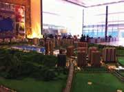
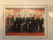
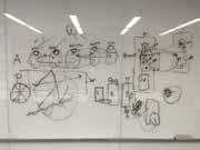
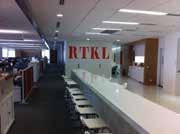
Photos from this spread are snapshots from RTKL’s global practice in the `80s, `90s, and 2000’s / Photos: Lance Josal, FAIA & Thom McKay
THE THIN RED LINE
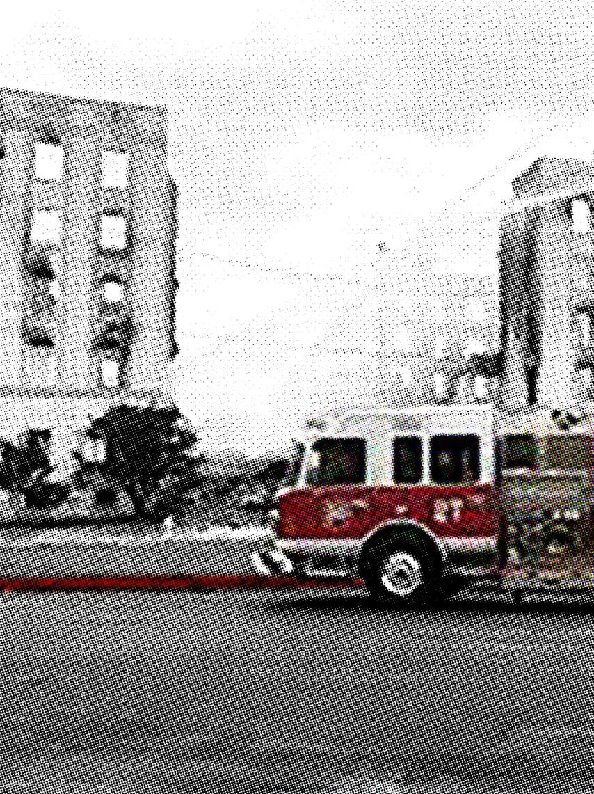 By Gavin Newman
Think about an ordinary residential street. In Dallas, it’s wide enough for cars to park on one side and two others to drive past, and it probably has sidewalks on each side of the street. If you’re lucky, you might get the pleasant experience of having some trees along that street and maybe a bike lane.
However, each residential street exists in dual states. In one state it is the means by which we go to work, we go for a walk, and the corridor in which we might meet our neighbors; in its second state, in crisis, an ambulance speeds to the sick or injured, or a firetruck deals with a nightmare situation. Ultimately, these residential streets create a network of infrastructure to allow for public safety in the event of crisis.
In many Dallas neighborhoods built in the early 20th century, gridded streets and blocks were the de facto position in urban development. Then the story of 20th century urbanism was to do everything we could to avoid grids and blocks. For many places developed post-World War II, a city street cannot serve well during an emergency. For these occurrences, we have fire lanes, better known in our building codes as “fire apparatus access roads.”
Allow me to project for a moment: I don’t have much affection for fire lanes. I imagine you might not either. They eat up valuable land (that isn’t getting any cheaper), they get wider every time I turn around, they lay down concrete where we want a field of green, and who doesn’t like a shock of red striping running through the middle of their site? Given the choice, who’d pick this?
Fire lanes are not supported by theory, either in origin or in their current requirements. Rather, they respond to a particular history of decisions to increase safety for our first responders (and general public?). In this history, things burn. Until the 20th century, cities often burned, with the blazes becoming known as “The Great Fire of ______.” (If you’d like to read up on the history of urban fires in America, Peter Charles Hoffer’s book Seven Fires: The Urban Fires That Reshaped America is a fantastic resource.)
And out of each fire came progress that slowed the next great fire: London burns, and the next London is built of brick.
Of particular interest in the tools of firefighting: the fire engine, replacing the bucket brigade that moved water onto a fire. For the purposes of fighting a blaze, the fire engine is a mobile pump. Pumps have existed since antiquity; the modern fire engine emerged after the invention of the brass and leather fire hose in 1672. With this means of dispensing water, the Dutch-English inventor John Loftin patented the “fire sucking worm,” the first mobile fire pump with sufficient pressure and throw to fight fires.
These early firetrucks were drawn by men. Some firsts are hard to pin down, but in an attempt to present some chronology I’ll offer the following: In 1832, volunteers of the New York Mutual Hook and Ladder Company No. 1 bought a horse to pull their fire engine; horses remained in service after the 1841 emergence of the steam-powered pump, far more effective and far heavier than the previous generation of manual pumps. Detroit saw the first use of a gasolinepowered tractor in 1922, ushering in the retirement of horsedrawn pumps.
Anecdotes fill the history of firefighting. When the first horse-drawn engines replaced man-drawn engines, one group of pump-moving men, fearful of being replaced, sought to shame neighboring firefighters by painting their horses and shaving the animals’ manes and tails. Horses were only accepted into wider use with the advent of the heavier steam pump. When Detroit debuted the tractor-truck propulsion, the city gave the horses a ceremonial last run; it is said that firefighters and residents complained for years about the trucks, seeing the horses as more reliable.
21 COLUMNS // aiadallas.org
It might be characteristic of firefighting to both adopt new technologies and cling to practices known to be effective. The fact that firefighters have sought the best tools available to them (better pumps, better means of moving those pumps) is easily understood through the lens of self-preservation against a chaotic danger. These tools, as well as the regulatory frameworks to require safer, less combustible buildings, have worked toward protecting life and property.
The City of Dallas operates on an amended version of the 2015 International Fire Code (IFC). (Actually, every city in Dallas County operates on some version of IFC. Check your jurisdiction, but the parameters remain the same.) Section 503.3 of the code governs fire apparatus access roads, with additional requirements in Appendix D. A rough outline of this section includes where these roads are required, their physical specifications, their markings, and what happens if you block them intentionally (gate) or unintentionally (cars).
This is a situation where the glove must fit the hand. Much here is left to the discretion of the fire code official, given that the firetruck and equipment deployed changes with each site and need, noted regularly through IFC as “when approved by fire code official.”
There are set points with the fire lane, having more to do with how far a firefighter could pull a hose (they’re heavy) and how much clear width a first responder needs with the bulk of protective gear on them. Where base IFC and Dallas amendments do allow for variation is in the size of the fire access road width and the turning radii. These sizes are based on the size of the firetruck most likely to show up on-site.
Section 503.2.1 of IFC outlines a minimum required width of 20 feet with a turning radius of 28 feet and a clear height of 13
feet 6 inches. When a building is taller than 30 feet, this width increases to 26 feet for at least one of the required routes, which must be between 15 feet and 30 feet from the building.
As Dallas buildings have grown in height, its fleet of firetrucks has changed to reach these heights. For buildings taller than 30 feet, aerial trucks are used. These are the trucks that children’s toys are modeled after, equipped with a mobile boom able to lift firefighters to a window and to retrieve people. Suffice to say, these are complicated, expensive pieces of machinery. The city recently spent $1.6 million on a new truck. As buildings get taller, these trucks get longer as their ladders lengthen. Requirements for wider roadways and turning radii are largely from the need to deploy this kind of vehicle.
The clear height of fire lanes might suggest they can be routed underneath a building, or a section of a building, but this not preferred.

“[It] is not desirable to have a structure cross over a fire lane. … Such structures prove to be an obstruction to responding fire personnel,” said Ricky Butler, fire protection plan reviewer for the City of Dallas. When pressed on specific instances, say a bridge passage between buildings, “structures over a fire lane shall be as limited as possible,” Butler said.
IFC is concerned with whether firetrucks can get there and the type of surface they’re on. Dallas’ amendments stress that the fire lane should be built of asphalt or concrete, but allows alternate paving methods so long as they can support loads of 81,500 pounds and are passable in all weather conditions.
“Grasscrete” serves as the shorthand. Fire personnel are interested in an “engineered and repeatable permeable
22 COLUMNS // aiadallas.org
based system … that is determined to be all-weather in their capabilit[y].” If a fire lane is constructed on top of a parking deck or runs over a bridging element, additional engineering standards apply and should be discussed with the fire code official.
Some low-hanging fruit with fire lanes is their markings. Dallas’ amendments add language describing a 6-foottall continuous line of red paint with 4-inch tall text and the possible use of a sign of set size in lieu of striping. San Antonio’s fire code allows fire lane markings to be up to 40 feet apart and marked with materials other than paint such as red tiles within the paving. In Dallas, though, the consistency of the fire lane marking is of great importance.
“This consistent indication notifies the responding firefighter or paramedic that a fire apparatus access roadway has been properly designed per current amended fire codes,” Butler said. “Properly designed fire lanes can alert first responders of possible hazards and overhead obstructions or underground structures that might not have been designed to support the imposed load of the fire apparatus.”
If there is a question of what the fire lane ought to be, an obvious answer would be for it to be less conspicuous, a little more like our residential streets. A residential street is about pedestrians and cyclists and cars, trees and sidewalks, but not crises. there are ways of recovering this piece of infrastructure for place-making effect.
The marked fire lane is an information problem. First responders move fast (and sometimes break things), and that red line painted on the curb is their best way to distill the built environment into a go/no-go scenario. But as an information problem, it has other solutions.
I broached the idea of a GIS dataset that could incorporate this information for firefighters, a new kind of fire map. “That’d be awesome,” Butler said. Of course, this should not be taken as a coordinated response of the city, but it does hint at a potential solution.
Slimming up the fire lane is a whole other battle. The place-making desire for narrower streets is often at odds with the fire lane minimum requirements. Smaller trucks, or at least nimble trucks with smaller turning radii, would go a long way toward helping, and the industry may provide that at some point.
Current options might include mountable curbs so that the largest fire apparatus could move through a site in the off chance it must. When asked about mountable curbs, Butler said, “They often do not allow [for] proper placement of the outriggers on the fire apparatus prior to engaging in aerial maneuvers.” With this difficulty, the benefits of mountable curbs should lead us to find a resolution on how to address the technical requirements of fire equipment.
At some point Dallas will adopt the 2018 version of IFC; while the text governing fire lanes between 2015 and 2018 does not change, Dallas’ amendments might. Fire lanes are not currently positioned as place-making devices in the city of Dallas; IFC allows the fire code official some leeway, encouraging more conversations. Through wise application of new technologies by firefighters and through placemaking advocacy on the part of those engaged with the built environment, this necessary piece of site infrastructure can be made into a place to enjoy.
23 COLUMNS // aiadallas.org
Gavin Newman is a project coordinator at GFF.
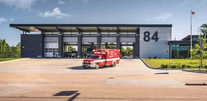
A mobile EMS unit, one of many vehicles in a fire department’s arsenal, leaves the BRW Architects-designed City of Houston Fire Station 84. / Photo: Parrish Ruiz de Velasco
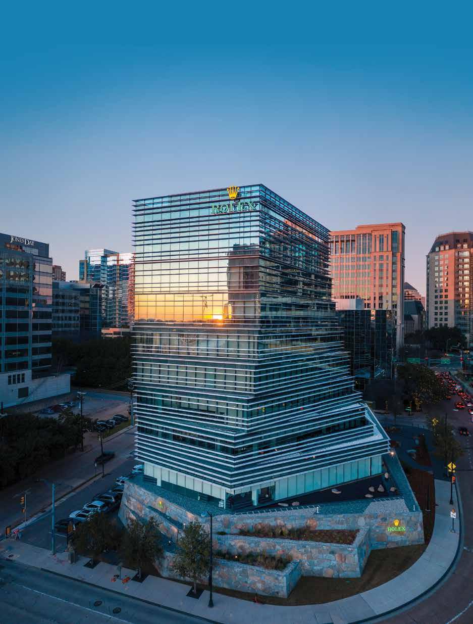
Offices in DALLAS BOSTON and now AUSTIN 214.871.7010 | lafp.com Rolex Building
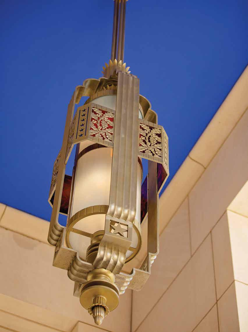
This North Texas Space? Find the what, where, and more on page 64.
Can You Identify
IN CONTEXT
Photo: Alicia Spaete
The Emotional Impact of Safety
Balancing technology and psychology in design innovation
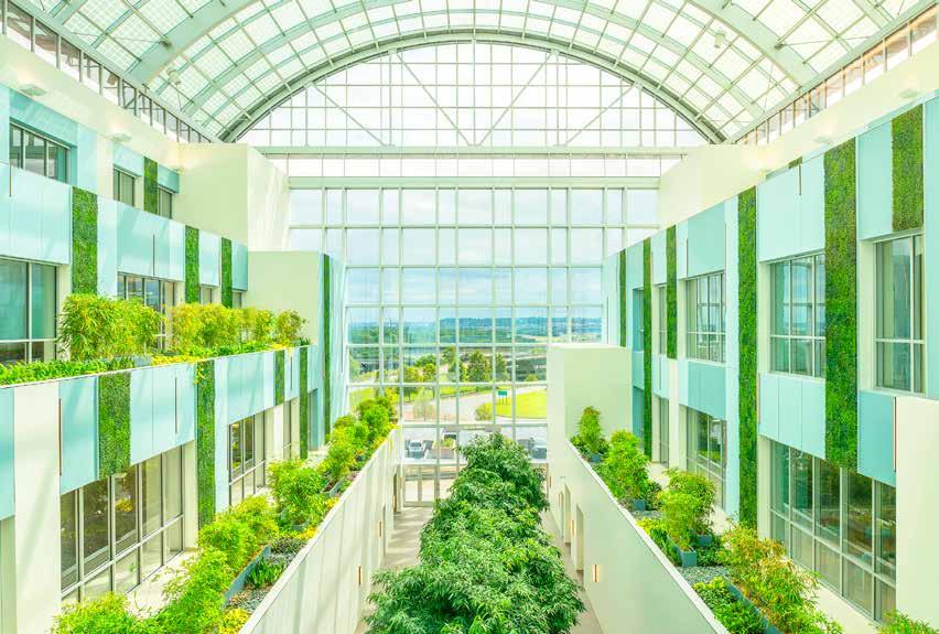 By Alison Leonard, AIA, EDAC
26 COLUMNS // aiadallas.org
Above: Strawberry Hill Behavioral Health Hospital, The University of Kansas Health System, Kansas City, Kansas / Photo: CannonDesign
We see new safety features every day: metal detectors, plexiglass shields, bullet-resistant glazing, and cameras. While society expects this extra security in order to feel safe, at what point do all of these additions detract from the original design intention of the space?
Yet concept sketches and vision boards for projects never feature security cameras, social distancing parameters, exit lights, or metal detectors. Designers consider the feelings they want the space to evoke and make decisions with intention. How do we incorporate safety precautions that current events dictate buildings need without interrupting the design purpose? At what point do the security features meant to ensure a feeling of safety instead detract from our emotional health, disrupting education in schools and healing in healthcare environments? No matter the type of building, a common theme is evident — reducing stress while fostering and maintaining a sense of community.
The public expects to see security features in municipal and civic buildings and at transportation hubs. But people don’t expect to see them extensively in healthcare, worship, and educational environments. Hospitals and churches are places of hope and healing, and schools are places of learning and community gathering.
Whatever the function of the building, the psychology behind space design is an important consideration. The senses play a critical role in how the human brain interprets where you are and how the space makes you feel. The scale of a room evokes feelings of intimacy or of grandeur. Natural light provides a connection to the outdoors, while a lack of windows can cause claustrophobic conditions or the “casino effect” of losing track of time. Colors and materiality of finishes can drastically change a space from dark and serious to light and whimsical. Each of these factors creates a feeling; in these ever-changing times, feeling safe and secure is vital.
The design of healthcare spaces always presents a challenge. While the goal is to create a patient care environment for clinical success, the patient experience
must also be positive and calming. Hospitals, surgery centers, and emergency rooms can be overwhelming to anyone — long hallways, crowded waiting rooms, cold and sterile procedure rooms, and confusing noises. The care team is often stretched thin, working long hours with limited resources, and patients can endure long waits. The COVID-19 pandemic has created isolated environments for patients and clinicians alike, as well as the need for more robust infection control measures. Add a patient in the throes of a mental health crisis to the situation, and the stress levels skyrocket for all involved.
Emergency rooms are not equipped to handle the influx of mental health patients needing help, and that number of patients has increased throughout the pandemic as it continues to take a toll on society’s collective mental health. Standard treatment rooms are not typically designed to provide the level of safety and security for patients in crisis who may harm themselves or who present a danger to the care team. Unfortunately, much of the stigma around mental illness keeps those who need help from seeking care until they are in crisis. Only after being evaluated in an ER will the patient potentially be transferred to a hospital better equipped for psychiatric treatment.
Psychiatric hospitals and behavioral treatment center designs must balance safety and aesthetics. The building has to address the potential for self-harm with vulnerable patients as well as protect healthcare staffers, but also consider the psychology of the built environment.
In recent years, behavioral healthcare design has evolved. Treatment models are no longer synonymous with the asylums portrayed in the film One Flew Over the Cuckoo’s Nest . New facility design employs evidencebased research, and designers have borrowed innovative European concepts to revolutionize psychiatric hospitals in the United States. They foster a normalized environment for care by incorporating key elements such as natural light, views of and access to the landscape, unique and flexible therapy spaces, and durable but homelike materials.
27 COLUMNS // aiadallas.org
It is no surprise that violent events like the Sandy Hook, the Sutherland Springs church, and the El Paso Walmart shootings and public health threats like COVID-19 have changed the perception of safety and security in buildings.
This specialized building type requires a “form follows function” approach to planning and design. It is essential that layouts manage safety concerns for both patient and the care team. But a thoughtful layout, program space adjacencies, and access can help mitigate safety concerns. Flexible use of space is critical when square footage is at a premium and clinical staff prefers a variety of therapy options. Flexibility is also integral because the population and its needs may change.

The approach to the building and the path to the intake area should be simple. The lobby of a mental health unit shouldn’t feel any different than that of any other hospital. A focus on hospitality and dignity, combined with staff empathy, can build trust and camaraderie between the new patient and the care team. It’s important that the intake process not add to anxiety and also vital that the patient and family feel comfortable enough to share information for the staff to complete a thorough risk assessment. Understanding the patient’s stress points is crucial for safety and security and ultimately recovery.
A design risk assessment will also steer the building design. Understanding staff operations and the clinical team’s approach to patient therapy can lead to a design that creates a collaborative healing environment. On some scale, decisions will be made about which program spaces are high-, medium-, and low-risk. High-risk areas include patient rooms, toilet rooms, and other spaces where a patient shouldn’t be left alone; medium-risk spaces have staff supervision, a group type setting, or limited access for some patients. Low-risk spaces are typically public areas, administrative areas, for staff only, and support spaces on the unit that are locked. Design decisions will be made about which spaces and risk levels will require ligatureresistant fixtures and hardened finishes. Other infection
control and social distancing considerations may need to be factored in for each type of space, depending on the trajectory of COVID-19 and future pandemics.
For inpatient hospitals, the specific populations (adolescent, adult, geriatric) and acuity levels dictate the ideal number of patient rooms per unit, unit shape, and length of corridors. Design trends include open care team stations to encourage transparency between staff and patients and to facilitate communication and trust. Some staff still prefer a closed care team station for protection from potential patient violence.
Research has shown that a hybrid model between the two options may be the best solution. A direct line of sight from decentralized care team stations into patient rooms is the best practice for patient safety as well as discouraging negative behaviors and affording patients some choices and control of their personal space. Singleoccupancy rooms are typically preferred. Sometimes they can be personalized with a color preference, offer privacy for quiet meditation, and respect dignity — especially when sensitivity is needed regarding gender.
It is also important to provide areas outside the patient’s room for interaction. Large, flexible spaces for group activities are necessary, but it is also important to provide quiet areas like window seats or built-in benches along a corridor. Unique spaces for therapy like music, art, gardening, and dance allow expression. A gym provides space for much-needed exercise and activity, especially for pediatric and adolescent populations. An enclosed courtyard with views to the exterior gives patients access to fresh air as they walk on secure paths. When needed, a sensory room creates a safe space for a patient who needs to de-escalate. This innovative room, a safe alternative to moving a patient into seclusion, includes

28 COLUMNS // aiadallas.org
The Behavioral Health Pavilion (left) and Crisis Response Center at Banner-University Medical Center South in Tucson, AZ / Photos: CannonDesign
music, lighting, tactile elements, and images to meet any patient’s needs.

While material selections may vary between pediatric and adult populations, one thing that doesn’t change is the importance of patient safety. Colors and textures are essential to human-centered design, but understanding the risks associated with standard design elements in behavioral health environments is imperative. Increased infection control measures from COVID-19 can also limit the type of materials available for use.
The addition of building materials with warm wood finishes, natural textures, and colors supports a normalized environment for healing. Durable, easy-to-clean surfaces are essential, but some impact-resistant materials make it difficult to control sound levels and may require supplemental acoustical products. Continuous sheet flooring with an integral or mechanically-fastened base is best. This helps avoid wall base that can be peeled off and used as a weapon. Ceilings should be at least 9 feet high above finished floor and contiguous in high-risk areas. Products like acoustical ceiling tile in a grid should be avoided as they allow patients to hide contraband. Lighting fixtures should have lenses, be recessed where possible, and have a tunable control if possible. LED lighting that can be adjusted to the circadian rhythm is beneficial and requires less maintenance than typical lamps.

Eliminating everyday items that can be used to loop, wedge, or create a point of ligature is challenging but necessary to create a safe environment for patients at risk. In the last decade, the market has grown exponentially with safe, innovative products that are aesthetically pleasing and ligature-resistant. In past years, fixtures were stainless steel, prison-like, and sterile. Built-in furniture and millwork that include a sloped top enclosure are dependable
options, in addition to the few furniture companies making off-the-shelf solutions. Products that must be selected for patient and staff security include door hardware, glazing and exterior windows, lighting and plumbing fixtures, mechanical diffusers, toilet accessories, furniture, sealants and fasteners, and interior finishes.
When we think about the role that safety and security play in the psychology of spaces, mental healthcare is different from most building types. While airports and municipal buildings make their security features noticeable enough to deter trouble, behavioral health facilities typically do their best to blend it away. To reduce stigma around mental health design, designers strive to normalize the built environment for care.
Thoughtfully designed spaces can empower patients, foster feelings of independence and dignity, and discourage some negative behaviors. Many providers are quick to build a fortress and prison-like environment, thinking that the highest level of safety and security possible is best when, in reality, a balance between the safety level and creating a healing environment promotes accountability and wellness. The extremes limit recovery and can cause patients to be defensive instead of open to new ideas and coping techniques.
To choose which types of spaces to be in (like sociopetal spaces designed to bring people together) or sociofugal spaces (designed to emphasize privacy) to dim their lighting, adjust their temperature controls, or simply open the window can foster the sense of control that a patient may need to jump-start a journey to wellness. Allowing patients the freedom of choice is a welcomed privilege.
29 COLUMNS // aiadallas.org
Alison Leonard, AIA, EDAC is associate vice president at CannonDesign.
VCU Medical Center, Virginia Treatment Center for Children, Replacement Facility, Richmond, VA / Photos: CannonDesign
THE NEW AGE of SECURITY
Technology in a post-pandemic world
By Samantha Flores, AIA, NCARB, RID
Facial recognition instantly analyzes 80 unique nodal features to verify personal identities—a highly secure method of touchless processing used for everything from surveillance to digital wallets.

The pandemic has raised new questions on what it means to design for a world that is forever changed and what safety looks like in these places. Whereas issues of security are primarily concerned with mass shootings, unauthorized visitors, harassment, violence, theft, and vandalism, world events now require that we plan for a future where the safety of individuals and communities are also defined by protecting the health and well-being of its citizens.
Global economies and social dealings have made us especially vulnerable to the quick spread of viruses and other contagions while also making it difficult to implement the solutions to contain these threats once exposed. Designing for an invisible enemy that could quickly and quietly threaten the safety and security of our modern world has prompted designers to investigate the implications for architecture, including questions on how the built environment can detect and respond to threats to our public health. The call on architecture is not new — responsible, human design has always asked for design solutions and spaces where users feel safe. The pandemic, however, fundamentally confronts public spaces and challenges designers to creatively adapt to not only reduce viral spread but also to re-establish communal trust in these places.
The answer is not simple. Rather, any successful response to this historic change in our global culture will be layered and fraught with trial and error. Our core relationship to our built environment requires design to look ahead to a continually evolving definition of what it means to be and feel safe — anticipating the next iteration of threat on our collective security while preserving and even amplifying a more personal experience. Deeply invested in these issues, design has the potential to embrace the ways our society and lives have changed both on account of this pandemic and before it to offer spaces that restore our sense of stability and community.
Novel technologies and the world of big data have not only made possible several necessary accommodations in a post-COVID world — remote work, on-demand delivery services, contagion tracking — but have also provided powerful tools for solutions that make possible a safer, healthier world.
BIOMETRICS
Our world was already headed toward a seamless world where everything is at our fingertips, but the COVID-19 pandemic has required that seamlessness now take on a touchless capability. From contactless doorstep delivery of groceries to virtual telehealth appointments, security in the modern world has expanded its scope to creating and sustaining the protection of personal space. Lessons from the COVID-19 outbreak not only challenge us to reconsider social norms such as shaking hands but also demand that responsibly designed spaces support our new best practices — minimizing touchpoints and providing options that maintain the humanity of our experiences while mitigating the risks of person-to-person contact.
Biometrics offers a powerful tool to use unique features such as a person’s speech, fingerprints, gait, or facial features to instantly identify and often personalize the built environment and user experience. Biometric processing can provide building access, serve as payment methods, or be used for surveillance or targeted marketing without requiring a license, wallet, or key fob. Biometric processing points at airports — convenient, secure, and touchless — have begun to transform the passenger journey from curbside and TSA checkpoints to retail concessions and boarding at the gate; they offer models for larger-scale adoption.
As we’ve become more aware of covering our coughs, keeping six feet apart from each other, and donning masks, biometrics offers the potential of voice activation, facial recognition, and gestural technology to replace elevator buttons, keypads, switches, and doorknobs. Removing bottlenecks caused by gatekeepers or analog functions, these technologies can also keep traffic moving, reduce congestion, and prevent lengthy queues.
Biometric technology has become increasingly popular for its ability to personalize experiences. For instance, at airports, facial recognition paired with push notifications can alert passengers when and where to board, suggest tailored concessions, and even help people connect to lodging and ground transit information.
DIGITAL TWI NS AND BI G DATA
These types of personal user experiences within the built environment can be managed through a building’s digital twin, a highly complex virtual model that is the exact counterpart of the physical environment. A digital twin gathers data from seemingly infinite points in the physical environment — lights, doors, HVAC systems, behavior patterns, and much more — to improve decisionmaking, preventive building maintenance, and responses to changing demands. These models not only have a
31 COLUMNS // aiadallas.org
For architects, the rapid spread of COVID-19 creates challenges on current building typologies, how people interact in and experience public spaces, and how people understand the value of place.
communication platform with the users of the space, responding to commands in real time, but also permit building-to-building communication. These buildings “learn” from one another through a complex network of advanced analytics, machine learning, and artificial intelligence, working together to glean real-time insights. Digital twins provide a powerful understanding of how people engage with the built environment while identifying opportunities and patterns for increased efficiencies and quicker responses to pain points and potential challenges.
The digital twin can monitor indoor health and safety by providing information on air quality, precision maintenance, targeted cleaning, and potential operational improvements for better safety and hygiene. In times of pandemic, a digital twin of a large public space, such as an airport, office, or a school, could simulate safe escort routes in the event that someone is found to be infected, provide adaptations to the environment for isolation, put maintenance protocols into place, and alert building occupants of any temporary changes in building access points — all without the need to build permanently isolated circulation routes into the

physical space. On a larger scale, digital city twins can tap into the Internet of Things, or IoT, systems and public databases to simulate disaster readiness — a tool that helped Singapore manage the pandemic by monitoring foot traffic and building occupancy.
EDGE DATA
Large volumes of data, uninterrupted connectivity, massive storage, and the bandwidth needed to keep current and emerging technologies operating can overwhelm existing networks. When fully realized, digital twins and biometrically enabled public spaces that gather and analyze data points for billions of people and countless built environments will require a new framework for managing data.
Our world runs on the internet. We use it to keep our social networks running, stay connected at work, and shop for groceries. Our dependency and demand grow as we see the potential of technologies to mitigate biological threats and explore their capacity to provide a solution to our world’s current pandemic. From tracking viral outbreaks in real time to expanding the services we need to support
Dynamic real-time data from digital twins empowers better decision-making, improved monitoring and maintenance, and faster responses to building and user needs. / Credit: Corgan
our new normal, our need to connect anytime, anywhere is more important than ever.
The round-the-clock exchange of information over Zoom calls and social media and an infinite world of smart phone applications that bring your favorite restaurants and studio workouts into the control of your home create an insatiable need for data — fast, reliable data.
But latency, introduced by the distance from remote data centers, hampers the way we live and do business. The global response to COVID-19, as well as our sense of safety, has hinged on our access to data and the internet.
In the race for more connectivity at faster speeds for more parts of our life, edge data solutions have the capability to distribute high-performance computing closer to the end user. Scalable, smaller footprints embedded throughout dense urban locations or deployed in remote areas also help democratize the infrastructure we need.
CONCLUSION
The scale, complexity, and urgency of today’s global problems, as shown by the pandemic, do not lend
themselves to easy answers. Instead, these technologies provide the tools for agility and to preserve the cultural value of places. Empathetic design must consider and anticipate evolving expectations, fears, and anxieties about using public spaces and our changing definition of safety and security in the wake of COVID-19.
Our world will never be the same. COVID-19 has radically tested the foundation of community and the spaces that bring us together — places that were designed to encourage face-to-face connection and remove barriers to exploring what makes us human. Reintroducing these spaces into our new cultural vocabulary after months of sheltering in place and social distancing provides a powerful opportunity for design to do what it does best — adapt. And, where the future seems uncertain and the impact of this pandemic is still to be fully realized, these technologies give design the tools we need to be agile and stay human.
With an insatiable demand for data, Corgan and TMGcore’s conceptual designs call for a data center that is a tenth of the usual size but that offers greater computing capacity while greater computing capacity while reducing latency and expanding deployment. / Credit: Corgan
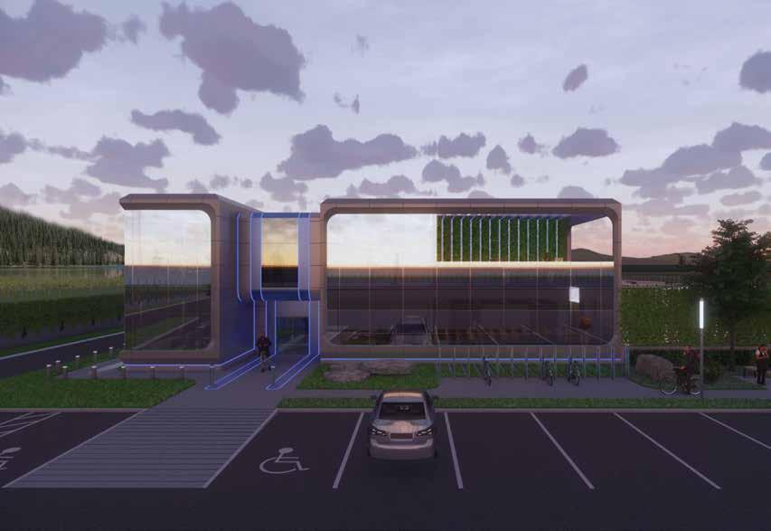 Samantha Flores, AIA, NCARB, RID is the director of HUGO, a research and innovation team at Corgan.
KIRK HOPPER FINE ART DESIGNER SERVICES


Consult with designers
Client collections
Special discounts and incentives offered to interior designers

Visit us at our new location in the Dallas Design District

1426 N. Riverfront Blvd Dallas, Texas 75207 214-760-9230
Tuesday to Friday, 11 to 5 Saturday, 12 to 5 kirkhopperfineart.com
ALICE LEORA BRIGGS THE SCENT OF REASON
34 COLUMNS // aiadallas.org
Floyd Newsum, Remembering Winter in Chicago 2010, oil on paper, 80” x 65”
DECEMBER 3 – JANUARY 14 KIRK HOPPER FINE ART 1426 N. RIVERFRONT BLVD, DALLAS KIRKHOPPERFINEART.COM
A Walk in the Parks
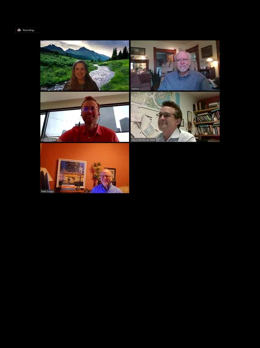
Nate Eudaly, Hon. AIA Dallas, member of the Columns Committee and executive director of the Dallas Architecture Forum, moderated a panel on “Safety in Public Spaces” with four Dallas leaders on parks, trails, and public spaces, especially in the wake of COVID-19. Although the session took place April 9, 2020, the Q&A has been updated as well as edited for brevity and clarity.
The panelists were:

Bud Melton of Halff Associates, an expert on bicycle and pedestrian trails and a member of the Product Council of the Urban Land Institute.
Chuck McDaniel, FASLA managing principal and lead designer of the SWA Group, designers of the Katy Trail and Pacific Plaza.
Dustin Bullard, ASLA of Downtown Dallas Inc., who oversees park planning and public space management for the central city.
Emily Henry, ASLA a principal with Studio Outside Landscape Architects who focuses on people and community.
DIALOGUE
NATE: What is the balance between leaving public spaces in their natural condition versus inserting programmatic design that improves the safety of people using those spaces?
CHUCK: Well, I’ll start with the Katy Trail. It traverses through an actual space that grew up around the rails over the decades, and it is very unprogrammed space, or at least it was until the development boom that went on adjacent to the trails. I’m not for programming the Katy Trail too much. I think it ought to have all the public access points that we need for ADA accessibility, but I’m advocating for fewer bicycles on the Katy Trail. And I’m also advocating strongly for a revegetation of that corridor to let that urban forest regenerate.
EMILY: There are a lot of benefits of being immersed in nature for us in Dallas. Since we are in an urban environment, having those small areas in which we can engage with nature is very important. We’re lucky to have the Trinity River and the Trinity River Basin to really allow people to engage more in those natural environments. It is super important to allow it to be raw and unprogrammed because the immersion in nature is so important to the health of human beings. And I think a lot of times we view humans and nature as separate, but we need to remember that we’re not, and it’s important to have those spaces of respite where it is natural, untouched, and unprogrammed.
BUD: I think programming the trail for formal group activities is problematic in terms of conflicts with other users and adjacent property owners. Over the years I’ve had numerous discussions with the Katy Trail Friends Group about access, and they’ve wanted to limit the access and I’ve said it needs to be as permeable as possible. So Chuck, I agree with you that more is better as to the accessibility of the space and would help relieve some of the bottleneck conditions that occur. There should probably be more signage and understanding of how to use the space.
DUSTIN: What’s great about an urban park system throughout the city is that you have a mix of spaces, and you have some spaces that are highly programmed and highly designed for a variety of uses. But having these more natural spaces is really important to the overall park system, to relate back to nature for our citizens. We must push that every space does not have to be a highly programmed urban park. There are a lot of spaces where we should tread lightly, within minimal programming, and I think it’s healthy for the community. And we’ve seen great success in that. I think COVID has shown us that a lot of the parks people are flocking to are places like Katy Trail and White Rock Lake. We’re not seeing people flocking to the more programmed spaces like Klyde Warren or Pacific Plaza.
EMILY: It’s definitely an advantage that we have many spaces in Dallas that are still very much untouched. Some people don’t feel like they have the invitation to go into the Trinity River Basin or the Trinity River Forest, which is the largest hardwood forest in the country. But for some it is an issue of safety and a bit of fear of the unknown to explore them because of their vast size and lack of safety features.
NATE: Let’s talk about lighting. There’s a consensus that we want to preserve the natural environment while incorporating basic concepts of safety. What responsibilities do you think developers, planners, designers, and municipalities have to install lighting?
BUD: Traditionally, the park department has resisted putting much lighting on the trails. We’re at a point now with light technology where there’s an opportunity to step back and revisit how we put lighting into civic space. I’ve coined a phrase: “Taming the shadows” in civic space, which maybe gets away from the uniform building code requirements of lighting but instead looks at how you do an aesthetic that eliminates the dark shadows and makes it possible to feel comfortable.
CHUCK: I like the fact that the Katy Trail is strategically illuminated because it’s got such other depth and other interest at night. We have to illuminate things, but I don’t think it has to be bright. There needs to be a certain amount of light to be able to recognize people, and you also want to let wildlife and foliage be seen. So there’s a lot of merit for proper lighting.
EMILY: Lighting obviously is the biggest thing we can do to eliminate the fear factor of public space at night.
NATE: What’s your view about security cameras and facial ID? There’s a lot of technology, much of it expensive, but how does that play into safety versus invasion of privacy. Should it be incorporated into public spaces?
CHUCK: I’m really torn on this. I don’t like Big Brother looking over our shoulder. But in conversations on every park I’ve ever done, if you have a camera, you’re giving the user the impression that somebody’s watching. We decided not to do cameras on the Katy Trail and in Pacific Plaza simply because of the expense of monitoring and providing safety. But Pacific Plaza has opened with ambient light that meets all the Dallas lighting codes. I think a part of society will get into mischief in parks if they feel like no one is going to be held accountable. But I really wish we could get to some way to provide immediate, tangible observation of our public spaces.
EMILY: And you wonder if people felt ownership — you know, this is my Dallas park — there’d be a sense of pride. I think use of cameras is a tricky topic because you don’t want an intrusion of privacy. Especially as technology is advancing, and you’re starting to see programs that track people’s faces. It’s kind of scary where some of this is going. But it does provide, again, that sense of safety so it’s a balance.
DUSTIN: With cameras it’s a double-edged sword. I’m more of a big government guy in that I don’t have as many concerns about people watching public space through the cameras. We have a robust camera network in downtown that our organization was the lead champion for 10 to 15 years ago, and we funded additional cameras at Civic Garden and Pegasus Plaza and Main Street Garden. All city camera networks, all monitored by the Dallas police fusion center. That’s part of a citywide network. More than anything, they’re a deterrent to mischief. I think if someone sees the camera, they think, oh, I might get caught. There has to be an acknowledgment and some level of risk that we all take in public space. Cameras are amazing when we have a protest or large
36 COLUMNS // aiadallas.org
events at the parks. We can actually reduce the number of police officers in a given space because we can better monitor that from a remote location by camera. It’s very helpful for DPD to be able to remotely monitor the situation on the ground and maybe stage their assets, police, behind the corner. And it looks better, and it functions better for those folks exercising the First Amendment.
NATE: Let’s talk about scale. If someone goes to one of the downtown parks, it’s more tightly programmed to maintain a sense of safety than the Katy Trail or White Rock Lake, and even less so when you go to the Trinity River Forest. Do you think scale and maybe urban versus rural has different ramifications and expectations?
EMILY: You’re always going to look at the context of the site to design it in a way that’s most comfortable and creates the best outcome for the user. That is going to change in an urban setting versus a rural setting. Depending on where you are, there’s a lot of different factors you take into account when you’re looking at programming and safety. Some of the gold standards are visible means of entry and exit and elimination of hiding spaces, the Jane Jacobs theory of eyes on the street. Those steps help keep people safe or at least create the perception of safety. But it really will depend on where you are, what your goals are, to fine-tune what safety for that space means.
DUSTIN: Bryant Park [in New York City] obviously is one of the models always bantered about on this topic. Inviting people into space and having programmed activities or a reason to linger in a deliberate fashion is probably the biggest thing, post-design, that can be done for the success of an urban space. That includes a physical safety presence. The more people, whether it’s safety or porters or ambassadors with a physical presence in the park, creates safety. There is safety in numbers. Also important is the concept of ownership by park users — this is my space. We’ve seen at Main Street Garden and Civic Garden and now at Pacific Plaza — the more that we can interject these social activities, the less issues there are. This concept is sometimes lost in the design process. Because as architects, we turn it over after construction and hope it works. There’s a missing piece and a missing component in the programmatic piece. And engaging landscape architects, such as Chuck and now Christy Ten Eyck working on Harwood Park in this process, is important. How is this space ultimately going to be used? And how can I make sure that people feel comfortable in it and want to be there for 30 minutes as opposed to five minutes?
CHUCK: I’m excited about the fact that there is such an emerging community of people living in the urban core as we develop this walkable connection between Civic Garden and Main Street Garden and Pacific Plaza and Carpenter Park and Harwood Garden and Klyde Warren Park and all the other little intermediate green spaces. That’s going to make our city safer and makes it more of a community of people who take ownership of the spaces; this community becomes the de facto “police” to help keep things going. Also, as these parks are completed, the real estate becomes more valuable and the community grows.
BUD: When Rudy Giuliani was mayor of New York City, he implemented the “broken windows” theory, which is one of the most important components of programming of space. Anytime
there needs to be an intervention, you need to get it programmed right away: to fix the graffiti, the broken stuff, repair the damage and make it very well known that this place is monitored. They started a concept called CPTED, for crime prevention through environmental design. You try to make your design as bulletproof to vandalism as possible, but with aesthetic design elements included. Keep nature included in the equation. It is probably one of the better safeguards to prevent vandalism to the programmatic elements of the design, while keep costs to a minimum.
NATE: Let’s talk about COVID-19. The necessity of maintaining social distancing while being outside has been essential. Let’s talk first about existing public spaces, parks and trails and how COVID has impacted them. Should we look at retrofitting or installation of safety guidelines, measures for public spaces?
EMILY: I envision massive innovation when it comes to cleanliness of public spaces. We will put pressure on our cities to provide those measures and some sort of public notice so that we know that those measures are in place. We will probably also use personal devices such as cellphone programs that monitor to make sure the spaces we use are clean. I think about that with my children when they’re hopping on a swing or when they’re climbing a jungle gym or we’re boarding a plane. We want to spend time together. But I think that we’re going to have higher standards as to how we interact with each other.
CHUCK: I hope we don’t have to start metering people’s entrances into parks. Every time the signal turns green, another person can go into the park, so you must line up and wait. Our Shanghai office reports that after the initial COVID-19 crisis in China, people were so pent up to get out to the parks that they had to make reservations to go into the parks in Beijing and Shanghai. I hope that we all have a more self- awareness. I have a much more heightened awareness of hand-washing and cleanliness and how germs and infections move.
BUD: Some immediate interventions include parks like Klyde Warren defining specific spaces for activities like yoga, so that someone would be able to exit that space and walk out to the clear zone without intruding into another space, even if that were just temporarily marked with chalk.
DUSTIN: As park managers become responsible for the public health, we sometimes have to make very difficult decisions to protect the greater good of people because I don’t think everyone can be trusted to take care of themselves. That’s a hard reality. We look out for each other from a long-term perspective. The types of materials we use and specify, especially in the playground, will probably change with some longer-term impact. We’re already evaluating things like where people put their dog waste. Can we make a modification to allow a “no-touch environment?”
NATE: We’ve seen that people really want to be out in nature, that they want to experience the landscape and the sky, and they also want to share those spaces with other people. We need to figure out long term how to balance all these issues so that people can enjoy the parks, public spaces, and trails.
37 COLUMNS // aiadallas.org
Read the full conversation online at aiadallas.org/columns/a-walk-in-the-parks
Discussion moderated by Nate Eudaly, Hon. AIA Dallas, executive director of the Dallas Architecture Forum.


38 COLUMNS // aiadallas.org available through 230 Decorative Center Dallas, TX 75207 214.741.6060 www.tkoassoc.com TKO Associates 2020--GLOBAL - TKO_Layout 1 12/2/2020 3:23 PM Page 1
The Magnolia Lounge
Dallas Showcases the International Style
“
Be Our Guest and Rest, at Magnolia Lounge.” (April 26, 1936) – The Dallas Morning News advertisement touted the soon-to-open Texas Centennial Exposition in April 1936. Promising cool, luxurious lounge space with “continuous entertainment” for 100, the Magnolia Lounge competed with eight other major oil industry pavilions for the attention of fairgoers seeking entertainment, education, or just a place to sit down and cool off.
MAGNOLIA LOUNGE AND THE TEXAS CENTENNIAL EXPOSITION
While the Continental Oil Co. offered a “House of Hospitality” within its Colonial-style pavilion and the Sinclair Refining Co. offered a mechanical dinosaur battling two “monsters,” the Magnolia Oil Co. offered a modern pavilion by an international architect. Making an architectural impact was not new to Magnolia. The company’s headquarters, built in 1922, was the tallest building in Dallas for 20 years, and its iconic Pegasus sign, mounted to the roof of the building in 1934, left a lasting mark on Dallas’ image.
Fred Lege Jr., vice president of the marketing division of Magnolia Petroleum, sought the advice of his friend and Dallas tastemaker Stanley Marcus, Hon. AIA on selecting an architect to design the company’s pavilion for the exposition. Consistent with his well-known comment “I have the simplest taste. I am always satisfied with the best,” Marcus, a selfdescribed modernist, went straight to the top, meeting with three of the nine architects featured in the Museum of Modern Art’s 1932 exhibition on modern architecture.
In his 1974 memoir Minding the Store, the Neiman Marcus retailer said he interviewed architects “Lescaze in New York, considered Neutra in California, and finally ended up visiting the great Frank Lloyd Wright at Taliesin,” before he decided in late 1934 on Wright to design his home. Architectural

historian Virginia McAlester, Hon. AIA, wrote that Marcus “was dispatched to New York City by Dallas-based Magnolia Petroleum to find the most up-to-date architect of the United States for their Centennial pavilion.” However this recommendation came about, William Lescaze was selected in 1935 as the architect for the Magnolia Lounge.
INTRODUCTION TO LESCAZE AND THE INTERNATIONAL STYLE
1932 MOMA EXHIBITION
Lescaze was one of the nine architects featured in the 1932 “Modern Architecture: International Exhibition” at the then 2-year-old Museum of Modern Art (MOMA) organized by HenryRussell Hitchcock and Philip Johnson. The Modern Architecture catalog accompanied the show, and a later publication, The International Style, expanded upon the catalog and canonized the style.
The book described one of the underlying principles of the new style as resulting from a skeleton-like structural system that permitted volume of space as opposed to mass, freeing facades from the constraints of a loadbearing role and enabling the architect to bring an “inherent aesthetic possibilities” to the design.
The catalog noted the influence of Le Corbusier, Walter Gropius, and Mies van der Rohe and of the 1925 Paris Exposition
39 COLUMNS // aiadallas.org LOST + FOUND
Photo: Michael Cagle
Internationale des Arts Décoratifs et Industriels Modernes. The Paris Exposition presented a new modern style — Style Moderne — for architecture and the decorative arts, which in the United States initially became known as Art Deco, named after Arts Décoratifs. This modern style was later classified in America under the umbrella of the Modern movement with the nomenclature International Style, Art Deco, and Moderne. The Texas Centennial Exposition is most commonly referred to as Art Deco, but it can also be classified as Moderne, although the permanent buildings also display characteristics of Art Deco. George Dahl, the chief architect responsible for the exposition’s design, referred to the architecture as Classic Modern. Semantics aside, there was a clear intention to produce something both timeless (traditional) and modern in Dahl’s approach. It was decidedly different from Hitchcock’s and Johnson’s International Style, which was meant to leave tradition behind in favor of a new way of thinking about architecture.
LESCAZE
Lescaze immigrated to the U.S. from his native Switzerland in 1920 looking for an opportunity to build what he called “the monumental,” or larger scale projects of prominence. He established a partnership with George Howe in 1929, and the firm gained instant notice with the completion of the Philadelphia Saving Fund Society Building in 1932, considered the first high-rise designed in the International Style, and with its inclusion in the MOMA exhibition. Opposing stylistic labels, Lescaze questioned the validity of the terms “International Style,” “functionalism,” and “organic architecture” as a means to explain architecture, preferring just the “architecture” in On Being an Architect, published in 1942. His least favorite label was “Modernistic” because, to him, that meant design was dependent on prevailing fads. However, he was not opposed to using the term “modern” and said of the firm’s 1929 Oak Lane Country Day School in Philadelphia: “That was the first work of modern architecture in the United States.” His own home and studio at 211 E. 48th St., completed in 1934 and considered the first International Style townhouse in New York City, remains a unique example of design for a narrow city lot for the way the street and rear facades expressed freedom from structural constraints. The partnership with Howe ended in 1935, and in January 1936, Lescaze had already presented his
design for the Magnolia Lounge. Would the Magnolia Lounge become another first?
MAGNOLIA LOUNGE DESIGN
Lescaze’s first design for the Magnolia Lounge was not accepted with open arms by the Centennial Exposition or the Dallas Park Board, which referred to it as “extremely modernistic.” In turn, Lescaze sought the support of a local architect to whom he wrote:

“I need not say that I am surprised that such a decision should have been reached. I would be less surprised if I had not assumed that since there were architects on the Centennial board, I could expect them to use their influence to convince these gentlemen that what they mistook for ‘modernistic’ is really simply good modern architecture.”
According to architectural historian Jay Henry, Lescaze’s original scheme was more provocative than the executed design: “It would have provided a raised block supported on slender round piers, approached by an entrance ramp — an obvious reference to the work of Le Corbusier. As completed, the building bears certain traces of streamlined commercial, such as the porthole fenestration on the doors and the curving wall of glass block. These features are also found in European functionalism around 1930, however, and may have been derived independently.”
Instead, the final design retains the idea of the entire front facade on piloti, but tempered by the placement of the front doors and screen walls on the north and south ends that, with four Lally columns, define a facade of void rather than solid (like the other buildings of the exposition) with a terrace on the ground level and a canvas-covered deck above it. In addition to design changes, Dahl explicitly objected to the color of the building — white — preferring instead that the predominant color assigned to all the exhibition buildings, Centennial Tan, be used. Lescaze refused, utilizing a “bright white” for the stucco walls, dark gray for windows and secondary doors, and aluminum flake paint for the Lally columns.
The plan was designed around the primary “lounge” space, a wedge-shaped room where “talking” motion pictures of Texas and the Southwest were presented. The three red entrance doors led directly into a lobby, lit by a curved wall of glass block, a product just introduced the year before. Neiman Marcus provided the interior decoration and furnishings. The interior finishes, examined in 2001 by Matthew Mosca, historic paint
40 COLUMNS // aiadallas.org
Magnolia Lounge at Fair Park / Photo: Michael Cagle
specialist, indicate that Lescaze maintained a strong hand in the overall interior color scheme, where the same “extra white” and dark gray of the exterior were used in combination with two additional tones of gray.
The architectural plans, dated March 23, 1936, were issued just two and a half months before the exposition opened, with two revisions after that. As the Dallas architect in charge of the work for Lescaze, Robert O. Koenig had the unenviable job of getting this project built. The project was completed on time, exhibited, and included in Hitchcock’s “Thirteen Years of Fair Building” at MOMA and in Architectural Record magazine in July 1936.
The entire pavilion cost $75,000.
OTHER INTERNATIONAL STYLE BUILDINGS IN DALLAS
Lescaze’s Magnolia Lounge is often identified as the first International Style building in Dallas and, occasionally, in Texas. Without taking on the statewide claim, it appears to have been the first commercial building in Dallas of that style and certainly the first in Texas by an architect directly tied to the MOMA exhibit. But there was other residential work in Dallas that was contemporary with the Magnolia Lounge. The most obvious example was the Contemporary House by DeWitt and Washburn Architects, one of four model homes on display at the exposition. Marcus was also most likely influential in the selection of the architect for this project, having selected Roscoe DeWitt for his own house in 1935 after deciding not to build Wright’s design. Neiman Marcus would also provide the interior decorating for the Contemporary House.
In writing about the house, DeWitt & Washburn said the design was rooted in the climate of North Texas, not by any association with the “so-called modernists.” Despite this, the influence of the International Style is obvious in the non-materiality of the facades, especially the south, or rear, facade, and the use of smooth white stucco walls, flat roofs, and a cantilevered exterior stair. For many years, the house at 6851 Gaston Ave., also completed in 1936, was thought to be the Contemporary House, moved to that location after the exposition. The similarities are obvious; however, the authors of Fair Park Deco documented that the house was designed by another architect, Reynolds Fischer, and that the Contemporary House was demolished in 1947. A recently discovered photograph of the front facade confirms that not even a portion of this house came from the exposition.
The house on Gaston Avenue is one of 14 other modern-style
houses built by the Mayflower Investment Co. in 1936, and the company had plans to build 25 more. This house is distinguished from other International Style houses by the use of brick, painted white, instead of stucco as the primary material. Another brick version of the style is at 4593 Belford and has been attributed to Luther Sadler.
Sadler is the architect of 6843 Lorna Lane, built in 1936 and just a block from the Gaston Avenue house. Sadler was responsible for many Moderne and International Style houses in Dallas and the Park Cities. Most of those houses have been demolished; however, four smaller examples, recently verified as Sadler’s work by Willis Winters, survive in Cochran Heights. These houses, bordering on Moderne, were built in 1936 and 1937.
Jay C. Henry’s Architecture in Texas 1895-1945 notes that Sadler’s Highlander Apartments, remodeled beyond recognition, was his “modernistic masterpiece.” Also, Howard Meyer designed a few International Style-inspired houses in the late 1930s, including the Sanger House at 3216 Jacotte Circle. Meyer worked in Lescaze’s office in 1926 while a student at Columbia University before moving to Dallas in 1935. Finally, a well-known International Style house that was in the early phases of design in October 1935 — before Lescaze’s rendering of the Magnolia Lounge was published in January 1936 — was DeWitt’s design for the Marcus House at 10 Nonesuch Road, completed in 1938. The Cedar Springs Place housing project, the first Works Progress Administration construction in Texas, was completed in 1937 and designed by Walter C. Sharp and the Dallas Housing Associates, of which DeWitt was a part.

CONCLUSION
The International Style appears to have arrived to Dallas around 1936 and to have flourished briefly during the late 1930s and early 1940s. But by the time of the war, there were other priorities. Postwar modernism carried many of the principles but also took on other attributes, leaving Magnolia Lounge as a rare example of the early International Style. Today, the building is the longtime home of the Friends of Fair Park, where you can still be a guest and rest.
41 COLUMNS // aiadallas.org
Nancy McCoy, FAIA, FAPT is principal at McCoy Collaborative Preservation Architecture.
6851 Gaston Ave. designed by Reynolds Fischer / Photo: Michael Cagle
DETAILS OF DILBECK
By Janet Spees, Assoc. AIA
This 8,800-square-foot residence, a 1962 Charles Dilbeck design, was constructed with a pier and beam foundation and exterior materials of California driftwood stone and pecky cypress wood trim. When the Geisler residence tragically burned down in 2016, owners Mike and Stacy Geisler reached out almost immediately to Droese Raney Architects to assist them in the reconstruction of their architecturally significant home.

When Droese Raney was brought on, and knowing the task ahead, the architects made quick work of pulling dimensions and taking tons of photographs of what was left of the residence.
“It was really fortunate that we had done that, because I came one morning for a site visit to take some dimensions, and in true demo-contractor fashion, half the house was gone when I got there. It was a frightening moment. I just prayed that I had enough photographs and dimensions,” said Lance Raney, AIA, a principal with Droese Raney.
During this process, Droese Raney contacted the University of Texas, which maintains the Charles Stevens Dilbeck collection, an archive of architectural drawings and specifications of some of Dilbeck’s significant designs. Luckily, the collection had six sheets of original construction documents that helped confirm many of the dimensions taken before the house was demolished down to the foundation.
Additionally, the daughter of Sam Lobello Jr., the original owner, found spiral-bound pictures of the home in her father’s office. These photographs, showing the original condition of the house, provided clarity and confirmation of some of the conclusions and assumptions Droese Raney made on site.
PROJECT DESIGN TEAM
OWNERS: Michael & Stacy Geisler
ARCHITECTURE & INTERIORS: Droese
Raney Architecture
GENERAL CONTRACTOR: Maplehill
Residential LLC
LANDSCAPE ARCHITECTURE: MESA
MEP ENGINEER: Arjo Engineers Inc.
STRUCTURAL ENGINEER: StenstromSchneider Inc.
Top: Vintage photo of the home courtesy of Lobello family // Opposite page above text: Recent exterior elevations by Droese Raney
Architecture
DETAIL MATTERS
In the not so distant past, Charles Dilbeck was one of the best-known residential architects practicing in Dallas. In a career that ran from 1932 to 1970, he designed the Geisler Residence, originally called the Lobello House.
42 COLUMNS // aiadallas.org
The rebuilding of the Geisler Residence proved challenging because of the importance of making an exact replica of the original home. The determination to match materials nearly identical to the original home required research and months of sourcing.

Droese Raney spent about three months hand-combing through pecky cypress looking for wood with just the right size holes. All the stone was removed from the house and organized by elevation in order to reinstall it exactly as it was. Employees contacted showrooms for missing door hardware such as the Schlage Rondell knobs on the beautifully ornate entry doors.
“The knobs are new and painstakingly replicated,” Raney said. “They had these beautiful Schlage, big Rondell knobs. One was missing, and it had been missing from the previous owner. So we were able to source a replacement from 1960 or something. There was a pretty cool little hunt for that.”
The sheer size and Dilbeck-designed eclecticism contribute to many fascinating details in the project. Walking up to the home, a visitor would likely notice the heavy, dentil-style fascia trim at the overhangs.
This trim “is four to five pieces and is a beautiful square dentil molding that is built up, really heavy, really masculine
[and] combined with the low overhangs, you really feel the presence of the fascia,” Raney said.
In addition to taking photographs and dimensions before the demo contractor came in, two-foot sections of the trim profiles were cut from the home and later used to make new knives for the trim profiles. Ultimately, it was a father-son team of trim carpenters, with the project from the beginning, who were very attentive to re-creating and fabricating these profiles exactly as they were before.
This project, which evolved from tragedy, ultimately turned into a success story. It has been a combined effort, from the passionate owners, to the dedicated architects, to the many construction workers who worked diligently to see this vision through.
View more photos of the Geisler Residence, courtesy of the Lobello family on the next page, and learn more about the project at aiadallas.org/columns/dilbeckdetails and at facebook.com/thephoenixdallas/
Janet Spees, Assoc. AIA is senior project coordinator at GFF.


44 COLUMNS // aiadallas.org
Exterior details of the home / Photos on left: Frederik Broden; Photos on right: courtesy of Lobello family
BRYAN TOWER
Located at Federal and Harwood streets in downtown Dallas, Bryan Tower is a 40-story Class A office building designed by Neuhaus & Taylor Architects and known for its distinctive I-beam facade and bronze hues.

In 2018, Spire Realty engaged TBG Partners to renovate and reenvision Bryan Tower’s entry plaza to be inviting to pedestrians and provide additional amenities for tenants and visitors. The design embraces and celebrates the work of architect Harwood Taylor, a Dallas native who designed Bryan Tower in 1973 as part of the Neuhaus & Taylor architectural team. The building’s orthogonal form and minimalist aesthetic of steel and glass warranted TBG’s continued expression of the linear element.
Inspired by works of Mark di Suvero, an abstract expressionist sculptor, TBG designed a centerpiece sculpture that speaks to Taylor’s use of I-beams as a form of structural expressionism emphasizing the transparency in design and construction. The sculpture’s bright yellow trio of I-beams stand at 27, 17 and 12 feet tall, and the illuminated beams draw attention to the vertical nature of the design while grounding the building to the pedestrian realm.
TBG reinforced Taylor’s emphasis on authentic materials and modern elements by designing and orienting custom benches at the entryway to reinforce the site’s linear relationship to the streetscape. Additionally, the design’s commitment to transparency warranted furnishings that exposed fasteners and materials to express the interesting design details. From inside the building looking out, warm wood accents invite people into the plaza, while from the outside looking in, the benches embrace an austere feel, using concrete that responds to the travertine wall facade.
Responding to the elevated corner of the site, the design for the plaza was derived from a singular point. The angular notion of the pavers and benches embraces the corner, creating varied heights and backing options while simultaneously representing an intervention of the structure’s orthogonal configuration. Structural expressionism is further reinforced using raw steel and natural wood on the site’s custom trellis at the corner of the building, and I-beams erected along the skybridge extend the design intent into the parking garage. The trellis overhangs and seems to float with little structural support, just as Bryan Tower seems to float above the pedestrian realm.


Reinforcing the history of place through design is a critical component of landscape architecture. Bryan Tower represents a great example of how architecture can be complemented and celebrated by the outdoor environment.
Seth Atwell, ASLA is a principal at TBG Partners. Henry Dalton, ASLA is a senior associate at TBG Partners.
45 COLUMNS // aiadallas.org PUBLIC ARTS
Photos: Menary Studio
ARCHITECTS IN DALLAS
Nate Eudaly, Hon. AIA Dallas discusses perspectives on practice in Dallas with three distinguished firm leaders—Maria Gomez, AIA, Eurico Francisco, AIA, and Christian Lehmkuhl—each of whom started their architectural journey in another country.
NATE: First, tell us where you grew up and about your childhood years. Did you attend high school and college in your native country? And when and what prompted you to become an architect?
MARIA: I grew up and went to school, including university, in Colombia. I was there until I moved here to Dallas. Since I was very young, traveling was one of my favorite things. I think that was something that my parents instilled in my sister and me. Every time we traveled somewhere, I would always think how impressive all of the museums and buildings that we visited were and how they had been there for, in some cases, thousands of years. And they were still there, and they were so permanent, and they were so much a part of the culture. So that’s when I started thinking about architecture specifically.
EURICO: I grew up in Brazil, in São Paulo, a gigantic city. It was a bit of a shock when I moved here, growing up in São Paulo, with 20 million-plus people, and came to Boston. Boston can be provincial, even though it’s one of our largest American cities, full of history, and it didn’t feel the same. Growing up, my interests were not necessarily architecture. I was interested in cinema. I was also interested in motorcycles, old cars. Then I realized whenever we were driving around the city, sometimes my mother would point out: Look at that building, at that other building — isn’t it interesting? And I started paying attention to those beauties. That was the spark. To the big disappointment of my family. We had the doctors and dentists but no architects. When I announced architecture, they were deeply disappointed.
CHRISTIAN: I was growing up in East Germany, and when the wall came down, I think I was 11. I remember both the United Germany and East Germany, but my memories of East Germany are all black and white. East Germany didn’t have a lot of offerings in terms of entertainment, so whatever you wanted to do, you had to make it yourself. That’s a good lesson from growing up in that society: If you want to have something, you have to create it. One thing that Maria said, you admire this kind of permanence of the buildings. I remember the permanence of the East German architecture being an obstacle or something that I really resented. Because
particularly after the second world war, in the ’50s, ’60s, and ’ 70s, when there was a housing shortage in East Germany, they had all these precast concrete buildings to slab buildings. They built these all over the Warsaw Pact countries. They were all built in the satellite cities, and every single building was the same, like a sixstory version, an eight-story version, but all the apartments are the same. So I had this idea that I need to rebel against this monotony and against this permanence of these buildings. Just funny it came to me that permanence can be a bad thing.
MARIA: Yes, you’re absolutely right. In the context that I was talking about permanence was visiting the Taj Mahal and the Great Wall of China and those sort of buildings that have been there so long. But I totally agree with what you just said. It happens in every city where we’re thinking, God, I wish that could come down and be replaced by something more.
NATE: Christian, at what point did you decide to become an architect?
CHRISTIAN: My parents were both civil engineers. So I had been around planning ideas. When I was small and kind of drawing on that, I was always interested in kind of creating culture. Yeah, I don’t think it was a snap moment. It just felt right. And I didn’t try anything else. So far, it’s worked OK.
NATE: Let’s move into your architectural studies or training. If you studied architecture in your native country, how do you compare that to how architecture is taught United States?
CHRISTIAN: I studied in both countries and a couple other countries. I studied in Germany, and I received an architecture engineering degree. I would say it’s probably a little broader in its educational approach. There’s a big emphasis on structures. There’s emphasis on economics, all aspects of it. And the idea is that when you leave the university, you’re actually ready to build something, right? That might be true or not true, but that’s the aspiration they have. Then I studied a couple of semesters in different countries, including New Zealand and China, which were completely different, particularly China. Then I went to Boston and did the postgraduate master’s at MIT, which was more technically

46 COLUMNS // aiadallas.org
inclined because it was MIT. I remember very harsh critiques in Germany, like on design studios. I remember tears. I remember morale broken apart by professors.
MARIA: Since I went to school in Colombia, I don’t know as much about how the education system works in the U.S. in terms of architecture. But what I sense, based on the discussions I’ve had with colleagues and friends who are architects, is it seems like architecture school in Colombia was incredibly focused. You started year one, and you were studying architecture from year one to year five. What I see here is that most people start college, and in their undergraduate phase they can switch around and go from one orientation to a different one. And that doesn’t happen in Colombia. So if I do one year of architecture school and I decide I want to want to do journalism, I’m starting over. It was very, very focused, very intense. And I’m sure there’s a lot of intensity here, too. I’ve always had the impression that there are a lot of people who started in one career and then ended up being architects.
EURICO: I went to the University of São Paulo and got my bachelor’s there. It’s a five-year program similar to Maria’s. And I have a master’s from Harvard. In Brazil, the education was broad. The school was called School of Architecture, Planning and Landscape Architecture. In the U.S. culture, we understand we have architecture and we have landscape architecture, they have separate tracks, and planning is yet another specialty. I don’t think that we should dissociate those disciplines. Even if you decide to focus on one of those tracks, it’s very good and beneficial to be aware of other tracks that are running parallel to what you’re doing.
I do want to say that the particular building known as the School of Architecture was a revelation. The big decision moment was when I actually stepped foot in the School of Architecture building, designed by Villa Navarre, an important figure in Brazilian architecture and history. It’s a magnificent building designed in the early ’60s. It’s a cast-in-place concrete block elevated from the earth, and everything happens inside that blank block. It’s magnificent. One of my professors described it as a temple with no doors — Temple for Teaching and Learning Architecture with no doors. That’s the Brazil chapter. The Boston chapter, well, it’s radically different. Of course, the pace and the focus and the intensity really took me by surprise.
Nate: Is that at the GSD?
EURICO: The GSD. Wonderful professors. Everybody who had anything to say anywhere in the world would make a stop at the school. So the exposure that the school affords the students is incredible. And you know, all those names — Rem Koolhaas or


2020 AIA Dallas president From Colombia

Rogers — they would stop by, and I would actually see those guys and sometimes talk with those people. Sometimes Zaha Hadid stopped in. It changed my perspective coming from a country in South America.
NATE: What brought you to the United States and then Dallas?
EURICO: What brought me to the United States was graduate school. I knew that in this country, whoever is doing anything of interest will come by to teach, to practice, or to lecture. So that was the attraction.
I finished school in Boston, and I was happy as I could be. We bought a place, we loved the city and the culture, but a classmate had moved to Dallas. He claims he did extensive research, checked all the cities around the country, and Dallas was the place where everything was going to happen in the next 50 years. So he came here, he got a job. Immediately he started bugging me. And I kept him away for two, three, four years. Eventually I visited him and people at the office treated me extremely well. I was surprised by the type of work that I saw in the office. They were working in Asia, South America, all over this country from Dallas, and I asked how is it possible? Look, we have a wonderful airport, and we can go anywhere. We can get up, have a meeting, take the plane, have a meeting in New York, and be back home for dinner. It’s part of that Texan spirit, bigger than life. And the can-do attitude we have very much in Dallas.
CHRISTIAN: I worked in Germany for a bit and then in 2009, when the last economic crisis hit, the interesting projects were drying up. I thought, well, I might as well go back to school. I moved to Boston and did a two-year program. Then I just happened to stick around.
NATE: You were at MIT, correct?
CHRISTIAN: Yeah, I was at MIT. Initially I wanted to go back to Germany, but when you study here as a foreigner, they have this OPT program, so you’re allowed to work for a year. And then your company says, ‘Why don’t you stick around,’ like this seems to be working well. Now it has been 11 years. Originally, I worked from New York. Three years ago, we had a baby. New York is fantastic if you’re young, it’s a fantastic place if you’re an architect. It’s a horrible place if you’re a parent. We didn’t have any ties anywhere in the U.S.; we don’t have any relatives here. I embarked on a twoweek interview tour throughout the country, interviewing here at Gensler in Dallas, and it just immediately clicked.
MARIA: When I finished university, I worked for a year at a firm and then started my own office with one of my best friends from college. I got married, but there was a lot of violence going on in
47 COLUMNS // aiadallas.org
Colombia. My husband and I had thought we might go somewhere else. My husband, who worked in a company that had a joint venture with an American company, talked to the owner of the Colombian company about our desire. The owner told my husband that the vice president of the American company was coming for a visit that week. Sure enough, my husband talked to him, and within a week he had a job offer. That was incredible because if you’re not a U.S. citizen, you can’t just apply for a job. You’ve got to get a sponsor, and it’s a long, tedious, and expensive process. The company is an elevator company, and their headquarters was near Chicago. They also had a big office here in Allen, and they gave him the option of Chicago or Allen. We realized, being from such a tropical area as Colombia, that Chicago might be too much of a change. We got here, and there was a big shock in many ways. But people here have been so welcoming. We’re just really thankful that it turned out that way.
NATE: Describe what you thought Dallas would be like. And once you arrived, how were those first impressions confirmed or modified?
MARIA: I had been in many cities in the U.S., but I had never been to Texas. I was a little shocked that it was so flat. There were no mountains, there were no trees. It was the landscape that was so different than what I was used to. Medellin was a medium-size city of about 3 million people, but it was fairly urban with mass transportation everywhere. You could walk anywhere, and one of the things that was shocking to me was that there were so many areas in Dallas where you couldn’t walk from one place to the other — you would have to drive. Dallas was incredibly oriented to highways and cars, which was difficult for me to accept. But there have been so many changes and improvements over the past 20 years that are moving us in the right direction.
EURICO: This place has changed dramatically. When I arrived here in December 1997, we rented a nice place close to the Quadrangle. The firm’s office was at the Quadrangle at the time. Of course, I walked to work.

I had a colleague who lived one block closer to the office, and, I kid you not, I would see him driving his car out of the garage to drive to the office and park his car in the garage. We would arrive at the same time, with me walking three blocks and his driving two blocks. Many times, I would walk that three-block trek and wouldn’t cross anyone on the sidewalks. One time I was on the sidewalk, and on the other end of the block I saw a young woman walking a dog, and the dog starts barking like mad. As we walked by each other, I could hear her talking to her dog, “Don’t worry, it’s
Principal at CRTKL
From Brazil
just a person.” As if the dog had never seen another person before on the sidewalk.
Downtown was dead 20 years ago. When RTKL moved to downtown, we were the first architecture office in the area, so things have changed a lot. Downtown is coming alive, and Uptown changes all the time. It’s a good thing that for us, as architects, we like to see things being built, things changing. And we see that happening in Dallas.
NATE: So Christian, you’re the relative newcomer of the group. What were your first impressions of Dallas, with your background in Germany, then Boston and New York. What do you think about Dallas now?
CHRISTIAN: In Germany, strangely enough, when I was growing up the TV series Dallas was running and was also popular on German TV. My ideas of Dallas were from pop culture. I remember two things that I that I was surprised about. I think Rem Koolhaas said that it seems like the human consensus is beige. And it kind of reminded me of Dallas — yeah, everything is beige. The landscape was beige, a lot of the architecture was beige, interiors were beige. And whenever we do projects, I refuse to use any kind of brown tone in any project. The other thing that was interesting, and that speaks to what Eurico just said, is that this is the least walkable city I’ve lived in. New York, Boston, and European cities are walkable. I live in downtown Dallas. And when I walk around here, I’m kind of the odd person. Others look at me like, “Why? Why is this person walking here?”
EURICO: Like, “What’s wrong with you?”
CHRISTIAN: I know! And when we moved here from New York, we didn’t have a car because it doesn’t make sense in New York. It took me eight weeks to buy a car out of necessity. If you don’t have a vehicle, you see sides of the city that most people don’t really see.
NATE: How would you compare the political and civic leadership in Dallas to what it was in your native country?
CHRISTIAN: A lot of the art, culture, and architecture here is supported by philanthropy, which is interesting because in Germany we don’t have that. In Germany, you also don’t have this cultural divide of the super-rich and the super-poor, with the superrich creating a legacy of philanthropy. In Germany, if you’re rich, you’re almost embarrassed and try to hide it. There’s nobody going out to give back to the city like happens in Dallas.
The issue of philanthropy raises questions of influence from a few people on the cultural landscape of the whole area. But it comes with a lot of opportunities. There’s a lot of money here to achieve great things.


48 COLUMNS // aiadallas.org
MARIA: I really appreciate the philanthropy that you see here. There are so many families and people who support the arts. With the Dallas Architecture Forum, there are a lot of people interested in supporting not just the museums, but the opera and architecture. There are civic leaders trying to do the right thing and push the city into a better place from an architectural standpoint. Whether it’s more insular or national versus international, it’s different.
Medellin is so different in the way the government works. To me, it was very interesting to learn how Dallas has council members representing their individual districts. And it’s also interesting that it’s not as politicized as I would have imagined. It’s not about Republicans or Democrats. It’s about what their districts are trying to achieve. In terms of the architectural community, the big difference is that there was a lot of collaboration and camaraderie in the architectural community in Colombia. For us, a large firm was 30 people. A lot of small firms and people would pull together and collaborate and do all these incredibly interesting things with very little resources.
EURICO: Philanthropy is definitely different here from what I experienced in Brazil. Culture, arts, and the public good are the territory of the state in Brazil. Philanthropy happens at a much smaller scale than in this country and here in Dallas. If you think about it, it’s beautiful when you see things like the Meyerson Symphony Center, with a family that decided to put their money where their passion is. It shows commitment, it shows generosity and a sense of community. It’s a very different story between what I experienced in Brazil and what I experience here. I worked in Brazil maybe five years as an architect, and I have been working here for 25 years. I don’t know if I’m still a Brazilian architect or an American one.
In Brazil, architecture was a smaller community. We were more attuned to what was going on elsewhere, not only in our country, but also in Europe and United States. That’s part of living on the fringe. If you live on the fringe, you look toward the center. Here, we don’t pay as much attention to Brazil or Colombia as Colombia and Brazil pay attention to the United States. We could have stronger awareness of what is outside the U.S. borders, and that would make us all culturally richer.
CHRISTIAN: The first time I visited the U.S. from Germany, I was 14 or 15. Somebody asked me if we had televisions in Germany, so I guess not everybody is well informed about Germany either.
I want to discover the identity of North Texas — what is the architecture of North Texas? There’s obviously not that many international architects here. So maybe it could be beneficial for architects from this area to look outside the U.S. not necessarily
Design Director at Gensler From Germany


to copy something else, but to define their own identity and understanding of who they are compared to what is happening internationally.
NATE: I think all three of you touched on something — there’s so much innovative work happening internationally that often Dallas designers are not looking at or knowledgeable about. I think it would be enriching for designers, personally and professionally, to do that. One final question: Let’s say you are giving advice to a young international architect who’s just moved to Dallas. What words of wisdom would you share with them?
CHRISTIAN: I think what Dallas really has going for itself, like besides being a great place for a family, is opportunity. There’s a lot of opportunity to shape here. That may be more difficult in other cities. If you have ideas, if you make the right connection, and if you convince people, you can really change and influence things. One of the great things about architecture is that you can make a difference not only for yourself but also for others, and Dallas is a great place to achieve that.
MARIA: One recommendation I would give is to get involved in local organizations. The AIA provides many great opportunities to network, to learn from others, and to understand how things work. As somebody who came from a different country, it certainly has played a big role in my career. And not just the AIA, but other groups and organizations. Serving on a committee for the City of Dallas, you can learn how architects influence policymaking. That kind of networking expands your horizon. Connecting with people and understanding their priorities and understanding how the different organizations work and support each other — that has been really interesting and helpful for me in getting to know the right people to get to where I want it to be.
EURICO: Dallas is a place where you can achieve things because it is a young city and things are happening. You do have the chance to influence and be part of that change, which for an architect is the best thing ever. And I agree 100 percent with Maria — you do have to get involved. Try to not be a spectator. The city does offer you the organizations and the opportunities, and the city does welcome you. Get involved with the architecture school (CAPPA) at the University of Texas at Arlington — lots of good things happening there. It’s one of those best-kept secrets, a great school with great professors and good students coming out of that school.
Discussion moderated by Nate Eudaly, Hon. AIA Dallas, executive director of the Dallas Architecture Forum.
49 COLUMNS // aiadallas.org
DAN NOBLE, FAIA
By Douglas Dover
Dan Noble, FAIA, FACHA is president and CEO at HKS, where he leads the strategy and development of the global design firm. Under his leadership, the firm has won numerous design awards from organizations such as the World Architecture Festival and Fast Company. Columns visits with Dan about practicing architecture, both globally and locally.

PROFILE
50 COLUMNS // aiadallas.org
Photo by Liane Swanson
Did you always want to be a designer?
Since I was 13, I wanted to be an architect. Growing up in Aberdeen, South Dakota, I’d visit construction sites and doodle. I designed and built a bunk bed and dresser for my brother. Growing up, the distinction between designer and architect wasn’t there. I still don’t think it’s a distinction.
How do you define globalization?
I define globalization beyond the physical idea of worldwide locations. It’s an all-encompassing concept of influence or shared knowledge. You are informed by the cultures and experiences. You understand and include voices from a wide swath of people, race, ethnicity, education, religions, cultures. We have offices in Shanghai, Singapore, India, Mexico, London, the Middle East. We have had offices in Abu Dhabi, had offices in Chennai, and now we have it in Delhi. The more you travel, the more you see people are similar and the more you see their differences and missions are similar. You’ll also see how fortunate we are in the U.S., contrasted with the poverty of the rest of the world and the dire circumstances under which many people live. You become aware of the human condition and of our connection to the planet and how people’s actions affect that relationship. I think it’s more of a cultural awakening and an awareness of the impact that design can have on the world and being in tune with where you’re working. You’re talking about how people are similar, but people are also very different. That cultural manifestation, or the symbolic built manifestation of that culture, is different everywhere.
How do you account for local traditions and practices?
You do research. Every project should start with this idea, brainstorming on what is the culture, what is fitted, what is the proper fitting for this culture in this site, this context? You research the tighter site and the community, the civic aspects of the site. And you collaborate with the owner, with the consultants. Ideally you work on-site for a time and come back to the office, tighten things up, then go back on-site. Sometimes we camp out on-site. In our Shanghai office, we have over 60 people, and 99 percent of them are Chinese nationals. They live there, so they understand the culture. Every one of our international offices, a vast majority are from the area, region, and country.
At what point did you discuss going global?
Around 20 years ago. I was director of design of the firm, and we committed to go global in a big way in the downturn in about 2010. In 2000, before 9/11, we had offices in Mexico, we had a partnership in London. I think we had opened our office in Shanghai by then.
In our strategic plan, we said we wanted to be more diverse. We want to be more than just an architecture firm. We want to be a design firm that helps solve problems. We have an advisory group. We have doctors on staff, nurses
on staff, former athletes on staff. We have economists, sociologists, psychologists, Ph.D.s in research. All these people are helping us to create another offering with the firm that’s based on intelligence.
Thinking about sustainability and the environment, should all architects be considered global?
Exactly. Certainly this COVID situation shows we are all in this together. A sneeze in China is now affecting millions of people around the world. That should be a wakeup call: We are connected in how we interact with each other and with the planet, how we are sensitive and empathetic to others. When people urge wearing masks, they are talking about you helping others. You may be fine, but you may be an unintentional carrier. This is about being conscientious of your neighbor.
How do you feel when other global architects get hired for prestigious commissions in Dallas? Does that bother you? Or do you welcome that?
I wouldn’t say I welcome it, but I wouldn’t say it bothers me. We are a local architect and a global architect. This is the competitive edge for architects who are active in the Dallas marketplace, with strong relationships with clients, with consultants, with governing bodies, their deep expertise in a particular project type, their ties to the local supply chain, and their knowledge of the local culture. All I ask is that, when these opportunities arise, local architects get an equal opportunity. I don’t mind if we lose the commission in a fair fight. But when we aren’t even invited to the dance, that is a problem.
Does the HKS participate in pro bono work?
Oh, yes, an awful lot. We have a group called Citizen HKS, and we do pro bono work annually. You can see it on our website.
We did a birthing clinic with Kachumbala, Africa, where we did the design work for free. We went to Kachumbala, met with a tribe. They had a birthing clinic where the infant mortality rate was terrible. We lived among them for a few weeks, saw what they were doing, sketched out ideas, and put together a design package.
They couldn’t come up with the money. We had an internal fundraiser and raised around $55,000 through HKS employees. That was enough to get the materials for them to finish it. And we sent some of our people to Africa to help them build it.
Lane Technology, a project in Fort Worth for the homeless, we did pro bono. We put hundreds of thousands of dollars a year into pro bono work.
Interview conducted by Douglas Dover, senior architectural designer at Strand Architecture. It has been edited for brevity and clarity.
51 COLUMNS // aiadallas.org
LOCAL VS. GLOBAL
WHO SHOULD BE DESIGNING FOR DALLAS?
In a city that boasts the works of seven Pritzker Prize-winning architects and is home to global architectural firms, homegrown boutique design practices, and talented sole practitioners, who should be designing for Dallas? Columns Committee member Patrick Nedley moderates an exploration of this age-old question. He’s joined by:
• Norman Alston, FAIA founded the architecture firm bearing his name 30 years ago so he could focus on historic preservation. He has led over 100 preservation planning and restoration projects, with an eye on keeping a community’s architectural legacy.
• Ron Stelmarkski, AIA is principal and design director for Texas for Perkins&Will. His multi-faceted expertise includes urban design, and he believes that architecture is the connective tissue uniting people, place, and culture.
Before we can tackle the question of who should be designing for Dallas, I feel that there is an underlying question that needs to be asked. Is there a “Dallas architecture,” and, if so, how would you define it?
RON: I think there are competing forces when defining a Dallas architecture, the notion of a smaller scale architecture and the developer-led, large scale, almost plug-and-chug architecture. The work of smaller scale practices like those of Max Levy, Corky Cunningham, and the late Frank Welch seemed to truly have a very dedicated understanding of the culture and climate of Dallas. Dallas exists between cultures, between geographies, between East and West. What I see is that Dallas is much more of a center versus a between space. That center is where there is an ability to talk about what is a Texas architecture.
NORMAN: I have said for many years that Dallas is an adolescent city, where we have been finding ourselves through the fog of hormones that have cropped up over the years. Dallas has had periods of identity, but nothing that I would quite call a Dallas architecture, and that’s a function of time; I don’t think that Dallas is old enough. We are starting to get our legs steady in a lot of ways, culturally and architecturally.
I see the current Dallas architecture as two parts. We have an urban model and a suburban model, a suburban look and feel. The suburban imagery has been the imagery of Dallas and the Dallas area.
I think the urban imagery of Dallas will almost by necessity become the Dallas architecture model — we are just not there
yet. We are just a little younger than some of the places that we compare ourselves to.
What advantages do you see hiring local talent versus bringing in outside firms to design for Dallas?
NORMAN: Cities are built over time, an architectural identity forms over time, and that needs to inform the things that come next. That is the advantage of working with local talent, people who are actively engaged here and have been here long enough to get a sense of where we have been, how we have gotten here.
Local talent already understands what the elements are that have shaped this city and are likely to shape the city and this region in the future.
It takes a willingness to understand where you are, however you got there, and to look carefully to understand what has happened to bring the community to where it is.
RON: I am all for local talent. Wherever I am working, I’d like to think that I have a chance to be a part of that conversation. I feel that really great designers have enough understanding and intellect to take in a context, adapt to it, do the proper research, and really have a role. I think about the Nasher [Sculpture Center] as a really great space, and I don’t think anyone would disagree that Renzo [Piano] coming from Italy impaired his ability to have the Nasher fit into downtown.
Too often I get the sense that many of us walking through any city can start to get blind to what’s around us. The beauty of travel is that your eyes are wide open, you see things very clearly the first time you go somewhere, you’ll notice curb
52 COLUMNS // aiadallas.org POINT/COUNTERPOINT
heights and intersections and building scale — things that you might sort of get a bit numb to if you’re used to that situation.
Do you feel the size of a firm influences the type and scale of work it can pursue? Does the business side of the practice prevent larger firms from taking on smaller-scale local projects?
RON: I don’t think so, we [Perkins&Will] are so distributed at this point, we’re in so many cities that you have to really behave locally. I’m not going to go out and take work away from our Chicago office, so you tend to be very local, and that’s really what our model aspires to. We want to have a genuine awareness of what’s happening around the world. We can see the types of projects that are going on … and then apply it to our work. So I don’t think [firm size] should be an impediment.
NORMAN: You’re bringing up a good point that I’ve thought about for a long time.
I worked 10 years as a normal architect before I lost my mind and went into historic preservation. I worked for a very small firm in the late ’80s, and our principal was able to the master plan for Parkland Hospital Emergency Department and were eventually awarded the work to do the redesign. We had no prior medical service. … Do you think that could happen again? I think there is no way that happens.
What effect do you feel publications have on local firms, of all sizes, winning work both regionally and nationally? How can this be addressed so that Dallas firms gain more recognition and are able to successfully pursue work outside of Dallas?
NORMAN: Is it the magazines making particular architects famous? Are the magazines the reason we’re bringing in these famous architects? Do they treat the profession well or evenly, or do they play favorites? That’s a rhetorical question. I absolutely think they play favorites. Publications promote some people’s work over others, and that’s how they
get famous. How much of the issue that we [in Dallas] don’t use Dallas architects comes from the fact that we [Dallas architects] don’t make [Architectural Record] as often as other architects did? I think it’s a big factor.
RON: I would agree. I think it’s a major factor. I do feel that the outside architect brings a level of cachet to these developers. I’m not saying it’s legitimate, but they do think there’s probably a broader global outlook that they bring as well, which I think is also artificial. There is this notion that there’s something outside that we [in Dallas] don’t have, something that allows outside firms to be perceived as a plus one. I agree that magazines can carry a lot of other collateral or intangibles.
It seems like we need a publication concentrated on telling the Texas or Dallas story. What does the Dallas perspective now offer other parts of the country or world?
Any closing thoughts?
RON: Dallas is in a place to really turn the corner. And that’s why I think the conversation about global versus local is a really good conversation to have now and have us really sort of pinpoint and sharpen the arrow in terms of how we can design locally and make a case for ourselves in all these upcoming projects.


NORMAN: Dallas, good or bad, is a very forward-facing place. One of the things that I battle all the time is a notion that we really don’t have a history. There’s nothing to worry about there, but we’re making our history — now let’s go with it. That’s never really been true, but it’s becoming so untrue now that I really do think trying to connect with what we have and what all it means is getting a lot of traction. Not everywhere, but a lot more.
Our history is our history, and like it or not, that’s what we have to go work with, and let’s run with that and use that to inform the history we haven’t made yet.
53 COLUMNS // aiadallas.org
Discussion moderated by Patrick Nedley, vice president at HKS Inc.
NORMAN ALSTON, FAIA
RON STELMARSKI, FAIA

54 COLUMNS // aiadallas.org
BUILT 2 020 AIA DALLAS DESIGN AWARDS
The 2020 AIA Dallas Design Awards were selected by a jury composed of esteemed architects: Chris-Annmarie Spencer, AIA, principal at Wheeler Kearns Architects in Chicago; Gabriel Smith, FAIA, director at Thomas Phifer and Partners in New York City; and Wendell Burnette, FAIA, founder of Wendell Burnette Architects in Phoenix. The jury deliberated on 72 entries and selected the recipients based not solely on their aesthetic qualities, but also on their ability to push the boundaries of what architecture can do even within mundane settings as well as projects that preserved the stories of a place.
“We are greatly impressed by the number of entries that displayed high quality and thoughtfulness, even though we are
in the middle of the pandemic situation,” said 2020 AIA Dallas Design Awards Committee Chair Kei Lee, AIA. “We believe it proves that architects are nimble and prepared to face difficult situations, eventually overcoming them and making our world much better. We congratulate the award recipients and all who participated in our 2020 event.”
The submissions for the 53rd AIA Dallas Design Awards represented a range of project typologies across the globe — from hospitals, stadiums, and museums to residences, chapels, and restaurants.
View the entire 2020 gallery of entries and recipients at www.aiadallasdesignawards.com
HONOR AWARDS
ESTADIO BORREGOS
BECK ARCHITECTURE LLC
Dallas, TX
AREA: 143,300 square feet

ARCHITECT: Beck Architecture LLC // CLIENT: Tec de Monterrey // CONTRACTOR: The Beck Group // PHOTOGRAPHERS: Federico de Jesús Sánchez Gutiérrez, Adrian Llaguno Treviño, and The Beck Group
3-Edge Residence
2020 Built Design Awards | Small Projects | Entry #3795
HONOR AWARDS
3-EDGE RESIDENCE
FAR + DANG
Dallas, TX
AREA: 2,264 square feet
ARCHITECT: FAR + DANG // CONTRACTOR: Dwellings: A Kagan Company // ENVELOPE/ROOFING/WATERPROOFING: RCS Roofing & Sheet Metal LLC // LANDSCAPE ARCHITECT: Patrick Dickinson // STRUCTURAL ENGINEER: Childress Engineering // PHOTOGRAPHER: Robert Tsai

GALLERY
GALLERY: HONOR AWARDS
SIGNAZON
GFF
Plano, TX
AREA: 29,000 square feet
ARCHITECT: GFF // CLIENT: Signazon // CONTRACTOR: Bob Moore Construction // CIVIL ENGINEER: CGP Dynamic Engineering Consultants PC // MEP ENGINEER: Sutton Eldridge Engineering LLC // STRUCTURAL ENGINEER: Click Engineering //
PHOTOGRAPHER: Andrew Adkison, AIA
2020 Built Design Awards | Small Projects | Entry #3797
PACIFIC PLAZA PAVILION
HKS INC.
Dallas, TX
AREA: 4,600 square feet
FIRM/ARCHITECT: HKS Inc. // CLIENT: Parks for Downtown Dallas //

CONTRACTOR: The Beck Group // ENVELOPE: Zahner Metals // LANDSCAPE
ARCHITECT: SWA Group // LIGHTING: Scott Oldner Lighting // STRUCTURAL
ENGINEER: Brockette Davis Drake // PHOTOGRAPHERS: Parrish Ruiz de Velasco, SWA Group, Zahner Metals, and HKS Inc.
PITTMAN HOTEL
PERKINS&WILL
Dallas, TX
AREA: 140,000 square feet
FIRM/ARCHITECT: Perkins&Will // CLIENT: Westdale Real Estate and Asset

Management and Hightower // CONTRACTOR: Balfour Beatty // ELEVATOR
CONSULTANT: HH Angus // HISTORICAL CONSULTANT: Gary Skotnicki //
ACCESSIBILITY: TAS Compliance // ACOUSTICAL: Swallow Acoustic Consultants // AUDIO/VISUAL/TELECOM: Presentation Products // CIVIL ENGINEER: KimleyHorn // INTERIORS: Busta Studio // KITCHEN: Bosma Design Solutions Inc. //
Client: Parks for Downtown Dallas
LANDSCAPE ARCHITECT: Talley Associates // LIGHTING: OHM Lighting // MEP

Location: Dallas, Texas
ENGINEER: Schmidt & Stacy Consulting Engineers // SPECIFICATIONS: Perkins&Will // STRUCTURAL ENGINEER: Thornton Tomasetti // PHOTOGRAPHERS: Leonid
Furmansky and Chris Molina
2000 ROSS
HKS INC.
Dallas, TX
AREA: 390,000 square feet
Size: 4,600 square feet s.f.
Completion Date: 10/23/2019
ARCHITECT: HKS Inc. // CLIENT: JP Morgan Chase/Stream Realty // CONTRACTOR: Austin Commercial // CIVIL ENGINEER: Kimley-Horn // ENVELOPE: Haley Greer //

GRAPHICS/WAYFINDING: RSM Design // LANDSCAPE ARCHITECT: TBG Partners // MEP ENGINEER: Blum Engineering // PARKING/TRANSIT: Jason Carpenter and Brian Lozano // STRUCTURAL ENGINEER: Brockette Davis Drake Inc. //
PHOTOGRAPHER: Daryl Shields
Located at the main entrance leading into Pacific Plaza Park, the pavilion welcomes pedestrians into the park with a grand shade-providing structure. Where just a year prior existed as a surface parking lot, an iconic gateway to a neighborhood park now stands prominently at a critical downtown intersection. From this intersection of St. Paul and Pacific Avenue, clear sight lines are visible to a string of nearby parks - Klyde Warren to the North and Main Street Garden to the South. In order to hold the prominence of this intersection and act as a visual beacon within downtown, the pavilion reaches out toward the corner intersection of Pacific Ave and North St. Paul Street, hovering above the main entry steps to welcome and shade pedestrians. Reacting to the topographic change of the park, the pavilion undulates and morphs its spatial relationship to the landscape as one winds around the pavilion. Acting as a backdrop to concerts and other civic events, a skin of perforated metal panels provides shade and filters light, presenting dynamic visual surface patterns throughout the day and complimented by illumination and shadows of the landscape at night.
Performance Narrative:
56 COLUMNS // aiadallas.org
Pacific Plaza Pavilion
For several decades the site on which the pavilion stands was home to a surface parking lot,
GALLERY: HONOR AWARDS
UNIVERSITY OF NORTH TEXAS COLLEGE OF LAW
STANTEC Dallas, TX
AREA: 106,753 square feet

ARCHITECT: Stantec // CLIENT: University of North Texas // CONTRACTOR: Turner

Construction // COST CONSULTANT: Project Cost Resources // CONSTRUCTION
MANAGEMENT: Turner Construction // ACOUSTICAL/AUDIO/VISUAL/TELECOM:
Datacom // CIVIL ENGINEER/STRUCTURAL ENGINEER: JQ Engineering // ENVELOPE: Drytec // EXHIBIT DESIGN: Pony Allen Studios // FIRE PROTECTION: Jensen Hughes Inc. // INTERIORS/LIGHTING: Stantec // MEP ENGINEER: Purdy McGuire //
PRESERVATION: Architexas // ROOFING/WATERPROOFING: Drytec // SECURITY: Datacom // SPECIFICATIONS: WDEO // SUSTAINABILITY/ENERGY CODE: Studio D //
PHOTOGRAPHERS: Chad M. Davis, Terry Wier, and John Forasiepi
BAYLOR SCOTT & WHITE HEALTH
ADMINISTRATIVE CENTER
PERKINS&WILL Dallas, TX
AREA: 270,000 square feet
ARCHITECT: Perkins&Will // CLIENT: KDC & Baylor Scott & White Health //
CONTRACTOR: Austin Commercial // ELEVATOR: Lerch Bates // TRAFFIC: Pacheco
Koch // WIND: RWDI // AUDIO/VISUAL/TELECOM: WSP // CIVIL ENGINEER:
RLG Consulting Engineers // ENVELOPE: Morrison Hershfield // LANDSCAPE
ARCHITECT: Studio Outside // MEP ENGINEER: Telios Engineering // PARKING/
TRANSIT: HWA Parking // ROOFING/WATERPROOFING: Jim Whitten Roof Consultants
// STRUCTURAL ENGINEER: LA Fuess Partners Inc. // PHOTOGRAPHER: James Steinkamp
JUROR CITATION
1970S MODERN INTERIOR RENOVATION

MARC MCCOLLOM ARCHITECT Dallas, TX
AREA: 7,500 square feet
ARCHITECT: Marc McCollom Architect // CLIENT: Angelica and Eduadro Acuna //
CONTRACTOR: Mark Siepiela Custom Homes // INTERIORS: Joshua Rice Design and Marc McCollom, AIA // PHOTOGRAPHER: Charles Davis Smith, FAIA
CRITIC’S CHOICE AWARD
The Critic’s Choice Award was awarded individually by Inga Saffron, architecture critic at The Philadelphia Inquirer, and Belinda Tato, who is on the editorial board for Bracket Each selected Pittman Hotel, Perkins&Will.
PEOPLE’S CHOICE AWARD
The People’s Choice Award presented by Charles Davis Smith, FAIA, was given to the Taula House (M Gooden Design) based on popular vote.

ARCHITECT: M Gooden Design // CLIENT: Dr. Yogesh Patel // CONTRACTOR: Hartman
Construction // MEP ENGINEER: Telios // STRUCTURAL ENGINEER: Arch Consulting Engineers // PHOTOGRAPHER: Parrish Ruiz de Velasco
57 COLUMNS // aiadallas.org
BUILT DESIGN HONOR AWARDS PARTNERS

Creativity and collaboration came together to develop Dallas’ Deep Ellum and The Epic entertainment district, honoring its community roots in innovation since 1873.


Offices Worldwide | ThorntonTomasetti.com


58 COLUMNS // aiadallas.org
Design Architect: Perkins&Will , Photography: Leonid Furmansky Photography LLC
Design development custom home builder, Mark Siepiela, has over 30 years of experience in building a unique portfolio of signature projects in the Bluffview, Greenway Park, Park Cities and Lakewood areas of Dallas. With his background in design, and his love for modern architecture, Design Development was born. Mark works with several of Dallas’ nest Architects and Designers to design and build enduring properties unique in form, function and efficiency.


59 COLUMNS // aiadallas.org BUILT
PARTNERS F A R + D A N G On The Design Award Winning: 3-Edge Residence Congratulates Columns Magazine.ai 3/31/2021 9:01:19 AM
DESIGN HONOR AWARDS
Mark Siepiela 214-636-0226 mark@desdevhomes.com 2021 Escape - Mark Siepiela_2021 Escape - Siepiela 4/12/2021 11:52 AM Page 1
By Douglas Dover
RICK LOWE & PROJECT ROW HOUSES A PROFOUND INSPIRATION
One Sunday morning in the early ’90s, while sipping a coffee and reading The New York Times, I came across a story about Rick Lowe, Hon. TxA and his Project Row Houses in Houston. I was a young architect in New Haven, Connecticut, working in a commercial architecture office and finding my voice in my profession.
I was instantly moved and inspired by Lowe.
Project Row Houses is a development in Houston’s Third Ward, an impoverished part of town. Lowe and his team restored 22 shotgun houses and used art as an incubator for the neighborhood. Noble as that simple description is, it does not do justice to the powerful weaving of architecture, history, art, memory, education and rejuvenation that is at the core of Project Row Houses.
Having been attracted to vernacular architecture from childhood, I was drawn by the idea of the shotgun house. This classic urban typology is common in inner-city neighborhoods of the South, particularly African American communities. The simple plan, long and narrow, places rooms along one side of the house, and, on the other side, a single hall connects the front and back porches. These porches were a place for sharing and socializing with family and neighbors. Porches speak “welcome” and provide a place to say hello.
Lowe has said he begins each presentation on Project Row Houses with a slide of Dr. John Biggers, whose influence on the program is unmistakable. Biggers understood the sense of heritage that the shotgun house represents. To many, the shotgun house, with its straight line hallway, personifies the movement from slavery to freedom. Biggers, himself a Third Ward resident and African American painter, also understood the architectural significance of the row house.
“ I see them as I walk the Third Ward of Houston, the rhythm of their shadows, the square of the porch three over four like the beat of a visual gospel.”
— Dr. John Biggers
These light-framed structures stand solid, their repetitive gabled roof forms and gabled porches, standing stoic and proud. Author and architectural historian Stephen Fox eloquently expresses what I find so compelling about this house.
“These small houses,” writes Fox, “combined in rows, endow the block with the presence and dignity that are essential attributes of urban architecture.”
When Lowe and his team began the project, the 22 shotgun houses sat derelict. Around the same time, Lowe was working on some of his large-scale paintings and cutout sculptures dealing with social issues when a group of Third Ward high school students dropped by his studio.
“I appreciate that your paintings and sculptures show what is happening in our community, but we don’t need that. We know what happens here,” one said. “If you’re an artist, why can’t you create a solution to these issues?”
It was a turning point for Lowe’s creative energy. John Biggers’ Shotguns painting, which depicts a sky full of abstract shotgun house gables with a line of enduring, proud African American women standing their ground along the base, made Lowe realize he had the vehicle for his vision: the derelict row houses in his own backyard. With seed money from the National Endowment for the Arts and the Elizabeth Firestone Graham Foundation, Lowe and five colleagues purchased the houses, and Project Row Houses was born.
The other powerful influence on Project Row Houses was the work of Joseph Beuys, a German artist who coined the term “social sculpture” to represent the way that people shape the world around them. Quickly, the founding team saw the understanding of art shift from a traditional studio practice to a conceptual base of transforming the social environment.
Not only did Lowe and his team restore the physical houses, he brought new activity into the spaces. The Artist Residency Program was the first step in rejuvenation. The shotgun houses became studios with visiting artists of various backgrounds, staying anywhere from a week to six months to transform the interior spaces with site-specific installations whose subjects addressed the very issues the high school student pointed out.
The power of the Artist Residency Program extends beyond the art installations themselves:
It is the everyday presence of an artist living, working, and sharing in the presence of the residents.
It is the children who are encouraged to engage with the artists and join the after-school programs and help care for the grounds.
The artist Sam Durant has told Lowe that the work he did at Project Row Houses nearly a decade ago is still “the show I am most proud of because my work could have meaning beyond the walls of the contemporary art world.”
The Artist Residency Program has engaged the community as creative agents. In 1998, painter Julie Mehretu spent afternoons teaching art to children. “I loved it. The kids were full of energy and pride. The program evolved organically, out of the neighborhood. It had a family vibe. The kids got used to feeling that this was their place, that the doors were always open.”
60 COLUMNS // aiadallas.org
STORYTELLING
Clockwise: Row houses before renovations / Photo: Sheryl Tucker

Vasquez courtesy of Project Row Houses // Jasmine Zelaya Art House Round
51 - Local Impact II - Fall 2020 / Photo: Project Row Houses // Project Row Houses, 2015. / Photo: Peter Molick
As the Artist Residency Program grew, it was clear that Project Row Houses was becoming the community inspiration Lowe had sought. But more could be done.

DeBorah Grotfeldt, who had worked with Lowe from the inception of Project Row Houses, suggested filling a need for the ward’s young mothers, many struggling to find their way. Thus, the Young Mothers Residential Program was established. Since 1996, it has provided a year of housing and day care for young mothers in need.
Assara Richards offered a glimpse into the typical struggles: “My son was 6. I was financially struggling and having a hard time with housing. I was low on self-esteem. I had been a high achiever, but motherhood, working, and going to school were taking a toll on me.”
Richards is now an assistant professor of sociology at the University of Pittsburgh.
Lowe proudly recalls when he asked Richards what she saw as art at Project Row Houses.

“Well, I heard Rick was an artist when I got there,” she said. “But I thought what kind of art does he do? Then I realized we were his art. We came into these houses, and they did something to us. This became a place of transformation. That’s what art does. It transforms you. And Rick also treated us like artists. He would ask, ‘What’s your vision for yourself?’ You understood
that you were supposed to be making something new, and that something was yourself.”
Beuys would have been very proud.
Tom Finkelpearl, director of the Queens Museum, said, “To me it doesn’t matter if you call it art or not because, either way, it puts to shame a lot of so-called political art, which preaches to the converted. Doing something that’s actually valuable in a low-income African American community, staying there for 22 years and continuing to be imaginative, that’s Rick Lowe’s legacy as an artist.”
I have spent a career gravitating to art and architecture practiced in the social realm. Yes, it started with influence of Rick Lowe and Project Row Houses, but Nick Cave, Samuel Mockbee, Walter Hood, and Kids KOS are all examples of creatives who have inspired me and, more to the point, the many others outside the traditional bastions of art and architecture.
The notion that art and architecture can move beyond presenting a pretty face and tackle real issues of community, history and giving back still drives me today, 30 years after first reading about Lowe’s work.
Douglas Dover is a senior architectural designer at Strand Architecture.
Acme Brick 2, 3 www.brick.com
AffiniPay-ClientPay 6 www.clientpay.com
Baker Triangle 63 www.bakertriangle.com
The Beck Group 54 www.beckgroup.com
Blackson Brick Co. OBC www.blacksonbrick.com
Bonick Landscaping 10 www.bonicklandscaping.com
Brandon Stewart Realtor 12 www.mod214.com
Centre for Building Performance 62 www.centreforbuildingperformance.com
Childress Engineering Services 59 www.cesglobal.com
Click Engineering 12 www.clickeng.com

Hartman Construction Inc. IFC www.larryhartmaninc.com
Hossley Lighting and Power Solutions 5 www.hossleylps.com
Hunt & Joiner Inc. 63 www.h-jinc.com
Kirk Hoppper Fine Arts Studio 34 www.kirkhopperfineart.com
L.A. Fuess Partners, Inc. 24 www.lafp.com
Mark Siepiela Custom Homes 59 www.designdevelopmenthomes.com
Metro Brick & Stone Co. 11 www.metrobrick.com
Modern Luxury Interiors Texas 4 www.modernluxuryinteriors.com/texas
Pacheco Koch Consulting Engineers 62 www.pkce.com
RCS Roofing & Sheet Metal 58 www.rcsroofingandmetal.com
Scott Oldner Lighting 7 www.oldnerlighting.com
SEDALCO Construction Services 38 www.sedalco.com
StazOn Roofing 7 www.stazonroof.com
Sutton Eldridge Engineering LLC 58 www.suttoneldridge.com
Thornton Tomasetti 58 www.thorntontomasetti.com
TKO Associates Inc. 38 www.tkoassoc.com
WHY
Advertising in Columns means your firm will be well positioned to get in front of an array of subscribers, readers, and leaders who have come to rely on the premier publication in North Texas devoted to art and architecture.


Contact Jody at 800.818.0289 or jcranford@aiadallas.org.

62 COLUMNS // aiadallas.org
ADVERTISE?
866.325.7343 | pkce.com We are proud to have played a part in the restoration of this historic building. If it’s outside, it’s in our job description. THE HALL OF STATE AT FAIR PARK DALLAS, TX Optimizing the Built Environment www.airengineeringandtesting.com Office 972.386.0144 www.tcfbp.com 972.388.5558 • AIA Training • HVAC Testing / Adjusting / Balancing • Duct Testing • Building Commissioning • Air Quality Testing • Green Program Administration • Energy Code Inspection • Energy Modeling / Energy Star www.facilityperformanceassociates.com Office 972.388.5559
INDEX TO ADVERTISERS
Design Assist
With in-house Revit and CAD capabilities, BakerTriangle can provide advice and design influence early in the planning process. Budgeting efforts can be combined with design input to help provide the owner with the most efficient products and design.
Multi-Scope Approach
In an effort to provide better service to our clients, BakerTriangle offers drywall, acoustical, plaster, thin veneer, metal panel, plaster, and prefabrication packages to make the buying and on-site coordination process easier.


Prefabrication

Our prefabrication efforts span from interior drywall methods to prefabricated interior components and load bearing systems, with a heavy focus on exterior skin panelization. Build smarter. It’s not a product, it’s an approach.

Work with Experience. Work with Confidence. Work with BakerTriangle.
63 COLUMNS // aiadallas.org
HALL of STATE
A reservoir of Texas history, the Hall of State recently underwent an overdue renovation. Led by the architecture firm Gensler, the preservation project addressed site drainage and restoration of exterior doors and windows.

The Hall of State and Fair Park have a long heritage of conflict and protest, with the seeds sown in Texas’ declaration of independence from Mexico in 1836. As the young republic moved toward joining the U.S. in 1845, Texas pursued Anglo immigration. When the railroads arrived, its growth accelerated.
Fast-forward almost 100 years, when the Depression gripped the nation: One of the best economic drivers was celebratory infrastructure for fairs, exhibits and expositions. In 1932, when Texas solicited proposals from cities to host an exposition, Dallas won partly for already being home to the State Fair of Texas. And so begins the story of the Hall of State.
Later that year, George Dahl was hired to plan Fair Park. In his design, the Hall of State sat as a crown jewel at the esplanade. Then the state stalled for two years on hiring an architect.
Feeling responsible for the endeavor’s success, Dahl kept sending design drawings to the state. This angered many Dallas architects, who, wanting the design and economic opportunities, banded together. They succeeded in getting hired in 1934, bestowing upon themselves the title of Centennial architects. In 1935, they submitted two designs, which the state rejected. Only after the group brought on Donald Barthelme, 29, was the design approved and construction started. The federal government funded the Hall of State as a gift to the City of Dallas.
With a grueling schedule to get the job done, workers went on strike and stalled construction even further. When the Texas Centennial opened, the Hall of State was still being built. It was only in the Centennial’s the last couple of months that the building welcomed visitors.
Despite the turmoil, all involved celebrated the Hall of State and took pride in its symbolism. And all patted themselves on the back, especially the Texas Centennial architects. But Barthelme, who supervised the job, wasn’t singled out for praise. In a glorious act of protest, he coded his name on the decorative frieze that ran along the facade of the building. He arranged the names of Texas heroes — Burleson, Archer, Rusk, Travis, Hogg, Ellis, Lamar, Milam — so that together the first letters spell BARTHELM; he’d run out of heroes for the last “E.”
The Texas Centennial Exposition welcomed largely Anglo crowds, with African Americans allowed in one day a month — despite the fairgrounds being in South Dallas in an African American neighborhood and many of the support staff being Black. Starting in 1955, Juanita Craft brought children from the NAACP Youth Council to the gates, where they were consistently turned away until the State Fair fully desegregated in 1967.
The fairgrounds and the Hall of State were back in the news in February 2021 after Texas’ big freeze. The Hall of State, where the $14.4 million renovation had been completed in December, flooded when a sprinkler pipe burst in the attic. Display cases and artwork in the East Texas Room were damaged, and the Hall of Heroes was also affected. Flooding also occurred in the Cotton Bowl and the Tower Building.
The Hall of State remains a crowning glory and a celebration of Texas. As the repository of our collective memory, it deserves our advocacy for its full restoration and maintenance. The same can be said for many Fair Park buildings. They all have complex, rich stories, but will we listen?
RESTORATION TEAM
ARCHITECT/ HISTORIC PRESERVATION: Gensler
GENERAL CONTRACTOR:
Phoenix I Restoration
ART CONSERVATION:
Van Enter Studio, R. Alden
Marshall & Associates, John Canning & Co, and Hull
Historical
CIVIL ENGINEERING/ LANDSCAPE: Pacheco
Koch
CONCRETE: Master Construction & Engineering
COST CONSULTANT:
Eudacorp
ELECTRICAL: Integrus
Electric
MASONRY: PSA
Management and Dee Brown Inc.
MEP ENGINEERING: MEPC
PAINT CONSERVATION/ ANALYSIS: Source Conservation
ROOF: Texas Roof Management
STRUCTURAL ENGINEERING: Walter P. Moore
WATERPROOFING: Jeans Waterproofing
Shahad Sadeq, Assoc. AIA is executive director at AIA Springfield.
64 COLUMNS // aiadallas.org
IN CONTEXT
Photo: Alicia Spaete
By Anna Procter , Hon. AIA Dallas
the LEANING TOWER of DAL LAS
It is not often that a failure leads to overwhelming success. It is not often that demolition and destruction lead to love and adoration. One would never expect that a failed building implosion would become an internet sensation and win the hearts of the residents of Dallas and beyond.
Following the failed implosion, De La Vega Development embraced Dallas’ newest icon and social media darling: the Leaning Tower of Dallas.
The firm, which plans a multi-use development and a park on the site, even hosted a lawn party next to the 11-story tower, once the Affiliated Computer Services building. Festivities included music, food trucks, and pop-up art.
Between Feb. 21, 2020, and March 2, 2020, the Leaning Tower of Dallas garnered over 2.68 million impressions over Facebook, Instagram, and Twitter as people flocked to North Central Expressway and Haskell Avenue for joke selfies. The stubborn building made national TV newscasts and The New York Times as a wrecking ball pounded away at it for days. Finally the building fell, but the Leaning Tower of Dallas lives on in fond memories.

For more images and a video of the demolition, please visit aiadallas.org/columns/leaningtower
Anna Procter, Hon. AIA Dallas is senior associate/ business development at AG&E Structural Engenuity.
Original photos: Felipe Castillo / Collage: Frances Yllana
LAST PAGE
BLACKSON BRICK CO.


66 COLUMNS // aiadallas.org Build Green, Build Better: Blackson Brick. PERKINS+WILL THE KIMPTON PITTMAN HOTEL ENDICOTT BRICK CLOUD CERAMICS Sienna IS Velour Mods Heirloom Velour Mods PROJECT BRICK ARCHITECT BUILD BETTER WITH BLACKSON™ GENERAL CONTRACTOR Balfour Beatty MASONRY CONTRACTOR Dots Masonry Technology
BLACKSONBRICK.COM @BLACKSONBRICK


 James Adams, AIA Editor in Chief james.adams@corgan.com


 By Gavin Newman


 By Alison Leonard, AIA, EDAC


 Samantha Flores, AIA, NCARB, RID is the director of HUGO, a research and innovation team at Corgan.
