Rockinghorse Children’s Charity Brand Guidelines


Welcome to Rockinghorse Children’s Charity. Our aim is to create a world where children are healthy and happy.
Rockinghorse Children’s Charity support sick and disabled children across Sussex. We support babies, children and young people, along with their families, at The Royal Alexandra Children’s Hospital and The Trevor Mann Baby Unit in Brighton and all of the specialist children’s wards and baby units throughout Sussex.
Originally set up in 1967 by Dr Trevor Mann, we are the official fundraising arm of the Royal Alexandra Children’s Hospital including the Trevor Mann Baby Unit.
Since then, we have supported nearly a million children with lifesaving medical equipment, support for parents and families, environments and spaces for children and additional staff.


The Rockinghorse Children’s Charity brand is our identity and helps our stakeholders differentiate us and our services from other organisations within the sector.
This document gives guidance on how the Rockinghorse identity should be portrayed. It avoids the confusion brought about by inconsistent messaging and means that we can strengthen our brand and continue to raise our charity.
It also means that Rockinghorse Children’s Charity can be easily identified and allows us to deliver our goals more effectively.
It is worthwhile familiarising yourself with these guidelines and sharing them with external partners that may benefit from the information included.


Rockinghorse Children’s Charity should always start with a capital letter and be used in association with the Rockinghorse Children’s Charity statements.
Our name is often written inaccurately. The correct use of our name is:
Rockinghorse Children’s Charity or Rockinghorse
Please do not use any of the following itterations:
• The Rockinghorse
• The Rockinghorse Charity
• The Rockinghorse Appeal
• Rocking Horse Appeal
• Rocking Horse
• Rocking Horse Charity
• RCC
Rockinghorse Children’s Charity is singular, for example:
‘Rockinghorse Children’s Charity believes that children should be allowed to be children,’ or ‘Rockinghorse Children’s Charity uses donations from the local community to fund their work.’
Vision: A world where children are healthy and happy
Mission: First person – for use in internal marketing materials/website etc:
We do this by funding projects, programmes and people that enhance the care and support given by our incredible colleagues in the NHS.
We work in partnership with the UHSussex NHS Trust and other local charities to fund projects, programmes and people as well as helping young patients and their families.
We fund cutting edge equipment and facilities, support medical staff, innovative research and pioneering treatments, that make a difference to patients and their loved ones. We support developments that go above and beyond what the NHS can provide at present.
Mission: Third person – for use in external marketing/press releases etc:
Rockinghorse Children’s Charity does this by funding projects, programmes and people that enhance the care and support given by our incredible colleagues in the NHS.
They work in partnership with the UHSussex NHS Trust and other local charities to fund projects, programmes and people as well as helping young patients and their families.
They fund cutting edge equipment and facilities, support medical staff, innovative research and pioneering treatments, that make a difference to patients and their loved ones. They support developments that go above and beyond what the NHS can provide at present.
When we talk about Rockinghorse Children’s Charity, we have four statements that vary in length to describe who we are and what we do.
These can be uesd for external facing audiences, websites and reports, wherever we need to explain our work to people who may not already be aware of us.
Rockinghorse Children’s Charity supports babies, children, young people, and their families throughout Sussex.
Rockinghorse Children’s Charity support sick and disabled children across Sussex. We support babies, children and young people, along with their families, at The Royal Alexandra Children’s Hospital and The Trevor Mann Baby Unit in Brighton and all of the specialist children’s wards and baby units throughout Sussex.
Rockinghorse Children’s Charity support sick and disabled children across Sussex. We support babies, children and young people, along with their families, at The Royal Alexandra Children’s Hospital and The Trevor Mann Baby Unit in Brighton and all of the specialist children’s wards and baby units throughout Sussex.
Originally set up in 1967 by Dr Trevor Mann, we are the official fundraising arm of the Royal Alexandra Children’s Hospital including the Trevor Mann Baby Unit. Since then, we have supported nearly a million children with lifesaving medical equipment, support for parents and families, environments and spaces for children and additional staff.
Rockinghorse Children’s Charity support sick and disabled children across Sussex. We support babies, children and young people, along with their families, at The Royal Alexandra Children’s Hospital and The Trevor Mann Baby Unit in Brighton and all of the specialist children’s wards and baby units throughout Sussex.
We deliver and fund projects that enable doctors and nurse to do more. All of projects are led by the needs of children and young people and their families – the lifesaving medical equipment, the support for parents and families, the toys for children spending time in hospitals across Sussex, the environments and spaces that help children feel more at home when they are in hospital and additional staff to make sure children get the best possible care when they are unwell.
Originally set up in 1967 by Dr Trevor Mann, we have been supporting children for more than 55 years, and in that time, we have supported nearly a million children and their families. As the official fundraising arm of the Royal Alexandra Children’s Hospital, including the Trevor Mann Baby Unit, we work with the NHS, charity partners and the Sussex community to ensure children can be children no matter now sick they are.
We do not receive any government, statutory or local authority funding and so we rely on the generous support of individuals, community groups, companies and trusts: people like you, who care about children and want Sussex to be a safe place for children to grow up.
We have four fonts that we use within Rockinghorse Children’s Charity. Each has a different use across internal and external platforms.
Obviously Black
This is an Adobe font. This font can be used as a display font, for headings.
Obviously semibold
This font is to be used for titles in marketing materials, printed material and PowerPoint presentations.
Poppins Semibold
This is font us used for subtitles within marketing materials.
Poppins Regular
This is our standard day to day font for use in letters, emails, envelope labels and general correspondence.
Obviously Semibold
Poppins Semibold
It is important that all communication materials that are produced are accessible to everyone, including those with sight or literacy issues. We adhere to the following guidelines:
• Paragraph text should always be a minimum of 11 point and header text should be a minimum of 13 point
• Small print text (used for disclaimers and our charity number). It should always be a minimum of 7 point, with small print header text at least 8 point
• Bold, italic or capitalised font should be kept to a minimum and only used as follows:
Setting text over images or blocks of colour should be used carefully as this makes it difficult for those with sight impairments, especially colour blindness, to read.
If you do need to set text over an image or block of colour there should always be a contrast (dark against light) between the text and background colour.
This should only be used for headings or to highlight important words, such as our contact telephone number.
This should only be used to add emphasis to a word, to add clarity to an ambiguous sentence or for quotes. It should also be used when referring to the titles of books or films.
Never use underlined font. Underlining text can make it difficult to read for people with literacy or sight related issues to identify text.
Avoid capital letters where possible.
They should only be used at the beginning of sentences and for proper nouns (e.g. Rockinghorse), job titles (e.g. Fundraising Manager) or for emphasis. Whole words or sentences should rarely be capitalised (unless important to the design).
Bullet points and numbered lists
Bullet points should be used when the order is not significant
• Always use rounded bullet points, indented
• Do not use full stops, unless the point is longer than one sentence
• There should not be an extra space between bullet points
• Always start bullet points with a capital letter
Numbered lists should be used when the order is important such as when referring to four categories or steps:
1. Go to the website www.rockinghorse.org.uk
2. Click on the ‘Donate’ button
3. Complete the form
Ampersands
Avoid the use of ampersands (&), unless referring to a book or film title. Do not use ampersands in our strapline or in job titles and headings.
Quotation (“_”) marks should always be used.
Numbers one to nine should be written as words. Numbers 10 or more should be written as numerals.
If you are referring to numbers below nine and more than 10 in the same paragraph, please stick to either numbers or words for consistency. For figures more than a thousand please insert a comma using the following format:
1,000 10,000 1,000,000
and time format
On all external communications, the date should be written in the following format: day/month/year. The date should always be written out in full on marketing materials but can be abbreviated on letters. Please note that Rockinghorse does not use a suffix after the number (5th, 22nd), the number should stand alone.
Correct date format:
Tuesday 15 February 2012 15 February 2012 15/02/2012
Incorrect date format: 15th February 2012 15 Feb 2012 15.02.2012
It is a requirement of the Charity Commission and HM Revenue and Customs that our registered charity number be shown on all official documents and marketing materials, which are used to inform or contact other people.
This should be displayed in small type (size 7 point) in the following format:
The registered company number should also be displayed on official documents but doesn’t need to be on marketing materials. These include headed paper, financial documentation, legal documentation, invoices and the annual review/accounts.
This should be displayed in small type (size 7 point) in the following format: Company limited by guarantee. Registered in England no. 2791054. Registered charity no.1018759.
The Head of Marketing and Communications (HOMC) is responsible for the creation of all marketing materials, whether that be in-house or engaging external contractors.
Requests for any marketing material including leaflets, posters, postcards, promotional items and digital designs, must come through the HOMC.
Requests should be made at least one week before the material is needed for non-printed items. For printed items, requests should be made three weeks before required, or as early as possible.
However, for larger documents and promotional material such as branded stationery, t-shirts and promotional material, requests should be made at least one month prior to use.
Rockinghorse has to obtain permissions to use photos and other images, including buying in images for promotional use.
If you wish to use an image, whether used previously or not, permission must be sought from the HOMC to check that permission has been granted from the family and/or that it is appropriate for the context it is being used for and it is still current.


The primary Rockinghorse logo, with or without date, depending on the document and size, is to be used on all material, internal and external, created by the charity.
For white background, always use the Primary Logo in blue and yellow - see far left.
For other colour backgrounds, choose primary logo in single colour - see left and overleaf.
Ensure the chosen logo has significant contrast from background colour/pattern.
Green indicates clear space. The green area must be kept free of other elements.
Magenta indicates type and element alignment and boundaries.
The minimum required clear space is defined by the white boundary box around the logo design.
The blue text Rockinghorse logo can be used on a white and the white text version can be used on a dark background.



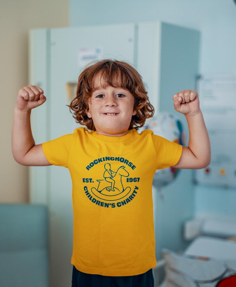
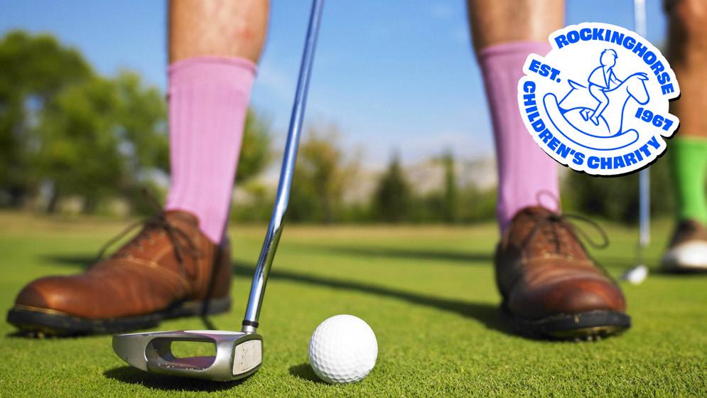
For primarily image focused assets, including social media posts, printed media, advertising and web assets, we have stamp versions of our logo.
These can be used where the asset being used utilises a photographic image as it’s main focus.
The ‘Stamp’ logo show the relationship between the image and Rockinghorse.
For visual examples, see Social Media Assets examples on page 18.
Don’t change the elements’ positions
Don’t stretch or distort the logo
Don’t change the colour of elements
All these examples are incorrect use of the Rockinghorse logo and are not permitted.
Our corporate image is our public facing perception and if it is seen to be weak, damaged or mistreated this affects the overall brand image of the charity.
Additional logos
Proud to support logo
The ‘Proud to support’ logo is used by external supporters holding an event in aid of Rockinghorse.
The use of this logo ensures that there is no confusion with official Rockinghorse events and those organised by external community or corporate supporters.
Proud to support logo guidelines
These guidelines are for all uses of the ‘Proud to Support’ logo:
• This logo is to be used for external Rockinghorse fundraisers or by a person or organisation hosting an event or activity in support of Rockinghorse.
• The logo must be used in exactly the form shown, with no alterations, including changes in: colour (only available in the primary logo of blue and yellow, and white), proportion, clear space or design.
• The logo should not be animated, morphed, or otherwise distorted in perspective or appearance.
• The activity or event where the logo will be displayed should be in line with our values. If displayed digitally, the contents of the website where the logo is being used should meet the same standards.
Proud to support logo spacing
Every logo lives in a variety of environments, surrounded by various design elements or even other logos. For this reason, the space allotted around the logo is essential to properly represent our brand.
The logo should be surrounded on all sides by clear space as per spacing guidelines on page 12.
Proud to support logo variations
The ‘Proud to support’ logo should be used in the original blue and yellow version wherever possible.
However, for dark backgrounds or where the blue and yellow option isn’t suitable, supporters can use the white version.
Funded by logo

The ‘Funded by’ logo is to be used for items funded by Rockinghorse.
This logo show items that Rockinghorse has funded, enabling people within settings we support to be able to see what items or spaces we have funded.
The ‘Funded by’ logo is available in stickers form which are administered by the Rockinghorse Project Manager.
Rockinghorse Blue
R.0 G.85 B.255
C1007 M.70 Y.0 K.0
# 0055FF
Sunshine Yellow
R.255 G.239 B.59
C.4 M.0 Y.81 K.0
# FFEF3b
Use of corporate colours:
Nurse Navy
R.27 G.20 B.100
C.100 M.97 Y.32 K.22
# 1B1464
Cloud White
R.255 G.255 B.255
C.0 M.0 Y.0 K.0
# FFFFFF
Scrubs Pink
R.255 G.156 B.236
C.11 M.47 Y.0 K.0
# FF9CEC
Green
R.127 G.255 B.208
C.46 M.0 Y.34 K.0
# FFFFD0
Primary Brand colours are the main colours of Rockinghorse and are to be used in all publications, promotions and web projects. These can be used for typography, imagery and graphic elements.
Wording can be in either of the blues but never yellow on white. This is due to accessibility issues. The legibility of the content is to be considered when designing for Rockinghorse at all times.
Secondary colours are to be used only for web projects or as an accent colour in print materials. They are supporting colours only.
Please be careful to use the correct colour breakdowns when designing for Rockinghorse to keep our brand consistent. If you have any concerns please contact the Head of Marketing and Communications.
We use our visual assets to reflect our tone of voice and identity.
Having a clear visual identity that works across our website, social media, printed assets and marketing materials helps differentiate our brand and make the link between our visuals and our values.
They also help build trust and loyalty amongst our supporters and the local community. Having a clear visual link between all our digital and physical assets helps them form a journey from their initial interaction with the brand, through to further tangible interaction.
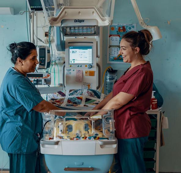
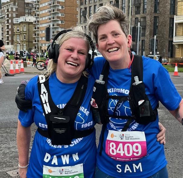
We use photographic imagery and a suite of text and graphics for all types of visual/digital assets to reflect our brand.
We use a range of primary sourced and stock images across our brand assets.
Primary sourced images are always preferable but not always possible to obtain, especially of children and young people in a hospital environment.
In these cases, stock images that reflect the correct content are an appropriate alternative.
Approriate consent should always be acquired if using primary sources photography.
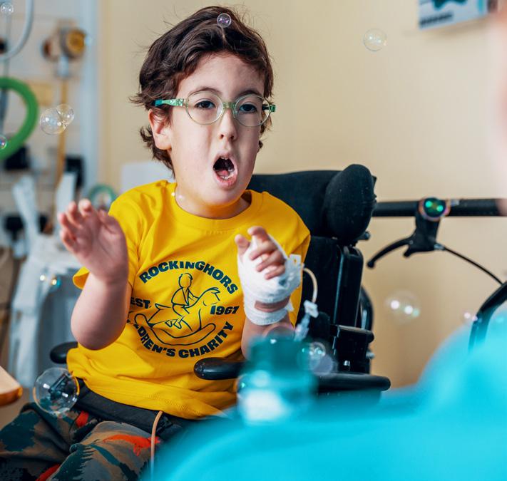
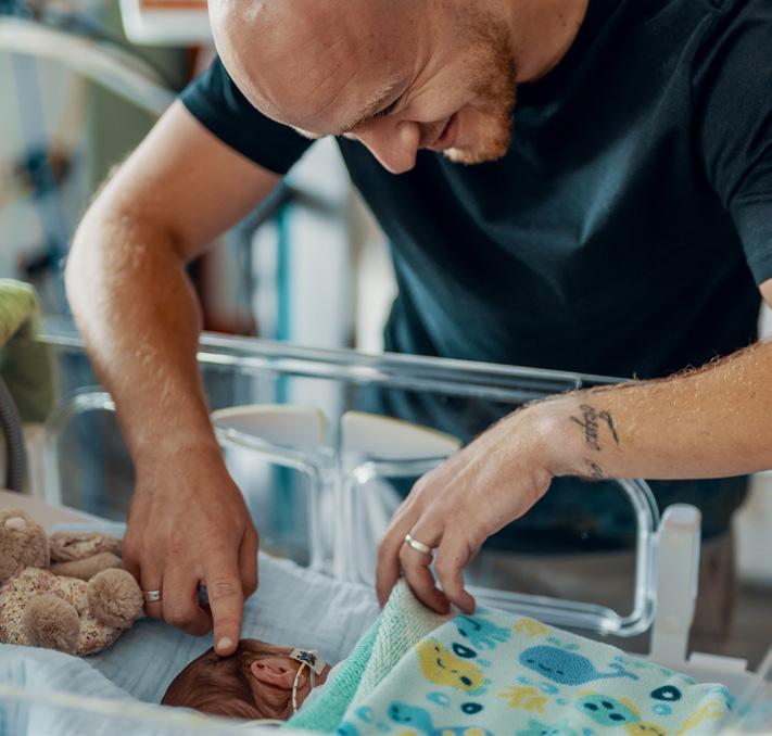
Photographic images should reflect our tone of voice. This means they will represent our core values:
• We care
• We’re passionate
• We’re honest
• We’re supportive
• We’re collaborative
If using stock images, these need to accurately reflect these values and not appear too corporate, staged or obviously from another country or culture.
Wherever possible, photographic images should include a diverse range of subjects to reflect gender, age, race and disability status.





rockinghorse.org.uk
Our social media channels reflect our brand and our tone of voice: caring, passionate, honest, supportive and collaborative.
People within Sussex know us, understand what we do, and trust us. As such, our social media presence plays a really important role in promoting our work.
This is why it’s important that the visuals we use in our posts reflect our branding to create a clear visual link across all our marketing assets.
Depending on the post needed, we have a range of different designs that are flexible enough to incorporate photography, text and graphics.
Across the different kinds of posts (show, tell, ask) we want to keep the graphics interesting and engaging, making sure that there is a good variety of different images and messaging.
We use primary sourced and stock images in our social media posts, depending on the content.
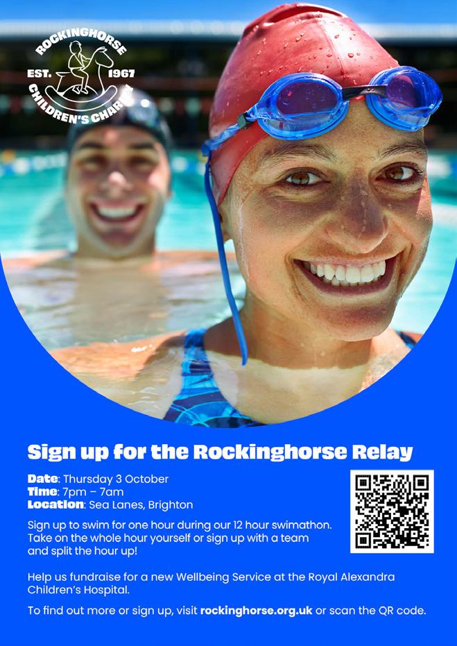
In order to promote our work, including events, fundraising and campaigns, we often use printed material to distribute to supporters, local businesses and community groups.
Like all our graphics, these materials follow the visual style of the brand whilst making space for all the relevant information including sponsor details and QR codes when we need them.
They also relfect our tone of voice and help to engage people with our work.
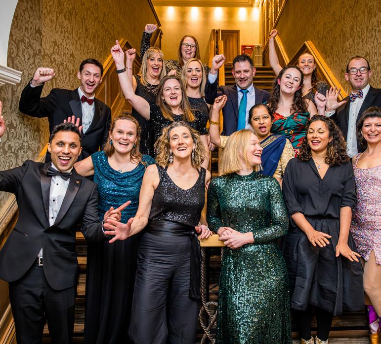
• Date: 23 March 2024
• Time: 6.30pm - 12.00am
• Venue: The Grand, Brighton
• Cost: £1,100 per table
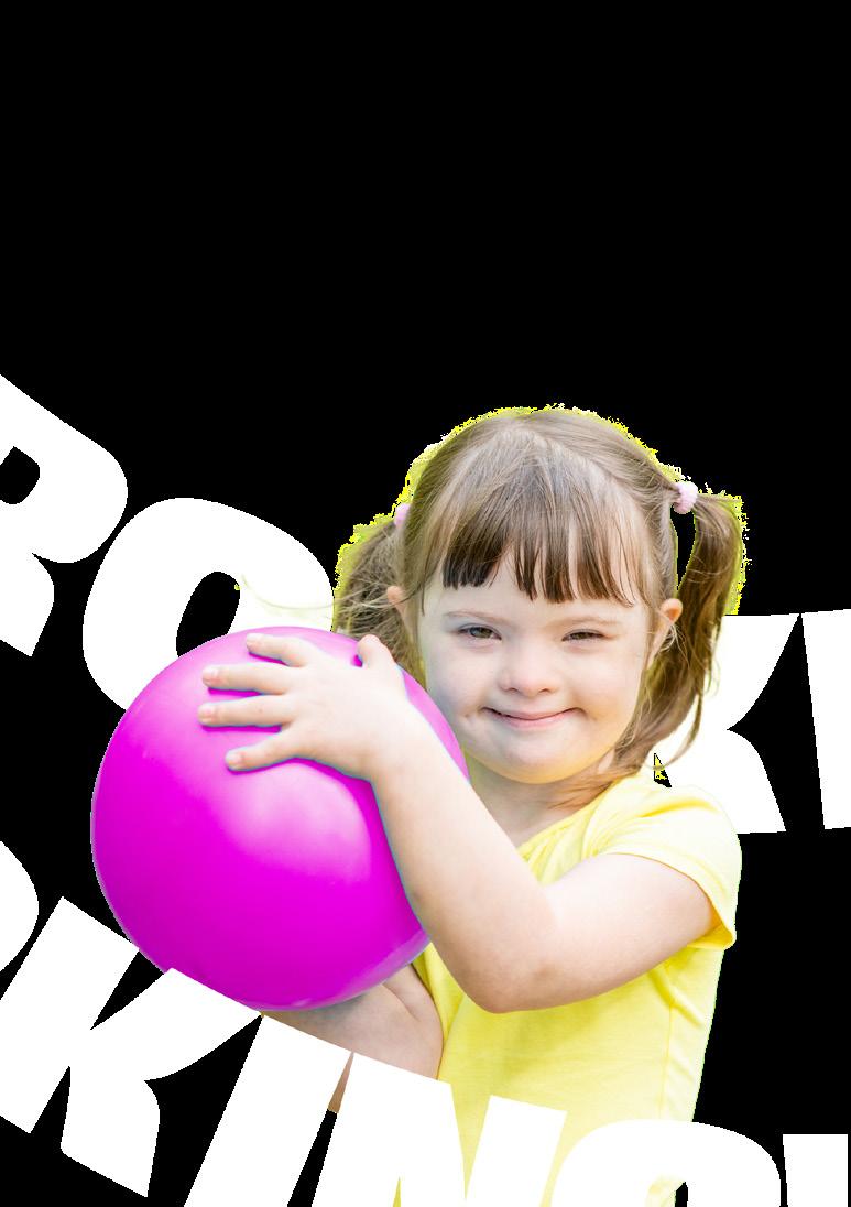
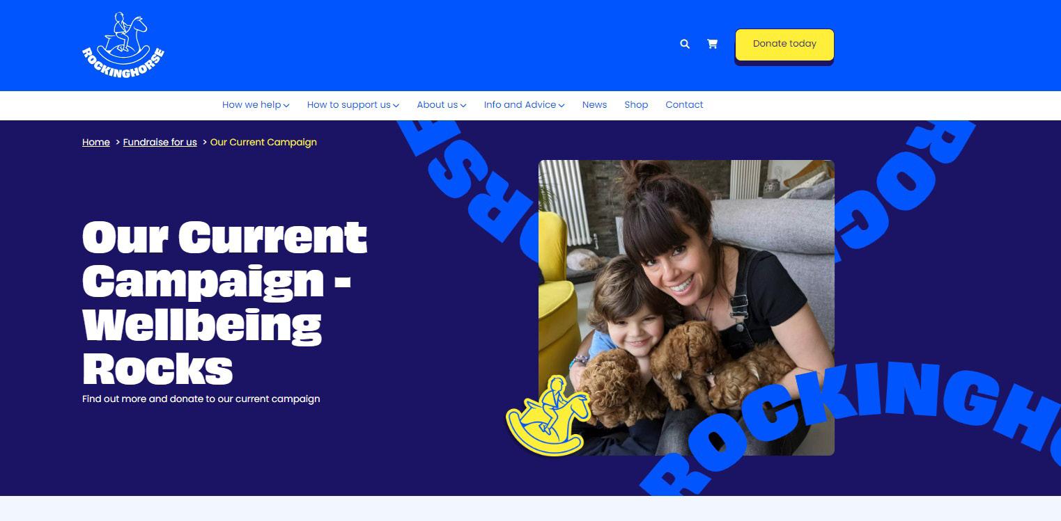
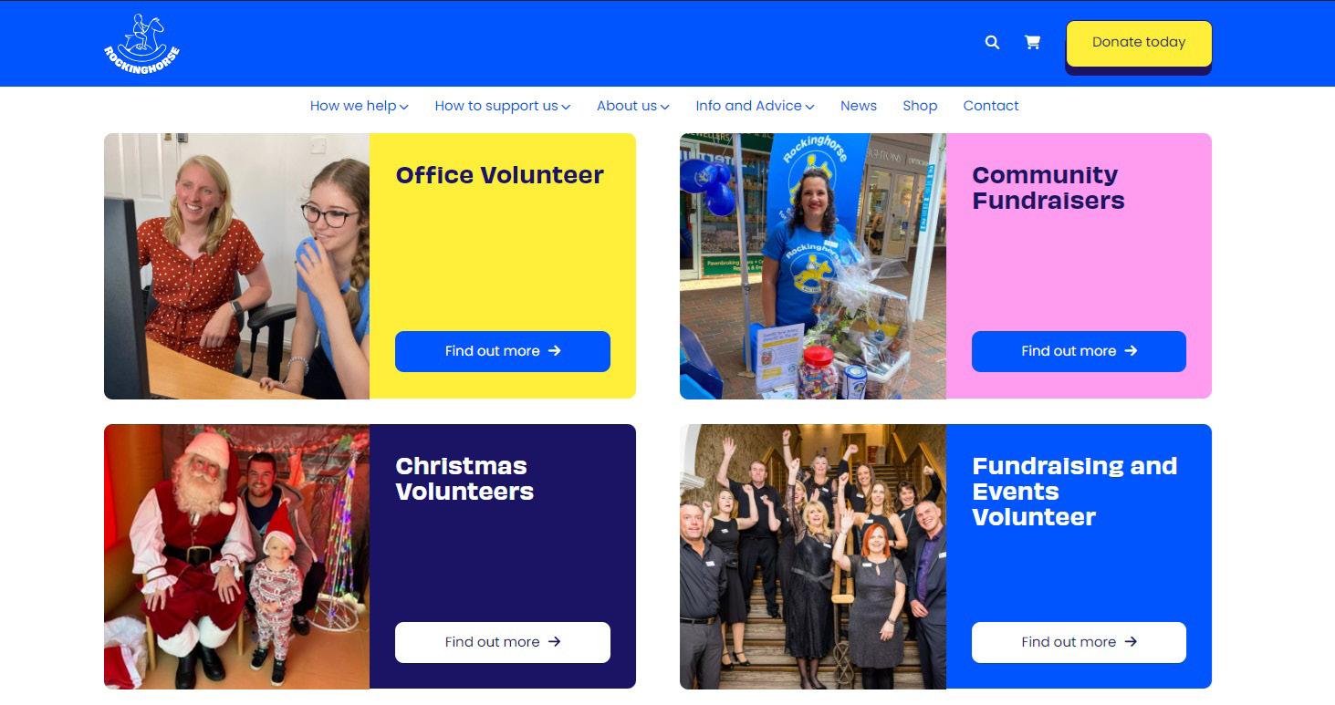
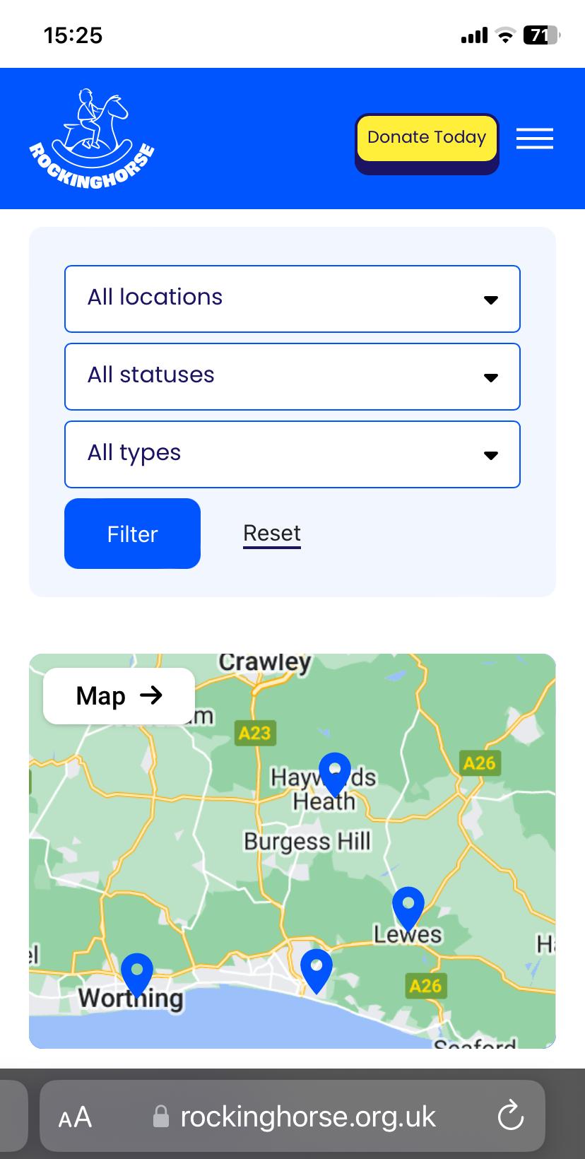
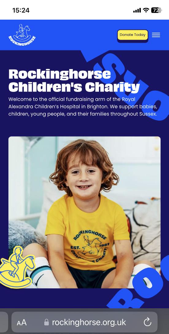
Our website plays an important role in our work. It’s the ‘shop window’ for what we do and is used for everything from information about our projects, event tickets, donations, and so much more.
As such, it’s vital that our branding across the site is consistent and has a visual link to our social media channels, printed material and advertising.
People need to feel confident that if they have clicked from a social media post or searched for us from a printed advert, that they have come to the right place.
The site utilises a range of photography, graphics and fonts from across the brand kit.
We use a range of graphic assets to help articulate our brand.
These graphics use variations of our emblem and typography, along with photography, in our brand colours to help re-enforce the brand and reflect our vision and tone of voice.
These graphics can be used across all platforms depending on the need.





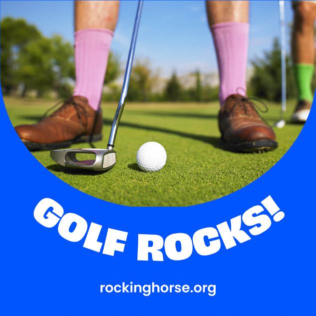

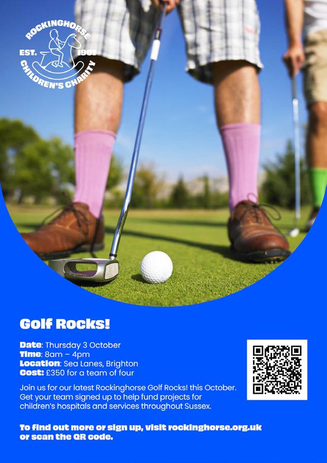

The ‘Rockinghorse Rocks’ wording forms part of our visual and written identity, reflecting our brand in a positive, active way.
The use of the word ‘Rocks’ across our internal events portfolio creates consistency consistency and re-enforces our branding.
It also helps to identify and distinguish our events and activities from other charities working within the same space.
