1
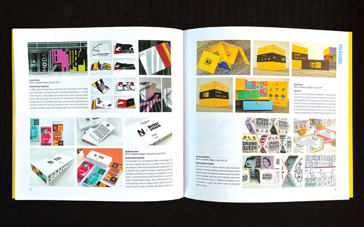
Amelia Whittington graduated with a BFA in graphic design from the Savannah College of Art and Design (SCAD) in 2022. She is a highly creative individual who is interested in publication and print design. With over five years of recognized work, she is passionate about design and eager to take on projects that challenge her and encourage growth.

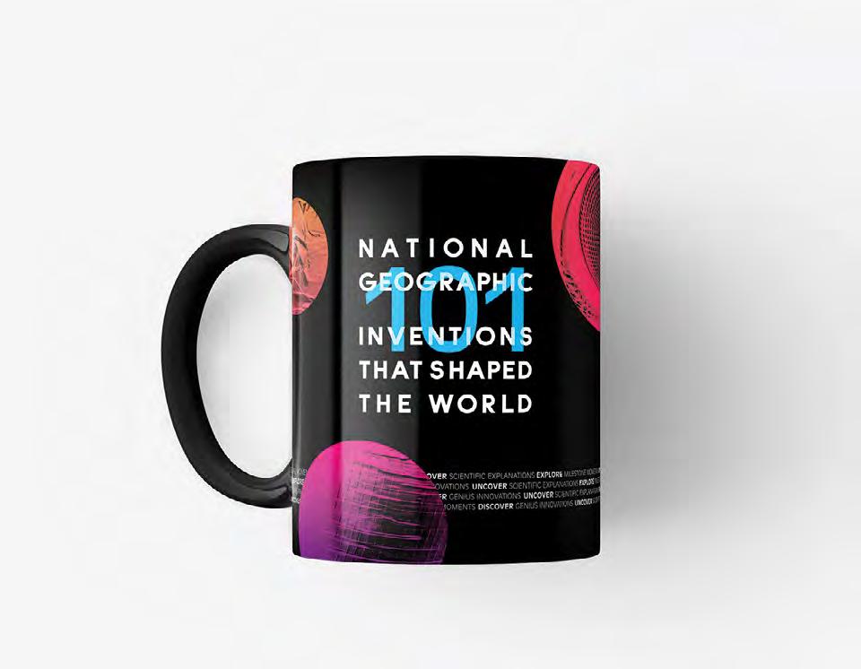
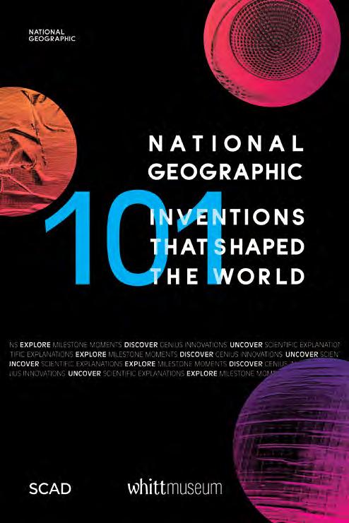
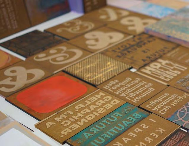
101 Inventions That Shaped the World Vignettes
O.H.S.O. Brewery Choose Chicago 2032 Olympic Bid Peak Chew CRACK Magazine The Power of Perfume Gasoline Hollywood on Lake Michigan
2 8 14 20 26 34 40 46 52 58
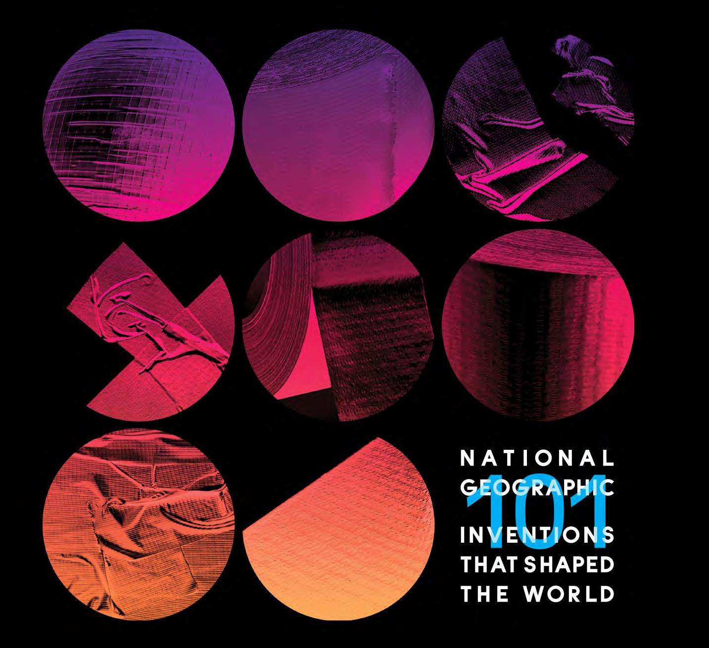
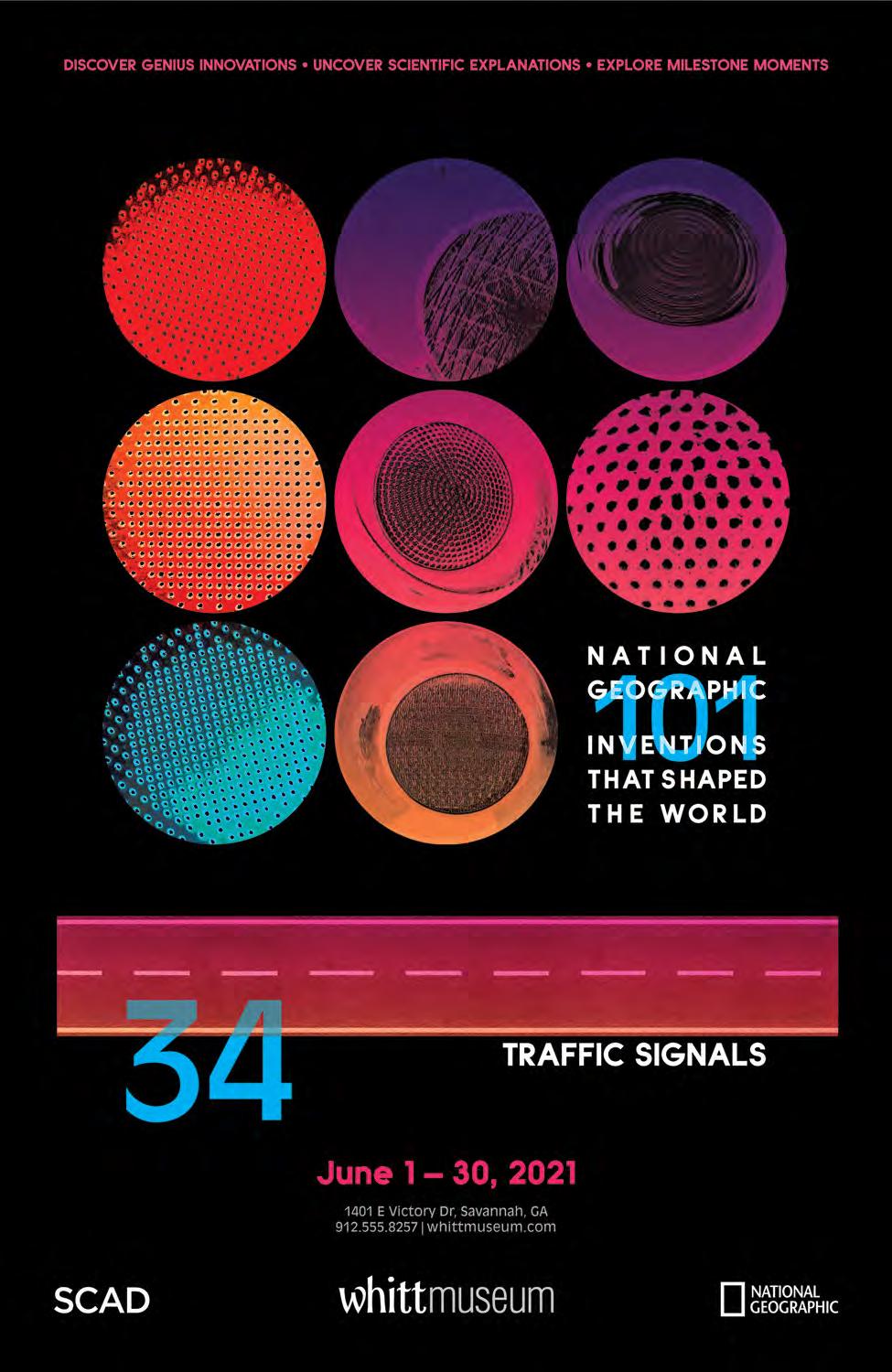
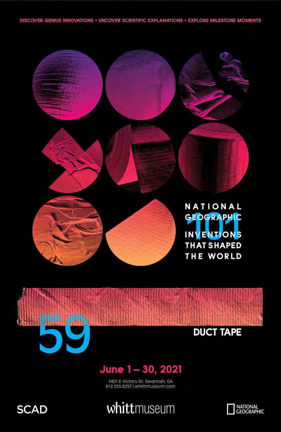
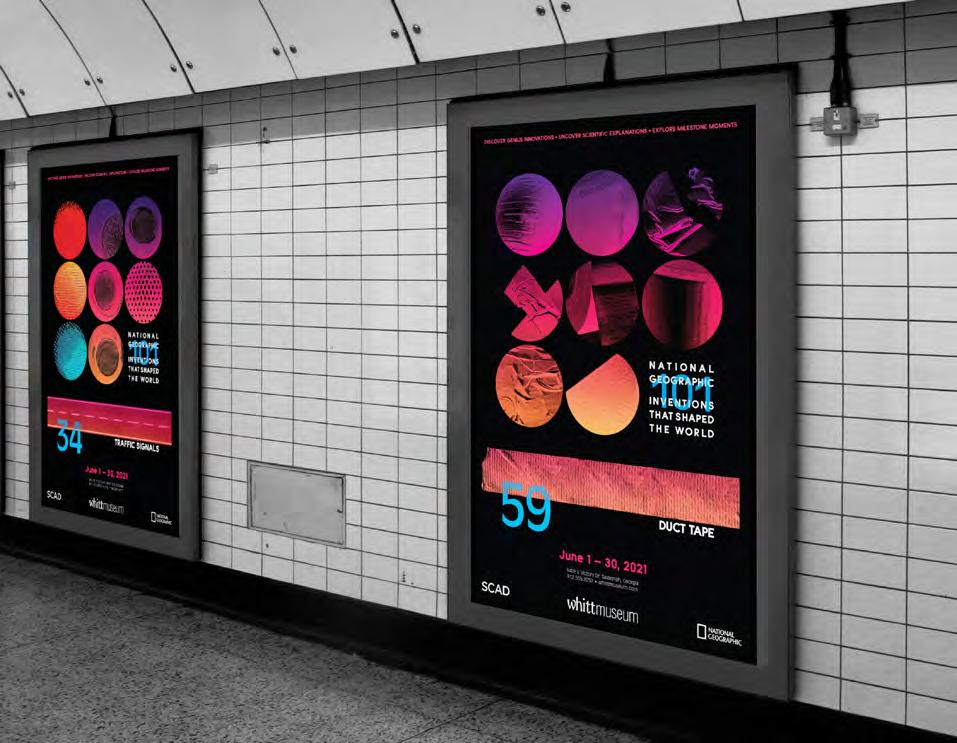
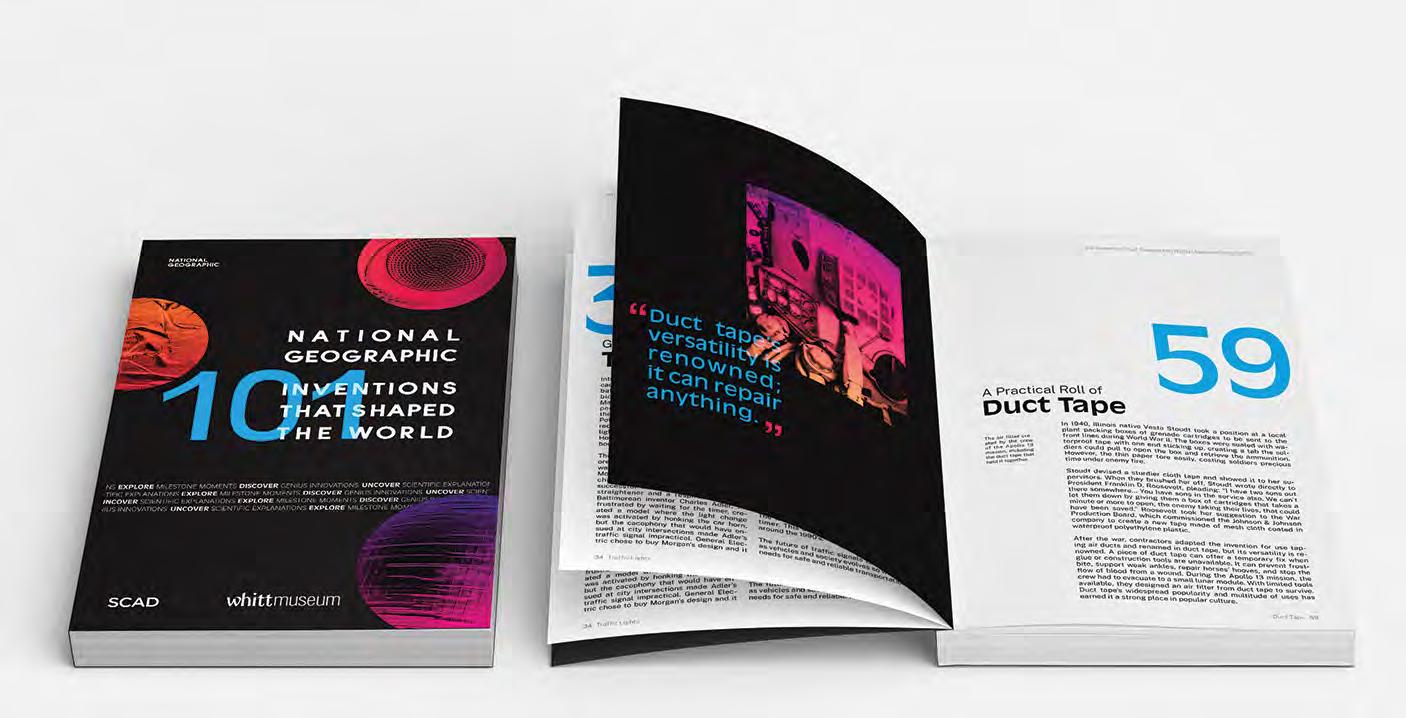
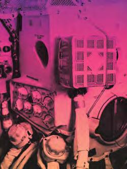
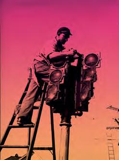
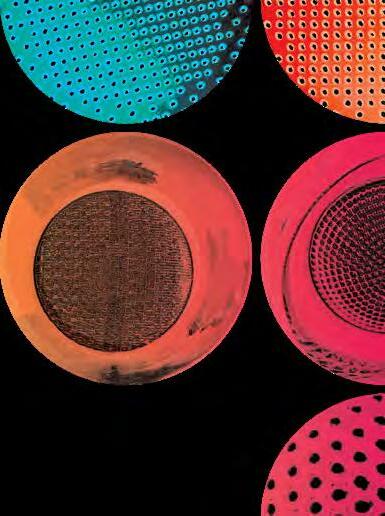
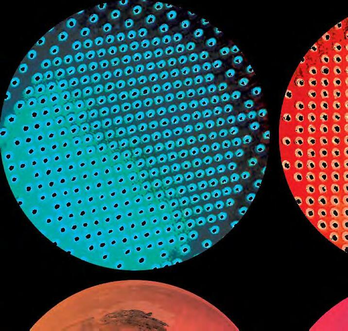
To accompany the National Geographic’s list of 101 Inventions That Shaped the World, a visual design system for 101 posters and an accompanying catalog was produced. Of this system, two posters and their corresponding editorial spreads were produced: #34: traffic signals and #59: duct tape.
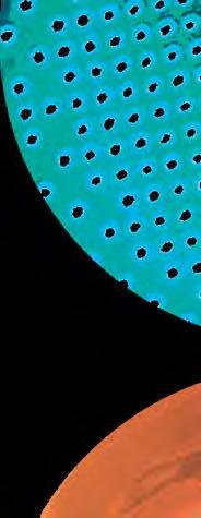
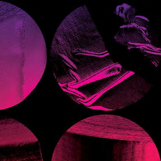
The concept for this campaign was to make these seemingly ordinary inventions extraordinary. By featuring the history behind these influential inventions, a story and narrative could be formed for each of the 101 items. The visual treatment for images was reliant on two things: texture and colors. Each object was abstracted with bright colors and tight zoom-levels to cause intrigue and a new appreciation for these everyday inventions. The close-up composition not only allows for interchangeable parts in all of the 101 posters, but also a challenge for the viewer as they work to puzzle the images together in this new context.
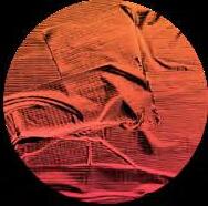
The planetary circles are designed to give an otherworldly and alien impression so as to give the viewers a new appreciation for everyday life.
2021 Winner

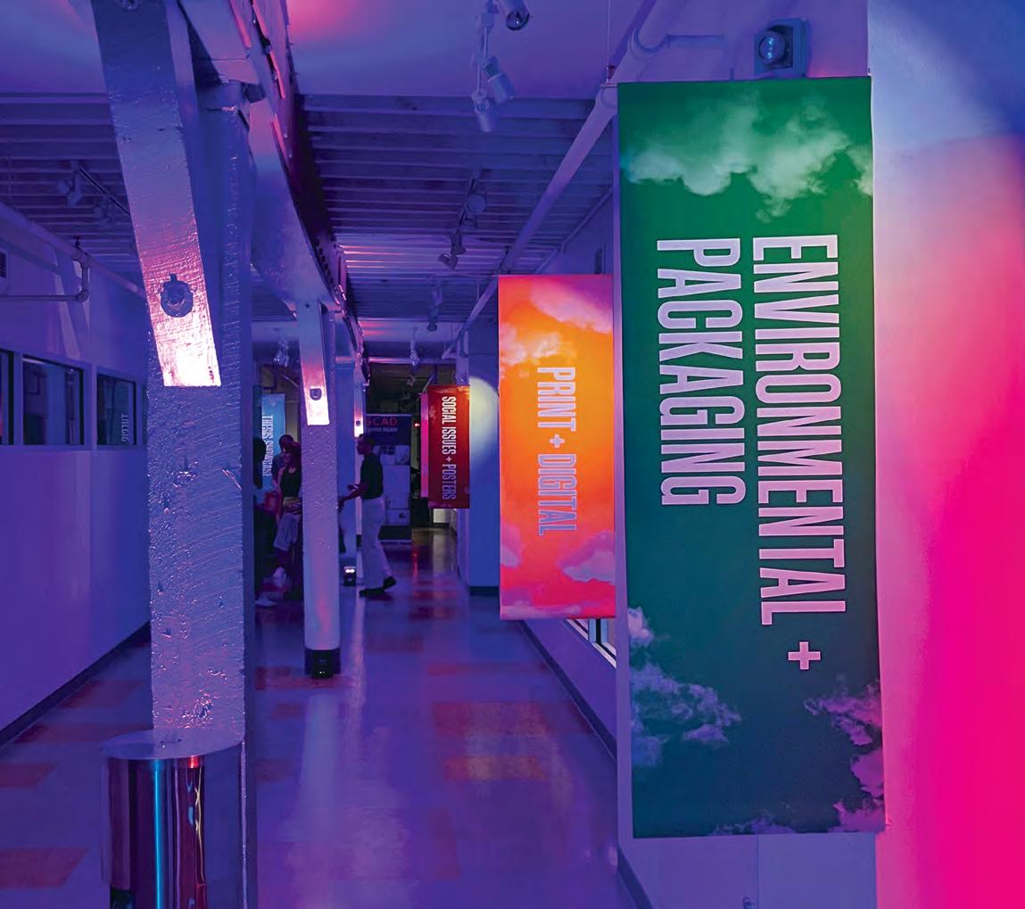
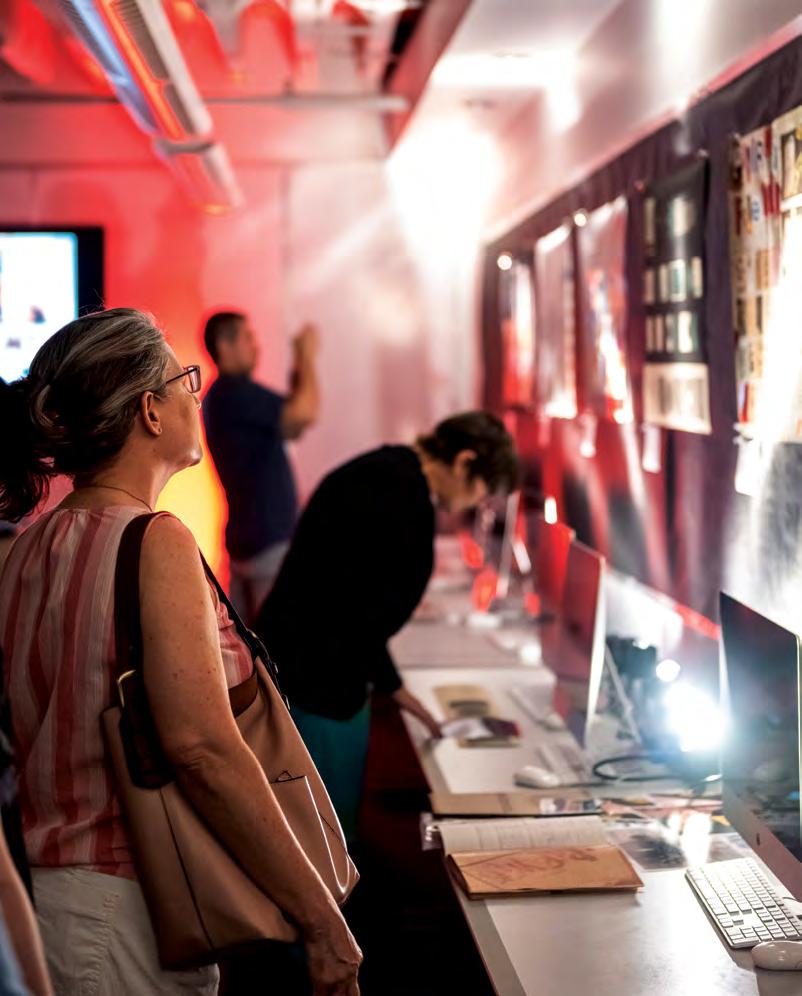
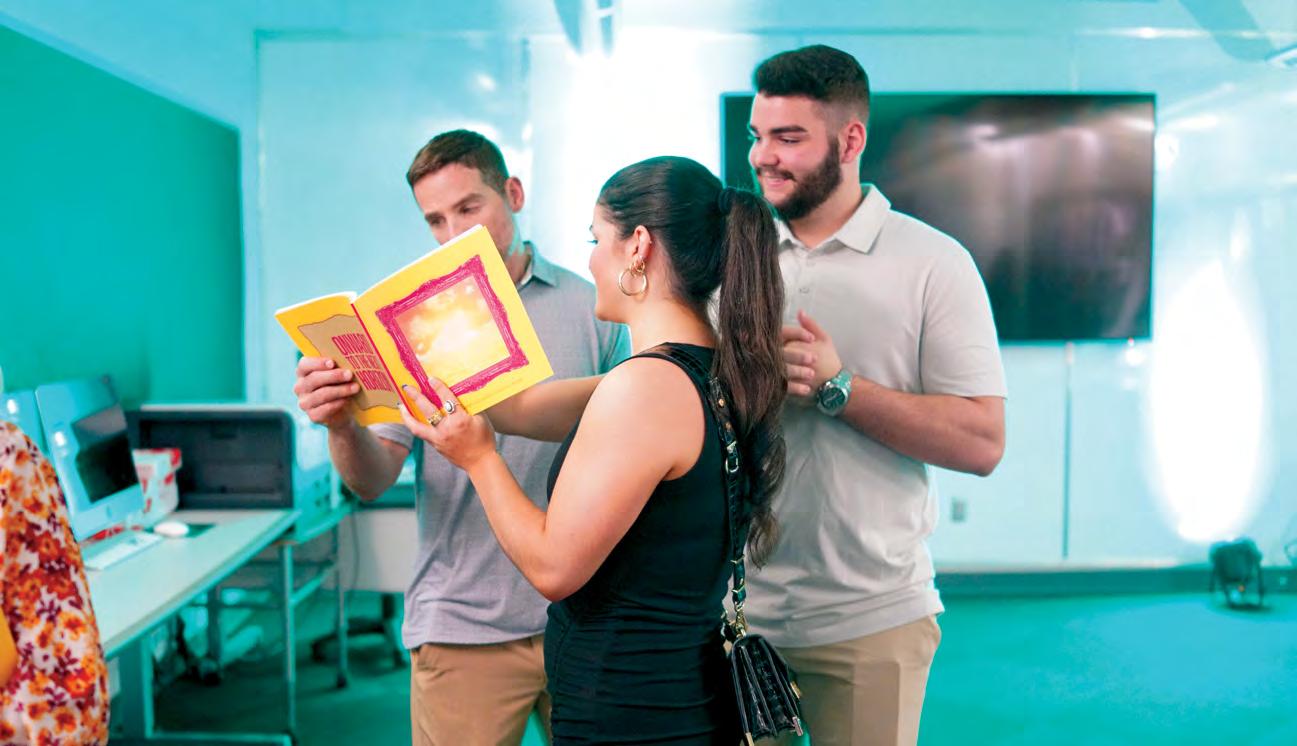
Exhibited in the 2022 SCAD GRDS Showcase
Published in the 2022 SCAD Port City Review
Branding & Identity Poster
Editorial
2
GDUSA
3
4
5

6
Green-Lighting the
Traffic Signal
Introducing automobiles on roadways caused chaos. The “horseless carriages” battled with pedestrians, horses, and bicycles, and accidents were common.
Manually operated traffic signals ap peared on railroads and city streets in the 1860s. Detroit Police officer William
Potts introduced the first yellow light to reduce collisions that occurred when the light abruptly switched from green to red. However, a police officer still sat in a booth and changed the lights by hand.
The patent for the first automatic tricol ored electric signal in the United States was awarded to Garrett Morgan in 1923. Morgan was an African-American me chanic in Cleveland with a string of successful inventions, including a hair straightener and a respiratory device.
Baltimorean inventor Charles Adler, Jr., frustrated by waiting for the timer, cre ated a model where the light change was activated by honking the car horn, but the cacophony that would have en sued at city intersections made Adler’s traffic signal impractical. General Elec tric chose to buy Morgan’s design and it
was installed around the country. Since then, numerous innovations have come to the traffic signal. With the new age of computers, automation and further programing was possible, including the addition of pressure sensors under the road to detect stopped vehicles.
The traffic signals for pedestrian crossing lanes came later in the history of the traf fic signal. There were many innovations around the globe. In 1961 a German psy chologist named Karl Peglau proposed a figure of a man walking to mean “go” and a man standing for “stop”. These figures are named ”Ampelmännchen”. In North America, pedestrian signs adopted the written “walk” or “don’t walk”. There has also been the addition of a “stop” hand motion, thought to have been designed by Alexander Heron in Montreal, Canada. The latest addition was the count-down timer. This became widely popularized around the 1990’s.
The future of traffic signals is limitless, as vehicles and society evolves so will our needs for safe and reliable transportation.
The traffic signal was a valuable lifesaving invention.
In
Stoudt devised a sturdier cloth tape and showed it to her su pervisors. When they brushed her off, Stoudt wrote directly to President Franklin D. Roosevelt, pleading: “I have two sons out there somewhere… You have sons in the service also. We can’t let them down by giving them a box of cartridges that takes a minute or more to open, the enemy taking their lives, that could have been saved.” Roosevelt took her suggestion to the War Production Board, which commissioned the Johnson & Johnson company to create a new tape made of mesh cloth coated in waterproof polyethylene plastic.
After the war, contractors adapted the invention for use tap ing air ducts and renamed in duct tape, but its versatility is re nowned. A piece of duct tape can offer a temporary fix when glue or construction tools are unavailable. It can prevent frost bite, support weak ankles, repair horses’ hooves, and stop the flow of blood from a wound. During the Apollo 13 mission, the crew had to evacuate to a small lunar module. With limited tools available, they designed an air filter from duct tape to survive. Duct tape’s widespread popularity and multitude of uses has earned it a strong place in popular culture.
7
101 Inventions that Shaped the World National Geographic
34 Traffic Lights
1940, Illinois native Vesta Stoudt took a position at a local plant packing boxes of grenade cartridges to be sent to the front lines during World War II. The boxes were sealed with wa terproof tape with one end sticking up, creating a tab the sol diers could pull to open the box and retrieve the ammunition. However, the thin paper tore easily, costing soldiers precious time under enemy fire.
Duct Tape
Practical Roll of
Duct Tape 59 The air filter cre ated by the crew of the Apollo 13 mission, including the duct tape that held it together. Duct tape’s versatility is renowned; it can repair anything.
A
101 Inventions that Shaped the World National Geographic
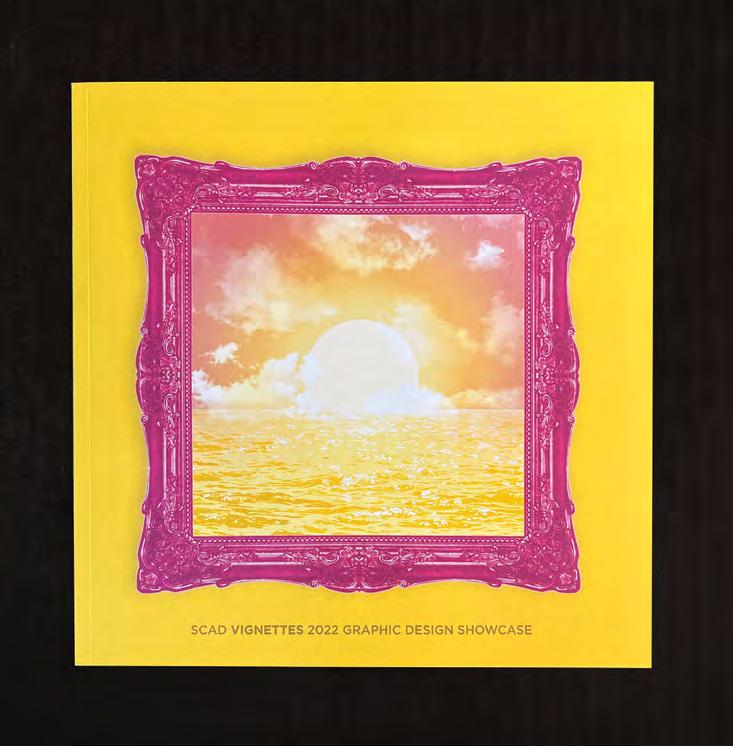
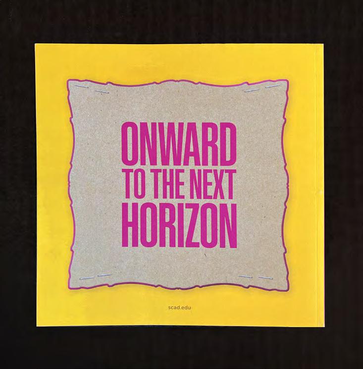
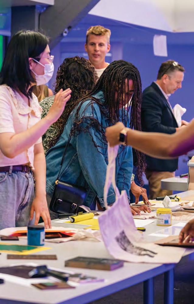
Annually, a showcase is hosted by the Graphic Design department of the Savannah College of Art and Design to honor and celebrate works by senior and graduate students. For 2022 a group of 13 students were tasked with representing their graduating class with an exhibition and 44-page catalog of student works.
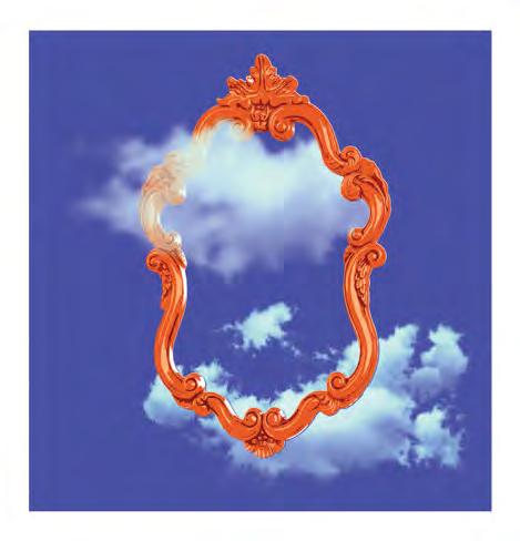
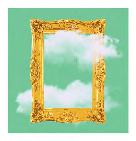
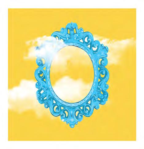
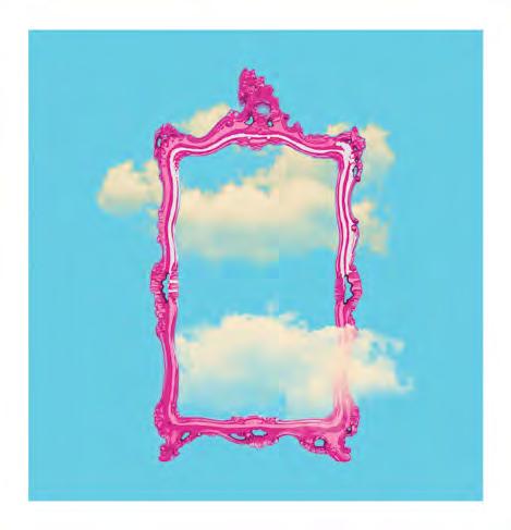
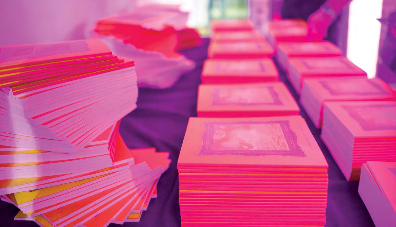
In graphic design a vignette is an ornate and decorative frame that surrounds an artwork to compliment its beauty. The exhibition Vignettes is about celebrating and reflecting on the works and experiences shared by a graduating class of young designers.
Bright colors and ornate frames are used throughout the campaign and exhibition to represent not just static images, but doorways leading to new opportunities. The transition between the small and nurturing community of art school into the real world is treated with excitement and anticipation.

Because the catalog was revealed to the guests during the exhibition, it was important to connect the two experiences. Along with the branding of the event, the catalog uses a visual design system that extends into the signage and wayfinding of the physical space. The attendees could also leave their own creative mark with a graphic designer themed printmaking station.
Vignettes serves to celebrate and mark a moment in time. Although the exhibition is celebrating past work, there are more creative endeavors beyond just these vignettes. The illustrations within the catalog use the sun and moon to mark the time passed, but also serve as a reminder that the world keeps spinning.
Branding & Identity Publication Exhibition Design Publication Halle Garrett Luke Kollar
Amelia Whittington Communication Meghan Cleary Josh Gorski
James Naser
Event
Chris Bartoldus August Collucci Laura Hintzman
Camille Kulakowski
Lauren Sciortino Kami Stallworth
Francesca Villa
8

10

13
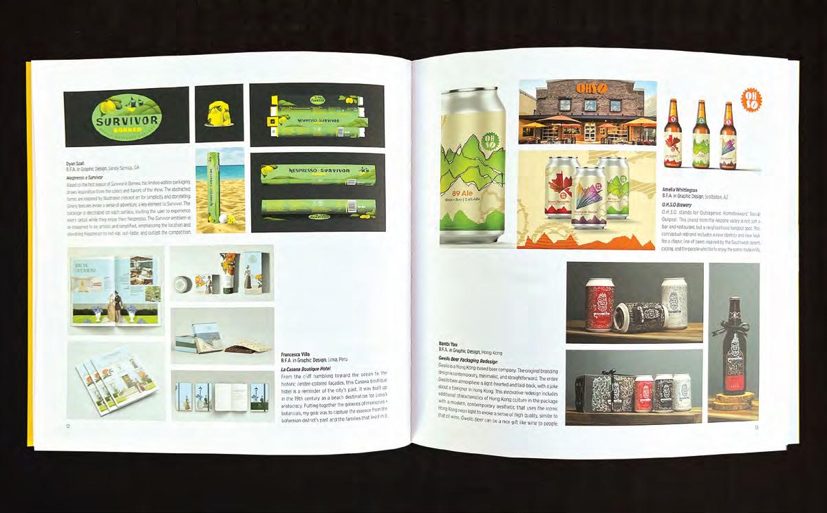
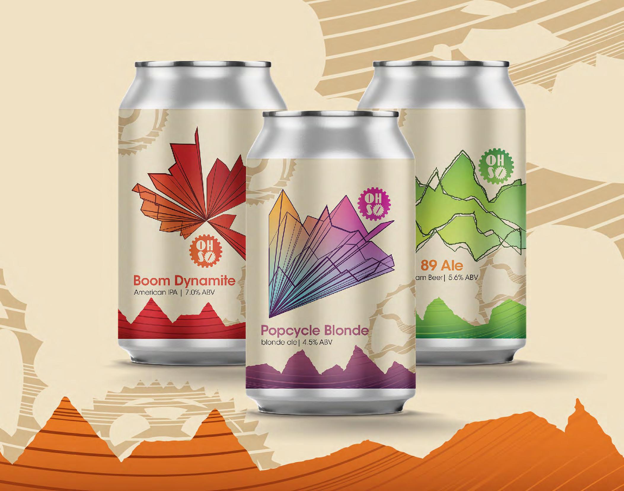
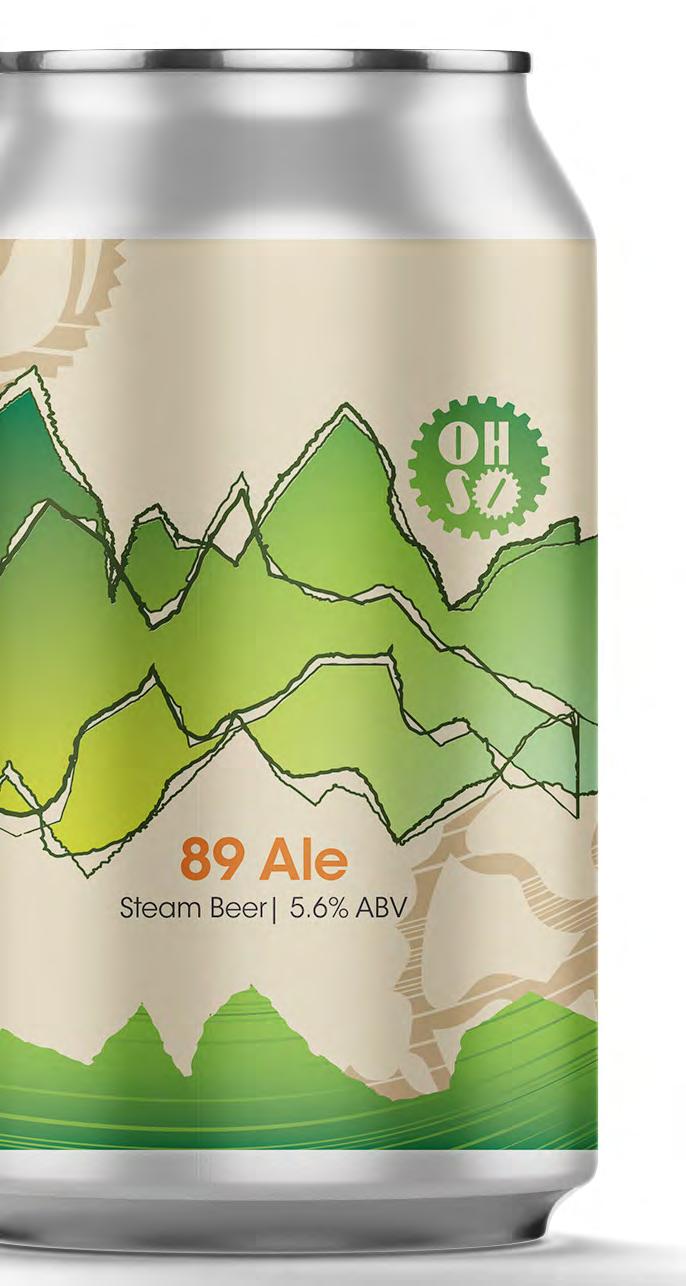
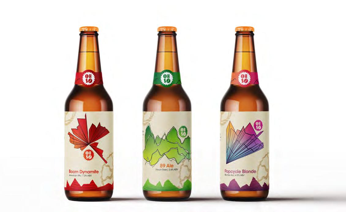
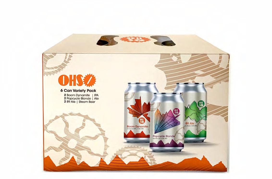
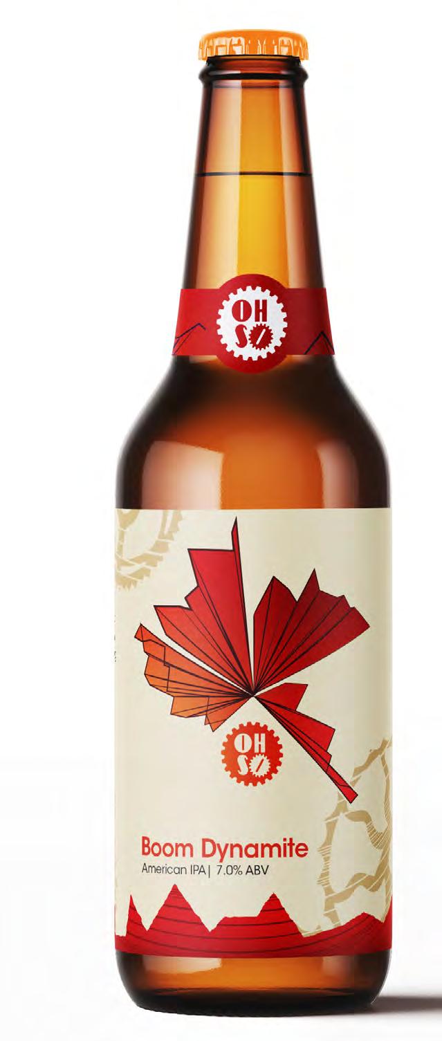
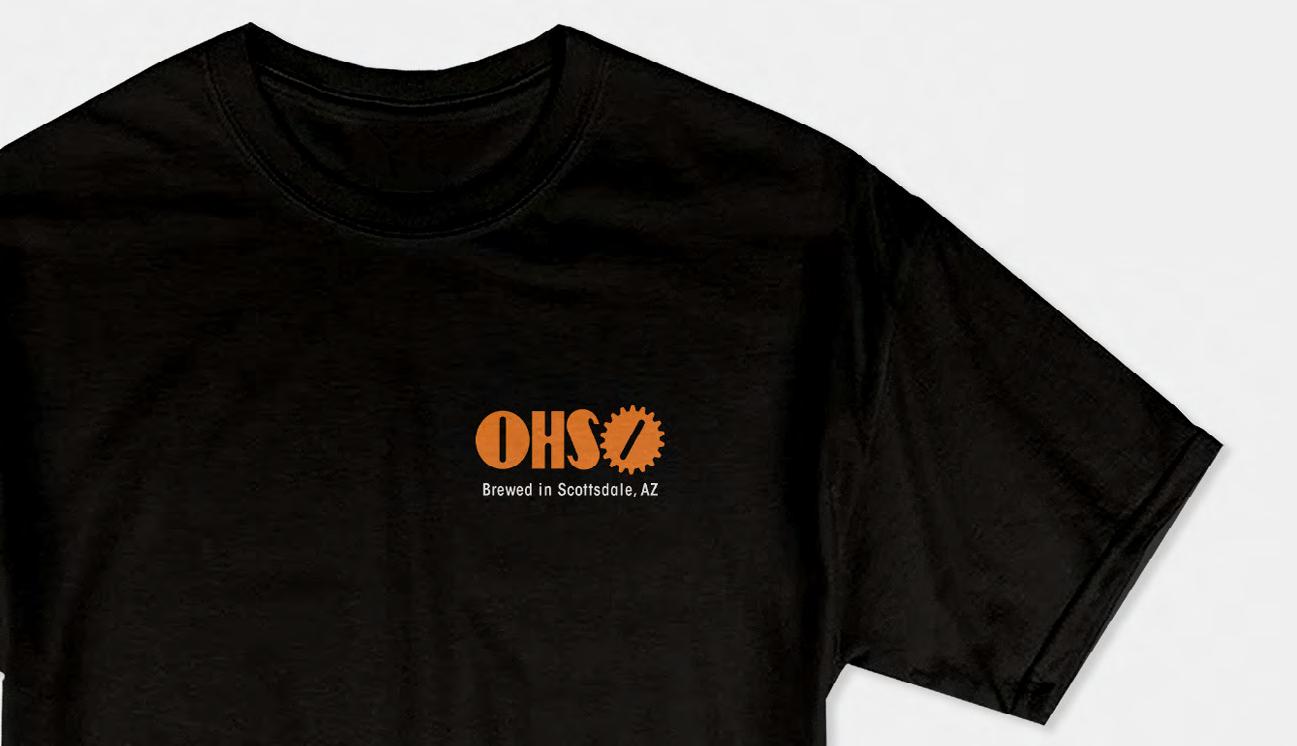
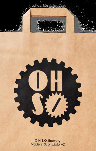
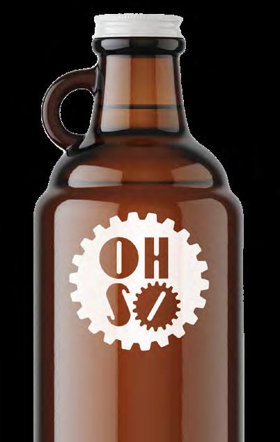
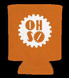
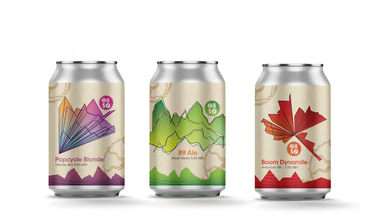
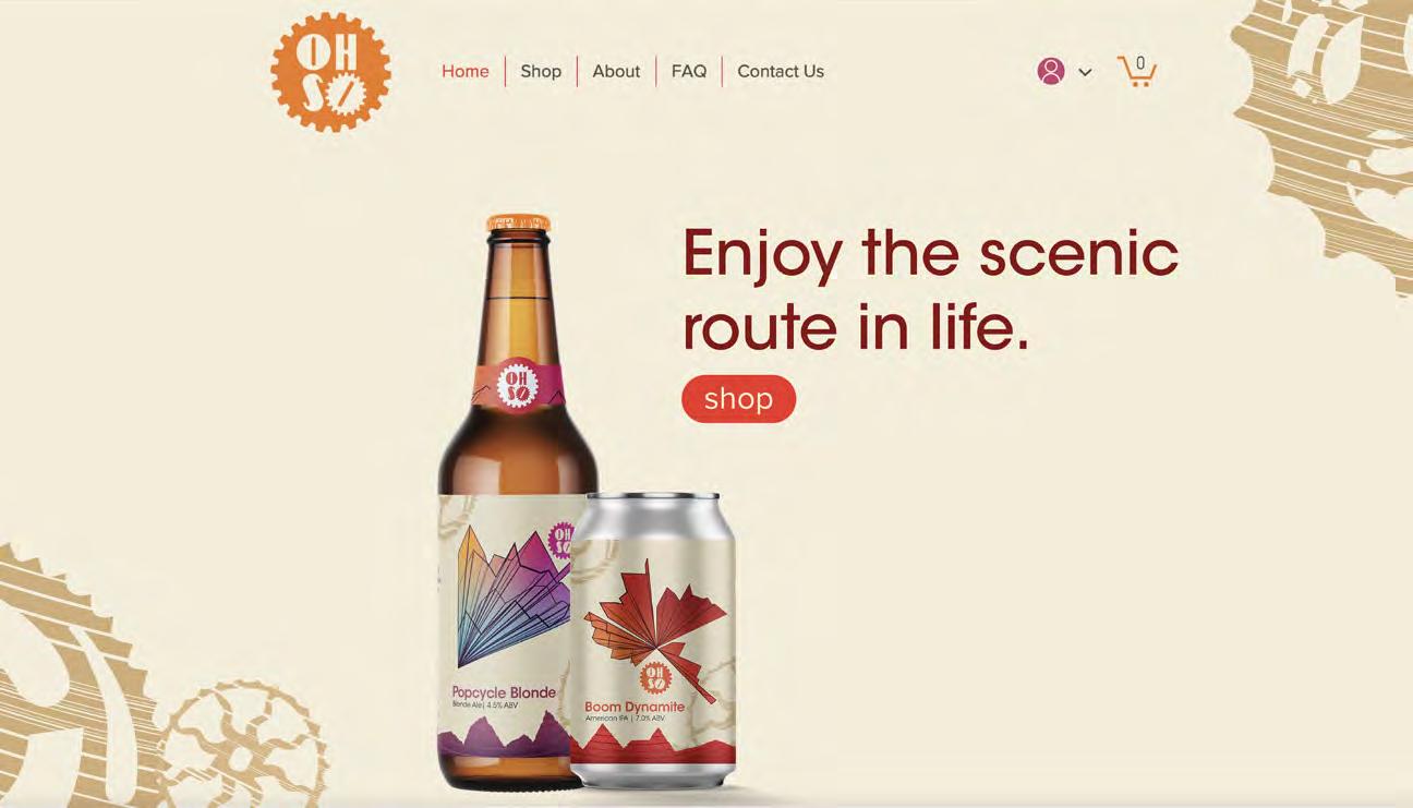
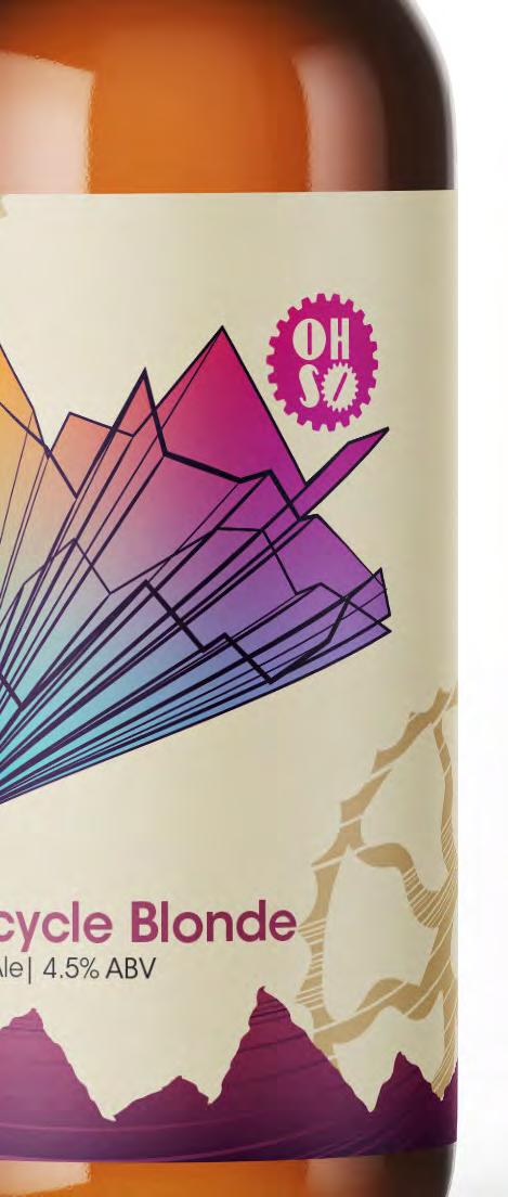
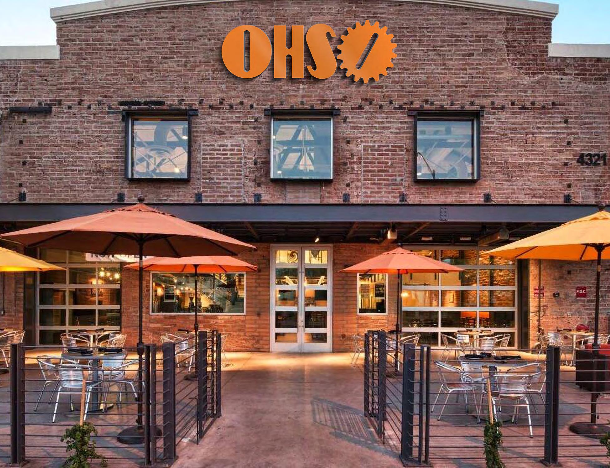
O.H.S.O. stands for “Outrageous Homebrewers’ Social Outpost”. This is the core value of this Scottsdale, Arizona brewery and restaurant chain. OHSO is not just a bar and grill, but a neighborhood and community hangout spot for those who like to take the scenic route in life.

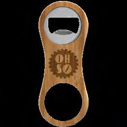
This conceptual project took three OHSO specialty beers and sought to revitalize them with a fresh new look. The OHSO brand identity was also updated. Taking inspiration from OHSO’s current tone and themes, the logo was inspired by the founder’s passion for cyclist culture. The gears of the symbol can read as the sprockets on a bike or as a bottle cap. The shape of the hand-designed logotype was inspired by 20th century European bike race posters.
There are three flavors that received an updated look: Boom Dynamite is a strong and heavy IPA, Popcycle Blonde is a refreshing blonde ale, and 89 Ale is a rustic and earthy American steam beer. These three flavors were designed to work together while still holding their own personalities.
The labels are inspired by the Arizona desert landscape with geological features in mind. The shape and color palette was created from scientific drawings, gemology, and topography. All three of the labels were created from one sketch of a mountain landscape and this sketch was then abstracted and reorientated to reflect each individual beer flavor.
Exhibited in the 2022 SCAD GRDS Showcase
Branding & Identity Package Design Merchandise
14
16
17
18
19
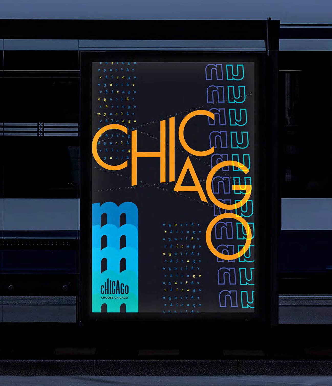
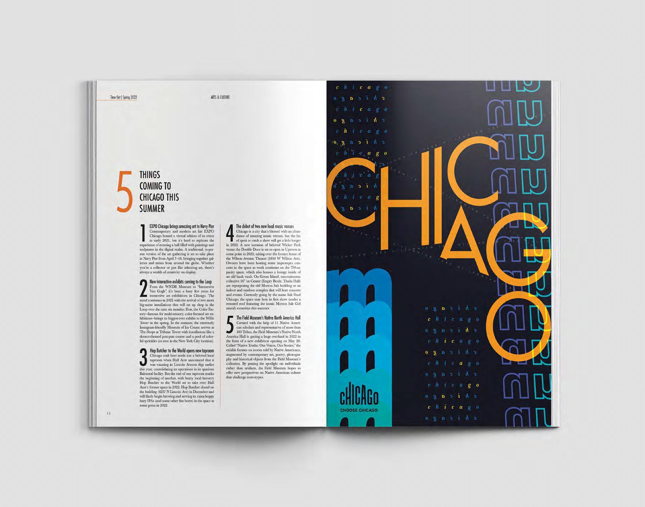
CHOOSE CHICAGO
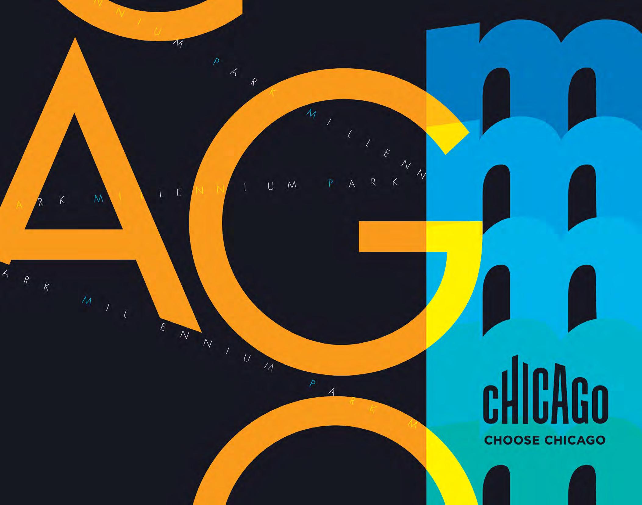
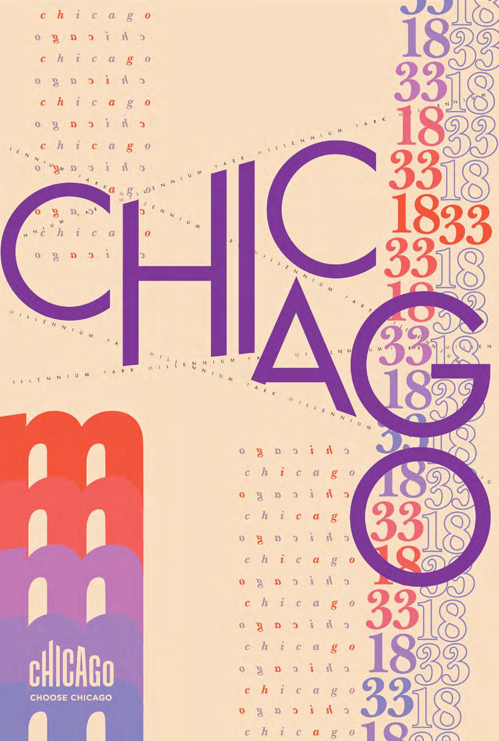
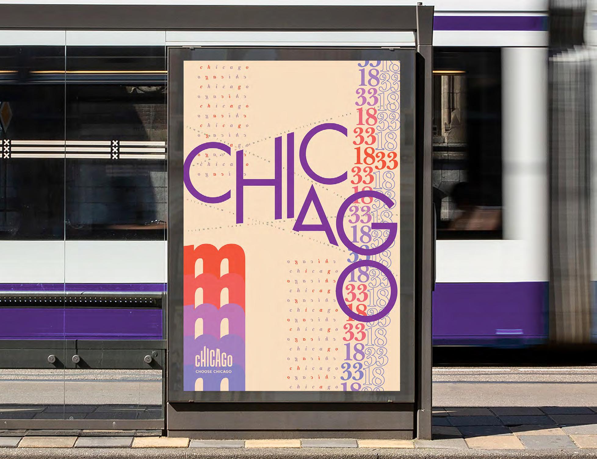
Choose Chicago is the official tourism and marketing organization for the city of Chicago. In this conceptual campaign two typographic posters are used throughout the state of Illinois and in travel magazines to encourage people to explore all that Chicago has to offer.
The pair of posters are an homage to Millennium Park. This iconic park is in the heart of downtown Chicago and acts as a gathering space for people to experience culture, community, and nature. The contrasting posters take two different color schemes to show the cityscape during the day and night. The daytime scene is inspired by the warmer tones of summer and the cool lake breeze. The nighttime cityscape is inspired by the glow of neon signs and the city’s Jazz clubs and history; it is designed to be backlit when displayed.
The typographic structures create their own skyscrapers in the composition, creating windows and doors to the city’s residents. The diagonal and orbiting lines are reminiscent of the train tracks and The Loop. The year 1833 marks the city’s founding date.

Part of my process included building an intricate grid from an image of the Jay Pritzker Pavilion as designed by Frank Ghery. The arching lines of text and the title are designed on the grid that forms the bandshell and centerpiece of Millennium Park.
Marketing
20
Poster
22
23
24
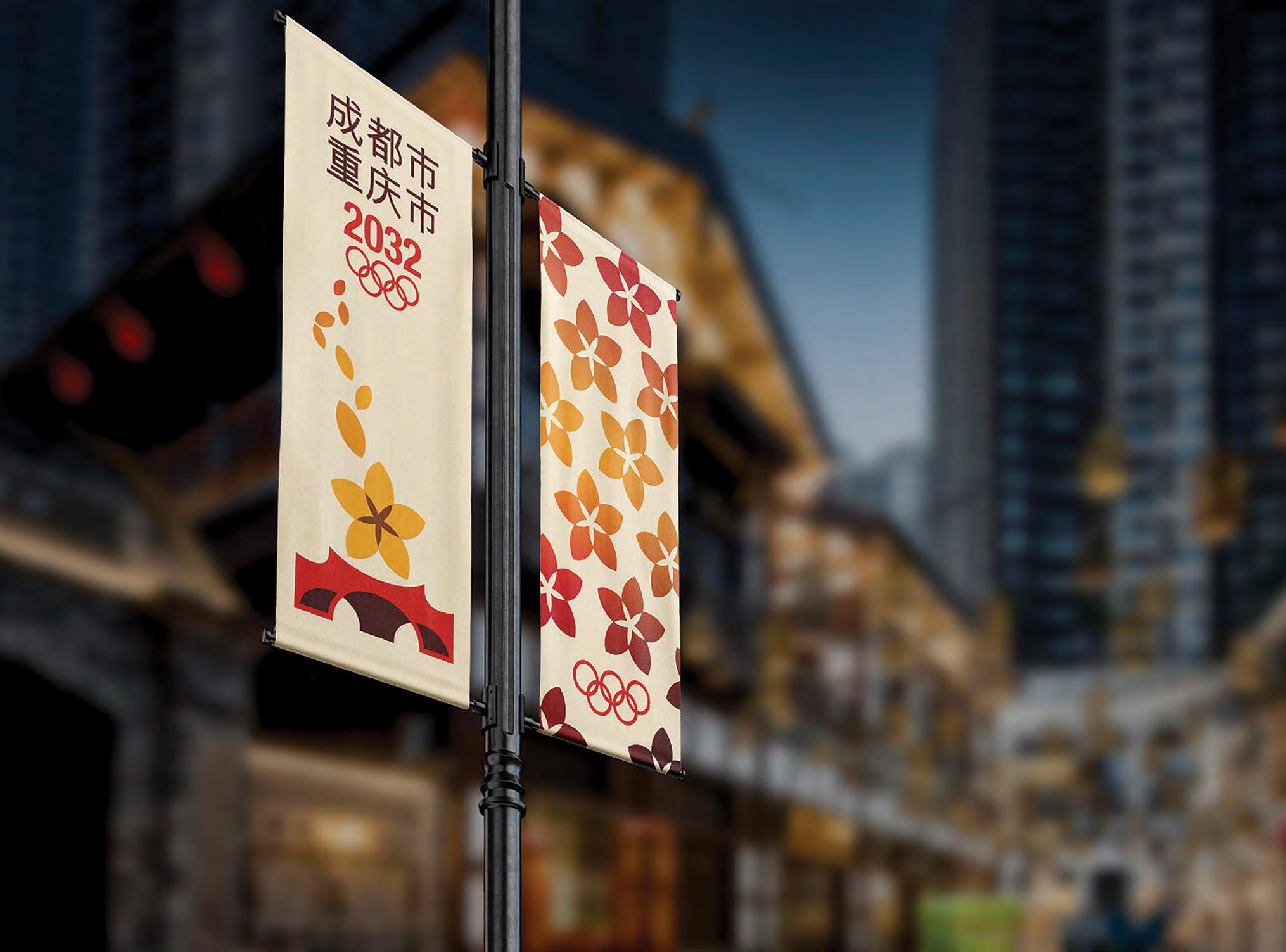
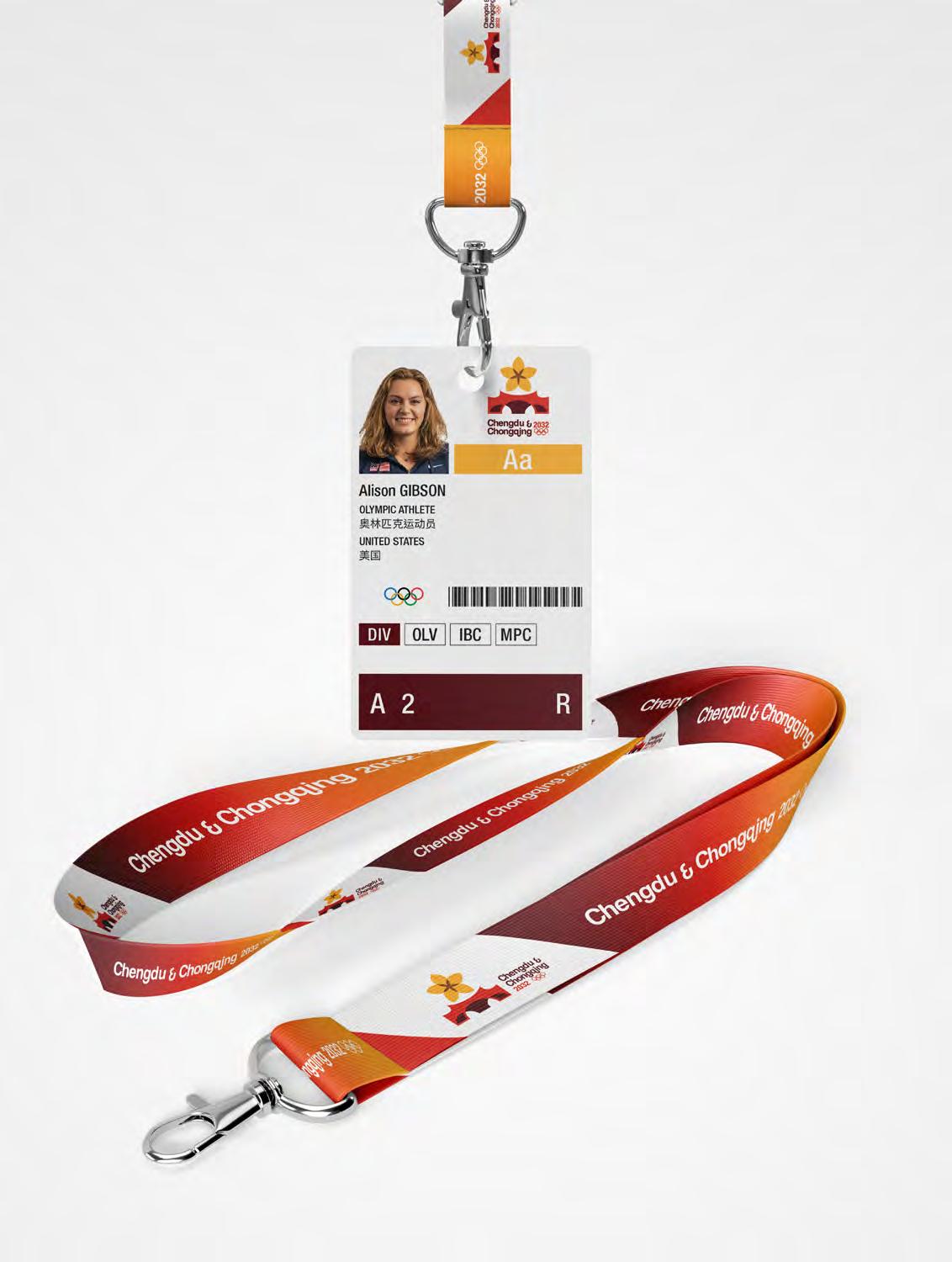
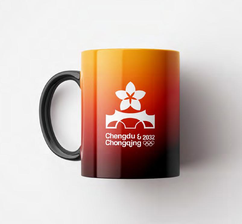
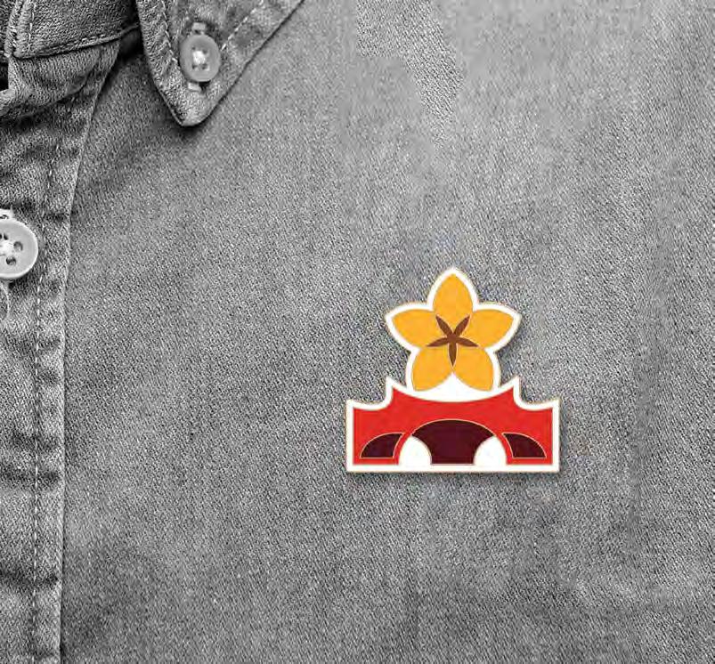
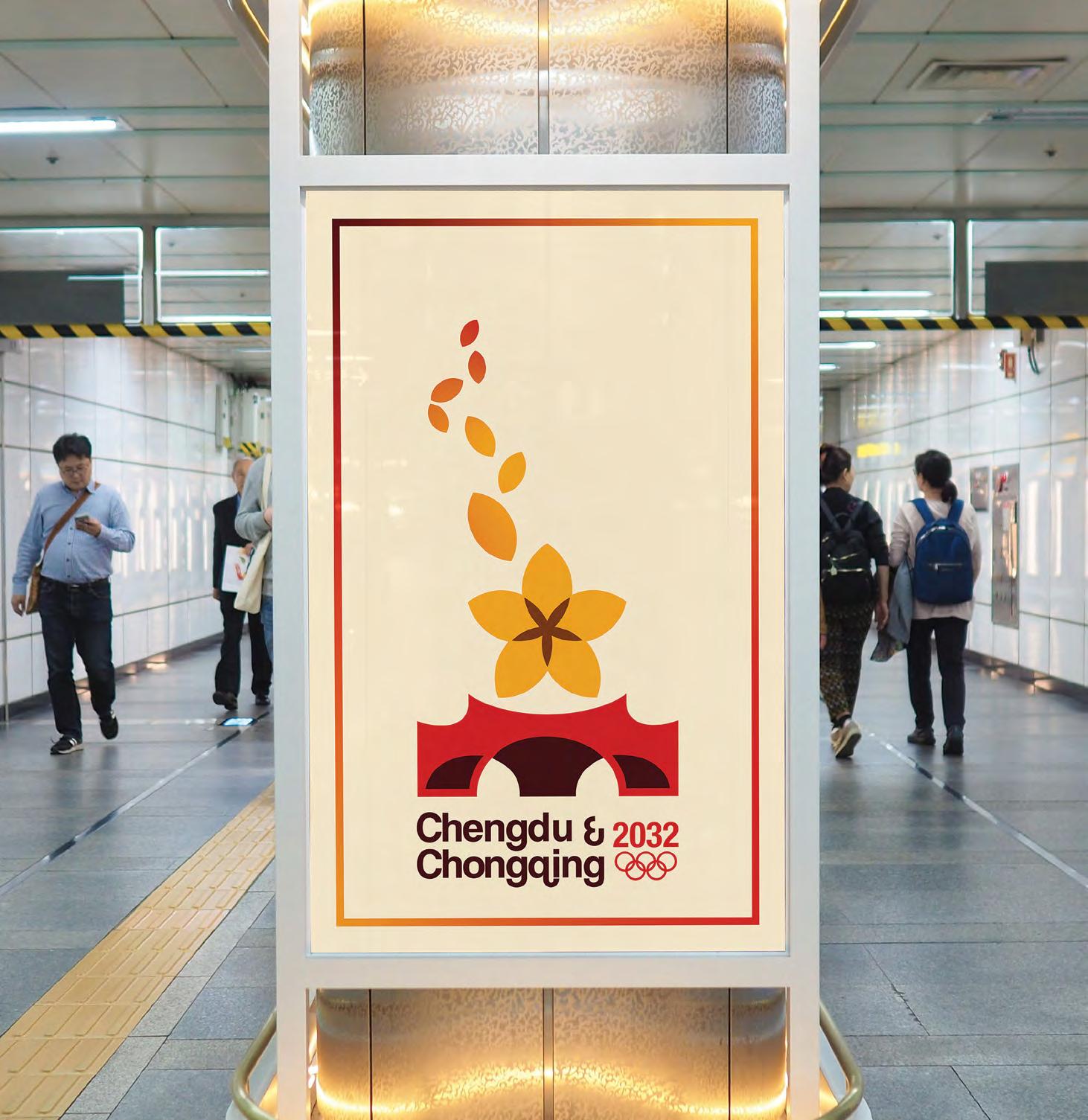
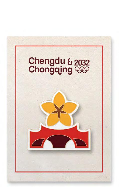
Located in the central Sichuan region of China, Chengdu and Chongqing are neighboring cities divided by rivers and connected by bridges and culture. This conceptual bid proposal for the 2032 Summer Olympics honors the two cities with a brand identity designed for the world stage.
Chengdu is the capital of the Sichuan province and is known for their diverse and modern economy and spicy Sichuan cuisine. Chongqing neighbors Chengdu and is situated upon the Yangtze River. It is recognizable by its huge quantity of bridges, all designed in various architectural styles. Together, the cities have a population of over 47 million people.
Inspiration from this identity mark came from synthesizing landmarks and city symbols with the spirit of the Olympic Games. In the final emblem the flower represents the hibiscus flower of Chengdu as well as the agriculture and nature that surrounds the cities. The flower is composed of the five Olympic rings intertwined and united. The bridge is significant to both cities, and it specifically resembles the Anshun bridge in Chengdu. The bridge brings people together and encourages teamwork and community.
Together, the colors reference the Olympic rings and the Chinese flag. The reds and yellows create unity between the flower and the bridge. In the combination mark, the typography is rounded and friendly, with a strong emphasis on ligatures that help create rhythm. This brand identity signifies the partnership between Chengdu and Chongqing, and invites the world to gather and connect at the Summer Games of 2032.
Branding & Identity Merchandise Marketing

26

28

29
30
31
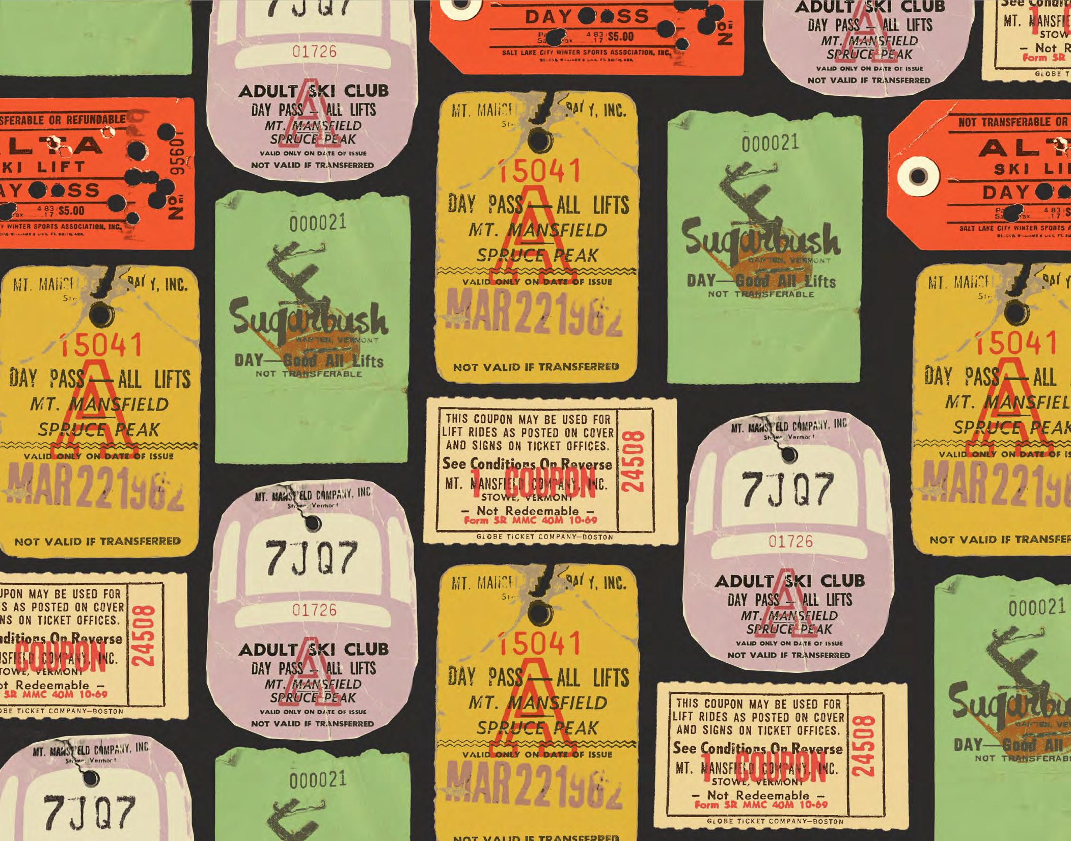
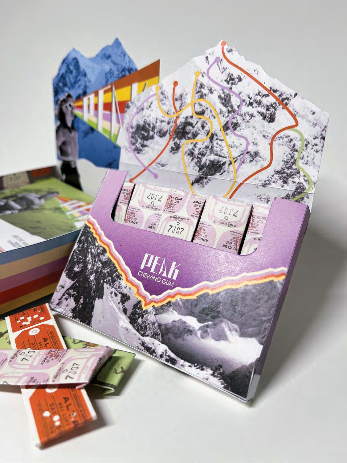
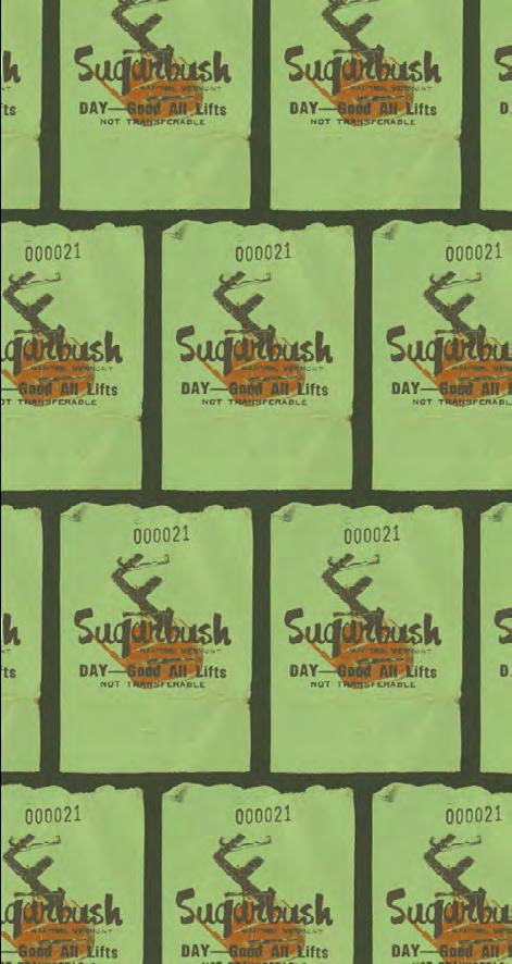
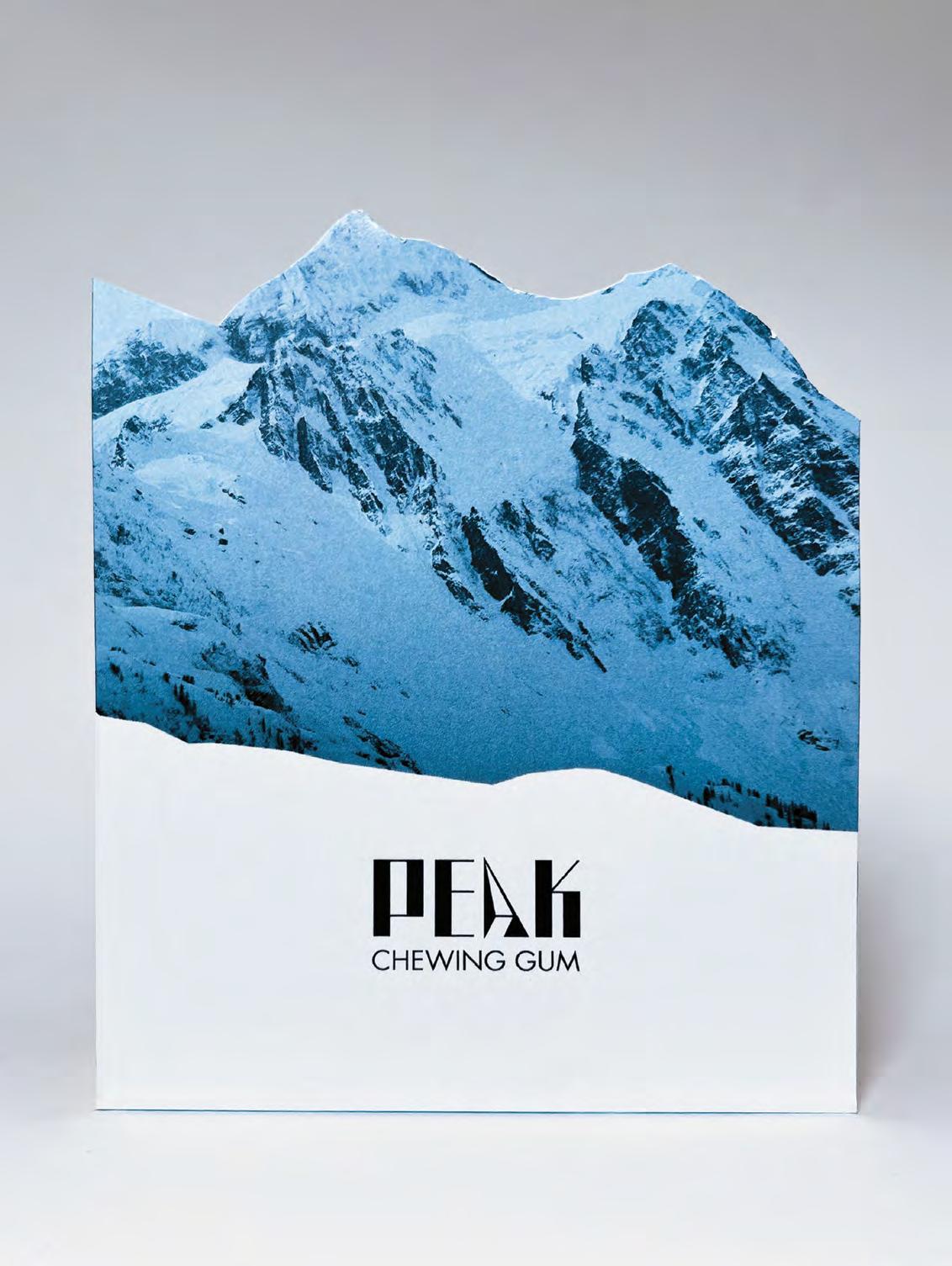
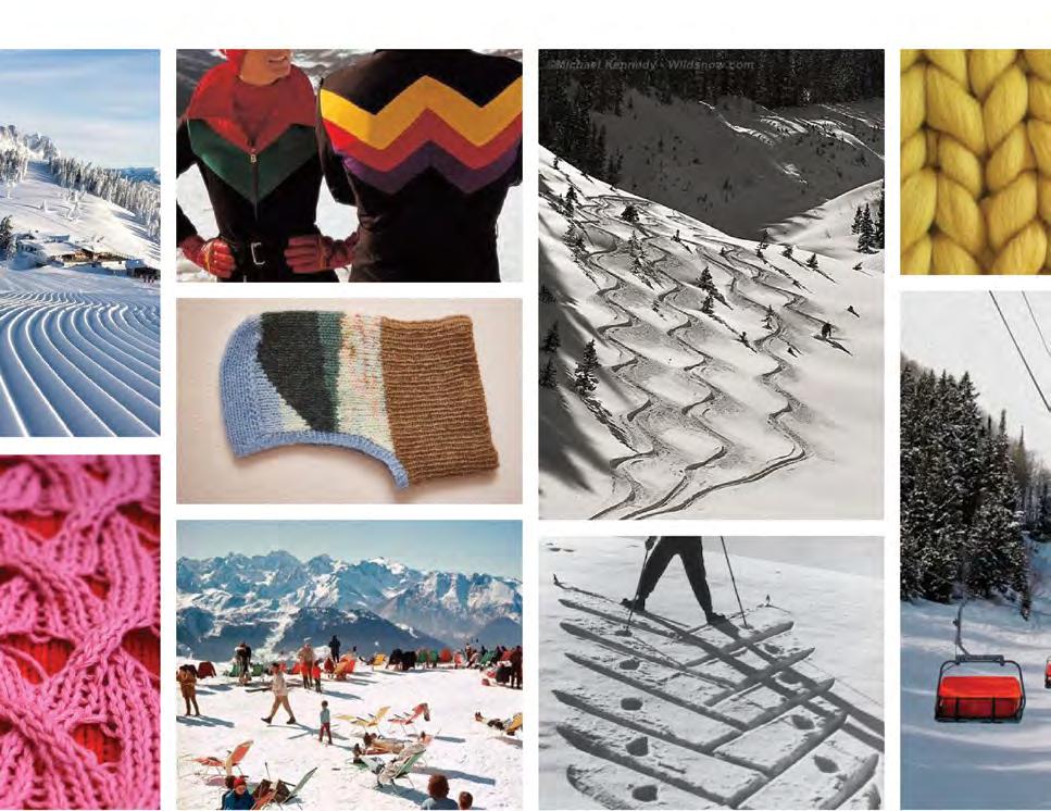
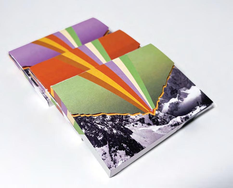
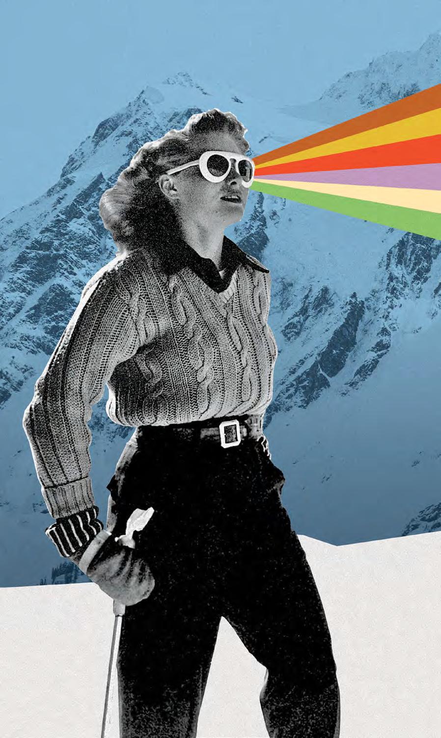
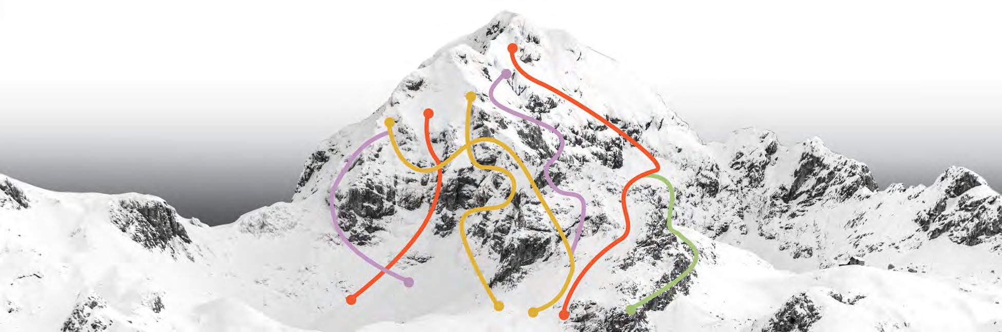
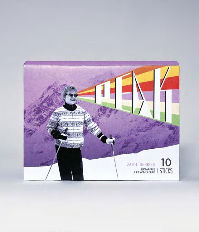
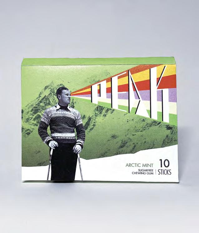
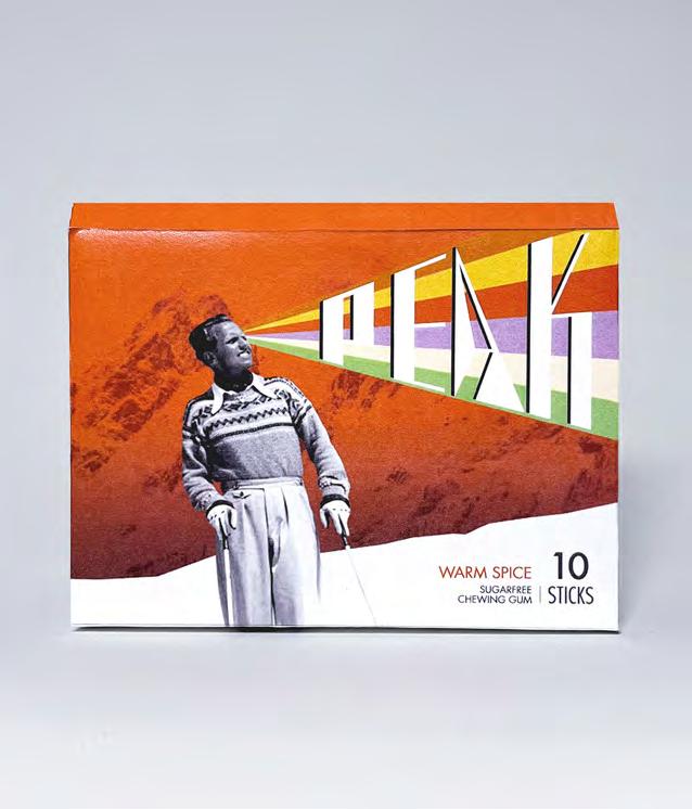
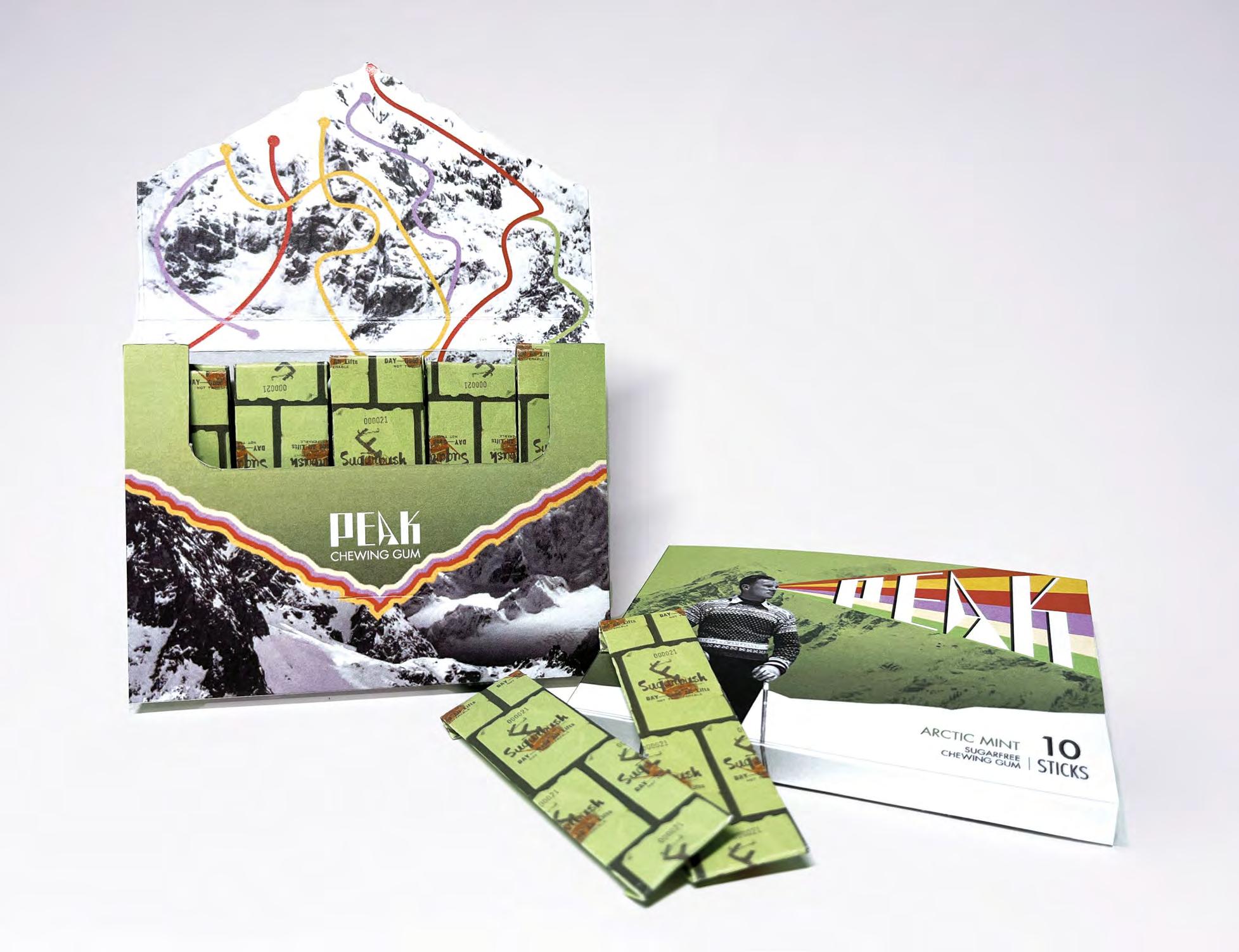
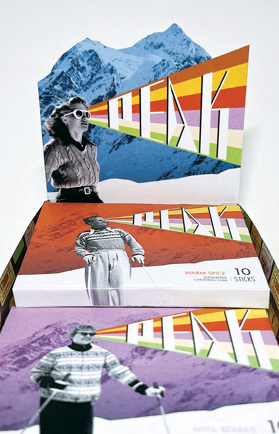
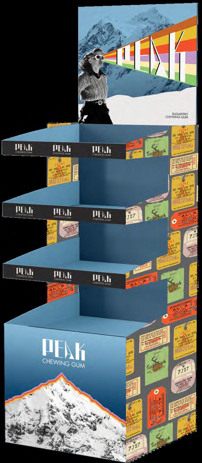
Peak Chew is a fictional chewing gum for mountain sports and climates. When in high-altitude locations it isn’t uncommon to chew gum to help aid vertigo, ear-popping, indigestion, and dehydration. Peak Chew offers a sugar free gum that can be packed for the trails when participating in skiing and other winter sports.
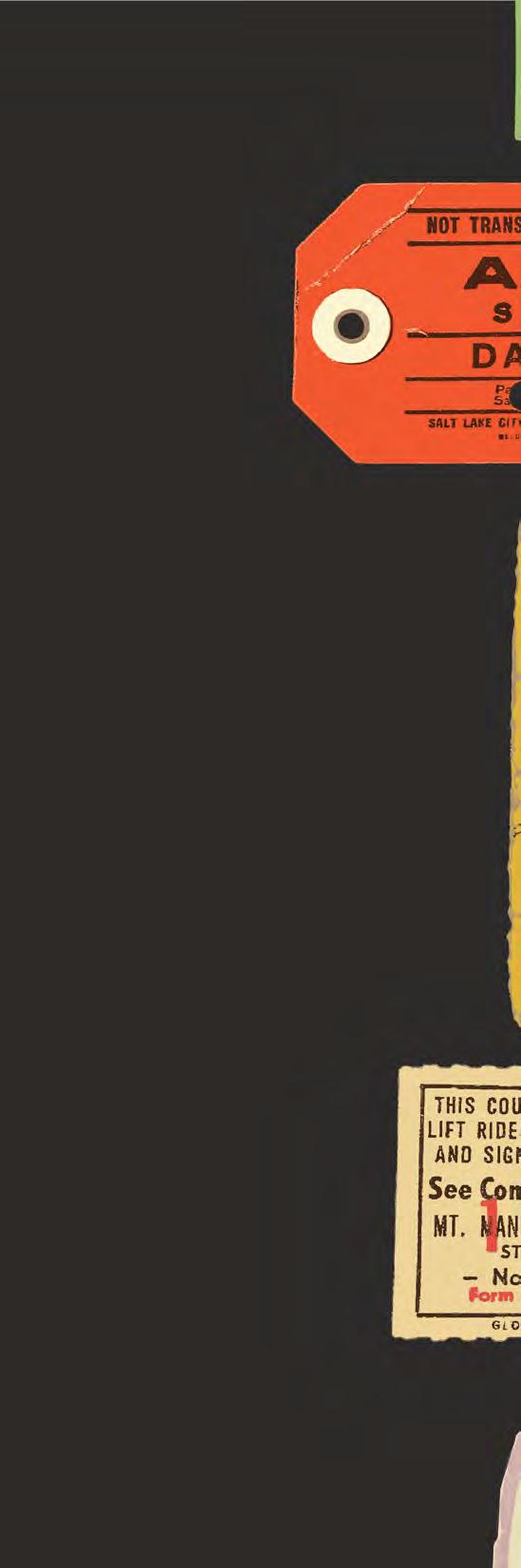
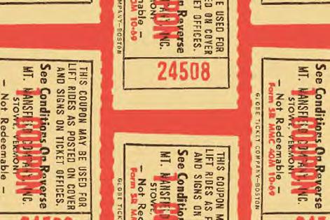
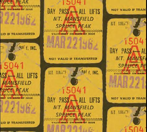
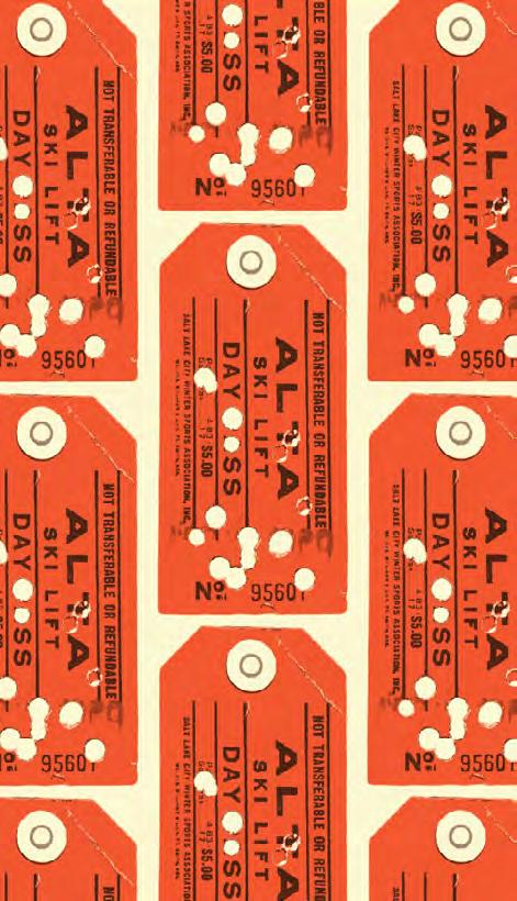
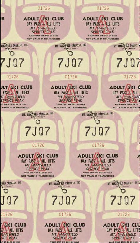
The core design concept is a revival of the vintage ski resort aesthetic and fashion from the 1950’s — 70’s. The brandmark is an experimental hand-designed logotype with geometric points to demonstrate the intense feeling of winter climates and flavorful chewing gum. The packaging utilizes archival photography and materials with photos of people on the slopes and vintage ski lift tickets.
The overall gum packaging can be easily packed into a ski suit or hiking pack for accessibility on the trails; It can also be opened one-handed. The covers feature flavor-coordinated color schemes and a collage of vintage ski enthusiasts looking towards their next adventure. The interior packaging is reminiscent of a ski resort map with colorful trails pointing to the flavorful destination below.
The lift tickets compose the color scheme and are collaged together to create an individual look and wrapper for each flavor. The three flavors are Arctic Mint, Warm Spice, and Mtn. Berries (a blackcurrant flavor). The lift tickets were originally photographs of an online seller’s collection of vintage ski passes. These images were then digitally altered and separated into limited color palettes for a graphic and easily reproducible image.
& Identity Packaging
32
Branding
34
35
36
37
38
39
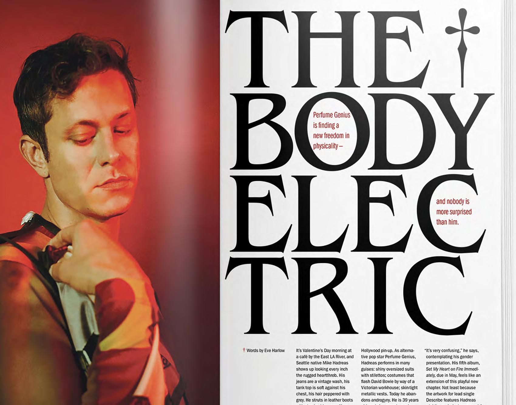
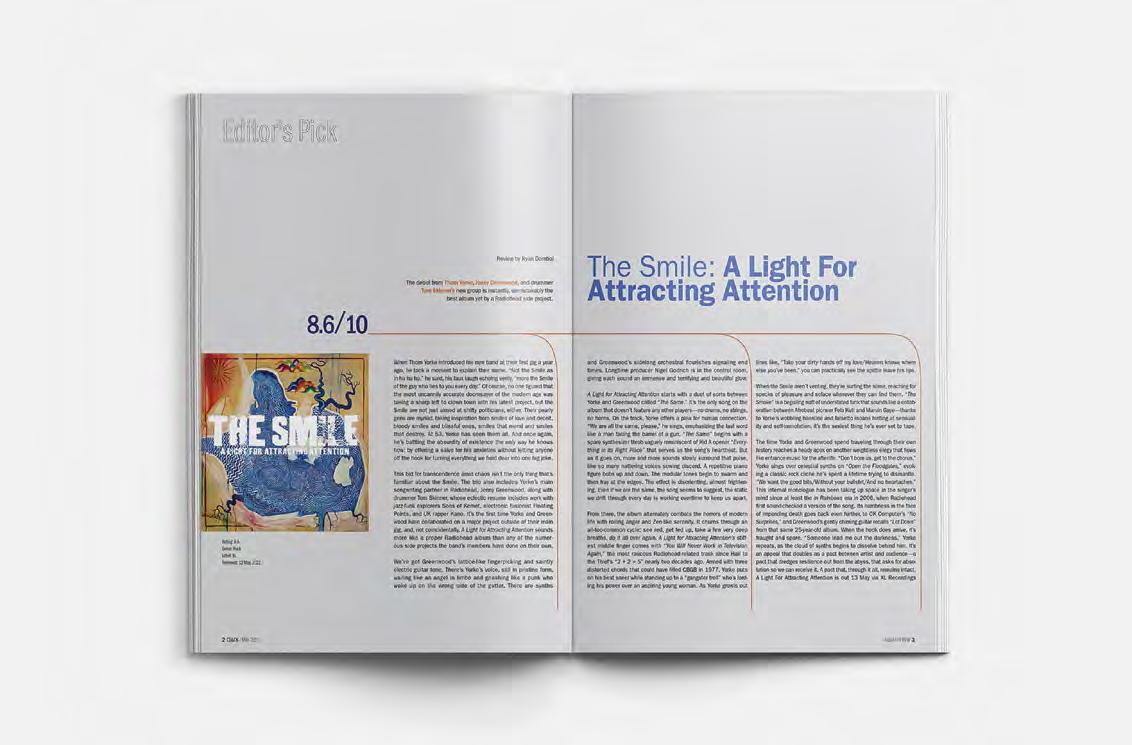
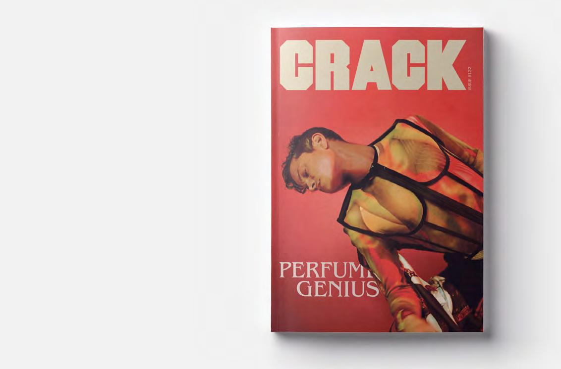
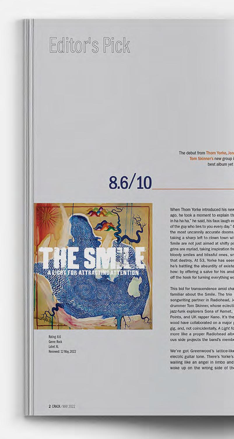
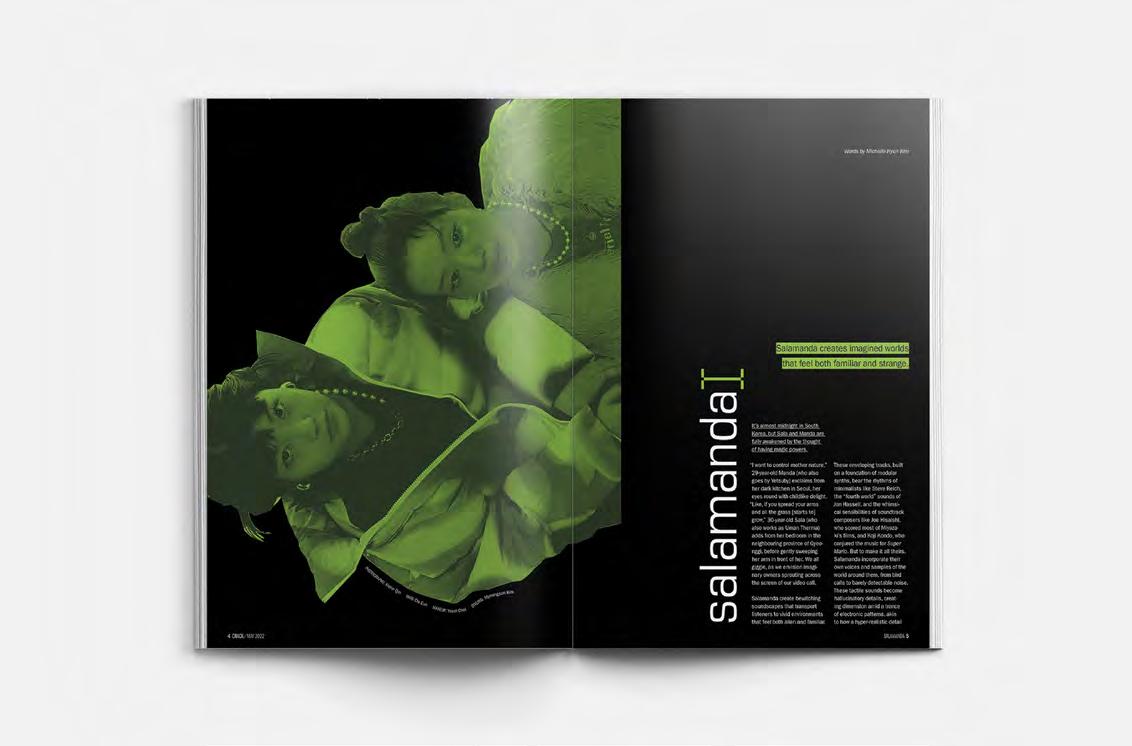
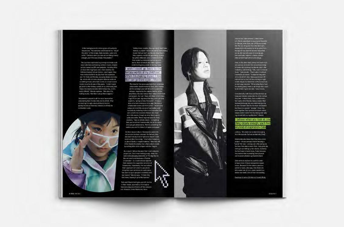
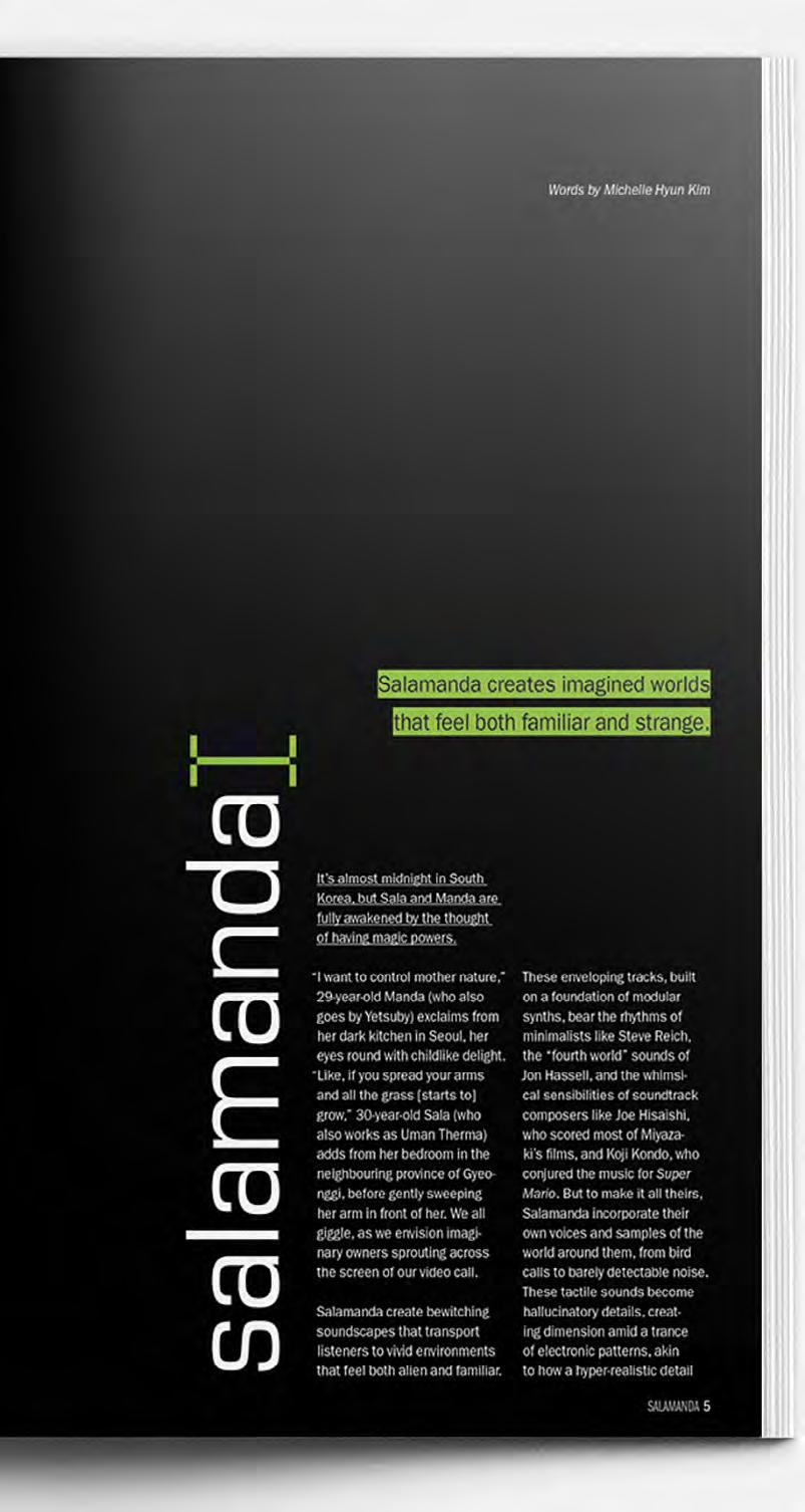
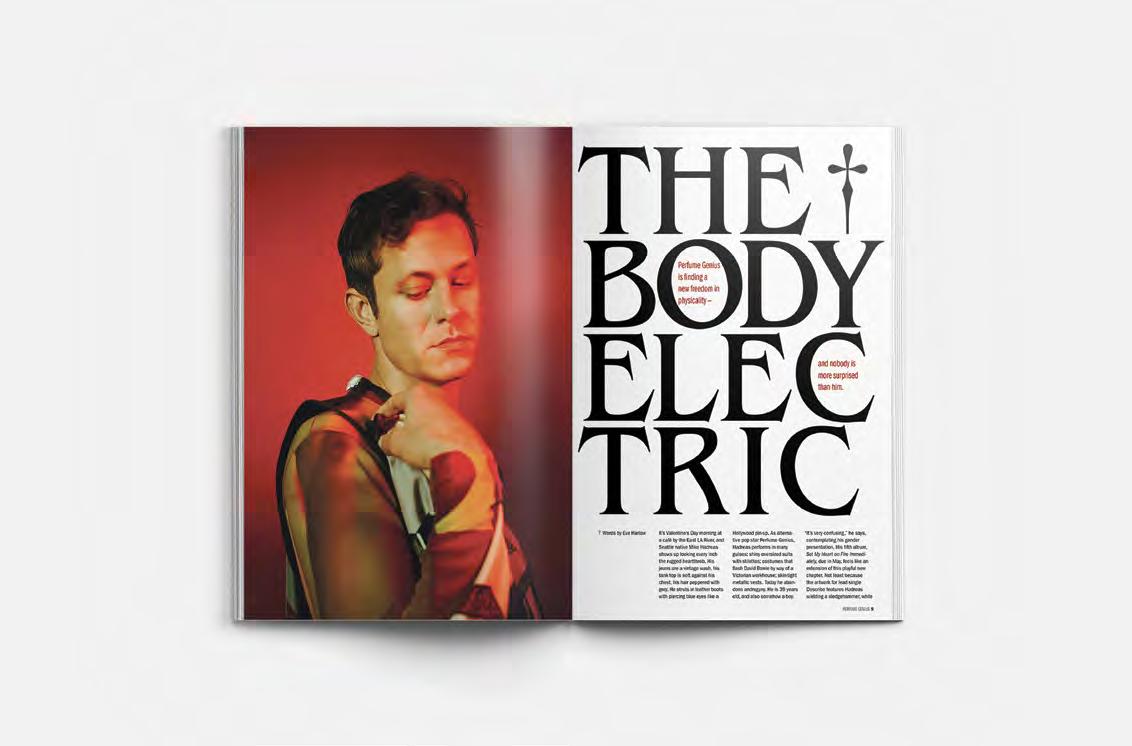
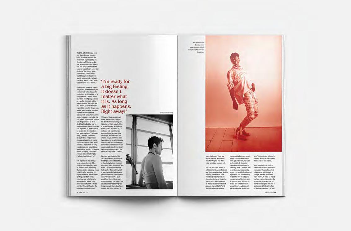
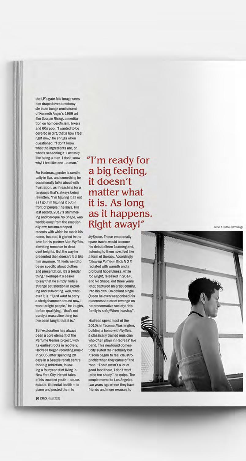
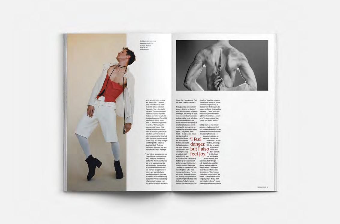
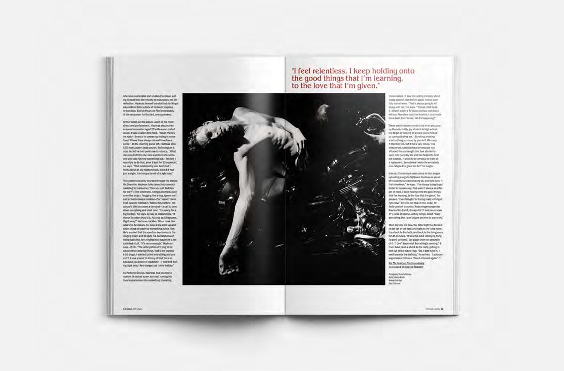
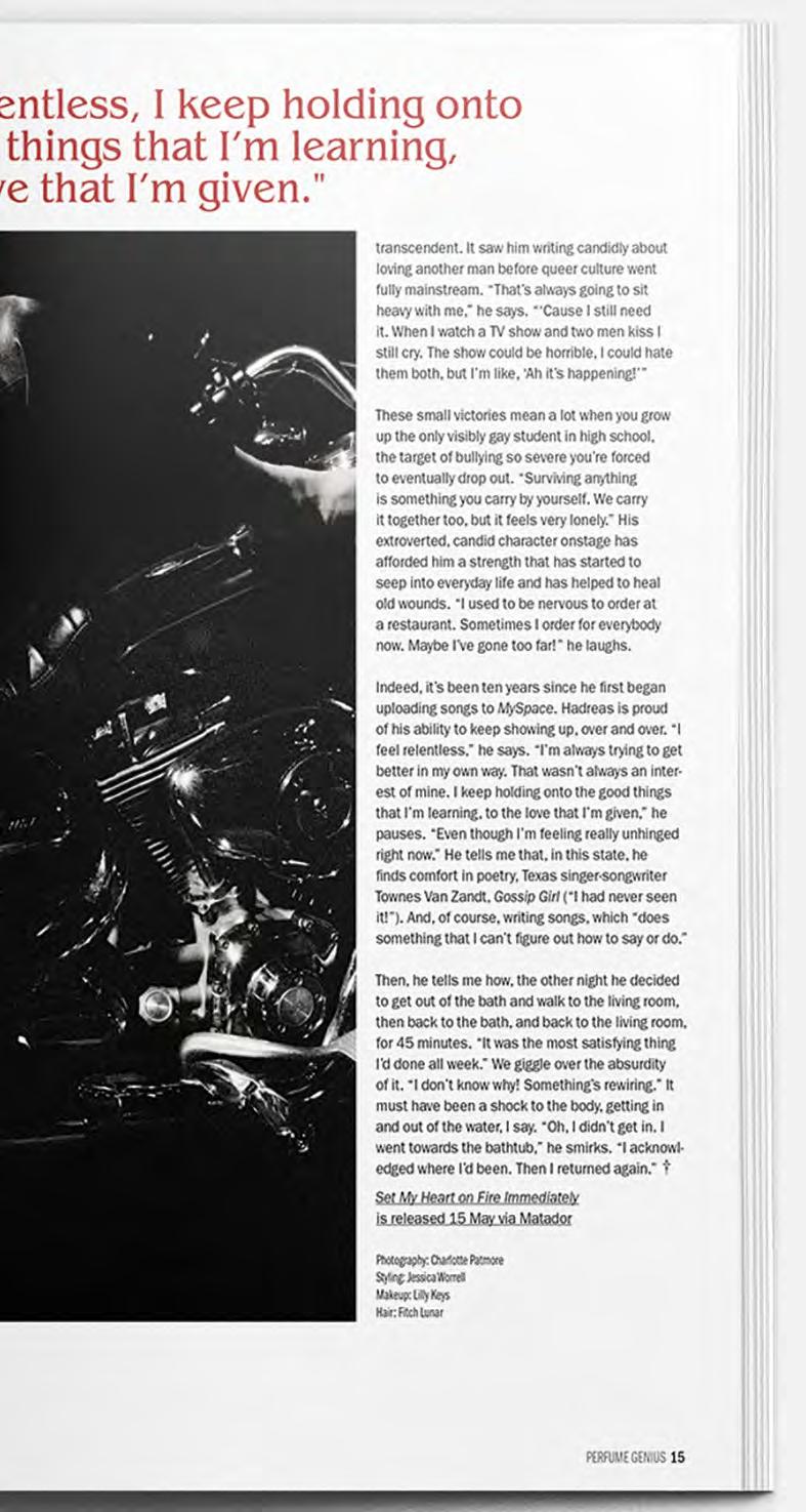
Crack is an independent music and culture magazine established in 2009 and based in the U.K. They report and offer articles on latest album releases, rising artists and musicians, and profiles of the top names in independent music. This publication offers three artists in different categories of articles. The editor’s choice is an album review for The Smile’s first album; The rising artist profile is of a South Korean techno artist duo called Salamanda; And the cover profile is about singer-songwriter Perfume Genius.
The two profiles’ opening spreads are typographically focused and reflect the artists’ indivudal aesthetics. It was also important Crack’s contemporary photography felt cohesive in the spreads. Salamanda’s interview spoke a lot about the influence of film, video games, and pop-culture in their work. The design direction is centered around a large bitmap portrait of the duo, and an early 90’s computer glow.
Perfume Genius speaks about his experience with gender and his physicial form. His music is dark, baroque-inspired, and sensual. A gothic typeface with an ornamental obelisk glyph references the exploration of masculinity in his latest album with a resemblance to a knife.
40
Publication Editorial
42
43
44
45
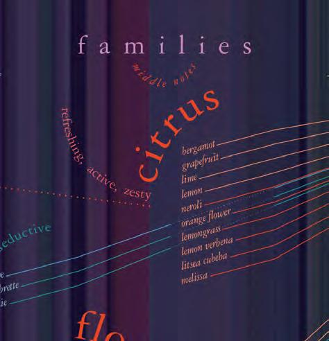
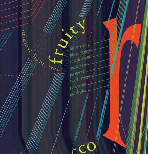
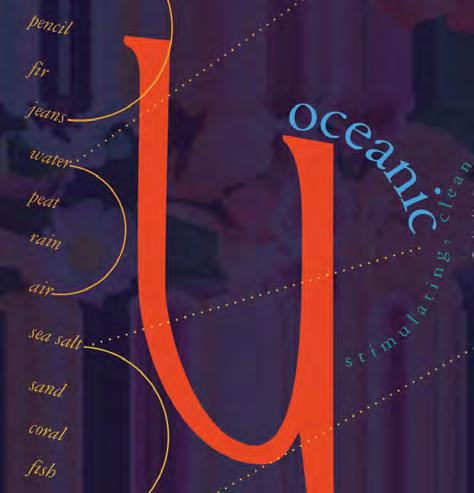
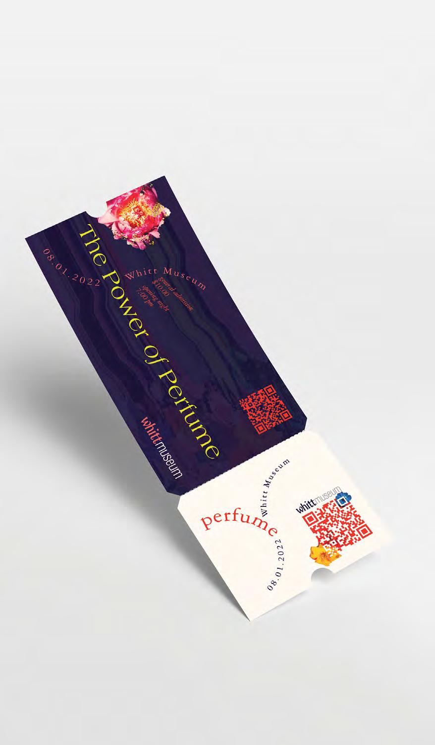
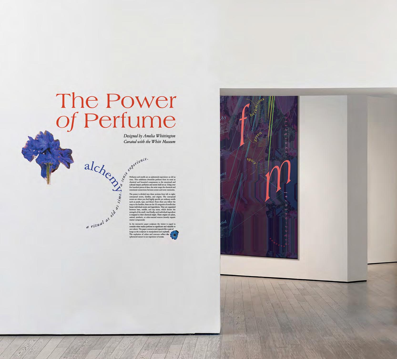
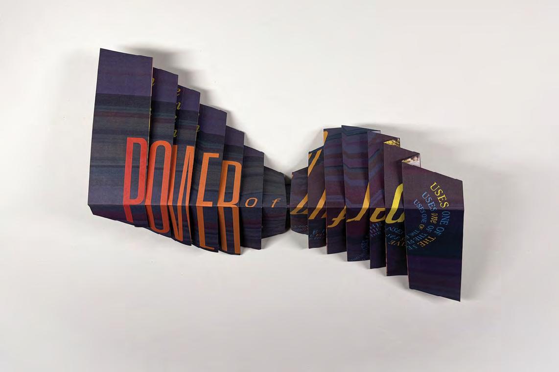
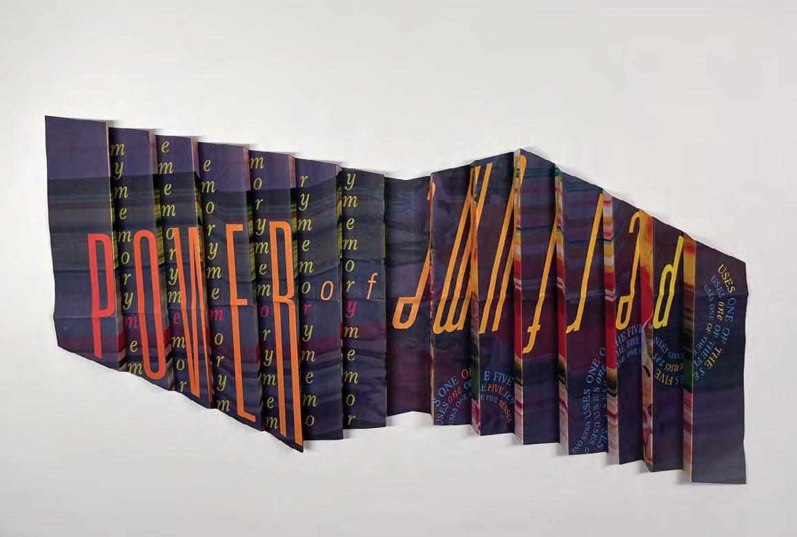
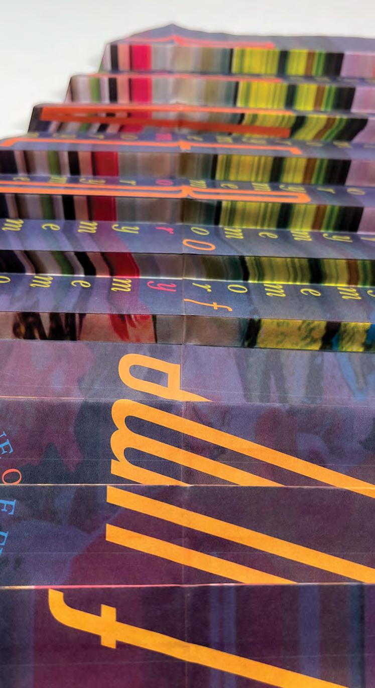
The Power of Perfume
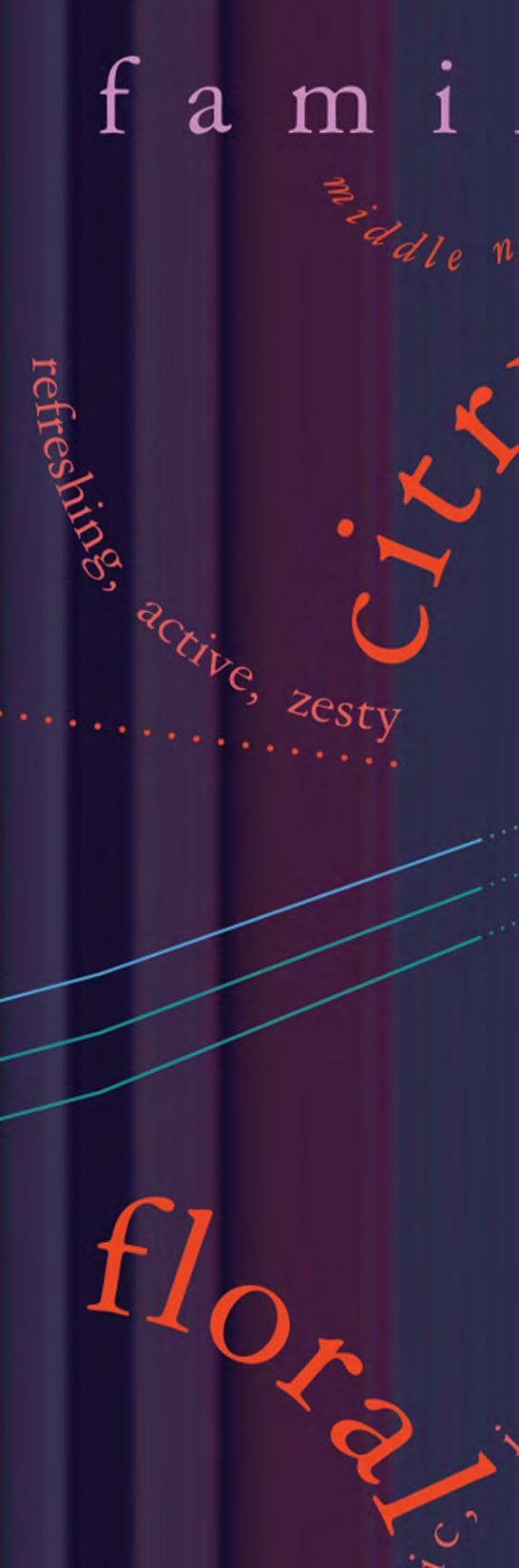
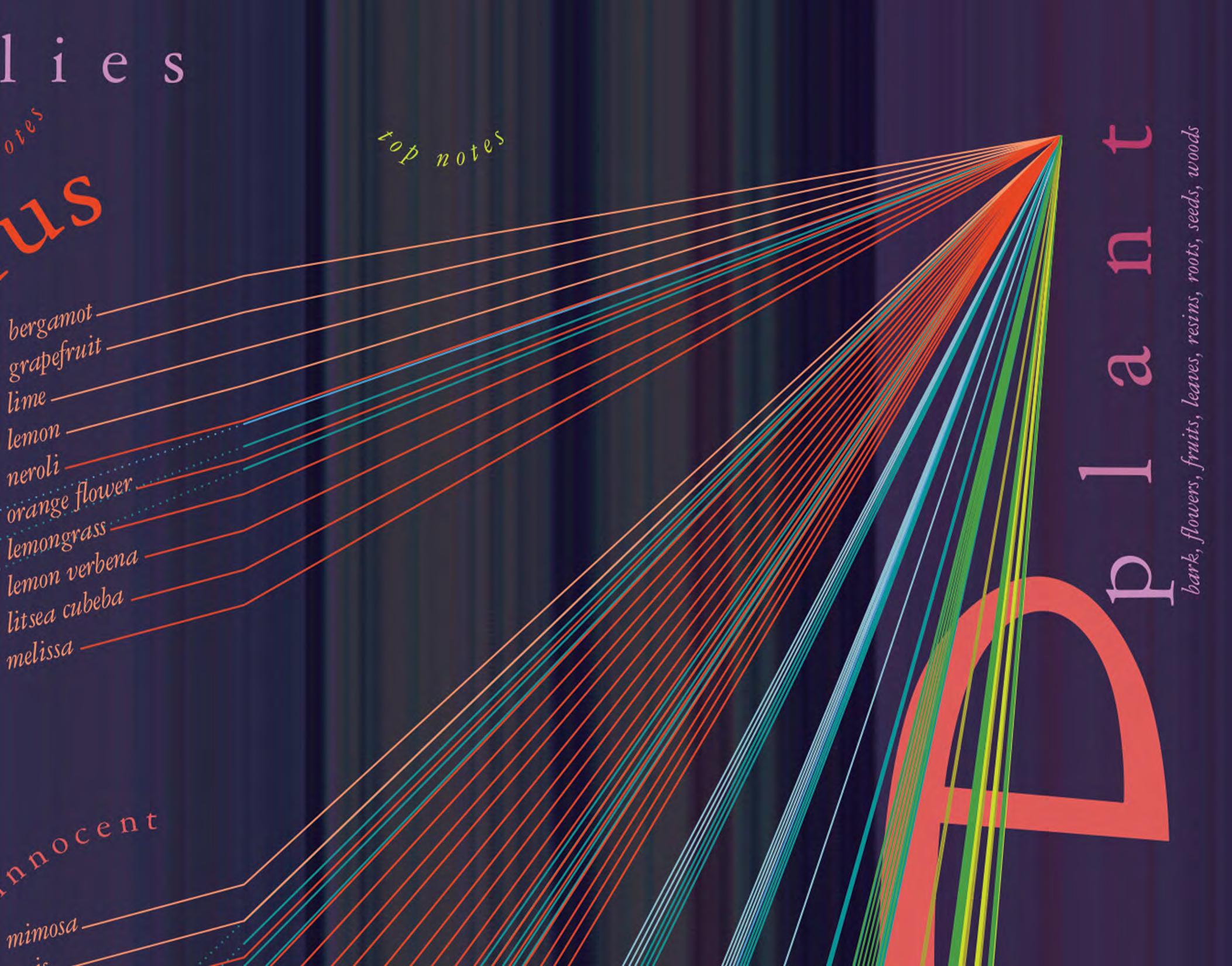
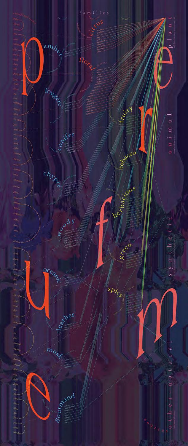
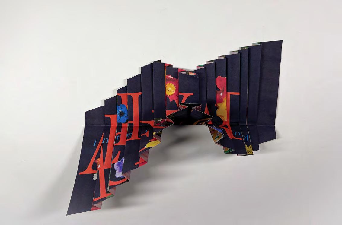
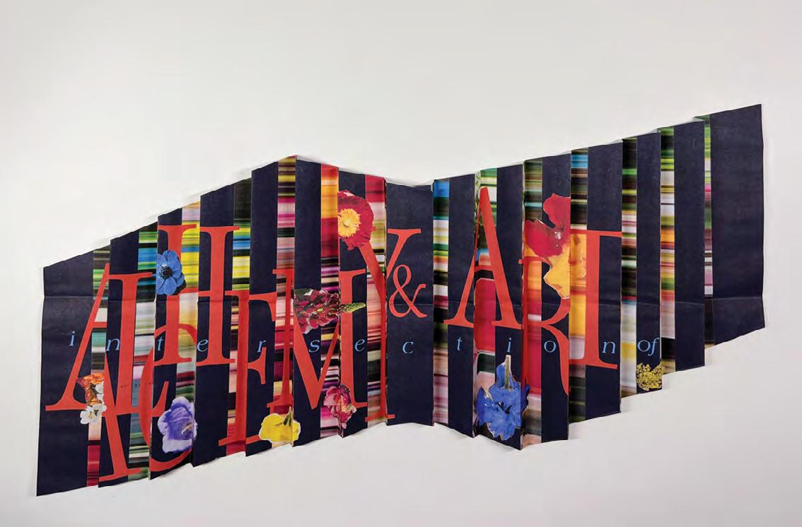
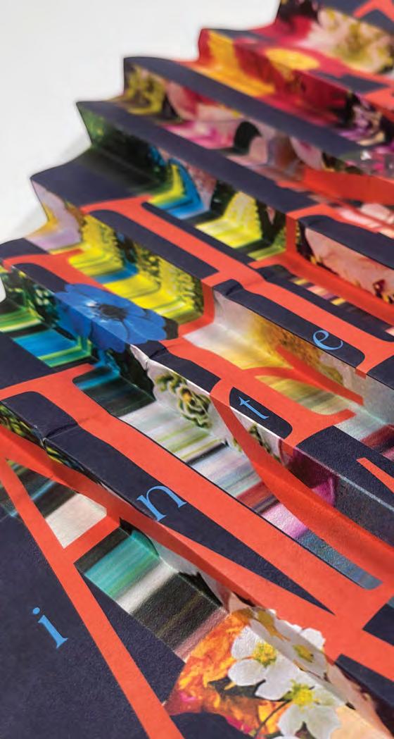
Perfumes and smells are an ephemeral experience as old as time. This exhibition chronicles perfume from its roots as chemical and botanical components to the emotional and cultural impact perfumes and scents hold on us. This series includes an informational poster and an interactive paper sculpture.
The poster uses more than 500 individual pieces of data and information that map conceptual scents to their core ingredients and origins. The poster is divided into three sections from left to right: conceptual scents, families, and origins. The conceptual scents are where you find highly specific yet ordinary smells such as pearls, tape, and blood. From there you follow the map to the families, these are the 16 categories of smells that house individual scents and ingredients. They are organized between base, middle, and top notes, which dictate the strength of the smell. And finally, each individual ingredient is mapped to their chemical origin. These origins are plant, animal, synthetic, or other-natural sources (mostly organic matter compounds).
In the interactive paper sculpture the viewer is urged to consider what makes perfume so significant and valuable to our culture. The paper contracts and expands like a pair of lungs as the sculpture is manipulated and explored. The explosion of colors and textures reflect the sense experience of scents.
Print Exhibition
46
Poster
48

49
50
51
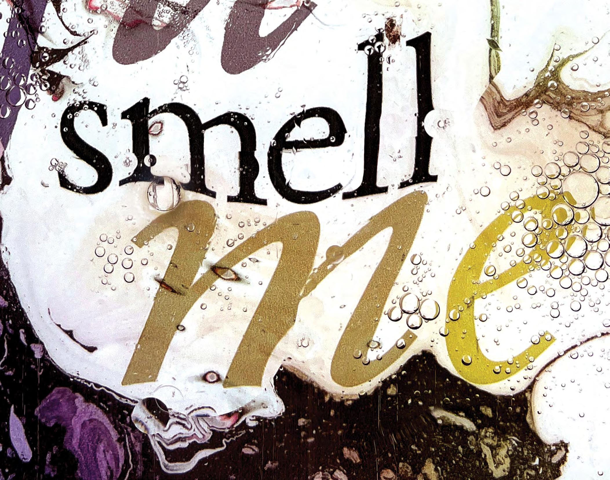
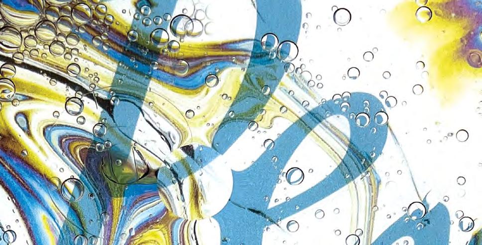
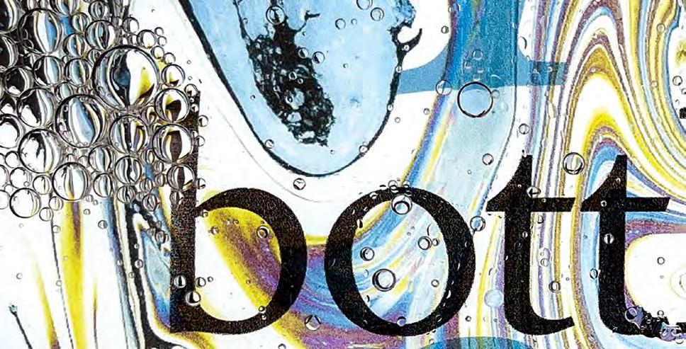
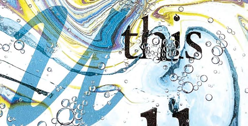
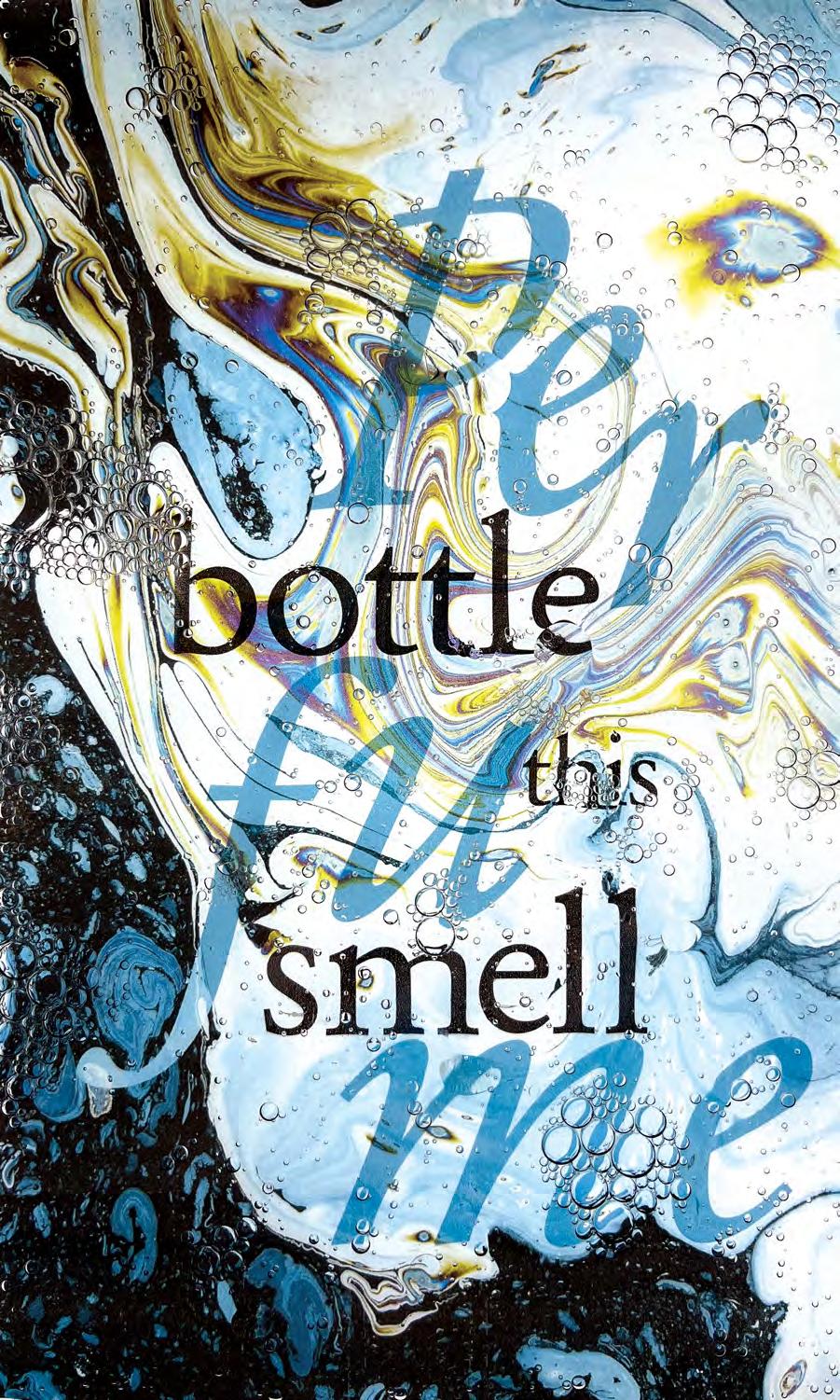
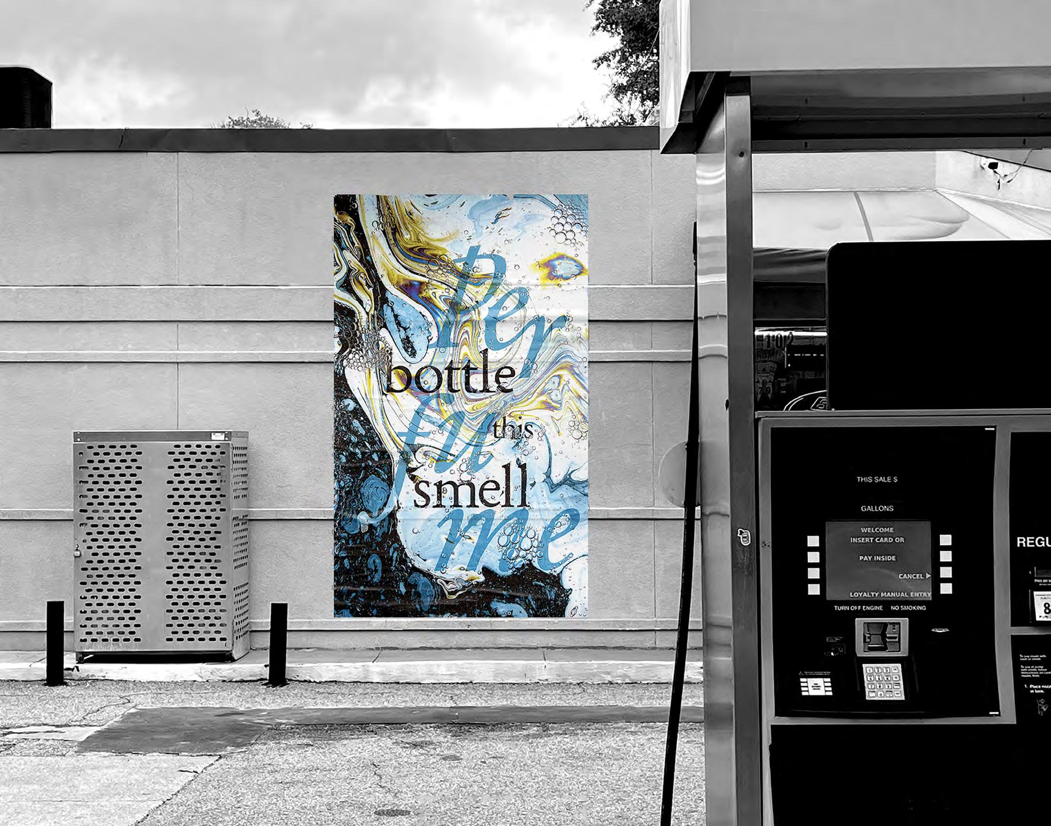
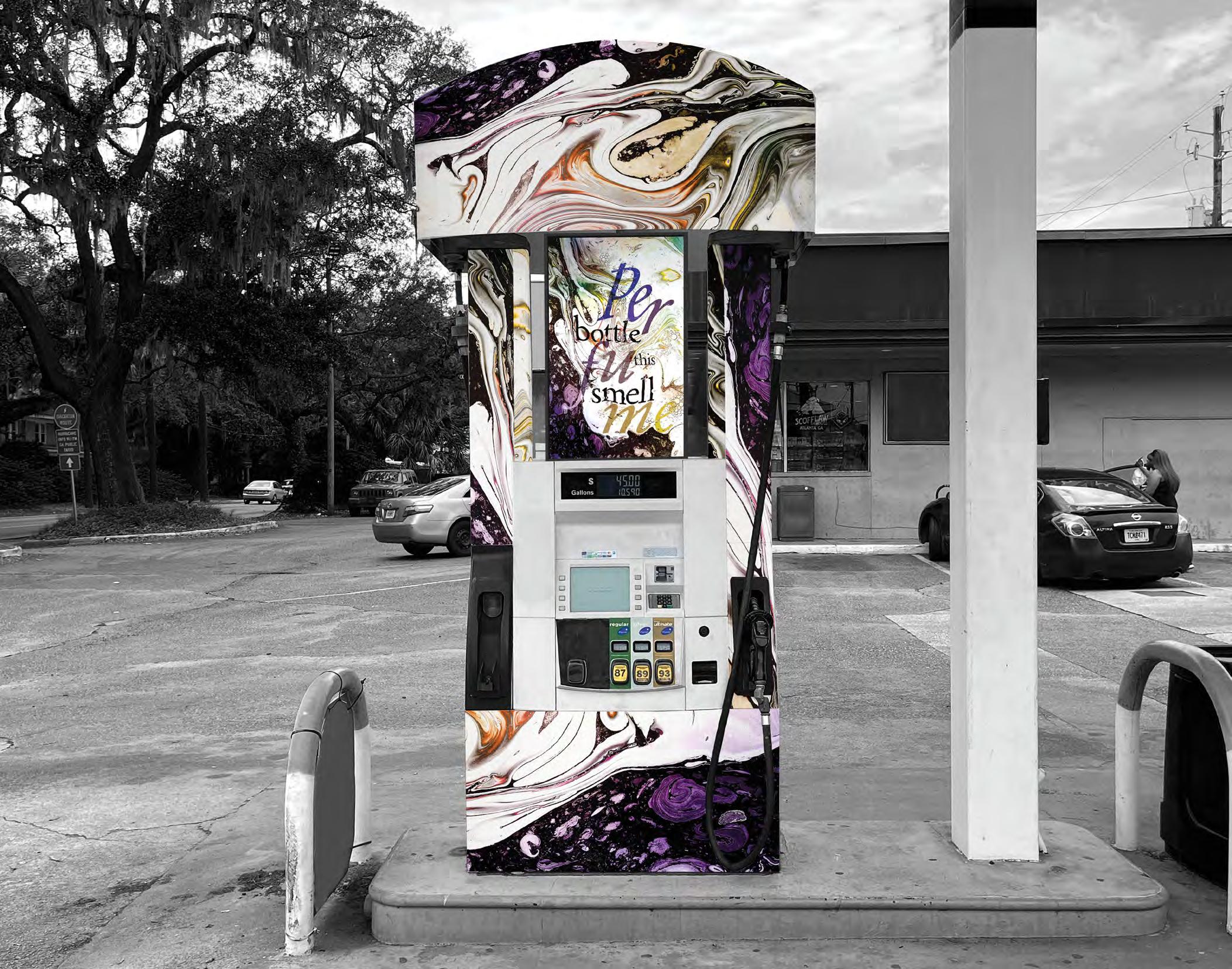
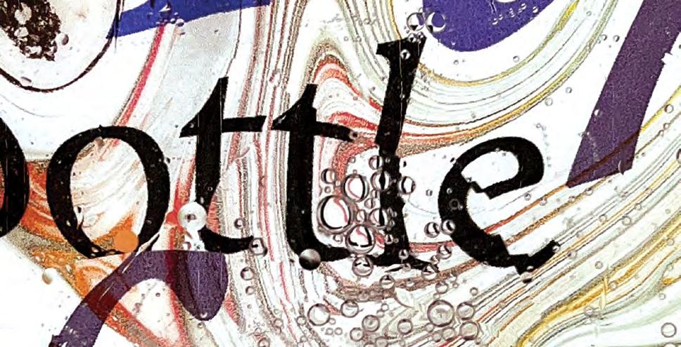
Gasoline
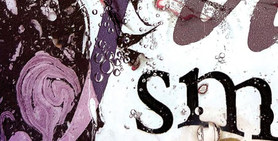
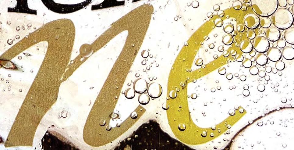
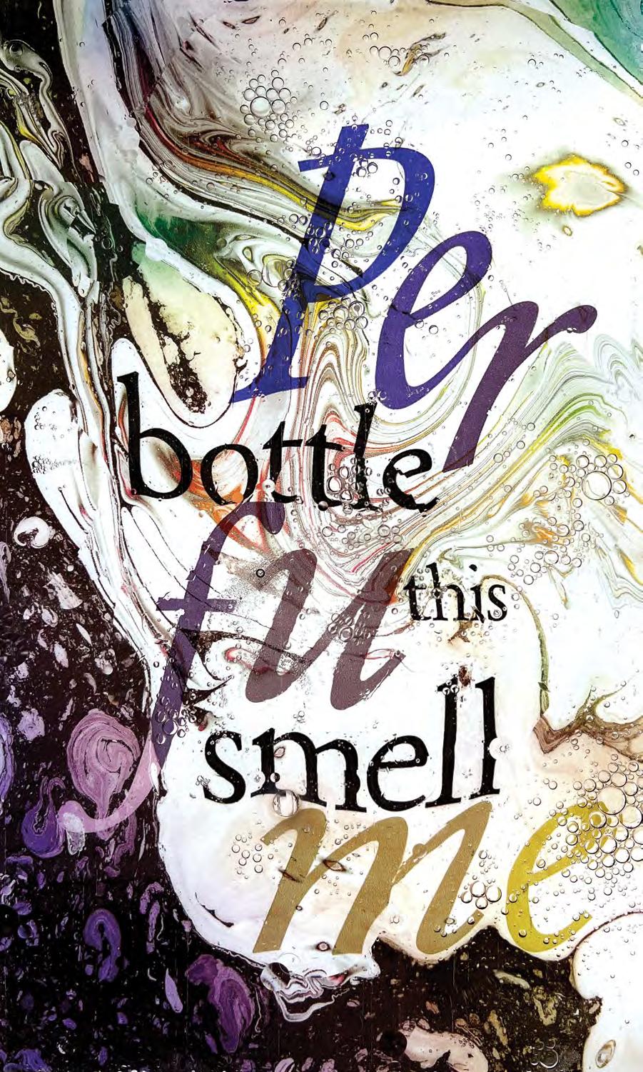
As a spiritual successor to the previous project, The Power of Perfume, Gasoline continues the investigation into what fascinates our culture about perfume, scents, and ephemeral senses. This project uses environmental designs and posters that are specific to the location of gas station pumps. The main concept is to intersect something as soft and romantic as perfume with the noxious fumes of gasoline.
The messaging of Gasoline encourages the viewer to engage with the routine and ritual of pumping gas whilst being acutely aware of the sense experience. The imagery does not cast a positive or negative opinion of the substance or its smell, but the swirls of color and bubbling oil give an impression of its toxic and volatile potential.
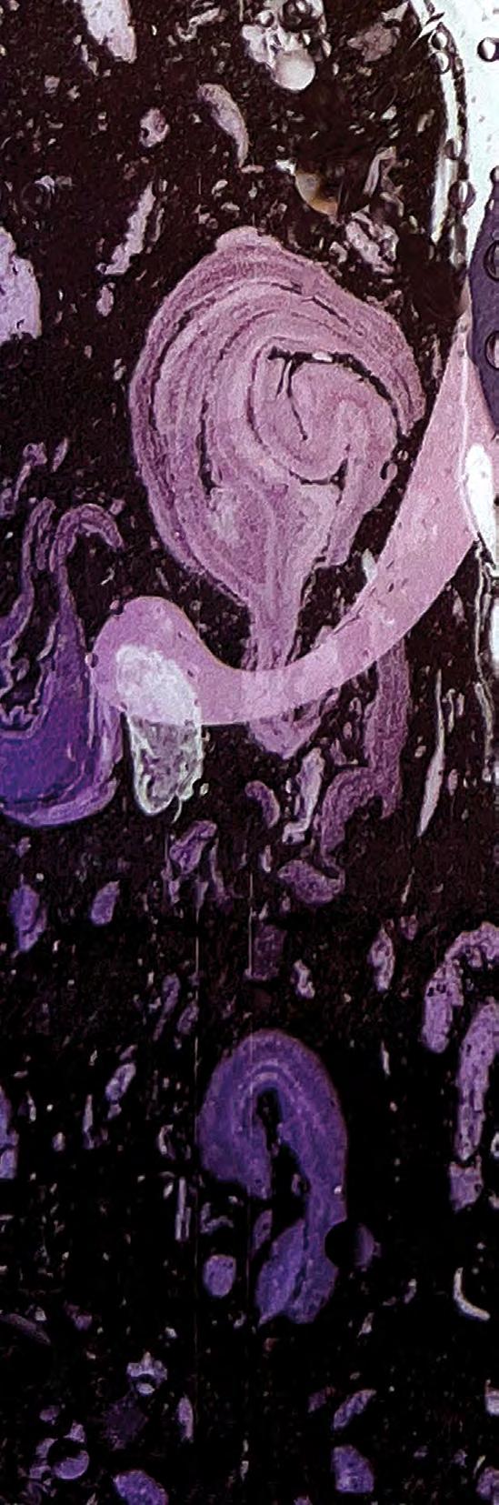
The posters and imagery are made from true photographs of oil and water. The colorful background is reminiscent of a shimmering oil spill in a body of water and the type glides on the surface as it is swirled and mixed with bubbles of oil. To capture these images I printed on sheets of transparent film and then backlit and photographed them under a dish of water and cooking oils. The process of capturing images of the oil and water interactions led to unique and entirely random compositions of bubbles and distortion over the type.
Poster Environmental
52
54
57
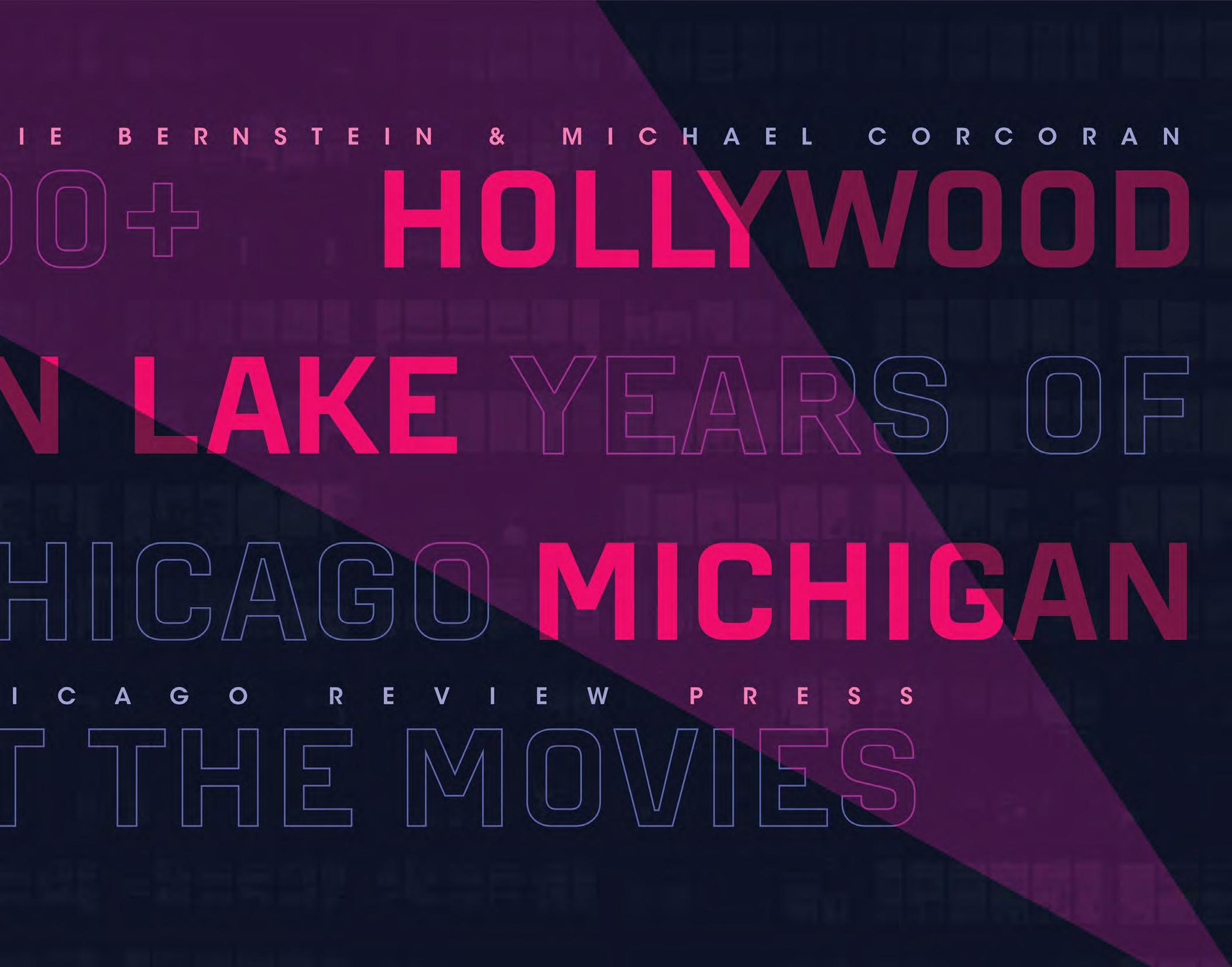
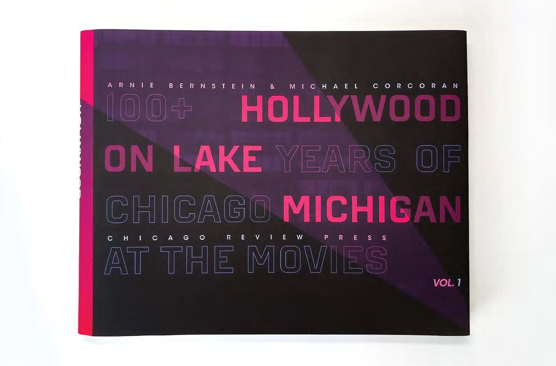
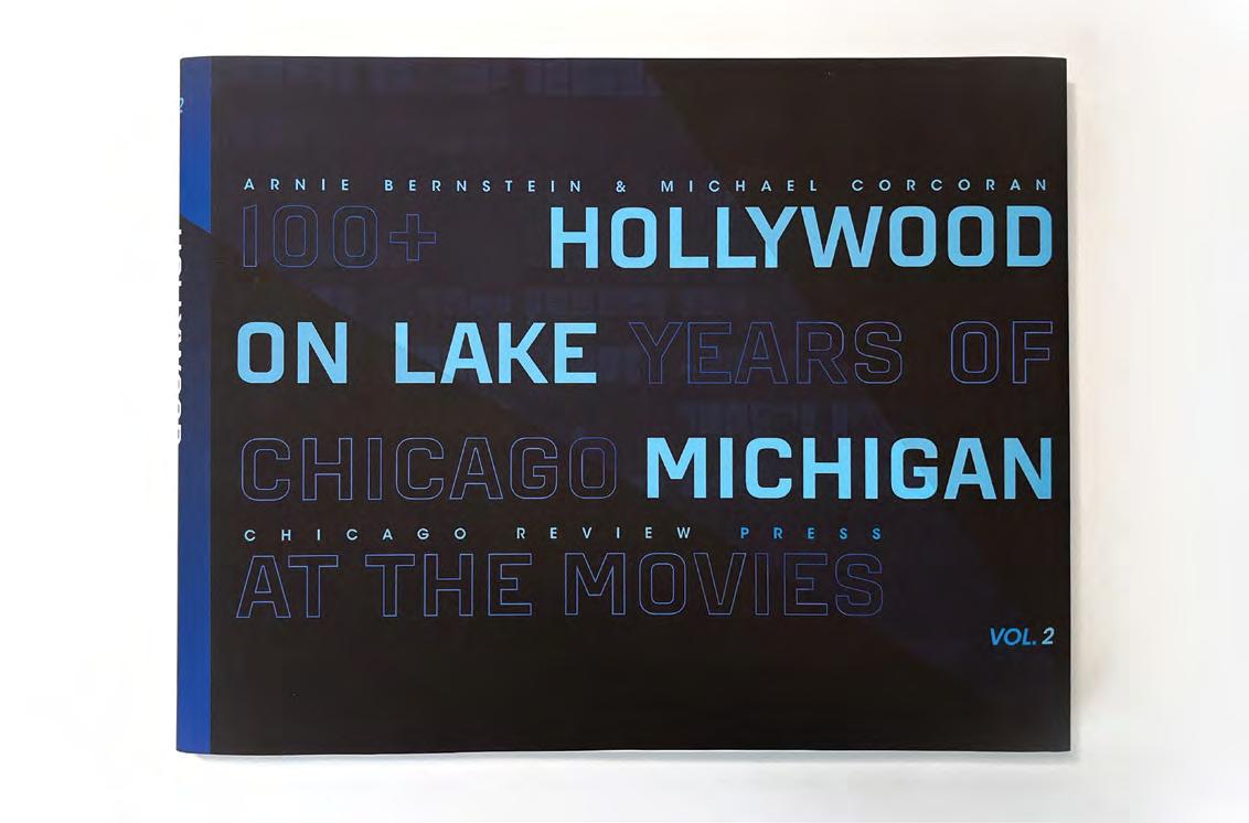
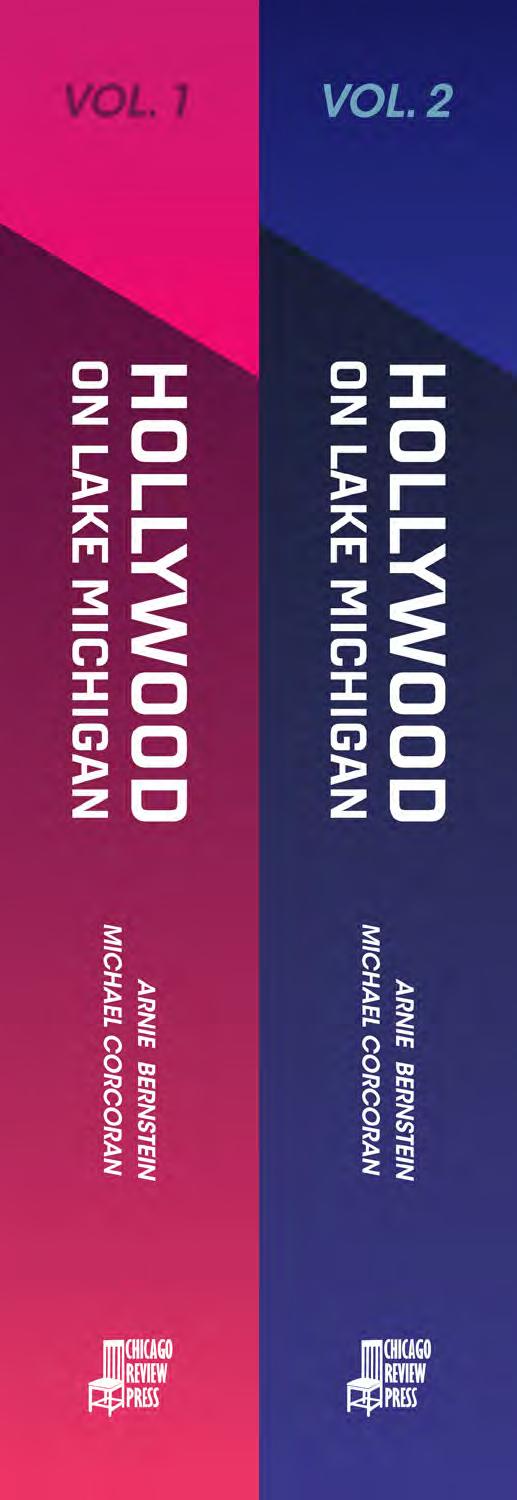
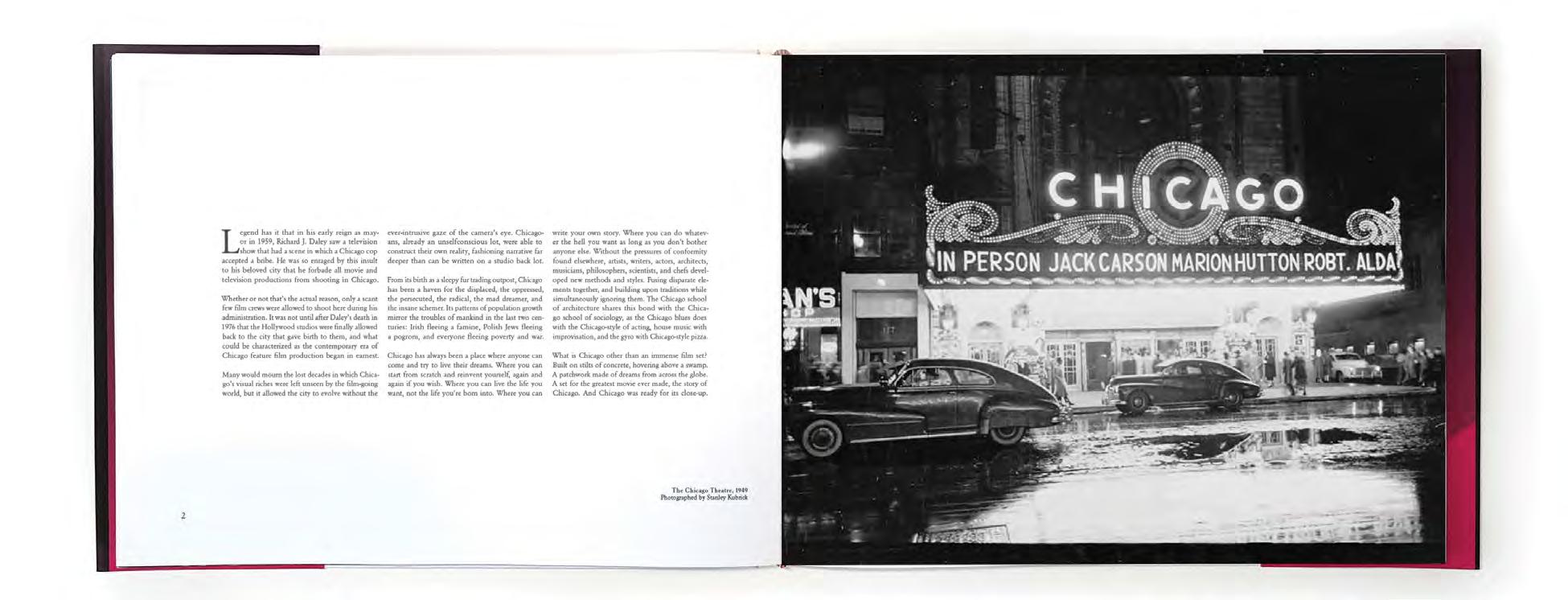
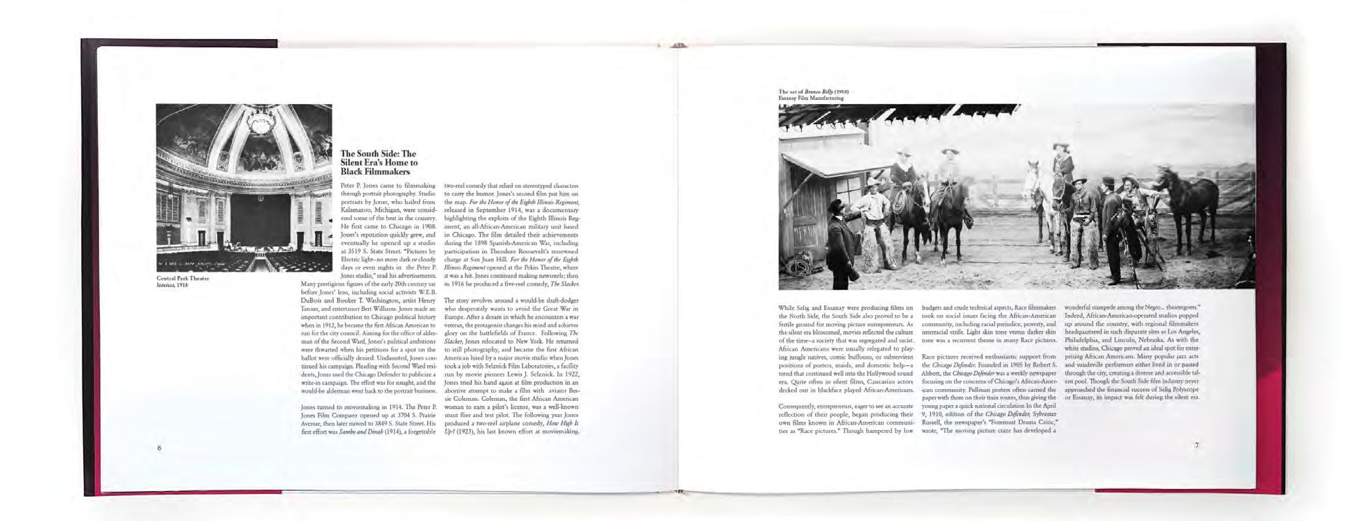
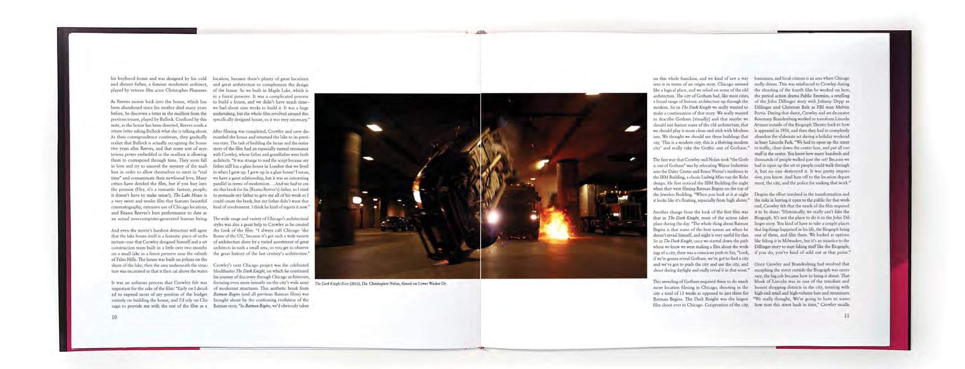
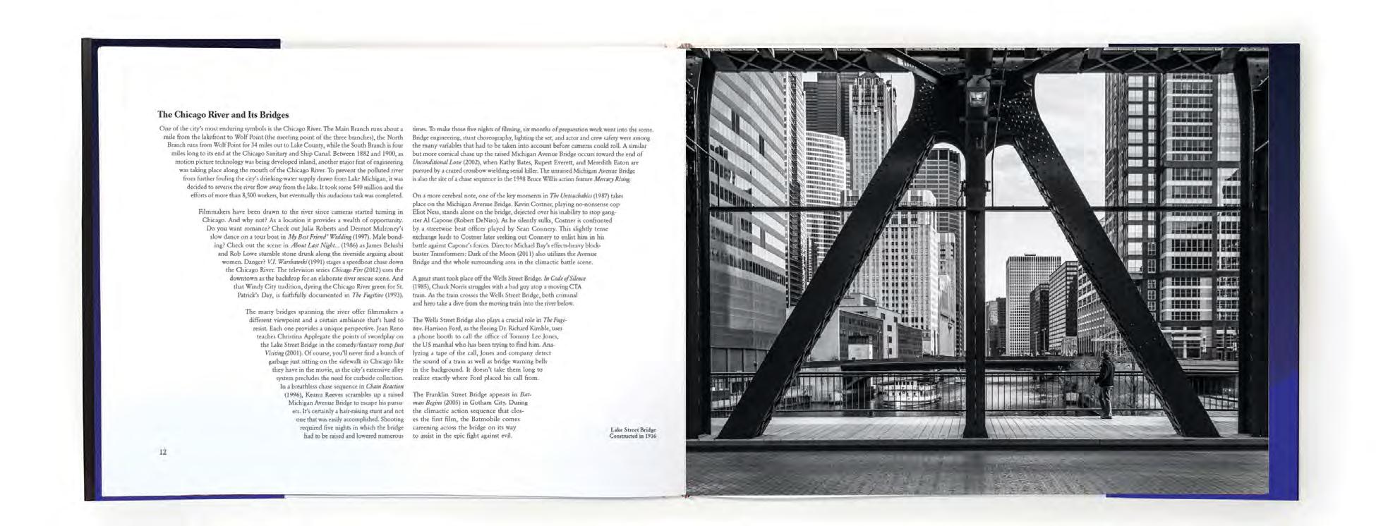
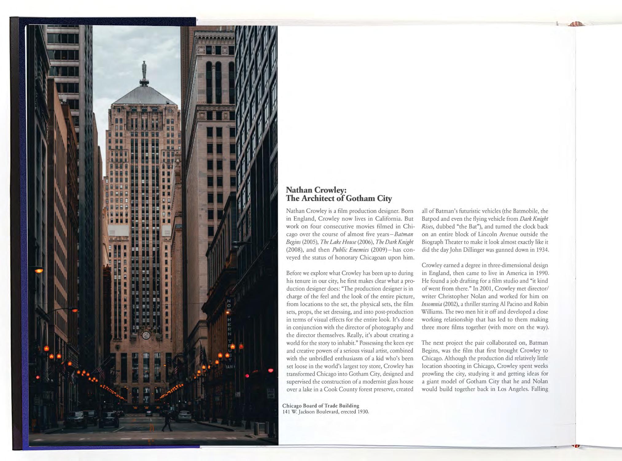
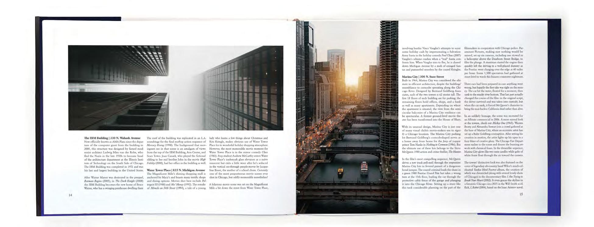
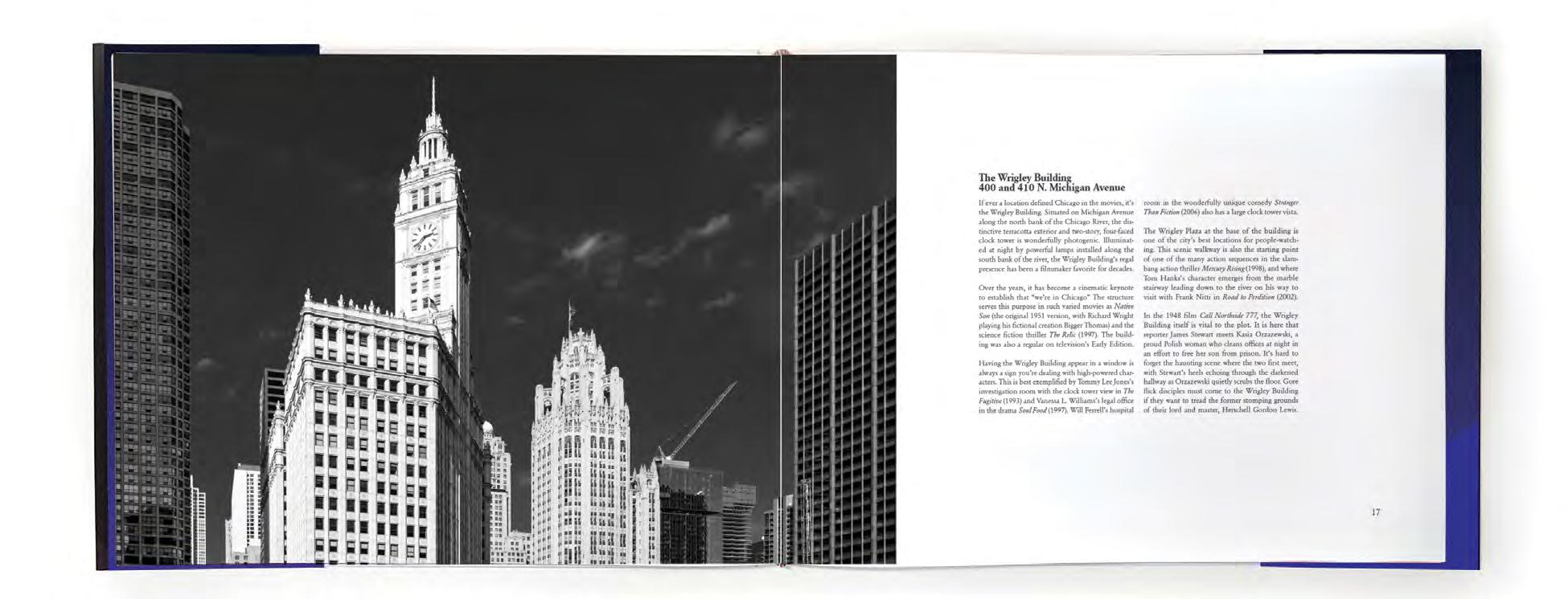
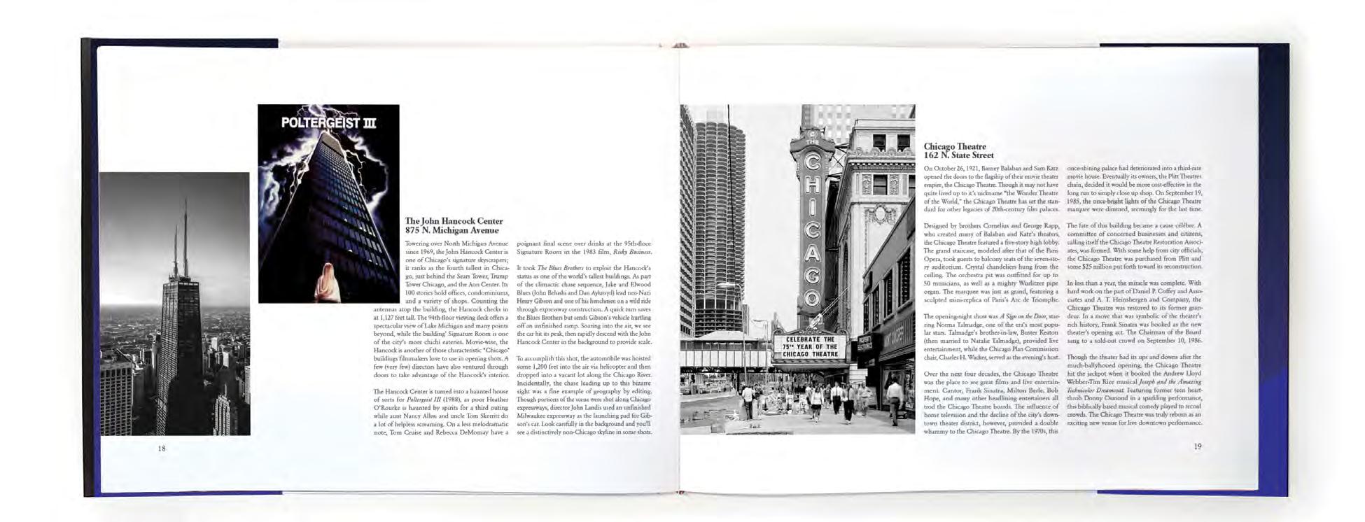
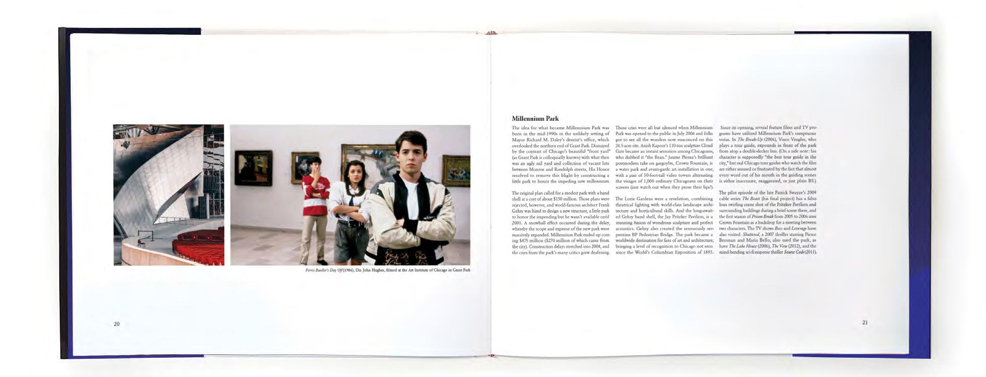
A re-imagining of the book Hollywood on Lake Michigan written by Arnie Bernstein and Michael Corcoran. This book acts as an intensive tour through the city of Chicago’s history through one hundred years of film. The full scope of the project includes two volumes of cover designs and ten interior spreads.
The cover features bold typography and colors influenced by Americana and Hollywood aesthetics. The spotlight on the text reveals an image of skyscraper windows that wraps around the whole book jacket.

The structure of the book includes chapters on the history of film production, interviews with artists in the industry, and specific locations of interest around Chicago. The historical chapters utilize archival imagery to narrate the story, while the more contemporary chapters focus on architectural photography as well as stills from famous Chicago-based movies.
Published in the 2022 SCAD Port City Review Publication Typesetting
58
60
61
62
63
64
65
66
ameliawhitt.com
ameliakatw@gmail.com Amelia Whittington
