
38 minute read
Graphic Portfolio
GRAPHIC
DESIGNER
Advertisement
2


0 1
4-2 0 1 8
P RESEN T
Drawing

S K E T C H I N G
2
cubes standard


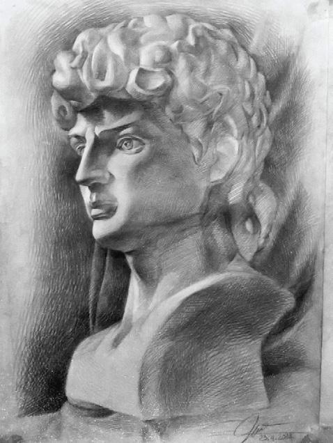
Drawing pecil exercises of the ‘Art Of Painting 1’. With the aim of practicing penmanship, ability to feel shape and measure.


P E N C I L Drawing
art portrait person
bust art statue


Exercises at the exam with statues of complex complexity, improving the style, style and creativity in the style formation process. This is an advanced stage compared to the Painting period 1.


PRINT ADS DESIGN


Print Ads is a media language. Is the fastest way to convey product messages from businesses to consumers.


This is a summary of all the print ads that have the best viral effects I have done during my time as a branding freelancer.


vietnam
15.00mm
15.00mm

D O C U M E N T SIR
chic
firsl
P E N C I L SIR
F L A S H D R I V E SIR
D I S P L A Y SIR

E N V E L O P E SIR
B I N D E R C L I P S SIR
N O T E P A D SIR


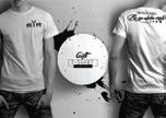


OFFICE IDENTITY SIR
men’s
clothes



PRODUCE HOUSE
media
BRAINSTORM
“guul“
+ + +
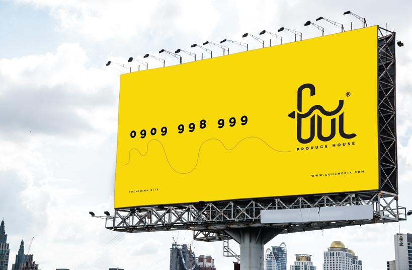
THE VICTORIOUS THE CONQUER MEDIA FLAG
• Tên thương hiệu: “Guul” xuất phát từ phiên âm tiếng Somali
• Tiếng Việt nghĩa là Sự Chiến Thắng.
• Là tinh thần và ý chí quyết tâm.
• Là tư thế ngẩng cao đầu tiến về phía trước .
• Hình ảnh ngọn núi và là cờ trên đỉnh thể hiện sự quyết tâm chinh phục đỉnh cao, chinh phục khó khăn, vượt mọi gian nan.
• Ngọn núi thể hiện cho sự hoang dã, thiên nhiên. Thương hiệu có thể đến được nhiều nơi, nhiều địa hình khác nhau để thực hiện sứ mệnh.
• Bên cạnh đó, chủ thương hiệu còn muốn xây dựng môi trường làm việc của mình thiêng hướng tự do, phá cách và không bị gò bó, rập khuôn.
• Nút “Play” là biểu tượng ngắn gọn và cô đọng nhất để nói về lĩnh vực Multimedia.
• Ý nghĩa của nút “Play”, trong Logo là Sự khởi đầu, xuất phát điểm để chinh phục một hành trình.
DEMO
PRODUCE HOUSE
1 2
PRODUCE HOUSE
3 4
media

PRODUCE HOUSE
M C JEWELRY
LOGO PRESENTATION
the ring, the braceret
mix
‘MC Jewelry’ is a Luxury jewelry brand of Long Beach Jewelry Company.
‘MC Jewelry’ ponsitioning is young consumers segment. Cause this brand carries the spirit of ‘creations’, ‘innovations’ and ‘concepts’.
The MCJ Logo is created with mainstream monochrome (black & white) tone for elegant appearance. The poin is the C symbol (Concept) that represents the maximum creativity that the brand owner wants. This is also the signature of the brand.


DIGITAL ICON
5
Other projects Logo for small brands of Long Beach Group.
5
www.donghocat.vn
www.donghocat.vn
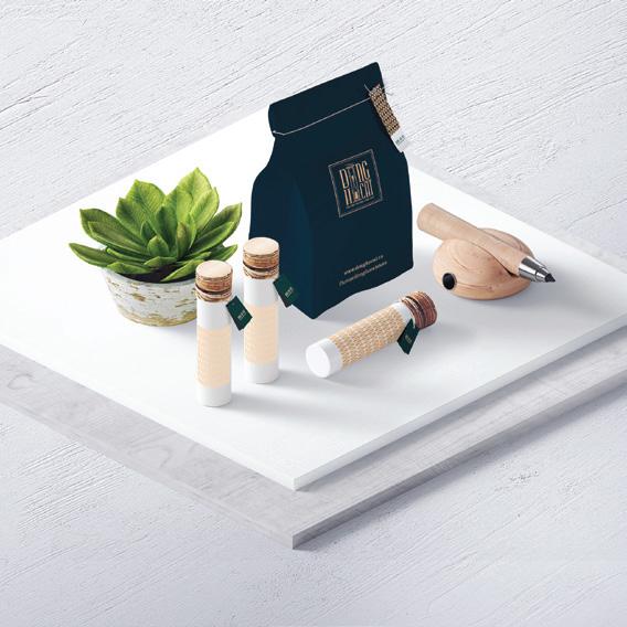

18006099 fb.com/donghocatstore
www.donghocat.vn
18006099
fb.com/donghocatstore

L O G O & B R ANDIN G
dong Ho Cat
Dong Ho Cat Brand is a cosmetic brand, weight loss product and health products for women from Ho Chi Minh City.
Brand is responsible for branding and marketing product.
Logo feeling from Hourglass. It’s symbolizing the slender, graceful body of the woman. Along with the image of 'leaf hat' symbolizing the youthfulity of Thuan Viet woman.

The font is modeled in a stamped bold, which meaning a Pure Vietnamese brand and has a long lasting value.
BE C H I C F I R S T

B R O C H U R E DESI G N S

BRAND SIR


Brochure of SIR Brand introduce to customers about Concept ‘Who Am I’.

C O BRAND ING
(+84) 947 99 79 78 hello@longbeach-phuquoc.com www.longbeach-phuquoc.com


Best Western is a cobrand of real estate proj- ect between Long Beach Group and Best Western International.
The project is the cooperation 2 big group real estate to jointly build spectacular projects invested in Phu Quoc island.
I participated in this project as a cobranding designer to carry out publications such as Envelope, Business card, Paper Folder.
The publications made must meet the criteria such as: professional brand identity, not over- lapping with the Best Western BI. Create a unique substance with the spirit of both groups.
www.donghocat.vn
C OMI C C H A R A C T E R S DESI G N
www.donghocat.vn
C OMI C C H A R A C T E R S DESI G N

‘Cát Funfam’ also a branding campaign have been design to develop the ambassador of ‘Dong Ho Cat’ Brand. For another audience segment.
C OMI C C H A R A C T E R S DESI G N
www.donghocat.vn
Đây là bạn khi ai đó hỏi...
Ê bánh mì, lâu quá không gặp nay nhiêu kí rồi ???


D I G I TA L POS T S

‘Pearlsense Spa’ ponsitioning luxurious & Five Star estate .

Graphics of brand look like estate. Minimalism style, professional and elegant.
Brand identity of digital channels has been designed by me. Violet gradient is signature of brand.
BÍ Q U Y ẾT L Ấ Y BÍ Q U Y ẾT L Ấ Y ĐIỂM ĐIỂM KHI H Á T K AR A OKE KHI H Á T K AR A OKE BÍ Q U Y ẾT L Ấ Y BÍ Q U Y ẾT L Ấ Y ĐIỂM ĐIỂM KHI H Á T K AR A OKE KHI H Á T K AR A OKE




DIGI TA L POS T DIGI TA L POS T S


Pearlsense Spa là một Brand về dịch vụ chăm sóc sức khỏe và nghỉ dưỡng thuộc khối ngành Thương Mại - Dịch Vụ của tập đoàn Long Beach Group tọa lạc tại Đảo Ngọc Phú Quốc. ‘Pearlsense Spa’ định vị một thương hiệu Spa sang trọng, đẳng cấp 5 sao ‘Pearl Karaoke’ is a entertainment service brand of the Long Beach Group of Commercial - Service sector located at Phu Quoc Island. Pearl Karaoke is a top of karaoke center in Vietnam for all of facilities- modern & estate.


PROM O TIO N


POSM, Promotions, marketing material of Pearl Karaoke visualize like activity, youthful, enthusiasm meaning a new age of this services have been available in Vietnam for a long time.


WEB LAYOUT DESIGN

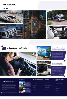


BRAND NGOC TRAI BIEN TRANSPORT
‘Ngoc Trai Bien - Transport sevice’ is a service brand of the Long Beach Group Commercial - Service sector located at Phu Quoc Island.
Layout website showing 3 main spirits of the brand (fast + modern + convenient) with tone & feel white blue theme.
I show a spirit of design that is a bit disruptive, applying manipulation skills to keyvisual websites.
NEWSMD - TRANSLATION


UI/UX SOFTWARE DESIGN
NEWSMD TRANSLATION


UI kit of a pharmacy management software developed by the medical technology solution company. Designed according to criteria: Modern, smart, professional, accurate
The UI kit layout was completed and implemented closely by IT Team and Designer Team during 6 months of work.
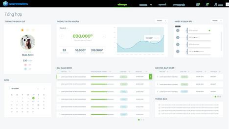

Interface set and software code belonging to the intellectual property rights of DHS Technology Co., Ltd.




UI/UX SOFTWARE DESIGN
UI kit of a pharmacy management software developed by the medical technology solution company. Designed according to criteria: Modern, smart, professional, accurate


The UI kit layout was completed and implemented closely by IT Team and Designer Team during 6 months of work.
Interface set and software code belonging to the intellectual property rights of DHS Technology Co., Ltd.
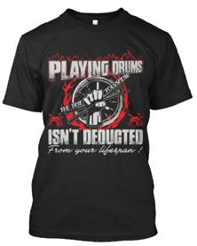
This is a collection of all of my best designs for T-shirts and pendants during my time working in the T-shirt Trading Company of the US and European markets.

Designs T-shirt, I learned a lot of design skills. Help me to master Photoshop, Illustrator. Good hand drawing skills and aesthetic thinking in European and American countries.


DESIG N

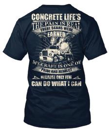



SHIRT DESIG N


2
0
1
4-2
0
1
8
P
RES
E
N
T
6

R E N T U


SHOOTIN G P E A RLSENSE RESORT


FOOD CONCEPT &SHOOTIN G
T H E E N D
F O R V I S ITIN G


