
ANNEMARIE MORMAN
ANNEMARIE MORMAN
NCIDQ, WELL AP
CONTACT ME
morman.annie@gmail.com
513.716.2682
Austin, TX
EDUCATION
Bachelor of Fine Arts
Interior Design
Miami University
Oxford, Ohio
August 2016 - May 2020
First in Class | Magna Cum Laude
CERTIFICATIONS
NCIDQ Certified CIDQ
Issued: April 2024
WELL Accredited Professional
International WELL Building Institute
Issued: August 2020
PROFESSIONAL ENGAGEMENTS
IIDA Assoc. (Austin)
January 2023 - Present
IIDA Assoc. (Columbus)
January 2021 - December 2022
Inaugural WELL Building Conference
Long Beach, CA May, 2024
Alpha Rho Chi -
Professional Architecture Fraternity 2016-2020, President - 2020
SOFTWARE
Revit
Enscape
Adobe Suite
AutoCAD
+
EXPERIENCE
Interior Designer | SHP Columbus, Ohio
January 2021- Present
Designed and Documented K-12 renovations from Schematic Design to Construction Drawings. Assisted Senior Designer in design and documentation of new K-12 Schools including SDs, DDs, CDs, Furniture Packages, and Construction Administration.
Assisted LEED Documentation for several K-12 schools. Prepared and presented client presentations and communications.
Coordinated with MEP, Structural, Acoustics, Kitchen, Technology, and Civil consultants. Prepared furniture budgets, specifications and furniture package documentation. Reviewed and prepared submittals, proposal requests, requests for information, and punch lists. Member of SHP’s Sustainability Research Group and Mental Health Design Group.
Contract Designer | GOLogic
Belfast, Maine
November 2020- January 2020
Designed and prepared Design Development and Construction Documentation for a low carbon single family residence.
Communicated directly with client and coordinated design with consultant engineers.
Woodworking Apprentice | Phil’sFineWoodworking Loveland, Ohio
November 2020- January 2021
Created two and three-dimensional drawings for carpentry projects.
Worked directly with master woodworker to design and build projects varying in scale from small art pieces to entire rooms of custom bookshelves and wood paneling. Assisted in shop construction, edge banding, sanding, routing, assembling, and install.
Interior Design Intern | VSWC Architects Mason, Ohio
May 2019- August 2019
Worked directly with Project Managers both in office and on site for many K-12 education projects.
Gained extensive knowledge on building and zoning permits as well as on site punch lists.
ACCOLADES
John Weigand Founder’s Scholarship in Interior Design
May 2019
The Dean’s Commendation for Outstanding Academic Performance & Contribution to the MUDEC Community
December 2018
Fred Whitcomb Scholarship in Interior Design
May 2018
REFERENCES
Katy Goettl - Senior Interior Designer - SHP 614. 519. 0827 kgoettl@shp.com
Phil Ping - Wood Craftsmen 513. 256. 0419 philsfinewoodworking@gmail.com
Katherine Setzer - Interior Design Professor 615. 945. 1510 ksetzer@miamioh.edu
ABOUT ME
I am looking for a community of designers that shares the belief that the built environment has a direct affect on mental and physical wellbeing and seeks to create spaces that foster healthy and enjoyable lifestyles for all.
I received my bachelor's of Fine Arts in Interior Design from Miami University in Oxford, Ohio in 2020, with a specialized concentration in Disability Studies. Committed to providing inclusive and human-centric designs, I furthered my expertise by becoming a WELL Accredited Professional shortly after graduation.
Since 2021 I have excelled as a member of SHP's Education Studio in Columbus, Ohio and remotely from Austin, Texas. At SHP I specialize in crafting spaces that foster engagement, collaboration, and supportive learning environments for students and educators.
Outside of work, I actively pursue growth as an Interior Designer. Recently I achieved NCIDQ Certification, underscoring my commitment to industry excellence. Additionally, I had the honor of attending the inaugural WELL Conference this spring, deepening my understanding of designing spaces for human health and wellness.
My passion is using design as a tool for positive social impact, ensuring that every space I create not only meets functional needs but also fosters inclusivity, well-being, and creativity.


Design Concept
01
CHARTER COMMONS
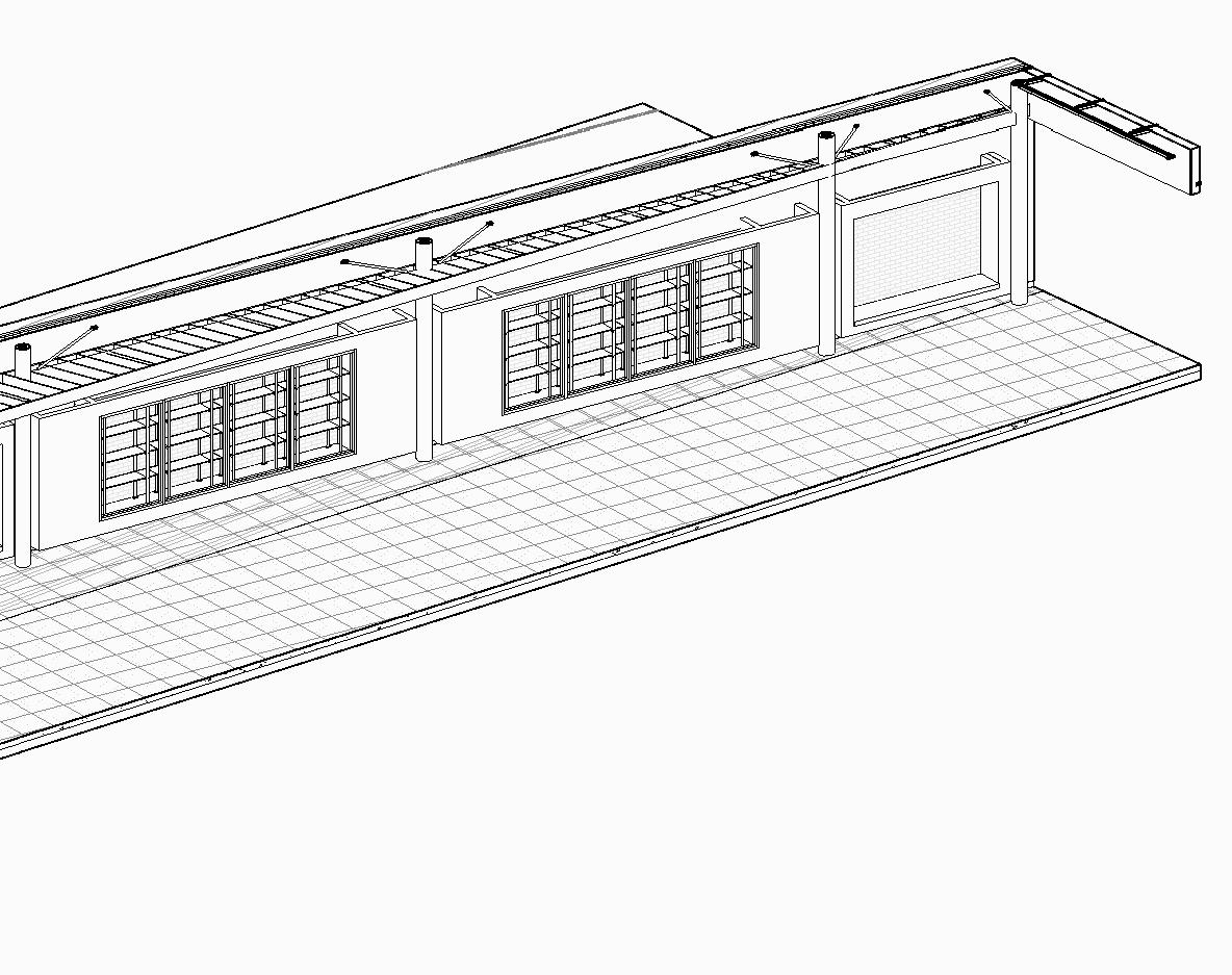
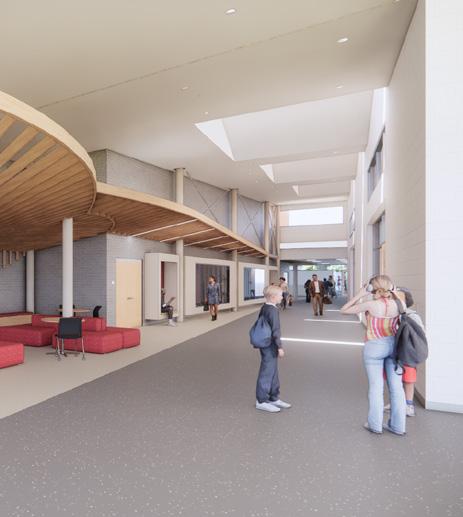
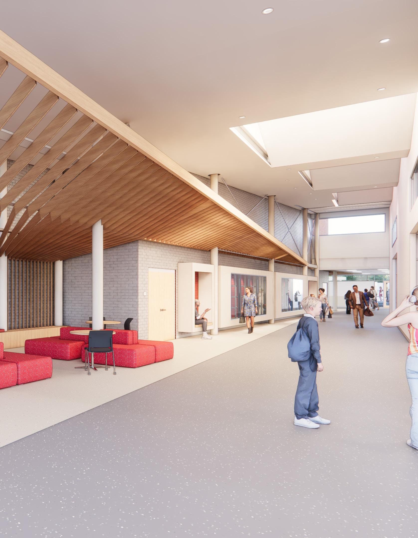
This project showcases a striking new grand entry commons for a North Carolina charter school, featuring a suspended wooden baffle ceiling inspired by the school's mascot, the cardinal. This architectural centerpiece symbolizes the school's spirit and commitment to excellence. The design process involved iterative development and collaboration with the school stakeholders to achieve a balance of aesthetic appeal, acoustic improvement, and subtle branding. The resulting space serves as a welcoming hub for students, faculty, and visitors, fostering a sense of community and pride right as they enter the new building.
Project Phase: SD to DD
Project Type: Charter School Addition
Location: North Carolina

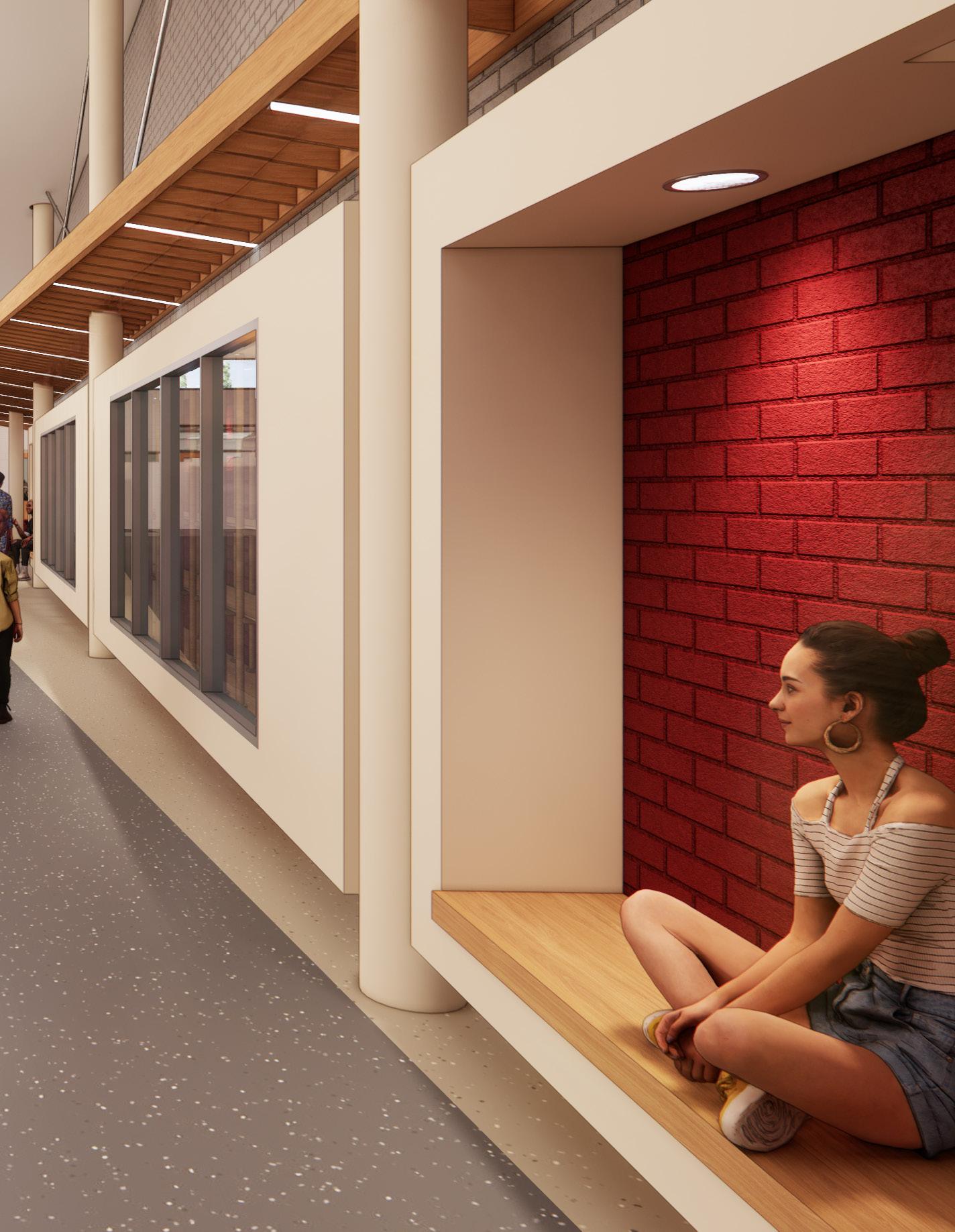
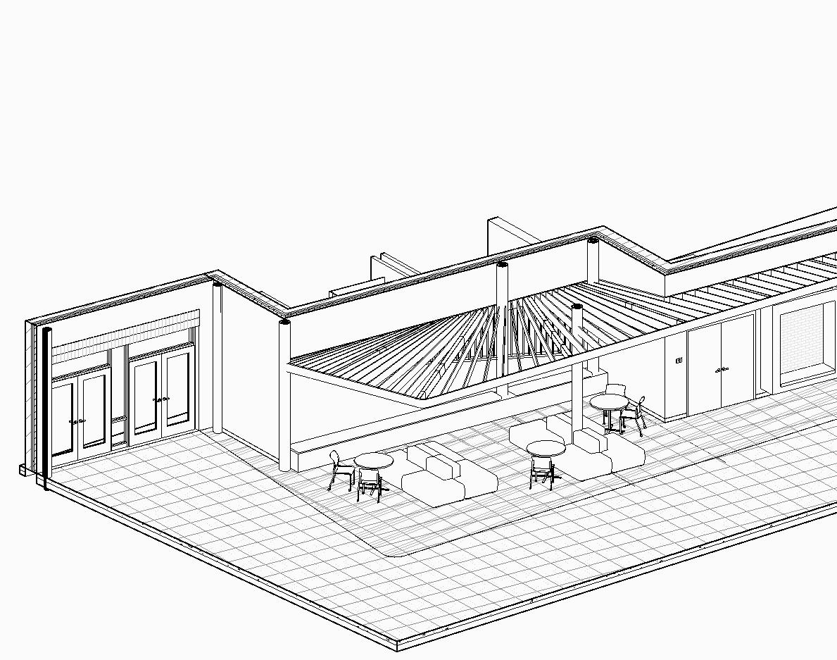
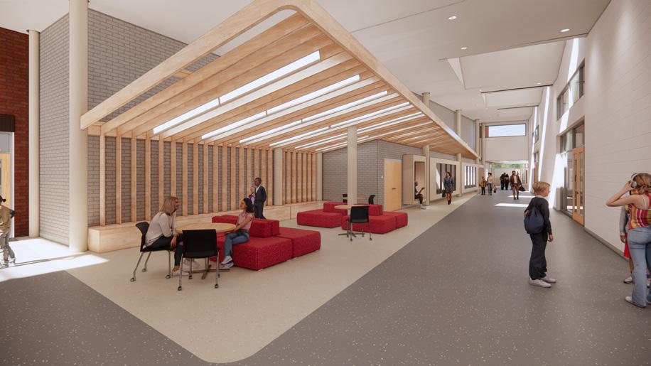
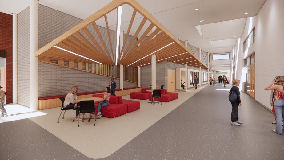
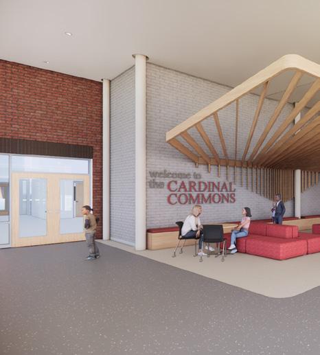
AXON OF NEW ENTRY COMMONS
DESIGN STUDY OF WOODEN BAFFLE CEILING STRUCTURE




South Bend Market Lots
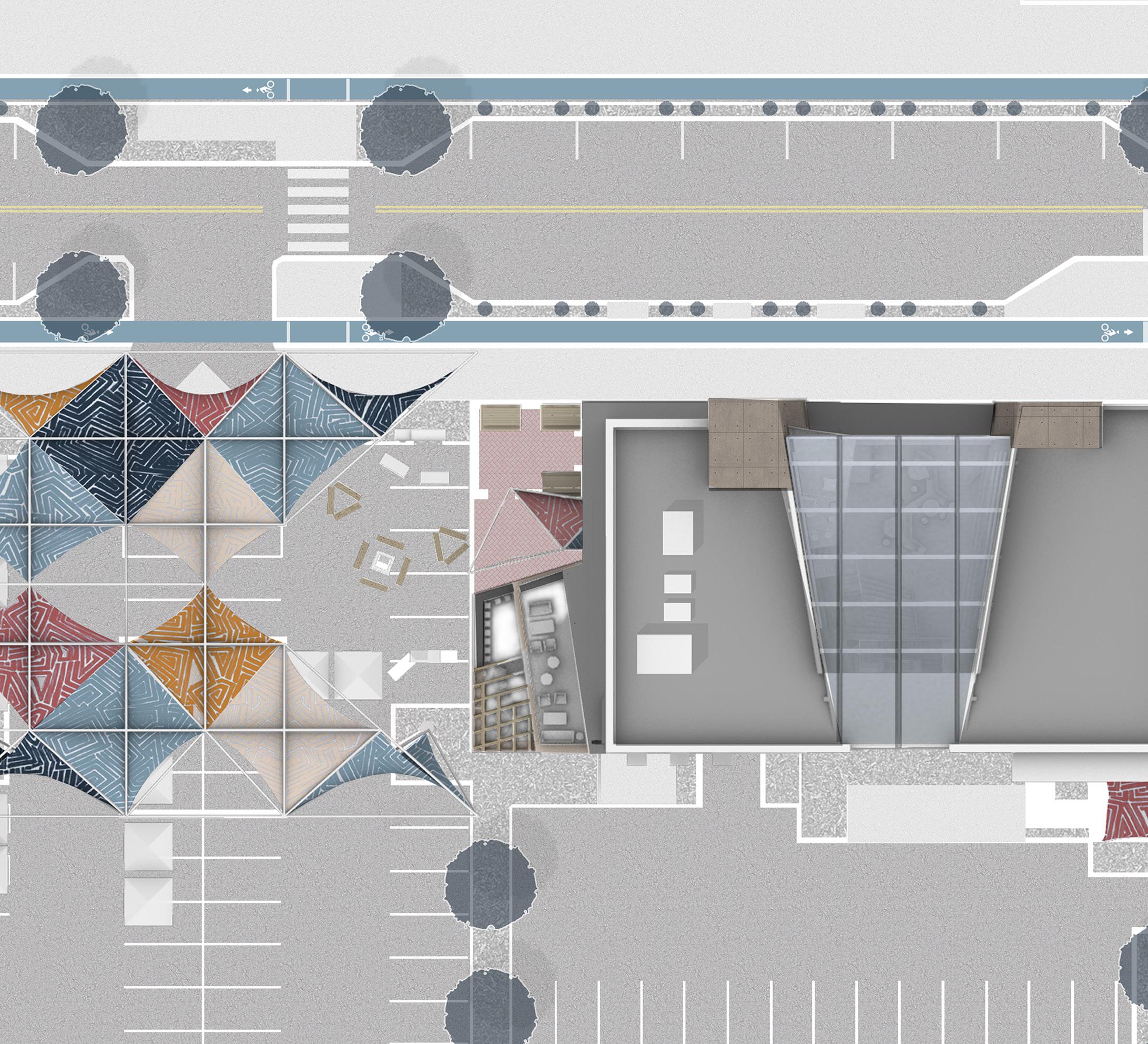
In order to address growing urban inequality and the dominance of the parking lot in downtown South Bend, we propose a plan to pair new construction with partial repurposing of parking lots to serve as dynamic and flexible venues for commerce, leisure, and events. Each transformed parking lot can be infused with a unique identity, thus creating a place where before there was none.
Development in this manner is meant to allow growth to different parking lots throughout the city and adapt quickly to changing demands. While the parking lots provide constantly morphing venues, the building provides a more permanent venue, creating a spectrum of possibilities that allows people of all backgrounds to take part.
Teammate: James Mustillo- Architecture Student
Year of Completion: Senior Capstone
Project Type: Mixed Use
Location: South Bend, Indiana
The Site and the Spectrum


Jefferson of
was redesigned is a vegetative the bike lane The street parking imagined to provide ride-share and well as parking
W. Jefferson Blvd.
West
the South

Jefferson Blvd. to the North Bend Market lots redesigned so that there vegetative buffer between lane and car traffic. parking was also reprovide a lane for and bus drop offs as parking for bike shares.
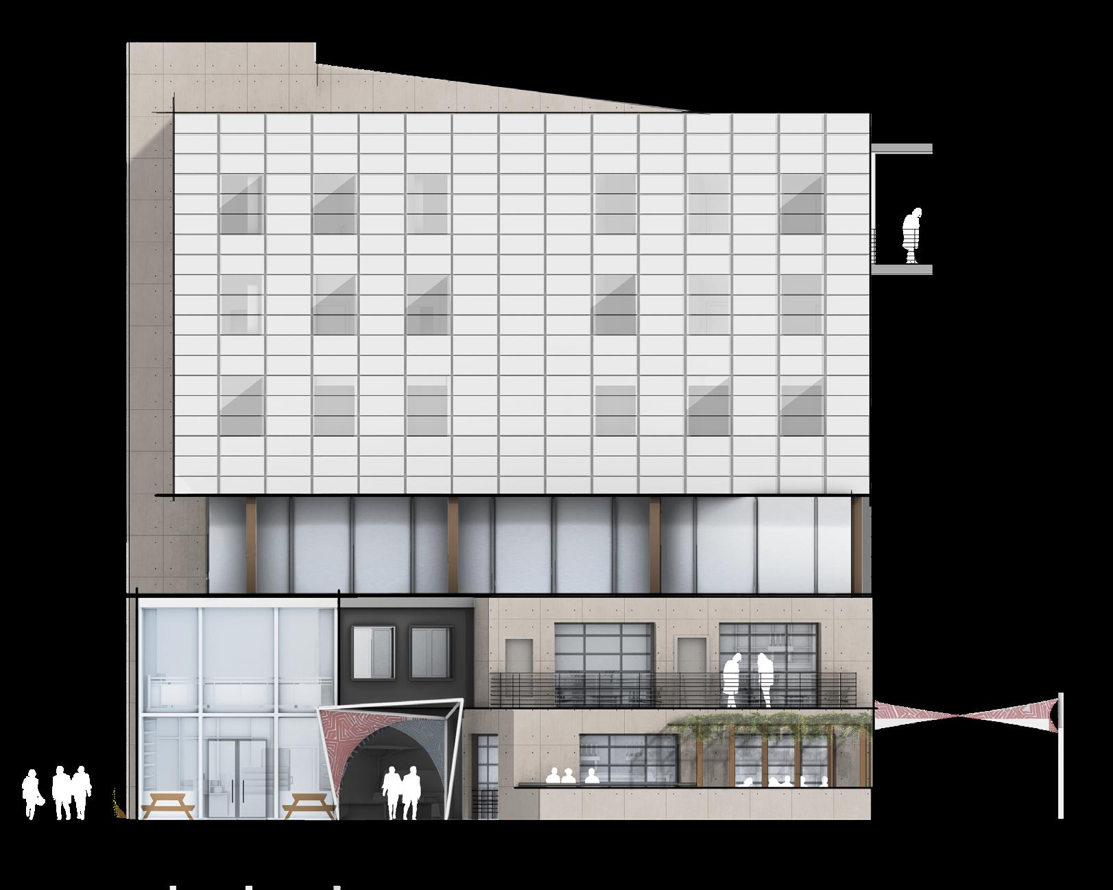
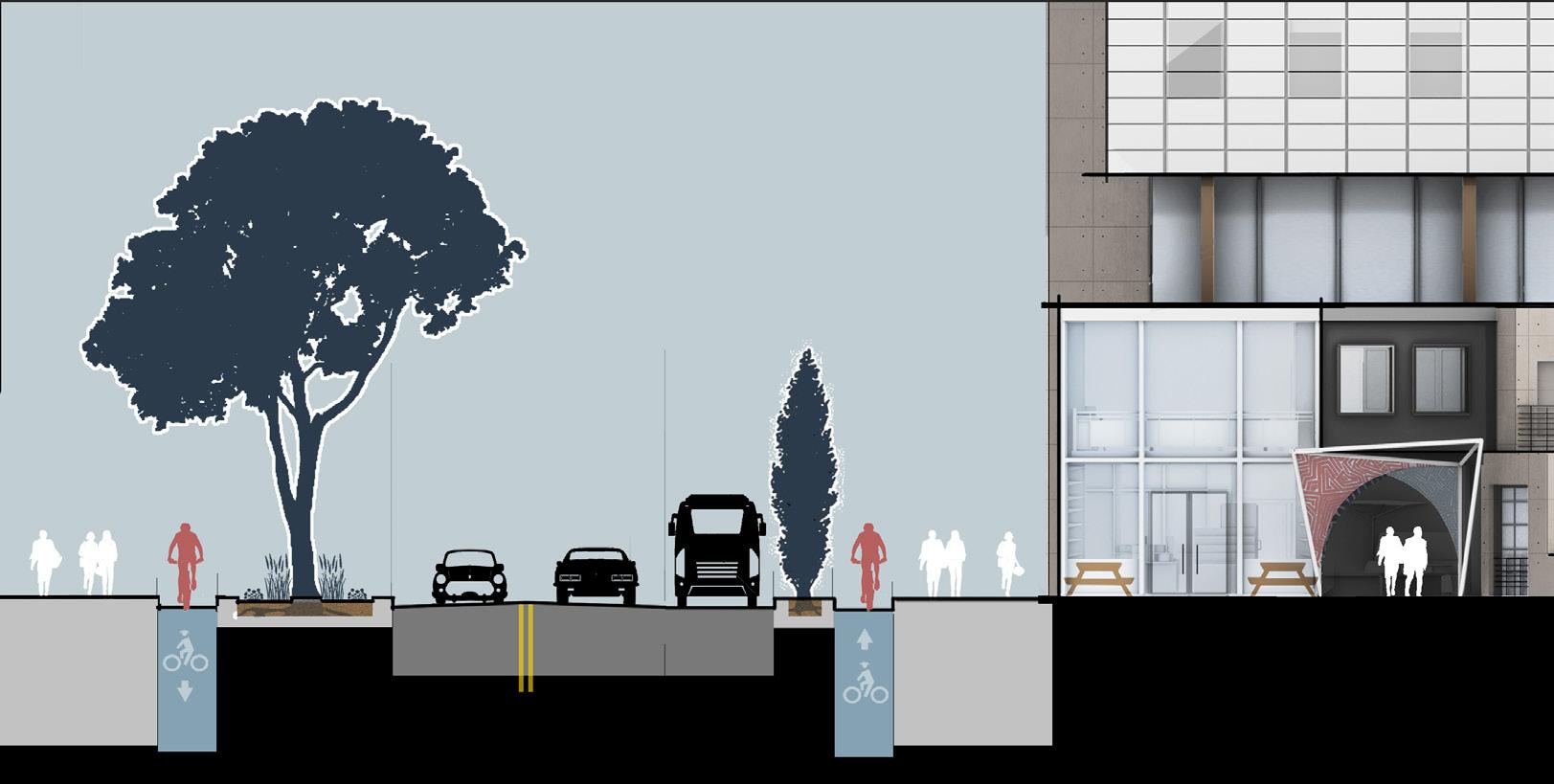


AUXILIARY LANE
Buffer
Pedestrian
STREET INTERFACE
Semi-permanent, semi-seasonal, the Grab and Go Market is a grocer style market store selling local fresh foods, baked goods and healthy fast meals.


Semi-permanent, semiseasonal, the Grab and Go Market is a grocer style market store selling local fresh foods, baked goods and healthy fast meals.
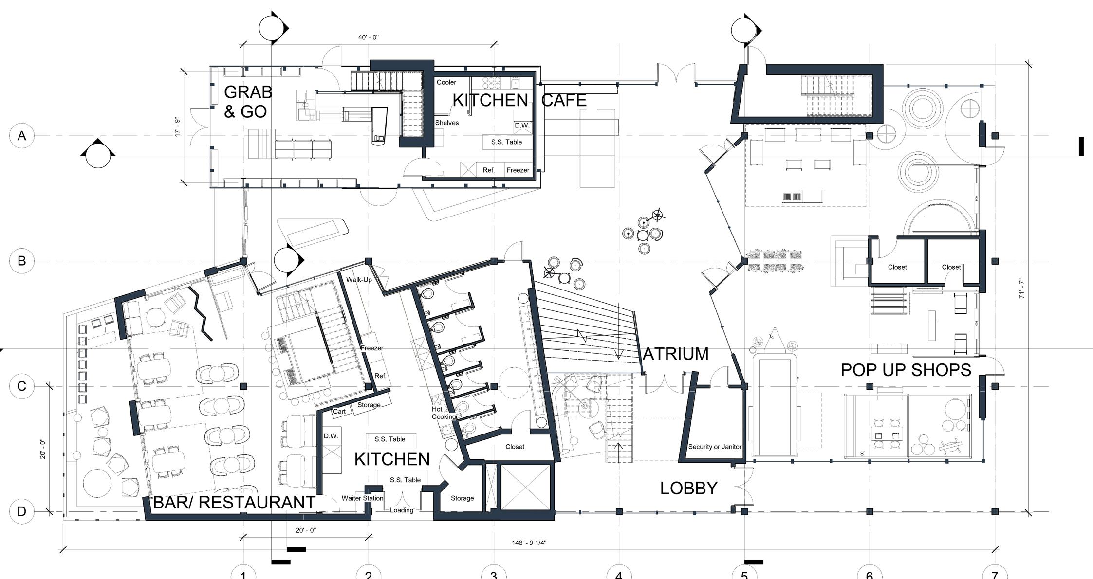
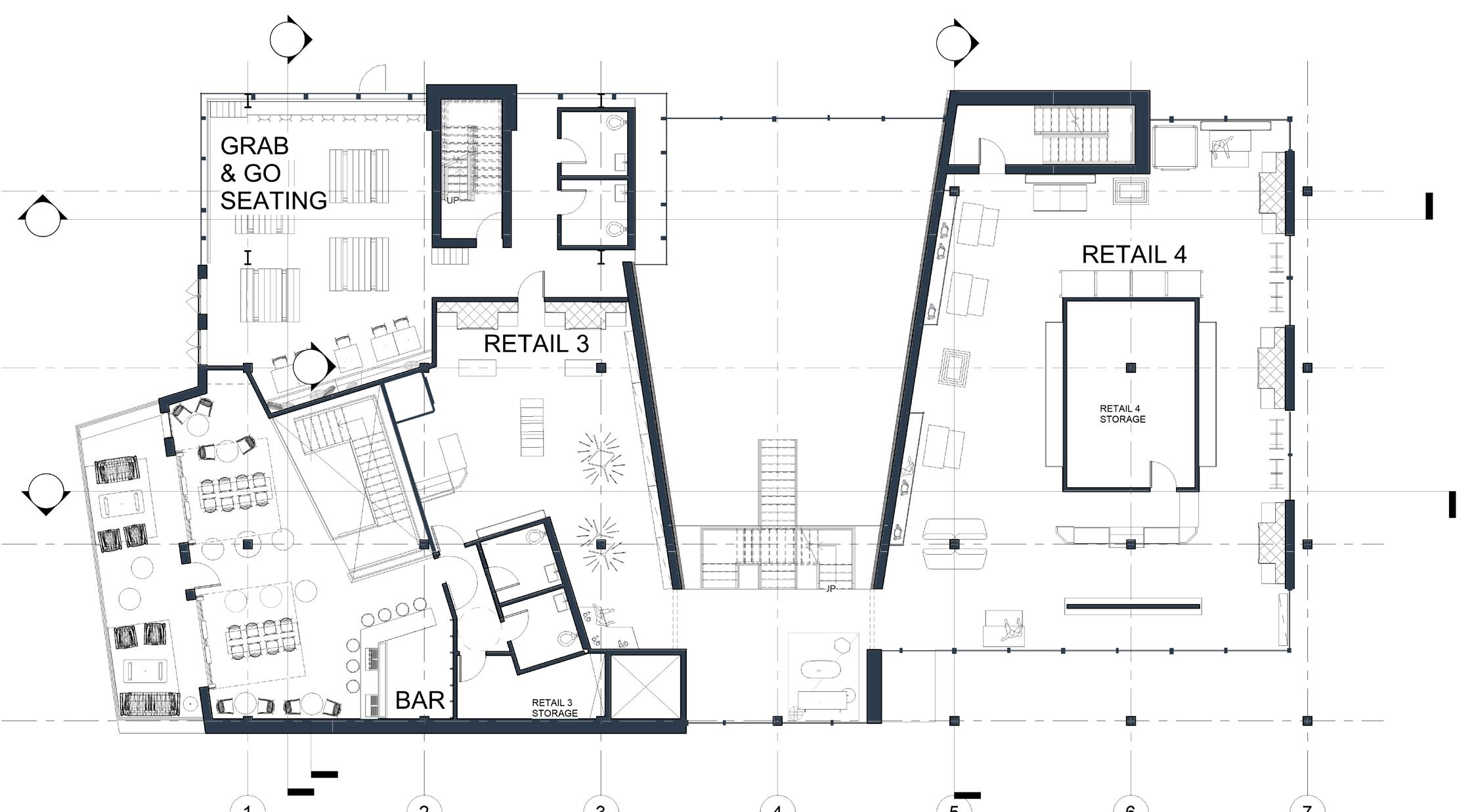
FIRST FLOOR PLAN

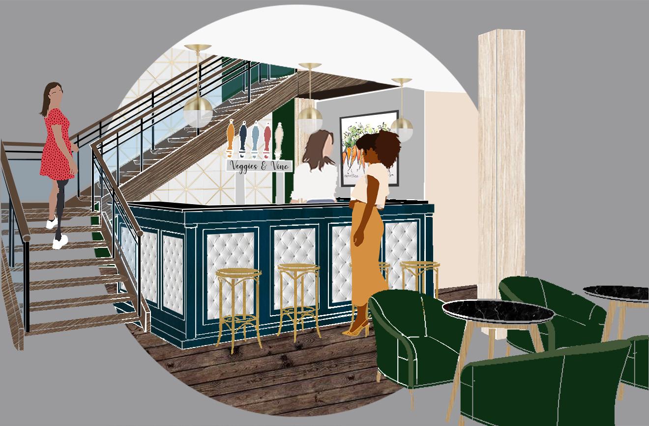
The first floor of the two-story bar and restaurant is a sit-down dinning area while the second floor is a more causal bar atmosphere. Each connect directly to outdoor dining areas that overlook the Market Lots.


VEGGIES AND VINO'S COASTERS
VEGGIES AND VINO SECTION
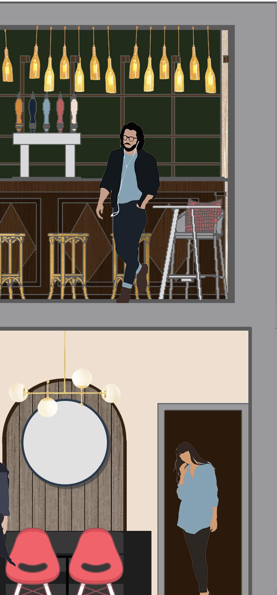
Wine Bar and Plant-Based Restaurant

Veggies and Vino is designed based off the ideals of Blue Zones. Blue Zones are communities in the world that have been found to live long healthy lives. In these blue zones plant-based diets and a glass of wine a day are important parts of a healthy lifestyle.


CoHousing and Micro-Apartments
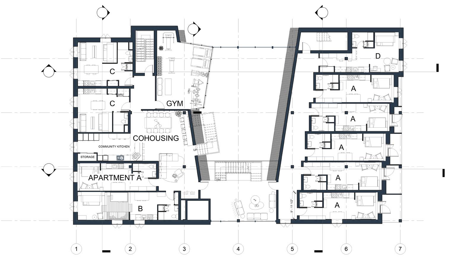
Fifth Floor Plan

SHARED KITCHEN, LIVING, AND DINING PLAN
Shared Kitchen, CoHousing
Co-housing
Co-living areas such as a kitchen, and gym, encourage social interactions as tenants to expand small apartment
Co-living areas such as spaces and gym, community tenants out of their small

FIFTH FLOOR PLAN


Kitchen, Living, & Dining Plan
Kitchen, Living, & Dining Plan
Co-housing kitchen, study spaces community and as well as allow expand out of their apartment spaces.
CoHousing a kitchen, study gym, encourage community and social tenants to expand small apartment
CoHousing a kitchen, study gym, encourage community and social interactions as well as allow tenants to expand small apartment spaces.

Micro-Apartments
Apartment type A is 300sf and designed to maximize efficient use of space. Each piece of furniture has multiple uses and is highly flexible. Ex. The kitchen table is at counter height and can slide out to expand the kitchen work surface or slide back for dining or studying.
Micro-Apartments
Micro-Apartments
Apartment type A is 300sf and designed to maximize efficient use of space. Each piece of furniture has multiple uses and is
Apartment type A is 300sf and designed to maximize efficient use of space. Each piece of furniture has multiple uses and is highly flexible.
Ex. The kitchen table is at counter height and can slide out to expand the kitchen work surface or slide back for dining or studying.
Ex. The kitchen table is at counter height and can slide out to expand the kitchen work surface or slide back for dining or studying.

Micro-Apartment A Plan
Micro-Apartment A Plan


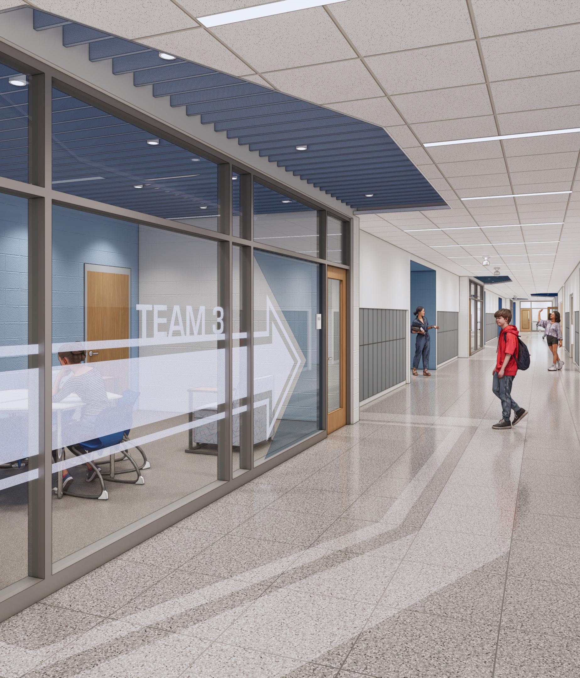

New Middle School 03
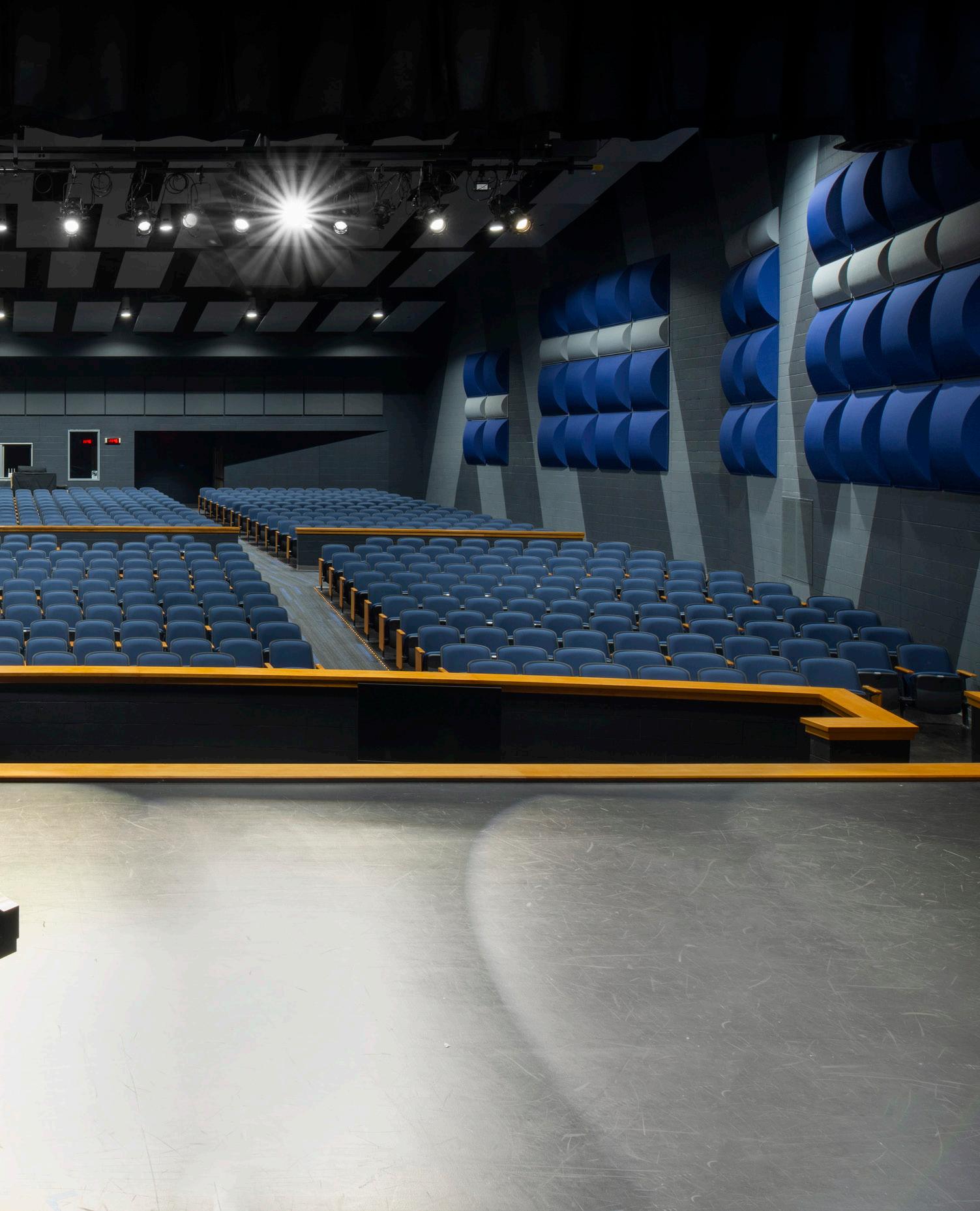
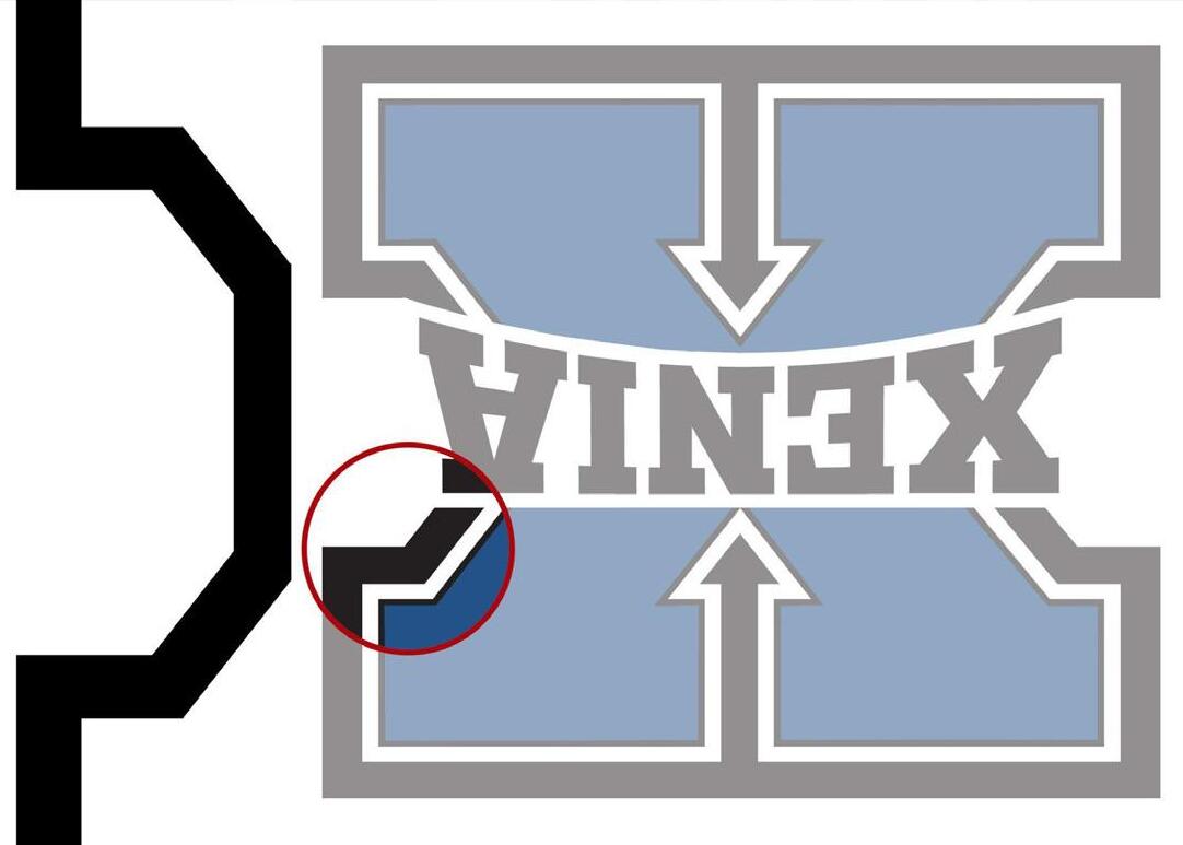
This new middle school blends functionality with the school's brand identity, while supporting its transition to a project-based learning curriculum. Each space from large assembly/ cafeteria space, to flexible classrooms, and dedicated STEAM labs, reflects the school's values and identity. Design elements such as terrazzo flooring patterns and frosted glazing graphics, subtly incorporate the school's branding while also understanding the importance of a long lasting and supportive learning environment.
Project Phases: SD to CA
Project Type: New Middle School
Location: Ohio
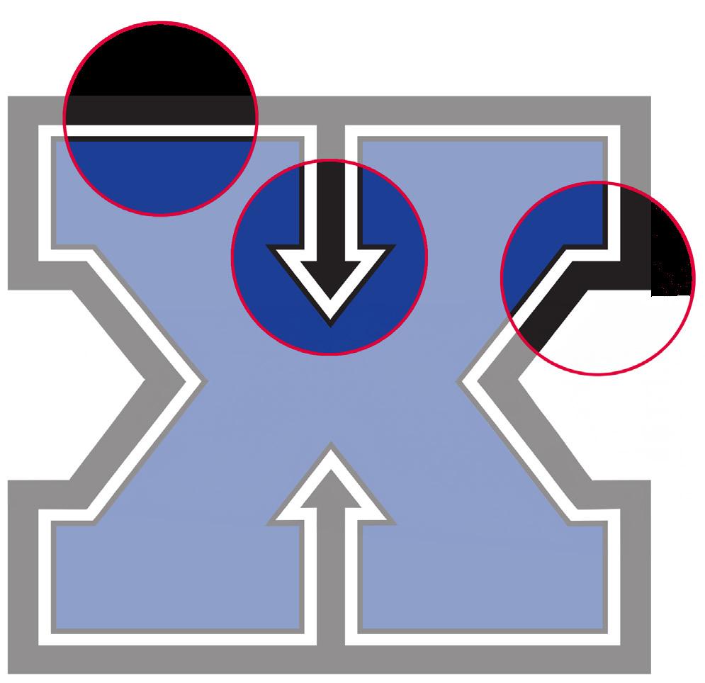
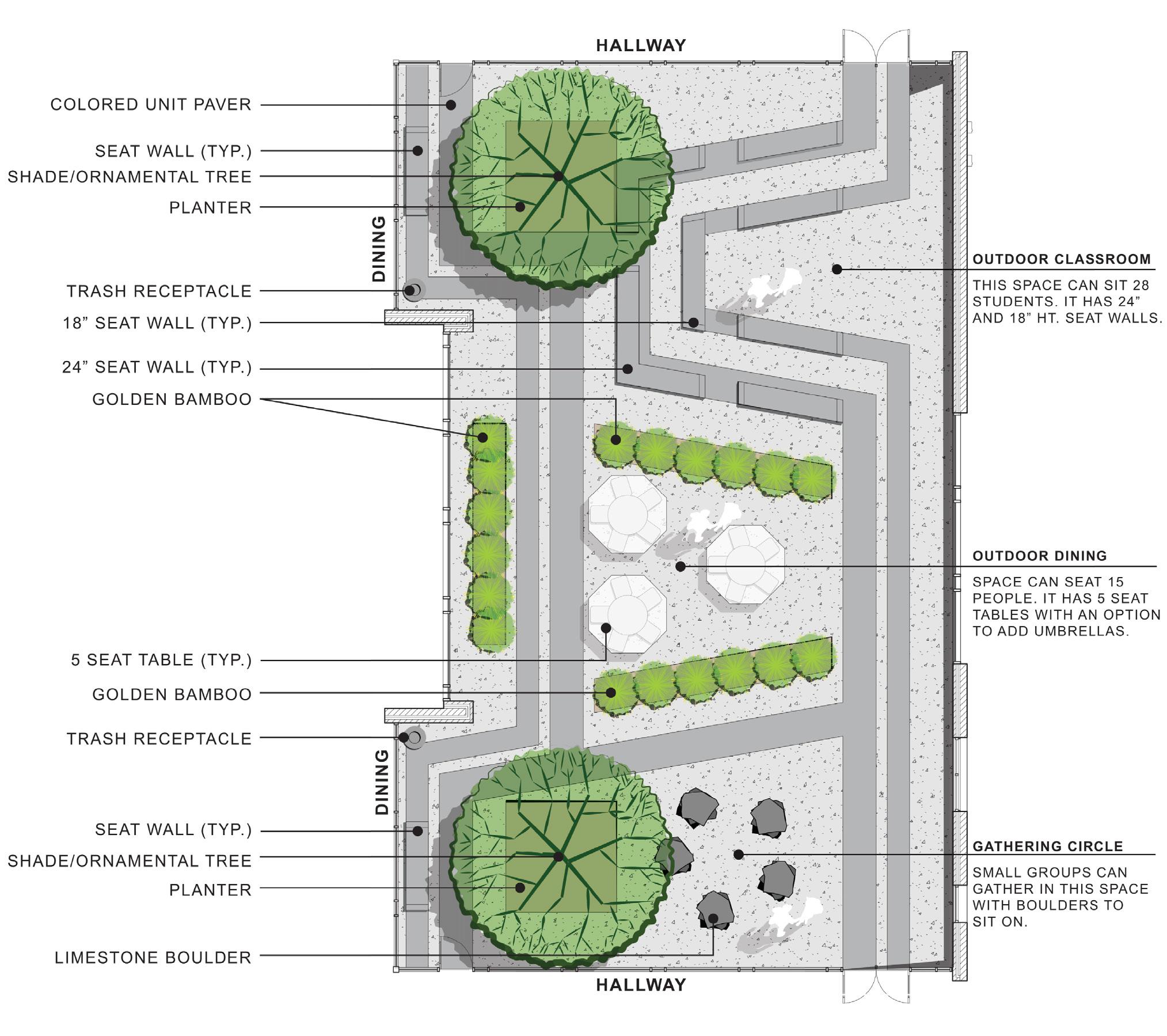
SCHOOL LOGO USED TO DESIGN GRAPHICS, FLOORING AND LAYOUT OF THE SCHOOL


STUDENT

ANGLES

DISTRIBUTED


“ The Terrace Plaza demonstrated in a concrete waythatCincinnaticouldbe modern,progressive,and innovative. “
~ Beth Sullebarger, local historic preservationist
The Terrace Farms strives to continue the legacy of innovation and progress for the city of Cincinnati by celebrating the history of the site and creating a program unlike any other in the city.
Terrace Farms will attract all kinds of audiences with many different purposes. From businessmen and woman grabbing lunch to a family going grocery shopping to children exploring the vertical farming museum. The space is one for living, learning and working.
WAY-FINDING SIGNAGE


Terrace Farms
Rooted in urban innovation, Terrace Farms is contributing to the future of urban agriculture through the adaptive reuse of the historically innovative Terrace Plaza Hotel. By engaging the community with living, learning and working opportunities, Terrace Farms promotes the well-being of Cincinnati while responding to growing needs of urban populations.
Year of Completion: Spring Junior Year
Project Type: Adaptive Re-Use
Location: Cincinnati, Ohio

Open to Individuality
This satellite office in Cincinnati, Ohio was designed for the architecture and interior design firm Bergmeyer, before their 2020 re-branding. The firm focuses on enhancing the everyday by their designs. They encourage active, hardworking, and health focused lifestyles. This office uses the same tenets to provide an office focused on wellbeing
Year of Completion: Fall Senior Year
Kind of Project: Office Place
Location: Cincinnati, Ohio
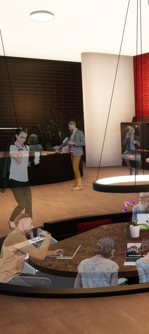

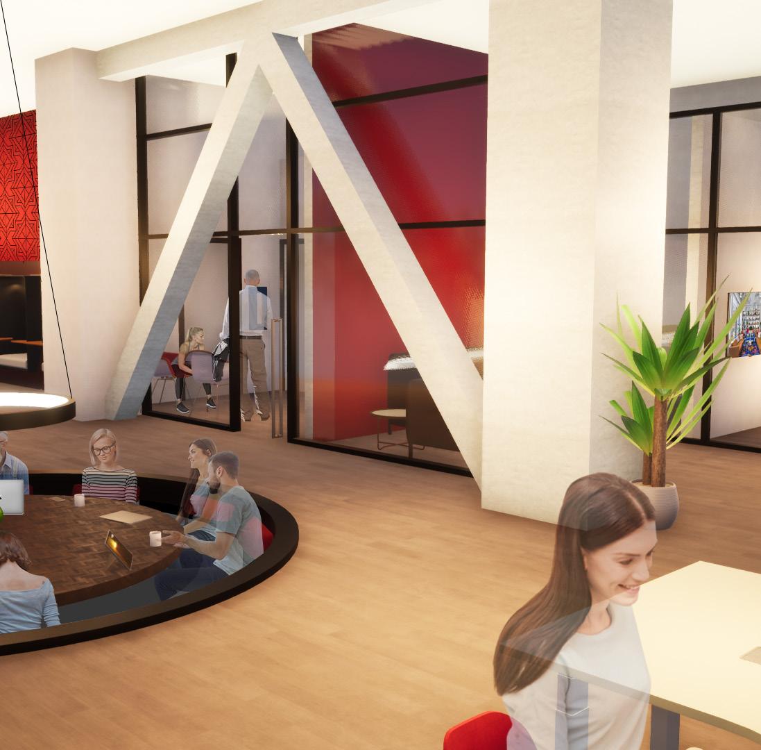


In order for each employee to succeed, the office is designed for free address seating to allow individuals to choose from works zones based on focusing, collaborating and resting as needed. Whether an employee prefers perfect silence or the white noise of the office, a rigid seat verse a more comfortable lounge seat, or a warmer part of the office or cooler. This Cincinnati office caters to the different and changing needs of its employees and clients.


Natural and neutral colors and textures juxtaposed with bold reds and accents of navy and geometric patterns creates a dynamic and exciting environment.

CAFE
06 High School Additions
This school district was looking to increase the number of classrooms and renovate their media center for their expanding student population. The focus of the project was the details, from constructing an efficient new circulation desk, to convenient built-in breakout spaces, and minute paint details for use in way-finding.
Project Phases: SD to CA
Project Type: Renovation and Addition
Location: Ohio


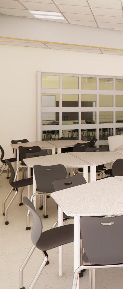


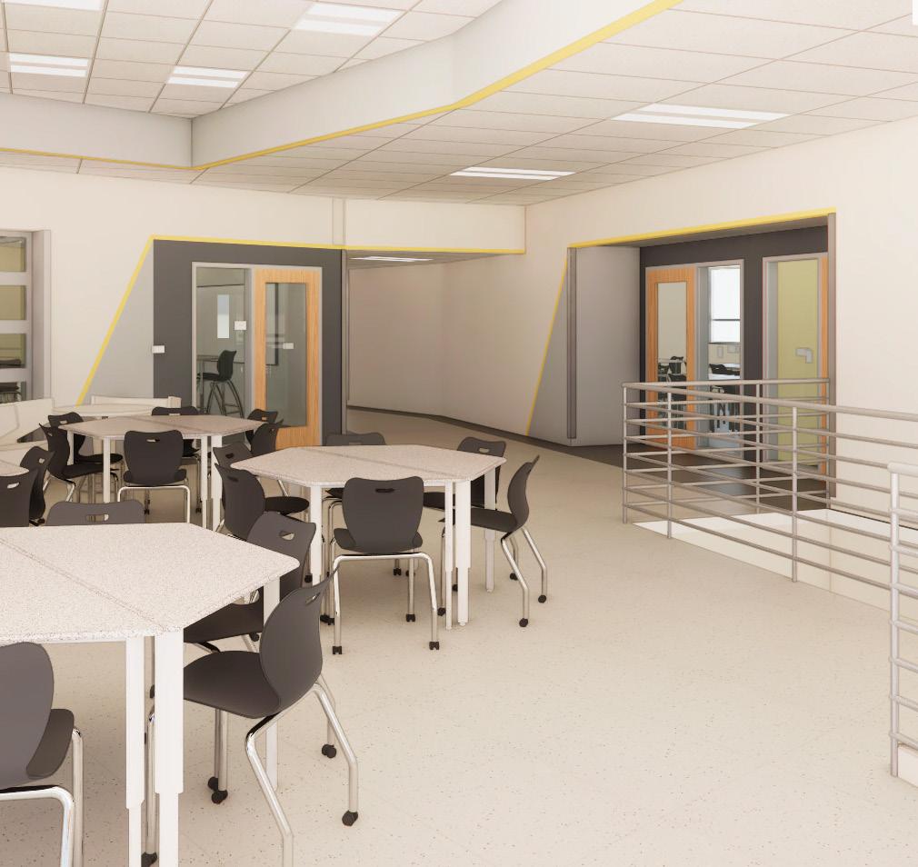

Each ELA and connected classrooms have a different accent color to help create varying spacial identities.
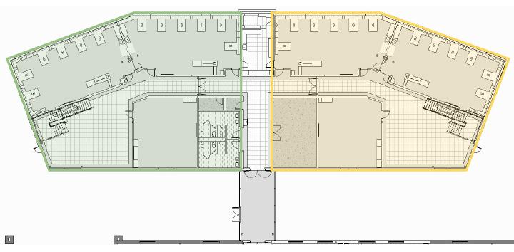
floor academic addition
SCHOOL NORTH FINISHES
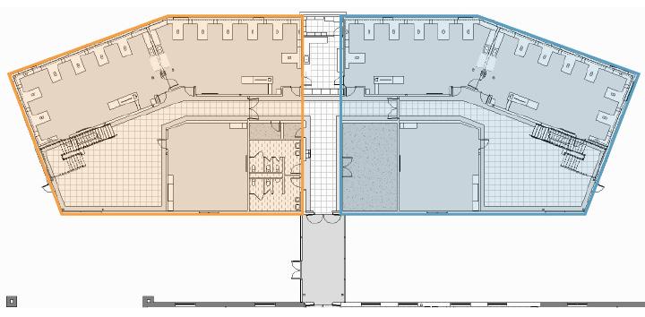
floor academic addition
HIGH
PAINTS
LAMINATE
CABINETS
First
Second
Paint Colors
Media Center Details

PLASTIC LAMINATE STAIR SURROUND - NO EXPOSED FASTENERS
HARDWOOD NOSING WITH EASED EDGE - STAINED TO MATCH PLAM-1
FOAM BACK PANEL. UPHOLSTERY: MOMENTUM ROW - MAGIC
LETTER INDICATES CASEWORK TYPE. (NOMINAL
( L= LABORATORY, M=MUSIC NO DESIGNATION INDICATES STANDARD EDUCATIONAL CASEWORK)
INDICATES ADA ACCESSIBLE CABINET
GENERAL NOTES - CASEWORK
A.PROVIDE
C.FOR ALL SINKS LABELED "ADA" REFER TO DETAIL 16/A681
D.ALL PLASTIC LAMINATE CASEWORK TO BE PLAM-1 UNLESS NOTED OTHERWISE. ALL PLASTIC LAMINATE
(2) LAYERS 3/4" MDF
Under-Stair Details


New PK-8 School
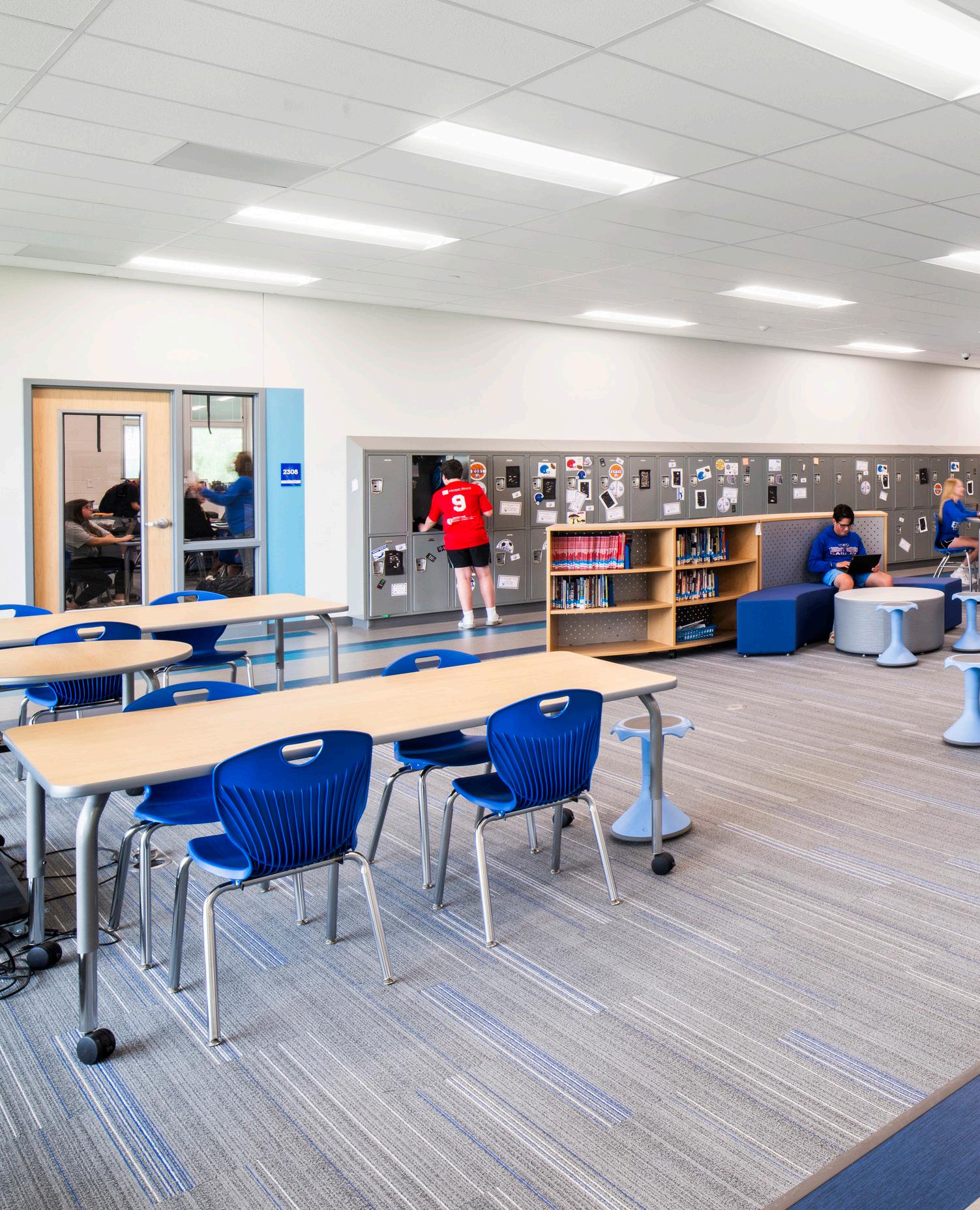
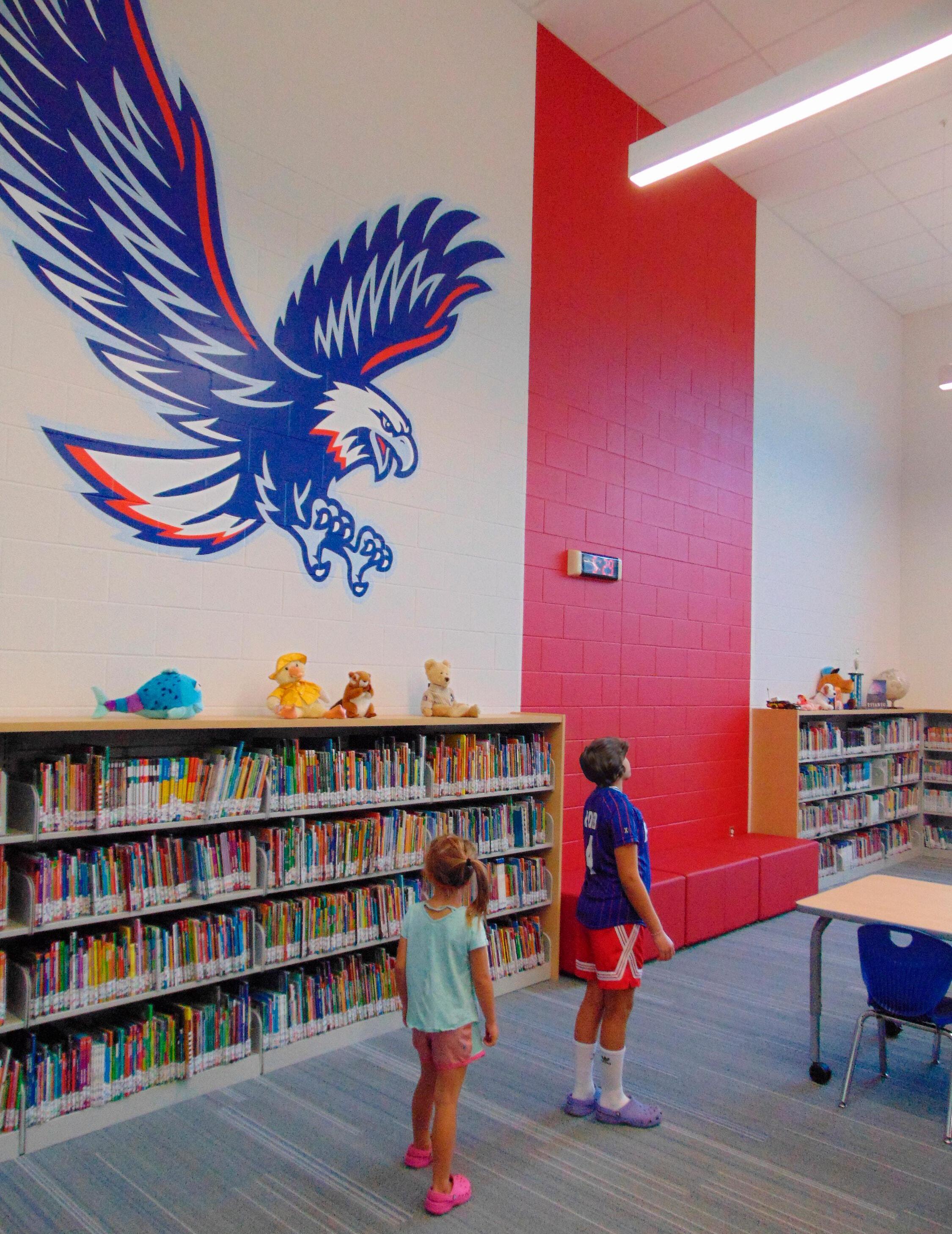
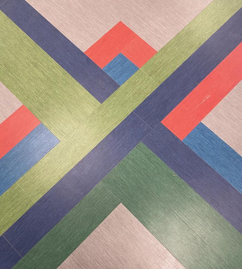
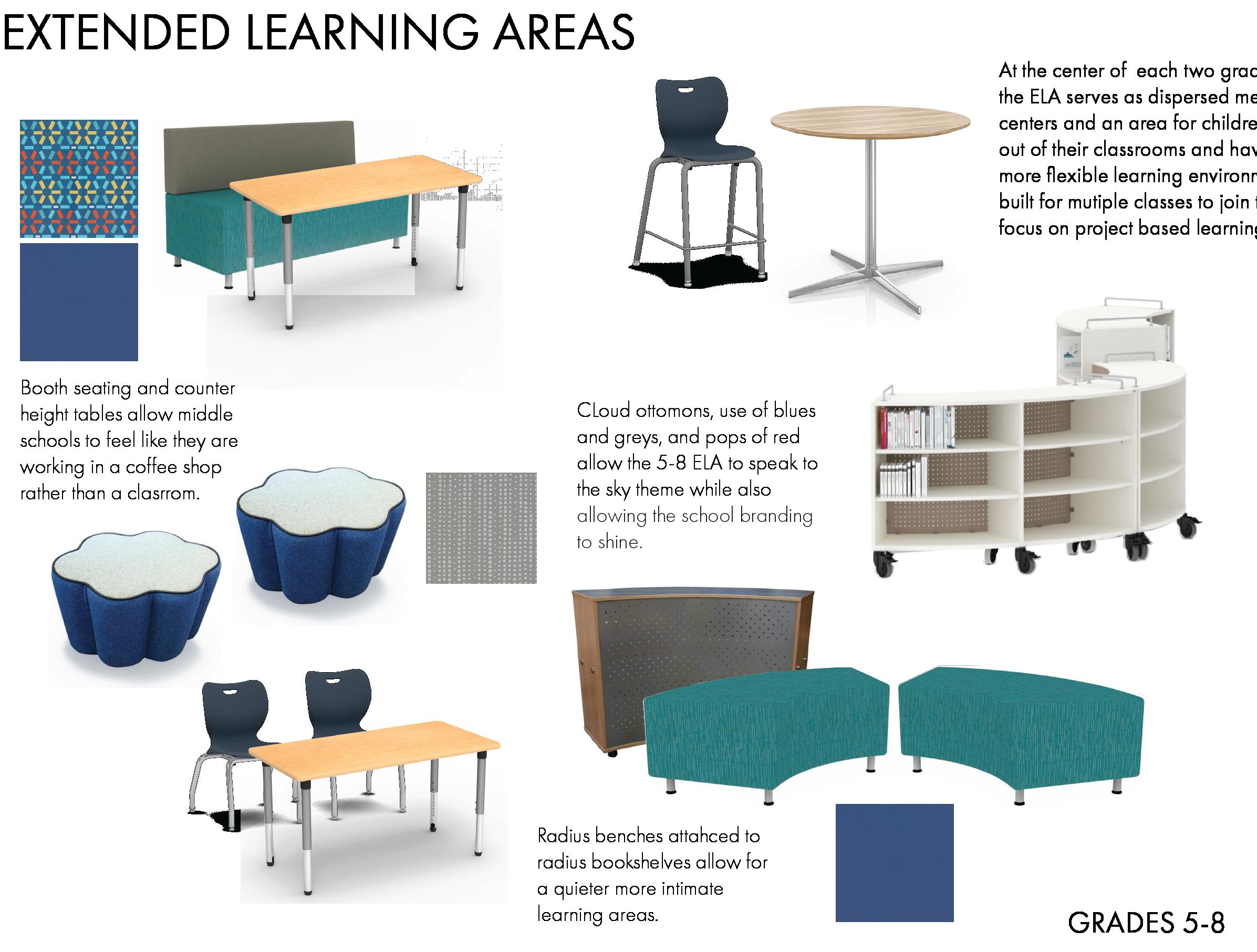
The design of the new PK-8 building intricately weaves the school's ethos and motto, "Where eagles learn to soar," into the fabric of daily student life. Each pod of classrooms symbolizes a stage in the students' growth, from the underbrush of grades 1 and 2 to the soaring heights of grades 7 and 8. The design themes not only beautify the school's circulation spaces but also serve as educational tools, foster collaboration and enhance the learning environment.
Project Phases: DD to Completion
Project Type: New K-8 School
Location: Ohio
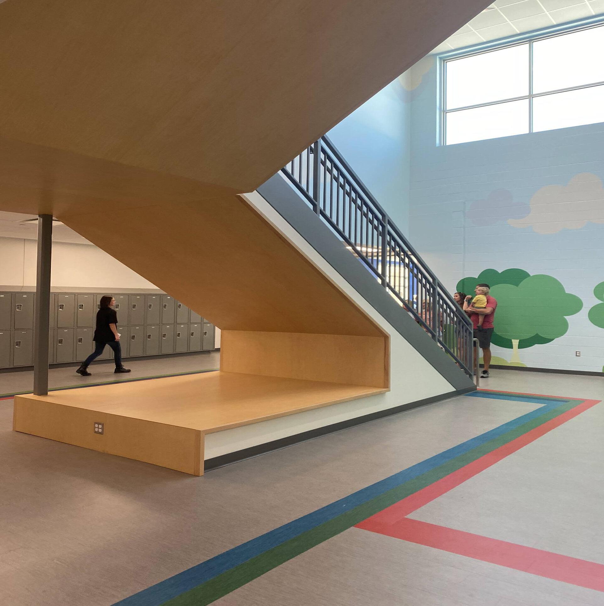


Main stairwell at the center of Grades 1-8
Floor pattern plan of main hallway to academic wing


Main hallway connecting public space to academic space
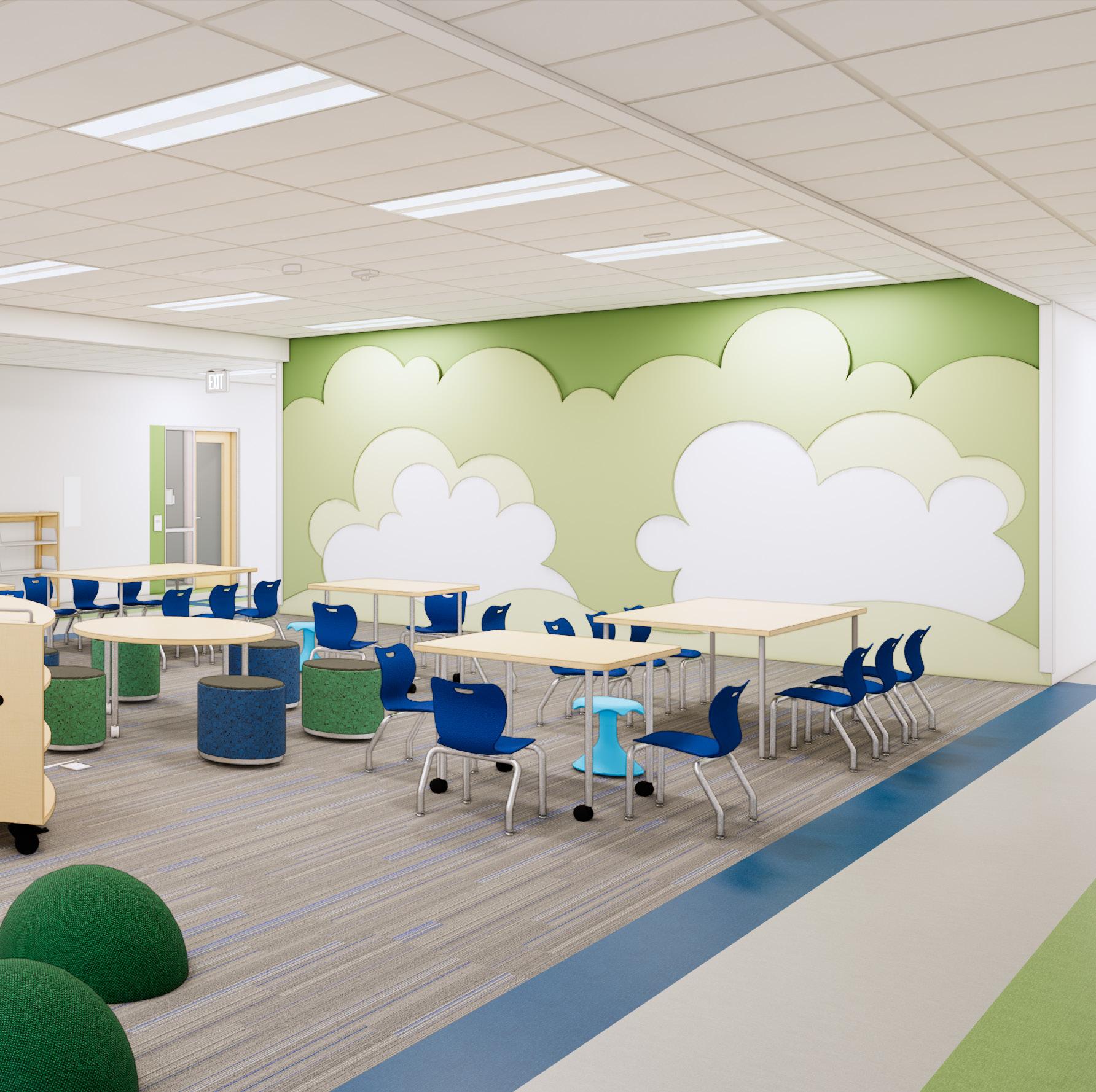

Grade 1-2: Bushes
Grade 3-4: Trees

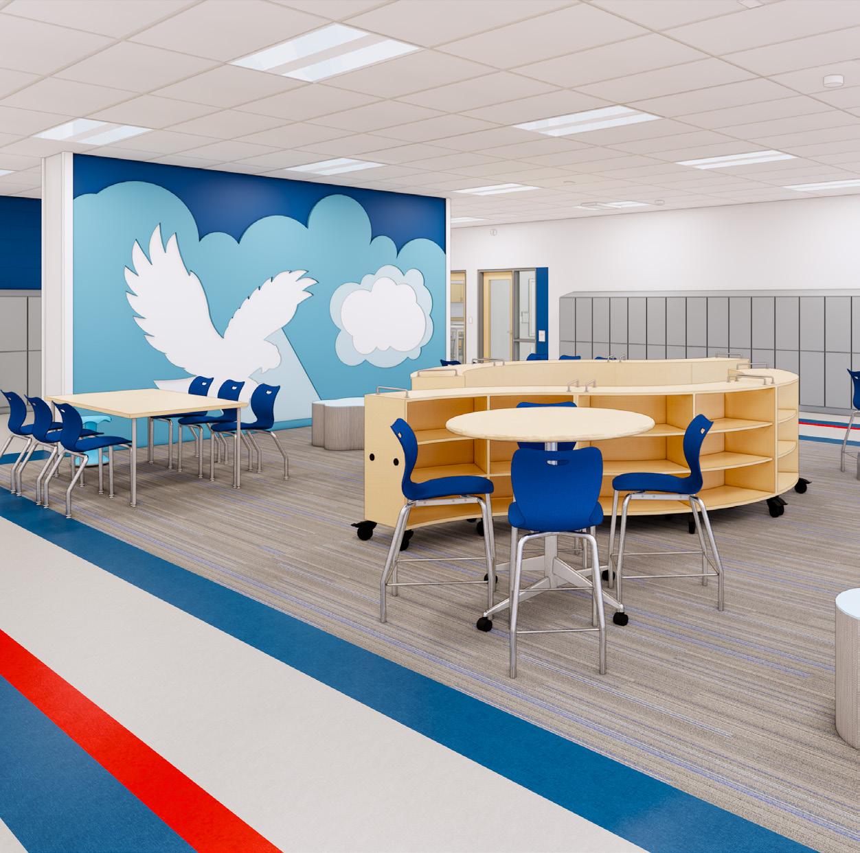

Grade 5-6: Sky
Grade 7-8: Soaring Eagle
