
80 minute read
Anthology


G. LYON PHOTOGRAPHY
Catalysis, Cooking, & Used Books
In this month's anthology, critics review a startup incubator, a workforce training center, and the renovation of a Breuer-designed library: SHoP Architects' Ion in Houston; The Kitchens at Reynolds in Richmond, Virginia, by Chris McVoy; and Cooper Cary's refresh of the Atlanta Central Library.
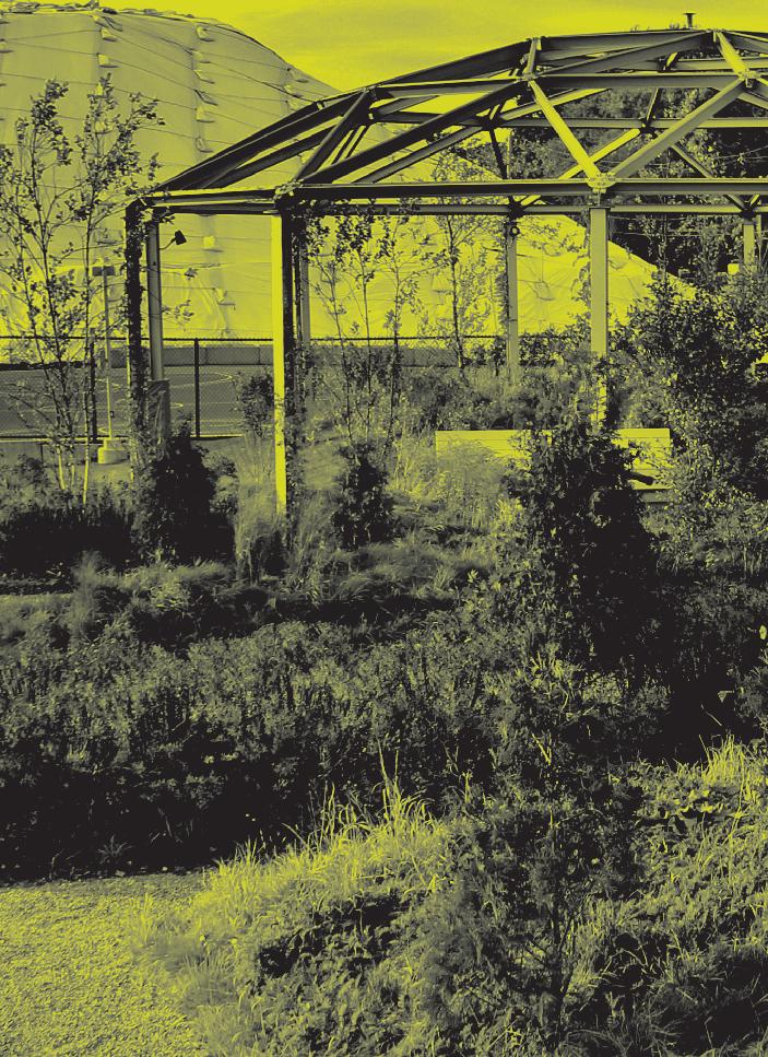
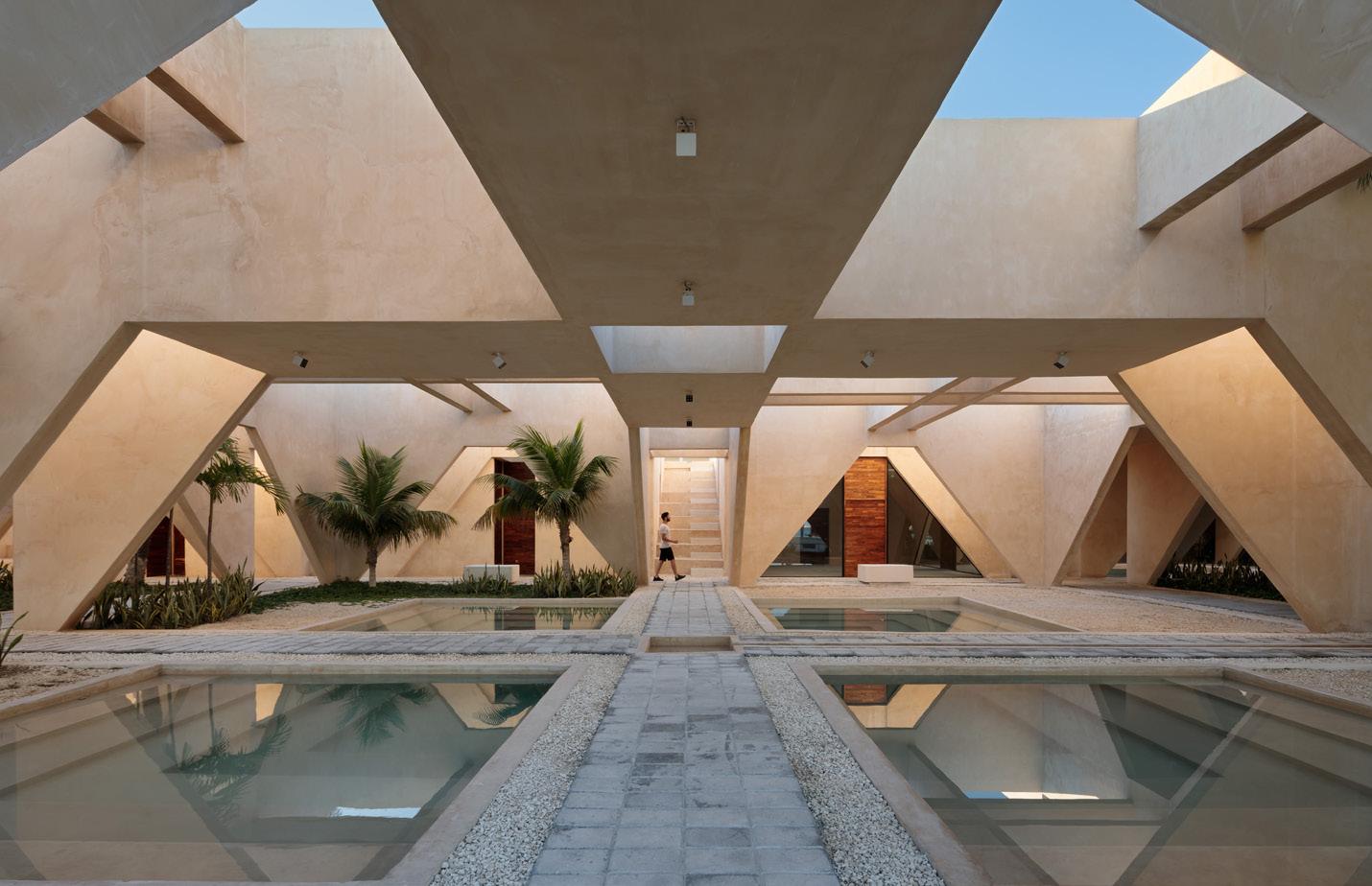
Facing page: Portions of the former Sears’ facade were kept while large openings were cut into the plaster to admit daylight.
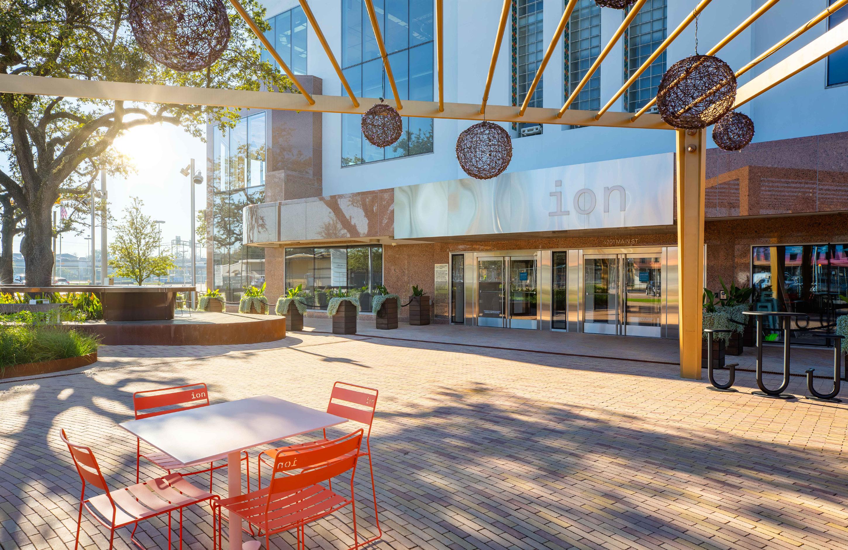
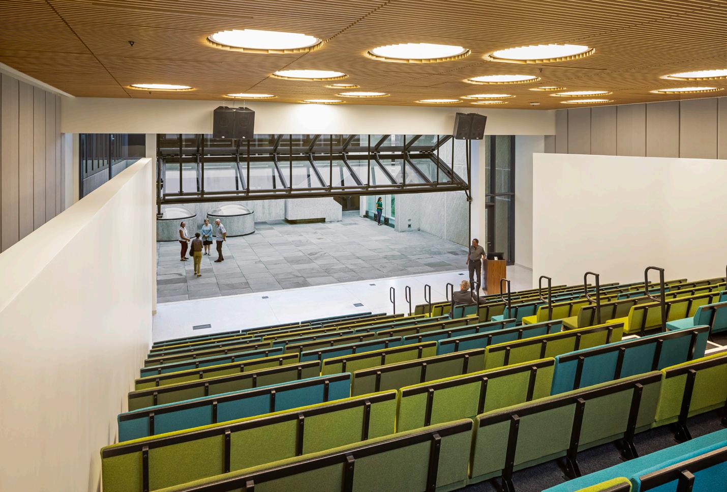
Above: A landscaped plaza featuring heritage live oaks and ample seating creates a welcoming entrance. Far left: The Ion is situated roughly halfway between downtown and the Texas Medical Center, Houston’s two largest employment centers.

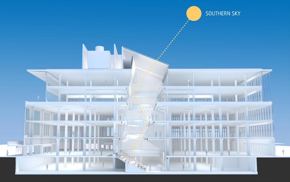
Left: Section showing the atrium cut into the center of the building and the daylighting scheme
SHANNON O'HARA PHOTOGRAPHY
G. LYON PHOTOGRAPHY
Plus and Minus
The Ion in Houston upgrades an art deco Sears into a tech-incubating cyborg
COURTESY JOHN CARPENTER DESIGN ASSOCIATES
The Ion
Design architect: SHoP Architect of record: Gensler Location: Houston
General contractor: Gilbane Structural engineer: Walter P. Moore Facade consultant: James Carpenter
Design Associates Landscape architect: James Corner
Field Operations
Exterior curtain-wall glass: Viracon The blocks surrounding Houston’s old Main Street Sears have seen better days. When the department store opened in 1939, this section of the Fourth Ward, which is just south of downtown, was a quiet suburban neighborhood. Commercial storefronts lined the thoroughfares, and quaint bungalows nestled along the tree-lined streets. It may as well have been Mayberry, to hear some old-timers tell it.
Things took a turn for the worse in the 1960s, during the construction of the I-45 and U.S. 59 freeways. Thousands of homes, businesses, and churches were seized by eminent domain and demolished—particularly in the neighboring Third Ward, which was and is predominantly African American—while tens of thousands of people fled the area to new developments dispersed along the high-speed ribbons of concrete. The community was shattered. What businesses remained found themselves starved of customers. Many shuttered permanently. Others limped along, a shadow of their former selves. Economic depression set in. Crime shot up. In a particularly vivid sign of the times, Sears sheathed its once-proud art deco facade in a corrugated metal slipcover and filled in its shop windows with bricks.
What’s remarkable is that the Main Street store continued to operate in this condition until 2018, when the ailing retailer filed for bankruptcy and pulled out. By that time, the neighborhood itself was reduced to trashstrewn vacant lots and derelict buildings where people experiencing homelessness and drug addiction squatted and wandered through the roaring sound of the rushing freeway traffic like lost souls in search of the community that once thrived there.
It was a truly depressing situation. So completely depressing, in fact, considering the barbarism and racism that underpin the urban design moves that created these circumstances, that you almost have to approve of what is happening there now. Almost.
Even before its shuttering, Rice Management Company, which shepherds Rice University’s $8.1 billion endowment, acquired the remainder of the ground lease on the old Sears and assembled some 12 other more or less contiguous plots. The purpose of this investment was the planning of an “innovation district” to incubate tech start-ups. Houston, it must be noted, was the largest city in America not to make Amazon’s 20-city short list of potential sites for its second headquarters. Places like Indianapolis and Columbus, Ohio—even Dallas!—beat out the Bayou City. This gave way to some soul-searching among Houston’s elites, who, Amazon or no, were already trepidatious about the future of the oil and gas industry. What the city needed, they decided, was a centralized hub where investors could meet ambitious young makers working in the areas of energy transition, medicine, and aerospace—a nurturing environment where the future of Houston’s economy could take root and grow.
The Main Street Sears was the perfect spot. For one, the department store’s large,

G. LYON PHOTOGRAPHY

Above: The Forum stair provides access to the lower level, which houses the incubation space. Top right: The added fourth and fifth floors are framed with structural steel and provide striking views of downtown.

G. LYON PHOTOGRAPHY
Right: Classrooms and breakout spaces characterize the incubation space.
G. LYON PHOTOGRAPHY
58,000-square-foot floor plates—a rarity in Houston—were ideal for creative office space. It’s also located on the light rail line halfway between the city’s two largest employment centers: downtown and the Texas Medical Center. What’s more, the surrounding land was up for grabs and not yet overrun by the gentrification marching south through Midtown. Rice rechristened the old Sears “The Ion” and hired SHoP Architects, along with Gensler, John Carpenter Design Associates, and James Corner Field Operations, to transform the aging structure into the anchor space of a new city center dedicated to evolving the local economy.
This is The Ion District. An ion is an atom or molecule with a net electrical charge, which can be positive or negative. Ions are used as catalysts in chemical reactions, which is why Rice chose this name, though the bipolar nature of these particles says more than what was intended.
Houston’s legacy of historic preservation is lackluster. For that reason, the client and the design team must be commended for seeing the value in restoring the art deco facade. But only the north and half of the east and west facades had any fabric worth saving. The rest of the building was always more service-oriented, and the whole thing was almost entirely windowless. To compete as creative office space, daylight was needed on the interior. So the choice was made to glaze most of the building, including the two upper floors that were added to make the real estate equation work, and large windows were cut into the restored envelope. The resulting composition looks sort of like a giant, abstracted rendition of RoboCop’s mug—the back and upper regions encased in high-tech metallic blue glass shaded by perforated metal fins, the lower front showing what remains of the human within.
RoboCop, as awkward as he was, had a lot of charisma. (Incidentally, RoboCop 2 was shot in Houston, while the first film was made in Dallas—both cities filling in for a future Detroit imagined as even more dystopian than the present one.) The same is true of The Ion. The landscaped plaza that fronts the building features two heritage live oaks whose broad boughs shade plentiful seating, which, during my visit, was being amply used by people on their lunch breaks. Additional plantings were selected to attract charismatic insects, like the ladybug that flew into my partner’s fingers as we stood there. The preserved face of the building at street level is home to hospitality spaces, including restaurants, a cafe, and a soon-to-come “taproom.” They make this tech incubator also a destination for regular Houstonians looking for a bite or a drink.
Inside, the existing concrete structure is left exposed, as are the department store’s worn terrazzo floors. These patinated surfaces, as humdrum as they may be in the grand scheme of things, exude an aura that can’t be re-created in new construction. An atrium cut into the middle of the floor plates admits a controlled but consistent amount of daylight, which pours down from a skylight tilted to the south and outfitted with fixed louvers. This light, which has a silvery quality to it, is refracted throughout the space by perforated aluminum panels that ring the atrium, reaching all the way down to The Ion’s lower level (they don’t use the “b” word, I was told), which can be accessed by a “forum” stairway. The lower level is where start-up entrepreneurs begin, engaging in workshops and refining their pitches. On the first level, in addition to the hospitality spaces, are an investors’ suite and a large makerspace outfitted with 3D printers and the like. The second level hosts a co-working office. On the third are smaller leased spaces for companies that have moved past the initial incubation phase. The fourth and fifth levels are reserved for large tenants. Throughout the stack, the floor area around the atrium is meant to remain publicly accessible, the goal being to create a lively buzz up and down The Ion’s core.
Though only 52 percent leased during my visit, The Ion was indeed lively with what I took to be young entrepreneurs cooking up schemes for the future. Microsoft and Chevron had moved into the building, the first large corporations to stake their claim to the innovations that will presumably be fusing here as in a particle collider. The district that will grow around this catalyst building will, I guess, offer the sort of mixed-use urbanism that attracts enough talent/money density to precipitate a reaction and ignite a new economy, one that is hopefully a lot greener than Houston’s oil and gas addiction. But what other reactions will The Ion catalyze? Is this just the walkable-urbanism version of the freeway in terms of the displacement it may cause in the Third Ward? And what of those lost souls who now wander in its shadow, prevented from even cutting through the parking lot by a high chain-link fence? Will they reap the benefits of the innovations taking place here or be blown away like so many dead leaves before the lawn man’s blower? Aaron Seward
Lift off

A new multipurpose center brings ambitious architecture to an underserved Richmond community.
IWAN BAAN
The Kitchens at Reynolds
Design architect: O’Neill McVoy Architects Architect of record: Quinn Evans Location: Richmond, VA
General contractor: Hourigan Structural engineering: Silman Civil and landscape engineering: Timmons MEPF: Valley Engineering
Richmond, Virginia, has always been a cultured town, but for years it lacked a purpose-built base for contemporary art. And then, in 2018, one appeared on the corner of West Broad Street in the Fan District. The building, designed by Steven Holl Architects (SHA) for Virginia Commonwealth University (VCU), marshaled frosted glass and sky-blue zinc into a willful composition of lozenges, bars, and torqued planes. Holl described this collision of forms in the verbal tracery we’ve come to expect from him. Evidently, the converging volumes epitomized Bergsonian ideas about time, with partial recourse to Einsteinian (or at least non-Euclidian) geometry. Of course.
A more obvious referent was the traffic junction out front, where two of the city’s major thoroughfares, West Broad and North Belvidere Street, bisect. They lend the walkable terrain around the Institute for Contemporary Art (ICA) at VCU an undeniable, if environmentally noxious, charge. For a form-inclined architect, it’s an enticement.
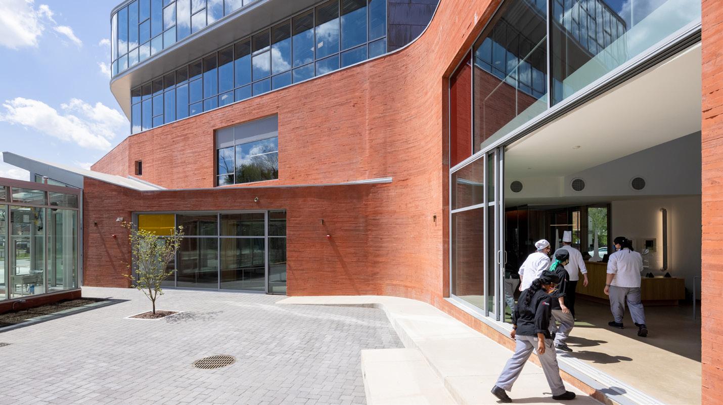
Across town in the East End, another object building in suspiciously Hollian guise—the Kitchens at Reynolds—has appeared on the scene. Evidence of a connection abounds, starting with the layout of the 50,000-squarefoot development. Two wings, linked by daylit corridors with slidable doors, cradle a courtyard further bounded by a working greenhouse. The splayed plan is in part a response to a node in the local traffic network, a seemingly minor interchange (from the ground, at any rate) invested with a significance more conducive to the purposes of icon making.
These are hallmark signs of Holl’s practice. There are more. Mischievously, the unspooled building presents a different face at every turn. Square windows appear to be haphazardly punched into structural concrete walls, tinged red and textured to resemble residential brick courses. This sturdy base slackens in places, as at the webbed corners of the court or the supplely formed benches that peel off from the facade. Plate glass optimistically inches down toward the sidewalk pavement. Up above, divergences in the massing signal a material change from concrete to glazing or copper sheeting. A penthouse volume slides off its pedestal to cantilever over the main entrance.
But the Kitchens at Reynolds is not a Steven Holl building. It was, in fact, designed by Holl’s faithful aide-de-camp Chris McVoy with collaborator Beth O’Neill. McVoy was integral to the ICA’s realization, as he was to the build-out of the Nelson-Atkins Museum of Art in Kansas City and so many others. As an SHA partner, he has presided over triumphs and middling points. In the past decade, he began branching out on his own. He and O’Neill, a seasoned architect who also teaches at the Pratt Institute in Brooklyn, linked up in 2012, with the latter taking the reins. McVoy chipped in during his off-hours.
But the Richmond project, and a commission from the Bronx Children’s Museum, shifted the balance for him. “Until recently, I was 100 percent with Steven, 30 percent working with Beth. I was working nonstop,” McVoy told AN. “That changed in the last year—I’m now 30 percent with Steven and 100 percent with Beth.”
Holl was approached by the philanthropist couple Steve and Kathie Markell, major donors to the ICA, about the East End job. He passed, but recommended O’Neill McVoy Architects. The brief came later, after

IWAN BAAN

IWAN BAAN
Facing page: The Kitchens at Reynolds comprises two wings.
Top left: The building is located at a traffic circle in Church Hill North.

Middle left: Sliding glass walls expand the space of the courtyard. Bottom left: One of the four on-site teaching kitchens.
Top right: The stacked glass volumes were designed for fine-dining restaurants.
IWAN BAAN
extensive community engagement revealed more than a few priorities.
The predominantly Black neighborhood of Church Hill North is, in benign sociological terms, “underserved.” It lacks the everyday infrastructure (for instance, access to fresh food) that seamlessly accrues to wealthier hubs. North 25th Street is jarring proof of this. Up by the Reynolds interchange, the street conforms to the vision of desolate downtowns forever waiting to be “revitalized.” Cruise southward, in the direction of the historically preserved Church Hill neighborhood, and the street undergoes a transformation. There are more trees and less hardscape. The air is cooler, less saturated with desperation. All the well-reviewed restaurants and corner-store throwbacks are abuzz with chatter.
The city is slowly alleviating some of Church Hill’s ailments. In late 2020, the first phase of the Armstrong Renaissance project opened, unlocking a fraction of the expected 256 affordable units that will eventually be made available. Incentives are in place to encourage more housing construction. Corporations and philanthropists like the Markells have also become active in the area. Next door to the Kitchens at Reynolds, the pair launched a new health food store to address the neighborhood’s dietary troubles.
Among the conclusions unearthed by the community outreach process—McVoy likened it to a “neighborhood charrette”—was the need for localized economic stimulus. The Markells approached prospective tenants to anchor a large development, in particular the culinary program at Reynolds Community College. It was soon discovered that nearly a third of enrolled students already lived in Church Hill, and receiving favorable terms, the college committed to the site.
Reynolds occupies approximately half of the building area. But for the demonstration theater and a few classrooms on level 2, the core culinary functions are all located at grade. Four teaching kitchens are positioned around the courtyard, which, thanks to those sliding glass doors, is likely to become a venue for private parties. The transparent vegetable shed along Nine Mile Road is meant to attract interest. A small cafe and the shallow, measured steps that lead to it indicate a natural entry point to the campus.
The double-height glazed boxes on levels 3 and 4 of the west wing are graded for restaurants, though the spaces have yet to be leased. The east wing, meanwhile, offers 12 affordable apartments. A fairly unimpressive number, but O’Neill and McVoy hope for more. Indeed, they’ve already drawn up plans for an additional two wings. “We’re architects,” said O’Neill, “so after being asked to design one building, we of course came back with a site master plan.”
Without imposing itself on the neighborhood, the Kitchens at Reynolds has somewhat more mass than its architects’ conceptualizing admits. Though development in the surrounding area is picking up, much of it is low-rise, the result being that the Reynolds campus is unlikely to be challenged for bulk or height anytime soon. It makes a statement about what its architects call “urban form,” only to indicate the limits of that descriptor. As a discipline, urban design has outgrown the Lynchian categorical repertoire of paths, edges, nodes, etc. The notion that landmarks aren’t simply the by-products of rehearsed interactions and synced-up sightlines is by now tacitly accepted by designers. That they are no substitutes for reparative economic investment is just the rote truth.
At the same time, the Church Hill project is anticipatory, which is another way of saying hopeful. It’s obvious that O’Neill and McVoy have thought long and hard about the consequences of their work. Lecturing about the building, they like to show a slide of simple prompts that guided their efforts. These self-inquiries are wide-ranging. “How to transform this important crossroads site as catalyst for a positive future,” reads an early prompt under the heading “Past/Future.” Another listed under “Program” asks: “How to infuse all spaces with natural light?”
That they mostly accomplished their high-order directives could be cynically chalked up to stage-managing. But the physical evidence doesn’t lie: O’Neill and McVoy have delivered a building of considerable substance that manages to do a lot in a far more challenging context than the VCU gallery. Will it be a catalyst? Here architectural terminology does us a disservice. We may speak of “wings” while completely neglecting the limitations of uplift. Samuel Medina
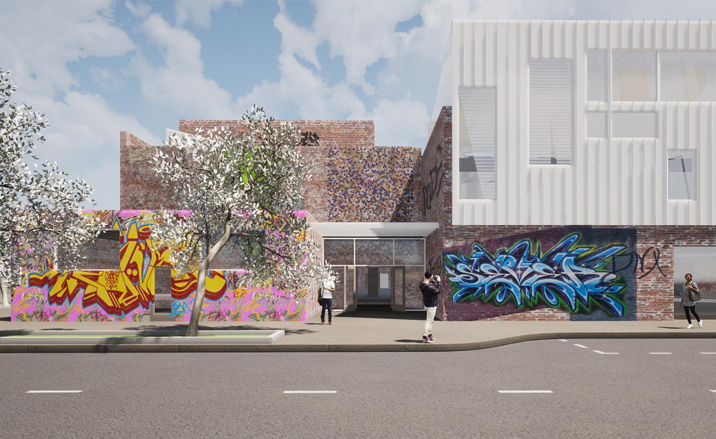
Out of Frame
An interior remodel of Marcel Breuer’s Atlanta Central Library demonstrates the fault lines—and even absurdities—of preservation causes.
JONATHAN HILLYER PHOTOGRAPHY
Atlanta Central Library
Design architect: Cooper Carry Associate architect: Vines Architecture Design/build architect: Moody Nolan Location: Atlanta
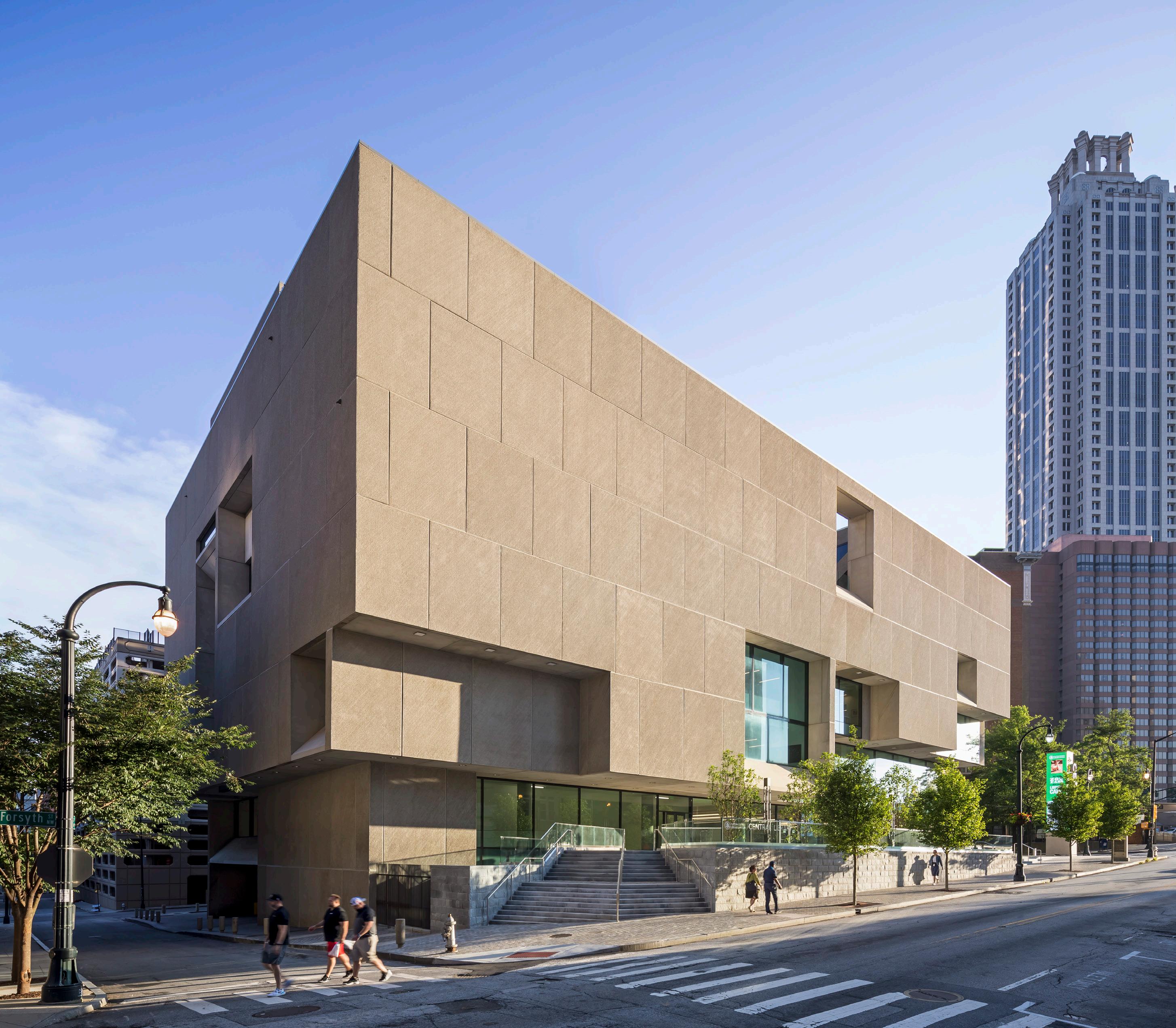
General contractor: Winter Johnson Group Structural engineer: Sykes MEP engineer: Newcomb & Boyd Civil engineer: Long Engineering The renovation of Atlanta’s central library is easy to miss. With minor changes made to the facade, the Marcel Breuer–designed building appears much as it did in 1980, the year it opened. Its stark concrete volumes invoke the authority of a modernist master as the last word in any critical evaluation.
At first, such a critique was fixated on the demolition of a much-admired Beaux-Arts library to make way for the brutalist design. In recent years, however, preservationists have invoked a similar framing to protect Breuer’s own building from such a fate, rallying against a possible plan to replace the city’s main library branch with a new facility. During a half-decade of advocacy that began with an urgent savethe-Breuer petition and culminated in a public debate over modifications to the building’s envelope—regarding whether to recognize patrons’ requests for natural lighting—the preservationists lobbied on behalf of the architect’s original “monumental” vision. Credited with both saving the library and ensuring the integrity of its facade, this campaign has come to define how we understand the building—and evaluate Cooper Carry’s recent intervention.
On the surface, the completed renovation seems to vindicate this narrative. After all, the building still stands, and the exterior alterations amount to just three banks of new glazing, deftly incorporated into the rhythm of the precast concrete panels they replaced. But look past the once-impenetrable facade, and the library begins to tell a different story. Compared with the former home of the Whitney Museum of American Art in New York or with the erstwhile Pirelli Tire Building in New Haven, Connecticut, the Atlanta project is neither a meticulous restoration nor a redevelopment of a Breuer building that can profitably trade on the cachet of modernist nostalgia. The renovation doesn’t hew to any historical sensibility at all, much less bear out the abstract value of design suggested by the Docomomo mode of appraisal. Instead, the contributions of Cooper Carry (supported by Moody Nolan and Vines Architecture) attend to the more mundane demands of the library’s economic, institutional, and urban circumstances, a set of considerations integral to the redesign but all too easily obscured by the critical frame of conservation.
Setting aside Breuer’s place in the modernist canon, the renovation stands on its own as a capable reuse project, overwhelmingly concerned with immediate rather than historical stakes. It is a modest, yet welcoming city library with a few especially nice spaces that benefit from the new fenestration. Low shelving, colorful pods, ubiquitous charging stations, and other familiar tropes of recent library design absorb activity into a common background. The building’s soft opening during the pandemic underlined this quality, with a number of areas cordoned off, waiting to assume their role as part of a heavily programmed plan.
The two big “moves” of the redesign likewise signal a more animated but precisely

JONATHAN HILLYER PHOTOGRAPHY

JONATHAN HILLYER PHOTOGRAPHY Facing page: The new fenestration is in keeping with the the original facade design.
Above left: The new skylights are welcome addition. Left: A retractable garage door offers access to the rooftop terrace.
Above: The interiors were substantially remodeled, owing to changes in the building’s program.
JONATHAN HILLYER PHOTOGRAPHY
calibrated future: a seating stairway beneath a new skylit atrium and a retractable garage wall that opens onto the roof terrace. These areas are ancillary to the main library functions, drawing their purpose instead from opportunities afforded by an existing book-sorting shaft and an underused administrative space.
So while the design does not exalt Breuer’s architecture, in many such moments, the work of the renovation team takes its cues directly from the original structure. Sensitive to the limits of a public project’s budget, the architects tightly interfaced old and new elements to make the most of the existing conditions. They were helped in this effort by the flexibility built into Breuer’s plan, with its minimal internal partitions and provisions for the expansion onto unfinished seventh and eighth floor spaces. This not only made the project financially tenable—a determinant factor in the building’s continued existence, given the scale of the bond measure and the failure of the advocacy campaign to secure any legally protected status—but also meant that the requirements of a new program could be readily incorporated.
And indeed, the brief presented in 2018 brought important changes: library holdings were to be greatly reduced, and nearly half of the floor space was to be closed off from the general public, including the celebrated roof terrace (which, in any case, had been functionally inaccessible for years). The library’s board of trustees, the stakeholder responsible for these changes, outlined this program in answer to ongoing digitization and the demands of new service elements like tech facilities and classrooms. To offset expenses, however, their plan also involved commercializing significant parts of the building as leasable space.
None of these decisions, however, found their way into the preservationists’ critique. Long after it became clear that the building would not be replaced, a symbolic focus on historical continuity kept the facade as the central matter of discussion. Ultimately, this focus overshadowed the real, material changes being made inside the library, ones far more consequential to its future. The concerned architect-advocates who took the floor in community meetings looked past the diminished program and calculations of rentable square footage, instead explaining why natural light in a library was actually undesirable. As alienating as this might be to a skeptical public—which appreciated the distinctive building but didn’t necessarily see its modification as a betrayal—the position also represents a lost opportunity for architects to envision a legacy for modernism from outside the shadow of authorship. Beyond such a narrow notion of “saving the Breuer,” the question of whether the facade changes were justified quickly falls away, while more pressing issues such as a library’s responsibility to the public become available for debate.
Given the sudden demolition of Breuer’s 1945 Geller House in January, and for many more practical, carbon-related reasons, it is unquestionably good that the Atlanta Central Library was spared the wrecking ball. And it is also great that downtown Atlanta, for the first time in decades, has returned a pride of place to its public library. Nevertheless, we might do better to reevaluate its main frame of reference. The renovation is instructive because it reveals all that is at stake yet inaccessible to a preservation-based approach to architectural advocacy. A different strategy might have shed more light on the decision-making that informed so many of the project’s architectural outcomes and possibly even suggested alternatives.
Shota Vashakmadze is an architect and historian currently pursuing a PhD at the University of California, Los Angeles. He hails from Atlanta.


AMIJA AZRAAKŠ BORDERLESS STUDIO

DIETMAR OFFENHUBER BRANDON BIEDERMAN
LILLIAN KOLOGY

Top: The Future Heritage Lab’s Memory Matrix installation in Cambridge, Massachusetts Above: Akšamija’s Silk Road Works installation at the 2021 Venice Architecture Biennale
COURTESY BORDERLESS STUDIO
Top: A 2017 installation highlighed the opportunity for green infrastructure Bronzeville, Chicago. Above: A 2020 visioning project temporarily activated the underside of an elevated railway.
Since founding the Future Heritage Lab at MIT in 2016, Azra Akšamija has worked with countless refugees, empowering the displaced through art, design, and architecture. A refugee herself, Akšamija fled her native Bosnia in the 1990s and settled in Austria, where she went on to study architecture at the Graz University of Technology. She continued her education in the United States, earning a master of architecture from Princeton and a PhD from MIT, where she is now a tenured professor.
As the director of the Art, Culture, and Technology program, Akšamija contributes to the evolving discourse of socially engaged art and design by rethinking the complex relationship between creators and institutions. She uses her scholarly background in art, architecture, and history (with a specialization in Islamic societies) to investigate the ways social life is affected not just by cultural bias but also by conflict. As she told AN, her research revolves around the question “Where does one insert the preservation of heritage during a time of crisis?”
A provisional answer can be found in the activities of the Future Heritage Lab, which develops design methodologies to uncover, unpack, and ease the unfathomable impacts of forced displacement. The group’s work with inhabitants of Jordan’s Azraq refugee camp yielded a series of lowtech designs applicable to everyday scenarios, including a vertical garden in a context where ground plantings are forbidden and a baby swing made from recycled school desks. Akšamija likens these humble, yet necessary interventions to a form of “transcultural technology” that challenges conventional humanitarian design.
The collaboration is among numerous ones documented in Akšamija’s new book, Design to Live: Everyday Inventions from a Refugee Camp (The MIT Press). Written in Arabic and English, the book includes testimonies and contributions from residents of refugee camps, humanitarian workers, and researchers, as well as illustrations created by a group of MIT students who used photos of refugee inventions to reverse-engineer architectural drawings. “We are contributing what we can from the perspective of our skills as designers,” For BORDERLESS Studio, a name doubles as a mission mandate. “Can we think across disciplines? Can we think through territories? No one belongs to a single identity anymore,” said founder Paola Aguirre Serrano. “We don’t have to choose one thing; we can collaborate, we can exchange.”
That ethos has shone through BORDERLESS’s work from its formal inception in Chicago in 2016, with a focus on research and social equity. Architect Dennis Milam joined in 2019, broadening the practice’s operations to include physical spaces and large-scale installations.
“I was still working at SOM when Paola started [BORDERLESS],” said Milam, “always kind of understanding that I’d join at some point. Well, 2019 became that starting point, and I came in to develop the architectural practice.”
A concentric diagram of the firm’s methodology explains it all; ringed around “design values and practice” are “justice,” “agency,” “creativity,” and “resilience.” “Who doesn’t have access to design?” reads a prompt above “justice.” The question “How can design create more joyful experiences for everyone?” sits alongside “creativity.”
BORDERLESS has completed projects across Chicago that turn underutilized parking lots (like Chicago Extra-Large in 2017), play courts (2021’s Basketball (Art) Court), and underpasses (the California Avenue Streetscape Vision, 2020) into vibrant, engaging spaces. The 2021 Chicago Architecture Biennial, The Available City, proved an ideal venue to promote and build on earlier research, specifically the ongoing Creative Grounds project, which draws attention to the almost 50 schools across the city’s South and West Sides to be shuttered in recent years. In the parking lot of an erstwhile school in the Bronzeville neighborhood, Serrano and Milam erected a colorful woven canopy that acted as a pop-up showcase for community initiatives. The 10-by-10-foot frame-and-canopy structure is intended to be easily replicable in similar sites across the city.
Add an interior retail project on Chicago’s South Side to the mix, and the firm’s built footprint is only growing. With a greater focus on Texan projects on the horizon (the studio has another office in San Antonio) and a move toward the architectural, BORDERLESS lives up to its name more and more every day. Jonathan Hilburg
ESTUDIO MMX FELECIA DAVIS

DANE ALONSO JEFFREY KILMER/COURTESY PLY+
DANE ALONSO
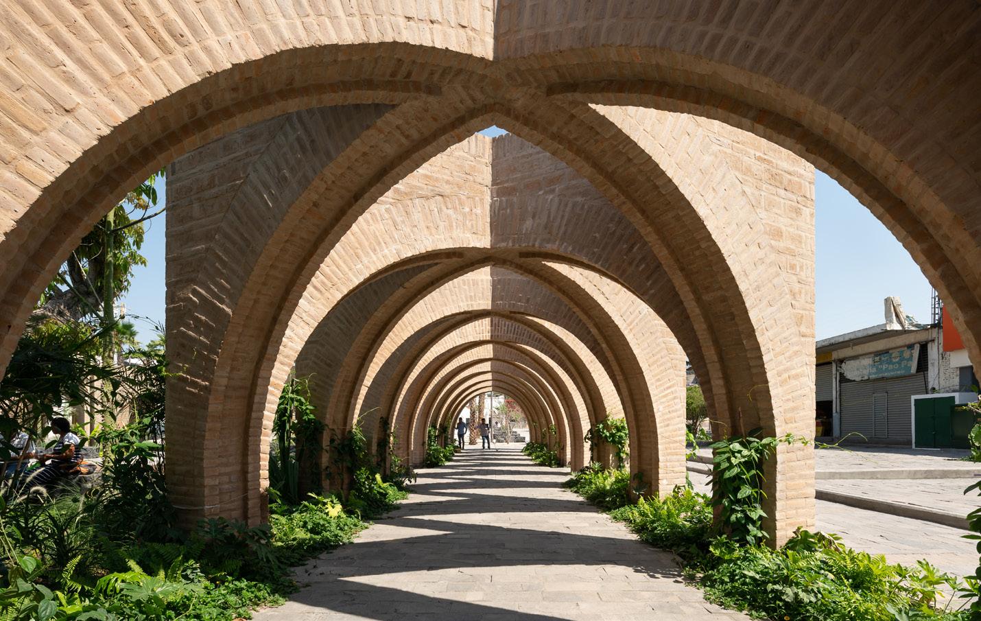
Top: A pavilion for the Jojutla Central Gardens, opened in 2019, features interlocking brick arches. Above: Angular geometries characterize the design of a new museum in Progreso, Mexico.
Estudio MMX was founded in Mexico City in 2010 (hence the name) by Jorge Arvizu, Ignacio del Rio, Emmanuel Ramirez, and Diego Ricalde. The four partners met while working for Alberto Kalach, and while they all went on from that office to do different things, they stayed in touch and finally decided to band together to form a collaborative practice. “When we got together, we always realized that four minds are better than one, so we like to work that way,” Arvizu told AN. “It’s not easy, because everybody is different.”
At the outset, most of the firm’s work was private houses and gardens, but it always harbored a desire to design public spaces and buildings. The opportunity came after the Puebla earthquake of 2017, which damaged and toppled thousands of buildings across Central Mexico, killing scores of people. Estudio MMX was commissioned to design a new civic center for the town of Jojutla, which was particularly hard hit by the tremor. The resulting project, the Jojutla Central Garden (2019), is a series of open landscaped spaces defined by arcades of crossing brick arches that borrow from the local vernacular while giving this inspiration a twist. The project caught the eyes of the international design press and opened the way for a series of other public projects for the office, each of which seems to hinge on a particular disaster, whether natural or artificial. Mothers’ Monument Plaza in Tequila and the Aqua Verde Sports and Community Center (both 2020), for example, were both part of the effort to bolster community life and public space in the wake of Hurricane Willa, which devastated the states of Sinaloa and Nayarit in 2018. Hurricane Grace struck during the completion of The Regional Museum of Progreso (2021), which is notable in that 75 percent of its footprint is shaded, open-air public space. The Tamulté Civic Square in Tabasco and the Tepozan Arts School in Canalejas, meanwhile, provide other options for children, who are too often drawn into Mexico’s powerful organized crime gangs.
These projects show the potential of architecture to make a positive difference in a troubled world. In the words of Ricalde, “We have always focused on not necessarily architecture, but how architecture can change something else.” Aaron Seward As an architect and materials researcher, Felecia Davis readily identifies each camp’s quirks. “Architects love predictability. They want to know how a material is going to behave,” she said. “But researchers love unpredictability. We like playing with a material and seeing how it misbehaves.”
For years, she has channeled this “tension” into interactive art installations such as Flower Antenna, a knitted sculpture that modulated its environment via electromagnetic waves. Flamboyant yet also understated, the piece was one of several to be staged in the Museum of Modern Art’s 2021 exhibition Reconstructions: Architecture and Blackness in America. The New York museum was the largest venue Davis’s work has been given to date, unless one counts Manhattan itself: Her first project, Walking Tours: Urban Riffs (2004), catalogued the ghostly traces of historical African-American sites across the island-city. Anticipating augmented reality technologies, Davis combined wearable devices (“a camera strapped to your neck”) with early web design to create a hybrid installation that was staged, after a fashion, at the Studio Museum in Harlem.
“People keep thinking there was this big technological switch in my work past some point,” Davis said. “But I don’t think there is one.”
An engineer by training, Davis went on to practice architecture professionally. It was the 1990s, and the discipline was only beginning to reexamine its conceptual apparatus; “hard architecture” gave way to “soft architecture,” elevating systems and processes to objects of design inquiry. This shift pushed Davis toward research, and in 2017, she completed a PhD in the Design and Computation program at MIT. Her work on smart fabrics—textiles, felts, quilts—became the basis of SOFTLAB, the research hub Davis directs at Penn State’s School of Architecture. Open to students of all experience levels, ranging from firstyear undergraduates to late-stage PhDs, SOFTLAB explores the potential, as well as the discomfort, of what she calls “materialized digital media.”
By Davis’s own admission, her penchant for softness never had much to do with architectural discourse. She reaches for a biological metaphor: “It allows for fluidity, which I like because materials change constantly, as do we. Our bodies are these machines that want us to believe that everything is stable when it isn’t. But it’s not a conspiracy.”
That’s how some might describe the newfangled “machines” that overlie our everyday reality, Davis said. “Facial recognition systems are now part of architecture. These things are making our thresholds. They constitute what transparency and opacity mean and what they mean for different people, particularly Black and brown people. These are no longer exclusively material questions.” Samuel Medina
GERMANE BARNES
Davis plans to reinstall Flower Antenna, her contribution to MoMA’s 2021 Reconstructions exhibition, at Penn State University, where she teaches.
JA ARCHITECTURE STUDIO LANDING STUDIO

COURTESY LANDING STUDIO
COURTESY JA ARCHITECTURE STUDIO

Ja’s design for a linear home on Markham Street in Toronto garnered the firm a Canadian Architects Award in 2020. Top: PORT Park in Chelsea, Massachusetts, adjoins a seasonal salt terminal. Above: A master plan for the area incorporates affordable housing, urban agriculture, and more.

Behnaz Assadi and Nima Javidi, cofounders of the Toronto-based Ja Architecture Studio, like to talk about relationships: parts-towhole, front-and-back, public-and-private. Perhaps the impulse to relate sets of pairs comes naturally to married architects. Or perhaps it’s simply a useful frame for Ja’s work, in which idiosyncrasies are imbued with significance and inflections become central points of interest.
Originally from Iran, Assadi and Javidi have fostered deep ties to their adoptive city, especially the West Queen West neighborhood, where they established Ja in 2010. Many, if not all, of their active projects are within walking distance of the office. “Part of the reason we made it that way,” said Assadi, “is that we are familiar with the people here, with the aesthetics here. We just know what works.”
Aside from Queen Street, a commercial corridor that forms the spine of the neighborhood, West Queen West is residential in character. Single-family homes—some of them Victorian, following the Toronto tradition, many more of them not—are neatly arrayed along avenues. They back onto minor streets and alleys called “laneways,” which have become a sort of testing ground for Assadi and Javidi. When the municipal government passed a bylaw allowing for the construction of accessory dwelling units (ADUs) in 2019, Ja had already completed several studies that sought to “reverse an essentially ‘frontal’ typology by activating the back,” said Javidi.
The idea, Assadi added, has the potential to alter cultural norms around domestic architecture. “A backyard is key to the identity of a single-family house. With an ADU, the backyard becomes a courtyard, a kind of shared amenity. It changes the definition of single-family houses, in a good way.”
Still, Assadi and Javidi, who teach design at the University of Toronto and New York’s Cooper Union, respectively, aren’t disrupters. Their designs for houses and small mix-used developments aim to engage and gently persuade. Cannily embedded within the grain of West Queen West, the projects are entirely of a piece. The same construction techniques—a hybrid of conventional wood-frame, concrete, and steel construction—and compositional elements—periscope volumes, eccentric staircases—recur but never grow stale.
For all their fondness for relational thinking, Assadi and Javidi endorse autonomy of a kind. “In our practice, there is always a geometric desire that is autonomous from more practical demands,” said Javidi. “Sometimes it operates in plan, sometimes it operates in section, sometimes it operates in iconography. But ideally it does all these things at once.”
COURTESY LANDING STUDIO
Some of this country’s most vital spaces— port facilities, highway underpasses, public works depots—are criminally overlooked by the design professions. But not by Somerville, Massachusetts–based architecture and urban design practice Landing Studio.
“What our work is really premised on is sort of ‘fixing’ infrastructural spaces,” explained Dan Adams, who founded Landing Studio alongside partner in practice and life Marie Law Adams in 2005.
A Boston native who came of age in the era of the Big Dig, Dan, who also serves as director of the School of Architecture at Northeastern University, describes the work of Landing Studio as being decidedly less “aggressive” than the city’s $22 billion megaproject that rerouted an elevated stretch of the Central Artery into a greenway-topped tunnel. “Our work is nimbler than that and also premised on the notion that the infrastructure is still used and still valuable but just needs to be made more human and sustainable.”
The PORT (Publicly Organized Recreation Territory) at Rock Chapel Marine in Chelsea, a small and dense city on Boston Harbor, illustrates Landing Studio’s agile but powerful approach, in which industry and community coexist: What was once a 13-million-gallon oil tank farm is now a seasonal road salt terminal that gives way to a waterfront recreational hub complete with sports courts and public event space during the water months—that is, when road salt is less in hot demand and local spots for quick pickup games and neighborly alfresco gatherings are more.
Among the most high-profile sites Landing Studio has engaged is the Frederick Law Olmsted–designed Charlesgate, where a vital piece of connective tissue for Boston’s three major historic park systems was forever altered by the construction of an overpass in the 1960s. Landing Studio has proposed mending the site though the creation of restorative natural landscapes and public open space. “A lot of our ongoing work is trying to improve spaces under highway viaducts and reconnect communities that have been separated or ecosystems that have been fragmented because of highway development,” said Marie, who also lectures at MIT on urban design.
While Landing Studio has taken on projects outside the Boston area, the practice is generally focused on forging longterm relationships with communities in its own backyard.
“We struggle with it a little bit,” said Marie of taking on projects in locales that are farther afield. “We’re just not getting as rich of results, because we just can’t be in the place long enough to do the kind of design advocacy work that we’re able to do more locally.” Matt Hickman
CHASE DANIEL

SEKOU COOKE STUDIO TSZ YAN NG DESIGN

NATHAN KEAY KENDALL MCCAUGHERTY/HALL & MERRICK PHOTOGRAPHERS
COURTESY SEKOU COOKE STUDIO
Top: Grids + Griots was installed at the 2021 Chicago Architecture Biennial. Above: The in-progress Syracuse Hip-Hop Headquarters, or SHHQ Top: The SPatial-LAMinated Timber (SLT) Pavilion at last year’s Chicago Architecture Biennial Above: The Robotic Needle Felting project explored additive techniques for nonwoven textiles.

Sekou Cooke is best known as a curator and theorist of Hip-Hop Architecture, which he first encountered as a student at Cornell in the mid-1990s. In the years before Cooke enrolled, Nate Williams, a DJ and architecture student, had already been turning the lecture hall into a party space. In 2014, while pursuing his master’s degree at Harvard, Cooke published a seminal essay called “The Fifth Pillar: A Case for Hip-Hop Architecture” in The Harvard Journal of African American Planning Policy.
“In that essay I was really just trying to make a singular case for positioning architecture within the realm of all the hip-hop elements and saying that it can be a viable product of hip-hop culture,” Cooke told AN. “It really was supposed to be a one-off thing, like, ‘OK, I’m doing this. I’ve got the ideas out of my head. It’s out. Now I can move on with my life.’”
The world, however, had other plans for Cooke. ArchDaily picked up the essay, it garnered a lot of national attention, and soon Cooke was hearing from others who had been writing about the topic. Those correspondences led to a 2015 symposium at Syracuse University, where Cooke was teaching. Next came Close to the Edge: The Birth of Hip-Hop Architecture, an exhibition that premiered at the AIANY Center for Architecture in 2018, and, most recently, a book titled Hip-Hop Architecture (Monograph, 2021).
Today, the Jamaican-born Cooke is the director of the urban design program at UNC Charlotte and continues to run his eponymous studio, which he founded in 2008. His notable built work includes the Eat to Live Food Co-op (2013) in Syracuse and Grids + Griots, a community space made from a chopped up shipping container that was originally commissioned for the 2021 Chicago Architecture Biennial. Moving forward, Cooke said he hopes to continue working for progressive, well-funded nonprofits and move his projects through construction, which he sees as the ultimate test bed for architecture.
“I’m not a hip-hop architect. I’m not even a Black architect. I’m an architect and primarily I want to identify as an architect,” Cooke said. “To me that means someone who is capable of developing really complex ideas and getting them built and tested in the real world.” Aaron Seward
TSZ YAN NG DESIGN
Tsz Yan Ng is a Michigan-based designer, professor, researcher, and artist whose work seeks to challenge modern fabrication and manufacturing practices. “We haven’t changed the way we build in so long,” Ng told AN. “We need to think of it more productively—not just economically—and as a collection of different voices. Architecture is a global ecosystem of people, where the sum is greater than the parts.”
Raised by parents in the garment business, Ng is well acquainted with the manufacturing industry and its shortcomings. She teaches a class at the University of Michigan on “Sartorial Architecture,” which examines architectural and clothing manufacturing alongside these industries’ global economic, social, political, and environmental impacts. The course challenges students to wrestle with the complexities— and inefficiencies—of making, say, a simple T-shirt and imagine alternative production systems. Ng is careful to foreground labor politics and how modern technologies might be used to alleviate unfavorable conditions for laborers.
She further examines the textile industry in her independent practice, in which her keen interest in concrete also comes into play. For 15 years, Ng has conducted extensive scientific and applied research on textile manipulation for use in creating and forming concrete. These two passions coalesced in the design of a garment factory in Shantou, China, for New York–based fashion brand Lafayette 148. The form of the building was driven entirely by the organizational structure of garment production; and innovations in post-tensioning concrete aided in providing well-lit and ventilated workspaces. A concrete brise-soleil, curved to resemble a woven textile, opened the interiors to light and air.
More recently, Ng partnered with a team from SOM on the design and fabrication of a shelter for use at the Chicago Architecture Biennial. The simple structure featured a canopy composed of “spatially laminated” timber, which Ng dubbed SLT (not to be confused with stress-laminated timber).
Throughout her career, Ng has situated her work within the R&D space of building science, which she hopes will see more investment in the coming years. These explorations pull in professionals from many disciplines—robotics, material science, engineering, history—furthering Ng’s belief that collaboration across many fields is the key to pushing all industry toward a safer, cleaner, and more equitable future.
COURTESY ZAHA HADID ARCHITECTS
COURTESY JOURNEE

THROUGH THE SILVER DOOR

COURTESY JOURNEE COURTESY ZAHA HADID ARCHITECTS
COURTESY ZAHA HADID ARCHITECTS

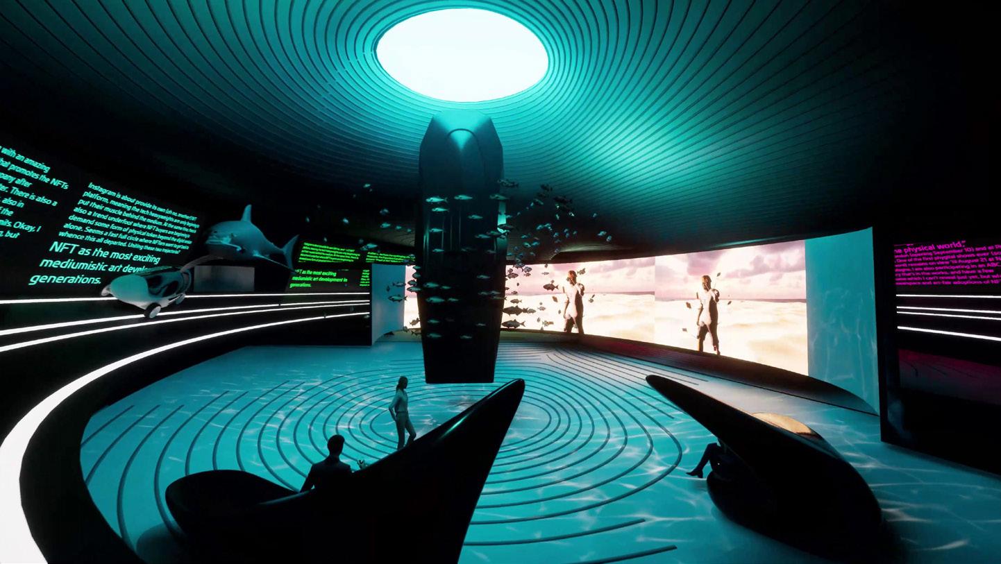
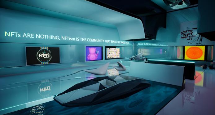
Metaverses and NFTs are made of digital architecture, but what do they have to do with real architecture?
COURTESY JOURNEE

COURTESY ZAHA HADID ARCHITECTS

Difficult as it is to choose, I do have a favorite episode of Frasier. Season 10, episode 11, titled “Door Jam,” revolves around La Porte d’Argent, a new Seattle day spa frequented by high-profile socialites that Frasier and Niles are dying to get into. They eventually scheme their way into the club and have the most pleasing experience of their lives—until they find out about an even more elite level of membership locked behind a golden door. So off they go again plotting to unlock further access, spending gobs of money along the way. During a post-treatment scene in a room dubbed the “relaxation grotto,” the Crane boys eye a platinum door at the very back of the spa. By now out of patience, they simply barge in—only to emerge in a grimy alleyway, locked out of the establishment, naked and covered in various powders, wraps, and sliced fruit. In her infinite wisdom, Frasier’s producer Roz Doyle sums up the episode’s arc: “The only reason why you want to go there is because you can’t.”
For me, “Door Jam” is a fitting allegory for the emergence of metaverses and NFTs, which seem prone to the same sorts of status and exclusivity-based upselling, as well as the fraud and emptiness that lie beneath the surface or, rather, just outside the door. And yet, even within architecture, views on the subject are mixed. Everyone I speak to is either hell-bent on telling me that virtual worlds are the future of space-making as we know it or the most dishonest manifestation of manufactured scarcity to date. A sweeping judgment of metaverse space seems impossible.
A metaverse is any interactive online space that allows for open participation and shared stewardship. An NFT (non-fungible token) is a blockchain-secured digital asset existing in the metaverse; it can take the form of an artwork, currency, or just a cool hat that your online avatar can wear wherever “you” go. While it remains unclear what its exact parameters are, the metaverse isn’t a “new” invention per se. Backed by a relentless marketing campaign, it rebrands older, existing platforms such as Second Life, a free and open-source metaverse that has been around since 2003. It would even be wrong to speak of the metaverse in the singular. In the past year, bolstered by the hubbub surrounding Facebook’s switch to Meta, a legion of metaverses have arisen to serve an audience geared toward expansion, capitalization, and the nonstop intrusion of big tech into the social lives of human beings.
Each self-designated metaverse contains a “spawn space” where every individual avatar entering that environment always starts. These spaces are clearly important areas of architectural inquiry, as they offer valuable insight into the underlying value systems that constitute them. They may or may not be designed by an architect (Zaha Hadid Architects recently designed a gallery for NFTs), but they are nonetheless “built” by open participatory communities. Their architectures, like everything else in the game environment, are designed to elicit the favor of or advance the aims of these communities. And so, in the spirit of inquiry, I decided to take the challenge head(set)-on. I bought a Quest 2 virtual reality system, hopped onto Twitch, and set off into today’s most popular metaverses. Here’s what I found.
Meta-Core
The spawn space for Meta’s Horizon Worlds (Facebook’s metaverse) looks like northern Arizona, complete with steep mesa walls surrounding an outstretched valley lined with palm trees and cacti. My perch is situated halfway up one of these mesa cliffs, in typical Frank Lloyd Wright fashion. Yet the surrounding structure is vaulted and curvy, more akin to the desert oasis Arcosanti, which Wright protégé Paolo Soleri conceived “as a deliberate critique of the rampant culture of consumerism.” But to my horror, the space seems to have been outfitted by the likes of Crate & Barrel: dome lights, throw pillows, tweed couches, yoga carpets, a gas fireplace, and otherwise extraneous “stuff” of contemporary life—exactly the opposite of DIY desert modernist ideal. Nothing about the interiors elicit joy in me, nor does any of it fit my vibe. This is all fine by Meta, which allows users to purchase, download, and upgrade their home environments to their liking. Hooray.
COURTESY META
Opposite page and top: Scenes from the virtual art valley that Zaha Hadid Architects developed for the 2021 edition of Art Basel Miami. Above: Depicted is the standard home environment for Meta’s Horizon Worlds, i.e., Facebook’s metaverse. While the palm trees are a bit of a stretch, it is an oddly realistic vision of the Coconino National Forest. The sensual lighting effects reinforce the conceit of an idealized Earth.

COURTESY RYAN SCAVNICKY

Cursed in the Afterlife
My visit to Horizon Worlds started off picturesque and wholesome: I dropped into a fun little shooting game and met a friendly someone who sounded like a child. After the game concluded, we were sent to yet another “lobby,” which is an actual space where avatars can socialize between matches. My friend giggled when I said I liked the low-poly trees—since for them the chunky conifer shape seemed obvious and unimportant. As we waited, my friend showed me how to complete routine tasks in the game, such as checking the leaderboard or tossing around a football.
But as soon as I stepped away to explore other areas and met some adults, everything became completely cursed. I was immediately catcalled. I reluctantly went to The Afterlife Club, a space oozing with lazy sci-fi tropes like illuminated hexagons and glowing node lights. I dashed toward the female-presenting robot bartenders, hoping for a glowing orange libation that looked like something from The Jetsons. A voice behind me offered to buy me a drink. I turned around to see four or five male-presenting avatars with masculine voices and was instantly bombarded with transphobic slurs. You see, I am a guy with long hair, and so is my Horizon Worlds avatar, but I’m shocked that that’s enough for some folks to judge me in the metaverse. I spent the next few minutes feeling powerless while watching this pack of ignorant bros harass any female avatar who came through the door. Last time I saw a seedy pack of men treat others like this, I was at a real-life club in Vienna and my raucous disapproval of their behavior landed me a night in the ER. This time, shock had frozen me in a way that filled me with embarrassment for not saying more—what were they going to do, kick my ass? This whole space must suck for marginalized people. Harassment of this kind is a well-documented issue within the metaverse and is at the same time extremely concerning and sadly predictable.
Less than ten minutes into the experience my adrenaline was pumping and I started feeling nauseated. I hit the metaverse ski slopes, thinking some fresh air might lift my spirits. As I rode the chairlift up a cartoonish hill with pop-up-book–like dimensions, I saw someone tumble off in front of me. I watched them intently, concerned for their incorporeal safety. Against all odds they found a high point in the slope and readied themselves to climb back onto the lift, their eyes focused on the empty spot next to me. As my chair neared, I tried to help them up, but the mechanics of the game were poor and unfamiliar to me. I accidentally took their poles from them and one by one threw them off the lift while shoving the person to the ground. How’s that for a pick-me-up? Feeling glum and fully sick to my stomach, I peeled off my goggles, had a big swig of (actual) beer, and ate a double ginger tummy drop. “What have I done?” I said out loud to myself, swirling in emotion.
COURTESY MOR
Punk’s Graveyard
After recovering my sea legs and a shred of emotional confidence, I made my way to another metaverse called Decentraland, the “first fully decentralized world” of its kind. It is not owned by a corporation, but rather by its users: a group of similarly interested individuals who operate a decentralized autonomous organization (DAO)—basically a blockchain-based company. I began by hitting the Random button on the avatar generator, which spawned me as an unfortunate creature whose sock-and-trouser geometry collision wasn’t quite worked out, resulting in an unnerving glitch texture near my shins. It felt like wearing a shirt that needed ironing. Nevertheless, I and a handful of similarly costumed visitors found ourselves on a hilltop overrun with clouds in all directions, safely perched on a small patch of ground fenced in by three billboards resting aloft goofy Ionic columns. The billboards, which differed in height, advertised current events happening on the ground down below. In the center, a circular pool of water poured in on itself, similar to the aesthetic swirl of Anish Kapoor’s 2014 installation Descension except highly triangulated. A cheeky diving board dropped users directly into the center of the vortex—a strange choice, seeing as we did not expect to make a splash as much as get sucked in.
This could be a contemporary acropolis. We could have instant access to unlimited information instead of stone-faced structural columns. One needs only a browser and an internet connection instead of executing an arduous climb to the top of a hill. Yet rather than seeking wisdom, culture, or philosophy, here in Decentraland the quest is for coin and clout. This was reinforced by what I saw after jumping into the watery vortex: another piece of civic infrastructure designed after a bar (this one simply called Genesis Plaza Bar) filled with gaudy decorations of “line go up” meme culture—HODL, Musk, Doge, etc. Unlike the off-putting Afterlife Club, with its obnoxious slack-jawed chuds, this locale was empty and soulless.
I exited the communal space and made my way into the rest of the game world, which comprises multiple properties upon which any landowner can build whatever they want. And, yes, I mean landowner. You see, private property is taken to an extreme in this purportedly “free” space, which to me felt like walking through Europe in the Dark Ages: Accessing these fiefs requires specific types of NFT currency. Everyone is using a different currency and competing for your attention, trying to make ever more desirable experiences to sell to you, or simply to become the next viral meme. Even though property rights are already enforced through strict and impassable computer code, the presence of cop cars circling the map was a telling sight. How does one square calls for decentralization with the rampant valorization of existing power structures? How can something claim to be countercultural if it presents us with a laughably conventional, or just downright dreadful, version of the current world? Not exactly punk, is it?
COURTESY DECENTRALAND
Top left: An image of the author as he navigates a ski lift in Horzon Worlds.
Top, right: Works on display at the Museum of Other Realities Above: The landing space of the Decentraland metaverse features abundant references to the Athenian acropolis. Voting even takes place on a website called the Agora.
Art in the Age of the Metaverse
To close out my journey, I paid a visit to the Museum of Other Realities (MOR), a Vancouver-based virtual reality start-up designed with the help of VR artist Samuel Arsenault-Brassard. It was a welcome change of pace from the gamified social life I had just endured. While MOR doesn’t constitute the full ownership model of other metaverse spaces, it isn’t designed to take over your social life. It is a simple virtual reality art showcase—and it got me excited for the potential of 3D space in VR.
The forms of the structure were careening all around me. The artwork—made by artists with years of experience in the medium—was beautiful and vibrant. The scalar shifts filled me with joy, and the ability to edit my avatar by drinking different potions (à la Alice in Wonderland) put a monster smile on my face. This is what virtual space, art, and interaction could feel like if it weren’t designed to monetize every single interaction. Even in the metaverse, an art museum has real civic purpose, while the risks and spatial implications explored are a healthy balance of experimental spatial games with familiar spatial navigation. There are no exit signs, fire pulls, or even overhead light fixtures to get in the way of seeing this artwork. Even in the metaverse, what constitutes art is the same as it ever was: something called a museum and a wall label.
What are the right questions to ask as design professionals tackle future metaverse spaces? What is, and how do we define, a world? Of all the metaverses I visited, only MOR showed any hints of an answer. But generally, I suggest we remain skeptical of the next hyped NFT just waiting to be unlocked. Let’s be more like Frasier, who at the conclusion of “Door Jam” inveighs against the human compulsion for more. “Why,” he asks his brother, “must we allow the thought of something that to this point could only be incrementally better ruin what is here and now?” (To which Niles quips, with foolish yearning, “I don’t know. Let’s figure it out on the other side.”) At almost every step in the metaverse someone is trying to take advantage of our desire to be included. What lies beyond the next Porte d’Argent could be the next big thing, but it is way more likely to be hot garbage.
Ryan Scavnicky is the founder of Extra Office, a design studio that investigates architecture’s relationship to contemporary culture, aesthetics, memes, and media to seek new agencies for critical practice. He teaches theory, criticism, and architecture at Kent State University.
CLOSE ENCOUNTER
The Dark Chalet by Tom Wiscombe Architecture touches down on Powder Mountain.

COURTESY TOM WISCOMBE ARCHITECTURE


COURTESY TOM WISCOMBE ARCHITECTURE COURTESY TOM WISCOMBE ARCHITECTURE

COURTESY TOM WISCOMBE ARCHITECTURE COURTESY TOM WISCOMBE ARCHITECTURE

Summit Powder Mountain in Eden, Utah, is an ultraexclusive community for billionaires with good taste. The mountain resort is a preserve for refined, and in some cases adventurous, residential architecture by the likes of Olson Kundig, MacKayLyons, and Studio Ma. The most ambitious and beguiling design comes from the Los Angeles–based office Tom Wiscombe Architecture (TWA)—an angular and withdrawn mass perching lightly on the downslope of the ski resort. The so-called Dark Chalet is a bit brooding, and one can easily see why the 5,500-square-foot home has been likened in the press to an “alien spaceship.” In most instances that would be a hack descriptor, but the project does indeed have the bearing of stealth bombers and sci-fi space cruisers. The house is nearing completion, so AN caught up with TWA founding principal Tom Wiscombe to discuss what implications it may have for his practice and for architecture beyond.
The Dark Chalet’s signature aesthetic is defined primarily by its “black on black” cladding, which had to be algorithmically segmented into jigsaw pieces to accommodate the house’s jagged, gem-cut form. The facade assembly comprises matte and glossy panels; the former are aluminum composite, while the latter are commercial-grade, integrated photovoltaic panels finished in black glass. The other standout feature can be found inside, where a massive central fireplace, itself embedded in a sculptural staircase, organizes the living spaces. Emblematic of TWA’s interest in nested geometries and objects, the fireplace has a presence somewhere between rarefied and alienating. “It’s weird because while [the hearth] ties all the levels together with the circulation and puts a fireplace in the living room—things you’d expect are going to happen in a house—when you’re in there, it feels like this separate entity that’s not totally fused with the rest of the house,” Wiscombe told AN.
The fit-out is nearly finished, and already the Dark Chalet marks a major milestone for TWA. Wiscombe chairs the undergraduate program at the SCI-Arc, the progressive L.A. school known for pushing the limits of form and technology. Prior to that, he enjoyed a long stay working at Coop Himmelb(l)au in Europe; returning to the United States, he set up shop under his own name and began churning out design proposals or competition entries. But he realized very few of these designs. That isn’t a criticism. Speculative architecture is incredibly meaningful for architecture’s image-based culture, and TWA’s work has for years been at the forefront of conceptual approaches to context, energy, and the objectlike nature of buildings.
But Wiscombe maintains that he’s not satisfied or interested in ending with the architectural image: “As an academic, I notice more and more a break between ideas of what architectural representation is and how we build or what construction documents are. I guess I’ve become tired of that. Anything that draws our architectural eye back into ideas about landing things on the earth is the sweet spot for me.”
“Landing on the earth” is something the Dark Chalet certainly does well. While the project raises many intriguing theoretical questions, the more interesting story tells of highly practical issues of documentation, representation, and construction. In an unorthodox move, TWA assumed responsibility for much of the modeling, detailing, and issuing fabrication files for the complex facade. This involved creating an original design model in Rhinoceros and then drone-scanning the entire shell of the substructure on-site once it was waterproofed, which resulted in an updated point cloud model with tolerances within about one-quarter of an inch. Once TWA had this model in hand, the designers remodeled the details of the facade again—“basically what you would do if you were a facade contractor,” Wiscombe said.
Rhino and other modeling software can already facilitate some kind of design-to-fabrication process with CNCrouting and other tools, but applying that model at the scale and scope of a building, with its different trades and stakeholders, is no easy task. By taking over the fabrication files, TWA broke with convention, according to which the architect is responsible for design intent only, and the means and methods of construction or fabrication are the province of contractors and their subs. Wiscombe said he was aware of the risk his team was taking by flouting precedent, which has litigious implications: “As architects, we’re always trying to stay in our lane, [but] if we’re really invested today in integrated ways of building, I just don’t think that we can do that anymore,” he said. The risk paid off at the Dark Chalet, where the metal panels and PV array, with associated substructure and power supply, flush together perfectly. The resulting facade anticipates producing 364 percent of the house’s annual energy usage.
TWA also upended the look and use of construction documents, which cut up a building into thousands of flat, isolated moments. For Wiscombe, the ideal CD set
Opposite, clockwise from top left: The Dark Chalet’s “blackon-black” custom photovoltaic facade; the living room, with wraparound mountain views; a detail of the facade panels; and the nested fireplace, which anchors the house
This page, clockwise from top left: One of the “Godzilla” drawings TWA developed for the project; a plan of the primary level; an elevation indicating the steep slope; a diagram of the PV panel assembly; and another Godzilla drawing
COURTESY TOM WISCOMBE ARCHITECTURE


COURTESY TOM WISCOMBE ARCHITECTURE


COURTESY TOM WISCOMBE ARCHITECTURE
is “the Revit file and a ‘Godzilla’ drawing or five ‘Godzilla’ drawings or however many are necessary to represent the full picture of the building so that ‘everyone gets it.’” His “Godzilla” drawings are dimensional cutaway diagrams similar to those packaged with Japanese toys and model-building kits, which detail the integration of exterior, interior, and in-between systems in a single drawing. While Wiscombe appreciates their striking and unique aesthetic atypical of architectural construction drawings, which tend to be quite utilitarian and convoluted compared with presentation drawings, he stressed their practical utility. “I’m just always looking at drawing sets, and I just don’t like [them]. You’re not giving an overview of what we’re trying to come together as an integrated group to build,” he said. Instead, he wants to protect the “object” of his architectural desire: “Don’t hurt it. Be kind. Show as many of its features as you can, inside and outside, simultaneously. [You] therefore also give everyone access to it, from the plan checker to your builder to your owner—everyone gets it when you draw like that.” Although Wiscombe admits his office didn’t quite get to that ideal drawing set with the Dark Chalet, it got far enough to achieve a successful proof of concept. (The team achieved something similar— albeit at a smaller scale—with the interactive Sunset Spectacular billboard in West Hollywood.)
Still, there remain concerns about the project’s surrounding context. The Summit Powder Mountain development was dreamed up by a group of mostly white tech CEOs and venture capitalists who get together to talk about climate change, antiracism, and income inequality at a private resort where their vacation homes function effectively as tax havens. Asked about the political irony of this situation, Wiscombe pointed to the indirect nature of architecture and aesthetics. He cited the incredibly strict and conservative design guidelines that Summit placed on all buildings in the community, which TWA challenged in a number of ways, not least aesthetically.
“What is ‘mountain modern’? What is ‘heritage modern’? What do all these words mean?” Wiscombe said, in reference to Summit’s self-description. “What I’ve found out in talking with them is it’s not clear. It’s very vaporous what it includes and excludes. I hope that I put a bunch of big question marks in terms of the answers to that.” He’s grateful for his clients and the chance to work on such a beautiful site, but he’s clear about not trying to make excuses. “What we do as architects is inherently political, but I don’t think we operate in linguistic politics, where we speak ideas through language and take positions that way. I think we’re doing it in a much more backhanded, sneaky mysterious way through our work.”
Davis Richardson is a senior designer at Overlay Office. He teaches at the New Jersey Institute of Technology’s School of Architecture.
COURTESY TOM WISCOMBE ARCHITECTURE


The Architects & Designers Building is New York City’s ultimate showroom resource. Located at 150 East 58th Street in Manhattan, the A&D Building offers discerning homeowners and trade professionals the finest collection of premium brands to suit any design project, whether modern, traditional, or transitional. Its 40 showrooms contain hundreds of distinctive products, spanning high-end residential and contract furniture, luxury appliances and lighting— all under one roof.

adbuilding.com
Drummonds: The Jordan Winery
Founded in 1972 and largely untouched since its opening, the Jordan Vineyard and Winery in Healdsburg, California, recently underwent a major eight-month renovation that saw the complete transformation of its luxury guest suites. The new lodgings were designed by San Francisco–based interior designer Maria Haidamus to honor and enhance the vineyard’s traditional French style through subtle modern touches.
Known for classic English designs with a strong contemporary edge, Drummonds was the perfect choice for the property’s bathrooms and ensuites. The company, which continues to manufacture its wares in Europe, is unique for employing artisan techniques such as iron casting and lost-wax casting. It does so with an eye to combining high craftsmanship with modern quality control.
drummonds-uk.com
COURTESY DRUMMONDS
eggersmann: Tradition in the Modern
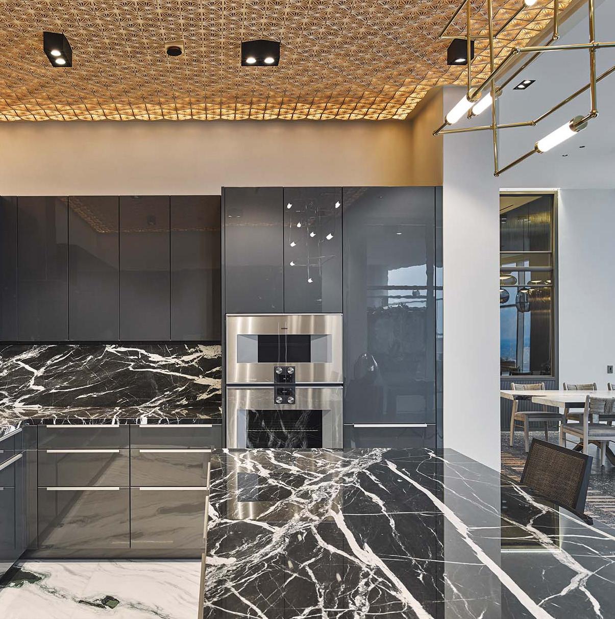
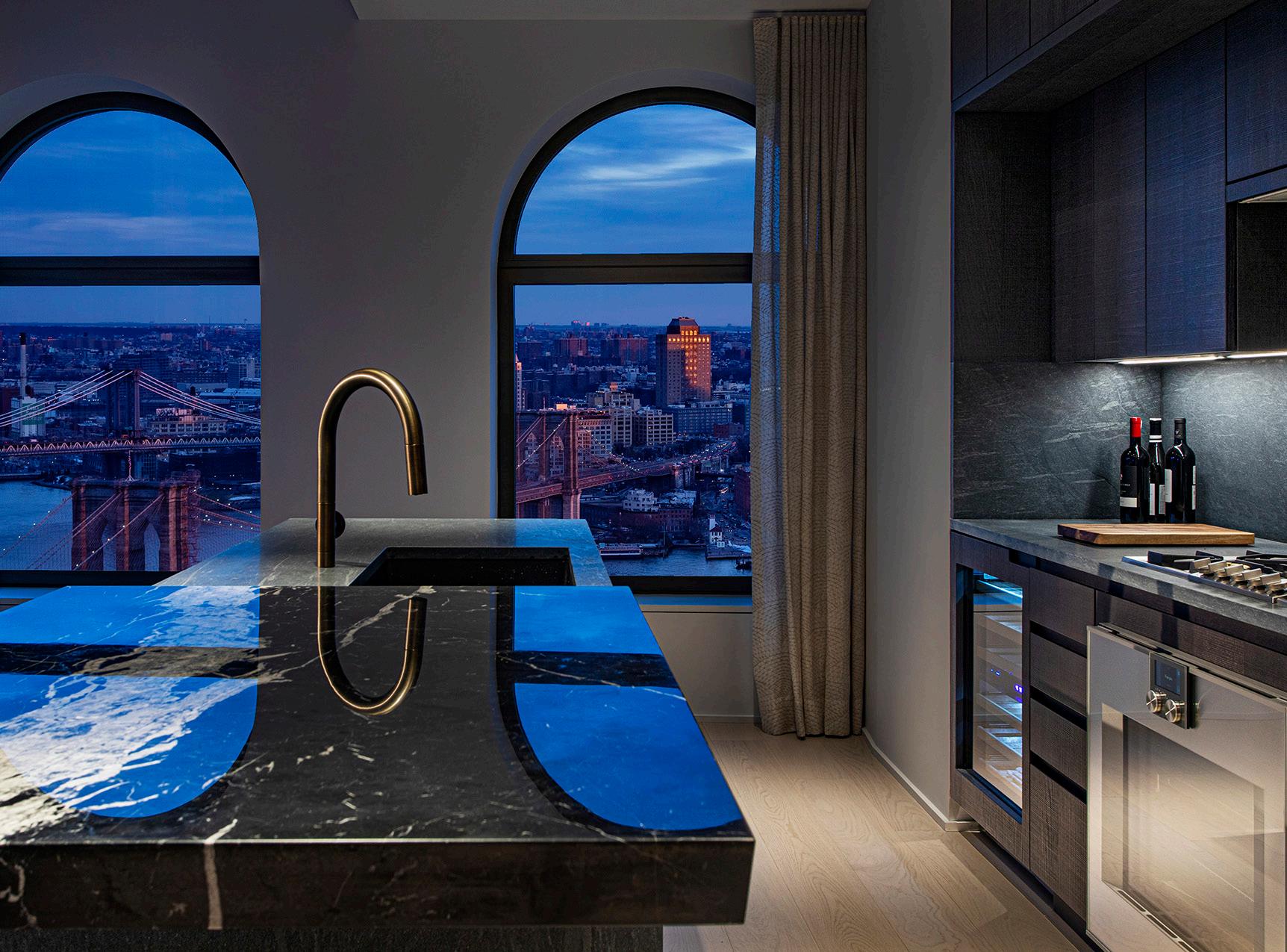
With the help of 50 artists and artisans, designers Eric Clough and Eun Sun Chun of 212box arrived at this amazing design, which uses 25 types of onyx and marble, for the Arabella, a luxury high-rise in Houston, Texas. The design duo selected eggersmann to create this ultra-black kitchen, outfitted with Gaggenau appliances. It features eggersmann’s graphite high-gloss Dallas range along with customized, full-length edge grip handles. Drummonds’ impressive freestanding Wye cast-iron tub in a painted finish is set against strikingly veined white marble. Cool nickel fittings feature throughout, from the Coll basin taps and bath mixer to the towel rails and bathroom mirrors. The Double Thames vanity with an arabescato marble top adds a timeless feeling to the space.

COURTESY EGGERSMANN Kitchens are living spaces that invite us to indulge our senses; places that help to bond us with others, and the heart of the modern home. With eggersmann, kitchens are only the beginning.
Founded in 1908 by Wilhelm Eggersmann, the company rests on a strong design foundation, pulling on Bauhaus elements such as smooth surfaces, cubic shapes, and neutral color palettes. Its modern German kitchens and home living solutions are distinguished not only by unique stone cabinet fronts and exotic veneers, but also technological feats in cabinetry composition and ergonomics. eggersmann’s ever-evolving cabinetry and accessories offer exactly what you need to create a space that is uniquely you, whether you’re working, relaxing, or entertaining. Maintain the modern aesthetic you love in any room in your home.
eggersmannusa.com
Discover Design at the A&D Building
One-Thirty William, Adjaye Associates’ first New York City condominium tower, was designed from the inside out with a people-first approach. Firm principal David Adjaye “understood this was a building not just to be seen, but to be felt,” said Scott Avram, senior vice president of development for Lightstone, which developed 130 William. “The people who live here must experience the building every day—from the inside. Perspectives matter. Details matter.”
With this in mind, Gaggenau worked to deliver the highest quality details. Textures, colors, and components “all work as a collection of specialness—something not found everywhere,” added Avram. “Gaggenau, like our architectural and design partners, was a true collaborator. The company worked with the full team to realize the vision.”
gaggenau.com/us
J Geiger: Shading’s BIG Moment

COURTESY J GEIGER

Above: Saving time and money without compromising style, Inception Shades are a new prefabricated option that has already proved popular in the multifamily residential sector.
Right: The infinitely customizable R Series Shading System is meticulously constructed on-site for a precision fit. According to Avram, the development team wanted a building that wasn’t common to downtown— something more than a “plug and play” glass tower. “It deserved a richness—from the exterior materials to the historically referenced arched windows to the modern yet sensitive interior spaces.”
In 2018, Bjarke Ingels Group (BIG) relocated its New York office from Manhattan to Brooklyn’s DUMBO neighborhood. Located at 45 Main Street, BIG’s 50,000-square-foot office occupies the entire ninth floor of a 12-story building built in 1912. The renovated space is exceptionally modern—an open concept that maximizes daylight with glass-walled conference rooms and unobstructed windows. By eliminating walls and installing motorized solar shades, the BIG team can take full advantage of its Brooklyn Bridge view without sacrificing building performance.
BIG’s office is outfitted with J Geiger’s R Series Shading System, which features a mix of 200-plus wired and wire-free shades. The ceilings are entirely exposed, and wire-free rechargeable motors were an easy way to avoid pesky wiring. In terms of aesthetic and basic functionality, the two power options are nearly identical. Both motor types are linked to keypads, since it would be easy to misplace remotes in an office this large.
jgeigershading.com
COURTESY GAGGENAU
Healthcare

March/April 2022
Two years ago, COVID-19 made its way across the globe, prompting every industry—especially healthcare—to adapt and improve upon operations in record time. With hospitals and clinics at max capacity, those working in design searched for a way to help—and they haven’t stopped since. Architects, designers, and manufacturers continued to develop and deliver new or improved products that optimize the medical experience for both patients and healthcare workers, in any situation. From germ-conscious hardware to durable, sustainable surfaces, the following wares meet rigorous standards of function and beauty. Furthermore, three California case studies put all that we have learned throughout the pandemic into practice, demonstrating the highest standard of contemporary healthcare design.

42 Case Study
Through the Looking Lab
A neuroscience and psychiatric hub at the University of California San Francisco allows researchers to interface with each other—and the public outside.

Design architect: Mark Cavagnero Associates Architect of record: SmithGroup Location: San Francisco
General contractor: DPR Structural engineer: Degenkolb MEP engineer: Critchfield Mechanical Facade consultant: Walters & Wolf Lab planner: Jacobs Lab Planning Group Lighting consultant: Loisos + Ubbelohde Sustainability consultant: Atelier Ten Acoustics consultant: Arup
A lot is happening inside the Joan and Sanford I. Weill Neurosciences Building at the University of California, San Francisco’s (UCSF) Mission Bay campus from moment to moment.
Patients struggling with the effects of Alzheimer’s and other mental disorders confer with caregivers in a bank of exam rooms or in the MRI suite. Loved ones may be on hand or teleconferenced in to participate in treatment decisions. Administrators tap away at the desks in light-filled offices, while others make presentations in corner meeting rooms. Teams of scientists and researchers stationed in wet and dry labs on floors 3, 4, and 5 work toward cures, sometimes deep into the weekend. People crisscross the wood-paneled atrium, a much more pleasurable space than one might expect at a clinical or research facility, where, on certain evenings, a donor dinner or charity event may be taking place. Those searching for a much-needed break scale the stairs to the top-floor cafe and roof terrace or other social spaces clustered on the building’s west side, where intermingling is encouraged.
Much, though not all (patient privacy is obviously considered), of this activity is visible, either to peers or other UCSF visitors, particularly in the early evening hours, when the hub, in the words of its architect, Mark Cavagnero, “becomes totally alive.”
A staggering transparency characterizes the 181,500-square-foot, LEED v4 Gold–targeted building, whose intricate program augments those of nearby Sandler Neurosciences Center and Rock Hall, which, too, are dedicated to exploring and treating brain disorders. The other research labs and treatment facilities that form the top-rated UCSF Medical Center tend, in their architectural demeanor, toward involution. By contrast, the Weill Neurosciences Building is extroverted, disclosing in its attitude where others are concealing.
“The rest of the campus was designed with more traditional lab spaces,” Cavagnero said, “where everything was kind of isolated and there was no exterior sun control, so everyone has their shades down and there’s no daylight for researchers.”
According to Cavagnero, lead donor Sanford I. Weill, former chief of Citigoup, tasked him with finding a “forward-thinking” architectural solution that satisfied the needs of multiple users and stakeholders and also had iconographic value. The exact meaning of “forward-thinking” was left for the architect to sort out. In explaining his concept, he reached for ethereal analogies, the most material of these being Japanese origami. “The idea of making science appear light, and not heavy and obtuse, really appealed to me,” he said. “I wanted the building to feel like it was about lightness itself. This concept of light being hope.”
But given the project’s corner site, which offers primary exposures to the south and west, and the extensive use of glazing, an invitation to daylight might soon come to be regretted. Various strategies were implemented to assuage this concern. The top-heavy massing, for one, results in a deeply shaded arcade. The first two floors, containing the clinical spaces and their waiting rooms, are stepped far back from the property line, which the upper floors, held aloft by concrete columns, meet.
To shield those higher floors, the design team, which included the local office of SmithGroup and facade consulting firm Walters & Wolf, among others, devised a prophylactic metal screen that preserved the desired transparency. Orderly white aluminum blades suspended from the glass facades deter heat gain while adding visual interest: Depending on one’s approach, an elevation may seem opaque or clear, prompting the observer to “start reading form and abstraction in a new way,” Cavagnero said.
The metal blades are “the primary point of the building’s crisp outer expression,” said Jon Riddle, a principal architect at SmithGroup. The description accords with Cavagnero’s references to origami; the likeness comes into play at the top register, where the corners of canted penthouse volumes (separated by a gallery) are pulled up like butterfly wings. Riddle also compared the precise handling of the exteriors with the “precision care happening inside, where computer modeling and analysis are used to really target the area that needs treatment.”
The same ethos informed the design of the interiors, which are flush with warm and natural materials, especially the prevalent use of sycamore. The wood paneling finds its way into all sorts of spaces, including exam rooms, though it’s used most extensively in the fullheight atrium. Lining back walls and soffits, the sycamore enlivens the broad room, especially during the day, when it’s suffused with daylight falling through the center skylights and western facade. A durable marble acquired from a small quarry in southern France blankets the floor, a finish that would be cost-prohibitive for most facilities of this kind.
“The quality of those finishes was really driven by the donor, who wanted more of a hospitality feel,” said Suzanne Napier, a SmithGroup VP, “and they do really go throughout the whole building, top to bottom, inside and out.”
A telling thing happens at the corner of the atrium. The walls of a fire-rated stair core are partially glazed so that light can reach them. This visibility—counterintuitive from a functional perspective—also makes the stairs more attractive to the building’s core user set. It’s an elegant summary of the project’s aims, Cavagnero said. “The underlying message was that there isn’t anything happening here behind closed doors. We’re all chasing the same dream. We’re all trying to find the same cures, here in this wonderful new environment together.” Samuel Medina March/April 2022
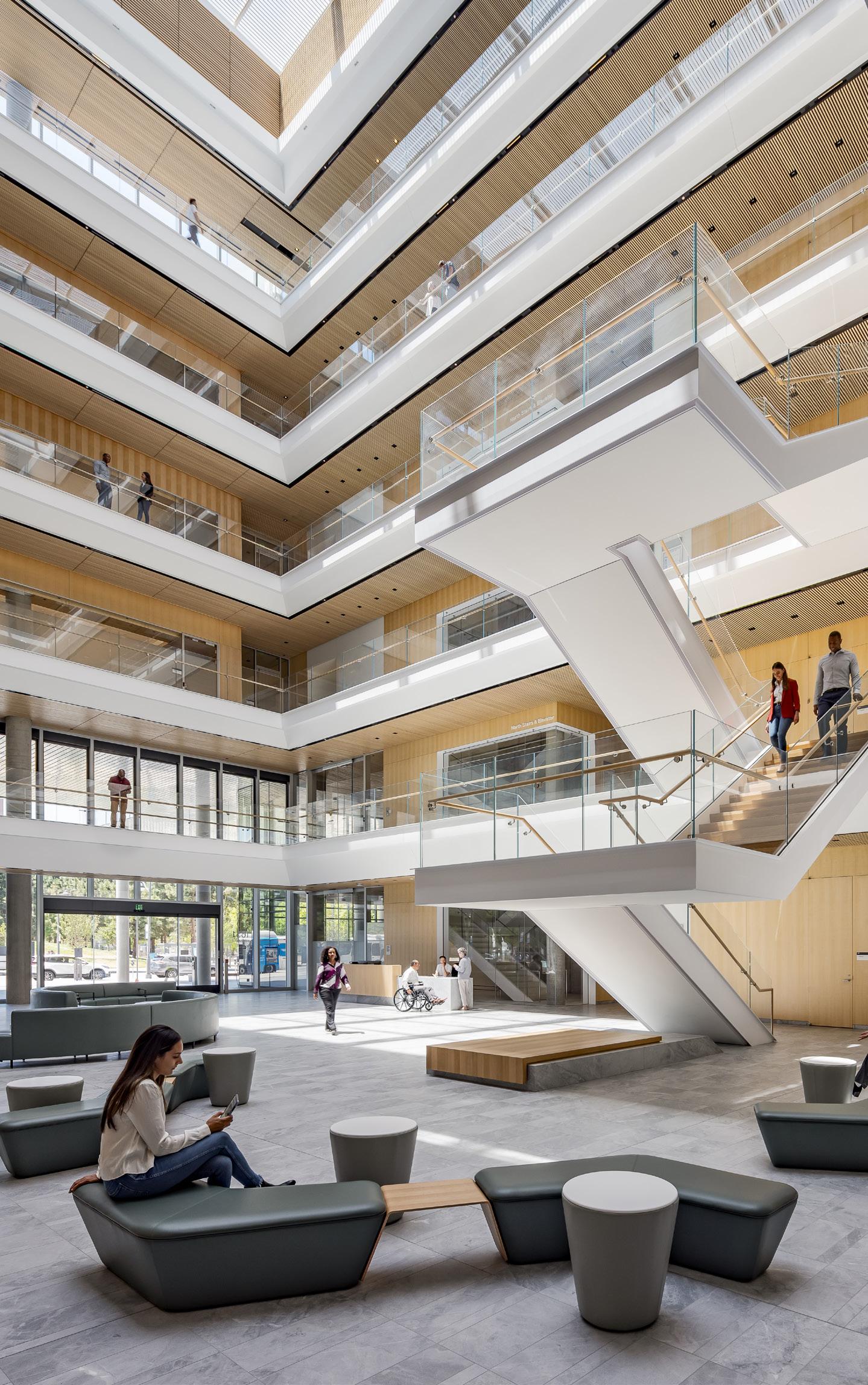
TIM GRIFFITH
43 Case Study
March/April 2022
TIM GRIFFITH


Opposite, top: At night the building “glows like a beacon of hope,” its architect said. Top: The building’s pointed profile resembles origami.
KYLE JEFFERS
44 Case Study
Support of Nature
ART GRAY
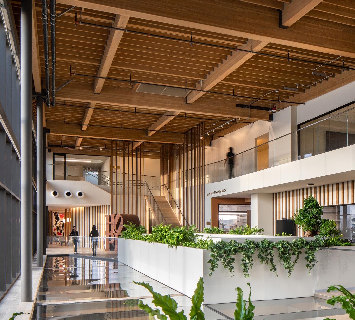
Architect: Rios Location: Los Angeles
General contractor: Sierra Pacific
Constructors Structural engineer: Risha Engineering Windows: Arcadia Doors: Western Integrated, EZ Concept Interior finishes: Galleher, Thermory, Farrow &
Ball, Amerlux Fittings and furniture: Tacchini, Bernhardt,
Hay, Herman Miller, Ariana Rugs, Tom Dixon,
Bentley (carpet)
The Lawrence J Ellison Institute for Transformative Medicine in Los Angeles is an innovative cancer research center that harnesses nature to create a space conducive to the hunt for a cure. Founded by Dr. David Agus, author of The End of Illness, among other titles, with a substantial donation from Oracle co-founder Larry Ellison, the project encourages collaboration between researchers, patients, and others, by providing a comfortable and creative environment that overturns many expectations of what a laboratory building should be.
Designed by Rios, which provided architecture as well as landscape architecture and wayfinding services, the scheme derives from Agus’s maxim: If you change the soil, the seed won’t grow. “How do you change researchers’ soil, mentally, and prime them to be collaborative?” asked Rios creative director Sebastian Salvadó. To answer this, the team looked to its landscape practice. “We have always put landscape thinking at the forefront of everything we do,” Salvadó continued. “We really believe in the power of nature to create healthy spaces and spaces that we’re comfortable in and spaces that feel familiar and engaging.”
Unable to find an appropriate site for a ground-up building, the institute purchased a spec creative office designed by HLW that was still under construction. While the location, at the border of Santa Monica near the Expo Line, was ideal, the building’s long, skinny footprint—79 feet wide by 300 feet long, with the broad sides facing east and west—presented some challenges. However, Rios developed a concept that turned these challenges into a driver for the design.
“We needed the institute to be open and free-flowing, but it couldn’t be so open that it had an inhuman sale,” Salvadó said. “We had to create a gradient of differently scaled spaces.” The architects divided the eastern side of the building from the west with a line and then made this line meander. To the east they placed the laboratories and other introverted spaces. To the west, they placed the open, collaborative spaces, like the communal kitchen, cafe, meeting rooms, and The Forum, a triple-height atrium that serves as the collaborative core of the project.
The meandering line breaks up the long, skinny floor plates into neighborhoods without introducing walls and doors. Meeting rooms and the few private offices were deployed as clusters of “boulders” that subdivide neighborhoods. The labs were also dispersed, which increased the cost of the HVAC system, but forces researchers to walk around and interact more. Throughout the building, access is provided to outdoor decks, even from the laboratories, though there you must also pass through an air lock.
The materials on the interior also lean toward the natural. In addition to an abundance of plants, there is a wealth of wood flooring, wood plank paneling, and exposed wood structure (stained to match the wood palette used in the rest of the building). Carpeting was used in the collaborative areas to make them softer and dampen the acoustics. In the lounge spaces the carpeting is even plusher and arrayed with custom upholstered dark metal furniture in sophisticated earthy colors. There is also a lot of art on display, including major works by Robert Indiana and Jeff Koons, yet another contemplative perk in this very comfortable and engaging lab building. Aaron Seward March/April 2022

45 Case Study

ART GRAY

Opposite page, left: Plantings in the Forum and elsewhere bring nature inside.
Opposite page, right: Access to the outdoors is provided throughout the facility, even from the labs themselves, and art is everywhere.
Top, left: The wood structure was left exposed and stained to match the wood palette used elsewhere on the interior.
Top, right: A communal kitchen brings researchers, administrators, patients, and others together.
Middle, right: While the designs of the labs themselves are prescribed, ample glazing keeps them connected to daylight and views.
Bottom, left: Lounge spaces evoke a residential character with plush carpeting and cozy furniture.

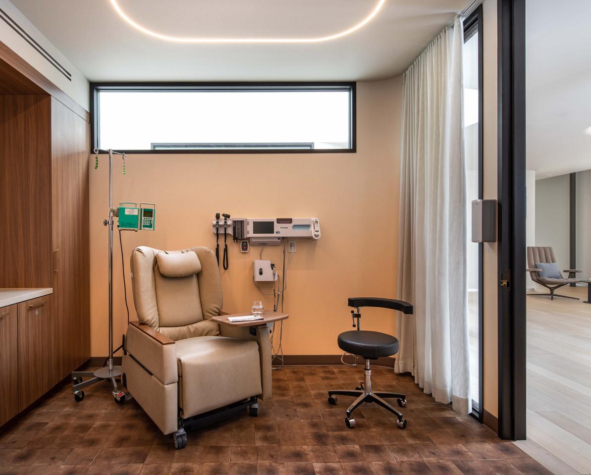

Bottom, right: Comfort was prioritized in the patient treatment rooms. March/April 2022
46 Case Study
First Steps
The Belardi Family Pavilion at the City of Hope medical complex puts a new master plan on the right track.
Architect: Gensler Architect of record: M. Arthur Gensler Jr. & Associates Location: Duarte, CA

General contractor: Hathaway Dinwiddie
Construction Company Structural engineer: Walter P. Moore Glass: Viracon, Technical Glass Partitions Expanded mesh: AMICO Architectural
Products Louvers: Construction Specialties, Pottorff,
Greenheck Doors: Panda, Wilson Partitions Ceilings: Armstrong Interior finishes and furnishings: Hufcor,
Bentley, G-Rail, Kvadrat, Mecho, Owens
Corning, Shaw Contract Landscape: Hanover Architectural Products

Founded in 1913 as a tuberculosis sanitorium in Duarte, California, City of Hope has grown into a leading center of medical research, education, and treatment. Located just 20 miles from Downtown Los Angeles, the sprawling 116-acre campus acts as the anchor of the National Cancer Institute, which has a network of clinical practice locations throughout Southern California and regional fundraising offices across the United States.
In order to optimize operations throughout this growing, multifaceted organization, City of Hope tapped Gensler to design a master plan that would unite existing functions as well as pave the way for future development. The project’s first phase wrapped in 2021 with the completion of the Belardi Family Pavilion, a medical and administrative space that consolidates multiple research, surgery, and treatment departments, as well as executive offices. Breezy corridors take advantage of the climate and subtly hark back to City of Hope’s original function.
The form of the four-story, 96,000-squarefoot building follows the curve of the campus’s eastern-most property line, with primary frontage to the east and west. The east facade is outfitted with silver, sawtooth metal fins to mitigate solar heat gain. The inner edge of each fin is finished in bronze to burnish the light that bounces into private offices lining this side of the project.
On the western half of the building lies the “collaborative zone,” which is spread over two floors. Conference and seminar rooms, food service, outdoor terraces and break-out areas are bounded by galleries and connected by exterior stairs. Perforated facade panels, calibrated at optimal angles to shade the promenade, are nearly imperceptible.
The meticulous facade detailing is part and parcel of the architects’ wider sustainability strategy, which helped the building achieve LEED Gold Version 4 certification. Gensler, working with local firm M. Arthur Gensler Jr. & Associates, factored embodied carbon into all of its design decisions, resulting in an emissions reduction of 2.8 million metric tons. Powered largely by the extensive solar farm atop the roof, the facility performs with twice the efficiency of standard office buildings.
“The pavilion will serve as a springboard that allows the campus to move into the future,” said project architect Brian Fraumeni. As the first step in City of Hope’s vision for a patient-friendly, ecologically conscious, and technologically advanced campus, the Belardi Pavilion has set the bar high for future development. Sophie Aliece Hollis
BENNY CHAN March/April 2022
BENNY CHAN
47 Case Study

Opposite page, top left: The building follows the curve of City of Hope’s eastern-most property line.
Opposite page, top right: Silver sawtooth fins are lined with bronze to reflect warm-colored light into the eastern and southern sides of the building.
Opposite page, bottom: A large staircase invites visitors to ascend and engage with the building at multiple levels.
Top: The generously shaded exterior walkway looks out on the City of Hope campus.
Right: The Belardi Pavilion houses ample open plan office spaces to provide opportunities for departments to crosspollinate. March/April 2022

BENNY CHAN
Furnishings
January/February 2022 March/April 2022
The constantly changing needs of the healthcare industry require that care environments be responsive. The following furnishings do just that by providing myriad applications, customizability, and mobility in times of change. Sophie Aliece Hollis

3-In-1 Comfort Commode by Michael Graves Design CVS Health cvs.com

WOW - Complete workstation-on-wheels Fellowes Brands fellowesbrands.com VOLA RS11 Hastings Tile & Bath hastingstilebath.com Elly Tablet Arm and Planter Versteel versteel.com


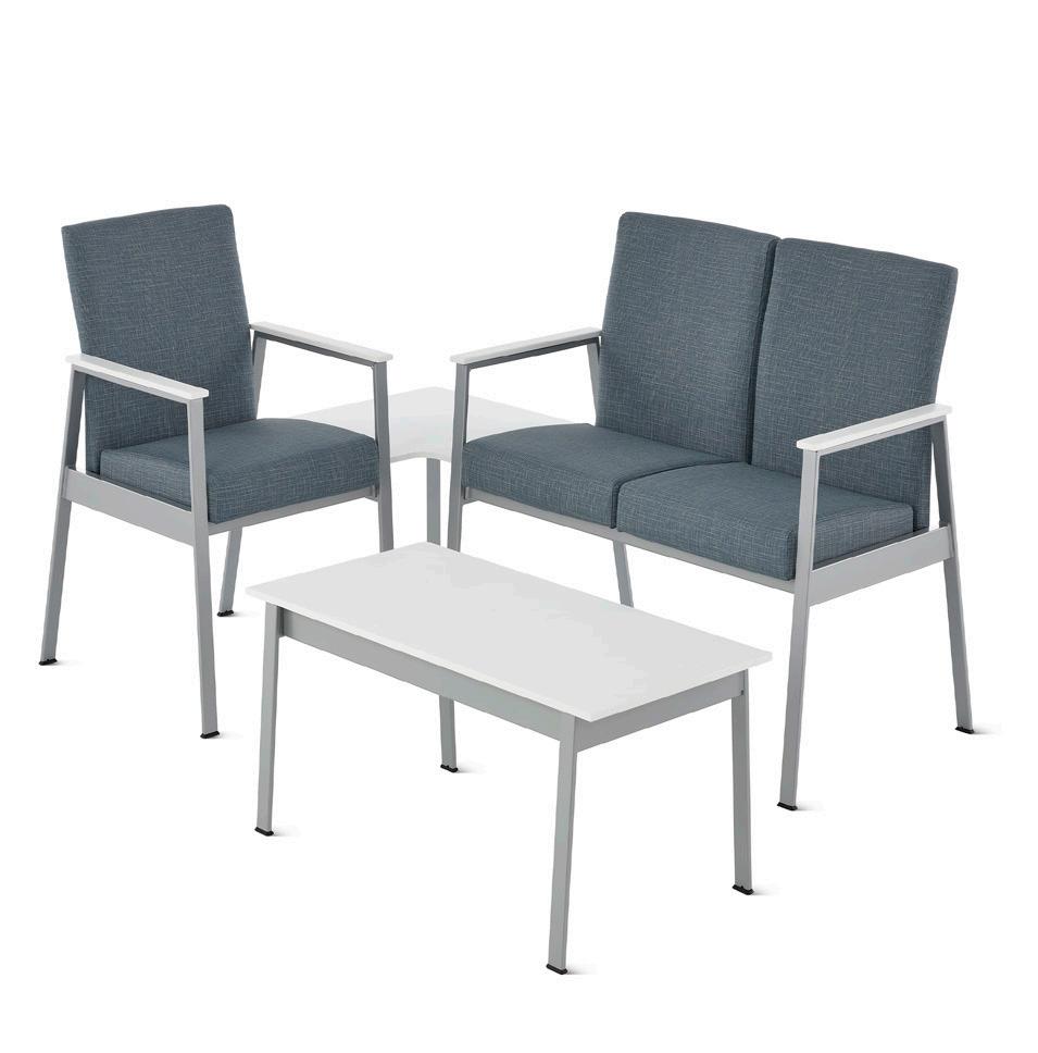

Nemschoff Easton Family Herman Miller hermanmiller.com M-Series Quad Workstation HAT Collective hatcollective.com Zoetry Collection KI ki.com
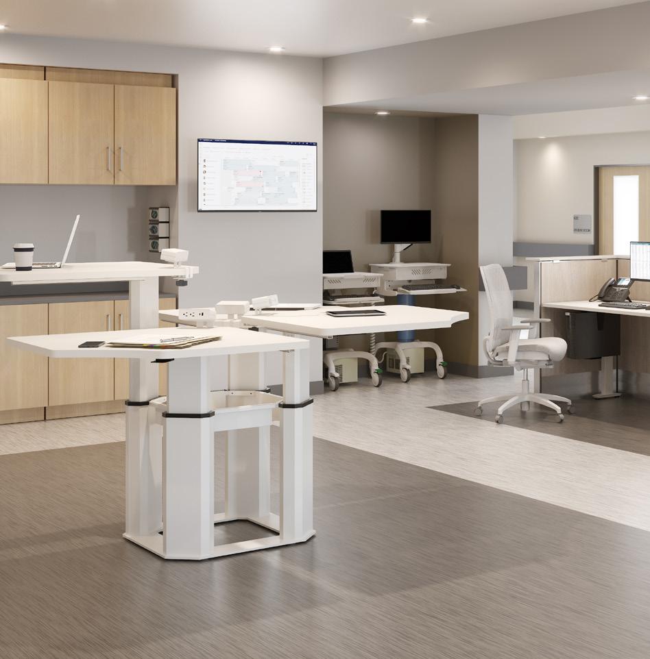
ALL IMAGES COURTESY THE RESPECTIVE MANUFACTURERS
Acoustics & Textiles
January/February 2022 March/April 2022
Although great care is taken to keep healthcare spaces as sterile as possible, they don’t have to feel that way. These versatile acoustics and textiles employ high-performance technologies to ensure cleanliness without sacrificing color, texture, and playfulness. Sophie Aliece Hollis

C.A.R.E. x Stinson CF Stinson cfstinson.com EchoTile Sync Kirei kireiusa.com Supreen fabric Supreen supreenfabric.com


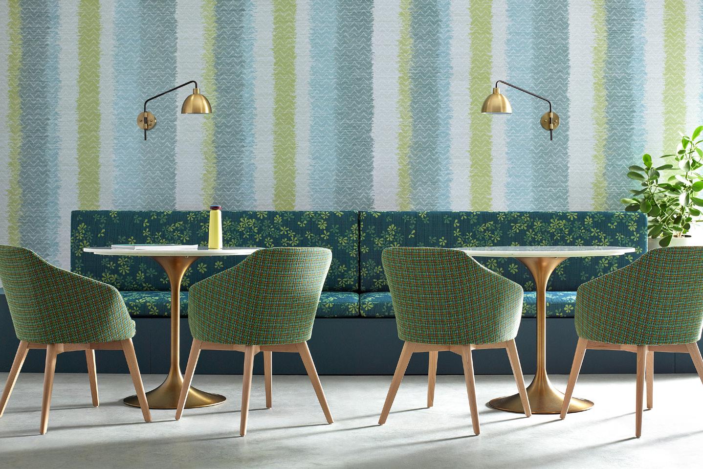
Haku by Teruhiro Yanagihara Kvadrat kvadrat.dk
Pattern Play Collection KnollTextiles knoll.com
ALL IMAGES COURTESY THE RESPECTIVE MANUFACTURERS
Hardware and Accessibility
March/April 2022
Access is of utmost concern for hospital staff, and these handles, locks, and hinges are ready for any scenario. Especially crafted for healthcare environments, they ensure safety, privacy, and cleanliness.
Sophie Aliece Hollis
SafeGlow Accurate Lock accuratelockandhardware.com Double Action Spring Hinges Sugatsune sugatsune.com Door Hardware with Microban Technology Kwikset kwikset.com


Decorative Hardware Assa Abloy assaabloy.com PD3000 Narrow Profile Mortise Lock for Sliding Doors INOX inoxproducts.com
ALL IMAGES COURTESY THE RESPECTIVE MANUFACTURERS
Surfaces
March/April 2022
It goes without saying that hospitals and clinics require durable, hygienic, and easy-to-clean surfaces. But there’s also an aesthetic component that shouldn’t be overlooked. These products answer all these needs, pairing utility with a calming mood. Sophie Aliece Hollis

2022 Color Collection 3form 3-form.com Asana Heterogeneous Sheet Armstrong Flooring armstrongflooring.com


Antimicrobial Collection Formica formica.com Amtico Active Lines Collection Mannington Commercial manningtoncommercial.com Switch Glass Skyline Design skydesign.com

ALL IMAGES COURTESY THE RESPECTIVE MANUFACTURERS
Acoustics & Textiles
3form 3-form.com
Architex architex-ljh.com
Arktura arktura.com
Armstrong armstrongceilings.com
Carnegie carnegiefabrics.com
CF Stinson cfstinson.com
KnollTextiles knoll.com
Supreen supreenfabric.com

Furnishings
ERG erginternational.com
Fellowes Brands fellowesbrands.com
Futrus futrus.com
Hastings Tile & Bath hastingstilebath.com
HAT Collective hatcollective.com
Haworth haworth.com
Herman Miller hermanmiller.com
Integra Seating integraseating.com
Versteel versteel.com
Via Seating viaseating.com


Hardware
Baldwin baldwinhardware.com
Construction Specialties c-sgroup.com
FSB fsbna.com
Hardware Resources hardwareresources.com
HEWI hewi.com
INOX unisonhardware.com
Kwikset kwikset.com
SARGENT sargentlock.com
Sugatsune sugatsune.com
Sun Valley Bronze sunvalleybronze.com
Yale Commercial yalecommercial.com
Surfaces
Altro altrofloors.com
Armstrong Flooring armstrongflooring.com
Ceramic Technics ceramictechnics.com
Corian corian.com
Daltile daltile.com
Forbo forbo.com
Formica formica.com
J+J Flooring Group jjflooringgroup.com
Mannington Commercial manningtoncommercial.com
Shaw Contract shawcontract.com
Skyline Design skydesign.com
Stone Source stonesource.com
Tarkett tarkett.com March/April 2022
COURTESY 3FORM
COURTESY KNOLL


