4 minute read
SLUMPING AROUND Jillian Mayer's Sculptures for a Digital Age
SLUMPING AROUND Jillian Mayer's Sculptures for a Digital Age
BY DANIEL AUSTIN WARREN
Advertisement
Miami-based, internationally shown, multi-disciplinary artist Jillian Mayer is responsible for the “Slumpies,” an ongoing sculptural series designed for a theoretical space.
Put crudely, the “Slumpie” is an object meant to facilitate a more comfortable public-accessing of cyberspace. Taking it a stretch further, the Slumpie (as the artist herself claims) envisions “a practical solution to the contemporary world of cellphone–dependent humans cum ‘post-posture’ persons.”
This makes the art object a real answer to a pseudohypothetical question: What do we do when our necks are crooked from too much doom-scrolling, or from walking-and-talking with our phones pressed to our ears, or from reposing bedridden and binge-watching for hours on end? It renders the series like a revolving showroom of imaginary solutions, as if some furniture-based corporation was hypothetically hiring the new Man Ray or Herman Miller to design a response to our self-obsessed, imaginarily fractured state of being, along with its subsequent, and expected, deformations.
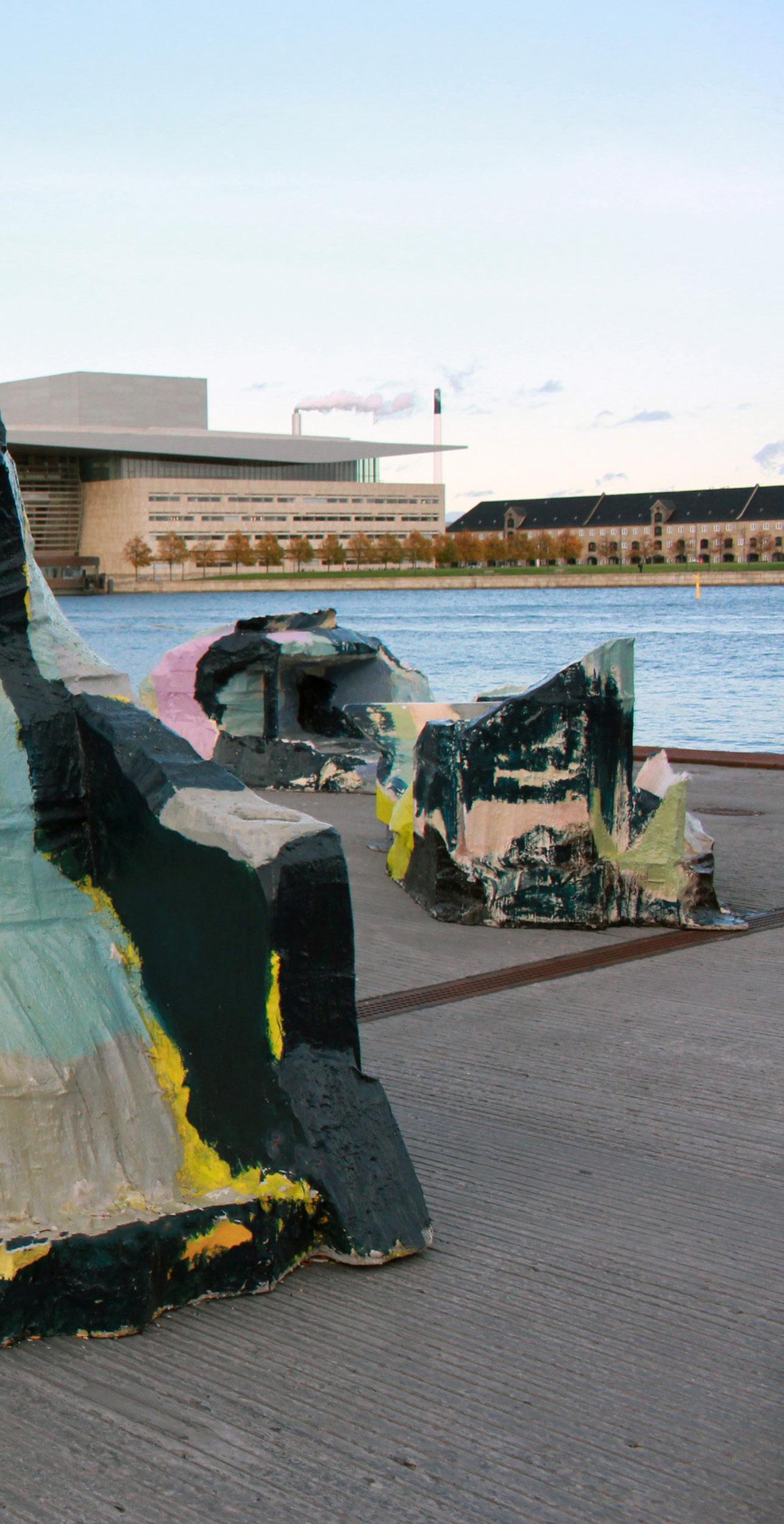
In light of this speculative marketing brief, the resultant objects are a hilarious hodgepodge of disjointed calamity; some “Slumpies” attach to walls and support akimbo elbows; others resemble lounge furniture, but with contorting undulations like mock medieval devices of detainment; some Slumpies resemble plinths or daises; others appear as both pedestal and trophied art object (therefore appearing quite useless in comparison to their also-mangled kin).
Variation and multiplicity aside, in the simplest sense, any given “slumpie” comes to life through its own publicity. Because
Slumpie 65- Thicc Zucc, 2017. Photo by Signe Ralkov at Ofelia Plads (Coppenhagen).

of its being anti-sensible, the Slumpie is nonsense in privacy—it might even suggest a certain madness. The object invites the awkwardness of interaction, the seen-ness of the user overcoming its preposterousness.
Regardless of the artist’s statement, I would argue for the Slumpie as being meaningful through public engagement. That’s because the Slumpie is not actually a tunnel to a more comfortable internet experience; it is an object encouraging self-identification through its tandem participation—a union of IRL and URL, if you will.
I only re-encountered the Slumpie lately because I follow Mayer on Instagram; she had reposted others’ photos of themselves straddling, contorting and bending to fit the molding of a variety of Slumpies. And in this reposted sense, this postDadaist object becomes like an antenna directing a field of related, social-media transmitted objects, perhaps what would be replicating evidence of similar encounters.
I admit bias, though. I love the Slumpies series, if only because sometimes I see an unoccupied one and lack the imagination for its usage. I then see it in use, a person straddling it awkwardly, bent and turned in surrender to its absurdist design, and I enjoy a rush of endorphins, an unforced exhalation of windy suspiration.
Mayer portrayed a concern when she presented her most recent grand-master Slumpie, Fort (2020), at Miami’s Hotel Confidante, a hotelier’s structure of glass and orthogonality reminiscent of scenes from Brian de Palma’s Scarface. Mayer’s December exhibition was part of Art Week Miami Beach's No Vacancy public art competition and exhibition. It kindly featured pump-station hand sanitizer for visitors and was wiped down between uses for pandemic safety. Fort included Wi-Fi honoring the zeitgeist of the series, i.e., web access. This latest Slumpie proved the tallest, widest, greatest of them all: less a solipsistic object of satire and more a carnival-size tiered cake, some 10- to 15-feet tall, begging to be climbed and played upon.
In conversation with Mayer at the end of the year, she brought up some points: (1) The Slumpies refuse design efficiency by being molded with uncycled materials: resin, wax, styrofoam, and even wood from used palettes. (2) These materials hearken back to Miami’s leisure activities: boating, surfing, wood lifeguard towers. (3) Theoretically, these sculptures float—meaning they should persist long after the ocean’s rise.
Mayer describes Fort as part of a series of “quasi-functional sculptural furniture” that is “a rejection of contemporary design efficiency” and that is “presented as an interactive sculptural installation… ” The artist goes on to claim: “Fort is motivated by my concern that our cities, buildings and furniture will soon resemble the computer programs in which they were designed; clean lines on horizontal planes based on the optimization of manufacturing and their ability to be shipped flat efficiently... Fort is a rejection of this.”
So after volumes of user-centered selfies and conceptual ad–satirizing textual documents furnished by the artist herself, the key to grasping the Slumpie concept is to consider what it is not. The Slumpie is not comfortable; the Slumpie is not functional; the Slumpie might offer Wi-Fi access based on solar recharging capabilities (but it also might not; you’ll need to contact the gallery ahead of time, wink wink); the Slumpie is not public or private (a gallerist can be contacted to purchase them; others are cycled in and out of various public displays; some are just in artist limbo, either in transit, storage, or in rotation between galleries). And, if one accepts my argument, the Slumpie is not unless it is posted online.


