


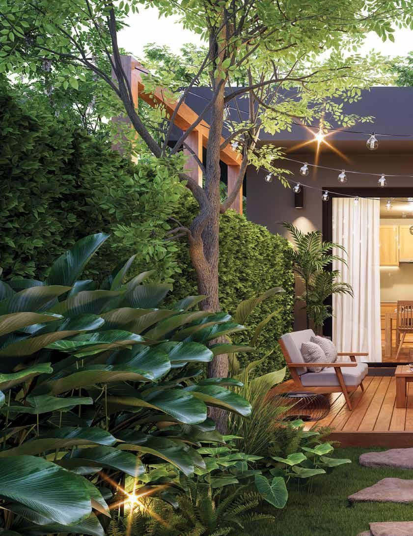
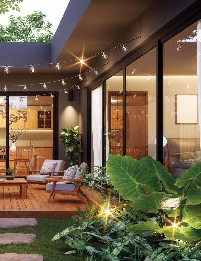
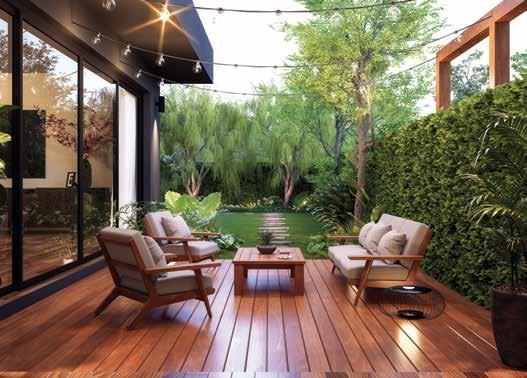
BEAUTIFUL BANFF FROM MAJESTIC MOUNTAIN VISTAS TO HIDDEN GEMS, THIS NATIONAL PARK IS CALLING YOU TO REDISCOVER THE GREAT OUTDOORS


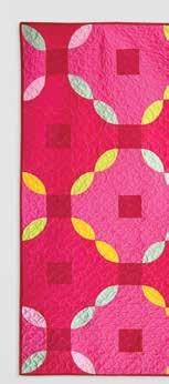
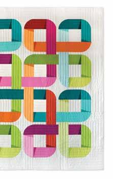
A NEW TAKE ON TEXTILES HOLLY CLARKE SHARES HER CUTTING-EDGE QUILT DESIGNS


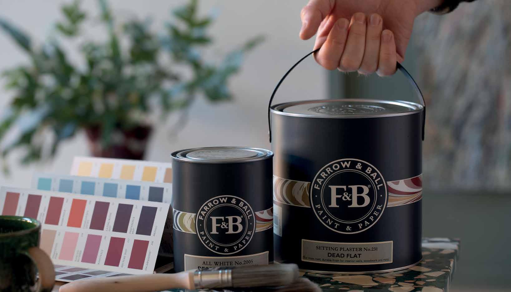
NEW location: 6R Bellevue Lane (off Queen's Hwy), Freeport, GB, The Bahamas (242) 352-9788 | info@paintfair.net | PAINTFAIR.NET


Redeemable at Paint Fair, 6R Bellevue Lane, Freeport, Grand Bahama
*Valid on cash purchases through December 31, 2024, only. Coupon cannot be combined with any other sale or offer.


Take 20% OFF your first purchase at our new location* NEW location: 6R Bellevue Lane (off Queen's Hwy), Freeport, GB, The Bahamas (242) 352-9788 | info@paintfair.net | PAINTFAIR.NET

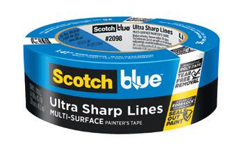


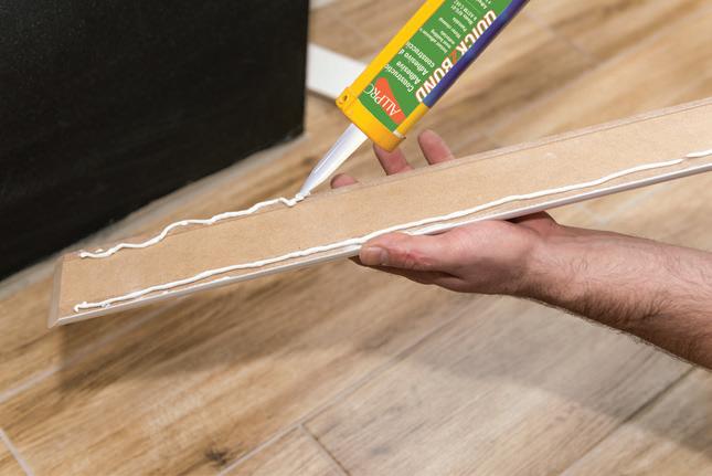
No two surfaces are alike — that’s why starting with the right prep can make all the difference. With a family of tapes designed specifically for your surface, Scotch® Painter’s Tape helps you prep right for professional-looking results.
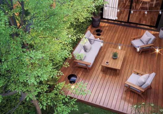
Check out more colorful and inspiring spaces starting on page 28.
SPACES:
Real home redesigns with wall-to-wall ideas you can use.
28
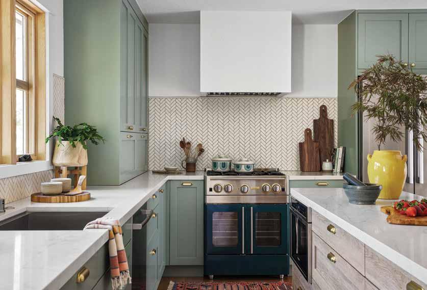
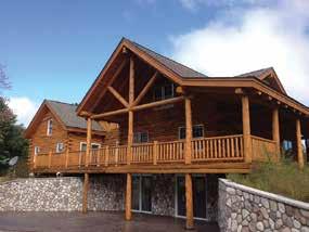
WHAT’S NEW IS OLD AGAIN
Durable materials, meaningful details and heirloom furniture are carefully curated to add a personal touch and charming character to this new lakeside build
34
THE FUN HOUSE
A self-described “designer at heart” leaves her job in the corporate world to foray into full-time design, bringing plenty of fun and function and her signature dose of “zhuzh”
40
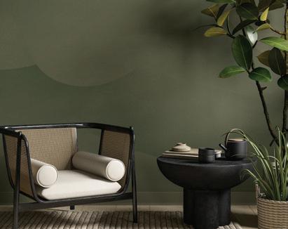
A MARVEL IN THE MOUNTAINS
A split-level nestled in the Colorado mountains is revived with nature leading the charge
46
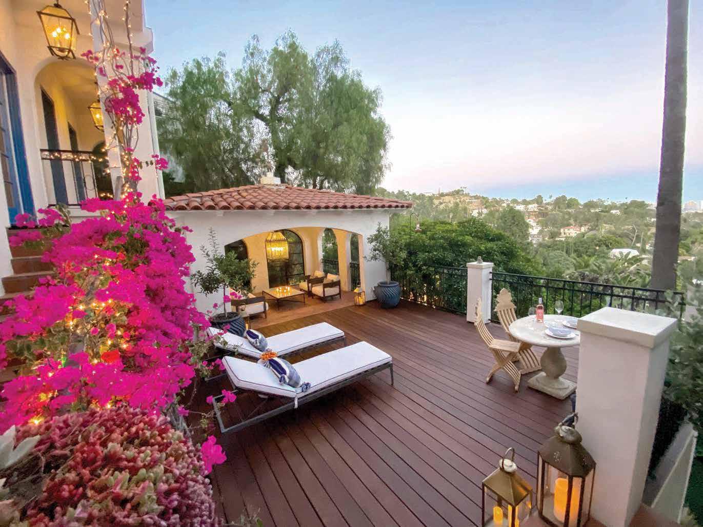
CALIFORNIA DREAMY
A cozy Bay Area ranch is refreshed and ready for its closeup
Products featured in At Home are available at Paint Fair, some by special order.


CARLEE BAIGRIE
ANDREA DANELAK
TWILA DRIEDGER
DARREN GRUNERUD
OLIVIA HIEBERT
ARTHUR LIFFMANN
JIM TAYLOR
AUBREY TAYLOR
IRA VAN DEN BERG
Love the designs within our pages? Connect with the talented folks behind the gorgeous spaces.
WHAT’S NEW IS OLD AGAIN
PG.28
O’Hara Interiors
Krystal Kellerman & Taylor Allsup oharainteriors.com @ohara_interiors
THE FUN HOUSE
PG.34
CoCreative Interiors
Misty Molloy cocreativeinteriors.com @cocreativeinteriors
A MARVEL IN THE MOUNTAINS
PG.40
Laura Medicus Interiors
@loveandinteriors A
Laura Medicus lauramedicusinteriors.com @lauramedicus
CALIFORNIA DREAMY
PG.46
Love and Interiors
Melanie Love loveandinteriors.com
FALL 2024
Bahia Taylor
Editor in Chief
Co-founder
Leigh McKenzie
Creative Director
Co-founder
Twila Driedger
Contributing Writer & Editor
Olivia Hiebert
Graphic Designer
Carlee Baigrie
Contributing Writer
Andrea Danelak
Contributing Writer
Arthur Liffmann
Contributing Writer
Graphic Design
Styling
Gallon Creative www.galloncreative.com
Owned and Published by: Gallon Creative
For inquiries, please contact us at projectsgalloncreative@gmail.com 5 Scurfield Blvd #25 Winnipeg, Manitoba R3Y 3G4
www.galloncreative.com projectsgalloncreative@gmail.com
Cover Photography - Aubrey James Projects aubreyjamesprojects.com
While every effort has been made to ensure that advertisements and articles appear correctly, At Home Magazine cannot accept responsibility for any loss or damage caused directly or indirectly by the contents of this publication. All material is intended for informational purposes only. The views expressed in the magazine are not necessarily those of its publisher or editor.
All rights reserved. Reproduction in whole or part prohibited without written permission from the publisher.
22
CRAFTY:
DIY? WE SAY Y-E-S!
UPCYCLE YOUR CUTLERY
Transform mismatched forks and knives into a delightful set perfect for your next dinner party
24
HOT SPOT: Shining a spotlight on the world’s hidden gems
QUILTING IN THE DIGITAL AGE
The joy and generosity of Holly Clarke designs
52
TOOLBOX: Helpful resources for any homeowner
BEAUTIFUL WOOD MADE EASY
Conditioning oils that revive and restore
56
CHOW: Just thinking about it is making us hungry
JUST DESSERTS
Scrumptious goodies perfect for your sweet tooth
60
EXPLORER: Pack your sense of adventure and let’s go
A MOUNTAIN OF POSSIBILITIES
From majestic mountain vistas to hidden gems, Banff is the place to rediscover the great outdoors


As adventurers, if there is one place in Canada that we can’t get enough of, and don’t feel shy about encouraging others to visit, it’s Banff (PG. 60). With its majestic mountain peaks and surrounding pristine waters, the crown jewel of the Canadian Rockies is a must-see with a long list of must-dos. Whether it’s hiking, kayaking or riding a gondola to soak in the panoramic and postcard-worthy views, a trip to Canada’s oldest national park is something that needs to be seen to be believed. And autumn provides a golden opportunity to experience the area, with a short window that showcases the changing shades of the typically green coniferous trees.
Nature is something that we repeatedly see as inspiring our interiors. From rich woods and durable stone to earthy hues of greens and grays, shades of sunny yellow, and deep turquoise blue, spaces featured in this issue reference the stunning landscapes that surround them. From the red rock mountain range of Colorado (PG. 40), to the lake life in northern Wisconsin (PG. 28), the outside environment creates a meaningful and appropriate color scheme for any space.
However, as suitable as the countryside is for certain abodes, there is still something to be said for the unexpected: a pop of yellow paint on a front door (PG. 47), a fun and whimsical wallpaper in a small bathroom (PG. 35), a coat of color on underused spoons (PG. 22), or a hip pattern to an age-old hobby (PG. 24). We always encourage the unexpected - especially when it comes to paint!
Wherever this season takes you, whether it’s across the continent, or to your own backyard, we hope you try something altogether new but also sink into a few of your favorite pleasures.


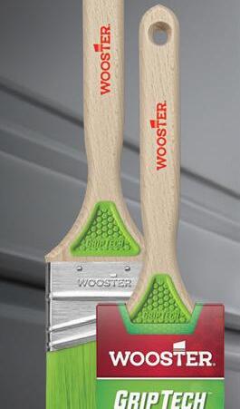
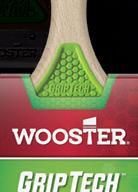


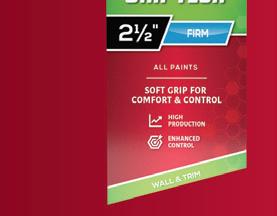

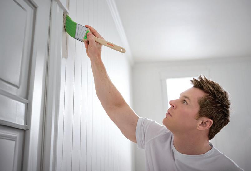
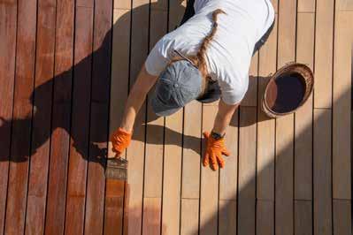
Wooster® GripTech™ features a rubberized grip built into each side of the handle for increased comfort and control. Designed for enhanced ergonomics, GripTech™ provides reduced slip during prolonged use. Its firm polyester filament blend is formulated to deliver excellent cut-in ability and smooth finishes in all paints. Available only from Wooster®
Your guide to the three Ps: prepping, priming and painting

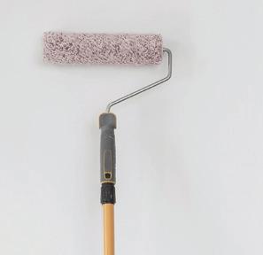
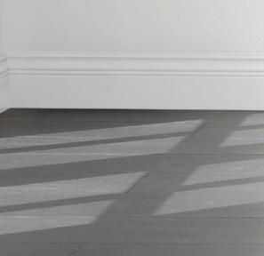
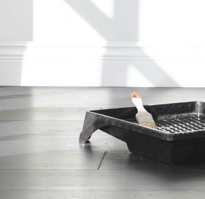
Shortcuts are great for avoiding traffi c or beating video games, but not so much for painting. In fact, no matter the size of the painting project, its success really does depend on how much time and effort is put into preparation. There’s simply no way around it.
• Before you begin, move all furniture out of the room. Larger items can be placed in the center of the room and covered with a plastic or canvas drop cloth.
• Take down any pictures, wall hangings or removable fixtures as well as the nails holding them up. This is also the time to remove electrical plates and switch covers as well as air vents you don’t want to get paint on.
• Scrape off any loose, flaky paint. Patch any holes and repair any other imperfections with a spackling compound. Allow to dry and then sand down until the surface is smooth.
• Clean the walls with a sponge and TSP (Trisodium Phosphate should be used if the walls are greasy, i.e. in the kitchen) or a mild cleaning solution of water and detergent. Rinse the sponge frequently and repeat as necessary. Once dry, go over the surface with a microfiber cloth or a trap-and-lock style duster.
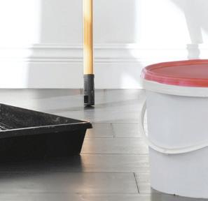
• Collect and assemble all of the tools and supplies you’ll need for the job: paint, stir sticks, drop cloths, brushes, rollers and painting tape.
• Apply a high quality painter’s tape on trim, baseboards, window and doorframes to protect everything you don’t want to get paint on.
• Secure a drop cloth to the floors to protect carpeting, linoleum or hardwood flooring.
Primer is the essential foundation of every paint job. It helps paint to adhere to the surface by making it more “accepting” of the finish coat, it blocks stains and tannins from bleeding through; it penetrates and seals problem substrates; and finally, it improves the color performance and prolongs the durability and smoothness of your paint job.
• It is especially important to use primer when painting new wood or surfaces that have never been painted before, or when repainting a surface that is uneven, stripped, or badly deteriorated (sand it down before priming). Prime the walls if a lighter color is being painted over a darker color. Semi-gloss paints need a coat of primer as they tend to absorb unevenly.
• Match the primer to the job. Tinting your primer first will give you a head start when painting darker colors and will require fewer finish coats.
• Remember that latex-based can’t be used over oil-based paint (alkyd). Ask the experts at Paint Fair for advice on the best primer to use.
• Lastly, be sure to start painting only after the primer has dried completely. Check the paint can’s instructions to find out how long to wait between coats.
PRO TIP: There are 2-in-1 paint and primer products available on the market, but it’s important to note that they work well on alreadypainted surfaces, not never-before-painted surfaces. While they may seem to eliminate a step, 2-in-1 products may require extra coats to give as effective coverage as the traditional primer and paint process. Ask Paint Fair for their advice before purchasing.


Before the first coat, get reliable advice from the experts at Paint Fair


So much goes into creating a beautiful space, but the right paint color can often pack the biggest punch. It’s arguably one of the most impactful decisions made in the design process (and also the most laborious), and we can help make sure your paint project goes off without a hitch. As a paint retailer, we are obsessed with color. We live and breathe it, and we take any opportunity we can to put that passion and knowledge to use, particularly when it helps bring a customer’s vision into reality. We love educating our customers about the nuances of tone, chroma, and everything in between so that you can ensure your chosen shade is around for a long time.

TALK TO THE EXPERTS AT PAINT FAIR TO BOOK YOUR COLOR CONSULTATION TODAY!
Often in situations where space is in short supply, people will automatically gravitate toward crisp whites to make a room feel more open. This is a good, tried-and-true tactic for creating the illusion of expansion, but it also leaves little room for character and personality to shine through. While a nice clean
white is never a bad idea, don’t concede too soon! There are plenty of shades in the color wheel that can have a similar effect without sacrificing the much needed punch that a bold shade can pack, or making it feel like the walls are closing in on you. A few general rules of thumb to keep in mind:
Dark colors won’t always make a room feel more compact. In fact, a darker hue can actually make a space feel bigger by drawing the eye inward. Try using a deep shade of black in your powder room — the darkness can actually be your friend, creating the perception of depth.
Smaller spaces can present the perfect opportunity to experiment with colors outside of your comfort zone. Because smaller spaces are usually more secluded from the rest of the home, you have more freedom to play with the atypical. Choose a brilliant blue in a bedroom to make it feel simultaneously relaxing and exciting.
Neutrals are always a safe bet in smaller spaces, bringing warmth without overwhelming the eye. This is perfect for those that aren’t willing to settle with white and want to incorporate some color, but aren’t ready to commit to anything too bold or bright. This shade is perfect for a smaller-scale living room or sun room.
One of the most important aspects of decorating a smaller space is ensuring there is plenty of contrast. Try a lighter pastel on your walls and pair it with white décor or furniture. The definition will help make the space feel more dynamic, while the lighter tone of the pastel will keep things from feeling too weighed down.
WHEN
Gray is one of those timeless neutrals that never seems to go out of style. Go for one with a lighter tone and a little bit of luminosity in it. The color will fluctuate slightly with the changing natural light throughout the day, keeping you on your toes. This is a great option for a high-traffic areas like a hallway or entryway.
Painting your walls and ceiling the same color give the illusion of a bigger space. Because there is nowhere for the eye to stop, the room will feel more expansive.
If you’re working with a smaller space and want to choose shades that create the illusion of expansion, talk to the experts at Paint Fair.


This September marks a momentous day in the record books for Paint Fair. Five years following Hurricane Dorian’s devastating strike on Grand Bahama, flooding the store, offices and warehouse with a 9.5-foot surge of water, Paint Fair is opening its doors to a new location.
“This is huge for us, and we are so grateful to be home again!” Lesley Davies-Baptista says of the location on Bellevue Lane, just off Queen’s Highway. “It’s an 8,000-square-foot building with a new showroom, new equipment, lots of parking and lots of space to allow for us to get back to our colour shows, back to demos, special events and sales.”
The catastrophic Category 5 Atlantic hurricane, which became the most intense hurricane on record to strike the Bahamas, left many homes and businesses destroyed.
“We immediately recognized that the clean-up, demolition and rebuilding would take far too long (over a year at least) and our customers and our island needed to have supplies to rebuild and our business (and the 11 families it supported) needed to survive!”
Fortunately, thanks to a friend’s help, they were connected with a place to rent and with the commitment and hard work of staff and vendor support, they were open within eight weeks.
While the team at Paint Fair is grateful to have had the temporary location for the past five years, they’ve missed having their own space to do all the things they love: colour & design shows to inspire customers for the holiday season, pro events and training that demonstrate application techniques, best practices, new products and tools. And customer appreciation events that feature fresh baked goods!
“We’re excited about our new home, and getting back to the things we love sharing with our customers and our community,” she adds.
With the new location, customers can expect a new and improved space for all-new colour displays, all-new equipment, all-new product categories, plenty of parking and the same trusted service, expertise and value they have trusted for almost 45 years.
“There is truly no place like home,” Davies-Baptista says. “Despite all the devastation and the incredibly difficult times experienced in Grand Bahama (not just from Dorian but a series of devastating hurricanes from 2004-2019), there is nothing like our community working together, supporting one another to rebuild. It was never a question of if we would rebuild – we always knew we would rebuild. Our Grand Bahama community is supported by vendors, customers and caring folks and organizations from around the world. We are #grandbahamastrong and five years later, we are HOME!”

Unfortunately, our founder and greatest innovator, champion and supporter, Joan Doreen Davies, passed away on December 30, 2023, just shy of seeing Paint Fair’s return home. She did, however, make her way through the building in November 2023, prior to the purchase. As always, she could see the potential and believed in our team and our community, knowing it would be a success. This building – and all that is done here – will be thanks to God and in loving memory of Joan Davies, an original Devoe independent dealer, who always believed that when it was worth doing, it was worth doing right.

Pull together the perfect color scheme with this timeless formula
Shhh! We’ll let you in on the little secret behind those swoon-worthy rooms as seen on TV, magazines and décor websites. It’s as simple as 1-2-3, or more accurately, 60-30-10.
The reason your favorite spaces look so elegantly harmonized is that they are professionally pulled together using the 60-30-10 rule of design. The color scheme has been divided into percentages: 60 per cent is the room’s main color, 30 per cent is the secondary color and 10 per cent is the accent color.
Let’s look at it another way. The 60-30-10 rule is like a well-tailored business suit; 60 per cent of the ensemble’s color comes from the jacket and pants; 30 per cent is the dress shirt; and the final 10 per cent is the jazzy necktie that gives it that certain little je ne sais quoi. If you understand the rule, then you’ll understand the principle behind decorating any room. It will also help you to collaborate and communicate with your interior designer to create the look you want.
60/THE MAIN COLOR: In a living room, this would include the walls and perhaps an anchor piece of furniture like a large sofa. This unifying color is the foundation for the room and it serves as a backdrop for what else will come into the space.
30/THE SECONDARY COLOR: In general, this color appears half as much as the main color. Think window draperies, accent chairs, painted furniture, lighting, linens or perhaps a single accent wall. The secondary color’s job is to support the main color in a complementary way and yet, look different enough to set it apart and create interest.
10/THE ACCENT COLOR: This is where the real fun comes in. You’ll likely find the accent color from artwork in the room or from a large fabric print, such as an area rug, and use it to choose throw pillows and other decorative accessories. Remember, a few bold choices can have a big impact.
Can you break the tried and true 60-30-10 rule? Why, of course. There are ways to break the rule and still strike a balance by going 6030-5-5 or even 30-30-20-20, you rebel, you! You can also play with a monochromatic color scheme, applying the 60-30-10 rule to varying shades of the same color.
While some rules are made to be broken, keep in mind that they are also helpful when we need a bit of direction. That’s certainly true in decorating. If you’re unsure about introducing bold hues or striking balance in your space, the 60-30-10 rule is definitely the key to color confidence.
PAINT FAIR CAN WORK WITH YOU TO CHOOSE A 60-30-10 RATIO THAT WILL BRIGHTEN AND BALANCE YOUR ROOM USING CLASSIC AND CONTEMPORARY COLORS.

Bring in the holiday season and make ‘em say ‘wow!’
Paint Fair’s tips for transforming your home for the holidays. During the holiday season, all it takes is a stroke of colour to add a dose of Christmas spirit to your design scheme. Consider sprucing up your space with a bold berry red, sophisticated spruce green or going all-white this winter. Whether you like to stick to the holiday standards or celebrate by adding colour outside the lines, we’ve got ideas for every area - no checking twice required.
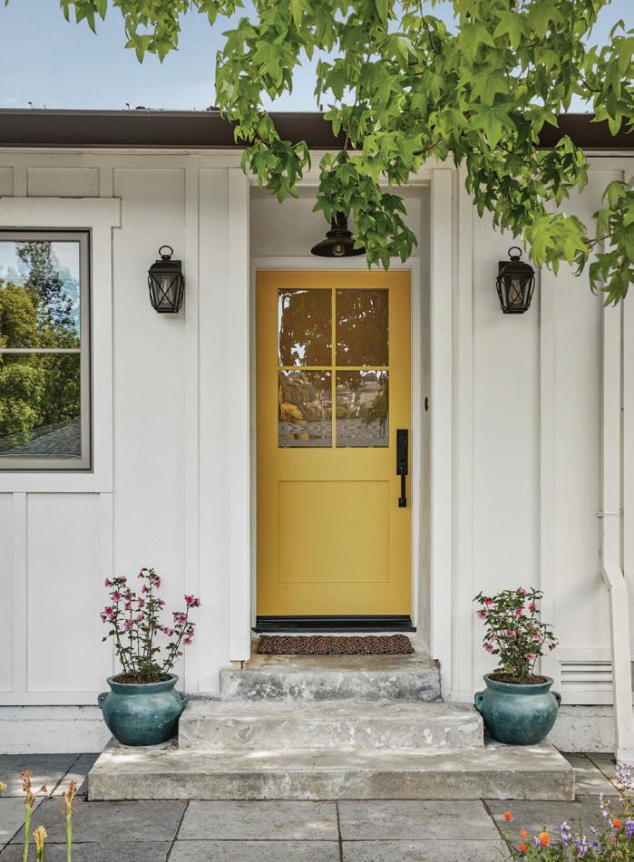
1. MAKE A GREAT FIRST IMPRESSION! You don’t get a second chance to make a first impression, so make it count! Selecting a new and fabulous shade for your front door is an easy and inexpensive way to add curb appeal and make a big statement. Consider a colour that will complement your holiday wreath!
2. DRESS UP! The hot holiday party isn’t the only time you can throw on a velvety jewel tone or wear a fun new colour combination. Consider invigorating your space with your favourite shade of the season. Paint it on an accent wall or armoire in need of an upcycle.
3. DON’T FORGET THE BASICS! You wouldn’t pair that new outfit with old shoes and accessories, would you? Freshen up your baseboards, trim and doors to make the look come together.
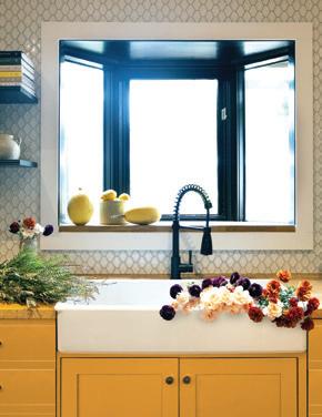
4. A HOLIDAY SURPRISE! A powder room is a great place to feature the unexpected. Check out the peel & stick wallpaper now in stock at Paint Fair and coordinate it with another bold shade to play up a small space for the holidays.
5. SPRUCE UP YOUR SEASONAL DECOR! No need to upgrade your tree trimmings or holiday decor. Simply select three seasonal colors and update the canvas around it! A ravishing red, deep evergreen and a universal neutral can take your decor from blah to brilliant!
Want more ideas? Don’t miss our Colour & Design Show! Get great tips and inspiration from the PPG colour experts.
Colour & Design Show for architects, designers & contractors Tuesday, October 29
Colour & Design Show for homeowners and design DIYers Wednesday, October 30
See our website for more info and to sign up: WWW.PAINTFAIR.NET
Entirely removable and incredibly impactful, peel and stick wallpaper is considered by the pros as a no-brainer for people looking to elevate their space without the commitment (and labor) involved in traditional wallpaper. Whether you’re looking for a renter-friendly hack to personalize your apartment or hoping to test the waters with a bold pattern with the freedom to switch it up, peel and stick might just be the perfect solution. Here’s everything you need to know before you bring it into your home:
EASE OF APPLICATION: Traditional wallpapers typically require a fair amount of effort in adhering them to the surface. A typical application will involve wetting the pasted backing and carefully lining up any patterns to ensure accurate placement, while the removal process can be even more labor intensive. Peel and stick is a great option for renters or homeowners looking to save time.
VARIETY: Peel and stick wallpaper affords you the freedom to change up your interior style frequently without the commitment involved in traditional wallpaper. If you value variety and don’t mind a little DIY, peel and stick could enable seasonal shifts to keep things fresh.
RENTER-FRIENDLY: Gone are the days when you’d have to choose between personalizing your space and keeping your damage deposit. Peel and stick ensures you can have the best of both worlds.
AFFORDABILITY: Though the options for peel and stick wallpapers tend to vary greatly among brands, they are generally considered more cost-effective, especially since they don’t require the hiring of a professional for the installation or a removal, even for beginner DIY-ers.
FUN FACT: Peel and stick is a little known secret amongst home stagers who want to demonstrate a home’s potential or show off a particular look until a sale goes through.
1. DETERMINE THE AMOUNT: Use your tape measure to calculate the surface area that needs to be covered. Order a little extra to be safe!
2. PREP YOUR SURFACE: Remove flat plates and outlet covers (turn off the power first if a screwdriver is required!), use a mild cleaner and cloth and allow a day to let the surface fully dry before starting.
3. MARK IT OUT: Using a pencil, identify where each panel of peel and stick will end and the next will begin so you can remove the guesswork during application and ensure everything lines up perfectly. Use a level to draw a straight vertical line from the bottom of the wall to the ceiling (or wherever your desired surface area ends).
4. CUT & PASTE YOUR PEEL & STICK: Begin cutting your strips along the markings, removing about a foot of the backing and adhering the corner to the top corner of the wall. As you remove the remainder of the backing, align it with the markings on the wall, pressing and smoothing as you go.
5. REPEAT: Repeat this process with the rest of your peel and stick, ensuring any patterns or images are lined up.
• Leave a bit of an overhang at the ceiling and baseboard. Trim after application is complete.
• Air bubbles can be flattened by poking a small hole and smoothing after the application is complete.
• Though peel and stick is designed to adhere with minimal effort, it will stick best to walls with eggshell, semi-gloss or satin finishes.
PEEL AND STICK WALLPAPER LIBRARY AND GET ALL THE TOOLS AND GUIDANCE YOU NEED.
From the broadest selection of paint and coatings to an unprecedented level of specialized and certified service, at Paint Fair, you can see the di erence experience makes.
A CORNERSTONE IN THE COMMUNITY: Paint Fair was started by Colin and Joan Davies in 1980, when Colin found he couldn’t get the paint and supplies for his contractor jobs. Joan continued to operate Paint Fair for decades, making sure the team put customers and community first, and believing that when it’s worth doing, it’s worth doing right.
DECADES OF EXPERIENCE: We have years of experience providing residential, commercial, industrial and specialty products to our customers, along with serious solutions to every paint issue under the sun. In need of hurricane resistant products? Advice on a leaky roof, mold or cracking/ peeling? Our team has the answers!
INDUSTRY EXPERTISE: Our customer service representatives are certified paint coating specialists, having completed both independent training and PDRA Paint 101 (with 80% or higher), and experts in the products, preparation and applications of our offerings.
CUSTOMER SERVICE FOCUSED: We are committed to helping you get the look you love and one that will last! At Paint Fair, we provide project support and on-site help so that you can get the advice you need, whether it be the right preparation (prep, prep and more prep – that’s where most issues occur!) or the best and broadest range of products on the island for the project.
Paint Fair offers free colour consultations for your home or business!
Come to us for colour advice – we have decades of experience providing colour support and the latest colour matching expertise in the industry.
OUR STORE FLOOR CREW WEIGHS IN ON THE TOP PRODUCTS AT PAINT FAIR
Residential: Advantage
“I love PPG’s Advantage - it covers well, is bright white and brushes on smoothly while still drying fast. It acts like an oil but cleans up with water!”
- Antoine
Commercial: MasterWall Coatings
“I love MasterWall finish for homes or business exteriors! Customers love that it is low maintenance, gives a flawless finish, has a 10–15year colour retention AND great new competitive pricing. - Taneko
Industrial: NACE Certified Inspector
“Experience and training always matters, but especially for industrial products. We not only sell a wide range of marine and protective coatings for the toughest industries or jobs, but we also custom tint it here and can provide specifications and on-site inspections and support.” - Eric
Specialty Products: Acrylabs Roof Coatings
“I think Acrylabs is one of the best products for Grand Bahamian homes and business. It is hurricane-tested and a proven, renewable solution for leaking roofs and it is easy to apply on most roof substrates. It gives you a wind and watertight roof, protecting your most important assets!”
- Gavin
Colour Consults: A Voice of Colour
“We provide colour consultations and support for both residential and commercial projects… And our VOICE OF COLOUR interactive display is BACK in store! Swipe your way through thousands of options on a large screen for a look you’ll love!” - Charlene


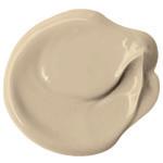
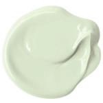
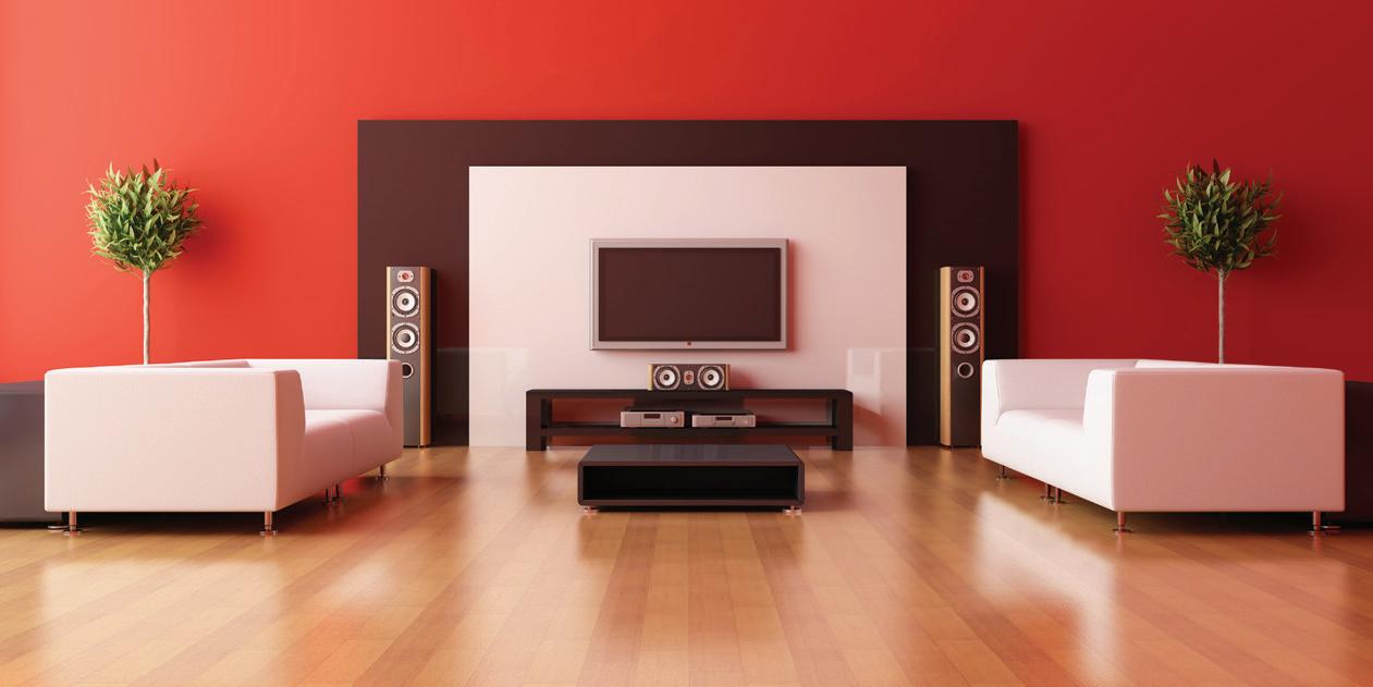
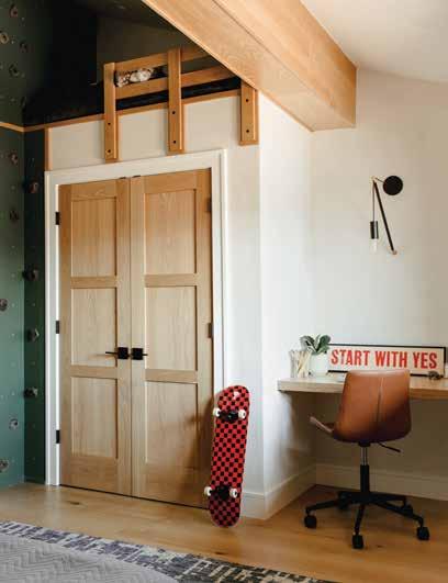
Invite nature inside with a color that captures the mossy green of a Bonsai tree. This earthy shade is energetic enough to inspire an adventure yet calm and cozy, drawing feelings of comfort and confidence. Add this hue to the board and batten in a boy’s bedroom, paint it on a piece of furniture for a pop of color and pair it with other warm woods, crisp whites and matte black.
Travel to the deep waters of the Mediterranean with this rich teal blue tone. Splash this shade on an outdated vanity, dining room walls or ceiling and take the space from bland to beautiful. Aside from upcycling and providing additional storage, this bold blue vanity grounds the room and permeates the small space with plenty of pop. Take a cue from Misty Molloy, CoCreative Interiors, and pull a dark aquamarine accent out of a fun peel and stick wallpaper.
Shop these stunning PPG Paints colors, from the homes featured in this issue at Paint Fair. The friendly staff will help you get all the right tools to help with your project.


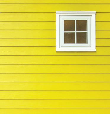
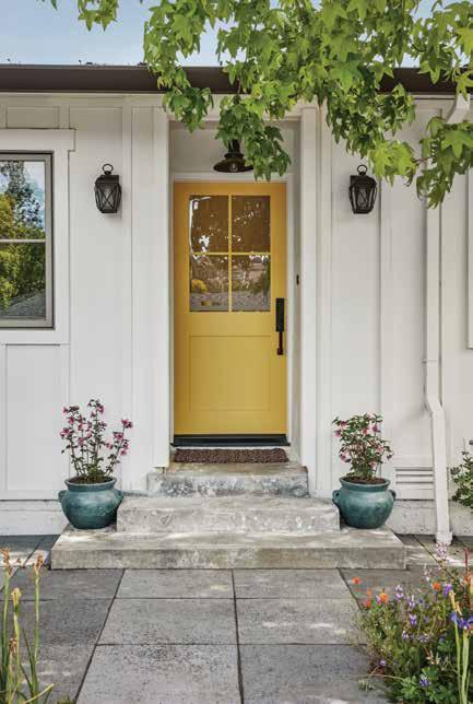
Add personality – and a splash of sunshine – to any space in or out of your home with this happy hue. Yellow adds an unparalleled brightness and pick-me-up and can be used in many areas in your abode. Pale, buttery tones are perfect for nurseries, while cheerful golden shades are ideal for porches, laundry rooms and front doors.


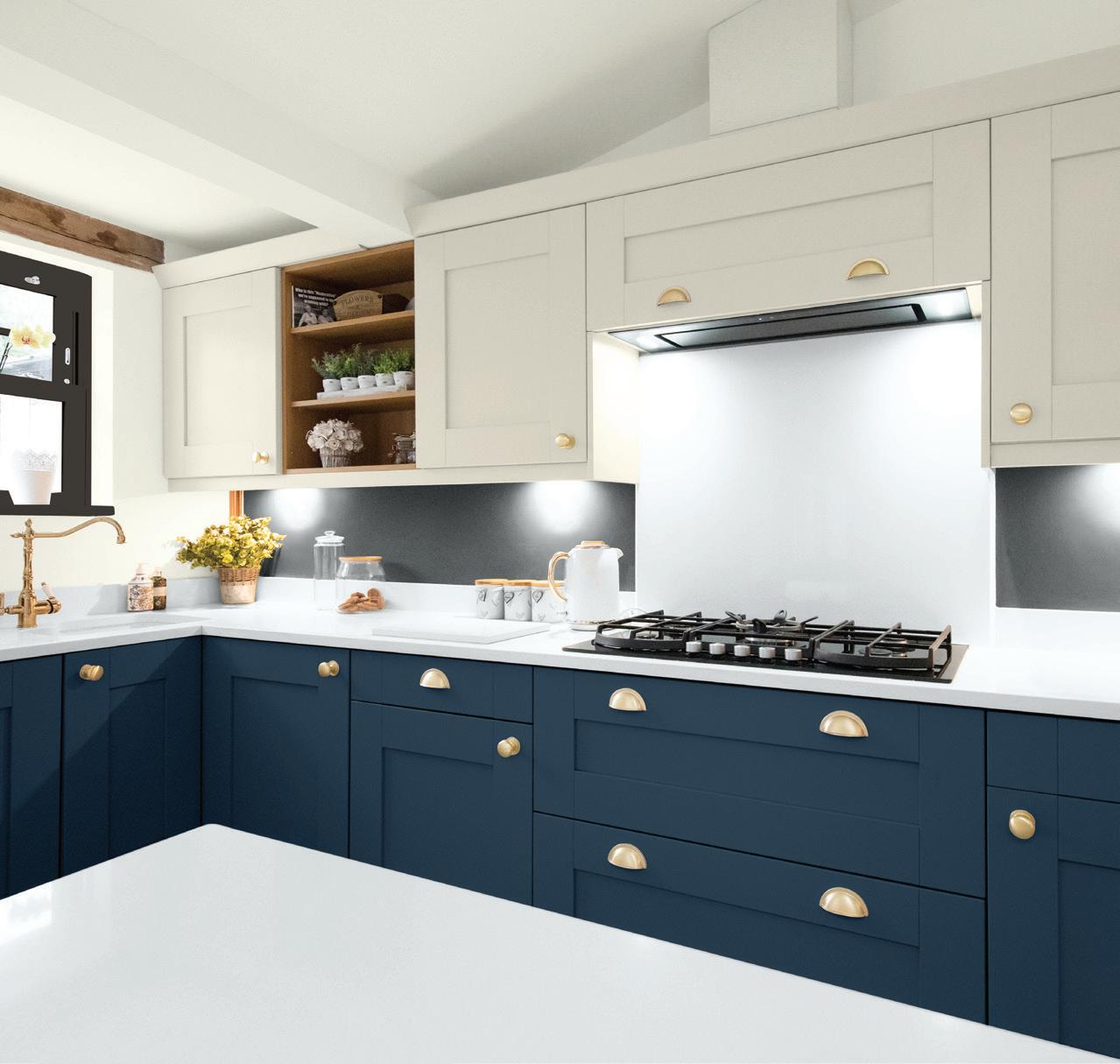
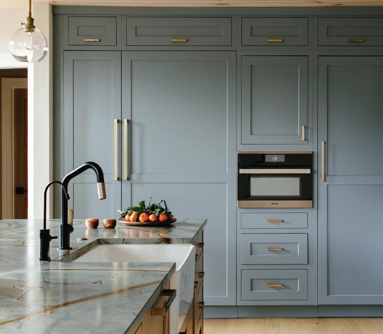
According to Laura Medicus from Laura Medicus Design, the shade coated on this kitchen cabinetry “is an excellent blue with enough gray in it to give it some sophistication [while maintaining] enough light reflectivity that it’s still a playful color.” Drench kitchen cabinets in the elegant color or use it as a complementary shade in more contemporary spaces. This timeless hue effortlessly transcends a range of styles and sensibilities.

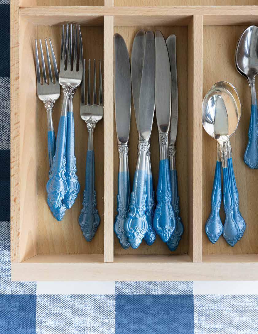
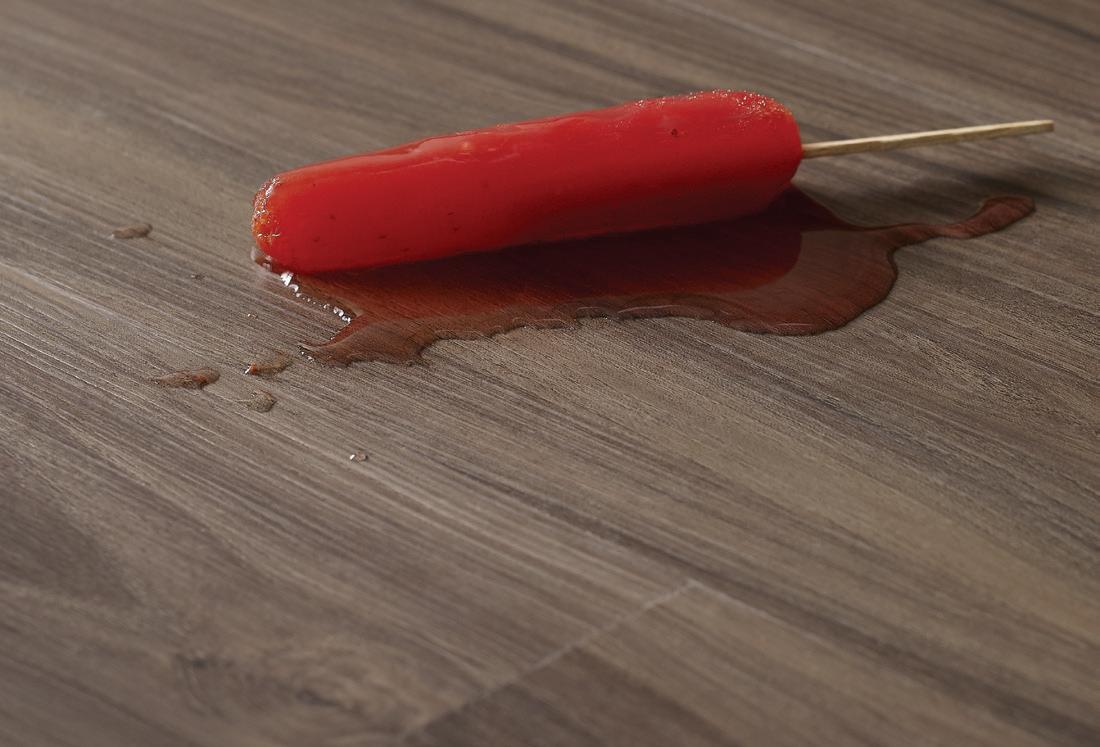
TRANSFORM MISMATCHED, OUT-OF-USE CUTLERY INTO AN UNEXPECTED BUT DELIGHTFUL SET PERFECT FOR YOUR NEXT DINNER PARTY.
A creative mind knows that beauty is often only a few coats of paint away—even for some of the most unexpected of subjects. This season, we’re turning our attention towards the overlooked and underused items in our kitchen drawers for an upcycle: mismatched silverware. Equipped with a fresh, coordinating pop of color, the idiosyncrasies in design, shape or detail that used to feel kitschy and dated suddenly feel intentional and charming—a win that’s good for your hosting chops and the planet.
STEP ONE:
Dip cutlery handles into Plasti Dip rubber coating in your selected shade, following package instructions. Feel free to eyeball this, or mark off your silverware stems with tape for added precision.
STEP TWO :
Hang to dry with the silver side up—you can use bulldog clips or painter’s tape—from a clothesline or hook.
STEP THREE:
Allow four hours of drying time for the coating to set.
STEP FOUR:
Apply a second coat and repeat the drying process.

we amped up the look of Plasti Dip blue with a spray coat of the brand’s Pearlizer to add a lovely luster effect.

The equivalent of the fashion world's red sock peeking out below blue jeans, a drawer lined with an unexpected pop of pattern is a delightful surprise. Whether it adds a touch of coastal charm in a rustic kitchen or a hint of tranquil elegance in a bedroom, a patterned drawer liner brings unexpected joy to any space.


olly Clarke was always destined to lead a creative life. Growing up as a child in the '80s, she watched her mother immerse herself in the joy of crafting, from woodcarving to photography and everything in between, while her father owned an architectural firm. The idea that her own two hands could bring beauty and utility into this world was ingrained in her from a young age. But her love of quilting and the success that would follow wasn’t discovered until 2017, after pursuing multiple varied (and successful) entrepreneurial endeavors and creative passions.
“I realized I could combine my love of sewing and fabric with my background in design. I became totally obsessed and haven’t stopped making quilts ever since,” shares Clarke.
Today, she’s designed dozens of quilt patterns, sold as digital PDFs to other quilters, from seasoned professionals to beginners at home. She also has a slew of impressive partnerships under her belt, including collaborations with Riley Blake Designs, PBS Fabrics, Camelot Fabrics, FIGO Fabrics and a brand ambassador deal with PFAFF sewing machines.
Although the specific medium of quilting didn’t occur to her until recently, Clarke has been sewing since the '90s, a time she devoted to studying fine arts and graphic design at the University of Manitoba and launching her first business to help fund her education: Trendy Hats. After she had her first child, she channeled those sewing skills into the creation of a successful handmade baby line called Small Potatoes, which she operated while navigating a 20-year graphic design career, first in the advertising industry, and then, after 2013, working for her own graphic design freelance agency, Waterloo Design House. This theme pervades throughout the story of Clarke’s life: the discovery of a passion and the impulse to share it with the world. A true creative fire that was the driving force behind her latest venture: Holly Clarke Design, a company dedicated to sharing the craft of quilting with the masses.
Clarke’s quilting designs are defined by a love of color and pattern, influenced heavily by her experiences both personally and professionally.
“I am inspired by the world around me, from shapes in nature and architecture, to bold visual graphics I see in various pop culture media. My design aesthetic is heavily influenced by being a child of the ‘80s; my parents’ home furnished with mid-century modern furniture, my mother’s love of Scandinavian textiles, my Sanrio toy collection, Saturday morning cartoons, Archie comics and record album artwork.”
Just as her past colors the aesthetic qualities of her designs, her training and experience as a graphic designer permeate her patterns, with a discernible eye for scale, geometry and balance intact. But like most great art, Clarke’s patterns begin with an idea for a quilt she wants to create. Utilizing Adobe Illustrator software, she uses digital “fabric swatches” to plan materials and determine measurements. Aware of quilting’s reputation as somewhat old-fashioned, Clarke works hard to ensure the patterns she sells online are both accessible and exciting, doing the work to bring an age-old tradition into the 21st century. She describes a great quilt pattern as one marked by choice and made with multiple skill levels in mind. Her patterns are always accompanied with a generous array of diagrams, photos and suggested color palettes. “This helps the audience envision options for their own finished quilt.”
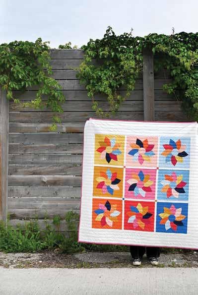
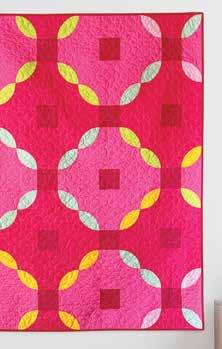
#dresdenswirlquilt
#avantgardenquilt
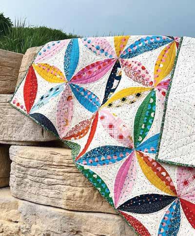
Leveraging the power of social media, Clarke also likes to include a custom Instagram hashtag for each pattern so that quilters can view the work of other creators in the community.
For the uninitiated, the process of quilting (once a pattern has been selected) begins with material selection. Once the fabrics have been established, the quilter will cut and iron fabric using special quilting tools like a self-healing mat, rotary cutters and acrylic rulers, which help accommodate the diverse range of block patterns available today. The next phase is known as “piecing,” where the quilter sews together their various blocks of fabric, finishing with an iron for a flat, polished surface, and marking the completion of the “quilt top,” the most substantial design element. From there, the top quilt is combined with a middle layer of batting for coziness and a flat quilt backing to serve as the bottom layer— these three layers are basted together using adhesive spray or an abundance of safety pins to prevent shifting.
Quilters today have the luxury of relying on a sewing machine, which, Clarke cautions, requires lots of practice to achieve good results, but is certainly the most efficient methodology. The other more traditional (and time-consuming) option is to hand-quilt, which produces exceptional texture. Of course, there are many in the quilting community that relish the therapeutic process of hand-quilting and prefer it regardless of the time involved. On the other end of the spectrum, some quilters prefer to send their quilt tops to a professional longarm quilter, which will do the heavy lifting for you in consultation with the quilting design, thread color and scale. Excluding the time used for design, a typical quilt will take Clarke about two to three weeks to complete, with a few hours dedicated in the evenings and weekends.
Whether enlisting the help of a longarm quilter or doing the handiwork yourself, quilting is an undeniably time-consuming task. But it’s a labor of love—the kind of hands-on work that we could all use more of in our increasingly digitized lives.
“It is easy to forget what goes into the production of the goods we use on a daily basis until we step back and take the time to make something ourselves. I think that creating something tangible with your hands gives you a great sense of accomplishment but also an appreciation for what goes into the items we see on store shelves.”
While Clarke’s creativity was a birth rite, her determination and work ethic were earned. That she has the space and stamina to maintain all these different mediums is a truly remarkable feat. She characterizes herself as a “very busy entrepreneur who wears many hats”—to which we say, it’s a good thing she makes those too!
You can follow Holly Clarke on social media @holdmyseamripper on Instagram or browse her impressive catalogue of patterns at hollyclarkedesigns.com
Discover how the quilting community has brought Clarke’s patterns to life with the dedicated hashtags for quilts featured in this article.
L ay e r e d
SH ADE S N E W C O RDL ES S U LT RA L I TE L I F T
Virtually Weightles s & P erfe c tly Preci s e
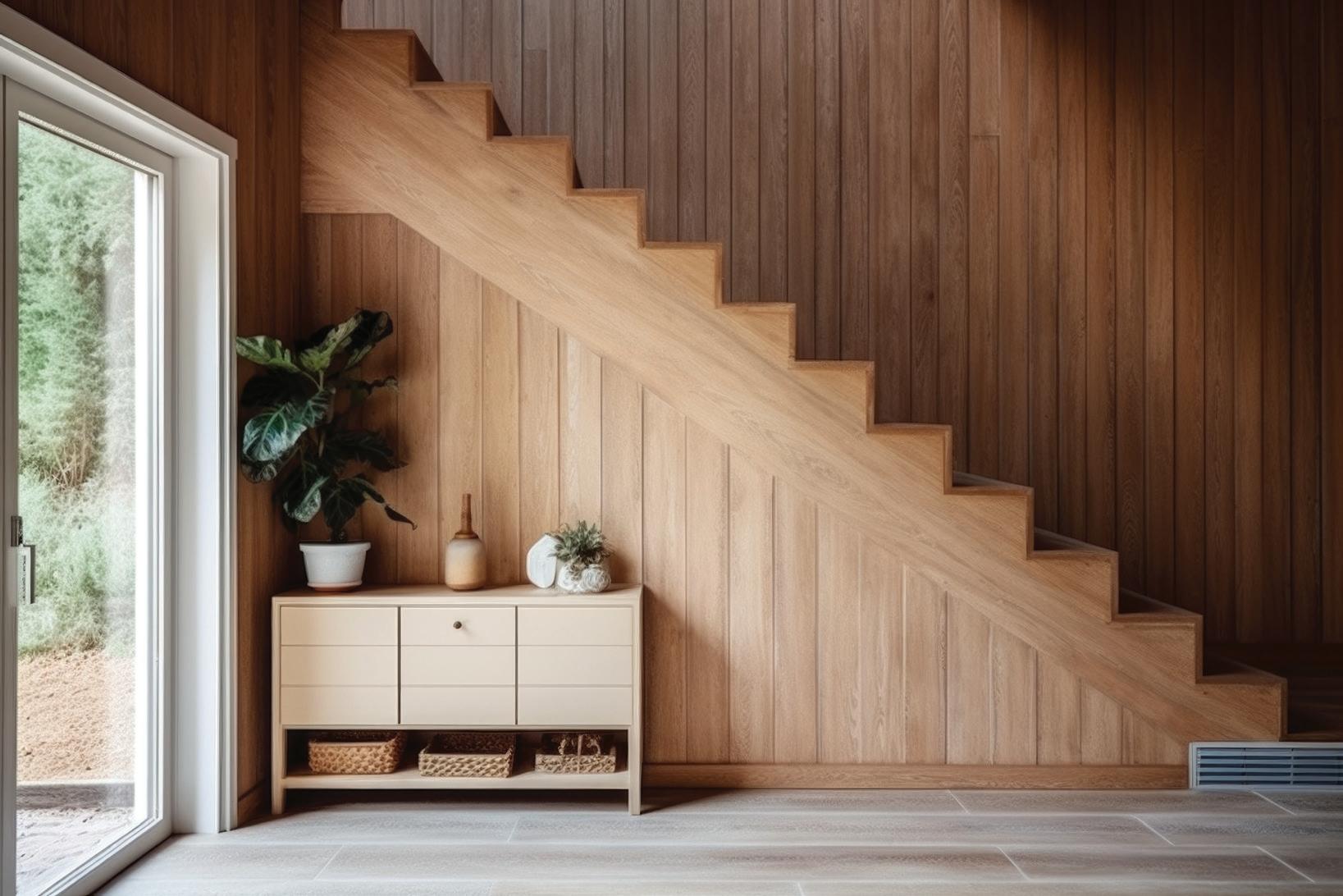
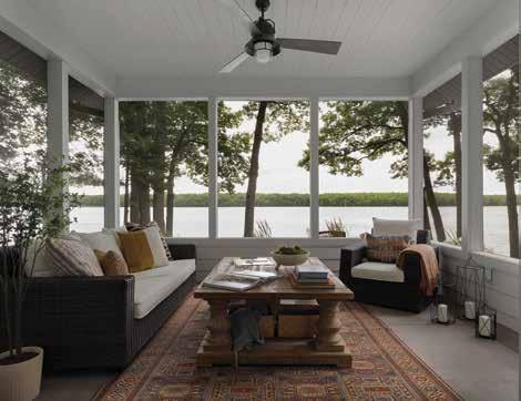
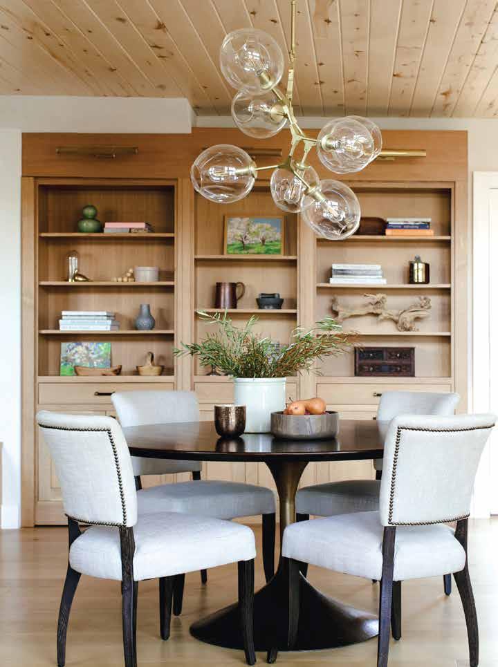
Design: O’Hara Interiors | Photography: Spacecrafting Photography | Text: Twila Driedger
Design: O’Hara Interiors | Photography: Spacecrafting Photography | Text: Twila Driedger
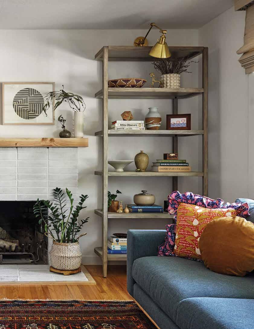
Durable materials, meaningful details and heirloom furniture are carefully curated to add a personal touch and charming character to this new lakeside build.
materials, details and heirloom furniture are curated to add a personal touch charming to this new lakeside build.
Sometimes something new can be a wonderful thing. That new car smell, the first time you wear a crisp white shirt or the excitement of a budding relationship.
But sometimes when something is new, it also lacks history and nostalgia. Which is why O’Hara Interiors’ client requested that the firm design a brand-new summer house that felt lived in and loved.
“The client reached out to us and our CEO, Kate O’Hara, passed me the lead,” explains Krystal Kellerman, senior designer at O’Hara Interiors. “The style that she was looking for was so fitting for all the things that I love.”
After one conversation, Kellerman and interior designer Taylor Allsup, also of O’Hara Interiors, hit it off with the client. A husband-wife duo, the homeowners were retired and living in Florida, but regularly traveled to the lake in northern Wisconsin to spend time with their adult children and grandchildren. Having owned the pristine piece of property for years, the client was finally ready to tear down the old family cabin and build their dream lake retreat.
“She wasn’t interested in a traditional blue and white lake house. She wanted it to feel whimsical and incorporate vintage elements,” says Kellerman, adding that embarking on a new build and ensuring it exuded history and warmth was no small feat, but that she was passionate about the possibilities. “That aligned with my own style preferences, so it was wonderful to work on a home with so much character.”
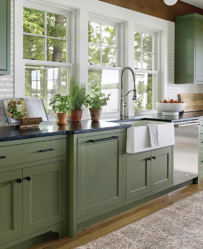
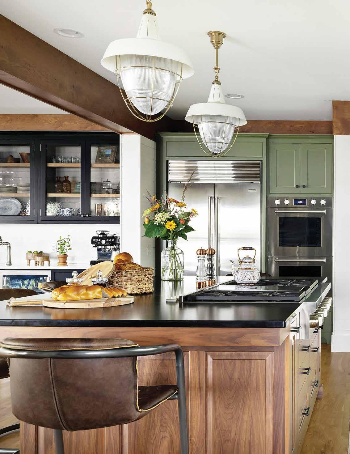
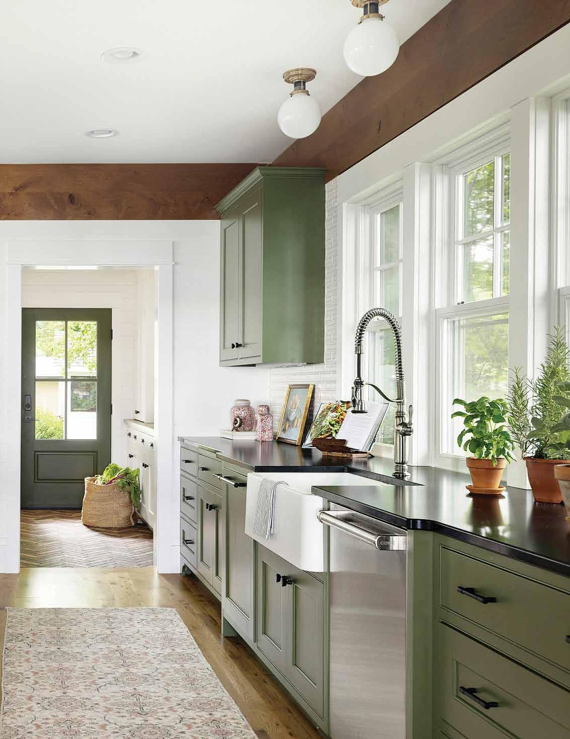
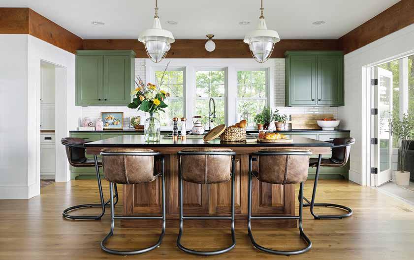
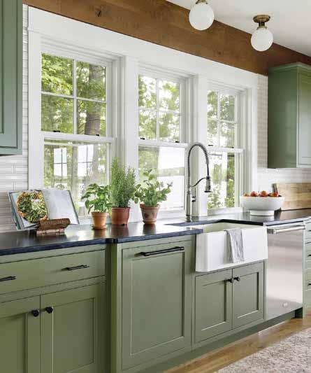
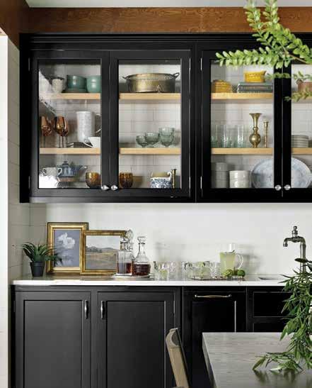
Doing dishes doesn’t feel like a bore when they’re washed in a big farmhouse sink while taking in the green grandeur just outside the bank of kitchen windows.
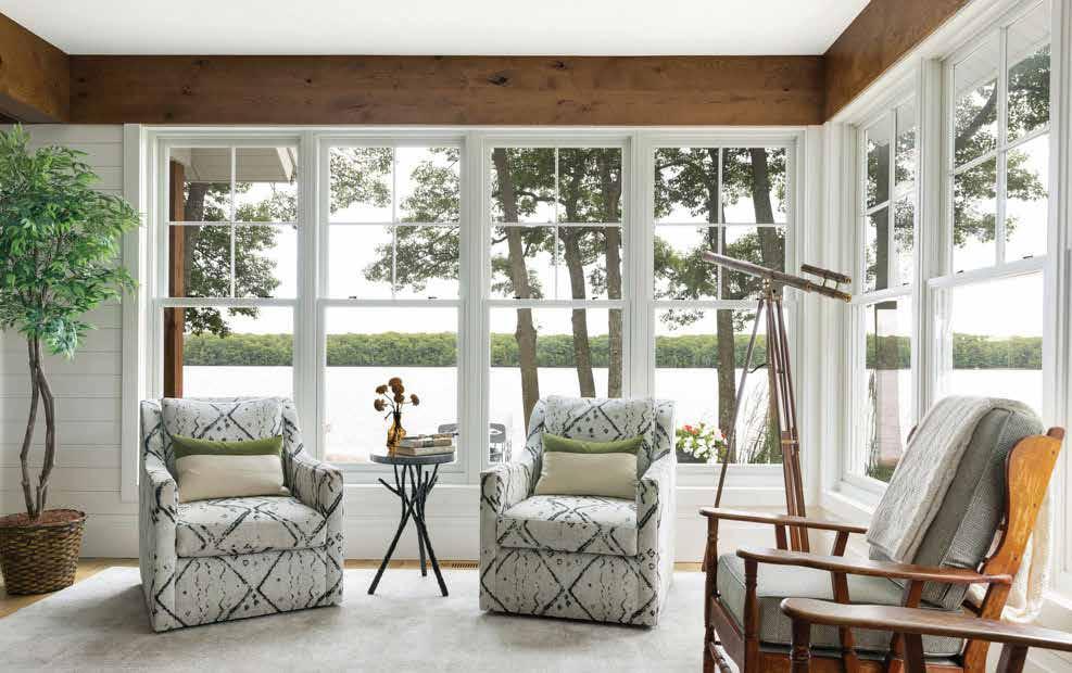
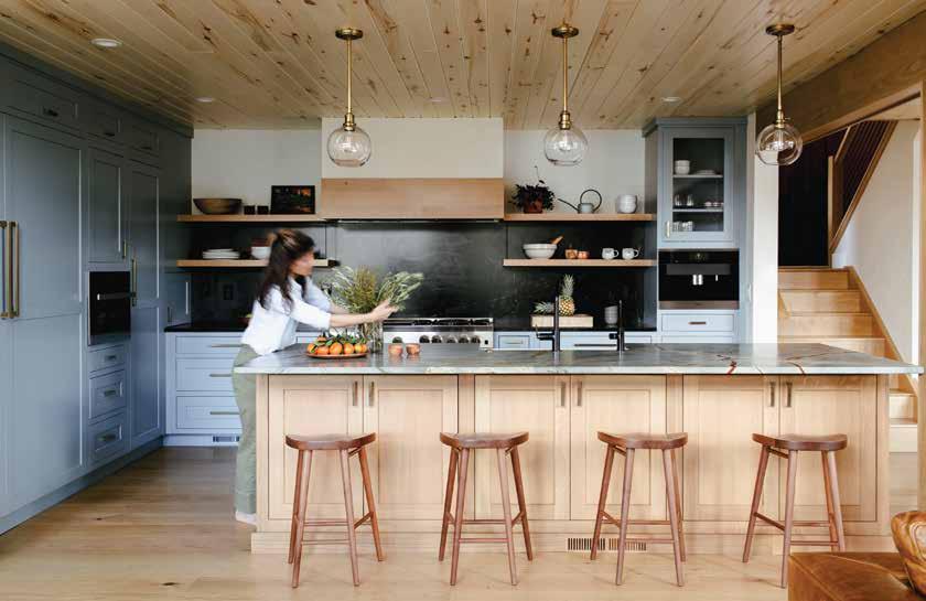
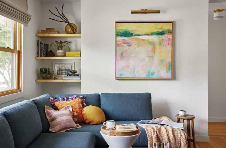
The lake house’s open floor plan was a perfect canvas for the design team’s creativity, and they took every opportunity to pay homage to the lush landscape, viewed on all sides through the build’s big windows. The home is bursting with earth tones, gorgeous greens and warm woods.
As entrepreneurs who started a college catering business and love to host friends and family for meals, the kitchen was an especially important space for them.
“Taylor and I were inspired by green because that deep woodsy hue paired well with the kitchen’s wood elements and felt natural in the space and surroundings of the home,”
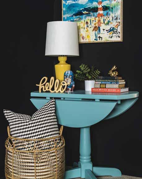
Kellerman tells, adding that the design team selected a mossy green for the shaker cabinets, higher industrial-style light fixtures to ensure optimal lake views and low counter stools made with vintage leather. The charm is accentuated with a farmhouse sink, subway tile and white shiplap walls. “It felt so warm, welcoming and cozy.”
To add visual contrast and a transitional zone between the kitchen and living areas, dark ebony-stained cabinetry was chosen for the bar and serving area.
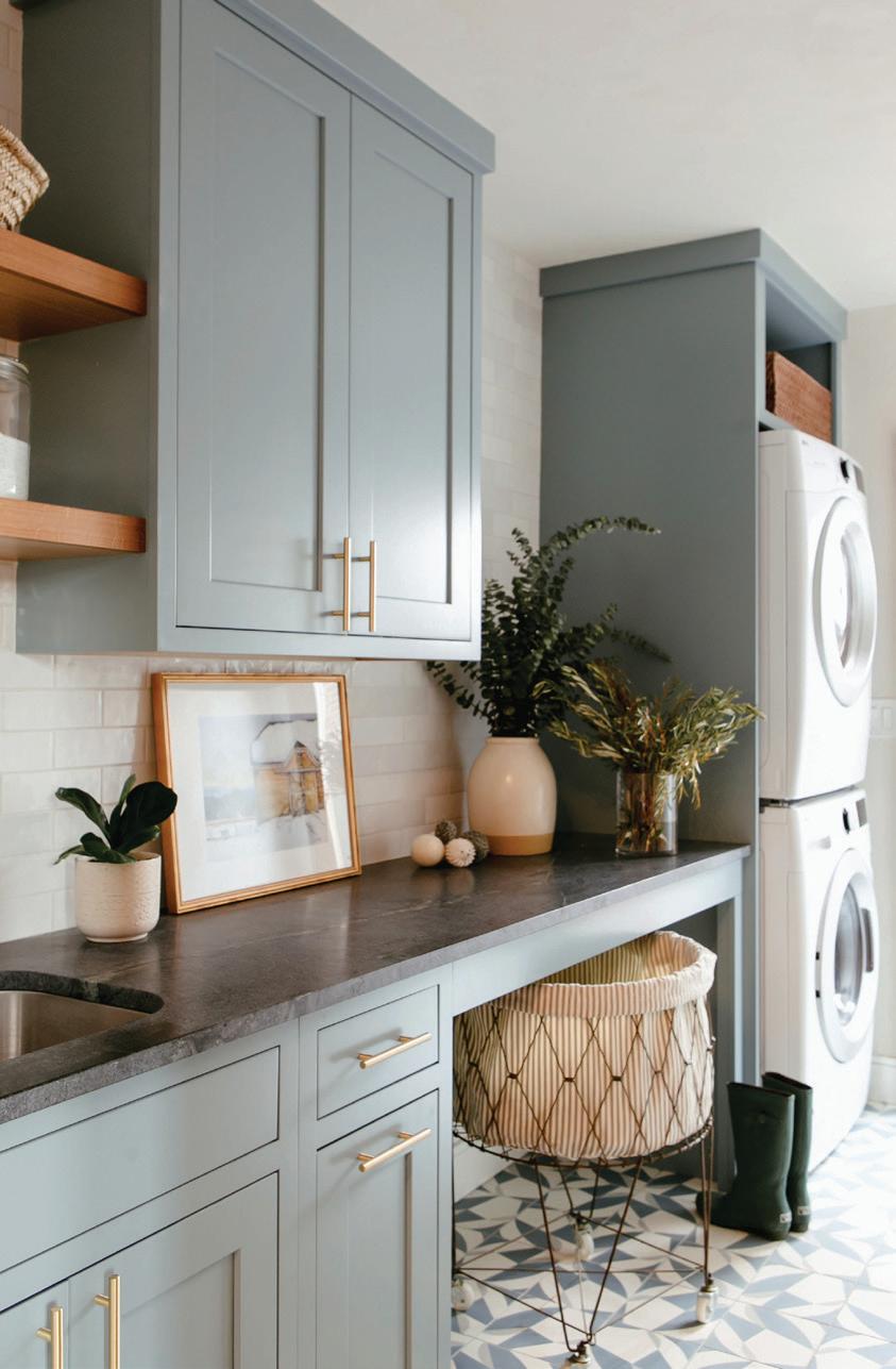
“The client was open to bold color but didn’t have specific shades in mind at the start,” she says. “[In] the laundry room, I picked out an aged yellow color because it felt fun, different and most importantly, happy. The client wanted the home to feel older, despite it being a new build, and this yellow was one of the colors that fit her desire for bold color, but a vintage feel.”
The earthy honey hue invokes sunshine and a cheerfulness, lifting spirits while doing an everyday task.
In the bathrooms, Kellerman continued the bold brigade, selecting chartreuse cabinetry and blue tile in one, while going with navy in another. According to the designer, the warm colors break up the cool white shiplap in the rest of the home and along with vintage elements, create a rich space with touches of whimsy.
“I think the use of color especially reflects that,” she says. “The mustard yellow in the laundry room, the blue and white tile in the upstairs bath, the powder bathroom’s antique dresser are sprinkled throughout so the home feels warm and bright, while still feeling lived in and unique.”
According to Kellerman, at the beginning of the project, the client shared the heirloom pieces she had inherited from her family and expressed how important it was to see them in the new home. “So, we planned to incorporate pieces like a cabinet and bookcases from the very beginning of the project, before many other design decisions were made.”
While many furnishings are invaluable heirlooms, plenty of pieces are practical, yet stylish. Between the husband, an avid fisherman, the wife, a retired caterer, and their gaggle of grandchildren, the homeowners expect the abode to see plenty of wear and tear over the years. With that in mind, the design team focused on using materials that would stand the test of time.
“We had to logically think through how each space functioned and make sure the materials and furnishes were cleanable and durable,” says Kellerman.
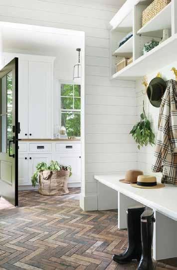
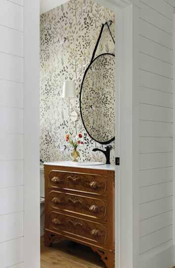
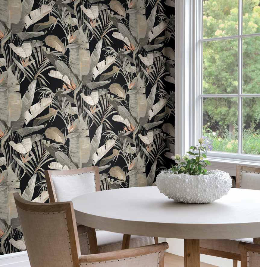
Warm hardwoods flow throughout the main floor area and tie in the rustic wood beams and collected accessories. In high traffic areas, such as the laundry room and entrance, tiles are laid in a herringbone pattern. And in the powder room, a pretty wallpaper pulls all the colors - natural shades of greens and creams - together while not stealing the spotlight from the star of the show: a marble-top vanity passed down from the homeowner’s grandmother.
“I never want a home to feel repetitive or to look too new. So, in this home, our design choices when it came to the wallpaper, wood beams and floors, are examples of mixing different elements to always give the eye something interesting to look at,” Kellerman explains. “I also love mixing old and new styles to give texture and variation to each room and the client’s vintage furnishings were a great opportunity to do just that. The result is a home with curated character that is totally unique to this client but fits well with the lakeside location.”
With the old cabin gone and a new one in its place, the couple and their extended family can usher in a new era of memories, complete with cooking, fishing, swimming and lots of lakeside laughs.
“The client stays here in the spring and summer and often hosts friends and family, cooks together in the kitchen and plays board games together at the kitchen table.”


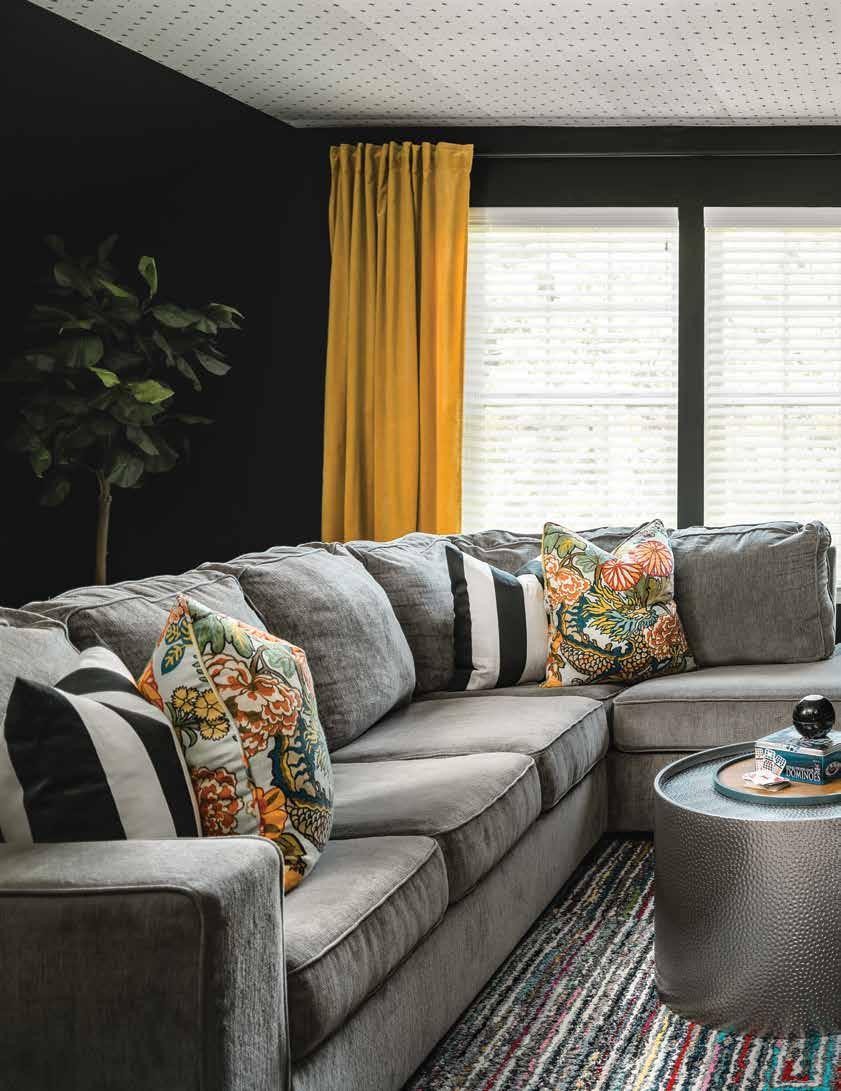
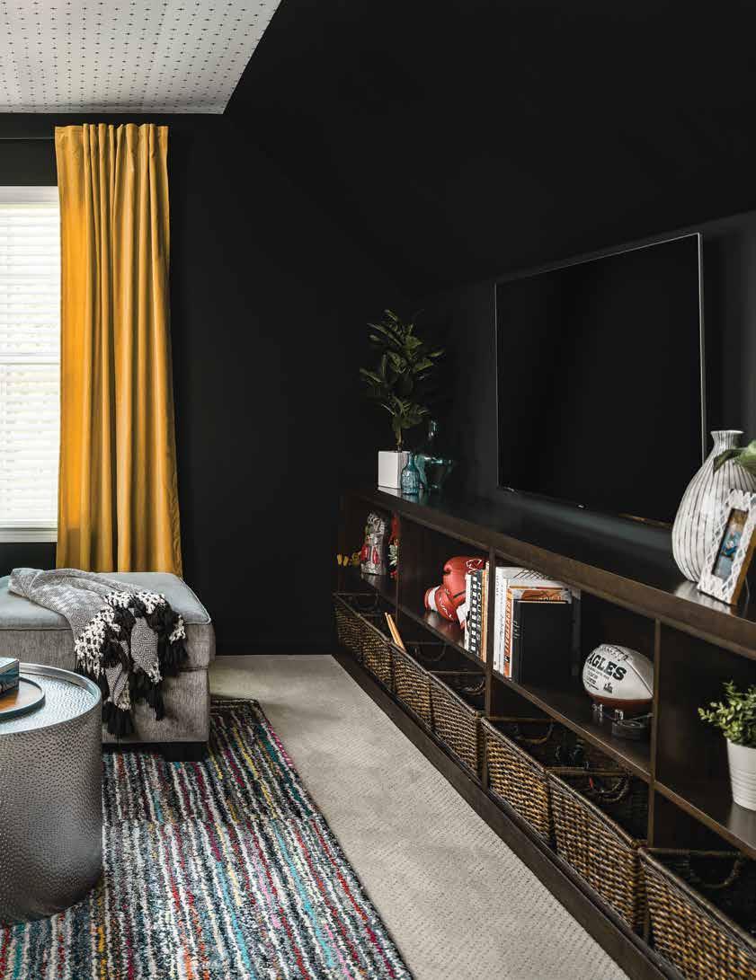
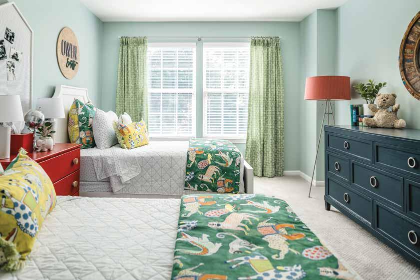
A self-described “designer at heart” leaves her job in the corporate world to foray into full-time design, bringing plenty of fun and function and her signature dose of “zhuzh”.
Earlier this year, Misty Molloy left the corporate world to pursue her passion project - CoCreative Interiors.
“I've always been a designer at heart,” Molloy says. “I just took a bit of a different path to get here, but everything always works out as it should.”
That it does. Molloy’s 20 years working in an office set the stage for following her dreams and owning her own design business. “There’s so much project management and everything else that goes into design that having the foundation of the corporate background has been super helpful in terms of delivering design.”
With business-savvy smarts and an eye for interiors, Molloy and her new business are poised for success. Anyone who has stepped inside her home can see her colorful style on display – something her family, especially her two sons, have benefitted from.
Recently, when Molloy’s sons hit double digits, she knew it was time to update their living areas.
“They needed more space of their own,” Molloy explains. “They've gotten out of that stage of wanting to be in the family room 24/7. And they also wanted to share a bedroom.”
So, Molloy embarked on a redesign of three rooms for brothers who are best friends: the family entertainment room, a shared bathroom and their bedroom.
Before getting started, Molloy sat down with her clients to ensure they were on the same page when it came to the design.
“We talked a lot about what they wanted the rooms to look like,” she explains. “The area that they had the most input on, because it was the most important to them, was the bonus room.”
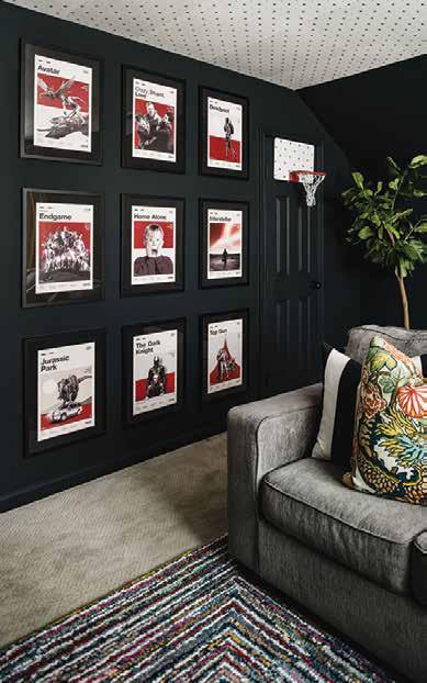
To make the entertainment area the ultimate hangout space for the 10- and 12-year-old and their friends, musthaves included an over-the-door basketball net, enough space for mini hockey, and comfy furniture to watch movies and play games.
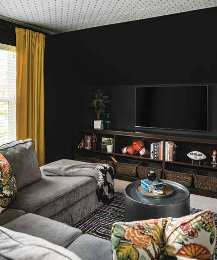
Molloy chose a deep blue hue for the walls (“people think it’s black”) for a few reasons: to add contrast to the gray carpet and sofa, and to amp up the drama.
“Black was a great way to bring a really bold color,” she details. “They also spend a lot of time watching movies and playing games in that space, so I wanted to give a movie theater effect.”
The designer made another brave move – painting the angled part of the wall – which paid off and made the room feel larger. To keep the space from feeling too dark and heavy, Molloy added a pop of pattern to the ceiling and added flecks of color – a blue table, floral cushions and sunny yellow drapes.
“I think that anything can be made beautiful. Ultimately what makes a space fabulous is the ‘zhuzh’. For us, the ‘zhuzh’ is what we call the finishing touches. A room doesn’t fully come to life until you add those finishing touches.”
In the boys’ bedroom, Molloy added fun splashes of color in various shades, including a gorgeous light watery aqua on the walls and vibrant shades of green, red and yellow on furniture and fabrics.
“The power of paint is tremendous!”
– Misty Molloy, CoCreative Interiors
“They are like their mom, and they are color lovers,” says Molloy, explaining that the lighter colors instantly make the room feel brighter and more spacious. “The power of paint is tremendous!”
The designer has always gravitated to a more “grandmillennial” design style, a throwback to incorporating vintage, comfort and design that has a story. “For me, that comes with using pieces that people already have or using older pieces and then injecting them with color.”
By painting a well-worn and much-loved family heirloom dresser red, Molloy injected liveliness to match the young boys’ energy.
“The red dresser has been in my husband's family for a very long time,” she says. “It was the right height for the boys to use as a nightstand and just served as a good starting point.”
Once she selected a playful fabric featuring animals to use as a bed scarf, the rest of the design came together effortlessly.
“We wanted something different and so the green was a really fun way to add color and make it feel boyish without using the color blue. And then the rest of the design just kind of fell into place.”
According to Molloy, the boys had a hand in choosing their favorite décor for display, and then she arranged the items, including books, trinkets and treasured 42-year-old Timmy the Bear, who has been in the family for two generations.
“We used all of their toys for styling that room to showcase their personality – I didn’t really bring in a lot of extra pieces,” she explains. “Ultimately, a home should tell the story of the people who live there. The room would feel silly if I had a lot of different pieces that you wouldn’t typically find in a boy's room. I don’t think the space would feel authentic.”
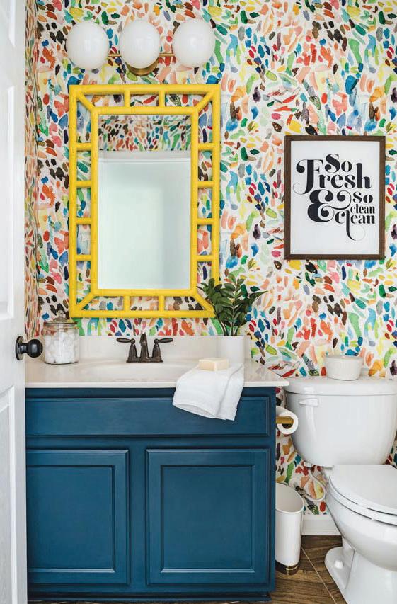
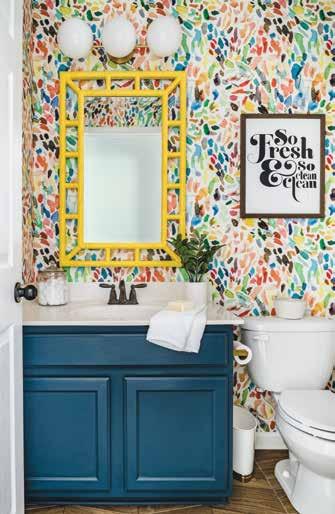
In the small bathroom the brothers share, Molloy amped up the charm by removing the builder-grade medicine cabinet, vinyl flooring and lime green paint and replacing it with a juicy blue vanity color, herringbone tile and a fun and fabulous wallpaper.
“That room is tiny,” she explains. “I needed to inject some color because there’s no natural light source. My thought process behind using yellow, for example, is that color is like adding our own form of sunshine. If there’s no light, we’ll bring it in ourselves.”
The result is a bathroom that truly is “so fresh and so clean.”
Since completing the three spaces, the Molloy family’s front door has been a revolving one, welcoming friends, family and lots of little boys.
“We named this project ‘The Fun House’ because I really wanted our house to be where all the neighborhood friends come over and hang out,” she shares. “We have eight different boys (two of those are mine) who are always together. My house is the house where they always want to be, and I think so much of that has to do with the fact that we’ve created spaces that they really enjoy. It’s even affected me and my husband’s social life because the parents end up coming over to our house, too. It’s been really FUN!”


Design: Laura Medicus Design | Styling: Kristy Oatman
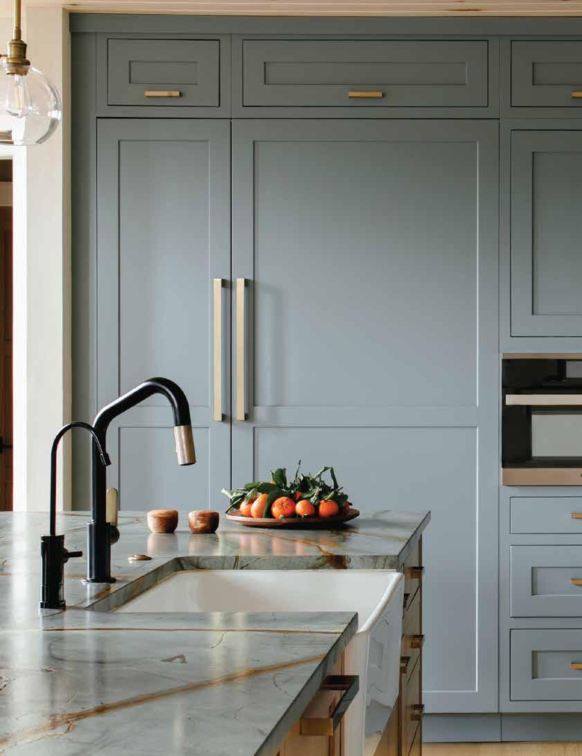
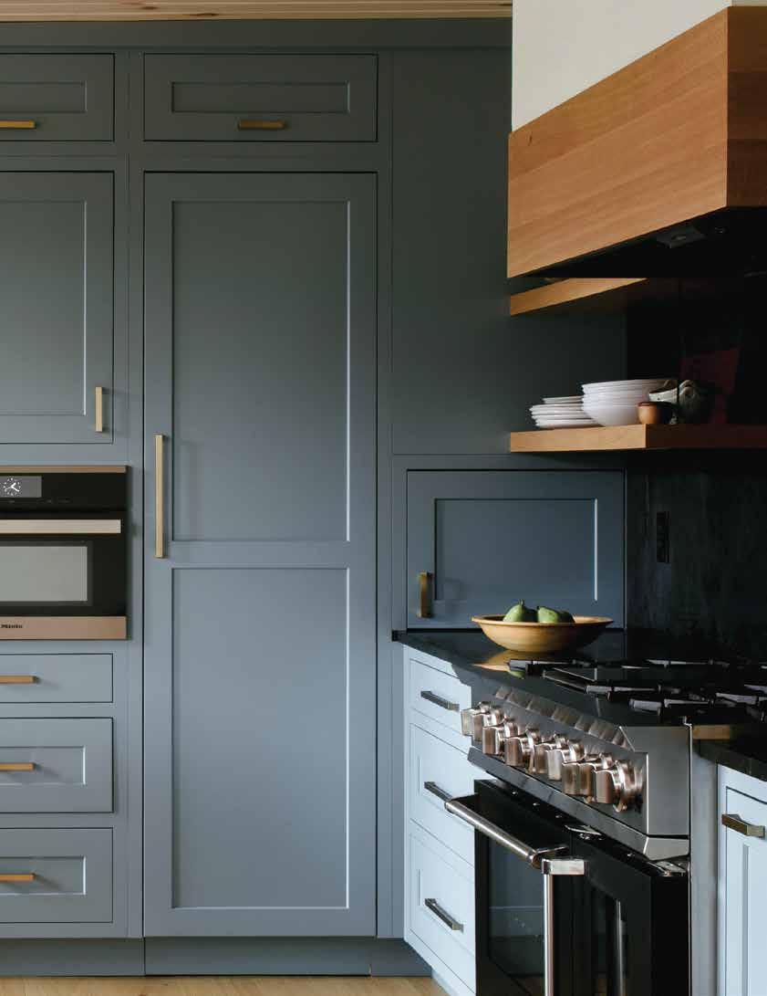
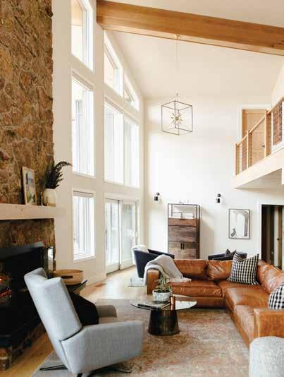
A split-level nestled in the Colorado mountains is revived with nature leading the charge.
Situated amongst the enormous red rocks in the beautiful and quaint town of Morrison, Colorado, a 1979 split-level has been given new life thanks to Laura Medicus Design. The clients brought Medicus on board immediately after purchasing the property, which featured promising bones but an undeniably outdated aesthetic. Having earned her Interior Design degree in Florida, where she also gained an appreciation for historic buildings, Medicus was up for the challenge of ushering the space into the 21st century.
“The home felt very much of a certain time and place,” explains Medicus. “The kitchen, bathroom and laundry [rooms] were stuck in a late-'70s, early'80s time warp—like you might find a VCR still in use.”
But through the noise of the antiquated furnishings, one fixture immediately stood out: a wall of windows and the spectacular view that they afforded. Medicus instinctively knew that her plans would center around highlighting this feature and spreading its impact throughout the house. Normally, when embarking on a new design, Medicus likes to take her time getting a feel for the home, but this space inspired a more immediate response from her: “This home made its vibe known to me as soon as I stepped in. It wanted natural materials, some color and warmth.”
Immediately opposite the windows, with a spacious living space sprawled between, sits the kitchen. The clients, a family with a passion for home cooking, had a vision for appliances that supported their culinary inclinations; specifically, a 54” refrigerator/freezer space, a 48” stove, a built-in coffee maker and a speed oven, to name a few. Medicus admits fitting it all in—plus a stunning, goldveined marble island for kids to complete homework while dinner was being
prepared—to the limited square-footage of the kitchen was a challenge. But what transpired was an incredibly thoughtful, well-appointed kitchen that makes clever use of a compact footprint.
Another problematic aspect of the kitchen that the designer sought to remedy was its relatively low ceilings. Medicus combated this by adding warmth in the form of the gorgeous, blue-hued cabinetry.
“[It's] an excellent blue with enough gray in it to give it some sophistication [while maintaining] enough light reflectivity that it’s still a playful color.” Elaborating, Medicus shares, “We have a lot of brilliant blue-sky days in Colorado, and this color reminds me of that.”
The theme of infusing color inspired by the landscape persists throughout the home, perhaps in part due to the “sunny” disposition of the clients, who actually lived in the home during the entire remodel.
Taking direction from the laid-back, outdoors-oriented lifestyle of the region’s inhabitants, Medicus is committed to an unfussy and approachable design language—one that isn’t afraid to be imaginative and playful while still retaining a layer of maturity. The boys’ bedroom is a prime example. Structurally, it featured a drywalled, flat-top closet, which left dead space that Medicus took as an invitation to get creative.
“It seemed like it was dying for a nook to be put in!”
From there, she forwent the obvious choice of a ladder (how boring!) for access to the newly minted look out spot and opted for a climbing wall. She went with a deep, nature-inspired green (a shade that also appears on the laundry room cabinets), referencing the beautiful evergreen trees lining the nearby mountains.
“We picked a great, outdoorsy color for the wall to add some interest and also help hide foot and handprints,” she shares.
In the conundrum of where to place the client’s wish-listed dining room built-ins (the best wall option featured two doorways), Medicus found an opportunity to put her love of hidden spaces and secret rooms into practice while checking an important box and providing a hefty dose of both closed and open storage.
“One of the doors leads to a cute little room under the stairs where the boys have sleepovers and play Legos....It seemed like the perfect spot to hide a doorway in!”
It’s easy to picture this space evolving with the family: today it’s a playroom, but perhaps a decade or two from now, the parents will find new use for the space as a hidden speakeasy or theater room. Somehow, even as we age, the charm of the unexpected never ceases to delight.
Throughout the home, the influence of nature and its materials is evident. Varied wood tones ground the space while shades of blue that are indeed reminiscent of the big open sky dance across tiling and millwork to create a scene not unlike the vista from any one of the property’s windows, but especially the stunning wall of windows flanking the living room’s large moss rock fireplace. It seems this triedand-true palette and Medicus’ keen eye for function and fun were a winning combination.
Top: A hall desk area in between the children’s bedrooms is as pretty as it is practical, with turquoise cabinetry and gold and glass pendant lights. A colorful vintage rug pulls the pastels together.
Bottom: Form meets function in the boys' bedroom, where a climbing wall provides access to a cozy nook above the closet.


Design: Love & Interiors
Photography: Vivian Johnson Interiors
Text: Arthur Liffmann
A cozy Bay Area ranch is refreshed and ready for its closeup.
Many people vicariously live the California dream by savoring the beauty of West Coast architecture. And while architecture and design, like all things, must always make room for the new and now, there are certain styles that some of us hold close to our hearts. The quintessential California ranch is certainly near the top of many lists. And while most people have to leave their hearts in San Francisco, others - like these lucky homeowners - get to come home to a space they love every day.
But this wasn’t love at first sight - more of a script in need of a rewrite. The clients recognized the potential their home had but understood that it required some serious attention to improve the way the house, particularly the service areas, could better function to suit their modern lifestyle and sufficiently meet their needs.
They approached Melanie Love, owner and principal designer of Love and Interiors, in Oakland. The firm focuses on creating cozy, thoughtful spaces that both support and provide refuge for busy, modern lifestyles. The designer, who approaches every project as a partnership, worked with the clients to understand their needs and the needs of their home.
“The kitchen and dining area were closed off and not functional. The two bathrooms needed to be updated to better serve their family,” notes Love.
“Looking at the layout, we could see that the space in the hallway wasn’t being efficiently used,” says the designer. Love recognized that some strategic spatial reorganization could provide an opportunity to not only create better layouts in both bathrooms, but also to establish more efficient circulation overall.
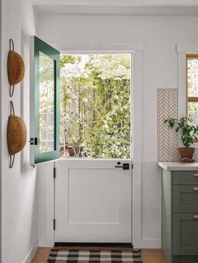
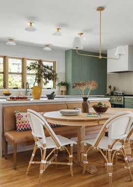
She began by refocusing the kitchen and anchoring it on the long exterior wall, centering the sink under a bank of four double-sash windows, and offsetting it on one side with a swoon-worthy glass Dutch door to the garden. On the other side of the windows, two of the designer’s favorite details are on display. Handsome rich green cabinetry wraps around onto the next wall, centered on a showstopping gas range.
“[It] is the perfect shade of green for their kitchen…,” says Love. “And I love that my clients were willing to do something different than the usual stainless and approved the blue-green shade for their Blue Star range.” These special details are given space to shine against classic, simple details including quartz countertops, a herringbone marble tile backsplash and rich oak plank floors.
A long, narrow island in the center of the kitchen provides additional storage and workspace, and cleverly serves as the back of the dining area. The wooden racetrack table, surrounded by a Parson-style upholstered bench and chic white French bistro chairs, is illuminated by a simple
gold and white pendant that, along with the clean white walls, sets the benchmark for the tones and materials used throughout the home. But it’s the natural light in this space that makes it shine, and the designer delights in how it now flows straight through to the living room as well.
“I love how much more open and light-filled the kitchen and dining room feel, even though the overall size of the room didn’t change. It seems counterintuitive, but when we decreased the size of the windows so we could anchor the kitchen on the exterior wall, it allowed us to incorporate a connection to the living room with glazed pocket doors. The new opening allows light to travel between the two spaces while creating acoustical separation when desired.”
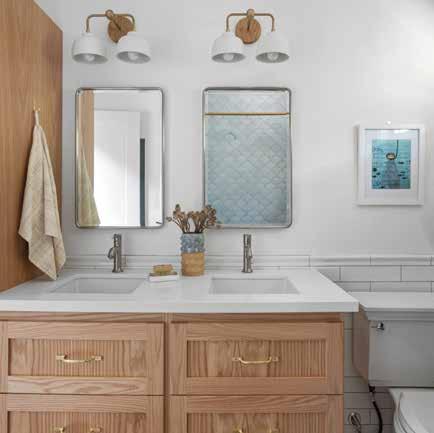
With the spatial reconfiguration, Love also gained some additional space that proved beneficial to both bathrooms. While both are bathed in white paint, stained wood millwork and gold fixtures, each features details that make them unique. In the young children’s bathroom, additional space allowed for the installation of a golden oak double
vanity and extra storage. The bathtub is appropriately surrounded in ethereal watery blue/green fish-scale tiles and complimented by a simple white mosaic floor. The effect here is young, fresh and fun. In the principal bath, adjustments to the layout also provided for a larger vanity. In this space, the focus is on the classic hexagon tile floor with black patterned insets, while simple white subway tile lines the newly expanded shower area. The oak is darker, the patterns more linear and the feeling more refined… yet both match the energy of the rest of the house.
The results of these renovated spaces are well summed up by one of the clients. “The kitchen and bathrooms are now a joy to use every day. Melanie designed their functionality for the way we uniquely live, so everything feels intuitive and efficient. The beauty of the spaces also makes it a true pleasure to cook, get ready and spend time in these areas.”
During the process, the clients and their designer discovered an opportunity to make some additional adjustments to better serve the needs of the family.
“While the initial focus of the renovation was on the kitchen and bathrooms, we found we were able to open up a narrow and nonfunctional entry hall by taking up a bit of space from the living room,” says Love. “With the additional space at the front door, we were able to add a small bench and some hooks for guests to remove their shoes and hang their belongings.”
The revised layout resulted in a living room niche with custom oak wood shelves that provides open storage and display space behind the sectional sofa. The new bump-in also had two additional benefits: by moving the seating area closer to the wood-burning fireplace, it positions the sectional directly under the windows while creating a comfortable conversational grouping with the vintage lounge chair opposite. Moreover, the new wall effectively mirrors the fireplace and creates visual balance, while providing the perfect home for a substantial piece of art.
Even though they are enjoying their new home, the clients have already started brainstorming with Love about the next project they’ll undertake together in a few years. And that’s understandable, given the clients’ appreciation for what they’ve created together.
“The remodel has significantly improved our quality of life and brought a lot of joy to our lives. I find it to be a real privilege to live in such a beautiful space. The entire layout works so well for our family, providing a perfect balance between togetherness and personal space. We feel close and connected, yet everyone can be in their own area at any given time, which is incredibly important. We never would have thought of this particular layout, but Melanie made it happen, creating a space that is both functional and beautiful.”
It’s a sentiment shared by their designer. “I love how much more functional the house is. It makes me so happy to know it’s better serving my clients’ family.”
Top: A bright hue on the front door, Craftsman-style sconces and a pendant with personality enhance the home’s curb appeal and make a bold and beautiful first impression.
Bottom: In the children’s bathroom, fish-scale tile adds a splash of fun, while a bank of cabinets and a double vanity make space for everything from brushing teeth to bath time.


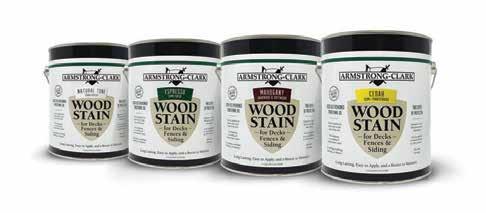
Armstrong-Clark Company specializes in wood restoration, oil-based coatings for wood and non-toxic wood stains of all kinds for all wood, wood shake restoration and waterrepellant needs, backed by seven generations worth of experience in oil-based coatings in combination with modern technology.
Armstrong-Clark’s deck and siding wood stain utilizes conditioning oils.These nondrying oils penetrate the wood and take the place of the naturally present wood oils that diminish over time, reviving and restoring wood. Specialized drying oils stay on the wood surface and lock in the conditioning oils to produce a barrier that is dry to the touch.
WHAT SETS ARMSTRONG-CLARK DECK AND WOOD STAIN APART?
• Application may be done in direct sunlight and on hot days up to 110 degrees.
• The stain can be walked on during application.
• Formulated for single coat coverage, a second coat can be applied wet on wet or wet on dry if it is desired.
• A project can be exposed to rain one hour after absorption.
• Application can be made on wood with up to 20% moisture content.
• Applies easily with no need for additional primers or sealers. Older wood is reconditioned by deep penetrating nondrying oils.
HOME TOOLBOX SPONSORED BY:
WHY TWO LAYERS OF PROTECTION IN A SINGLE BRUSH STROKE WORKS…
• Drying oil stays at the surface creating a breathable barrier (not a film) to lock in and protect the non-drying conditioning oils.
• Non-drying conditioning oils dive down and spread into the wood.
• The drying oil barrier reflects and absorbs UV rays to protect the wood and the non-drying oils from breaking down.
• The drying oil barrier prevents rain and snow melt from floating out the non-drying oils by repelling and wicking away water.
• Non-drying conditioning oils stay protected to condition and rejuvenate wood for longer.
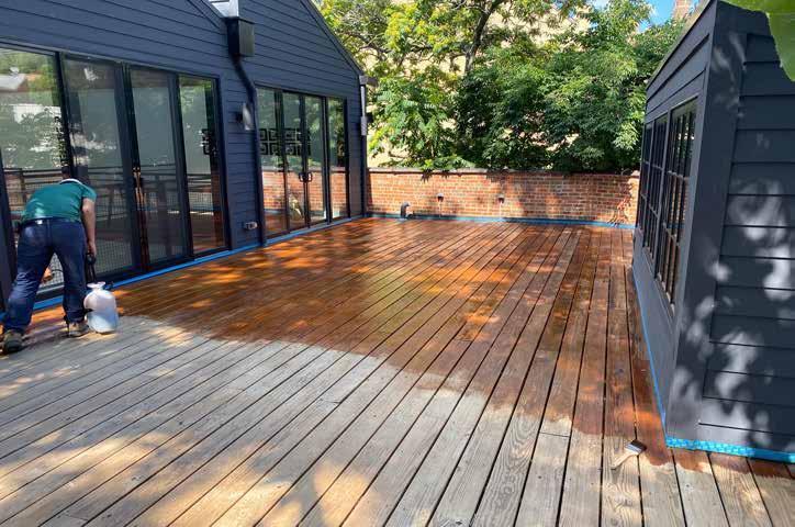
A quick and easy way to determine if your project is ready to accept stain is to dip your fingers into water and shake a few droplets onto the surface of the wood. The goal is for the droplets to only fall a short distance, so they do not splatter when they meet the surface. Wood will accept Armstrong-Clark stain as it does water; the wood is ready to accept stain if the droplets start to spread out and soak into the wood within two minutes. If water droplets do not absorb readily in two minutes, then additional surface preparations are required.
*This test does not work on exotic hardwoods as their tight grain inhibits absorption.


Give your sweet tooth what’s coming to her with these simply scrumptious goodies.

Let the classic combination of milk and cookies take you back to mom’s kitchen table with this lunchbox favorite. Dunking highly recommended.
Old Fashioned Hermit Cookies recipe on page 59.

1 ½ cups all-purpose flour
1 ½ teaspoon baking soda
1 teaspoon ground ginger
1 teaspoon salt
1 cup packed brown sugar
1/3 cup unsalted butter, cubed
1 cup mashed potatoes (recipe below)
2 large eggs
¾ to 1 cup buttermilk
Whisk together flour, baking soda, ginger and salt in large bowl. Add sugar and mashed potatoes. Slowly add eggs and buttermilk. Stir until rough ball forms, adding more flour if too sticky. Turn dough out onto lightly floured surface. Knead dough 2 minutes; roll into ½-inch thick square. Cut rounds with 3-inch cutter, then cut smaller hole in centre. Place doughnuts on lightly floured baking sheet. Cover with clean cloth and let rise 30 minutes. Heat oil in large skillet over high heat. Fry doughnuts in batches for 2 minutes per side or until puffed and golden. Drain on paper towels. Dip doughnuts into glaze, turning to coat. Sprinkle with brown sugar flakes. Serve immediately. Makes 8.
½ cup sugar
½ cup 35% cream
2 tablespoons unsalted butter
pinch of ground sea salt
In small heavy bottom saucepan, heat sugar over medium-low heat until melted and golden-brown, stirring constantly with wooden spoon. Remove from heat and slowly add cream and butter. Sprinkle in salt. Return to heat and stir until smooth, about 5 minutes. Mixture will thicken as it cools.
3 Yukon Gold potatoes, peeled and cubed 1/3 cup milk
1 tablespoon butter, melted
Cook potatoes in boiling salted water until very tender, about 15 minutes. Drain and return to saucepan. Add milk and butter and mash until smooth.
Pastry
1 ½ cups all-purpose flour
1 teaspoon salt
3 tablespoons sugar
6 tablespoons unsalted butter, chilled and cubed
1 egg yolk, slightly beaten
2 tablespoons cold water
2 tablespoons 35% cream
Place flour, salt and sugar in food processor and pulse to combine. Add butter and pulse until mixture resembles coarse meal. Add egg yolk and ice water drop by drop with machine running, until dough comes together. Divide dough into 3 balls. Press each ball into a flat round, wrap and chill for at least 2 hours.
Filling
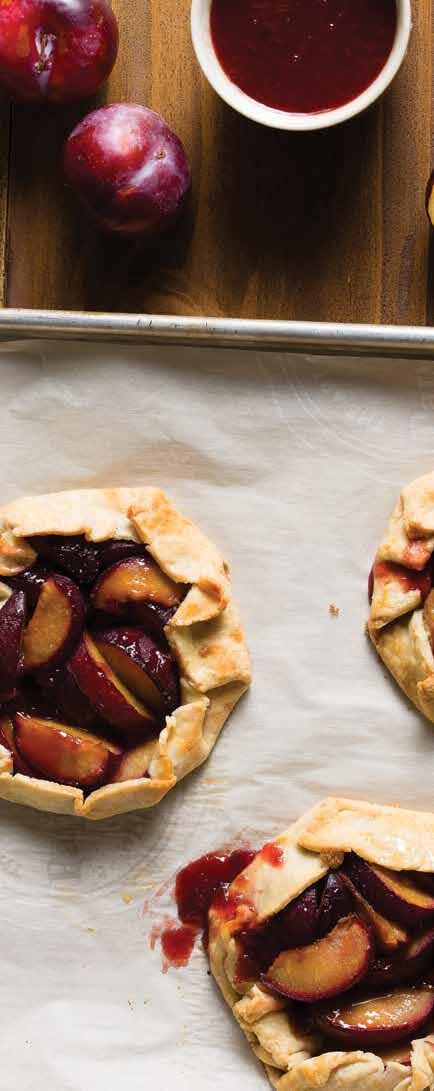
1 pound ripe and fresh black plums, pitted and quartered
2 tablespoons brown sugar
1 teaspoon grated lemon zest
1 teaspoon fresh lemon juice
Combine plums, sugar, lemon zest and lemon juice in a medium bowl; toss gently and set aside. Preheat oven to 375°F. Roll out pastry rounds and transfer to a baking sheet. Divide plum filling evenly among the rounds, leaving 2-inch borders. Fold pastry up and over filling. Brush pastry with cream. Bake until crust is golden and juices in centre are bubbling, about 40 minutes. Let cool on baking sheet. Makes 3 tarts.
½ cup unsalted butter, room temperature, plus additional for pan
¾ cup firmly packed brown sugar
2 eggs
��₃ cup sour cream
to 55 minutes, or until skewer inserted in center comes out clean. Remove from oven and let cool completely. Frost top of loaf with maple icing. Sprinkle with additional chopped walnuts if desired. Makes one loaf.
6 ounces cream cheese, softened
��₃ cup unsalted butter, softened
¼ cup pure maple syrup
1 teaspoon pure vanilla extract
Beat together cream cheese, butter and vanilla, scraping down sides of bowl. Add maple syrup and beat until smooth.
1 cup unsalted butter, softened
1 ½ cups white sugar
1 teaspoon ground allspice
1 ½ teaspoons ground cinnamon
1 teaspoon ground cloves
3 eggs
Nothing beats fresh from the garden vegetables at a picnic or otherwise. If you aren’t a green thumb, check out the homegrown fare at the city’s farmers' markets this summer.
1 ½ cups all-purpose flour
2 teaspoons baking powder
½ teaspoon baking soda
1/8 teaspoon salt
1 cup mashed bananas (2 large) ½ cup chopped walnuts, plus more for garnish
Preheat oven to 350°F. Grease 9x5 inch loaf pan. Line bottom with parchment paper. With an electric mixer, beat butter and sugar until light and fluffy. Add eggs one at a time, beating well after each addition. Mix in sour cream. In separate bowl, whisk together flour, baking powder, baking soda and salt. Add to butter mixture and beat on low speed for 1 minute. Stir in bananas and walnuts until combined. Spread batter evenly into prepared pans. Bake for 50
3 ¼ cups all-purpose flour
1 teaspoon baking soda
1 cup raisins
½ cup molasses
½ teaspoon salt
½ cup chopped walnuts
Preheat oven to 375°F. In large bowl cream together butter, sugar and spices. Beat in eggs one at a time. Sift in flour, baking soda and salt and stir until well blended. Stir in molasses and raisins. Drop batter about 2 inches apart on greased cookie sheet and bake 12 to 15 minutes. Let cool on wire racks. Store in an airtight container for one week or freeze for 1 month. Makes 48 cookies.
Marisa Curatolo is a Paris-trained chef, food stylist and culinary instructor. She inspires cooks with her simple, easy recipes that are beautifully presented.

With over four million visitors a year, Banff National Park has garnered a reputation as a premier destination in Canada— with good reason. Visitors to the country’s oldest national park are rewarded with awe-inspiring views, a fascinating glimpse into history and a renewed sense of adventure.


From sparkling turquoise waters to majestic snow-capped mountain peaks, Banff’s natural beauty almost needs to be seen to be believed. One of five national parks in Alberta, Banff National Park is truly a jewel in the heart of the Canadian Rockies, replete with a rich history and activities for adventure seekers of all ages.
The town of Banff—and the nearby village of Lake Louise—offer accommodation options for every budget and travel style, from luxury hotels to quaint bed and breakfasts to RV campgrounds. All visitors need a park pass for entry into Banff National Park, which can be purchased in person at numerous locations or online before visiting.
If you’re not planning to rent a vehicle, book a shuttle at the Calgary International Airport to take you to Banff, located 90 minutes away. Once you arrive, the charming town is easily walkable. Public transit is available via the energy-efficient Roam buses, which head to the most iconic destinations within town and the park.
With over 1,600 kilometres of maintained trails in the park, seasoned hikers and more leisurely strollers will find an abundance of routes to tackle on foot or wheels. Borrow a bike from one of the many rental shops in town and head out for a picnic on the Banff Legacy Trail, built to celebrate the park’s 125th anniversary.
Scenic walks are also close to town, like the self-guided Fenland Trail through old-growth spruce, or Marsh Loop encircling a wetland. Follow the Bow Falls Trail right from downtown Banff to view the roaring waters and see if you can spot where Marilyn Monroe filmed the iconic River of No Return in 1953.
Catch the sunset and keep your eyes peeled for wildlife by the magnificent Vermilion Lakes. Critters like bears, cougars, wolves and moose call the park home, so make sure to stay alert and view wildlife from a safe distance.
At a lengthier 12 kilometres, Spray River Loop is a popular trail enjoyed year-round. For a more strenuous hike, head uphill to reach breathtaking views at the Sulphur Mountain summit, where you can also stop by the Cosmic Ray Station National Historic Site.
Banff is a playground for outdoor enthusiasts. While the park is the perfect place to explore on your own, guided tours can offer the experience of a lifetime, like horseback rides along the river or canyon ice walk tours in the colder months.
For a scenic view of the Rockies without hiking or riding, soar above the trees in a sightseeing gondola or chairlift. Depending on when you visit, you can also hit the slopes at the Big Three—otherwise known as the three world-class ski resorts in the area, featuring 8,000 acres of skiable terrain and some of the best powder in the world. The season typically runs from early to mid-November until late May.
Designed by master golf course architect Stanley Thompson and winding along the Bow River, the Fairmont Banff Springs Golf Course is a favorite for its layout and stunning panoramic views.

Water babies, rejoice: There are plenty of aqua-filled adventures in Banff National Park.
Experience the scenery from a different point of view and take to the water by canoe, kayak or stand-up paddleboard, all available for rent in town. Or, hop aboard the Lake Minnewanka Cruise for a relaxing heated boat ride on Banff’s largest lake.
A stop at the Cave and Basin National Historic Site—often called the birthplace of Canada’s national parks—is a must. It features interactive exhibits, short films and seasonal activities, set beside thermal waters in an underground cave. The Cave and Basics Tour highlights everything the site has to offer, while the Natural History Tour shows how the landscape has been shaped by hot water, biology and people over the years. Before you leave, search for the red Adirondack chairs that Parks Canada placed on the upper boardwalk as part of a national initiative. Grab a selfie or two before relaxing in the chairs and gazing out over the Bow Valley.
Soak away your stress in the Upper Hot Springs’ naturally heated mineral waters on Sulphur Mountain, the highest operating hot spring in the country at an altitude of 5,200 feet. A recognized federal heritage building, the landmark bath house sits at the source of the hot springs, boasting exquisite views of the mountain countryside.
Take in the rich history, culture and traditions of local First Nations Peoples at the Buffalo Nations Museum. The Whyte Museum of the Canadian Rockies also explores the mountains’ human and

cultural history, encouraging visitors to consider their place in the mountain landscape.
Get up close with local flora and fauna at the Banff Park Museum, which houses over 5,000 botanical and zoological specimens showcasing the park’s natural history. Built in 1903, the rustic log building is a national historic site and the oldest natural history museum in western Canada.
Whether dining downtown or on top of a mountain, Banff boasts a vibrant culinary scene, with cuisines to suit every palate.
Craft beer aficionados can imbibe at the Banff Ave Brewing Co. and Three Bears Brewery and Restaurant. Book a free tour at Banff’s only distillery— PARK Distillery Restaurant and Bar—to learn how their spirits are made right in Banff.
Banff Avenue and surrounding streets are a prime spot for souvenir shopping. Get festive year-round with a stop at The Spirit of Christmas, peruse Indigenous crafts and home goods at The Banff Trading Post, grab gifts for the kids (and kids at heart) at Duck Duck Moose, and pick up a piece of art from a local gallery. End your day with a sweet treat from The Fudgery or Banff Candy Store.
With all it offers, Banff is a must-visit destination for thrill seekers, history enthusiasts and foodies alike. No matter what your travel preferences, a mountain of exciting possibilities awaits!

Autumn brings brisker temperatures—and the spectacular phenomenon that is the golden larches.
Visitors to the region in mid-September to early October are spellbound by the glowing golden hues of the typically green coniferous trees. Popular spots like Larch Valley and Sentinel Pass (near Lake Louise) offer some of the best fall larch viewing in Banff National Park before the trees shed their needles for winter.
Larch season is a short window that only lasts a few weeks, but it’s well worth exploring. Don’t forget to bring your camera and charge your phone!


Celebrating 60 years of an iconic design
Certain designs have attained iconic status over the years, captivating and inspiring people long after their creation. Whether you’ve realized it or not, you’ve likely laid eyes on a well-known floral pattern on a dress, piece of home décor or even oven mitts.
Marimekko’s beloved Unikko pattern has been a design mainstay for more than half a century, showcasing its versatility and widespread influence across different eras and evolving trends. Remaining one of the most recognizable patterns in the world, Unikko celebrates its 60th anniversary in 2024.
A Finnish design house founded in 1951, Marimekko adds a dose of color and nostalgia through the bold prints that have become synonymous with its name. Striped, checked, floral — whatever the occasion calls for, chances are there is a Marimekko design to meet your needs.
Creating one of the world’s first lifestyle brands, the late founder Armi Ratia was known for translating her vision of optimism and personal joy into forward-thinking prints that celebrated individuality and empowerment.
According to the Marimekko website, Ratia’s journey began with a simple dress in captivating prints that became an instant classic. A Marimekko summer dress even made headlines when Jackie Kennedy wore a light pink version of it on the cover of Sports Illustrated in 1960.
Through the decades, the company’s designers have created some 3,500 print designs that have graced everything from clothing and accessories to furniture and tableware. Located in Helsinki, Finland, its textile printing factory prints approximately a million meters of fabric on site every year before the products take their final form in partner facilities around the world.
Ratia was a fan of bold, splashy colors. However, according to the company’s website, she believed it was not possible to faithfully capture the true essence and beauty of real flowers in fabric, which is why early Marimekko collections excluded floral designs.
But that all changed in 1964, when, in protest of Ratia’s ban on florals, the late textile designer Maija Isola experimented with new designs. The result was a series of graphic, pop-art-inspired floral fabrics, including the now-infamous flower abstraction that made waves as an alternative to more photorealistic floral renditions.
Not only did Isola change Ratia’s mind on florals, but she also likely had no idea she would forever change the design world — and
world at large — with the confident pattern inspired by the poppies in her garden.
“There’s such inherent magic to Unikko’s design. Abstraction is deceptively difficult! Good abstraction appears effortless because the artist finds that elusive balance between recognizable form and simplification that preserves just the right details,” says Amanda Duarte, the director of DIY product development for WallPops, which collaborated with Marimekko on a collection of peel-and-stick wallpapers. “It takes great intuition — and I think Unikko admirers respond to this sense of intuition, whether they recognize it or not.”
Given its roots, it’s no surprise that Unikko — which literally means poppy in Finnish — represents joy and creativity. Isola traveled the world and painted what she saw, particularly inspired by the beauty of nature. She typically painted Marimekko patterns in the full width of the fabric in their actual size, often painting while sitting on the floor. If you look closely, you can see her brush strokes in the Unikko pattern, which she painted by hand.
Eventually taking on the role of head designer of interior fabrics, Isola designed more than 500 textile patterns for Marimekko during her 38-year tenure with the company, including others that remain popular today, like the stone-inspired Kivet. She also laid the foundation for Marimekko to become a print house.
Unikko’s popularity and longevity speak to its enduring appeal, as the pattern has been continuously printed since it launched 60 years ago. To celebrate its anniversary, Marimekko has released new Unikko-patterned products, including limited-edition collector’s items and digital wallpapers available for download on its website.
The pattern’s versatility shines through in adaptations of the popular design. Piirto Unikko, for instance, emphasizes the pattern’s graphic lines and honors its minimalistic style. In the Heijastus Unikko variation, we see reflections from both the past and the future. Finally, Vesi Unikko combines two of Isola’s most famous patterns: the delicate Vesi vertical stripes designed in the late 1970s and, of course, Unikko.
Unikko enthusiasts can also seamlessly incorporate the pattern into the home through wallpaper. Your local independent paint and wallpaper shop carrying Brewster Home Fashions / York Wallcoverings offers WallPops’ Marimekko by JV NuWallpaper collection featuring their most notable floral prints, including Unikko, in several bold color combinations.
“Unikko’s iconic design is also being bolstered by a massive wave of nostalgia. There is a huge demand [for] vintage or retro-inspired
furniture and décor currently, which has introduced Unikko to a huge, new audience of design enthusiasts,” says Duarte.
Move aside, boring walls. There are plenty of exciting ways to feature the large-scale floral designs and deliver a pop of vibrancy to walls and other spaces. “Unikko’s versatility makes it a great option anywhere in your home. However, we’d love to see this pattern as the star of a powder room, bedroom or entryway,” says Duarte.
“We see some incredibly creative uses of our peel-and-stick wallpaper,” she continues. “Our recent favorites have been different kinds of millwork embellishments: door frames, the doors themselves and even various wainscoting applications. With peel-and-stick wallpaper, you’re really only limited by your imagination — which is one of its biggest benefits.”
Over the past six decades, Unikko has undergone numerous color iterations, transcended physical locations and evolving design trends, and popped up in near-countless applications in décor, fashion and beyond. Yet, one thing remains constant: the enduring power of a design that continues to speak to and resonate with millions worldwide.

WANT TO SEE JUST HOW IT WOULD LOOK IN YOUR SPACE? ON THE WALLPOPS WEBSITE, USE THE ROOM PREVIEWER TO INSTANTLY VIEW THE UNIKKO (AND OTHER MARIMEKKO) WALLPAPERS IN YOUR RESPECTIVE ROOMS.
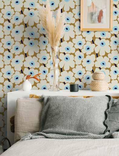

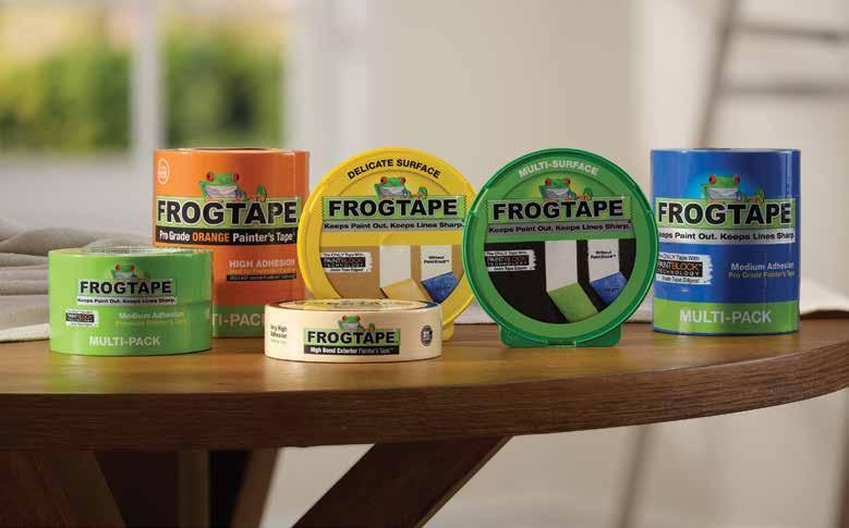


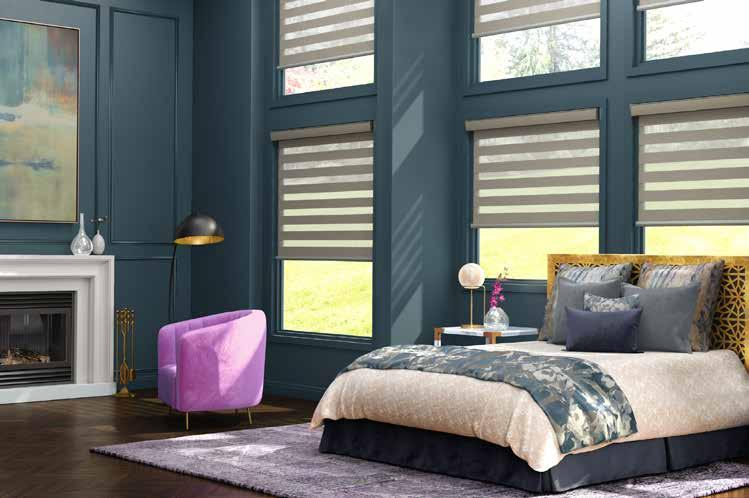


• Handcrafted in USA with global components
• Firm Nylon/Polyester blend
• Hardwood handle, stainless steel ferrule, chiseled edge for ease of use
• Designed for all interior or exterior latex and oil-based paints, stains, primers, and polyurethanes
• Durable construction suitable for everyday use
• Excellent cleanup attributes
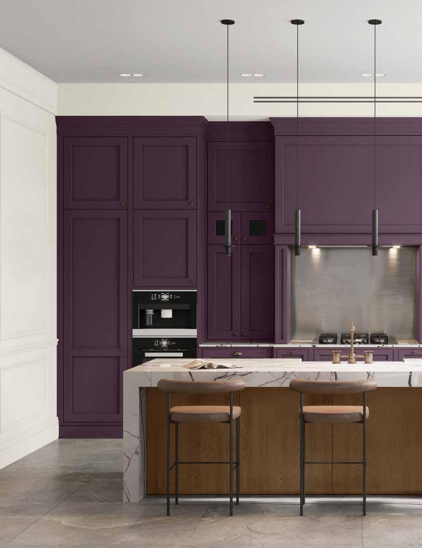
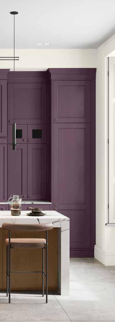
From cabinet doors to pantry drawers, create a flawless finish with PPG Break-Through.
Transform your cabinets with PPG BREAKTHROUGH!, the ultra-durable, waterborne acrylic enamel. With excellent flow and leveling, fast dry time, and outstanding block resistance, it's perfect for a fresh, vibrant look. PPG Break-Through! prevents cabinets and doors from sticking. It dries to the touch in just 20 minutes and bonds quickly to hard-to-paint surfaces. The result is an ultra-smooth, durable finish that lasts. Whether you're updating kitchen cabinets, bathroom vanities, or built-in shelving, PPG BREAK-THROUGH! is ideal for any cabinetry project, offering versatility for both interior and exterior applications.
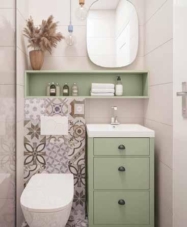
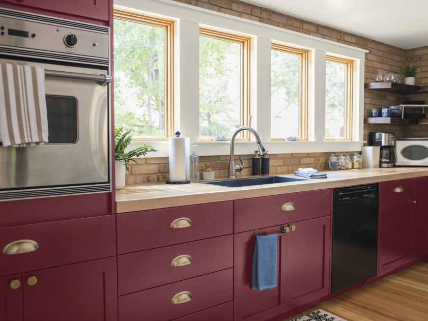
Choosing the right color for your painted cabinets can have a significant impact on the overall look and feel of your space. Remember, it's always a good idea to test the color on a small area or a sample board before committing to painting all of your cabinets. This will allow you to see how the color looks in your specific lighting conditions and with the other elements in the room. Here are some considerations when selecting a color for your cabinets:
• Style and Aesthetic: Consider the style and aesthetic you want to achieve in your space. Are you going for a classic, traditional look, a modern and sleek design, or something more eclectic? The color of your cabinets should complement the overall style and theme of your home.
• Light and Space: Consider the amount of natural light in the room and the size of the space. Lighter colors tend to make a room feel more open and spacious, while darker colors can create a cozy and intimate atmosphere. If you have a small kitchen or bathroom, lighter shades like white, cream, or pastels can help create the illusion of more space.
• Existing Color Scheme: Consider the existing color scheme in the room. Take into account the colors of the walls, countertops, backsplash, and flooring. You can choose a color that complements or contrasts with the existing colors to create a cohesive and visually appealing look.
• Timelessness and Versatility: If you're looking for a color that will stand the test of time and remain versatile, neutral shades like white, cream, gray, or beige are popular choices. These colors can easily adapt to different design styles and can be paired with a variety of accent colors.
• Personal Preference: Ultimately, your personal preference plays a significant role in choosing the color of your cabinets. Consider colors that you are drawn to and that resonate with your style and taste. It's important to choose a color that you will enjoy for years to come.
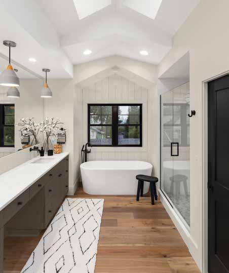
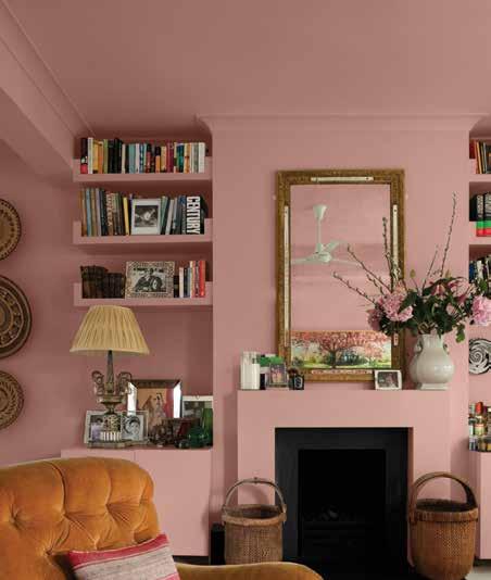
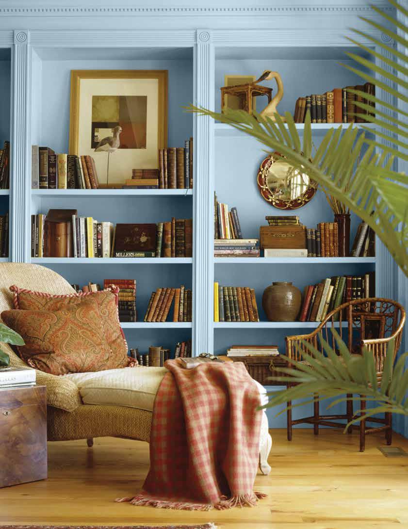
Time-saving tip: Painting cabinet doors (and similar large areas) may go faster if you use a foam or microfiber paint roller instead of a brush. Like with primer, let your first coat of paint dry completely before moving on.
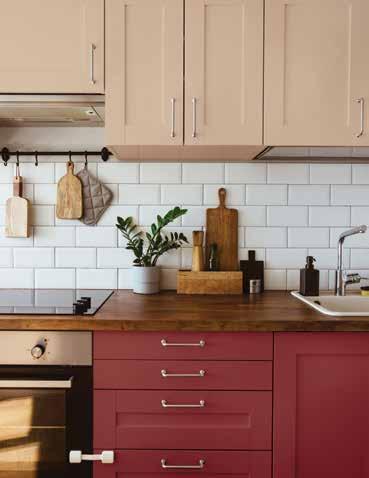
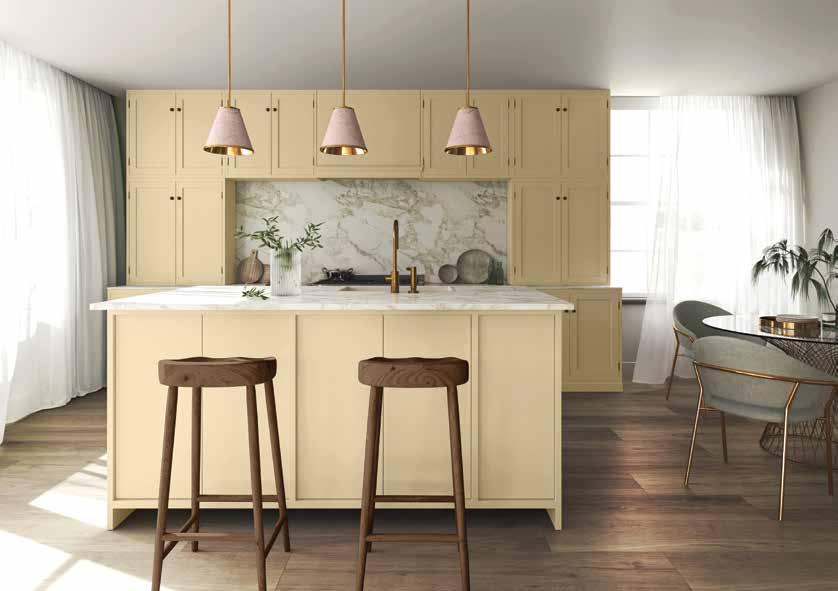
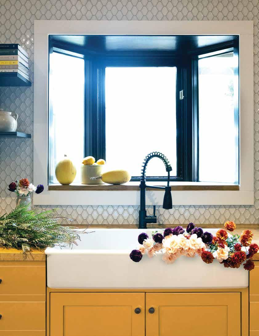
Replacing your kitchen cabinets every few years with new ones is a stretch – even for those with the biggest of budgets. Happily, painting cabinets presents a colorful alternative accessible to the do-it-yourselves and the do-it-forme kitchen denizens.
See our cabinet painting guide on page 70.
PPG1210-7
An earthy and intense mustard bordering on orange with a toasty brown undertone offers sophistication with a punch.
A rich and warm shade of off-black that is dramatic without being aggressive.
Zebra Grass
PPG1126-5
Zebra Grass is a saturated, shaded, glass bottle green with a viney undertone. It is for a pop of color on cabinets or an accent wall behind a bar.
Mother Of Pearl
PPG1100-1
Soft and balanced, warm with nary an undertone, this go-to white can effortlessly buoy a space.
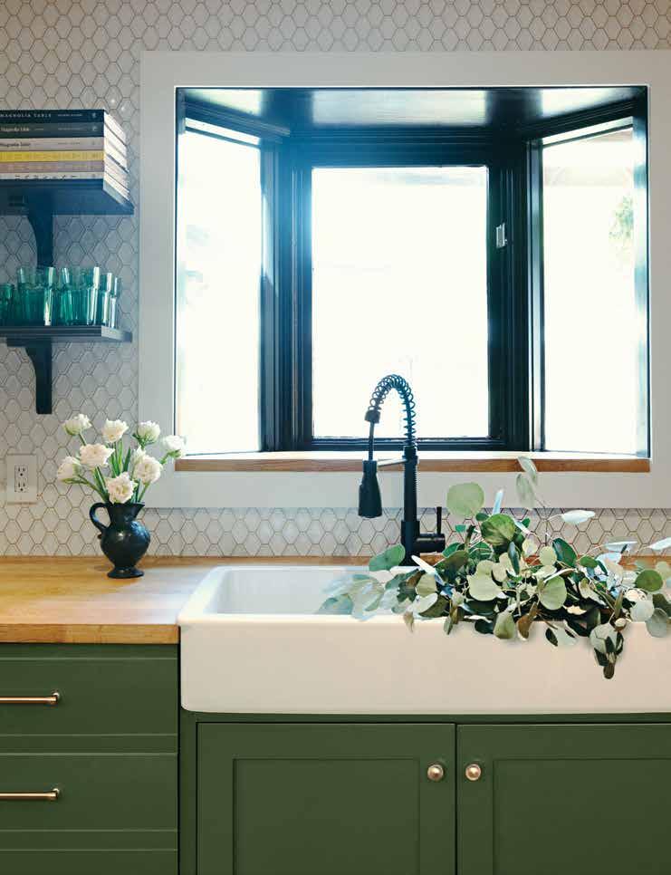
Fresh eucalyptus has a beautiful aroma and can last around 3 weeks in water with proper care. What remains is a bonus bouquet of dried eucalyptus that you can keep until you need an update.
With some good basic bones in place like go-with-everything tile, timeless wood counters and classic white trim the sky truly is the limit when it comes to giving your kitchen a facelift when the mood for a makeover strikes.
Aqua Smoke
PPG1034-5
A muted blue-green-gray that can instantly anchor a room, coastal but not overtly turquoise. Calm and tasteful yet anything but boring.
objects too. For a fail safe combo choose colors opposite each other
For a quick and satisfying update, infuse your kitchen with accessories that capture the spirit of the season. Swapping out towels, canisters, items on display, and countertop accoutrements can easily and affordably change the mood. Arranging flowers, branches, greens, or fresh, in-season produce provides an of-the-moment ambiance. Adding candles with fresh spring floral scents or winter scents like pine or cinnamon helps to envelop the senses beyond the visual.
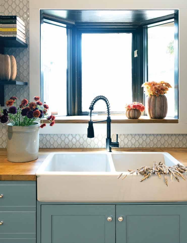
A collection of items can be a fun way to bring a unifying element to the kitchen. Groupings of similar objects en masse create a presence in a space and offer a landing spot for the eye. Not to mention, they can be wonderful conversation starters for kitchen parties! Collections can consist of new or old objects and can begin with a single family heirloom or something that catches your eye while out and about. The décor comes to life through the thrill of the hunt, and recounting each piece's journey can become a treasure in itself.
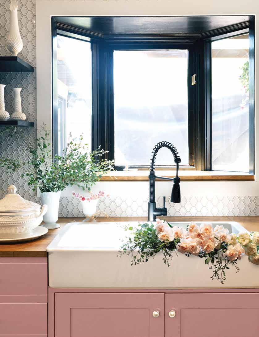
Popular kitchen collection ideas: antiques like rolling pins, carnival glass, milk glass, framed recipes, spice jars, stoneware bowls, pottery, cookbooks and more!
Everything you need to know to nail the look.
From the runways of New York Fashion Week to the pages of Architectural Digest, hues of crimson and blush have taken the design world by storm. Although these pops of red are showing up in small doses, their impact is outsized—a phenomenon social media is now referring to as the Unexpected Red Theory.
Coined by Brooklyn-based designer and Tiktok creator Taylor Migliazzo Simon, the Unexpected Red theory posits that a pop of red can instantly elevate any space or outfit, particularly those wherein it shouldn’t totally make sense. Some argue than any bright pop of color might serve to improve an otherwise neutral toned space, but there is scientific research (and plenty of anecdotal evidence) backing red’s resonance. From a color theory perspective, red’s uncanny ability to go with everything can be attributed to its status as a primary color—every other hue will have some form of red or a compliment to it in some capacity, so its perceived compatibility is an accurate observation. According to medical studies, the color red actually has a physiological impact too: exposure to red light has been shown to increase blood pressure, respiratory rate and eye blinking—all indicators of a state of arousal.
But this phenomenon’s intrigue feels deeper than science—it says something about the way we look at the world around us, the way we consume art. When well executed, a pop of red marks a deviation from the script, reminding us of all the potential waiting on the other side of convention. Sometimes, a dose of the unexpected is required to jolt the brain awake and out of its usual patterns of observation. It reminds us to see things through a new perspective. Perhaps on some level, the excitement garnered from this trend is an overcompensation for the predominantly neutral palettes of the past, an enthusiastic embrace of color. It’s certainly a turn toward optimism and levity, a playful infusion in a design world that has felt decidedly serious as of late (we haven’t yet recovered from the internet’s obsession with the “dark academia” aesthetic).
Whatever the reasons behind our shared embrace of this theory, it’s certainly a testament to social media’s power to spark conversation and get people excited about great design. And it’s just not the discourse itself that’s accessible—the trend itself is incredibly easy to execute thanks to its versatility and low commitment level. Incorporating it into your space can be as simple as placing a picture frame on a ledge or as involved as applying new wallpaper to a feature wall. Join the fun and customize the idea to work for your tastes and space and relish in your home’s new talking piece.
With so many layers to play with, your bedding is an easy mark! Here, a bed skirt provides the punch, with a coordinating bed tray and lamp complimenting as accessories. Because red is such a potent shade, the subtlest of additions in the smallest of scales will still feel striking.
Small home details like throw pillows or wall trim are ideal terrain for the unexpected red theory—overlooked elements that can quickly steal the show with the right shade of rose.

BRICK DUST PPG1056-7: A merlot-inspired hue with a subdued nature and an oaky undertone.

RED GUMBALL PPG1187-7:
A bright coral red with hints of raspberry, Red Gumball is a fun and playful shade that still feels classic and mature.

CALIFORNIA WINE PPG1184-7:
A light Pinot Noir in visual form, this shade feels romantic, rich and earthy—just like a good glass of red.

CALYPSO BERRY PPG1185-7:
Pure and bright, Calypso
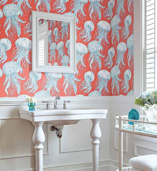
Whether working with a large surface area or small, a great wallcovering can provide character as well as color—a red motif will guarantee a statement is made, while the shade’s timeless nature will ensure longevity. We recommend trying this trend out in a bathroom or powder room, where the space’s status as a confined area will open up room for experimentation without the need to coordinate with the rest of the home.
Berry is a candy apple red with ruby undertones.
SWEET SPICEBERRY PPG1059-7:
A dark, spicy shade of red with an earthy appeal and brown undertones.
From upholstered sofas to dining chairs, your home’s accent furniture is the perfect canvas for a hit of crimson color. The bigger the piece you select, the bolder your impact.
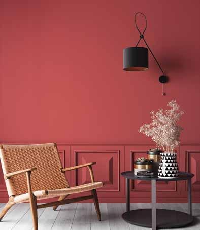
This is a great opportunity to dive into the spectrum of options and find a delicious red hue that speaks to your vision of home. Whether you’re wanting a dramatic, velvety scarlet or a juicy redapple tint, have fun with your selection process and let your personality shine.
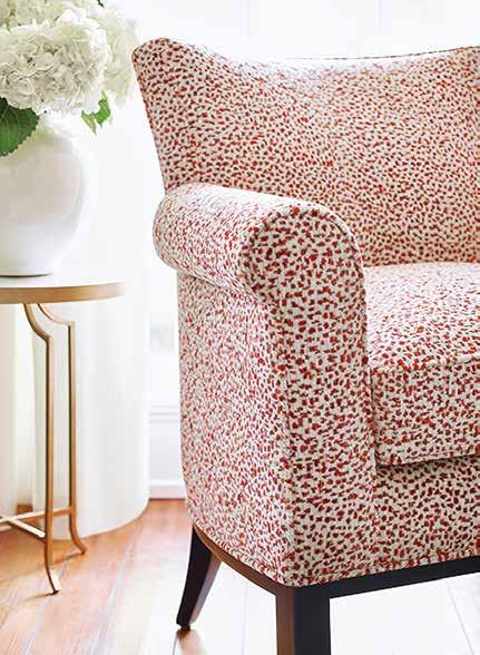
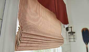
Window treatments have always been a great opportunity to experiment with color—from roman shades to drapes. With multiple layers available and a diverse range of fabrics to compliment the look, it’s easy to create a thoughtful and balanced vignette.
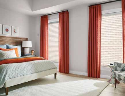

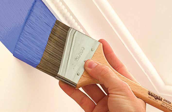


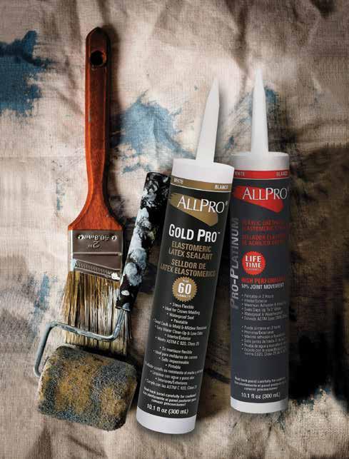
THE QUESTION IS NOT WHAT YOU LOOK AT BUT WHAT YOU SEE.
--Henry David Thoreau
SAIL CLOTH
PPG1213-1
MOUNTAIN FOREST
PPG1130-7
IVY