5 minute read
Pride & Passion
Setting the Stage Ryan Hughes, pictured in his personal residence, has been surrounded by design since childhood—his mother ran Interior Accents of North Atlanta in the ’90s. “I never could have accomplished everything I have without the support of my parents,” he says. opposite Hughes’ eponymous ADAC showroom may be best known for its Coup D’etat upholstery and opulent Ochre chandeliers, but at home, he’s incorporated antiques—like this elliptical antique table from Darryl Carter.
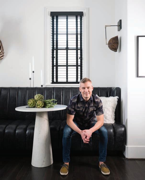
The personal residence of R HUGHES’ Ryan Hughes is cozy, inviting and deceptively down to earth
PRIDE & PASSION
Written by KATE ABNEY Photographed by MALI AZIMA
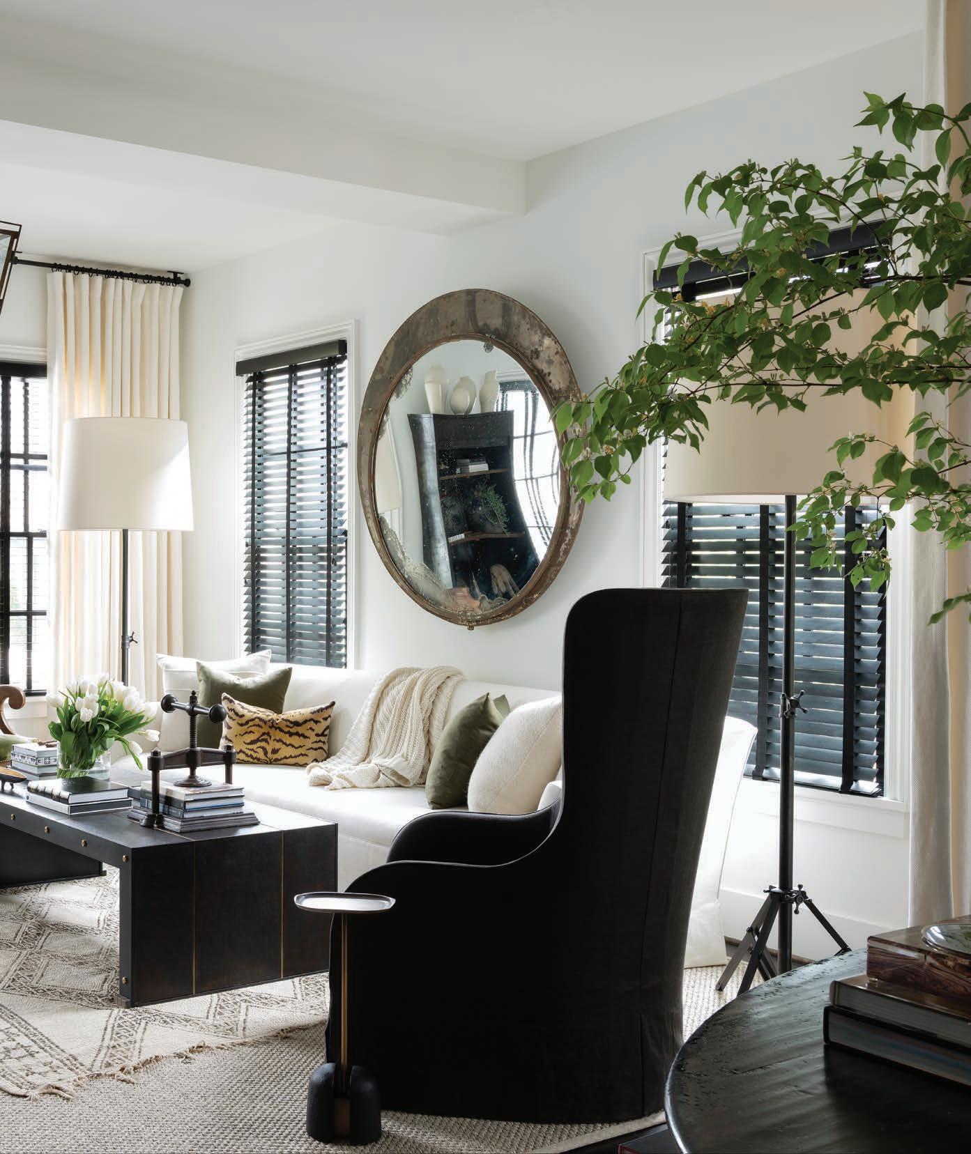
Stylish Scale Interior designer Susan Ferrier, a confi dante, suggested a 10-footlong sofa, and Hughes subsequently selected Seine by Dmitriy & Co. The wing chair is Gregorius Pineo through Jerry Pair. The coff ee table is Jean de Merry.
SSTEP INTO R HUGHES, the über-glamorous ADAC showroom Ryan Hughes fi rst founded in West Midtown in 2010, and you’re immediately struck by its sleek sense of luxury. Asked to imagine the place its proprietor calls home, you might conjure a mirror image of the showroom’s salonlike den, but the reality is that Hughes’ vision for his personal abode is far more understated. A metro-area native, Hughes has been instrumental in ushering in a sea of change for Southern design, bringing in boundary-pushing vendor lines once virtually impossible to fi nd in our region. Ten years ago, when it was unfathomable for Atlanta to slant as progressive as, say, Chicago or Los Angeles,
Hughes—along with longtime friend and business partner Steven Leonard—helped carry the torch.
“By year two or three, we had a lot of people fi nally get it,” Hughes remarks of Atlanta’s slowpaced march toward contemporary style.
But the trailblazer’s new town house—nestled into the Manchester, a recent venture from Hedgewood Homes co-founder Pam Sessions—is more traditional than his edgy workplace. And that’s precisely how Hughes likes it. “Pam is someone I’ve always admired,” says
Hughes, her former intern. “When she told me she was building a neighborhood tucked in to this little pocket off Piedmont and Cheshire Bridge, I
Moody Contrast Open to, but set back from, the living space, the powder room features an open-format vanity and accompanying water closet. The dark tone comes from a hand-troweled wall treatment by Tommy Taylor and Will Lawless of Southern Plaster.
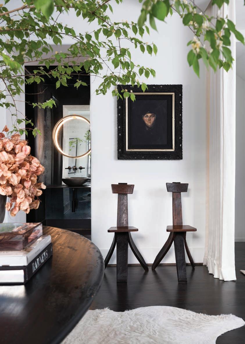
knew it was going to be really cool.”
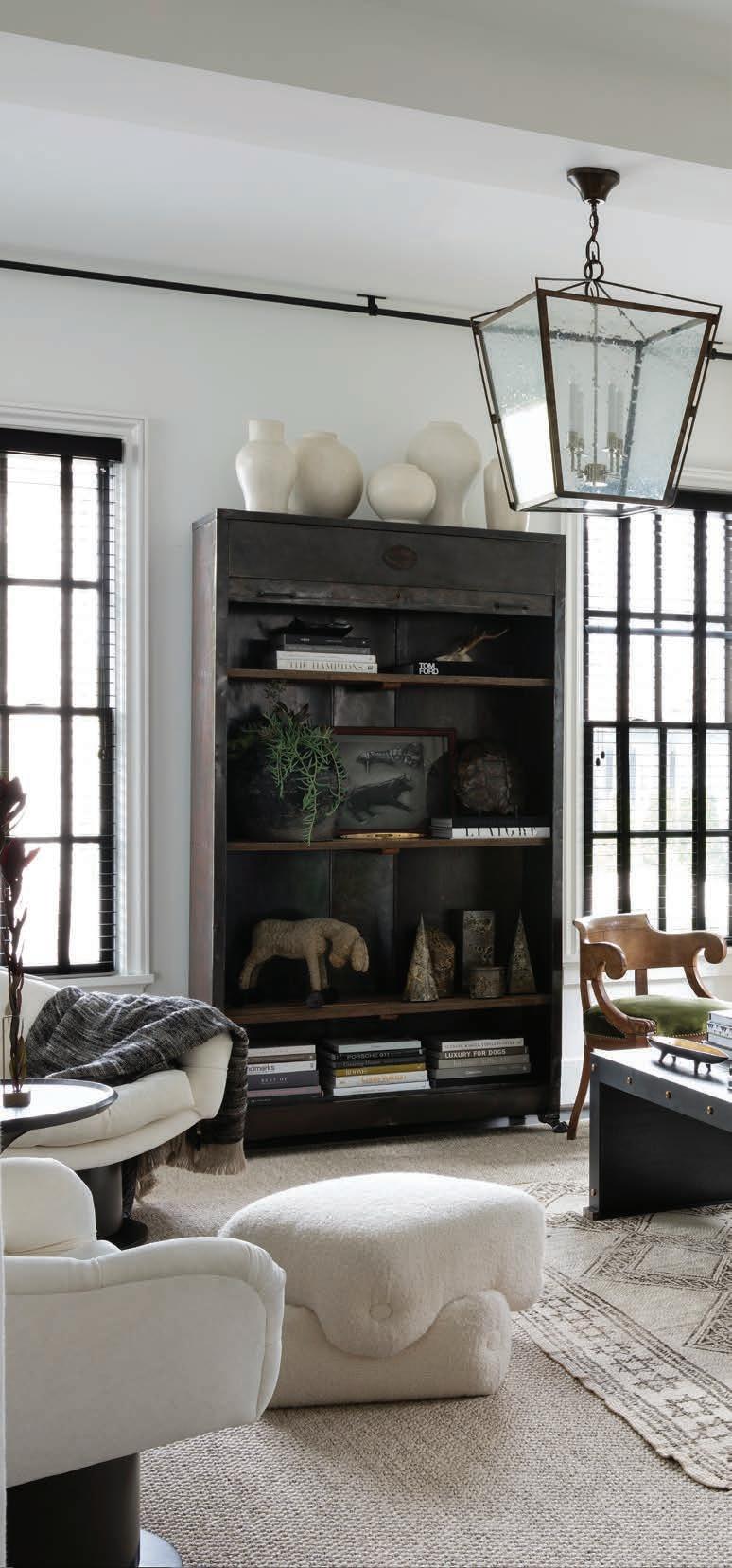
Apart from treasured works of art and a few pieces picked up on his fi rst buying trip to Paris—an oversize convex mirror and a pair of rustic chairs made from wine barrels—the increase in scale from his former, 700-square-foot condo required Hughes furnish his new home almost entirely from scratch.
After more than a decade liaising with some of the most discriminating trade professionals in the industry, Hughes had formed important friendships, so he called up a few for advice.
First, he enlisted architect Bobby McAlpine to redraw the fl oor plan, moving the dining area to the back of the house and combining the living and cooking areas into one continuous space. Interior designer Susan Ferrier lent her expertise to the furniture layout. “I would have never thought to put a 10-foot sofa in that room, but that’s what she drew; it’s probably my favorite sofa we sell,” Hughes says.
Nashville designer Chad James suggested some of the home’s more daring moments—like an oxblood-colored rug and a graphic Kelly Wearstler wallpaper—while Barbara Westbrook served as Hughes’ antiques advisor, suggesting pieces that would
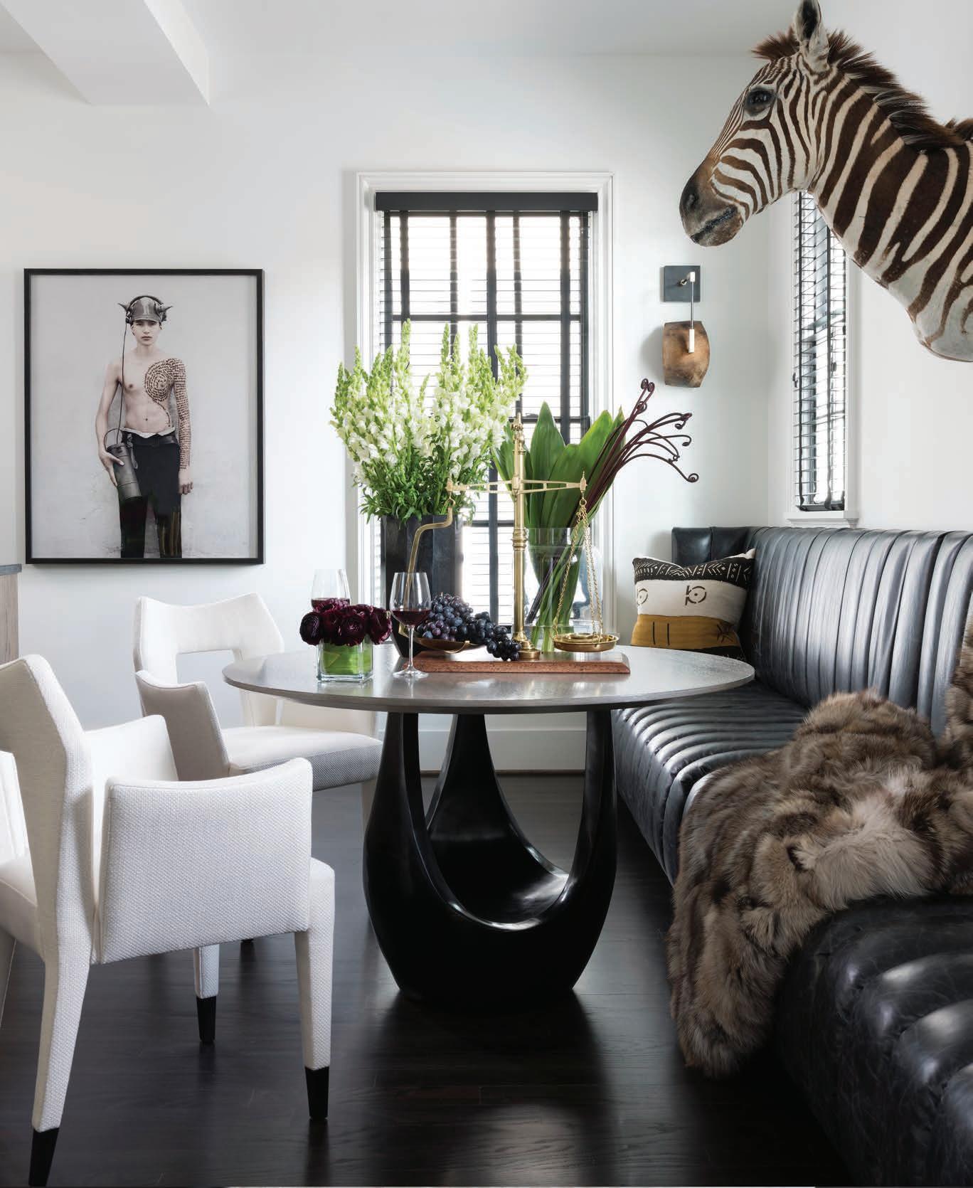
Form & Function A dining table by Jiun Ho pulls double-duty as full-scale sculpture in Hughes’ dining area. A pair of modern chairs by Natasha Baradaran are covered in a Holland & Sherry linen.
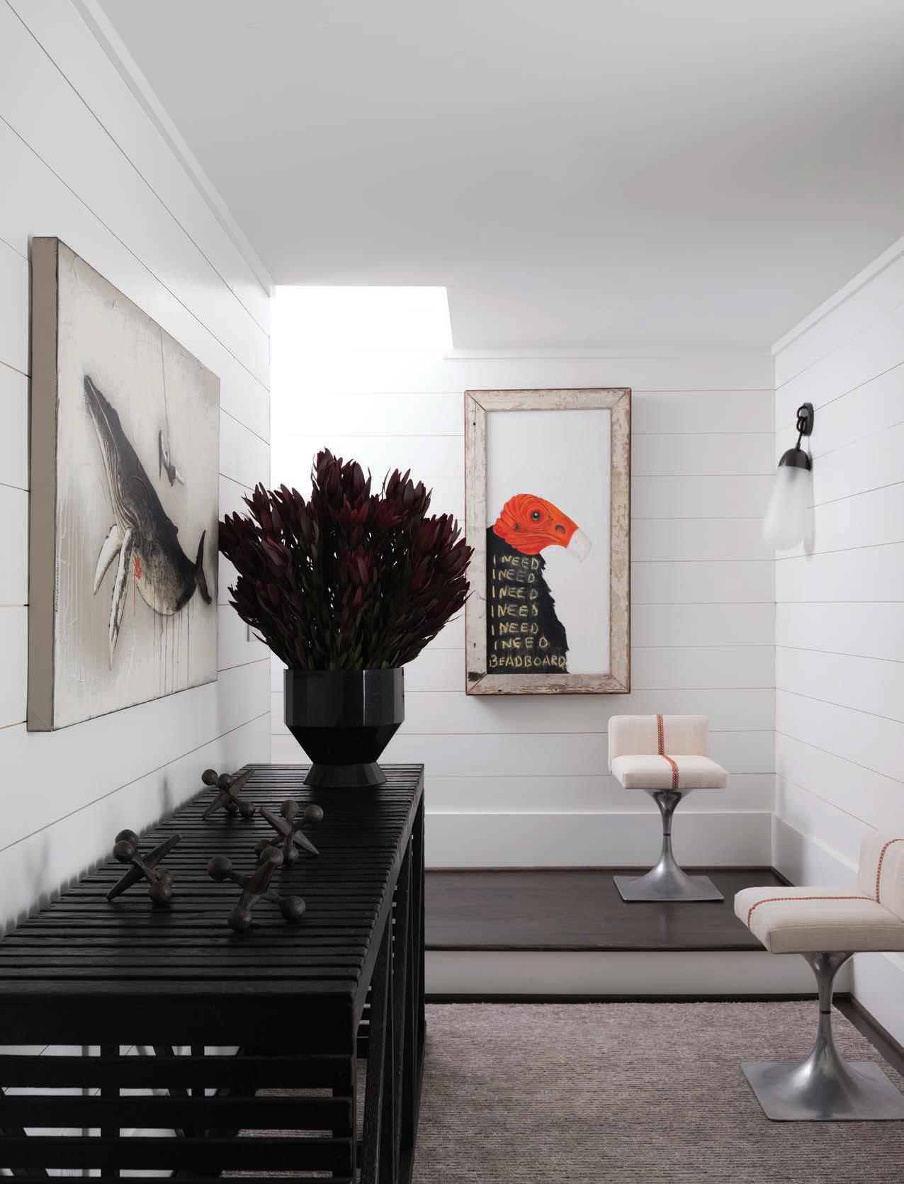
Passing Fancy This passage on the lower level is essentially an elevated mudroom— and the ideal home for Bobby McAlpine’s Museum Crate Console for Holland MacRae. Vintage stools from Dixon Rye are recovered in a favorite Zak + Fox fabric.
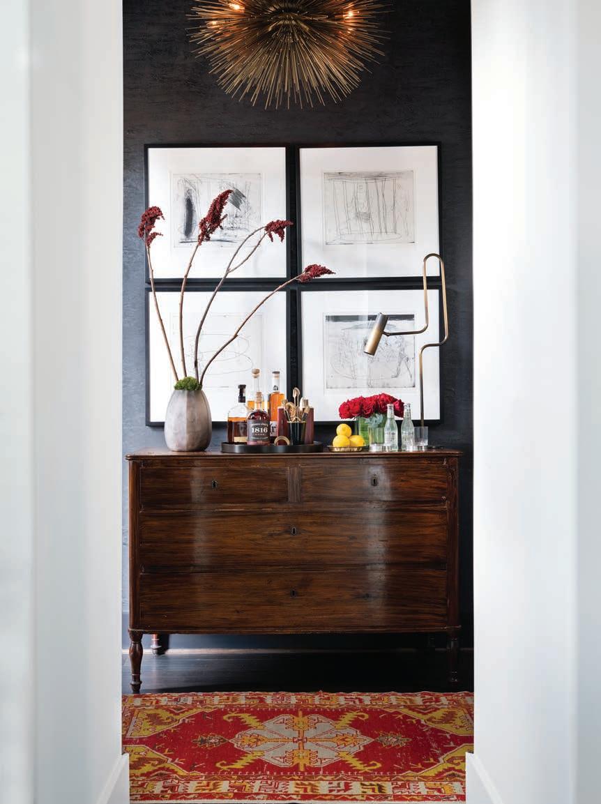
Libation Station Jean de Merry’s modern classic Lumiere chandelier shines over an antique chest Hughes has repurposed as a bar, along with an antique Oushak rug from Moattar. The quartet of works on paper is from Townhouse by Robert Brown.
give the new-build a sense of history and patina.
“Barbara has such a way of mixing modern and ‘crusty.’ She would tell me exactly where I needed to place an antique, such as that center table between the living room and kitchen.” Giving it pride of place establishes the perfect spot for book stacks and dried botanicals, while additional textures—like curly Mongolian lamb, alpaca and zebra hide—add softness.
Thanks to his relationships with longtime vendors, Hughes was able to cull from a robust list of perennial favorites, such as Moroccan rugs from Moattar and Barry Dixon’s Synapse Pendant for Avrett. He also brought home a few beloved pieces from the showroom, such as vintage equine art in teal and mustard.
Still, Hughes isn’t keen to make his home a revolving door for R HUGHES inventory. “My goal with the showroom is for it to be an experiment that’s always changing—we redo everything in the showroom four times per year—so it gives me that feed I need,” Hughes explains. “Home is the place I want to feel more constant.” See Resources, Back of Book.
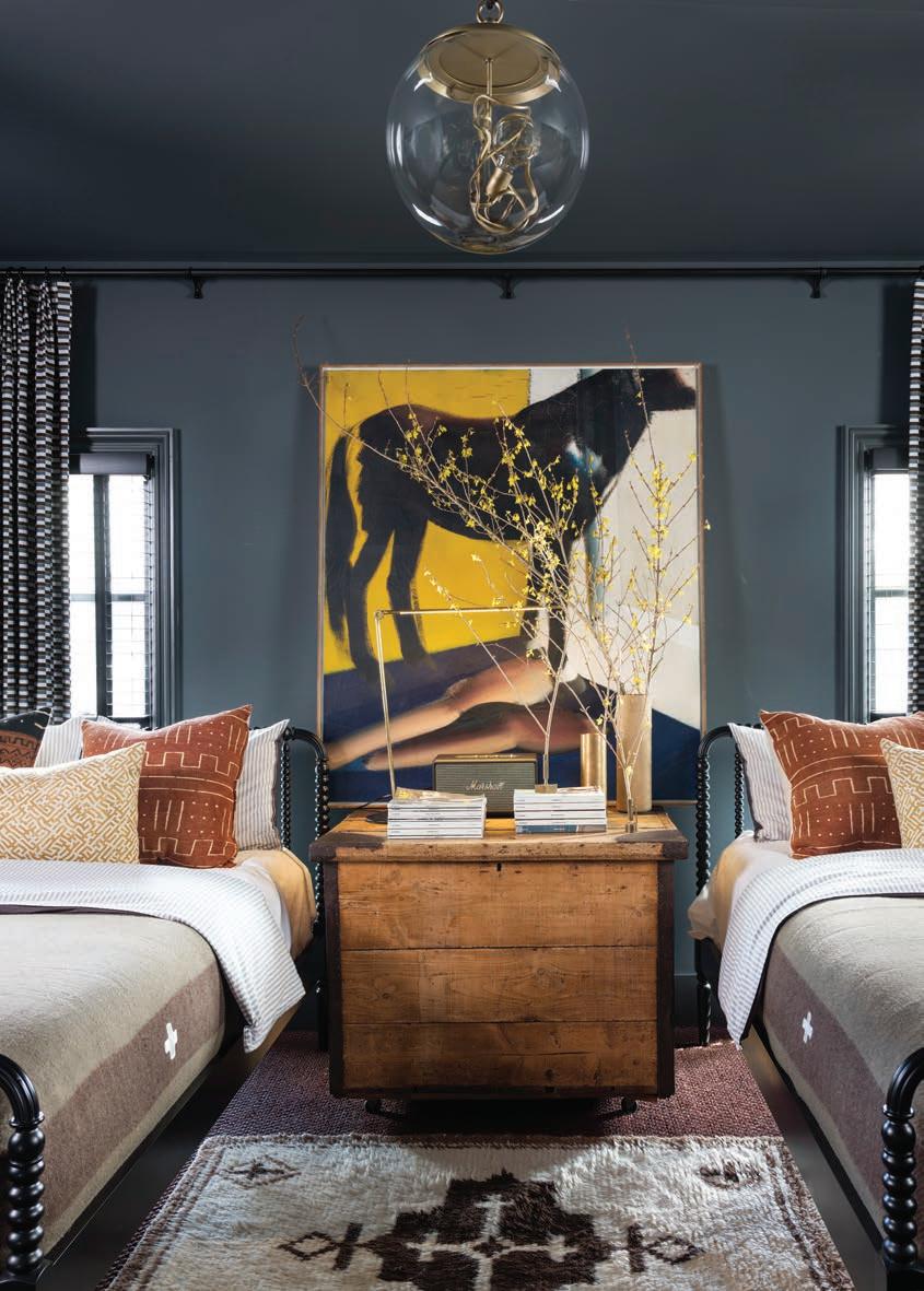
Gracious Living To provide his guests the ultimate in comfort, Hughes combined two small bedrooms to make a single, immense one. An antique pine trunk is tucked between the two Jenny Lind beds from Crate & Barrel. The reproduction wool military blankets are BoBo Intriguing Objects.
“The coolest part of the job is bringing in product that people have not seen and get excited about using, in every type of interior.” —Ryan Hughes
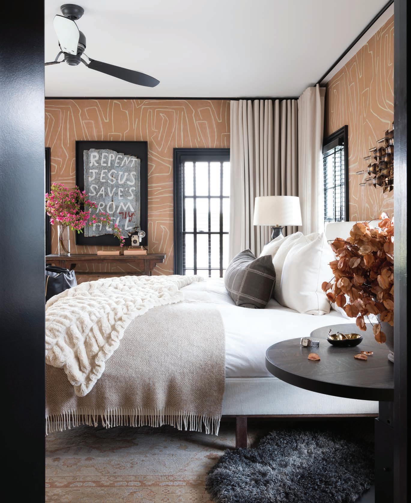
Dream Weaver Kelly Wearstler’s Graffi to wallpaper lends the master bedroom a graphic element. Wool draperies by Holland & Sherry add softness.
