5 minute read
A Stylish Evolution Carole Weaks
A Stylish Evolution
WRITTEN BY Alice Welsh Doyle PHOTOGRAPHED BY Emily Followill
DESIGNER CAROLE WEAKS BREATHES NEW LIFE INTO HER LONGTIME CLIENTS’ BUCKHEAD HOME WITH A LIGHTER COLOR PALETTE, FRESH FABRICS AND PRETTY UPDATES THROUGHOUT.
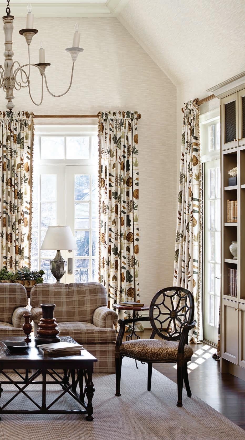
The family room furniture was reupholstered in more neutral fabrics, but the room is certainly not staid, with its window treatments in a distinctive Travers fabric. Beautiful French antiques still work in the space but feel revived in the new color scheme.
AA number of qualities go into creating well-appointed interiors, but a truly successful relationship between client and designer may be at the top of that list. And like a good marriage, it’s a collaboration that can last throughout the years even as styles change and tastes evolve. “When you have clients that really enjoy the process and appreciate design, it is more like a partnership,” says interior designer Carole Weaks. “Carole instinctively understands how we live, anticipates our needs and updates things accordingly,” adds homeowner Lisa Hills. For both, the relationship has blossomed into a friendship as well. Weaks began working with Lisa and her husband, Jim, in their Buckhead home more than 14 years ago, when the emphasis was country French with a palette heavy in yellow tones, red accents, and lots of pattern. (In fact, their home was originally featured in the May 2003 issue of Atlanta Homes & Lifestyles.) The rooms were refi ned over the years, but eventually it was time for a more substantial refurbishment, but not from scratch. “I always advise clients to purchase pieces that will last, and not some fad that will be over in 15 minutes,” says Weaks. “I instinctively know what will be short-lived, and I steer them away from that towards more classic styles.” The makeover began with an overall lightening of the spaces, with walls painted or wallpapered in neutrals instead of the yellows of before. Even the library’s dark wood paneling was painted, giving the room a whole new attitude. “The room was very traditional and clublike with plaid chairs,” says Lisa. “It was time to go in a totally different direction.” In the living room, two consoles were repainted to accommodate the less yellow, more taupe look, and all the furniture in the family room was reupholstered, a testament to buying high-quality pieces from the start. The marriage of old and new continues in the master bedroom. The toile is gone, replaced by a sea of creams, while the carved upholstered bed and midcentury bedside tables remain. A new work of art over the bed sets the stage. “A painting can be that one piece that makes everything else work together in a room,” says Weaks. “Working together” is a key phrase in this home. “I think it’s an interesting evolution how a client’s taste can evolve over the years, and as designers, we walk that path with them,” says Weaks. “You can appreciate the progression in a project where the client actually works with the designer to keep things fresh and updated.” Adds Lisa: “We have grown up with Carole, and it continues to get better. I like to remind her that we only have a few more years to go before we can start all over again.” See Resources, Back of Book.
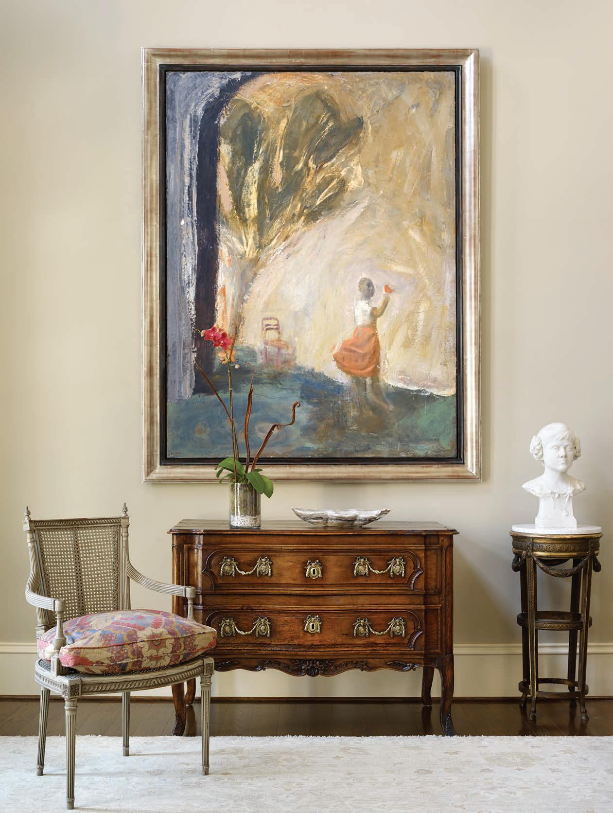
An elegant arrangement at one end of the living room is set off by an arresting painting by Chuck Bowdish and an 18th-century sculpture Weaks found in France years ago. A melon shade in the painting is subtly incorporated throughout the room as well as in the powder bath.
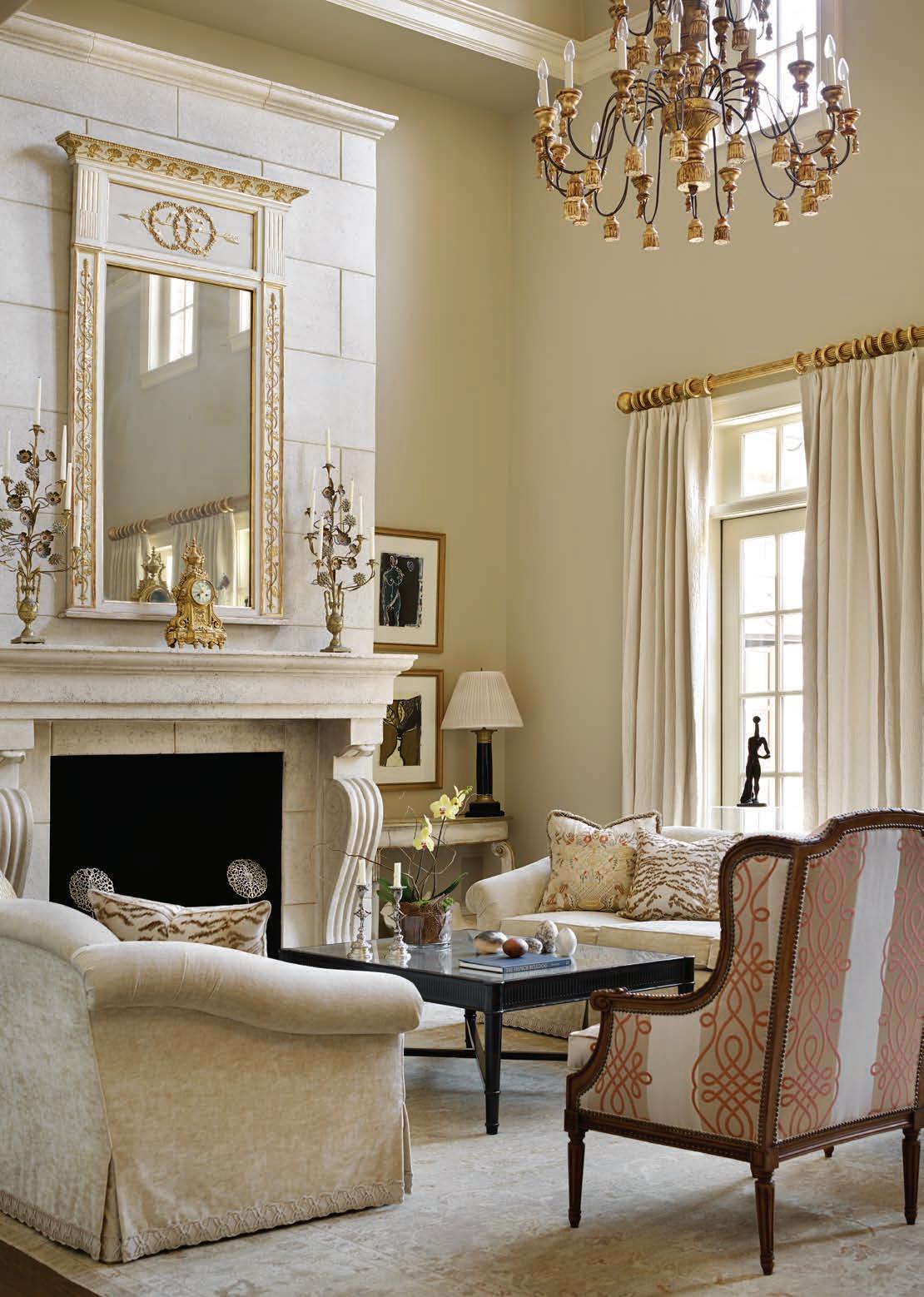
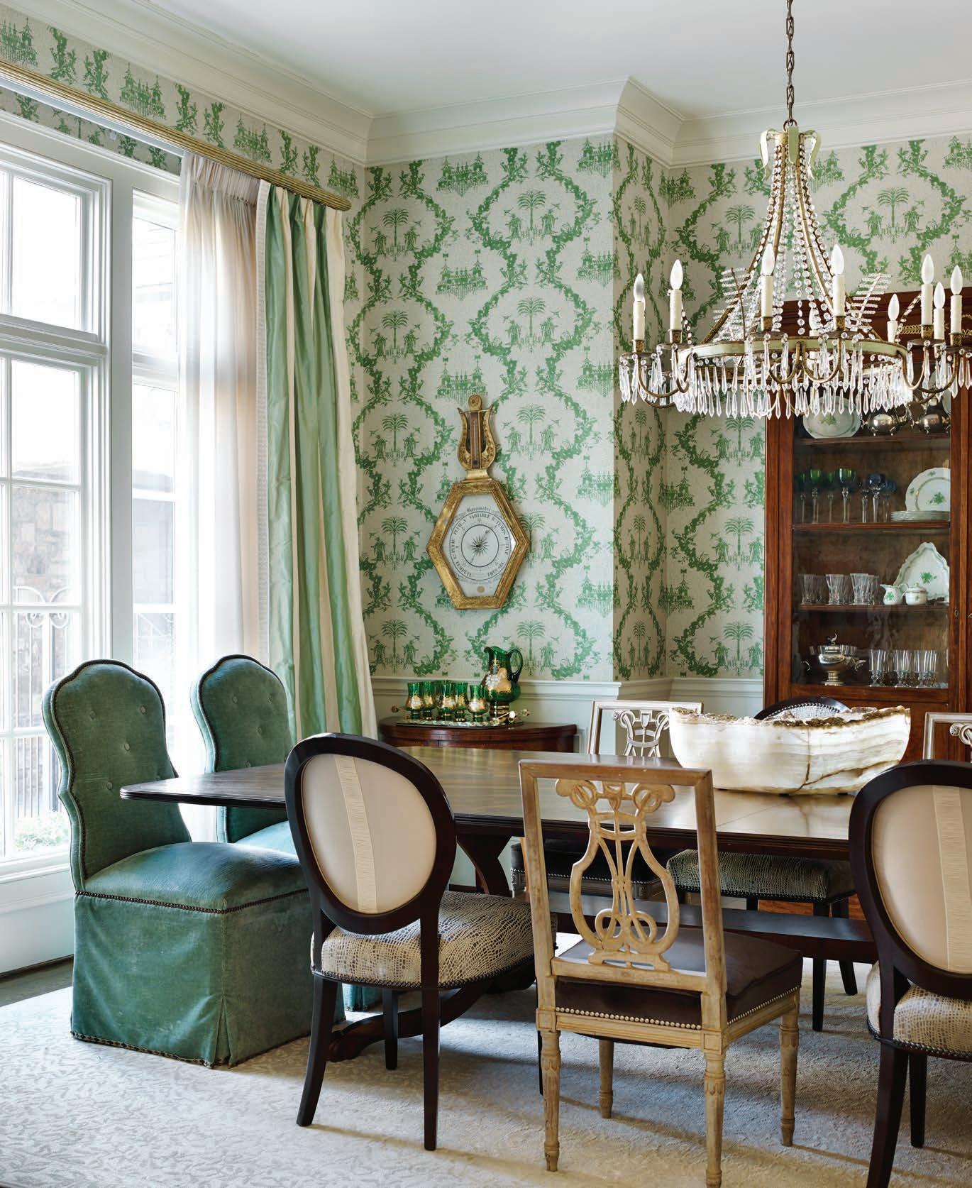
In the living room, the yellow tones were taken away and seating rearranged and expanded after moving the grand piano. Weaks added two neutral sofas and a pair of bergères, but most of the accessories stayed the same, including the chandelier, mirror, candelabra and statue in the window. opposite The Brunschwig & Fils wallpaper originally specifi ed for the dining room continues to take center stage, but the mix of chair styles, revamped window treatments and chandelier give the room a layered look.
“I THINK IT’S INTERESTING HOW A CLIENT’S TASTE CAN DEVELOP OVER THE YEARS, AND AS DESIGNERS, WE WALK THAT PATH WITH THEM,” SAYS CAROLE WEAKS.
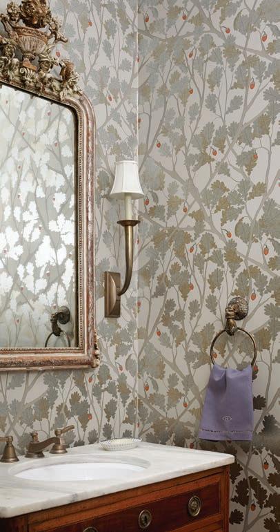
above The guest room bedding and window treatments were retained, with the addition of a bright roman shade for privacy. The star of the room is now the fresh Nina Campbell wallpaper, which ties everything together. right The powder room received a glamorous makeover with its Osborne & Little wallpaper in metallic silver and gold with a touch of the melon color pulled from the

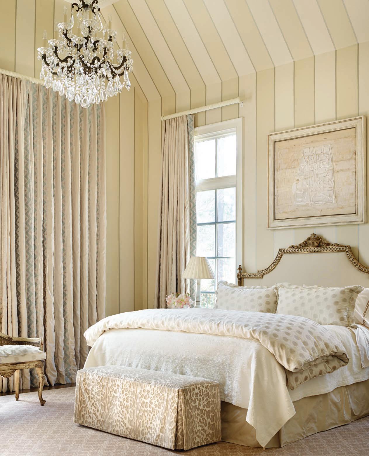
the living room. An antique commode was retrofi tted for the vanity, and the ornate mirror is from Parc Monceau. opposite Subtle patterns in the fabrics and striped walls add interest to the monochromatic color scheme in the soothing master retreat. A contemporary painting by Raul Diaz, represented by TEW Galleries, helps anchor the showstopping space.
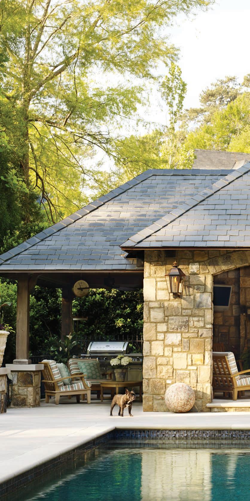
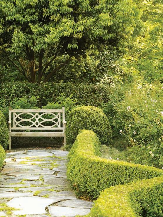
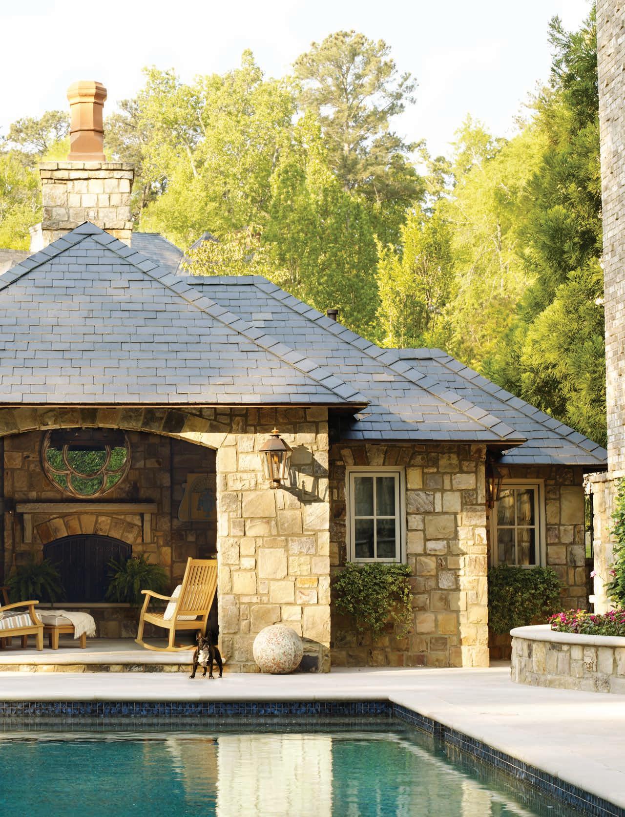
right “The pool and outdoor living spaces are part of the evolution of this home and were added later,” says Weaks. “The Hillses and their large family love to be outdoors when possible, so these areas are used all the time.” Rick Hatch of Harrison Design designed the pool and pool house. below Landscape architect Joe Gayle created a series of distinct spaces, including this lined pathway that culminates with a bench overlooking climbing roses in bloom.
