ELEMENTS OF DESIGN


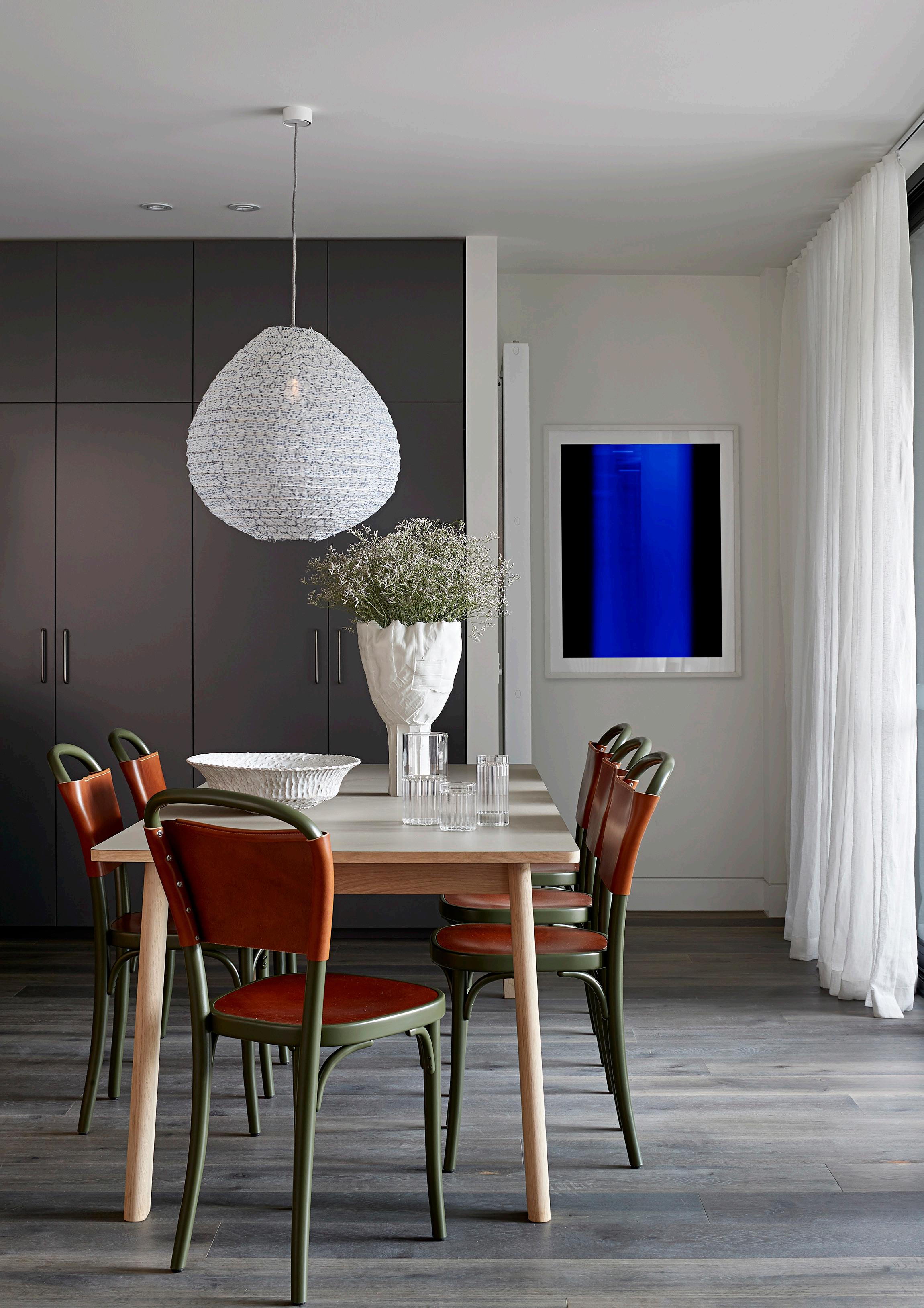 Photo credit: Lovelight
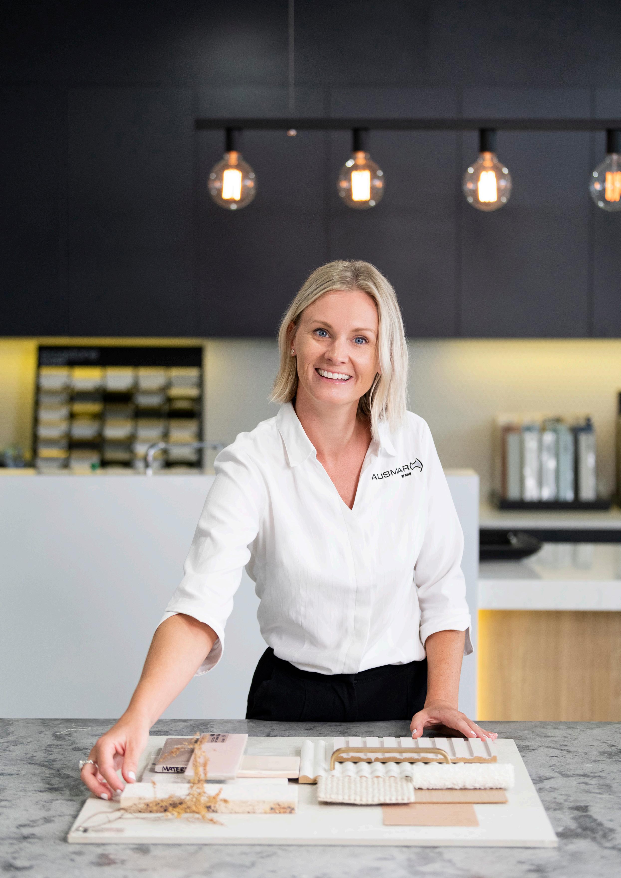
At AUSMAR we want you to be equipped to make the best design selections for your home, which is why in this guide we will be delving into a bit of design theory and exploring the elements of design.
These elements have been used to create interiors worldwide, and being aware of them will enable you to create beautiful interiors time and time again.
We will be sharing tips on space, line, shape, texture, pattern, colour and light to give you perfect balance in every room.
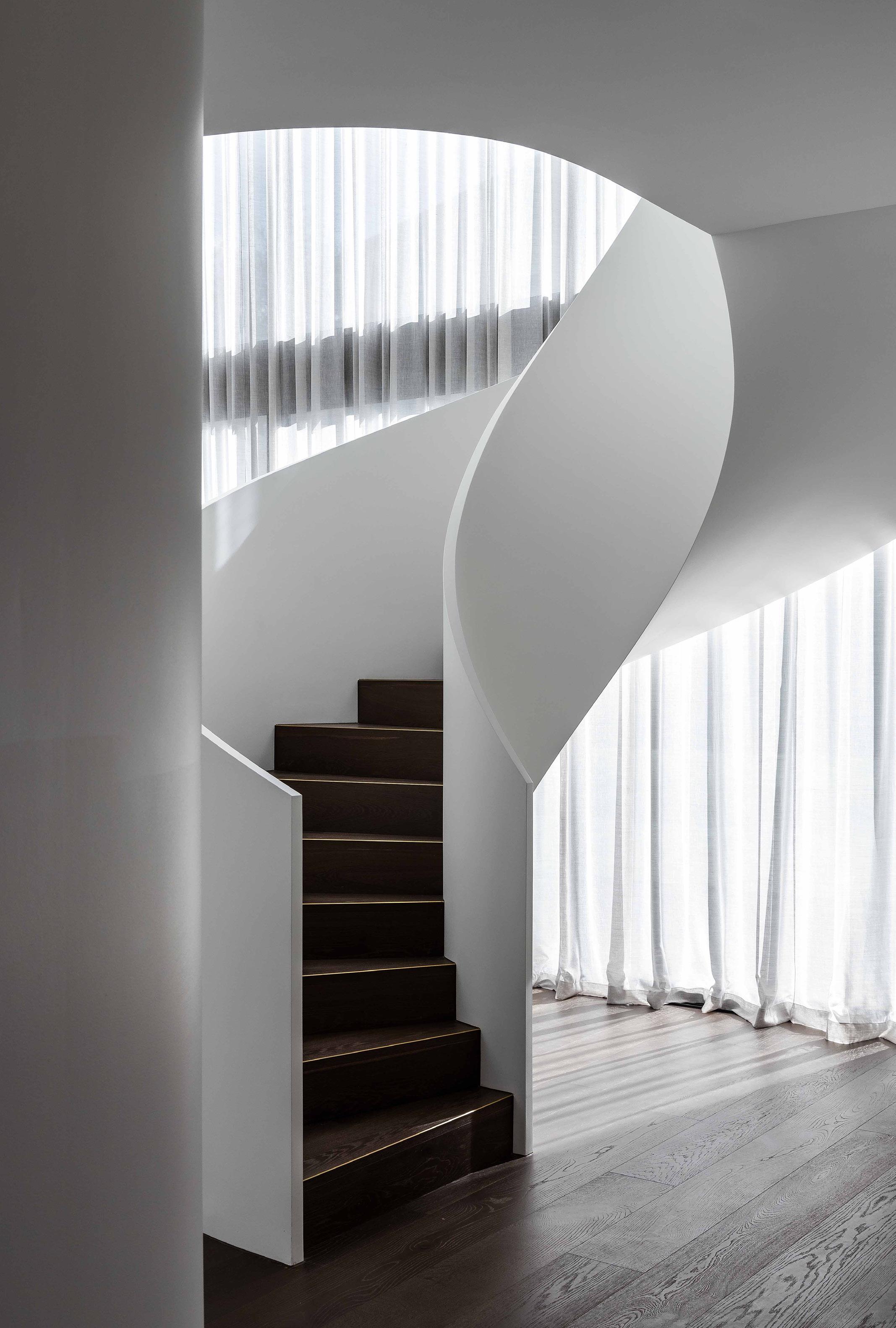
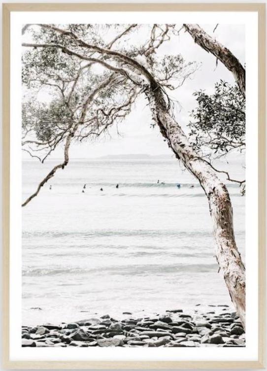
First things first, ask yourself how are you going to fill your space? Keeping in mind that less is often more. Empty space in a room is just as important as filled space.
Empty space can make a room look and feel larger because there’s more flooring visible, more air flow and more space to move through the room.
When it comes to space, you want to create the perfect balance in the room of captivating but not crammed.
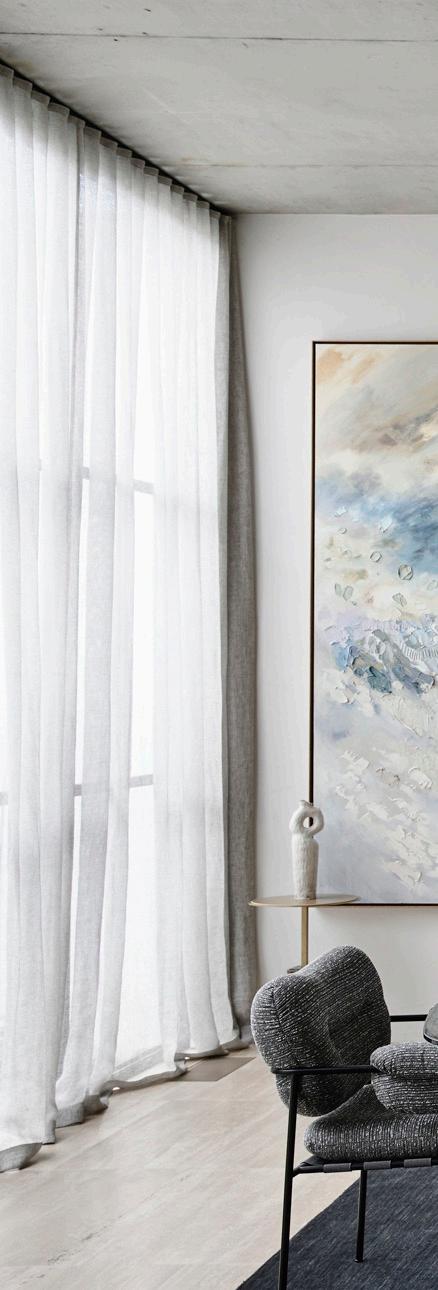
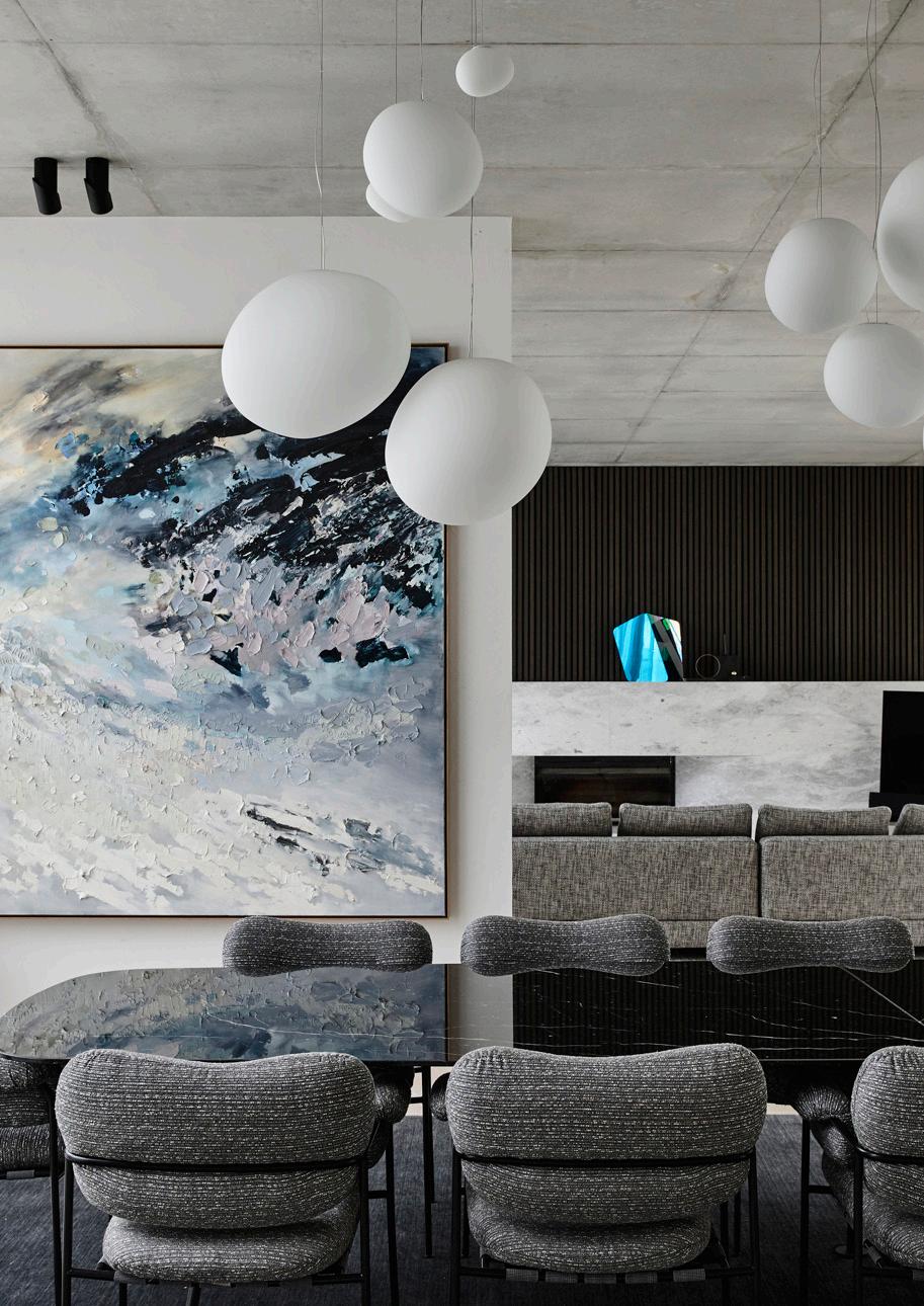 Photo credit: Dulux
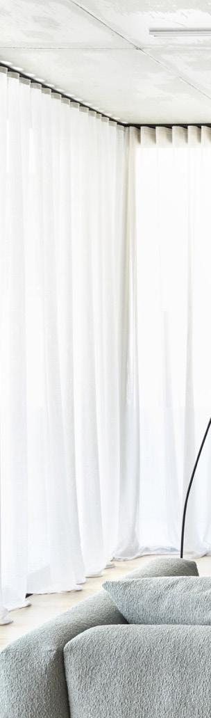
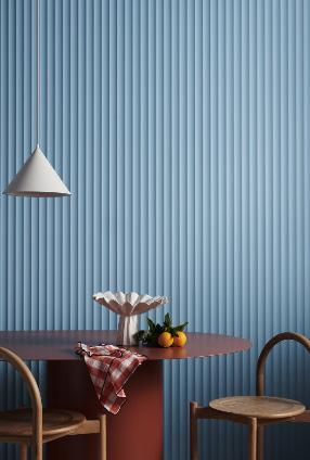
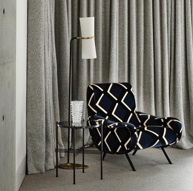
LIGHT CURTAINS
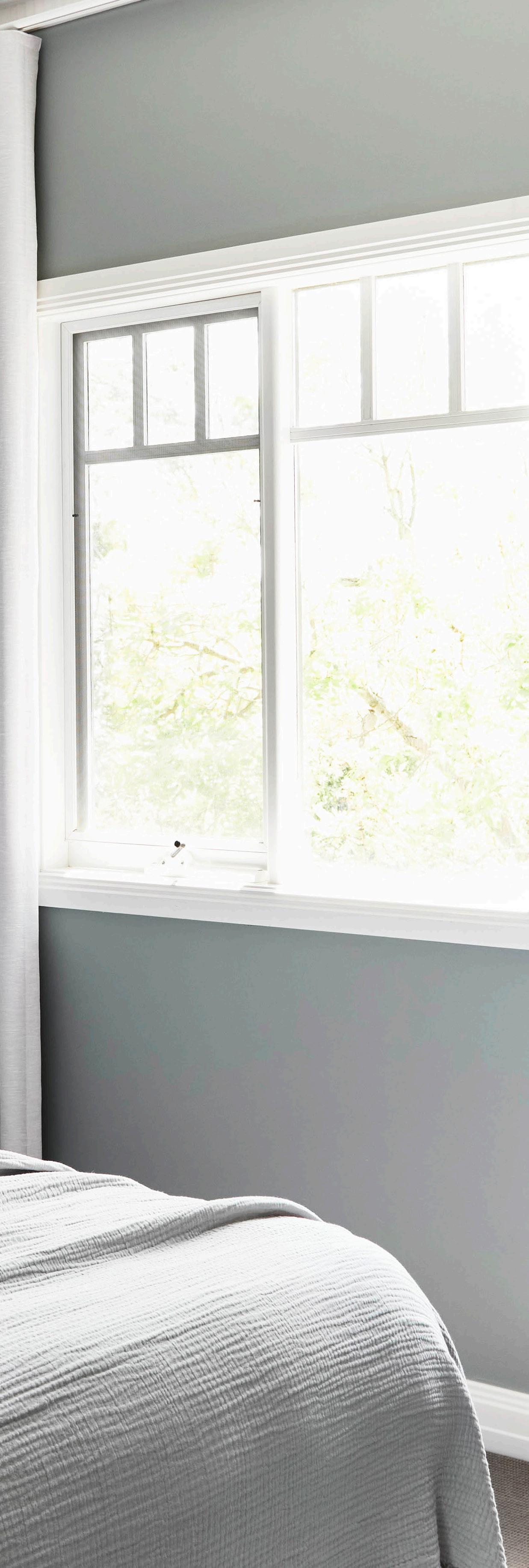
White and light coloured walls makes a space feel larger and this applies to furniture selection too. Choosing light coloured pieces of furniture help to make the room feel airy and light.
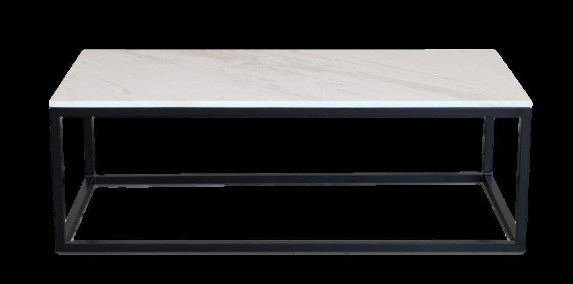
Reflective surfaces like mirror and tile help make a space feel large by reflecting the light around the space. Using glass coffee tables or marble in a space can help give the illusion the space looks grand.
Lastly clear out the clutter, make the space have a clear walkway and avoid over styling your room. By having a few statement pieces you can really make the space look airy and give a feeling of calm.
CLEAR WALKWAY Photo credit: Lovelight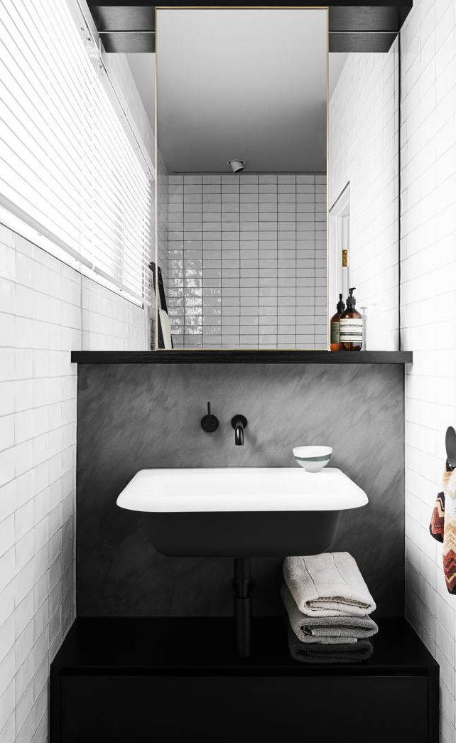
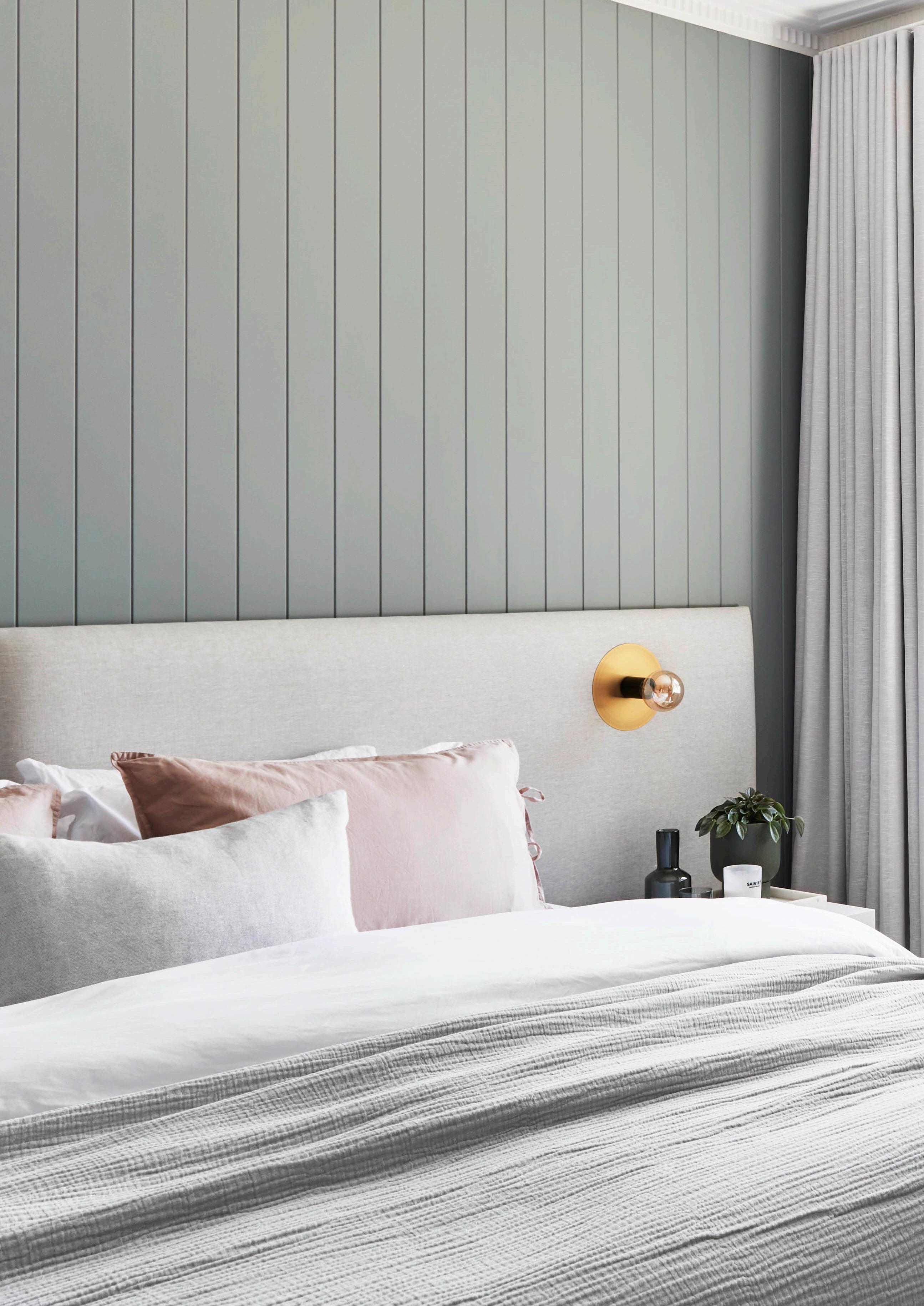
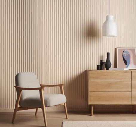
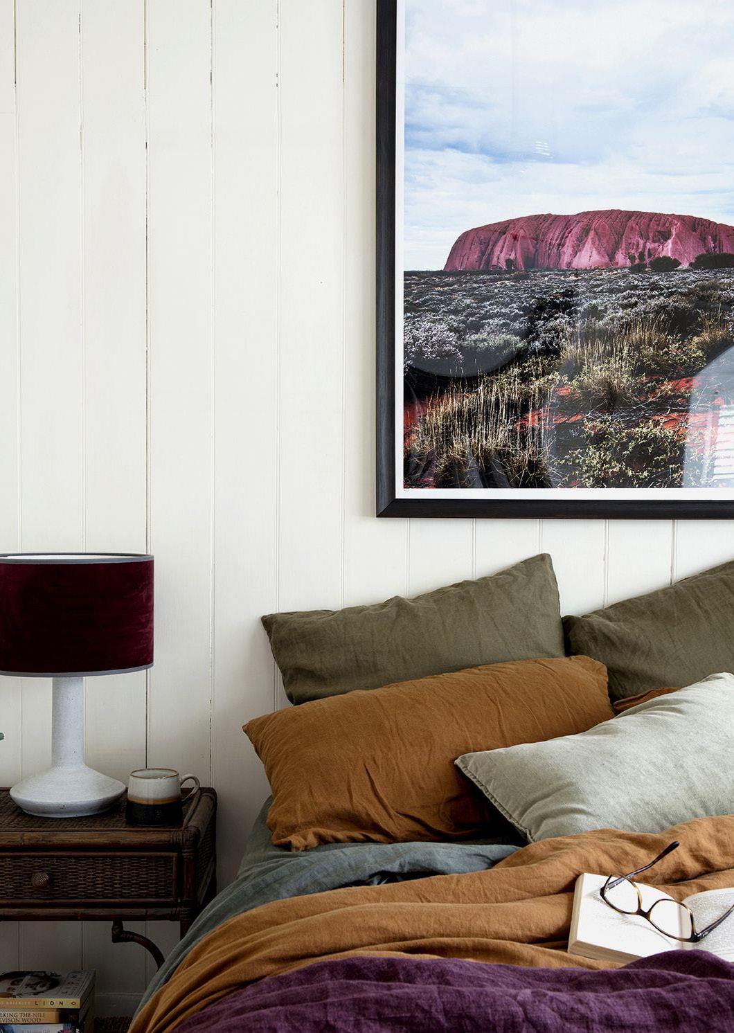
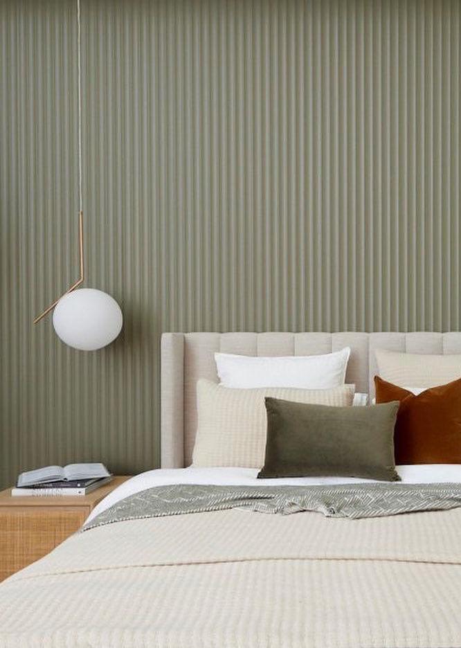
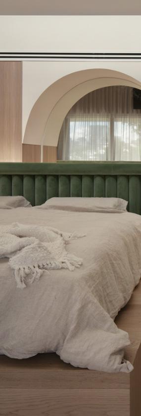
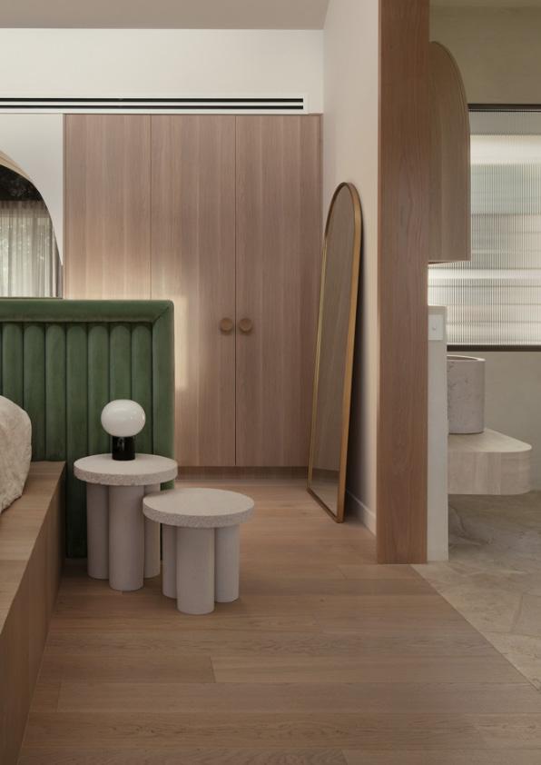
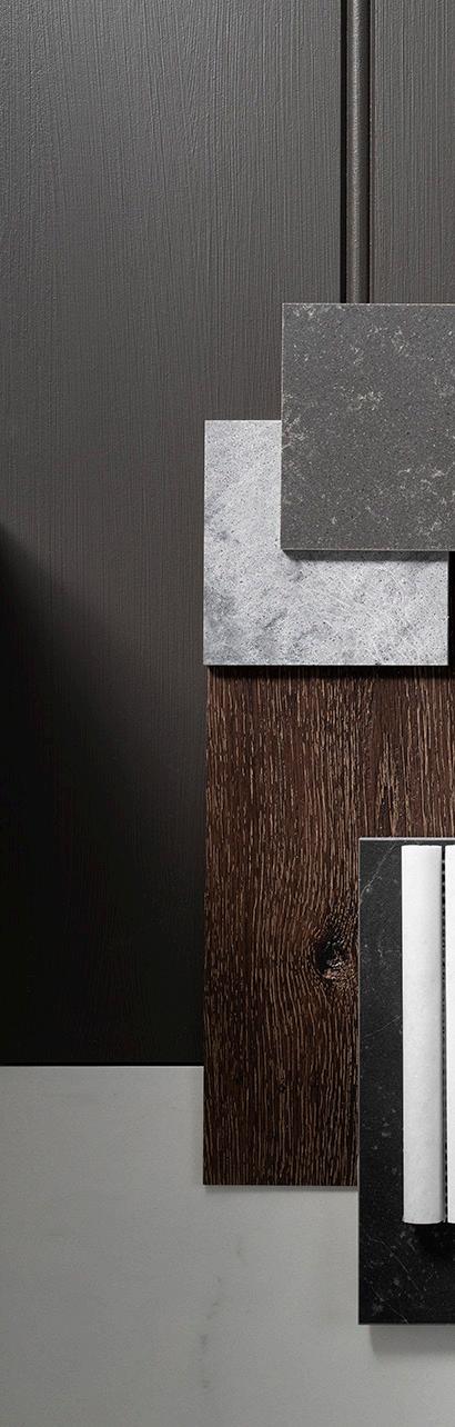
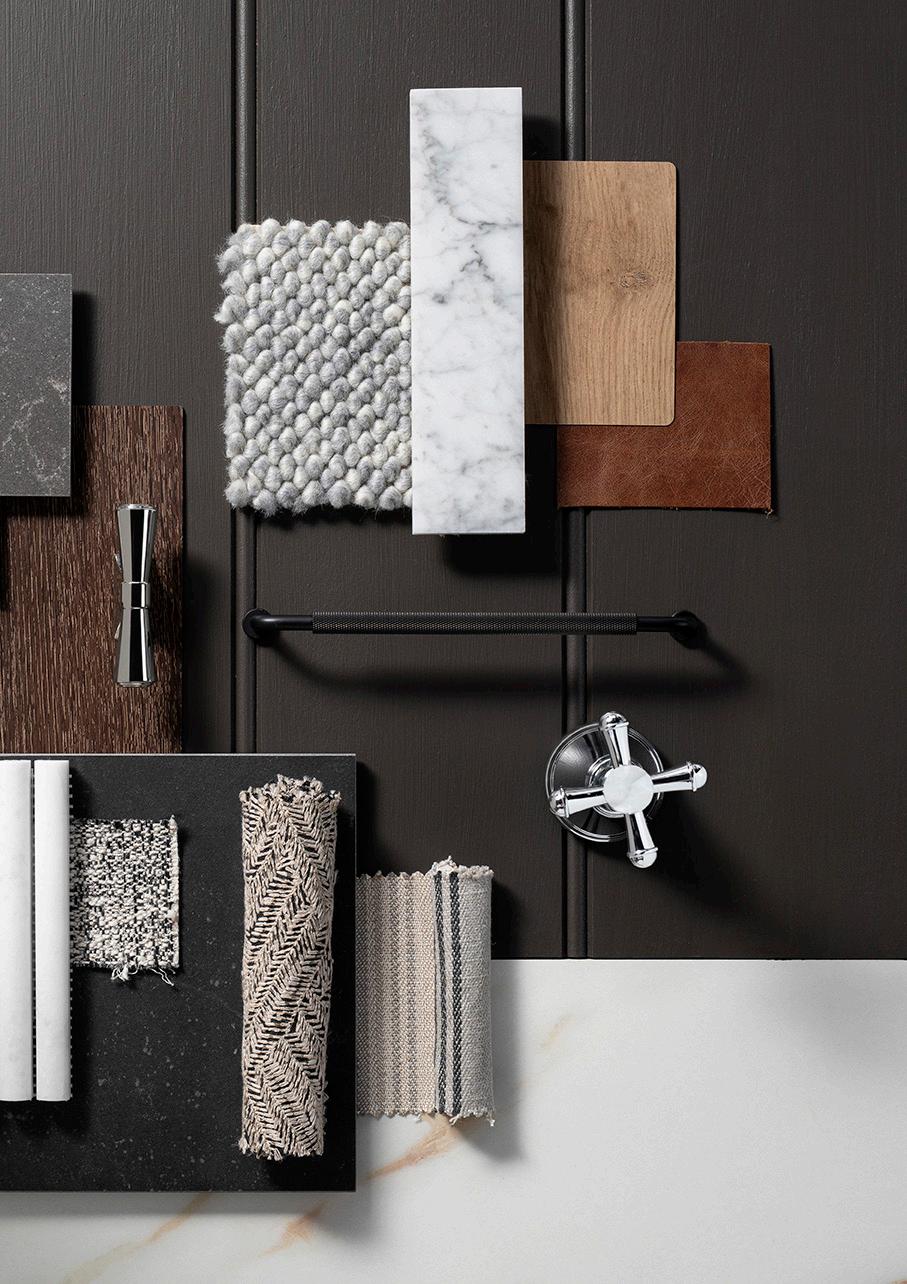
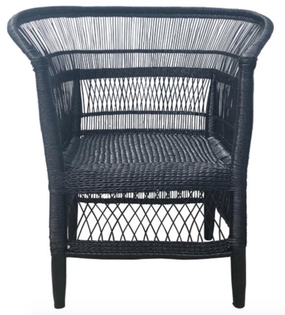
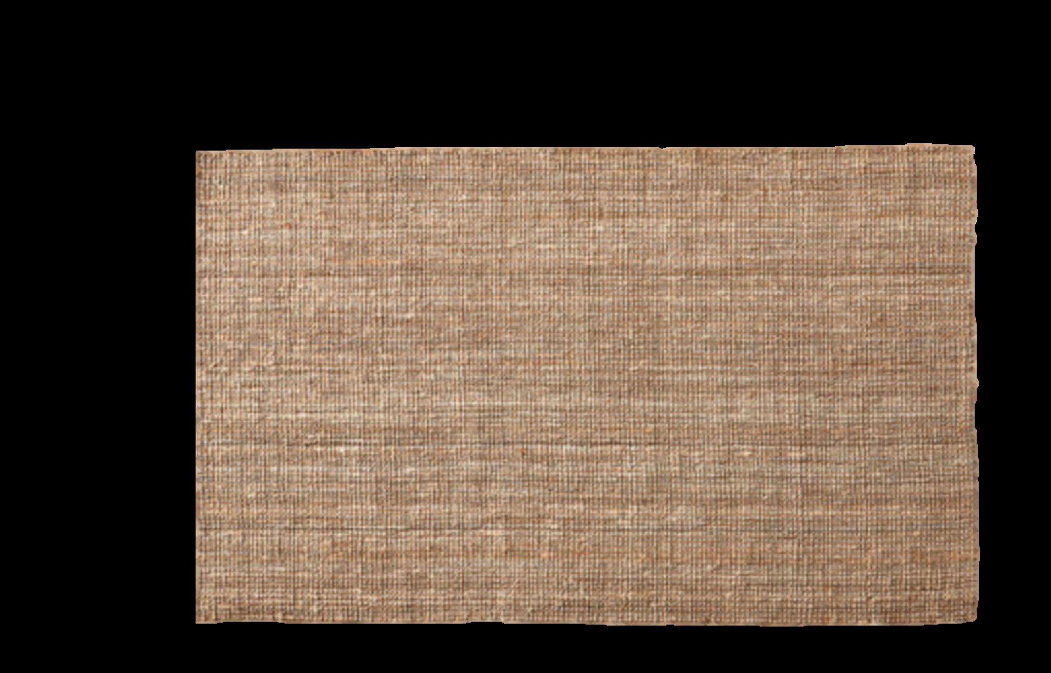
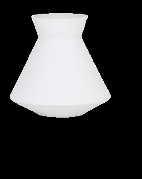
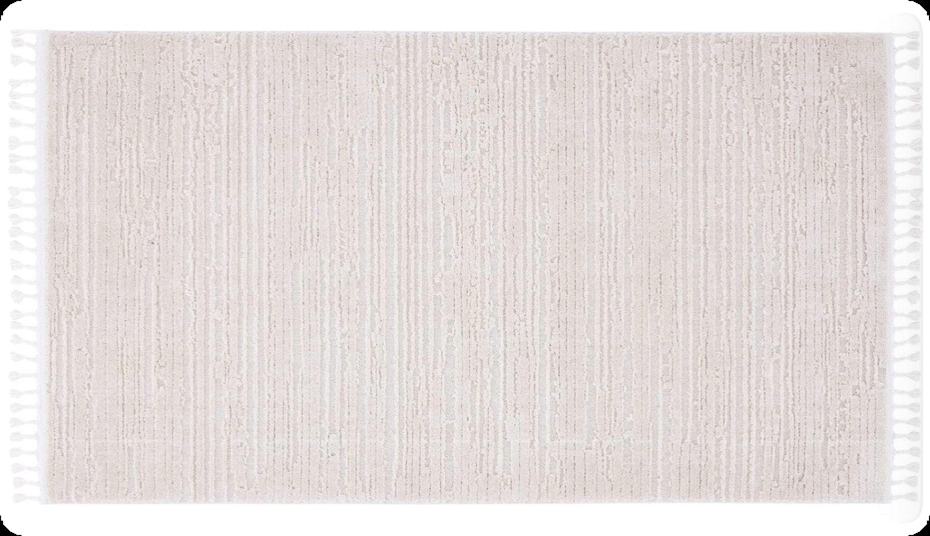
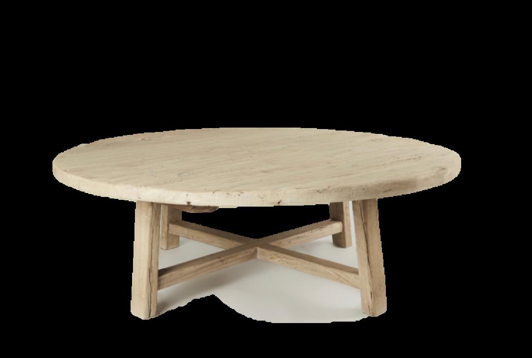
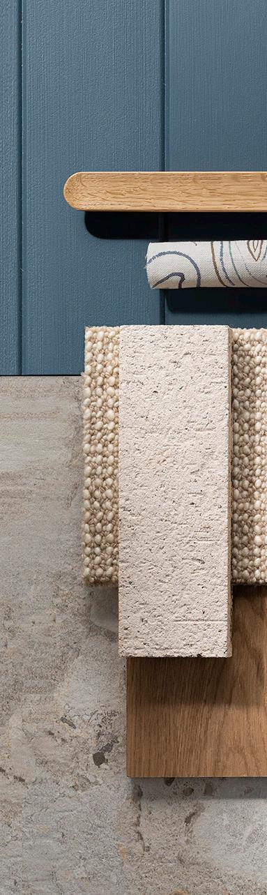
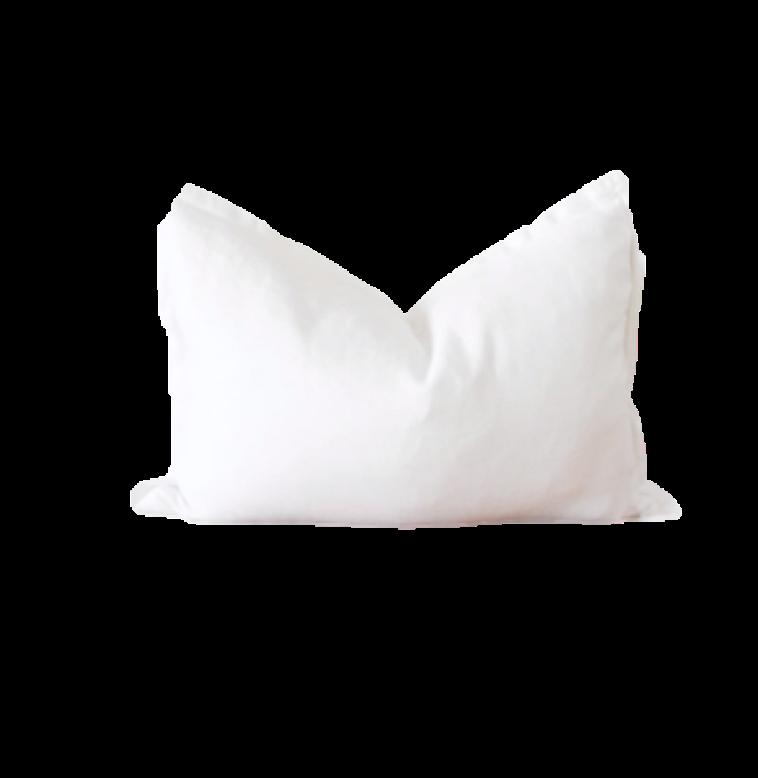
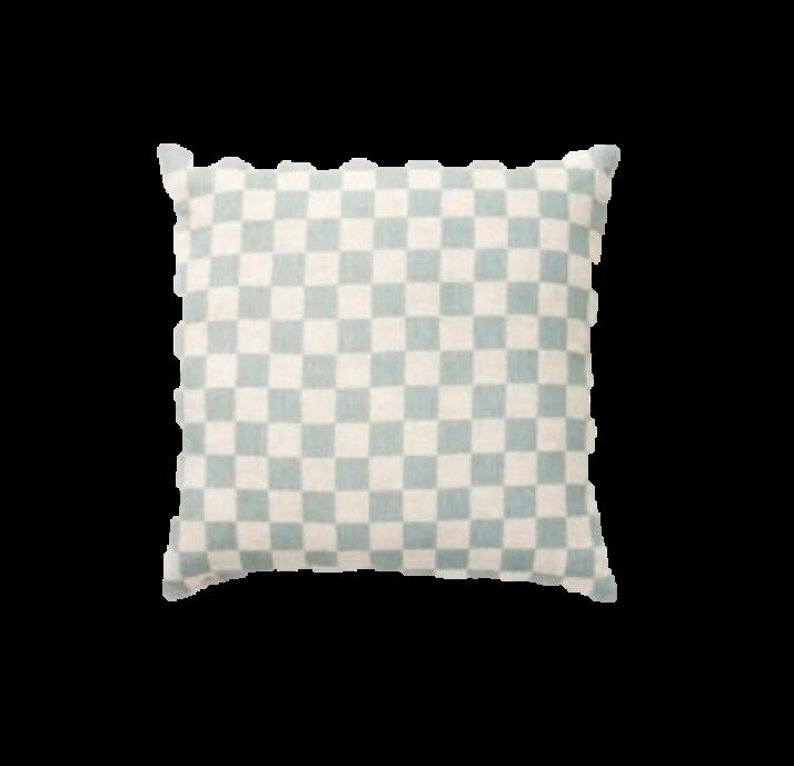
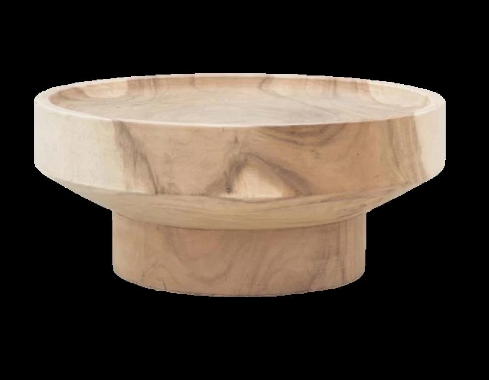
TEXTURE
Texture is a medium in interior design that can be used to add depth and interest to a space. Texture is something that creates a story.
Rough textures can make a space feel cosy, rustic and grounded, while smooth surfaces tend to add a modern, sleek and contemporary tone to a space.
Texture is a way to add layers to your interior design. It is a medium that is used to emphasise different areas and draw your eye around the room.
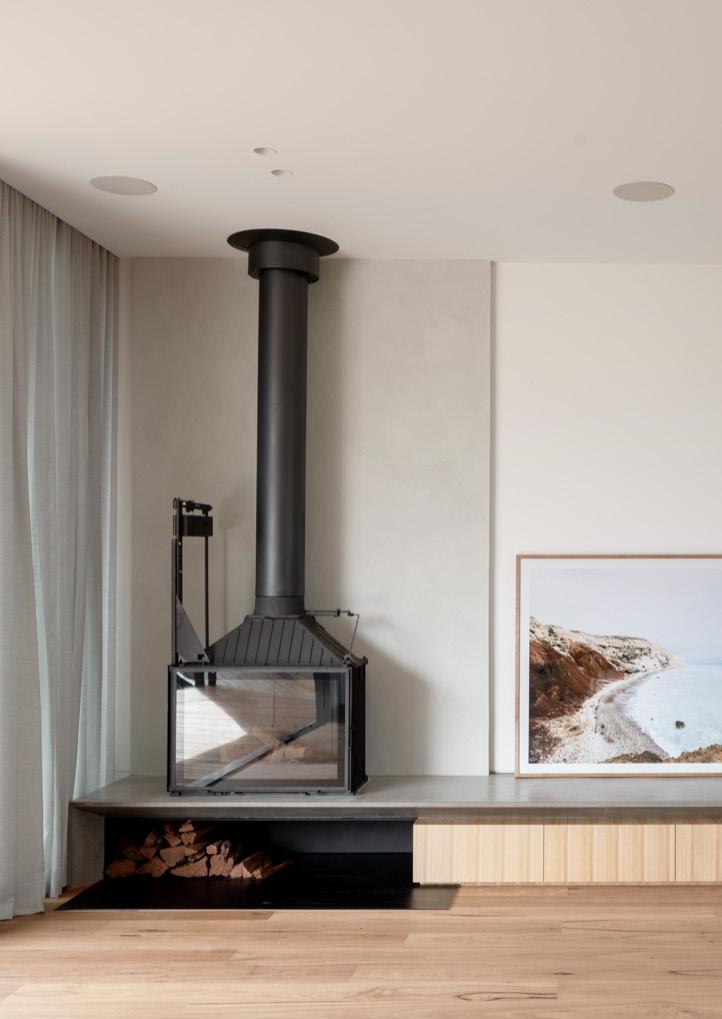 Photo credit: Essastone
Contrasting textures bring balance to a room as they create a depth to the landscape. This is especially obvious if you have a monochromatic colour scheme throughout the objects and furnishings in your space.
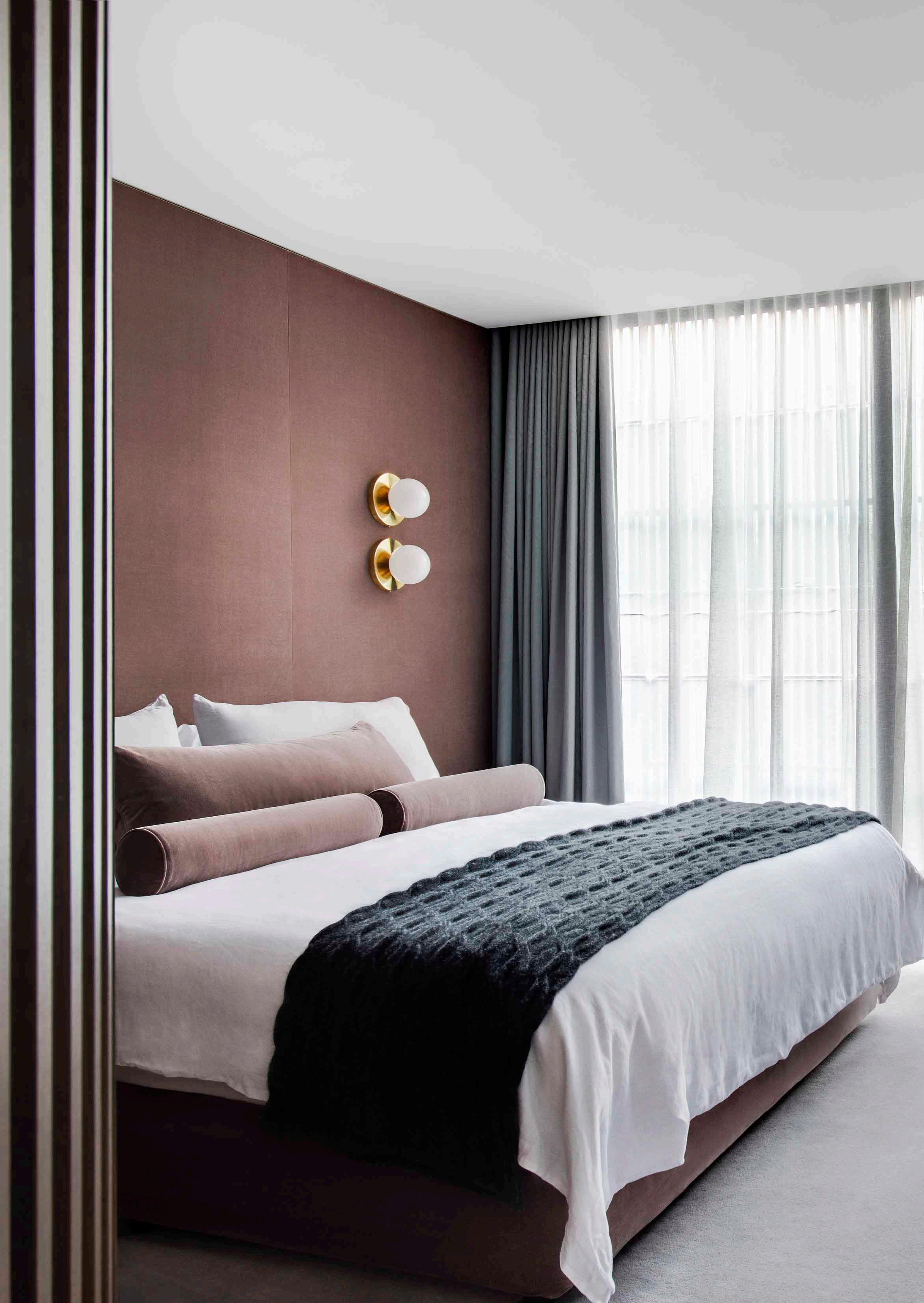 Photo credit: Lovelight
WALLPAPER
COTTON
VELVET
KNIT KNIT CARPET
WOOD
GLASS
Photo credit: Lovelight
WALLPAPER
COTTON
VELVET
KNIT KNIT CARPET
WOOD
GLASS
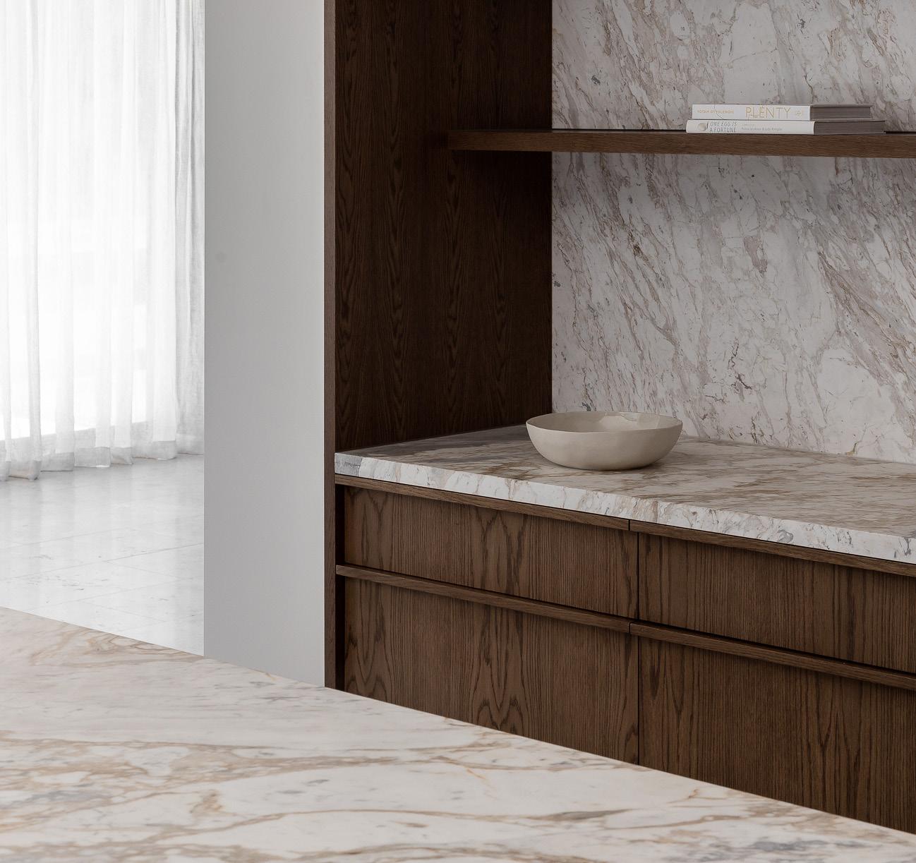
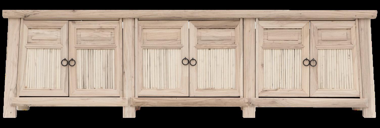
The opportunities to bring texture into a room are endless. Some of our favorite ways are through upholstery, curtains, rugs and lighting fixtures. Every item in the room can add texture and make your room exciting without being too loud.
Using objects to bring in texture to a room is an inexpensive way to add beauty. Through vases, cushions, throws, artwork or something like a mirror. When adding objects into your space you want to add interest through texture but not overwhelm the space with too many competing textures.
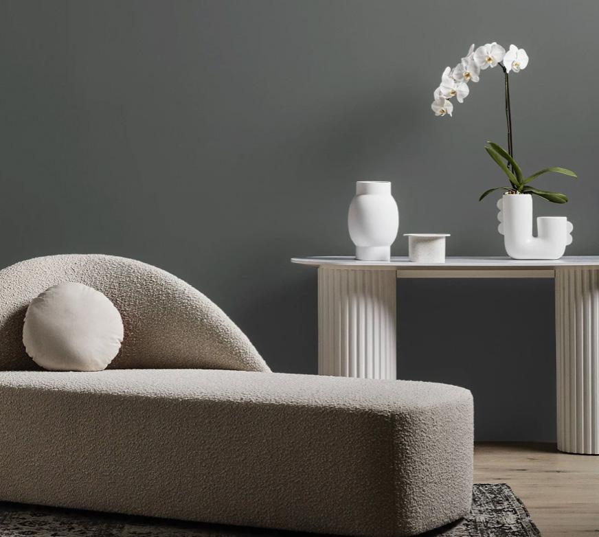 Photo credit: Surround by Laminex
Photo credit: Dulux
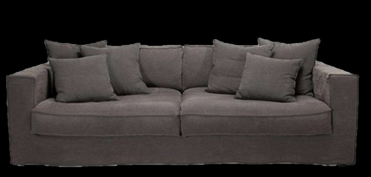
COUCH
WOOD
SURROUNDS BY LAMINEX
RUG
Photo credit: Surround by Laminex
Photo credit: Dulux
COUCH
WOOD
SURROUNDS BY LAMINEX
RUG
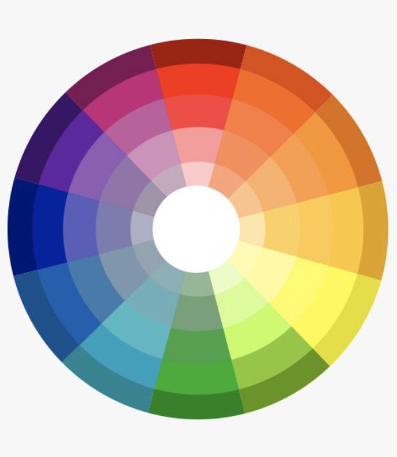
Colour can be a complicated element to nail, but by following our colour wheel theory, it’s something you know you can perfect time and time again!
ALL COLOUR SCHEMES CAN BE SOFTENED BY ADDING WHITES AND NEUTRALS TO THE SPACE.
 Photo credit: Lovelight
A colour wheel shows you how colours relate to each other and visually demonstrates the relationship between primary, secondary and tertiary colours. You can use the colour wheel to develop colour schemes with these several key approaches.
PRIMARY COLOURS: red, yellow, blue.
SECONDARY COLOURS: green, orange, violet
TERTIARY COLOURS: red/orange, yellow/orange, green/yellow, blue/green, blue/violet, red/violet.
Let’s take a pure hue, like green, from the colour wheel and make it less vibrant and more user-friendly through tinting, shading and toning it.
ADDING WHITE TO A PURE HUE/COLOUR
ADDING BLACK TO A PURE HUE/COLOUR
ADDING GREY TO A PURE HUE/COLOUR
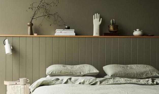 Photo credit:Surrounds by Laminex
This is a variation of a single colour. Monochromatic schemes are serene and relaxing. Light tones create a relaxed delicate feel, whereas dark tones can feel moody and dramatic. Mixing light and dark tones adds interest and a touch of energy.
These colours can be found on the opposite sides of the colour wheel, such as blue and orange, red and green or purple and yellow. Used together, the colours appear brighter in contrast to eachother.

The split complementary colour scheme is a variation of the complementary colour scheme. In addition to the base colour, it uses two colours adjacent to its complement. This colour scheme features less contrast, making it for the less confident.
This approach uses three different colours on the colour wheel. They can be monochromatic, complimentary or contrasting. The results are harmonious but are a little more vibrant.

 3. SPLIT COMPLEMENTARY
4. TRIADIC
3. SPLIT COMPLEMENTARY
4. TRIADIC
Time to test your colour knowledge. Guess what colour scheme these Dulux painted rooms are inspired by.
 Photo credit:Dulux
Photo credit:Dulux
Photo credit:Dulux
Answers: Picture A: Split Complimentary, Picture B: Monochromatic, Picture C: Monochromatic, Picture D: Triadic, Picture E: Split Complimentary.
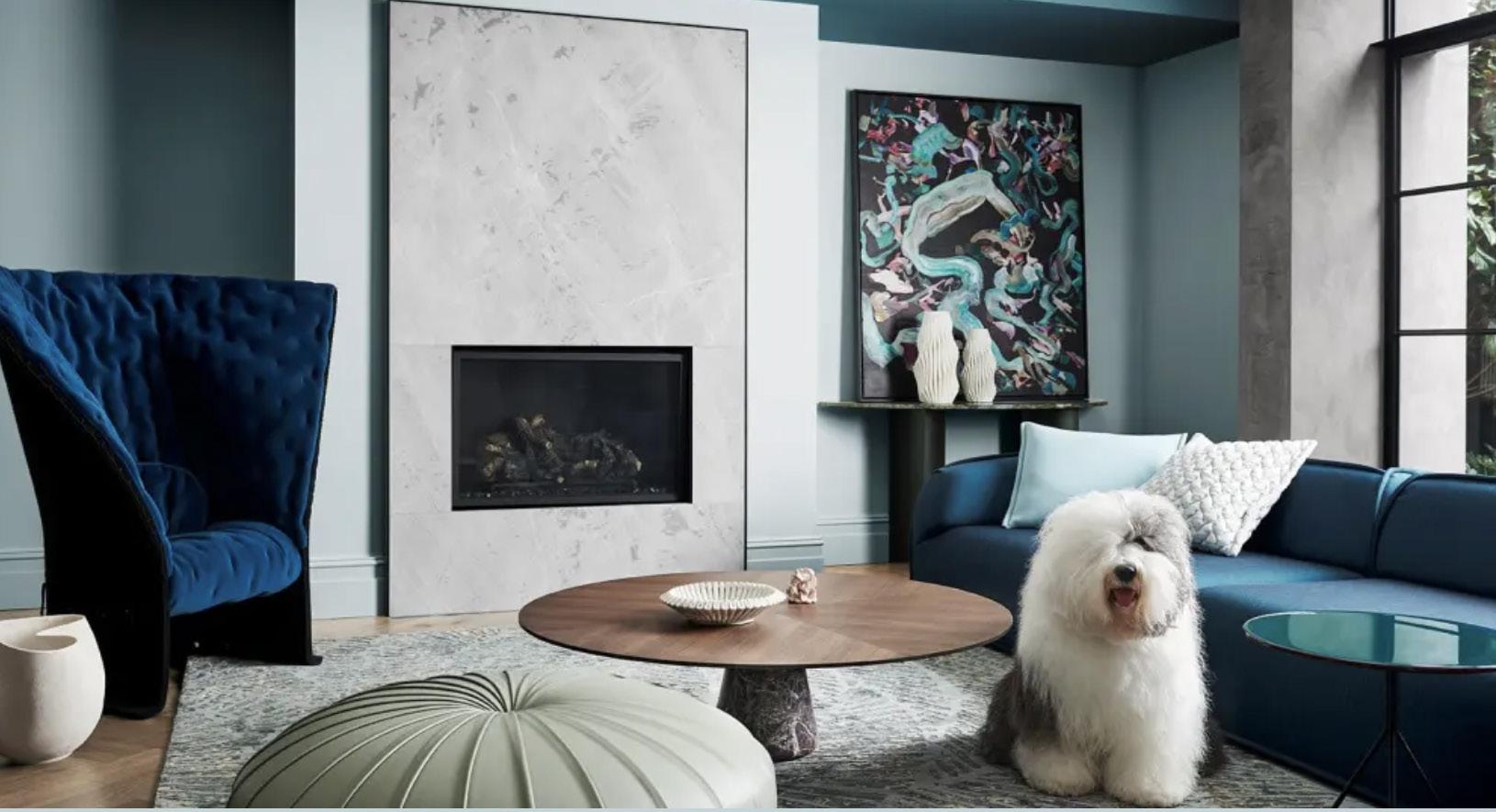
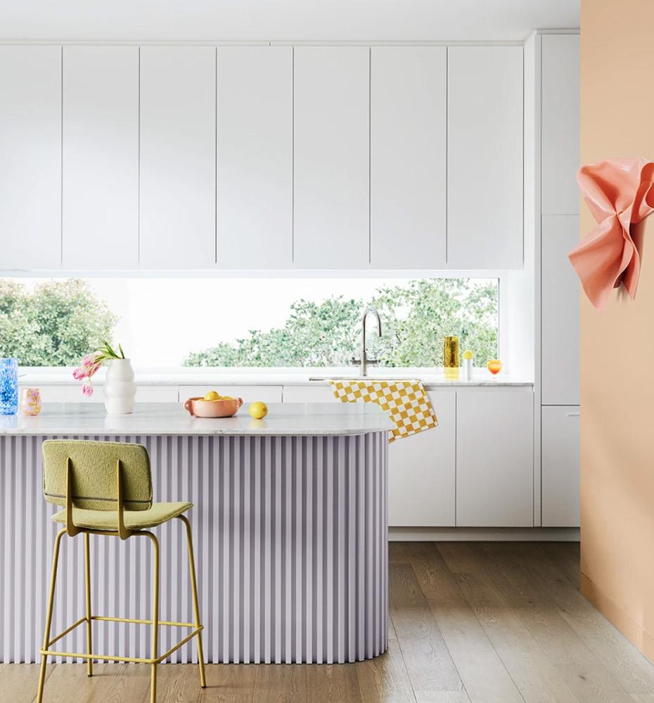
 Photo credit: Lovelight
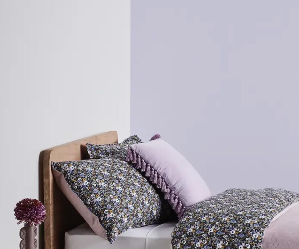
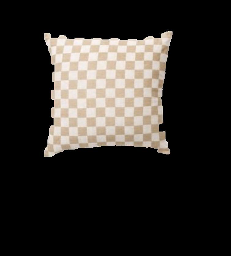
Choosing a subtle pattern is a safe way to introduce patterns to a space whilst you gain more design confidence. You can keep it subtle by using a neutral colour palate in your pattern. This will introduce interest without overwhelming a space.
If you’re ready to make a bold move and create a point of difference with a pattern in your room, it doesn’t have to be covering all four walls, you can add a feautre wall, a tiled area or wallpaper to a room to create a feeling of luxury.
Too many patterns of numerous colours in one space end up making the space feel cluttered. While adding a pattern, you must choose hues that compliment each other, rather than create friction. Choose colours from the same color palette and then create an aesthetically pleasing foreground for the patterns to compliment.
Patterns can be intimidating, and if you’re feeling unsure, start with small items you can easily change in a space, such as cushions or artwork.
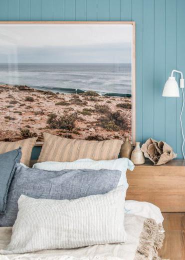
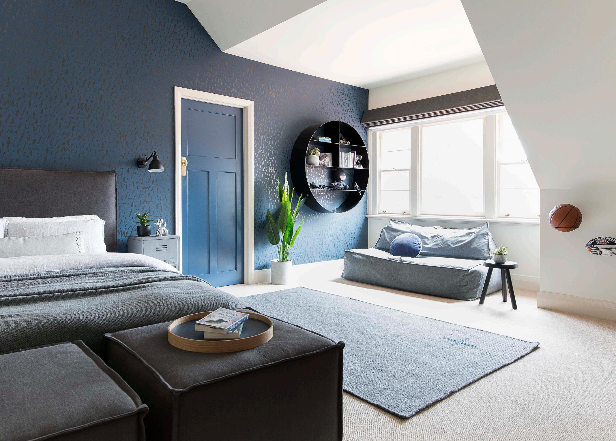
BLUE PATTERN COMPLIMENTS THE BLUE DOOR AND THE SUBTLE BLUE AND GREY COLOUR PALATE OF THE ROOMLines are an important element to interiors as they add direction and flow to a room. Line in a room can be created in many different ways.
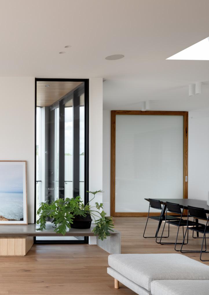
A lot of furnishing such as tables, stools and lamps naturally create strong vertical lines in a room, these help you to feel grounded. You can use vertical line in a room such as timber cladding to make the room look tall and feel more spacious. Line can be brought in through striped patterns on furniture or cushions.
Everything you choose to put in your room has shape and line, so being aware of how all these lines work and flow together will help your room feel unified
HORIZONTAL LINES
CURVED
Lines are an important element to interiors as they add direction and flow to a room. Line in a room can be created in many different ways. A lot of furnishing such as tables, stools and lamps naturally create strong vertical lines in a room, these help you to feel grounded. You can use vertical line in a room such as timber cladding to make the room look tall and feel more spacious. Line can be brought in through striped patterns on furniture or cushions. Everything you choose to put in your room has shape and line, so being aware of how all these lines work and flow together will help your room feel unified
A lot of sharp and clean lines in a house can give it that modern and minimal feel, using vertical lines gives the illusion the space is wide and horizontal the space is tall. You can also use lines to section off different areas in your kitchen or the use of a rug underneath works as a line that groups sections of your house together.
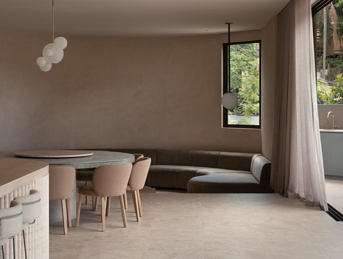 Photo credit: Local Project
Whilst rounded lines can be used to soften a space. Round shapes can be added through archways or curved lounges. These can make a space look feminine and soft, and are big features in warm European style houses.

Diagonal lines or zig zag help to add vibrancy and energy to a room. You can achieve this though tile patterns, wallpaper or a patterned fabric.
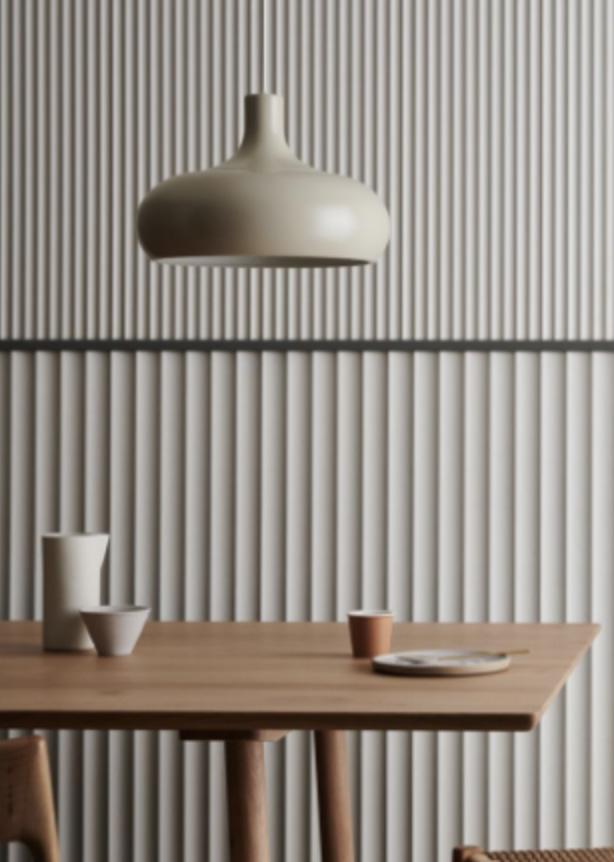
Photo credit: Local ProjectThe secret to perfect lighting is creating layers of light with a combination of different light sources in the room. Great lighting creates depth and height, warmth and draws attention to the most important features in the room. Never underestimate the importance of lighting in a room. Without the right lighting, you are unable to view the beauty of your interiors. Let’s walk through all the options so you can choose what lighting is best for your space.
Start with utilising the natural lighting by removing any dark curtains. If you’re needing to add light to a room, consider sheer white or cream curtains, this helps to bring the natural light in.
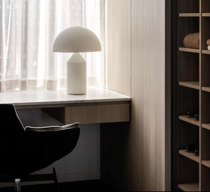 Photo credit: Lovelight
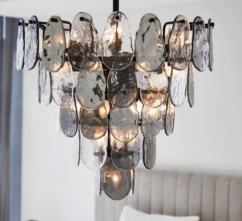
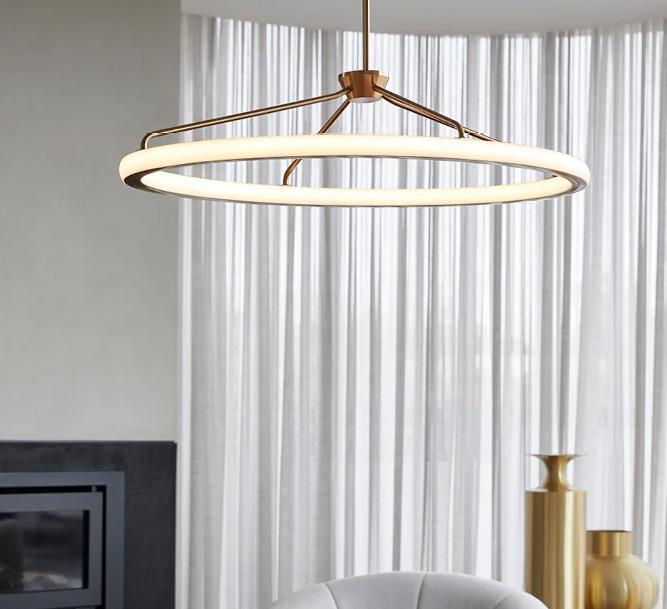
The most obvious light source is ceiling lights, as they provide the primary illumination in a room. There are many different types for different functions, here are some examples.
 Photo credit: Beacon Lighting
If your wanting to add a touch of luxury to a room a chandeliers is the statement piece your searching for. Not only does it light up your space but it is a peice of art in itself.
Pendants are stylish and highly versatile. They look good standing alone or in a cluster.
As it’s name suggests this type of light choice helps you get tasks complete with efficent lighting. Table lamps are ideal for reading and writing, while decorative lamps add style to your home. Floor lamps add height and help to create zones in the room. Lamps with warm glows make a room soft and ambient and preapre you for bedtime or help with reading.
Recessed downlights provide even light source throughout a room. They are subtle and unobtrusive, which work well with a modern home design. They let the architecutre around them shine with crisp clean lines. Spotlights light up a specific area of the home for a little extra drama or showcase an artwork.
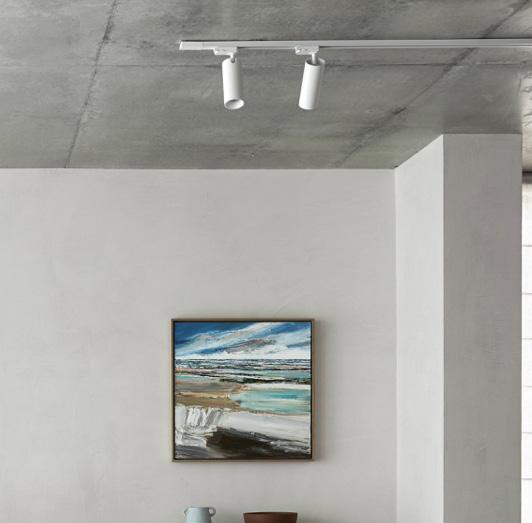 Photo credit: Lovelight
Photo credit: Beacon Lighting
Photo credit: Beacon Lighting
Photo credit: Lovelight
Photo credit: Lovelight
Photo credit: Beacon Lighting
Photo credit: Beacon Lighting
If you’re stuck on a theme for your interiors, we have prepared four mood boards for you to get inspired by. They are based on four styles that are tried and tested Classic inspired, Australian inspired, Warm European inspired and Coastal inspired.
These mood boards are versatile. The materials we have used are available through Laminex, we’ve even given you the names of Laminex product if you want to follow the scheme exactly in your own home.
Lastly we’ve selected some of out favourite decor and furnishings that match these four schemes. This should really kickstart your styling process.
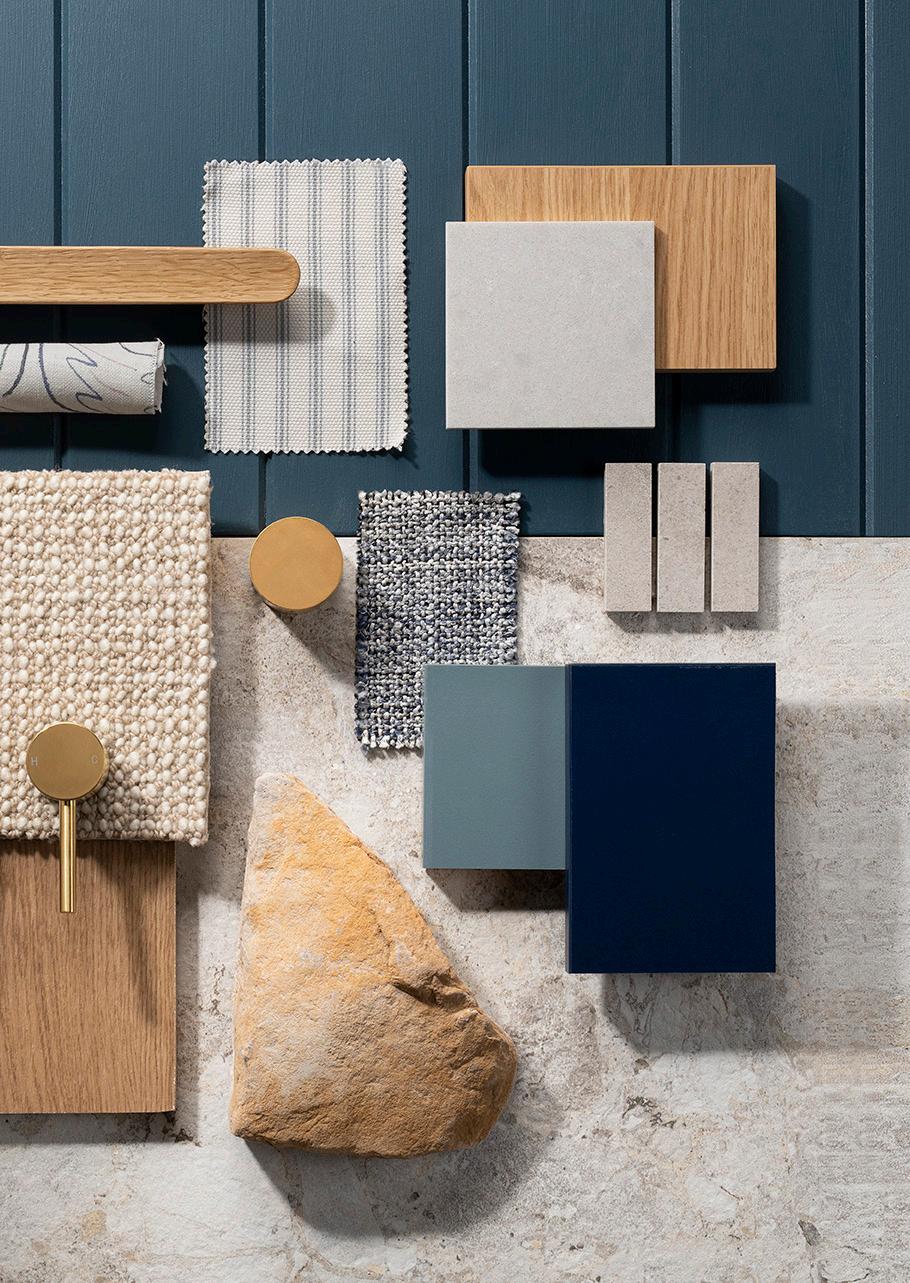
Whether you’re creating your first home or forever home a classic interior will confidently stand the test of time. Keeping true to what lights us up, our take on a classic look leans to a broody and masculine feel but feel free to spin it however your heart desires.

• A classic scheme feels simple, strong, with a black and white colour palette.
• Marble or marble-look is a staple in a classic scheme.
• Heritage wall panelling is synonymous with a classic scheme.
• Include dark timber-look vinyl flooring for its richness and warmth.

• Polished chrome is the ultimate in simple elegance.
• A stripe in your soft furnishings is timeless and effortlessly sheik.

Inspiration for the Classic Interior Scheme has been taken from a simple monochrome Scandinavian coastal vibes. The palette is monochromatic with blacks, greys and whites with accents of light timber to soften the otherwise masculine feel.

lassic Interior Scheme has imple monochrome ibes. The palette is blacks, greys and whites timber to soften the feel.


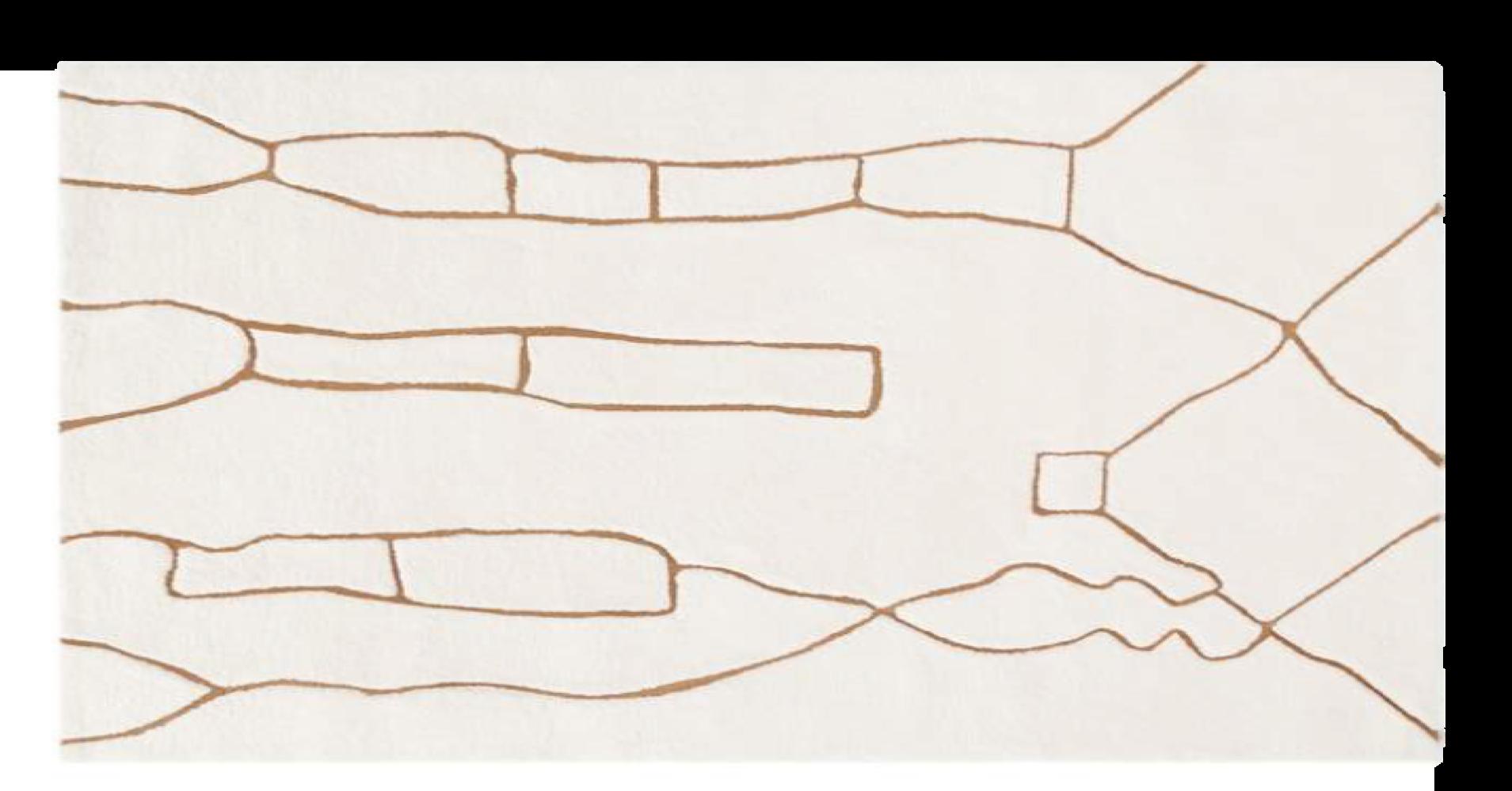
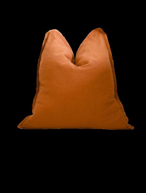
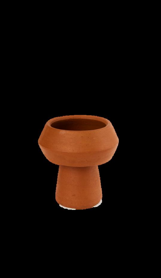
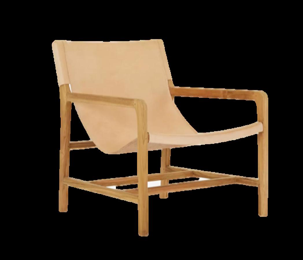
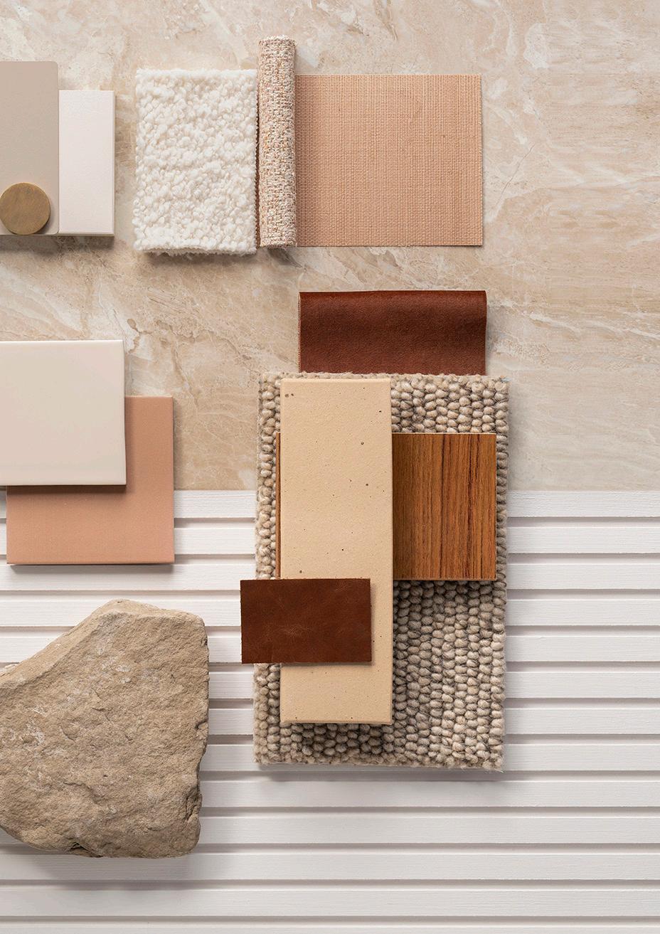
We tend to give a nod to our unique Australian landscape in all of my interiors in one way or another. There is something special about our island nation that we love to see celebrated in our homes. This material board pays homage to our country in a more overt way with its earthy greens and pops of rust, warm timbers and rich metals.

• Australian Styled interior design drives inspiration from our unique country landscape.
• Look for earthy greens, pops of rust, warm timbers and rich metals.
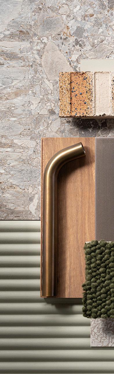
• Decorative wall paneling will elevate the space.
• The fluid pattern and colours in the large tile is a key element for bringing together the scheme.
• Bronze metal feels on-brand with the Australiana look and feel.
• Natural, breathable fibres like linen and cotton textiles suit this interior perfectly.
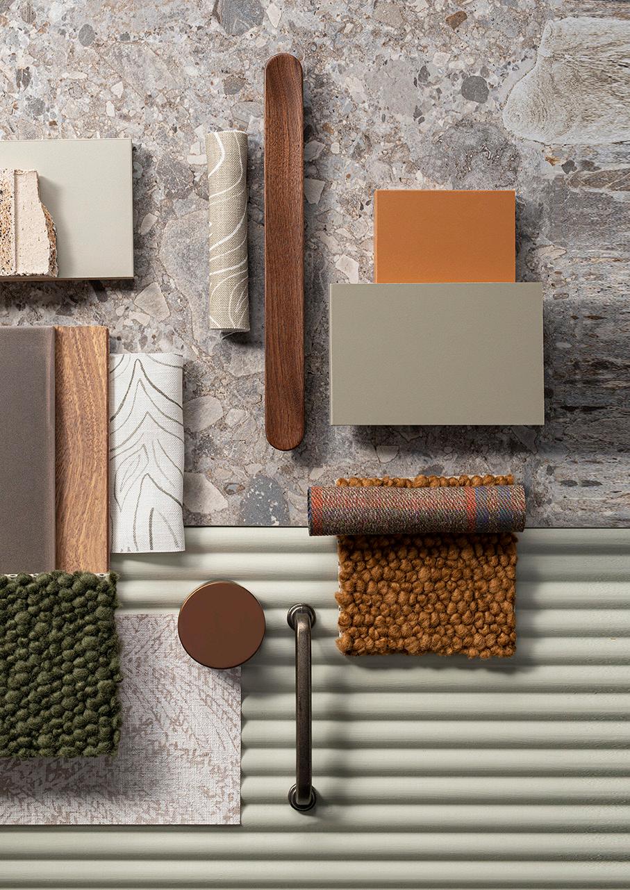
Inspiration for the Australian Interior Scheme has been taken from the rich ochre soils of outback Australia together with Eucalyptus and sage greens from the bush. The palette is from nature with burnt ochre and terracotta together with soft greens and added textures of leather and timber.
The palette is from nature
terracotta together with sof textures of leather and timbe

A European-inspired scheme feels especially on-point right now. It’s centred on a look that’s rich in texture, reflected in a tonal colour scheme, layered in neutrals with warm undertones. When it comes to decoration in this scheme, it’s about showcasing few pieces but making sure each piece is a piece of art in its own right.

• European schemes are about showcasing fewer pieces that are art on their own
• The warm pink undertone of the tile was the starting point for this scheme
• The Laminex batten board would make striking wall detail
• The aged bronze handle adds a sense of warmth and drama to a space
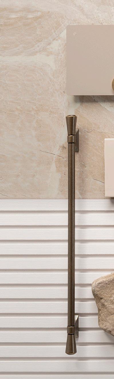
• The rich walnut timber grain laminate provides enough contrast to help anchor the look
• Grasscloth wallpaper adds texture without adding a pattern into the mix
Inspiration for the European Interior Scheme has been taken from tonal hues, soft organic shapes and calming European holiday vibes. The palette is nude, soft and organic with light timbers and terracotta to add warmth and softness to the mood.

uropean Interior Scheme has tonal hues, soft organic shapes an holiday vibes. The palette organic with light timbers and mth and softness to the


It’s easy to understand why Australians love a coastal-inspired aesthetic when we enjoy some of the best coastlines in the world. However, drawing inspiration from our coastal surroundings and applying this in your home interior can be easier said than done. Start by creating a mood board that depicts an array of inspirational images and a suggested colour palette to give you a sense of the overall look and feel of your ideal coastalinspired space.

• Strive for warmth in your neutrals, ie sandy colours and blonde timbers.
• Too much white and grey will feel cold
• True navy is like a neutral, it will stand the test of time.
• Brushed brass adds warmth and sophistication to a coastal scheme.
• If your budget allows for wall panelling, you won’t regret it.
• Contrasting patterns an scale add interest and personality.
Inspiration for the Coastal Interior Scheme has been taken from calming coastal scenery and hues of blues from the ocean. The textures are natural with jute and hints of light timbers throughout. The palette is crisp whites and calming blues.
whites and


 Moodboard credit: Salty Palm Interiors

We have put together a checklist for you to think through all the elements of design in each room of your home. This checklist breaks down the overwhelming task of styling your entire home. Simply print these pages out for each room and fill in the blank, before your know it you’ll be a styling master.
My homes architectural style is
The theme in my home is inspired by
You should consider all the design elements of every room, here are a few rooms to consider but customise the room to your own home design.
Entry/Hall, living room, kitchen, dining room, master bedroom, bedroom 2, bedroom 3, home office, ensuite, bathroom, laundry, garage. You might even want to consider the facade of the home here.
ROOM 1:
How am I utilising space in my room?
What is the colour scheme of this room? Is it Inspired by a monochromatic, complimentary, split-complimentary or triadic colour scheme? Write down paint colours you will choose for this room.
What elements of texture do I want to bring in?
Is there a pattern you envision in this space?
Have you considered line as a tool to make the space look larger? What furniture will you be putting in the space and will it create strong lines in the space to move your eye around?
What lighting will be featured in this room?
Any additional notes