5 minute read
HOW TO HANG ART AT HOME
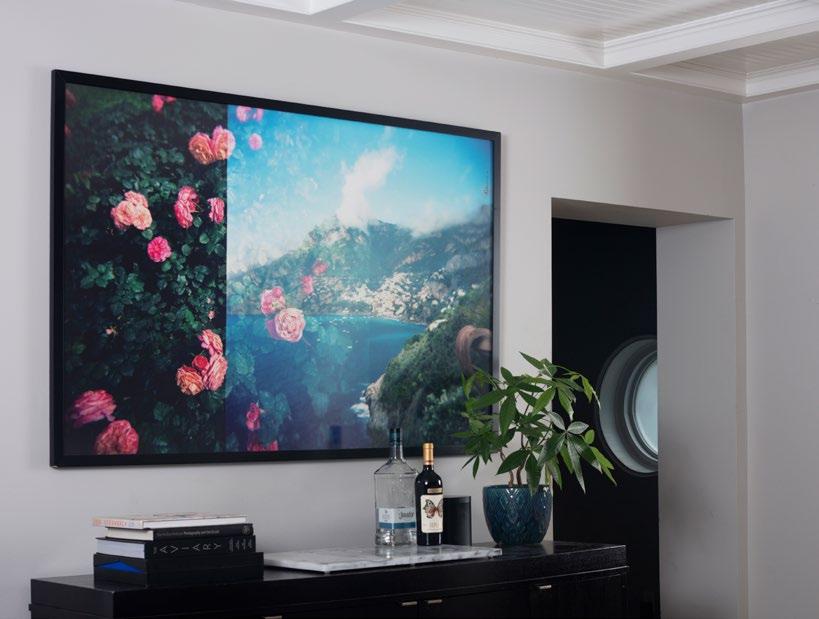
Rose Garden, Double Exposure archival pigment print 40x60”w
Hang Art How to at Home
Tips and Tricks from a Museum Professional
by Nicholas Croghan Director, Pensacola Museum of Art
Artwork and Photography by Robert Malmberg robertmalmberg.com | instagram: @malberg few weeks ago, I had the opportunity to tour the home and studio of Robert Malmberg, a good friend and professional photographer who recently moved to Pensacola from New A
York City with his wife Wendy. While visiting, we discussed different strategies for hanging artwork in their new space, and I couldn’t resist picking up a few tools and helping with the installation of his exquisite photographs and collages. Although this playful process was in a home environment, it wasn’t much different from how I would approach hanging a show at the Pensacola Museum of Art.
The way artwork is organized and installed in a museum is dependent on many different factors, but the main considerations are informed by the communication needs of the curator and corresponding aesthetic intentions of the exhibition designer. This article will illustrate various measuring techniques for hanging artwork as well as provide an overview of the most common design strategies.
To simplify the decision-making process, first consider whether you intend for the space to be minimal or maximal. Between these dualities are a plethora of beautiful interior design choices
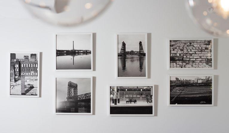
Industrial Black and White Photographs archival pigment prints variable sizes

that utilize repetition, emphasis, unity, proportion and color harmonies. For the purposes of this essay, the contrast between an airy, modern aesthetic and a dense, salon-style design will form the starting point for comparing different art hanging options.
Exhibition designers understand that there is no such thing as a neutral installation. A work of art, and the space in which it hangs, are so much like a person—the same work of art reacts differently depending on the environment and situational context. Therefore, it is important at the beginning of the process to examine how your aesthetic intentions can be accomplished in accordance with the size and/or number of objects and available space.
In the museum world, the “White Cube” concept represents a psychologically neutral space that allows a single work of art to be experienced without competing visual stimuli. The prime example of that concept is a singular object centered on a wall. The standard center height, or centerline, to comfortably view a two-dimensional work on a gallery wall is 60” from the floor. A work of art that is given ample space to breathe can create a mood of contemplation that is typically found in modern or contemporary galleries. The equation I use to achieve this is as follows: imagine an artwork that is thirty inches in height; if you divided that in half and added it to a 60” centerline, then the top of your artwork would be 75” as measured from the floor. If the distance from the top of the frame to the hanging hardware on the back is 4” then your anchor would need to be installed at 71” to ensure the center of the picture is level at five feet high.
If I am installing more than one work of art on a single wall, I will still start by determining the centerline. There are many high-tech ways to do this including lasers and fancy gadgets, but all you need is a tape measure, pencil and level. With a basic centerline established, even the most complicated installations can have a sense of order.
When designing an exhibition layout composed of multiple pieces on a gallery wall, grouping the works as a diptych, triptych, or in a grid is a great hanging strategy to avoid a disorganized outcome –especially if all the works are consistently sized and framed. Similar frame types, such as all black aluminum frames or natural wood finishes, provide a sense of cohesion. If frame consistency isn’t an option, I find it best to lean into a variety of types to create a sense of irregular intentionality.
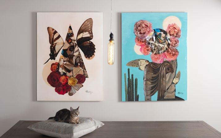
The centerline remains your friend when measuring and hanging a triptych or a grid of pictures. For a triptych, take the same measurements from before and calculate the anchor point for the middle picture. Once this is determined, and assuming the hanging hardware is positioned equally high on all three pieces, the additional anchors can be marked off from the central point using a level. If all works are 30” wide, and you
Original Collage wood panel with resin 32x50” each

Man O’ War Jellyfish, Fort Pickens archival pigment prints 30x30” each

want to space them at 2” apart, then you would measure 32” inches left or right from the center mark to locate the anchor point for each flanking work.
For a simple grid of four works centered at 60,” you need to make only one measurement to determine the anchor height for each top and bottom piece. If you want 2” of vertical space in between the works then you will measure the distance from the bottom of the frame to the hanging hardware and add it to 61 inches for the top row. For the lower row of pieces, measure from the top of the frame to the hanging hardware and subtract that from 59 inches. By doing this, and placing your anchors accordingly, there should be two inches of vertical space between the top and bottom row. During the 19th century, in the Royal Academy Salons, artwork was hung from floor to ceiling, and this style of installation has henceforth been known as salon-style. In most cases, your artwork will be of different sizes and orientations and will need to be pieced together like a puzzle to form a comparable salon-style accent wall. The trick to making this type of arrangement feel full, not chaotic, is dependent on how the work is spaced, the balance of different proportions, frame styles, colors and the overall gestalt. I enjoy laying out all the work on the ground below the chosen wall to get a sense of these different considerations. I find the process of moving the work around in various configurations important in visualizing the final arrangement. From this perspective, each work is like a brushstroke and you get to orchestrate the overall composition. A large work in the center can help to ground an assortment of smaller works that radiate outward; conversely, several large pieces might function well as bookends to contain a grouping of smaller works in the center. Stacking works or alternating between vertical and horizontal combinations can also create a nice symmetrical balance.
A good exhibition designer has the responsibility to reveal and enhance the nuances of a given artwork and create a stage for its performance. But, at the end of the day, as long as you enjoy the visual experience and the atmosphere your installation creates, there is no wrong way to do it.


