3 minute read
INFORMATIONAL DESIGN
ASSIGNMENT V: TRIBAL LANDS
INTRODUCTION
Advertisement
Information Design focuses on taking complex concepts and visual data and making it more visually accessible, using typography and imagery to help the viewer navigate through the confusion in order to gain an understanding of the information. Information design is the use of graphic means to organize and communicate data or knowledge. It is a graphic representation of a structure, situation, or process – the anatomy of a creature, the hierarchy of a corporation, the flow of ideas. Information design allows us to see relationships that would not come forward in a straight list of numbers or verbal description. In this project you will choose one issue, researching it thoroughly. If there is significant division on the issue, make sure that you research both sides. Watch movies, read books, go to the library, search online. Make sure your research is thorough. You will present your research to me during your designated workday. You will then create an information design in the form of a poster and a series of three Instagram posts, presenting the research found.
PART I: RESEARCH
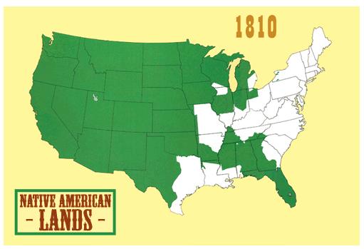
I chose to research Tribal Lands in America. This is an important issue because it shines a light on our America’s prevalent history of imperialism and gentrification. The issue at hand has not changed much over time in principle. There has been theft of Native Land for generations. The main change is how the topic is being discussed. I believe now, more than ever, Americans understand how corrupt and inhumane this theft has been and how it has horrifically affected Native Americans and contributed to the inaccuracy of representation of Native American culture in America. For my poster I wanted to keep the imagery simple to show the viewer the full extent of the theft of Native Land. Personally, I think the maps speak for themselves and show just how much has been stolen over 2 centuries. I don’t believe this issue is that two sided, it is rather factual evidence of American imperialism. I want my tone to be serious, but inviting and minimalistic.
PART II: REFLECTION
I did not realize the full extent of stolen land in America. I found it to be pretty alarming the sheer amount of land that was taken from Native Americans over the course of American history. I think this image could be easily teachable. It is a simple concept, yet a horrific one as well.
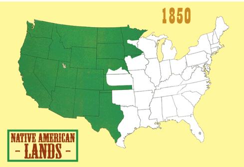
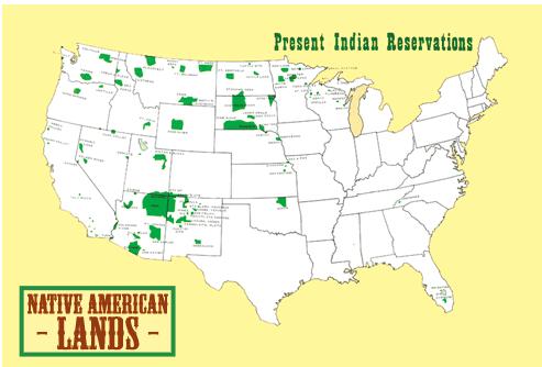
I really enjoyed the visual impact of the graphs on page 46, and wanted to use something similar for my design. I wanted the map to be more modern and simplistic as opposed to being hyper-realistic. I also wanted to incorporate more imagery or iconography that is referential to that of Native American tribes.
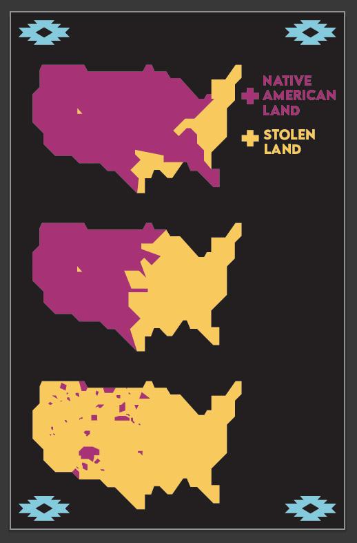
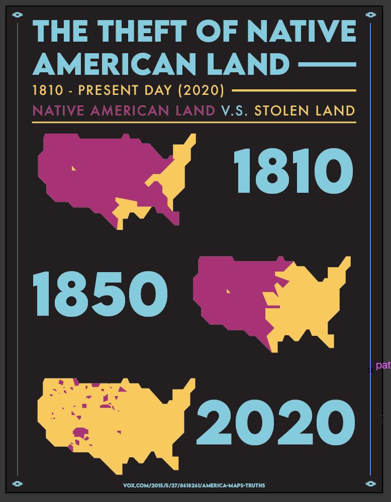
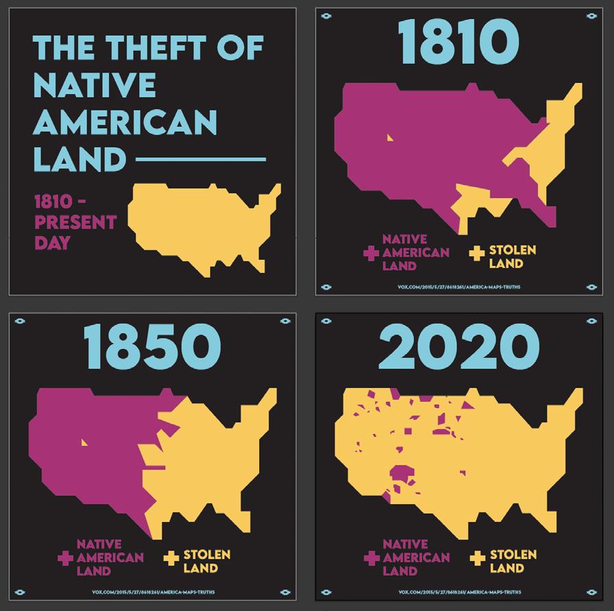
I recieved a few notes that my hierarchy was a bit difficult to understand, as well as great feedback about the use of color. The Instagram posts had little adjustments to make, but the poster needed some edits in color and visual understanding.
I changed the weight of the font for the dates on the poster. I also switched the pink and yellow, since red hue colors typically have a more menacing tone. Because of this, it makes more sense that the “stolen land” would be in red to further emphasize the meaning in the poster. I also switched the colors on the Instagram posts.
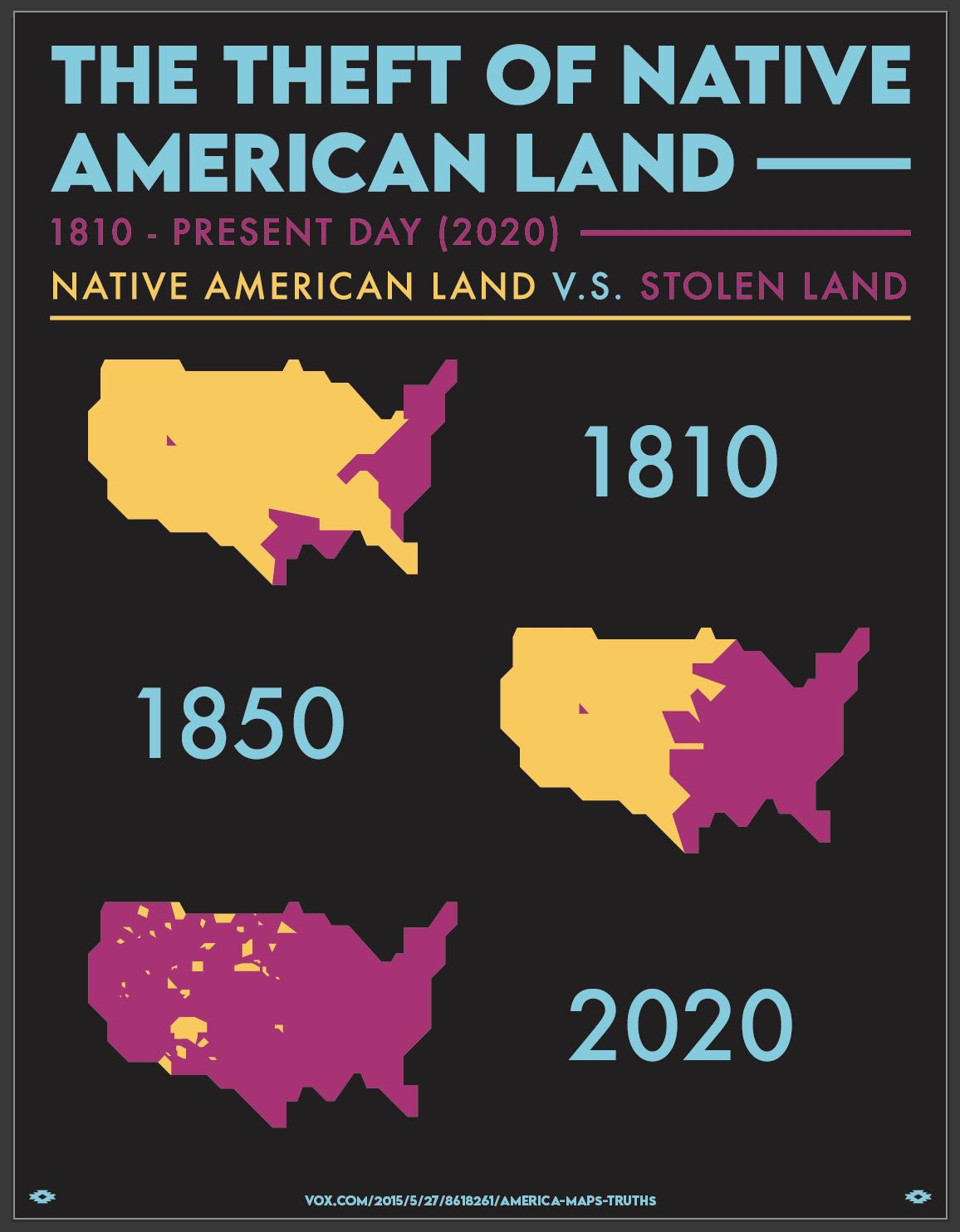

After another critique, I had recieved conflicting feedback. Some of my peers actually prefered the bolder font over the lighter one. I switched the font for the dates back to the original, but made it slightly smaller. I also added lines and more iconography to tie everything together.


