bokubar.mohammed@gmail.com
+1 619 657 6972
+965 9917 6621

Mohammed Bokubar
Architectural Designer
Achievments
• 2022 Fall Design Excellence Winner by the faculty of architecture at ASU
• 2021 Spring academic project was nominated among the best 12 out of 48 and was featured on KOIN 6 News
• 2019 Spring academic project was selected among the best 2 out of 80 projects and was showcased at the collage entrance.
Education
• Master of Architectre (MArch)
Arizona State University
Tempe, AZ, USA
2022 - Present
• Bachelor of Architecture (BArch)
NewSchool of Architecture & Design
San Diego, CA, USA
2017 - 2022
• Intensive English Program
Drexel University
Philadelphia, PA, USA
2016 - 2017
Skills
• Team leadership
• Team collaboration
• Architectural research
• Design thinking
• 3D modeling
• 3D printing
• Model making
• Architectural rendering
• Video editing
• CGI animation
• Graphic design
Experience
• Bursa apartment
interior design
Turkey - 2023
• Dubai apartment
interior design
UAE - 2022
• Abo Halifa house
schematic design
Kuwait - 2021
• South Al-Mutlaa house
3D visualisation/ rendering
Kuwait - 2021
• Jaber Al Ahmed city private garden
landscape design
Kuwait - 2020
Software
• Adobe Creative Suite
• Rhinoceros 3D
• Blender
• Lumion
• QGIS
Languages
• Arabic - First language
• English - Fluent (130 Duolingo test score)
3
Contact
QR Code
Scan
4
5
Academic - Individual project
OCT 2021- JUN 2022
San Diego, USA
AR501 - AR502 - AR503
Studio professor: Daniel Manlongat - dmanlongat@newschoolarch.edu
Instructor: Raul Diaz - rdiaz@newschoolarch.edu
Background
The United States Department of Navy has proposed the modernization of Naval Information Warfare Systems Command’s (NAVWAR’s) facilities on Naval Base Point Loma
Old Town Campus (OTC), in San Diego. A suggested plan include the demolition of current industrial warehouses and the construction of a high density mixed use development including: residential, office, hotel, and retail spaces. NAVWAR have collaborated with NewSchool’s 5th year students to develop a master plan and design a building of interest within the site.
Project Phases:
1. Master plan
2. Schematic design
3. Integrated design Challenge:
Designing a high density master plan with minimum effects to the historic Old Town area.
Parti Diagram Master Plan Concept: Project Sites MTS Light Rail Major Streets 50’ 100’ 200’ 400’ • Access to green space • Daylight • Views • Density • Noise from freeways • Scenery blockage • Visual out of character elements Maximum Minimum Parti Diagram Parti Diagram Master Plan Concept: Project Sites MTS Light Rail Major Streets 50’ 100’ 200’ 400’ • Access to green space • Daylight • Views • Density • Noise from freeways • Scenery blockage • Visual out of character elements Maximum Minimum 6
MasterPlan
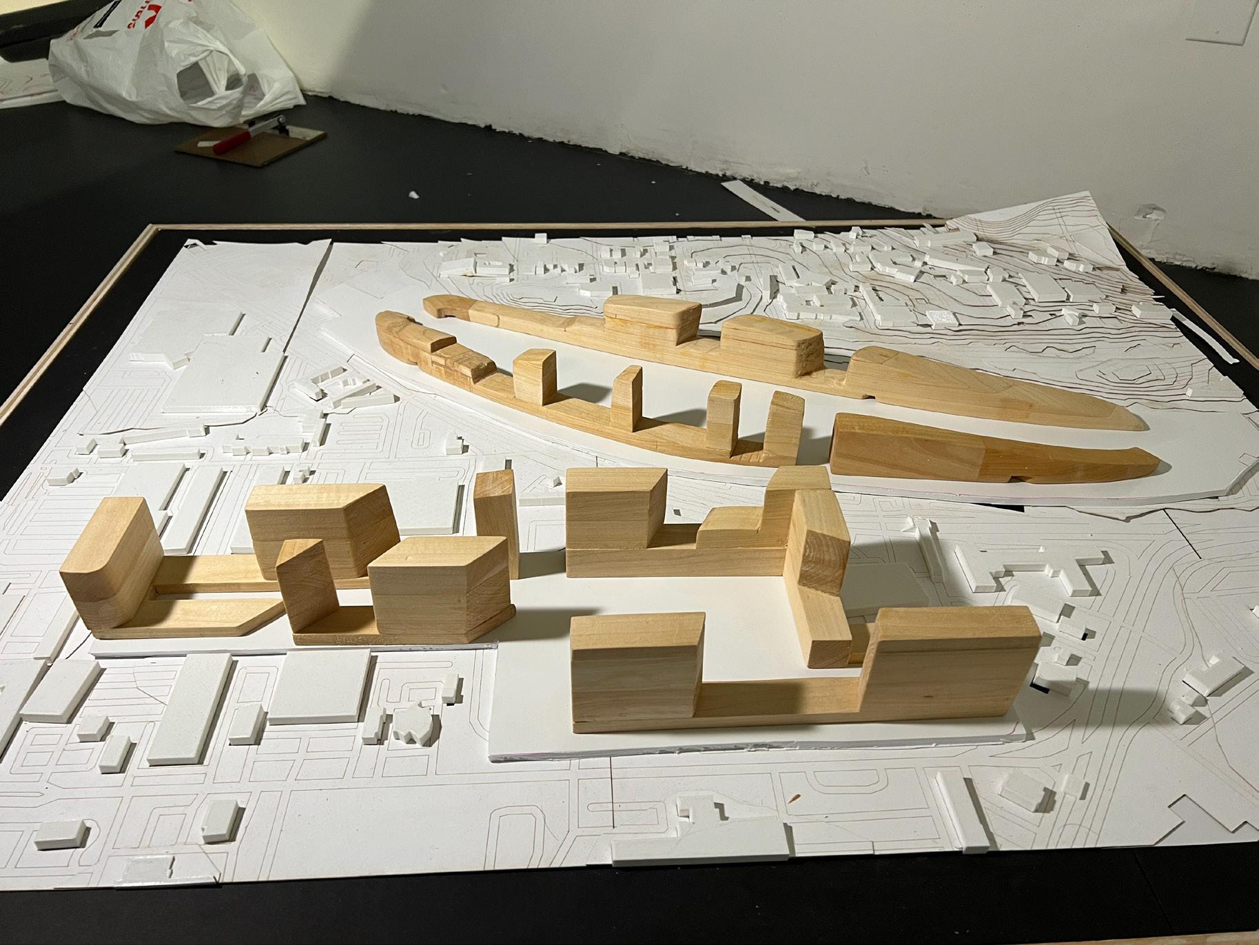
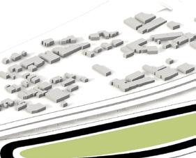
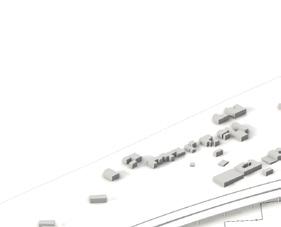
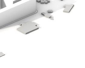
Master Plan Massing Development

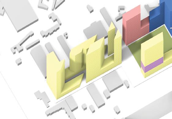
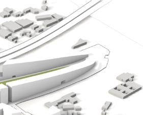
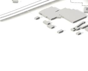
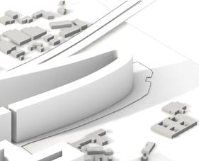
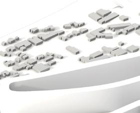
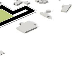

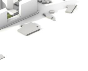
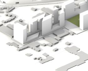
Diagrams showing concept application to both sites in regards to framing views of the green oasis and the old-town hillside to have maximum access to nature.


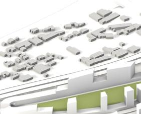
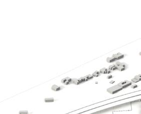

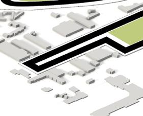
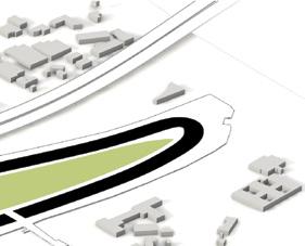
Transit center

Public/ private residential
Public/ private residential





Hotel
Retail
NAVWAR offices, laboratories
Open space
7
San Diego Center of Architectural History
Investigation:
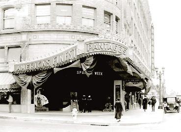
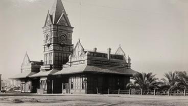
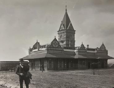
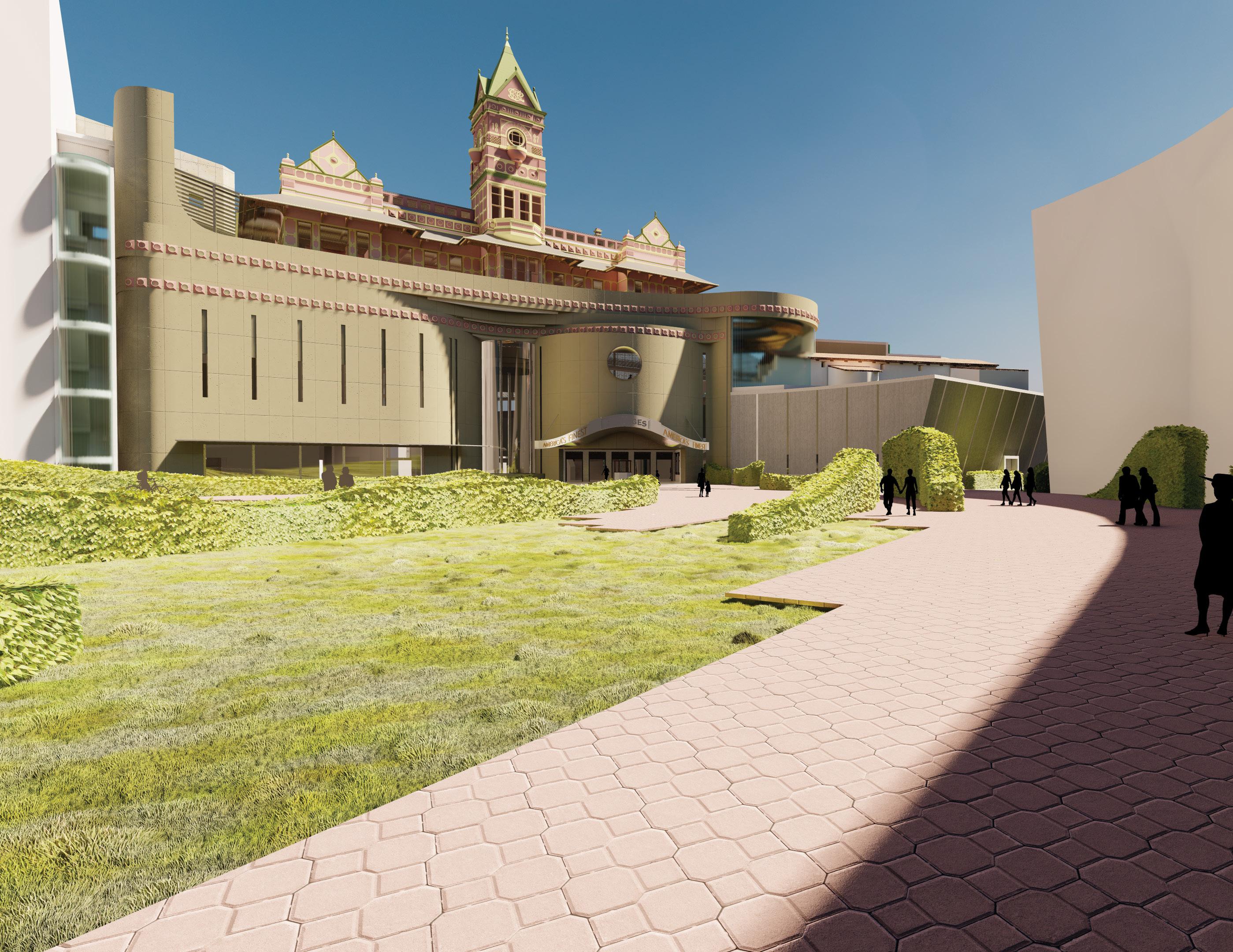
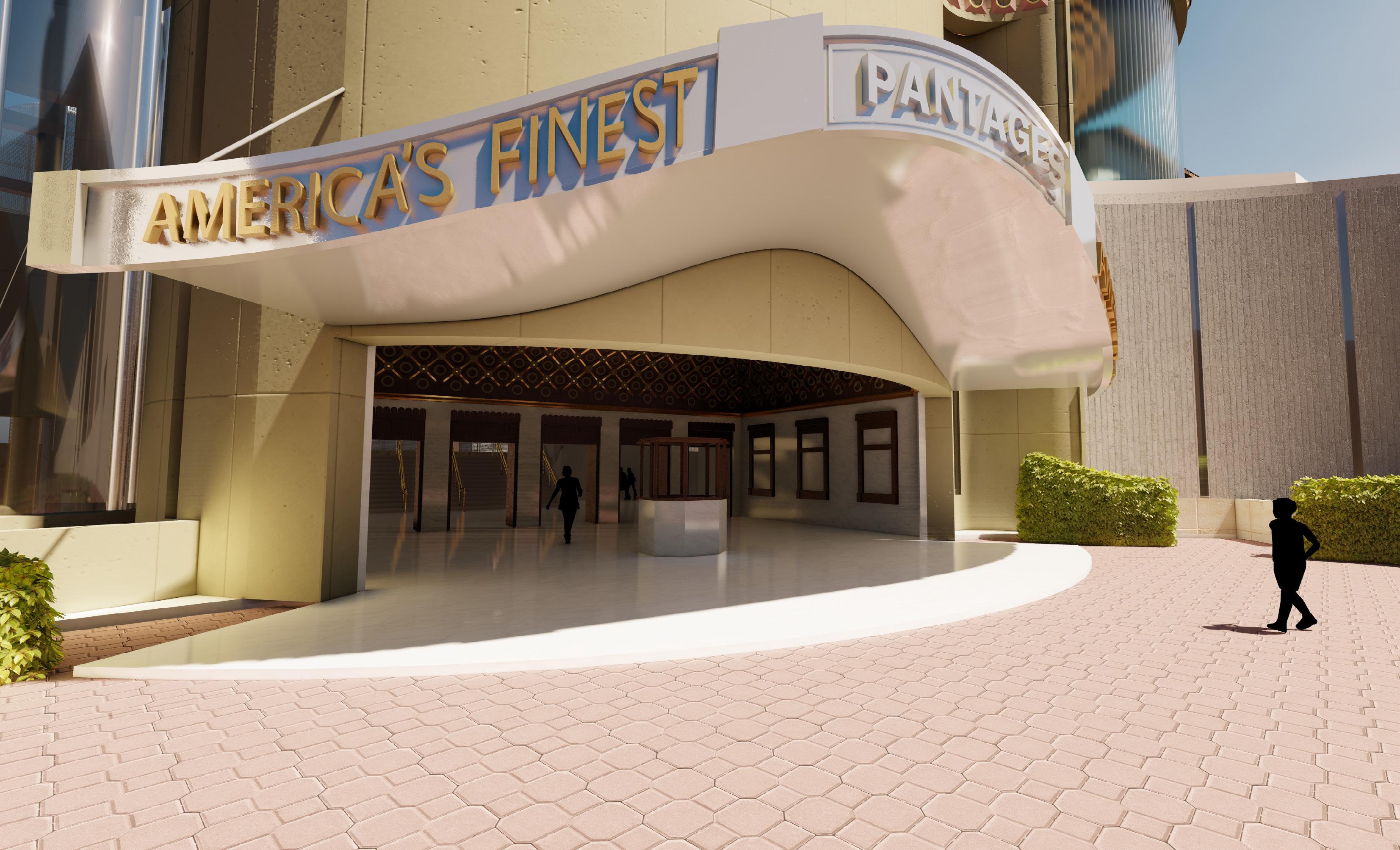
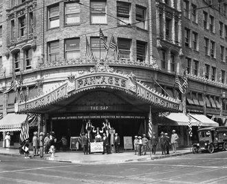
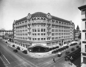
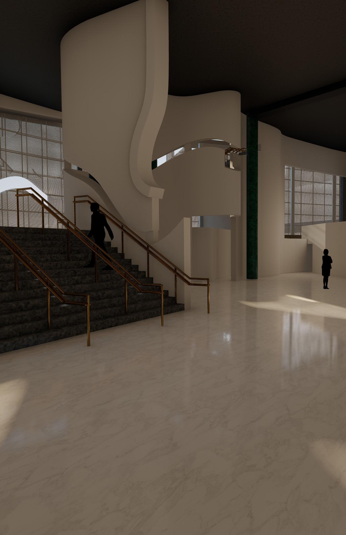
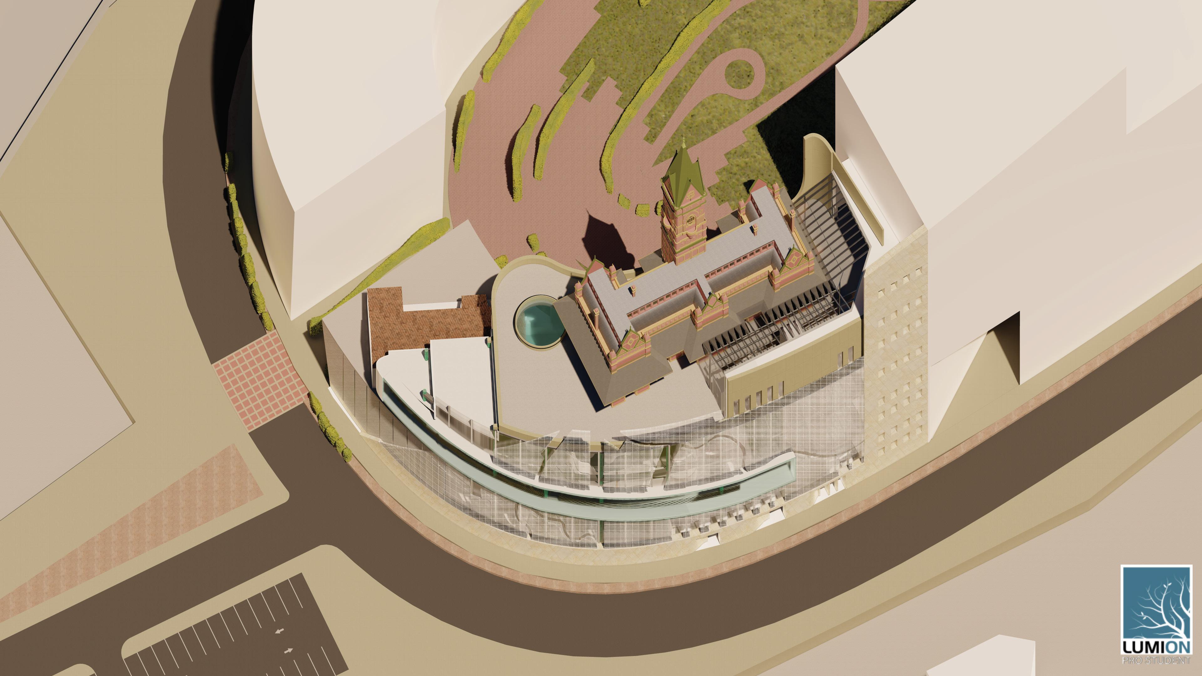
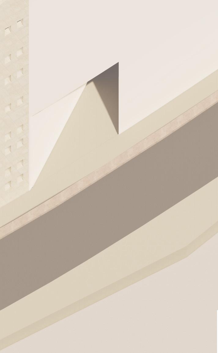
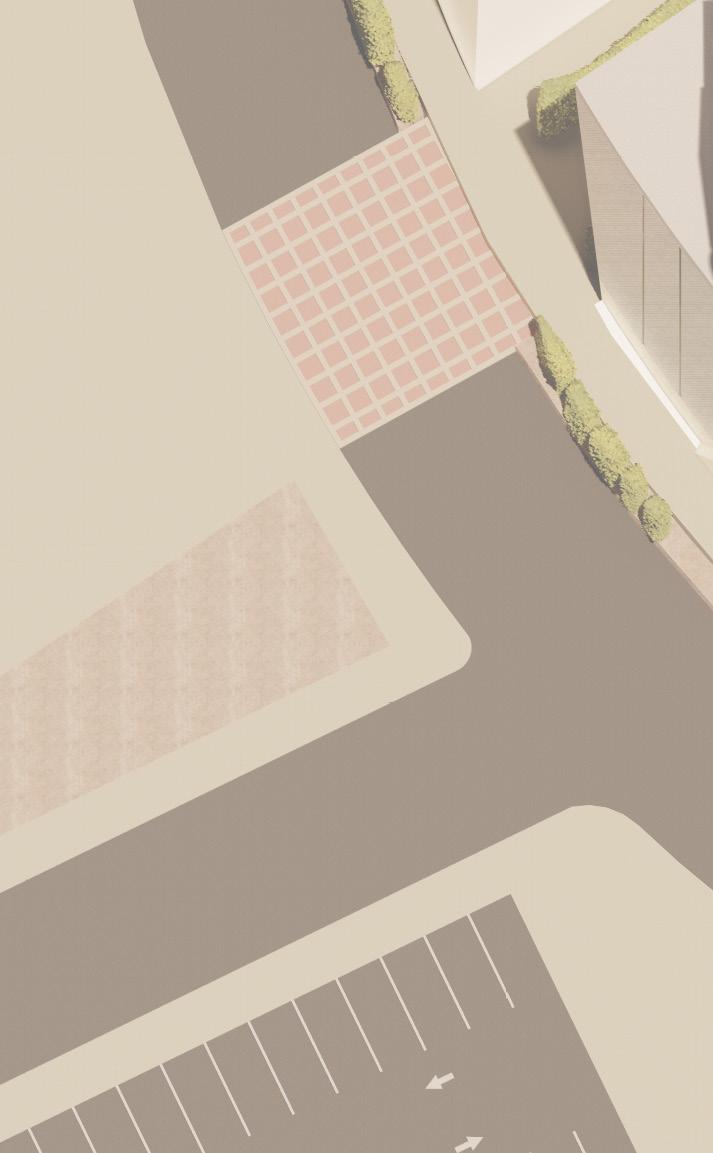
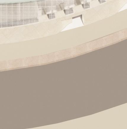
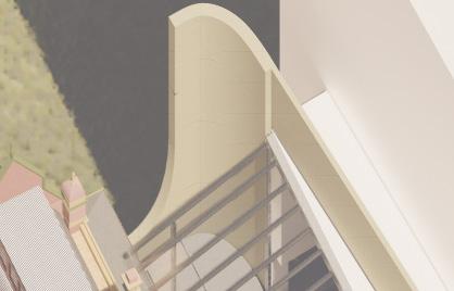
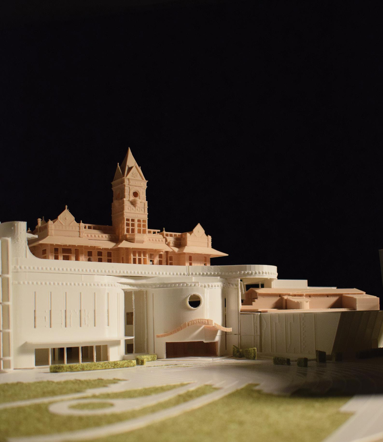
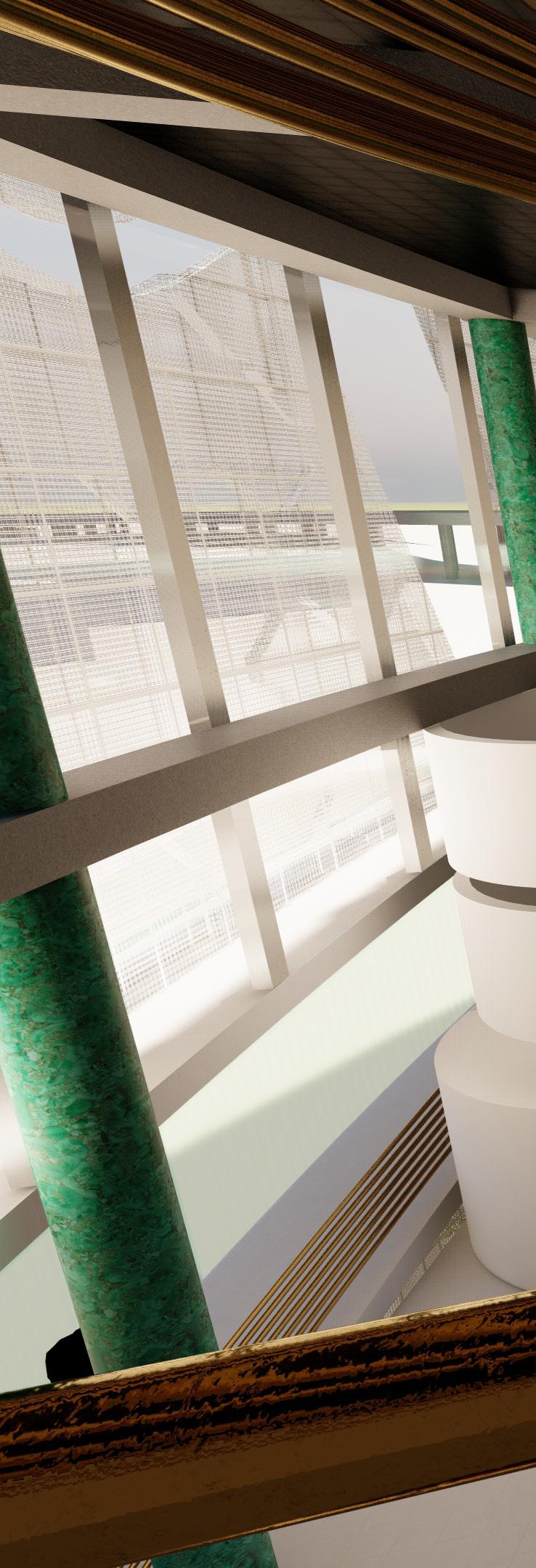
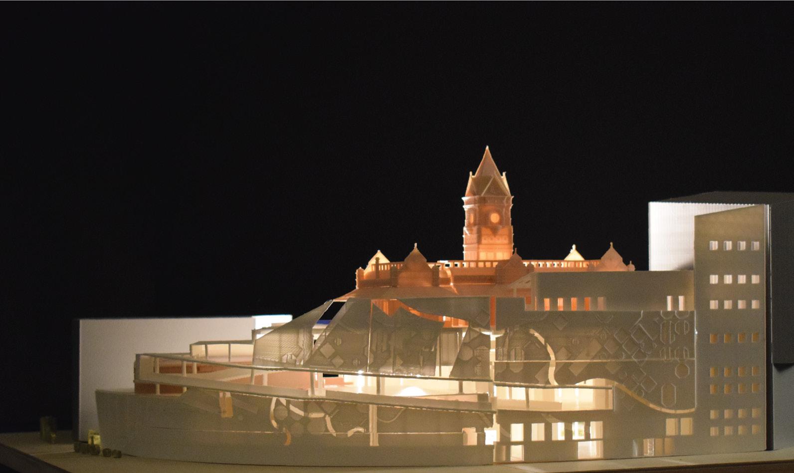
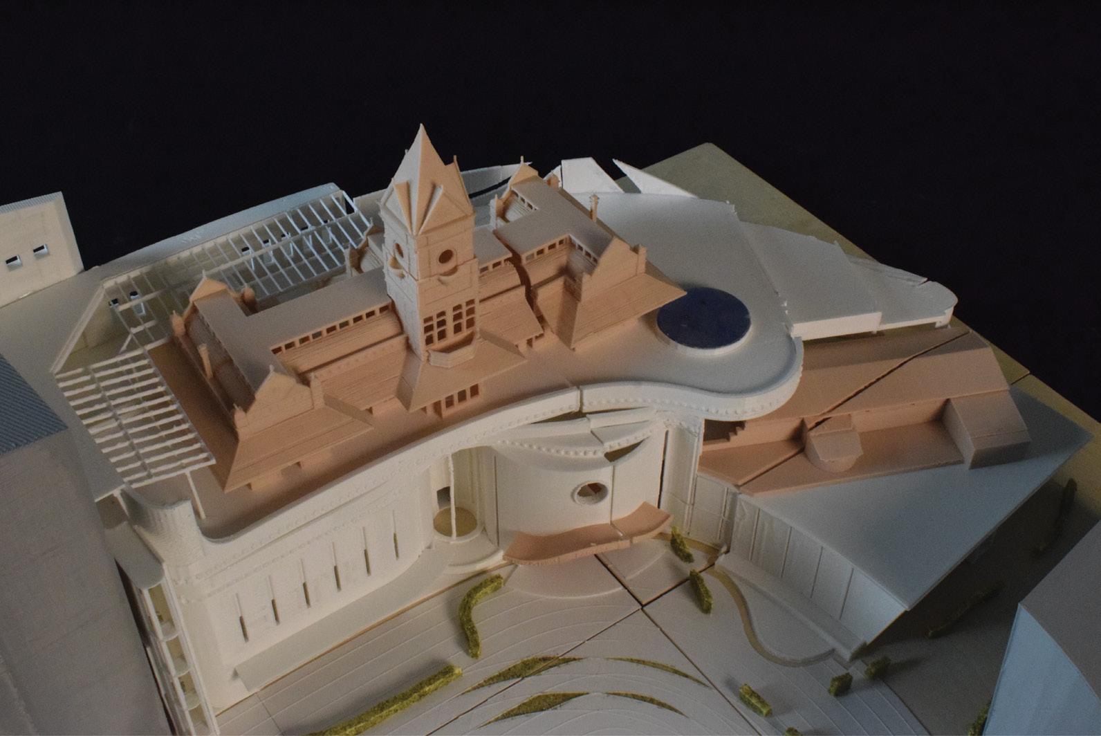
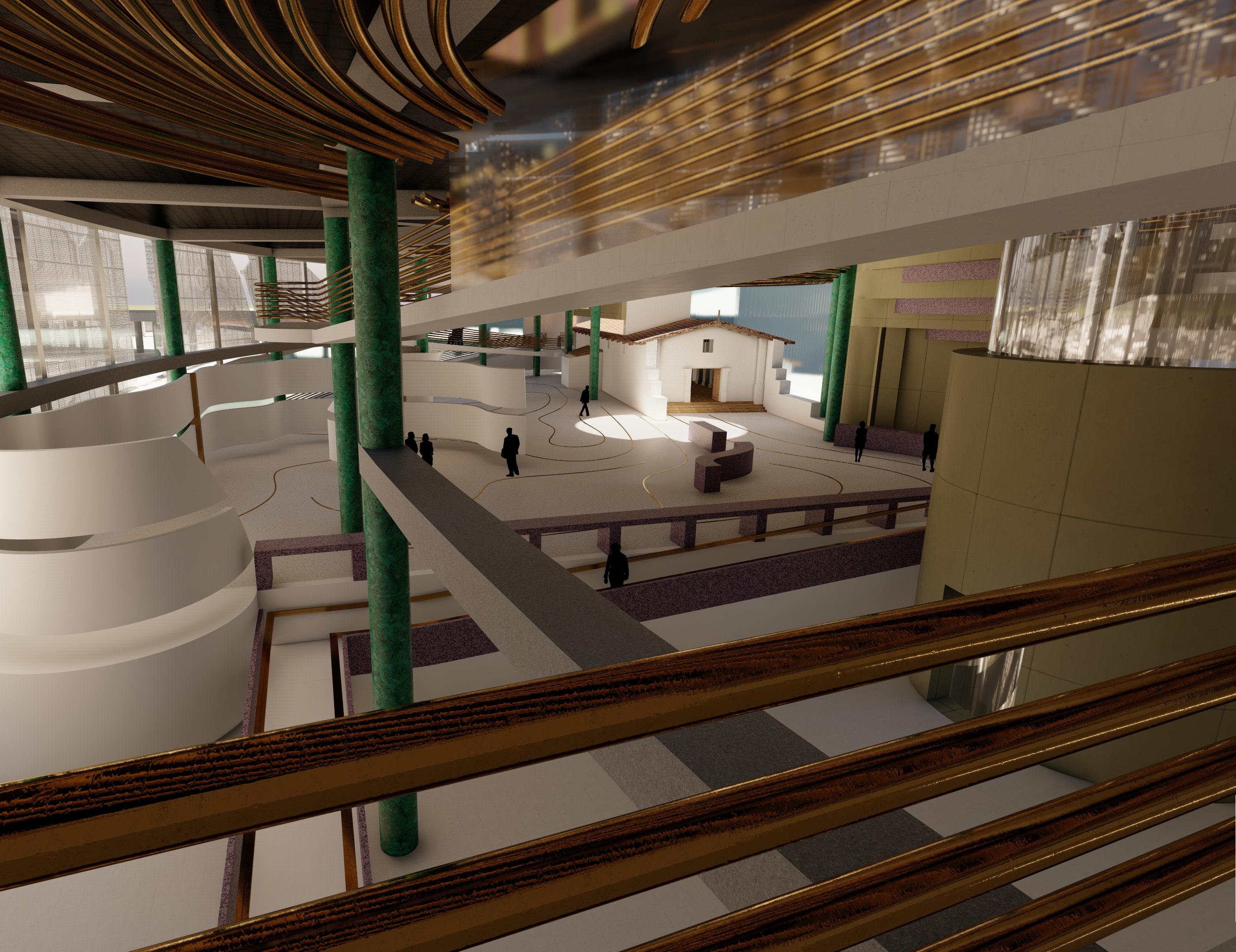
Three lost buildings from three different centuries were chosen to be reconstructed based on their Architectural and historical significance. The Presidio site (now buried under Presidio hill) is on of the first permanent buildings in California by the Spanish. It had a chapel where many were buried in. The Old Santa Fe Depot station only stayed for 10 years before being demolished for the bigger Spanish colonial style station for the world exposition. The original station had an iconic clock tower, a bright red color, and many facede ornaments/ detail. The San Diego Pantages theater designed by Benjamin Marcus Priteca. The theater’s iconic entrance/ box office is reconstructed as the building entrance.
Thesis Investigation:
Re-constructing Lost Architecture In New Contexts To Serve New Functions.
Pantages Theater Entrance 1924 Presidio Site Chapel 1769
Re-constructing Lost Architecture In New Contexts To Serve New Functions.
Old Santa Fe Depot Station 1897
buildings from three different centuries were chosen to be reconstructed based on Architectural and historical significance. The Presidio site (now buried under Presidio hill) permanent buildings in California by the Spanish. It had a chapel where many
The Old Santa Fe Depot station only stayed for 10 years before being demolished Spanish colonial style station for the world exposition. The original station had an tower, a bright red color, and many facede ornaments/ detail. The San Diego Pantages designed by Benjamin Marcus Priteca. The theater’s iconic entrance/ box office is as the building entrance.
Theater Entrance 1924 Presidio Site Chapel 1769 Old Santa Fe Depot Station 1897
San Diego Center of Architectural History
Thesis Investigation:
Three lost buildings from three different centuries were chosen to be reconstructed based on their Architectural and historical significance. The Presidio site (now buried under Presidio hill) is on of the first permanent buildings in California by the Spanish. It had a chapel where manywere buried in. The Old Santa Fe Depot station only stayed for 10 years before being demolished for the bigger Spanish colonial style station for the world exposition. The original station had an iconic clock tower, a bright red color, and many facede ornaments/ detail. The San Diego Pantages theater designed by Benjamin Marcus Priteca. The theater’s iconic entrance/ box office is reconstructed as the building entrance.
Re-constructing Lost Architecture In New Contexts To Serve New Functions.
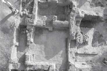
Three lost buildings from three different centuries were chosen to be reconstructed based on their Architectural and historical significance. The Presidio site (now buried under Presidio hill) is on of the first permanent buildings in California by the Spanish. It had a chapel where many were buried in. The Old Santa Fe Depot station only stayed for 10 years before being demolished for the bigger Spanish colonial style station for the world exposition. The original station had an iconic clock tower, a bright red color, and many facede ornaments/ detail. The San Diego Pantages theater designed by Benjamin Marcus Priteca. The theater’s iconic entrance/ box office is reconstructed as the building entrance.
Pantages Theater Entrance 1924 Presidio Site Chapel 1769

Old Santa Fe Depot Station 1897
8
9
Pantages Entrance / box o ce Lobby Theater Back stage Store Restaurant Meeting room Elevator <<Path to Old Town Park Entrance>> Plaza 5’ 10’ 20’ 40’ 60’ 90’ FLOOR PLAN LEVEL 1 10
5’ 10’ 20’ 40’ 60’ 90’ FLOOR PLAN LEVEL 3 Library of Architectural History Old Santa Fe Station Rooftop Terrace Water Feature /Skylight 11 A B C D E F G H J K L 1 2 3 4 60’ 90’ Main Exhibition Presidio Chapel Hub Secondary Exhibition Storage Sta FLOOR PLAN LEVEL 2 FLOOR PLAN LEVEL 3
12 SECTION 1


13

14















15

16

17
18
19
Academic - Group project
AUG 2022- NOV 2022
Phoenix, Arizona, USA
ARC 501
Studio Instructor:
Luis Cruz-Martinez - lgcruz@asu.edu
Group partners:
Prathibha Prakash - ppraka19@asu.edu
Ayushi Gandhi - agandh22@asu.edu
Brief
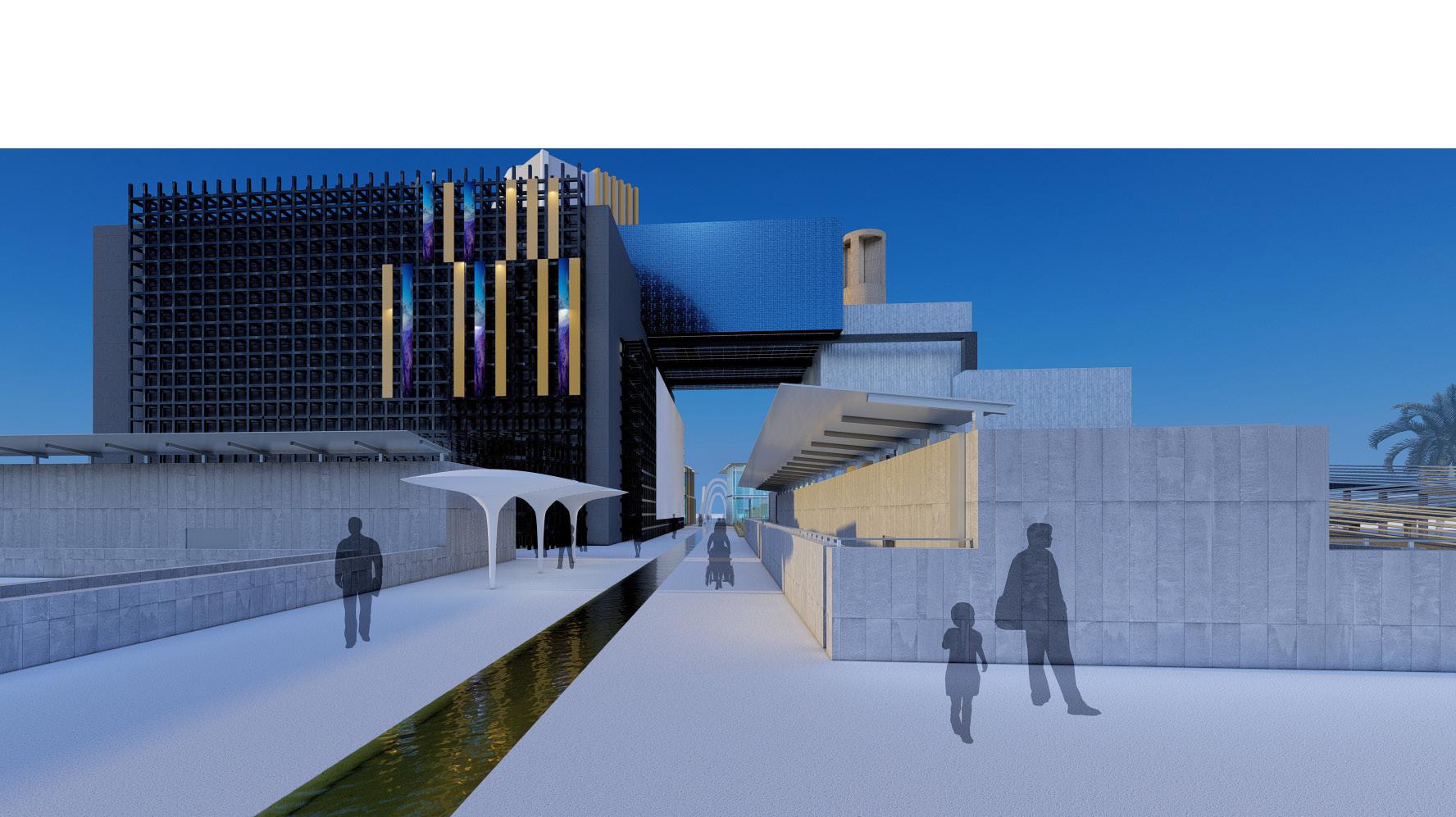
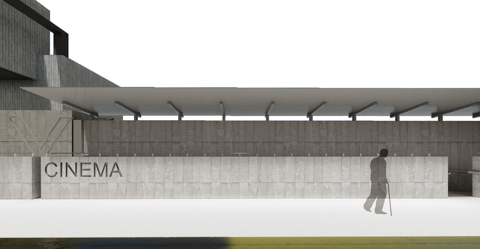
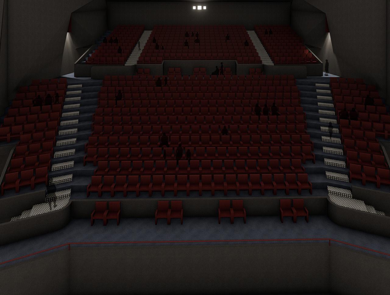
This project focuses on architecture expansions as a “game” with a set of rules that allow improvements and innovation. The goal is to transform the historic Phoenix Financial Center by architect Wenceslao Sarmiento into a cinema center. The approach of adaptive reuse is utilized to give existing buildings a second life in a sustainable way. In sum, the objective is to propose an expansion, several modifications and new programs to co-exist with the current existing office building.

Project Phases
1. Research (precedents studies)
2. Reconstruction (existing conditions)
3. Expansion (new programs)
4. Improvement (adaptation)
20
Graphics in this page are produced by Mohammed Bokubar
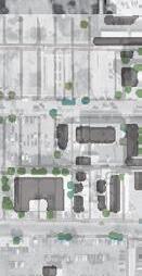
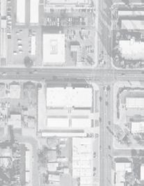
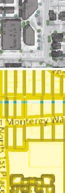
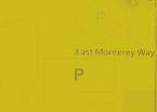
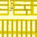
Context + Site Analysis
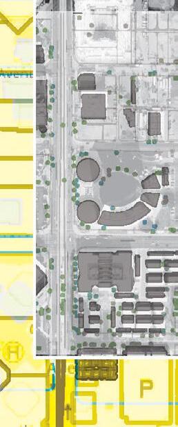




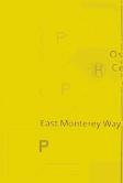


Playgrounds
Parks
Historic sites
Street bike lanes
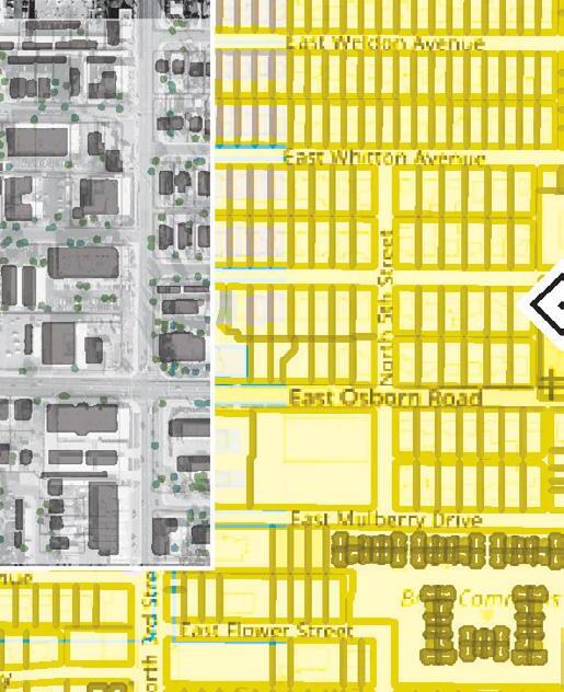
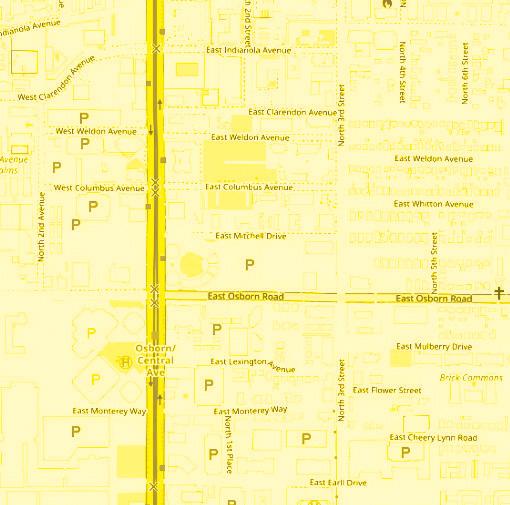
Light rail
Light rail
Parcels

Commercial Hospitals
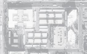


City owned properties
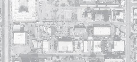

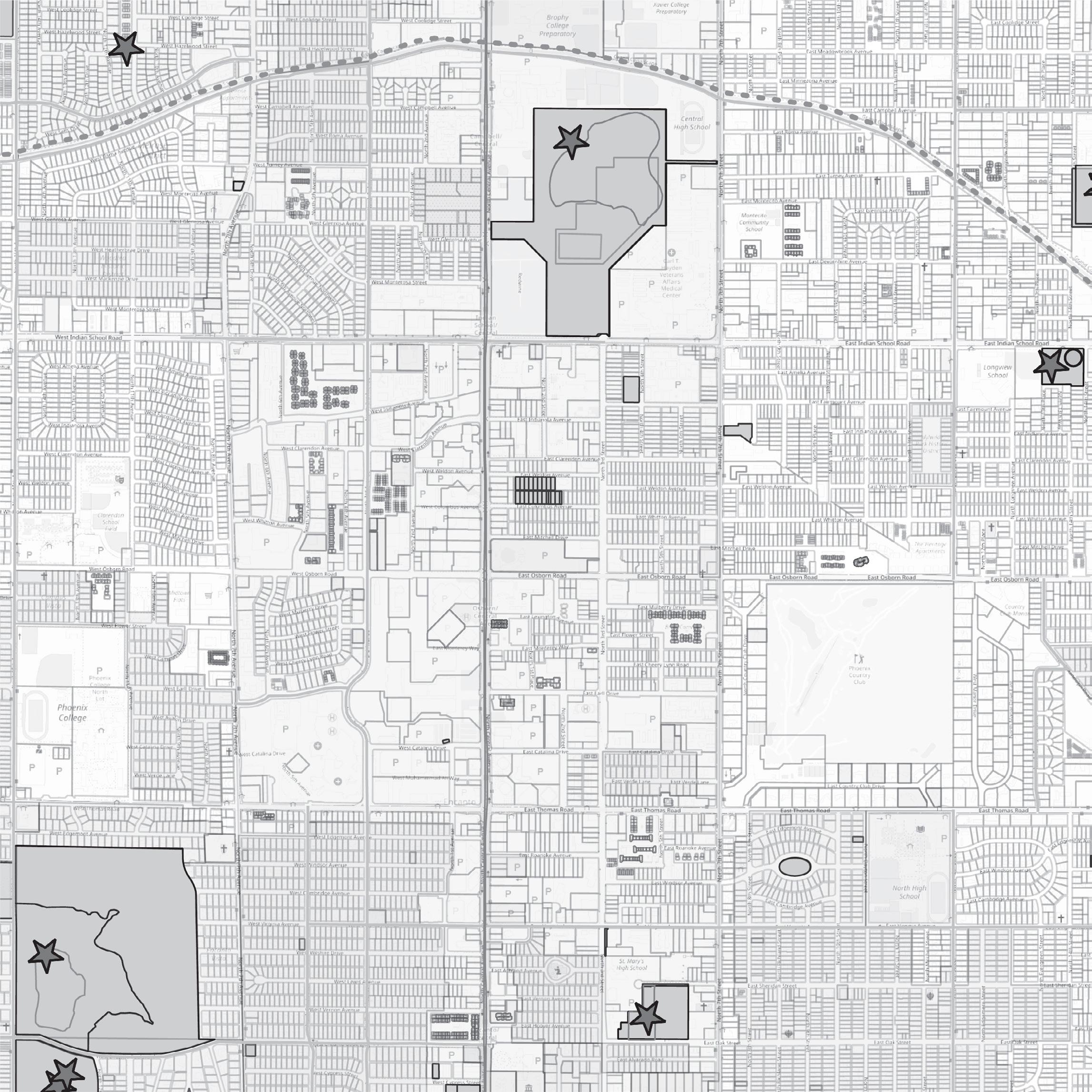
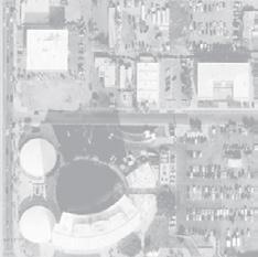
Existing building
Trees
Access Strategies
• Main access on the east
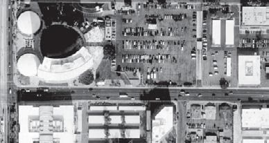
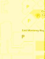
• Secondary access on the south
• Local access on the west
Architectural Strategies

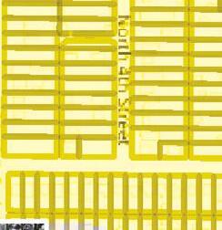



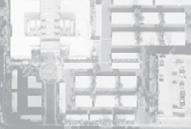

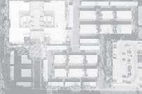




• The axis
• Symmetry x Asymmetry
• Existing form reuse
• Center x Edge conditions






in this
21
Graphics
page
are produced by Mohammed Bokubar + Prathibha Prakash
Program

The project introduces new programs to the site which include but not limited to:
• Large cinema
• Medium cinema
• (x2) Small cinemas
• (x4) Experimental cinemas
• Outdoor theater
• Phoenix Flim Festival archive + exhibit
• Lobby + Restaurants + Retail spaces
Concept
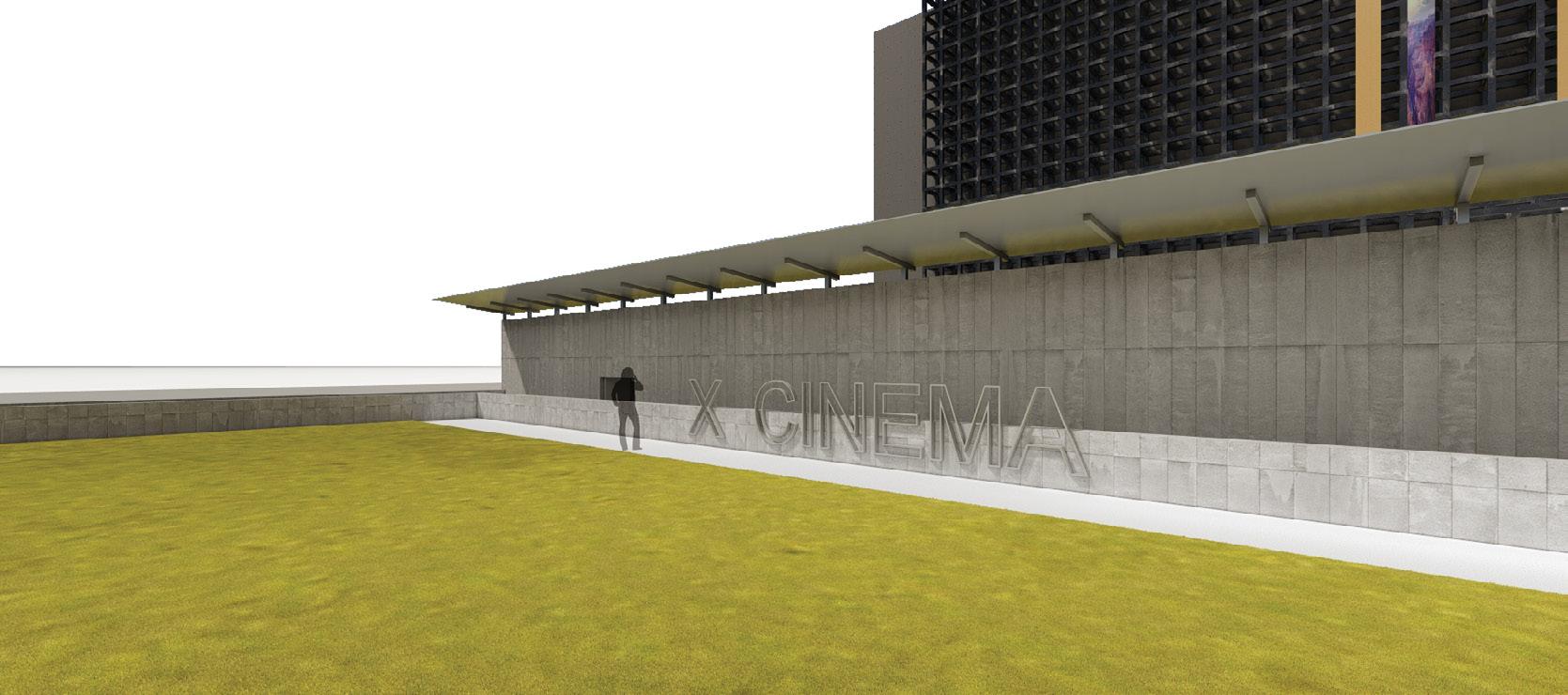
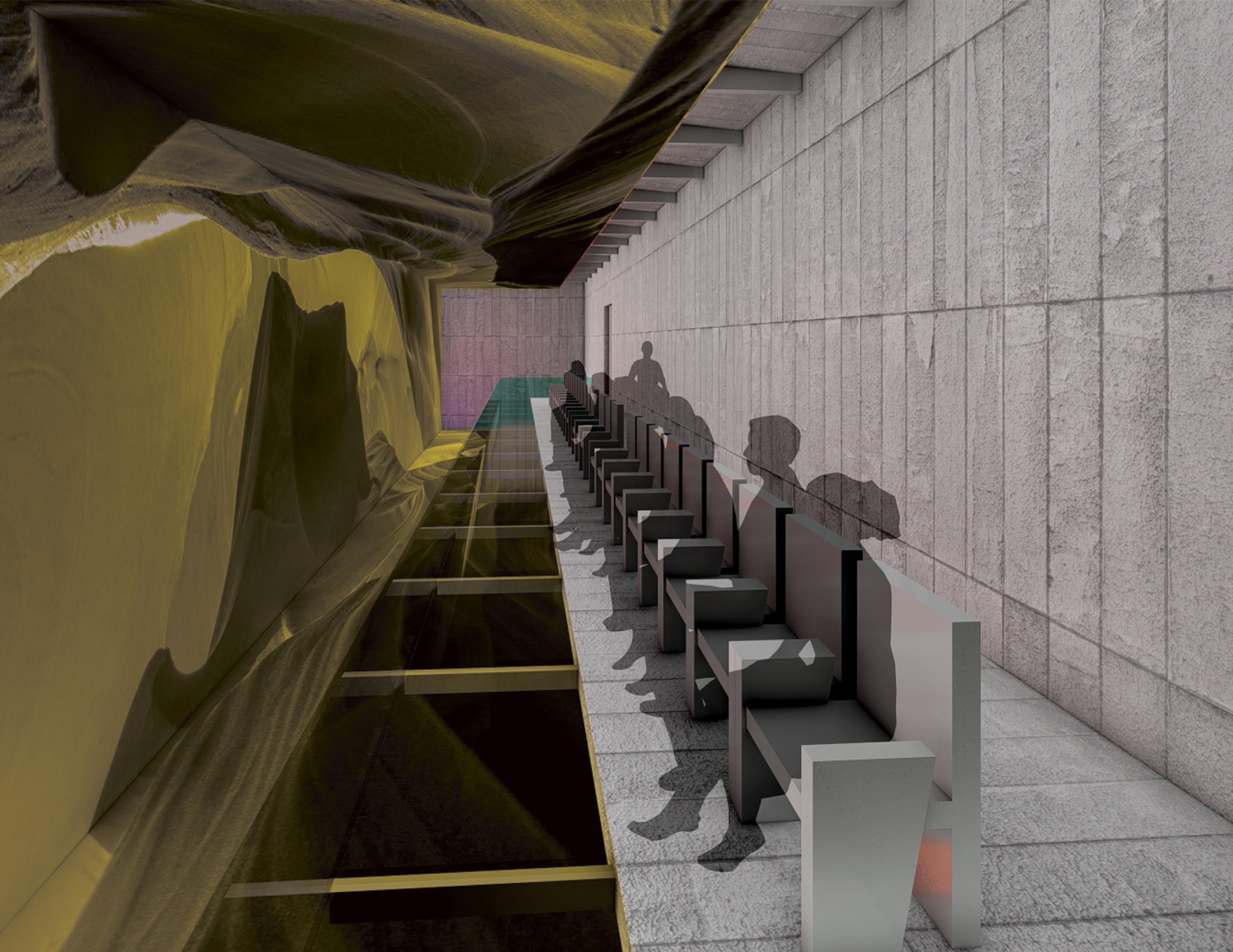
The project’s concept was to activate the public spaces by planning an axial bioswale connecting the existing buildings to the new ones. Experimentals cinemas are perceived as linear element that dynamically break the main axis. while the other cinemas are strategically located to maximize shade in the hot climate of Phoenix.
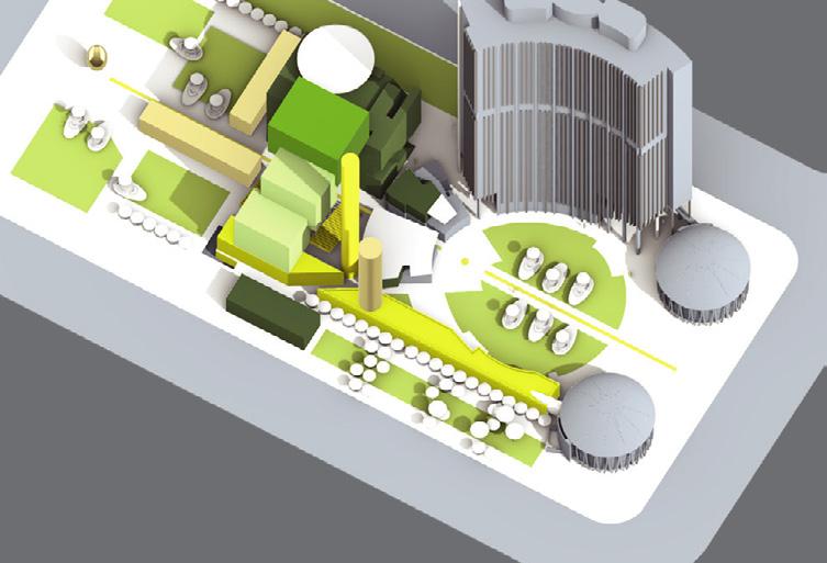
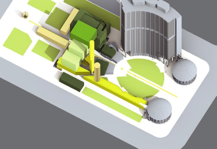
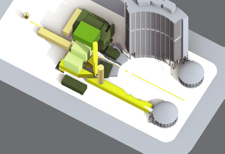
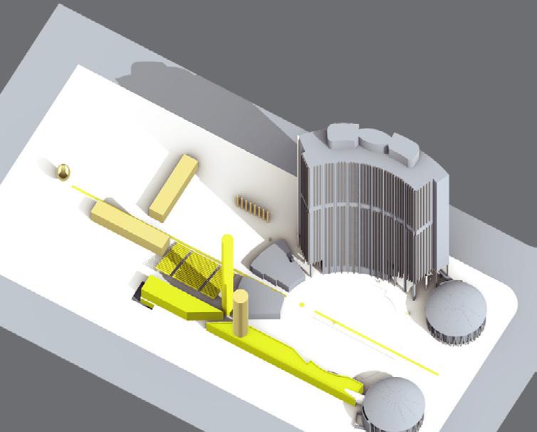
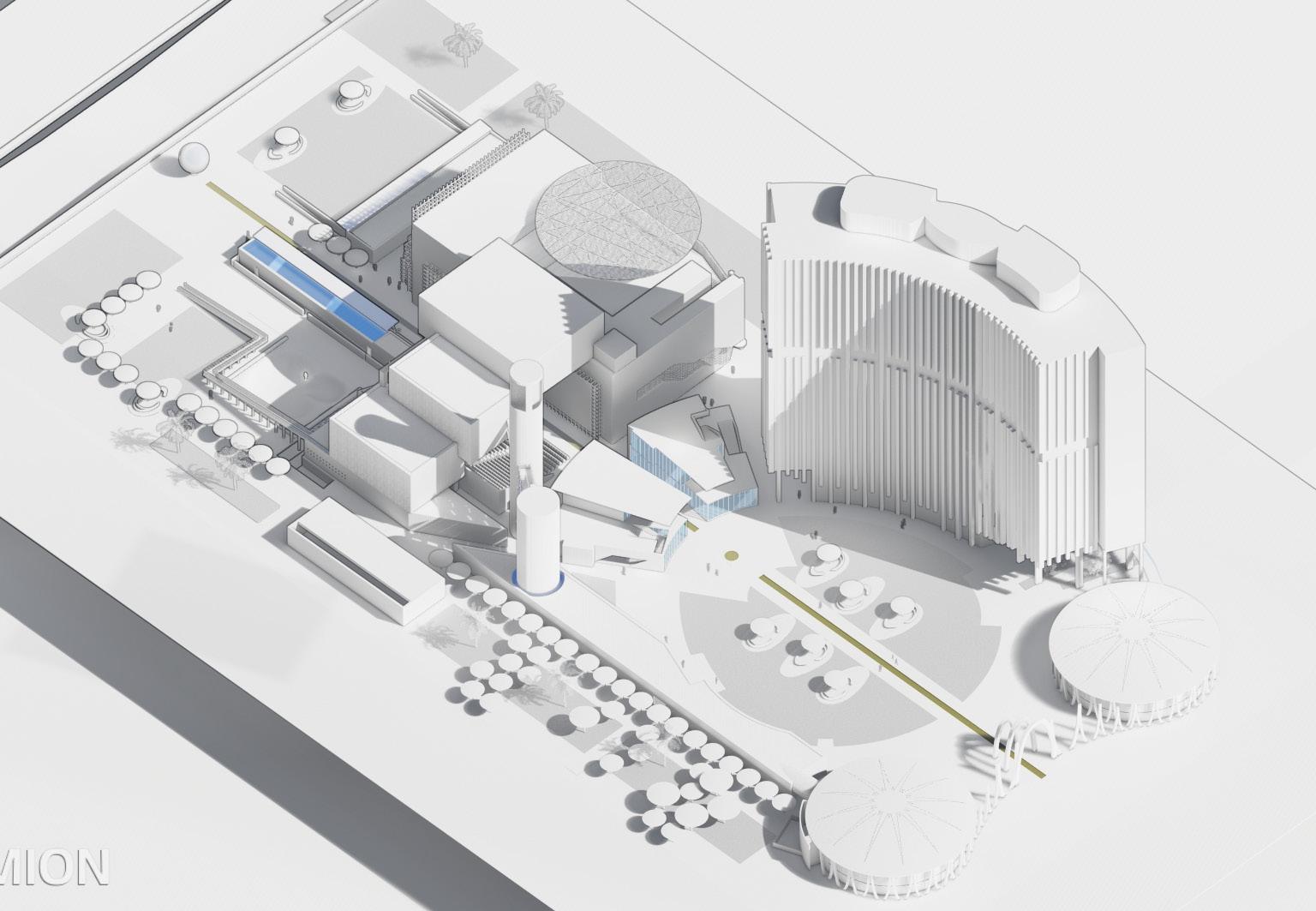
Program Massing Development
Bioswale Axis + Linear Elements


S,M,L Cinemas
Landscaping
Social Interaction Zones
22
Graphics in this page are produced by Mohammed Bokubar
23
Graphics in this page are produced by Mohammed Bokubar
Floor Plan 1
Central Mechanical Room Central Green Plaza Bioswale
Ticketing Outdoor theater
Existing structure
New Proposal/ Adaptaion
Graphics in this page are produced by
Skate Park
Experimental cinema (Y)
Large
Experimental cinema (X)
Tower 20’ 40’ 80’ 120’
Mohammed Bokubar
Archive Exhibit Lobby Phoenix Film Festival Exhibit
Restaurant Retail Services
Location
IMAX Theater Foyer Tower Lobby Staff Offices Drop off
Cooling 24
Existing structure
New Proposal/ Adaptaion
Floor Plan 2
Experimental cinema (Z) Offices Archives Large IMAX Theater Small Cinema Oudoor theater 25 20’ 40’ 80’ 120’
Graphics in this page are produced by Mohammed Bokubar


Content in this page is designed +
by Mohammed
Experimental
(X) 40’ 20’ 80’ 26
Produced
Bokubar
Cinema
Content in this page is designed +
27
Produced by Mohammed Bokubar
Experimental Cinema (Y)


Content in this page is designed + Produced by Mohammed Bokubar Film Storage 40’ 20’ 80’
28
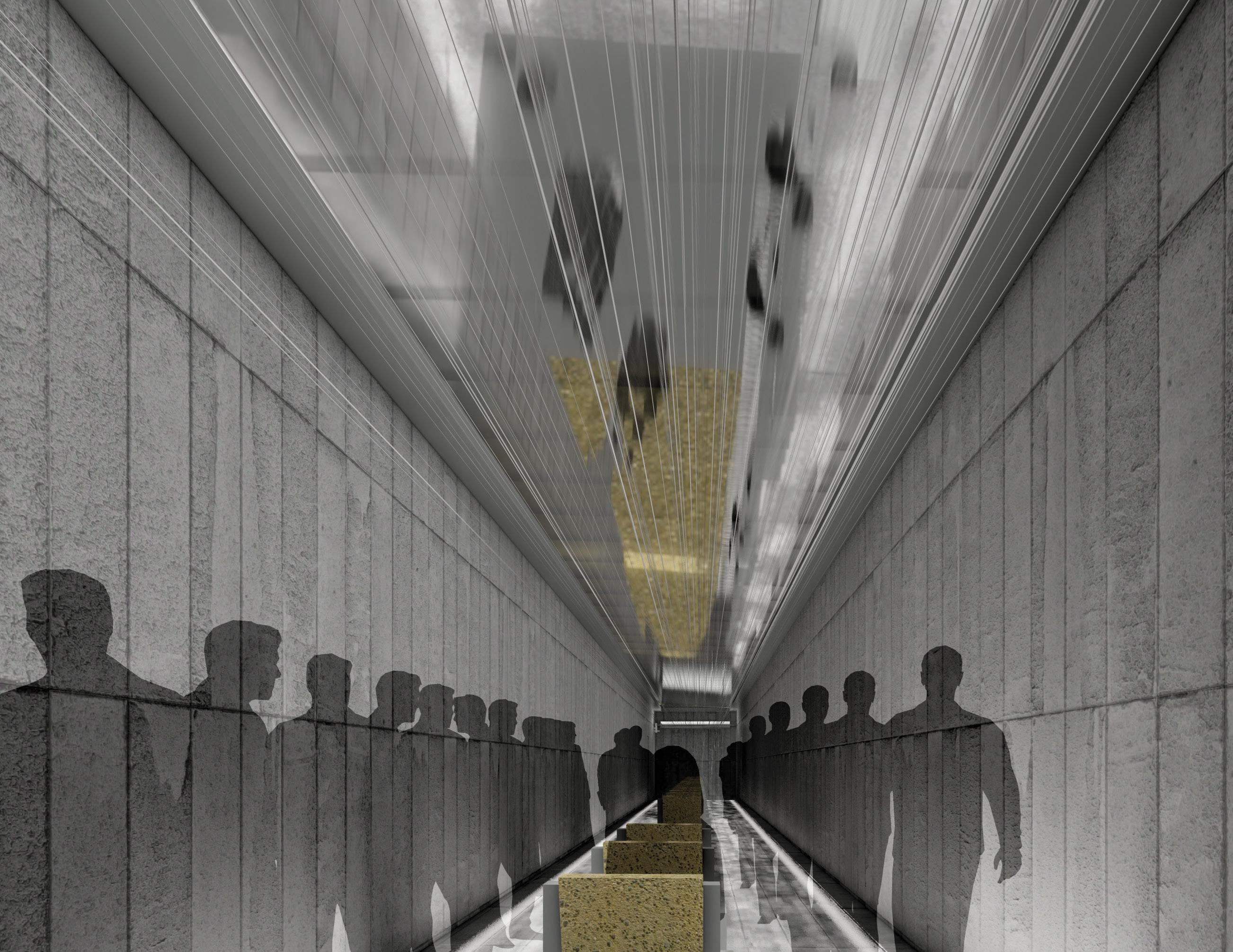
Content in this page is designed +
29
Produced by Mohammed Bokubar

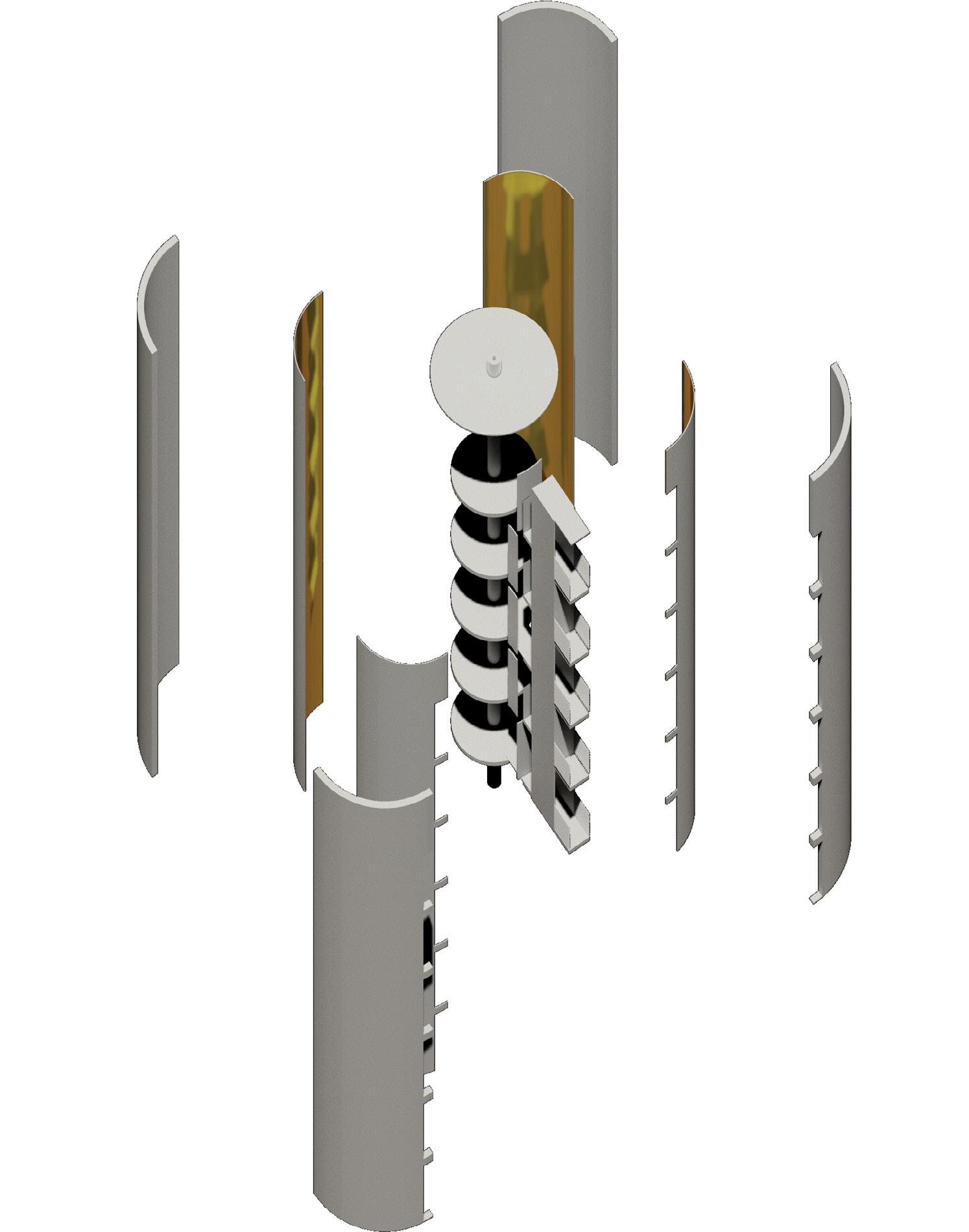
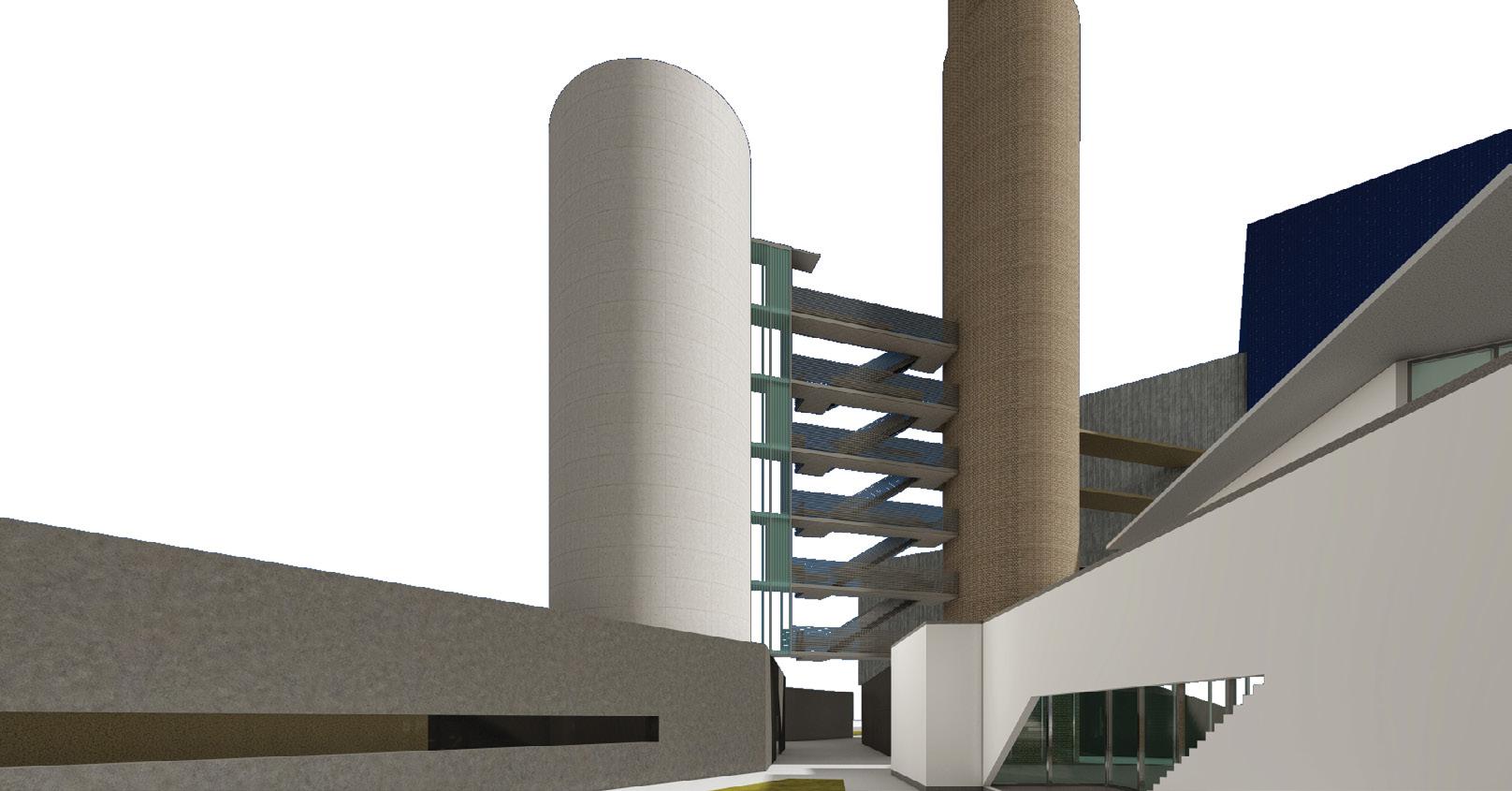
Content in this page is designed +
by
40’ 20’ 80’
30
Produced
Mohammed Bokubar
Experimental Cinema (Z)
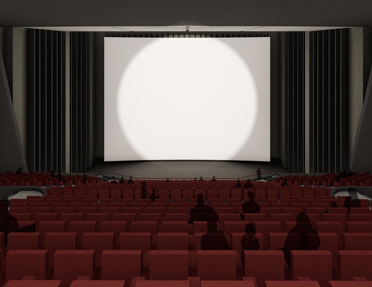
31
Large IMAX Theater
Academic - Individual project
JAN - MAR 2020
Site-less AR302
Instructor: Philipp Bosshart pbosshart@newschoolarch.edu
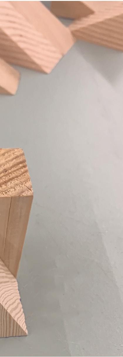
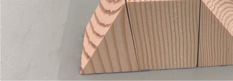
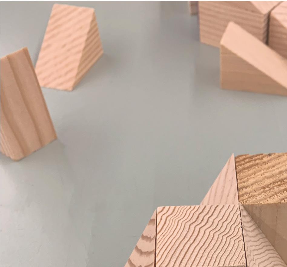
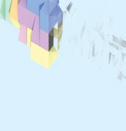
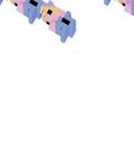
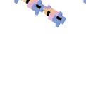
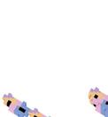
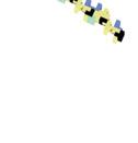
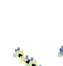
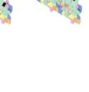
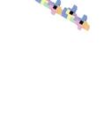
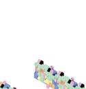
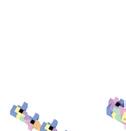
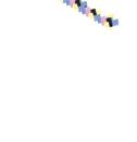
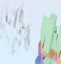
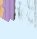
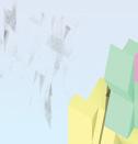
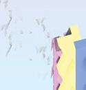
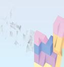
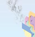
This project re-imagines apartment buildings through creating a system of growth-friendly units that are able to be assembled. Students are given precedent studies to investigate their spacial arrangements. A system of 6 units varying in size is developed from regular geometries and then aggregated in different ways to explore their possibilities.
32
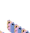
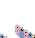
This aggregation system is chosen as the best because of its high density level, similar floor area in all levels, and regular elevations.
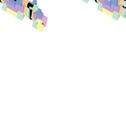
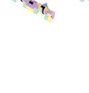


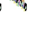

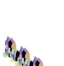

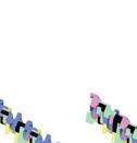
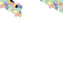
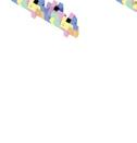
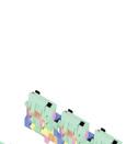
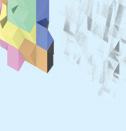

Individual living units are designed within the chosen form aggregation but not necessarily constrained by the colored units forms. Diversity of inhabitants is considered a goal for the project and it is reflected in the different apartment types. The project consists of 2 categories of units:
1. Duplex apartments
Inhabitants: couples - small families






















Amenities: full kitchen, in unit laundry, office/studio space
2. Co-living apartments

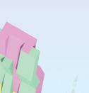
Inhabitants: individuals - couples





Amenities: shared kitchen, shared laundry, shared office spaces

Explorations of aggregation linear growth and core placement
33
Analytical diagram
34
35
Academic - Individual project
JAN - MAR 2019
San Diego, USA
AR202
Instructor: David White
dwhite1@newschoolarch.edu
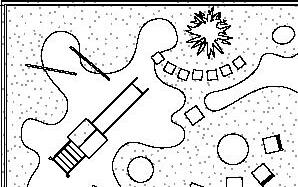
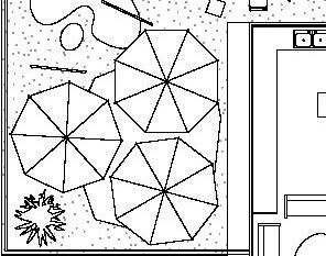
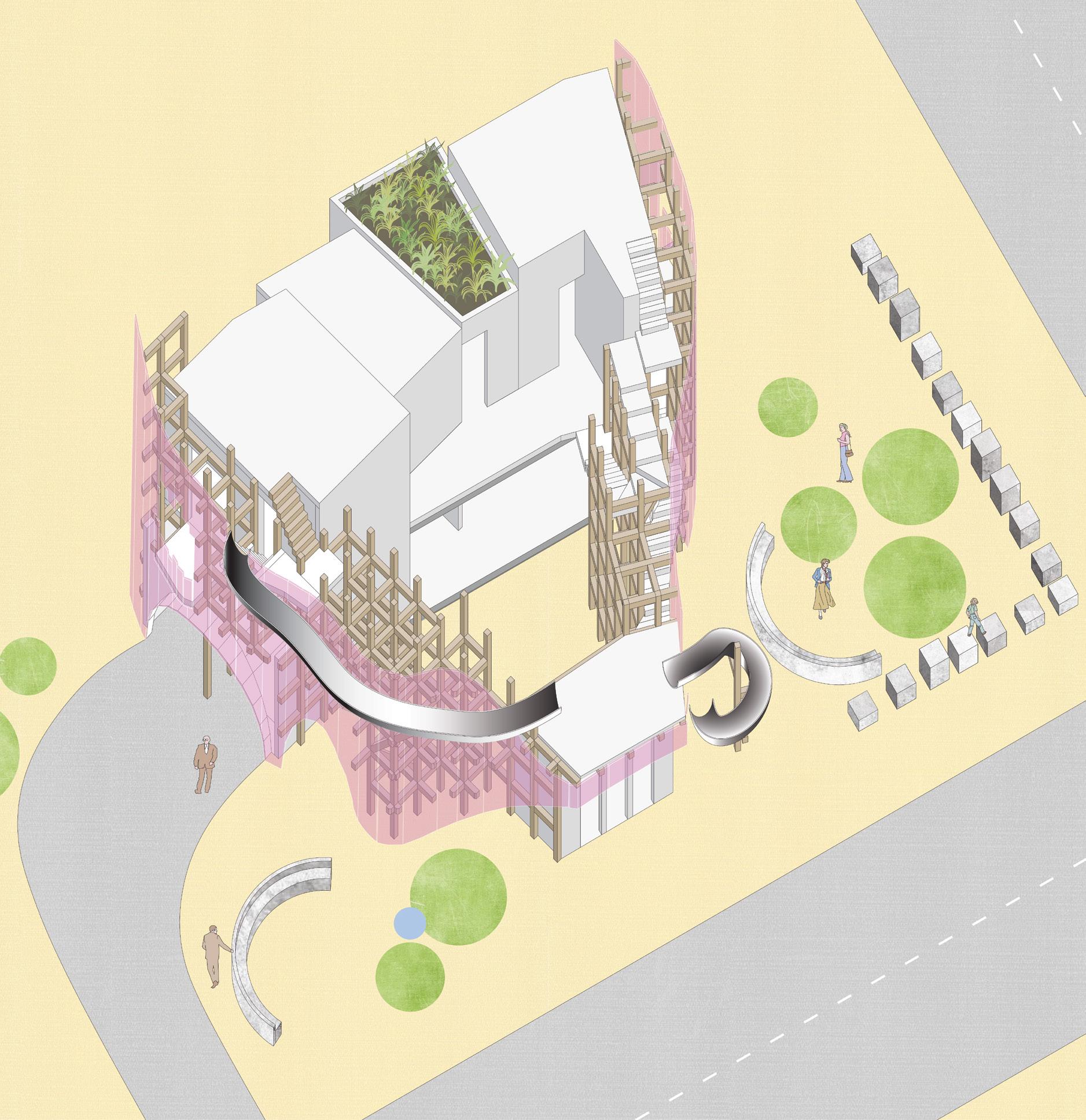
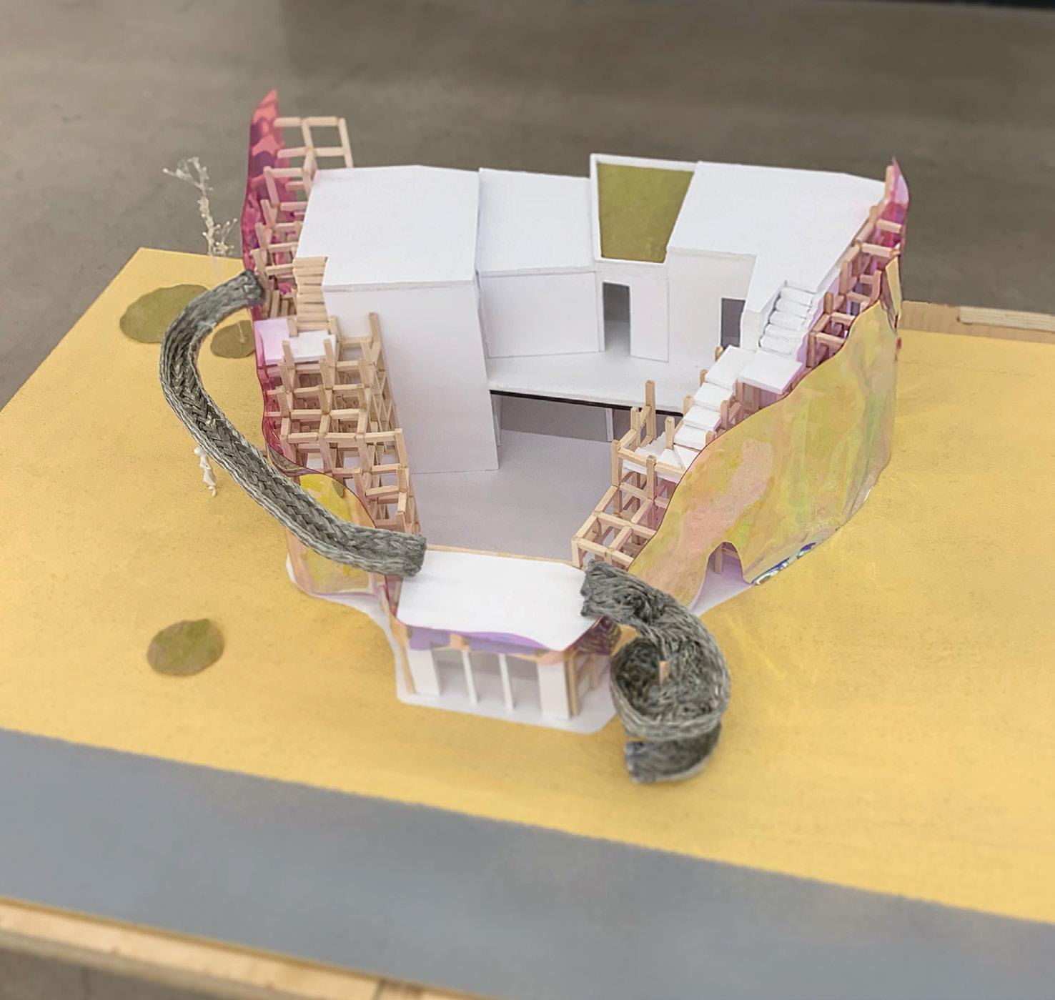
The prompt is for a house for the characters of the Jaques Tati 1958 film Mon Oncle. The design of the house addresses the conflict between the characters (Hulot and the Arpels) but doesn’t attempt to resolve it. Its’ purpose is to enable the coexistence. The project explores the spatial possibilities of standard wood framed construction and seeks the generation of spatiality. The students are allowed to use two steel frames, and a heavy timber element (glulam beam).
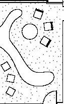
The house seeks to enhance interactions between the two sides inhabiting it by arranging its elements around a central courtyard. Indoor – outdoor relationships were taken into consideration due to observations of inhabitants’ activities. Needs of the child were reflected on the project as abstract and playground elements that act like imagination tools.
36
37
The house is designed for the four characters of the film which are: the mother, father, son, and the uncle. The house has a central courtyard as a space of assembly. An office for the father is separated from the rest of the program to provide privacy. The second level has the parents room, son’s, and the uncle’s room (right to left). the playful relation between the son and the uncle is reflected be slides from the uncle’s secret closet door to the top of the father’s office leading to the yard. The facade is translucent glass which gives privacy to the courtyard while allowing sunlight to penetrate through the supporting scaffolding structure.
Flexible functions of wooden scaffolding structure

38
39
Academic - Individual project
APR - JUN 2019
San Diego, USA
AR203
Instructor: Donald Klumker dklumker@newschoolarch.edu
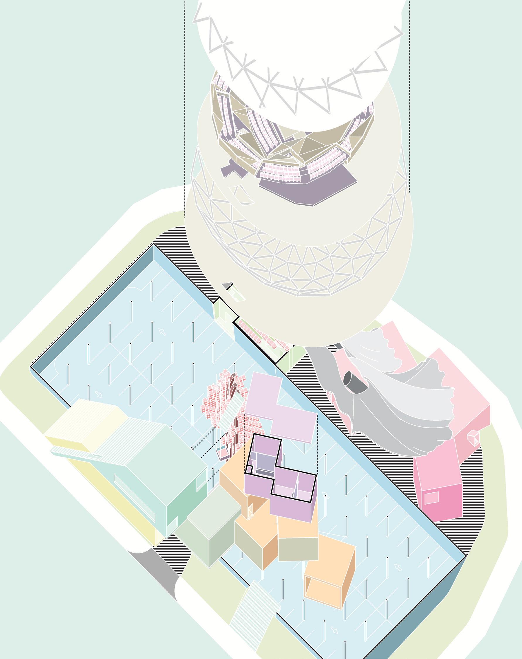
The project is a center for avant-garde music located in downtown San Diego. Students are asked to integrate concept, program, and structure to define an experiential sequence. Tectonic principals such as mass, skeleton, and skin are researched and explored in this project. The program is divided into three clusters:
1. Open to public: Urban plaza, open-air stage, underground parking garage.
2. Controlled public access: Reception cluster, concert hall, surround sound chambers, exhibition space, media library.
3. Restricted access: Sound recording studios (x2), anechoic chamber, think tank suites (x4), media labs (x4), offices, break lounge.
40
The concept is to elevate the main mass which is the concert hall to give the users a sequential promenade leading to the hall. A desired effect of floating is achieved by minimizing structure supporting the main mass and hiding it by a curtain shape concrete shell structure and a pixelated extension of the outdoor theater. The curtain and the pixelated elements enhance the floating effect, creating iconic architecture in downtown San Diego.
41
42
43
Academic - group project
OCT 2020- JUN 2021
Portland, Oregon, USA
AR401 - AR402 - AR403

Studio professor: Danieala Deutsch ddeutsch@newschoolarch.edu
Instructor: Gregorio Ortiz gortiz@newschoolarch.edu
Group partner: Rayan Makki rayan.makki@student.newschoolarch.

This integrated design project is designed in collaboration with:

1. BEAM Development (Client)








2. Mackenzie – Integrated Design Firm (Architectural)





3. KPFF Consulting Engineers (Structural)


4. EB Energy & Water (Energy and Mechanical)


Project phases and group responsibilities:










1. Research & Urban Analysis (shared responsibility)



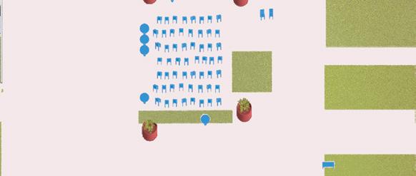
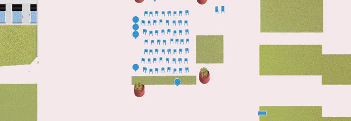
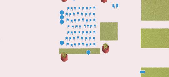

2. Master Plan/Urban Development Model (my responsibility)











3. Site and Building Program Analysis (shared responsibility)










4. Massing and Initial Floor Plan Studies (my responsibility)









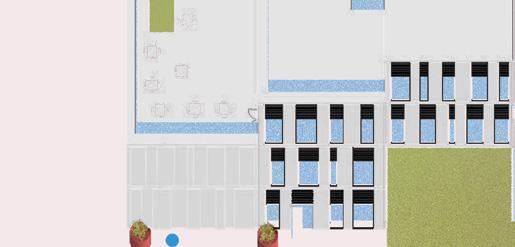


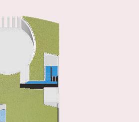

5. Building Systems Integration (shared responsibility)


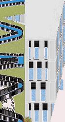
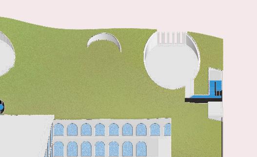
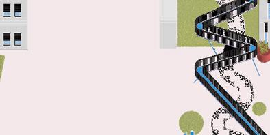
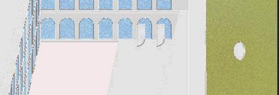
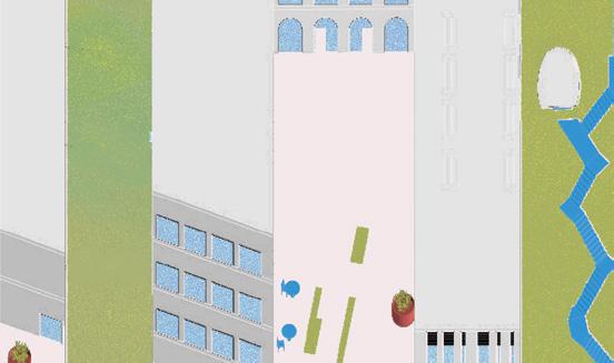
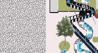
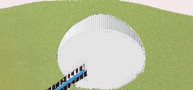
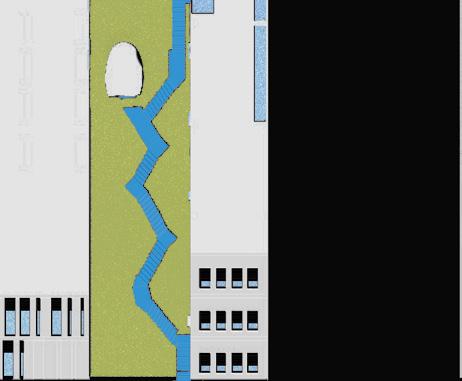
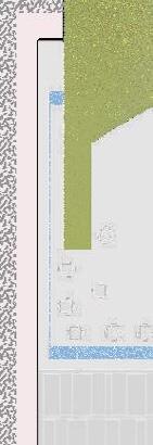
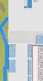
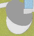
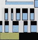
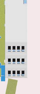
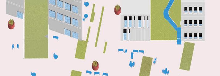
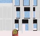
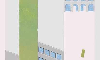
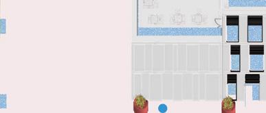
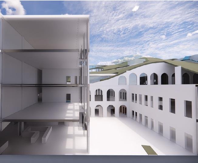
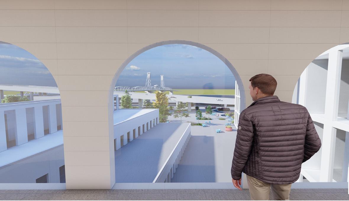
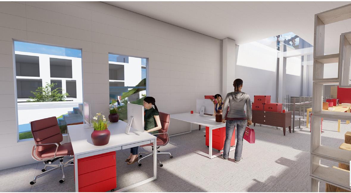
 Illustration showing the green roof/ facade and building connection to the plaza.
Made by: Mohammed Bokubar
44
Background
The ODOT blocks (Oregon Department of Transportation) are three blocks located in Portland’s Central East Side district along the east bank of the Willamette River. Prosper Portland acquired the ODOT Blocks in 2016 and have selected Beam Development to redevelop the 2.19-acre site. Portland Local design firm Mackenzie have collaborated with NewSchool of Architecture and Design and asked students to re-imagine the site.
Site Analysis
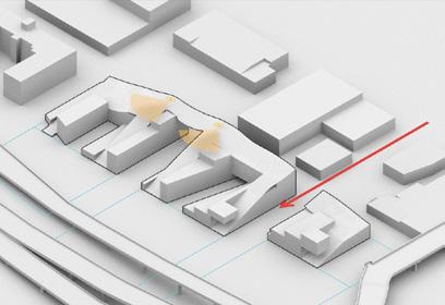
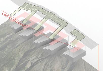
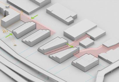
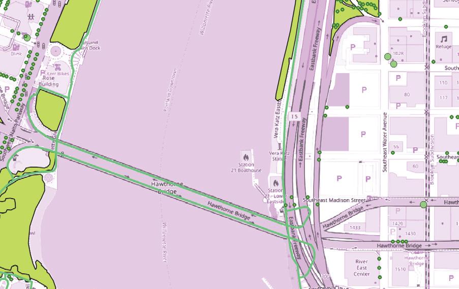
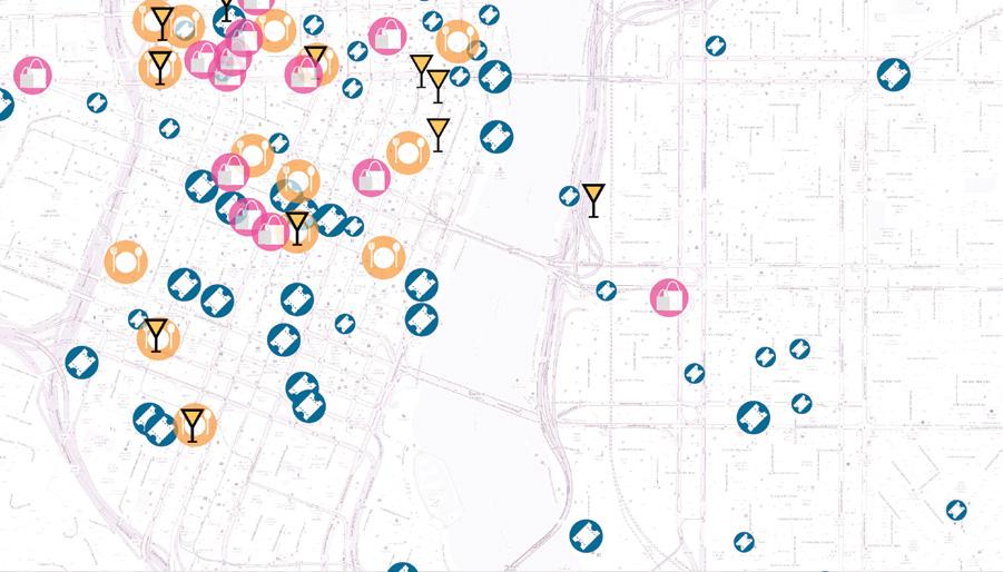
The site at the time of design was used as a parking lot located in an industrial area. The climate in Portland between September and June is cool and rain is quite common. Other times of the year it is sunny and warm. The site lacks greenery and it is neighboring the Interstate 5 and some historical buildings.
Using the analysis outcomes, 3 initial goals were developed:
1. Maximizing winter sun access
2. Creating a public green space
3. Attracting tourists and locals
Program Analysis
The project calls for a mixed use development including but not limited to:
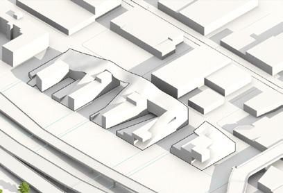
1. Innovation quadrant center, events community space (20%)
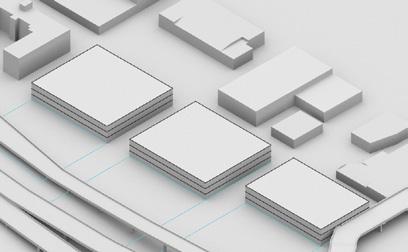
2. Small - medium tenants, small-scale work spaces, urban manufacturing (25%)
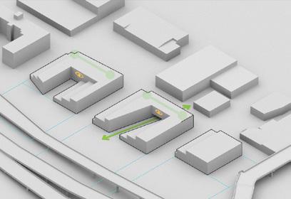

3. Large anchor tenants (25%)
4. Housing component, postCOVID ideas (15%)
5. Additional programmatic elements (15%)

Program Adjacency and Circulation Diagram
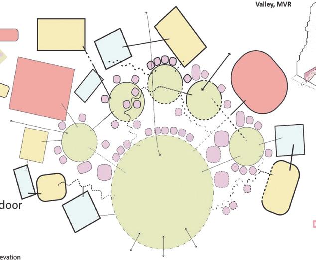
Analytic Diagrams Form Development All graphics are made
45
by: Mohammed Bokubar
46
All floor plans here are developed and drafted by: Mohammed Bokubar
47
All floor plans here are developed and drafted by: Mohammed Bokubar
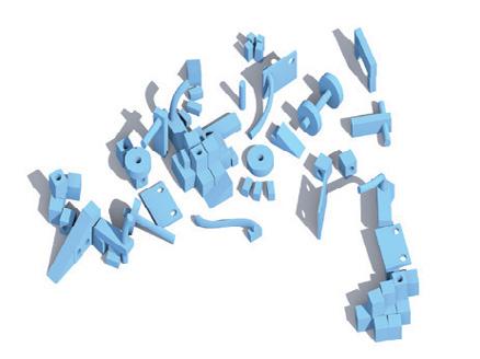
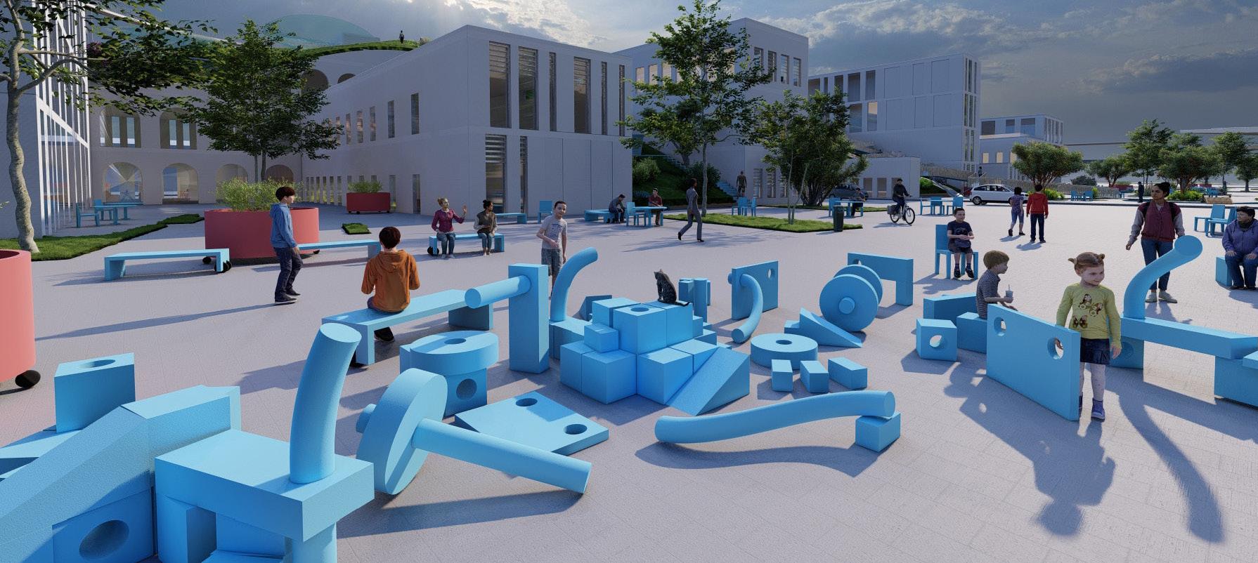
Playground
A tool to encourage physical andmental activity
TOP View


Thermal Comfort Passive Systems
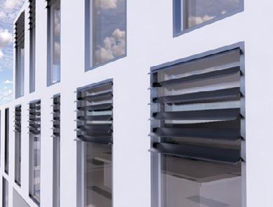
Climate Comfort Passive Systems
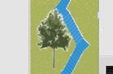
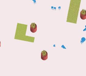
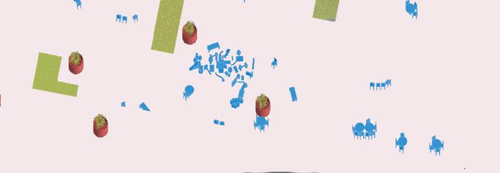
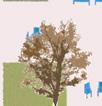
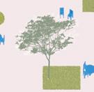
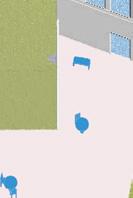
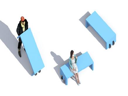
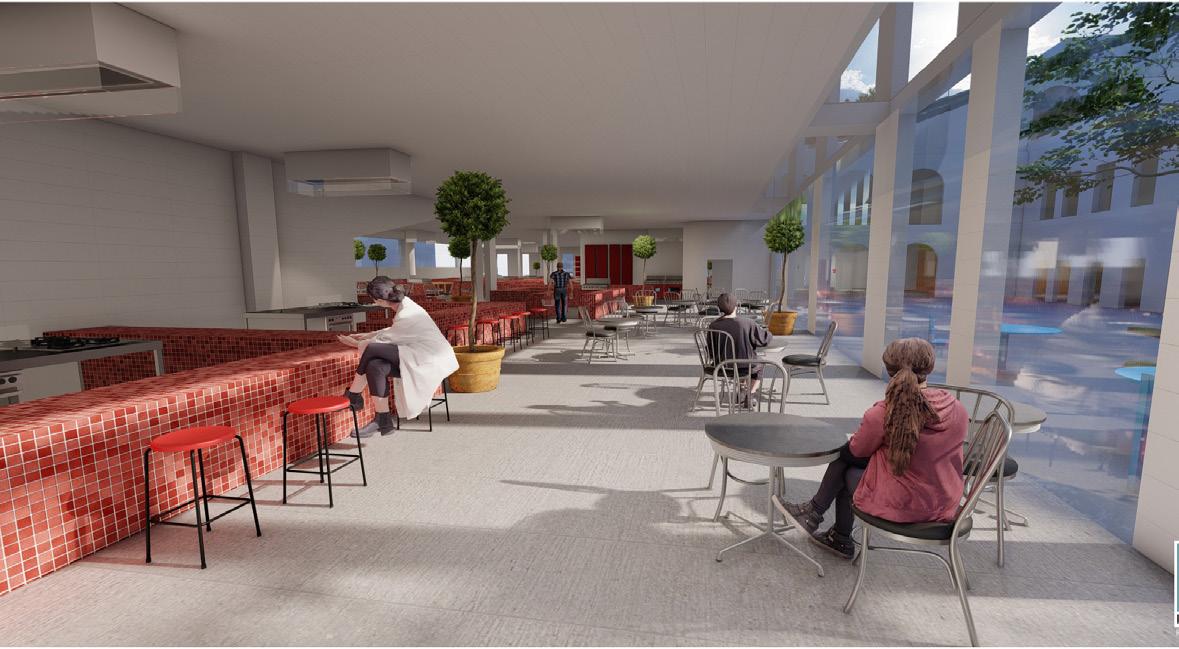
Movable Benches
Allowing people to design their place
22% Of project floor area will take advantage of the double facade passive heating and cooling system
Movable chairs + tables
people have the choice of where to sit
Movable planters
public involvement in place making
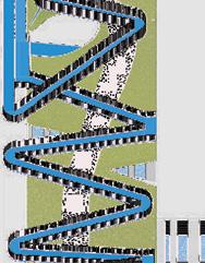
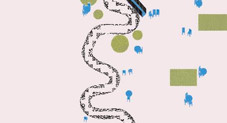
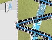
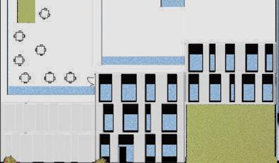
Perspective view showing the different types of public circulation systems on the green roof such as stairs, ramps, and hiking paths.
West facade shading system
1M 5M 20M 10M All the work here is developed
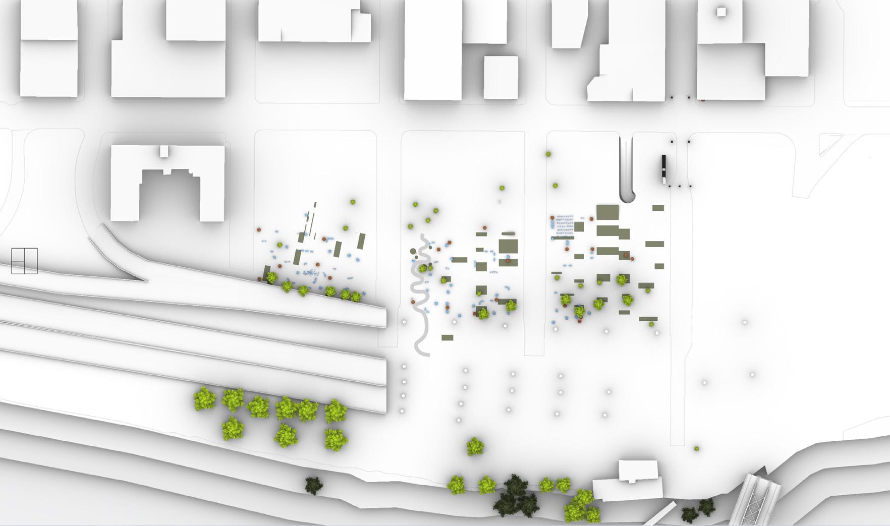
Food Market Site Plan
by: Mohammed Bokubar
Winter Summer Winter Summer
Flexible Landscape Elements
17
displayed work is developed
48
by: Mohammed Bokubar

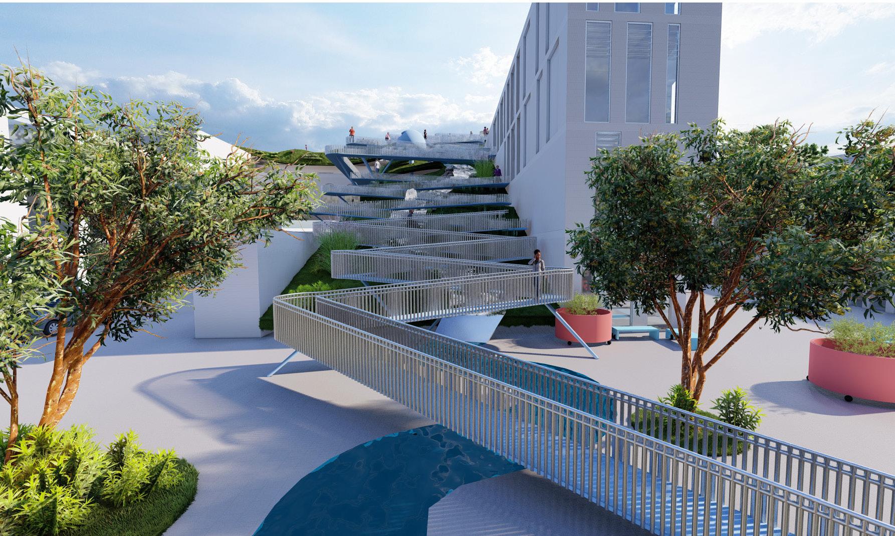 Aerial view showing the different types of public circulation systems on the green roof such as stairs, ramps, and hiking paths.
Perspective view of the accessible ramps that connects the ground floor to the top green roof. 49
displayed work
is
developed by: Mohammed Bokubar
Flexible Landscape Elements

Playground
A tool to encourage physical andmental activity
Movable Benches
Allowing people to design their place
Playground
A tool to encourage physical andmental activity

Movable Benches
Allowing people place
Movable chairs + tables

people have the choice of where to sit
Movable planters

public involvement in place making

quadrant
View
Site Plan TOP
Anchor tenanat: Grocery store quadrant Workshop Workshop
Plan
View
Site
TOP
Flexible Landscape Elements
50
displayed work is developed by: Mohammed Bokubar
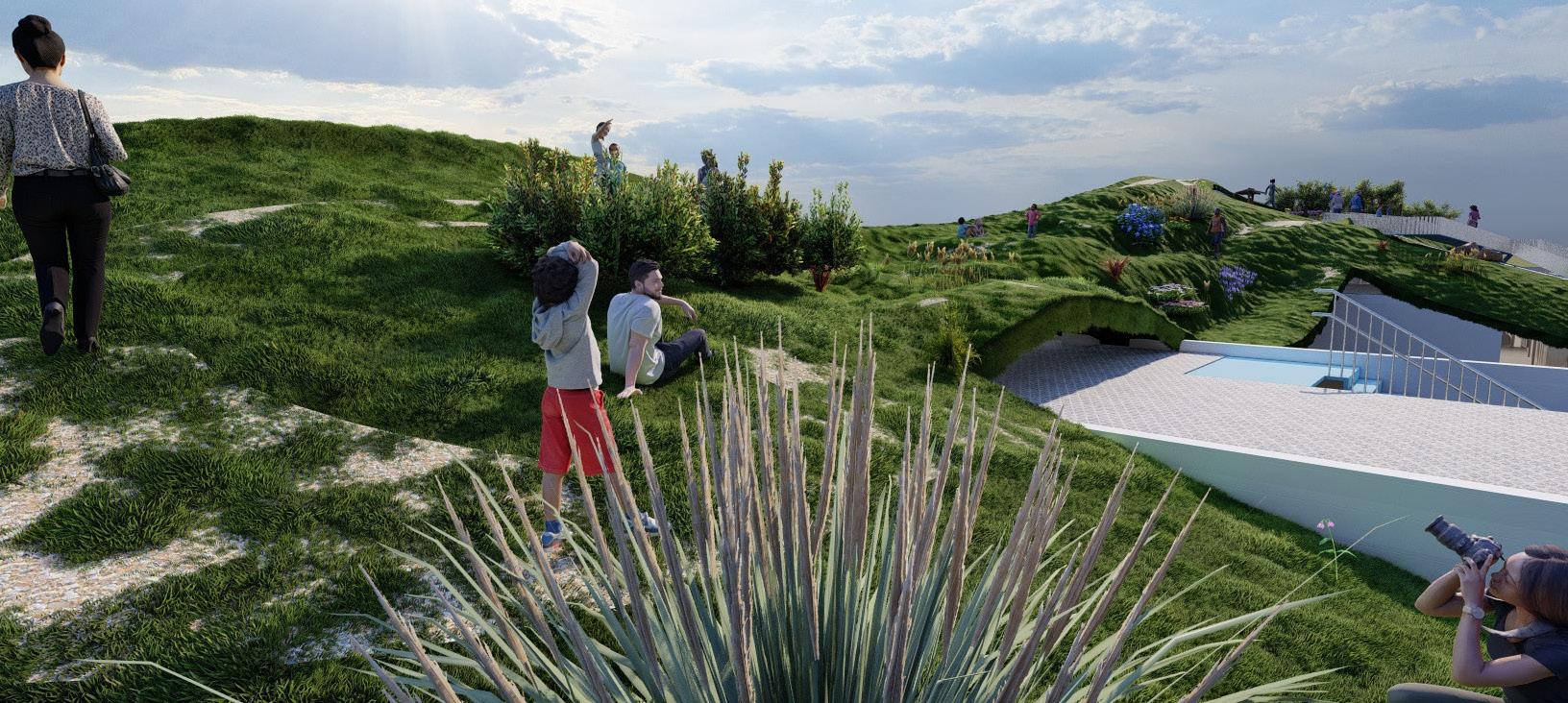
 Perspective view of the top green public roof and the hiking paths.
Ground perspective view of the public plaza and its different activation element.
displayed work is developed by: Mohammed Bokubar
51
Fly-Through video ( Scan QR Code )

Contact bokubar.mohammed@gmail.com +1 619 657 6972 +965 9917 6621 Scan QR Code




 Illustration showing the green roof/ facade and building connection to the plaza.
Made by: Mohammed Bokubar


 Aerial view showing the different types of public circulation systems on the green roof such as stairs, ramps, and hiking paths.


 Perspective view of the top green public roof and the hiking paths.
Ground perspective view of the public plaza and its different activation element.
displayed work is developed by: Mohammed Bokubar
