DIFFERENT PERSONALITIES, SAME PASSION.
What emoji would you choose to describe yourself? Think about it for a second. Now pick an emoji that represents your best friend. Is it the same one you chose for yourself? Probably not. And if it is, it’s likely not for the exact same reason. We all have our own distinct personalities—and here at Big, we like to celebrate that.

Every client we worked with this past year was different from the next. But they all want to get their stories and products out there. And we love building brands that make that happen.
Now we get to look back at all that we’ve accomplished together. This Look Book highlights the projects we completed for some of our best friends—our clients. Thanks to everyone who made it happen and to those paging through. Who knows? Maybe you’ll find yourself in next year’s edition.
 C. STUCKEY
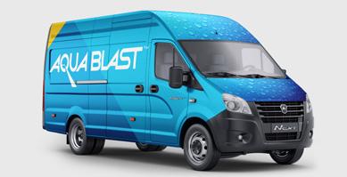
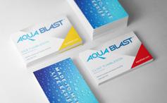
CLIENT Aqua Blast

TITLE Company Rebrand
DESCRIPTION
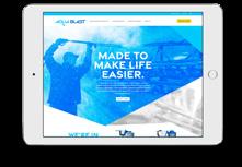
Aqua Blast is a hardworking company that has been producing high-pressure cleaning systems for over half a decade. When they wanted to refresh their brand and focus more on developing new business, they came to us. We helped Aqua Blast look at their business through the eyes of their customers and build a brand identity and messaging that spoke customers’ language. The voice and visuals were then applied to their website, products, business cards and more.





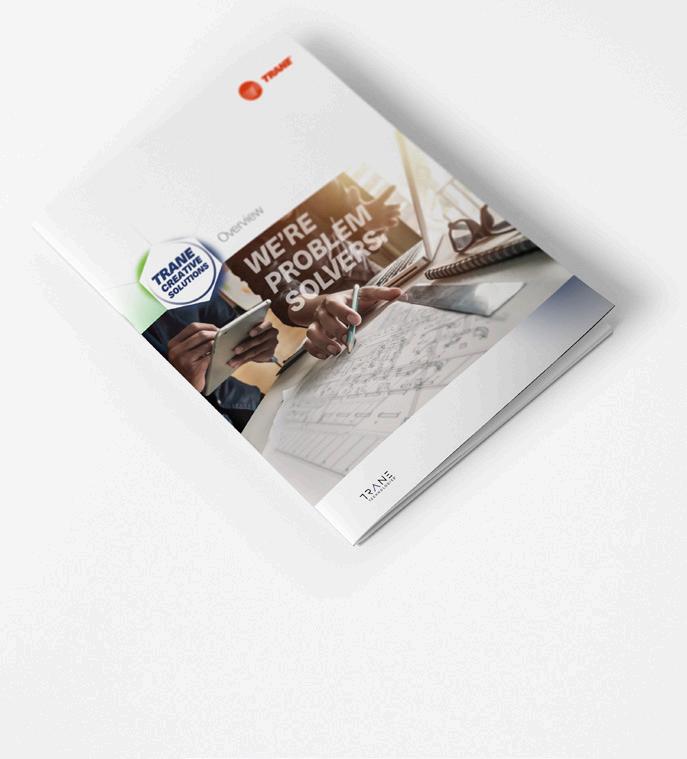
CLIENT Trane Creative Solutions
TITLE
Division Rebrand
DESCRIPTION
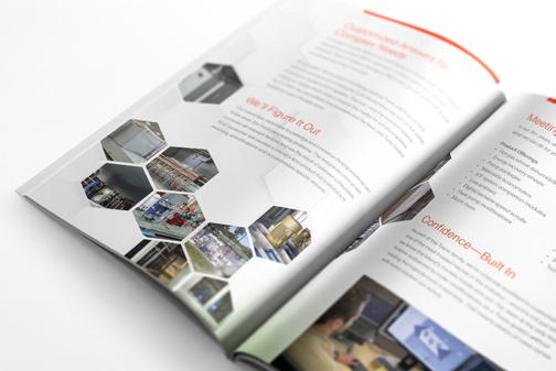
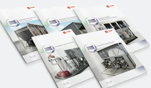
Trane Creative Solutions wanted their brand to emphasize that their company is about innovative ideas, not just manufacturing. To do this, we focused on their ability to customize HVAC units. They also wanted to establish their own identity separate from Trane, but still wanted it to be known that they were deeply connected. We developed a new logo and brand identity for them, but we incorporated some of the parent company’s features, such as the circle and minor font features.
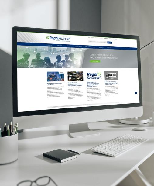
CLIENT Regal Rexnord
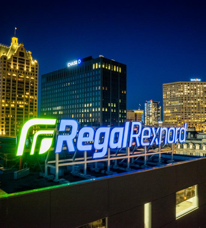
TITLE Company Rebrand
DESCRIPTION
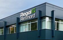
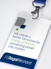
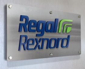
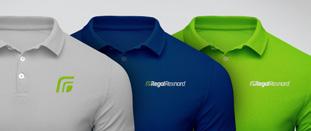
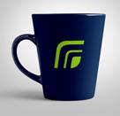
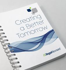
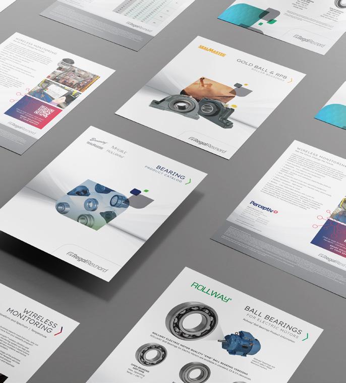
Regal Rexnord, a more than $4 billion company, was born from the merger of two powerhouses in the motor and motion control industry—Regal Beloit and Rexnord PMC. This merger was huge. Quickness and strict confidentiality were required of us as we blended the two companies’ personalities together to create one cohesive brand. The new brand identity also celebrated Regal Rexnord’s future goals towards green energy.
REGAL REXNORD MOTION CONTROL SOLUTIONS HEADQUARTERS IN MILWAUKEE, WI

CLIENT
Trane
TITLE
Continuity Guide
CLIENT Central Insurance
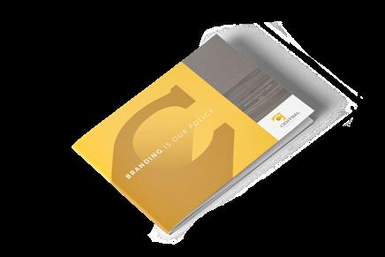

TITLE
Continuity Guide
CLIENT Best Home Furnishings
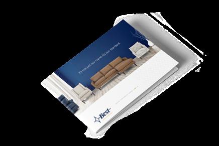
TITLE
Continuity Guide
DESCRIPTION
Continuity Guides are essential for brand projects. They explain everything you need to know to use, understand and communicate a brand. While producing each one, we contemplate how to make the brand come to life as well as how to effectively communicate its standards. At Big, our Continuity Guides allow brands to evolve with each creative expression while keeping everything consistent.
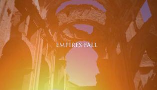
CLIENT
Asset Marketing


TITLE
Online Video
DESCRIPTION


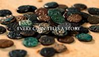
We love advertising unique products, so we were pumped to create a video showcasing Asset Marketing’s ancient coins collection. We inspired interest by focusing on the coins’ special features—for example, the coins are more than 2,000 years old and are each handmade.


DESCRIPTION
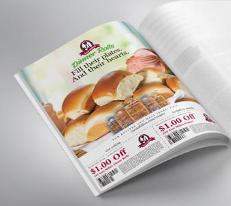
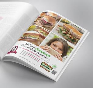
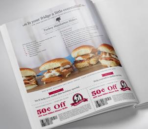
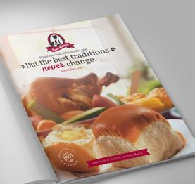
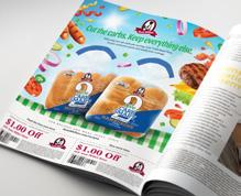
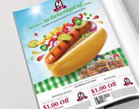
We had fun putting together this series of ads promoting Aunt Millie’s dinner rolls and sandwich bread. The ads appeared in Food Network Magazine, featured a seasonal theme and included a coupon. Our goal was to present Aunt Millie’s as an essential part
TITLE
FRONT BACK FRONT BACK
CLIENT Aunt Millie’s
Ad Campaign
DESCRIPTION
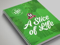
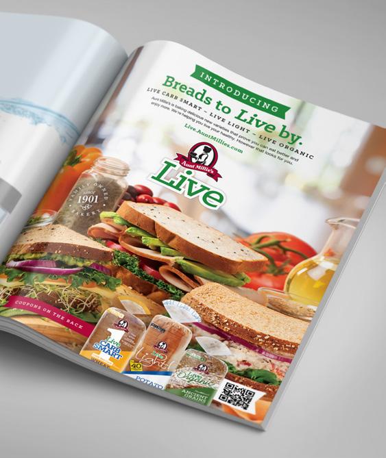
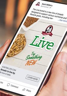
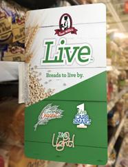
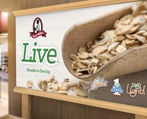
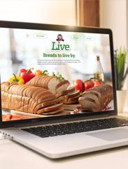
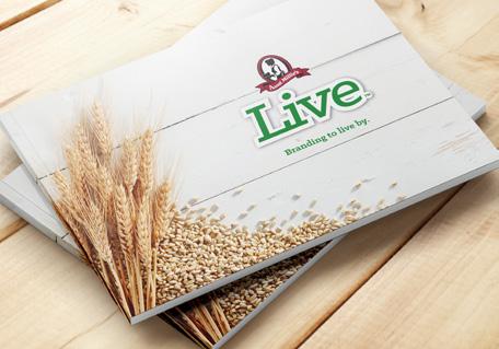
Over the years, Aunt Millie’s has expanded their healthy lifestyle options. Before long, they realized they’d created a family—and it needed its own brand. We helped them shape the Live brand to group three product lines together under one umbrella. Then, we created a microsite, Continuity Guide and point-of-purchase collateral to help sell the brand.
 CLIENT
Aunt Millie’s TITLE Live Product Branding
DESCRIPTION
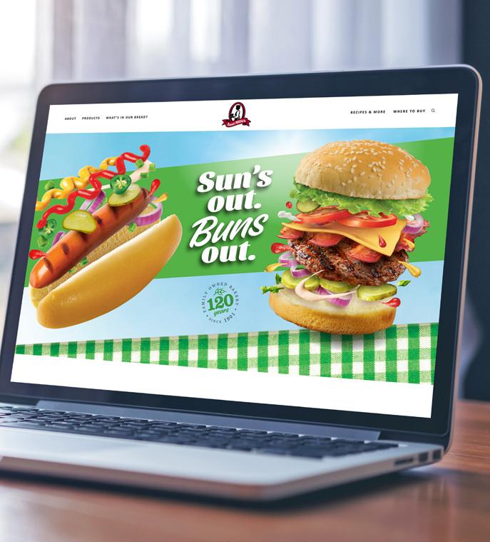
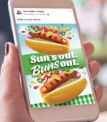
We all have our favorite summer traditions. At Aunt Millie’s, theirs is a summer bun campaign. For this campaign, we brought a fun, sunny feeling to grocery store displays. This campaign turned heads and made people smile—because who doesn’t love a big juicy burger straight from the grill?

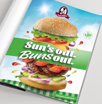
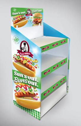 CLIENT Aunt Millie’s
TITLE Summer Campaign
CLIENT
Dilling Group

TITLE
Rebranding
DESCRIPTION
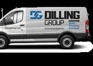
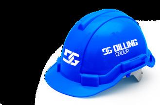
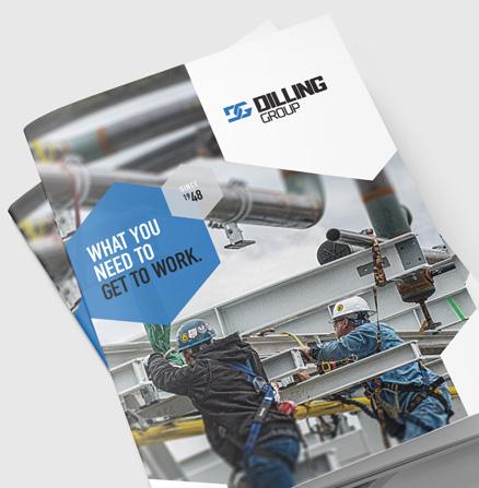
Dilling Group is a contractor that provides their clients with industrial solutions related to mechanical and electrical needs. They wanted our help organizing their brand, communicating their strengths and refreshing their look. We designed new graphics and messaging with bold colors and metallic accents that represented this hardworking and tough company.
CLIENT
Camber Wealth
TITLE
Brand Development
DESCRIPTION
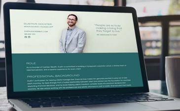
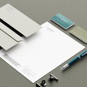
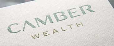
Camber Wealth was formed by a group of experienced professionals launching their own firm. This California-based financial planning group specializes in high-value portfolios and values professionalism and a personalized approach. Because they were just starting, we had the opportunity to develop their name, tagline, messaging, logo and visual style.
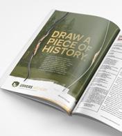
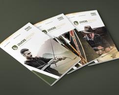
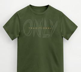
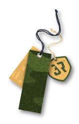
3 Rivers Archery is nationally known for being one of the biggest and best traditional archery suppliers. Their online sales were skyrocketing as their company grew. Naturally, they wanted their brand to reflect their success and leadership within the industry. We designed a new logo that represented the family legacy but had more of a modern look. We then created the cover and inside cover for their catalog with the same woodsy feel.

You’renotinterestedinwhat’seasy.Ifyouwere,youwouldn’t bedrawntotraditionalarchery. Youlovethechallengeandthrillofhittingthetargetwhenit overtakesalotmoreskill.3RiversArcheryfeelsthesameway.For 35years,we’vespecializedinonething.Andthat’smade usthesourceoftheworld’slargestselectionoftraditionalWhetherarcheryproductsandtheexpertsinthesport. arecurveorlongbowfeelslikeanextensionof yourarmoryou’rejustpickingoneupforthefirsttime,we accessoriesserveyourexperiencelevel.Frombows,arrows,targets,and tomaterialssoyoucanbuildyourown,wehavePlus,everythingtofullyequipyou—instockandreadytoship. alltheadviceandsupportyou’relookingforisasimplephonecallorchatmessageaway.As family-ownedbusiness,Wegenuine,helpfulinteractionsarethehallmarkofourcompany. feelingmakesureevery3RiversArcheryexperienceleavesyou valued,inspired,andmoreknowledgeable. It’sOurpassioncomesfromwithin.Welovetraditionalarchery. notonlyourwork—it’sourfreetime.Thetipswegive toyouarethesameonesweuseourselves.Andourdrive helpyouispartofthecamaraderiethatthissport bringsoutinpeople. archeryTraditionalarcheryisn’teasy.Neitherisrunningatraditional store.Butwhere’sthefunindoingwhat’ssimple? Sopullbackthestringandrelease.Pursueyourtarget with3RiversArchery.
 CLIENT
3 Rivers Archery
TITLE Rebrand DESCRIPTION
TITLE
Sales Brochure


DESCRIPTION
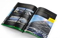
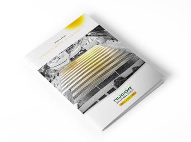
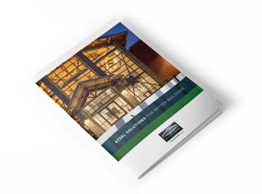
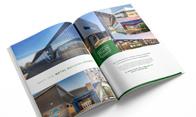
When you’re learning about a new product or service, it’s best to have all the information in one place. That’s why the sales team at Nucor asked us to develop brochures highlighting their products for prospective clients. One brochure showcased steel buildings and zeroed in on durability. The other focused on their innovative products that harness solar power. Nucor also requested strong graphic design so we delivered bold and edgy fonts and images.

CLIENT Nucor

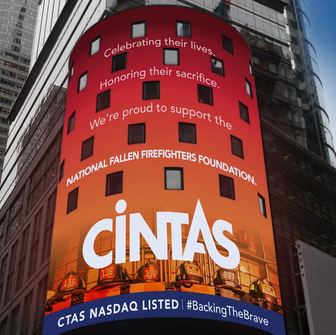
NASDAQ TOWER IN NEW YORK CITY
CLIENT Cintas
TITLE
Special Event Campaign
DESCRIPTION
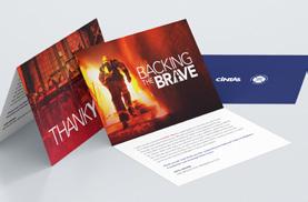
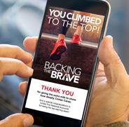
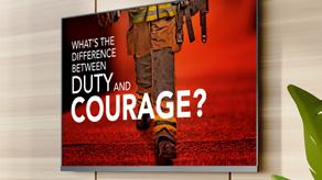
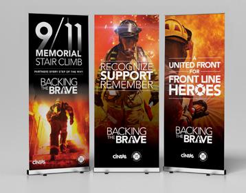
For Cintas, the Backing the Brave event is a special experience. The campaign honors the firefighters who served on 9/11 and engages employees in a companywide fundraising event for The National Fallen Firefighters Foundation. We had the opportunity to create a name, theme, brand and promotional materials for last year’s event. Backing the Brave gained national attention—even appearing on the NASDAQ Tower in New York City. That’s something to be proud of.


CLIENT
The Rescue Mission
TITLE
Awareness Campaign
DESCRIPTION
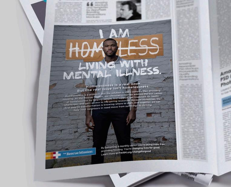
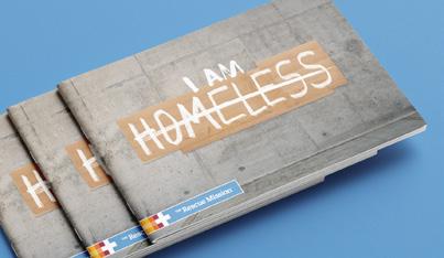
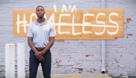
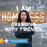
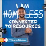
The Rescue Mission came to us with a big goal—to change minds about what homelessness looks like. We created a campaign to raise awareness and attract long-term donors. By putting faces to the struggles that go along with homelessness, we were able to humanize the issue and appeal to the emotions of community members. We also completed a second series of ads that showed how The Rescue Mission instills hope and restores lives.


CLIENT
The Rescue Mission
TITLE
Donor Development Brochure


DESCRIPTION
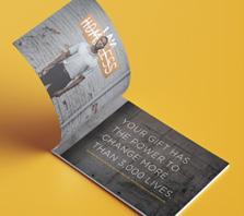
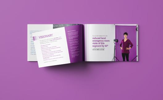
Everyone wants to know where their money is going—especially if that money is donated. The Rescue Mission needed a brochure to help highprofile donors understand the impact of their gifts. We made an informative and compelling brochure that The Rescue Mission could use in these important one-on-one meetings.

Talent A: I am isolated.
Talent B: I am crashing with friends.
Talent C:
I am living with mental illness.
Narrator
Homelessness is a real issue. But the real issue isn’t as simple as housing. At the Rescue Mission, our Christian ministries work to address the true causes of homelessness.
And with your gift, you’re helping people move from surviving—to thriving.
Talent D:
I am learning new skills.
Talent E:
I am healing from trauma.
Talent F: I am connected to resources.
Narrator
You can help us change lives for good. Visit FWRM dot org.
CLIENT The Rescue Mission
TITLE TV Commercial


DESCRIPTION
The TV commercial showed a series of experiences that reflected the issue of homelessness and gave a deeper description of The Rescue Mission’s impact. These 30-second spots gave the awareness campaign an even bigger audience and showcased The Rescue Mission’s programs as a long-term, sustainable solution.


CLIENT
The Rescue Mission
TITLE
Digital and Radio Ads


DESCRIPTION
The digital and radio ads kept the awareness campaign top-of-mind. As a multimedia campaign, these ads used the same look and messaging as the others to expand reach and impact.
Talent A:
Talent B:
Talent C:
Narrator:
I am isolated.
I am crashing with friends.
I am living with mental illness.
Homelessness is a real issue. But the real issue isn’t as simple as housing.
At the Rescue Mission, our Christian ministries address the true causes of homelessness by helping people overcome the physical, emotional, educational, and economic hardships they may be facing.

Because it’s not enough to simply help people survive. Your gift can help them thrive.
Learn more at FWRM dot org slash change for good.
Talent D:
Talent E:
Talent F:
Narrator:
I am learning new skills.
I am healing from trauma.
I am connected to resources.
Homelessness looks different than you might imagine—and so does the solution.
At the Rescue Mission, our Christian ministries address the true causes of homelessness—by helping people lay a foundation for a successful future.

Because a meal and a warm bed might change life for a moment. But with your help, we’re changing lives for good.
Become a monthly donor at FWRM dot org slash change for good.
CLIENT

Goshen Health
TITLE
PR Campaign
DESCRIPTION
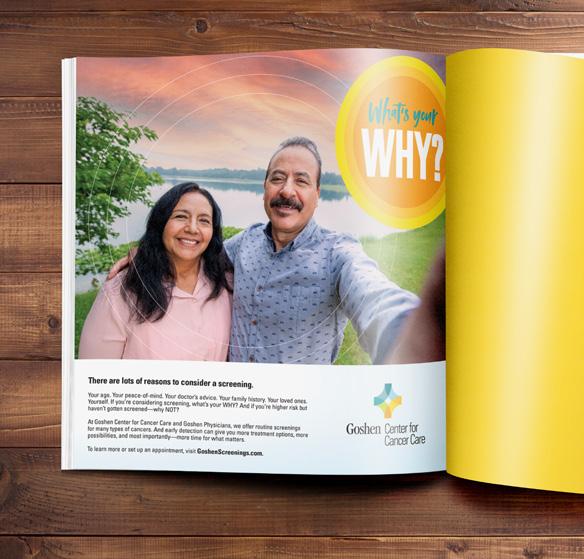
Goshen’s Center for Cancer Care is known for expert care. For this campaign, they wanted to focus on encouraging people to get a cancer screening. Because screenings are scary and inconvenient, we suggested they ask people to consider what their motivation might be with the tagline, “What’s your WHY?”


CLIENT Goshen Health


TITLE
PR Campaign
DESCRIPTION


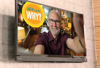
“What’s your WHY?” was an important campaign, so we didn’t want to limit its reach. We created print ads, website banners, Facebook ads, videos and radio broadcasts featuring real Goshen cancer patients. Each piece told the same story—you have relationships and passions, so get a screening to preserve the life you love.

Amy Clay:
Keith:

Juan: Amy Rainey:

Narrator:
Why did I get a health screening?
Because I’m higher risk.
Because my doctor recommended it. (en Espanol)
Because my kids need me.
If you’re thinking about screening, what’s your WHY?
At Goshen Center for Cancer Care and Goshen Physicians, we offer routine screenings for many types of cancers. And early detection can give you more treatment options, more possibilities, and most importantly—more time for what matters.

To learn more or set up an appointment, visit Goshen Screenings dot com.

DESCRIPTION


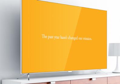
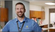
During the COVID-19 lockdown, people were restricted on what medical treatments they could receive. Once Goshen opened their doors to elective procedures again, they wanted to make sure their patients came back for the care they needed. We made a promotional video to show patients that the colleagues at Goshen were ready and waiting and that their mission hadn’t changed. The video featured actual providers that patients would recognize and feel comfortable listening to.


Video
CLIENT
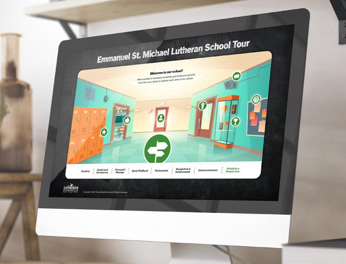
The Lutheran Schools Partnership

TITLE Virtual Tour Website


DESCRIPTION
The Lutheran Schools Partnership noticed that schools they supported were having a hard time getting prospective students to tour their facilities. To combat this, we created a fun and interactive virtual tour website. The platform was easy to customize so that each school could create their own unique tour experience. This template included instructions to help school administrators upload information and videos. This smart digital tool gave prospective students a clear picture of each school’s philosophy and programs.

CLIENT
Jace Medical
TITLE
Packaging and Logos

DESCRIPTION
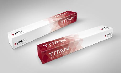
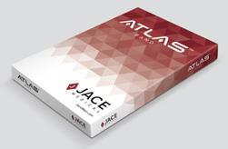
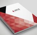
Jace Medical was growing rapidly and wanted their packaging to reflect their success. Here at Big, we like to go the extra mile. We updated their packaging and revamped the logos for Jace Medical, Titan and Atlas to reflect their modern and efficient innovation.


CLIENT
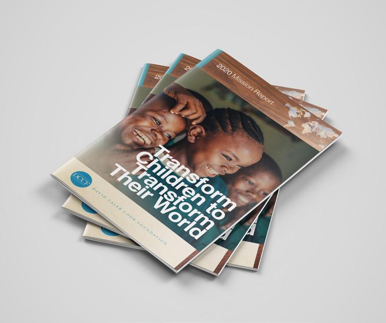
David Caleb Cook Foundation
TITLE Mission Report
DESCRIPTION
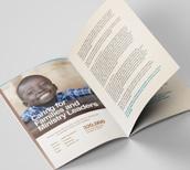
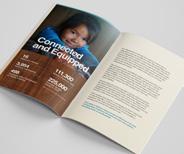
Every year, we design a Mission Report for the David Caleb Cook Foundation. The Foundation provides books and resources to missions worldwide. The report is essential to the Foundation because it shows donors how their money is being used through true stories and informative statistics. We created a print and digital version that featured people serving and being served in the supported communities.


DESCRIPTION

Big has a lot of specialties, but branding is our passion. We can’t help but get excited when a logo redesign comes our way. While there’s a lot more to a brand than just a logo, it’s usually the first thing consumers think of. These logos were designed with colors, custom type treatments and avatars that embody each company’s specific vision. These redesigns help each brand stay relevant and stand out in their industry.

TITLE Logos
DESCRIPTION
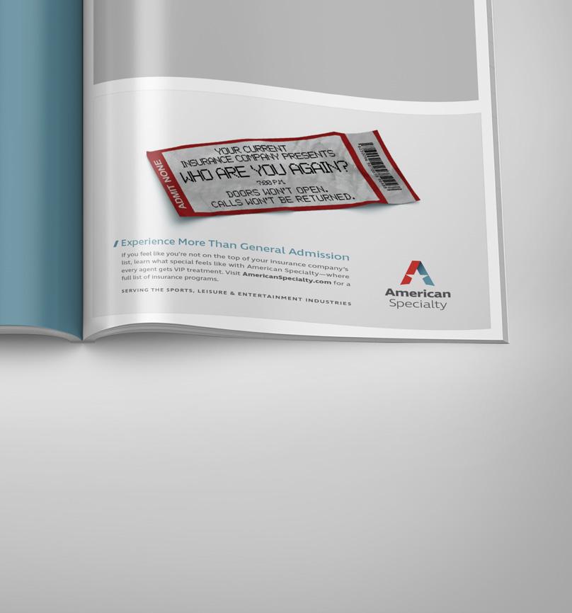
What do you do when you find out your competition doesn’t treat their clients with much care? You remind people that you’re different. That’s exactly what American Specialty asked us to help them do. American Specialty is an insurance underwriter for the entertainment industry, and they care deeply about people, not just money. Our ad provided a clever visual representation of how other insurance companies fall short while American Specialty gives each client VIP treatment. Big Thinking helped them stay competitive in a creative way.

CLIENT American Specialty
TITLE
Print Ad
CLIENT
The Lutheran Foundation
TITLE Campaign
DESCRIPTION
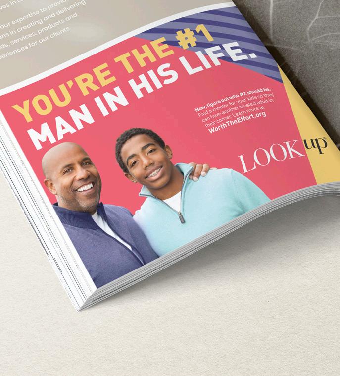
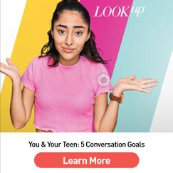
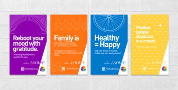
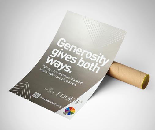
The Lutheran Foundation created a website and campaign called Look Up that they asked us to help them promote. Look Up encourages teens to seek help with mental and behavioral health issues and helps parents better communicate with their teens. Big took the encouraging and informative messages and turned them into bright, youthful ads that made these difficult conversations seem less scary. The campaign included ads for a wide variety of platforms, including print, digital, radio, Tik Tok, Spotify and Facebook.

DESCRIPTION
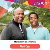
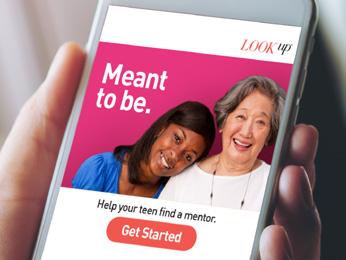
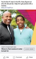
One wave of the Look Up campaign encouraged mentorship with messages that spoke to both teens and parents. We created digital and radio ads with that specific request in mind.


The Lutheran Foundation
Digital and Radio Ad


First thing’s first. When it comes to your kids, you need to be there for them. Listen, support and guide. What’s another thing you can do? Make room in their lives for a mentor. Teens thrive when they have a trusted adult—who ISN’T their mom or dad—that they can turn to. Mentors don’t replace your role as a parent—you still have to be involved—it just means your kids have another person in their corner.
Help your teens find a mentor. They’ll benefit from it now and in the future.
Get more info at Worth the Effort dot org.
CLIENT
TITLE
CLIENT The Lutheran Foundation

TITLE
Social Media Ads


DESCRIPTION
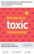
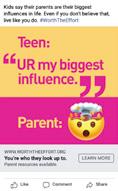
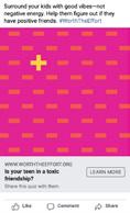
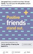
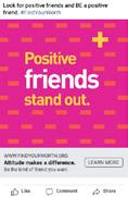
Each phase of the Look Up campaign focused on a different aspect of mental health and wellness. At every phase, our social media content supported the message—from choosing positive friends to reminding parents of their impact.


(The Lutheran Foundation Continued)
CLIENT
The Lutheran Foundation
TITLE
Digital and Radio Ads


DESCRIPTION
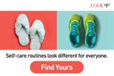
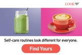
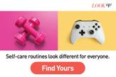
We created digital and radio ads that gave examples of self-care practices and directed teens to the Look Up website for more ideas. The ads were colorful and catchy, with images of everyday items that made a statement and sparked interest.


Mom:
Dad:
Mom:
Dad:
Mom:
Dad: Mom:
Announcer:
I was just looking at Jasmine’s TikTok… Did it remind you of me? I think she got some moves from her old man.
Very funny. But did you notice all these people commenting? Who are they?
Hmm. You’re right. I have no idea. We used to know who she was friends with.
She’s getting older. We can’t keep up with all of them…
Well…why don’t we ask?
As a parent, you SHOULD know who your kids’ friends are. Don’t make it a “thing” or accuse them. Just talk to them. Knowing who’s in their life will help YOU help THEM.
Learn more at Worth the Effort dot org.
CLIENT The Lutheran Foundation
TITLE Tik Tok Ads
DESCRIPTION
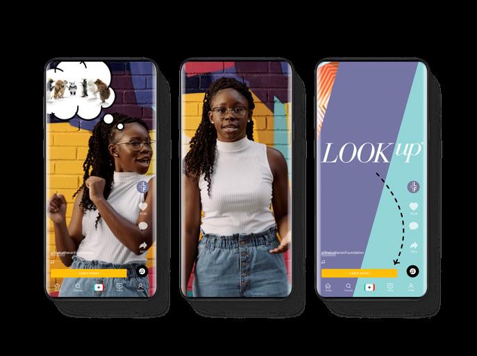
If the target audience is teens, Tik Tok almost always needs to be a medium. We created fun and informative Tik Tok ads that led teens to the Look Up website.

(The
Continued)
Lutheran Foundation
CLIENT The Lutheran Foundation

TITLE
Wall Posters

DESCRIPTION
Big made posters for each concept of the campaign that could be hung in school hallways. Each poster reinforced the message and offered quick advice.
(The Lutheran Foundation Continued)
CLIENT
Junior Achievement


TITLE Bel Awards
DESCRIPTION
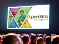
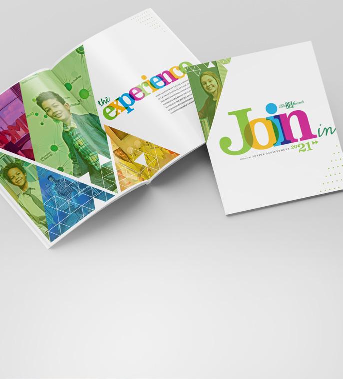
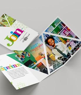
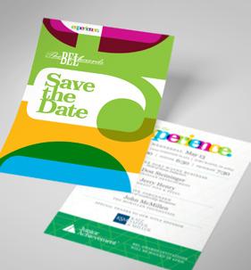
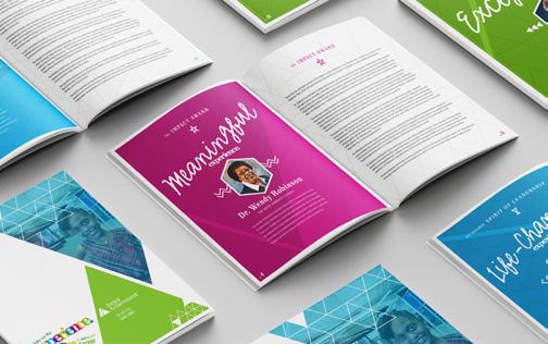
Big is proud to support Junior Achievement’s mission to teach students integrity in the business world. Their Bel (Business, Education and Leadership) Awards go to business professionals that play an important role in their communities and help students on their journeys toward a future career. For the 2021 Bel Awards, we created a packet of information, a brochure about the event and a save-the-date card. We stuck with Junior Achievement’s bright color scheme and incorporated their triangular logo into the design.


DESCRIPTION
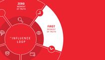
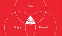
Here at Big, we practice what we preach. To share our expertise and demonstrate how we use it in our own branding process, we created a series of four animated videos that feature our bold red color scheme and Big personality.


CLIENT Big TITLE


Thought Leadership Videos


GOTOBIG.COM


 ALIG
BARNES BAUM
CRILLY EGTS FELGER
GERBER
GREGORY
HART
A. HOCKEMEYER
E. HOCKEMEYER HOEPPNER KOENEMAN ROTH
BELL BUSHUR
COOKE
SOWERS
S. STUCKEY
BECKER

 C. STUCKEY


 CLIENT


 CLIENT Aunt Millie’s
TITLE Summer Campaign


 CLIENT
3 Rivers Archery
