ARCHITECTURAL Brick Workshop
A Collaboration between Architects, Educators, Students and Manufacturers on Design Possibilities with Clay Brick


Department

A Collaboration between Architects, Educators, Students and Manufacturers on Design Possibilities with Clay Brick


Department
"Architecture is the transformation of a worthless brick into something worth its weight in gold."
- Alvar Aalto
A Collaboration between Architects, Educators, Students and Manufacturers Exploring Design Possibilities with Clay Brick
The Workshop was Made Possible by and Organized by

Edited
by
Ben K. Mickus, AIA, LEED
Mila Kim,
AIA, LEED AP
AP
Architecture Department
COLLEGE OF ARCHITECTURE and ENVIRONMENTAL DESIGN
WRNS Studio
Ben Mickus
Mila Kim
Pacific Clay
Josh Higgins
Section 02
Ellen Chang
Audrey Mininger
Huma Shahid
Molly Alford
Gabriel Koren
Avery Loll
Alex Luis
Crystal Doan
Bay Baysinger
Phoenix Homer
Miguel Mariscal
Audrey Aceituno
Elianna Ehlenberger
Nicolaas DeGrood
Kate Thompson
Emma Briceno
Judy Gnanadoss
Peyton Hagstrom
Dhruvi Jain
Section 03
Anatalia Beiler
Nixon Calderon
Diego Perez
Bella Leyva
Eleanor Vickery
Katherine Lee
Siena Lopez
Elijah Harris
Lynne Chirillo
Dylan Ferrer
Leilani Vance
Collin Yan
Donovan McPeek
Cameron Grove
Poppy DeArmondMacLeod
Delaney Denham
Naomi Komadina
Sylvie Gliko
Yadira Bautista
Cal Poly
Mark Cabrinha
Carmen Trudell
Robert Arens
Section 04
Adrian Botouroglou
Aoife Murphy
Joey Dovidio
Ella Mendoza
Maura Shernisky
Mariana Sanchez Heisecke
Cindy Moreno
Antuanette Arteaga
Adrian Gonzalez-
Esquivel
Henry Frierson
Chloe Williams
Payton Lee
Curtis Jacobs
Arsh Gupta
Joshua Flynn
Madi Li
Peyton McLeese
Juliette Mendoza
Hazel Ross
Gabriel Kaprielian
Mark Rawson
Zahra Rasti
Ansgar Killing
Section 06
Alyson Buchholz
Hope Gallemore
Peyton Lien
Yvonne Wu
Samantha Zack
Michelle Orozco
German Raygoza
Emily Alvarez
Julissa Soto
Sandra Cisneros
Mia Heywood
Kyra Costantino
Rachel Whitney
Aden Becker
Daniella Hernandez
Luis Alvarez
Clay Barbee
Christian Munoz
Ian Spangler
Jermaine Washington
Caitlin Milich
Jessica Goswick
Cover
Ryan Gobuty
Chapter 1
Ben MIckus
Mila Kim
Chapter 2
Mark Cabrinha
Chapter 3
Ben Mickus
Mila Kim
Josh Higgins
Chapter 4
Ryan Gobuty
Chapter 5
Celso Rojas
Section 07
Aki Goonetilleke
Ash Pacheco
Jason Hoang Ha
Nico Cloarec
Miguel Castellanos
Dillan Watson
Sharo Perez de Pablo
Avril Pacheco
Yuritzy Padilla
Rutvi Parikh
Tasia Nguyen
Faith Miller
Kate Hughes
Sophia Ralls
Andrew Bernard
Maritza Gonzalez
Thy Truc Ho
Alexis Kovacevic
Jose Sanchez

Section 09
Caroline Parker
Jake Lima
Jax Stutz
Maria Reyes
Shruti Mankale
Lizzy Maharas
Eduardo Lopez
Victor Lucas
Maria Sahakyan
Catherine Tonnu
Ryan Thompson
Maria Rangel
Josh Kim
Abraham Azcona
McKenna Winzenz
Samantha Victoria
Ella Sylvester
Jose Flores
Section 10
Gonzalo Vazquez VelaNova
Alexa Vasquez
Claire Enright
Jarrell Ramos
Aubrey Goings
Christopher Dinh
Junie Carlos
Collin Lamb
Saundra O’Connor
Lucas Olney
Breanna Chen
Sriya Reddy
Danielle Bergstrom
Kieran Derrington
Max Dennison
Zach Evans
Kai Iwasaki
Maddie Komatinsky
Naama Mazor
Emma Wood
Section 11
Jordan Pople
Ethan O’Reilly
Kev Murphy
Ella Roosakos
Trinity Carrizosa
Francisco Orozco
Kristin Pham
Mila Vaish
Yareli Vazquez
Destiny Do
Paul Velasco
Genesis Donis
Zoe Klement
Juju Dru
Dylan Jacobs
Lea Rocheleau
Cristina Towers
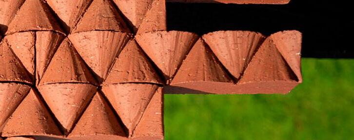
Organized by WRNS Studio, Pacific Clay Brick, and Cal Poly College of Architecture & Environmental Design, the Architectural Brick Workshop brings together educators, students, architects, and manufacturers to investigate new possibilities with architectural brick, and explore the relationships between the fabrication process, craftsmanship, and calibration of unique visual and textural effects at multiple scales.
The workshop aims to expand the use of brick in the design process, while cultivating a deeper understanding of brick as a primary façade material. Organized as a series of charettes at Pacific Clay’s Southern California Production Facility, and on the Cal Poly campus, teams have the opportunity for hands-on experimentation with the tools and processes involved in the creation of bricks, to understand how those forces influence the finished product. (See Chapter 3)
Brick has many elemental qualities; earth, water, fire and air are all intimately involved in its creation. Likewise, the workshop encourages elemental thinking about design, using clay brick as a medium. Students are given a series of prompts (See Chapter 1) to explore through conceptual sketches, prototype formwork, mock-up scale installations, and design drawings. Participants are introduced to color and texture, uniformity and variegation, pattern, proportion and scale of an individual brick and a field of assembled bricks. Topics of structure, aperture, planarity and distortion are discussed in the context of human scale and placemaking.
This workshop was conceived as part of a multi-year research and design effort between WRNS Studio and Pacific Clay on a mixed-use project in the Bay Area which included several bespoke, purpose-built brick facades (see Chapter 5). The inspiration and insights from that intensive and fruitful process are condensed into a 3-week workshop, to share the knowledge with a talented group of architecture students, while also soliciting their perspectives and ideas for creatively using this versatile and timeless building material. It’s an experiment for sure!


Thanks to Josh Higgins, and the entire team at Pacific Clay Products, for devoting their time, energy and passion to this project! Their generosity to host the entire student group at the Lake Elsinore facility, making themselves available to mentor the students during the visit, and then firing, carefully packing and shipping all the brick prototypes to Cal Poly was an incredible gift to all of us.
Thanks to Mark Cabrinha for supporting this idea from the very beginning, and for clearing the way for this endeavor to be integrated within the Architecture Department curiculum.
Thanks to Carmen Trudell, Robert Arens, and the second year architecture faculty for catalyzing the students around this idea and augmenting the discussion of design and fabrication possibilities with brick.
Thanks to the WRNS studio Partnership for supporting this ambitious project and creating invaluable learning opportunities for the next generation of architects
Thanks to Ryan Gobuty for beautifully photographing the final presentation, and capturing the excitement and emotion felt by the students, faculty and guests when seeing the final products of this workshop.
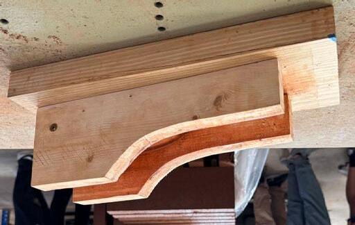
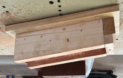
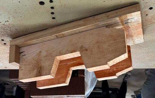
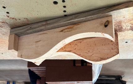
Thanks to Deadwood Revival Designs for donating the urban forest salvage lumber, which was used by all the student groups to make the prototype brick formwork for this project. The formwork creation was one of the most meaningful parts of the workshop.
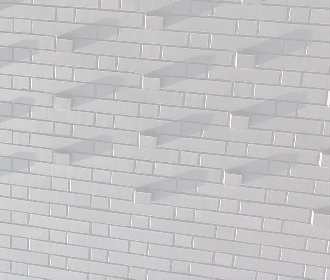
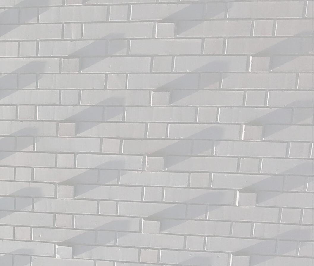
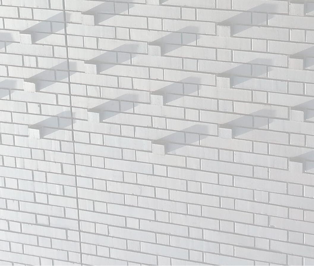
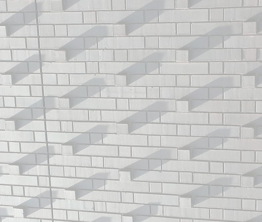
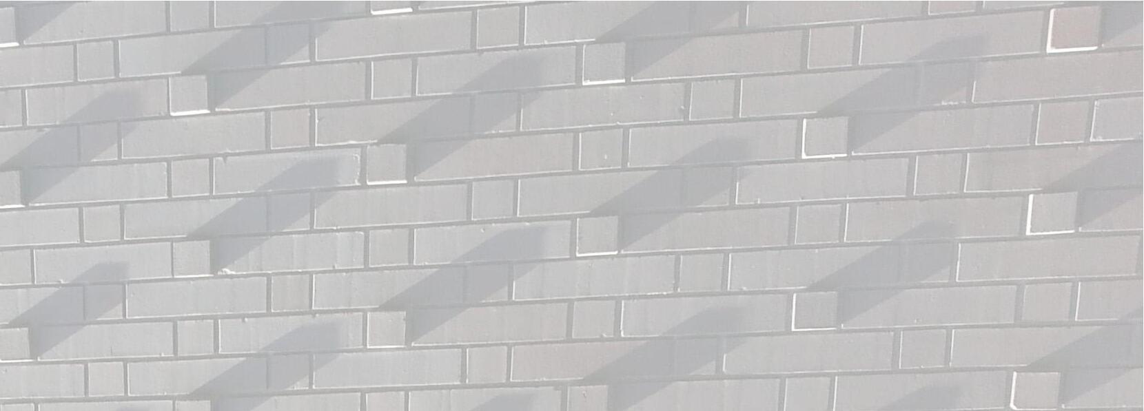
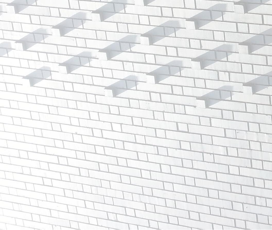
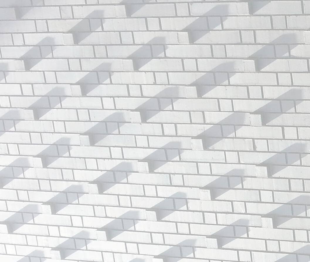
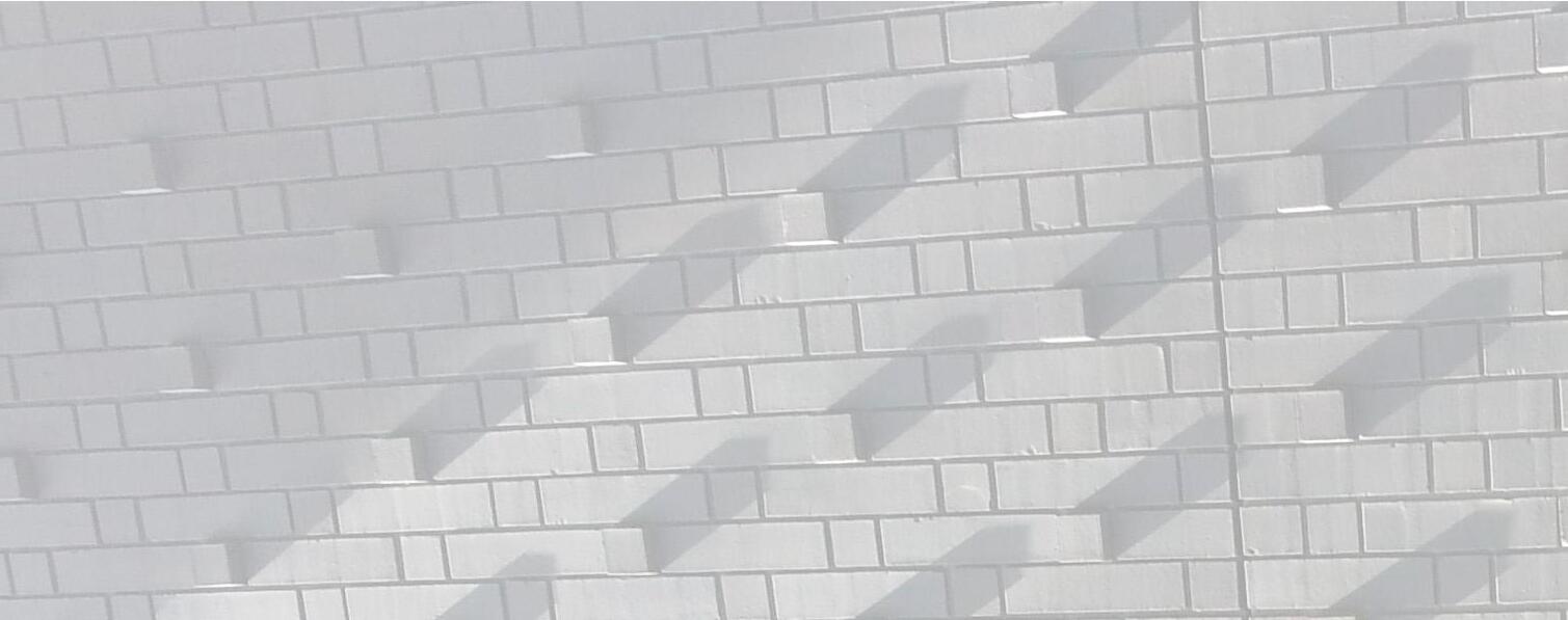
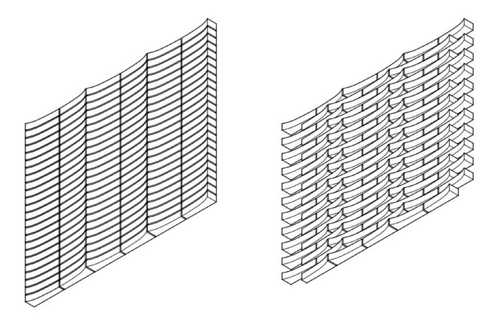
Design an individual brick, starting with a 2-1/4"H x 3-5/8"D x 11-5/8" L brick module
Give consideration to its size, shape and finish texture, as well as pattern and proportion, uniformity and variegation of the individual element.
This portion of the project will be done with wood formwork and a sample brick created at the Pacific Clay Factory visit, and supplemented by diagrams showing how multiple bricks come together.
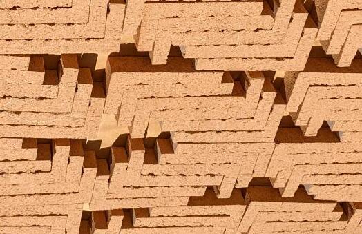
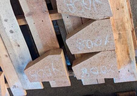

Design a brick wall; either a freestanding wall, folly, cavity wall structure, or a portion of a larger structure.
Give consideration to how individual bricks transform into a larger field. The individual brick considerations apply here also, but at a larger scale. Additional considerations include the overall form, bond pattern, apertures, and environmental interface.
This portion of the project can be done with sketches, drawings and 3d modeling
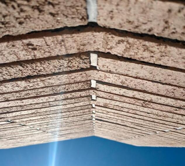
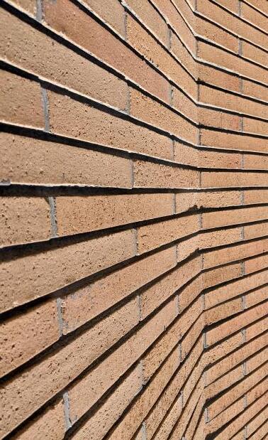

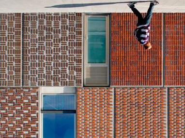
Load-bearing wall bonded together to form a singular structure
Considerations: bond pattern, wythes, gravity and seismic loads, reinforcement, thermal mass
size brick as the face of a cavity or veneer wall
Considerations: inner support construction type (wood studs, metal studs, concrete block, poured concrete)
Thin brick veneer as the outer layer of a composite wall system
Considerations: longevity as it relates to backup structure (wood studs, metal studs, concrete panels), veneer thickness, joints, corners, openings, construction sequence
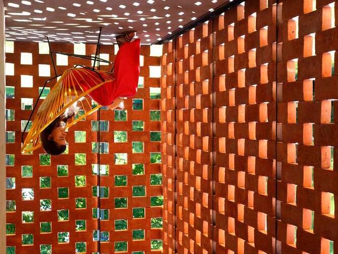
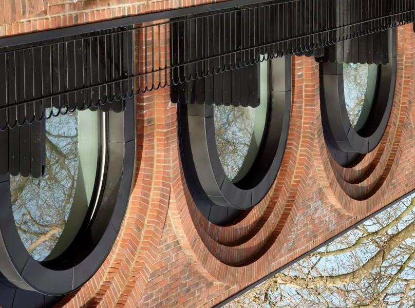
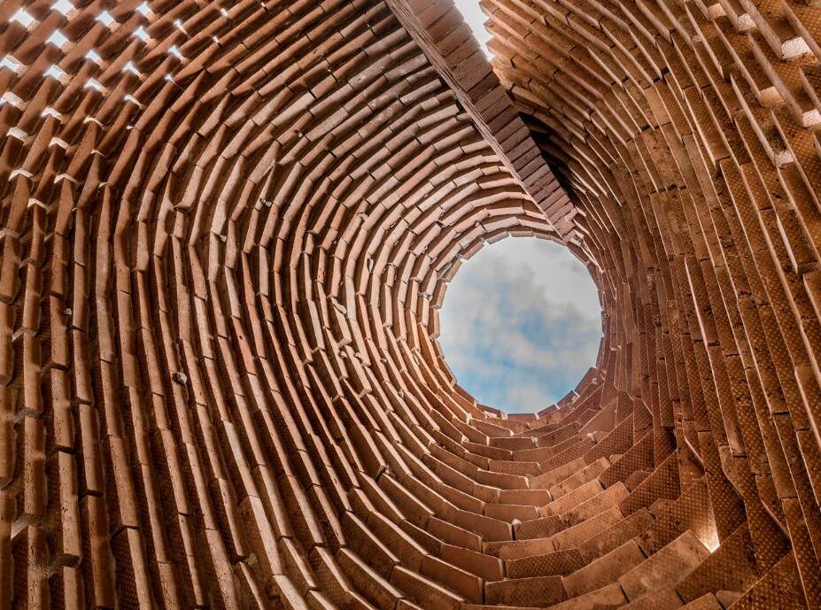
Introducing apertures between individual bricks
Considerations: integrated structure or separate, solar and wind orientation, size and pattern
A component of a wall where loads are uniformly distributed to create a large opening
Considerations: shaping of individual bricks, loads and spans, temporary supports, circular, parabolic or other shape
Self-supporting brick structure which is not part of a building enclosure
Considerations: structure through shaping/inflecting, solar and wind exposure, connections to site features, abstraction and artistry

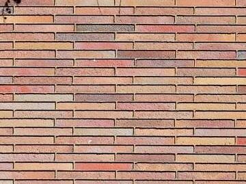
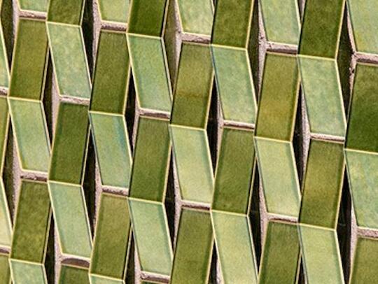
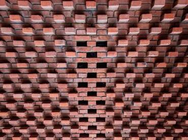
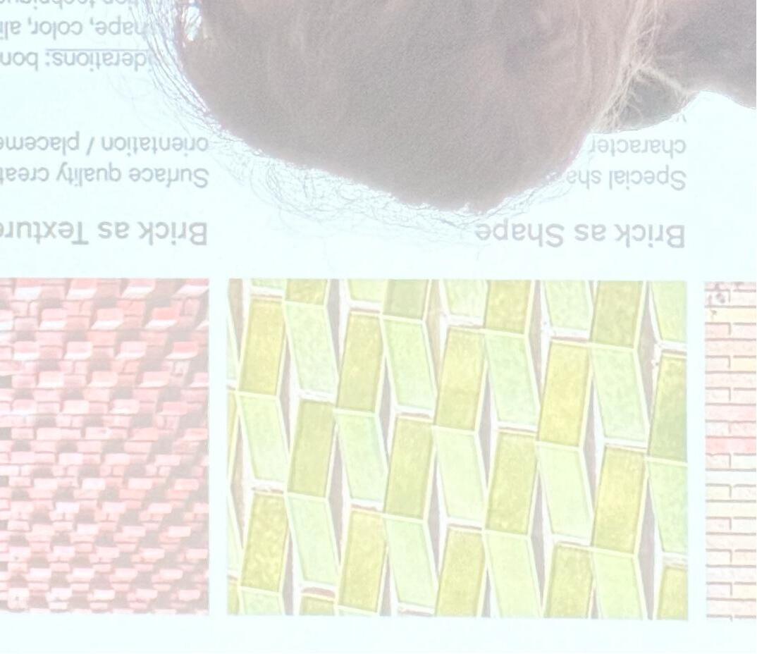
Brick as Color and Finish
Firing temperatures, glazes and surface treatments all add a unique impact and character to the brick surface
Considerations: clay color body, desired end color
Brick as Shape
Special shaped bricks create character through volumetric variation
Considerations: size, form, back up structure
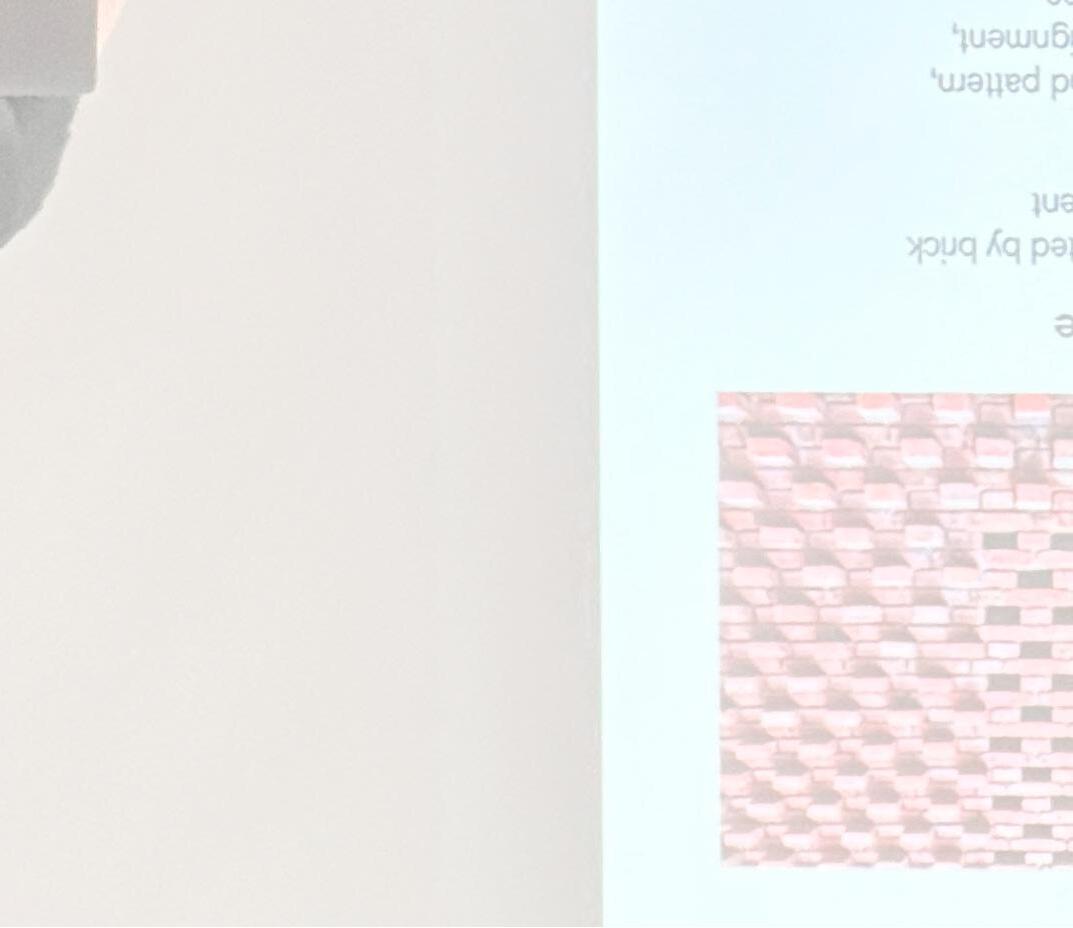
Brick as Pattern
Surface quality created by brick orientation / placement
Considerations: bond pattern, size, shape, color, alignment, fabrication techniques
Standard Shape
Standard Texture
Unique Bond Pattern
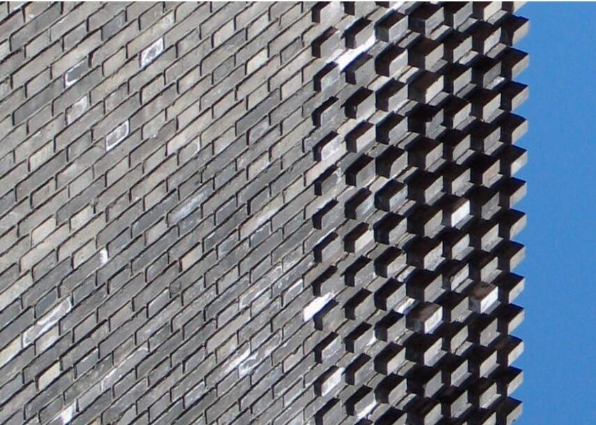
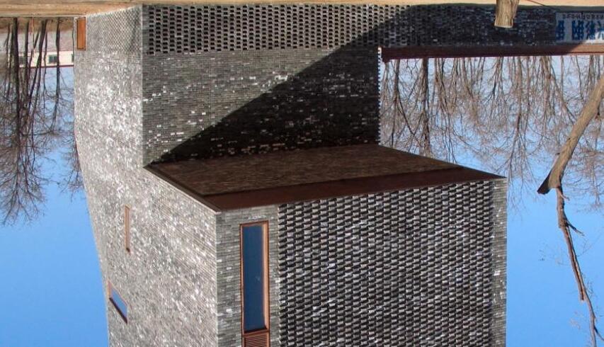
Standard Shape
Unique Texture
Standard Bond Pattern
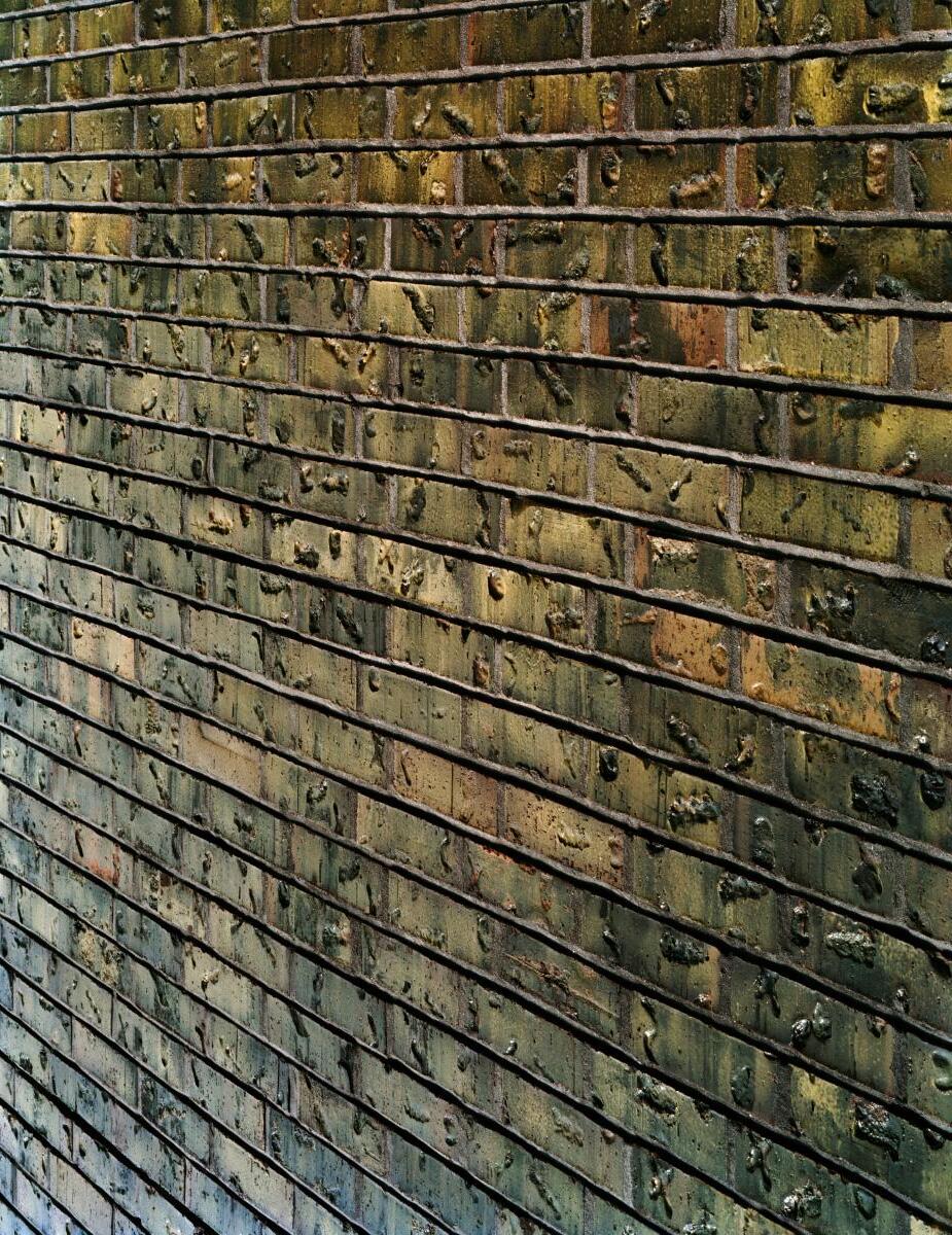
Unique Shape
Standard Bond Pattern
Standard Texture
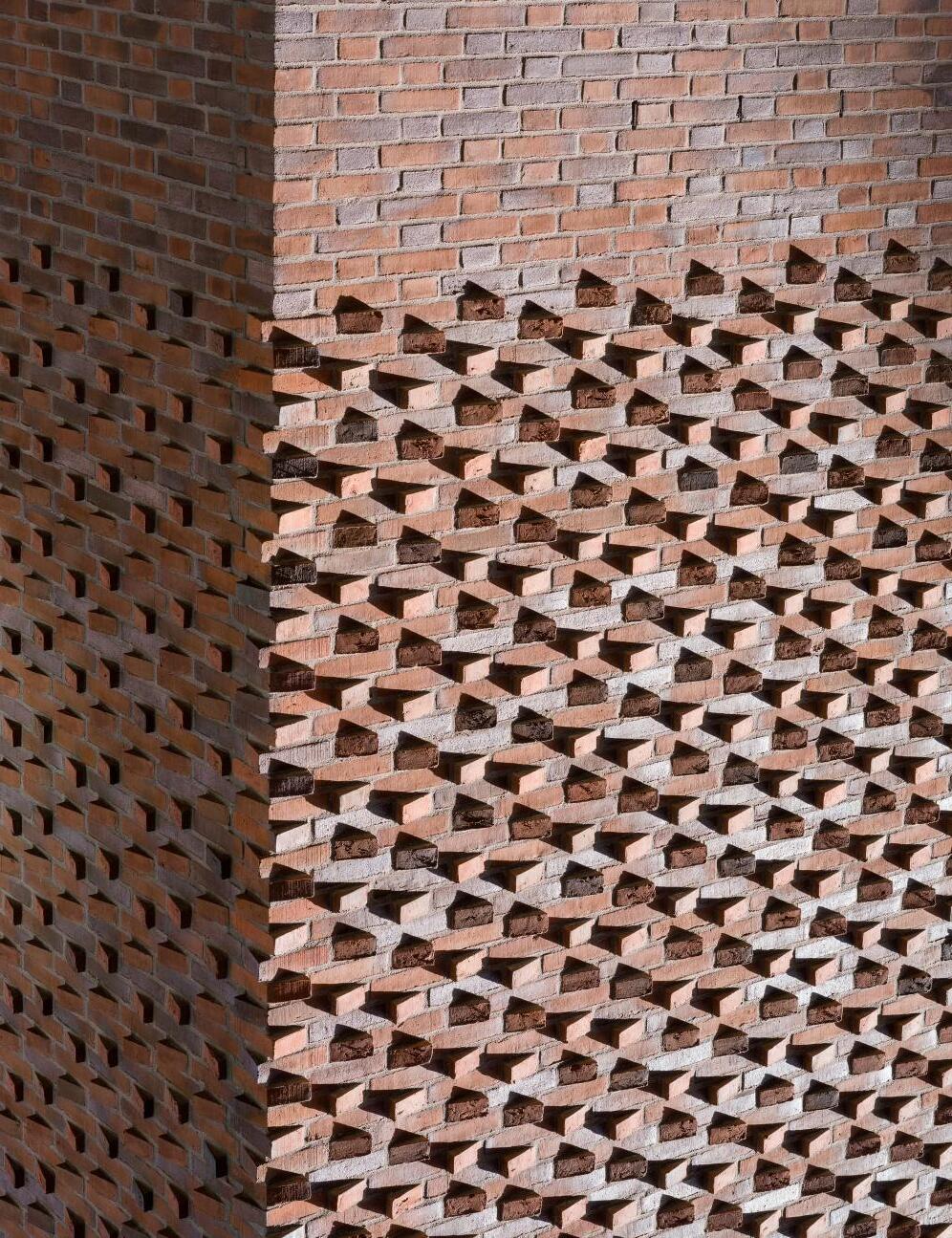

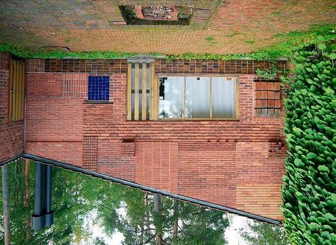
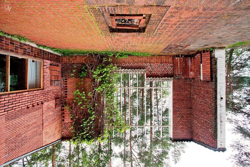
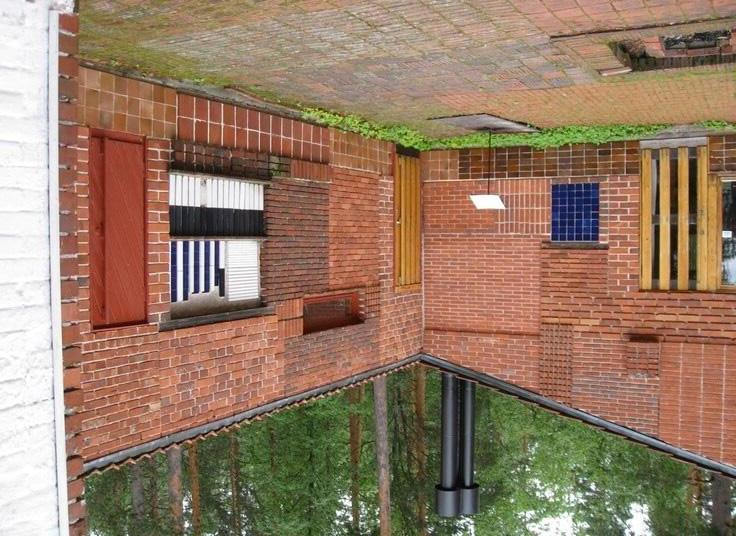
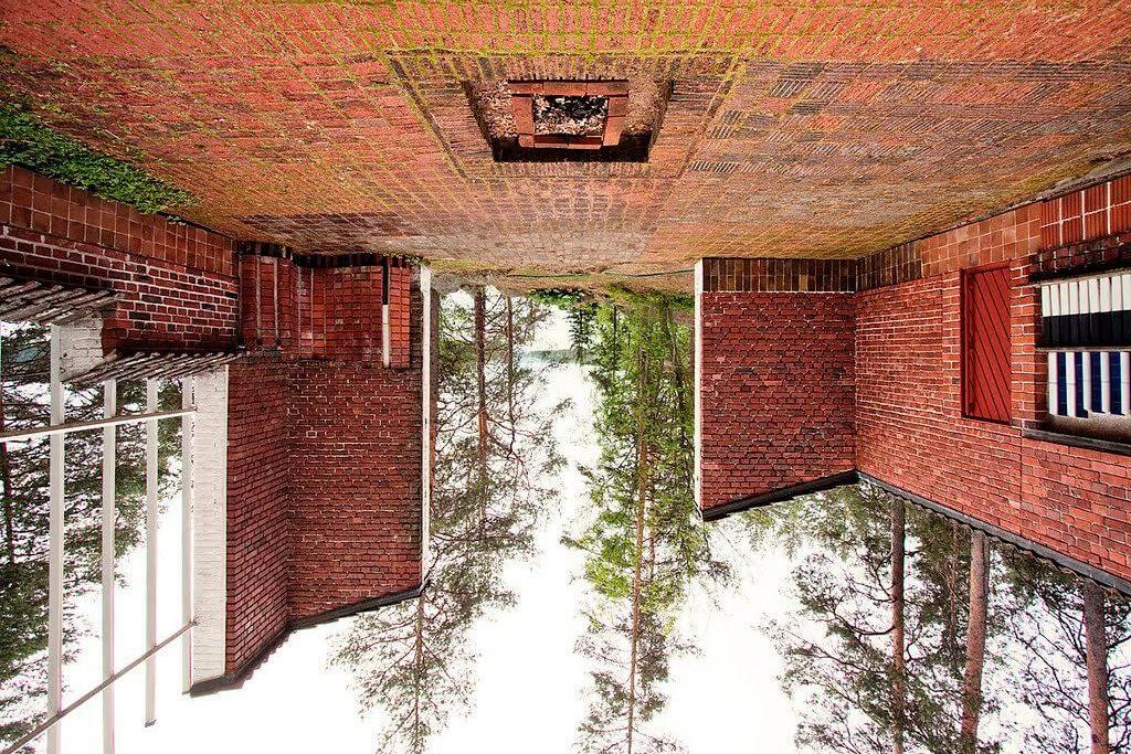
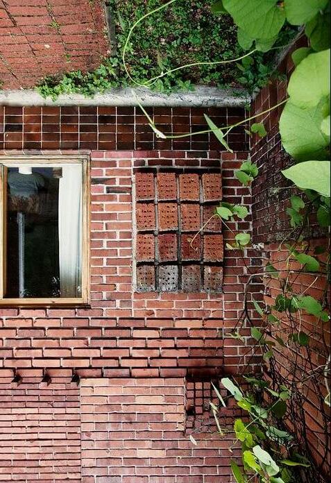
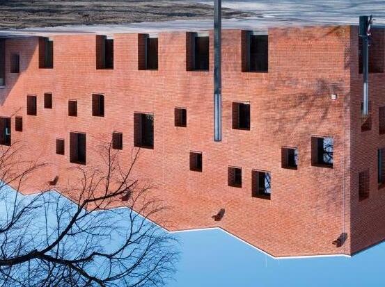
Designed and built by Aalto in 1952-1954, the Experimental House was Elissa and Alvar’s summer residence. The house is nestled in a forest on the shore of Lake Päijänne, and provided Aalto with the freedom to experiment with different materials, proportions, installation techniques using a variety of brick and masonry materials.

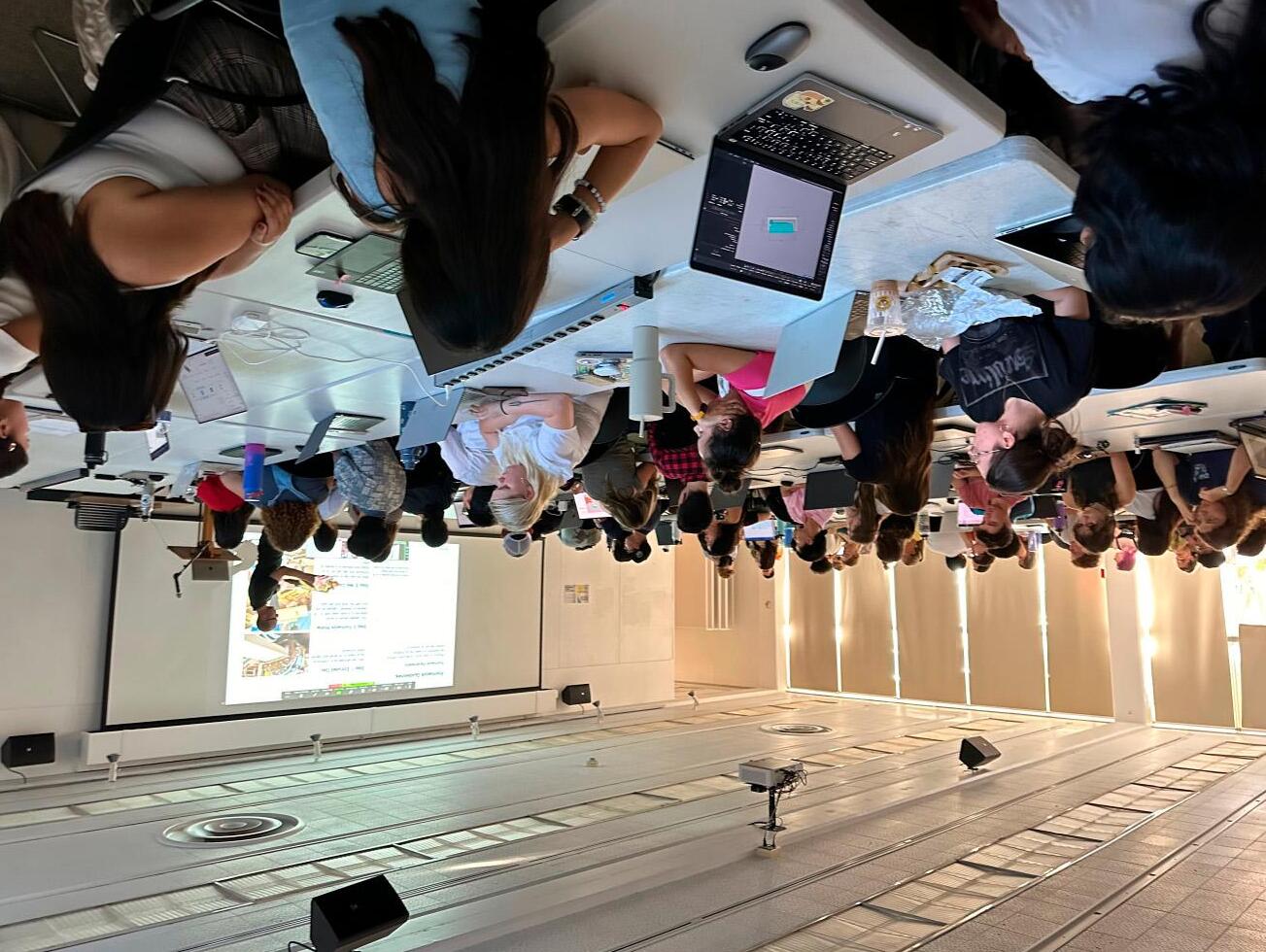
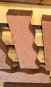
The project kicked off with WRNS Studio, Pacific Clay and the Cal Poly Architecture faculty all participating in a joint workshop session. With the design prompts in mind, students were asked to ideate on an individual brick form that can be aggregated into a variety of different wall types. In preparation for the in-person brick-making workshop at Pacific Clay, the constraints of formwork construction were introduced, along with the design possibilities of making bricks with wet clay in a wood form. Mass production was off the table, giving the students additional freedom for how the brick could be shaped and cut.
Step 1: Extruded Clay
Wet clay extruded as a continuous block, ready to be sliced and placed within formwork
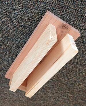
Step 2: Formwork
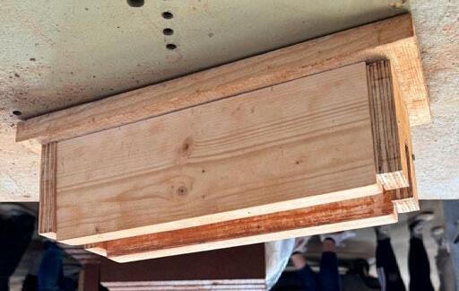
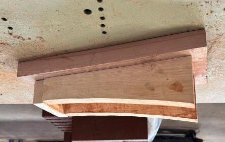
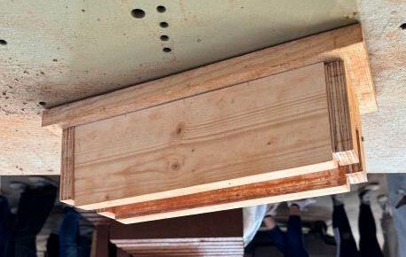
Two parallel pieces of wood attached to a solid base, with 2-1/4" clearance between, capped at one end with the other end left open
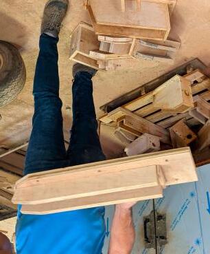
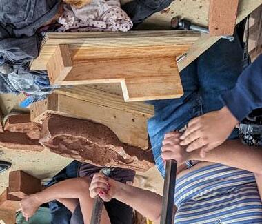
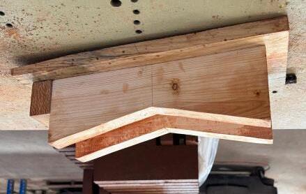
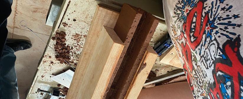
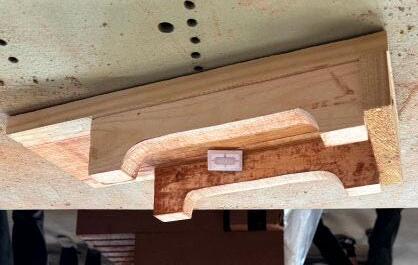
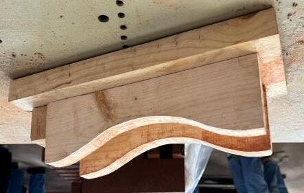
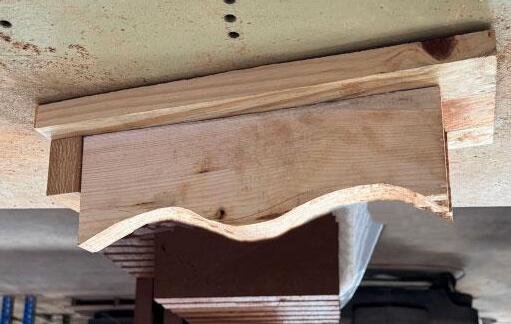
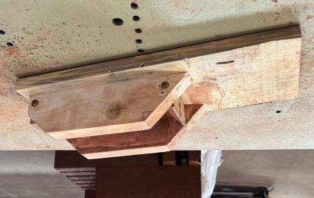
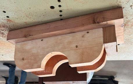
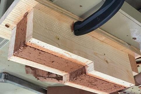
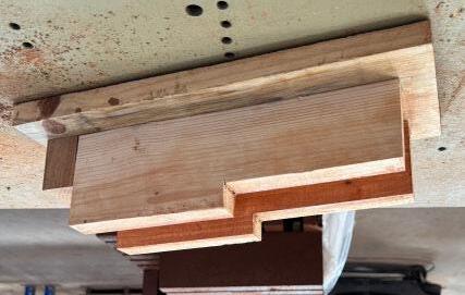
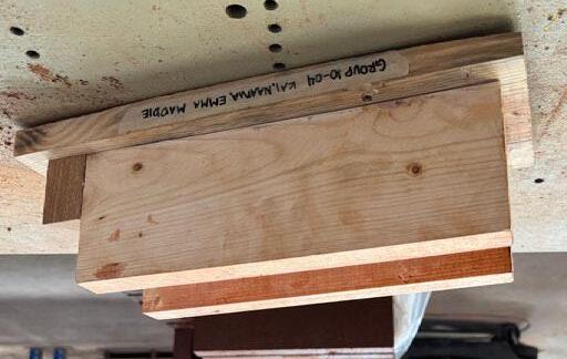
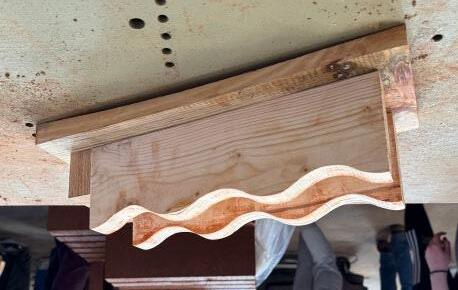
The formwork for the brick prototype should be built out of plywood or solid wood, without any fasteners on inward facing surfaces (where clay will be pressed in)
Portion of formwork available to cut off for unique brick profile design. (final profile of both sides must match)
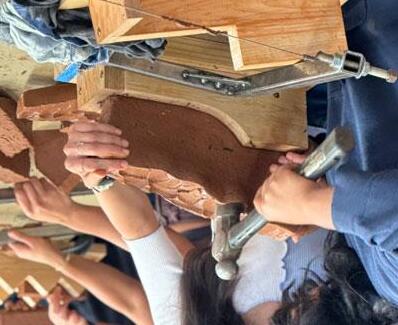
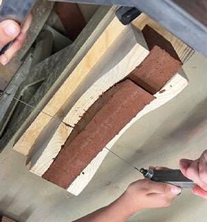
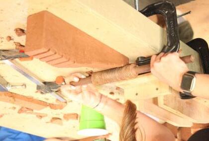
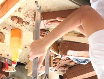
After the wet clay is inserted in the formwork, the clay can be cut to shape and textured in a variety of ways
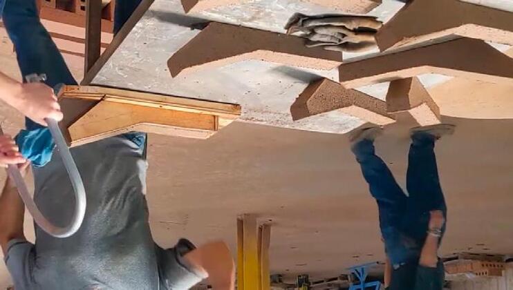


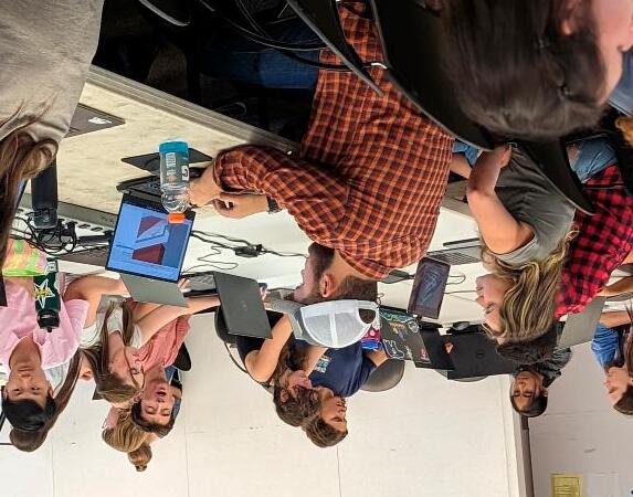
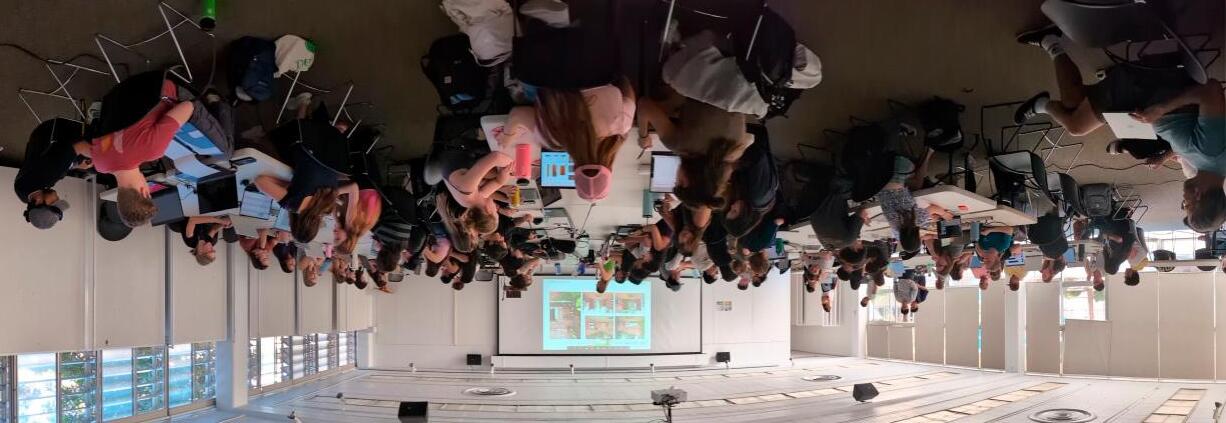
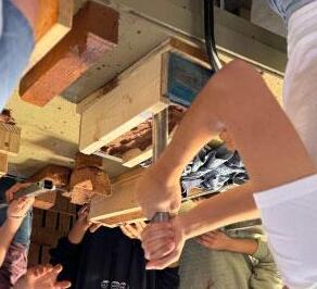
After the prompts were introduced, the students started immediately on their formwork design, using hand sketches and 3d modeling
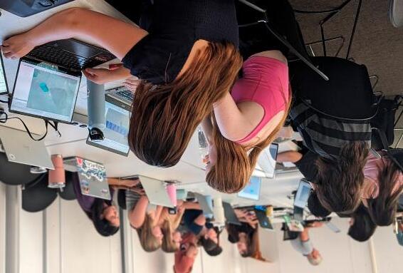
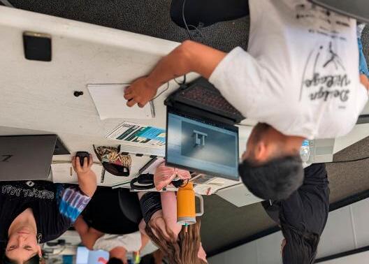
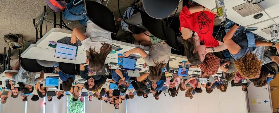
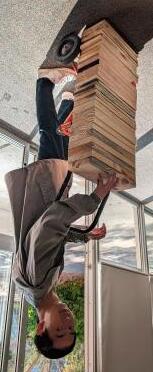

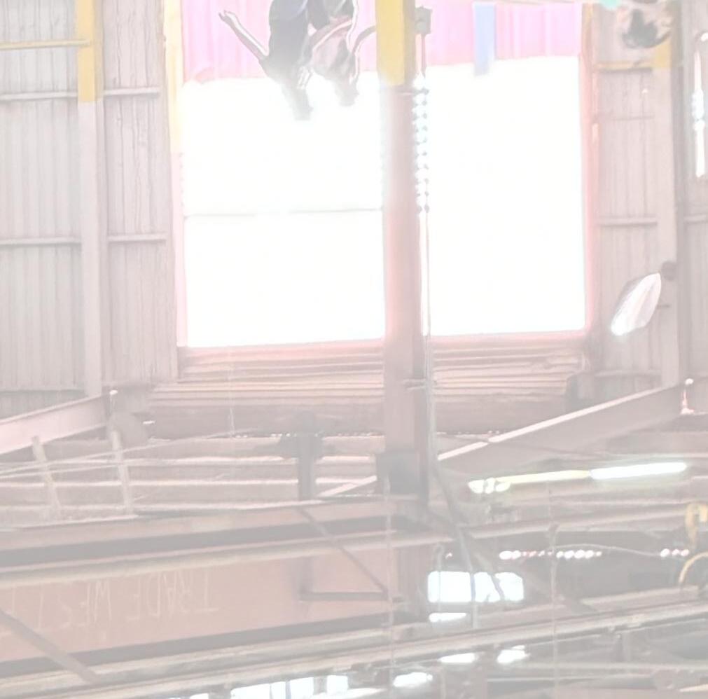

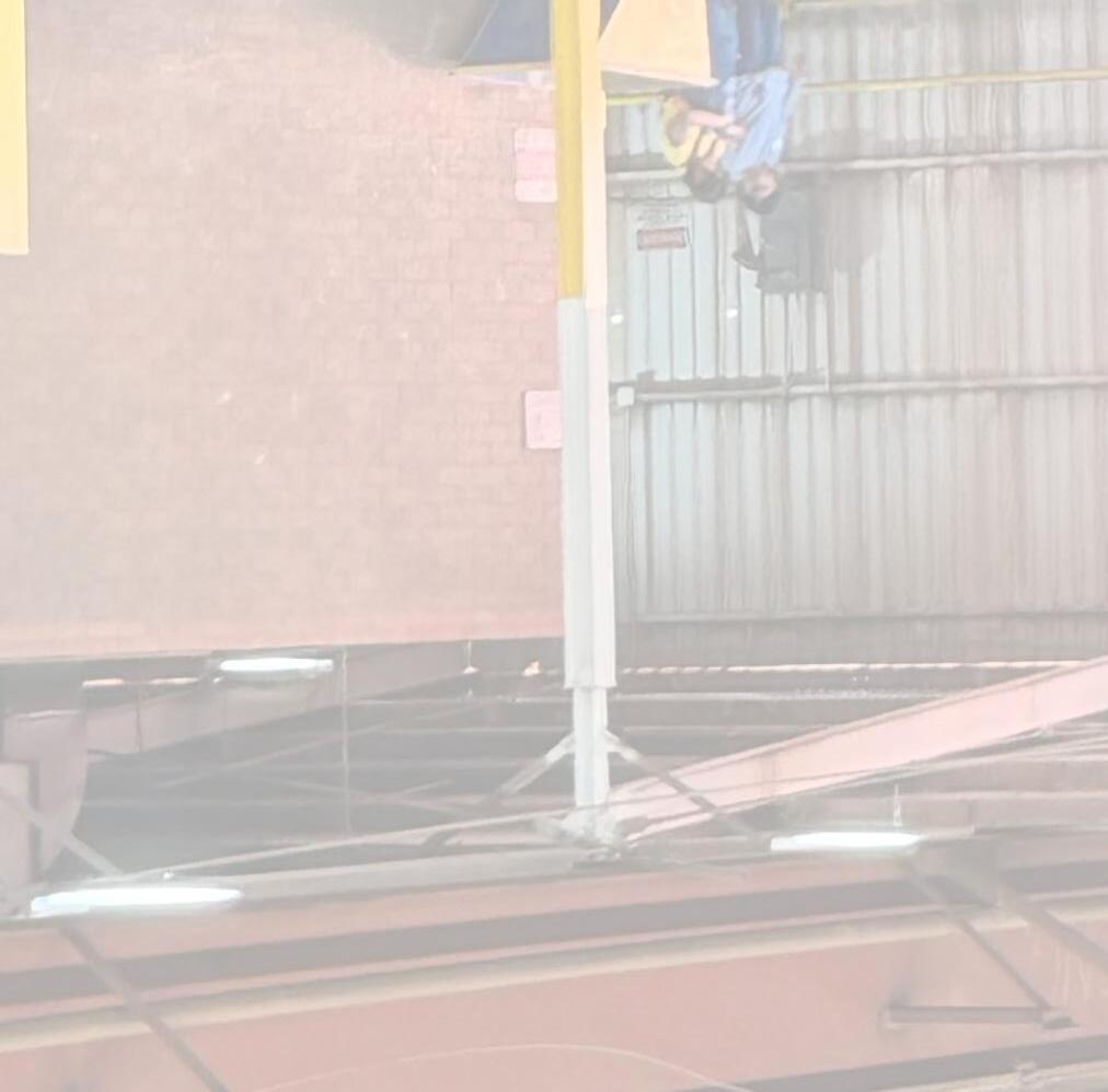
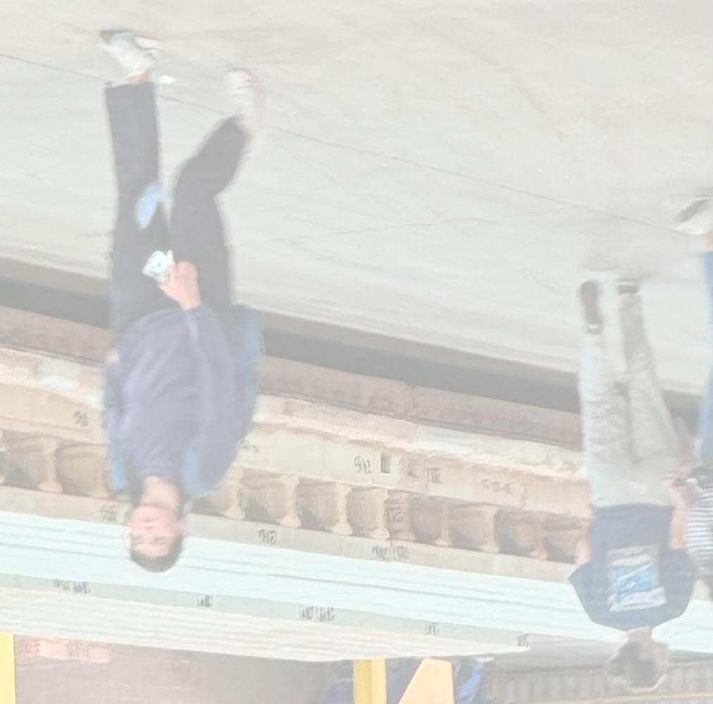
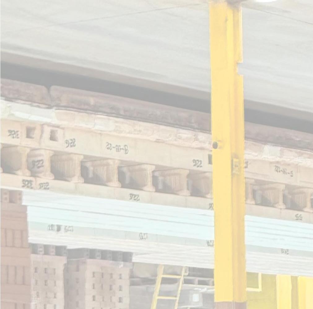

Before explaining the plant tour and the students’ work, Pacific Clay’s history and significance in the brick-making industry provides some context. Pacific Clay was established in 1892, and has been in continuous operation for over 130 Years. Today, Pacific Clay Products is a leader and innovator in the clay brick manufacturing industry.
In the late 1800’s, the discovery of high quality clay and coal deposits near Alberhill, California led industrialists to this area in pursuit of raw materials for numerous fired ceramic products. This clay is geologically unique in that both sedimentary (Lake, stream, or ocean deposits) and metamorphic (altered in place) clays are present. This allows for the necessary blending to make many different ceramic products. There is no other deposit of clay like this in the world. These clays are over 200 million years old! The Alberhill area has supplied clay for fine pottery, clay sewer pipe, face brick, brick pavers, roofing tile, clay pots, firebrick, lignite coal, and modeling clay. The Alberhill Coal and Clay Company mined on these premises from 1890 until 1940. Los Angeles Brick Company, which started in 1895 here at Alberhill, produced face brick, paving brick, sewer pipe and roofing tile. Many of the original buildings in Los Angeles were built using these products. UCLA’s Royce Hall and Powell Library, both built in the 1920’s, used brick from this company. During this time, Alberhill was a self-contained community with a post office, Catholic church and elementary school located right on the property. The three-room Alberhill Schoolhouse remained open until the 1960’s, and today is the site for many class reunions. The Los Angeles Brick Company was purchased by Pacific Clay Products in 1963. David H. Murdock, the current owner, purchased all the Pacific Clay stock in 1973 and took the company private.
Pacific Clay Products has continually expanded over the years, and in 1996 completed construction of a state-of-the-art brick production facility. The present facility is the largest in the west. The new plant can burn brick in 14 hours, compared to 35 hours in a traditional plant, and can produce 40,000,000 bricks per year. Along with many historic “ceramic firsts”, such as double-bullnose, mini-brick, ruffled-texture and others, Pacific Clay continues to create innovative brick designs and colors.

Josh Higgins is a 7th generation brick manufacturer, with over 30 years of experience in brick manufacturing, design, engineering and research. He is currently the Director of Brick Operations for both Pacific Clay Products in Lake Elsinore, California, and Yankee Hill Brick in Lincoln, Nebraska, and has worked closely with WRNS Studio on several high-profile projects involving brick research and design. Josh has been the main point of contact for the Architectural Brick Workshop, and has been deeply involved in planning it with WRNS Studio and Cal Poly since the workshop’s inception.
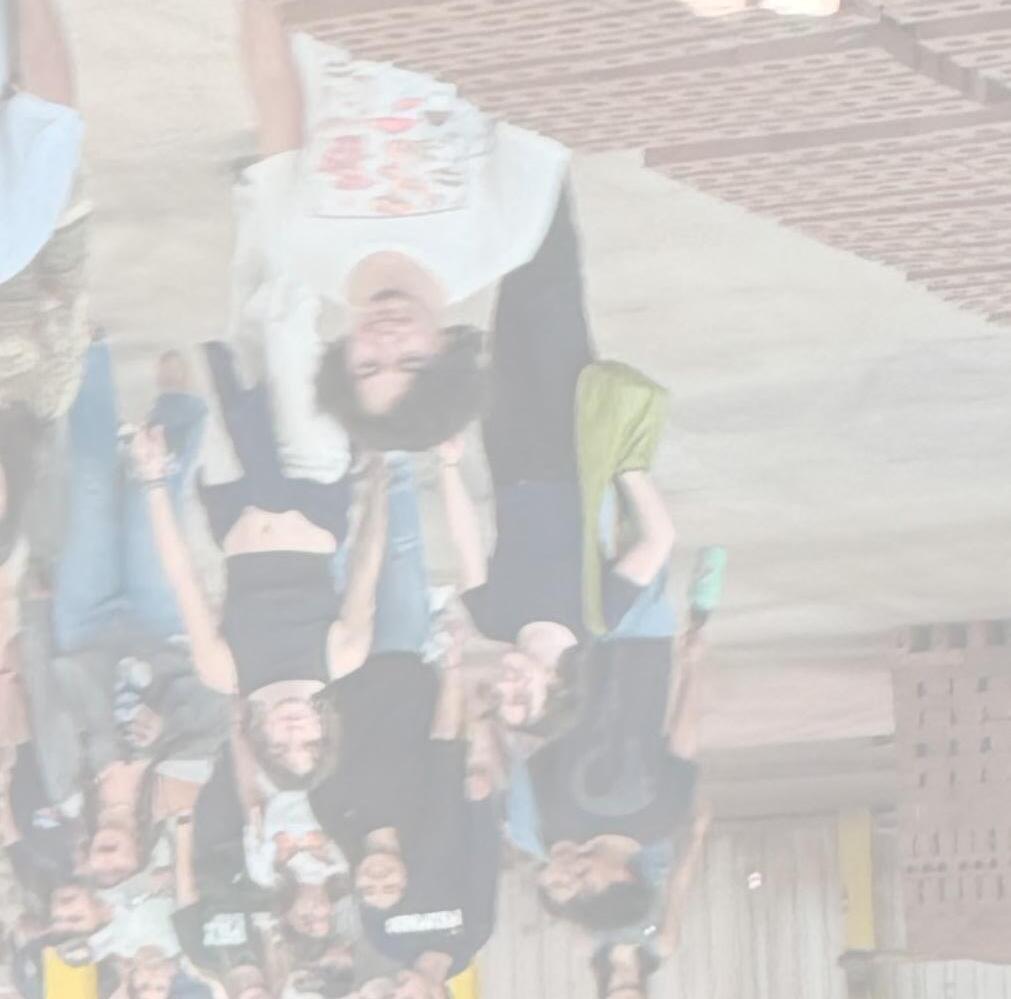
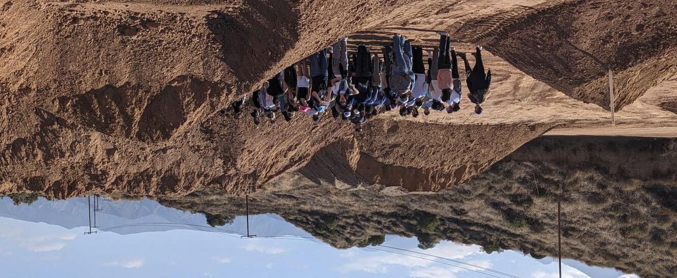
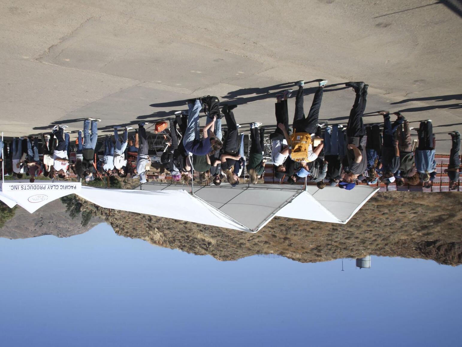
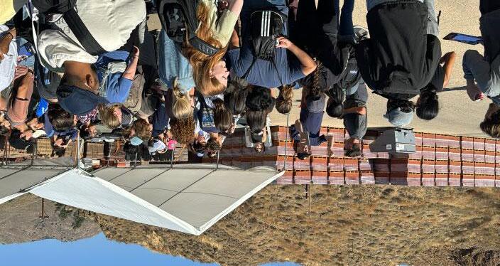
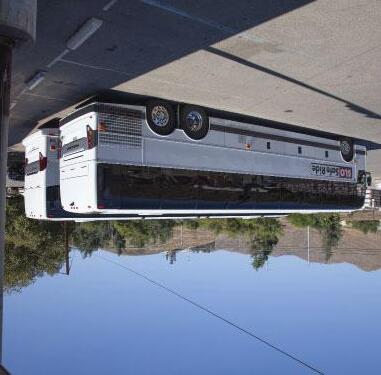
During one week after the project kick-of at Cal Poly, each group designed and built a custom formwork element, as part of a conceptual brick wall design. Then over 100 students boarded charter buses bound for the Pacific Clay Plant. The groups arrived at Pacific Clay with their formwork creations in hand, ready to spend the day learning about the process of brick-making and going to work making some custom bricks of their own.
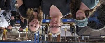
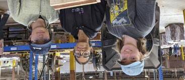
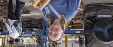
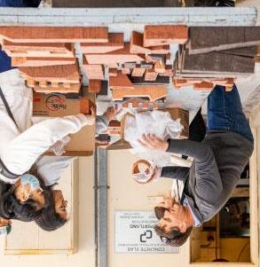
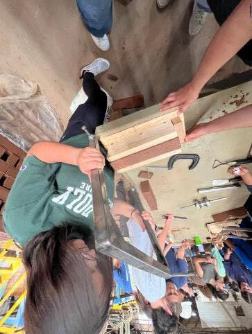
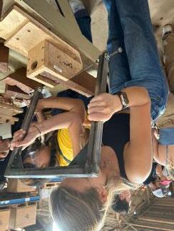
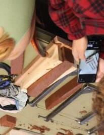
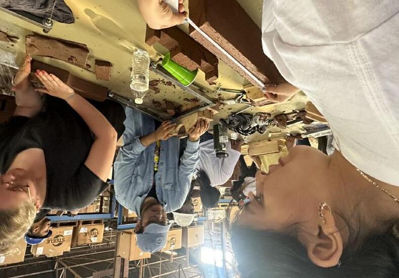
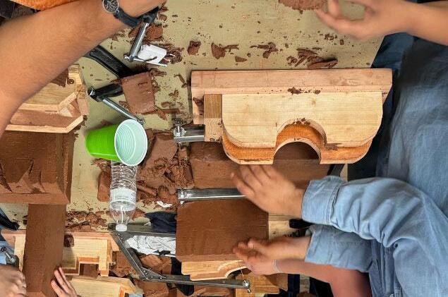
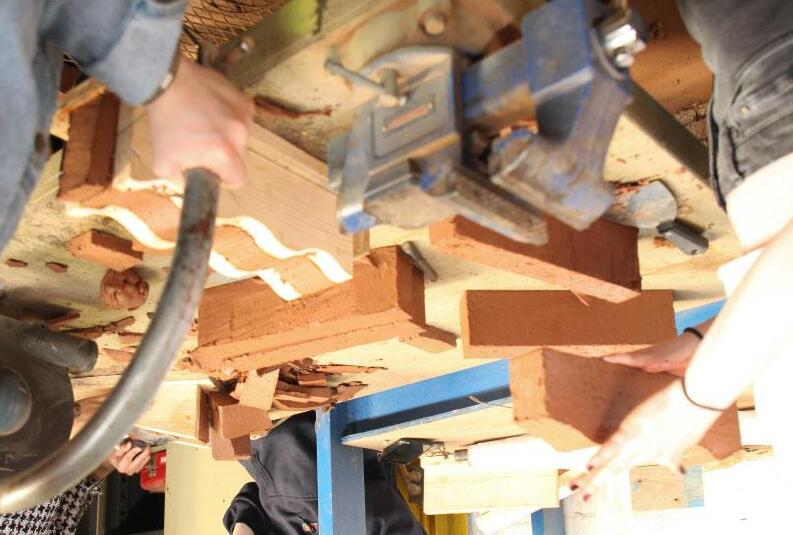
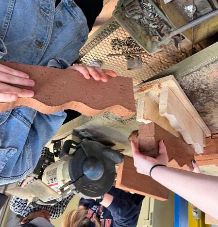
The action-packed 5-hour visit served two purposes for the workshop. First, the students were given an in-depth tour of the facility, with each step in the brick-making process explained, and often demonstrated, by the Pacific Clay team. This chapter highlights these steps, including the sourcing of raw clay on site, the purpose-built equipment for making specialized bricks, and the final steps of drying and firing the formed bricks. Second, the student teams gathered at a row of stainless steel work tables, and using their own formwork along with a variety of specialized tools provided by Pacific Clay, began to make their bespoke bricks. Pacific Clay provided palettes of wet clay “slugs” pre-cut into large rectangles, sized to fit into the students’ formwork. The teams worked closely with each other, and also consulted with the Pacific Clay team throughout the brick making effort. When a group this large takes on a task they have no experience with, the playing field is completely leveled. The following pages show the students’ unbridled curiosity, determination and intense collaboration as they undertook this unfamiliar but exhilarating project together. The afternoon was filled with unexpected surprises, when several students discovered their formwork was too narrow to fit the clay slugs inside. But Pacific Clay’s team quickly remedied this, by extruding new clay slugs on the spot! The students were able to quickly resume their work.

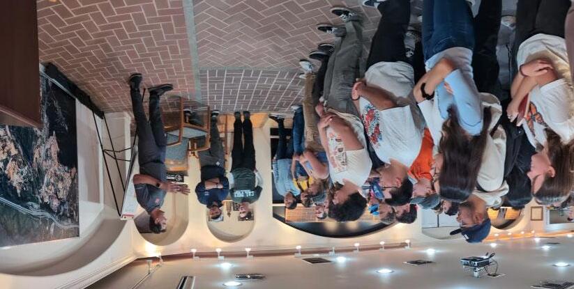

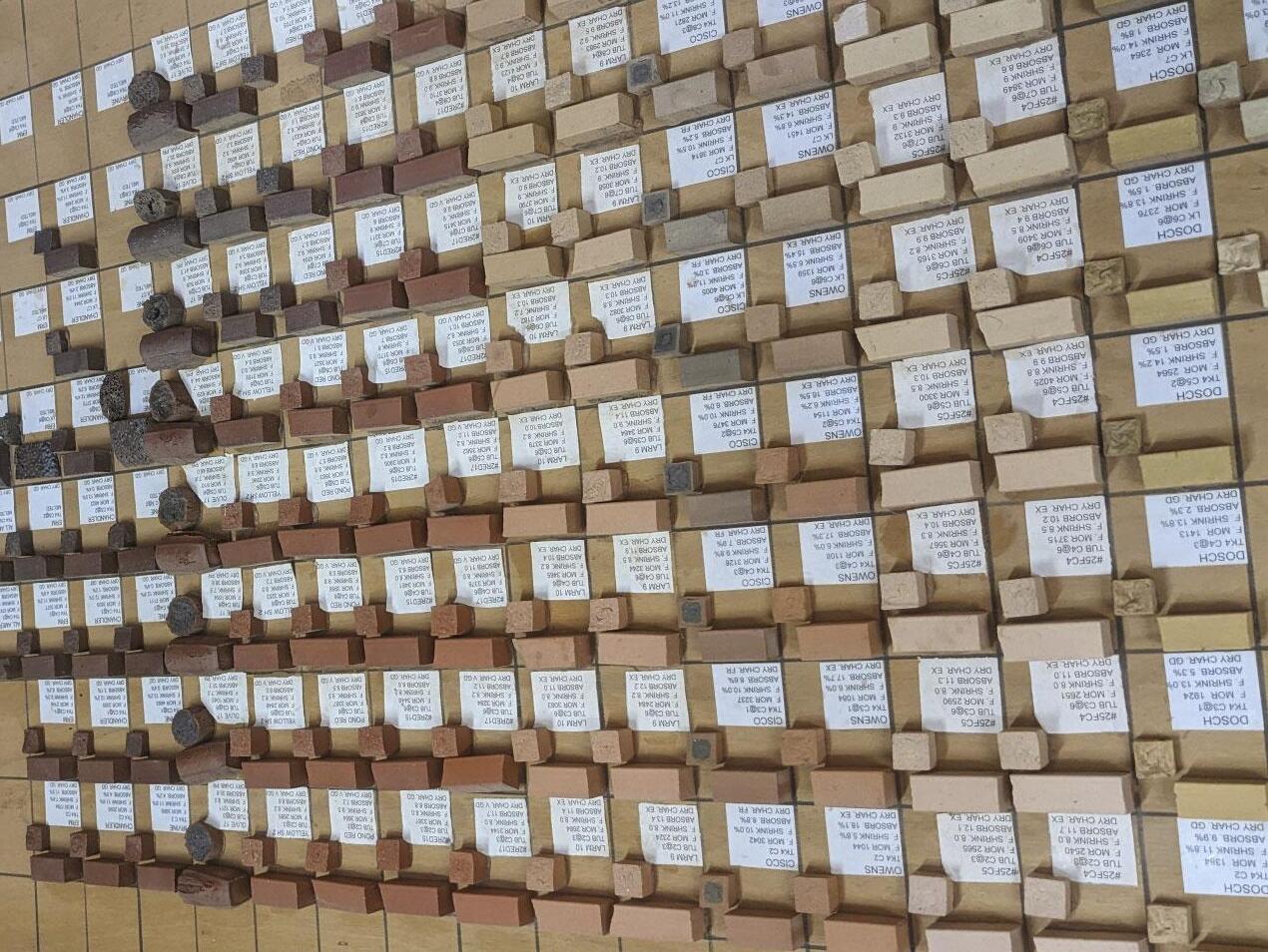
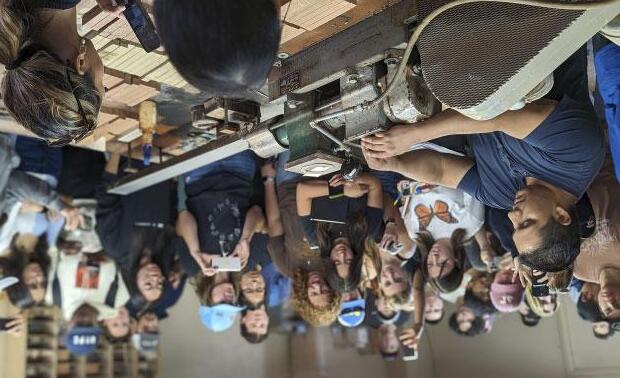
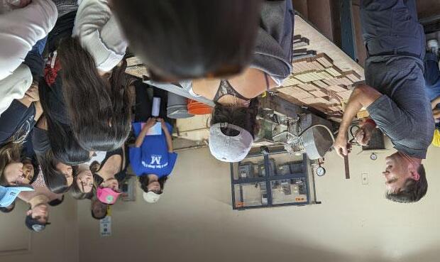
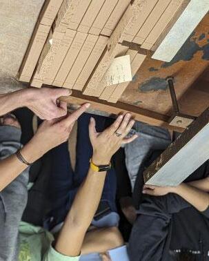
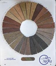
The first stop on the tour is the on-site research laboratory, containing all the materials, tools and equipment to mix, extrude, cut and dry miniature brick test bars. This area is also where new blends of clay are tested for strength and discoloration through the firing process.
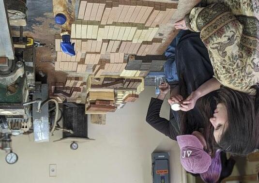

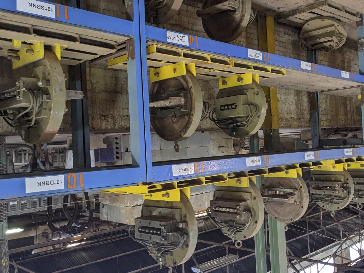
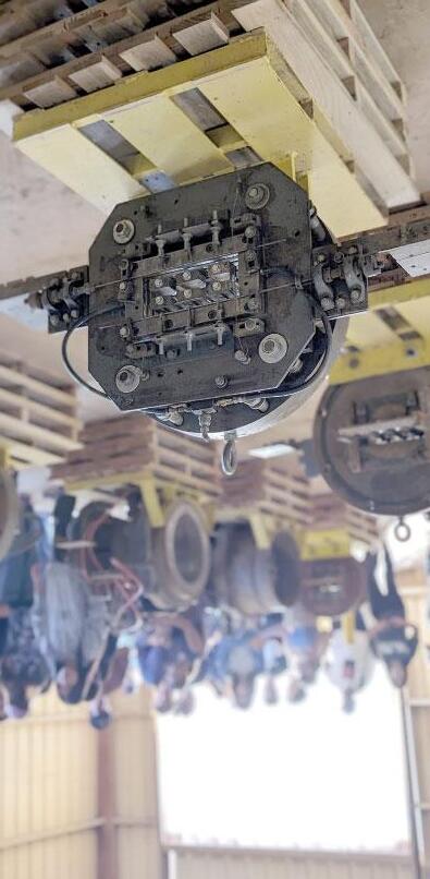

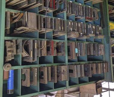
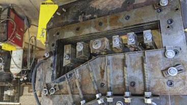
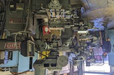
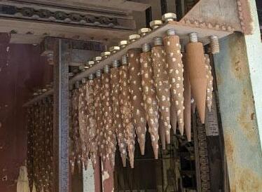
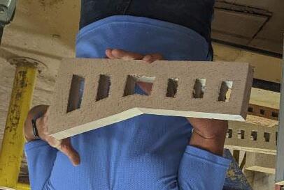
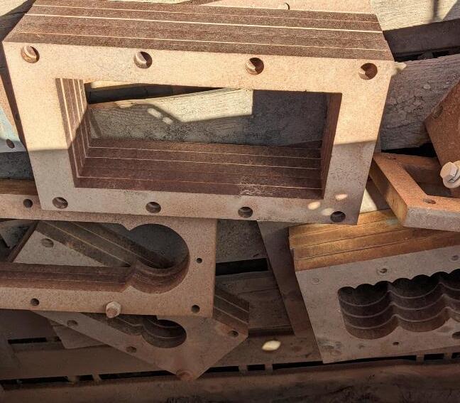
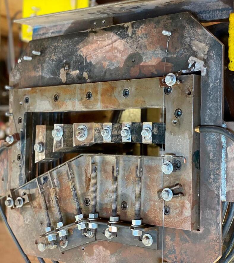
Pacific Clay’s on-site machine shops give them the capability to fabricate all the tools they need for every step of the brick-making process. It also allows them to customize nearly every aspect of the brick design, including custom aspect ratios of the brick, unique shapes for the extrusion, and bespoke textures for the finished bricks. The images above show dies for extrusion, with interchangeable die plates, shaper caps, and shanks for adding texture.
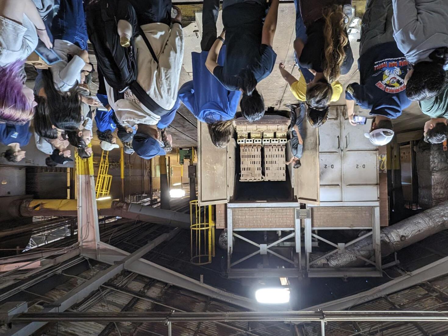
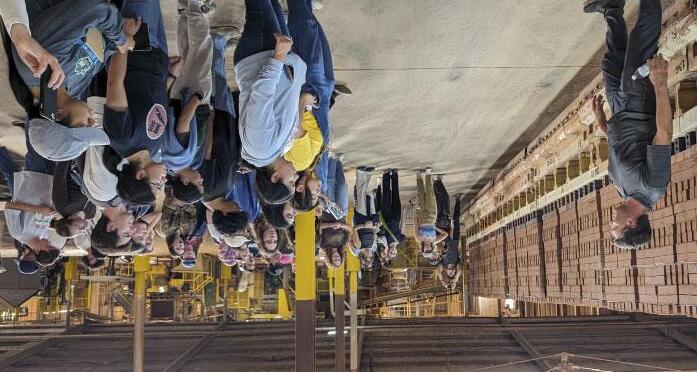
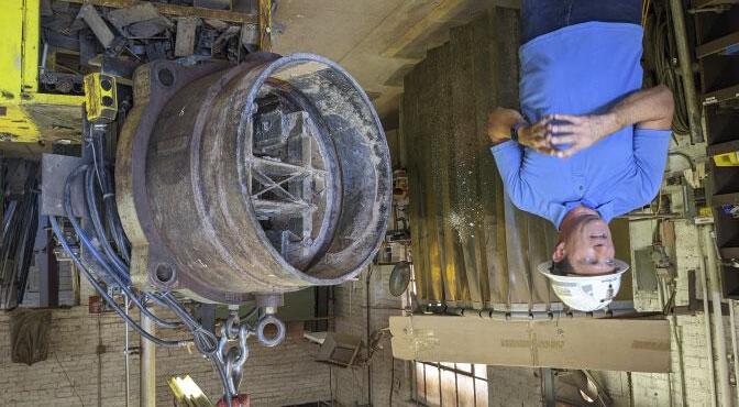
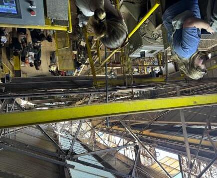
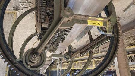
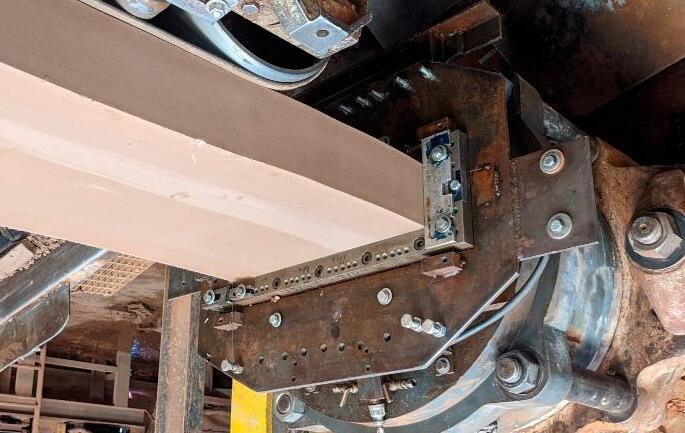
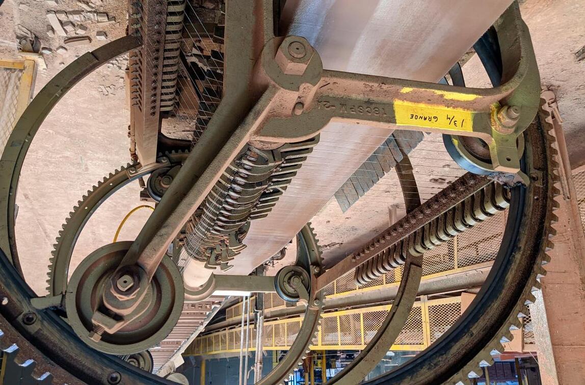
In addition to specialized tools, Pacific Clay has also built unique and dedicated machinery for brick production, such as the reel cutter above, to achieve a particular size, shape or surface effect in production. Pacific Clay’s production process is iterative, allowing a feedback loop of results from the production line to be immediately communicated to the machine shop. Alternations to tooling, equipment, and production settings can all be modified during the period between prototyping and full production.

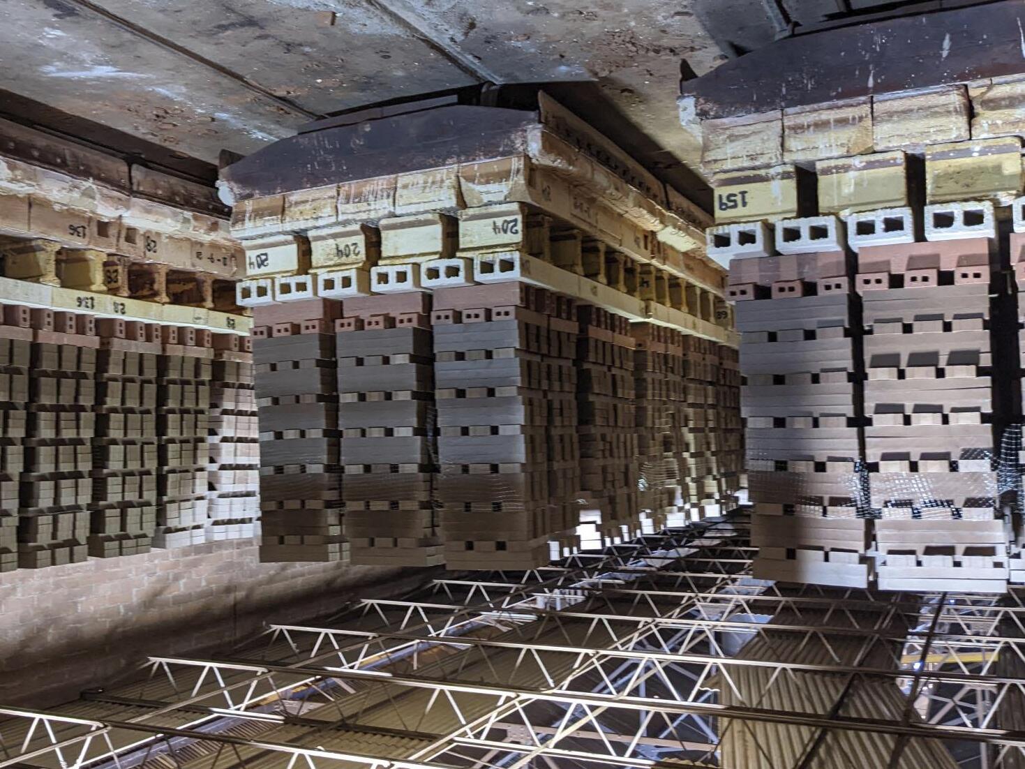
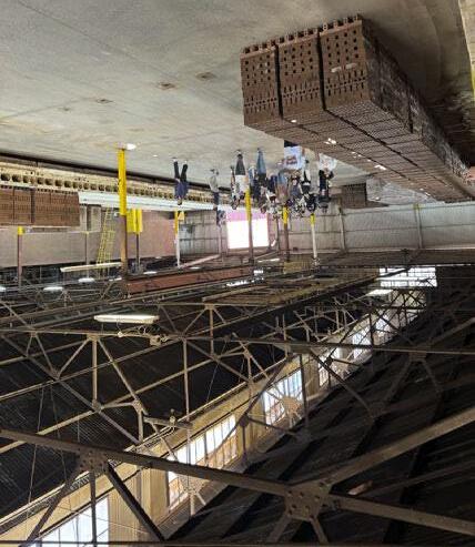
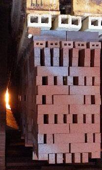
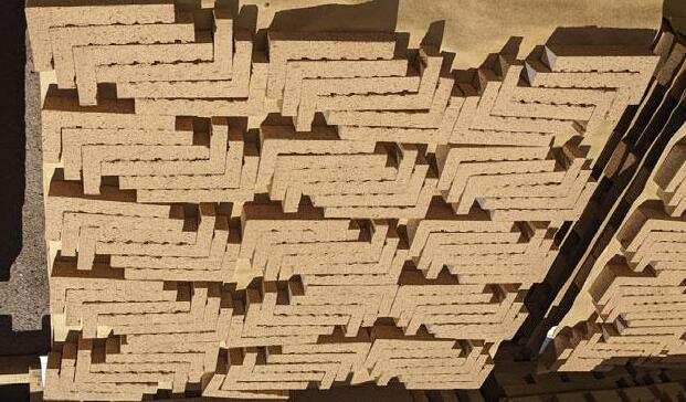
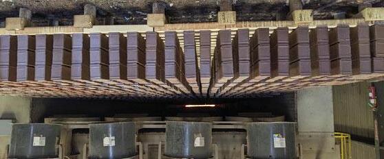
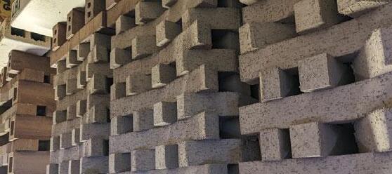
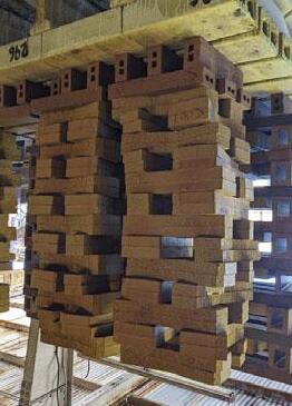
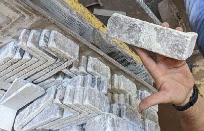
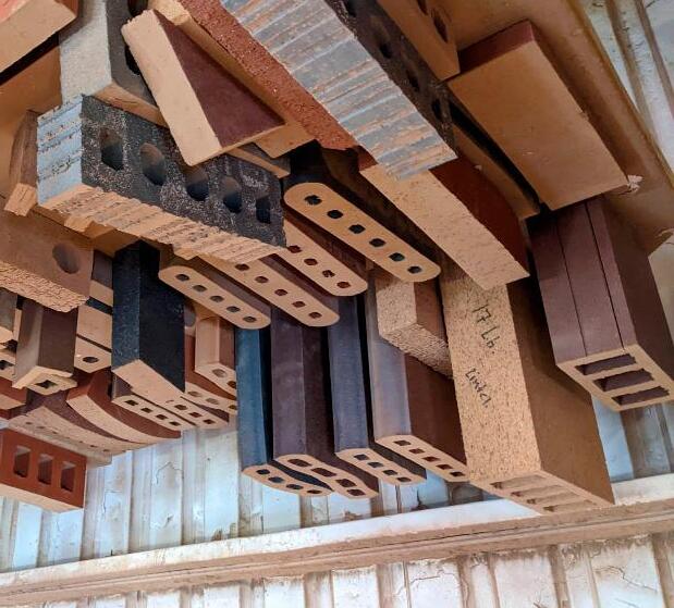
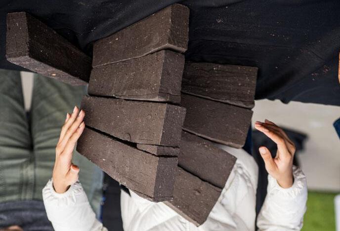
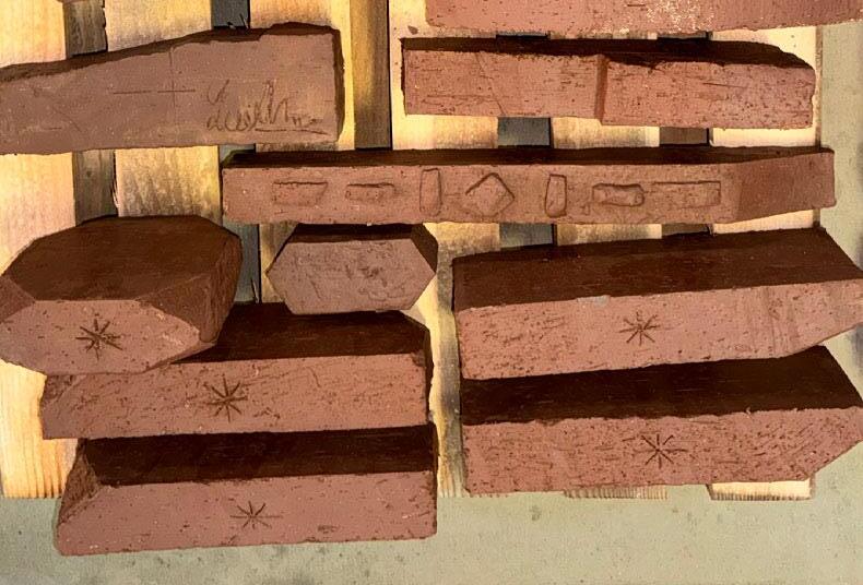
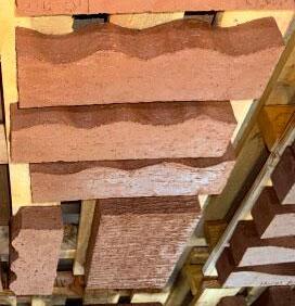
After being extruded and cut, the bricks are dried and then fired in kilns, where the heat from the kiln is recycled into heat for drying other bricks. Pacific Clay’s finished products demonstrate the variety of shape, size, color and texture that is possible with their various production processes.

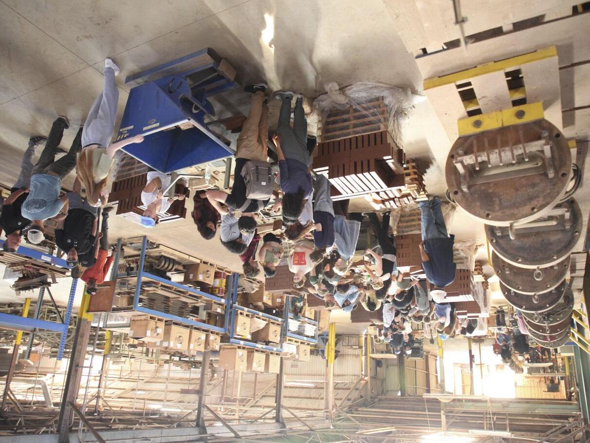
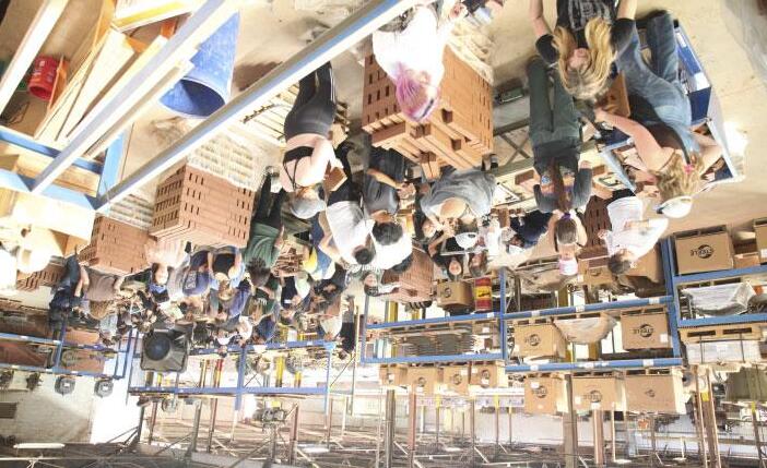
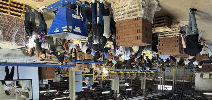
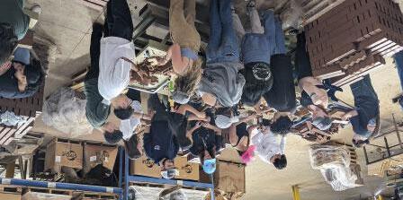
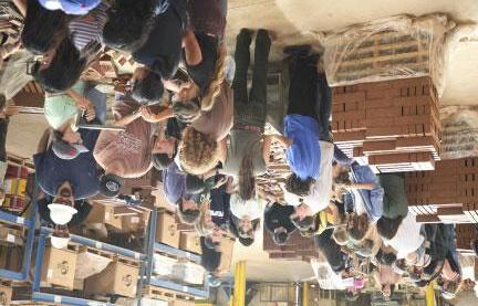
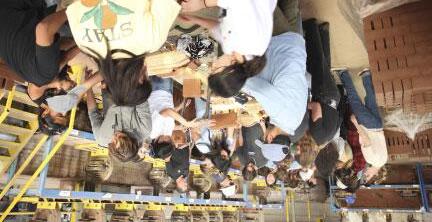

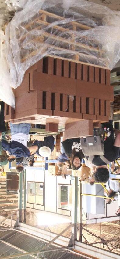
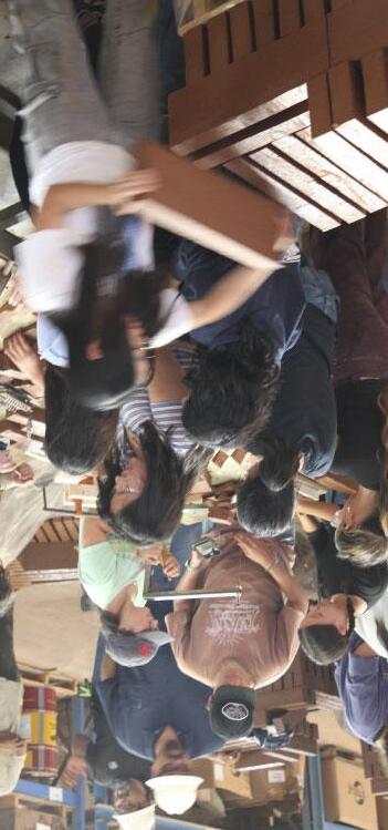
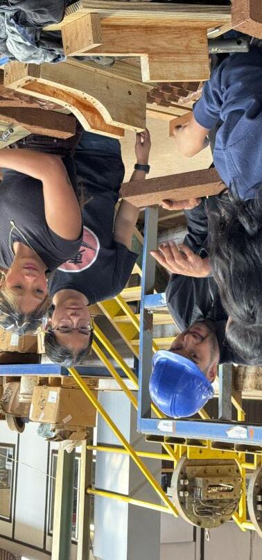
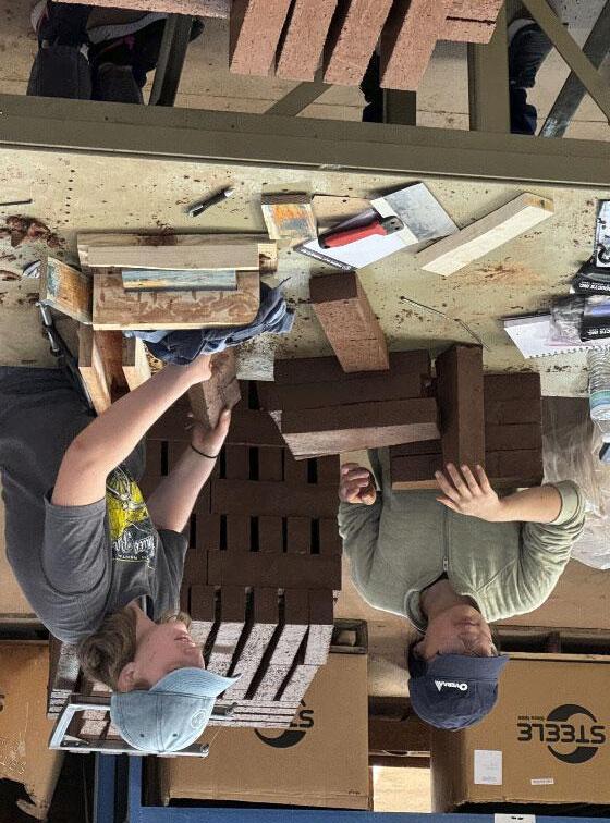
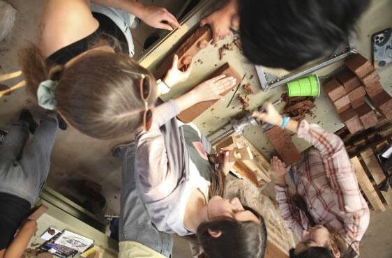
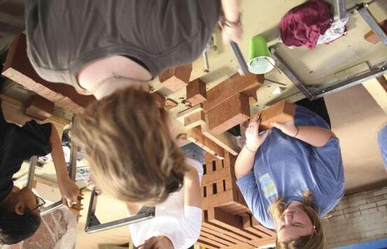

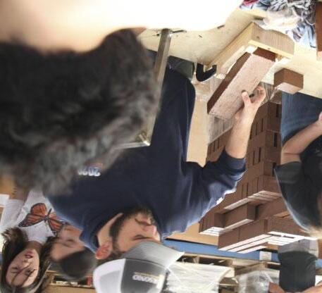
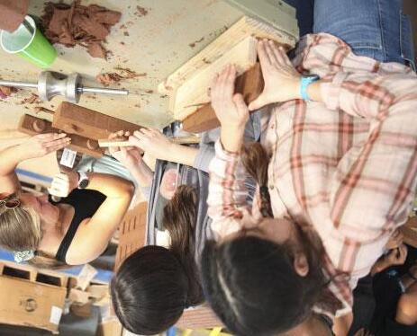
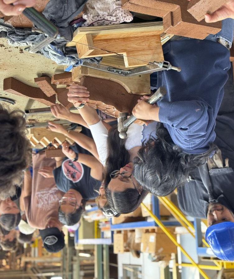
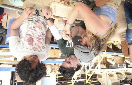
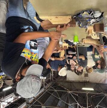

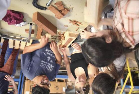
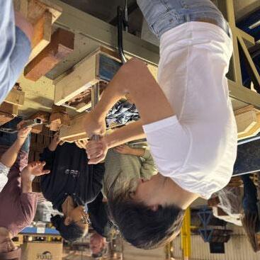
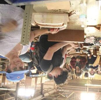
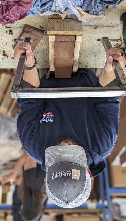
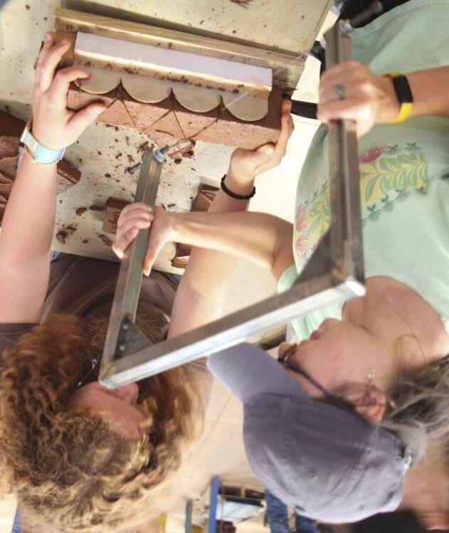
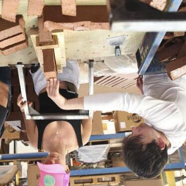
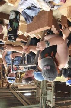

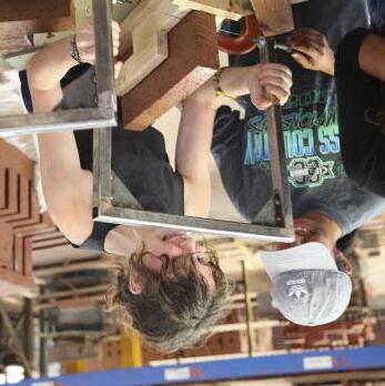
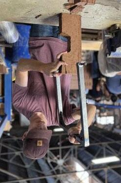
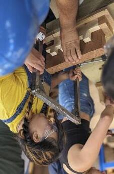
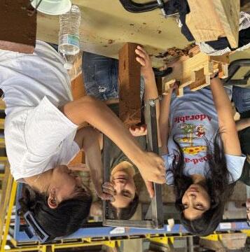
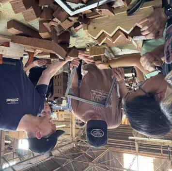
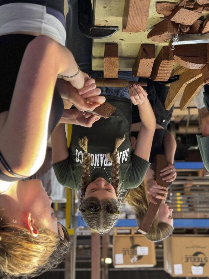

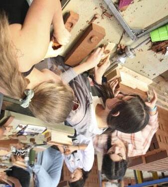
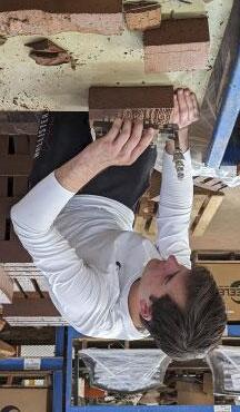
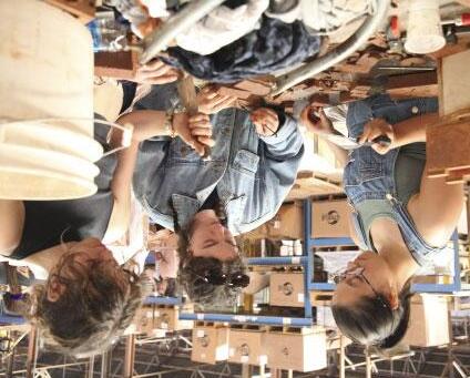
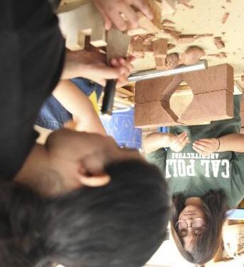
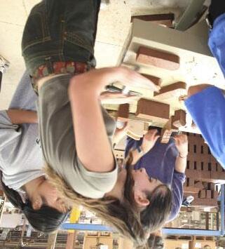
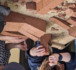
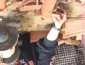
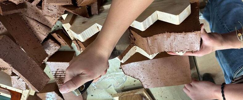
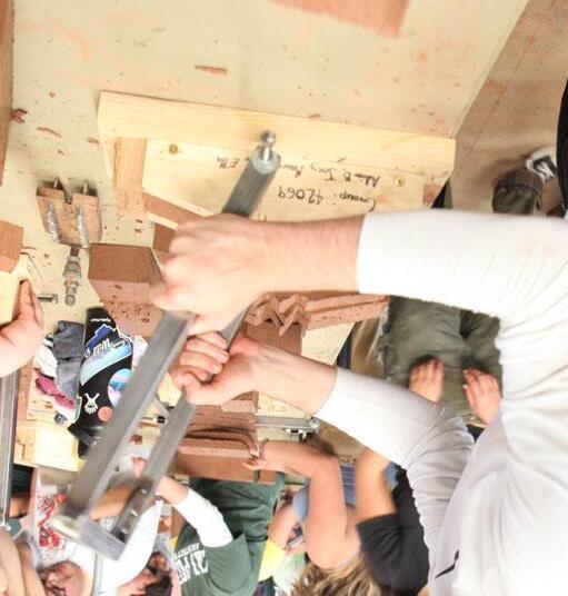
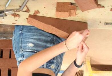
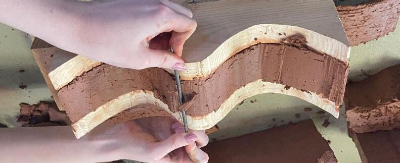
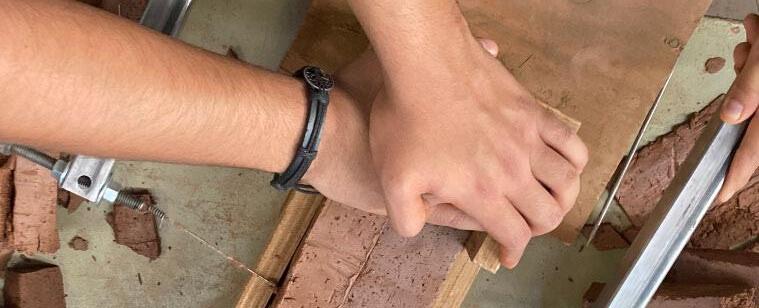
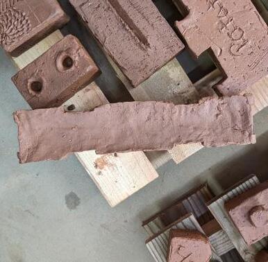
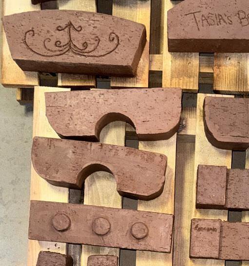
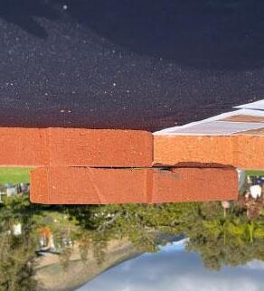
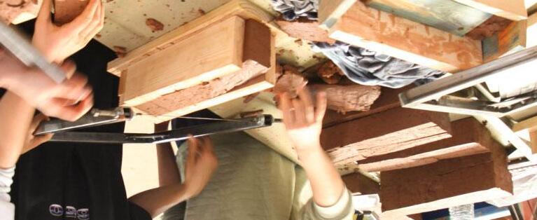
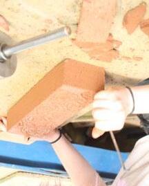
After--or instead of--wire cutting, the brick is removed from the formwork, with many details and textures applied by hand.

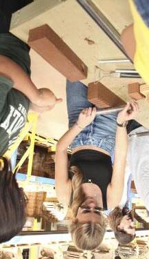
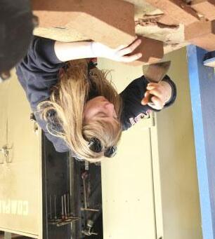
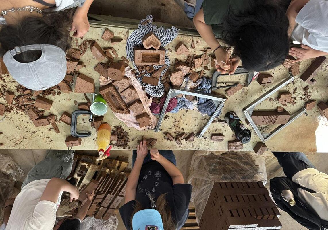
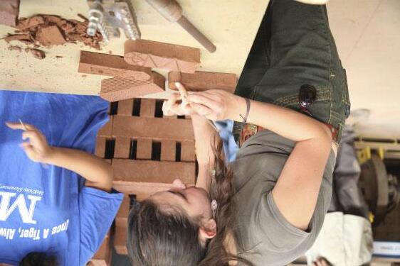
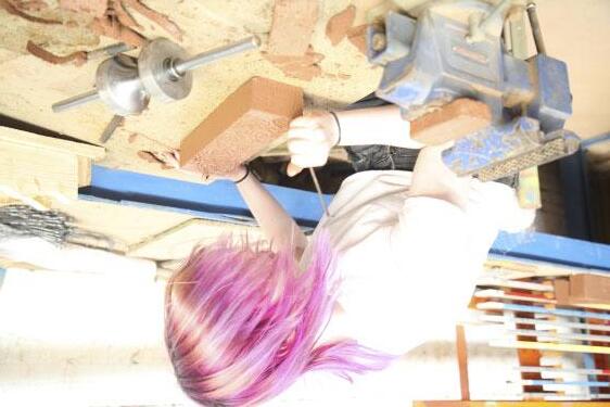
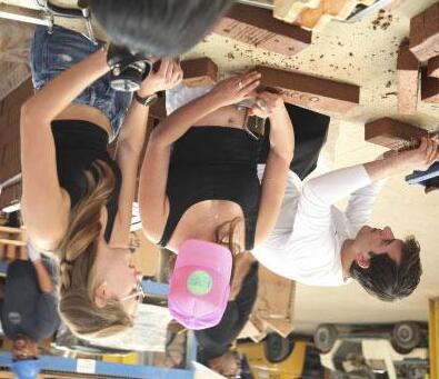
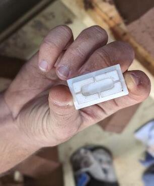
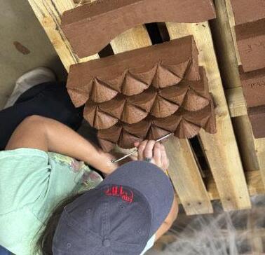

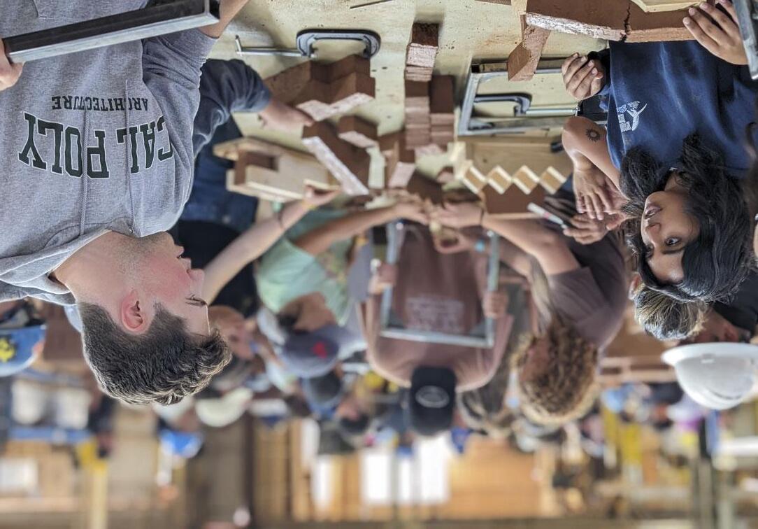
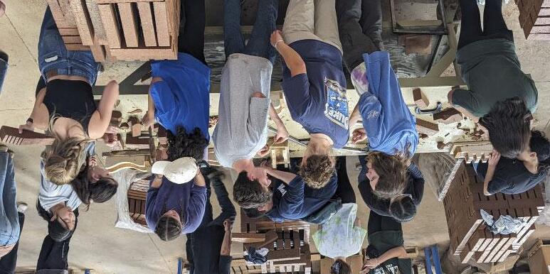
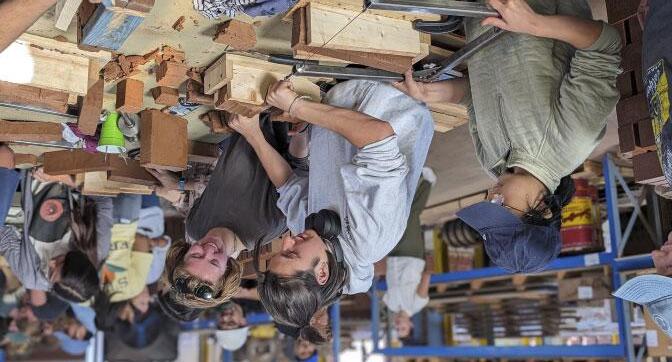
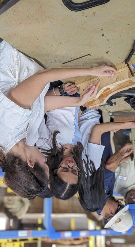
Throughout the day, the workshop was buzzing with intense discussions of problem-solving and possibilities for each of the group’s brick design goals.

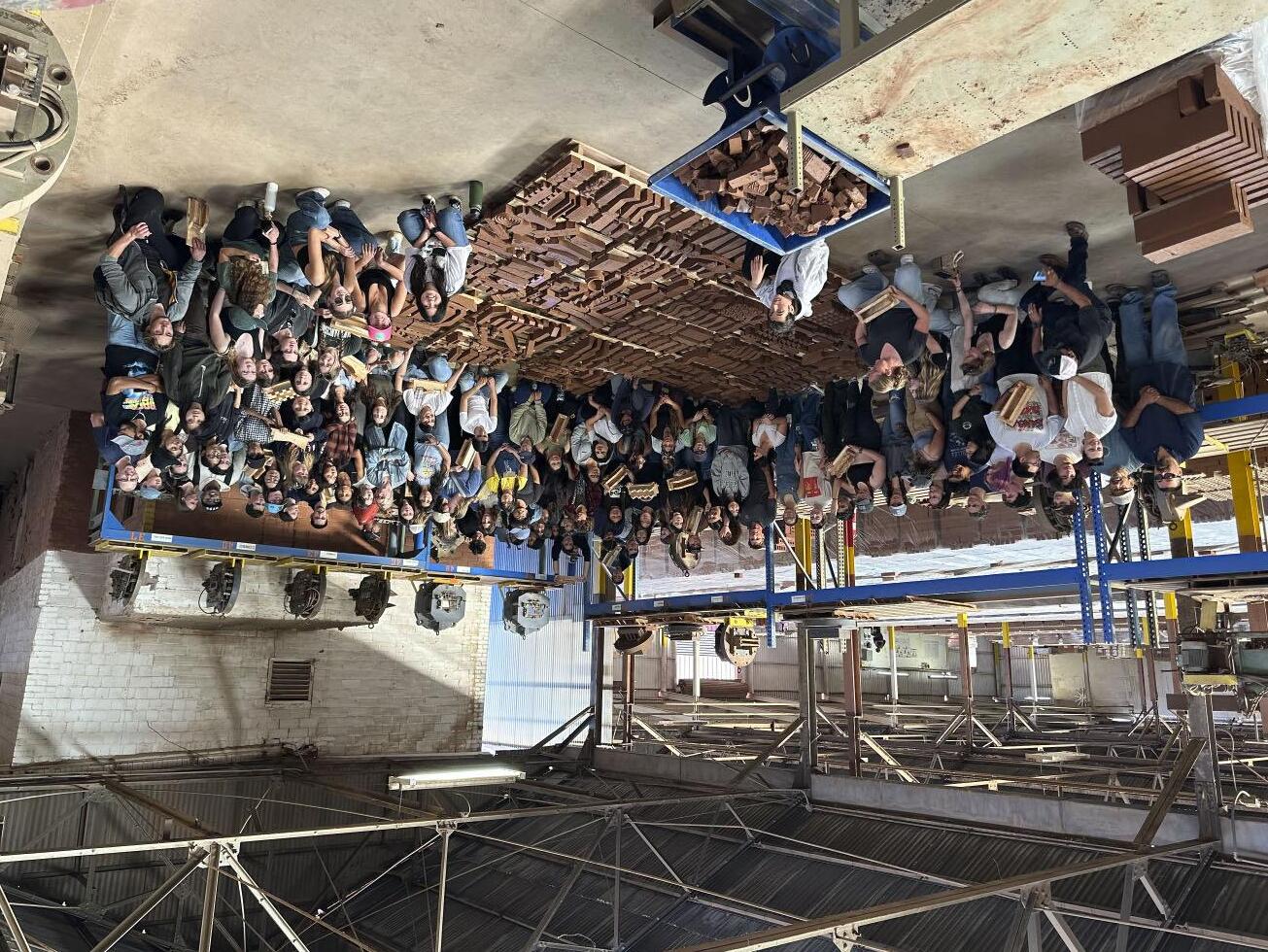
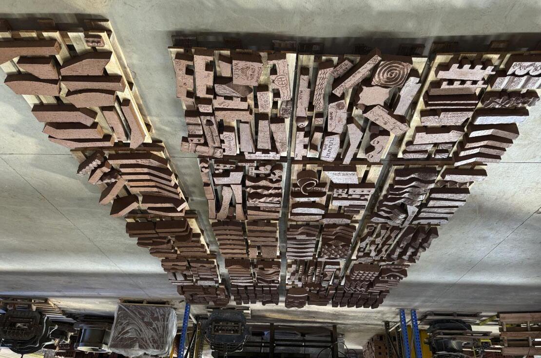





























In the weeks following the brick making session, Pacific Clay’s team dried and fired the protoype bricks, while the students documented their brick design with a series of drawings and diagrams, in preparation for the final presentation. The workshop was integrated with the 2nd year architectural technology curiculum. The assignment asked the student teams to demonstrate how their prototype brick could be used in distinct architectural wall applications:
• A single wythe load-bearing wall
• A double wythe load-bearing wall
• A brick cavity wall paired with CMU
• An open brick screen wall
• A freeform non-load bearing garden wall
The teams illustrated their designs starting with the initial concept sketches and individual brick module shapes. The ideas were then augmented with plans, sections, elevations and axonometric diagrams of the various wall applications. Selections of each group’s presentation material are shown on the following pages.
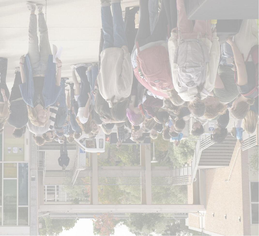
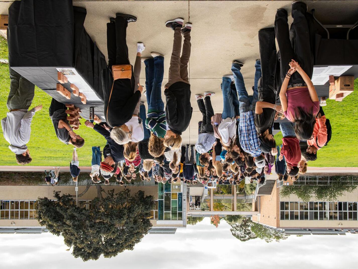
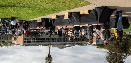
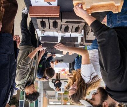
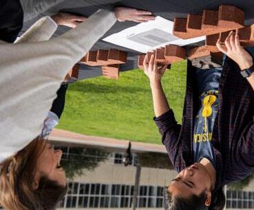
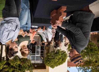
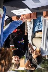
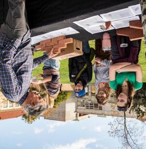
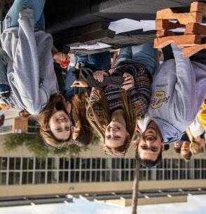
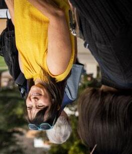
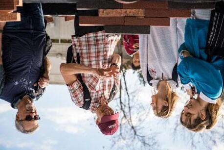
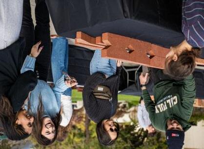
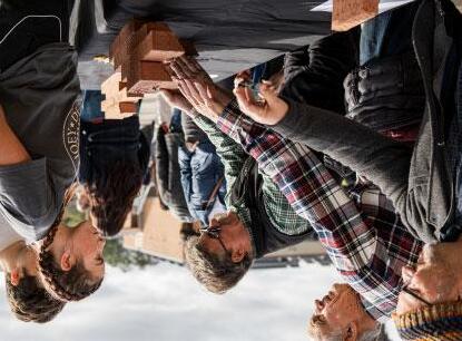
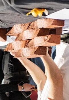
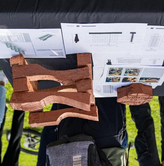
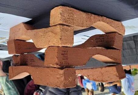
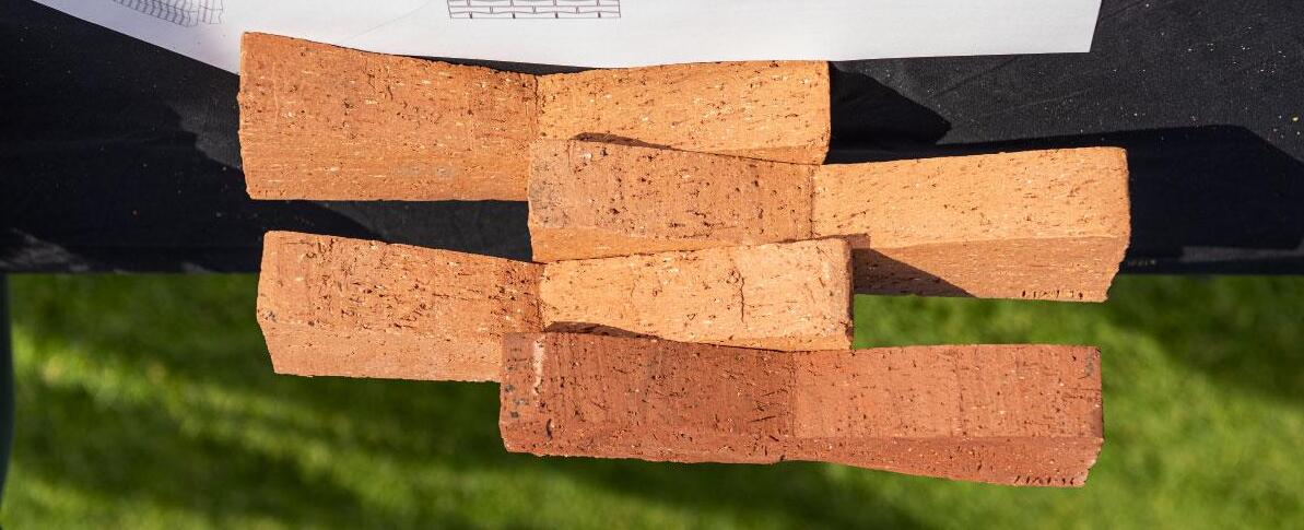
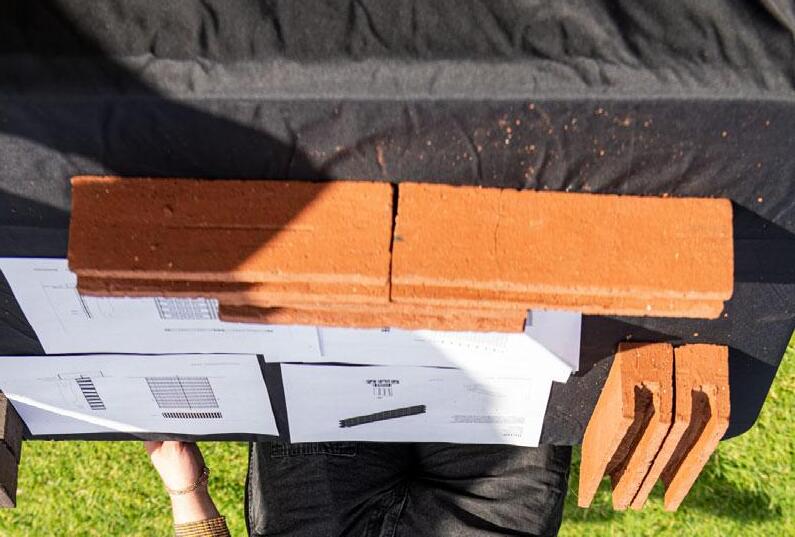
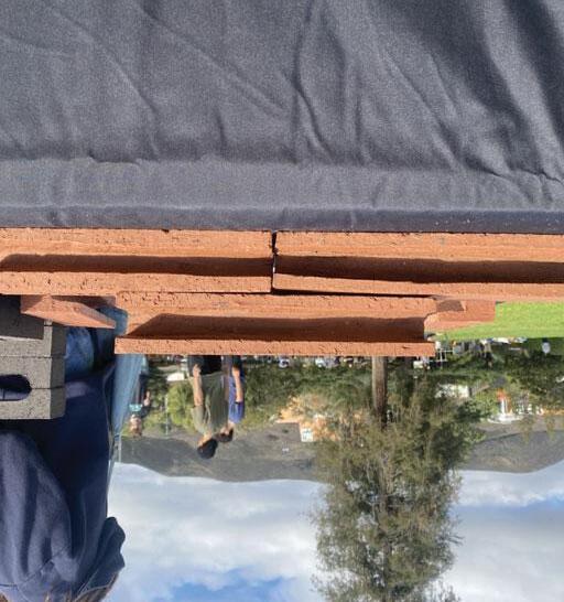
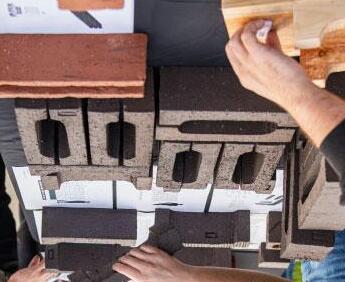
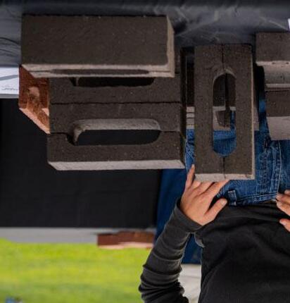
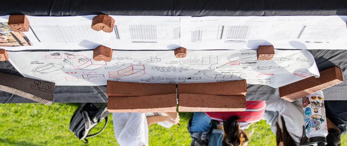
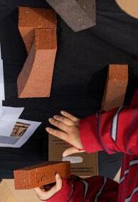
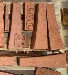
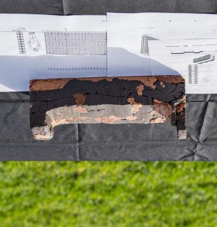
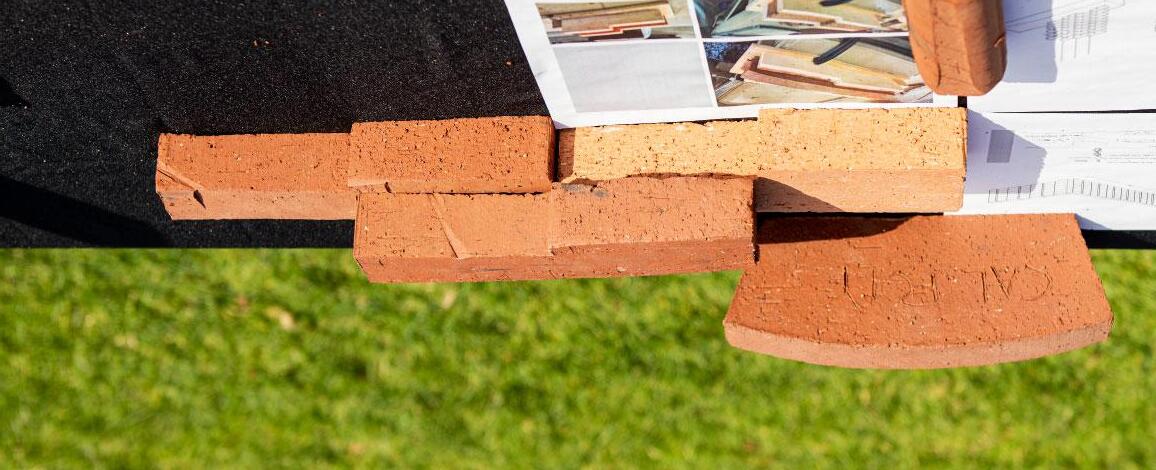
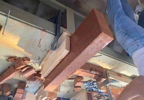
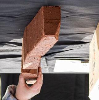
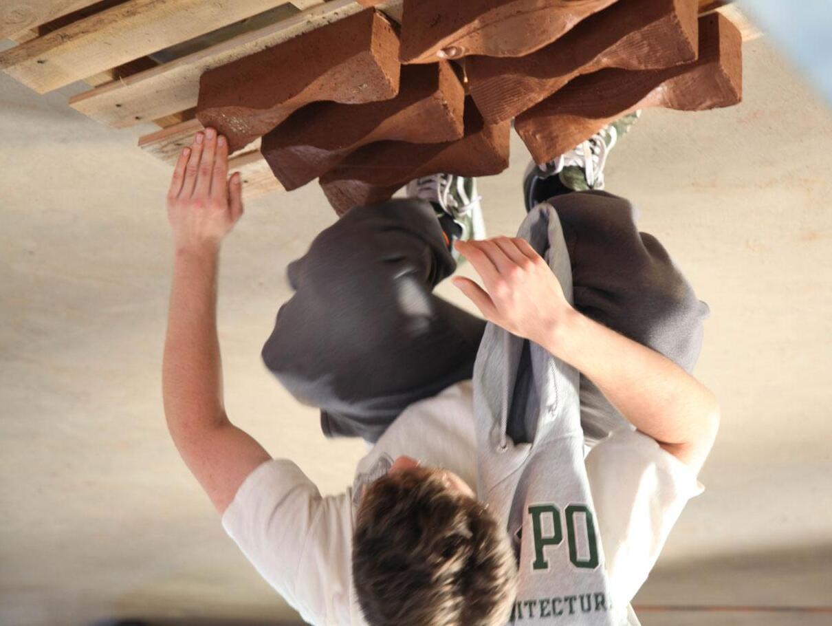
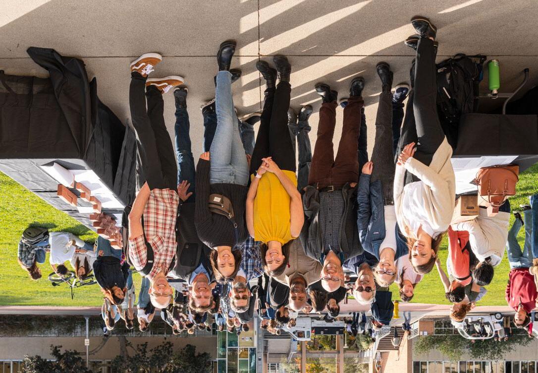
The fired bricks were delivered to Cal Poly, just in time to be included in the final presentation and reception on Dexter Lawn. This was the first time the teams were able to see and touch their finished bricks. When the students received the final products they had created themselves, the thrill on their faces was unforgettable. The bricks were assembled and arranged together with the presentation drawings, and the next few hours were spent talking about design possibilities with the Cal Poly faculty, along with the WRNS Studio and Pacific Clay teams. It was a memorable celebration to conclude a successful workshop.



Project Description text. Your text should address the initial idea for the brick design, plus additional ideas about the patterns possible with different methods of stacking. Also address how it can be used in a screen wall and a solid wall.


Crystal Doan
Crystal Doan
Bay Baysinger
Bay Baysinger
Phoenix Homer
Homer
Miguel Mariscal
Miguel Mariscal
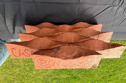
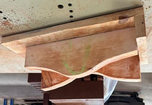
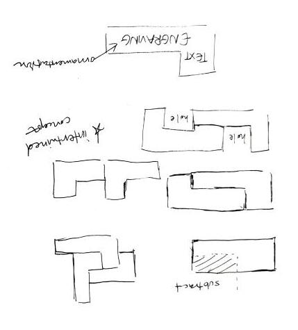
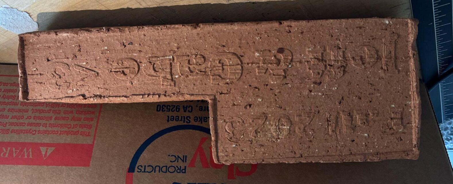
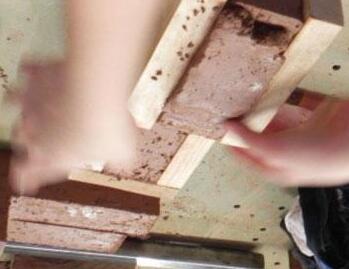
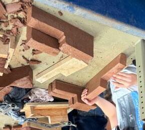
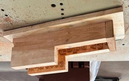
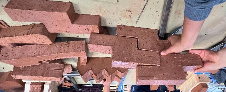
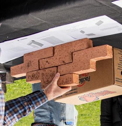
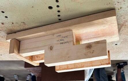
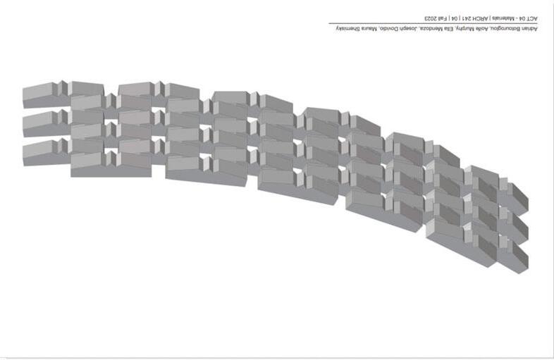
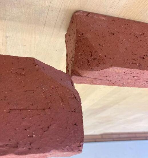
The intial idea for the brick design was to create an L-shaped brick. We believed the shape would allow for interesting construction patterns when assembled with multiple bricks. Due to the subtractive nature that the creation of the formwork required, we also thought it could be interesting to engrave the names of our professors into the brick, adding an extra layer of thickness, detail, and texture.
The initial idea for the brick design was to create an L-shaped brick. We believed the shape would allow for interesting construction patterns when assembled with multiple bricks. Due to the subtractive nature that the creation of the formwork required, we also thought it could be interesting to engrave the names of our professors into the brick, adding an extra layer of thickness, detail, and texture.


Audrey Aceituno
Audrey Aceituno Ehlenberger
Elianna Ehlenberger
Nicolaas DeGrood
Nicolaas DeGrood
Kate Thompson
Kate Thompson
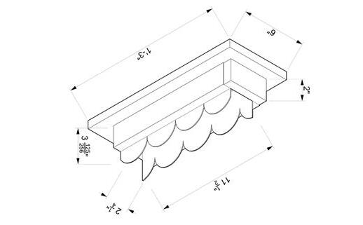
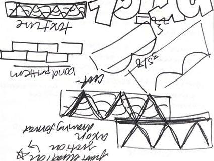
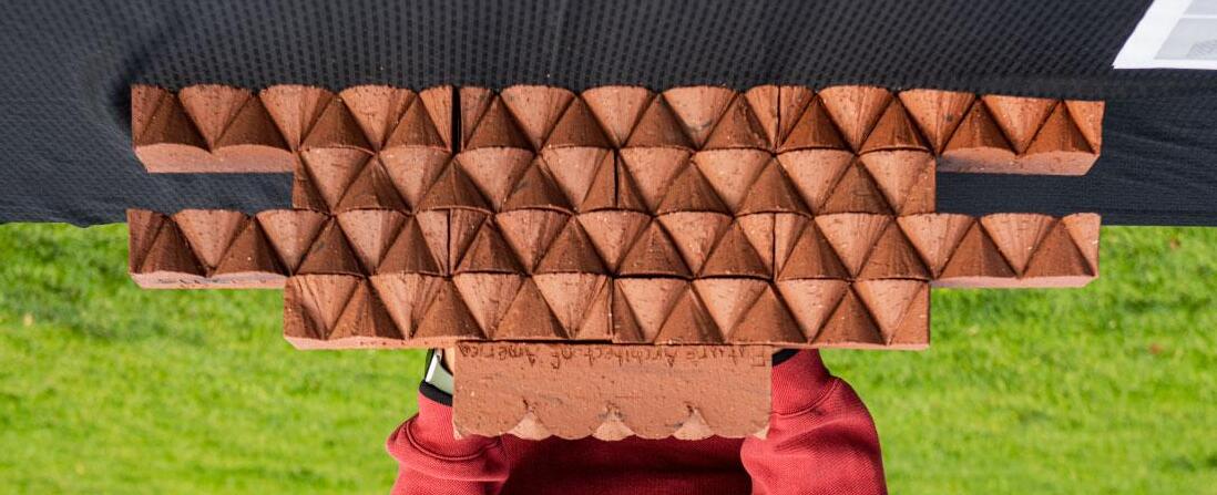
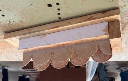
Our brick is an ornamental brick at a standard size. The pattern is produced by he offset semicircles in our form which are used to create cone shapes that nterconnect to form a facade on a wall. We used our knowledge of clay wire utting to develop this design.
Our brick is an ornamental brick at a standard size. The pattern is produced by the offset semicircles in our form which are used to create cone shapes that interconnect to form a facade on a wall. We used our knowledge of clay wire cutting to develop this design.




Emma Briceno
Emma Briceno
Judy Gnanadoss
Judy Gnanadoss
Peyton Hagstrom
Peyton Hagstrom
Dhruvi Jain
Dhruvi Jain
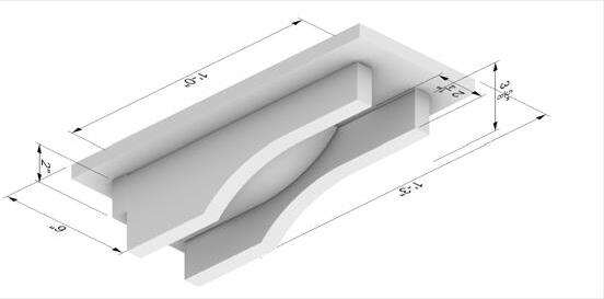
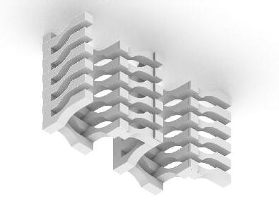
From the beginning, the goal of this brick design was to create a brick that could engage with the surrounding environment individually and together. Hence why there are inverse curves that allow the bricks to be arranged as a screen or wall depending on the environment they are being used for and the varying aperture of each brick with different assemblies. With any desired assembly, the bricks create openings that make way for light to shine through and provide greater circulation. Overall, the Jenga Brickscape is intended to serve as an open edge that can interact with the natural environment and lighting.
From the beginning, the goal of this brick design was to create a brick that could engage with the surrounding environment individually and together. Hence why there are inverse curves that allow the bricks to be arranged as a screen or wall depending on the environment they are being used for and the varying aperture of each brick with different assemblies. With any desired assembly, the bricks create openings that make way for light to shine through and provide greater circulation. Overall, the Jenga Brickscape is intended to serve as an open edge that can interact with the natural environment and lighting.













Anatalia Beiler
Nixon Calderon
Beiler lderon
Diego Perez
Bella Leyva
rez va pt was heavily influenced by patterning- we ultimately wanted created a tangible alteration to the structural facade in a beautiful way. Therefore, we carved out of the brick in order indentation that allowed us to create lines within our wall n a screen wall, the design creates more open space, whereas ilized in many patterned fashions in a standard wall design.
Our concept was heavily influenced by patterning- we ultimately wanted a brick that created a tangible alteration to the structural facade in a subtle and beautiful way. Therefore, we carved out of the brick in order to make an indentation that allowed us to create lines within our wall structures. In a screen wall, the design creates more open space, whereas it can be utilized in many patterned fashions in a standard wall design.
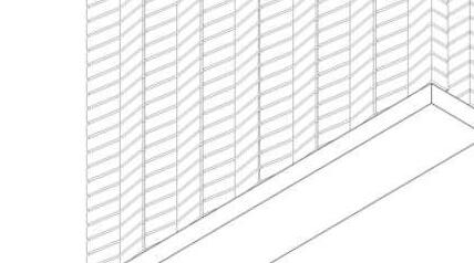
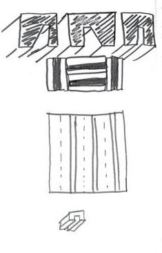
Axonometric diagram of brick assembly (ACT 04/05). PDF with simple shading and white background

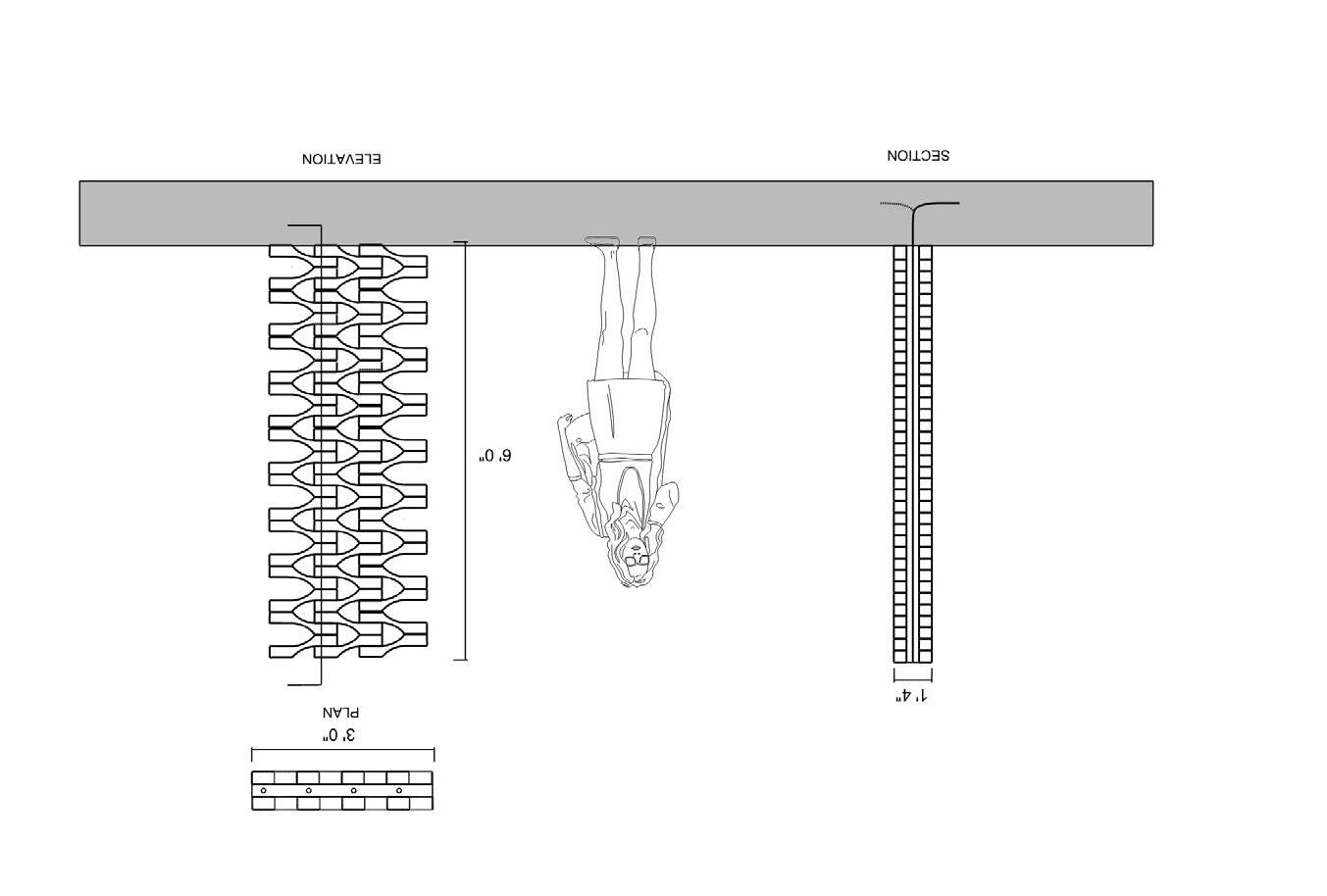
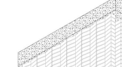
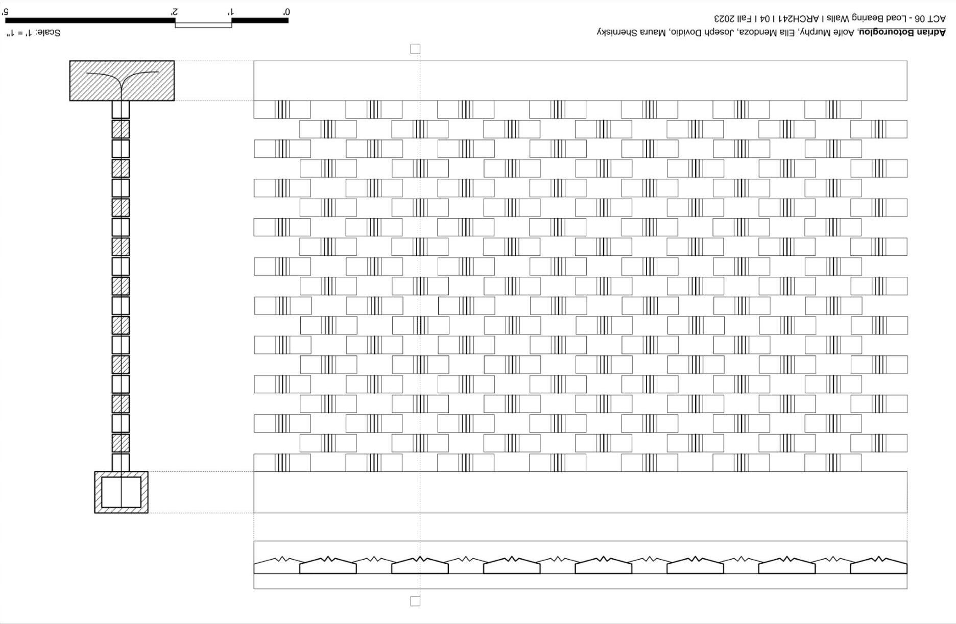
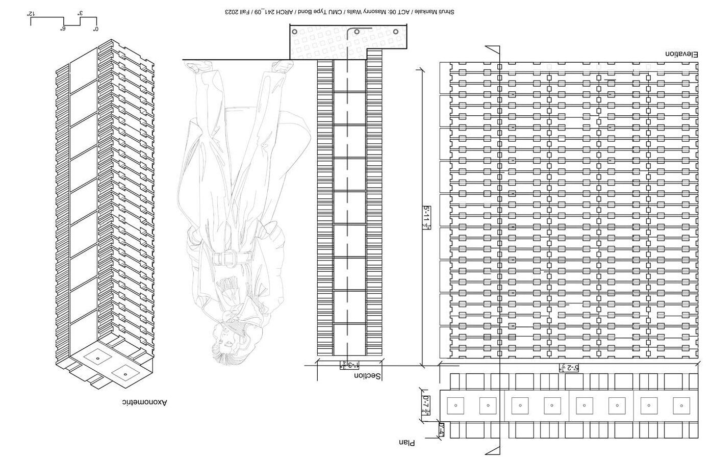
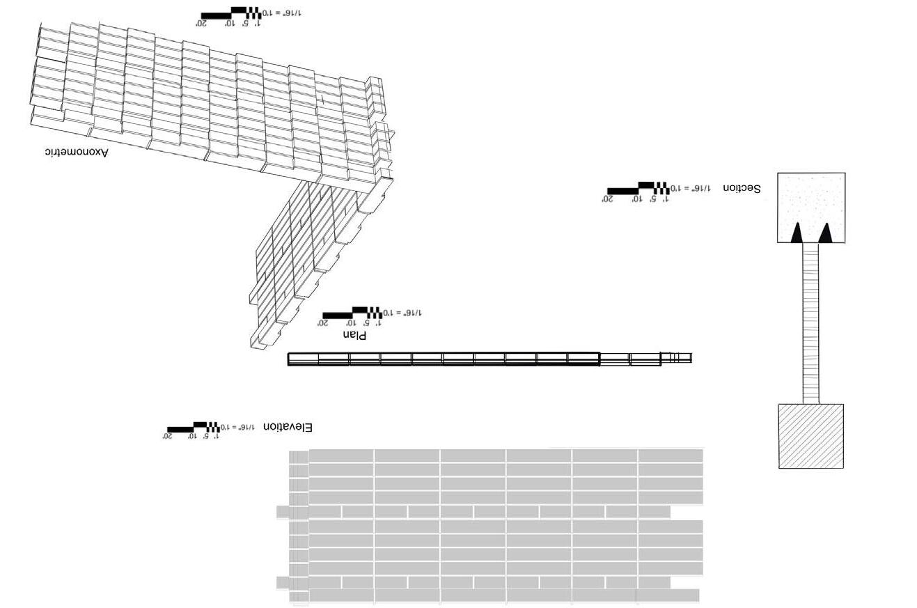
One of your team’s wall designs (ACT 06). PDF with elevation, section, plan, and axonometric. PDF should have lineweights, appropriate hatching, shading (axon only). Crop off titleblock so that only the line drawings are included on this page. Strive for consistency between all of the drawings produced by your team.

Eleanor Vickery
Eleanor Vickery
Katherine Lee
Katherine Lee
Siena Lopez
Siena Lopez
Elijah Harris
Harris Our brick was designed to use rounded edges and modular assembly to create a permeable wall structure. With the simple brick design, multiple different options are available for assembly, whether by creating different aperatures in the wall with the curved shape or manipulating the shape of the wall to create space.
Our brick was designed to use rounded edges and modular assembly to create a permeable wall structure. With the simple brick design, multiple different options are available for assembly, whether by creating different aperatures in the wall with the curved shape or manipulating the shape of the wall to create space.
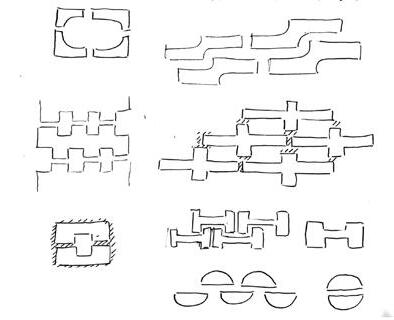
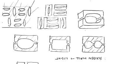


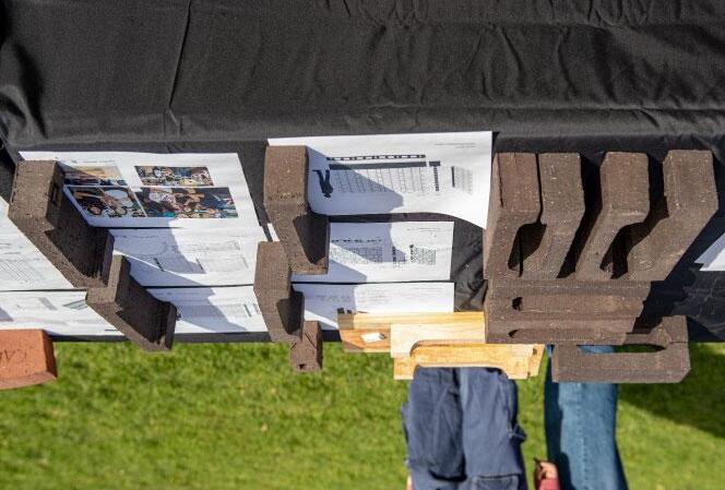
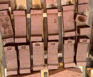

Lynne Chirillo
Lynne Chirillo
Dylan Ferrer
Dylan Ferrer Vance
Leilani Vance
Collin Yan
Collin Yan
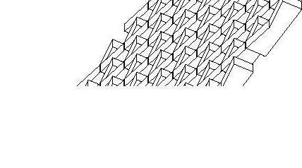
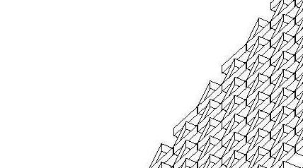
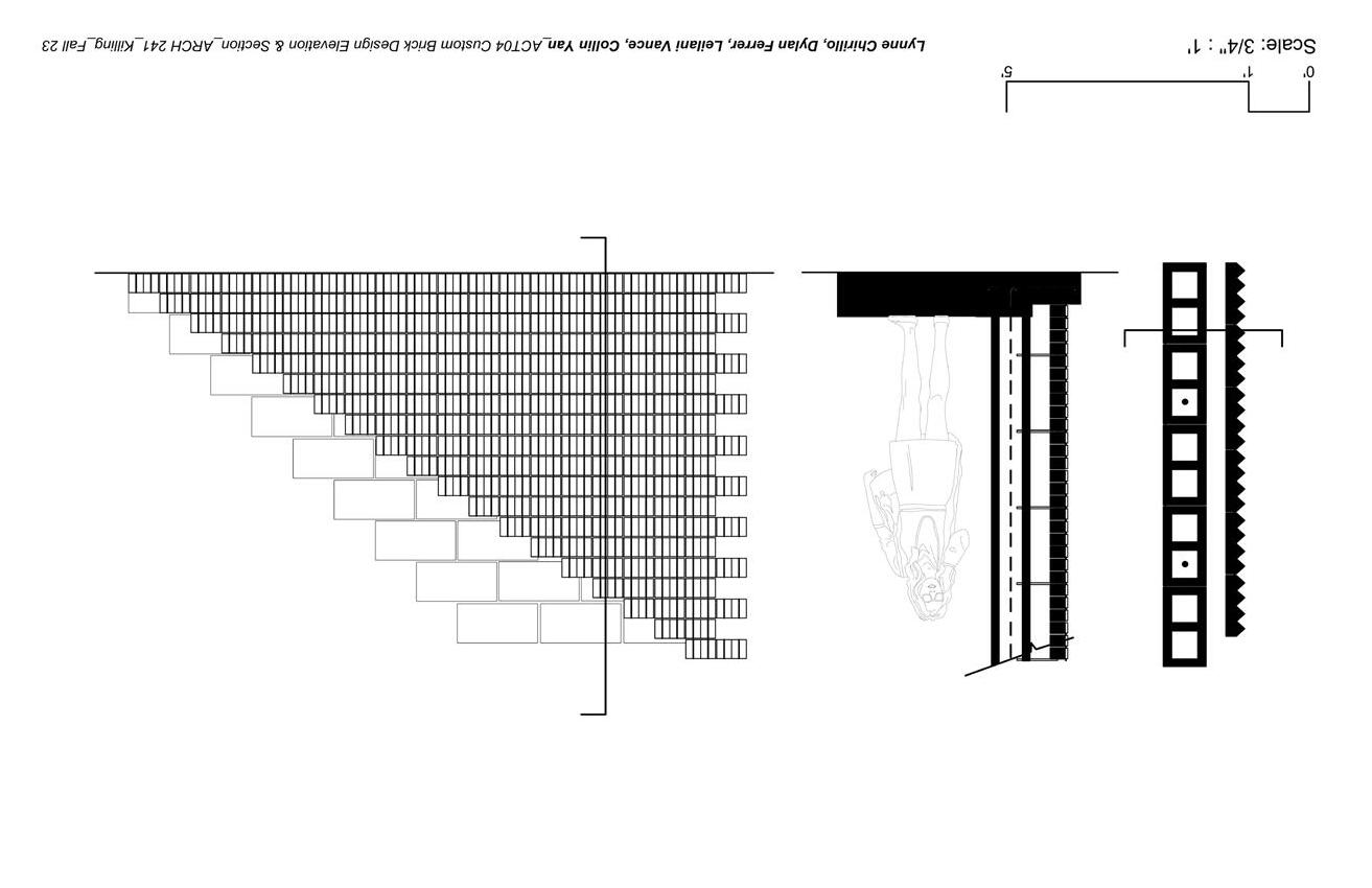
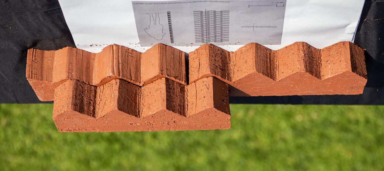
Our imposing structure gives off a distinctive texture, where each brick expresses a protruding spiked design, creating an aesthetic that is both commanding and visually striking. The surface is characterized by sharp, angular spikes that protrude from the bricks, forming an intricate pattern reminiscent of ancient fortifications. These spikes not only serve as a visual deterrent but also act as a formidable physical barrier, dissuading any potential intruders with their foreboding presence. As light strikes the surface, each angle creates an interesting texture on the brick and reflects light at varying perspectives.
Our imposing structure gives off a distinctive texture, where each brick expresses a protruding spiked design, creating an aesthetic that is both commanding and visually striking. The surface is characterized by sharp, angular spikes that protrude from the bricks, forming an intricate pattern reminiscent of ancient fortifications. These spikes not only serve as a visual deterrent but also act as a formidable physical barrier, dissuading any potential intruders with their foreboding presence. As light strikes the surface, each angle creates an interesting texture on the brick and reflects light at varying perspectives.
Axonometric diagram of brick assembly (ACT 04/05). PDF with simple shading and white background


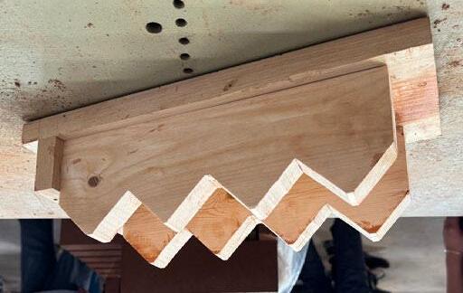
Axonometric drawing of form (use template provided in ACT 04, Part 02). PDF simple shading and white background


Donovan McPeek
Donovan McPeek
Cameron Grove
Cameron Grove
Poppy DeArmond-MacLeod
Poppy DeArmond-MacLeod
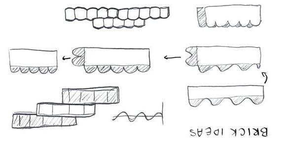
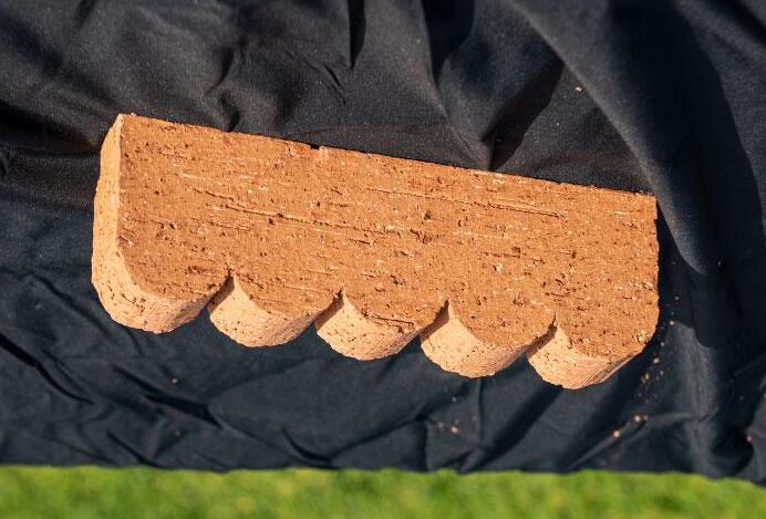
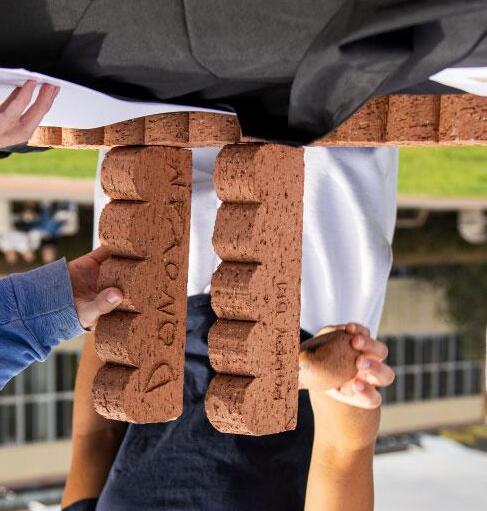
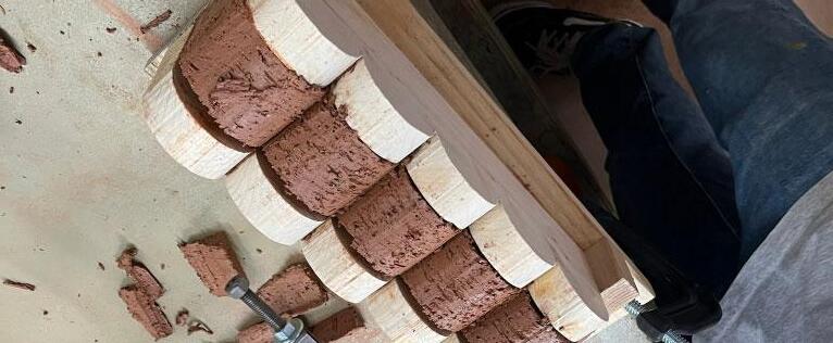
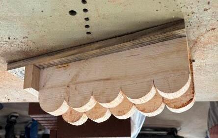
Our original ideas for this brick desgin started out by thinking about a sin graph, and after many iterations of curves turned into our final design and formwork. Our design could be used in any different types of brick orientations and walls. We ended up choosing this sequence of curves because when set up at an offset, the curves interact with each other in an interesting way.
Our original ideas for this brick desgin started out by thinking about a sin graph, and after many iterations of curves turned into our final design and formwork. Our design could be used in any different types of brick orientations and walls. We ended up choosing this sequence of curves because when set up at an offset, the curves interact with each other in an interesting way.


Delaney Denham
Delaney Denham
Naomi Komadina
Naomi Komadina
Sylvie Gliko
Sylvie Gliko
Yadira Bautista
Bautista
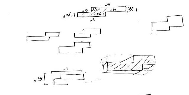
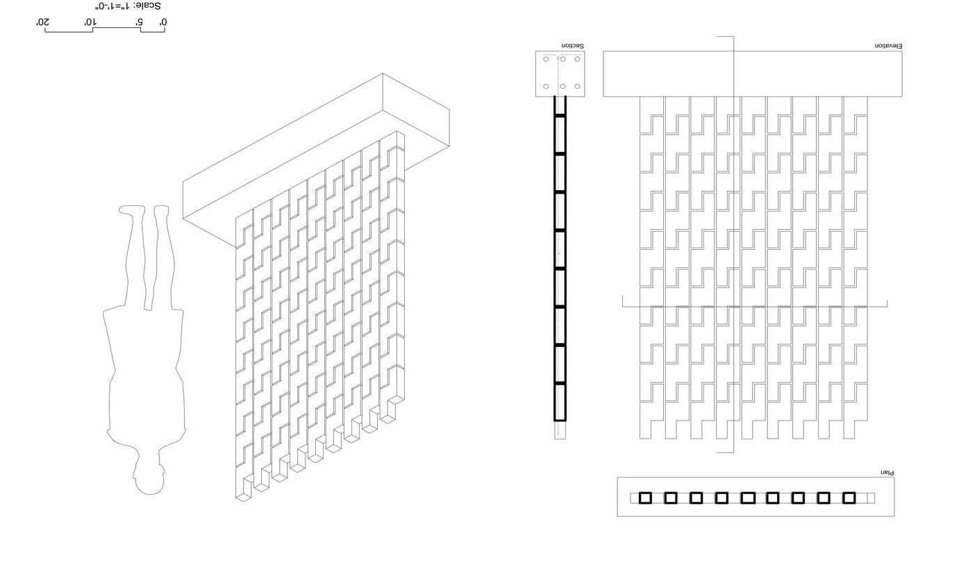
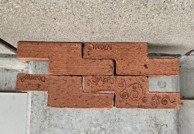
For our brick design we were curious about how we could create an interesting pattern in the way in which the bricks fit together. We used the concept of solid and void to develop many variations of brick ideas. By doing so we made different edge conditions from the various forms. We decided on the orientation of our brick because we wanted to create a seamless fitting between joints in a solid wall. Our brick has the ability to create visually compelling gaps in a screen wall.
For our brick design we were curious about how we could create an interesting pattern in the way in which the bricks fit together. We used the concept of solid and void to develop many variations of brick ideas. By doing so we made different edge conditions from the various forms. We decided on the orientation of our brick because we wanted to create a seamless fitting between joints in a solid wall. Our brick has the ability to create visually compelling gaps in a screen wall.
Scale: 1" = 1'-0"


Adrian Botouroglou
Adrian Botouroglou
Aoife Murphy
Aoife Murphy
Joey Dovidio
Joey Dovidio
Ella Mendoza
Ella Mendoza
Maura Shernisky
Maura Shernisky
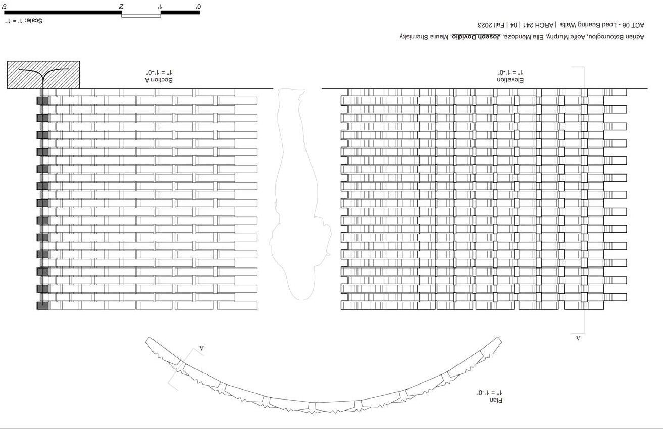
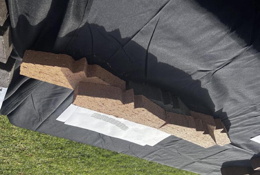
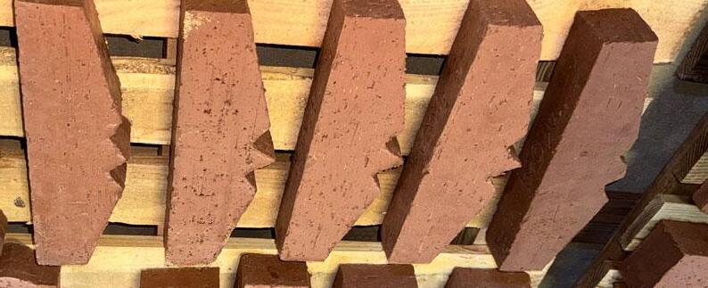
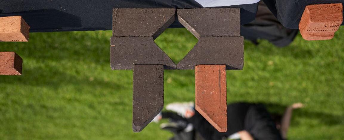
The brick design is striking at first glance as it’s derived from the famous batman symbol. The initial idea came to us during our ARCH241 Activity while we were brainstorming different designs. We wanted our brick to stand out amongst the rest as well as create unique shadows. The brick only has one face that strays from the recteliniar shape, allowing it to be used in a multitude of well designs.
The brick design is striking at first glance as it’s derived from the famous batman symbol. The initial idea came to us during our ARCH241 Activity while we were brainstorming different designs. We wanted our brick to stand out amongst the rest as well as create unique shadows. The brick only has one face that strays from the recteliniar shape, allowing it to be used in a multitude of well designs.
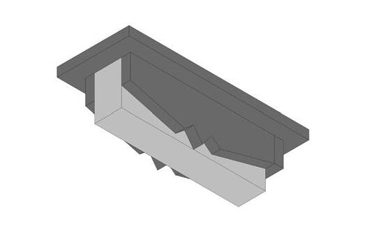
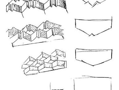
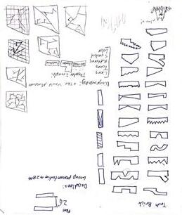
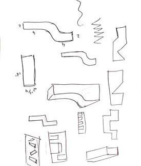
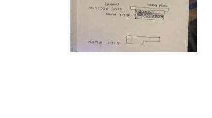
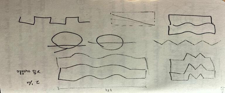
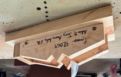
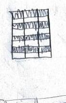
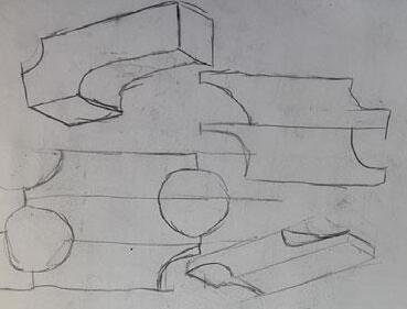
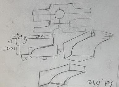
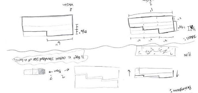
Concept sketches/diagrams. You can use photographs from your sketchbook. Strive for clear images without a lot of background.
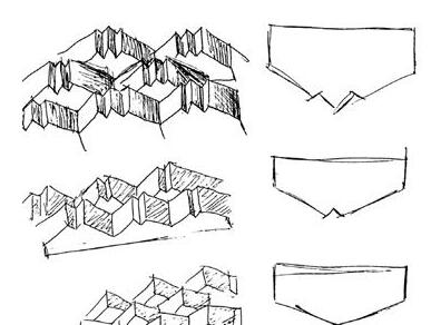


Heisecke
Mariana Sanchez Heisecke
Cindy Moreno
Moreno
Antuanette Arteaga
Antuanette Arteaga
Adrian Gonzalez-Esquivel
Adrian Gonzalez-Esquivel
Henry Frierson
Henry Frierson
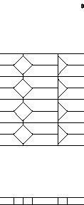
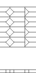
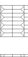
Our first idea was a brick that was modeled after a Lego. Figuring its seamless form and easy way to stack upon itself, we went with that idea. However, our brick molding failed so we had to produce another design, which was a brick that was cut at a corner. A simple design but also versatile when it comes to designing our brick walls. Our brick design can be rotated to achieve a screen wall and solid wall. Throughout the booklet you wiill be able to see that the changing of the orientation of the brick module itself can achieve multiple ways to make a screen wall and solid wall.
Our first idea was a brick that was modeled after a Lego. Figuring its seamless form and easy way to stack upon itself, we went with that idea. However, our brick molding failed so we had to produce another design, which was a brick that was cut at a corner. A simple design but also versatile when it comes to designing our brick walls. Our brick design can be rotated to achieve a screen wall and solid wall. Throughout the booklet you wiill be able to see that the changing of the orientation of the brick module itself can achieve multiple ways to make a screen wall and solid wall.






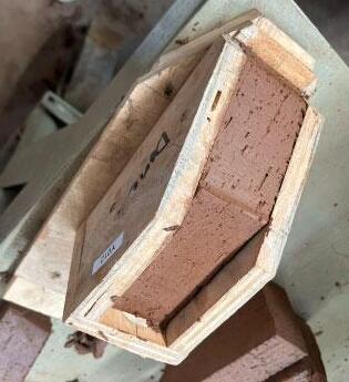

Chloe Williams
Payton Lee
Curtis Jacobs
Williams Lee Jacobs
Arsh Gupta
Arsh Gupta
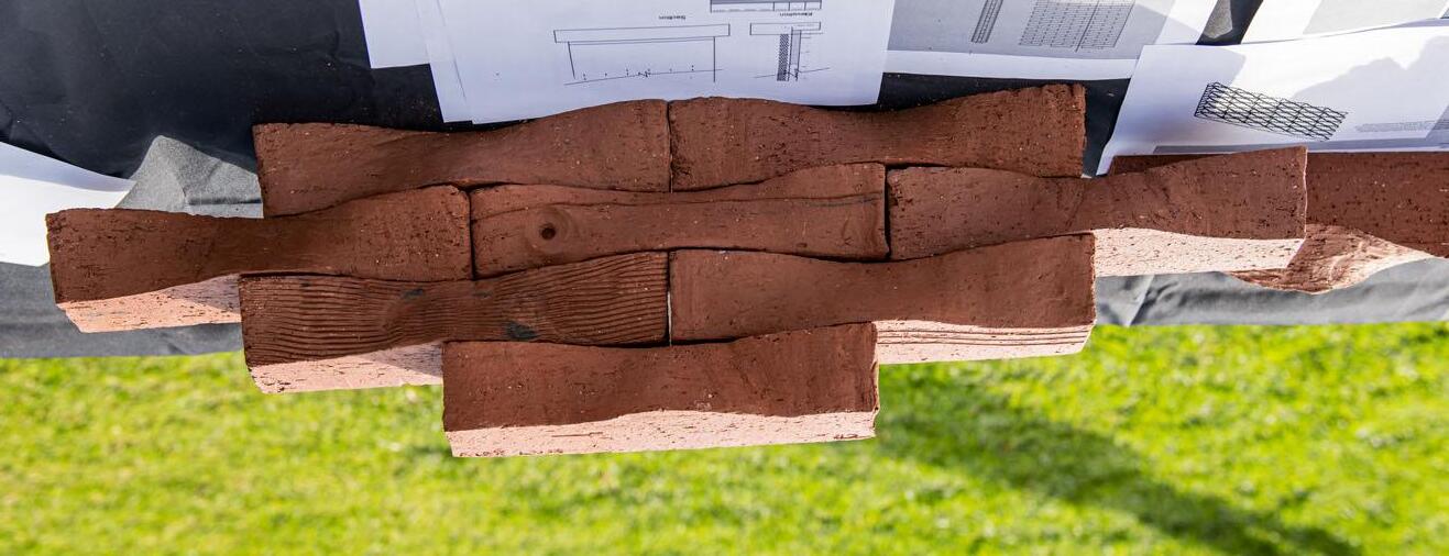
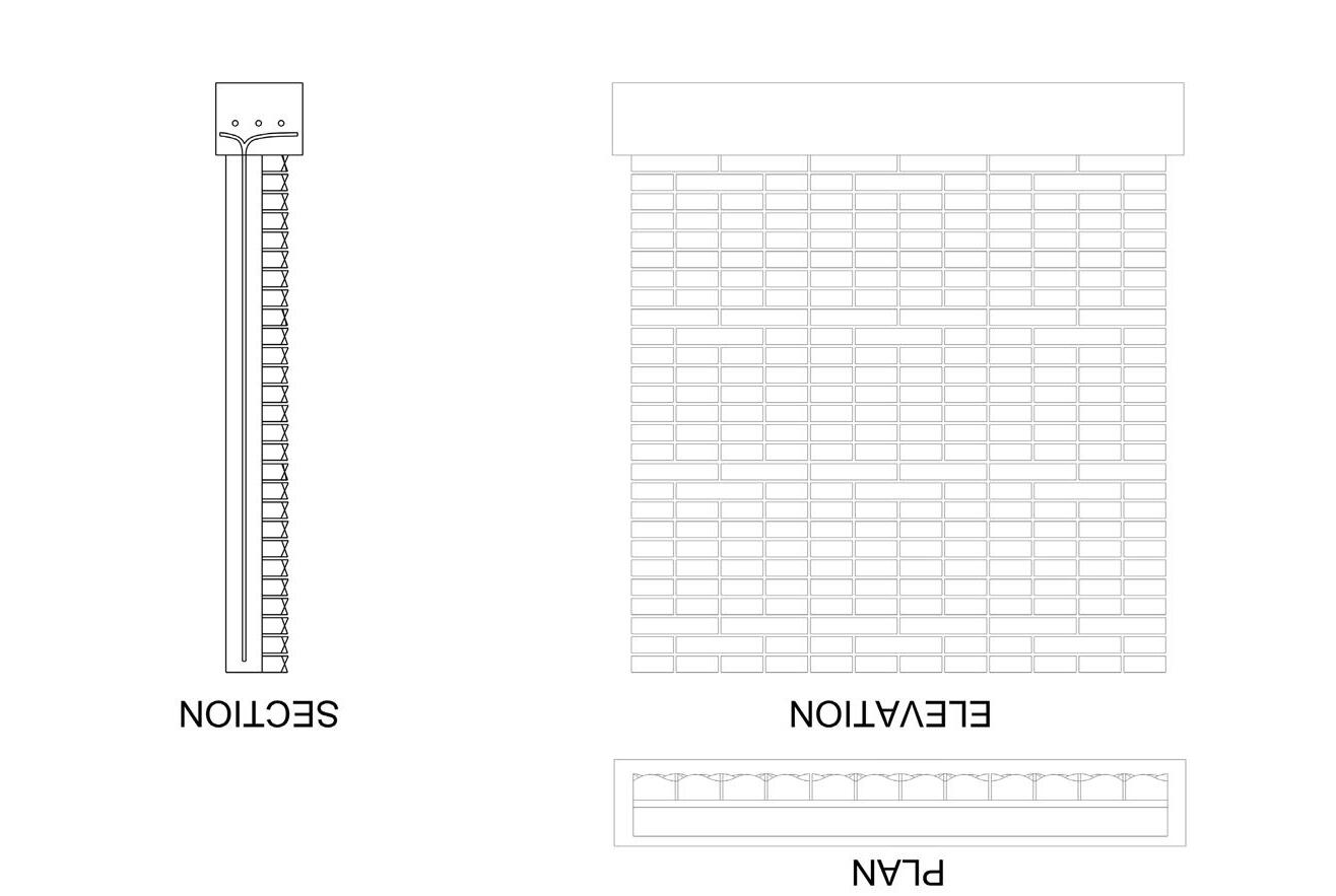
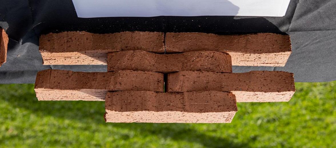
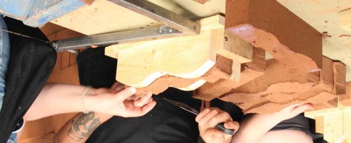
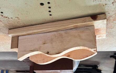
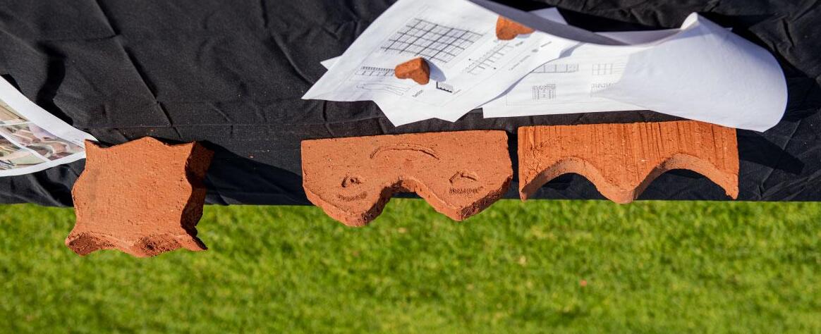
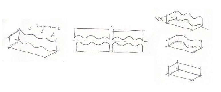
Our initial idea was to create an alternating wavy pattern on the outward facing side of the brick. Luckily we were successful in this with the help of our formwork!The curvature of the brick’s face embodies fluidity and works to create a rippling effect when stacked and spread across a surface. Additionally, even though the curved side is designed to be outward facing, these faces can be stacked against one another to create a curved space where the mortar is placed. It’s adaptability with spacing allows it to easily be both a screen wall and a solid wall.
Our initial idea was to create an alternating wavy pattern on the outward facing side of the brick. Luckily we were successful in this with the help of our formwork!The curvature of the brick’s face embodies fluidity and works to create a rippling effect when stacked and spread across a surface. Additionally, even though the curved side is designed to be outward facing, these faces can be stacked against one another to create a curved space where the mortar is placed. It’s adaptability with spacing allows it to easily be both a screen wall and a solid wall.
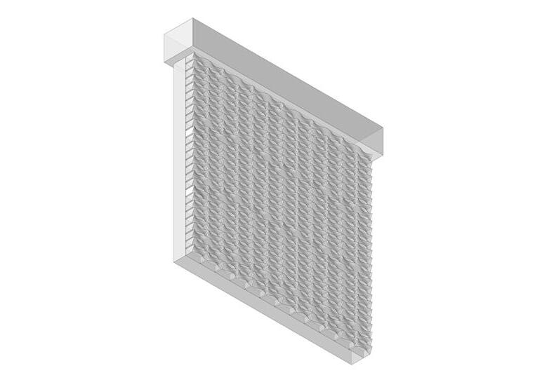
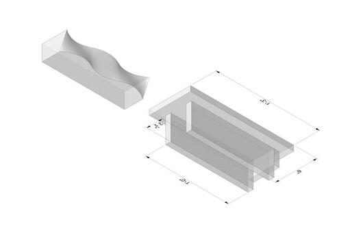
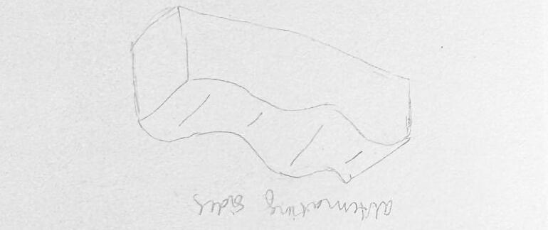



Joshua Flynn
Joshua Flynn
Madi Li
Madi Li
Peyton McLeese
Peyton McLeese
Juliette Mendoza
Juliette Mendoza
Hazel Ross
Hazel Ross
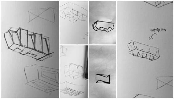
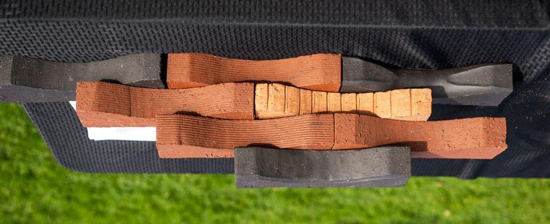
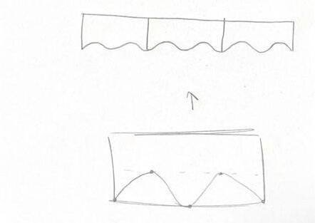
Our brick design began with the want for a cohesive wall, each of our team members sketched multiple possibilities for a brick that would blend into itself. This idea manifested most fully in a ‘wave or ‘ripple’ design -- Juliettes sketches of this are shown below. We first thought to put two layers of the wave design on the same brick, at the same length but half of the height - however, after some deliberation, we decided to go with a more simple, single wave design. Our brick could be a screen wall or a solid wall, as a solid wall, the bricks would blend together in their offset wave shape. As a screen wall, the waves would separate slightly and the wall would expand to include voids within the wave pattern.
Our brick design began with the want for a cohesive wall, each of our teammembers sketched multiple possibilities for a brick that would blend into itself.This idea manifested most fully in a ‘wave or ‘ripple’ design -- Juliettes sketchesof this are shown below. We first thought to put two layers of the wave designon the same brick, at the same length but half of the height - however, aftersome deliberation, we decided to go with a more simple, single wave design.Our brick could be a screen wall or a solid wall, as a solid wall, the bricks wouldblend together in their offset wave shape. As a screen wall, the waves wouldseparate slightly and the wall would expand to include voids within the wave pattern.
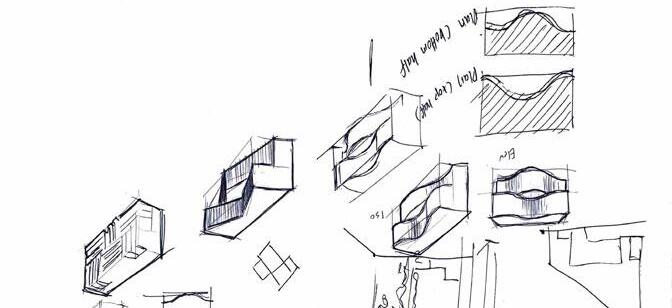
Formwork AxonometricConcept Sketches
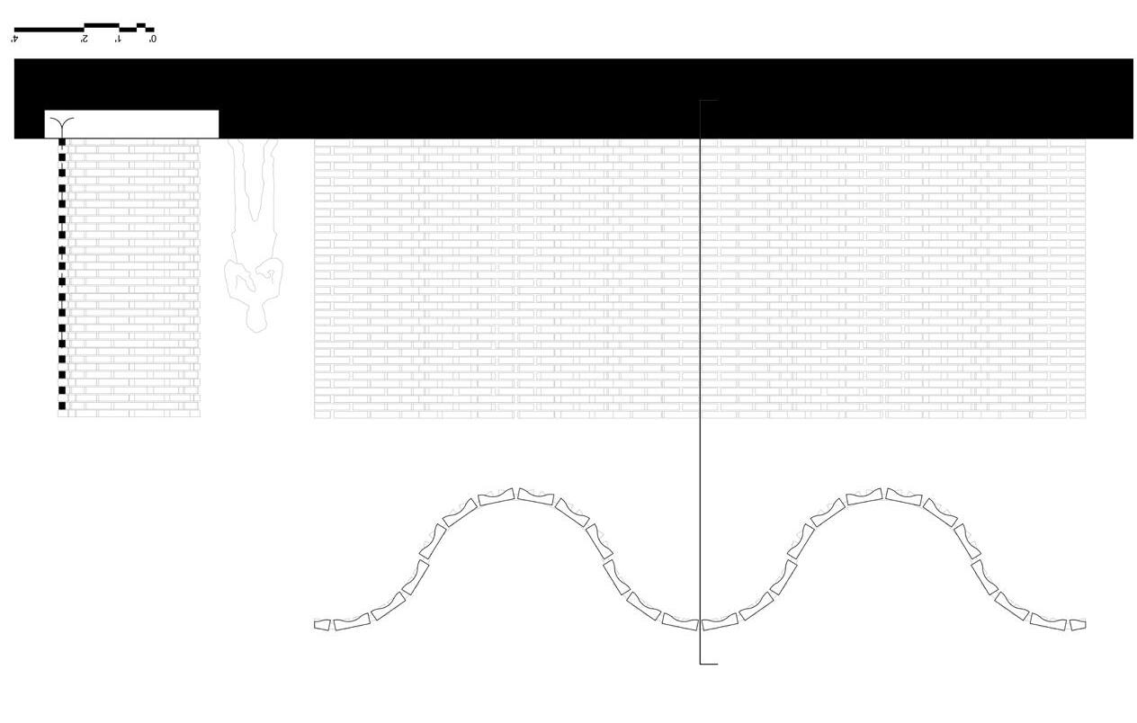

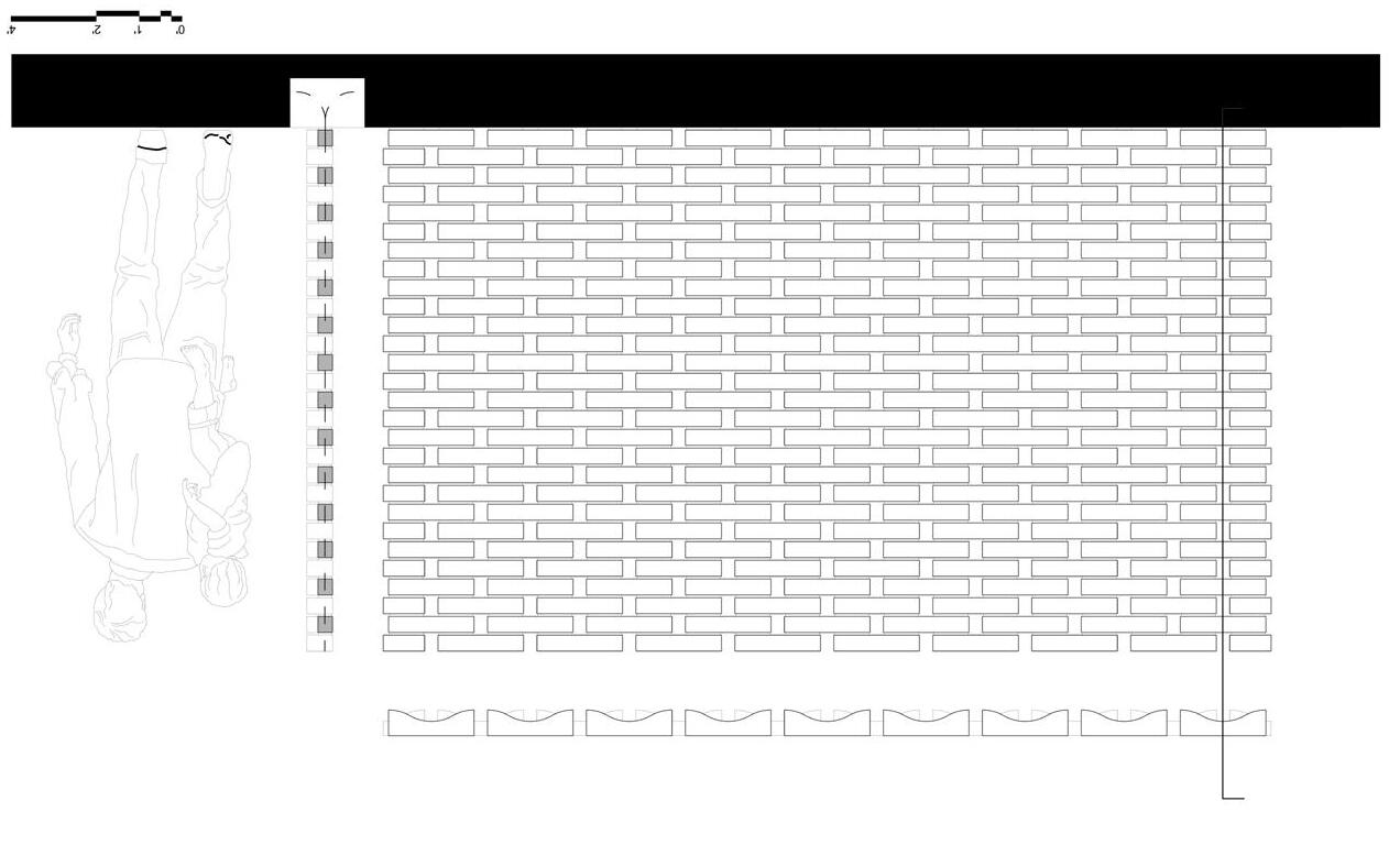

Alyson Buchholz
Alyson Buchholz
Hope Gallemore
Hope Gallemore
Peyton Lien
Peyton Lien
Yvonne Wu
Yvonne Wu
Samantha Zack
Samantha Zack
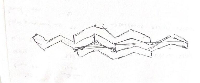
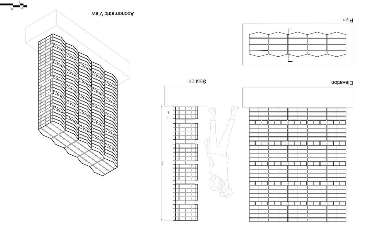
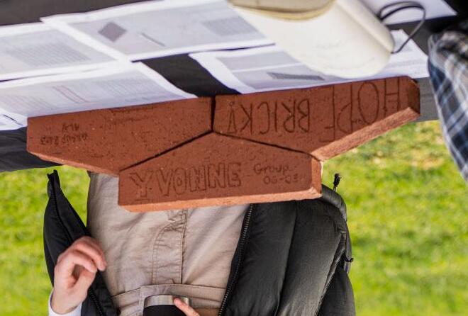
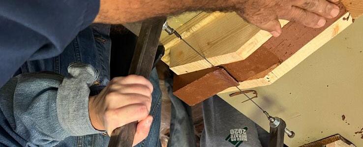
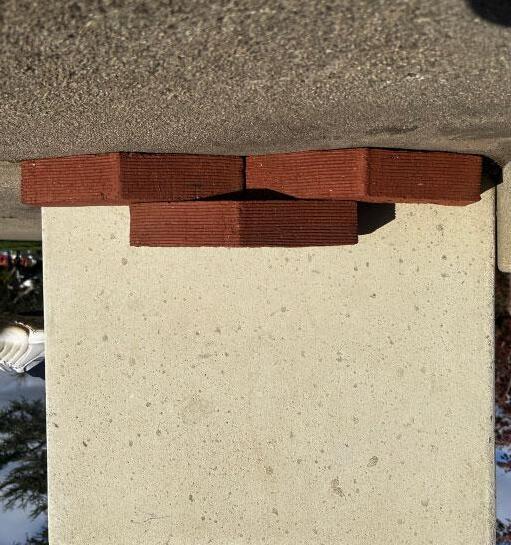
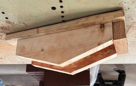
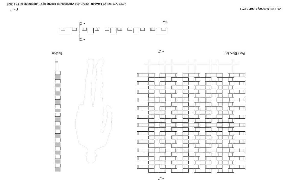
Initially, our group started with a plain rectangular standard brick. From there, we slowly chip away the brick and ended up with a pentagon shaped brick where the top meets at a point. With this brick design, we had a varaiation of ways to stack these bricks such as a screen wall. However, playing around with the shape, we liked the way we just placed the brick as a solid wall which will create this zigzag facade because of the pointed element of the brick.
Initially, our group started with a plain rectangular standard brick. From there, we slowly chip away the brick and ended up with a pentagon shaped brick where the top meets at a point. With this brick design, we had a varaiation of ways to stack these bricks such as a screen wall. However, playing around with the shape, we liked the way we just placed the brick as a solid wall which will create this zigzag facade because of the pointed element of the brick.


Michelle Orozco
German Raygoza
Emily Alvarez
Julissa Soto
Sandra Cisneros
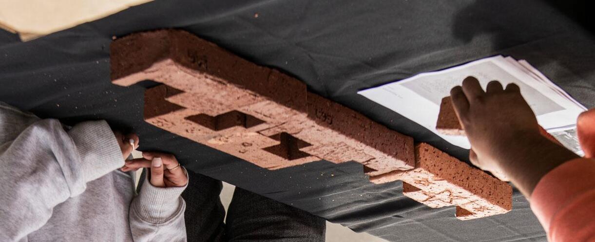
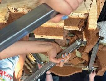
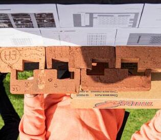
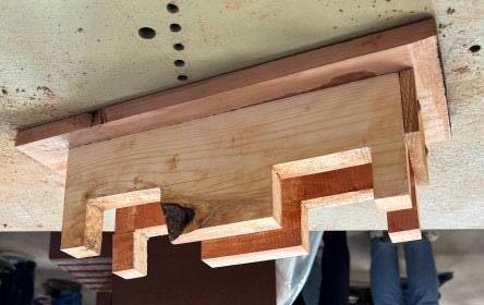
When coming up with a design for our brick we wanted something that when layed out in certain patterns could either give privacy or exposure. The patterns that would give exposure through the wall, such as a screen wall, would utilize the openings in the bricks and stack them in a way that leaves those open. In comparison, designing a solid wall with our brick must make sure that there’s another wall behind it to cover the exposed parts of the brick.


Heywood
Mia Heywood
a Costantino
Kyra Costantino
hel Whitney
Rachel Whitney
en Becker
Aden Becker
niella Hernandez
Daniella Hernandez
ect Description text. Your text should address the initial idea for the brick gn, plus additional ideas about the patterns possible with different methods acking. Also address how it can be used in a screen wall and a solid wall.
Project Description text. Your text should address the initial idea for the brick design, plus additional ideas about the patterns possible with different methods of stacking. Also address how it can be used in a screen wall and a solid wall.


Luis Alvarez
Luis Alvarez
Clay Barbee
Clay Barbee Munoz
Christian Munoz
Ian Spangler
Ian Spangler
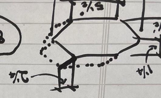
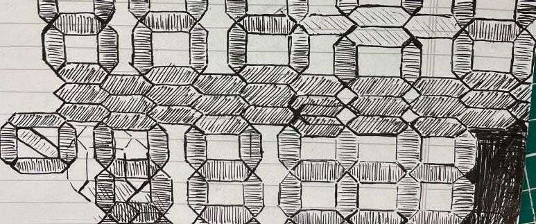
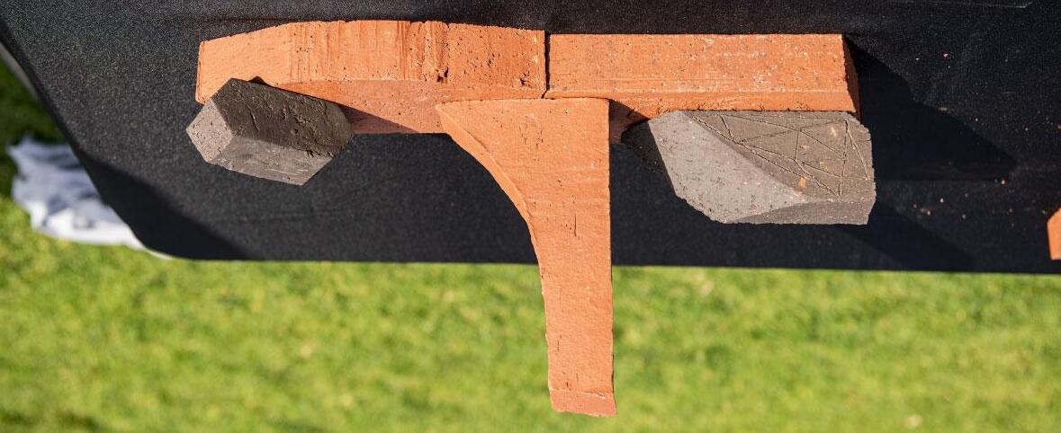
The concept our team created was built around hexagonal prisms due to the wonderful tiling hexagons are capaple of. The variety of the patterns that can be created with hexagons, such as those demonstrated below, dovetails well with the dynamism and flexibility of brick as a material for architectural practice.
The concept our team created was built around hexagonal prisms due to the wonderful tiling hexagons are capaple of. The variety of the patterns that can be created with hexagons, such as those demonstrated below, dovetails well with the dynamism and flexibility of brick as a material for architectural practice.


Aki Goonetilleke
Ash Pacheco
Jason Hoang Ha
Nico Cloarec
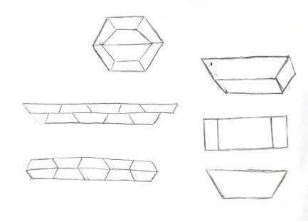
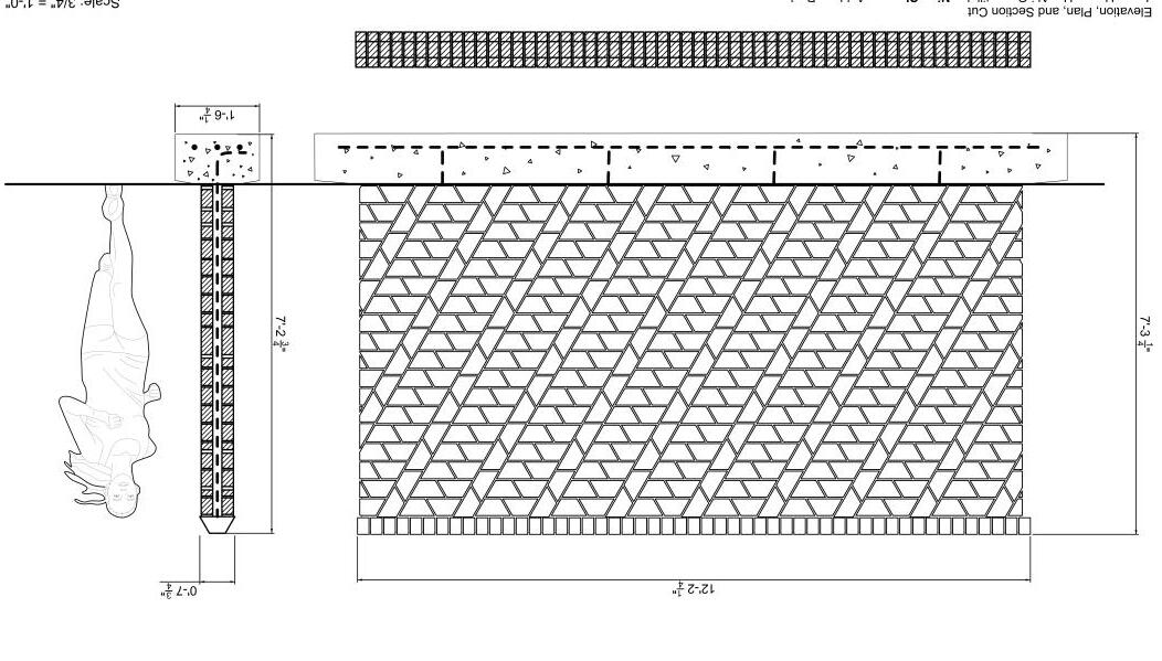
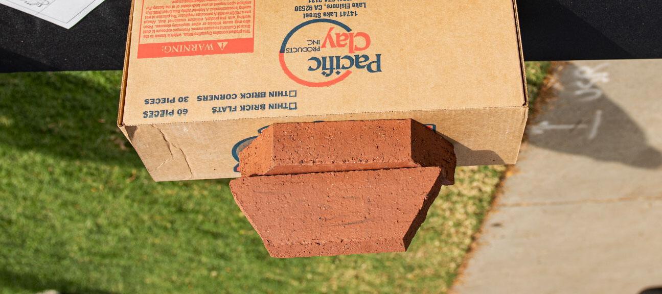
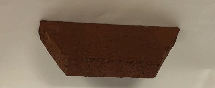
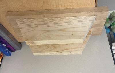
The essence of our brick design centers on the deliberate incorporation of the trapezoidal shape. This geometric choice serves a dual purpose, enhancing structural integrity and contributing to visual appeal. Structurally, the trapezoid’s effectiveness lies in its interlocking mechanism, mitigating potential issues like wall displacement and structural vulnerabilities which allows for many different confi gurations. This versatile brick design fi nds application in both screen walls, facilitating optimal airfl ow and light diffusion, and solid walls, simultaneously providing privacy and reinforcing structural stability.



Miguel Castellanos
Miguel Castellanos
Dillan Watson
Dillan Watson
Sharo Perez de Pablo
Sharo Perez de Pablo
Avril Pacheco
Avril Pacheco
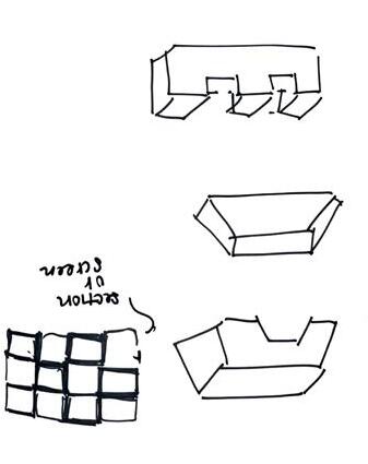
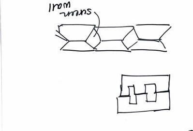
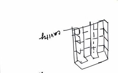
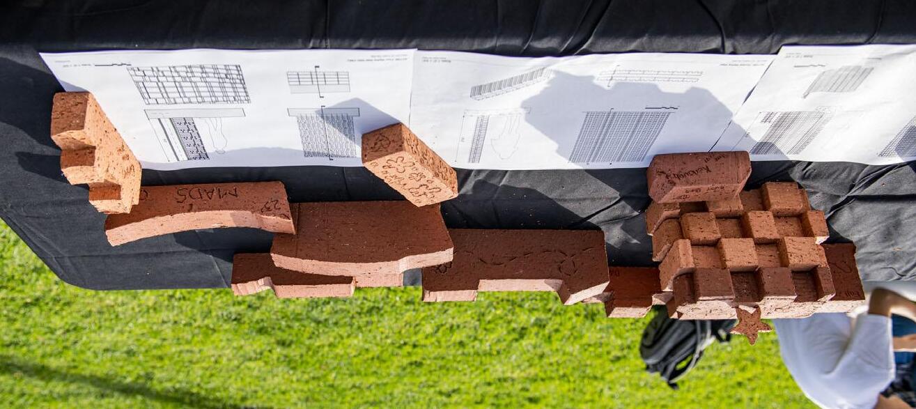
Our main idea for this brick design was to create a shape that was simple and flexible in how it can be arranged. We chose this lego shape as our final design because it creates depth within the wall by alternating between cavities and extrusions. We could also create pattern where the bricks aren’t aligned from top to bottom but alternate to create a checkerboard design. Additionally , when designing this wall we thought of how it could work as a screen wall if rotated to sit on its smooth edge. The screen wall would provide small square openings between the interior and exterior while also letting in just enough light to create a comfortable space inside.
Our main idea for this brick design was to create a shape that was simple and flexible in how it can be arranged. We chose this lego shape as our final design because it creates depth within the wall by alternating between cavities and extrusions. We could also create pattern where the bricks aren’t aligned from top to bottom but alternate to create a checkerboard design. Additionally , when designing this wall we thought of how it could work as a screen wall if rotated to sit on its smooth edge. The screen wall would provide small square openings between the interior and exterior while also letting in just enough light to create a comfortable space inside.

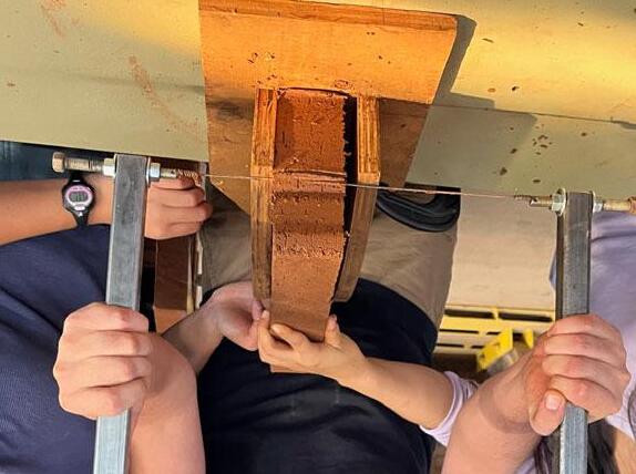
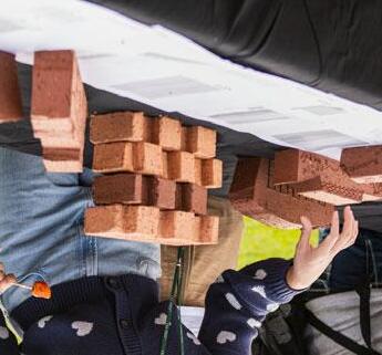
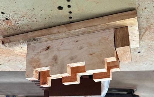

Yuritzy Padilla
Yuritzy Padilla
Rutvi Parikh
Rutvi Parikh
Tasia Nguyen
Tasia Nguyen
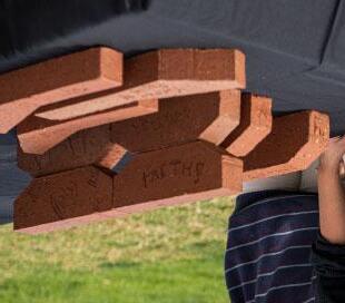
Faith Miller
Miller
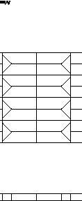
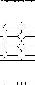
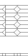
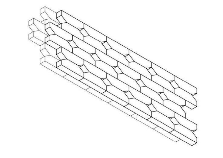
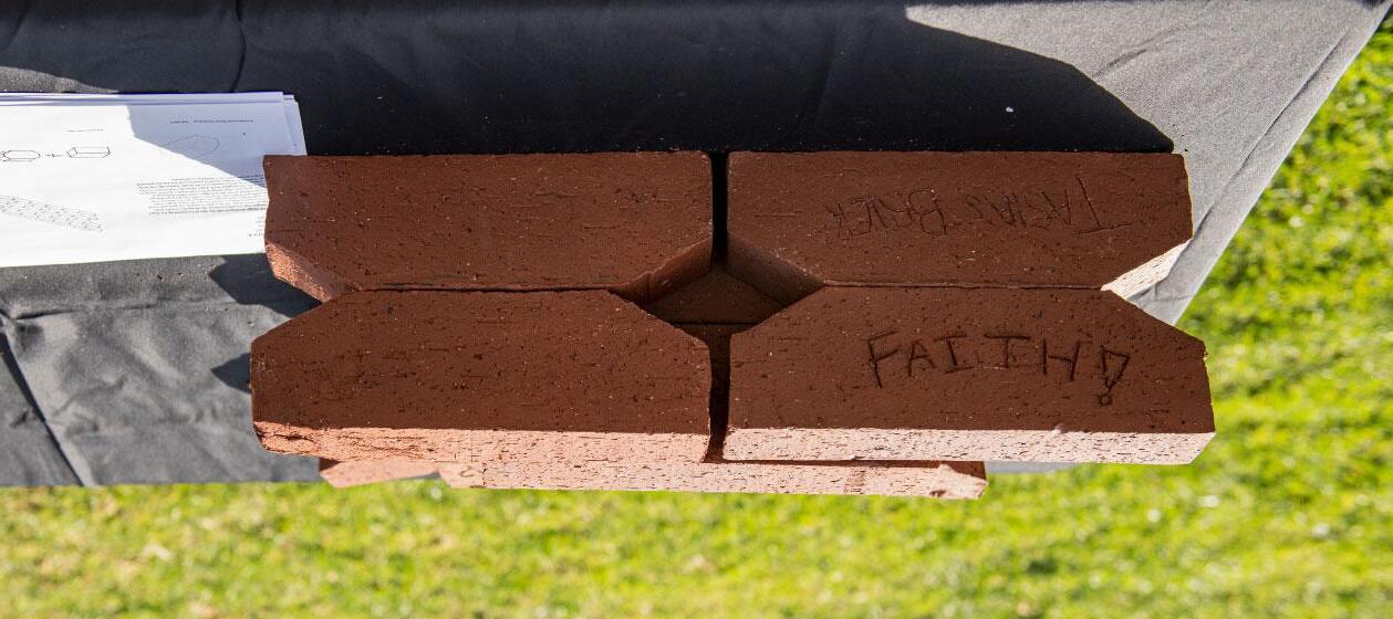
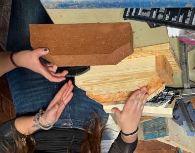
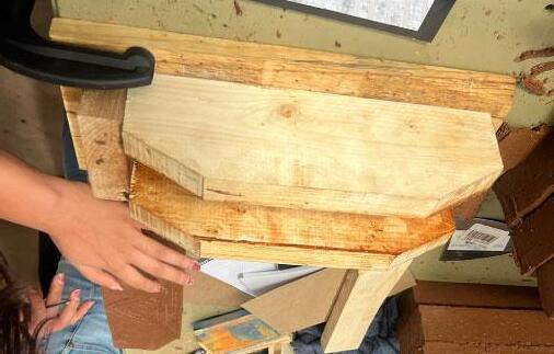
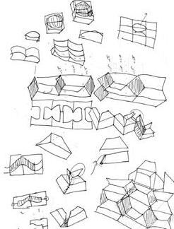
Our brick design developed with the idea of incorporating the shape of a pentagon into a traditional brick. By slicing the corners of the rectangular brick shape, we were able to achieve our goal and reveal numerous opportunities in which our specific brick shape could inspire wall designs. Our design was intended to be used for both screen walls and solid walls. In screen walls, the openings that are derived as a result of our slanted edges create either diamond or triangular apertures, depending on how the brick is stacked. Similarly, in solid walls, the irregular brick shape allows the wall to have texture that may serve to attract attention to the facade. Essentially, our brick design is meant to inspire limitless patterns and also has the potential to bring a unique aspect to a building composition.
Our brick design developed with the idea of incorporating the shape of a pentagon into a traditional brick. By slicing the corners of the rectangular brick shape, we were able to achieve our goal and reveal numerous opportunities in which our specific brick shape could inspire wall designs. Our design was intended to be used for both screen walls and solid walls. In screen walls, the openings that are derived as a result of our slanted edges create either diamond or triangular apertures, depending on how the brick is stacked. Similarly, in solid walls, the irregular brick shape allows the wall to have texture that may serve to attract attention to the facade. Essentially, our brick design is meant to inspire limitless patterns and also has the potential to bring a unique aspect to a building composition.




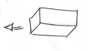
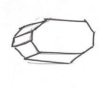

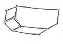
Formwork AxonometricConcept Sketches


Kate Hughes
Sophia Ralls
Andrew Bernard
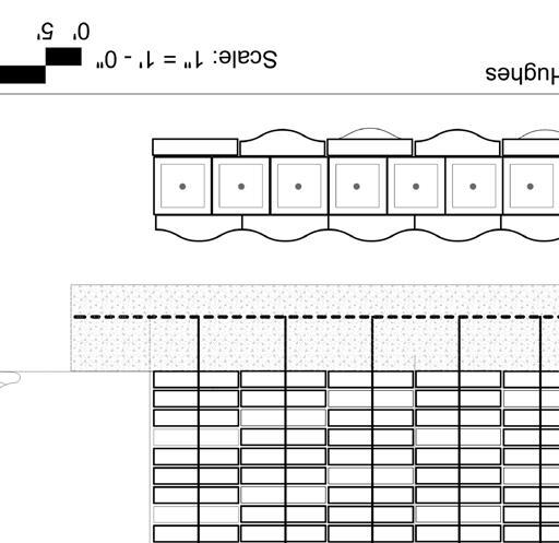
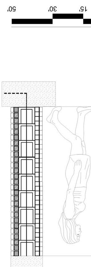
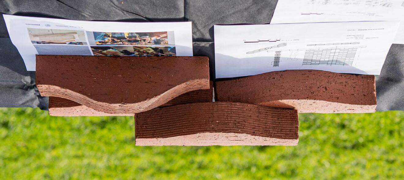
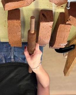
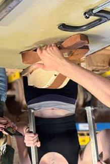
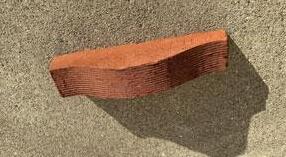
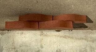
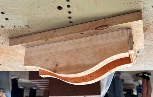
We chose to design this brick in a way that implies movement and juxtaposes the usual rectangular and ridgid form that a brick takes. We also designed the bricks so that they would look like one big wave when placed next to another. It also allows for an interesting tactile experience when one touches the bricks when aligned in a wall.
We chose to design this brick in a way that implies movement and juxtaposes the usual rectangular and ridgid form that a brick takes. We also designed the bricks so that they would look like one big wave when placed next to another. It also allows for an interesting tactile experience when one touches the bricks when aligned in a wall.
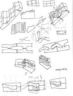
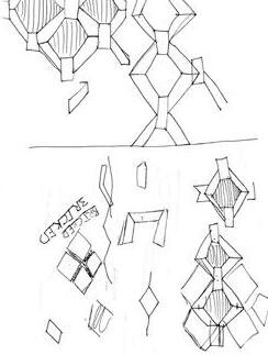

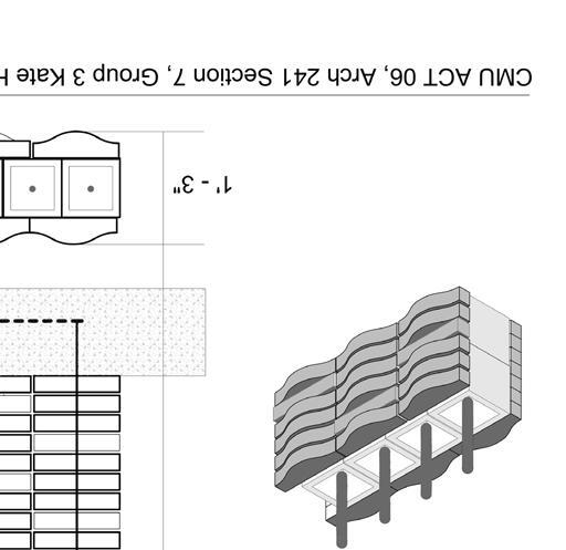

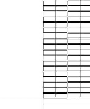
Wall ACT 06
Arch 241 Sec 07 Group 03Andrew Bernard
Scale: 1" = 1' - 0"
30' 15' 0'50' 5'

Maritza Gonzalez
Maritza Gonzalez
Thy Truc Ho
Thy Truc Ho Kovacevic
Alexis Kovacevic
Jose Sanchez
Jose Sanchez
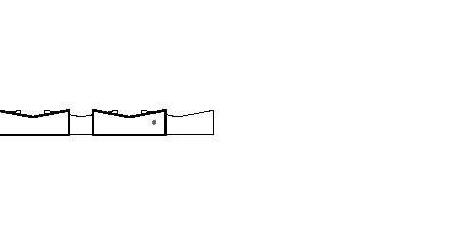
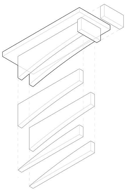
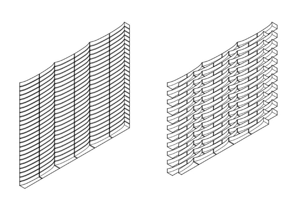
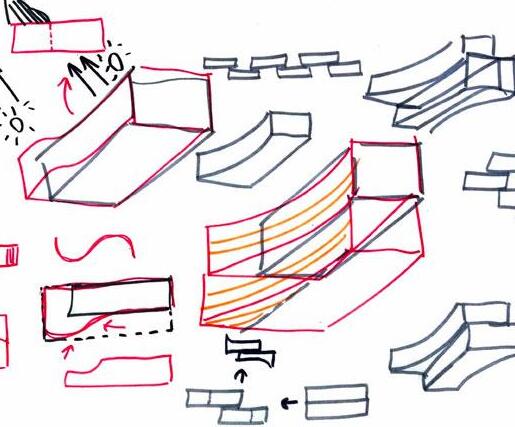
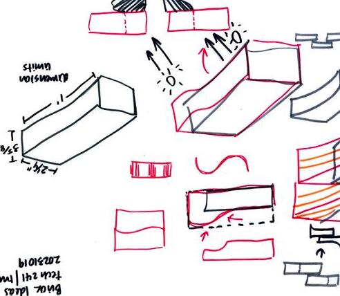
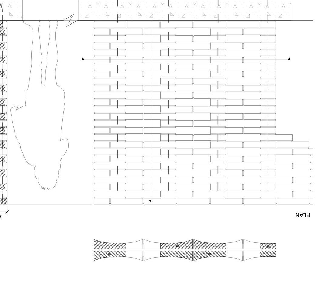
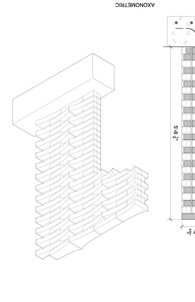
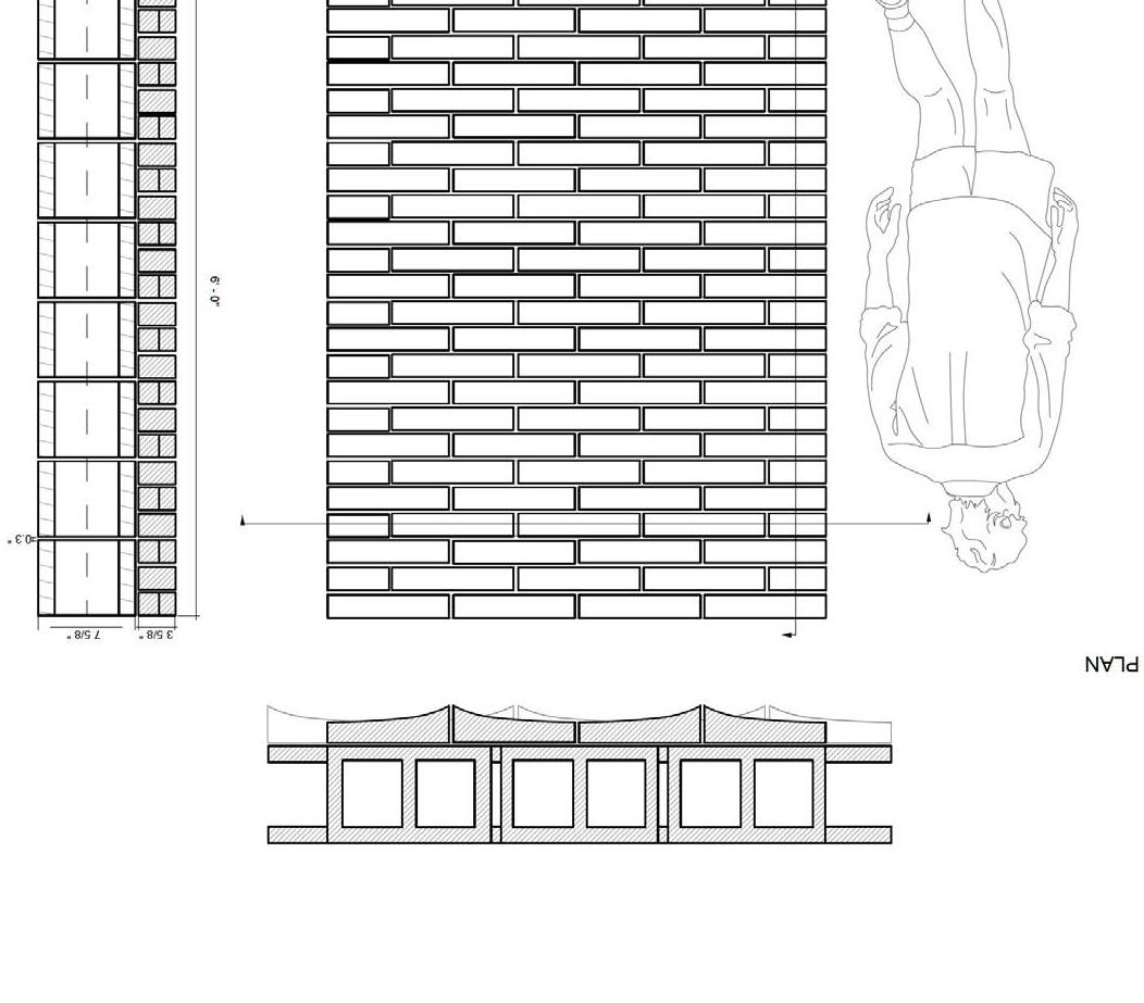
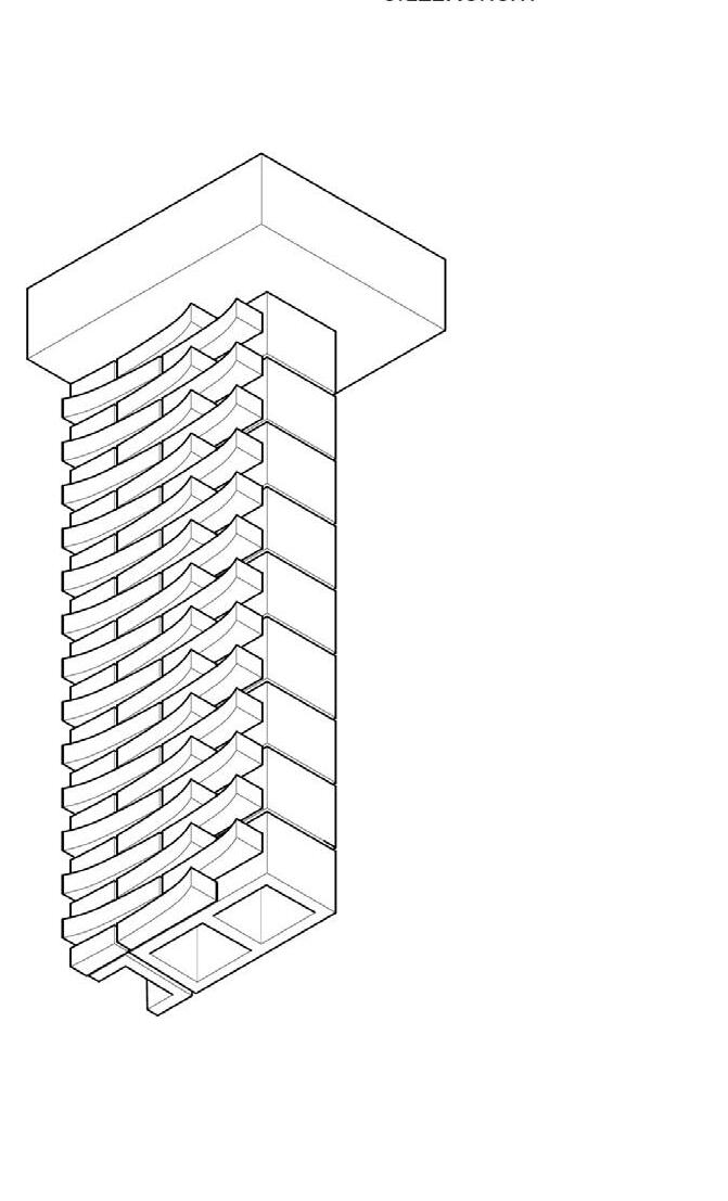
We wanted a versatile brick design that could be layered to create both simple and dynamic facades. So, we came up with a single curved face that goes along the side of the brick to create a gentle swoop. This design can be stacked to create a subtle wave effect, or layered to create a more dappled and engaging surface. This design could work with both a screen and solid wall.
We wanted a versatile brick design that could be layered to create both simple and dynamic facades. So, we came up with a single curved face that goes along the side of the brick to create a gentle swoop. This design can be stacked to create a subtle wave effect, or layered to create a more dappled and engaging surface. This design could work with both a screen and solid wall.



Caroline Parker
Caroline Parker
Jake Lima
Jake Lima
Jax Stutz
Jax Stutz
Maria Reyes
Maria Reyes
Shruti Mankale
Shruti Mankale
Utilizing subtraction methods to create gaps in the brick and overall form a veneer wall or semi-permeable wall that allows gaps of light through it.
Utilizing subtraction methods to create gaps in the brick and overall form a veneer wall or semi-permeable wall that allows gaps of light through it.
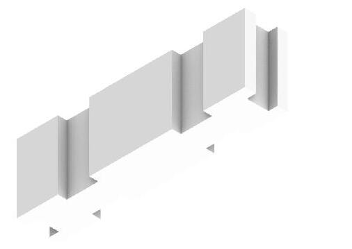
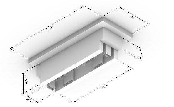
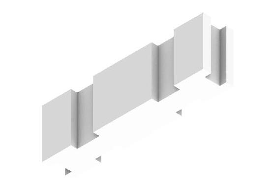

Axonometric diagram of brick assembly (ACT 04/05). PDF with simple shading and white background

Axonometric drawing of form (use template provided in ACT 04, Part 02). PDF simple shading and white background
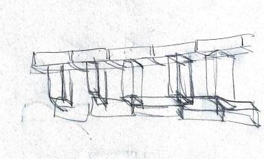
Concept sketches/diagrams. You can use photographs from your sketchbook. Strive for clear images without a lot of background.


Lizzy Maharas
Eduardo Lopez
Victor Lucas
Maria Sahakyan
Catherine Tonnu
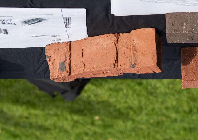
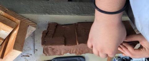
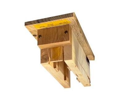
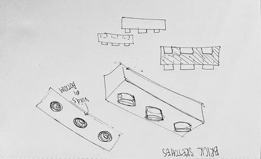
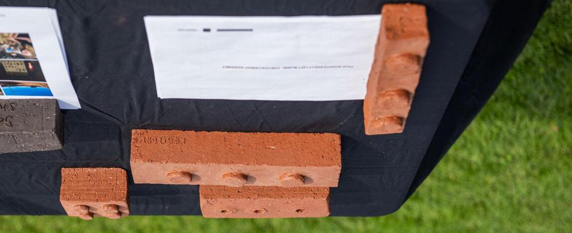
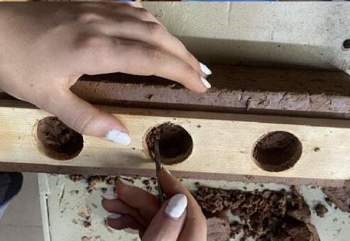
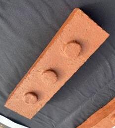
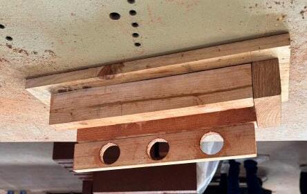
Our brick design is based on the design of a Lego brick, because our group agreed that using lego bricks as a child impacted us and was one of the factors that inspired us to become architects. We decided that making a real life lego brick would be a super cool and funny thing to have, because it is literally a brick, unlike the normal plastic legos (it is also much larger than a lego brick). Because of the three knobs on the top of the brick, it can be used to stack to make some interesting walls like a curving wall, without the use of mortar, though mortar still could be used if desired for extra stability.
Our brick design is based on the design of a Lego brick, because our group agreed that using lego bricks as a child impacted us and was one of the factors that inspired us to become architects. We decided that making a real life lego brick would be a super cool and funny thing to have, because it is literally a brick, unlike the normal plastic legos (it is also much larger than a lego brick). Because of the three knobs on the top of the brick, it can be used to stack to make some interesting walls like a curving wall, without the use of mortar, though mortar still could be used if desired for extra stability.




1" = 1'

Ryan Thompson
Ryan Thompson
Maria Rangel
Maria Rangel
Josh Kim
Josh Kim
Abraham Azcona
Abraham Azcona
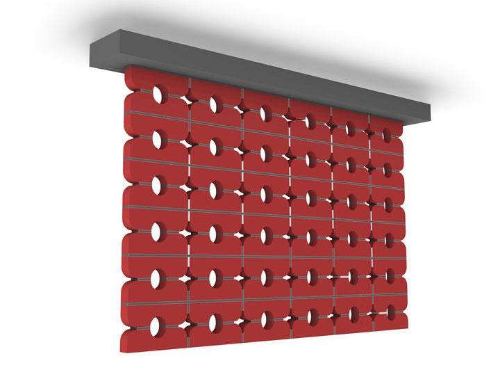
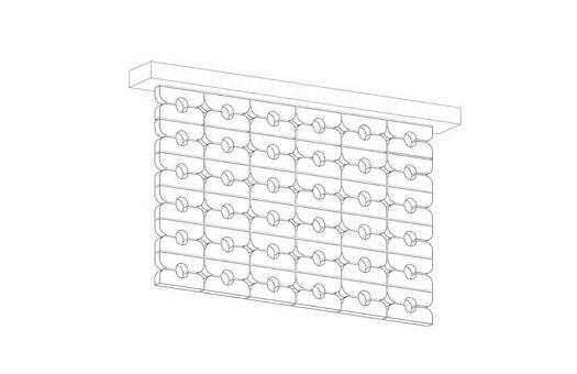
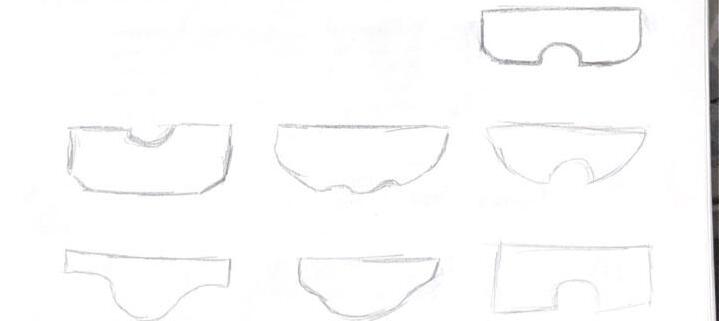
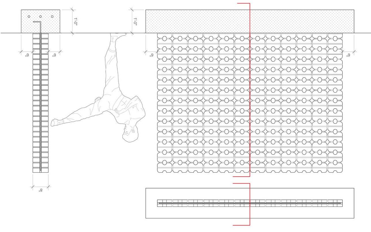
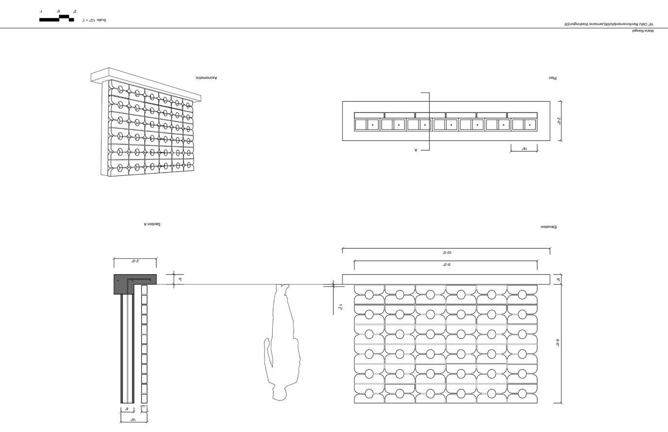
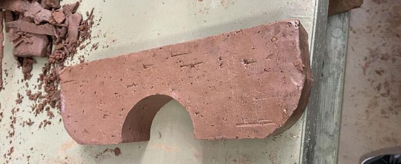
The idea behind this design was to create a brick wall that would allow for sunlight, but also have distinct curves that would create a curvalinear wall. The idea is to avoid covering these holes, hence, a screen wall would perahps work best for the design. However, all the other wall options can also work.
The idea behind this design was to create a brick wall that would allow for sunlight, but also have distinct curves that would create a curvalinear wall. The idea is to avoid covering these holes, hence, a screen wall would perahps work best for the design. However, all the other wall options can also work.


McKenna Winzenz
Samantha Victoria
Ella Sylvester
Jose Flores
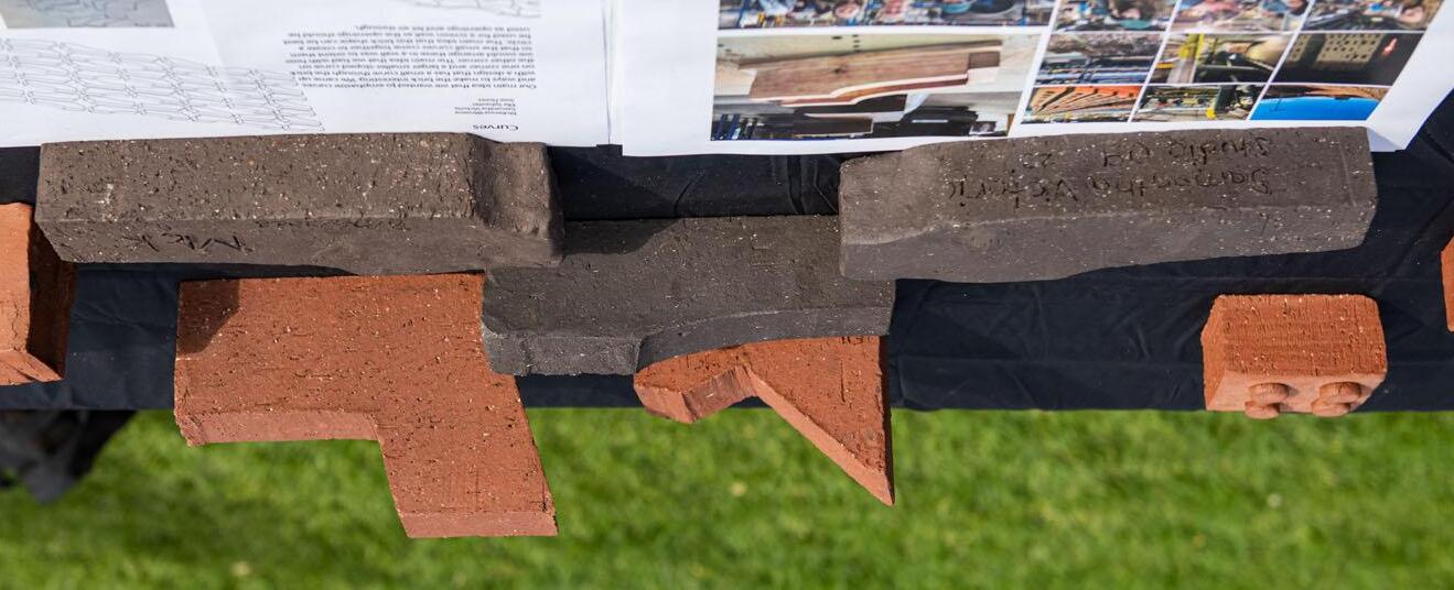
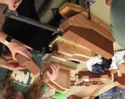
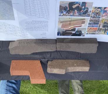
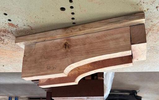
Our main idea that we wanted to emphasize curves and ways to make the brick interesting. We came up with a design that has a small curve through the brick on one corner and a larger smallersloped curve on the other corner. The main idea that we had with how we would arrange these in a wall was to orient them so that the small curves come together to create a circle. The main idea that this brick shape can be best be used for a screen wall as the openings should be used as openings and let air through.


Gonzalo Vazquez Vela Nova
Alexa Vasquez
Claire Enright
Jarrell Ramos
Gonzalo Vazquez Vela Nova
Alexa Vasquez
Claire Enright
Jarrell Ramos
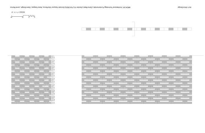
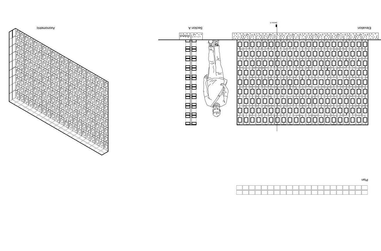
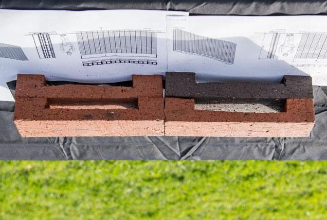
Our initial idea on our brick design was to create something simple and sleek yet effective in allowing light through when created into a wall. We really wanted to emphasize this when designing our garden wall concepts by orienting our brick in different patterns that would allow transparency but privacy.
Our initial idea on our brick design was to create something simple and sleek yet effective in allowing light through when created into a wall. We really wanted to emphasize this when designing our garden wall concepts by orienting our brick in different patterns that would allow transparency but privacy.
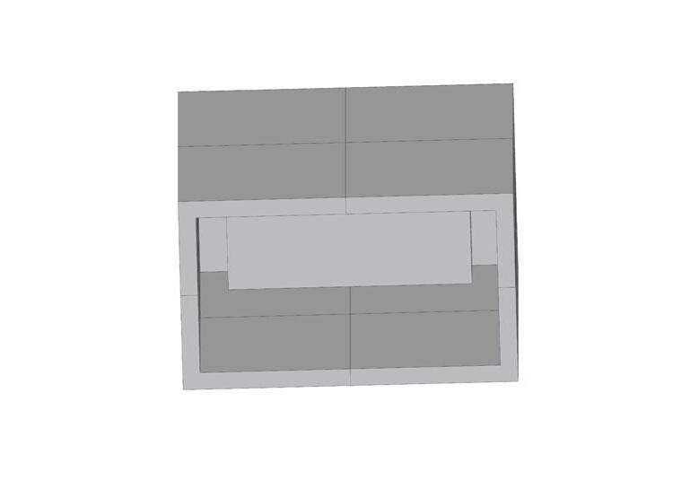


Aubrey Goings
Aubrey Goings
Christopher Dinh
Christopher Dinh
Junie Carlos
Junie Carlos
Collin Lamb
Collin Lamb
Our brick design was chosen because it is a simple, yet effective way to add depth, dimensionality, and interesting wall lighting opportunities. It can be stacked in a reminiscence of a checker pattern, areas of extrusions, and unplanned variety; the wall’s appearance is in the eye of the designer. As a solid wall, it adds interesting texture. For a screen wall it works well and adds further dimension that is not typically common
Our brick design was chosen because it is a simple, yet effective way to add depth, dimensionality, and interesting wall lighting opportunities. It can be stacked in a reminiscence of a checker pattern, areas of extrusions, and unplanned variety; the wall’s appearance is in the eye of the designer. As a solid wall, it adds interesting texture. For a screen wall it works well and adds further dimension that is not typically common.


Saundra O’Connor
Lucas Olney

Breanna
Sriya
Chen
Reddy


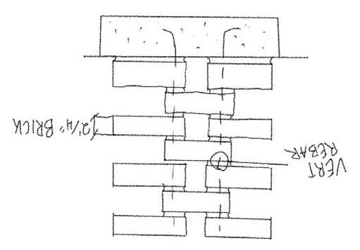
The initial idea of the brick was to make a simple yet versatile design that could be efficiently replicated. We wanted to create a brick that could create circular openings as well as rectangular openings in a screen wall and provide a textured appearance when used in a simple garden wall or reinforced wall.

We also wanted to shave off as little as possible from the volume of a standard brick to ensure wall stability during construction without much additional reinforcement required.





Danielle Bergstrom
Kieran Derrington
Max Dennison
Zach
Evans
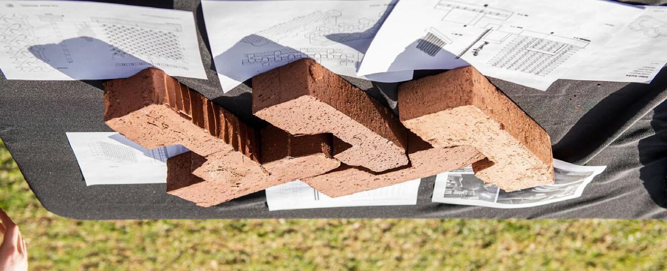
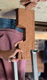
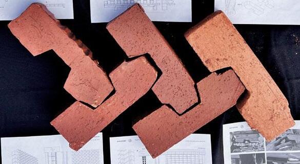
Our brick design, the inter-lock, challenged the traditional relationship between the individual masonry units. Rather than mortar and the weight of gravity being the primary joint, we saw an opportunity with this project to explore more diverse brick forms that could interlock--and therby be self-supporting. Capitalizing on their modularity and regularity, we designed a brick system (based on the allowances of the form-work provided) that, through one form, had effectively limitless applications in multiple orientations.
Our most radical design proposal can be seen to the right: a swirling, tower of bricks. Given its unique texture and channel for steel supports, this design fulfills both decorative and structural purposes. The following pages contain more traditional modes of construction, that, given the nature of the inter-lock brick, still have interesting apertures and a decorative capacity. For instance, see our double wythe and screen walls: by rotating the bricks 180 degrees about their long axis, the mouth on the side can change the direction of the lattice. In doing so, you can make walls with the inter-lock brick laying diagonal, horizontal, vertical, and more. The versatility of our brick is only limited by the imagination!


Kai
Iwasaki
Kai Iwasaki
Maddie Komatinsky
Maddie Komatinsky
Naama Mazor
Naama Mazor
Emma Wood
Wood
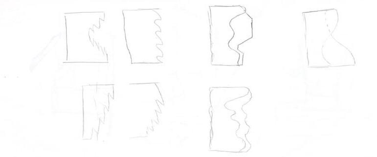
This projecct design focuses on its assembly, how the bricks relate to each other when being used for buildings and walls and how this effects user experience and perception. From all angles, the cutouts are able to be viewed and the diamond shapes made are emphasized. The cutouts allow for many different arrangements that can make other cutout shapes other than diamonds, including diagonal bowtie or even just a singluar triangle if assembled right. This design can be rotated, staggered, spaced out, and flipped, the options basically endless.
This project design focuses on its assembly, how the bricks relate to each other when being used for buildings and walls and how this effects user experience and perception. From all angles, the cutouts are able to be viewed and the diamond shapes made are emphasized. The cutouts allow for many different arrangements that can make other cutout shapes other than diamonds, including diagonal bowtie or even just a singluar triangle if assembled right. This design can be rotated, staggered, spaced out, and flipped, the options basically endless.
This specific design focuses on ease and simplicity in the early steps of brick making and allows for more creativity when it comes to its installation, something else we really liked in our beginning stages of designing. It creates a really clean facade while staying away from being too boring, leaving us with this very particular geometric design.
This specific design focuses on ease and simplicity in the early steps of brick making and allows for more creativity when it comes to its installation, something else we really liked in our beginning stages of designing. It creates a really clean facade while staying away from being too boring, leaving us with this very particular geometric design.


Ethan O’Reilly
Kev Murphy
Ella Roosakos
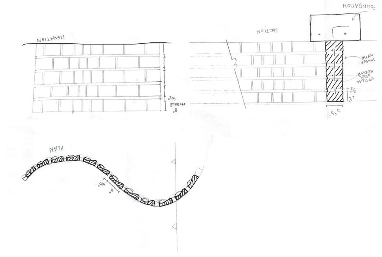
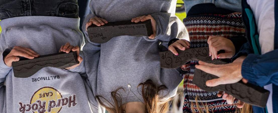
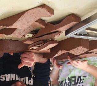
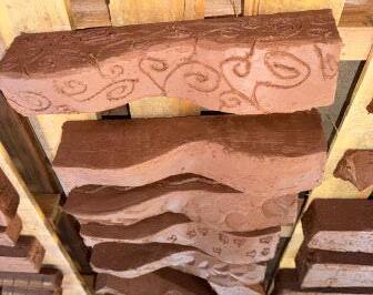
Our design focused on incorporating a fun wavy cut across the brick. Through this wavy cut, the aggregation of the brick creates a larger contrast between alteration of the orientation of the bricks. This creates asthetic comfort while simultaneously achieve the purpose of the brick.
Our design focused on incorporating a fun wavy cut across the brick. Through this wavy cut, the aggregation of the brick creates a larger contrast between alteration of the orientation of the bricks. This creates asthetic comfort while simultaneously achieve the purpose of the brick.




Trinity Carrizosa Francisco Orozco
Kristin Pham
Mila Vaish


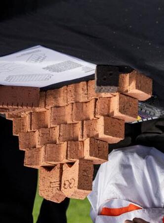
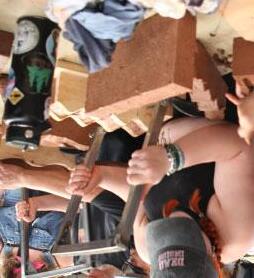
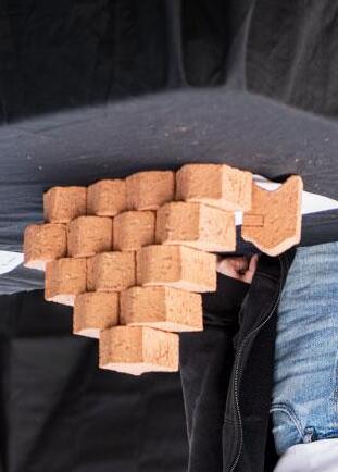
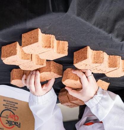
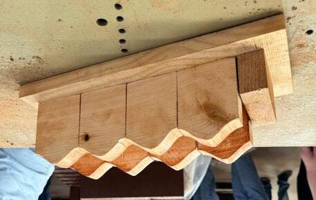
The initial idea for our brick design was to create smaller brick modules that could be configured in a variety of ways in order to create different levels of textured walls. This textured pattern comes from the wave-like pattern on each of the smaller brick modules. Since these wave cuts are also mirrored on the back of the brick, this textured pattern is also translated on the other side of the brick, which makes it best suited for facades. We have drawn the bricks in a way that shows them being offset at every singular module, however another design that can be produced with our brick system is to keep them all lined up so that the wave cuts flow much more smoothly across a solid wall. As for a screen wall, you can make groups of four or more brick modules and space these groups accordingly to mak the voids in the screen as big as you would like. The offset and more smooth pattern both work for this type of wall as well.









Yareli Vazquez
Yareli Vazquez
Destiny Do
Destiny Do
Paul Velasco
Paul Velasco
Genesis Donis
Genesis Donis
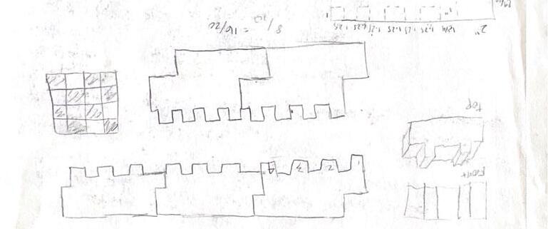
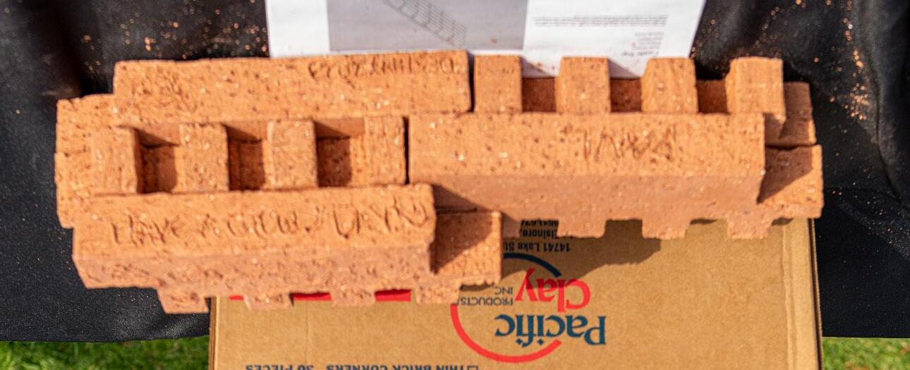
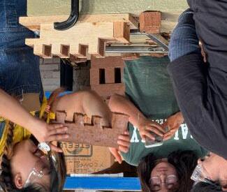
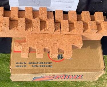
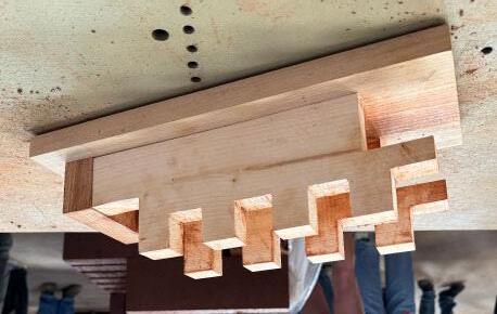
Our idea was to create a very chess-like pattern on the walls when placed together. The light seeps in or faces the bricks at a certain angle and recreates the pattern on the ground. It could be used while it’s laying down or standing up, with laying down preferred for a screen wall and standing up for a solid wall.
Our idea was to create a very chess-like pattern on the walls when placed together. The light seeps in or faces the bricks at a certain angle and recreates the pattern on the ground. It could be used while it’s laying down or standing up, with laying down preferred for a screen wall and standing up for a solid wall.


Zoe Klement
Klement
Juju Dru
Juju Dru
Dylan Jacobs
Dylan Jacobs
Lea Rocheleau
Lea Rocheleau
Cristina Towers
Cristina Towers
We wanted to create a brick that was wavy in form. This is atypical from a normal brick, and this was done on purpose. The wavy design allows for greater visual interest. We thought this brick was best used as a screen wall with voids between every brick. As a solid wall we would offset the waves so that the wall wasn’t a single wave - but has further depth.
We wanted to create a brick that was wavy in form. This is atypical from a normal brick, and this was done on purpose. The wavy design allows for greater visual interest. We thought this brick was best used as a screen wall with voids between every brick. As a solid wall we would offset the waves so that the wall wasn’t a single wave - but has further depth.




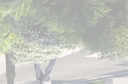

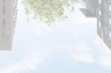
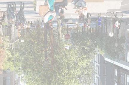
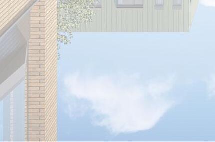
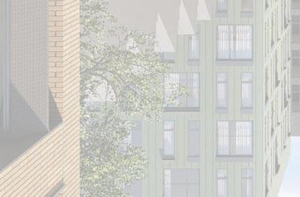
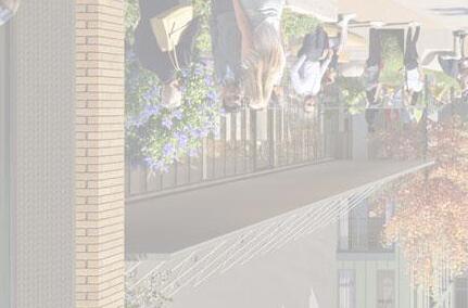
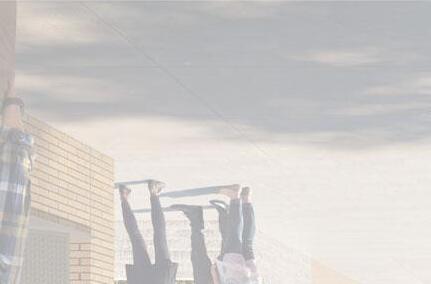
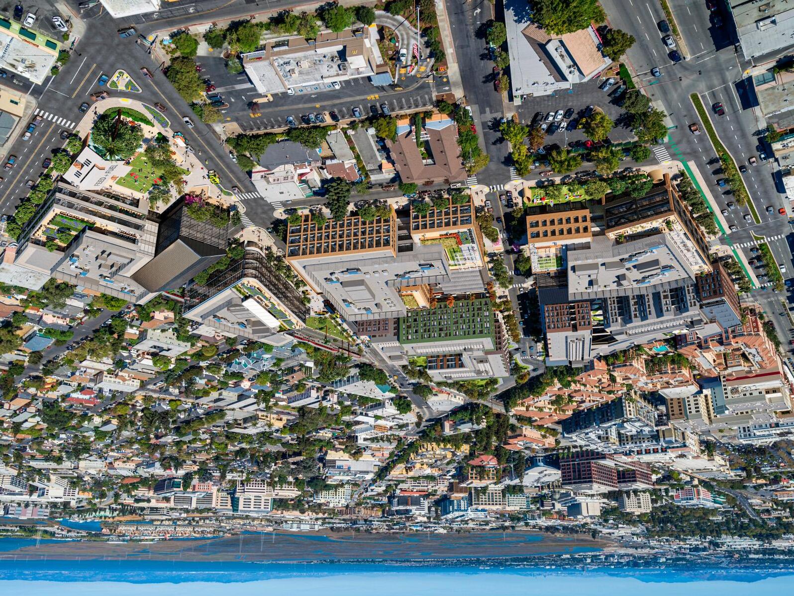
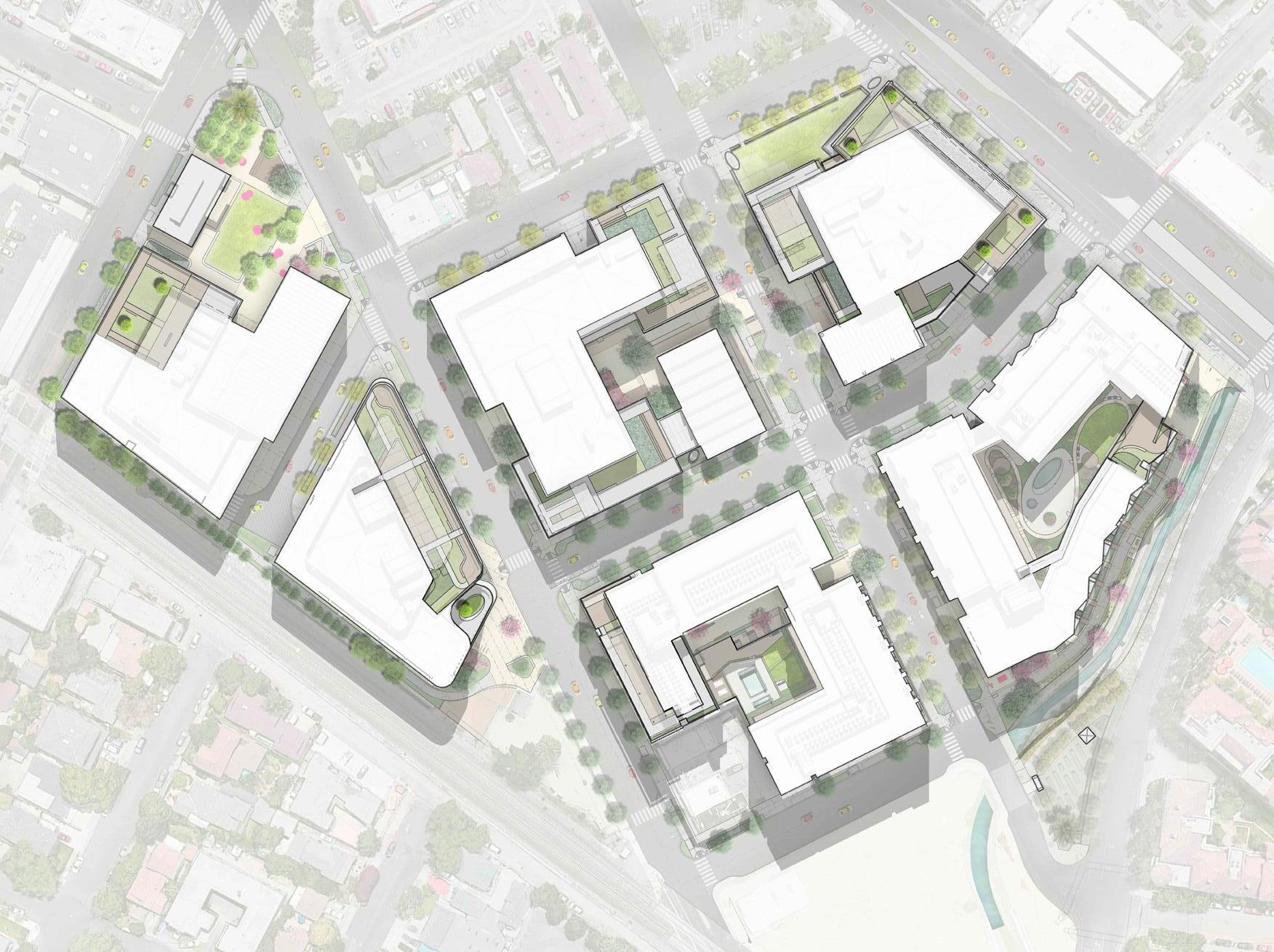
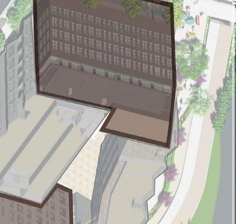
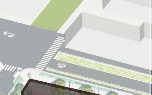
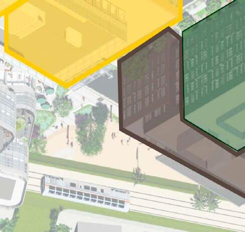
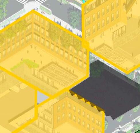
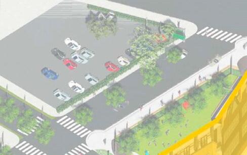
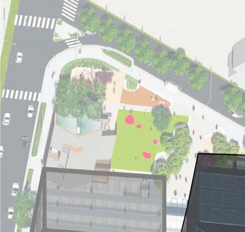
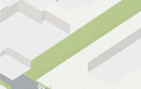
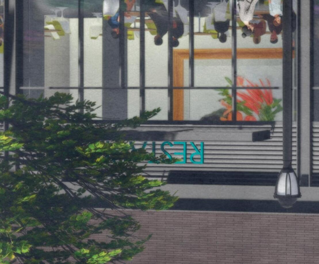
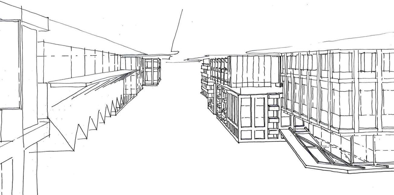
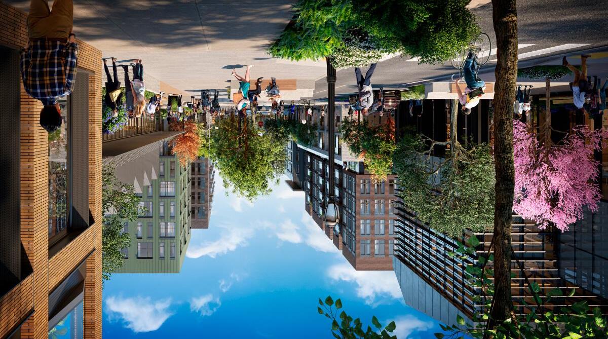
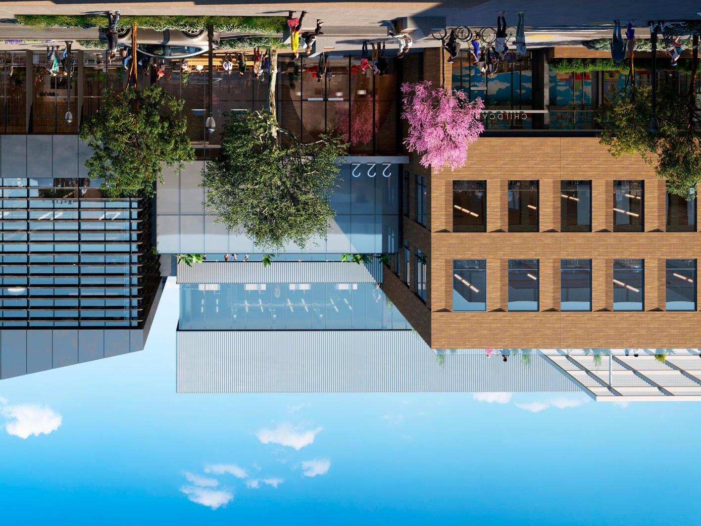
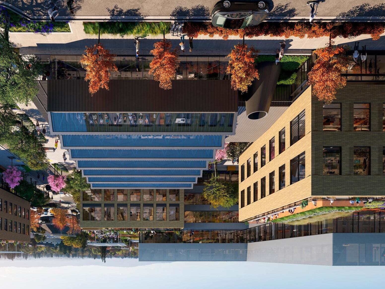
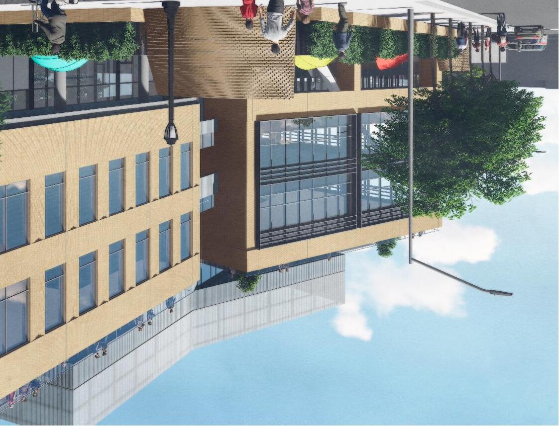
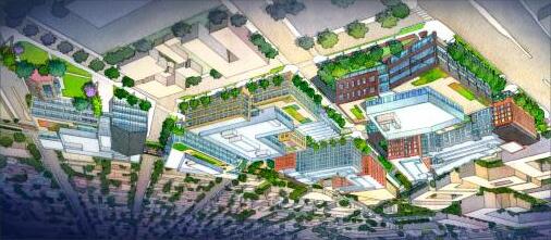
The Elco Yards mixed-use project is as much about urban design and making good streets as it is about architecture and making good buildings. Located just south of the higher-density downtown core, the project aims to extend the character of downtown to the south by creating a diverse set of buildings, whose massing is aggregated around a carefully composed set of public open spaces. The buildings are composed to step back along widened pedestrian landscape zones, with additional setbacks on upper floors for terraces that overlook the street. Other buildings form a backdrop to larger urban plazas, where retail, family entertainment, office and life science programs come together to enliven the street. The ground level of each building is designed with features to activate and animate the streetscape, including residential stoops, generous entry courts, urban-scale canopies and shade structures, and even break-out patios, which blur the boundary of public and private realm.
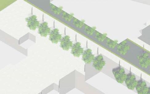
The landscape and streetscape design are calibrated to the different scales of public spaces across the project. Each of the main north-south streets running through the project has a unique identity, created through scale of the sidewalk, different plant and tree compositions, and different appointments in the larger open spaces that front on each street.
The architecture and material palette extends the idea of diversity further through the use of a broad range of façade materials and systems, giving the sense of a development built over time—not a singular campus. The design of each building strikes a balance between industrial heritage and modern abstraction. Timeless materials such as brick, concrete and steel are employed in a thoughtful set of details, paying special attention to texture, depth, rhythm and proportion. The end result is a rich architectural experience that can only belong in Redwood City.
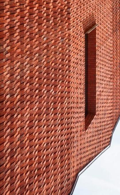
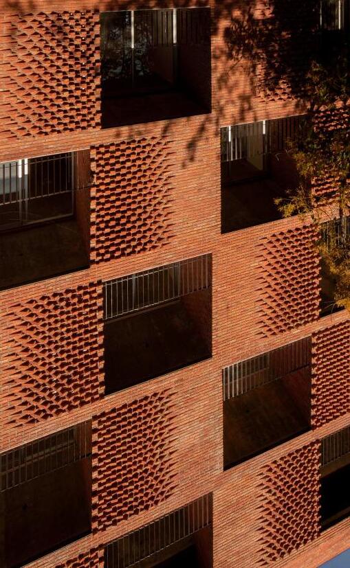
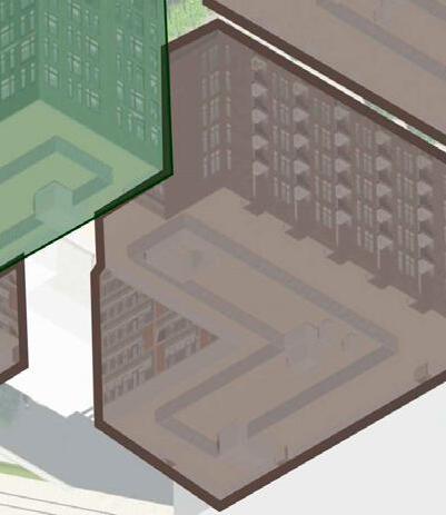
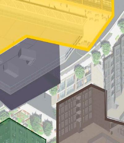
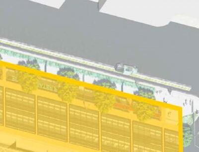
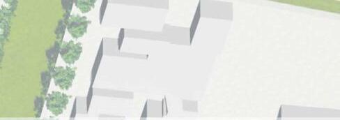
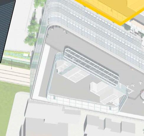
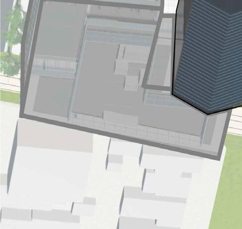
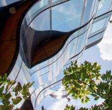
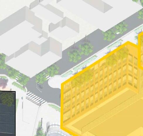
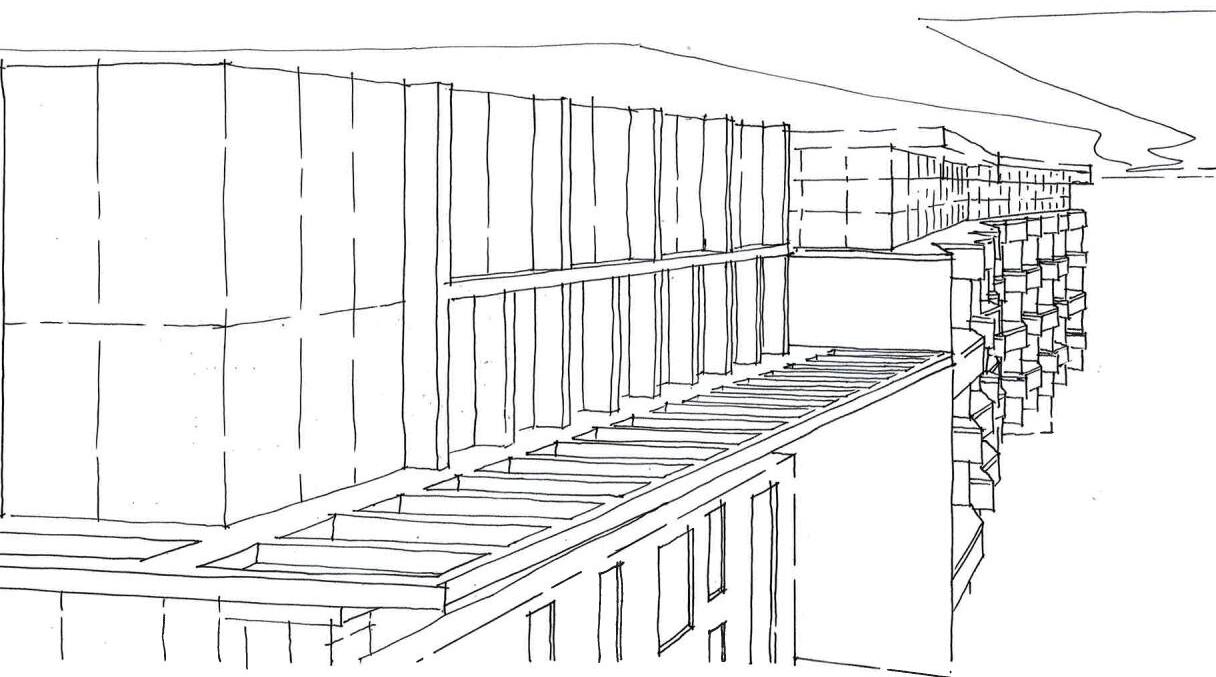
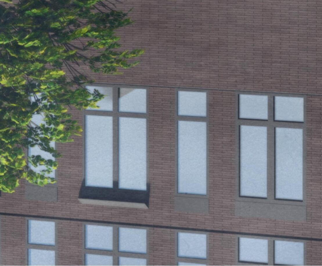
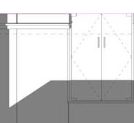
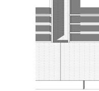
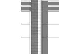
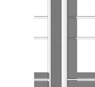
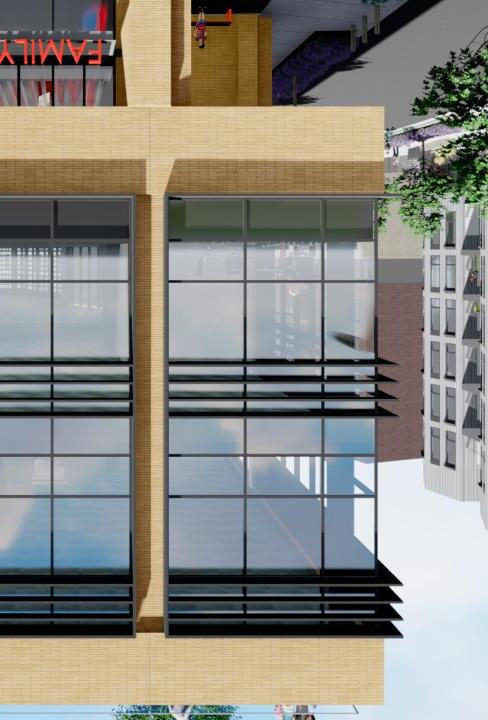
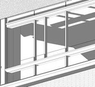
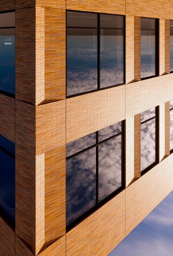
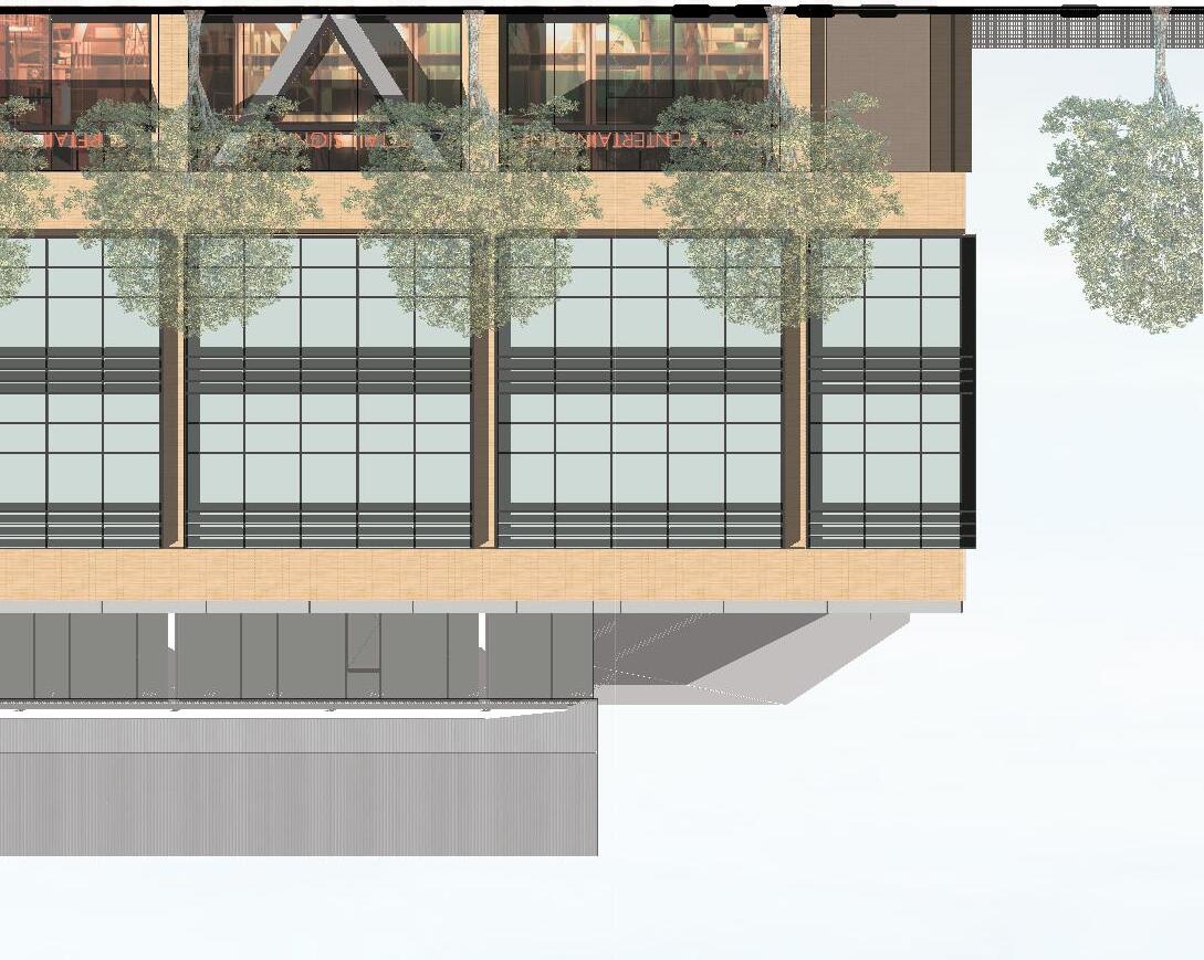
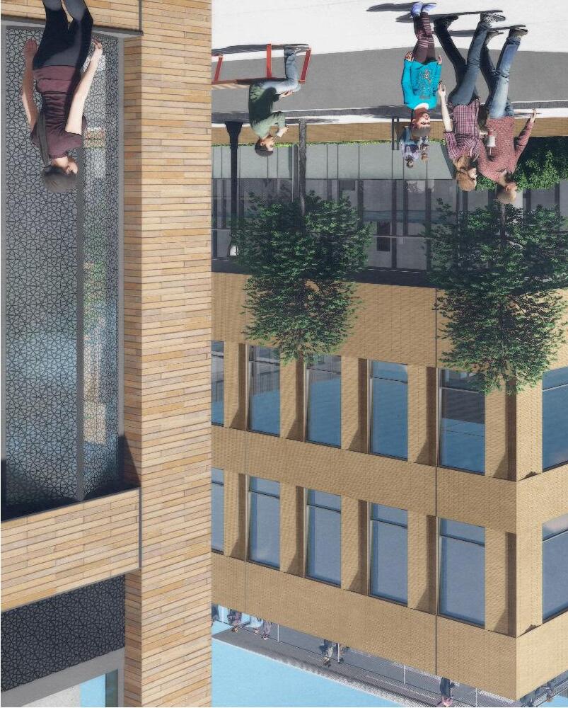
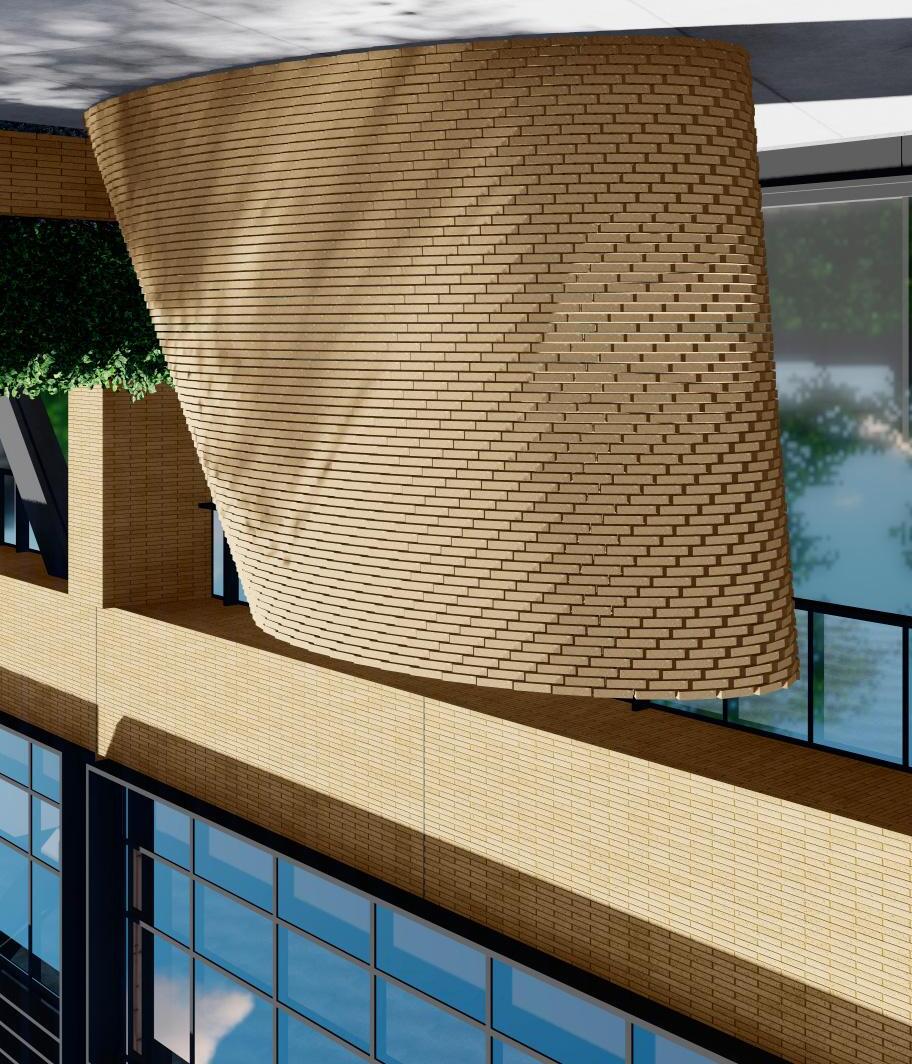
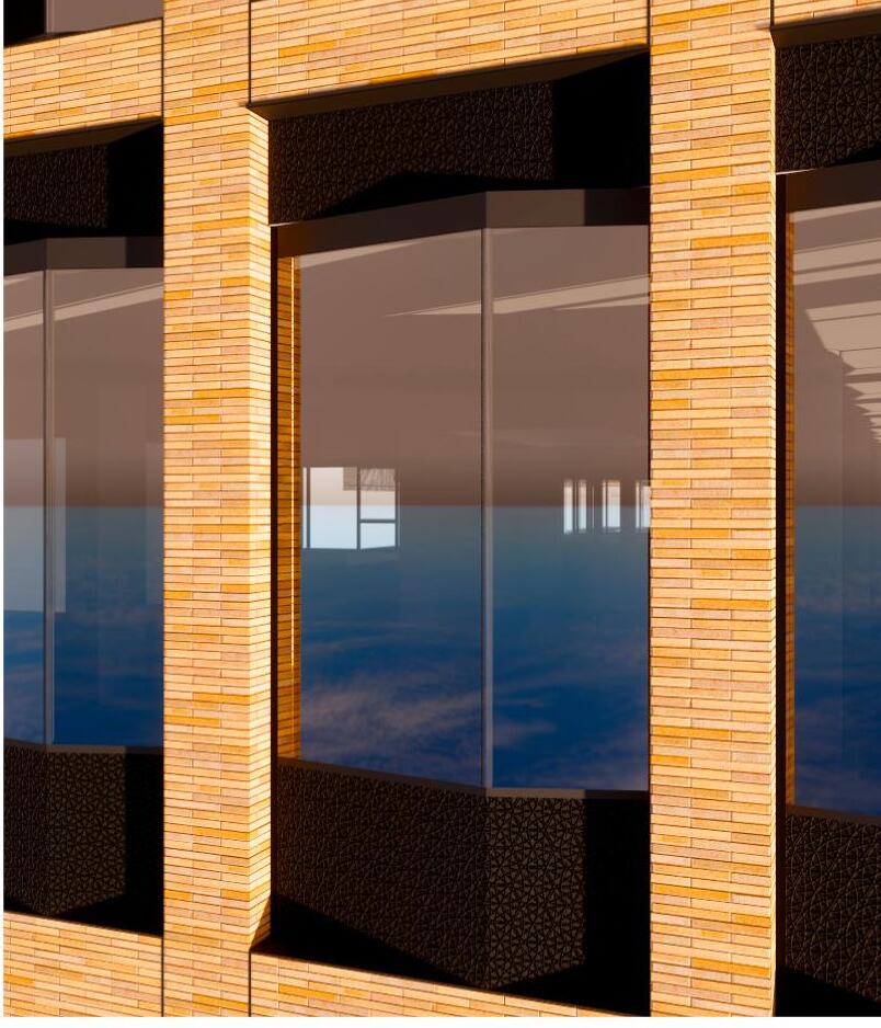
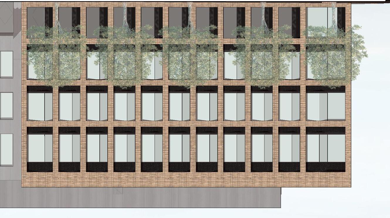
This chapter focuses on a portion of the project, with buildings where brick was used as the primary facade material. The decision to use brick veneer in precast concrete panels was made early in the design process. This allowed for buy-in from the numerous stakeholders on the project, including the client group, city and agencies, and the many contractors and subcontractors involved in the fabrication. The early decision also allowed for an extensive material research effort concurrent to the design phases. The project attempted to use 16” long veneer brick, with angled shapes, in a precast panel. This has never been done before.

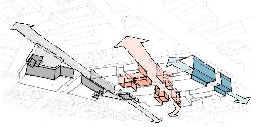
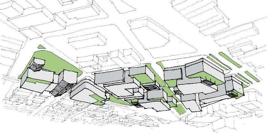
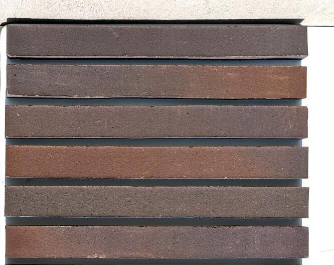
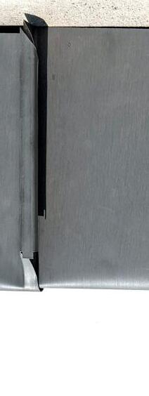
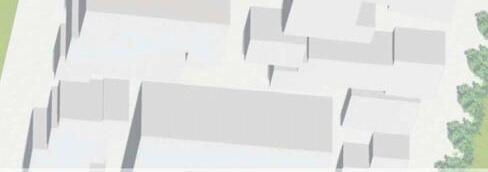
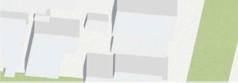
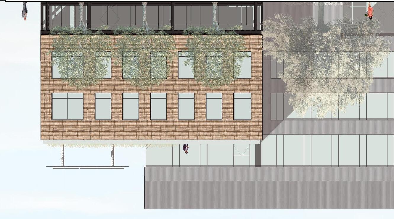
Each building in the project has a unique material palette, with some materials used across several buildings. This approach to material deployment is intended to unify the development as a neighborhood, while providing individual character and differentiation to each building. Brick materials are used across 4 different buildings, with subtle differences in color, texture and brick size from one building to the next.


Building E-N

es/diagrams

Building B

Building C

Building E-S
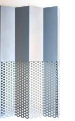
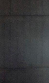
Building D
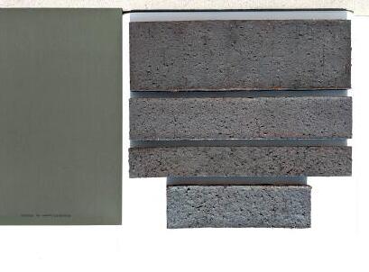
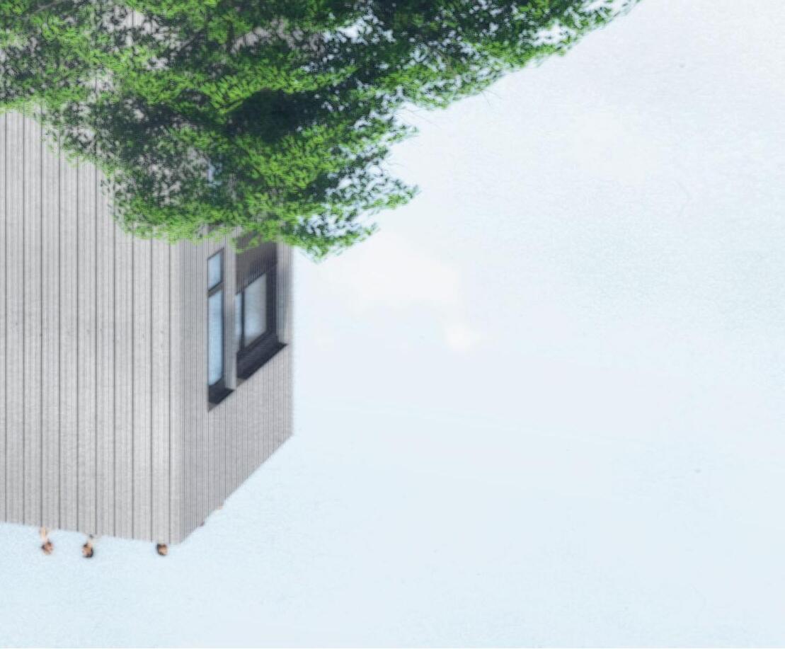
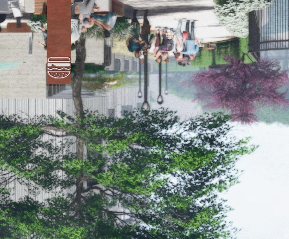
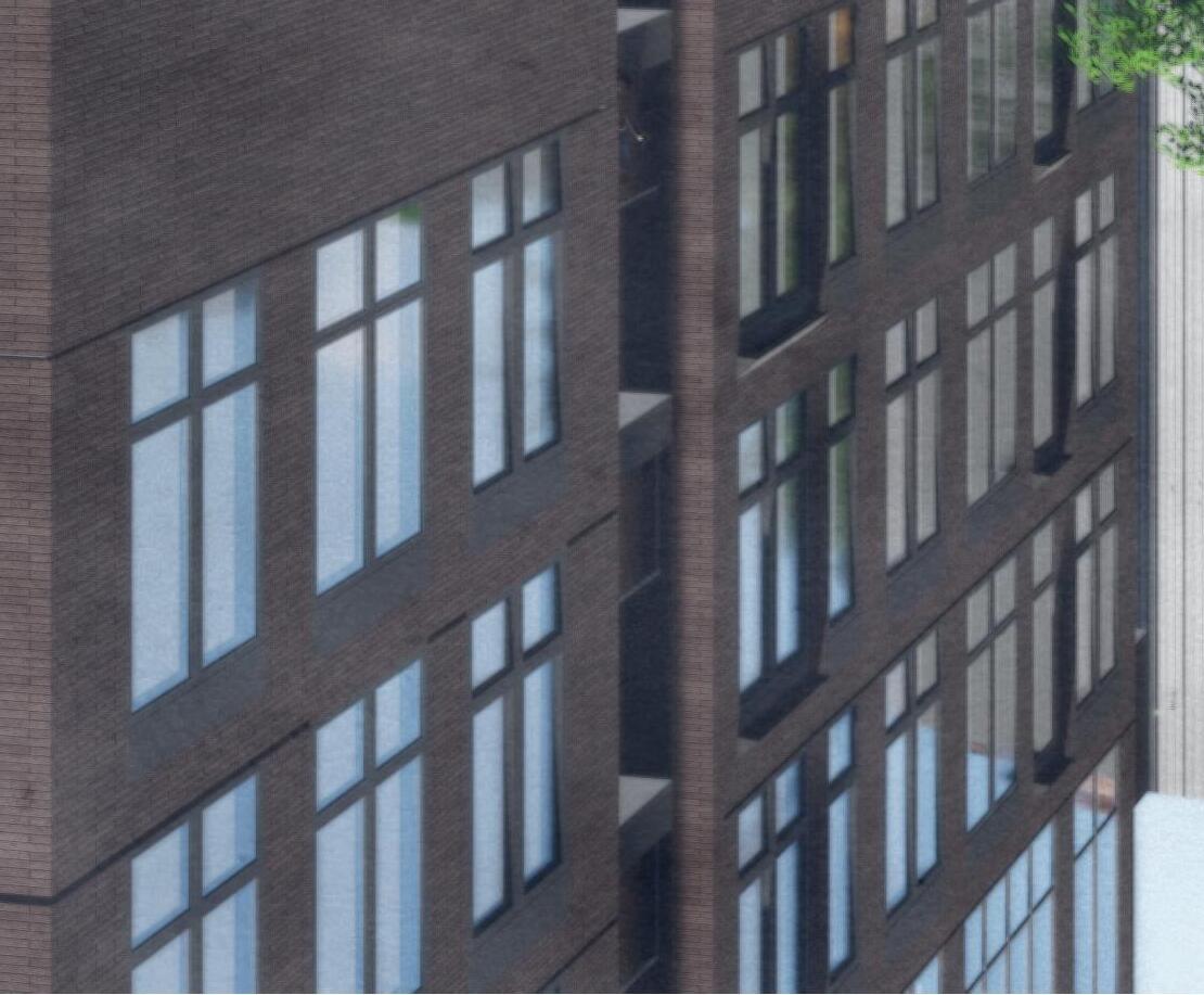
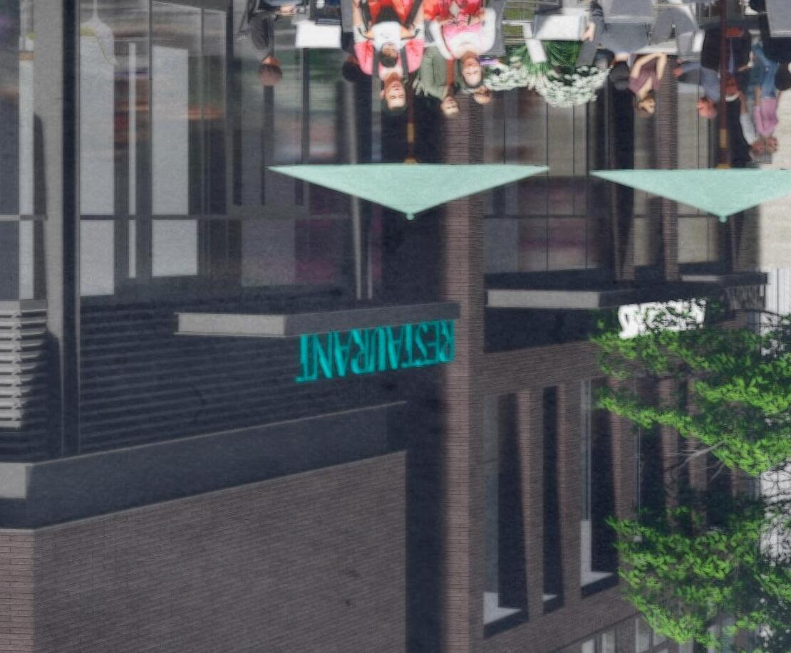




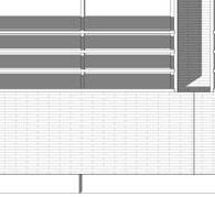

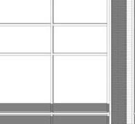
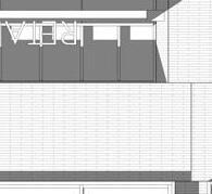
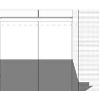

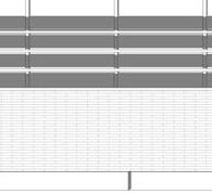


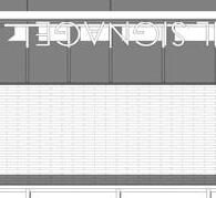

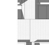
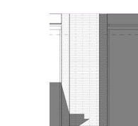

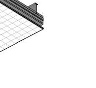
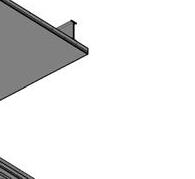

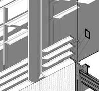
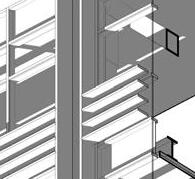
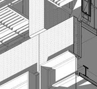
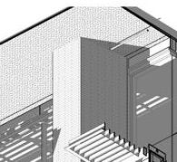
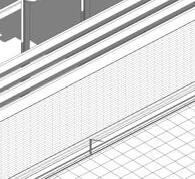
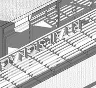
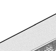
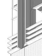
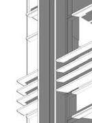
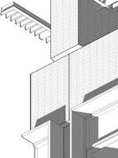
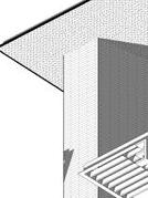



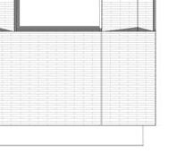
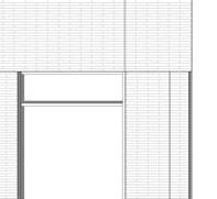
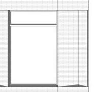
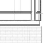
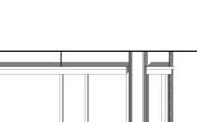

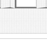
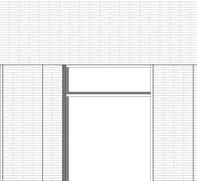
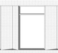

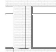
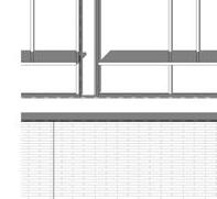


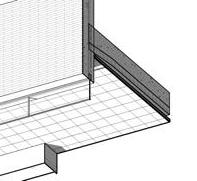
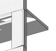
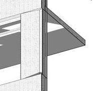
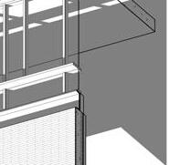
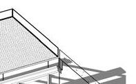
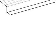
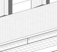
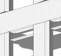
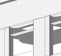
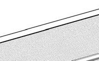

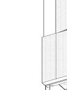
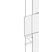
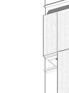
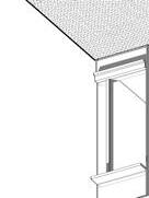
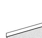


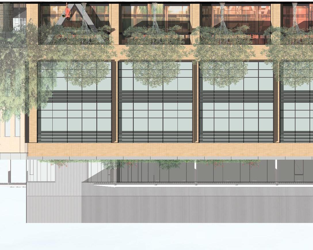
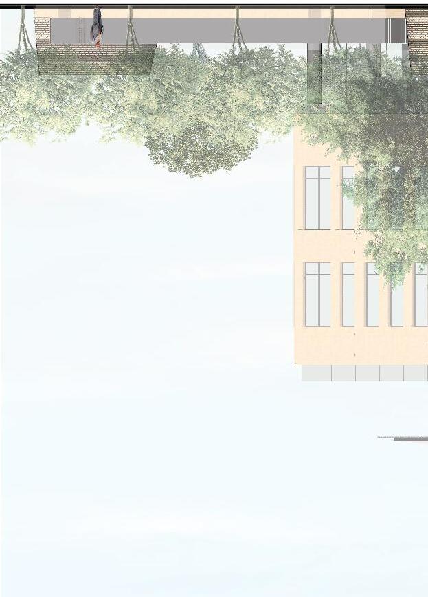
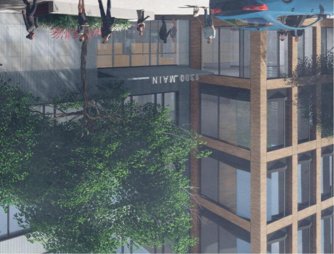

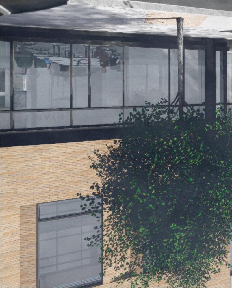

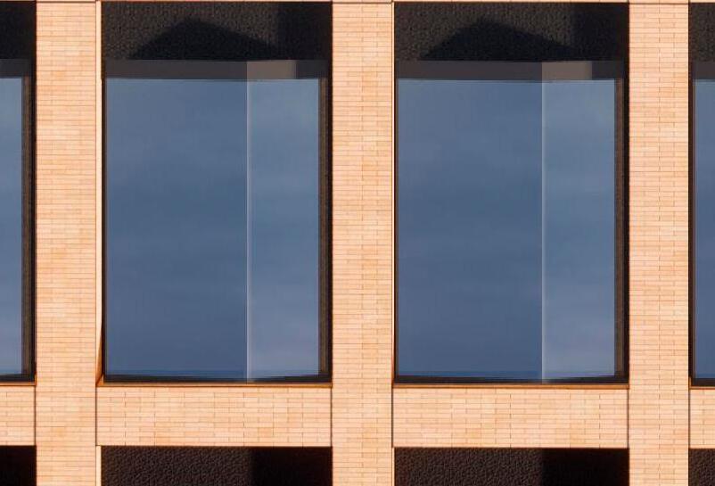
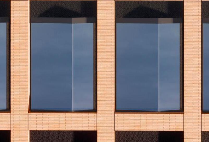
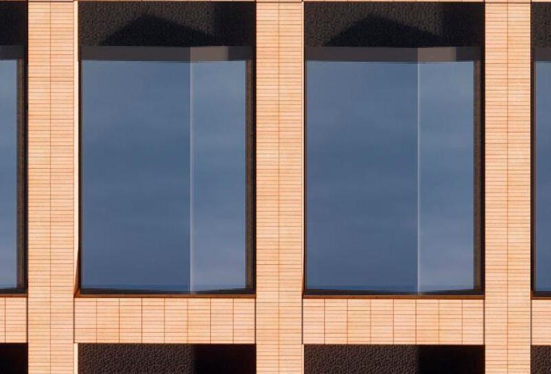
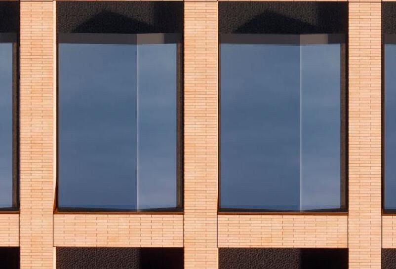
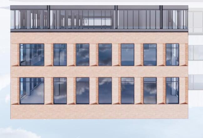
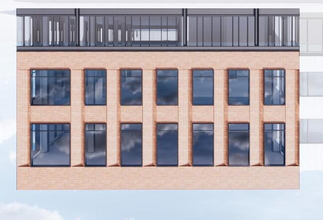
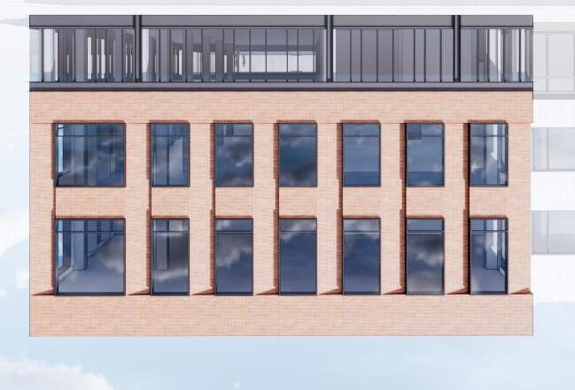
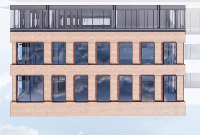

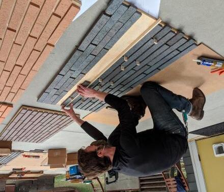
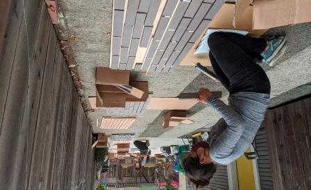
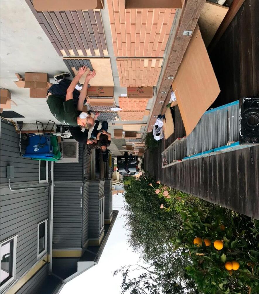
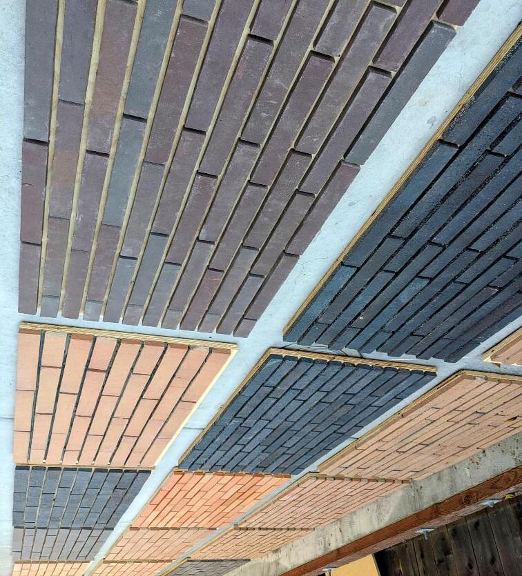
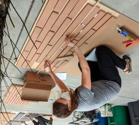
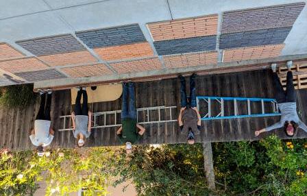

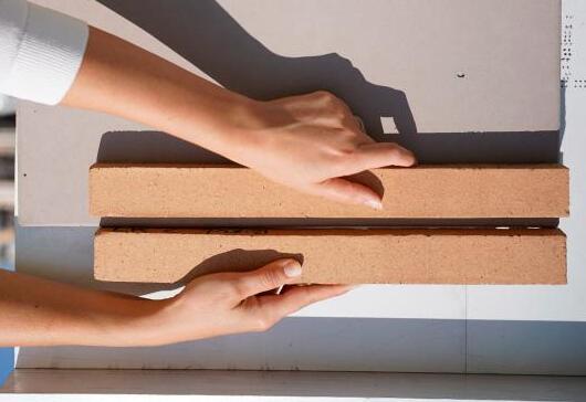
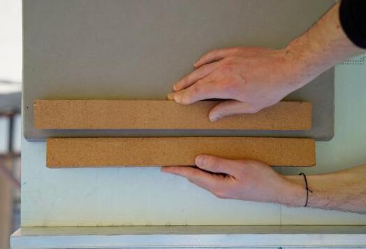
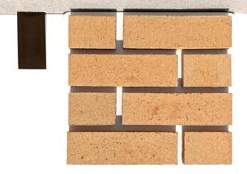
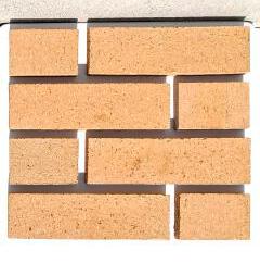
Later in design, after the brick color and size were confirmed, mortar color options were reviewed next
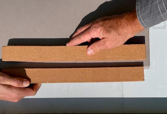
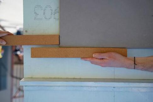
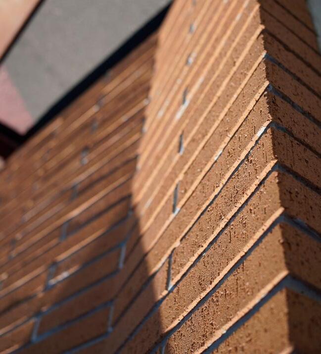
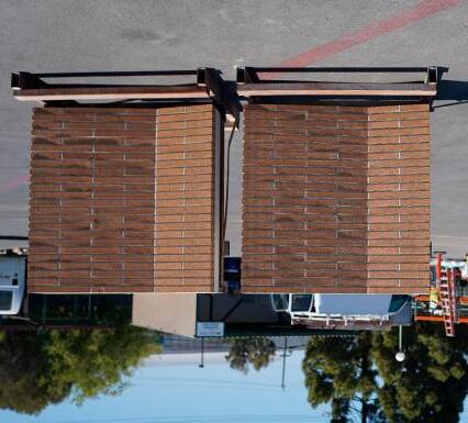
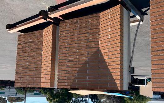

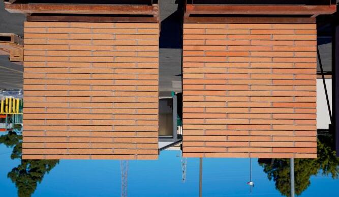
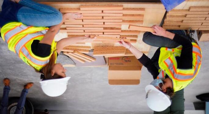
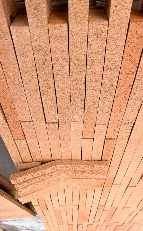
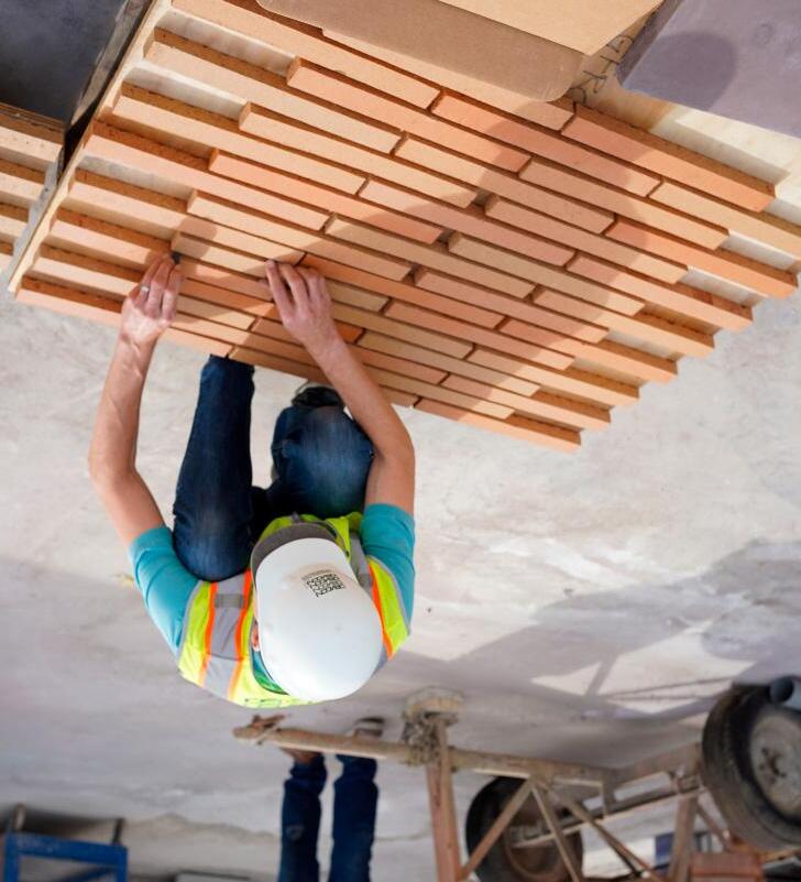
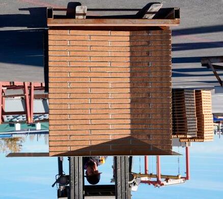
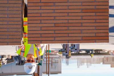

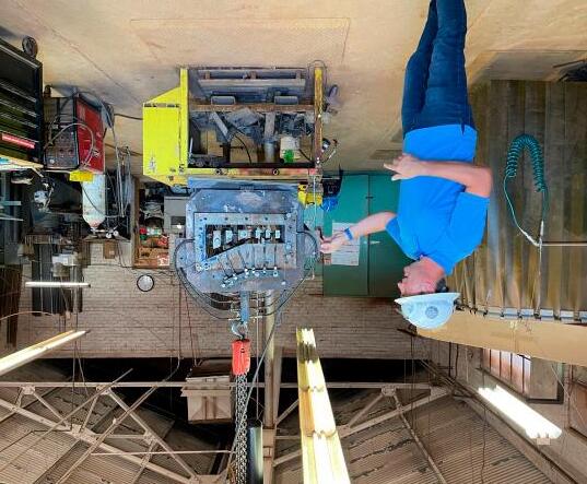
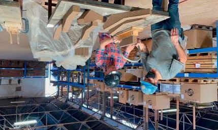

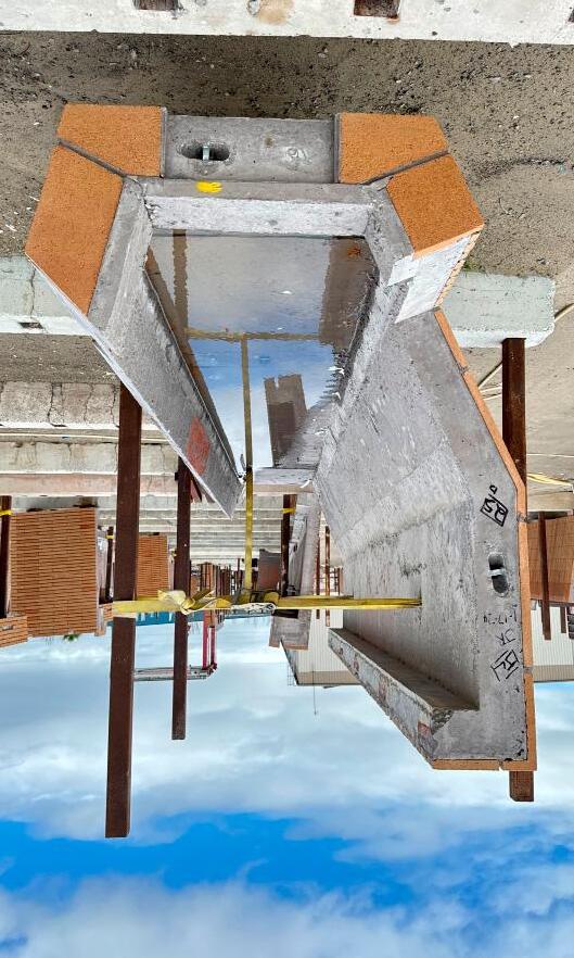
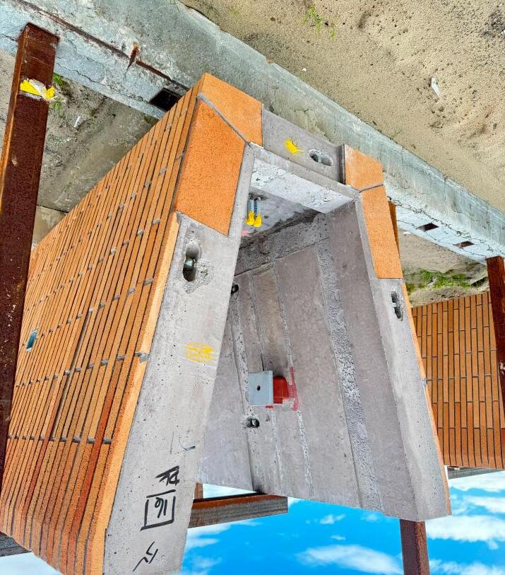
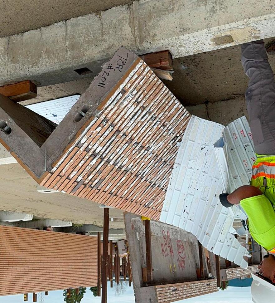
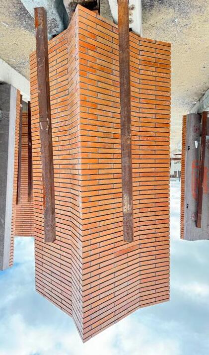

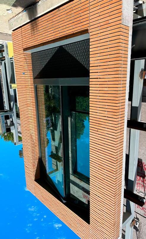

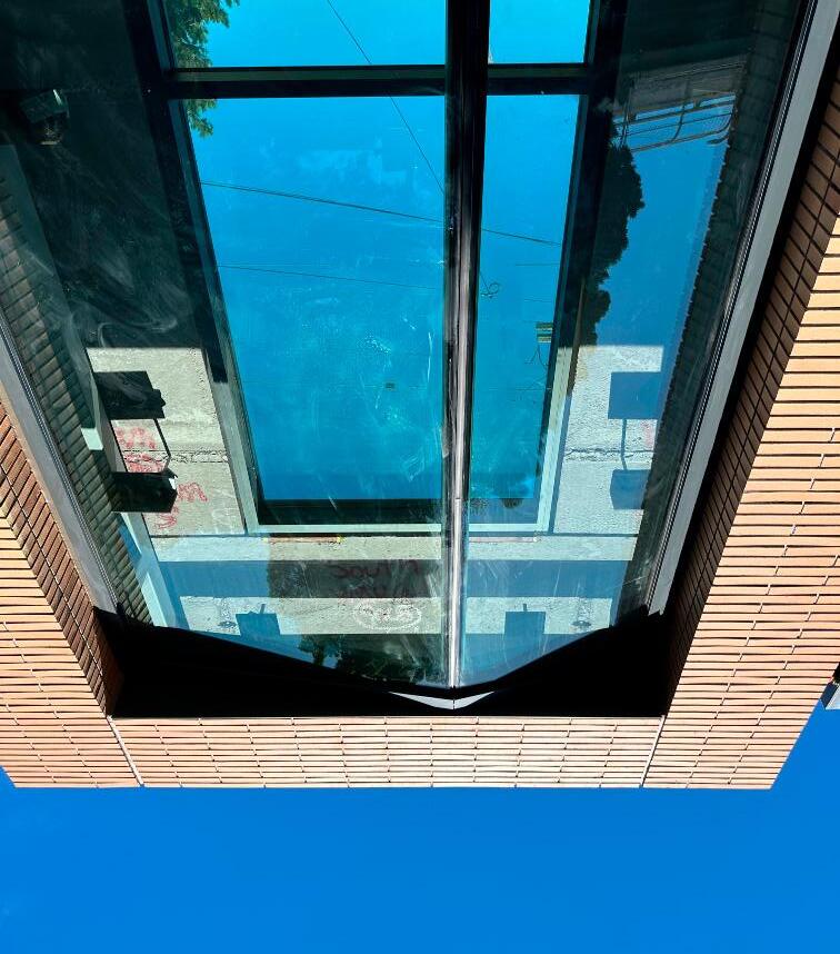
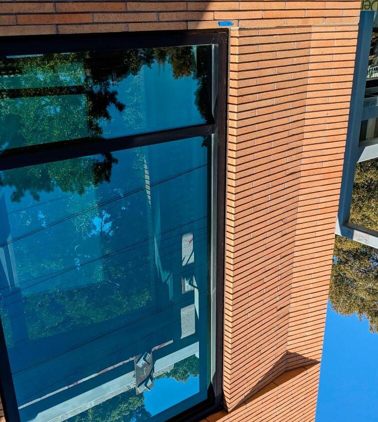
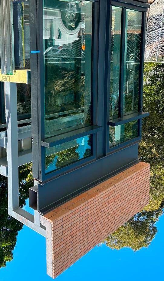

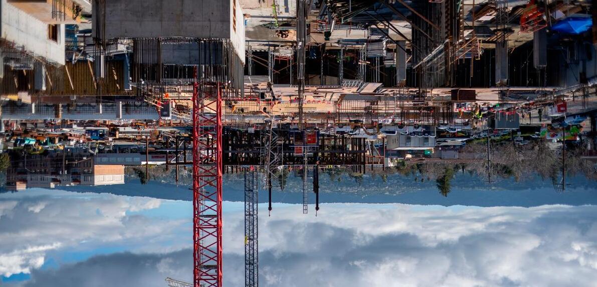
The striking result of the crafted use of brick was only possible with a holistic approach from the wider project team. Everything started with a client committed to transforming a city through design excellence, propelled forward with the ambitions of WRNS. These aspirations were brought to reality through the dedication to their craft of Pacific Clay and Walters & Wolf. Pacific Clay was willing to experiment with creating a very thin proportioned brick of 1 5/8” x 15 5/8” while meeting precast tolerance, custom angled bricks, and multiple fine tunings of color variations. Walters & Wolf brought everything together by creating and casting formwork for these unique bricks and architectural forms. When highly specialized disciplines work together toward a singular goal with the support of an ambitious client, meaningful beauty can be achieved.
Owner
IQHQ
Development Consultant
Westwood Interests
Architect
WRNS Studio
General Contractor
Devcon
Aaron Mauro
Abe Tarabieh
Alex Arizala
Annie Liu
Anya Sinha
Bella Mang
Ben Mickus
Branden Harrell
Brian Milman
Bryan Shiles
Celso Rojas
Chad Garrety
Christopher Pfiffner
Daniel Jimenez
David Gutzler
David Regina
Landscape
Structural
IMEG / DCI

Sustainability WRNS Studio
Erin Butler
George Ruiz
Jeffrey Fiftal
Jewel Pei
Julie Mithun
Karen Lee
Kelsey Cohen
Lily Weeks
MEP
Plumbing
ACCO / Lovazzano
Fire Alarm
Sprig / Helix / LPG
/ LDI
Mechanical ACCO / LDI Elevator
EWCG
Electrical Sprig / Helix / LPG
BFP / AFS
Parking Walker
Trash Mgmt. ATM
DSK Metrix / Jensen-Hughes Technology Integral
Acoustics
Facade Maint.
SitCo
Res. Interiors
Parisi Portfolio
Specifications Long Green
Envinronmental
Signage
ScottAG
Geotechnical Rockridge
Mark Yeakey
Mikiko Takasago
Milena Kim
Moses Vaughan
Niamh Gilmore
Stephen Hegedus
Stephen Kelley
Tim Jonas
Precast Concrete Walters & Wolf
Brick Pacific Clay Products
Curtain Wall Walters & Wolf
Metal Panels Pohl
Zinc Cladding VM Zinc
Concrete Conco
WRNS Studio is a 140-person architecture firm with offices in San Francisco, New York, Seattle and Honolulu. Three ideals inform WRNS Studio’s approach to each project: beauty, sustainability, and a positive contribution to the public realm. We relentlessly pursue these ideals over a diversity of project types, scales, and contexts. WRNS has learned from working with some of the world’s most transformative organizations that the most important thing we can do, as a business whose process and product is about innovation and creativity, is to attract, cultivate, and nurture talented people who share our values. The culture at WRNS Studio is strong and distinct, with interests focused on craft, technology, education, and pro-bono work. We have a thriving scholarship program that promotes inspiration and critical thinking in design and architecture.
AIA, LEED BD+C

Ben is a Senior Associate at WRNS Studio with over 20 years of architectural experience. With a nimble mind and a love of problem solving, he moves easily between different design and construction modalities, from hand sketching to experimenting with the latest digital software to leading large, complex projects. Ben’s diverse portfolio includes performing arts centers, higher education, mixed-use workplace developments, and life science facilities throughout the United States. During his free time, Ben makes furniture and lighting fixtures, interests that inform his exploration of materials and tectonics on larger-scale efforts at WRNS Studio. Ben achieved his Bachelor of Architecture at Cal Poly and his Master of Architecture at UCLA.
AIA, LEED BD+C

Mila is an Associate at WRNS Studio, with 17 years experience in architecture. Mila understands architecture through the experience of the city at street level. After emigrating from Vršac, a small town in Serbia, to the exurb of Mount Zion Illinois, she was surprised by how Americans underutilized civic space. Instead of public engagement consolidated around a square, many spaces in her adopted home facilitated isolation and were devoid of culture. This dichotomy of experiences informs her view of architecture; to design spaces for the public that look to inject program to activate and encourage community engagement. Mila has worked on a wide range of mixed-use, residential and educational buildings. Mila earned her BS in Architecture and Master of Architecture from the University of Illinois at Urbana-Champaign.

