5 minute read
LAYER BY LAYER
The team at Falken Reynolds strips away decades of bad renovations to create a space that celebrates both its history and its very modern future.
by Anicka Quin // photographs by ema peter
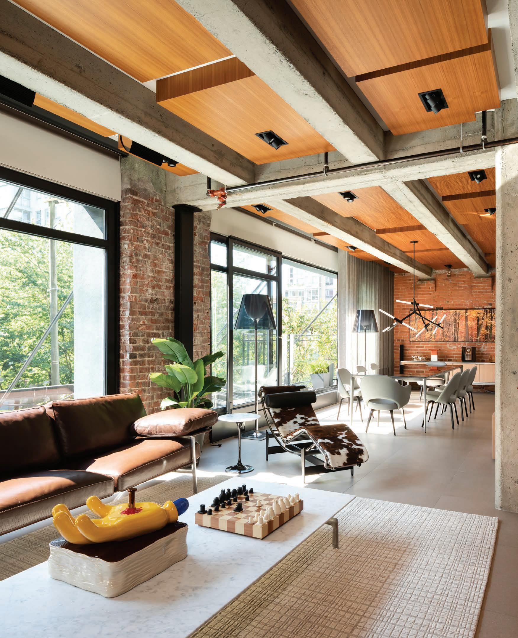
Lofty Ambition hen Chad Falkenberg and Kelly Reynolds of Falken Reynolds Interiors were W The Le Corbusier approached to renovate this condo in Vanlounge chair in cowhide sits in the spot where a wall once divided the couver’s Yaletown neighbourhood, they had a bit of a home-team advantage: the two units. The couple duo had already renovated a different unit has a collection of Bang and Olufsen electronics in the historic 1910 building a few years throughout the space. earlier. It also meant they knew there “In a lot of spaces we would try to hide the speakers, but here we was interior design gold hidden under the drywalled, low-ceilinged cookie-cutter were trying to celebrate condo that stood before them. Board-form them, with different speakers throughout,” concrete walls, original brick—it all just says Falkenberg. needed to be revealed.
That said, each unit within the building is a little bit different, and it wasn’t until they started peeling back the layers of renovations that the team could be truly delighted by what they were finding—like the 11 feet of height disguised by the low drop ceilings. “It was one of those things where you looked up as the ceiling was coming down,” explains Falkenberg, “and you thought, this is too good to be true.”
The homeowners, a couple with four rambunctious dogs, had purchased a second unit in the building after living in their original space for a number of
Home Zones
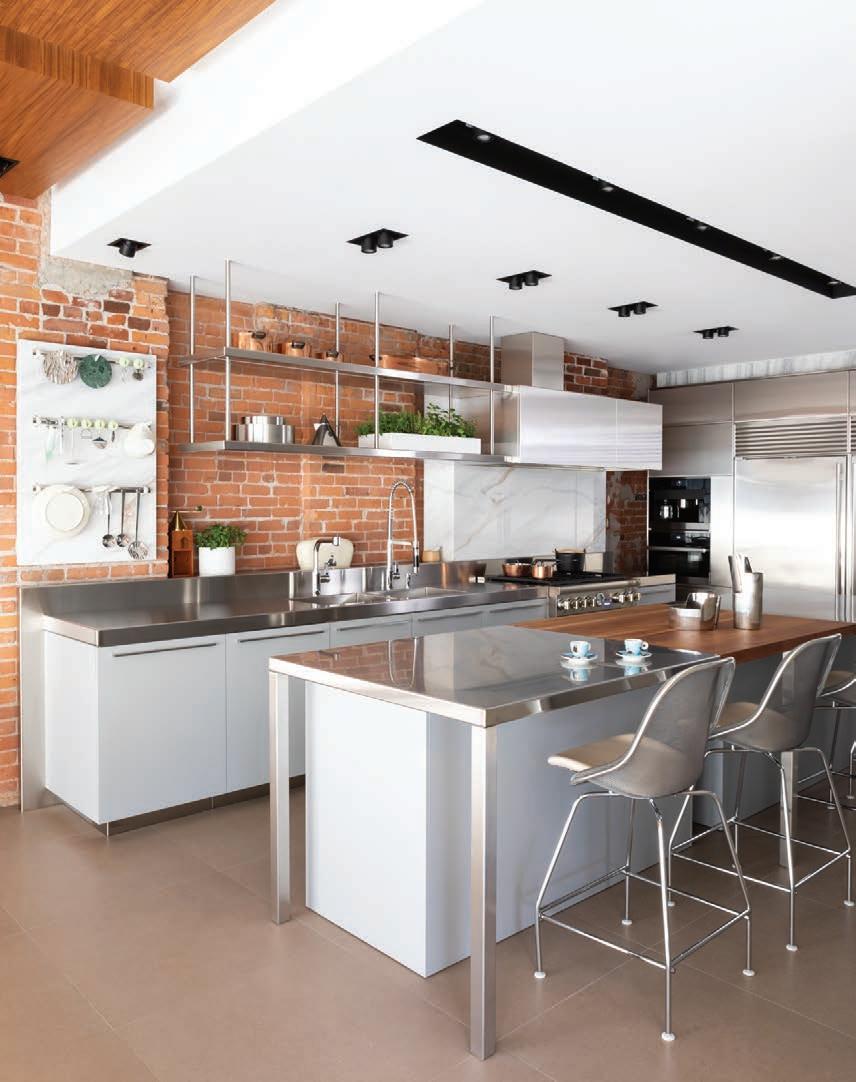
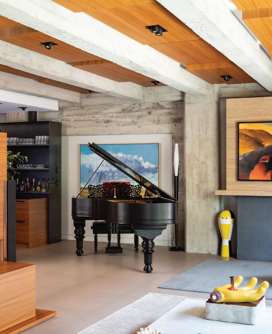
The board-form concrete wall that lines the dining room (top left) is actually part of the elevator shaft, and was revealed during the renovation. The homeowners are avid collectors of Alessi, so Reynolds and Falkenberg created an open display in the kitchen to have space for them—including the Il Conico kettle on the shelf and the vintage Alessi coffee grinder on the counter (top right). The baby grand in the living area (below left) is a Steinway from the mid-1800s that’s been totally restored. The home bar (bottom right) was finished first, so the homeowners used it as a mini-kitchen while the rest of the renovation was underway.


Around the Corner
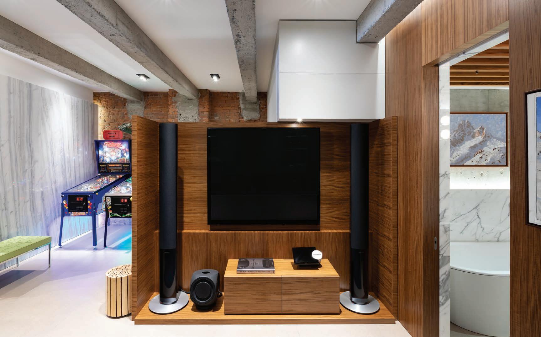
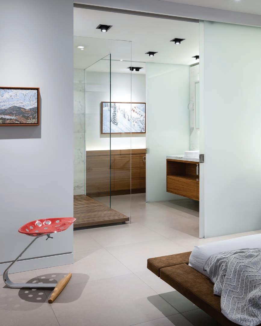
The “arcade” and adjacent home office are tucked behind the kitchen: that marble wall wraps around behind the refrigerator on the other side (above). The homeowners wanted just one large bedroom in the space, which also has its own airy ensuite (bottom left). The office is lined in teak (bottom right), and features artwork from Danny Singer.
years, and they reached out to the Falken Reynolds team to combine both suites and create one great design that could showcase their extensive art collection. “They also knew there was a lot of history in the building—and they absolutely love it,” says Falkenberg, whose team worked with Lightfoot Contracting on the project.
“Every layer that we peeled off, they got so excited,” says Reynolds. “It was almost like an archeological site.”
That layered dig through the eras meant a shift in the design itself, too. “There was an initial design, and then we did the demolition, and everything changed as soon as we saw some of the opportunities in the building,” says Falkenberg. “Those buildings are just so structurally complicated. They were built one way in the early 20th century, and then a lot of them went through a big renovation in the ’40s and ’50s. It’s nothing you can really anticipate until you take the walls down—and once they’re down, it’s a whole new thing.”
The open ceiling exposed two-foot concrete beams, which, while beautiful, created a bit of a cavernous effect in the space. The homeowners loved the look of the teak ceilings they’d seen in a hotel, and so the design team brought in teak boxes to recreate that look while also helping with sound baffling and disguising electrical and mechanical work. Each box is a different height and length, creating almost an “inverted coffered effect,” says Falkenberg. “It creates a rhythm, there’s a bit of play to it.”
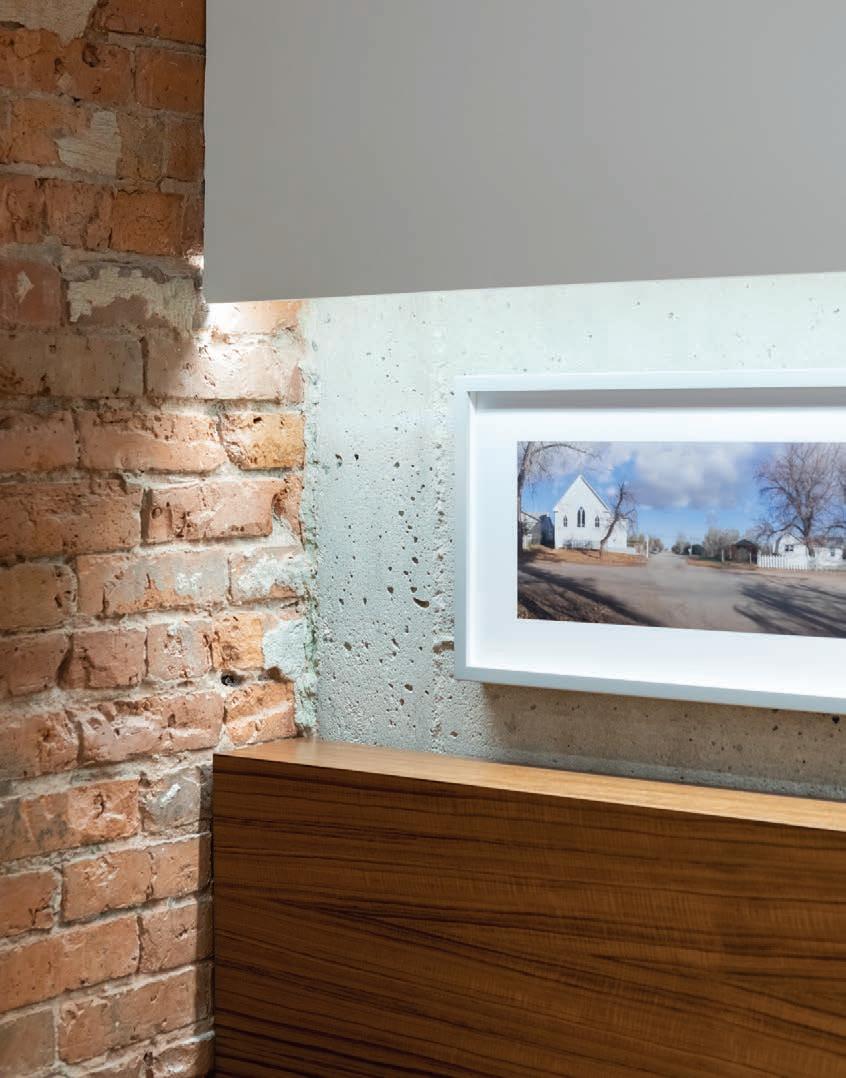
Exposed original brick lines the back wall of the kitchen, and the team was careful to protect it by hanging shelves and cabinetry from the ceiling, rather than directly onto the brickwork itself. Stainless steel counters in front of the wall also rise up into a low ledge, which levels out the uneven wall face and provides space for a toaster and planters for kitchen herbs.
Happy Pup
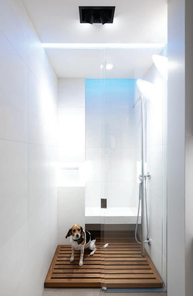
The homeowners have four dogs, so the team at Falken Reynolds designed a dog-wash station in a corner of the laundry room. the team at Falken Reynolds wanted the new iteration to feel almost as if it was a freestanding piece of furniture. Its asymmetrical design of black-flamed granite, cold-rolled steel and travertine became the inspiration for a re-envisioning of the entire suite. From the nearby home bar and media centre to the kitchen and home theatre, each installation in the space is made to feel like its own standalone unit.
The condo is quite long and deep, and because the main bedroom and bath is near the back, the team used frosted glass to separate it, allowing light to travel deep into the space. Meanwhile, in the guest bathroom, the small square footage made the extra-high ceiling feel a bit too vertical, so the team installed teak slats overhead to keep it open, but a little more contained. The result also makes the room feel as though it’s outdoors—with nothing but the sky above.
And, of course, with four dogs in the home, a dedicated dog shower was a must. The team claimed a corner of the laundry room for just such a task.
That kind of personalization is exactly what made this project such a thrill for Falkenberg and Reynolds. “The best part of this project was just how into the building the clients were,” says Falkenberg. “When we’re working in condos, people always have a life expectancy of their time in the condo—usually five or 10 years—so we’re always trying to design with a little bit of an eye to resale.”
But these clients, he says, were clear that this was their forever home. “So then it’s all about what they love. It’s a really fun way to work—you just do what your client gets excited about.”
