
33 minute read
FEATURED EXHIBITIONS


67–73 Pictures and Promises Vancouver Art Gallery
75–79 Feast for the Eyes: The Story of Food in Photography The Polygon Gallery
Advertisement
Grant Arnold
Susan Bright
Ken Lum Steve, 1986 chromogenic print on acrylic sheet 203.5 × 138.5 × 5.5 cm Collection of the Vancouver Art Gallery, Vancouver Art Gallery Acquisition Fund
Group Show
Pictures and Promises
Pictures and Promises is organized by the Vancouver Art Gallery in collaboration with Capture Photography Festival and is co-curated by Grant Arnold, Audain Curator of British Columbia Art, Vancouver Art Gallery, and Emmy Lee Wall, Executive Director, Capture Photography Festival.
Vancouver Art Gallery
February 20 – September 6
Generously supported by the Audain Foundation
www.vanartgallery.bc.ca

Barbara Kruger Poster for Pictures and Promises: A Display of Advertisings, Slogans, and Interventions Getty Research Institute, Los Angeles
1. Carrie Rickey, “Pictures and
Promises: The Kitchen,” Artforum,
March 1981, 86. 2. Barbara Kruger, press release for
Pictures and Promises, the Kitchen, 1981, http://archive.thekitchen. org/wp-content/uploads/2015/01/
PressRelease_Kruger_1981.pdf.
Warhol was represented in the exhibition, perhaps to provide a point of reference for the work of the other artists. Drawn from the Vancouver Art Gallery’s collection, Pictures and Promises brings together artworks that depict, employ, or critique the conventions and formal vocabularies that have come to pervade mass media, advertising, and the culture of commerce. The exhibition, which focuses primarily on lens-based works produced over the past century, reflects on some of the ways artists have engaged the iconography of consumerism, the forms through which it propagates meaning, and its role in shaping collective understandings of the world around us.
The exhibition’s title refers to the ground-breaking 1981 exhibition Pictures and Promises: A Display of Advertisings, Slogans and Interventions, curated by the now widely known American artist Barbara Kruger. On view at the Kitchen, a centre for video, music, and dance in New York, from January 8 to February 5, 1981, Kruger’s exhibition combined print advertising for jewellery, electronics, and men’s and women’s fashions and excerpts from television commercials for cigarettes, perfume, and the US Navy with works by artists including Richard Prince, Jenny Holzer, Dara Birnbaum, Victor Burgin, and Kruger herself. Art and advertising intermingled: a text-based work by Holzer and photographs by Prince and Burgin were placed adjacent to ads for jewellery and products from General Electric and Sony. A television ad by Birnbaum – commissioned by the cognac purveyor Rémy Martin – was presented with excerpts from TV ads for Marlboro cigarettes and a Waterpik shower massage. Many of the two-dimensional artworks were mounted directly onto the gallery walls without a frame, implying a level of equivalence with the other components of the exhibition that undercut the conventional hierarchy between art and mass culture. The implication being, as the art critic Carrie Rickey noted at the time, that “‘art information’ and ‘commercial information’ [could be] subsets of an inclusive repository of images.... Do they share a collective semiology, and, if so, how can we decode them?”1
This destabilization of boundaries was not, in itself, particularly radical. Artists such as Robert Rauschenberg, Richard Hamilton, Andy Warhol, Roy Lichtenstein, and many others had already been crossing this terrain and using appropriated imagery for two decades. The emergence of conceptual art in the 1960s had drawn attention to the mechanisms and institutional frameworks that – in Euro–North American culture at least – determined what is and what isn’t “art.” What marked a break between this new generation and pop art in particular, but also neo-Dada and conceptual art, was the overtly critical stance most of the artists represented in Pictures and Promises took in relation to the emblems, protocols, and graphic techniques that had come to pervade everyday life through their deployment in mass media. Here, the cool neutrality of Warhol and Lichtenstein was displaced by approaches that attempted to open up the codes of advertising, interrupting the pleasure evoked by conventional responses to publicity. The aim was, as Kruger put it, to couple “the ingratiation of wishful thinking with the criticality of knowing better.”2
The presentation of Pictures and Promises at the Kitchen corresponded with a historical moment in North America and Europe marked by
Vikky Alexander Obsession #3, 1983 gelatin silver print, vinyl type, coloured Plexiglas 92.0 × 61.0 cm Collection of the Vancouver Art Gallery, Gift of the Artist
the proliferation of new forms of advertising conceived specifically for an increasingly media-saturated culture – developments that Kruger would have been familiar with from her time as a magazine designer for Condé Nast Publications and picture editor for Mademoiselle magazine. Advertising strategies that focused on branding – which deploy combinations of text and imagery that operate on both symbolic and descriptive levels to construct an image that holds a significance beyond the functional properties of the commodity – began in earnest in the mid-1950s. By the mid-1970s, marketing campaigns began to combine branding with newly developed “positioning” techniques that were not exactly about the product itself. As marketing consultants Al Ries and Jack Trout put it in their book Positioning: The Battle for Your Mind, published the same year Pictures and Promises was presented at the Kitchen: “The basic approach of positioning is not about creating something new and different. But manipulating what’s already up there in the mind [of the prospect].... To retie the connections that already exist.” 3 Set against this background of new marketing strategies and ever more spectacularized forms of consumption, Kruger’s exhibition occupies an emblematic position within the development of a mode of postmodernism in which analysis of the imagery that permeates consumer culture – including its role in defining gender, race, and social status – seemed more urgent than adding new pictures to a world already saturated with images.
Of the artworks on view at the Vancouver Art Gallery, those by Richard Prince (who participated in Kruger’s exhibition), Vikky Alexander, and Ken Lum are paradigmatic of the new ways in which artists approached photographic images during the 1980s. Prince’s Live Free or Die 3 (1987) and Alexander’s Obsession (1983) use rephotographed images from magazines, a method of working adopted by a number of artists during the 1980s that finds parallels in the French philosopher Jean Baudrillard’s assertion that the real has become subsumed in a “simulacrum” of endless images. Live Free or Die 3 is from a larger body of Prince’s work that engages with cowboys and bikers as embodiments of a mythologized masculinity in American culture. The work comprises nine details copied from a photograph Prince found in a biker magazine – one submitted by a reader rather than a professional photographer – depicting a woman astride a Harley-Davidson motorcycle. In what seems like a deliberate pun, Prince arranged, or “ganged,” the details into a grid laid out on a single sheet of paper. The division of the original image into segments, with
3. Al Ries and Jack Trout, Positioning: The Battle for Your Mind (New York: McGraw-Hill, 1981), 18.
differing degrees of enlargement, that focus on the woman’s torso and the motorcycle’s fuel tank, along with the amateurish technique of the photographer, exaggerates the fetishization of the female body and the overblown phallic character of the machine she straddles. The parodic tone of the work – reinforced through the title’s reference to the cliché of the motorcycle as an emblem of individual freedom and rebellion – is immediately apparent, but it is also countered by a sense that the work wants something from the viewer, as they attempt to mentally reconfigure the details back into a completed image. The implication being that it’s difficult to engage with a fiction without being at least partly pulled into it.
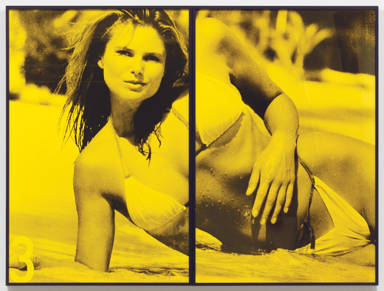
Alexander’s Obsession also uses pictures copied from magazines, although the sources for her material have higher production values and broader circulation than the subculture periodical that provided the image for Prince’s work. Obsession is composed of eleven black-andwhite copies of professionally made colour photographs of the American supermodel Christie Brinkley – the first model to be featured on three successive covers of Sports Illustrated’s “Swimsuit” issue, from 1979 to 1981 – in predictably glamorous poses and locations. Alexander has enlarged the photographs well beyond the magazine format of the appropriated images, and some are conspicuously larger-than-life size. Each print is overlaid with a sheet of yellow-tinted Plexiglas, one with Brinkley’s name and the others with numbers rendered in vinyl tape to indicate the image’s position in the overall sequence. This mode of presentation, which visually flattens the picture, and the use of familiar images cropped just enough to highlight the overdetermined character of the bone structure, toned body, and pale skin of the model, diverts a conventional male-identified reading, instead turning attention to the fairly restricted repertoire of codes used to elicit desire in glamour images.
Lum’s Portrait-Logos of the mid-1980s differ from the works by Prince and Alexander in that Lum appropriates a distinct photographic idiom rather than a particular image. The inexpensive family portraits that populate end tables in middle- and lower-class North American homes share a set of conventions that is clearly recognizable in works such as Steve (1986) and Ollner Family (1986), which evoke the familiar ritual of applying makeup, arranging hair, and selecting clothing in order to present the camera with an image equivalent to the sitter’s sense of self. The uniform lighting, ubiquitous smiles, and standardized postures convey a sense of familiarity that is unhinged by the large scale of the works and the custom-designed logos that brashly identify the depicted subjects. The size of the works and the manufactured smoothness of their surfaces formally fuse image and logo – but the combination is unsettling. Portraits of this size are generally associated with prominent personas and corporate spaces, while the visual presence of the logos – with their evocation of branding – seems to overpower the domesticity of the pictures’ settings.
While the tropes deployed in Lum’s Portrait-Logo series call up the standardization of daily life in the consumer cultures of the Western world, the implication is that difference is not entirely subsumed. In Ollner Family, for example, the ethnic makeup of the family in Lum’s staged portrait – a Euro-Canadian father, an Asian Canadian mother, and a mixed-race daughter – speaks to both the conditions of displacement that have been fundamental to modernity and the capacity of emotional bonds to transgress the processes of racialization. The smiles and apparent self-confidence of the family imply optimism and a sense that individuality is not entirely effaced by convention. Nonetheless, the image of the nuclear family is dominated by the intensity of the logo, which positions them within the patriarchal lineage of the father.
While photographs now have a prominent place in the collections and exhibition programs of art museums across North America and Europe, it was only in the 1980s that most of these institutions – including the Vancouver Art Gallery – began to collect and exhibit photography seriously. It’s something of a paradox that the elevation in the art world of what is commonly referred to as “straight” photography – discrete, small-scale prints with little or no manipulation – coincided with the critical challenges to both the “truth value” of photography and claims that the medium is a purely visual language that were taken up by artists such as Kruger, Prince, Alexander, and Lum. In relation to this exhibition and Capture Photography Festival as a whole, it’s worth noting that, right from the origins of photography, questions of authorship figured prominently in discussions about the medium’s status as art and its relationship to mass culture, although the terms of these original debates differed substantially from those of the 1980s. From the mid-nineteenth century on, the discussion focused largely on the question of whether the camera, as a machine, overwrote the individual subjectivity of its operator, and later – as photographs became commonplace
in everyday life in North America and Europe – interest turned toward identifying what might distinguish an “art photograph” from a commercial, vernacular, or newspaper image (questions that were turned on their head in Kruger’s exhibition).
The terms of these debates were put forward clearly in “Photographs of America: Walker Evans,” an essay that the writer and philanthropist Lincoln Kirstein contributed to Walker Evans’s now canonical art book American Photographs, published in 1938 in conjunction with a solo exhibition of Evans’s work at the Museum of Modern Art in New York.4 As Kirstein sees it, from its inception in 1839 through to the 1880s, photography was a nascent technology in which the articulation of “the human personality, the incidental individual comment of the photographer” through the photographic image had not yet entered the realm of possibility. While admiring the work of photography’s earliest practitioners, he argues – in the gendered terms of the time – that they held “a simple but overwhelming interest in the object which was set before his machine.”5 He disparages the developments that followed this early period, condemning both the pretensions through which soft-focus pictorialism claimed its status as art and the development of “candid-camera” photojournalism, which Kirstein argues – prefiguring later discussions on the social operations of photography – promised truth but delivered only an “accidental revelation which does far more to hide the real fact of what is going on than to explode it.”6
For Kirstein, the real possibilities for photography lay in an approach exemplified in works such as Evans’s Torn Movie Poster (1931), Bowery Lunchroom (1933), and Gas Station Reedsville, West Virginia (1936), all included in this exhibition. Evans’s approach emphasizes the descriptive power of the image while – in comparison to the work of his contemporaries like Edward Steichen – downplaying overt indications of the photographer’s sensibilities, as if the maker of the image is almost anonymous. As Kirstein puts it: “The facts of our homes and times, shown surgically without the poet’s or painter’s comment or necessary distortion, are the unique contemporary field of the photographer.... It is for him to fix and show the whole aspect of our society, the sober portrait of its stratifications, their backgrounds and embattled contrasts.” 7
Evans’s images of signs, posters, and billboards can be seen as precursors to the use of appropriated imagery four decades later by Kruger, Prince, and Alexander, although his frame of reference was substantially different. For

Walker Evans Torn Movie Poster, 1931 gelatin silver print 25.3 × 20.2 cm Collection of the Vancouver Art Gallery, Vancouver Art Gallery Acquisition Fund
4. At the time, the Museum of Modern
Art (MoMA) was one of the few art museums that collected and exhibited photographs, and it played a dominant role in framing the debates on photography as art until the late twentieth century. For a critical analysis of photography at
MoMA, see Christopher Phillips,
“The Judgement Seat of Photography,” in The Contest of Meaning: Critical
Histories of Photography, ed. Richard
Bolton (Cambridge, MA: MIT Press, 1989), 15–46. 5. Lincoln Kirstein, “Photographs of America: Walker Evans,” in
Walker Evans: American Photographs:
Books on Books 2 (New York: Errata
Editions, 2011), unpaginated.
Kirstein is generally believed to have funded the publication of American
Photographs. Born into a wealthy family in Buffalo, NY, Kirstein’s patronage was wide ranging. He is best known as a co-founder of the
New York City Ballet company and as a writer, editor, and impresario.
He was an important figure in the development of MoMA and was closely involved in a New York community of queer artists. 6. Ibid. 7. Ibid.

Zhang O We are all the Future of the Earth, 2008 inkjet print 80.5 × 99.5 cm Collection of the Vancouver Art Gallery, Gift of the Artist
8. Walker Evans, interview by Leslie
George Katz, 1971, ASX, https:// americansuburbx.com/2011/10/ interview-an-interview-withwalker-evans-pt-1-1971.html. Evans, an analysis of the subject positions embedded in advertising was not on the horizon of possibility, and he admired the work of sign makers, postcard photographers, and illustrators as manifestations of vernacular culture. Nonetheless, his images of signs – whether billboards in front of dilapidated row housing or cardboard advertisements pasted over holes in the walls of a tenant farmer’s shack – amplify the depredations of the Great Depression, the prevalent racism of American culture, and the desire for escape in the spectacle of entertainment as the primary themes of American Photographs.
Although Kirstein describes Evans’s images as “social documents,” documentary was a category that Evans explicitly rejected, at least later in his life. In a 1971 interview, he famously noted that documentary is “a very sophisticated and misleading word.... The term should be documentary style. An example of a literal document would be a police photograph of a murder scene.... A document has use, whereas art is really useless. Therefore, art is never a document, though it certainly can adopt that style.”8 Even if what Evans might have meant by “documentary style” is a bit slippery, its influence can be seen in the work of artists ranging from Robert Frank and Diane Arbus to Bernd and Hilla Becher and Jeff Wall. Of the artists included in this exhibition, threads of influence can be found in the use of signage in the urban landscapes of Roy Arden’s Condominium Advertisement, Vancouver, BC (1992) and Fred Herzog’s New Life Joke Shop (1957); the window display of vernacular objects depicted in Diane Evans’s Untitled (2005–07); a roadside recruiting billboard for the US Navy featured in Charles Gagnon’s Untitled (1971); and the celebrations of vernacular culture pictured in Henri Robideau’s Giant Ravel Piano Concerto, Minneapolis, Minnesota, 1976 (1978) and Lorraine Gilbert’s Untitled (1982–86), a photograph of the enticingly lurid lighting of an amusement park at dusk.
Parallels to the work of Kruger and Lum, as well as Evans, can be found in the work of Zhang O, whose photographs are often described as having a straightforward documentary character. The title of Zhang’s The World Is Yours (But Also Ours) (2008) project was taken from a 1957 speech given by Mao Zedong to a congress of Chinese youth, and the format of these works follows the combination of image and text found in posters from the Cultural Revolution. Each work in the series features a fairly conventional photograph of a cheerful-looking Chinese teenager casually standing in front of a Chinese monument. Each
wears a T-shirt with an English text that has obvious errors in translation or doesn’t make sense, as in “Thow Your Hand Up CHINA. Looking inti my eyes touch my heart” and “WALKIN «ONTHE« OVKRLOVS «NATUR«.” The Chinese versions of the English titles, which are based on well-known slogans from Mao Zedong, slang, and advertising taglines, appear below each image.
Zhang made the photographs for The World Is Yours (But Also Ours) in Beijing during the months leading up to the 2008 Summer Olympics – a moment when Chinese citizens were acutely aware that, since the nation was assuming a heightened role on the world stage, a successful staging of the Olympics was imperative. The apparent errors in translation, the evident fascination with Western pop culture, and the hollow tone of the slogans – which sometimes echo the aspirational rhetoric of both the Olympics and state propaganda – evoke the disjunctions that mark the merging of cultures and the discrepancies between the promise of harmonious prosperity and the realities of everyday life.
Of the works featured in this exhibition, Ron Terada’s Signage (2002) most closely mimics a “document,” in Evans’s definition of the word. Terada’s practice takes existing cultural idioms as subject matter and deploys them in a variety of mediums, including painting, illuminated signs, printed brochures, photography, and soundtracks for exhibitions. Signage is from a body of work that addresses the significance of place and its often troublesome position in the art world. The artist produced the work for an exhibition titled Signage at Vancouver’s Catriona Jeffries gallery by combining a photograph of a standard highway sign marking the geographical boundary of the city with text indicating the artists represented in the Signage exhibition as well as venues in Toronto and London where other Vancouver-based artists represented by Catriona Jeffries were showing. The work appeared as an advertisement in the June 2002 issue of Artforum, and a framed print of this advertisement was then hung in the gallery as Terada’s contribution to the exhibition, thereby situating the publicity for the exhibition as the work itself. Produced at a time when Vancouver had become internationally recognized for the photographic work of artists such as Rodney Graham and Jeff Wall, Terada’s Signage work drew attention to the way in which the city had become a brand that could be used to attract attention in a highly competitive art market, with exponential growth in pricing. However, the work’s implications are broader that the specific context it refers to, and it opens up much larger questions surrounding branding and identity in the art world – a topic many of its inhabitants prefer to avoid. As Terada’s work suggests, branding is a pervasive strategy used to stake out territory or to establish an identity by commercial galleries, art museums, photography festivals, and art journals. And, as the extensive and ongoing discussions on how the “photographer’s eye” of Walker Evans might be discerned in his “nearly anonymous” images indicate, the notion of branding also extends to the necessity for an artist to articulate a visible identity or cohesive logic as part of their practice, if they want to be recognized in the art world.
Terada’s collapsing of publicity into an artwork takes us back to the destabilization of the boundaries between art and advertising enacted in Kruger’s original Pictures and Promises exhibition in 1981. While Kruger continues to engage in an extended critique of cultural formations in which identity and human value are closely linked to consumption, she has never claimed her work sits outside the marketplace, noting specifically that “there is nothing outside the market.”9 While her work takes on diverse forms and has been presented in unconventional contexts, it carries a recognizable identity through her use of a specific red tone for her frames and a particular font for her text in combination with high-contrast monochrome photomontages. Further to that, the extraordinary ability of marketing agencies to co-opt any tactic intended to subvert the mechanisms of advertising in their search for ever hipper publics is exemplified by the logo of the Supreme clothing company – which is clearly based on the formal vocabulary of Kruger’s work. Pointing this out is not meant to suggest that the critical capacity of art is entirely subsumed by the market; rather, it’s intended to draw attention to the way in which the interests of artists and institutions are continually renegotiating discursive fields as they form – and are formed by – branded identities and market structures that permeate life in cultures and economies driven by relentless consumption.
9. Barbara Kruger, quoted in Mayer
Rus, “A Bold Social Commentary since the 1970s, Barbara Kruger’s
Art Is as Incisive as Ever,”
Wallpaper, January 26, 2019, https://www.wallpaper.com/art/ barbara-kruger-profile.

Daniel Gordon Clementines, 2011 archival pigment print 76.2 × 101.6 cm Courtesy of the Artist and James Fuentes Gallery, NY
Group Show
Feast for the Eyes: The Story of Food in Photography is organized by Aperture Foundation, New York, and is curated by Susan Bright and Denise Wolff.
The Polygon Gallery
March 4 – May 30
The exhibition at The Polygon is generously supported by the Babalos Family and Paula Palyga and David Demers through their membership in The Polygon’s Exhibition Circle.
www.thepolygon.ca
Photographs of food are rarely just about food. They hold our lives and time up to the light. As a subject that is commonly at hand, food has been and continues to be widely depicted. Many of the photographers in this exhibition demonstrate that the most obvious of subjects is often the most demanding, and photographs of food – much like food itself – can invoke deep-seated questions and anxieties about issues such as consumption, aspiration, tradition, gender, race, desire, wealth, poverty, pleasure, revulsion, and domesticity. It can be a carrier for all kinds of fantasies and realities, and photographs of food can be complicated and deceptive, touching on many aspects of our lives, both public and private. In addition, these pictures can be found in all sorts of places – not only in cookbooks, but also in art, fashion, and advertising, or as vernacular, industrial, and editorial photography. But despite the ubiquity of photographs of food – or perhaps because of it – these images are rarely written about in their entirety.
Early photographs of food feature in two parallel histories: that of art and that of cookbooks. But both environments show that photography is the magpie medium, borrowing, copying, and appropriating from other practices with bravura to create something unique. Early nineteenthcentury art photographers faithfully followed the traditions of painting, reproducing established genres and calling upon the same strategies and symbolism. Early photographic still lifes, in emulation of paintings, gestured allegorically toward the different states of human existence by depicting certain foods: peaches for fertility, apples as the forbidden fruit, or grapes to reference the Greek god Dionysus, insinuating excess and good living. Early photographers concentrated on the richness of objects, the things that make up our world – turning what was visible into artifacts and transforming them to resonate beyond mere subject matter.
But alongside allegorical meanings and similarities to painting, the photographing of food has also shown photography’s great differences to painting and the insecurities about its own status that have plagued its history. This can be seen in the richly toned black-and-white still lifes by Roger Fenton: the food he photographed may resonate with the history of painting that went before it, but it also works to show the abilities of photography to the fullest. Filling his scenes with rich textures and shapes to heighten the senses and show off his skill, he showed great dexterity in illustrating depth on a flat surface – something that painting could do more easily, using colour and the three-dimensional texture of paint. Without an established history within art, photography had yet to prove itself – so the frames of Fenton’s photographs were trimmed to a curve at the top, as if to signal his work as art, rather than mere document. This device of trimming prints to this shape was common among other early photographers, such as Julia Margaret Cameron, in order to mimic the actual shape of the paintings they were directly referencing. As such, the picture isn’t about what is visible, and what is seen in the world, but more about what is photographed, and what is art.
But it is perhaps meals as they appear in vernacular photography that tell us the most about our relationship to food. Snapshots of food have
increased and asserted themselves over the history of the medium, to the point where they are now part of the contemporary eating experience, captured with smartphones and distributed through image-sharing apps. But holidays and celebrations were being photographed almost as soon as cameras became readily available. Due to the expense of very early photography, it was mostly the pursuit of the wealthy. Food did appear in nineteenth-century family photographs, but it was more into the twentieth century, as the camera became more accessible, that food often took centre stage. Since then, snapshots have been taken when extended families gather together around the table. Birthdays, parties, and weddings are often photographed around the cake, and summer vacation pictures would seem lacking without the requisite ice cream cone or picnic shot. The photographs that we now associate with the commercial practice of “food photography” (as opposed to food in still life, art, or vernacular images) undoubtedly have their roots in the rise of magazines and packaged foods. The interwar period saw an explosion of inventive printing and publishing techniques in photography. No one mastered these methods more than Nickolas Muray, who, while working in Germany, had perfected experimental colour processes while studying photoengraving and working for a publishing company. On moving to America, he transformed that skill into a commercial practice, creating vibrant tableaux for magazines in both advertising and editorial. His photographs of food and homemaking are among his best, bringing a new and daring aesthetic to magazines like McCall’s. These heavily styled scenes of food offered a fantastical escape and a vision of America far removed from the food shortages and anxieties of the war. Due in part to the success of Muray’s photographs, the almost Technicolor results of the three-colour carbro process became a staple of American lifestyle and fashion magazines from the late 1940s into the 1950s – despite the fact that the process itself was fiddly and time consuming.
Such books and the magazines of the time also gave rise to the art and business of food styling. Often shot under hot lights in the studio, food had to be meticulously arranged to last while the photographer worked. Heavily propped and fastidiously set up, food photography from this period relied on techniques that have become somewhat mythic and, of course, made the food completely inedible – such as spraying it with hairspray so it would appear shiny and fresh. Ice cream might be made from powdered sugar, ice cubes from plastic, foam from soapsuds, and condensation with glycerin. But it is not just the food that made a food photograph important; the tableware, tablecloths, garnishing, and props showed mastery in making a scene complete, and were illustrative of the collaborative teamwork needed in commercial photography.
The 1960s and 1970s saw the increased publication of cookbooks and a shift from postwar ideas about national

Peter Fischli and David Weiss Fashion Show, from Wurstserie (Sausage Series), 1979 chromogenic print 43.18 × 53.34 cm Courtesy of the Artist and Sprüth Magers
identity to a desire for armchair travel, a precursor to the multiculturalism of the 1980s. Popular cookbooks with skillful photographs illustrated the advances in colour printing and food styling in North America, Europe, and beyond, reflecting changes and attitudes particular to each nation. There was also an increase in books featuring foods from a single country, as recipes and accompanying photographs from Mexico, Morocco, India, and Thailand became popular. This was the golden age of jet travel, and Western television began to feature more “ethnic” chefs. This fascination with the exotic also inspired the American Time-Life Foods of the World cookbook series (1968–78).
Coinciding with this explosion of cookbooks, the 1960s and 1970s also saw the rise of conceptual art and, with it, artists who used banal subject matter, mixed high and low culture, and favoured repetition and seriality, both in topographical and typological explorations. They used food for comic effect, as can be seen in John Baldessari’s Choosing Green Beans (1972), Fischli and Weiss’s Wurstserie (Sausage Series, 1979), and Marion Faller and Hollis Frampton’s series Sixteen Studies from Vegetable Locomotion (1975). Marcel Broodthaer’s La Soupe de Daguerre (1975) is more mysterious, however: Are these ingredients for soup? Unlikely, as this combination of “real” fish and tissue cutouts could hardly be cooked. At the bottom is a label that suggests museums and classification. Here, Broodthaers presents food as a puzzle – very much at odds with the bombastic messaging of pop art, in which food also often featured, and the advertising and lifestyle aims of cookbooks. Perhaps he is parodying oversimplified representations of food and the polarized positions across hierarchies and genres in the artificial divisions between high and low culture.
While much art of this time favoured systems, artists also turned to performance and visual playfulness.

Martha Rosler Semiotics of the Kitchen, 1975 video with sound, 6:00 min. Courtesy of Electronic Arts Intermix (EAI), NY Semiotics of the Kitchen by Martha Rosler (1975) does not use food, only the kitchen equipment. In this performancevideo piece, Rosler works through the kitchen in alphabetical order – apron, bowl, chopper, dish, eggbeater, and so on – demonstrating each appliance with increasing aggression, in a parody of the growing popularity of cooking shows on TV and the idea that a woman’s place is in the kitchen. Rosler has said of her work, “I was concerned with something like the notion of ‘language speaking the subject,’ and with the transformation of the woman herself into a sign in a system of signs that represent a system of food production, a system of harnessed subjectivity.”
The theoretical language of semiotics gave artists much-needed linguistic and visual tools to reclaim their work from critics and their value judgments, often to comic effect. The philosopher Roland Barthes famously illustrated how the tools of semiotics could be applied to the messages and meanings of images in his 1964 essay “Rhetoric of the Image,” using an ad for the pasta brand Panzani. By deconstructing the scene, he showed (among other things) how “Italianicity” could be read in it. These systems for the construction of meaning are key to how food is photographed in cookbooks and popular culture, both of which rely on easy readings across a wide audience. Clichés and stereotypes suggest authenticity – especially when illustrating food from other cultures. This device would later be used by artists such as Martin Parr and William Yang, who play on such clichés for instant recognition and a visual shortcut to understanding.
During the 1990s and into the 2000s, the rise of the celebrity chef, foodie culture, and eating out contributed to a rise in the popularity of cookbooks once again. Photography became increasingly dominant in these books, and a much more relaxed style prevailed. The pictures featured food that you wanted to eat – food as it was cooked, rather than overly styled and presented on the table. The styling was made to look somewhat nonexistent, and, most important, photographers were more likely to be credited. Taking photographs for cookbooks became a more credible, legitimate space in which artists could work. Well-known photographers have shot for cookbooks – including Joel Meyerowitz, Adam Bartos, Richard Learoyd, Ron Haviv, and Jason Fulford, to name a few – illustrating the fact that photographs have become more important than the recipes in many instances.
With the rise of digital platforms, printed books needed to rethink their shelf appeal in order to reach consumers,
and publishers have reached into the bag of tricks from art and design books. This has elevated cookbooks to become like photo books; their pictures have become more aligned with still life and art practices. Though the pictures, in some cases, could operate in a proper art book, in a cookbook they remain connected to lifestyle and taste, continuing to provide an aspirational experience that situates the reader in a very particular time and sensibility. They are for show, for seductive visual pleasure, and for longing – all very far away from the labours of shopping, cooking, and washing up, but not so far away from the very first cookbooks, such as Le Livre de Cuisine.
The distinctions between art and commerce that previously defined photographs of food are becoming much finer with the increasing cultural acceptance of commercial food and product photography, as well as a renewed interest in its history and pioneers such as Nickolas Muray. At the same time, fine-art photography has returned to the still life genre with new vigour. No longer at polar ends of acceptability, a crop of up-and-coming commercial photographers – such as Keirnan Monaghan and Theo Vamvounakis, Grant Cornett, William Mebane, Trey Wright, Lauren Hillebrandt, Paloma Rincón, and Stephanie Godot – produce exciting work that is often indistinguishable from art and its recent fascination with still life. Artists such as Maurizio Cattelan and Roe Ethridge also reference the commercial food photography of the 1950s through the 1970s, while Daniel Gordon and Laura Letinsky incorporate lifestyle pictures found in magazines and online into their collaged still lifes.
In short, many artists are turning to deconstruction, collage, montage, and appropriation to comment on the ubiquity of certain subjects on the internet – food being one of them. Right now, commercial food photography is incorporating the tropes of fine art, while fine art simultaneously comments on commercial and digital practices. This creates a seesaw of taste-making, and the connotations of aspiration, class, and style are up for examination. All the while, irony, deadpan humour, retro styling, and bold statements dominate. Much of it may seem superficial – but at a time of renewed nationalism around the globe, when we are once again grappling with the intricacies of nationhood in the culture at large, photography is an important marker of how food can define who we are.
And yet, despite how food has been photographed in art and commerce, it is how it has been photographed in vernacular imaging that has perhaps had the biggest impact on food as subject matter – and how those photographs are consumed. Photo sharing on social media platforms such as Instagram, Snapchat, Facebook, and Twitter have made photography part of the dining experience itself. So many people are taking pictures of their meals that restaurants expect each party to take more time at their table. And for those restaurants, as well as for specialty stores and brands, this sharing, tagging, and geotagging of food photos has become a kind of grassroots advertising scheme, in which both the authenticity of the author (and their established connection to the viewer) and FOMO (fear of missing out) might drive others to want the same experience – and it’s all delivered directly into the hands, homes, and pockets of an attentive audience. Photographing your food has never been more popular or encouraged. This may explain why traditional commercial photography has simultaneously become more like fine art – as well as more diaristic, mimicking the “realness” of social media.
Platforms such as Instagram can be outlets for more than just aspirational “food porn,” a term coined to poke fun at the glamorization and proliferation of photographs of food on social media. Like the book The Country Diary of an Edwardian Lady – in which Edith Blackwell Holden provides personal observations from her daily life in 1906 and intricate details of the woodland creatures near her home, along with exquisite paintings – Instagram can also act like a diary or journal, and of course food plays a part in this. Photographs of food in this context can be touching, a way of communicating with families and friends. There are mothers documenting care packages made for children who are away at university, families eating at holidays, and lovely tables set for celebrations. Food is photographed as it brings people together, as ritual and tradition.
The photographs in this exhibition hand the viewer a key for coding and decoding society, if one is prepared to take the time to really look. They can celebrate, pervert, inform, and inspire. From the banality of the diner breakfast special captured by Stephen Shore to the allegorically dense still lifes of Letinsky, from Fenton’s elaborate nineteenth-century setups to the cookbooks of the 1960s, food – and how it’s photographed – defines how we live and how we value ourselves, and, at its very best, connects us to our dreams and desires.

Dave Heath Miles Smith, Troy Ohio, 1962 gelatin silver print 8.26 × 12.07 cm Courtesy of Stephen Bulger Gallery
