
24 minute read
02. DAY 1: Prototyping to experiment
3.1 3.2 VIDEO PORTOTYPE ······································································ 11 TEST THE PROTOTYPE ································································· 13
Advertisement
4.1 4.2 SYNTHESIZE & IDEATE ································································· 19 FINAL PRESENTATION ·································································· 20
5.1 5.2 WORKSHOP PLAN ········································································ 21 THE WORKSHOP ACTIVITIES ························································· 24
01. INTRODUCTION
1.1 OUR CONCEPT
Ad.Dergano is a communication agency that enables associations to create and spread their own advertising by offering design education through workshops, business strategy information and customizable templates for the associations of Dergano. It means, we don’t create advertising for them, but we give them the tools to create by their own, thus offering a lower cost and learning opportunity.
The associations can subscribe in the website, fill their profile and a questionnaire with their main needs. With this information, a package of services is automatically created according to their needs, in which they can choose to purchase the basic or premium version of this package.
1.2 THE AIM OF PROTOTYPING WORKSHOP
During this workshop, our goal is to test the details of use of the website and improve either the interaction with the website, either detail more the services we offer.
02. DAY 1: PROTOTYPING TO EXPERIMENT Wednesday 21st
2.1 FIRST SESSION | SYNTHESIZE & IDEATE
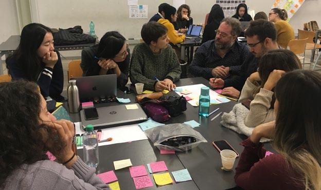
In the beginning of the Day, Marc made us a presentation about the workshop we would participate in the next 3 days and right after we did a warm up to wake up, recharge the energies and start working. During the first moment of the workshop we worked on the main feedbacks we received in the previous codesign session we had done with the associations of Dergano.
In the first 15 minutes we wrote down all the latest feedbacks we got, cluesterized these informations into main topics to create our ideation questions and further make an ideation session of 15 minutes.

15'
WRITE DOWN NOTES FROM PROTOTYPING
2.2 SECOND SESSION | FORMULATE HYPOTHESIS - QUANTITATIVE AND QUALITATIVE
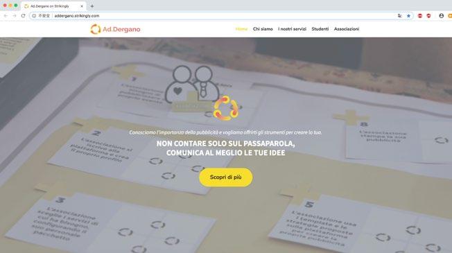
Then, we started formulating hypothesis as quantitative and qualitative. We divided the team in 2 groups and each group produced hypothesis. As a group, we qualified together in the post its if they were qualitative or quantitative. One of the examples for qualitative hypothesis is: “we believe that Polimi students will participate in this service because it will give them working experience”. An example for quantitative hypothesis is: “ Associations not always have facility with technology use, we created a platform that is user friendly so they will feel more comfortable.” Then, we clustered them according to the key aspects of our service. 2.3 THIRD SESSION | PREPARE YOUR PROTOTYPE In the late morning, we started to plan and create our prototype. Together, we decided to prototype 2 main aspects of our service: the website design and communication & the website use and interaction. The first prototype created was the the landing page of our website, conceived to understand if one of our service target (the students) would understand our service by reading the webpage and get interested in subscribing and uploading their portfolio in order to do an internship with us. Furthermore, this prototype was strongly recommended by the professors, indicating we were in the right way. 20'
CLUSTER & LABEL
10'
DEFINE IDEATION QUESTION
IDEATE
1. CREATE HIGH FIDELITY LANDING PAGE
15' 45'
CREATE LANDING PAGE


OUR LANDING PAGE


2. CREATE LOW FIDELITY MOCK UP

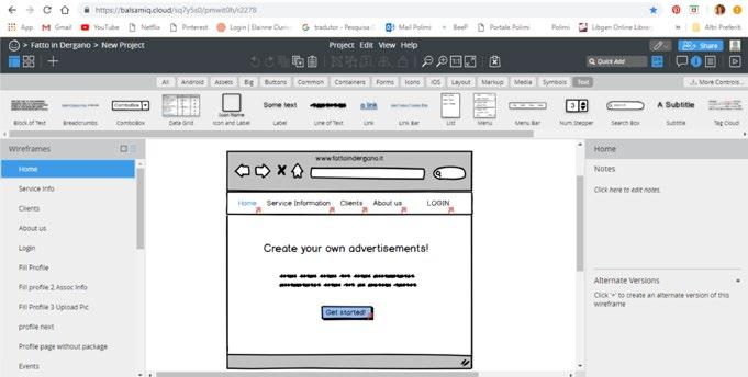
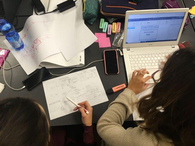
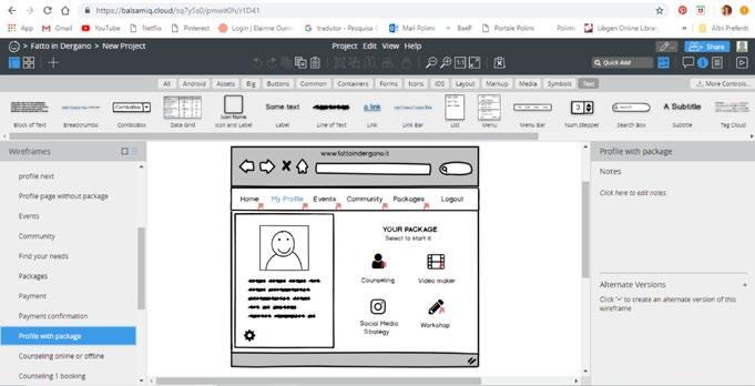
As a second prototype, we decided to create our website mockup using Balsamiq software to test in the next day with our final target (the associations).Creating the prototype allowed us to understand more in deep the details of our service and how to explain them in the website. We also had in mind that it would provide us many important insights when the users would test our website.


2.4 FOURTH SESSION | TESTS, METRICS & LOCATE POTENTIAL USERS
In order to have the best return with the prototype testing, We designed some evaluation metrics to use during the prototype test. We first described in paper exactly what we wanted to figure out during our prototyping sessions, in order to guide us during the process and have it documented.
Post-use survey distill questions from your hypothesis by identifying key areas that should improve with your idea, prepare pairs of opposite answers around negative and positive emotional keywords.
Partecipant: Teatro del Buratto
• For you to feel confident with our service, how would be the best way to know about us? Through a presentation/workshop that suggests a test of the service (or of a part of it)
• In a scale from 1 to 5, how hard to use was the service? Why? 3, it’s a “medium” judgement because the intention at the basis of the service is clear but the prototype is still “premature” an it is not specific on the promotion of the territory.
• Did you find the service useful? Using it, would you be able and willing to spend time in creating ads for your association? In our dimension of theatrical “firm”, the service is a bit too basic. From the perspective of a small or young association, it can offer a good opportunity.
• If there were dedicated spaces in the streets of the neighborhood for you to advertise events, would you use them? (How, where) I would talk about “integrated” visibility, strengthened by the dimension of a territorial network.
Choose one:
After using the service website you feel: • confused • confident • curious
After looking for the service you feel: • disappointed • satisfied • motivated After creating the video and sharing it would you feel: • frustrated • happy • I didn't try it
After visiting the “events” page in the website, you feel: • uninterested • interested
Partecipant: Rob de Matt
• For you to feel confident with our service, how would be the best way to know about us? I think the best way would be through direct contact with the service: speaking with the people that went already beyond the mediating tool. I would certainly feel more at ease, while using the service, if someone would help me and teach me.
• In a scale from 1 to 5, how hard to use was the service? Why? 4, it was definitely useful to discover the new possible opportunities.
• Did you find the service useful? Using it, would you be able and willing to spend time in creating ads for your association? It is a useful service, I think it would be mainly to foster the connection among different subjects.
• If there were dedicated spaces in the streets of the neighborhood for you to advertise events, would you use them? (How, where) Yes, absolutely.
Choose one:
After using the service website you feel: • confused • confident • Something in the middle, but definitely more sure than confused.
After looking for the service you feel: • disappointed • satisfied After creating the video and sharing it would you feel: • frustrated • happy
After visiting the “events” page in the website, you feel: • uninterested • interested
3.1 FIRST SESSION | VIDEO PORTOTYPE
During the morning, we worked in a few hours with a very challenging prototype: the video.
We started our morning as usual with Marc’s explanations and a warm up. Right after, we divided our group to be able to finish in time all the materials we needed. While 3 people from our group were refining the prototypes from the day before, the other 6 people were working in the video process.
We started by making a brainstorming of how our video could be done and deciding some key points that couldn’t miss in our story, such as showing the evolution of an association event after using our service.
Right after, the narrative of the story was created with all the group, while one of us was documenting all of it. Naturally, the sketches started to be created, giving personality and detailed characteristics to our storyboard.
When the storyboard was ready, we defined where we would record it, which equipments we would need. We printed some materials and we went straight for the shooting process, since we had to be fast! We shot the video in Politecnico university and right after we started to edit the movie.
Here the link to the video: https://vimeo.com/304931842 120'
CREATE A VIDEO
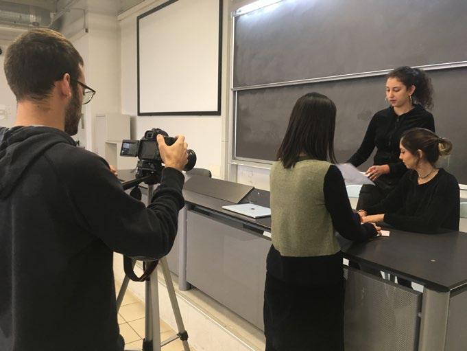
In the end, we were very happy with the result of the video, which showed us we can create many content in a short time.

3.2 SECOND SESSION | TEST THE PROTOTYPE
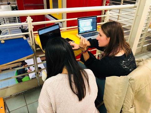
TEST OUR PROTOTYPE WITH STUDENTS In the afternoon we tested with students our landing page to check if they would be interested to take part in our service by seeing our online call. We also wanted to perceive if the landing page was informing clearly our service and what we were offering for students (the internship). During this phase, we focused on getting more quantitative information, so we tested it with 26 students. We split our group in 4 teams of two (A, B, C and D) and we walked around the campus looking for communication design students. When approaching one student, we would ask them: “Considering that you were looking for an internship in Service Career website from Politecnico, and you had found our website there, would you be interested in working with Ad.Dergano?”
Right after, we would give them a time to read and use our website; answer us if yes, they were interested, or not and give us feedbacks. Bellow is possible to check the results:

Team A • Tested with: 3 communication design students • Engagement: Yes: 2 No: 1 • Students Comments: “The landing page is simple, which is easy for reading. The graphics are good”. “The text should be larger. Use short sentences, more keywords and more graphics”. “It’s not clear the specific role of the student by reading the landing page”. “I don’t use the Career Service Website to search for internship”. “I have no idea where Dergano is”.
Team B • Tested with: 12 communication design students • Engagement: Yes: 11 No:1 • Students Comments: “But how and where the students will work? It is not clear” “It is not clear what you offer for students or for the associations” “Since it is like a graphic design job, the graphic design of the website is not good enough” “It is important to know how much I would earn with this job before applying to it” “It is a simple job that will pay me, I like it!”

Team C • Tested with: 4 communication design students • Engagement: Yes: 4 No: 0 • Students Comments: “The style of the page is not very attractive for a communication designer, because it’s very ‘PSSD’ style. Also the icons are not interesting. A communication designer would make it more graphical”. “The opportunity is very nice, so I would apply for it”. “The website, in general, is attractive, but it’s not clear if the services are for clients or for students”. “You should write in a more clear way”.
Team D • Tested with: 6 communication design students & 1 interaction design student • Engagement: Yes: 7 No:0 • Students Comments: “This website is better than career service. It seems interesting… Interesting idea, I would like to know this project”. “The website is so clear and cool. Actually, I am not interested because I don’t like to do graphic design, but I think it’s a really good opportunity for the students”. “The page is not the best, but it’s nice”. “It is not clear who you are, if you connect students with communication agencies or if you are an agency”. “Some texts need to have a bigger font and be synthesized”.
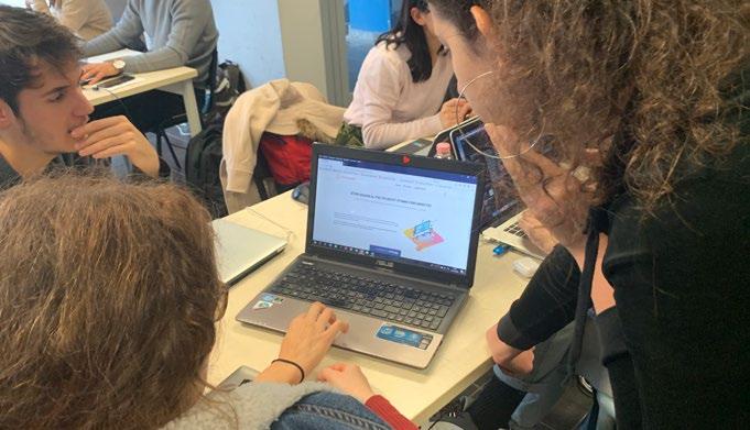
After this prototype moment, we gathered all the information and started to think about the modifications we needed to do in our website.

TEST OUR PROTOTYPE WITH ASSOCIATION In the end of the day, we went to Teatro Bruno Munari to test our website prototype with the associations. We showed them the landing page, but the test was focused on the website mockup.
We had the test with Francesco, promoter of Rob de Matt, and Silvio, one of the representatives of the Teatro del Buratto association that works inside Teatro Munari in Dergano.
We generally explained what we were expecting them to do, but we did not give them any detail or help, because the aim was to test if the mockup was understandable and if they were able to get to buy the package and use some of the online services on their own. Additionally, we were curious to see if they understood the additional value given by the premium package, and therefore purchase it. Finally, we observed how much time they would need to take in order to understand certain pages or arrive at a certain step.
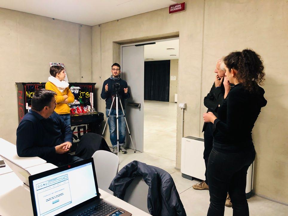

Silvio could use the mockup easily taking little time until he reached the “needs” page. He wished he could really select his needs, but they were preselected (due to the software’s limitations) to ease the process. He chose the basic package, but after the purchase he had trouble understanding where to find the services included. After finding it, he concluded the video template service easily, but then he asked about how the workshop booking was working, so we went back to the packages page and he chose the premium one, in order to test the workshop booking as well. He enjoyed the process and said the mockup was working fairly good, but that he would like to see the connection with the students that worked on the templates and that were holding the workshops.

Francesco tried the mockup and spent some time exploring the pages from the upper bar of the website. He was interested in the role of students since he found having a space for them was a good way to involve them in the development of the platform itself. He wanted to know more about the service in the info page so he tried to scroll down (he could not because of the aforementioned software limitation). He had no problem in logging in and getting to the selection of the packages and chose the Premium package showing no problem in the price we set as standard. He then had some issues going back to the profile page from having chosen the package. One thing he noted as very important was the “Events” page, that, he said, should be visible to everybody to show what is going on in the neighbourhood.

Francesco stated that some of the offerings are very useful, especially if there is no responsible person for the graphic part, or to offer laboratories to the public collaborating with the associations. Both associations said that the service could be really useful and used to develop project at a territorialnetwork level, so for instance to develop an image for the whole neighbourhood of Dergano.
Here the link to the video of the session: https://vimeo.com/305491328
4.1 SYNTHESIZE & IDEATE
We started the day watching the videos of every group and getting feedbacks from professors.
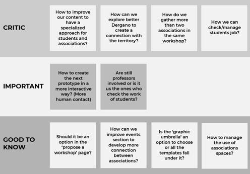
Then, we shared as a group our feedbacks and outcomes of the prototyping from the day before with students and associations. We clustered those feedbacks and observations as: what worked, what didn’t worked, ideas and questions. Then we formed new questions and integrated on the user journey to see how it will be affected. We prioritize our doubts and questions as critic,important and good to know, as it’s possible to check in the pictures bellow. Those questions were used later to refine our project. Then, we started to plan how our next Prototype Day would be developed. We created a written document with the main informations that would guide us in the nexts steps of the final prototype: 45'
TOTAL
3h
15'
WRITE DOWN NOTES FROM PROTOTYPING
CLUSTER & LABEL
10' 10'
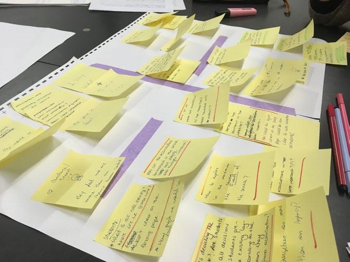
DEFINE IDEATION QUESTION
10'
IDEATE
Who would participate: the associations of dergano Rob de Matt/ Mamusca/ La Tenda/ Amico Charly/ Nuovo Armenia/ Teatro del Buratto/ Library of Dergano Why: • To give the associations the opportunity to test our service to feel closer to us, and provide us more feedbacks. • To understand if the structure they have is enough or if we have to provide materials (câmera, computer, etc). • To understand if the time of 3 to 4 hours workshop is enough. • To understand the level of information they already have. How: We defined the next steps, such as contacting the associations to invite them and understand what they would like to learn in the workshop. Define the location, materials to offer and how to teach the content for them in a way that they could really learn something new.

Right after, every group in the class presented this final prototype plan and we concluded the class sharing our feedbacks about those 3 days of prototyping workshop with professor Marc Garcia.
4.2 FINAL PRESENTATION

5‘
TOTAL
5.1 WORKSHOP PLAN
The final prototype session was designed to be a simulation of a real workshop provided by Ad.Dergano.
In order to organize it, during the previous week we invited 7 associations from Dergano, in which 4 of them confirmed to participate. We defined the theme of the workshop based on their previous feedbacks and lack of skills, so they could really learn and enjoy the workshop prototype. The theme was “How to preproduce a video”, in which they would learn how to plan a video, create the characters, the script and the storyboard. We prepared informational materials for them to use in the class and also to bring home/office, encouraging them to practice more times the activity we did together. WORKSHOP AGENDA 1. WORKSHOP AGENDA
WELCOME
10:00 INTRODUZIONE
10:10 WARM UP
10:30 INIZIO DEL LAVORO!
10:40
COFFEE BREAK
11:30
LAVORO! LAVORO! LAVORO!
11:40
PRESENTAZIONE
12:20 FEEDBACK
12:40
2.
GENERAL GUIDE
GUIDA PER WORKSHOP AD.DERGANO
IDEAZIONE
1. PIANIFICA IL CONTENUTO DEL TUO VIDEO
Definisci il tuo scopo
Cosa vuoi che il tuo pubblico faccia dopo aver visto il tuo video? Cosa vuoi che pensino/provino? Definisci il tuo obbiettivo in anticipo!
Identifica il tuo pubblico
Creare una “persona” specifica invece che un pubblico generico ti aiuterà a raccontare una storia autentica e in cui il pubblico potrà immedesimarsi
Usa il potere delle emozioni
Le emozioni sono ciò che portano gli spettatori ad andare fino in fondo al tuo invito all’azione, qualsiasi esso sia: iscriversi ai tuoi canali, condividere il tuo video o comprare un tuo prodotto.
2. COSTRUISCI UNA STRATEGIA PER IL TUO VIDEO
Crea una strategia solida per il contenuto del tuo video. Concepisci un contenuto mirato al tuo pubblico e impara a distribuirlo in base al tuo budget e alla tua scadenza. PRE-PRODUZIONE
1. SVILUPPA UN APPROCCIO CREATIVO
Fatti ispirare da altri video di successo, senza dimenticare che il tuo video dovrebbe essere unico rispetto agli altri in modo da distinguersi, riflettere delle intuizoni sul tuo target e non temere di essere diverso o strano.
Vedi esempi di video.
2. SCRIVI IL COPIONE
Sii coinvolgente, interessante ed emotivo. Cerca di essere intrigante per il tuo pubblico. Sii semplice e facile da capire. Trasmetti il tuo messaggio centrale. Un copione può includere informazioni dettagliate su luoghi, attori, materiali di scena e azioni.
Usa il template per il copione!
3. DETERMINA LA LUNGHEZZA DEL VIDEO
L’intervallo di attenzione media è di soli 8 secondi e mezzo. I primi 8 secondi del video sono abbastanza per una breve introduzione sul tema del video. Sarebbe meglio limitare il video a non più di 2 minuti!
4. CREA UNO STORYBOARD!
Lo storyboard è uno strumento che ti aiuterà a visualizzare le scene prima di girare il video. E’ collegato al copione, ne verifica la fattibilità. Con lo storyboard, trasformi le immagini nella tua testa in disegni su carta. Ti aiuterà anche a capire in anticipo quale attrezzatura può servirti.
Usa lo strumento storyboard!
5. PIANIFICA E ORGANIZZA LE RIPRESE!
3. SCRIPT TEMPLATE
AD.DERGANO
TEMPLATE COPIONE
ATTO 1 ATTO 2
PRODUZIONE
1. SHOOT THE FOOTAGE
Tutti coloro che appaiono nel video saranno rilassati e offriranno la loro miglior performance. Il video sarà girato con la giusta luce e la giusta inquadratura. Farai abbastanza riprese in modo da semplificare il processo di post-produzione. Dovrai seguire alla lettere il copione e lo storyboard.
Scegli la luce di sfondo (Vera/Artificiale)
Evita di usare il suono registrato sul microfono della macchina fotografica, un registratore audio esterno sarà decisamente meglio!
Usa la giusta luce! All’esterno in una giornata nuvolosa, un’ora dopo l’alba, un’ora prima del tramonto.
Per riprese in interno, la luce naturale è la migliore; perfetta una stanza con una grande finestra o con molte finestre. Se necessario, aggiungi altri luci con delle lampade.
Girare piccole scene renderà la post-produzione più flessibile. Controlla la composizione! Dividi lo schermo in 3 parti e posizione il soggetto in una delle intersezioni! POST-PRODUZIONE
1. MODIFICA IL CONTENUTO DEL VIDEO
Il video sarà più breve possibile ma conterrà tutte le informazioni necessarie, quindi taglia il video in modo da rendere il video semplice da capire e da seguire, essendo visualmente interessante.
2. AGGIUNGI GRAFICA ED EFFETTI
A volte grafiche ed effetti speciali aiutano il video a venire alla luce.
3. MIXA MUSICA ED EFFETTI AUDIO
Effetti audio e altri suoni possono essere aggiunti per creare un video più realistico e coinvolgente. Dovrebbero essere aggiunti in linea con il tono del video.
4. REGISTRA LA VOCE FUORICAMPO
5. LANCIA IL TUO VIDEO!
Puoi usare differenti piattaforme per condividere il tuo video per scopi di marketing, come Facebook, Twitter, Instagram e Youtube. Considera anche i post sponsorizzati che offrono queste piattaforme. Ancora più specifici saranno gli schermi presenti a Dergano.
EVENTO 1 Situazione attuale EVENTO 2 Evoluzione
EVENTO 3 Situazione successiva
4. GUIDE AND TOOLS TO MAKE A STORYBOARD
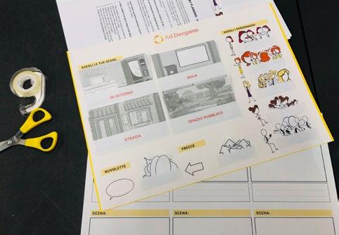
STEP 1: CREARE UN TEMPLATE
Disegna una sera di rettangoli su un foglio di carta, come se stessi creando un fumetto. Assicurati di lasciare spazio sufficiente per annotazioni e per frasi del copione sotto ogni rettangolo. COME FARE UNO STORYBOARD?
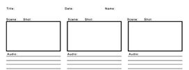
STEP 2: ABBOZZA IL SOGGETTO
Una volta determinate le proporzioni del tuo storyboard, dovrai disegnare i tuoi soggetti. Non devi essere un Leonardo Da Vinci dei nostri giorni, ma deve essere chiaro quali sono gli oggetti nella scena.

STEP 3: DISEGNA UNO SFONDO
Insieme ai soggetti, avrai bisogno di uno sfondo per determinare dove ci si trova.Lo sfondo potrà essere anch molto semplice. SE NON RIESCI A DISEGNARE, se disegnare i soggetti ti mette in difficoltà...

NIENTE PAURA! Abbiamo già preparato alcuni personaggi per te.
STEP 4: AGGIUNGI FRECCE PER IL MOVIMENTO
Le frecce mostreranno in che direzione si muovono i personaggi nella scena.

STEP 5: AGGIUNGI I MOVIMENTO DELLA MACCHINA FOTOGRAFICA
Oltre a determinare come si muovono le persone all’ interno delle scene, dovrai determinare anche in che modo si vedrà l’azione.

STEP 6: ETICHETTA LE SCENE
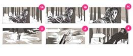
Etichetta tutte le scene. Se la stessa scena si compone di diversi frame, etichettali non sono con i numeri ma anche con lettere progressive. Quindi, se la prima scena ha tre frame, li eticcherai “1A”, “1B” e “1C”.
STEP 7: CONDIVIDI COL TUO TEAM
SCENA: SCENA: CREA IL TUO STORYBOARD
SCENA:
SCENA: SCENA: SCENA:
THE WORKSHOP | ACTIVITIES
At 9:30 the group was at the library room we booked, to organize the space. The morning started with a surprise, in which just one of our guests showed up. It was a bit disappointing, but the group overcame it and started the workshop with Silvio, the director of Bruno Munari theater located in Dergano. We made a brief introduction to ‘Fatto in’ project and to our service Ad.Dergano.
After that, we explained the theme and activities that would be done during the morning, and we showed examples of videos to be used as good and bad practices examples. Soon after, we did a warm up session that we learned during the workshop with Marc: clap, jump and shake. The warm up was done with our guest Silvio, the mentor Julia and our two professors Sergio and Elisa.
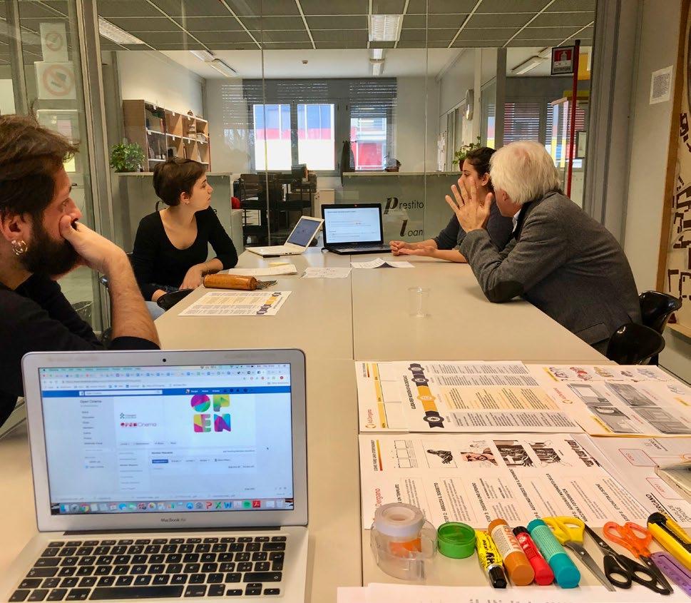
After warming up, we started to work. Carla presented an informative material on how to create a video, and later Silvio commented he would like to create a video to present the theater to the families and spread it on social medias. We then gave him the first template we created, which is a material to help writing the video script. After defining the 3 main moments of the story, we gave him the second template to help with the storyboard design.
He wants to work on an institutional spot: The discovery of the theatre Bruno Munari
A little girl is bored in the public gardens with her parents that don’t look at her but at the phone. She runs towards this (apparently) empty place and her mum/dad goes after her. They enter in a dark room and realise they are in the backstage of a play. Then, they open a door and discover another room: the foyer. There is nobody and the only sound they hear is a music playing in the background. In the room there are many doors, they open some of them and find a clown laboratory in one, a person playing piano in another, another where there is a different kind of play and so on. Then they go up to the stairs and find the offices, where they are greeted, then they go back downstairs in the café. In that moment all the people start leaving the theatre very happy.

He looked very conscious of what he was dong and had very clear ideas on the video he wanted to prepare, for example he already knew that he wanted only music and subtitles (or notes) in the whole video until the last dialogue. He thought about a 30-secondlong video to upload it on the social channels of the theatre or send it in the newsletter. He also gave us some detailed times in which we could film the video for real in the theatre.

After this moment, we had a 10 minutes coffee break and later Silvio continued to work with the storyboard, using our guidance to refine and add more details to the story and the drawings.

When he finished, we presented his story to us and we had a feedback moment, where he highlighted the need of creating other workshops with technical information of the further steps to record and edit a video. He also pointed out that the process of learning was pleasant and he had a great time during the workshop, besides having learned new tools and skills.

Here the link to the video of the session: https://vimeo.com/304928333


