1 minute read
DESIGN STATEMENT


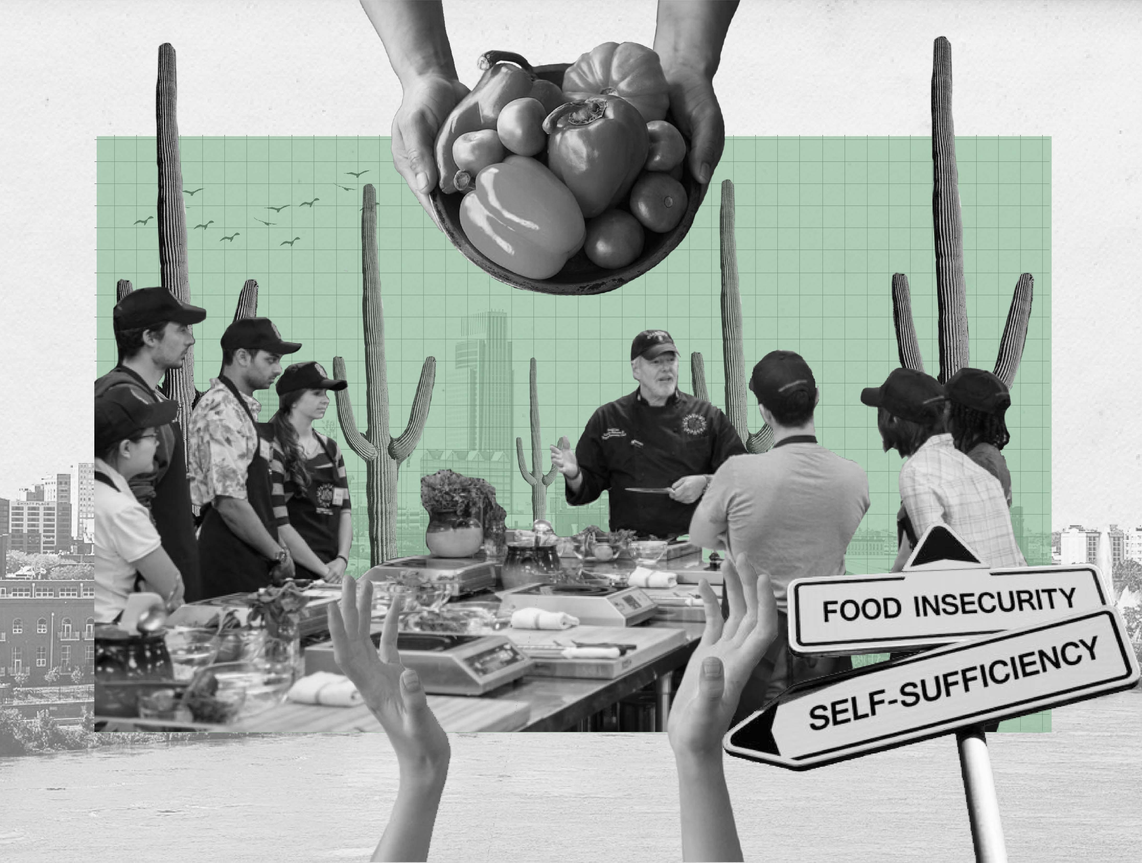
Located in downtown Omaha, it seeks to provide a community space where visitors are provided and educated about food. The first floor consists of the food pantry, main flexible dining/lounge, food redistribution area, and storage spaces. The second floor consists of office space and teaching kitchens.
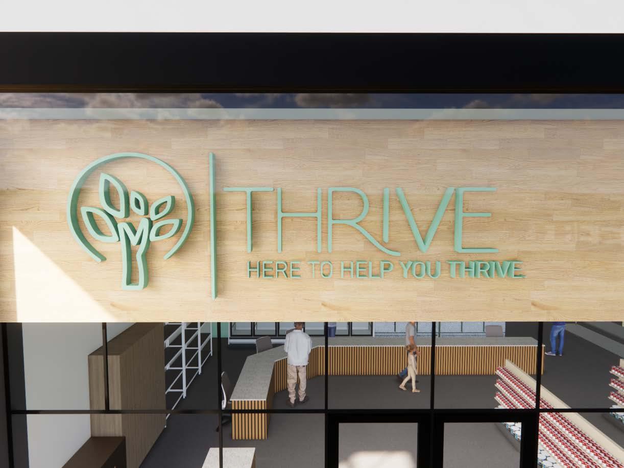
The entire design revolves around this idea of being a place where people can thrive through the food access and food/ nutrition education that occurs here, hence the name “Thrive,” which was inspired by the Casting Crown’s song of the same name. Specifically, the lyrics “we were made to more than just survive, we were made to thrive.” The album cover has a tree on it, which will ultimately be the logo of Thrive, and dictates the current material choices, with very natural, earthy tones, and tree influences. Another aspect that drove the project’s materiality was the idea of using the project to challenge how people think of food pantries, in terms of materiality and feel. In this thinking, the food pantry was designed to be more like a smaller market, to normalize the entire project and be more empathetic to the user.
Advertisement


This created a unique branding opportunity for both abstracting the original tree motif into various material choices, as well as incorporating murals communicating the Thrive nonprofit’s missions.


