RENOVATION MISTAKES TO


worry,
locally owned Carpet


room
all about
more about this teenage bedroom

up
by
get a sneak peek behind the design of
on
a
O’Hara
remodeled
Lisa Kooistra is the creative director and principal designer for Lisa Kooistra Design. This multidisciplinary sought-after GTA design firm has become known for creating exceptional well-curated interiors and custom builds.


Patti Wilson is the principal designer of award-winning Patti Wilson Design. Known for creating stylish, thoughtfully curated, livable interiors, the firm provides residential design services for discerning clientele, culminating in elevated interiors that are approachable and a reflection of their client’s unique story.
Kate O’Hara is the CEO and creative director of Martha O’Hara Interiors, a full-service interior design firm that designs and furnishes homes from inspiration to flawless outcome. With studios in Austin, Texas, and Minneapolis, Minnesota, Martha O’Hara Interiors has earned a reputation for designing classically beautiful spaces that feel refreshingly balanced and styled.
“We should make the best of where we live and we all should be able to come back home to a place that is welcoming and represents who we are.” — David Bromstad
Although it’s always sad to say goodbye to the bright days of summer, fall brings with it a crisp, clear air that paves the way for new beginnings. And what better time to refresh your home than during this cooler season, forgoing the rainy days and summer heat!
The housing market is hot right now, which is why so many people are choosing to stay in their homes and remodel. Whether you’ve just bought a new home or you’re investing in renovating your current house, let this issue of Beautiful Design Made Simple guide you through your journey!
In this issue of Beautiful Design Made Simple, we focus on all things renovation and remodeling. Our editorial includes exclusive content from professional designers like Patti Wilson, who discusses how to navigate the craziness of a home renovation. We delve into what’s trending this upcoming year with expert insight from interior designers. And you won’t want to miss out on valuable advice with our “5 Renovation Mistakes to Avoid.”
Plus, don’t forget about the solid foundation of any good home remodel—flooring! In this issue, we explore the nuances of how to make a smooth transition between floors with our article, “Creating Seamless Room Transitions.” We also showcase our favorite pet-proof floors in “Pet-Friendly Designs.”
Welcome to the Fall/Winter issue of Beautiful Design Made Simple by Carpet One Floor & Home.
Warm regards,





It can be easy to let the cold weather dull your sparkle, but with the right pop of color and personality, you can transform your home into a place that brings happiness. Finding joy at home is all the more important when you spend so much time there! Whether it’s through a patterned throw blanket or an abstract art piece, incorporating color and textures into your home can take it from drab to fab in the blink of an eye.


Transform any room in your home instantly with our Room

Visualizer tool. Choose from hardwood, luxury vinyl, carpet, tile, and more to find a floor that best complements your space.


Considering a home renovation this year? It’s no secret that remodeling your home is a huge project to undertake. Oftentimes, the worst part of a home renovation is getting started, but don’t fret we have a list of tips to help you get started. Here are five renovation mistakes to avoid!
We all know how easy it is to procrastinate, but this is one area where you can’t afford to! With the rise in housing costs, delayed shipments, and supplychain issues, it’s always best to plan as far ahead as possible. Because of pandemic-related labor shortages and backlogs, we recommend beginning to plan your home renovation at least a year in advance.

When beginning to plan your renovation, there are many things to consider. Here’s a list of top priorities to keep in mind:
Address any structural or safety issues
Draw a layout of the floor plan
Research your contractors early and contact professional installers
Take on big projects like flooring first
Think about lighting
Choose appliances and furniture early in the process

Although it’s tempting to cut corners and opt for less expensive materials (especially when you’re on a budget), you’ll pay more in the long run. Select durable, high-quality materials to ensure a long lifespan for your design.
Prioritize where you want to spend the most money. For example, high-quality cabinet construction and quality flooring are important for the overall structure of your design, whereas that high-end marble backsplash and the hidden water bubbler are not.
There’s a difference between a fresh, updated look and a fad renovation. For example, neutral colors are timeless classics that will never go out of style, whereas an abstract, asymmetrical accent wall installed to follow the futuristic interior design trend might look outdated in a couple of years.
Shag carpets and entryway chalkboards might seem all the rage now, but will you be sick of them in a few years? Stick to what you know you’ll love for years to come.

We get it—nothing gives you quite the same performer’s high as when you’ve completed a home improvement project on your own. But some tasks—like flooring installations—are better left to the professionals.
Painting walls, hanging wallpaper, and moving furniture are all prime examples of DIY tasks that you can confidently undertake. Structural changes, like installing new white oak floors or expanding the master bathroom, are a little trickier. It’s best to consult a professional before you end up in over your head. Trust us—spend the money now on quality craftsmanship so you don’t have to fix any issues down the road.

One design rule to remember when planning your next home renovation is that form follows function. Make sure your style blends with the natural architecture of your home. While a built-in water feature might sound appealing at first and look beautiful in the foyer of your home, what happens when your family grows, and you need more mudroom storage space for outdoor gear? Prioritize each space’s function over its appearance.
Remember, seemingly small details like the placement of doors, windows, and outlets are crucial to the overall flow of your home design. One misplaced outlet will leave you with nowhere to plug in the window A/C unit during those hot summer months.
Focus on the details. Pantry pullouts, toe-kick storage, and hidden kitchen appliances might seem small in the grand scheme of things, but they can make a world of difference in your everyday home life. There’s always a way to make a functional design beautiful.

Planning your next home renovation? Consider adding a personalized bar to your “must-have” list! A cocktail bar or a basement lounge is a great addition to a home renovation design. Not only do built-in at-home bars give you designated spaces for entertaining, they make excellent extensions to family dinner nights!
The best part about having a bar at home? Not needing to go out for drinks! Customize your home bar with one-ofa-kind accessories, from bottles and glassware to silly aprons and personalized bar logos.
Design by LAURA HAY Photography by STEPHANI BUCHMAN
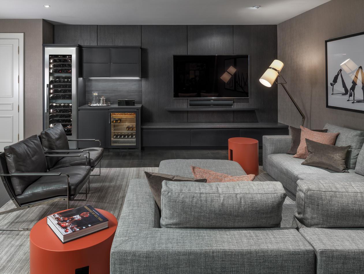
Transform your basement into a lounge space fully furnished with a wine cooler, mini-fridge, and glassware. Throw in some comfy chairs and a cozy area rug to create the perfect space to watch the next game. We recommend luxury vinyl flooring or laminate near the wet bar in your lounge space because they perform well in high-humidity areas like the basement. Plus, waterproof floors make cleaning up those drink spills easier!
Design by LAURA HAY Photography by GILLIAN JACKSON
Personalized bars don’t have to be just for alcoholic beverages— espresso bars and tea stations make crafting at-home brews fun, too! Maybe you’re a coffee aficionado, or your partner is a tea snob—look to install a custom bar fully equipped with a hot water faucet and a built-in espresso machine. You can even add custom drawers for essentials like Keurig pods, coffee mugs, and creamer.


Perfect for the early-bird crew, a breakfast bar nook has all the essentials for your first meal of the day. Often, breakfast bars include hot beverages, cereal, and fresh baked goods, so think of the equipment that you are most likely to need, such as a French press, an electric kettle, or a mini fridge for juice. Keep a bowl of fresh fruit and a blender on hand so you can kick off your morning with a refreshing smoothie.
 Design by ANDREA COLMAN Photography by STEPHANI BUCHMAN

If you’re currently renovating your kitchen, you might consider adding a butler’s pantry. These pantries have grown in popularity over the past few years as an extra space to store kitchen equipment, bulk ingredients, and baking goods that you might not want on display in the main kitchen. Plus, with a built-in fridge, a butler’s pantry offers the perfect space to prep before-dinner drinks and keep your mixers and other ingredients out of the main fridge space.
 Design by MICHELLE BERWICK Photography by MIKE CHAJECKI

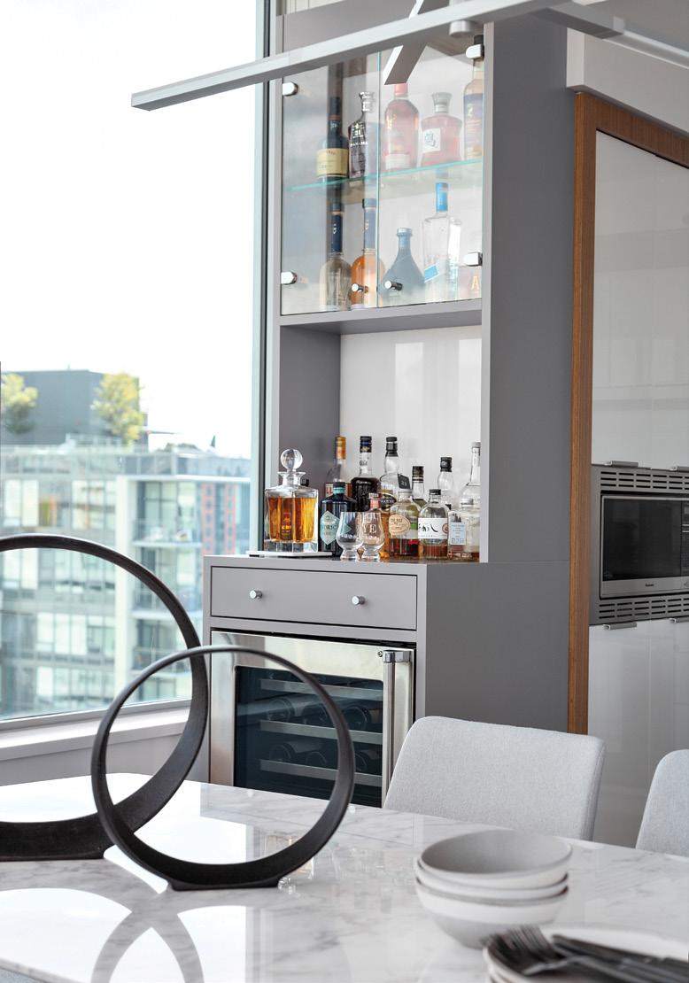
The perfect place to prepare your signature martini with a twist, cocktail bars are a simple addition to any kitchen, dining, or entertainment space. All you need is a bar cart or extra counter space. You can keep your cocktail lounge casual by displaying your prized bottles of liquor. Don’t forget to fully equip your cocktail bar with the essentials, including a cocktail shaker, fine strainer, and mixing glass. You can even level up with a built-in wine cooler to keep your favorite bottle of red close at hand.
 Design by KALU INTERIORS Photography by PROVOKE STUDIOS


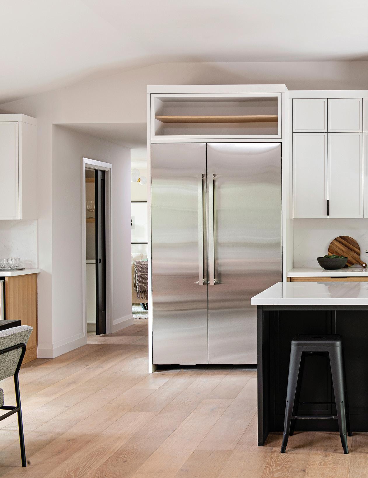
Who doesn’t love a little extra fridge storage and prepping space? The kitchen minbar provides just that, offering a place to stash beverages and more counter space to prepare your drinks. Plus, because the flooring in your kitchen is already designed to be waterproof, you won’t have to worry about dripping when preparing your margarita on taco night.
Design by REBECCA HAY Photography by MIKE CHAJECKI

First, who were your clients and what were their needs in designing this space?

This family had been one of our best clients when it came to trusting our visions and allowing us to create the home they wanted. They had a dream of taking an older, run-down bungalow on a beautiful street and completely revamping it. They have three children, so having almost all their needs on one floor was a must. They wanted the left wing of the house to have all the bedrooms, bathrooms, and laundry. The center of the house (the heart of it all) was designed for them to cook, entertain, and have a comfortable living space for TV and movie nights. They also wanted the ceiling vaulted to make this area grander and really make a statement. We added sliding doors on both the front and back of the house for the ultimate entertainment experience. The right wing of the home was designed so they could have a mudroom, pantry, powder room, and den. The clients had many wants, such as naturally sourced materials, environmentally friendly and low VOC-admitting elements, and natural gypsum free from offgassing and VOC exposure. One owns a naturopathic clinic downtown and likes to bring those practices into the home. They wanted a unique home without fitting the mold of other homes in the neighborhood.
QWe love everything about the living room— from the statement fireplace to the soft, bouclé chairs and potted greenery. Tell us a little bit about the design inspiration behind this room.
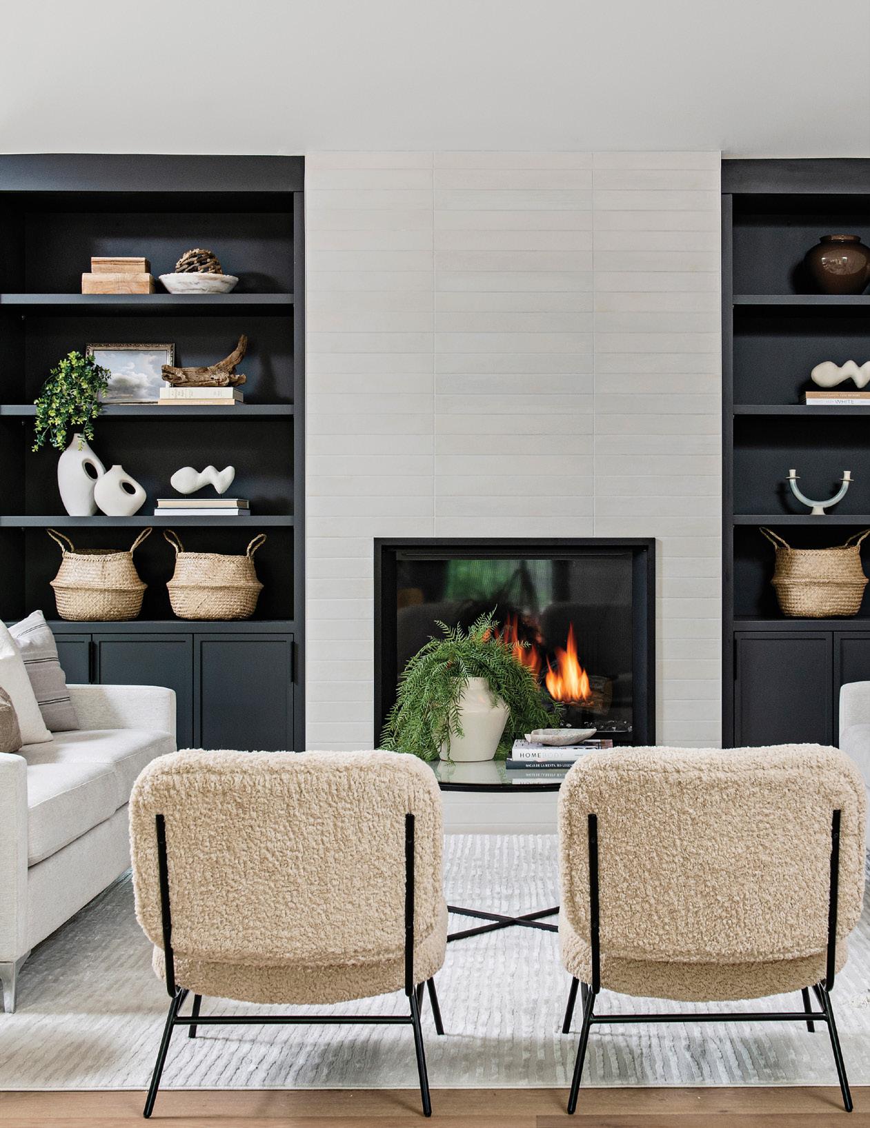
AWe wanted a consistent color palette throughout the main floor. This was to help create a calming environment while mixing in textures and finishes. The living room millwork is the same color as the island, which helps with the consistent tones used. We also wanted the décor to pop and show off the client’s style. The fireplace tile was inspired by Charles Eames’ mid-century modern style and famous interiors.
The kitchen is divine, with a double sink in the island and a custom stovetop with black and white accents. What is one thing you feel every kitchen space should have?

Kitchens need to have a statement piece! We love creating statements in the hood fan design. In this kitchen, we designed a custom, fluted hood that is sure to become a conversation piece.
The light, hardwood, wide-plank floors you used are right on trend with warm neutrals. What are your top considerations when selecting flooring for a home renovation?
The color of hardwood is very important because it really sets the tone and color palette. It’s important to consider who is living there—children, pets, and so forth—and determine where the flooring is going in the home. All these factors play a role in the finish, construction, and engineering of the wood. If clients with pets and children are set on a non-engineered flooring with a matte or smooth finish, it is important to help them understand that the wear and tear on the floors will become part of the charm of the home.
The mini bar in the dining room area is a nice touch. What are some of the benefits you consider when adding personal entertainment spaces like this?
When we know that our clients like to entertain, adding an area separate from the kitchen that can house extra drinks, bartending items, fancy glasses and a walk-up bar is a MUST! We also like to add walk-up bars when clients are coffee drinkers or like the idea of a separate beverage fridge. This way, there is a designated space separate from the kitchen to house everything you need.

Talk to us about your favorite ways to add statement pieces throughout a home design.
This can vary based on the overall design aesthetic, but some ways that we love to create impact are with applied moldings, wallpapers, artwork, stair runners, tile, lighting, and drapery.
The master bedroom has a gorgeously natural color palette—what influenced the colors?
We wanted this room to be a calming environment with large windows that allow lighting and greenery to shine into the space. The colors and tones are a representation of the natural feel and vibe throughout. The wall sconces were meant to be a statement whereas the fireplace was meant to blend and add warmth to the space.

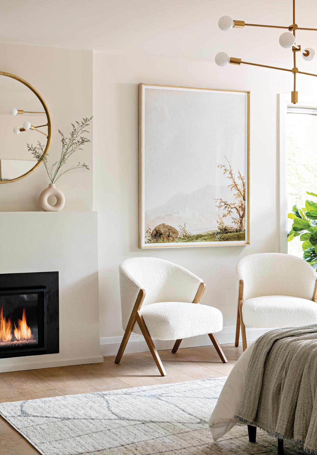
QPerhaps most unique is the bedroom sitting area with the cozy fireplace. What inspired this extra space?
With three children, it’s nice to create a little nook in your private bedroom that can be enjoyed when reading a book or sipping a coffee or a glass of wine by the fire at night with your partner.

We love what you’ve done in the master bath, with subway tiles in the shower and large-format floor tiling. How do you play with different textures and colors when using tile in bathrooms?

This primary bathroom has a real mid-century modern vibe. It’s fun to play with tile patterns when working with neutrals as well as the actual patterns printed on the tiles. In this case, we used a midcentury stacked tile approach in the shower that resonates in other areas in the home. The flooring is a fun play on the classic midcentury modern terrazzo tile dating back to the fifteenth century. Tiles do not have to be colorful to add drama to a bathroom; it’s more about the pattern and installation.

Now that working from home has become such a central part of our lives, what are some things you consider when renovating a home office?
When it comes to home offices, we really like to make these a stylish continuation of the home. We consider unique ways to hide and store away all the items you may need. A big investment is millwork, but we encourage our clients to invest in the right area to help with organization and a unique look. We like to design a wall of millwork in an office that can hide away the filing, office accessories, printer, and more! Adding some beautiful wall sconces or artwork and plants also adds warmth to a room. In this case, our clients’ professions don’t require a lot of storage needs.

Explore this season’s trendiest interior design styles with the latest edition of Styles We Love. With French Riviera’s high-class decor, Art Deco’s eccentric accents, and Biophilia’s nature-inspired details, these three trends make for the perfect way to stay in style this season.


French Riviera design offers an escape to the contemporary aesthetic of the French Mediterranean. This upscale style exudes luxury and sophistication with its lavish accent pieces and fresh coastal design. Infuse the French Riviera into your home with white-washed walls, colorful tiled backsplashes and neoclassical elements.


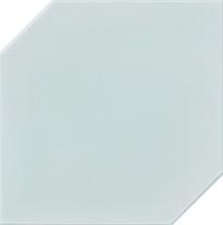


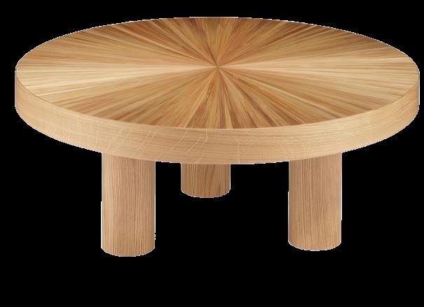


Biophilic design is all about bringing your love for the outdoors, indoors. By illuminating your space with natural light and integrating natural elements throughout your home, biophilia harnesses our innate love of nature. Sit back, relax, and take in everything nature has to offer with a Zen, biophilic aesthetic.



With its decadent detail, striking colors, and prominent geometry, art deco is all about bringing the Roaring ‘20s into your 21st-century space. This daring decor offers rich tones and glamorous qualities inspired by an over-the-top aesthetic that is sure to add personality to your home.




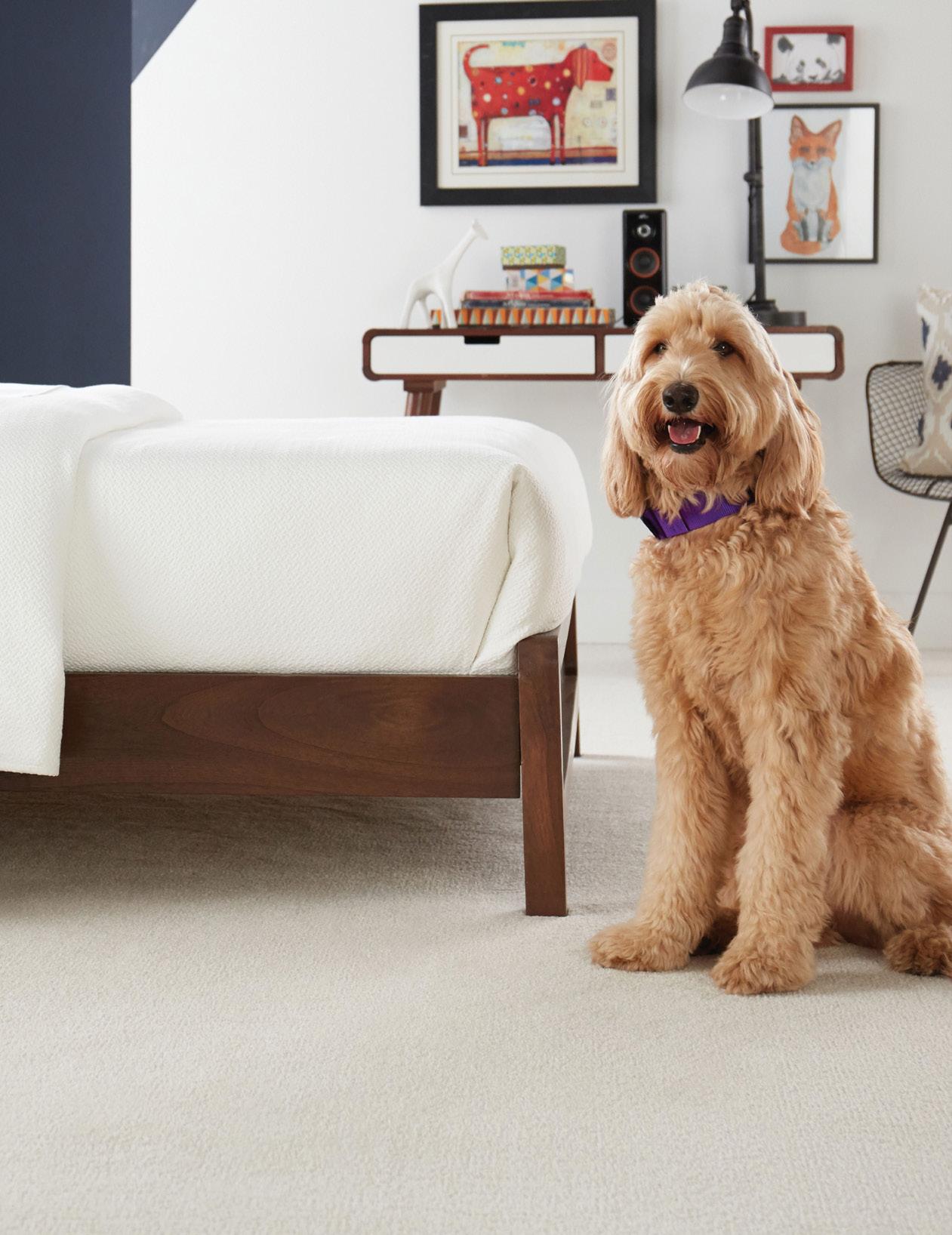
Our four-legged friends are more than just our pets. They are family. Let’s face it, though—these family members are not always the cleanest and can unintentionally damage some of your furniture, including upholstery. Pets are the best companions, but they tend to chew, claw, scratch, and shed all over the place. Fortunately, there are plenty of ways to design pet-proof spaces in your home. All it takes is a little planning and finding the right additions to make your space great for you and your pets. Check out our recommendations below to cultivate a comfortable (and clean!) pet haven.
INNOVIA WEEKEND GETAWAY IN CASHMERE SWEATER by Carpet One Floor & HomeWhen selecting furniture for your home, pick fabrics that are resistant to pet fur. Because upholstery is a magnet for fur and is easily soiled by dirt or damaged by pet claws, it is not ideal in a home with pets.

Some of our favorite pet-friendly fabrics include
Synthetic fibers
Leathers
Any quality textile that will withstand the test of claws and scratching
We recommend avoiding
Velvet
Velour
Corduroy
Mohair
Upholstered materials
Any delicate materials that could get snagged by claws
If you already have upholstered furniture in your home, don’t fret! There are a few simple steps you can take to ensure that your sofa stays fur free.
Step 1: Dampen a rubber glove and run your gloved hand over the surface of the couch to attract hair. Once the glove is covered, simply rinse off the glove and repeat as needed.
Step 2: Lightly spray a mix of water and fabric softener on your upholstered furniture and then wipe off as much pet hair as you can until the mixture dries.
Step 3: Once your furniture is free from dirt and fur, consider covering it with a liner or blanket to prevent future damage.
Pet furniture can be bulky and take up a lot of space, and it is not always designed to match popular interior design themes. Sometimes pet essentials cannot be hidden either. Pet crates, for example, tend to be large and wiry, and litter boxes, though necessary, are unappealing. Finding a way to make these pieces multifunctional and feel like part of a room’s decor is rule number one in incorporating your pet’s furniture into your space.
When selecting pet furniture, remember that materials matter. Consider selecting a dog crate that has a flat top that can be converted into a useful surface. Incorporating a dog crate into any space in your home can be achieved by styling the crate to fit your space. Add a wooden outer layer to your crate that matches the color of your wood furniture, or custom design a stylized dog crate for your living room or mudroom.
A similar concept could be applied to your cat’s litter box. We all know that although litter boxes are not the most pleasant addition to your home, they are necessary. Consider purchasing a cabinet that is big enough to store your cat’s litter box and has easy in-and-out access for your pet. You may even get some easy extra storage space out of it! Adding this to your bathroom, laundry room, basement, or mudroom makes it easier to keep your home clean from any debris that might escape the litter box.

When you own pets, choosing the right flooring materials matters. Pet-friendly flooring comes in different varieties. Whether you’re looking for hard- or soft-surface flooring, there are different options for you to choose from. Typically, you can find pet-proof flooring selections in hardwood, carpet, laminate, and luxury vinyl. Pet-proof flooring is tough enough to withstand damage from urine, scratching, tracked-in mud, and more. Here are some great benefits of pet-friendly flooring:
• Stains, mud, scratching, and moisture are no match for pet-proof floors.
• Pet-proof flooring offers traction so your pets can “grip” the floors and avoid slipping while walking or running.
• Pet-proof flooring is durable, waterproof, and easy to keep clean.
• Many options are budget-friendly, so regardless of how much you are willing to spend, you are likely to find flooring in your price range!

If you’re looking to take your pet-friendly home design even further, there are steps you can take to make your pet’s life more luxurious. Dog showers can make a great addition to any canine’s home. Installing a dog shower in your mudroom or bathroom can help alleviate dirt and quickly fix any messy situation. Not only are dog showers convenient, but they also can make washing your pup much easier and less stressful for both you and your dog.

If you have cats, consider installing wall-mounted floating perches or window perches for your feline friends. They not only act as a stylish piece of decor, but also provide a great adventure for cats who love to climb.
There are so many ways to make your home pet-friendly and pet-proof. Whether you’re adding a new space for your fur baby or adapting an old space to fit their needs, you are sure to find a creative way to make your home better for the both of you!


Simon says: What’s trending for 2023? While undertaking a home renovation is a lot of work, it can be a lot of fun, too! Take inspiration from the current trending styles to freshen up your new interiors. We asked several design experts what they’re seeing on the market for 2023. Here’s what they said!


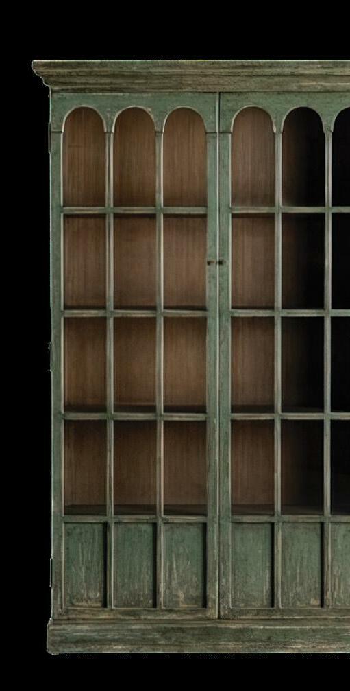
We’re moving away from crisp, straight lines and are adding curved furniture pieces and interior archways. We have seen this trend in Europe for a while now. Archways, curved interior walls, and furniture stem from Roman exterior architecture and started making their way into the interiors of the late nineteenth century.


Trends come and go, but there is something beautiful and classic about archways. Most doorways and pass-throughs are uninteresting, but archways create a statement when used sporadically in an interior (whether this is through a pantry, kitchen, long hallway, bathroom, or bookshelf). You don’t have to do much to this character-filled feature; it adds an Old-World feel that no other architectural element has. Arches also draw your eye upward to highlight the height of your walls.
As they say, what is old will become new again. Curved furniture has the same effect, because these pieces add interest and can be placed organically in an interior. This style was made famous by mid-century modern furniture designer Vladimir Kagan, who created the iconic Serpentine sofa in 1950. These sofas are largely referred to as conversation sofas or crescent sofas. They are not only meant for snuggling and watching TV, but also for cultivating aesthetic pleasure and conversation.

Floor patterns are trending—from herringbone to patterned tile. The herringbone is incorporated into tile or wood, sometimes throughout a main floor or in smaller areas such as an entryway. The patterned tile is created in a geometric style and is used primarily in powder-room floors, mudrooms, and laundry rooms. Terrazzo tile gives a nod to the popular European vibe for interior spaces—one of my favorite looks. It’s available in both muted colors and vibrant tones!

 Design by TRISHA ISABEY Photography by TREVOR COOPER


The idea of combining both vintage and retro with digital art inspired by the Metaverse will continue to trend into the next year.
Based on the 2023 Gucci collection, interior design will follow suit in creating retro atmospheres paired with a futuristic aesthetic, creating new designs and settings with an interesting new style. Vintage, retro pieces, traditional materials, and fabrications will continue to be used in contemporary ways. Think embellished and tactile wallpaper, crystal embellishments, floral appliques, Victorian ruffles, leather adornments, and velvets as accessories in a contemporary home. Now infuse these accessories with bold colors and shapes and use them as accents in furniture. Some may wonder how they can incorporate a vintage accessory with modern design elements, and the answer is simple: utilize a color palette. Whether you are trying to match a modern coffee table with a vintage sofa, or beautiful floral wallpaper with a modern leather loveseat, sticking to a cohesive color palette will allow for an all-around harmonious design.


Home design elements that will trend in the coming years include organic and natural elements, plus texture and patterns. Think textured, patterned floors and wall tiles, and textured tambour boards and wall treatments. The key is to curate these various elements carefully to create interest and balance. Terrazzo, graphic patterns, marble inlays, and boldly colored slabs and tiles will be a hit in luxurious interiors. Gone are the years of gray on gray!

Trending for 2023 is color. The farmhouse aesthetic kicked off almost a decade of neutral, neutral, neutral. But, as we emerge from the pandemic, people are energized and ready to jump back into a life of travel, entertainment, and social events. This energy translates to COLOR. The colors trending for 2023 in home furnishing will be ochre, persimmon, tobacco, moss, and other staples such as blush and navy. We will also see color brought into homes through biophilic design, aka bringing nature indoors to foster a feeling of health and wellness. We will maximize big punches of color in our designs through art, lamps, rugs, and pillows. We also love a gem of a chair that stands out boldly in a space.

We are introducing more vintage and repurposed elements into contemporary and transitional spaces, and clients are embracing it big-time. After being shut inside our homes for so long, I think we are all looking for a sense of comfort, simpler times, and maybe even a bit of nostalgia. Lovingly cherished, repurposed furniture, antiques, quilts, and artwork invoke childhood memories at grandma’s house and can be seamlessly integrated into redesigned spaces that feel thoughtfully curated and gathered over time.
Remember wicker furniture? We are seeing a resurgence of wicker made with natural materials like reed, cane, rattan, seagrass, bamboo, and willow. Wicker is being used in wall treatments and on everything from cabinet doors to furniture and headboards. Wicker, or any woven material, is a timeless classic detail that will have a lasting impression on interior design trends.


The all-white kitchen will always remain a constant; however, homeowners are feeling a little more playful when it comes to a pop of color on cabinetry in the kitchen and on other custom built-ins. Paired with a classic marble mosaic backsplash, soft-veined countertop, or vintage-inspired artwork and accessories, colored cabinetry is a classic and timeless trend.

 Design by PATTI WILSON Photography by MIKE CHAJECKI


When it comes to choosing the perfect flooring for your home, finding a onesize-fits-all solution can be a challenge. Therefore, in many homes, you’ll find varying flooring solutions as you move from room to room.
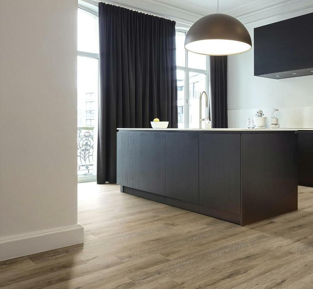
Each space has unique needs. Bathrooms, kitchens, and laundry rooms typically need waterproof and durable flooring such as tile or laminate flooring. But for other spaces, like your bedroom or living room, you might be in search of warmth and comfort, so a carpet or a warm-toned hardwood are likely contenders.
With so many different elements at play, it often makes sense to choose multiple
flooring options to fit the needs of each space. When this is done well, it creates a seamless design while still allowing for separate spaces. When done incorrectly, however, the change in flooring can feel abruptly jarring and, in some cases, can cause a tripping hazard at the threshold.
So how do you design a seamless flooring transition? With so many flooring options and factors to consider, it can feel like a daunting task. However, seamless room transitions are easy to create when you follow simple guidelines for choosing the best floors for your space.

The first thing you need to do is identify your primary flooring. If you’re starting from scratch or conducting major home renovations that aren’t limited to just one room, your primary flooring is simply going to be your first choice—whether that be hardwood, laminate, tile, vinyl, or carpet. If you are going to renovate one room only, your primary flooring will be the floor you are not changing, that borders the room you are changing. Identifying your primary flooring choice is essential for a seamless room transition, because you’ll base your secondary floor on your primary floor.
Your secondary floor may be the more difficult choice of the two. With your primary flooring, you have only to consider the needs of the space and your personal taste, but you must weigh your secondary flooring as an option not only for the designated space, but in relation to the primary flooring. So, what questions should you ask yourself as you design your room transition?

To narrow down your flooring choices, you should first consider the purpose of the space. What you plan to do in a room plays a huge role in determining the right kind of flooring. Is it a living room that doubles as an at-home game room? You may want a floor such as carpet or engineered hardwood that absorbs sound for those lively game nights but is durable enough for a high-traffic area. Will it be exposed to a lot of moisture? It may be beneficial to consider waterproof flooring options, like laminate, vinyl, or tile. Do you want your bedroom to feel warm and cozy, but need a smooth surface for your corner home-office? A warm-toned hardwood or wood-appearing laminate would be great options to explore.

As you determine your wants and needs for the space, narrow down your flooring choices to whatever solutions fit best. Doing so will help you decide on a complementary secondary floor. After determining the kind of flooring you want, you can consider other elements that are important for creating a seamless transition.

There are a few things to consider when selecting colors for your flooring transition. First, consider the color of your primary flooring. If it’s wood or has a wood-like appearance, what are the undertones? Is it a warm brown, or is it a cool grey? Is the flooring dark, light, or an in-between shade? Is it one solid color, or composed of multiple colors, or shades of the same color? These questions will help you determine what color your secondary flooring should be.
It’s best to err on the side of complementary, but not identical. Oftentimes, when you try to make an exact color match you might create the impression that you tried to match but couldn’t. It’s better practice to choose a color that’s complementary and has similar undertones to the original to avoid clashing. For example, if your hallway flooring is a warm, medium-toned hardwood and you want carpet in the bedroom, you could go lighter in color with a warm beige or go darker with a deep brown. Similar but different is a good rule to follow as you create your room transition.
A transition strip is the piece of material that covers the border between one room and the next. Specifically, a transition strip connects one kind of flooring to another. Although they are often made of wood, they also come in metal, aluminum, or vinyl. If you chose floors of the same material, like two different hardwood floors, it may be that you don’t need a transition strip between the rooms. However, if your floors are different materials, like carpet and laminate, you will need a transition strip to account for varying floor heights and to smoothly transfer from one floor type to the next. There are three major types of transition strips; which type you choose will depend on the two floors you’ve chosen to bridge together.

• T-Bar is made of solid wood and is good for transitioning from hardwood floors to another flooring with a hard surface and a similar height, like another hardwood or ceramic tile.

• Reducer Molding is also often made of wood and is used to bridge two floors that are different in height, such as laminate and carpet.
• End Bar is used to bridge the gap between hardwood or laminate with another type of flooring, like carpet. Like the reduced molding, it is designed to bridge the gap between floors of varying thicknesses.
Above all else, the best room transition is one made with two floors you love. Be sure to choose flooring that fits not only your needs and those of your space, but also suits your unique home design vision. While considering these helpful guidelines, know that if you go with your gut, there are ways to seamlessly transition any two flooring options.
If you’ve ever lived through a kitchen renovation, seen one in progress, or heard about the trials and tribulations second- or third-hand, then you already know that a kitchen renovation takes time, patience, and a budget. At the end of it all, a welldesigned and well-executed kitchen is worth every dime, every minute, and every bead of sweat spent. A successful kitchen remodel can make life easier, elevate your enjoyment of the home, and increase its market value. All in all, a kitchen renovation is a worthwhile investment.
On the other hand, a poorly built and finished kitchen can drain your wallet and suck the soul right out of you and your home. Don’t fall prey to a poorly planned kitchen project. Here are my tips for surviving the renovation—from someone who’s done it a few times!

A kitchen is by far the most complicated room in the home to renovate. It’s also the most expensive and arguably the most important when it comes to the function of your home and your quality of life. With all the various moving parts involved, many people choose to work with a professional designer or company that specializes in kitchens to handle the heavy lifting, from creating a design that’s reflective of your lifestyle and aesthetic, to balancing the budget, sourcing and scheduling trades, ordering materials, and maintaining a timeline. If you choose to manage the renovation on your own, be mindful that all these elements require careful
consideration and coordination. Before starting a kitchen project (or any renovation), be prepared for what lies ahead.
In my career as a designer, I’ve seen many wellintentioned kitchen renovations go wrong because of inexperience, overshot expectations, underestimated budgets, and unrealistic timelines. More often than not, a kitchen renovation will take longer and cost more than you think, so plan for this!


Book your installations well in advance. Depending on the time of year, your location, and preference, you may have to wait from six months to a year to complete your ren ovations. Discuss the scope of work, material details, and the timeline with your team. Beware of those promising to deliver the world in a weekend. Whether you’re work ing with a designer or going solo, engaging your professional team early in the pro cess affords you time to plan and prepare for the inconvenience of temporarily living without a kitchen, and it gives the pros plenty of notice to schedule installations, order materials, arrange for deliveries, and do the work.

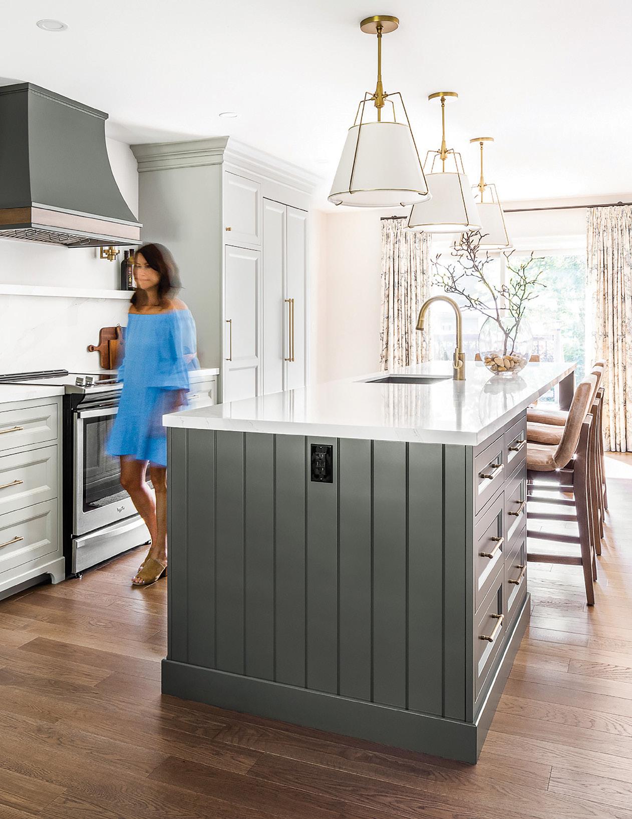
The kitchen in our most recent project struck a balance between function and style; it was designed for an energetic retired couple who love to cook and host family gatherings. The existing kitchen was in decent enough shape but lacked functionality and storage—a huge miss considering the kitchen is the busiest room in the home. The original cabinets were dark wood, which our clients wanted to trade for something brighter and more contemporary. Living so close to the water, they asked for a kitchen with a modern farmhouse vibe that reflected their location and love of the outdoors.
To achieve the casual, airy vibe and sense of community they were going for, we opened up the main floor by removing a non-load-bearing wall separating the kitchen and dining room. This layout also created an open sightline to the

family room, allowing natural light to flow freely throughout the entire space, with a brightness that’s amplified by the light cabinets and countertops and the neutral walls.
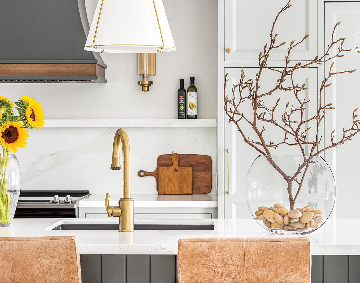
A large island at the center of the space is the star attraction for function and style—the perfect place to prepare a meal, serve, and dine. The island, together with the range hood, is finished in a muted, mossy grey colour that complements the off-white cabinets and carries the country-kitchen theme.
We reviewed and curated every detail, including appliances, cabinets, faucet, furniture, draperies, lighting, countertops—right down to cabinet hardware.

The kitchen is the most expensive room to renovate, with lots of big-ticket items such as cabinets, countertops, flooring, and appliances. A little extra spent here and there can quickly send your budget into a tailspin. This doesn’t even factor in those unexpected, unwelcome surprises that will inevitably arise once you open up walls. Any problems with the plumbing or electrical system, or other issues such as mold, will need to be addressed before any cosmetic work can begin. And yes, it can become more expensive.
To ensure that unforeseen circumstances do not force my clients to give up preferential design features or function, I typically dedicate between 10 and 15 percent of the total renovation budget as a “just in case” fund. If nothing comes up (but trust me, something always comes up), then you’ll have some money left over to indulge or put away for the next project on your to-do list.


On the topic of budget, I’m all for finding great deals, but be careful about buying clearance or “on sale” items online. Buy from a trusted retailer who stands behind the quality of their product and service. How will the vendor handle items that are damaged during shipping, and how long will it take to replace them? When it comes to critical components, don’t skimp out.


What features and upgrades make sense for your family and your lifestyle? Stay focused on the end goals of the renovation and ask which features will help you achieve those goals. Kitchens remain a huge focus for manufacturers and suppliers in the industry, and trust me, there’s always something new on the horizon. But just because it’s new doesn’t necessarily mean it’s right for your renovation. Ensure that your design choices and upgrades make sense for practical purposes and property value. Features such as custom cabinets, quartz countertops, and extra storage space are always in demand and are generally a safe splurge. Conversely, avoid being too trendy, especially when it comes to the key items that are expensive and inconvenient to replace. When choosing things like cabinets, floors, and countertops, I always recommend opting for neutral choices that have more staying power.
A kitchen renovation is one of the biggest projects you’ll undergo. It’s also the one that will have the biggest impact on the function, style, and value of your home. Be prepared before going all in, and most importantly, be realistic. Yes, you’ll be out-of-kitchen for a few weeks or months, depending on the scope of the project. Although it will be an inconvenience, remember that it’s only temporary. When the renovation is complete, your pleasure will outweigh any pain you endured along the way. The secret to surviving the kitchen renovation is ensuring that you have the right team and resources, a thoughtful plan, and a clear path forward for a kitchen that checks all the boxes: function, style, and budget.
Carpet One Floor & Home® is proud to support the Homes for Heroes Foundation in their mission to end homelessness among our Canadian Veterans. Learn more at H4HF.ca

 Written by KATE O’HARA Design by MARTHA O’HARA INTERIORS Photography by SPACECRAFTING PHOTOGRAPHY Remodel by MDS REMODELING

After relocating from a large city where square footage came at a premium, this family of four was eager for more space, combined with the benefits of city living. Location and walking access to restaurants and shops remained a priority, but inside, the home was about creating connectedness for parents who love to entertain, while offering personal areas for two teenage boys.
What was originally a twobedroom condo would no longer cut it for this family with teenagers. At the same time, because the condo wouldn’t be their forever home, the overall goal was to make changes that would support how the family wanted to live in their new home and city and increase the property’s value without any significant architectural changes.
This lofted condo offers great space for entertaining, but with dated finishes and only two bedrooms, it simply wasn’t enough. We found opportunities and solutions to modify this home to fit all the needs of a busy, city-dwelling family of four.

There’s a reason this family fell in love with the condo, and it was our job to highlight all the best features while ensuring that it could accommodate their daily needs. By embracing the current architecture, we found ways to enhance flow while infusing our clients’ eclectic, contemporary style.

A dated color palette in an array of beiges was adjusted to establish new focal points throughout the home that accentuate what the family loves most. A fresh coat of creamy paint and refreshed flooring in a dark finish created a backdrop that showcases the space, views, and furnishings.

Although spacious, this contemporary loft presented an oddly shaped floorplan. Given the unique layout of the main floor with its angled and asymmetrical spaces, our furniture plans had to be thoughtfully arranged. A fresh face meant an invitation to appreciate skyline views and help a useful stairway blend into the background. It meant transforming nooks into intentional and functional spaces with furnishings and finishes. A sitting area is nestled within the staircase. Layered textiles add intimacy, and furnishings define this cozy spot for reading and unwinding. A velvet pinstripe adorns swivel chairs, and a diamond-patterned, oversized ottoman grounds the area. Favorite books, accessories from worldly travels, and personal artwork amplify the coziness of the area.
We had to be careful about furniture floor planning to ensure that the furniture did not interfere with the door to the balcony or the path to the dining room and loft staircase. The goal was to maximize seating without obstructing the view. A vibrant palette connects the sitting area to the living room, maximizing function for this family that loves to entertain while also allowing separation and privacy for everyday living.
The jewel-toned sofas in plush velvet are anchored by an area rug, carving space for conversation amid the exposed brick and downtown views. The mix of materials feels slightly industrial, with texture and color elevating this seating area. A lacquered linen console behind the sofa adds functionality as a perfectly positioned drop zone at the stairway’s base, leading to a loft for the boys.

The golden oak flooring needed new life, and with a mix of dated wood tones throughout the residence, it was time for a dramatic change. We kept the original hardwood floors and gave them a refresh to complement the creamy color palette and modern design.
Uniform flooring throughout the residence makes the transition from one space to another feel natural, thereby creating a sense of cohesion and continuity. With the condo’s sky-high views, the rich tone is a grounded comfort, paired with bright walls, bold details, and ample natural light.
We painted the window frames black to frame skyline views and create a natural focal point. The clean lines of the windows juxtapose the warmth and texture of the exposed brick wall and let in all the daytime and nighttime light. This sets the stage for bold color and statement pieces. Sconces, floor lamps, chandeliers, and pendants offer warm nighttime lighting and ambiance when paired with the evening glow of the city.

For many, especially those who love to entertain, the kitchen and dining areas are the heart of the home. These areas are natural spaces for gathering and making memories over food and drink. This family needed a kitchen and dining room that would not only serve their family of four, but also accommodate a crowd.
One of our first goals was to unify these spaces. Both rooms were seamlessly connected by adding weight to the colors of the dining table, metal buffet cabinet, and vice versa in the base of the island and kitchen backsplash.
Quartz countertops match between spaces, and a metal and glass buffet cabinet stands out in the dining room. White lower cabinetry blends gracefully within the space without contributing too much visual weight. Adding even more cohesion is a wood veneer wallcovering backsplash in a bold diamond pattern, paired with a smaller scale diamond backsplash in the kitchen. Brass and silver leaf finishes add opulence and connection.
Serving up style and purpose, these details create an interesting canvas with clean lines that showcases a connectivity between rooms so that dinner parties can now happen with ease.

Like much of the home, the biggest challenge in the primary bedroom suite was an uncommon floor plan. The lack of wall space for a bed or dresser required an unconventional approach. To make the most of the room, we angled the kingsized bed in the corner between the windows. The door into the bedroom, which is also on an angle, is directly across from the bed and creates a welcoming feeling upon entering.
Layered wool rugs and oversized artwork anchor the space and create defined areas within this large room. The room is not only a clear sleeping space, but features a secondary area for reading and lounging near the balcony. Because


Counter stools and dining chairs are lavish in a light performance fabric that is made for messes. They provide visual relief from the heavier furnishings around them. Brass accents, like the kitchen pendants, nailhead detail on the counter stools, dining chair ferrules, and buffet cabinet accessories, are understated and elegant.
The result is a kitchen transformed into a modern showstopper, blending seamlessly with the nearby dining room. Contrast and cohesion result from a balanced color palette that feels modern and elegant.

this is the main suite, we wanted to create the impression of a boutique hotel in the comfort of the client’s home. Finishes and furnishings accomplish this goal with clean lines, unique shapes, crisp white bedding, and plush textiles. The bold floral velvet on the ottoman served as the initial inspiration for the overall color palette and invites fresh color accents amongst the otherwise moody space.
The ensuite features a timeless yet modern blackand-white aesthetic that will never go out of style and can be paired with any accent color to instantly transform the space.
This bedroom perfectly captures the spirit of a teenager in need of his own space, a room that is equal parts modern and mature. Tall ceilings provide the necessary expanse for the youngest son to sleep, work, and play. A bold navy on the walls and ceiling offers a daring canvas for artwork and lighting, and a mix of wood, metal, and geometric elements creates a sophisticated and modern atmosphere. Natural light streams through a large window to showcase this teenager’s love of plants and to highlight architectural details.

We selected furnishings that could grow with this teenager into adulthood. Vertical space maximizes the room’s function with a lofted bed and designed entertainment center underneath. This is great for watching movies or playing video games. In addition, an adjacent sleeper sofa offers comfortable overnight hangouts with friends.
This room is all about fun and function, with city skyline views and modern accents that feel grown up for a teenager who is ready for adulthood.

The upstairs loft features a cozy hangout for teens away from the busyness of the main floor. With an additional bedroom, the loft ensures that each teen has his own private space. This loft has it all, with easy access to the rooftop patio and a hidden office.
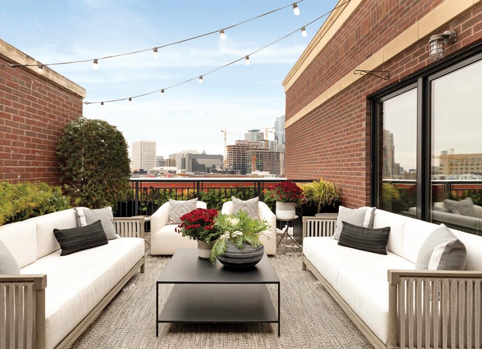
With big architectural changes out of the question, we decided to wall off a private bedroom for the eldest son. The remaining area was repurposed for the boys to share—a TV hangout, a music room for piano practice, and a homework station built into a closet and framed by a sliding door.


This downtown condo packs in function by including a hidden desk behind a sleek and modern sliding door. This office has the perfect mix of storage and workspace to maximize the square footage.
Planning a design is about relying on your team of designers and contractors to tailor your home to suit your family’s needs. You don’t need to know exactly what you want, but you should share must-haves, pain points, and inspiration to cultivate a home that’s right for you.
By seamlessly mixing the couple’s contemporary and eclectic styles and paying thoughtful attention to the family’s everyday and hosting needs, this loft can now accommodate daily functions in the most breathtaking city landscape, offering the best of urban living.

Shopping for new floors doesn’t have to mean multiple trips to the store. Browse our wide selection from the comfort of your home, pick your six favorite options, and we’ll send samples right to your mailbox. Once you choose the floor you love, we’ll work with you how, when, and where you want for a convenient, easy, and fun flooring experience.

Carpet One Floor & Home is your local source for all things flooring. Before diving into your next flooring purchase, learn more about what makes each type of flooring unique.

Versatile and beautiful, tile can complement nearly any style from traditional to contemporary and everything in between. With a wide variety of available colors, patterns, sizes, and shapes, creating a design that is exceptionally beautiful and elegant is simple. Tile offers a substantial number of styles, and some types are even water resistant or waterproof, making them ideal for moisture-prone areas like kitchens, bathrooms, and foyers. Tile can also be used to create an accent wall, interior spotlight, or textural feature for an elevated design.


Offering the look of hardwood, tile, or stone at a more affordable price, laminate floors are an excellent choice for those searching for the ideal combination of features, looks, and cost. The unique construction of laminate makes it highly durable and even water resistant—ideal for many areas of your home. Entryway, staircase, playroom, and dining room messes don’t stand a chance against the durability of laminate floors available today.

Area rugs are a quick and easy way to transform the look and feel of a space. Available in endless options of colors, designs, sizes, and even shapes, they can play a major role in interior design by defining key spaces and providing complementary looks. Area rugs can also provide a level of protection for hard surface floors, making them an excellent choice for any space where heavy traffic is common. And, because area rugs are a less permanent flooring style, they can easily be swapped out as trends and styles evolve so your home design stays current.
NOURISON DREAMY SHAG IN LIGHT BLUE GRAY
The ideal flooring option for adding warmth, carpet has been around for many years and still holds the top spot for making any space feel cozy. Carpet offers the opportunity to increase a home’s overall level of comfort, and new technologies have also increased its many benefits. With softer, stronger, and more stainresistant carpets on the market, maintenance is lower, and the burden of upkeep is no longer an issue. Plus, with new styles emerging every day, carpet is stylish and trendy and offers a look that suits any up-and-coming trend.


Known for its natural, charming appearance, hardwood has proven itself timeless and stylish. With an inherent strength complemented by raw beauty, hardwood floors create a beautiful canvas for inviting interior styles that are flawlessly fashionable and long-lasting. Available in varying wood types, stain colors, and finishes, there is an abundance of hardwood on the market to choose from. Some of today’s hardwood flooring styles also offer additional features like water resistance and scratch resistance to hold up to life’s toughest days. For a timeless and elegant look, hardwood floors are a great option.

Luxury vinyl flooring is a top choice thanks to its gorgeous appearance and unmatched value. With cutting-edge technologies and digital design advancements, many luxury vinyl styles offer wood, tile, or stone finishes that closely resemble the genuine product they’re mimicking. These products are often so realistic, it can be difficult to discern between vinyl and the legitimate product— making it a tasteful, attractive option for almost any interior style. In addition to its stunning appearance, luxury vinyl’s features make it ideal for a variety of lifestyles. Low-maintenance and water-, scratch-, and scuff resistance are just a few features you can expect from vinyl flooring.


FACEBOOK facebook.com/carpetone
INSTAGRAM instagram.com/carpetonefh
YOUTUBE youtube.com/carpetonefh
twitter.com/carpetone
BLOG carpetone.com/inspiration
“YOUR HOME SHOULD TELL THE STORY OF WHO YOU ARE AND BE A COLLECTION OF WHAT YOU LOVE.”

~ Nate Berkus ~


one of a homeowner’s most-feared stains. The thought of spilling red wine on carpet has been causing stress since the beginning of time. But make no mistake: the intimidating stain can be tackled if the correct steps are taken in a timely fashion. So sit back, pour yourself a glass of your favorite variety, and sip without worry, because you have Stain First Aid on your side.

what you’ll need on hand to make sure you’re prepared for an accidental spill:
Clear dishwashing detergent
vinegar

towels
water
Sponge
Books
Create your cleaning solution:


Mix ½ teaspoon clear dishwashing detergent with one cup of warm (not hot) water
Blot up excess spill.
Apply cleaning solution using a damp towel and leave 3-5 minutes.
Blot, don’t rub.
Apply undiluted white vinegar using a damp towel.

Blot, don’t rub.
Apply water with a damp sponge.
Blot again.
Finish by weighing down a half-inch thick pad of white paper towels with books to absorb all the moisture. Leave overnight if necessary.
Note: Not all carpet fibers react the same way when treated for stains. Before proceeding with any of the preceding cleaning procedures, we recommend you contact the appropriate fiber company for their suggested maintenance guidelines. Failure to follow these carpet stain removal guidelines may void your warranty. For more information, please contact your Carpet One Floor & Home retailer.
But they don’t have to stay with you forever. Be prepared to tackle any stain that life throws at you with Carpet One Floor & Home’s Stain First Aid app. It’s free for your iPhone, iPad, Android phone or Android tablet.

Never panic again when spills happen. Stain First Aid has over 50 of the most common household stains covered, including detailed cleaning instructions and video tips.

