5 minute read
The Charm of the Old Town
Photography by Tomeu Canyellas
In collaboration with interior designer Ondrej Zdercik, Jaime Salvá and his design team have completely refurbished a 110 m² apartment in Palma de Mallorca, mixing sophisticated colors with original materials.
Advertisement
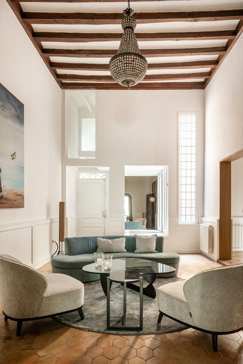
Situated in the historical center of the city, near the Town Hall and the cathedral, the apartment's building is surrounded by narrow winding streets. Its owners were looking to create a new home in the city, and the old town caught their attention due to the life on the streets of this characteristic neighborhood. The apartment was totally outdated; the facilities had to be renovated and thermally insulated. In the reform, careful attention was paid to preserving the elements that managed to maintain the essence of the original house, adding other more contemporary ones that could work. The main goal was to achieve a stylish and timeless environment, where the intervention was barely noticeable, and the apartment could be considered current and old at the same time. The premises that guided the reform were to gain light, open spaces and to preserve original elements. Care was taken to rescue the original materials that were most worthwhile, improving the functionality of the spaces and enhancing the great height of the original ceilings. Upon entry, a large mirror has been included which projects the adjacent formal living room, creating interplay between spaces. Here the exposed beams have been kept which increase the "historical value" of the house. The sofa and a pair of armchairs by Casamilano, characterised by an extremely refined and enveloping line, become the protagonists of the space. While a couple of tables, completely different from each other, give a modern touch.
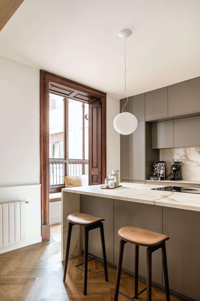
Framed by a wooden frame, the kitchen presents itself as a bright and open place. Jaime Salvá's team opened a hole in the load-bearing wall to be able to connect the semi-open kitchen with the other spaces in the apartment. The material chosen for the island and other elements that make up the space is Calacatta marble, which is white and has very distinctive gray veins.
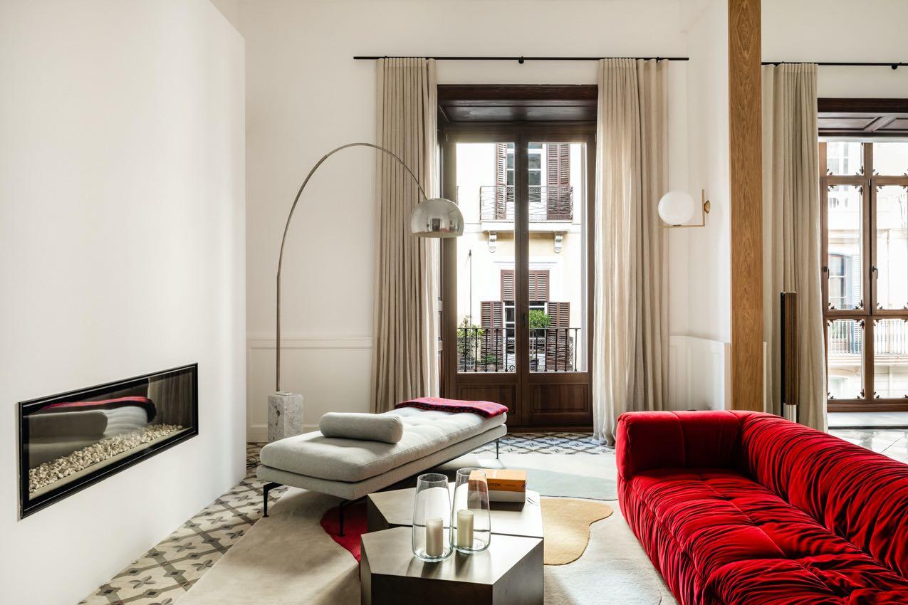
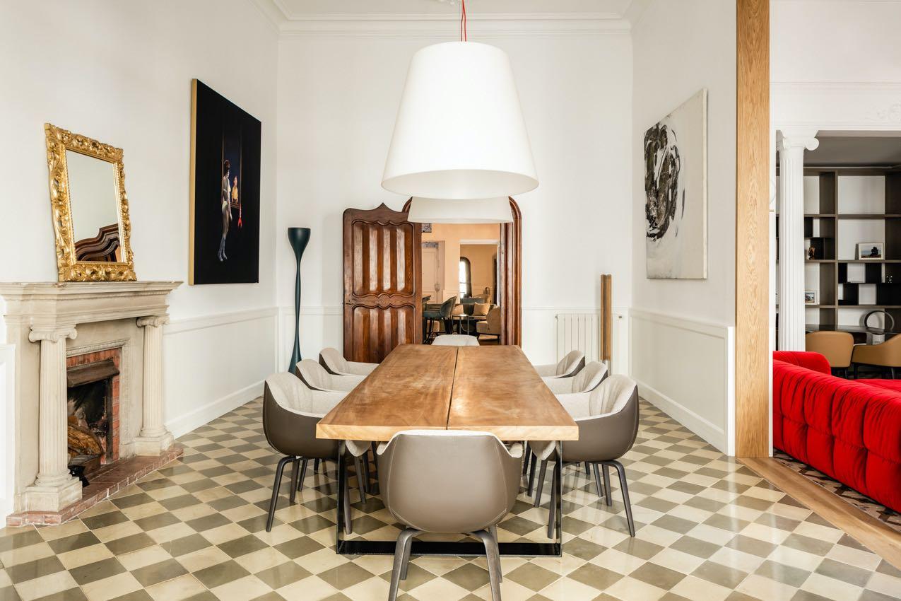
The kitchen leads to the dining room where the exposed walkway has been kept in its original state. A large dining table with an important wooden top is accompanied by the soft seats of MisuraEmme. A pair of large lamps and images by photographer Tomeu Canyellas complete the design. Here too, a wooden frame delimits the second living room. To obtain the soughtafter "chic" effect, the original colors of the house are combined with other bolder tones, such as the red used on the Arflex sofa. Furthermore, the style of the furniture is more modern, such as the composition of the tables by Casamilano or Vitra’s chaise longue. The rug has been made with a completely personalised drawing by Alfombras Peña, as well as its colors, allowing for perfect combination with the other pieces in the living room. The two Ionic columns were already in their original state, and it was decided to keep them to maintain the character. They mark a small space dedicated to the office area. A bookcase was hung on the wall, with large open holes, increasing the feeling of space. The pavement is also worth noting it was decided to keep the original despite having to replace some pieces of hydraulic ceramic tiles. Instead, in some rooms the herringbone oak wood was put on.

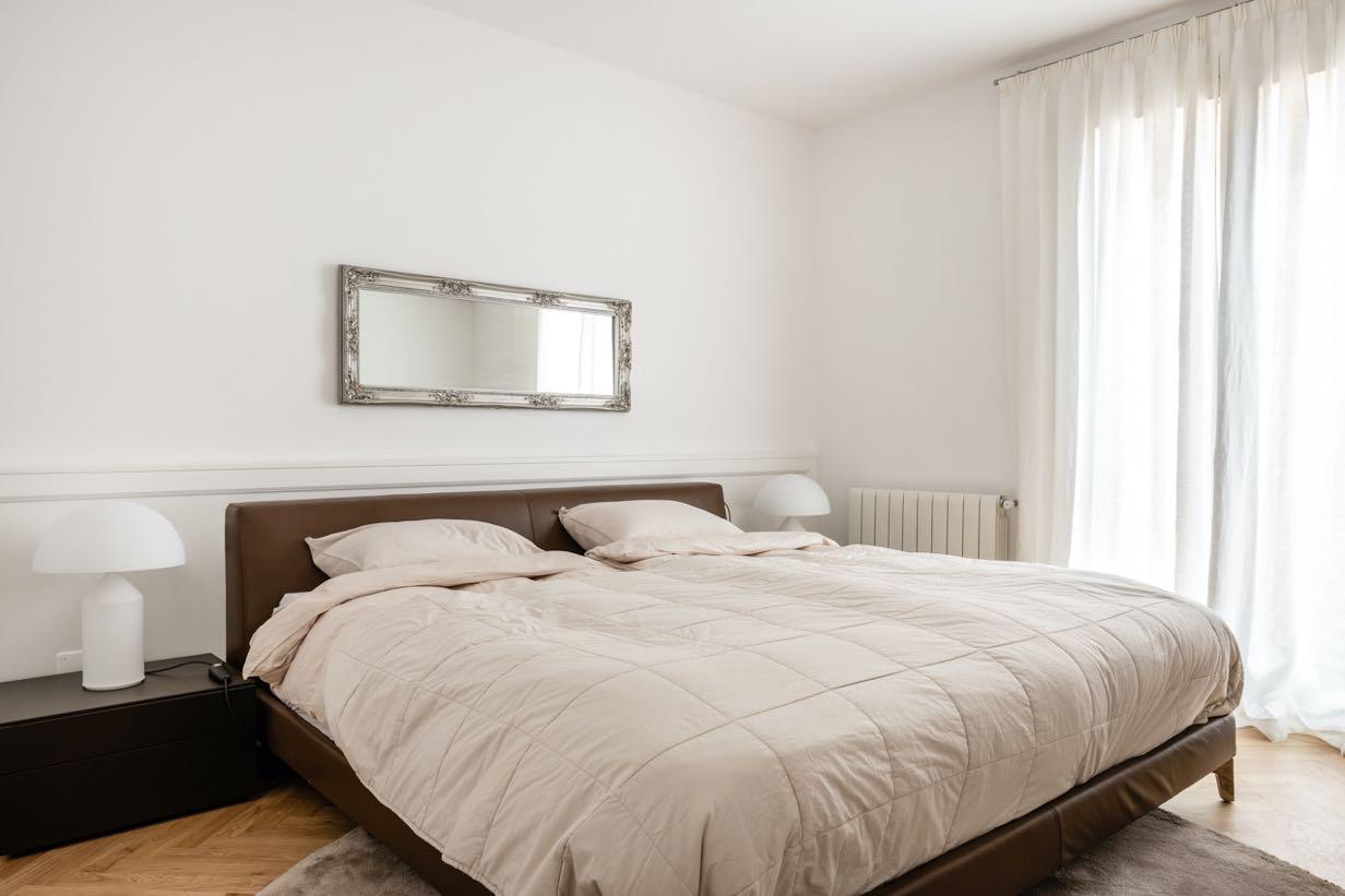
The apartment includes three bedrooms, one of which is the master bedroom with attached bathroom; all feature a simple, clean design. Banni was the company chosen to select the furniture, and in close cooperation with Jaime Salvá's team, all the elements were defined trying to understand the idea of the project to capture it and convey it in the best possible way.
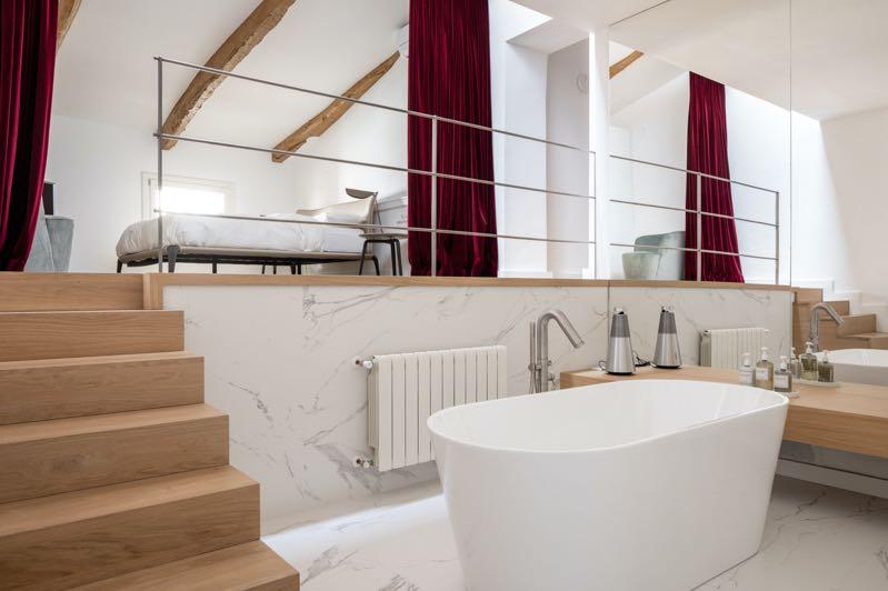
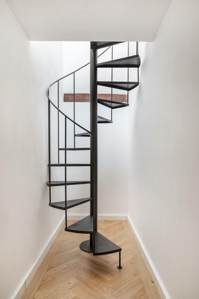
The master bedroom, located upstairs, was a major structural challenge. A bathroom was located in the middle of the passage, taking advantage of an unevenness, and in this way, a unique space was achieved where the placement of a bathtub in the center predominates and the presence of a large mirror that occupies the entirety of one of its walls.
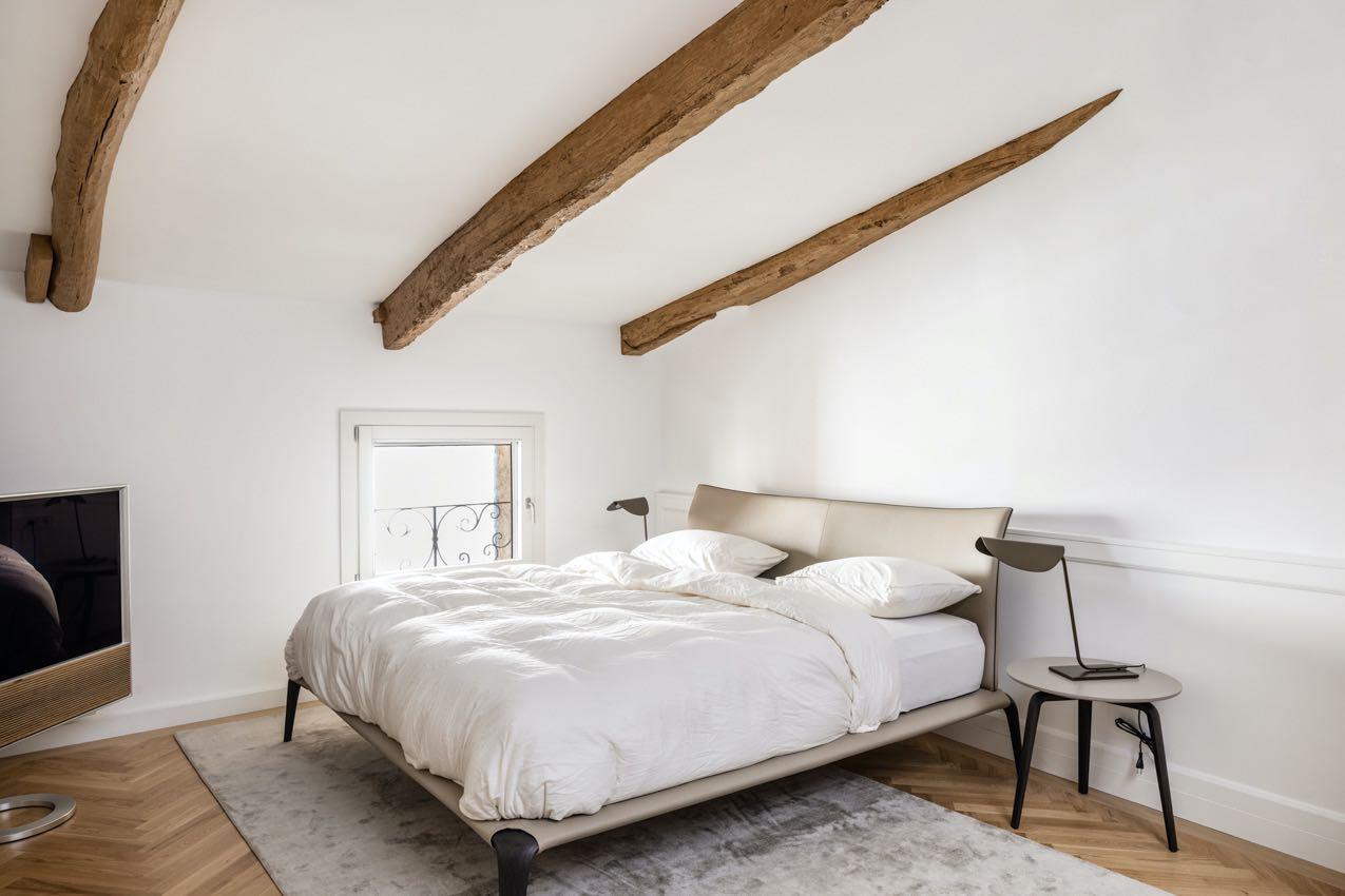
The designers decided to hang a large velvet curtain, allowing the separation of the bathroom and the main room with a great light between main walls and maintaining the line of the original hanging beam. With this intervention, not only was the aesthetic defined by the architectural firm, but comfort was found in every piece. Also, the original wooden beams stand out given their age, which can be seen with the naked eye due to their irregular shape. The shades of light gray recur in the furnishings adding elegance to the environment: the small tables and the bed with its supple design by MisuraEmme, while the minimalist table lamps by Oluce recall the lighting classics of the 1950s.
