3 minute read
Art everywhere
Studio Marco Piva, together with the local architect EGO Architecture di Egest Goxhaj & Partners, has curated the interior design of a villa situated in the heart of the new residential development area known as “Rolling Hills Luxury Residences”, composed by 122 luxury villas plunged in the green hills south-east of Tirana.
Advertisement
The villa, which is the owners’ primary residence, is organised according to the client’s specific living and display needs, indicated during the project phase. The main objective of the project has been to realise a house made for family intimacy since the client, a couple with three little children, doesn't often receive people at home. For this reason, the main floor, intended for the common areas of the villa, has been thought as a space where the separation in rooms is minimized, so as to favour life together. As a matter of fact, the living area is conceptually divided into two “areas”, one formal, one informal, not through walls, but only through the arrangement of furniture and the design of suspended ceilings. The challenge of furnishing an open space having very different functions has been overcome through chromatic matches or by using the same materials in the various environments, or by re-proposing some decorative elements or pieces of the same kind. Therefore, the lamps, symbolically ecclesiastic in style, also appear in the living room, where, however, they are more imposing with a double “crown” of lights. The family living room is, as suggested by its same name, a space for the family, for whom we have intentionally selected large seats where two people (or even three children) can sit together at the same time, such as the Amoenus by Maxalto. We have been exceptionally asked to put a TV in this area, which we have integrated and hidden in a furnishing system by Acerbis International, i.e. the Smartwall. In additional, the client has decided to embellish both living rooms with some of the best artworks of his collection, charging us with the delicate task of designing the relevant display elements and spaces.
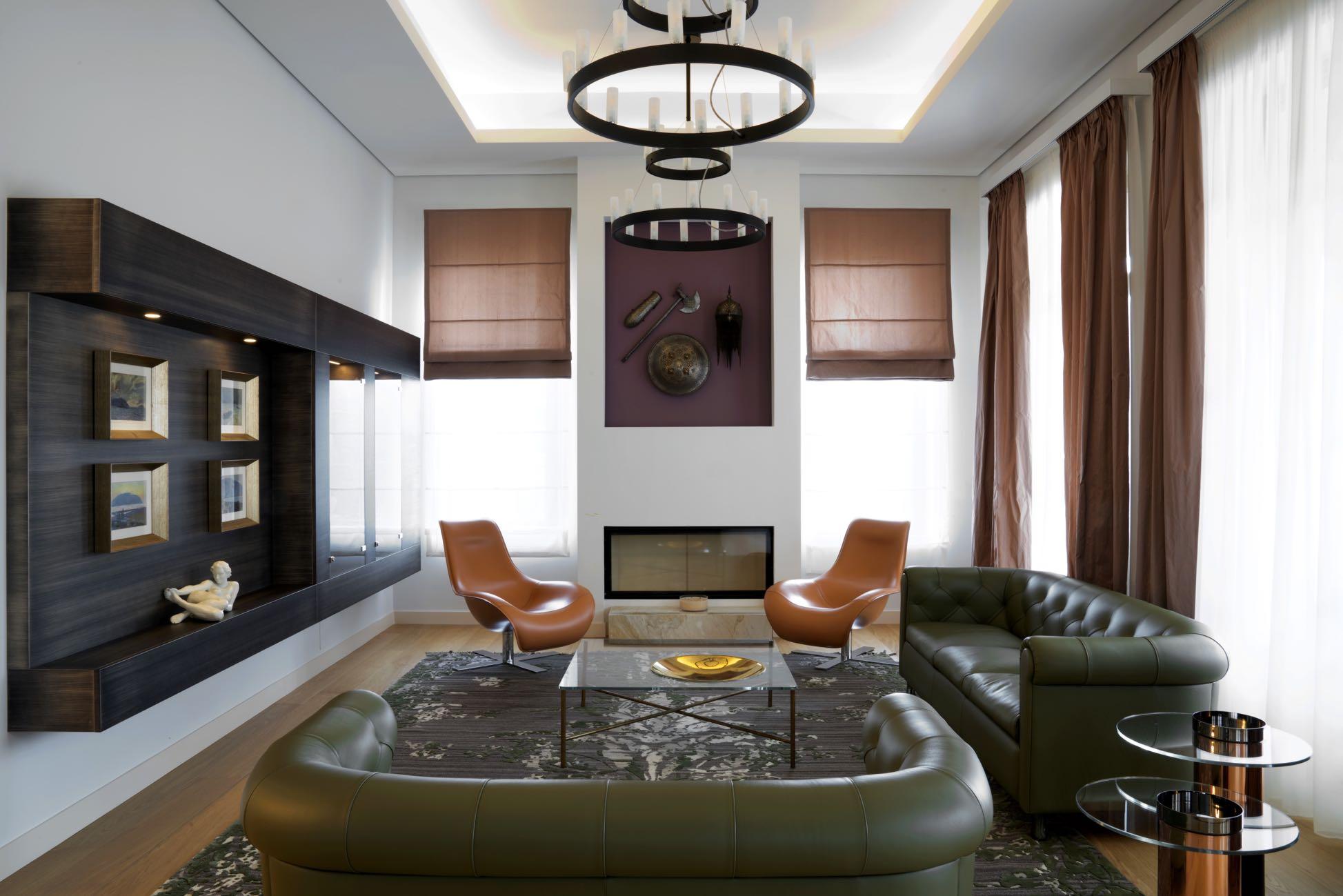
Opposite the conversation area, there is a suspended display case with “metal effect” finishing, realised by Salvioni Arredamenti according to a drawing by Marco Piva. It contains a collection of ceramics and four Cascella’s paintings depicting the Albanian landscape. The height of the suspended ceiling has been reduced to create a frame, thus giving the sense of a more welcoming warm ambiance.
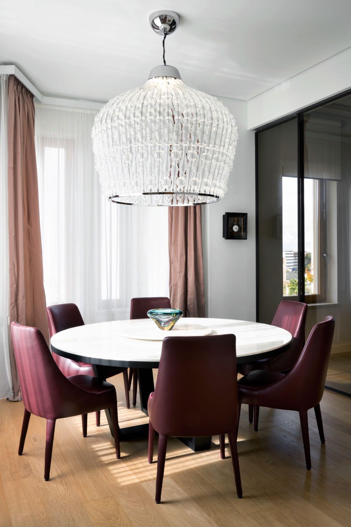
The dining room is in a very suggestive position in the bow-window, rich in windows and views on the external garden. Above the big, round wooden table covered with a layer of Calacatta gold marble, suitable for up to ten people, there is the equally big Italamp’s blown-glass suspended chandelier. The room is separated from the kitchen through the Rimadesio wall with sliding doors, which leave visual communication between the two environments, giving the perception of a wider space and creating poetic reflections and trompe l’oeil with two chandeliers. Essential, efficient and elegant: these are the characteristics that define the kitchen Phoenix by Varenna. Wood finishing was chosen for the columns, and lacquered finishing for the central cooking island, to make them match the dining area. The kitchen, moreover, has been equipped with latest-generation home appliances, including a wine cellar at controlled temperature and humidity.

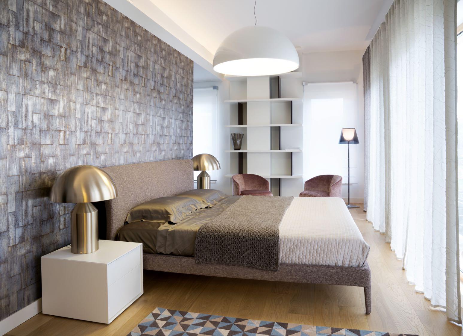
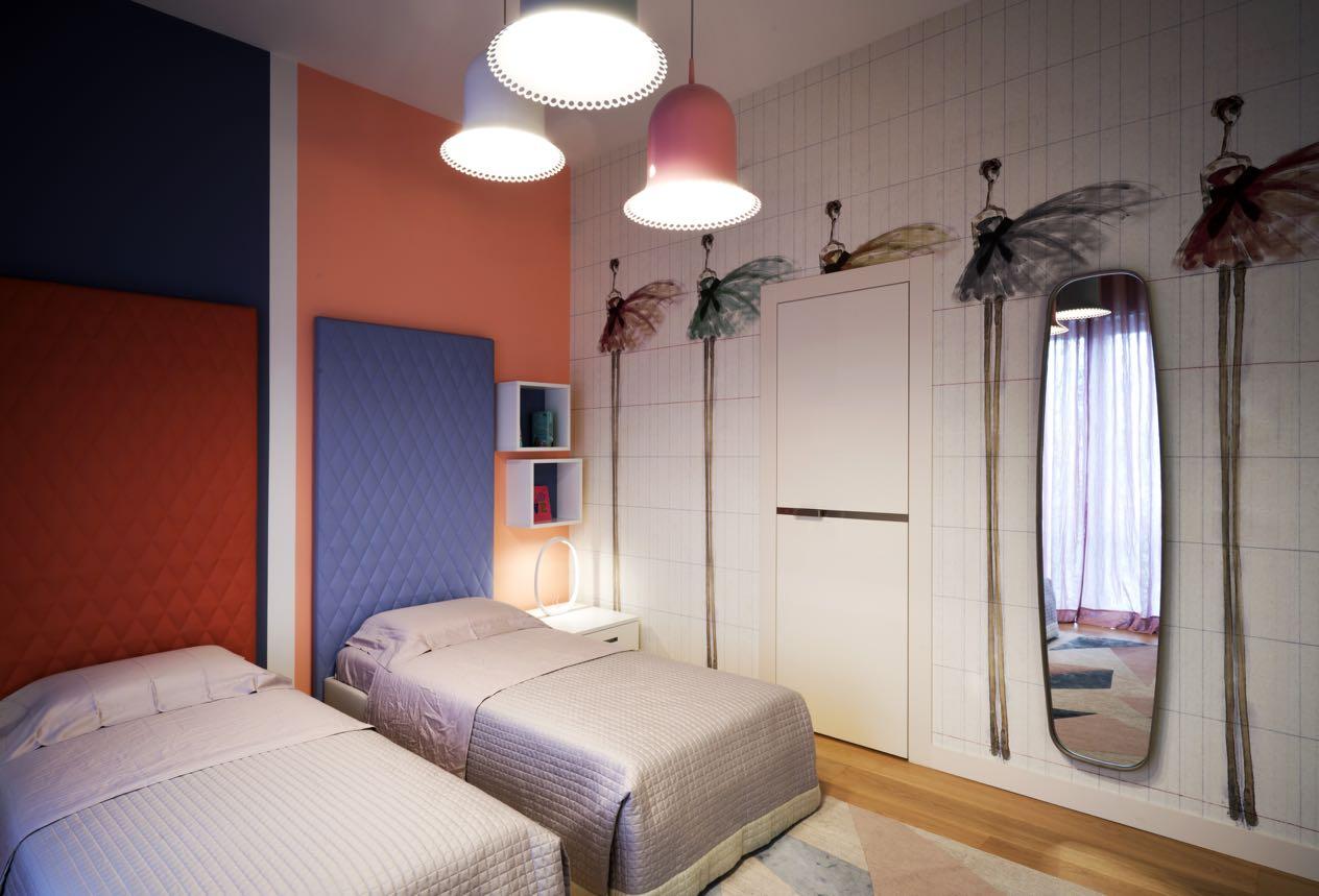
The master bedroom has got the best view on the landscape of the whole villa, and for this reason the bed is oriented in such a way as to fully enjoy the view. Behind the bed, we have designed a second wardrobe through a wing coated with a special, metal-effect Elitis wallpaper. A tailor-made bookshelf, designed on the basis of the need to hide the chimney of the fireplace downstairs, completes a reading area furnished with two rose velvet low armchairs. The children bedrooms have been strongly customised directly in accordance with their preferences. In particular, the little boy’s room has been designed to adapt to his evolving needs. An amusing home-shaped structure, which previously housed a cot, now there is a single bed and, as the little boy grows up, it will host a three-quarter bed. The predominant colours are blue and white, but the wallpaper with its parrots and watches is indubitably the real centre of attention.

