



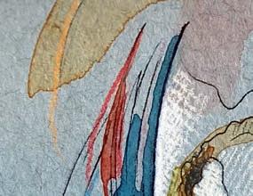


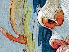


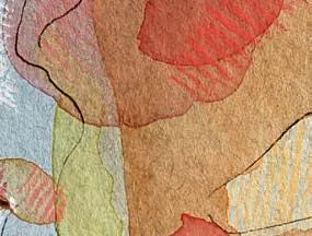


I n the first of four case studies, the part-time artist explains how she developed her colourful, layered approach to painting portraits in pastel and watercolour
Kirsten Britt was born in 1975 and studied at Wimbledon School of Art. She lives in Bexhill-on-Sea, East Sussex, and works part-time in the special educational needs department at St Richard’s Catholic College. With a brand new website showcasing her work, Kirsten makes portrait commissions and regularly sells work to raise money for charity, including Twitter Arts Exhibit (TAE21) for the Leukaemia and Intensive Chemotherapy Fund, and the Sophie’s Postcard initiative for The Royal Marsden Cancer Charity. www.kirstenbritt.co.uk
I’ve been drawn to portraiture since I was very little. I always come back to the human face, I love it in all its forms and expressions and colours. I think a portrait is a really unique way of capturing a moment in time as well.
My style is something that has evolved really. The artists who appeal to me have got a real signature style and you know what to expect from them – I wanted my work to have a similar signature, really.
Aside from the famous faces like Frida Kahlo or Billie Eilish, I use the Sktchy app to find my subjects. It’s a beautiful, collaborative community of artists who share photos with each other, as well as inspiration and ideas. The monthly fee (which I choose to pay) is optional, but gives access to additional content.
The source photos are all submitted by artists, so you know you are going to get nice lighting, interesting faces and unusual angles – things that are a bit different. Sourcing from Sktchy means that I have permission to use the photo too.
Before starting on a final piece, I create little advance sketches to try and get a feeling of tone. Tone’s really important to me. When you’re drawing from photos, it can be a real challenge to get the image to pop off the page. It can sometimes look a bit flat. This is one of the reasons I use toned paper. If you work on white paper, you can only really push the tone in one direction, whereas if you are using a toned paper, you can push that drawing in two directions – you can push it darker and you can add your highlights to lift it off the page.
The paper I use is Strathmore Mixed Media, a beautiful 300gsm cardstock. It’s a real workhorse –it doesn’t buckle with watercolour and it has an absolutely smooth finish for my pastels. I definitely spend a lot of time looking at the source photo so that it can tell me what colour paper it wants to be on.
Someone with a warmer-toned skin, I might try and complement with a cooler tone of paper. Other times I might deliberately paint a paler Caucasian skin on a tan paper to force myself to push harder with the colour placements. When you paint from photos rather than live models, the paper choice can be really key and make the highlights come alive and pop. I make colour swatches in advance so I know how my watercolour paints are going to appear on those different colour papers and then I’ll also make graphite sketches, just to get an idea of where the shadows will play out or if I want to emphasise a particular feature. Then I will launch into the final picture.
I sketch out the composition fully in pencil first. I don’t put shading in at that point, I’m just sketching out the shapes and I can be quite precise over the measurements. I’ll spend a long time on this stage, at least an hour, an hour and a half. Then I go over the top of the pencil with my Edding 1800, which is a beautiful waterproof fineliner.
Sometimes I’ll use a carbon or acrylic ink with a dip pen if I’m looking for a looser result. I try to be really free with my ink lines, whereas I’m very precise with the pencil sketch underneath. I know I’ve got that accuracy there so I can be a bit freer with my pen work and try and bring in the contours.
With the ink lines in place, I will completely erase my pencil drawing – I can erase really hard on this paper and I know the pen line is not going to be affected.
I use Schmincke Horadam Aquarelle watercolours. They are so vibrant, so intense – I won’t use anything else. I’ve tried many different brands and always come back to this one, it’s just gorgeous.
I prefer to begin with the middle tones and it’s a tentative start for me. I’m led by the painting as well. Although I have an idea of what colours I would like to use, sometimes as I’m exploring those initial washes, the painting will just speak to me and suggest a direction. I tend to start scared and finish up confident.
I like to start with a purple shadow, generally. Regardless of the paper you are using, a purple shadow is

This former set designer reveals how exploring the West Wales coast and experimenting with mark making tools has helped produce her beautifully textured landscapes


Lesley Dearn graduated with a BA in fine art from Sheffield Hallam University in 1989. She worked as a set designer for the likes of BBC Wales and S4C before a brief career as a civil servant. In 2011, she turned to art on a full-time basis, teaching life drawing and art workshops alongside her own painting. Her work is available via Cardiff’s Albany Gallery and the Queen Street Gallery, Neath. www.lesleydearn.co.uk
The Welsh landscape is an important part of these works. I spend much of my time on the West Wales coast at Newport, Angle, and Freshwater East or West, but I also walk the Preseli Mountains and the glorious Brecon Beacons. All of these places lift and invigorate me, and I feel a landscape as much as see it. When I’m in the landscape, painting is usually done as part of a long walk. Travelling on foot gives me a sense of scale and a vivid experience of all the elements: the wind on my face, a warming burst of sunlight... It all stimulates my thoughts and fires up the ideas I want to work with. The shapes and colours are wonderful, but it’s the atmosphere that really inspires me, and it’s that atmosphere that I try to capture. Welsh weather is reliably unpredictable and can change in the space of an hour. Nothing gives a clearer idea of distance, atmospheric perspective and scale than watching a distant landscape or coastline change as you walk through it. Along the way I take photos and make quick sketches –sometimes almost without stopping
– but, when I find a place I want to stop, I like to paint. I’ll usually do three or four 20-minute paintings in acrylic, looking at different views and concentrating on different aspects and experimenting with ways to reproduce them in the moment.
To capture the very specific light effect in paintings like Spirit, you have to first experience the moment, which is why being outside is so important to me. Putting a light effect down is a bit like trying to capture a gasp. I know when it’s working because I get a physical thrill. It’s often more about the feeling than it is about planning. It doesn’t always work but I spend a lot of time looking at what a painting needs – sometimes that’s a case of looking and thinking carefully and slowly, then acting very quickly.
My paintings are mixed media. I mainly use acrylic paint, sometimes with watercolour or ink underneath, and a wide range of drawing materials: various pencils, including watersoluble ones, and lots of charcoal.
I don’t have a specific, fixed palette, but I do keep it to a fairly limited number of colours in any particular painting. At the moment I’m using lots of Yellow Ochre, Lemon Yellow, Burnt Sienna, Phthalo Blue, Indigo, black, white and umber, but I will use any colour if I feel the painting needs it.
I like to have an idea of what I want to achieve in a painting before I start and what I want it to feel like, and then I think about the overall composition. Nothing is set too early, but I like to know the general
Putting a light effect down is like trying to capture a gasp…
When it works, I get a physical thrill
Painting is often a case of trying to depict a 3D object on a 2D surface. AL GURY reveals four simple principles that will help you create a true sense of depth
Illusion of depth is one of the hallmarks of representational painting. The genres of landscape, still life, portraiture and figurative painting often depend on illusions of three-dimensional forms existing in a perceptual space. While some art does not require illusions of depth to convey its visual narrative, many do, particularly in traditional genres.
Creating a visual sense of perceivable depth in a painting
depends on several artistic principles working in combination with each other. A very important area is colour, but colour in and of itself might not create the full illusion of depth in a painting unless it is combined with the elements discussed below.
Colour must be modified by – and added to – chromatic intensities, edge descriptions, brushwork types and details, and the size of colour touches in the image. This complete
package creates aerial perspective or illusions of depth via relationships between these several visual and technical elements.
The four descriptions on pages 58 and 59 are designed to support an increased understanding of the formal and visual elements of colour in creating depth in painting. The same concepts can be used across oil, acrylic, watercolour, gouache, pastel and other colour media.
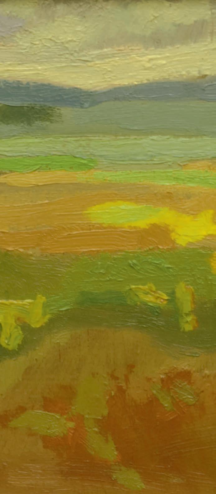
The overall high-key colour choices, combined with strong variety in foreground and background brushstrokes and planes, created a sense of depth.
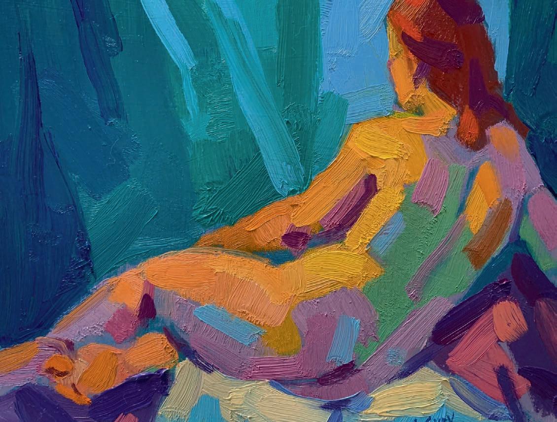

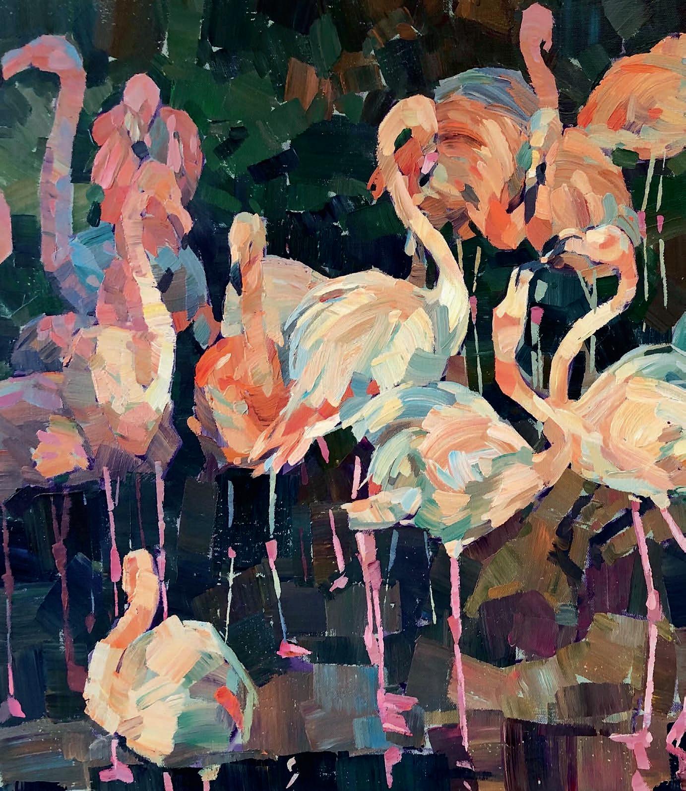
Depth was created by using sharper, more chromatic and expressive brushstrokes in the flowers, while softer brushstrokes and cooler colours helped other areas recede.
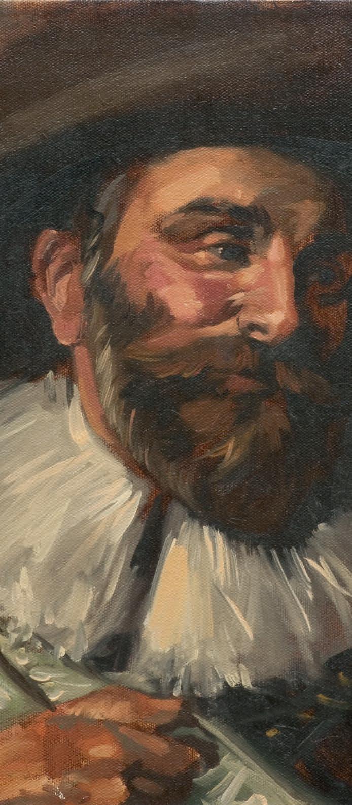
In this in-depth workshop, Pennsylvania Academy of Fine Arts head tutor AL GURY looks at four key factors that will improve your colour mixing abilities
