The ENGLISH HOME


• Decorate with block prints
• Experience a factory tour


• How to plan a lighting scheme


• Decorate with block prints
• Experience a factory tour


• How to plan a lighting scheme


Giles Godfrey and Barbara van Teeffelen have poured their hearts into restoring a dated Georgian mansion in Leicestershire to create a vibrant and elegant home
FEATURE JANET MCMEEKIN PHOTOGRAPHY RACHAEL SMITH
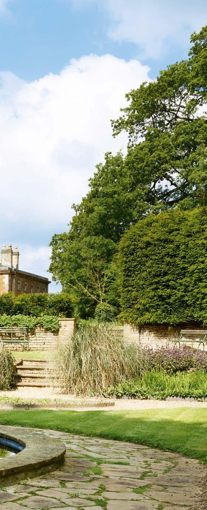
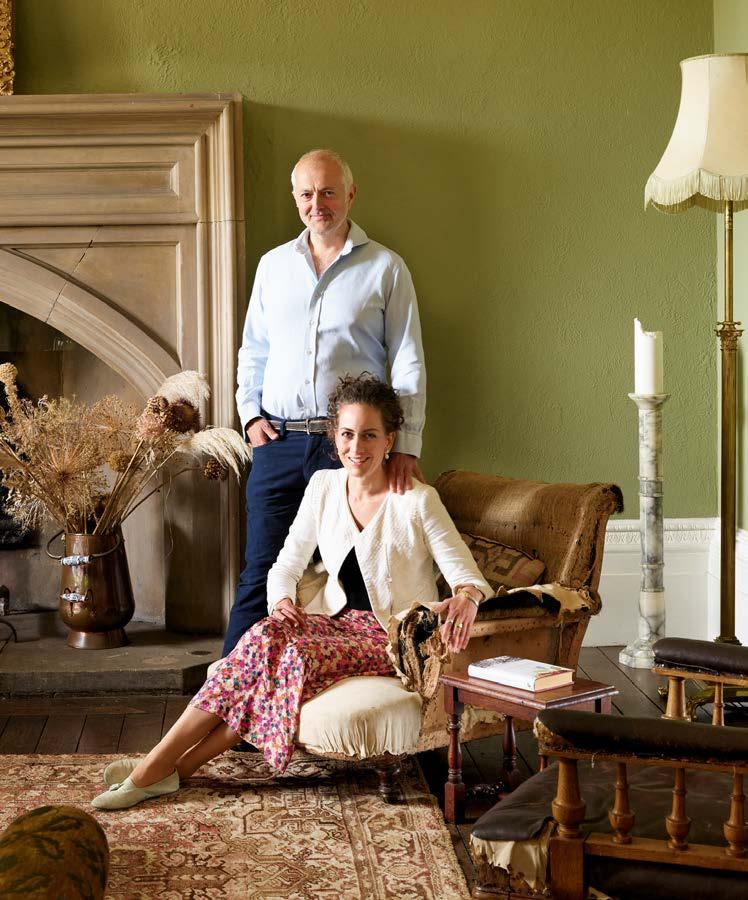
Captivated by the panoramic countryside views, spectacular location and prospect of breathing new life into one of Leicestershire’s finest Georgian gems, Giles Godfrey and Barbara van Teeffelen embarked on the ambitious transformation of a Grade II listed mansion and its neglected gardens. “In hindsight, perhaps we were a little naive when we decided to give Keythorpe Hall its heart back, but we have absolutely no regrets,” Giles says.

Serendipity played its part in guiding Giles, who at the time was living in London and fancied the challenge of tackling a rural renovation project, to the impressive property, located just 10 miles from where he grew up in Leicestershire. “Back in 2012, I’d been chatting to my father, who still lives locally, about the idea of buying a second home, possibly in the Cotswolds,” he explains. “When my father mentioned that Keythorpe Hall was on the market, I just had to investigate the possibility of buying a historic property
A tripartite collaboration has resulted in a remarkably light and spacious contemporary home enhanced by the subtle interplay of colour, pattern and texture
FEATURE AMANDA HARLING PHOTOGRAPHS ANDREAS VON EINSIEDEL
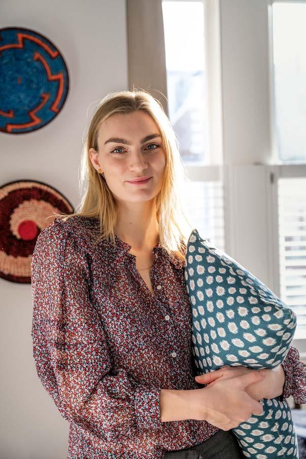
ABOVE Homeowner Eloise, whose fabric and wallpaper designs are available through Eloise Home and The Fabric Collective.
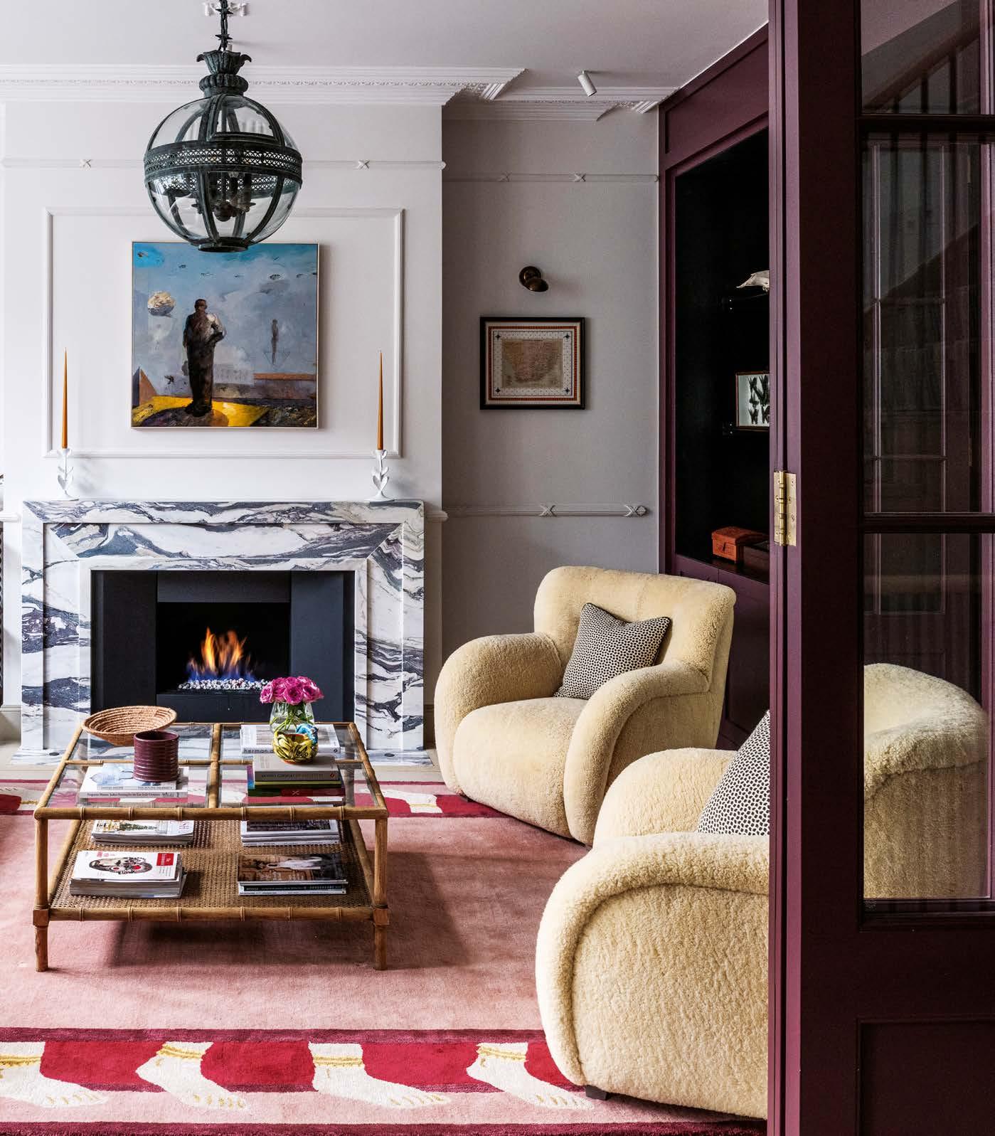
RIGHT The bold Calacatta Viola marble fireplace forms the focal point of the sitting room. Above the fireplace is a painting by
South African artist Richard Smith. The colourful rug is from Jaipur Rugs and the armchairs are upholstered in sumptuous New Zealand sheepskin. The coffee table is from Oka and the bobbin shelves to the side of the fireplace were made by Alfred Newall.
‘I love watching how the trees, plants and flowers change with the seasons, so nature in all its guises continues to be my inspiration’
compatible. Fortunately, the three of us have a mutual regard for our individual input.”
Kirstin’s principal aim when she and Luke started work on the house was to maximise the feeling of space and light, which she achieved by demolishing the entire house apart from the facade. Now, on the two upper floors, there are four bedrooms and
bathrooms, and a roof light above the stairwell ensuring that light permeates down to the hall on the ground floor. Another roof light above the dining area, together with the expanse of glass between the kitchen and garden, further accentuates the feeling of space and light. Details such as the cornicing and bespoke stair rail and banisters provide a nod to the
past in terms of workmanship and proportions but are contemporary in style.
Luke was emphatic that he wanted the kitchen to resonate with colour, so the bespoke cabinetry designed by Kirstin is painted in olive green and aubergine. “The starting point for all the colours was the pale Babycham-blue cooker. It’s a great combination,” says Eloise.
Images throughout the house pay homage to Kirstin and Luke’s African heritage, as does a framed drawing of the ski boots worn by Luke in the 2014 Winter Olympics at Sochi: “Luke was the first ever
athlete to compete for Zimbabwe in the Winter Olympics. He was born in Zimbabwe but grew up in Switzerland, hence being able to ski so well.”
Having combined modelling assignments with a degree in Creative Advertising and later a Master’s in Art Curation at Chelsea College of Art for a few years, Eloise launched her fabric and wallpaper brand, Eloise Home, in 2021 following lockdown.
“With time on my hands, I was able to concentrate on what I’d been hoping to do for ages – create a collection of designs for fabric based on natural forms which have inspired me ever since I was a
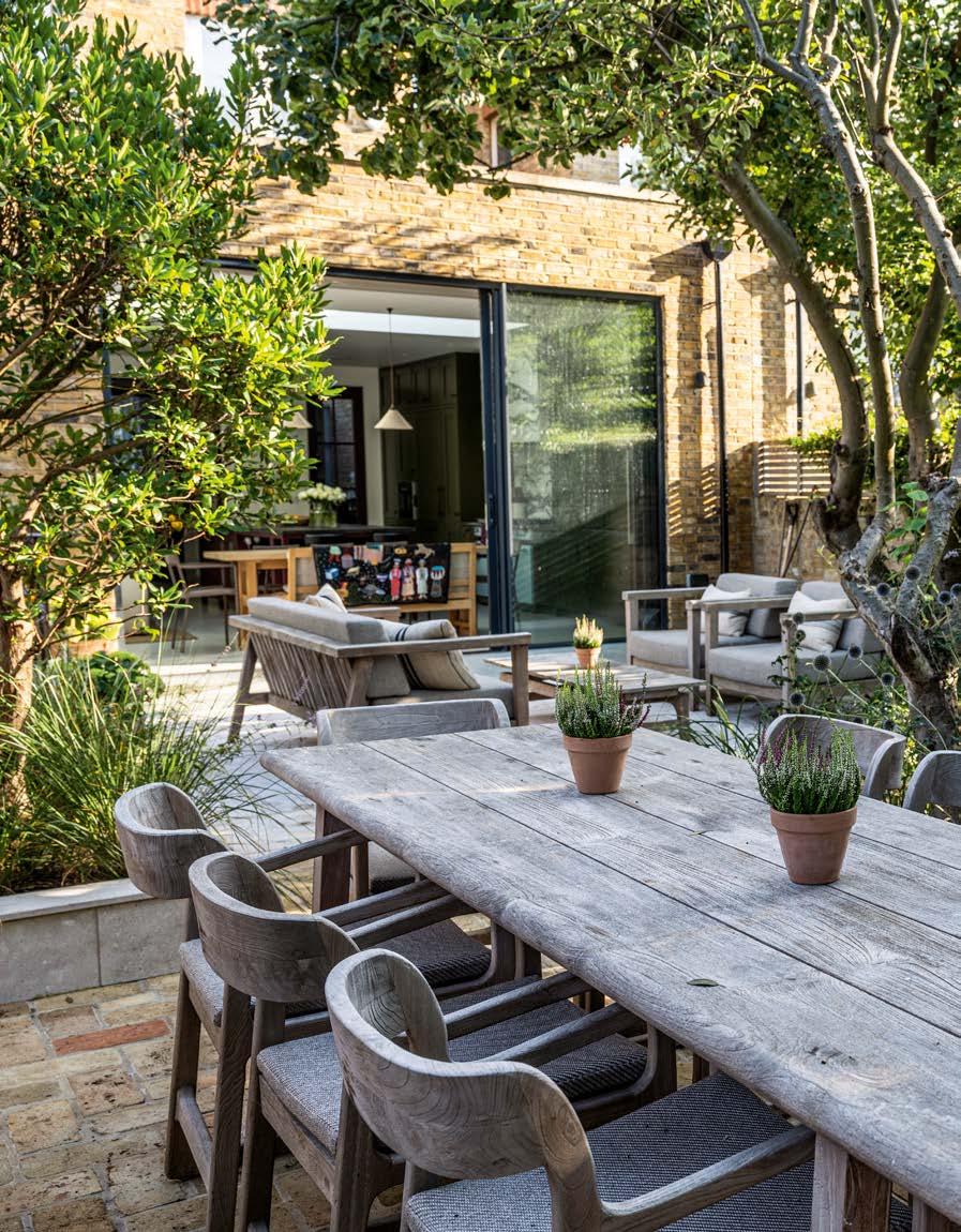
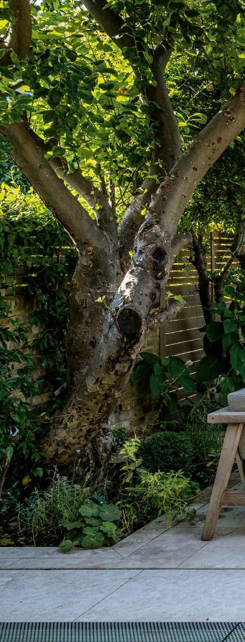
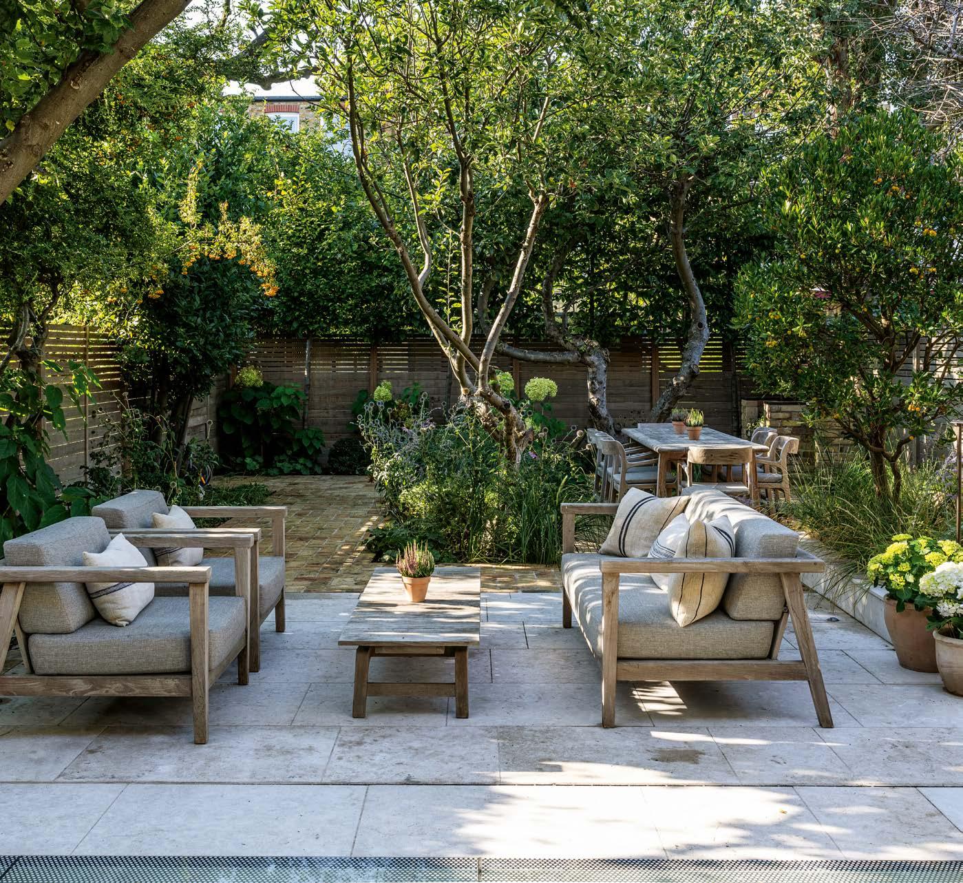
ABOVE The garden incorporates three mature apple trees which remain from the time when the land formed part of an orchard. A combination of hydrangeas, lavender, alliums and thistles provides year-round visual interest in the shaded setting.
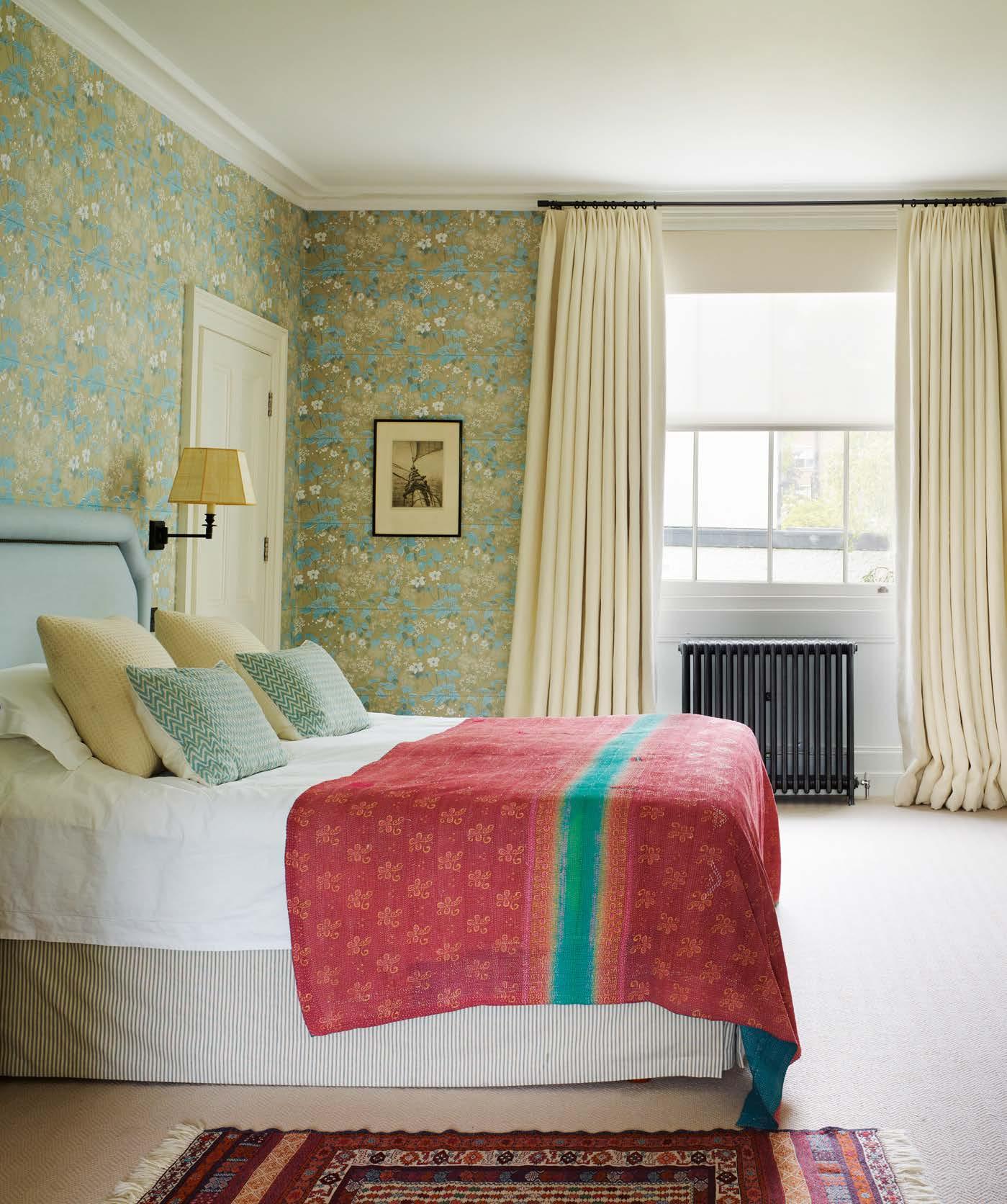
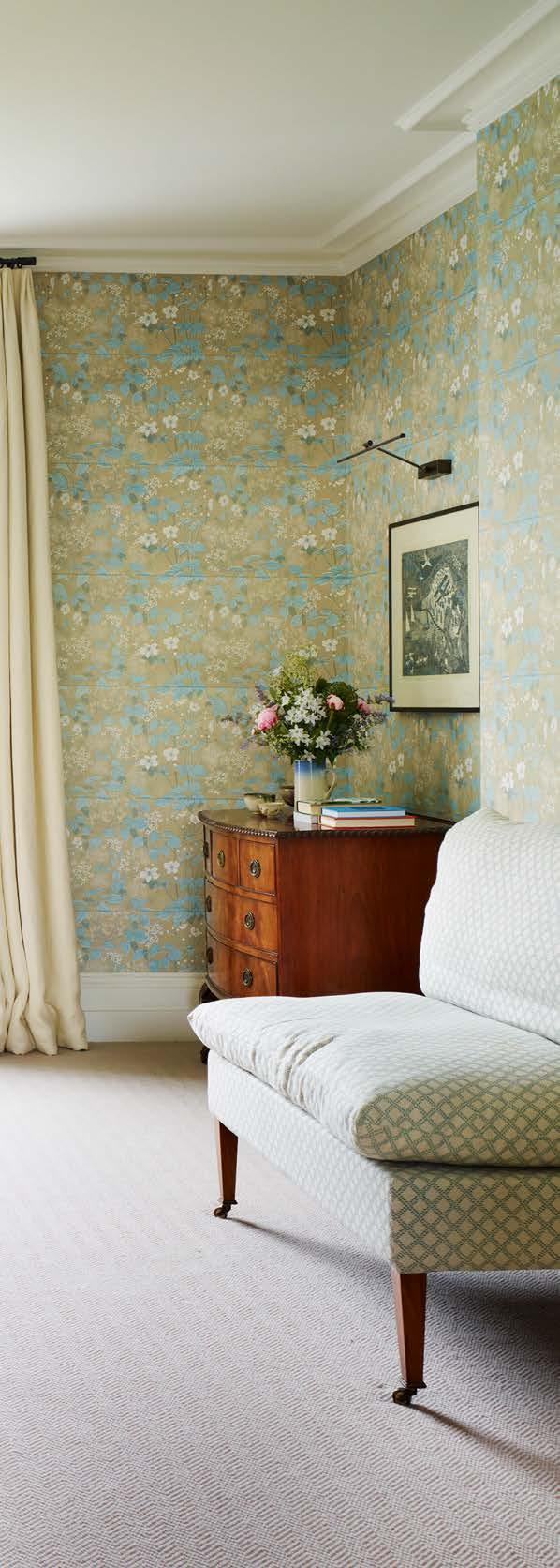

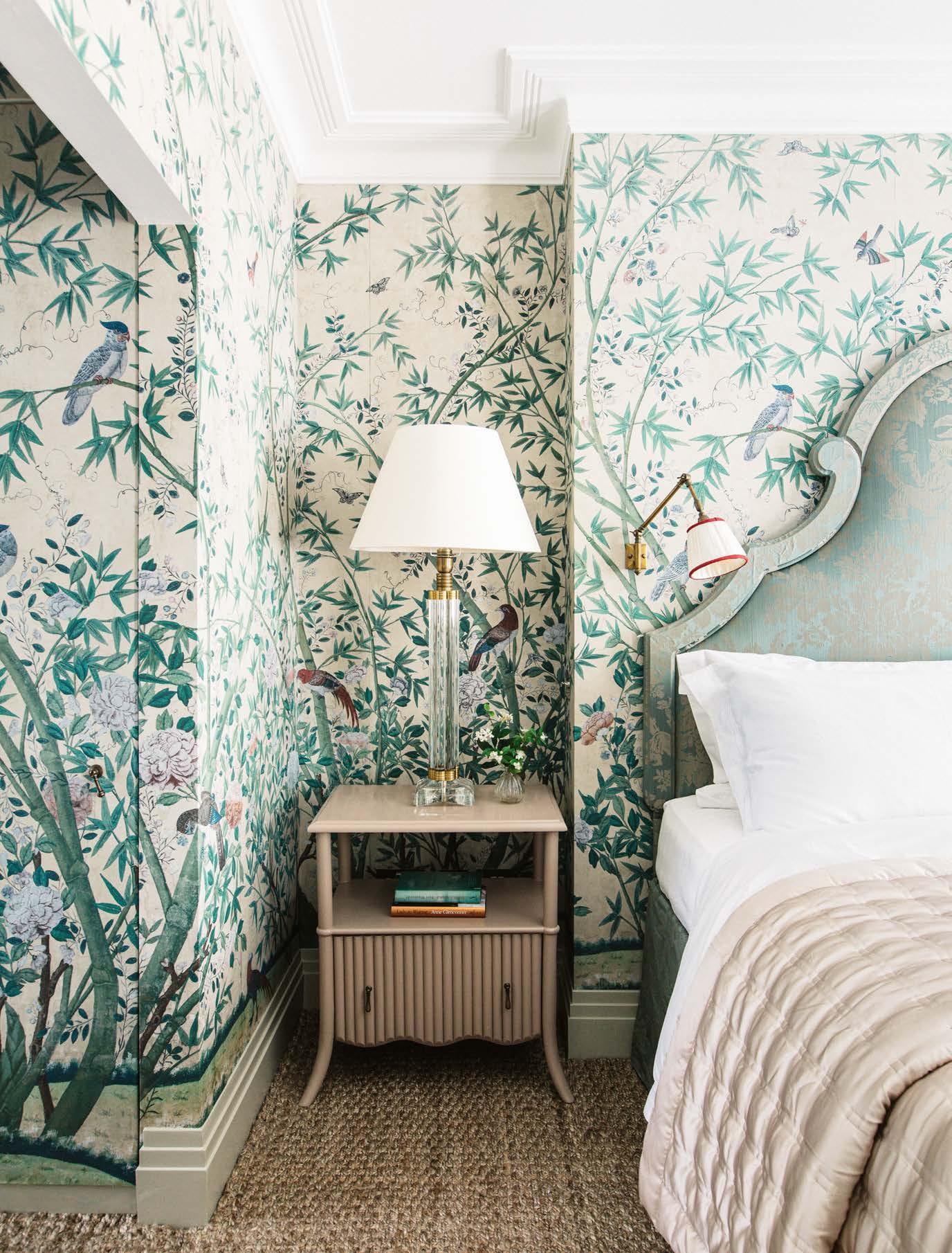
ABOVE Emery et Cie tiles in a range of hues add a playful element to the main bathroom. The bath is from C.P. Hart. LEFT The principal bedroom has been papered in Old Man’s Beard by Marthe Armitage. Vaughan’s Naunton Square swing-arm wall light with a Papyrus lampshade from Robert Kime sits above the Hästens bed.
process. I think I might be a frustrated architect,” she laughs. “If I could retrain, I would love to have done architecture. They change the space in a way you can’t even envisage.” Through a friend’s recommendation, the couple met architect Eryk Ulanowski, who had previously worked at Michaelis Boyd. “It was great working with Eryk because he understood exactly what we were trying to achieve, that this was an old building and we wanted something contemporary but in keeping with what was there before.”
For the garden room, the couple had a multipurpose brief. “It needed to be an office, my husband wanted a cinema screen and we wanted to house guests in it,” explains Frances. Myriad clever details have helped to fulfil the challenging brief while creating a fresh and welcoming space. “When you walk in, it looks like a library, but behind the panels are a kitchen unit, bathroom and fold-down bed.” Another key part of the project was moving the garden room on from its original design, which felt at odds with the surrounding greenery. “We wanted to widen it and have it enveloped into the garden. My husband was keen on having a living roof with wild planting and he worked with garden designer Graham Tytherleigh.”
The garden, in turn, was reconnected to the main house with a set of steps leading down to the newly refurbished basement. From the start, Frances was
