CONTENTS
1 2 3
EL ALMENDRON
Hospitality Design
ZILKER ASSISTED LIVING
Senior Living Design
COUCH POTATO
Retail Hospitality Design
4 5
Public Service Design
GHIA
Workplace Design
EL ALMENDRON

ALMENDRON
HOSPITALITY DESIGN
El Almendrón is a mid-upscale Latin American and custom cocktail restaurant featuring fine Cuban fare. Located in Downtown Chicago, the restaurant has a spirited, sensuous, and modern atmosphere— perfect for date night. By mixing old Spanish Colonial architecture motifs with lustrous finishes, contemporary furnishings, and punchy art and color, El Almendrón reflects the contradictory yet wholly energetic spirit of Havana.

CONCEPT & HISTORY


Cuba was used as a testing ground between the 1930s-50s for classic American cars— 60,000 of which remain in circulation in Havana as cabs. Locals nicknamed the cabs “el almendrón,” meaning “big almond.”
El Almendrón nods to Cuban culture by adopting this name, and furthers the mission by utilizing a color scheme based on the Cuban flag, classic car iconography, the hand signals used to call a cab there, and outdoor elements that evoke the alfresco lifestyle of Cuba.


FIRST LOOK
Dramatic velvet curtains frame the entry to the dining room, and are pulled back by brass cabbie hand signal hold-backs.

Ceilings in the entryway are intimately lowered so that guests are surprised and delighted by the lofty groin vaulted ceilings of the main dining space.

GENERAL NOTES:

FLOOR PLAN
SCALE: 1/8" = 1'-0"
FLOOR PLAN

The entry gathering vestibule shields cold/hot air from blowing into the restaurant.


This wall is a screen for the restroom area and is a way finding device for servers to direct diners.
The raised dining area with a fully accessible ramp is the focal point of the restaurant. The archways and stairs create a dramatic divide that lead to a terrace-esque dining space.
Outdoor seating is available during the warmer months and windows are fully operable during that time to bring the outside in and entice pedestrians.
SECTION CUT EAST


THE BAR

The bar has two seating levels and features custom millwork. Custom millwork also adorns overhead, taking advantage of the arch created by the groinvaulted ceiling.

The bar celebrates an outside-in motif by repeating awnings from the exterior indoors.


CHEF’S COUNTER & DINING ROOM


The open grill seating allows diners to interact with chefs and see the food come to life.


The main dining space features a mix of traditional, contemporary, and garden style furniture that reflects the many sides of contemporary Cuban culture.

ZILKER ASSISTED

ASSISTED LIVING
SENIOR LIVING DESIGN

Located in the rolling hills of Austin’s
Park,
Assisted Living will become home to aging residents with a range of physical and mental ability. The space will support the residents at the level of ability and comfortability they arrive with, and continue to anticipate their needs going forward.
Zilker Assisted Living will be a place that residents and their family members feel comfortable and excited to spend time in. This will be a space where meaningful connection takes place.
Zilker ZilkerENTRY & RECEPTION

A hospitality feel in the reception area will attract residents that are looking for a unique and exciting place to start the next phase of life. A friendly face is the first thing residents will see here.

 A central courtyard is a unique feature of the center that allows for connection and more access to light.
LOCATION

Austinites are used to access to nature, a great culinary and arts scene, community activity, and so much more. Elements of Austin are woven into the center to help residents feel as though they are entering a natural extension of their normal life. From an outdoor community library to regular food truck visits, fun times are always in reach, which promotes wellbeing.


1 2
FLOOR PLAN
Reception is managed and secured during business hours by employees. Doors are locked and survailed by security after hours.
Outdoor areas are fully fenced in and locked.
The dining area accordion doors and windows allow for an indoor-outdoor experience on nice days.
The main hall width is 10’-6” and resident corridors are 8’-0”, which allow plenty of room for mobility devices and assistance. They are lined with grab bars for support.
Staff enjoy lots of natural daylight.
Residents have access to a small kitchenette where they can store snacks, refreshments, and access filtered water.
There are two resident living rooms where residents can socialize or watch TV together.
Two of the 13 suites are family suites which have extra room, extra storage space, and double sinks.
The central courtyard allows natural light to flow through the building from the inside out. Suites 1-5 enjoy direct access to this space. Memory patients may only be located on the perimeter to prevent wandering.
Resident Suites
Community Amenities
Staff Areas
Outdoor Resident Spaces
CAFE & BAR

 1. The cafe is flooded with natural light from windows on all sides of the space.
2. A statement dining table is one of the first things residents will see after entry. It is reservable for special events.
3. Stainless grab bars line the hall.
EVIDENCE-BASED DESIGN
Guided by the WELL Building Standards, Zilker Assisted Living addresses the many facets of a healthy life. While each standard is essential, light, fitness, air, and comfort were special considerations.
— Two outdoor destinations, suite patios, and large operable windows throughout the building allow for fresh air access and flow.

— The center is outfitted with full ADA accessibility measures to promote comfort and saftey including features such as grab bar lined halls.
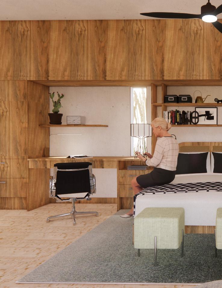
RESIDENT SUITES
The suites feel home-like even pre move-in due to the warm Texas pecan wood built-in wall that anchors the space and provides lots of opportunity for personalization.

A mixture of cork and carpet tile under the bed offer a softer surface should a fall occur, but is durable enough to withstand wear and tear that mobility devices may cause.
The bathrooms include features such as zerothreshold showers, a tilting vanity mirror, and grab bars in key areas.

COUCH 3

COUCH POTATO
RETAIL HOSPITALITY DESIGN
Couch Potato is a potato chip-focused dining experience that is designed to be a home away from home— rather, a couch away from couch. At 80 sq ft, this tiny kiosk was designed to drop right into any mall space. Couch Potato was inspired by the 90’s sitcom Seinfeld, but don’t worry, “no chips for you” will only be said in jest.

CONCEPT


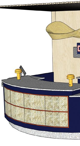
Couch Potato brings the couch to you. The simple menu (8 varieties of gourmet chips and a melted chocolate topping option) is read off of a retro TV. Customers also can select drinks from the coolers located on the side of the kiosk.

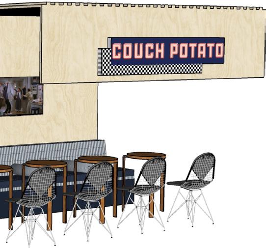
A walk around to the back of the kiosk reveals the dining area which is decked out with two TVs and stylishly comfortable seating. The TVs play Seinfeld’s 20 minute episodes on a loop so that customers enjoy lounging and snacking- but not for too long.




BOROUGH
PUBLIC SERVICE DESIGN
Borough is a youth residential facility located in Bronx, New York that will provide transitional housing for up to 40 young people experiencing homelessness. Borough seeks to push back against the myth that disadvantaged people must rise above their situations with hard grit and disassemble the pressure society puts on them to “pull themselves up by their bootstraps” by providing them with the tools they need to improve their lives at their own pace.
 This project was done in collaboration with designers Deja Carter and Sarah Deisler. Showcased are the spaces developed by Claire Ashcraft.
FIRST LEVEL FLOOR PLAN

The flex lounge is a touch down zone for residents to sit for a moment, take a call, hang out with friends, or charge their devices.
The cafe is a central area for residents to learn cooking skills and connect.
The gym and movement spaces are extremely versatile and support anything from movie night to movement-based therapy.

The outdoor space accommodates 40 diners, community gardens, yard games, and a peaceful lounge.
Areas showcased and developed by Claire Ashcraft.
PROJECT GOALS
This facility provides shelter for unhoused individuals, but most importantly it also provides the services that will support residents in the realms of health and wellness, personal autonomy, education and career, mental heath, and more. The spaces featured here are the flex space, demo kitchen, and cafe— all spaces that support resident’s transitions to the next phase of life.

LOCATION
Bronx, NY was selected because it has large unhoused population, and specifically unhoused youth. The name “Borough” references how NYC neighborhoods are categorized. Our goal is to celebrate the musical history of the area and street art seen throughout the streets. Bringing the culture into the space connects residents to their location and helps create a sense of place.


CAFE & DEMO KITCHEN

The cafe utilizes scaffolding-esque details and a graffiti wall that mimic NYC details. The mirror above the induction range is implemented for cooking demonstrations.
Tiered seating in the cafe makes for great hangout spots, but is also an option for residents who feel safe at a vantage point.


CONNECTION THROUGH FOOD
New York is one of the nation’s “food deserts” where there is little access to fresh foods, or they may be unaffordable. The cafe’s goal is to grow resident’s interest in learning to cook and using fresh ingredients from the gardens they maintain just outside.


FLEX LOUNGE
The flex space is the central commons of the building. Here, residents are able to hang out together, charge their devices, watch cooking demonstrations, or wait to meet up with someone.

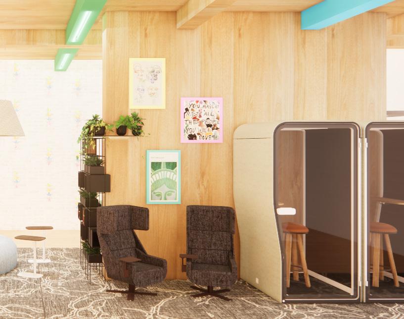
Sound proof privacy booths are offered in this space should someone need to take a call or just have a private moment alone.
A community art wall supports anything from graffiti art to origami. Pictured here are origami paper cranes, a staple for this age group and an activity anyone can learn.




GHIA HQ
WORKPLACE DESIGN
Ghia is a hospitality-focused company based out of Los Angeles. Their product is a non-alcoholic aperitif, and their branding is inspired by the Mediterranean with a retro flair. Founder Melanie Masarin is from Lyon, France, which is where the expanded headquarters will be. Ghia HQ will be a spirited, evocative, and expressive experience that is central to the community-based and wholly eclectic character of Ghia.
This project was done in collaboration with designer Kali Thompson.

WORKSPACE TYPICALS
Haworth product was used for this project, and workspace typicals were developed to suit the unique needs of each team.


6-pack Echo Typical

Compose Bench Typical


SECOND LEVEL FLOOR PLAN


The reception area on the first floor is open to the second level, creating an atrium-like space.
The second level offers a rooftop tasting room for Ghia products.
Rather than immediately revealing the bustle of the office, the elevators open to a calming refresh area and lounge.
Areas of respite, both private and public, as well as meeting spaces are consciously sprinkled in so that employees are never far from one.
Marketing | Social Media |Graphic Design

Product Development (on level 1)
Sales | Logistics | International Relations
Finance | Human Resources
Information Technology
Customer Service & Experience
Guest
Respite | Focus
Meeting Lounge
Support Spaces
Leadership
RECEPTION
The goal of the reception space is to welcome and excite guests whether they are moving into one of Ghia HQ’s hospitality experiences or returning to work from traveling abroad.
FIRST IMPRESSION
After many conceptual iterations, it became clear that the reception desk needed to be oversize in scale in order to ground the lofty atrium. Statement pendant lights are used to create an intimate feel over the desk. The style of the desk is inspired by an Italian espresso machine.


LOCATION & WORK NORMS


France emphasizes work-life balance and is trending toward a four day work week, which Ghia HQ is designed to accommodate. A restaurant and rooftop tasting room are amenities that are open to the public and connect Ghia employees directly to their community.
 Bruno Molliere

WORKSPACE & PRIVATE OFFICES


Bringing people physically back to the office after the pandemic has been a persistent global issue. Ghia HQ addresses this by not only offering hospitality spaces such as a tasting room which drives up engagement, but the workspace and private offices offer a hospitality feel— something that entices and encourages employees to come in and enjoy the office.
The open office is broken out by teams to create an organic flow and helps each team feel special and focused. The benching system featured has open desk surfaces rather than partitioned to support collaboration.
ROOFTOP TASTING ROOM
The rooftop tasting room is both a bar where employees and the public can try Ghia, and an extension of the workspace.
The rooftop bar serves Ghia product, mocktails, and coffee all day. It also supports the opportunity to host product launches and test new ideas for the public to try.


A palette of posture, surplus of natural light and biophilia, and a calming water feature make the rooftop an exciting yet relaxing place to work or socialize.


 Material
 White painted brick
Material
Material White painted brick
