1 minute read
bon n e vi e bon n e vi e


signature when needed.
To maintain the integrity of the primary lockup in print, a minimum width of 1.5 inches has been set. The height should be proportional.
Advertisement
To maintain the integrity of the primary lockup in digital, a minimum width of 108 pixels has been set. The height should be proportional.
Size Parameters
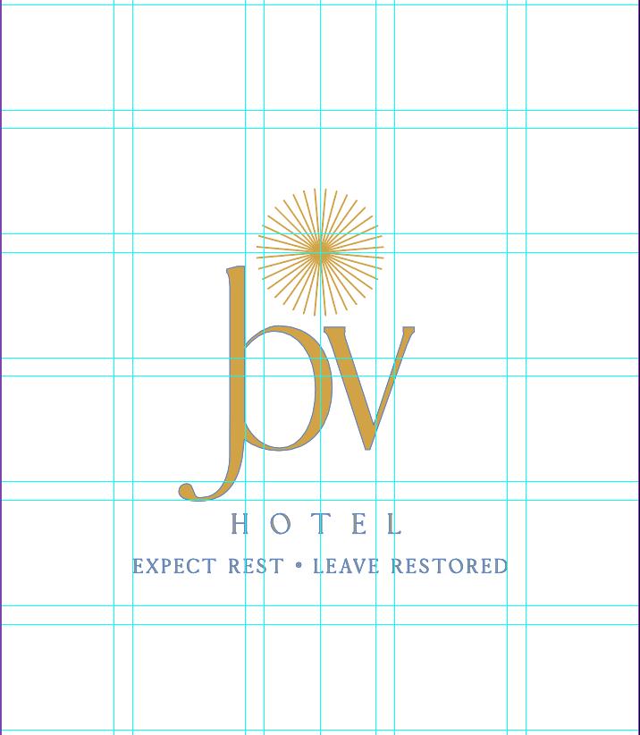
The Bonne Vie logo may be resized as necessary. However, it should follow these minimum size requirements to ensure that it is still readable, even when scaled to smaller dimensions.
logo
2.2 secondary logo
Our logo must have space to breathe, with rules concerning spacing and margins. It should not be cramped or overshadowed by other visual distractions. The logo clear space equals the CAP height of letter “X” around all edges of the logo, which should be free from other graphics and interference.
logotype signature
*The Bonne Vie logo and signature may only be used in our gold and tan primary colors, and black and white when needed.
To maintain the integrity of the primary lockup in print, a minimum width of 1.5 inches has been set. The height should be proportional.
To maintain the integrity of the primary lockup in digital, a minimum width of 108 pixels has been set. The height should be proportional.
Size Parameters
The Bonne Vie logo may be resized as necessary. However, it should follow these minimum size requirements to ensure that it is still readable, even when scaled to smaller dimensions.
2.3 primary colors
2.4 secondary colors
Two standardized fonts have been chosen for the Bonne Vie brand identity. They are to be used in all printed and online communications. Each of the typefaces was seleced for its visual compatibility with the hotel and for its ability to convey a personality that is consistent with our brand story. Only use the weights and styles shown on this page.
never...
1. substitute type in the logo.
2. alter the colors in the logo outside of the designated logo colors.
3. put other words or phrases inside the logo.
4. tilt the logo.
5. distort the shape of the logo.
6. alter the proportions of the logo in any way.
7. add elements inside or over the logo.
8. rearrange the elements of the logo, unless there is a special usage
The consistent and correct application of the Bonne Vie signature is essential. Always follow the standards presented in these guidelines. The examples on this page illustrate some of the unacceptable uses of the restaurant signature.
2.6 unacceptable logo uses