

Clarence Mensah Portfolio
Selected works
O34 Views On: The Vessel ceramic slipcasting and the production of multiples; exhibition
42 Tisser Vases digital textiles & ceramics; physics simulation as a form finding tool
Cosine Vase a set of connecting vessels
The Vessel: Wrapped abstracting architecture; an iteration of the dressed bottle project
une CHAISE an architect’s chair; exploring furniture design + metalworking processes
Vis-à-vis Table a table for uncomfortable conversations
S04 Oikos A a low energy, minimalist, mobile michrohome; competition entry
12 Upper Lawn Impostor intervention on an iconic house; intro to architectural 3D modeling
Odamtten House a passive house and workshop on a narrow plot; professional work
Thenma House a mid-century modern inspired passive house; professional work
Oikos B a low energy, minimalist, mobile michrohome; competition entry
Neuengland House modular multi-family housing; the triple decker as a versatile and sustainable concept house
M18 Roxbury Vertical Village a vision for affordable housing, urban revitalisation and food security
28 Counterfeit Museum a virtual exhibition platform; material studies research project
AIRMAG an aerospace museum and exhibition space in Airport City, Accra
What Cheer Flower Farm a net zero office, greenhouse and flower processing center; a collaborative project
Potters’ Guild Prov. a factory, maker space and gallery dedicated to clay and ceramic processes
Providence City Library injecting public programming into established urban fabric
LAero+Structuro a vision for air travel + cargo within Ghana + West Africa; undergraduate thesis
A Ticket to the Border a study of migration infrastructure on the USMexico Border; research project with Prof. German Palleres
EGS Catskill Campus a new campus for the European Graduate School; generating a mastperplan
Resume
+1 401 226 7799
cmensah@risd.edu www.clarencemensah.com
Education
Rhode Island School of Design
September 2018 - June 2023
Providence, RI, United States
Bachelor of Architecture | BArch
Bachelor of Fine Arts | BFA
Honour Roll Student GPA: 3.77
Prescott O’Clarke Scholarship Awardee
Alpha Rho Chi Bronze Medal Recipient
Exhibitions
Views On: The Vessel for the RISD Architecture Department
November 2022
Exhibited works from an architecture & ceramics collaborative design studio
Experimental Foundation Studies
Triennial for RISD EFS
September 2019
Exhibited select painting and sculpture work from my design and spatial dynamics studios
Architectural designer
Multidisciplinary artist https://issuu.com/clarence_m
Experience + Leadership
Architectural Design + BIM Intern at Arc-AURA Architects
January 2024 - April 2024
Osu, Accra, Ghana
• Participated in the design development process of multiple commercial projects
• Photographed construction progress and items of interest during site visits
• Translated sketch models and drawings into Revit models and produced construction working drawings in collaboration with the engineering team
Visualisation Intern at Incept Architectural Consult
July 2023 - October 2023
Ogbodjo, Accra, Ghana
• Created marketing material, presentations and construction documents for several housing and master planning projects
• Produced visualisation for in-progress and completed projects; created aerial, exterior, interior renders and walk-through animations for over 7 projects
Teaching Assistant at RISD Architecture
January 2019 - June 2023
Providence, RI, United States
• Provided one-on-one feedback and advising sessions for students
• Orchestrated software, drawing and model making demos as well as documentation and presentation workshops for 100+ students
• Produced digital models, site models and drawing templates for class use
RISD Orientation Student Co-Director
April 2021 - September 2022
Skills
Design
Research
Drafting
Sketching
Rendering
Animating
Digital
Revit
AutoCAD
SketchUp
Rhinoceros 3D
Grasshopper
Climate Studio
V-Ray
Enscape
Blender
Cinema 4D
Maya
Fabrication
Model Making Laser Cutting 3D Printing
Slip Casting Metalworking
Adobe Suite
Photoshop Illustrator InDesign
After Effects
Language
English - Fluent
French - Elementary Akan (Twi) - Limited
• Directed the day-to-day events of the orientation experience for over 400+ new students at RISD; this included event planning, coordinating with multiple RISD offices and services and managing stock of RISD merchandise and goodies
• Assisted in hiring, training and scheduling over 30+ student orientation leaders
Chapter President of RISD NOMAS
September 2022 - June 2023
• Facilitated monthly NOMAS and student community events with 20+ attendees
• Spearheaded the development of a marketing and outreach strategy for the chapter; achieved a 130% increase in membership and sustained attendance
• Negotiated and secured over $3700 in funding for the Spring 2023 event line-up, an increase of 450% from the previous budget
• Maintained partnerships with NOMA National, BOSNOMA, RISD faculty and RISD Arch alumni; leading to increased engagement with other NOMAS chapters
RISD Architecture Student Department Representative
October 2020 - April 2023
• Elected as an advocate for student interests to RISD administration; spearheaded the successful implementation of student-led initiatives and policy changes that resulted in a 30% increase in the student satisfaction rate
• Regularly collaborated with the Center for Student Involvement and RISD Admissions on open studios, and showcases which saw over 200+ attendees
• Served as a contact person to current and prospective students and parents
Oikos A
a mobile, minimalist michrohome that redefines the living essentials
Winter 2024
MICROHOME #7 Kingspan Edition
collaborator(s): Louis Hand
project type: Personal Work | Competition Entry
“The MICROHOME Kingspan Edition invites participants to conceptualize an off-grid dwelling that would accommodate a hypothetical young professional couple. This scenario serves as the benchmark family size for the competition. The total floor area of the structure should not exceed 25m2, thereby encouraging participants to push their creativity and innovate within these parameters.” - Competition Brief
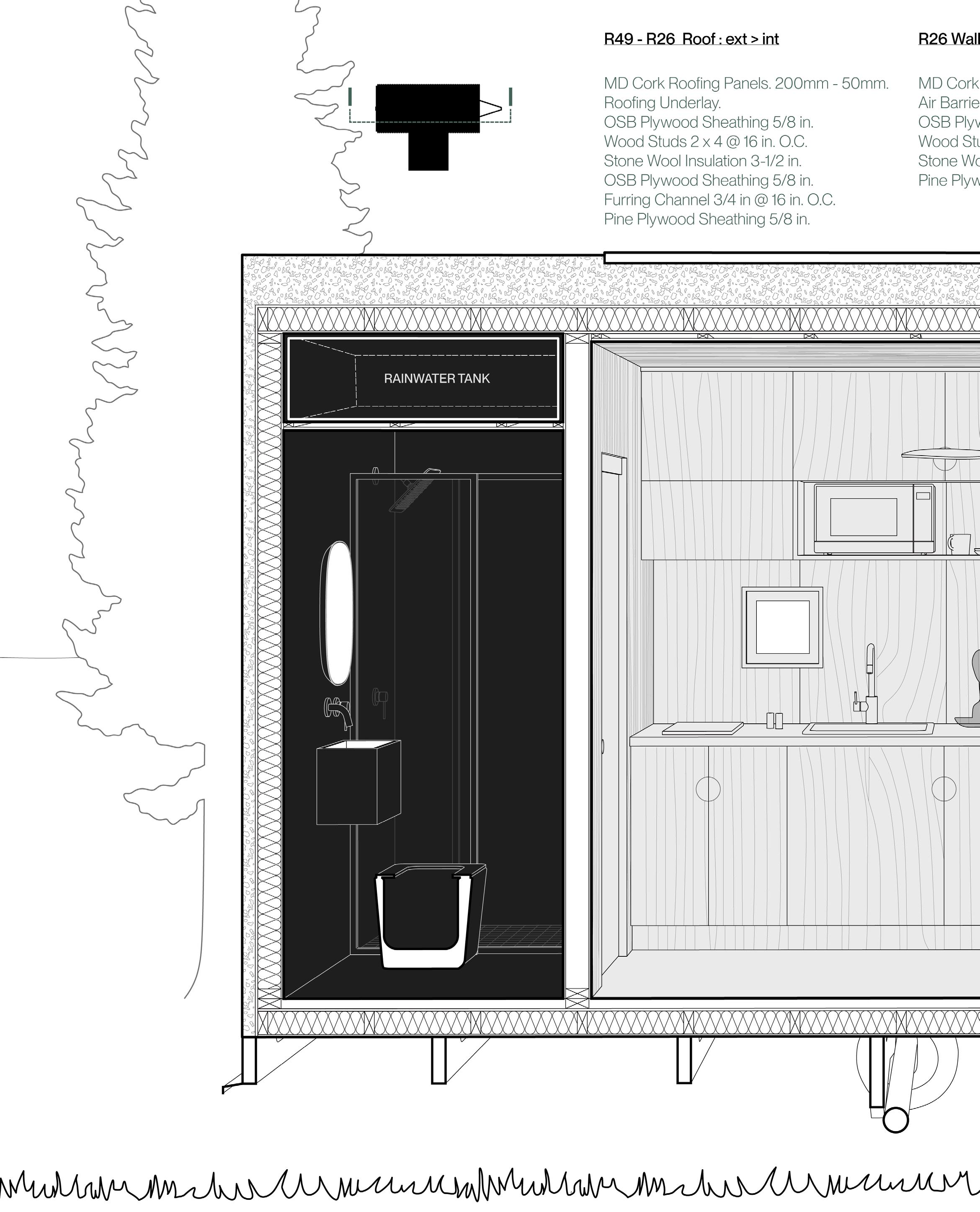
The Oikos focuses on the essentials a modern young couple would need to live; specifically space for work and play, full amenities like in-house laundry, kitchen and bathroom. Most tiny homes compromise on one or another, particularly washing amenities, all within an easy to assemble package of wood framing and super-insulated with a machined cork facade that assembles comes together like a puzzle.
On top of its standard sized 8x18 ft trailer the Oikos can function off grid and in-situ as a comfortable and low energy tiny dwelling or be a mobile residence for people with a more nomadic lifestyle.

Above: Aerial view of our working site; the Hand Residence in upstate New York. We begun the design process with the intention of the Oikos serving as an off-grid ADU for visiting/ extended family.
Right: Front of the Oikos. (in-progress render) Rendered with V-Ray for Rhino.
Canajoharie, New York, United States

Oikos is a tiny home designed to efficiently and pragmatically house two people. It is outfitted with everything that a small household needs while being under 25 m² or 270 ft²

Compact Footprint
The 8 x 18 ft trailer serves as our initial frame on which the microhome is conceived. It was important that the dwelling be mobile.

Passive Energy + Rainwater Harvesting
The butterfly roof aids rainwater harvesting and solar panel efficiency. The windows aid cross ventilation in the heat and warming the concrete floor for release in the cold.
The object is used to create a multi-part plaster mould. Slip (a mixture of clay in water) is poured into the mould which absorbs the water.
This leaves a behind a shell of clay in the mould while the excess slip is poured out. My mould is a ‘gangmould’ to facilitate the production of multiple objects simultaneosly.

Efficient Organisation
The fixtures and subsystems of the michrohome are centralised ensuring that maximum space is given to circulation and living/workspace.

Security and Mobility
The deck is connected to the trailer and folds up during transport. This also protects the large pivot door during transportation and when the Oikos is uninhabited.
The object is used to create a multi-part plaster mould. Slip (a mixture of clay in water) is poured into the mould which absorbs the water.
This leaves a behind a shell of clay in the mould while the excess slip is poured out. My mould is a ‘gangmould’ to facilitate the production of multiple objects simultaneosly.


Clarence Mensah

(in-progress render) The rear of the Oikos: The cork cladding gives the Oikos a distinct look within rural or urban contexts. The windows in this elevation provide as much light and circulation the dwelling needs.


The biogenic interior of the Oikos: The ‘green’ material pallet is meant to reflect the materials of our reference site and to of course provide a tranquil living experience. Wood flooring, terrazzo and brass fixtures complete the Oikos.
Clarence Mensah

Clarence Mensah
Upper Lawn Impostor
analysing and recreating the Smithson’s upper lawn pavilion
Spring 2020
ARCH-2142 Architectural Analysis
critic(s): Cara Liberatore, Aaron Forrest project type: Professional Work | Design Proposal
The Upper Lawn Pavilion (also known as the Solar pavilion) was Alison and Peter Smithson’s weekend home in Wiltshire in the countryside in South-West England.
A large part of analysis was finding useful drawings, images and construction documents in order to accurately reproduce the building. The 3D then became the reference for producing conventional architectural drawings: plans, sections, axonometrics and the reflected ceiling plan.
The final part of this core studio involved studying an architectural “impostor” of the original building: in my case, Office KGDVS’ City Villa. The final was creating an architectural hybrid of the two buildings and then creating a set of drawings that exhibit our selected formal or spatial relationship.
I chose to unite the wood structure of both houses as well as their respective indoor-outdoor relationships

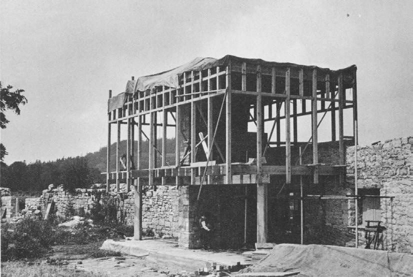
Above: The house’s wood structure during construction. Analysis was as much about research as it was about 3D modeling. The Solar Pavilion has undergone several renovation’s over the decades and it was a challenge understanding the house as it was vs how it is now.
RISD Architecture, Providence, Rhode Island
Right: The house in 2014, post-renovation.

the couple designed and built the low-cost pavilion between 1959 and 1962. The new construction replaced in large part the cottage and only one of the old chimneys was left to become the center of the new building

Digitally Recreate: Alison and Peter Smithson’s Upper Lawn Pavilion


Analyse and Hybridize with: Office KGVDS’ City Villa House


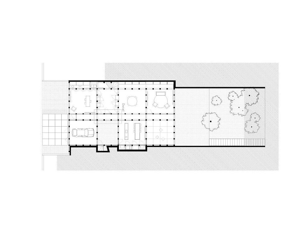

Diagram- the design intention for the architectural hybrid + Researched images and drawings: the hybrid explored unifying the design languages of the houses underground.


Digital recreation of the Solar Pavilion in Rhino: The model is stripped to show the details of the wood structure, the stonework of the original cottage and the massive yard that the property frames and the house flows into.
Lawn Impostor
Clarence Mensah

Axonometric drawing: The ‘new’ courtyard of the architectural hybrid. Note the skylights for the basement addition and the doors, bringing more light and air into the building and accessed from the remnants of the old cottage.
Clarence Mensah

Section perspective: The continuity of the architectural language of the original Upper Lawn Pavilion and the basement addition in the hybrid.
Upper Lawn Impostor
Roxbury Vertical Village
a neighbourhood of care | community centered redevelopment
Fall 2021
ARCH-2108-02 Urban Ecologies
critic(s):
Anne Tate, Hansy Better, Laura Briggs project type:
Academic Work | Core Studio
The Urban Ecologies core studio introduces the city as a designed environment with an emphasis on sustainability; working through impressions, analysis and design operations as ways to understand the relationship between naturally formed and culturally constructed landscapes as well as strategies for urban ecological development.
We confronted the design of low-cost housing as a way to order social relationships and shape the public realm and attack the problems of structure, construction, access and code compliance in the context of a complex, large-scale architectural design.
The project site is centrally located in the commercial and retail district of Nubian Square in the Roxbury neighborhood of Boston. Roxbury is a predominantly black neighborhood that is next to a wealthier and historically protected neighborhood of the South End. The site, originally a parking lot for the grocery store Blair’s Foodland, consists of 87,879 sq ft of vacant land.
The site was acquired by the Boston Planning Development Authority from its owner in 1985 after being labeled as “blighted.”

Above: Aerial view of site. The Blair Parking Lot in Roxbury, is already used by residents as a gathering space. It currently hosts smaller family owned businesses and a Black-owned Art Gallery. There is also a derelict packing factory that I would re-use as a space for processing the produce from the community farms.
Washington
Right: View of the housing block from
Street. Rendered with V-Ray for Rhino.
Roxbury, Boston, Massachusetts

the material finishes incorporate the traditional Boston brick ,while the addition of metal screens both adds a modern take and helps the individual residents control their solar heat gain

Site Plan - Key:
1. Housing
2. Paved Public Space
3. Future Farmer’s Market
4. Outdoor Dining Area
5. Orchard + Community Park
6. Community Art Gallery
7. Future Community School + Library
My approach to the site is the creation of an urban wall; a collection of over 100 housing units ranging from 1 bedroom studio, to 3 bedroom apartments. In keeping with zoning regulations and ADA guidelines, my units center ease of circulation and accessibility with over 30 of units being friendly to disabled persons.
Secondly, I wanted to maintain the capability of Roxbury Lot as a meeting space for the local community and my scheme re-integrates all existing local services and business including the Black-owned Art Gallery.
Finally, the Urban wall acts as a gateway to the much needed green space, which in conjunction with a new farmers market, school with rooftop gardens( and a curriculum centering farming and entrepreneurship), and garden terraces on the housing itself provides an opportunity for a new relationship with food for a community that exists in a food desert.


Site render and transverse site section: Renders showing the relationship of the housing mass to the rest of the master plan, and the creation of a new community gathering space.
Clarence Mensah
Roxbury Vertical Village

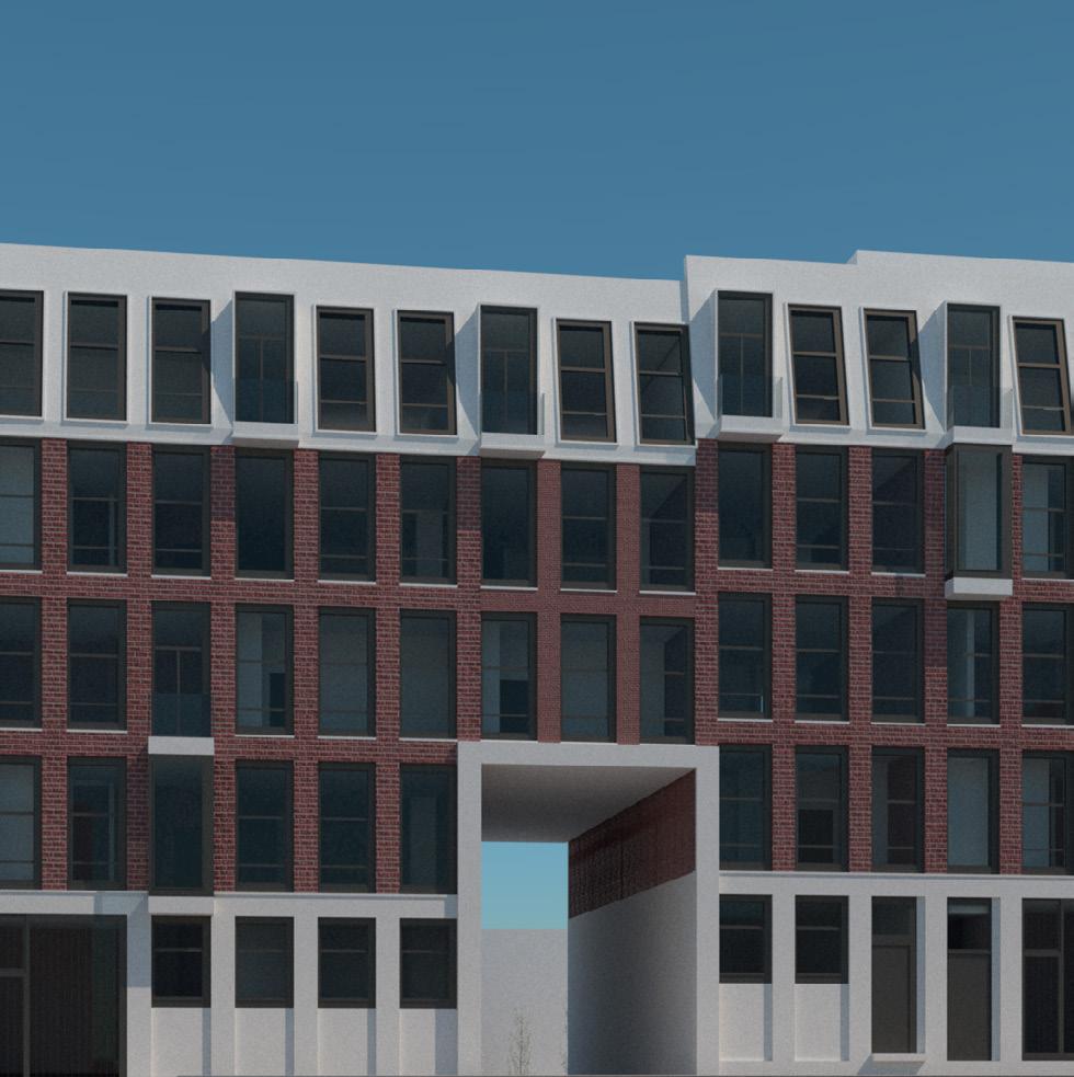
Repeated housing block, with material ecology:
In keeping with the local ecology, I wanted my materials to stay true to the classic Boston vernacular.
My final choice was recycled brick, primarily from the old buildings on site that would need to be cleared and ones from a range of new developments across the city.

The 5 story tall housing block becomes a visual and literal archway from the main road that is Washington street and into the new Blair Lot community where a massive orchard/ replaces hostile hardscaping.
My units have large windows, one for light, but also to give stellar views of the community and the Roxbury community at large.


Clarence Mensah
Roxbury Vertical Village

View of the Urban Wall from Eustis Street: the rear of the project has a completely different character to the Washington Street side. Space is returned to the local art gallery which is now an integrated community space.
Clarence Mensah

The Urban Wall from the new green space: the space that was once a giant concrete field becomes new green space for the community, that is most importantly, able to be used how it had been before the development.
Roxbury Vertical Village


Roxbury Vertical Village
Clarence Mensah
Counterfeit Museum
the
future of the museum | experiments in digital hyper-realism
Spring 2022
ARCH-8965-01 Trans-Dimensional Realities
advisor(s):
Carl Lostrito
project type:
Academic Work | Advanced Studio | Exhibition
coun·tef’•feit /’koun(t)af’ fit/ adjective
Made in exact imitation of something valuable or important with the intention to deceive or defraud.
“two men were remanded on bail on a charge of passing counterfeit $10 bills”
The trans-dimensional experience quickly leaves the realm of realism as one enters the world of the counterfeit. How will the museum exist in a world of VR, 3D Scans, Online Exhibitions and of course increasingly realistic CGI?
This speculative design project: The Counterfeit Museum, seeks to place art and the art of exhibition in digital space. Letting that art influence the architecture and vice versa.
Each subsequent space could have intricate themes and environments to compliment the art, and could be used in tandem with real-world spaces to create entirely new experience.

Above: Virtual and augmented reality technology is set to become more advanced and accessible. My project would ideally be expanded to a platform that museums could access and customise for their specific needs and their available hardware.
Right: Interior of the hyper-real gallery. Rendered with V-Ray for Rhino. Adapted for VR walkthroughs.
RISD Architecture, Providence, Rhode Island

the hyper-real gallery is a vision for a different museum experience. Making galleries and exhibitions digital creates new possibilities for creatives while allowing rare and ancient artifacts to be protected


More interior views of the hyper-real gallery: The hyper-real gallery is designed to simulate the current museum space in the most ‘traditional’ sense. The gallery takes cues from real world spaces including the RISD Museum.
The materiality, the art and the staging of the space is meant to set the precedent of hyper-realism so the following galleries have a chance to subvert, question and challenge the expectations of exhibit/museum design.
The next part of the project was the recreation of art itself. Using Blender’s extensive node-based material editor, I spent several months researching and recreating materials to place on various 3D scans of popular sculptures from across the globe.
While there wasn’t enough time to finish four more galleries, I imagine a feedback loop where the gallery is assigned a material theme and the materiality of the art is changed to match, or the opposite where scanned art generates a bespoke gallery interior.


Terrazzo, Marble, Stucco, Ocean glass: the process of recreating a materials full range of qualities from colour to texture as well as making sure they could be rendered by most engines was an exciting project in itself.
Clarence Mensah


Clarence Mensah
Views on: The Vessel
the production of multiples as art and industry
Spring 2022
ARCH-21ST-10 Views On: The Vessel
critic(s): Evan Farley, Maxime Lefebvre
project type: Academic Work | Advanced Studio | Exhibition
Vessels are coded as hollow objects; their shapes and forms have historically been suited for the storage or transportation of other substances, particularly liquids.
My project grasps the vessel as a shell, not so much for utilitarian use but as a designed object in its own right. I explore the recreation and manipulation of an established and recognised vessel, the glass bottle, through the natural properties of clay and other materials as well the injection of architectural associations through precedents, digital software and manufacturing tools.
The vessels were produced with slipcasting in stoneware clay, which was radically different from the 3D printing process I was used to

Above: The translation of the physical bottle to a digital object and the ensuing ‘fabric’ experiments. The finished pieces were showcased in an exhibition, and were formal inspirations for the preceding project.
Right: The vessel ‘Unwrapped’ approximately 8” x 4” x4”. Stoneware Clay, Slipcast.

the first set of vessels are directly derived from the glass bottle while the final 2-pieces are designed to abstract the bottle’s form and imbue them with architectural associations


My found object, a red-stripe bottle, made from smooth, amber-coloured glass.
The object is used to create a multi-part plaster mould. Slip (a mixture of clay in water) is poured into the mould which absorbs the water. This leaves a behind a shell of clay in the mould while the excess slip is poured out. My mould is a ‘gang-mould’ to facilitate the production of multiple objects simultaneously.


The objects then undergo some post-processing right out of the mould ie. cleaning up the seams and smoothing any cracks or tears.
In the case of the coloured objects, I decided to incorporate the pigment into the slip as opposed to having it be a surface treatment on the object. Besides creating a more consistent finish across the vessel it also means the clay is coloured all the way through.

Dressed Vessels series: The seam along the objects tells me it was mass produced as a vessel for a beverage. I think of the bottle as a canvas on which experiments manipulating form, material, colour and texture take place
Clarence Mensah


Architectural references for the designed pieces:
A subsequent piece; Wrap takes inspiration from Christo and Jeanne- Claude’s, 56000 Cubicmeters Package (above right). Similarly Drape has pleats, creases and folds of the digital ‘fabric’ evocative of Christo and Jeanne- Claude’s, Reichstag, Wrapped (above left).


Creating the intricate sweeps, ridges and mounds for a plaster mold required a similarly intricate manufacturing process and 3D printing fit the bill. It also added a third complexity to the objects, in the layers of the PLA print.
For colour, I use the same process as the dressed vessels: mixing mason stain pigments with slip and coating the inside of the plaster mould.
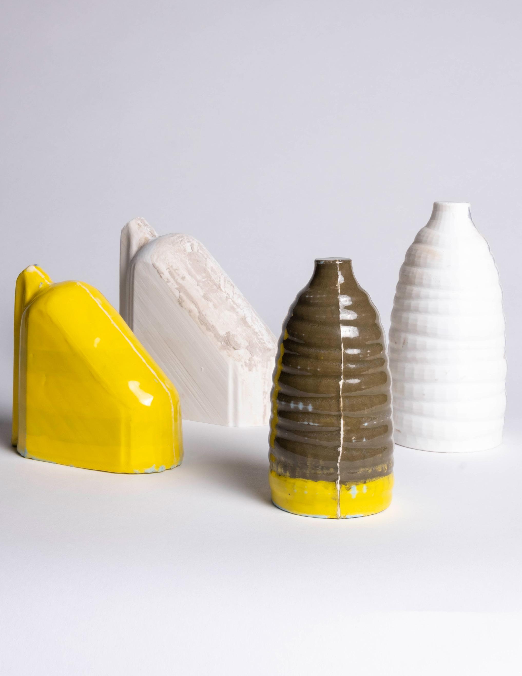
Drape and Wrap: The seam, in this context, is a reminder that these objects are crossing multiple physical and digital space as well as multiple fabrication techniques to come to fruition.
Clarence Mensah


Clarence Mensah
Tisser Vases
vessels made of fabric | fabricating intricate forms
Winter 2020
CER-W311 Digital Ceramics
advisor(s):
Justin Grubb, Colin Yoon project type: Personal Work | Product Design
Tisser is the french verb ‘to weave’, and I wanted to push the limits of what I could produce with a 3D printer.
The tisser vases employ grasshoppers physics simulation as well as textile concepts to create a set of vessels with exquisite surface designs. Combining the aesthetics of fabric smocking, and grasshopper’s kangaroo physics engine, I created a code that exerts force on a digital fabric that is simultaneously constrained all over by pins. The resulting deformation of the fabric replicates a smocking pattern depending on the pinning arrangement much like how actual fabric is smocked with folds and pins.
The final vases were glazed with solid colours to let the fine textures stand out. The tisser vases are objects that must be tactically experienced as much as they are looked at.
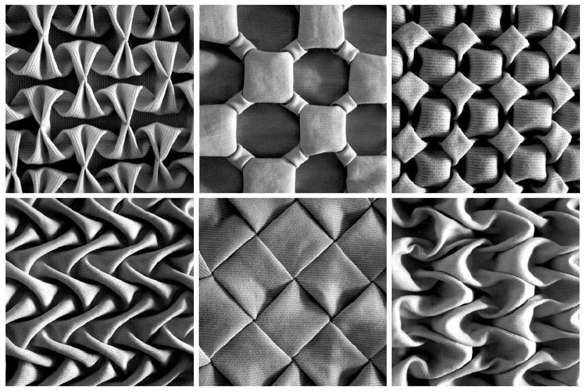
Above: Reference smocking patterns that originate the forms of the vases. The pattern density of each vase was determined based on its compatibility with the 3D printing process as not every pattern was viable.
Right: Photo of the finished vessels; Tisser A and Tisser B. Each vessel is approximately 4.5” x 4.5” x 10”. Stoneware clay, 3D printed
RISD Ceramics, Providence, Rhode Island

