

Colin Bost
2nd Year Architecture Portfolio
Spring 2018
Zenobia
Pusch Ridge House
Summer 2018
Flatirons Vista Trail Building
Fall 2018
Health & Equine Center
Spring 2019
Experiential Framework
Deep Ellum Hydroponics Center
Artistic Works
Hand Renderings
Digital Modeling
Physical Craft
Napkin
Awards & Honors
Honors College (2017-present)
Dean’s Honor Roll (Fall 2017)
President’s Honor Role (Spring & Fall 2018)
Napkin Sketch Contest 2nd Year 1st Place (2019)
Education
Christopher C. Gibbs College of Architecture, University of Oklahoma
Expected Graduation May 2022, summa cum laude
Current GPA: 3.94
Softwares
Blender (Cycles & Internal Rendering Engines)
Adobe Photoshop
Adobe Illustrator
Adobe InDesign
Contact
colin.a.bost@ou.edu
306-9263
colinabost.oucreate.com
ZENOBIA an “Invisible City” g
“Now I shall tell of the city of Zenobia, which is wonderful in this fashion: though set on dry terrain it stands on high pilings, and the houses are of bamboo and zinc, with many platforms and balconies placed on stilts at various heights, crossing one another, linked by ladders and hanging sidewalks, surmounted by cone-roofed belvederes, barrels storing water, weather vanes, jutting pulleys, and fish poles, and cranes.”

“No one remembers what need or command or desire drove Zenobia’s founders to give their city this form, and so there is no telling whether it was satisfied by the city as we see it today, which has perhaps grown through successive superimpositions from the first, now undecipherable plan. But what is certain is that if you ask an inhabitant of Zenobia to describe his vision of a happy life, it is always a city like Zenobia that he imagines, with its pilings and its suspended stairways.”
“This said, it is pointless trying to decide whether Zenobia is to be classified among happy cities or among the unhappy. It makes no sense to divide cities into these two species, but rather into another two: those that through the years and the changes continue to give their form to desires, and those in which desires either erase the city or are erased by it.”
- Italo Calvinio


Pusch Ridge House
Tucson, Arizona
ZENOBIA an
g
“Invisible City”
This assignment involved randomly generating a “cloud” with a screen mesh and finding inspiration in the form of the cloud to design a house. After generating the cloud a digitally modeled version was created explore the form in sections and find certain moments such as views, terraces, and stairs which would later be recreated in the rationalized version of the cloud house form.


The heaviest inspiration from the cloud form came from the two masses, one larger and one smaller, that were imagined to be capped by large windows. The terrace protected under the smaller windowcapped form and the stairs wrapping around the back also became some of the more pronounced features that reflected the original cloud.
“Now I shall tell of the city of Zenobia, wonderful in this fashion: though set on stands on high pilings, and the houses and zinc, with many platforms and balconies stilts at various heights, crossing one another, by ladders and hanging sidewalks, surmounted cone-roofed belvederes, barrels storing vanes, jutting pulleys, and fish poles, and
“No one remembers what need or command drove Zenobia’s founders to give their and so there is no telling whether it was the city as we see it today, which has through successive superimpositions from now undecipherable plan. But what is certain you ask an inhabitant of Zenobia to describe of a happy life, it is always a city like Zenobia imagines, with its pilings and its suspended
“This said, it is pointless trying to decide Zenobia is to be classified among happy among the unhappy. It makes no sense into these two species, but rather into those that through the years and the changes continue to give their form to desires, which desires either erase the city or are
*Various moments were placed within the spontaneously generated mesh form where appropriate.
*The irregular form of the mesh was rationalized in such a way as to recreate the same moments.

 Cloud Sketch
House Sketch


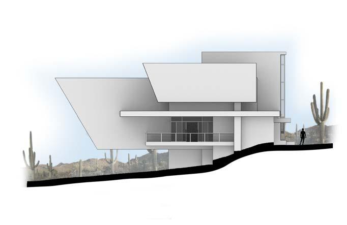
 South Elevation
East Elevation
West Elevation
North Elevation
Flatirons Vista Building
Boulder, Colorado
g g g


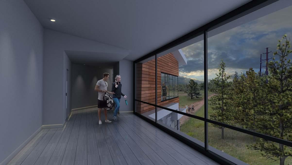
The building is located roughly 40 minutes outside of Boulder, two miles into the Flatirons Vista Trail. It sits on the edge of flat terrain overlooking the Flatiron Mountains. Its close proximity to the Flatirons makes it a useful location for a geology laboratory as well as a stop for hikers. As such, the building accommodates both functions, housing a private laboratory with accompanying living spaces for the lab workers, and a public stop for hikers with
an observation deck. The concept is driven by the idea of merging two functions into a single building, responding by interlocking multiple discernable forms. The larger, more prominent cantilevered form houses the private living quarters, while the smaller, west-facing cantilevered form serves as an observation deck. Each form is deliberately positioned to frame a particular view. Since the observation deck will be frequented by
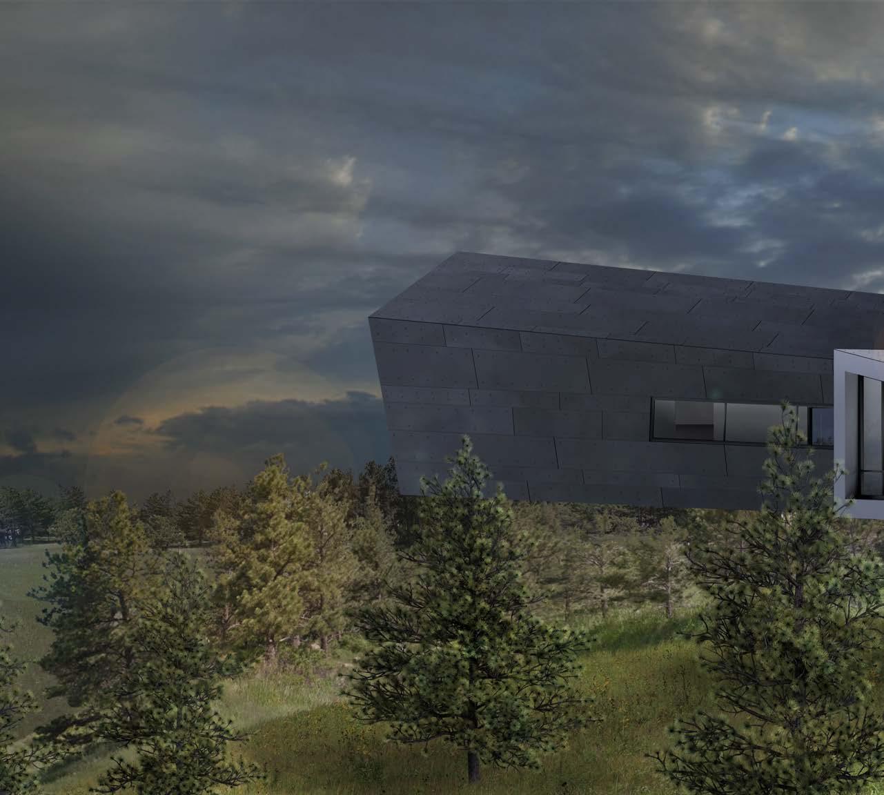
hikers intent on experiencing nature, the form points toward the edge of the mountains, with large windows wrapping around to frame the entirety of the Flatiron formations. The larger form, inhabited by the lab workers, is capped by a massive window which frames the city of Boulder far off in the distance. Whereas the observation deck narrows the view to largely exclude human construction, the lab workers who live in the building will have a
connection to civilization, though distant enough so as not to compete with the view of the natural landscape. Another driving element of the form of the building was the sloped roofs, which were intended to define the shape of the building, rather than simply appearing to be stacked onto the top. The work on this project was not intended to address either materials or structure, instead prioritizing program, form, context, and representation.

One of the aims of the design process was to reflect the architecture typically associated with Colorade while still allowing for personalized stylistic expression and exploration. A study of contemporary architecture by firms working in Colorado informed decisions such as the use of materials, proportion, window design, roof pitch, and so on.


Entry Sketch

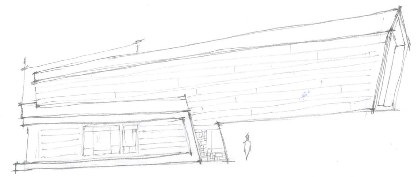


 *This sketch depicts the final arrangement of the stairs, a ramp, and bike racks.
Materials Sketch

*Buildings in Colorado often use stone masonry below wood paneling on the facade. This strategy was replicated for the Flatirons Vista Building, while also adding metal plating.


Final Model


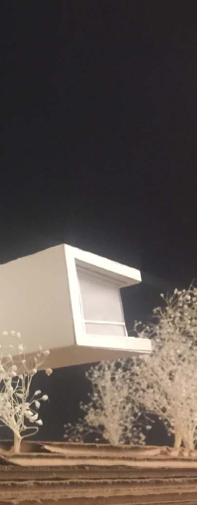
*The final mode, built from white art board, cardboard and trace paper at 1/8” = 1’-0” scale, was entirely hand cut.

Second Floor Plan


Private Living Quarters
1273 square feet


The design aims to articulate two languages, one of angles and straight lines intended to convey precision, complimented by curves intended to reduce the harshness of the design. The density of the façade and the roof adapts to the enviornmental needs, particularly natural light. The undulating forms unravel in areas that require natural light, while tightening around areas that do not. The forms that compose the façade extrude from the ground to articulate


a sense that the building is expanding upward and outward from the center, while also aligning at times with the truss system, and leaving it exposed at others. This serves to highlight the angles of the structure, while also providing the façade with depth.

*Thogh
The building mass and floor plan evolved primarily through multiple iterations of sketching as well as some study models. After the floor plans and massing were developed the visual, formal appearance of the building was breifly explored through spontaneous, chaotic study models. These were rationalized through rough sketches which were later polished on grid paper to be scanned and used to build the digital model.


 Early Schematic Diagram
*Program functions were grouped into distinct building masses early on in the programming stage,
Schematic Diagram
not the final floor plan, this plan was developed near the end of the programming stage.
Natural Lighting Diagram


*Spots where natural light needs to be blocked are indicated with darker shading


The design aims to articulate two languages, one of angles and straight lines intended to convey precision, complimented by curves intended to reduce the harshness of the design. The density of the façade and the roof adapts to the enviornmental needs, particularly natural light. The undulating forms unravel in areas that require natural light, while tightening around areas that do not. The forms that compose the façade extrude from the ground to articulate


Natural light, which is generally an important consideration, was especially important to many functions of the facility. Neither radiology nor the indoor gait can allow natural light as shadows can interfere with the delicate imaging technology. Hospitals are also moving towards less sterile architecture in an effort to appear more visually stimulating and less harsh and unwelcoming. All of these considerations heavily influenced the form of the facade.


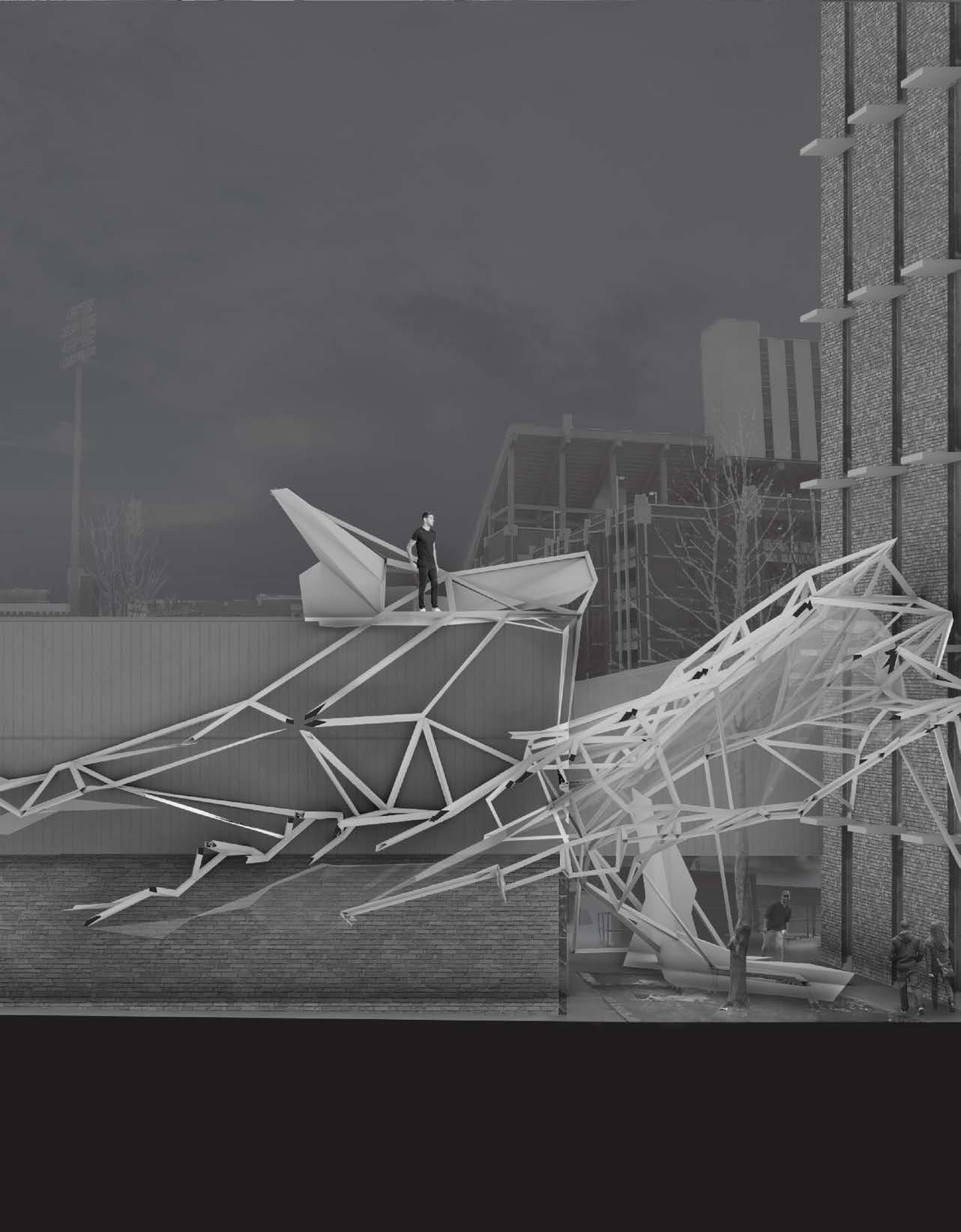
The framework intends to mask certain inhabitable spaces which are only accessible by climbing over and through the structural framework. The framework provides access to the rooftop and across the framework itself beginning at a piece of the framework that extends toward the floor of the alley, hanging just low enough to reach. Its function as a means of circulation is not made perfectly obvious; it must be discovered just as the alley in which it exists must be discovered.

Experiential Framework


Norman, Oklahoma
Much of the framework that exists in the courtyards forms a twisted truss system suspended by expanding beams. Glass plates twisting below the framework reflect and refract light while defining movement through the alley and around existing site elements such as the tree and the northern staircase. A series of objects intended to create gathering spaces make use of a triangulated geometry similar to the structural framework. They exist almost as solid versions of framework and connect to it as if to transition from solid form to wire frame. g g g g g

Primary Structure
Secondary Structure

Objects


The physical model needed to be as accurate to the digital model as possible, so formwork was created digitally then physically fabricated using the laser cutter. Formwork was used as templates for the shape of each face of the various objects as well as for the structural framework itself.


Deep Ellum Hydroponics Center
Dallas, Texas
g g g
The Deep Ellum Hydroponics Center aims to increase public understanding of urban farming methods such as hydroponic systems, but more importantly to promote the notion that urban farming is a viable solution to strengthen food security as the world becomes more concentrated in urban areas. Farming, typically associated with nature, is not restricted to nature. In response, the architecture of the center does not aim to simply bring nature into an urban context, or completely isolate farming in an inorganic environment.
Rather than set a dichotomy between nature versus the built environment, the architecture intertwines experiences of interior spaces and exterior spaces. The entry, often a stark line between inside and outside, is made less prominent to make that distinction less obvious, while the overall massing of the building directs people through a central path so that the entry may become obvious by location and direction, rather than by form. Bridges, tunnels, and cantilevers puncture interior spaces with exterior spaces, and exterior with interior spaces, until the entire site, interior and exterior feels more generally united.


Early Conceptual Sections


*These sections explore rough ideas of space, program, and approach.


Since the entrance was always intended to be pulled into the site to allow for more control over the entry sequence, a clear axis was needed to visually connect one street to another to draw people off the street and into the site.

Elevation of Eastern Building


Elevation of Western Building
Study Model
*A rough physical exploration of entry sequence, massing, and structure


A basic mass placed into the site.


The building divides into two to allow visual connection between streets and to encourage circulation through the site.

The eastern wing of the building is pushed back in order to keep clear of the outdoor seating areas of a neighboring restaurant.
The two wings of the building are connected by a lower ground floor.
Various cantilevers and bridges allow a more intertwined connection between interior and exterior spaces.
Sec. 2Hand Renderings

Norman, Oklahoma g g g g Graphite


ZENOBIA an “Invisible City” g
“Now I shall tell of the city of Zenobia, which is wonderful in this fashion: though set on dry terrain it stands on high pilings, and the houses are of bamboo and zinc, with many platforms and balconies placed on stilts at various heights, crossing one another, linked by ladders and hanging sidewalks, surmounted by cone-roofed belvederes, barrels storing water, weather vanes, jutting pulleys, and fish poles, and cranes.”
“No one remembers what need or command or desire drove Zenobia’s founders to give their city this form, and so there is no telling whether it was satisfied by the city as we see it today, which has perhaps grown through successive superimpositions from the first, now undecipherable plan. But what is certain is that if you ask an inhabitant of Zenobia to describe his vision of a happy life, it is always a city like Zenobia that he imagines, with its pilings and its suspended stairways.”
“This said, it is pointless trying to decide whether Zenobia is to be classified among happy cities or among the unhappy. It makes no sense to divide cities into these two species, but rather into another two: those that through the years and the changes continue to give their form to desires, and those in which desires either erase the city or are erased by it.”
- Italo Calvinioleft: A study of the firefly insect, as part of a project that concluded in building an abstracted “habitat” designed specifically for fireflies
below: Renderings of a misaligned coaxial outlet (6” x 4”)


right: Rendering of Hanno Koffler (4-3/4” x 7”)

Digital Modeling
left & right: Clone trooper modeled the animation style of Star Wars: the Wars television show
below: Fully rigged head model of Trintex, a character modeled after animation style of Star Wars: the Clone Wars television show


modeled after the Clone Rinek the Clone


This digital model of a paper crane was created as part of a project that involved designing original origami paper meant specifically to be folded into paper cranes. This was used to quickly test how the designs would appear once folded into a crane without needing to take time to hand fold test versions of the paper design to compare minor tweaks to the design.


Physical Craft




Pampas Grass Boxes

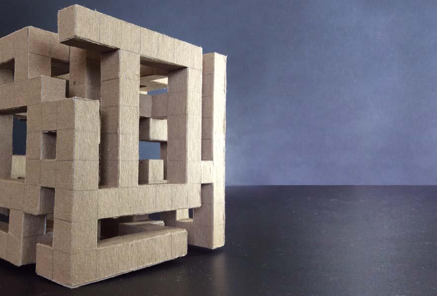
*These small boxes were created primarily out of cardboard, glue, twine, paper clips, and the hard stalks of pampas grass.


