
6 minute read
3.2 Explaining graphical and numerical data


Explaining graphical and numerical data
Big question: Are national parks a good way of developing an area sustainably?
✓ Analysis
Learning focus
• Identify the graphical or numerical data in a source. • Explain how the graphical or numerical data support an argument or perspective.
Getting started
Have you heard of ‘National Parks’? They are generally large, natural spaces owned by the government that are preserved and protected in law. Often, they have a strong conservation goal and are intended to symbolise national pride. Four well-known ones are: Key terms data: facts and statistics (numerical data) gathered for analysis quantifi able: can be measured in a scientifi c way White Desert National Park, Egypt. Yellowstone Serengeti Shennongjia Kaziranga 1 Working in a group of four, choose one park each and quickly research it. Find out: • where the park is • at least one species it is famous for or is trying to preserve • why people might visit it. Exploring People who wish to argue for or against a particular course of action often use data to support their argument. They do this for several reasons: • Data is quantifi able and is often seen as pure fact as opposed to emotional assertion. • Data can show trends or changes over time, enabling someone to make comparisons. • Data can be carefully selected in order to stress the evidence in Sample Pagessupport of one view. assertion: a statement • Data can be presented in graphic ways that are memorable. presented as fact without In the last topic, you began to think about developing a local natural supporting evidence area. One key question you might ask is: Can you preserve a natural trend: a general area and develop it at the same time? development in the way something happens Look at the infographic created by the US National Park Service. infographic: information The heading states ‘National Parks benefi t you’ – which here displayed in an interesting probably means citizens of the USA. way visually
2 How does the National Park
Service use data to support this perspective? Working with a partner, answer these questions: a) Four large numbers are clearly visible. What do these refer to?
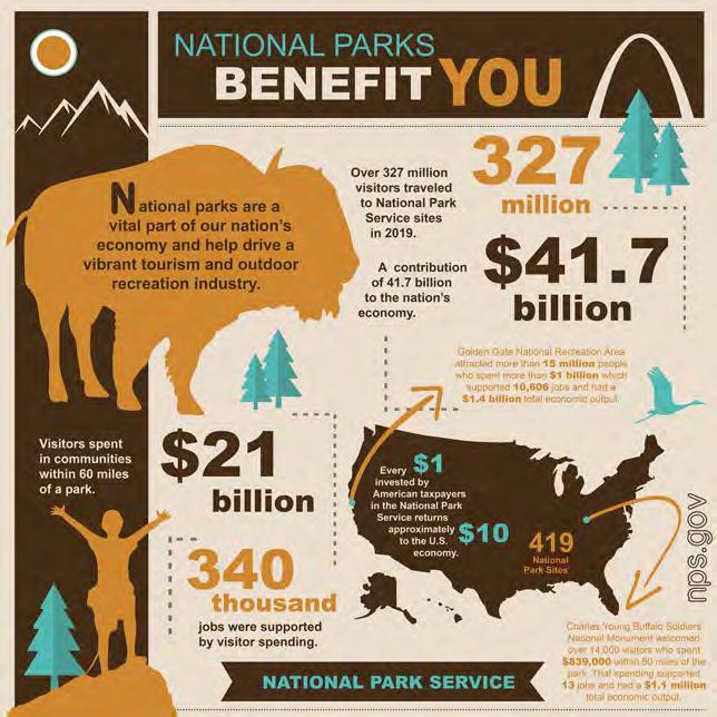
b) What other data measures can you fi nd? c) The infographic features fi r trees, a bison or buffalo and a fl ying bird.
What data are given about trees, animals or the landscape itself?

3 Three students have been discussing the infographic and its perspective – the
‘message’ or argument it conveys. Working on your own, write brief answers to these questions: a) What are the different conclusions each student has drawn from the infographic? b) Which of the students (if any) do you think is right about the perspective?

Student A: Well, the pictures of animals make it clear the argument is all about how they’re preserving nature. Student B: Really? There are no statistics or data on conservation. Student A: Isn’t that obvious though? The whole point is to preserve nature. Student C: Then, why not mention that? Everything the infographic shows is about money. How it’s good value for the US taxpayer – brings in cash. Student B: Hmm. It does mention visitor numbers, so they’re also arguing that the popularity of the parks makes it all worthwhile. Student C: Yeah – but only in terms of what visitors spend and how it creates loads of jobs. Source: National Park Service, US Department of the Interior, 2020.Sample Pages
4 Write a sentence summing up the perspective of the
National Park Service, including its argument and reasons.
You could start:
The Parks Service argues that…
Vocabulary
taxpayer:someone who pays a proportion of what they earn to the government
Simple fi gures such as the ones in the infographic are often used to support an argument. The same is sometimes done using graphs or tables. However, data of any sort need to be analysed as carefully as any other evidence. For example:

• Is the sample taken large enough to draw conclusions? • Is the time, date or period when it was taken signifi cant in any way? • Does the sample include all the relevant data or is anything missed out (consciously or accidentally)? • Does the sample show any trends? These useful pointers can be added to the questions you answered in Topic 3.1 about who produced the source, why it was produced, the credibility of the author/publisher and so on.

5 Read this press release from the environmental team that works for a local government responsible for putting
‘protected status’ on a local beauty spot to stop it being developed. Then discuss the questions below in a small group.
Our annual report is strong evidence that giving Vergreen Woods (an area of 4 square kilometres) protected status in 2017 has been worth it. We have seen substantial benefi ts, especially in biodiversity. Percentage change 20 25 30 40 45 50 35 Sample Pages15
10
5
0
Wildflowers Bee numbers Tree varieties
Percentage increase between 2017 and 2019. Pollution levels Fish
stocks
Bird numbers
Year
Vocabulary
biodiversity: varieties of species in one area stocks: supply or quantity fl awed: based on errors or lacking something

6 a) What is the argument being made here? b) Who is making the argument – and why? Are they credible? c) Is the period for the survey credible? d) Do the fi gures given support the argument about biodiversity? Why? e) Is the data set suffi ciently detailed? f) Is anything missing from the data? credible: believable data set: collection of linked data (information)
Final task

7 Working on your own, write 100–150 words comparing the arguments and the evidence used to support both sources.
Use this structure to help you.
The infographic produced by the National Parks Service argues that… This is supported by… However, the argument could be questioned because… The bar chart produced by the environmental team argues the case that… This is supported by… However, the argument could be questioned because…
REFLECTION POINT Have you ever thought how facts or numbers could be used to support arguments and whether these were trustworthy? Understanding how they are used is a good life skill as well as being useful in school or college work. • Find examples of data or statistics used in the media or other sources you read. • Why have these numbers been used? • Are they persuasive – or do you think they are fl awed?
If so, how?

Language support When you are analysing any argument supported by data or statistics, use these helpful words and phrases to summarise the fi ndings: • increase, rise, Sample Pages growth, surge • decrease, drop, fall, reduction, decline, loss • majority, high proportion of, greater, larger, numerous • minority, low proportion of, lesser, smaller, few, rare.