 FEATURING:
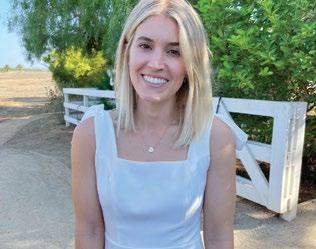
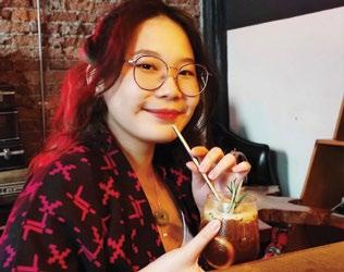
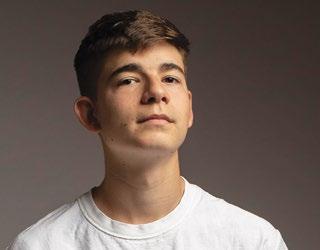
CuongNguyen | Rich Luna | Ryan Carrington | Krista Fay
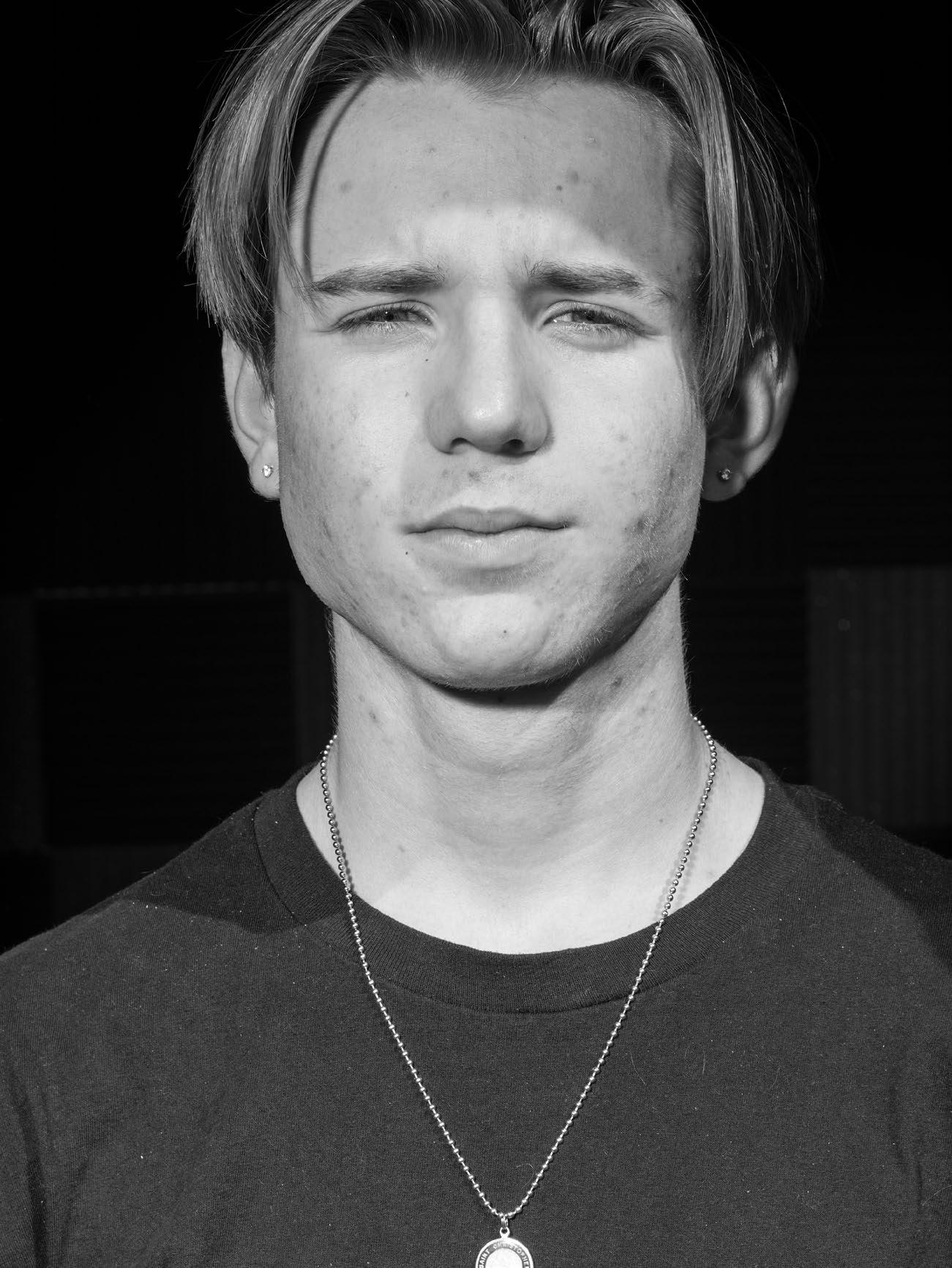
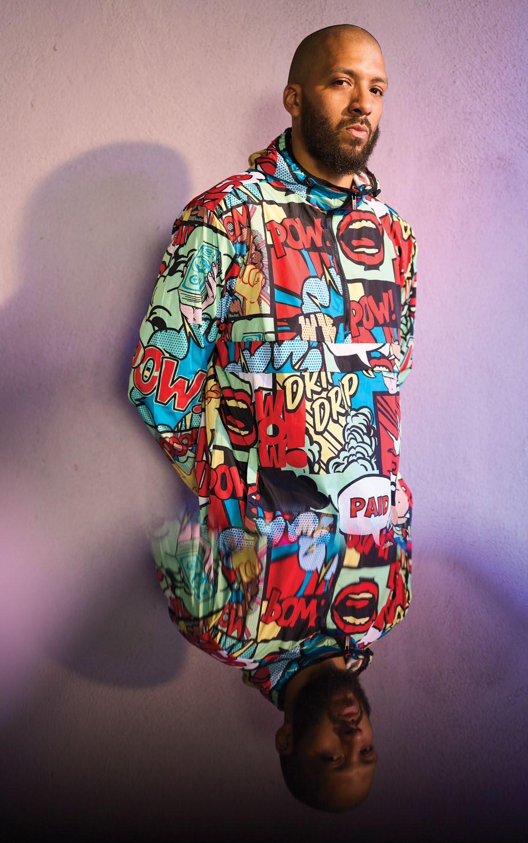
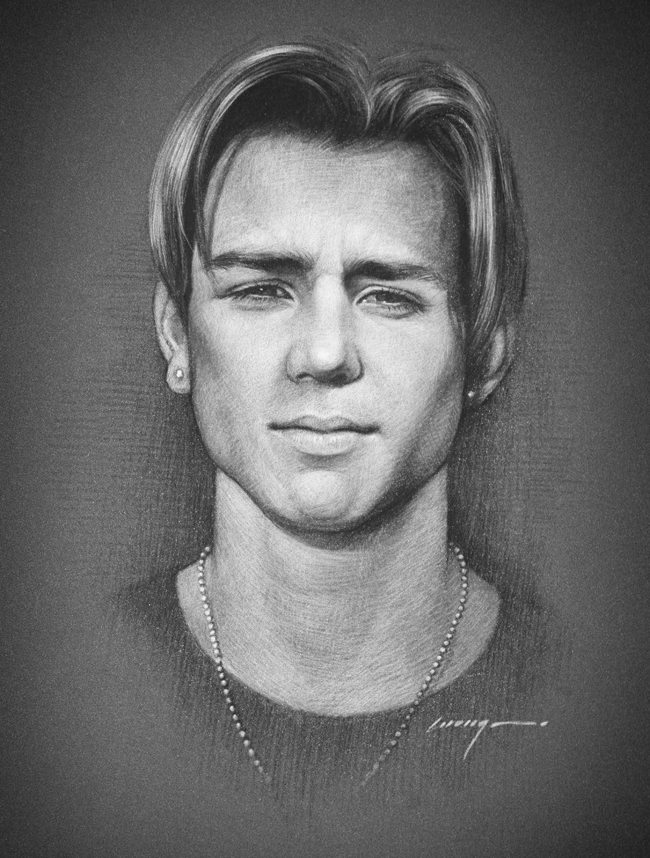
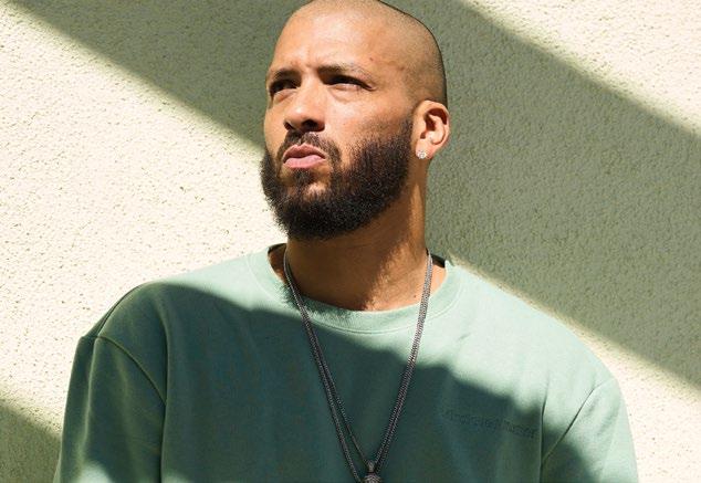
JACK PAVLINA Musician
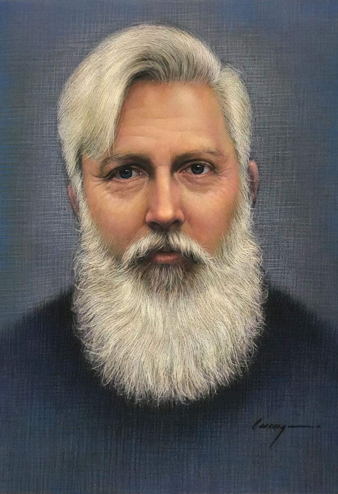
Portrait by Cuong Nguyen
21 C DISCOVER CONTENT MAGAZINE, SAN JOSE $14.95
Silicon Valley’s Innovative and Creative Culture
ISSUE 14.1 WINTER
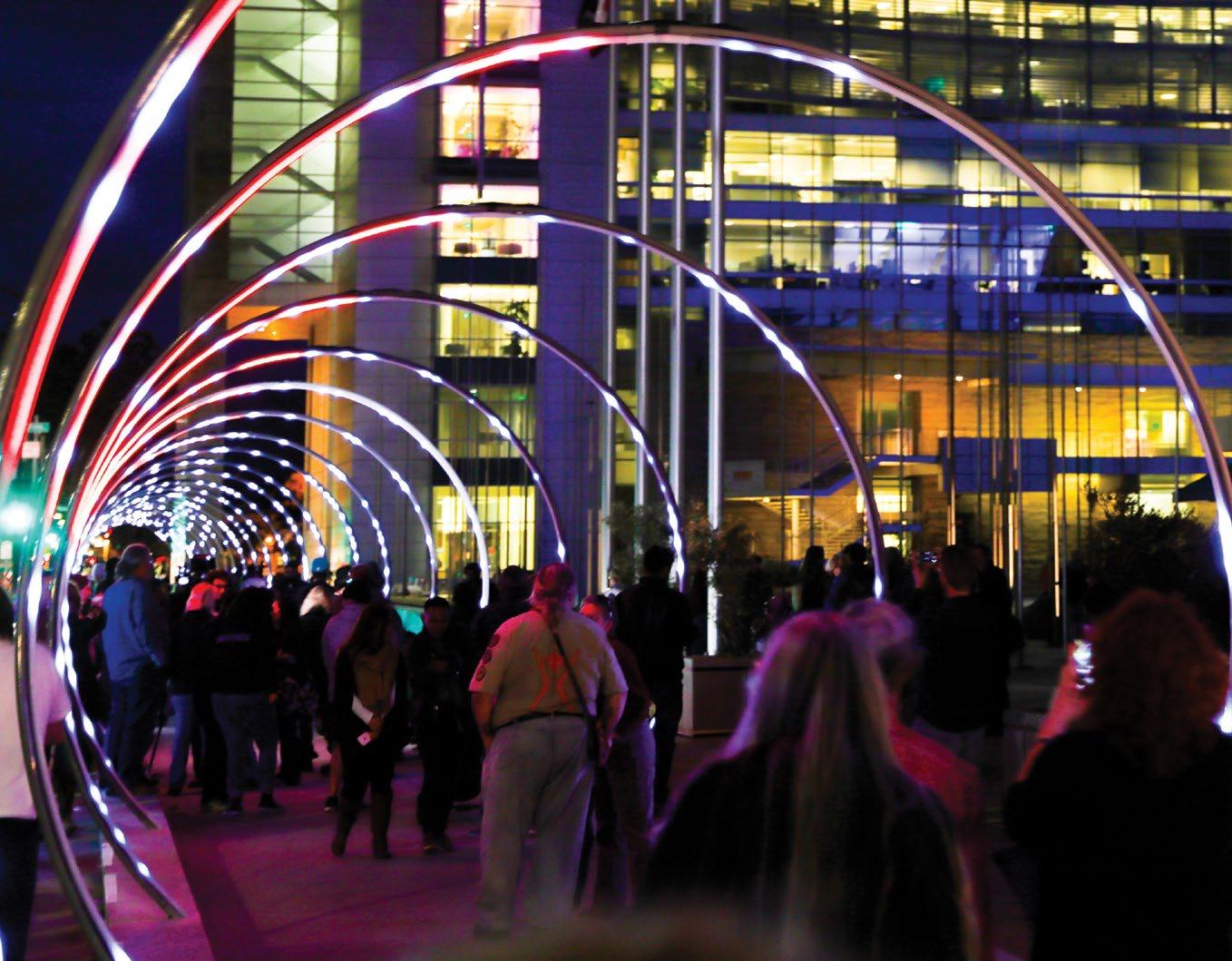






Now on view and activated through 2028 San José City Hall Plaza 200 East Santa Clara Street Visit sanjoseculture.org for programming updates.
Sonic Runway Lead Artist: Rob Jensen • Co-Lead: Warren Trezevant • Design: Stockhausen
ISSUE 14.1 “Discover”
Winter 2021
Cultivator
Daniel Garcia
Editors
Elizabeth Sullivan, Grace Olivieri
Katherine Hypes, Virginia Graham
Samantha Tack, Katie Shiver
Community Partnerships
Kristen
Photographers
Stan Olszewski, Peter Salcido
Avni Levy, Airyka Rockefeller
Writers
Johanna Harlow, Kah Mun Chia
David Ma, Demone Carter
Taran Escobar-Ausman, Albert Jenkins
Brandon Roos, Esther Young
Olivia Cohen, Nathan Zanon
Interns
Nicholas Wingate, Susan Do, Jesse Garcia
In this 57th issue, the last of our ninth year, I am excited to have commissioned a featured artist to paint a portrait of another featured artist for the cover. We had Gabriel Coke draw SVCreates Laureates in the 2020 issue 12.3, which was great, but not for the cover. I thought that Cuong Nguyen’s portraiture style, which has a classical old-school feel, would be an excellent juxtaposition with budding 17-year-old musician Jack Pavlina—and a great way to showcase both of these artists. In addition to Cuong and Jack, we present Ryan Carrington, Krista Fay, Dox Black, and Derrick Sanderlin—each with unique styles worth exploring.
Also in this issue, we look at two projects that affect space—the Valley Medical Center project, Like a Multivitamin, by Leah Rosenberg, and the State Street Market project by Gensler designers Brian Corbett and Corinda Wong. Both give us a backdrop to experience creativity and art that reach beyond music and canvas to the physical places we move, breath, and exist. Then moving from poetry to pinstriping, there is, in this our 57th issue, lots to discover.

Thank you,
Daniel Garcia THE CULTIVATOR
| Bryan West | Derrick
To participate in CONTENT MAGAZINE: daniel@content-magazine.com Membership & sponsorship information available by contacting kristen@content-magazine.com
SVCREATES
Publisher
C CONTENT
IN THIS ISSUE
Altos
CONTENT MAGAZINE is a quarterly publication about the innovative and creative culture of Silicon Valley, published by .
Los
State Street Market | Anouk Yeh
Sanderlin
501(c)(3)
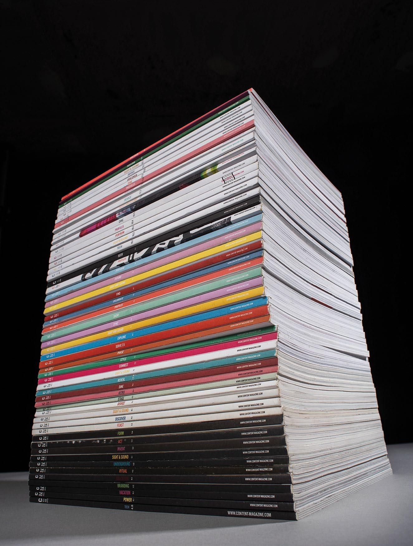
Support Local Creatives CONTENT-MAGAZINE.COM 9 9 years 57 issues 800+ artist profiles
CONTENT
DISCOVER 14.1
Winter 2021 San Jose, California
ART & DESIGN
8 Los Altos State Street Market, Gensler Designers, Brian Corbett, & Corinda Wong
16 Santa Clara Valley Medical Center, Installation project by Leah Rosenberg
20 Artist/Illustrator, Bryan West
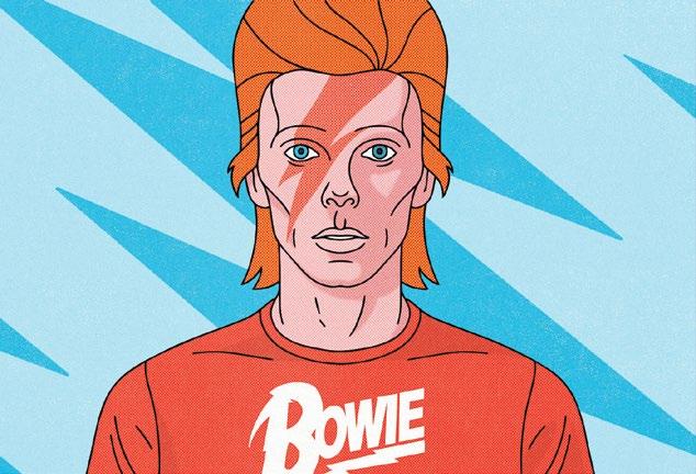
28 Artist, Krista Fay
34 Pinstripe Artist, Rich Luna
38 Painter, Cuong Nguyen

44 Interdisciplinary Artist, Ryan Carrington
WORDS & MUSIC
50 Santa Clara County Youth Poet Laureate, Anouk Yeh

54 Musician, Derrick Sanderlin
58 Musician, Jack Pavlina
63 Rapper, Dox Black
66 Album Picks, Needle to the Groove
68 Contributors
All materials in CONTENT MAGAZINE are protected by United States copyright law and may not be reproduced, distributed, transmitted, displayed, published, broadcast, or modified in any way without the prior written consent of Silicon Valley Creates, or in the case of third party materials, the owner of that content. You may not alter or remove any trademark, copyright or other notice from copies of this content. For further information, or to participate in the production or distribution, please contact us at editor@content-magazine.com
CONTENT magazine’s production is powered by
 Bryan West, pg. 20
Dox Black, pg. 74
Krista Fay, pg. 28
Anouk Yeh, pg. 66
WEST VALLEY COLLEGE
CREATE CULTURE CHANGE
APPLY TODAY!
westvalley.edu/art-design @wvccilkersoad
Certificate, associate’s degree and transfer programs accredited by the National Association of Schools of Art and Design.
DESIGN: Architecture, Interiors, Fashion, and UX
PERFORMING ARTS: Music, Dance, Film, and Theater
VISUAL ARTS: Studio and Art History
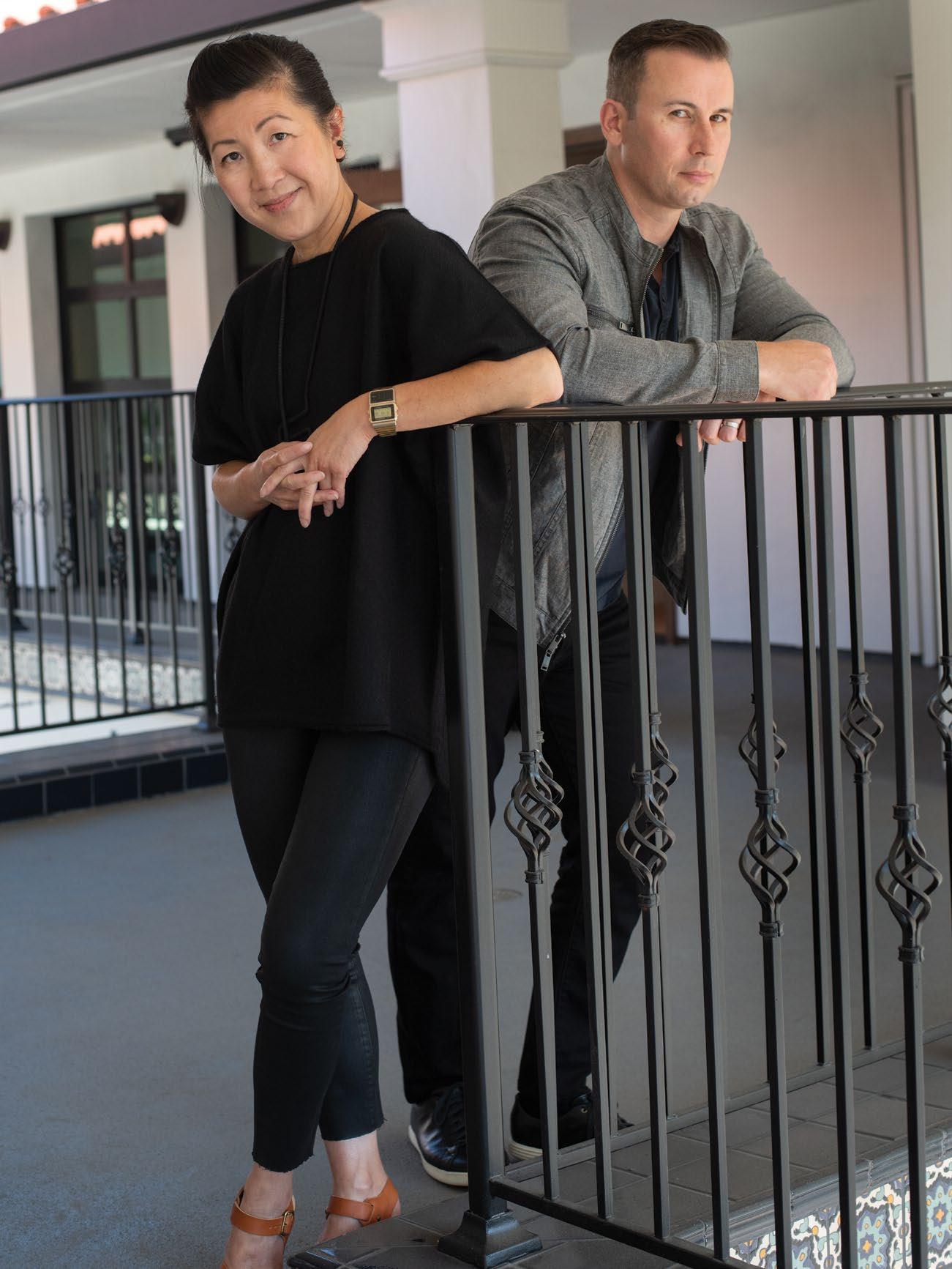
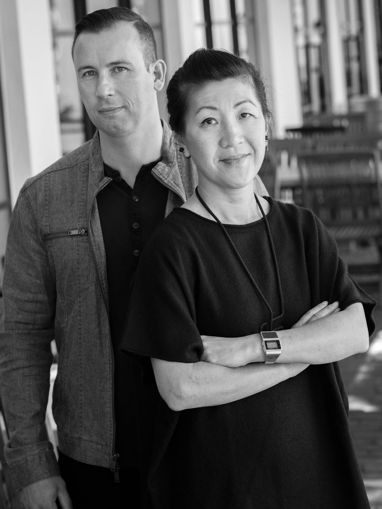
Interview and Portrait by Daniel Garcia gensler.com statestreetmarket.com Instagram statestreetmarket genslersanjose Corinda Wong corindawong Brian
bcorb0
Corbett
(L) Corinda Wong, Design Director | Senior Associate at Gensler
Discover 14.1 8
(R) Brian Corbette, Studio Director at Gensler
Designing
Gensler Designers Corinda Wong and Brian Corbett
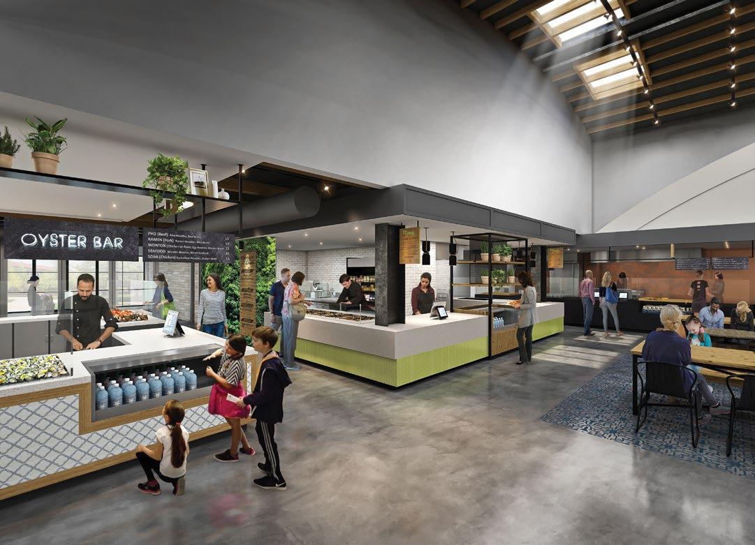
A 20,000 square-foot abandoned grocery store on State Street, between Third and Fourth Streets in Los Altos, has recently opened as a modern food hall after four years of planning and repurposing. The project was led by Los Altos Community Investments (LACI) founder and principal Anne Wojcicki, also of 23andMe. She envisioned transforming the space into a vibrant community hub and extension to the Los Altos Farmers Market. LACI partnered with Gensler’s San Jose office to bring that vision to reality.
Two of the primary designers on the project were Brian Corbett and Corinda Wong. They drew from their own life and design experiences to lead the charge to reuse and transform a dormant structure into a welcoming, flowing gathering place with hints of Santa Barbara. With Spanish colonnade elements, the space will be the home of various culinary offerings, including Taiwanese-Korean concept Bo B èi, local Los Altos favorite Tin Pot Creamery, El Alto by Chef Traci Des Jardins, and even a teaching kitchen. With work done by local craftsmen like Terra Amica, Mission Bell, and hand-painted signs by Ben Henderson, the space is sprinkled with an eclectic mix of tiles to create a venue that Corbett and Wong are not only excited to see opening, but enjoying themselves.
How did you get started in interior design?

Corinda Wong: I started by taking a career test in high school. Architecture, engineering, or accounting came up. My father said, “You would bore yourself to death going into accounting, so choose something else.” So, I just took a shot; I
actually didn’t know what interior design was; it was closer to home in terms of college, San Jose State, compared to architecture. So, I went for that.
Brian Corbett: For me, I was always into art as a kid. And, similar to Corinda, I took a test in 11th grade, like career ideas, and it was either an architect, engineer, or psychologist. And I was always into building. So, whenever we had the homecoming parade, I was the one building the floats or leading that team. I was drawn to that. Architecture just always kind of seemed like where I wanted to go with things. And like, instead of going strictly into art, I wanted to kind of take it to the built environment.
I went to Buffalo University for my undergrad program, which is a great school. Because the economy dropped out in the 60s, this was kind of like an amazing big city that was, you know, not very populated. So much of the projects that we we’re doing, and the thought, was around revitalizing the city. I really developed a passion for cities at that point in time. Eventually, when I went to grad school at Columbia in New York, I worked
for a few internships, doing high-end residential apartments and then got a job with a professor doing schools and community centers, which turned out to be a really great experience, and so much of it I found in New York, even though it’s architecture firms, they do a lot of interiors. And that was something I really hadn’t considered before.
But eventually, I married my wife, who I met in grad school. She’s from San Jose. And she wanted to move out here after we lived in New York for a few years. So we made the trek, and I began looking around for jobs. I found Gensler, a small office right downtown. I went in and interviewed; they were 15 people at the time. And that office, I guess, was really an outpost from when they were working on the airport. But they did mostly interiors. I kind of pivoted my career at that point in time. And over time, I really fell in love with it and making an impact on the spaces that people are in.
Corinda, how did you get to Gensler?
CW: For years, I worked in San Francisco for one design guy—for maybe
9
eight or nine years. I was then part of that whole slump in terms of work slimmed down in the economy. So, I actually took some time off and explored floristry for a while.
I had a friend who had a friend who worked for Gensler in accounting. I wasn’t actually looking for a job, and she said, “Hey, just give me your resume.” I said, “Okay, here it is.” I got a call maybe eight months later, very randomly, from Kevin Schaefer in San Jose, and he said, “Hey, why don’t you come on in and let’s talk.” We talked for maybe two hours with him and the design director at the time, John Scouffas. And I wanted to come work for them. They were sort of this source of just a familial sense of what design could be. And it brought me back to San Jose, where I started my schooling, and it was great.
Gensler has several tech company clients, which means those projects are not visible to the public; what’s some of the places that you’ve worked on that are public?
BC: I think the first one we did was HanaHaus (456 University Ave, Palo Alto). That was actually similar to the State Street Market project in some respects. It was the old Varsity Theatre that later became a Borders bookstore and then sat
abandoned for many years…That kind of partnership with working space, highend retail, and coffee really draws people together. So, reactivating that courtyard felt really good as well. And every time we go by there, that place is packed. MiniBoss (52 E Santa Clara St, San Jose) is another one of those enjoyable projects, and those guys are great.
CW: I’d say Moment in the parking garage by San Pedro Square Market. We were part of the original planning way back years ago. Some projects take a long time to come to fruition. But it’s great when you see people interact. It’s great to see the excitement when you bring life back to a corner, or especially to spaces that have been abandoned. HanaHaus was an empty theater, the corner where MiniBoss is was dormant—so that is very rewarding.
What are some of the unique aspects of the State Street Market?
BC: I think a plus is that we’re able to reuse the existing building. Though that’s probably a plus and minus. We can get into that. But, definitely a plus from a sustainability point of view. It might have been cheaper to knock this thing down and rebuild it, but it would be a whole lot
less sustainable. We save a ton of carbon by repurposing it.
And, keeping that authentic feel in Los Altos, I think there would have been a lot of hesitation to have something new and modern, or potentially larger here— so, keeping that same authentic vibe, but bringing it back to life in a different way.
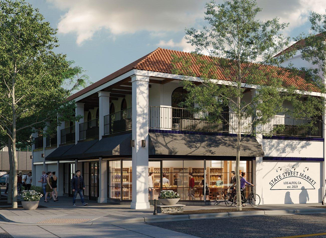
CW: There has been a lot of sort of sensitivity on that. I think the location was the first thing. Usually, in architecture and design, when it’s brand new, you’re picking the right spot; this location was already here. They had a vision that it would be an extension to the Farmers Market. And that created those first design triggers of what the storefront and facade could be, how that can invite people in. I think that was the initial sort of pluses. It had the bones, though it had a couple of decades of modification. To lose the story within it would be just a travesty.
BC: The building itself is pretty interesting. It was like a one-story grocery store, like mid-century modern, kind of built in the 50s. And it was covered up, later adding a second story and turned into this kind of mission-style building.
What was nice about it, like when Corinda talked about its bones, there’s a central dome that used to be there that
Discover 14.1 10
gives you that big grocery feeling. When that was opened up, it just lent itself to this community space. I think that was something that definitely worked out well for the project.
At what point were you brought into the project? Did the developer come to you and say, “Hey, I have this building, what can we do with it?”
BC: They wanted to do a food hall and probably offices upstairs. So they came in with a pretty good vision around that in terms of, like, operation model and specific program that wasn’t really figured out. But they came to us with that. And then we worked with them for a few months, really developing concepts and, like Corinda said, Anne’s vision (Anne Wojcicki, cofounder of 23andMe and principal and founder of LACI) is that of a local Los Altos resident, and she loves that Farmers Market there. And she really wanted to create a permanent extension of the Farmers Market and have that same vibe. So, a lot of the concepts revolved around that.
CW: Well, it’s also a multigenerational community, kind of a little township here. So it was really to create a space that would fit three generations—from your newborn
babies, your grandmothers, to your after work hangout happy hour, a place that everybody can come to, whether after baseball games or bike rides. I remember Anne was saying that everybody can actually go and have food together. And that was a missing piece to Los Altos.
What you’re talking about is “place making.” Is that concept taught in your training? How did that idea come into the State Street Market?
BC: It’s definitely part of my education, at least within architecture. And what I was doing in Buffalo, so much of the work was trying to make “place” there.
In this project, it was definitely a focus. Robert Hindman (Managing Director, LACI) is very into place making as well. And we had shared values on how this project could come to fruition in that sense.
CW: In my education, that wasn’t part of it. I was in interior design, so it wasn’t about that exterior; it was more inbound. So a lot of this, I think, came from just being in school in San Jose State, watching that city kind of stand still for a long time, and being part of Gensler for 14 to 15 years and watching the city actually start to come alive and the impact that we can
have slowly. It took a long time to make minimal steps, but you could see the significant impact that can be made. And we at Gensler were in some kind of forward vantage point; I think that’s the momentum that I’ve gotten from place making. I saw it sort of working from the middle of it and from watching it and being a part of it.
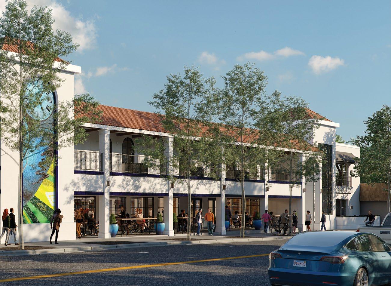
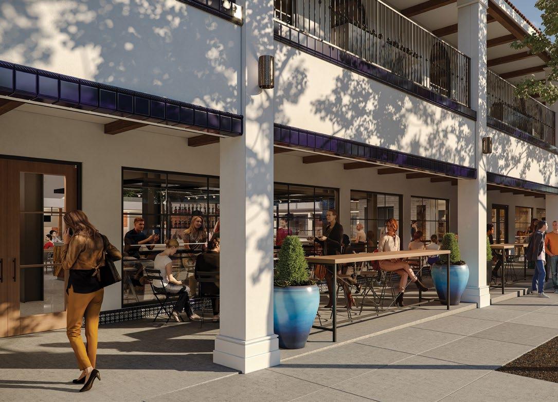
BC: Even before we were awarded the project or competing on it, we developed some sketches and ideas of what might happen. A lot of it is actually what we ended up doing. But it was all about place making. In the end, it was all about slight modifications to the building that created activity. And so, like the idea of widening the breezeway and making that an outdoor dining area or extending the arcade and making that outdoor space, we kind of painted a picture really early on.
But we had these solid ideas all around place making, more so than the design initially. Then, of course, the design followed.
With State Street Market recently opening, what are you proud of?
BC: I think some of the ideas that we brought to the table will have a significant impact; we feel very proud of the modifications to the Paseo into the arcade to
11
Discover 14.1 12
PROJECT VISION
(Gensler,



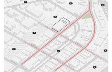
We view this building as an opportunity to create a new Hub for downtown Los Altos; a place infused with new energy that brings the community together, fosters dis covery and supports a wide range of activities.


Project Vision
We view this building as an opportunity to create a new Hub for downtown Los Altos; a place infused with new energy that brings the community together, fosters discovery and supports a wide range of activities.
Our focus would be on creating a more open facade to blend the inside and outside spaces, creating a vibrant and lively destination for families, entrepreneurs, friends and neighbors. While we are designing spaces for future use and think in modern terms, we feel it is equally important not to lose touch with the building’s history. For our initial ideas, we have chosen to stay close to the building’s original design to
complement the surrounding neighborhood.
Letting more light into the building is crucial to creating a new energy. Large windows that open up to the sidewalks and parklets will engage pedestrians. The first floor will be public spaces, restaurants, retail, food hall, bar. The second floor will be office and co-working space.
Ultimately, we view this as an opportunity to create moments for shared experiences and a place for the community to embrace and make its own. It’s about socializing. It’s about fun. It’s about learning. It’s about the experience. It’s about all the places one can discover.
Our focus would be on creating a more open facade to blend the inside and outside spaces, creating a vibrant and lively destination for families, entrepreneurs, friends and neighbors. While we are designing spaces for future use and think in modern terms, we feel it is equally important not to lose touch with the building’s history. For our initial ideas, we have chosen to stay close to the building’s original design to complement the surrounding neighborhood. Letting more light into the building is crucial to creating a new energy. Large windows that open up to the sidewalks and parklets will engage pedestrians. The first floor will be public spaces, restaurants, retail, food hall, bar. The second floor will be office and co-working space.
Ultimately, we view this as an opportunity to create moments for shared experiences and a place for the community to embrace and make its own. It’s about socializing. It’s about fun. It’s about learning. It’s about the experience. It’s about
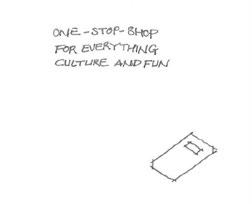

create that outdoor space. We think it’s going to be really active and create a great street presence.
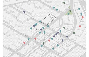
The widening the pass-through—that connectivity is going to be a big deal. We had a soft opening, and that space was super-well utilized, and it felt really good, felt activated. And then the front arcade, people walking by on the sidewalk, are naturally drawn in there. And they want to be part of it. So those are the two big moves for me.
But also, that central space and opening up that dome—it was all closed in the previous iteration, but it just created this amazing space once it was opened up. So, I think I’m very proud of creating that gathering space, both on the interior and the exterior.
CW: My background is interiors, but I had a hand in this project’s exterior architectural design, and that part is quite fun for me. And the best aspect of that is when you hear from the community, or Robert Hindman tells us that people will walk by and say, “Wasn’t the building always like this?” That fitting into the context and fabric of the community—I think it is the best thing when people peer in and
they’re excited to see it. That’s exciting to have this space be part of their world. I think that’s amazing.
Also, the secondary tier—I love the idea of design cues that give people this notion of “Oh, something to do.” So, adding simple things like awnings to the corner, where it signifies, “Hey, it’s retail. Come on in.” Then for the storefronts themselves, the windows, they were short. We elongated them from the top of the ceiling to the floor. That’s again, open it up with a “Come on in” visual cue.
Where do you find inspiration for designing a building like State Street?
BC: A lot of it is experiences, I think— like going and visiting as many places as you can, whether it’s overseas or even locally, and gathering those experiences and keeping an eye out as you’re there for what you like, what feels right, and trying to have a deep memory of those experiences, so you can draw back on those.
CW: I always used to tell people that it’s great when you experience things, and it becomes slightly fuzzy because then you would not ever mimic something. But you would create from that feeling in your-
self—like what you remember of it. So, it’s great to be slightly forgetful.
And, we are from a different generation; as much as I love them, we approach inspiration differently than looking at Pinterest and collecting images. Now there is a lot of design starts that way. But when you’re a little older, you’ve gone to a few more places, you can rely on other things—create your own “Rolodex.” And, usually those things are not merely visual; they’re inspired from experiences or literature, even songs. It’s paintings and a picture, or a feeling that you might want to bring into what you are creating.
What are some of the design elements that are here that make this place unique?
BC: The tile. There are 40 different tiles in this space. And that was something that Anne really wanted. It is almost something to be discovered throughout the space. Not that we selected all of it. We had a hand in a lot of it, but so many people had their hands in selecting the tile. So that’s kind of a cool feature. With each of the risers on the stairs to the second floor throughout the exterior, you’ll see that each tile is different.
72 Los Altos Community Investments | Gensler stay close to the building’s original design to Gensler | February 9, 2018 73 72 Los Altos Community Investments | Gensler
all the places one can discover.
think in modern terms, we feel it is equally important not to lose touch with the building’s history. For our initial ideas, we have chosen to stay close to the building’s original design to own. It’s about socializing. It’s about fun. It’s about learning. It’s about the experience. It’s about all the places one can discover.
72 Los Altos Community Investments | Gensler
13
February. 9, 2018)
“Creativity has to happen, and that’s not usually on that time schedule.”
“It might have been cheaper to knock this thing down and rebuild it, but it would be a whole lot less sustainable. We save a ton of carbon by repurposing it.”
–Corinda Wong
Discover 14.1 14
– Brian Corbett
CW: Yeah, I mean, and [Anne] wanted actually to reuse a lot of tiles that she didn’t use on another project. So, that was also a bit of a sustainability part of this project. I was like, “What are you gonna do? You have one box of this, one box of that. It’s not enough to do all.” But we patched it together, and it’s a great story because of that point, right? Not wasting very much.
They’re hidden in some of the private spaces. So every bathroom is a little different. So if you go on a bathroom hunt, you’ll see that they are different. Maybe that’s a “game” that people can do. There is a lot of tiles.
BC: Yeah, I think the other thing is the arched windows. I think they are really cool. They really brought this building, I think, closer to what they want it to be.
And from a furniture perspective, we paired our client here, Los Altos Community Investment, with Terra Amico. And they brought a lot of unique elements. They built tables from reclaimed bowling alley wood, and made it a feature, with a lot of reclaimed wood, to make interesting installations throughout the space.
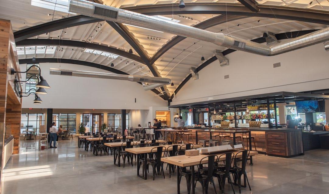
CW: Also, the signage was painted by Ben Henderson, who worked with us at Gensler for a while. We introduced him to the client about two years ago. And Robert Hindman brought him in to do a lot of hand painting of the signs.
BC: I love the work that Ben does. And we definitely had a vision of his style of hand-painting, hand-lettering, how that would fit really well here. And we’re so glad that they hired him because he’s been adding a lot of cool features throughout.
For someone looking for some design
principles, for example, if someone is redoing their kitchen, what are some design guidelines?
CW: It should be functional first. Right? I always say that. As for your height of countertops in your home, if you’re super tall, you can actually adjust that. In commercial, you don’t have that luxury. There’s a standard. There are laws. But I think you can always think of where you want your focus to be. What is the first thing you want your eye to go toward, right? Is it the hood? Is it the backsplash?
Is it important that the island is central, where everybody gathers? I think making those first initial choices can define what your other selections are.
BC: I was going to say storage, so you can keep it minimal.
CW: Hide everything. [Laughter.]
BC: Exactly. Keep it clean.
What advice would you give to somebody looking to get into a career in architecture or interior design?
BC: We’re hiring. [Laughter.] I think that with automation coming our way, that’s always something I’m worried about with the profession’s future. We’re employing it more but more as a tool for designers. But, ultimately, I think we’re the profession that is going to go more toward the creative outlet and the relationship-building with the clients; that is where the profession is ultimately going to have to go. It’s going to be the design creativity and in that client relationship. I think a lot of the technical aspects and the drafting will become very automated over time. You can have a 10-story-tall building, and it will populate the whole thing for you. And you can change the layouts,
and it gives you all the counts automatically. But that’s not design, right?
CW: That’s algorithms. It’s like a quick first pass. It’s iterations, but it’s not design. The missing thing is going back to human experience like that “Rolodex” I was talking about, the experiences you’re trying to create. I don’t think computers will ever be able to do that. And I think that’s what anyone interested in this profession really needs to be thinking about. It’s always going to be about the human experience instead of the more technical aspects in terms of drafting and drawing and computer modeling and things like that.
I’m on the oozy-gooey side because it is about your passion. You want to come in and do something creative. We’re part of a small percentage of fields where things get built; there’s an actual object, a thing, from your brain that comes out. But you actually have to love it, because it is hard work. Your brain is constantly working, and you’re training it all the time. And innovation needs to happen. Creativity has to happen, and that’s not usually on that time schedule. Not normally. But the rewards are what you can create and see. That one moment when you get your first project, and it gets built, and you hear somebody say, “Ah.” That is amazing. C
15
Like A Multivitamin
Discover 14.1 16
Written by Nathan Zanon Photography by Airyka Rockefeller scvmc.org leahrosenberg.com Instagram leahmartharosenberg
Artist Leah Rosenberg Transforms Hospital Wing Through Color

Apublic hospital may not be the first place one thinks of when considering spaces that need art, but when Santa Clara Valley Medical Center underwent a recent major construction project, administrators there found themselves in need of some creative touches. Originally built in the 1990s as a general hospital facility, the new construction and expansion of the hospital gave them an opportunity to repurpose the older building into the Women and Children’s Center, which houses departments such as pediatrics, labor and delivery, the mother and baby center, and the neonatal intensive care unit.
But this required reimagining the look and feel of the space, from a more sterile environment to a welcoming one that would accommodate the needs of new parents, children, and families in need of care and support. In short, it required some art.
Chief Operating Officer Michael Elliott at the Valley Medical Center (VMC) Foundation describes the origins of the plan: “Our role [at the VMC Foundation] is to partner with the hospital and raise funds in the community to do all kinds of projects. Sometimes it’s securing funding for a piece of medical equipment or technology, or to fund a research project or a clinical trial, or to innovate some new model of care. But a lot of what we also think about is the patient and the staff experience, and that’s really important to us as we think about what will keep our public hospital systems strong. And it turns out that the physical environment of a hospital is really important to the overall healing environment. You really want to put the patient at the center. You want to create a physical environment that is healing, that is welcoming, and that is appealing.” The courtyard on the third floor of the building was identified as an area in need of some help. “Its aesthetic was quite stark and severe,” says Elliott. “So we looked at that space [and we asked]... how do we make this space more alive? How do we transform it?”
Enter artist Leah Rosenberg, whose work in color can be found at the San Francisco International Airport, at Ghirardelli Square, in the offices at Facebook, and in cafes, businesses, and public spaces around California and as far away as Hamburg, Germany.
“I am a collector of color,” Rosenberg explains. “I use the medium to create a dialogue between viewer and artist, time and place. Color is dynamic, subjective, and a vehicle for wild, alchemical imaginings.” Born in Michigan, Rosenberg grew up in Saskatoon, Saskatchewan, “which is right in the middle of Canada (where we pronounce process PROH-cess),” she says. After studying art at the Emily Carr University of Art + Design in Vancouver, British Columbia, she moved to San Francisco, where she earned an MFA at the California College of the Arts after writing her thesis on the artistic possibilities of cake.
In 2017 SVCreates received an NEA grant for an Artist Residency at the Santa Clara Valley Medical Center and partnered with the Montalvo Arts Center and the VMC Foundation to select an artist who would embed themself in the hospital environs. Rosenberg was chosen for the project because of her past experience, including a fellowship at the Lucas Artists Residency Program at Montalvo Arts Center in 2012. Her relationship with Montalvo, along with a
17
partnership with SVCreates, helped secure the NEA grant for a new installation at Valley Medical that would deliver exactly what this stark-looking Women and Children’s Center needed.
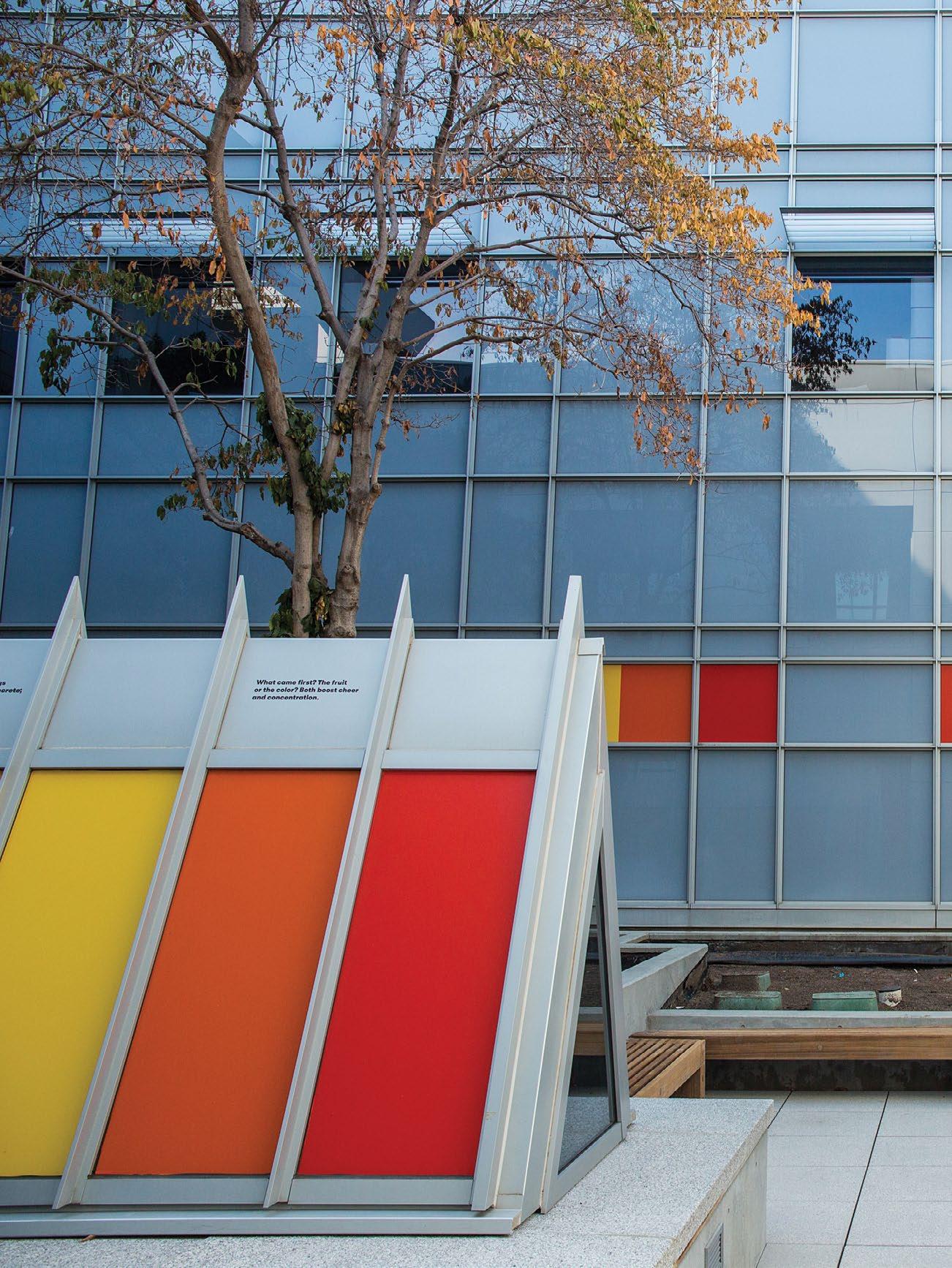
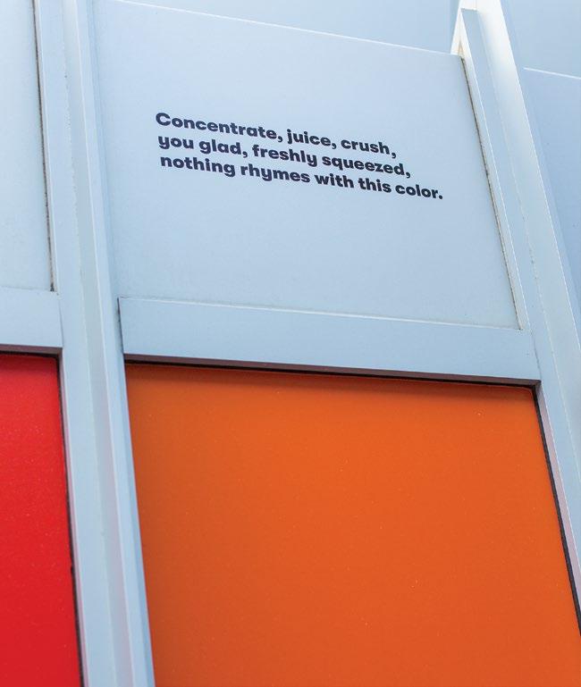
The piece she created is entitled Like a Multivitamin, a reference to the subtle but vital improvements in health that it is intended to deliver to those who encounter it. “I chose these colors for this installation for their healing properties and their connection to the surrounding landscape. Together, the palette can be considered a multivitamin: when encountered daily, it might make one feel better over time.”
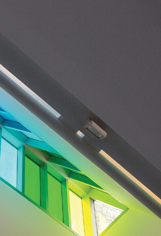
The work consists of various differently colored panels covering previously blank spaces, windows, and walls. Each color has been carefully considered by Rosenberg, with the intention of generating a range of positive emotional reactions.


“You walk out [into the courtyard] and it’s just a breath of fresh air, and I think it really surprised and delighted everyone that’s seen it thus far,” says Elliott. “We think about the people that are in this building in a holistic sense and creating environments where people can find calm and joy—and a little bit of magic.” Just looking at the transformations the installation has brought speaks to the projects that that the VMC Foundation hopes to bring to the building in the future.
“I learned that over one hundred languages are spoken by staff at Valley Medical Center,” recalls Rosenberg. “Experiences of the installation are bound to vary, but color is a universal language that welcomes multiple interpretations.” Relief is offered through a vibrant dose of color in a space where people are working, healing, and grieving—a multivitamin for their senses.
Also incorporated into the work are a series of haikus, printed as accompaniments to some of the color blocks. Rosenberg created these original poems as an alternative way to elicit what she describes as provocative, colorful images, images that offer a sense of a specific moment in time: a special event, a change of season, something that encourages one to pause, take notice and come to attention. “The courtyard, once grey and now imbued with color,
Discover 14.1 18
elicits emotions within us, helping to lift burden and stress, whether visiting once or returning daily.”
Executive Director of Inpatient Nursing Sue Kehl sees the impact of Like A Multivitamin daily—not just on patients, but on the hospital staff. “The pop of color, the haikus, the beauty of the language... [it] has really added inspiration, respite, and a place for both our staff and our patients to heal, to have a moment of quiet, to have a moment of silence to eat their lunch in peace and beauty...and this has really brought that sense of beauty and inspiration in the middle of a big and busy hospital.”
The color panels aren’t exclusively visible in the outdoor courtyard space: they shine through the angled windows to the interior of the building, so that those on the fourth and fifth floors can gaze down from above and those entering the lobby can look up from below. Those in the courtyard space can walk around the installation, sit in its glow, meditate on a single color at a time, or take the whole spectrum in at once.

While the idea of the healing power of color might sound to some like New Age pseudoscience, the value for patients of a space that is comfortable is well-documented, and that extends to the placement of art that feels calming and relaxing.
“This is not an interior decorating project,” Elliott stresses. “There’s a lot of thought and care that goes into wanting to create an environment that is as positive and as healing as possible. There’s real clinical value to that.” Patients that feel more at ease and more comfortable during their hospital stay get better faster, according to Elliott.
Rosenberg’s vision is a vivid one, filled with joy about the transformational beauty that will surround people who come into the space. “While people take a phone call or eat their lunch or have their weekly meetings or simply get outside to look up at the sky... the colors will be there playing off of one another, constantly in flux as the sun rises and sets, causing them to glow in the light and deepen in the shadows.” Maybe it will even make one’s lunch take on new flavor. C
19

BRYAN BRYAN WEST
Multi-talented artist writes comics, records podcasts, and talks
Written by Nathan Zanon
Photography by Daniel Garcia bryanwestportfolio.com Instagram van_dammaged fff_podcast
Jean-Claude Van Damme
“I think for a lot of people, if you are an artist and have specific aspirations of the types of art you want to do, you end up having to kind of jigsaw or Frankenstein a career together,” says Bryan West. And as a comic artist, illustrator, teacher, designer, podcaster, and Jean-Claude Van Damme evangelist from Hollister, he embodies this concept remarkably well.
Growing up, West knew early on that he wanted to create art and that he loved comics. “My mom always tells me, the first time she put a crayon in my hand, I was so elated that I could just use this thing and make lines with it,” he says. “I remember making my parents read me this Dino-Riders comic book that came with the toys, as a bedtime story. When I was old enough to read, I started getting into comics for myself.” Most of his life, he “wanted to do comics in some way.”
By the time West was finishing high school at the end of the nineties, the comic book market “kind of imploded,” he explains. “Marvel was going bankrupt at that time, which is a weird thing to think about now.”

Uncertain about how his passion could work out as a career, West drifted through some nonprofit jobs in his early twenties before eventually realizing that he wasn’t going to be happy unless he was creating art. Meanwhile, an insatiable desire for original content on the internet was creating more outlets for artists to find audiences. And at the same time, the Marvel comic franchise exploded into the media behemoth it is today, spurring new interest in comics.
At age 28, West decided it was finally time for art school, so he headed off to Full Sail University in Florida. He returned
21
Discover 14.1 22
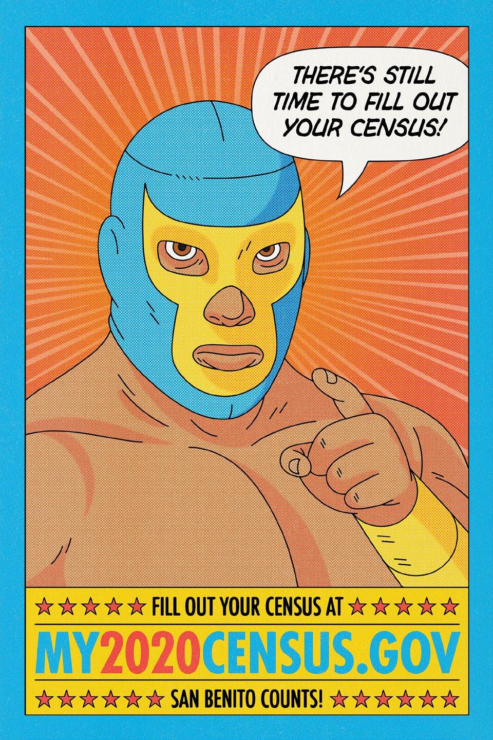
California Census Poster for San Benito County Arts Council
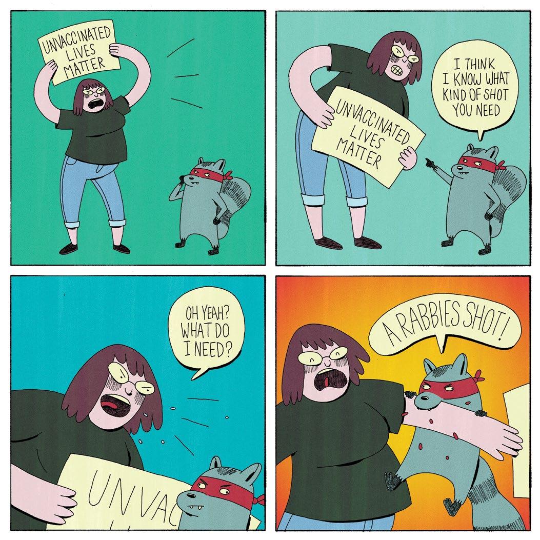
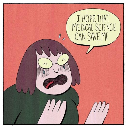
home and, with a graphic design degree in hand, began to “Frankenstein” a career together, teaching and freelancing. Before the pandemic, his creative projects focused on editorial illustration—“conceptual stuff, single images that can sum up an article or an idea behind an article”—because it’s one of the markets that actually pays. He describes the “fun” in it as a marriage between himself as “more of a traditional artist and illustrator” and his “education in graphic design.”

Meanwhile, West was finding time to create his comics and put them out into the world via the internet and, with much greater success, at comic conventions and zine fests. “People really need to pick up a comic and look through it,” he says, “especially if you’re a small press. You have to charge a little bit more. So, you’re looking at $5 at least for a comic that [if you bought it online] you might not like.”
His most successful comic to date is entitled Meat. He describes it as a “horror comic with a sort of vegetarian propaganda message about meat that turns people into, you know, bloodthirsty zombie monsters.”
But much of his comic work had begun to wane in the years leading up to the COVID-19 pandemic. Then, when quarantine hit in early 2020, things shifted. “I had some hard times financially,” he explains, “but more than anything, just being surrounded by a [pandemic] and the specter of death and mortality and all this kind of stuff...it definitely made me think a lot about the way I’m spending my time.” And so, after sort of writing comics off for a little while, he’s coming back to them now and prioritizing doing comics for himself.
Following the peculiar manner in which inspiration can strike, it was another creative pursuit that brought his newest comic to life: his friend Weston Notestine proposed the idea of doing a podcast that would examine the films of Belgian action star JeanClaude Van Damme, whose movies they both loved to watch.
23
“GoogleGod”
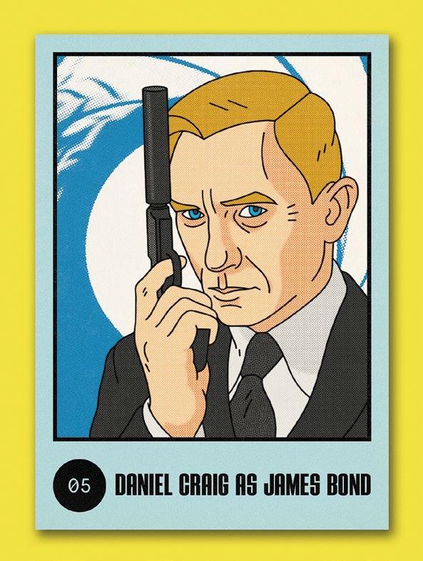
 Card05:DanielCraigasJamesBond
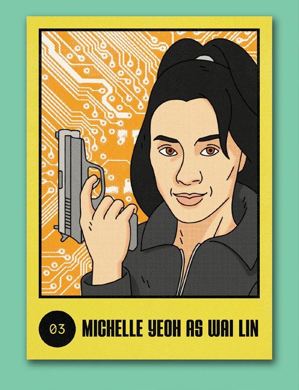
Card 03: Michelle Yeoh as Wai Lin
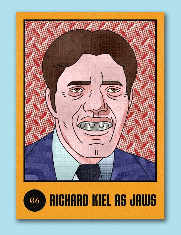
Card 06: Richard Kiel as Jaws
Discover 14.1 24
BRYAN TALKS BOND TRADING
“Being surrounded by a [pandemic] and the specter of death and mortality and all this kind of stuff...it definitely made me think a lot about the way I’m spending my time.”
25
- Bryan West

MalpacheVaccine Discover 14.1 26
West had tried his hand at podcasting years earlier. Now, with extra time available to watch movies, he dove back into that medium.
“[Van Damme’s] filmography is kind of funny in that he’s sort of the auteur, so to speak, of his own image. He repeats the same stories. He’ll work with multiple directors trying to get something right. He also has movies that are clearly a metaphor for the way he sees himself coming to America and sort of conquering Hollywood, which is really what most of his fight tournament movies are about.”
After recording more than 30 episodes of JCOVID, the podcast transitioned into its current incarnation, Film Franchise Friends, which casts the same entertaining but thoughtful eye toward various film franchises—everything from Planet of the Apes to The Matrix to The Muppets
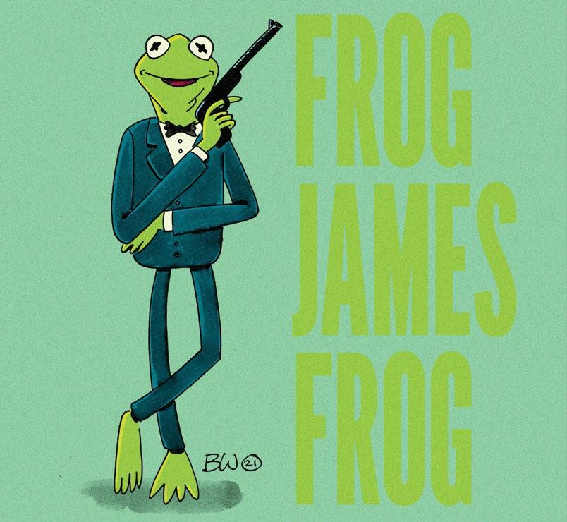
And while podcasting has been a fun diversion, the deep dive into Van Damme sparked ideas for his next comic. “Now I’m working on a comic that’s very, very loosely based off Van Damme’s journey to Hollywood in the eighties, but kind of glossed up. It’s going to have a bunch of fights and, you know, crazy supernatural stuff that obviously did not happen. I love cannon films, movies with ninjas, bad horror movies, just kind of junk filmmaking, so I thought it’d be a good way to sort of take these things that I was interested in—fighting ninjas and references to horror movies and all this kind of stuff—and throw it all together for that comic.”
In the past two years, West’s art has evolved from the regimented, “graphic, flat illustration style” of his editorial work. “Now I’ve been trying to sort of go back to my roots and get looser, be more cartoony, use more traditional
media again.” All the time staring at screens while working remotely during the pandemic made him adverse to spending his free time in the same way—on screen. “So, I started digging out all my pens and brushes and paints, and I’m getting back into…being more in this exploration mode again.”
West rebranded his Instagram under the moniker “van_dammaged,” coinciding with both his looser artistic style and his quarantine fixation on the action hero. Scrolling his Instagram, the change is obvious: older comic book images in black ink evolve into colorful frames with a distinct graphic look and then suddenly shift to looser drawings, sketches, videos, and short animations. It was important for West to mark this style shift with a new Instagram handle. Now, he explains: “I’m just not going to worry and just post the stuff that I’m making and make what I want to make.”
Trying to survive as a professional artist has always been challenging, and the art industry was particularly impacted by the pandemic’s disruption to the world. But despite the challenge, West has fought through, evolved, and used this time to keep creating. In some ways, it’s a story that might be portrayed by Van Damme himself, metaphorically roundhouse-kicking his way through every obstacle, be they tournament opponents, supernatural ninjas, or a deadly virus, and ultimately conquering Hollywood. Or at least making some great comic books to sell at the next zine fest. C
27
Kermit Bond
TROPHY SERIES
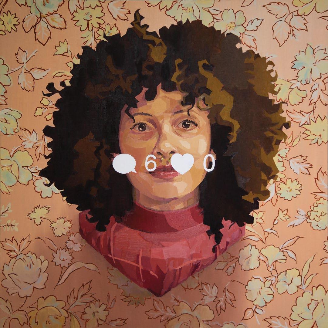 Alysia’sWall(2018) Oil on canvas, 36” x 36 “
Discover 14.1 28
Written by Olivia Cohen
Photography by Peter Salcido kristafay.com Instagram kristafay.art Facebook kristafayart
Krista aKrist FayyaF
On a crisp January afternoon in 2020, Krista Fay mingled with community members as they passed through the doors of Art Ark gallery in San Jose. Most came from neighboring apartments, enticed by the flyer on the door: “Generate and paint your own symbols.”
As an artist-in-residence at Art Ark, Krista had spent the previous months creating an app that would generate icons. She divided a digital canvas into four invisible quadrants, each containing simple shapes like a line or a circle. Every time someone clicked on the canvas, the app would randomly combine bits of the shapes across the quadrants to create a symbol. This was paired with a random verb, which then completed the icon. With 13 million possible combinations, virtually every icon is unique.
That January afternoon, Krista’s app was finally coming to life. As people trickled in, they clicked through the iconographer program until they found something that resonated with them. Then, they painted it by hand on a small canvas and placed it on the wall.
Some participants took their icons seriously, while some made light. Some worried about
painting it just right. Others recreated the icons with their own flair. But for Krista, the project was about more than the individual panels; it was about how they came together to represent the group as a whole. “I was trying to get the impression of a group of people,” Krista said. “I wanted to see if there were any patterns that showed through.”
For Krista, art is never just about aesthetics. It’s always about ideas. She uses her art to visualize complex concepts and communicate them in a way that’s approachable. “Even if nobody else gets exactly what I glean from it, I need to know why I’m making something,” she said.
Krista’s work operates as a visual philosophy text, leaving the viewer with more questions than answers. It can be hard to pinpoint exactly what those questions are, but getting viewers to think about something is always her goal.
Much of her work examines social media and life on the internet. For example, a favorite topic of hers is the mass subject from Hal Foster’s “Death in America,” which examines how large populations form tastes that are seen in objects or trends (such as viral TikTok videos). Another
If a philosophy essay were a painting, Krista would get an A. She takes complex ideas that most might grapple with over the course of 1,000 words and brilliantly translates them into compelling visuals that stop viewers in their tracks.
29
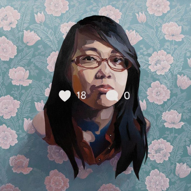
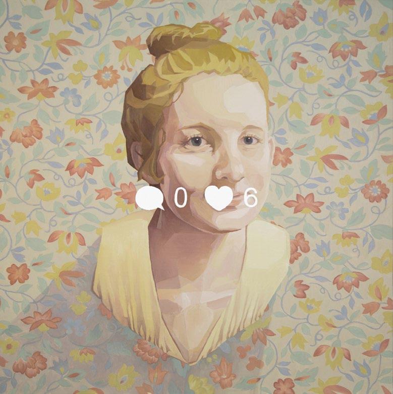 Annie’sWall(2019), Oil on canvas, 36” x 36”
TROPHY SERIES Discover 14.1 30
Ashley’sWall(2018), Oil on canvas, 36” x 36” (sold)
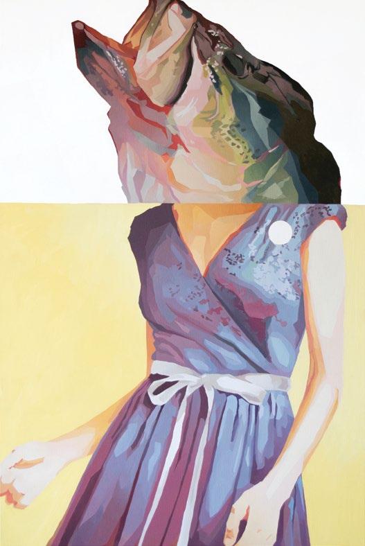

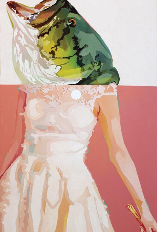
31
(Top) Sponsored #1 (2020), Oil on canvas, 48” x 30”
(Middle)Sponsored #2 (2020), Oil on canvas, 48” x 30“
(Bottom) Sponsored #3 (2021), Oil on canvas, 48” x 30”
THE SPONSORED SERIES

Discover 14.1 32
area of interest for her is the way that social media causes us to modify our behavior because we know other people are observing us (an idea heavily influenced by Michel Foucault’s panopticon).
Take her Sponsored series, which started as screenshots of targeted Instagram ads in which women’s heads were awkwardly cropped out of the frame. Krista imagined the frame continuing upward to reveal something totally absurd: a fish head. Part Instagram ad, part trophy fishing photo, the result is a completely mythical woman.
“Somebody took a picture of the Sponsored paintings at the Art Ark gallery show with this guy, and he held up his hands like he was holding the two fish. I was like, “You don’t get it, but that’s perfect,” she said.
In another series entitled Wall Mount, Krista uses taxidermy to make a point about what social media does to us. “Every time we post, it’s like this snapshot, this frozen-in-time, typically idolized version of ourselves,” she said. “So I just equated that to a stuffed animal. And then [I equated] the wall of social media and the wall of the taxidermy animal.”
Even in the materials she uses, Krista’s art is layered with meaning. She does the bulk of her work in oils but adds large pops of unexpected multimedia. From clean vinyl and acrylic details to collage and found materials, her art straddles the line between traditional and modern styles, thus creating a contrast that’s impossible to ignore.
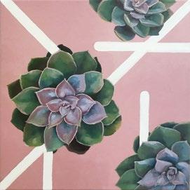

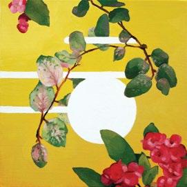

Krista said that “there’s something you have to know about oils to use them. They’re more technical, maybe more time consuming, which I like to pair with the subject matter of Instagram feeds and social media—stuff that you scroll by in an instant, paired with this thing that you spend a lot of time on.”
For all of her thought-provoking subjects, at the end of the day, Krista’s work owes its success in part to the expertise of her technique. Though she stays “scary busy” through a combination of private commissions, gallery shows, teaching gigs, and graphic design work, she still makes time to practice painting just for the love of it. “I do a meditative practice in painting that’s totally different from my conceptual work,” she said. “I like to set up a still life. I’ll paint a bowl of fruit.”
Despite her thoughtful criticisms of social media and mass tastes, Krista isn’t a hater. She recognizes the irony of moving from Texas to San Jose two years ago and getting a job at the Pacific Art League just minutes from Mark Zuckerberg’s house and describes it as “the perfect fit” for her subject matter.
“Social media isn’t just showing the best parts of peoples’ lives. It’s a totally different reality that’s being displayed,” she said. “We have to be social media literate to know that our lives aren’t going to reflect what we post.” C
“There’s something you have to know about oils to use them. They’re more technical, maybe more time consuming, which I like to pair with the subject matter of Instagram feeds and social media—stuff that you scroll by in an instant, paired with this thing that you spend a lot of time on.”
–
33 PROLIFERATION SERIES
–Krista Fay
Discover 14.1 34
Rich Rich Rich
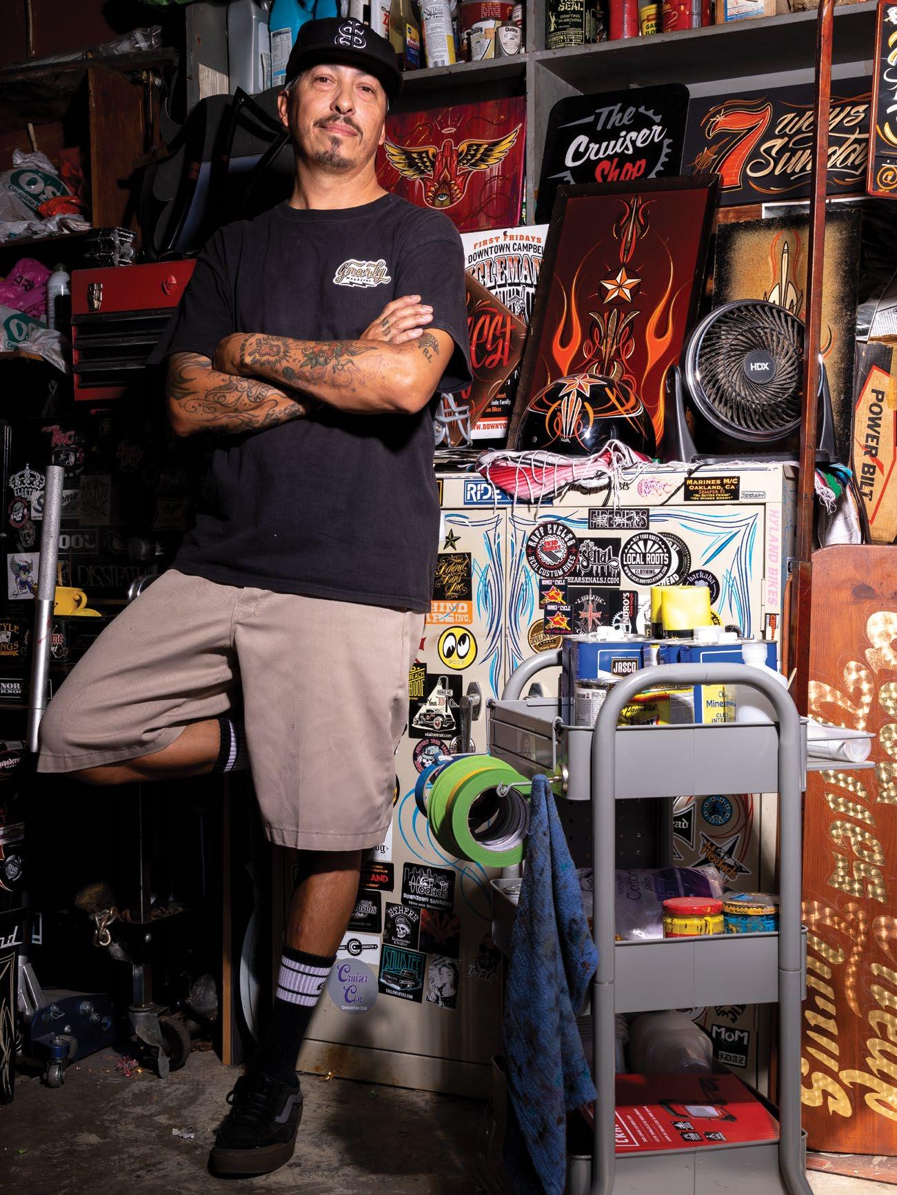
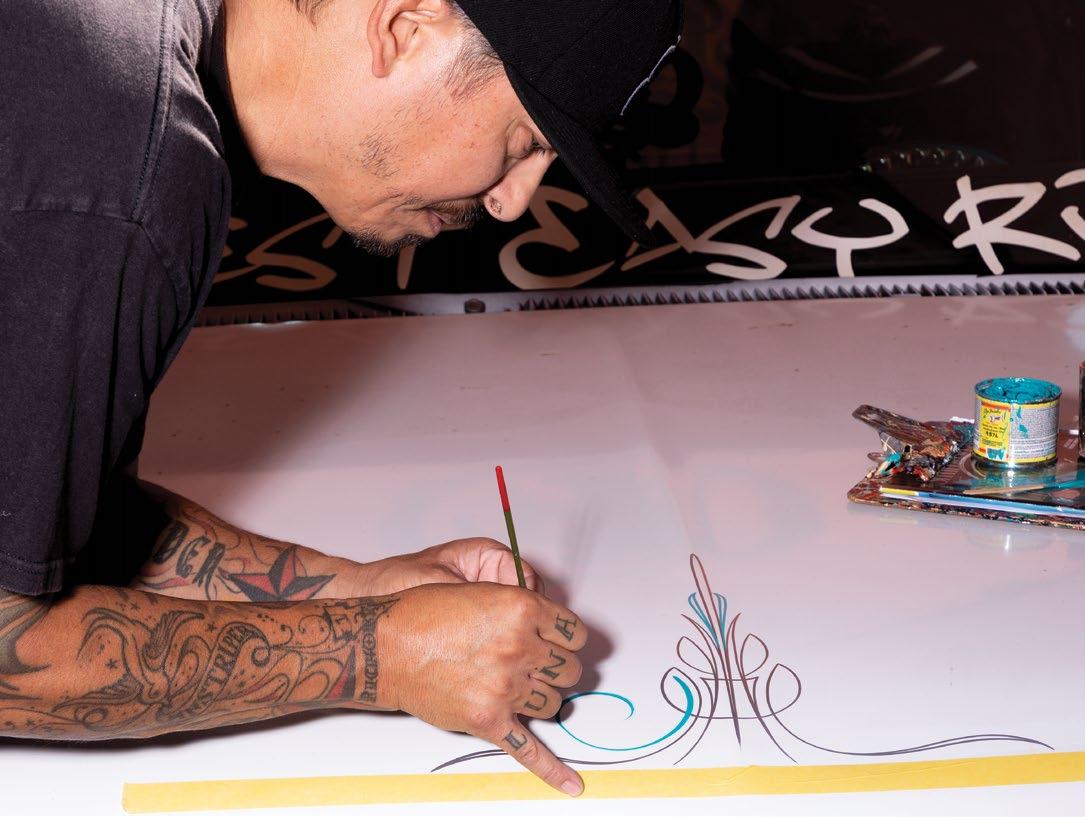
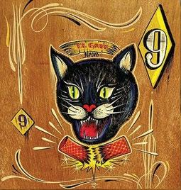
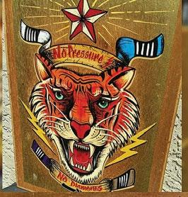
Tough guys with the pompadours; rockabilly bands with the upright bass and old microphones; Rat Fink on a hot rod; cruises and the exhaust from carbureted engines. These enduring symbols of Kustom Kulture are just a few of the sensory landmarks that lured Rich Luna into becoming the in-demand pinstriper he is today. Owner of Lunatic Customs, Rich Luna, who goes by Luna—the name tattooed across his knuckles—has applied his flowing linework, gold leafing, and lettering to every type of customizable piece. He has hand-painted a vast lineup of bikes and automobiles, as well as the unexpected piece of living room furniture or musician’s toy.
In every Lunatic Customs project, it’s less about showmanship, and more about enhancing the customer’s piece. From the color to the line weight, the customization must complement. The minute work begins, “Soul on, check your ego at the door.”
This motto has guided Luna through the 15-plus years since he picked up his first pinstripe brush. It was a 00 Xcaliber that he bought off an independent tool truck. Riding motorcycles at the time, he was fascinated by the artwork on the gas tanks. “I kept telling myself I could do that...it looked easy, right? Man, was I wrong!”
The journey required patience. In those early days, he picked up his brush and pinstriped everything in sight—his kids’ toys, furniture, personal items, people (with their enthusiastic consent), custom cars, bikes, and helmets. From the start he focused on growth, telling himself, “The cup is always half full; there’s always more to learn.”
But in Luna’s room sits a wooden pinstriping toolkit he’ll never use. Decked out with Ed “Big Daddy” Roth-style monster art and clean linework, that’s the toolkit that belonged to his dad, Ed Luna, who passed it to him as a keepsake a few Christmases ago.
Written by Esther Young Photography by Peter Salcido Instagram lunaticcustoms
Luna credits his dad with putting him on to pinstriping. By day, Ed worked as an illustrator for a defense company, designing tanks and logos. On his work desk sat a Rolodex, a pencil, and some paper. Everything was hands-on, and Luna took the chance to learn from his dad, who pinstriped on the side—also working on anything he could get his hands on, doing commissions from time to time (which included striping for the East Palo Alto–founded Soul Brothers motorcycle club).
“Mijo, just take your lines and make ’em flow this way; don’t
S oul o n, Ego o ff
35

Discover 14.1 36
–Rich Luna


make them go up-down-up-down,” Luna recalls him instructing. Orienting his finger and wrist to control the brush, and executing a clean pull, took time.
For Luna to take the hobby into business, however, it took the passion he arrived with as well as a push from life. From the beginning, it was the greasers lifestyle and the old school Rat Fink attitude for him. “All in your face and nothin’ nice about it,” he grins. “I wanted to go there like a moth to the flame.” He set up his pinstriping booth at every car show, up the West Coast and over on the East Coast. He got into car clubs and was even approached by James Hetfield from Metallica, who was part of the Beatniks of Koolsville. When he was let go from the dealership he previously worked for, Luna already had a base of clientele. As he worked his way up to pinstriping cars, commissions began to snowball, until he had to book people weeks out.
Though he doesn’t verbalize it, his collaborative approach may be one of the magic ingredients that keeps the customers coming. Born and raised in San Jose, his sociable personality frequently unearths mutual connections between him and a new client.
Across a picnic table, he shares, “I just did a lowrider and this guy, Anthony, he’s like, ‘My cousin in Style Kings…’ I’m like, ‘My gosh dude I used to belong to the Style Kings. I know your cousin Sal.’ ‘Oh then you know Randy...you know Matty…’ ‘Dude! Oh my god, Órale dude, what’s going on!’ ”
As friendly as he is, his business side is serious. “You have to be upfront and honest,” he says. “Name your terms, name your price, and stand by it.” Occasionally, admirers of his work try to pay him in alternative methods. “I don’t work for beer,” he clarifies. “We can do cash, PayPal, Venmo, what you need—I do this for a living.” Like with any full-time job, he commits to his own hours. Nine to six, you’ll find him in his garage with music on and distractions off. He takes a break when his fingers are numb.
“I try to tell myself, ‘Just have fun, man.’ Because it was a hobby, now it’s a business, but I should still have fun with it. When you put your soul into it, your emotions, your mind—that’s when your best art comes out.”
On the weekends, you might spot him out with his buddies or his girlfriend on their stretch cruiser bikes, pedaling to the music, present to the moment. “Enjoy that moment when you have it. That’s what I believe.” C
“When you put your soul into it, your emotions, your mind—that’s when your best art comes out.”
37
Cuong Nguyen
Discover 14.1
Written by Kah Mun Chia
38
Photography by Avni Levy icuong.com Instagram icuong
From Vietnam to the US, making art has always been in his blood.
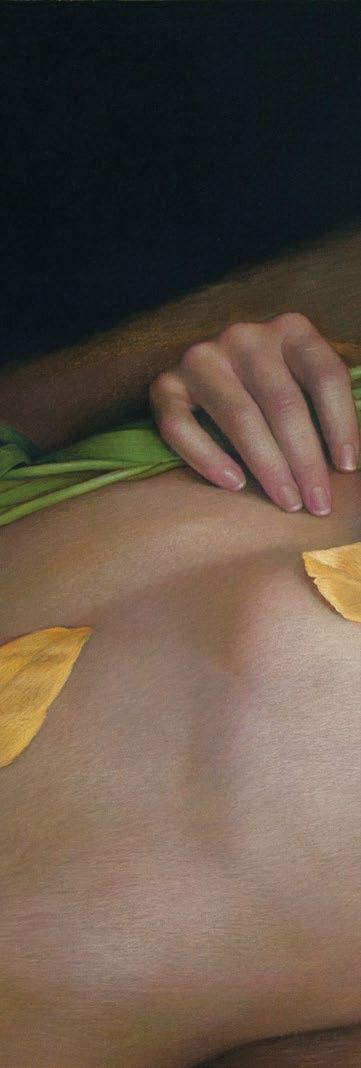
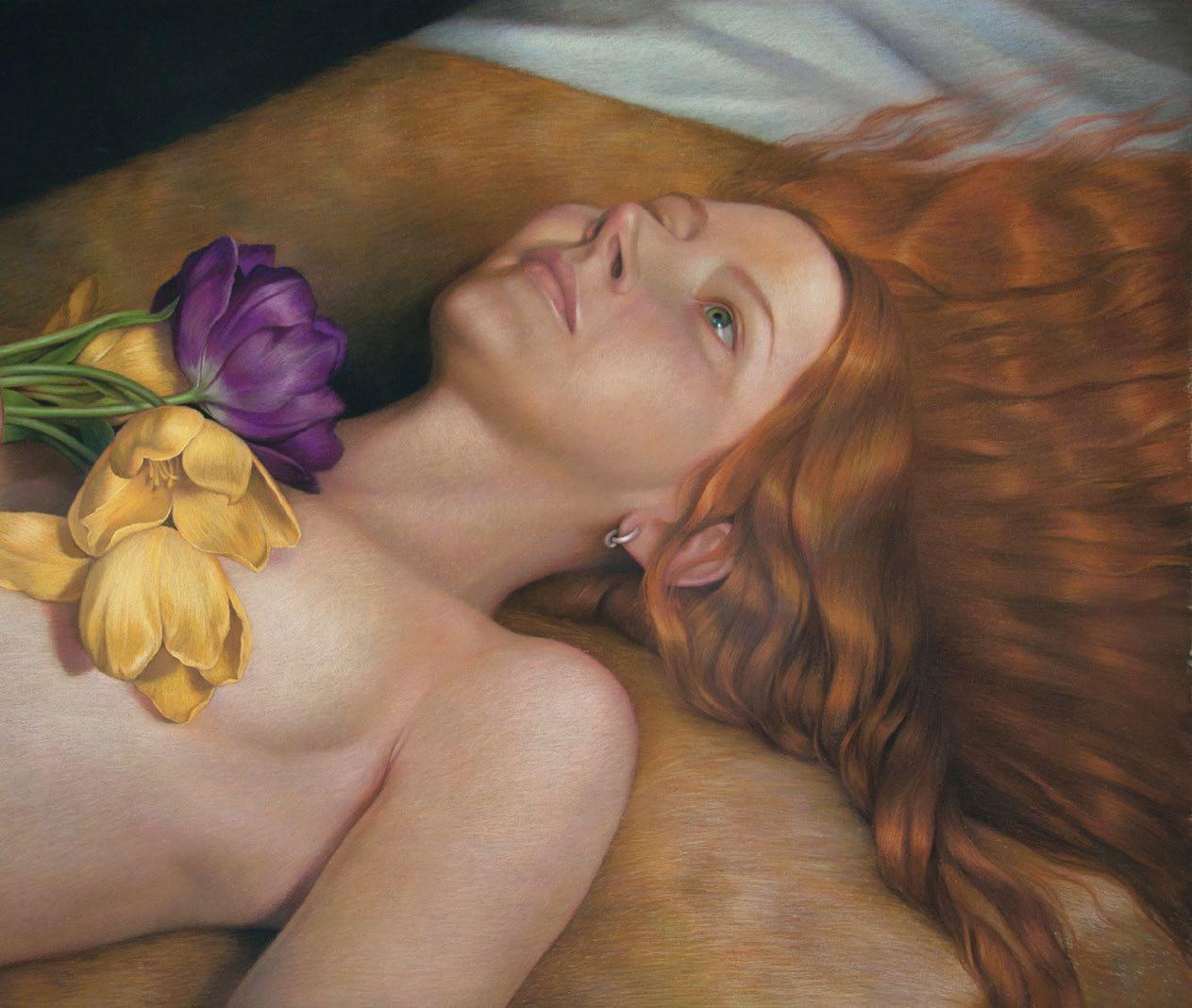
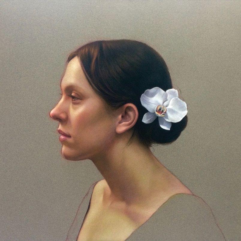
Cuong Nguyen says that much of his career came to him by luck, but the hours of work he pours into his pieces say otherwise. Nguyen’s paintings give the sense that if one were to reach out to the painting, one would be able to feel the texture of skin and the life that he imbues onto canvases, a feeling long associated with classical styles of painting. His work demands that viewers stop to study the portraits he paints in hopes of absorbing every detail into their minds. “It’s realism, but drawing humans doesn’t have to be so realistic,” says Nguyen. “It doesn’t have to be every wrinkle of the skin. I don’t go for that.”
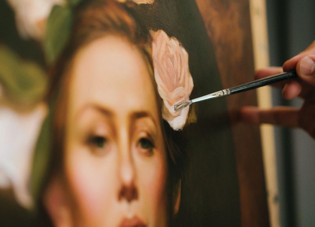
He began his artistic career by participating in public street painting festivals, where he gained notoriety for extremely lifelike pieces made with pastel chalk on asphalt. After that, he started getting invitations to competitions all over the world thanks to his use of verdaccio, where one uses a green foundation to build skin tones from black, white, and yellow pigments.
After experimenting with different styles of painting, Nguyen gravitated back to realism, even when his friends questioned his inclination to use the style, as it was not popular at the time. “I do try different styles, but it goes nowhere,” says Nguyen. “Only thing I can say is you have to listen to your heart.”
His portraits have won him many awards and accolades over the years, but the one that remains the most significant to him is the Best of Show Award in a statewide painting competition at the Triton Museum of Art in Santa Clara. The five-foot-tall oil painting of an impressively frowning friend (as well as the sheer size of it) certainly made judges stop and stare. “You have to play the game,” says Nguyen. “Make it big, make it bold, make a statement.” He says that award opened many doors for him and is what convinced him to quit his job as an icon designer at Yahoo in 2010.
For Nguyen, art has always been a part of life. Even at 10, he knew in his heart that he
39
Above: Ophelia, Pastel on sanded paper, 20” x 30”
40 Discover 14.1

41
(Oppositepage) Steve, Pastel on sanded paper, 16”x12”
(Top) Madeline and A Little Finch Pastel on sanded paper, 16”x16”
(Right) Michael, Oil on linen

Discover 14.1 42
was going to be an artist. He remarks that he was very lucky to be the youngest child in his family, his parents having loosened up their expectations by then, allowing him to do whatever he wanted. “I think art chose me,” says Nguyen, “because I had no choice.”
However, he explains, growing up in poverty limited his access to resources for learning how to make art. “The only book I had is a very old book,” says Nguyen. “It’s a Vietnamese work talking about Leonardo da Vinci’s life.” He copied the pictures he saw there, learning from da Vinci himself in a way. Nguyen was later accepted into Saigon’s Academy of Arts but was, unfortunately, unable to attend once he emigrated to the US. When he arrived 30 years ago, Nguyen supported himself while studying at San Jose State University, working parttime at a French restaurant and as a graphic designer at The Mercury News. He earned a degree in illustration and soon after, in 2000, began working at Yahoo.
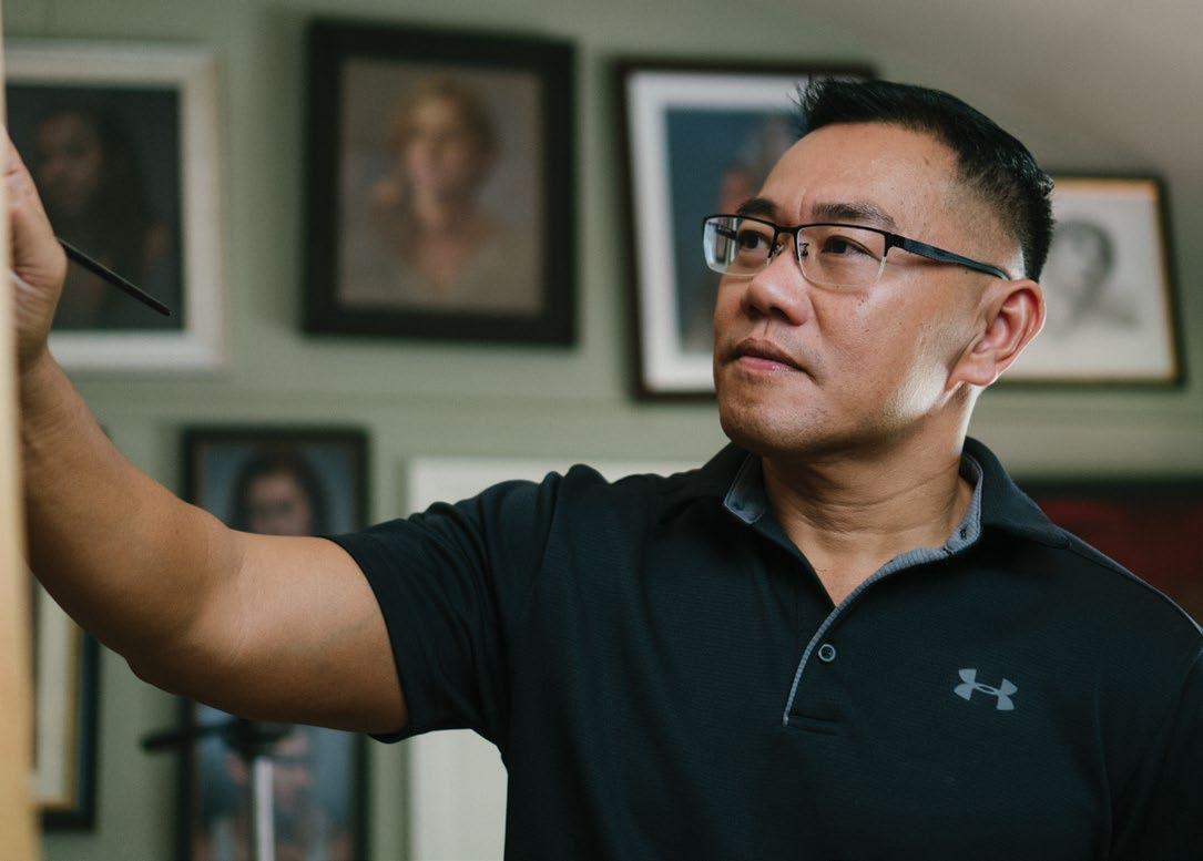
Nguyen also teaches workshops in exciting locations like Italy, Spain, and Mexico. “For me, the teaching is fun, because I think I was born to be a teacher,” says Nguyen. “But learning the different cultures is fun, too. It’s amazing to see people from all over the world.”
One of the most memorable workshops he’s taught was in his home country of
-Cuong Nguyen
Vietnam right before COVID-19 hit. Nguyen never expected to return to his homeland as a teacher or receive the warm welcome of his people. “It’s kind of an odd feeling when you go back to your own country and teach,” said Nguyen. He remarks that it also felt odd to be teaching in his mother tongue. He explains that he was used to speaking English when talking about his artistic process and methods.
“Teaching is a performance. You go on stage, you know what you have to say, and you keep saying that line forever,” says Nguyen. “And suddenly, that line has to be in a different language, and even in my own language, I couldn’t find some words to go with that.” In addition to his workshops around the globe, Nguyen also writes and posts video tutorials about his artistic process and techniques. When he teaches, he tries to share not only the techniques of his craft, but also the philosophy that guides his mind while creating art.
Love, passion, and feeling are three things out of innumerable ingredients that make the details in Nguyen’s work so captivating. To him, the portraits would otherwise feel dead. “If you don’t have the love and the passion, then you can’t get the soul,” says Nguyen. “When I do my work, all I can think of is how can I express the feeling.” C
43
“I think art chose me, because I had no choice.”
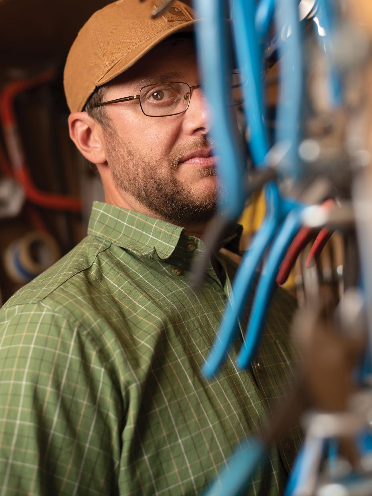
Discover 14.1 44
Written by Johanna Harlow
Photography by Daniel Garcia ryancarringtonart.com Instagram ryancarringtonart
Ryan Carrington Medium as Message
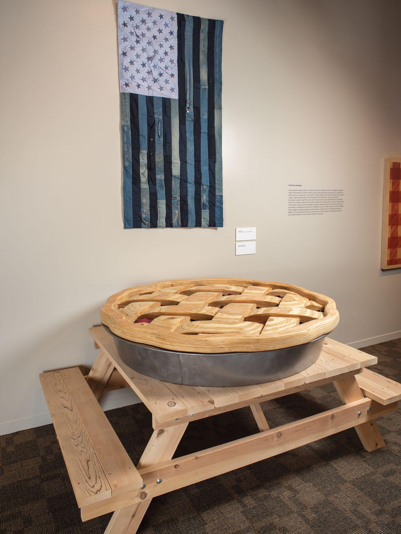
This past summer the San Jose Museum of Quilts & Textiles displayed a quilted red, white, and grey American flag stitched from carpenter’s pants, suits, collared shirts, and scraps of red ties. The delightfully unexpected choice of materials is common throughout Ryan Carrington’s work. “I use this idea of medium as message,” the San Jose artist explains. “What something is made out of affects the way that people perceive it and the concepts behind it.” This particular piece—an amalgamation of blue-collar and white-collar uniforms—reflects two recurring themes in Carrington’s body of work: the pay discrepancy between executives and laborers and the often-unachievable American dream.
“It used to be that you could just pull up your bootstraps…but it’s become this false narrative that’s been spun,” Carrington shares. “[Yet] people just sort of put their heads down and keep working.” He hopes to spark a dialogue about economics and distribution of wealth, as well as our society’s way of devaluing labor.
When Carrington creates, he poses the question: What can I do with different mediums to make something cool, but also have it be thoughtful?” This mantra has stayed with him ever since he participated in an artist-in-residence program at the Anderson Ranch Arts Center in Colorado (not long after earning his bachelor’s at the University of Wisconsin). At the beginning of his residency, Carrington recalls
feeling like his sculptures didn’t measure up to the work of the other makers, despite his strong technical skills. “Finally, I realized it was because their pots had content behind them— whether it was the way their pots interacted with the tabletop or paralleled the Kansas plane or had to do with man versus nature…and that was kind of this ‘ah ha’ moment.”
Carrington’s work today is equal parts humor and impact. Take for instance, his colossal apple pie, a plywood shell stuffed with a filling of business ties. Or an oven mitt fashioned from brick and mortar. Or a pitchfork planted in a sizeable pile of ties titled “Middle Management.”
There’s also his performance piece, “Build Them Up; Take Them Down.” To appreciate the peculiarity of it, imagine Carrington, wearing a hardhat, a Christian Dior suit, Prada shoes, and a crimson necktie, wheelbarrowing past you in the gallery with a load of cinderblocks. As he continues to ferry loads of concrete masonry, building a wall mid-gallery, he starts to sweat through his nice suit. Upon completion, he immediately begins deconstructing the wall. This futile act of labor “brings into question the discrepancy of laborers and executives, as well as the shift in perspective of the American dream,” the artist explains. “It was a really slow burning joke...I think a really good way to communicate with people is through humor.”
Another project, this one exploring the intersection between fashion and labor, consists of
45

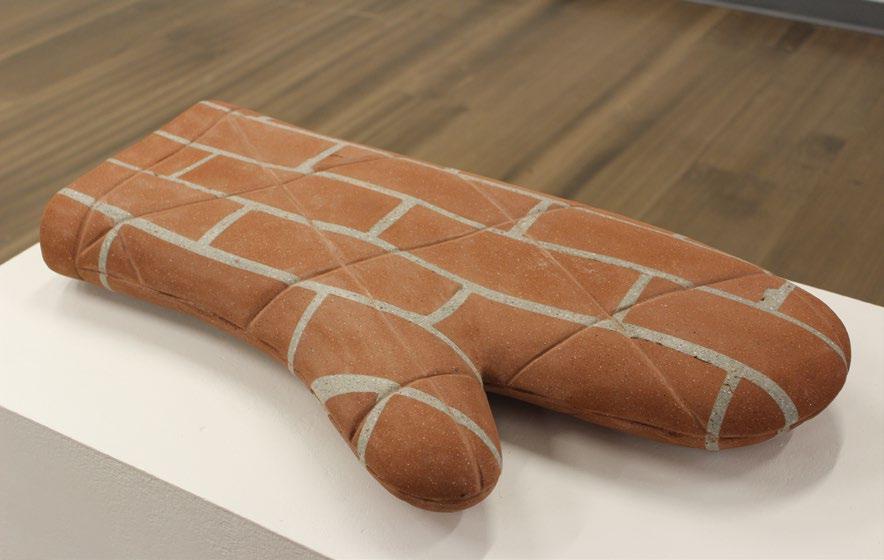 Oven Mitt Brick and Mortar, 30” x 16” x 4”
Discover 14.1 46
Flag#5, Carpenter’s Pants, Suits, Collared Shirts, and Neckties, 68” x 36”
47 Larry
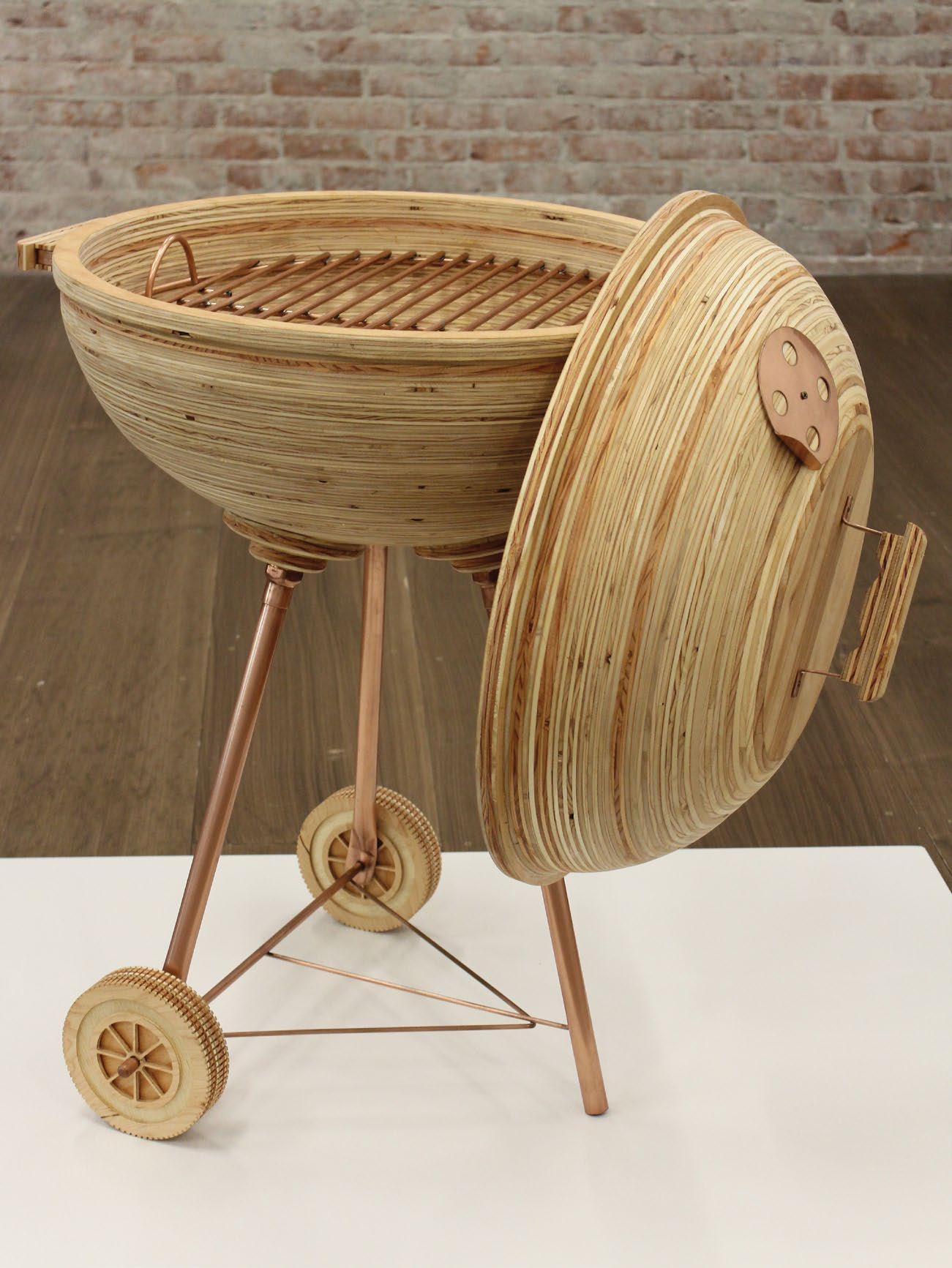
, Plywood, Copper Sheet, Copper Pipe, Refrigerator Coil, 32”x28”x34”
Discover 14.1 48
plaid patterns he made with colored nails (aptly named “Screw Relief”). The idea came from one of his frequent trips to Home Depot. “I have to go alone, my wife won’t go with me. She’s like, ‘You’re just going to stand there and stare at materials,’ ” he laughs. “[But] she’s very supportive! She’s like, ‘You can have your alone time with that. I’m going to go take care of some business.’ ”
While wandering the aisles, Carrington came across bins of screws and realized they were the exact colors of a plaid Burberry design. “This is hilarious, I must make Burberry,” Carrington recalls thinking to himself. “A lot of luxury companies have sort of appropriated plaid,” he goes on to explain. “Plaid is something that’s gone lowbrow (like grunge rock) all the way up through high-end Burberry, like Ralph Lauren.” It took him a good handful of weeks to develop the right design, a practice he fondly refers to as “failing through the process.” Then he began the arduous task of fixing hundreds of screws into place.
“When people find out I’m an artist, they imagine me up on some bluff with some oils, you know? And it’s like, ‘No, I’m just, like, firing screws or staples into a board,’ and just trying over and over and over and over to make something remotely good-looking,” he laughs.
This sort of labor-intensive detail can be found throughout Carrington’s work. His quilted flags take him 40 to 50 hours to complete. And that’s
after all the quilting classes at Eddie’s Quilting Bee alongside a group of venerable ladies (who got quite the kick out of this young man’s interest in their craft). “I make work about work. So, it should take work,” Carrington says, pointing out the parallel between his process and the way laborers perform the same task over and over again.
When Carrington isn’t creating, he’s teaching. “In sixth grade, I joined Future Teachers Club. You know, I just knew that was my calling.” He admits that for the longest time he intended to teach biology but had a change of heart after his college ceramics class. “I was enjoying the studio more than the lab,” he recalls. “I fell in love with artmaking through the potter’s wheel…the repetition and the craftsmanship and homing in on the technical skills.”
Today, he teaches at Santa Clara University, instructing students on the topics of sculpture, 3D design, site-specific land art, and professional practice. “So I got into this game as an educator and developed an art habit, I suppose,” he chuckles.
Carrington’s exhibit at the San Jose Museum of Quilts & Textiles has wrapped up, but keep an eye out for his upcoming projects. As he continues to educate others on the blueand-white-collar divide, the integration of craftsmanship, humor, and depth in his future artwork is sure to be seamless. C

49
ClosingBell, Plywood, 61”x50”x47”
Opposite Page: San Jose Museum of Quilt & Textile, 2021 Flag#28, Carpenter’s pants, suits, collared shirts, and neckties
EnoughtoGoAround, Plywood, steel, neckties
Discover 14.1 50
Artivist
ANOUK YEH
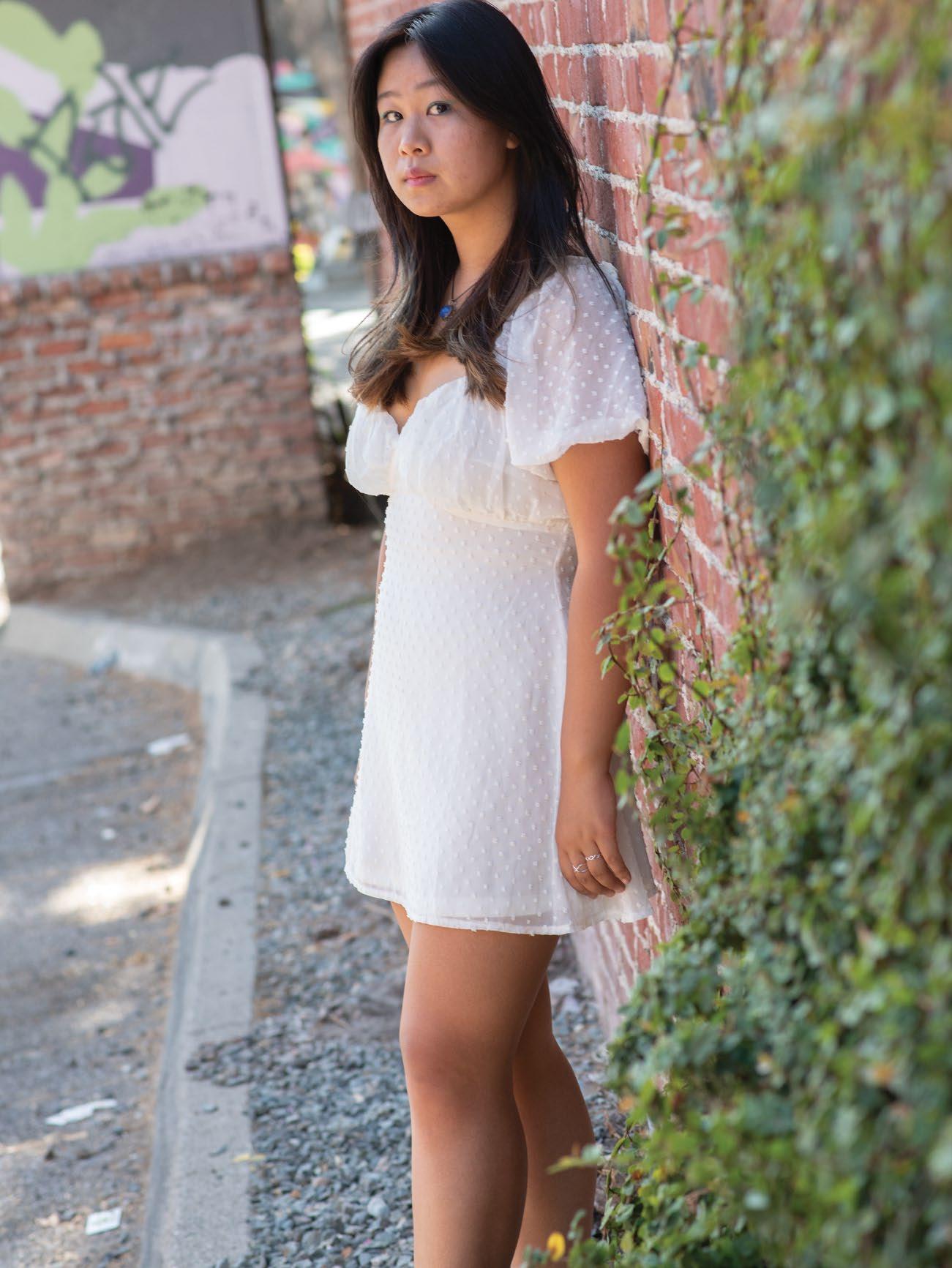
Santa Clara’s First Youth Poet Laureate
Anouk Yeh isn’t the kind of poet who cloaks her pieces in vague phrases or ambiguous analogies. As an artivist (art activist)—tackling heavy-hitting social and political issues like racism, ageism, gun violence, and sexual harassment—mysterious stanzas don’t cut it.
Written by Johanna Harlow Photography by Daniel Garcia anoukyeh.com Instagram uh.nouk Twitter anoukyeh
Poems are “vessels for awareness” for Santa Clara Youth Poet Laureate Program’s very first recipient, and there’s little time to dance around meaning. Spoken word is more palatable than soapbox speeches…so why not opt for a direct approach?
“People are, in a way, kind of caught off guard in the best way possible,” the high school senior explains. “I think poetry, like all art, kind of coaxes people to drop down their defenses.”
Anouk’s experiences as a student journalist at Sara-
toga High School have greatly impacted her work. “I think it’s made me unafraid to more concretely attach my poems to current events,” she says, like when she reported on Saratoga Union High School District’s Me Too movement for an investigative assignment. After a few student survivors spoke up about sexual harassment and assault on campus, Anouk interviewed students and organizers involved. “I was intrigued by the entire dynamic—like how a group of 16- to 17-year-olds, young female students, were able to lead this movement that ended up also making local and national headlines.”
The incident invoked a piece called “Ode to Teenage Girls,” which got her noticed by the Santa Clara County Youth Poet Laureate Program. There’s a haunting ache to the uncomfortable questions the
51
“color wheel connotations”
by Anouk Yeh
my art teacher, ever the whimsic tells me that colors are just complex emotions running her fingers along the edge of the color wheel, she says colors convey emotions, like every good taylor swift lyric depending on colors interpretations may change
my art teacher floods her canvas with red, says red by itself is angry
but red, drizzled with passion fruit orange is a glowing sunset smile
my art teacher says that depending on colors interpretations may change like how gold on purple is royalty in the middle ages
but gold on silver is san francisco circa 1949
like how black and yellow is a bop
but black and blue is a bruise
depending on colors interpretations may change like how black on white is classy
but black on black is dirty
like how gun on white is patriot
but gun on color is terrorist
like how crime on white is sex addiction
but crime on color is still terrorist
depending on colors interpretations will change so in the courtroom, when they arm up to paint with royal blues and subdued hues
i know they are painting an inherent eulogy so in the court
when they arm up to paint with pastels and white tinted pigments
i know they are painting a soft sentence
where the canvas is the accused the paint brush: the judge’s gavel
and the colors
the colors: the verdict
Discover 14.1 52
poem asks: “isn’t that teenage girlhood? knowing that anytime, anyone you love could be swallowed / by a boy who thinks he can pocket the sun / knowing that there are men who want to pop your vocal chords like violin strings but still choosing to excavate a song from your lips,” Anouk prompts. “what is more teenage girl than constantly mourning / the way your body turned into someone else’s gaudy souvenir, but still / belting the lyrics everytime taylor swift comes on the radio because / that’s your song and at least no one can take that joy from you?”
The poem grieves, but there’s also strength expressed in the bold empathy and raw vulnerability of its lines. “I think there’s a very emotional and a very personal component to spoken word that really helps make that revolution irresistible,” Anouk shares.
Early last year, her powerful poems gained her an invite to speak at the Women’s March Oakland to a crowd of 600. “Before that, I had only performed a few poems to a few people at the local open mics—and my dog. So not that many,” Anouk laughs.
As she continues to gain traction, Anouk has begun pitching places beyond her school paper, writing stories for publications like Refinery29 and Education Post—and then there’s her work as our county’s first youth poet laureate.
During her fellowship, she and vice poet laureate Mahder Aklilu will organize several youth poetry workshops, including one for the incarcerated youth of Santa Clara
County Juvenile Hall, which will culminate in a published anthology.
The latter workshop was inspired by her time volunteering with the Prison Journalism Project, a program that helps incarcerated writers pursue publication. The organization taught Anouk to ask important questions about mass incarceration. “Isn’t it weird, when we have these national and international conversations about incarceration and no one who has a seat at that table has been incarcerated before?” the poet asks now. “[Incarcerated] voices are never amplified. Their voices are never truly factored in.”
Anouk’s workshop will inspire youth at the detention center to tell their stories and their truth, while processing their experiences and exploring their identities. “Everyone needs an artistic outlet,” she asserts, adding that she also hopes to encourage her workshop attendees to re-imagine what our nation might look like through a lens of restorative justice.
As for her other workshops, Anouk hopes to champion student voices, showing the value our youth contribute to advocacy causes. “As young people, we harbor this sense of unquenchable hope,” she states. “I think a lot of the time, because we are so hopeful, we can be written off as unrealistic—but I think that optimism and radical joy should be amplified more, rather than pushed aside.”
Certainly, Anouk herself will bring her candor and contagious expectancy to many more projects and causes to come. C
53
“I think poetry, like all art, kind of coaxes people to drop down their defenses.”
-Anouk Yeh
Derrick Sanderlin k
Whether you met Derrick Sanderlin at an open mic four or five years ago or saw one of his bands performing onstage or met him as a barista at Roy’s Station Coffee and Teas or read about him in the news last summer, this post-COVID season finds him in coalescence with all parts of his identity—art, Black culture, and his calling.
Heading to his hometown of Phelan, off the I-15 exit, you can’t miss the house displaying a Confederate flag underneath the American one. When he was young, Derrick learned to assimilate to make friends.
Throughout his teenage years, a tension fluttered in his chest. He had a yearning to resolve something unnamed. With his father a pastor, Derrick had grown up singing hymns and spirituals with his siblings. Here he forged his own creative space. Listening to hardcore metal and playing in punk bands ultimately brought him his first guitar, gifted to him by his group’s lead guitarist.
Derrick became obsessed. Any fingerstyle, any scale, “I wanted to learn everything there was to learn,” he said.


He played it till it broke. After moving to Riverside, where he lived in communes for a few years, he began to write his own music. Widely inspired by “ridiculous writers and feelers” such as Iron & Wine and Bon Iver, he entered Riverside’s tightknit open mic scene. One day, Derrick sat with his friends discussing the sparsity of venues for musicians to play at for free. He voiced an idea to boost Riverside’s creative ecosystem: “What if we just, like, throw a show…and make a documentary?”
So he organized it. Leveraging a personal connection to a movie theater located inside an art gallery his girlfriend worked at, they packed out the theater. Their documentary illustrated the value of elevating relationships for any music scene.
“Oftentimes musicians can think of the scene as the industry, so it becomes a very competitive space,” Derrick explains. “The only reason I had friends for the documentary is because...we would invite each other to play at our shows.”
Cayla, his girlfriend, had moved up to San Jose for an internship. Every time he visited, he caught a glimpse of the work
she did with her organization, such as fighting the building of charter schools in the Washington neighborhood and visiting the Jungle homeless encampment before it was shut down. Back in Riverside, Derrick struggled through his daily grind. He had “No real good job. Was barely paying rent. Not eating every day,” he remembers. He was taking college classes for the opportunity to dance. Then, through a sociology course, he read statistics that showed how educated Black males make 50 percent less (sometimes 80 percent less) than their white counterparts having the same amount of education.
“I looked at those statistics, like, ‘Whoa, that’s me. I’m in those statistics.’ It put words to something I already knew.” He realized Cayla was going to stay in San Jose to continue her work as a youth mentor— and that work resonated with him.
In 2014, Derrick moved to the Bay Area. His first job in the Bay placed him in downtown Oakland during the height of the Black Lives Matter movement. “Pretty much every day I was working, there was a protest at the end of the night…I
Discover 14.1 54
With every show Derrick played with his band Sine Wave, he transformed tension into a story for justice.
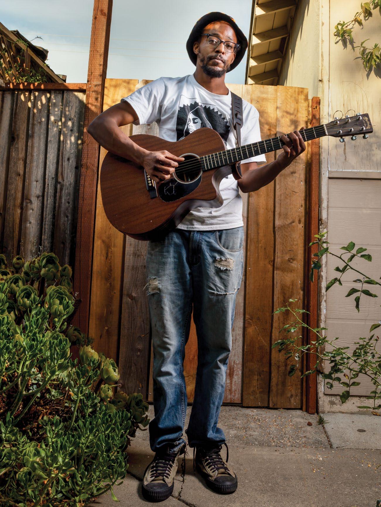 Written by Esther Young
Photography by Peter Salcido derricksanderlin.com
55
Instagram derrick_andstuff SoundCloud derrick_amongotherthings

“When I started seriously playing music, I was not super aware of my own Blackness.”
Discover 14.1 56
-Derrick Sanderlin
started slowly dipping my toes into some action.” In San Jose, he began volunteering with People Acting in Community Together to boost police accountability and lessen the involvement between Immigration and Customs Enforcement and the county. Derrick also started working part-time at Roy’s and married Cayla in November of 2015.
“Riverside was a place where I fell in love with the idea of organizing,” he says, “but San Jose is the place where I learned what it means.”
The next few years were a blur for him: He had begun attending open mics, and his performances impressed scene connectors like Mighty Mike McGee and with Grizzly Rob, who invited him to play more shows. In the summer of 2019, he landed an artist residency at Forager Tasting Room & Eatery, where he formed his band, Sine Wave. Just like in Riverside, he brought other musicians and poets onstage with him to tell the stories he wanted to tell.
Sine Wave allowed him to express the latest progression of his internal journey. Despite half his family heritage coming from Louisiana, his social mold had consisted of mostly white, Republican, desert towns.
“When I started seriously playing music, I was not super aware of my own
Blackness,” he reflects, but the ever-present tension of racial identity—crossed with uncertainty in his personal life—reveals itself in his lyrics. An early recording of “Drapes,” buried nine years back on Derrick’s SoundCloud page, dresses the same raw lyrical poetry in a very different sonic atmosphere than on his 2018 Ghetto EP. Over fingerpicked guitars, Derrick’s voice fills the sonic space with mournful confession. As layers of vocals build towards the song’s climax, the blues overwhelm whatever lightness filtered through his delivery of the first lines. With the newer recording, punctuated with syncopated claps and shakers, “I think I was feeling the sadness in a different way,” Derrick reflects. “It just felt like the pain was the pentatonic scale—bending and snapping more than it was floating or sounding like a harp.” With every show Derrick played with Sine Wave, or with his other project, Rhythm & Folk, he transformed this old tension into a story for justice.

Then, in June 2020, he faced an even greater pain to transmute. During the height of last summer’s protests for Black lives, Derrick was shot by an officer while defending a group of young protesters from close-range rubber bullets. He was alone in the hospital when he was informed his injury could prevent

him from having children. When he heard that, he only wanted to go home, rest, and “just stay off on the sidelines.”
But instead, Derrick was uplifted by the relationships he had forged—teaching implicit bias training, serving coffee at Roy’s, and elevating other musicians and poets. A mural was painted in his honor, along with the message “Don’t Hurt Our Friends: Demand Accountability.” A resolution to defund police presence in schools cited Derrick’s story and name and publicized the proposals in an open letter to San Jose Unified School District. He felt overwhelmed, but it was a feeling of love. “It has, in some ways, made me more fierce. And honest. Because it’s easy to edit yourself when you’re a Black person in America and you don’t wanna be labeled as angry. But I was tired of being afraid of that, and it feels really good not to be afraid of that. That’s a part of, I think, the Black tradition—which is being able to channel my rage.”
Now, as a community organizer for Sacred Heart, Derrick helps others who feel unsafe to strategize their demands for permanent housing, alternative responses to police calls, and better funding for programs that center their livelihoods. He has found himself deep within his calling, where the hunger of this world and the gladness of his heart coalesce. C
57
JACK pavlina

Discover 14.1 58
“Hometown streetlights, walking down the same road / These views are starting to get a little old / Skateboard riding, cruising ’round town / We know the places where you’re never found”
So goes the breezy hometown track “408,” an admitted tribute to the Campbell skate community. Now a senior at Del Mar High School, he shares that skating has played a key role in his life since his freshman year.
“Skating has always been an escape for me,” he explains. “I get really sick of seeing the same old scenes. When I go out and skate, it just feels new every time.” Those moments to reset and slow down have proven fruitful for the emerging singer-songwriter.
While Pavlina’s been writing and recording his own music for close to two years, he first remembers having a connection with music at the age of five, while enrolled in dance class. That burgeoning connection led to him playing the trumpet, then transitioning to bass. At the age of 13, he picked up guitar and, in more recent years, has tried to build his vocal ability.
While his musical output skews toward rock and alternative, he was exposed to a wide musical palette growing up.
Pavlina says his father introduced him to plenty of genres, from jazz and R&B to 90s grunge rock. Seeing that his son was getting serious about creating his own music, Pavlina’s father spent a couple late nights around Christmas a few years back converting a backyard shed into a makeshift studio space. It’s since become the epicenter for Jack’s creativity.
“It’s like my sanctuary in a way,” he shares. “It’s where I go to create and just have ideas. It’s been a journey—a lot of late nights trying to figure out how to work with all the technology, because my roots are just with an instrument and my voice.”
Enter Kody Beats. When Pavlina found out a coworker of his had a friend that made beats, he was eager to make a connection. “Kody came over once, and he hasn’t stopped coming over since,” admits Pavlina. “We work so well together. He’s been my drums. He has an ear for those things and it really helps.” It’s proved a fruitful pairing for both sides: while Kody has helped with production, mixing, and mastering, Pavlina has taught Kody how to play guitar and introduced him to music theory.
At 17, singer-songwriter Jack Pavlina is mining his experiences for earnest tales of complacency and young love —and has no problem sharing these tunes with the world
59
.
Written by Brandon Roos Photography by Daniel Garcia honeysoakedpeaches.wbflow.ioInstagram jackpavlinamusic YouTube jackpavlinamusic

Discover 14.1 60
The chemistry shows through on their collaborations, with Kody’s light touch never detracting from Pavlina’s musical core: playful, upbeat music speaking to the simple joys of youth and the urgency of new attraction.
Though Pavlina admits that some of his songs are written from a place of speculation, one song in particular cements a wildly cosmic connection. “Ran into You,” released earlier this year, captures the spirit of Pavlina’s music beautifully. His lyrics capture an internal dialogue from his time on a family vacation in Hawaii. A girl on the beach catches his eye, and when he goes to talk to her, he finds out she lives less than 20 minutes away from him. The tender production from Kody Beats adds dramatic tension to Pavlina’s telling, which vacillates between jubilation and steadied caution, with Pavlina reminding himself to not fall too deep too soon. But he can’t help but be blown away by the coincidence, stating, “I’m away on an island across the world / And right now it feels like you’re the only girl / Why is it here that I ran into you?” Such moments reveal a thoughtful writer unafraid to be vulnerable with his audience.
Pavlina released his debut EP, Shed, on October 2. In addition to summer singles “408” and “Fallin’,” the EP, whose title pays tribute to his backyard sanctuary, features five brand-new songs. While he wanted the entire project to come out fresh, he admits he released the singles to continue providing listeners with a steady stream of new material.
Some teenagers may be terrified to share their creativity with the world. Pavlina isn’t one of them. “Performing live just never really scared me. It feels so natural to just talk and play music for people,” he admits. He says he’s played open mics at Los Gatos Roasting Company, but he also has no issues with taking a short ride over to the Pruneyard, setting down his guitar case, and serenading strangers within earshot, all while his skate buddies ride over and cheer him on.
Perhaps it’s another way, like skateboarding, to chase away the monotony, this time not by getting lost but by being found.
“It’s been a journey—a lot of late nights trying to figure out how to work with all the technology, because my roots are just with an instrument and my voice.”
61
–Jack Pavlina
C
DOX BLACK
Wading into the Waters of the Unknown
Even as he embraces his place as a hip-hop veteran, rapper, and producer, Dox Black remains focused on pushing himself to new creative planes in the studio and onstage.

Rapper Dox Black shared about the night his 2020 completely unraveled, when the touring crew sat together in a meeting about what they were going to do moving forward. “Every hour on the hour, we would be getting these notifications,” he recalled. He remembers the slow roll of new capacity restrictions at venues, dropping from 1,000 to 500, then to 250, then to 100, then to 50.
“We were getting calls from the promoters basically canceling different spots along the tour route. It didn’t make sense for us to continue with such gaps. We had to cancel the tour after our first successful date,” he explained. It was a startling low after an incredible high. The first date of the tour, which featured Twista, was a sell out in San Diego. It was a complete 180 from the elation from the night before.
Written by Brandon Roos
by Stan Olszewski doxblack.com reverbnation.com/DOXBLACK
Like many others, 2020 was supposed to be a year of growth and success for Dox. He was going to continue to focus on touring and honing the skills he gained on the Vans Warped Tour while presenting the Bring It Back Tour, a hip-hop component that toured alongside the nationwide festival for several years. Starting in 2016, he earned recognition as an official act at South by Southwest, which places a global spotlight on emerging talent. He had planned for another summer on the road, building fans in new markets. But when COVID restrictions hampered his efforts to perform, he returned to San Jose.
Despite these setbacks, Dox had something working in his favor. As a tireless workhorse with 20 years in the game, he utilized the extra time to focus on his album, Enigma. He managed to deliver the new work to listeners on New Year’s Day—a tradition he’s maintained for eight years running.
“I’ve been producing and rapping about the same amount of time. I think that was a blessing in disguise, because some
times with artists, you get stuck in one action of your artistry,” he said. “I didn’t have to rely on anybody for my music to be developed,” he explained.
-
Instagram dxblx Facebook doxblack
Photography
Discover 14.1 62

63

Discover 14.1 64
Enigma’s 17 tracks certainly live up to the title, with Dox serving up a number of musical moods alongside a series of varying flows. Some are cool and laid back while others are delivered in rapid-fire double time. The boom bap spirit remains at its core. Quick shot scorcher “Juggernauts” has Dox proclaiming, “Bringing light to darker times / We as bright as it gets.” “Dynamite,” featuring vocalist Ricky on the hook, carries an uplifting, summertime feel. Just as the title promises, “Soultro” is a slow-burn, soulful instrumental with a spoken word send-off, imploring listeners to build toward their greater purpose.
He points to artists like the late Gift of Gab, Tech N9ne, and the Hieroglyphics crew as inspirations for his dense lyricism and studied flow, but makes sure to add that he doesn’t emulate other artists. Rising out of the far-reaching, ever-creative proving ground of 90s hip-hop, he maintains a sharp focus on incessantly being himself, adding that “I’ve always tried to deviate and be an individual. That’s all stemmed from the Bay Area and early hip-hop.”
Speaking on his developmental years as a teen, he shares of carefree days and nights when he and others used whatever tools they had available to piece together formative beats. A gifted four-track recorder pushed him to create sounds in unique ways.
“When I started getting into hip-hop, it was me and a bunch of friends messing around in a friend’s garage,” Dox recalled. “Because I had limited access to instruments at that time, I was making snares with two bottles in hand, just being creative with it. That really got me on the path of creating music myself as an emcee and producer,” he shared.
After high school, Dox moved to Honolulu for college, where he made inroads into the Hawaiian hip-hop scene and saw a more introspective side to lyricism. He’s also gained insight and inspiration during stints in Las Vegas and New York.
His knack for embracing change has certainly fueled him. It’s also likely at the core of why, despite the length of his career, he’s not short on answers for what keeps his creative flow going. His response is multi-faceted and studied, much like his music. He speaks of incremental change, brick by brick. He wants to refine his on-stage performance to better connect with his audience, continue to build on the possibility of performing with his band, the Aquanauts, tour the globe, and appear with larger acts.
“I think it’s the ability to do things I haven’t done,” he said. “There are sounds I haven’t created. I’m not looking to start singing or anything, but for me, I definitely feel there’s areas of my music that I have yet to tap into,” Dox shared.
For an artist with this much time in the game, that might just be the true gift: his continued desire to wade into the waters of the unknown. C
65
- Dox Black
“When I started getting into hiphop, it was me and a bunch of friends messing around in a friend’s garage. Because I had limited access to instruments at that time, I was making snares with two bottles in hand, just being creative with it.”
PICKS ALBUM
Isaiah Rashad
The House is Burning (TDE)
Release date: July 30, 2021
Written by Taran Escobar-Ausman
It’s been five years since Isaiah “Zay” Rashad’s 2016 breakthrough, The Sun’s Tirade, a long wait for fans but an even longer journey for Zay as he navigated addiction, rehab, and his mental health. The realization of that journey comes to us with his aptly titled new project, The House is Burning. As Zay says, “You can either lay down with the flames or get out before it burns down.”
In true fashion, Zay comes back humble as ever, rhyming and singing in his inimitable sly, rhythmic-speech style. There is no hard flexing here, no looking for any sympathy or praise. His mom relates, “Even when he f**ks up, it so casual.” With The House is Burning, Zay looks to create his own brand of music, finding a space between hip-hop, neo-soul, crunk, and trap. No matter what style he flirts with, Zay is still a master at taking care of the technical details while sounding as if he happened to be passing by the studio to lay down a verse.
The single “Headshots (4r Da Locals),” with its throwback beat and infectious chorus, is a therapy session about the changes he has been through: “Peep me in the scope, if I’m gone, don’t trip, baby, / Bringin’ back the strong, up to bat, all hits, baby.” Zay integrates more soulful singing throughout, including most notably on “Claymore,” “Wat U Sed,” and “Score.” While Zay himself is worried die-hard fans won’t be down with the more R&B vocals, it doesn’t distract from the overall flow; instead, it frames his creative pivot and artistic growth.
The House is Burning is a reflective and intimate collage of Zay’s current state of mind and a record of a person taking control. On the title track, “THIB,” he takes full responsibility for his actions before it segues into the top-down, sun-in-your-face soul beat of the closing track, “HB2U,” where he accepts himself, faults and all. The track ends with him singing the beautiful refrain, “You are now a human being.”
Favorite Track: “True Story”
Social media: isaiahrashad
Cleo Sol Mother
(Forever Living Originals)
Release date: August 20, 2021
Written by Taran Escobar-Ausman
Out of West London, songstress Cleo Sol and long-time collaborator Inflo created a classic and timeless soul album, Mother It is a sublime, peaceful album that plays through with an ebb and flow dancing with the iridescent rays of the late-afternoon sun. The sound harkens back to the sweet and soft glow of early ’70s R&B and singer-songwriter albums.
Since last year’s release, Rose in the Dark, Cleo became a mother herself, an experience that fundamentally changed her. While the aptly titled album is a meditation on her new role, she also reminisces about the frustrations and resentments of her own mother while looking inward on how we can all be better people to each other.


On the beautiful eight-minute opus, “One Day,” she seems to sing to herself over an upbeat groove. “I know you fell from your mother’s tree, but you / just started to live your life.” The song then pivots and slows to a measured synth bass, where Cleo speaks directly to her newborn. “My angel born in June, / The sunshine follows you, / Your love helped me push through.” And while you know she is singing to her own child, you can’t help but feel she is also singing to you.
There is a daydream-like quality to the sequencing and pacing of the album. Songs fade only to start once again as vamped reprises before crossfading into the next track or transitioning into new, unexpected directions. “We Need You” opens with a nod to Phil Upchurch’s guitar work for Curtis Mayfield before building into an uplifting chorus. “We need your voice, speak your truth, we need you.” While Mother is a deeply personal album for Cleo, it speaks to a universal yearning for self-love and acceptance in a seemingly connected, yet disjointed world. Cleo has definitely created something special and timeless.
Favorite Track: “One Day”
CLEO-SOL.COM
Instagram: gyallikeclee
Twitter: cleosol
Curated by Needle to the Groove Instagram: needletothegrooverecords
Discover 14.1 66
Skyzoo
All the Brilliant Things
(Mello Music Group)

Release date: June 11, 2021
Written by Demone Carter
Gentrification is defined as the process whereby wealthier people, moving into a poor urban area, typically displace current inhabitants in the process. Gentrification is not only changing the skylines of America’s great cities, but cultural landscapes are being altered as well. Brooklyn-born-and-bred rapper Skyzoo speaks to this tension with his latest album, All the Brilliant Things.
Skyzoo, born Gregory Skyler Taylor, grew up one block away from rap legend Notorious B.I.G. Although he was too young to have rubbed elbows with the great Christopher Wallace, Skyzoo cites Biggie as one of his primary musical inspirations. The Brooklyn that birthed Skyzoo and a slew of other rap giants (like Mos Def and Jay-Z) is rapidly changing, with gritty streets being transformed into playgrounds for the affluent.
All the Brilliant Things is a love letter to the Brooklyn Skyzoo once knew. He laments about the changes that have taken place in recent years. On the song “Humble Brag,” he opines, “Word to all the condos coming to tell us vamonos.”
This is a masterfully executed concept album, from the production to the artwork. Skyzoo has a gift for painting nostalgic scenes that don’t feel overly sentimental. Skyzoo doesn’t pummel us with punchlines; instead, he slyly layers double— and sometimes triple—entendres to get his point across. This approach allows the album to move along at a digestible pace and not buckle under the weight of its own concept. This album is an exercise in well-crafted subtlety, guest vocalists, wry trumpets, and poignant vocal samples blended together to create a cohesive listening experience.

The album’s thematic crescendo is the track “Bed-Stuy is Burning,” where Skyzoo asks, “My neighborhood gave you life, but was you here when it died?” The chorus implores other cities, “Don’t let this happen to you.”
Dealing with such a heavy topic leaves room for pedantic preachy tropes, but Skyzoo gracefully sidesteps these pitfalls, and that is part of the reason why All the Brilliant Things is a strong album-of-the-year contender.
Favorite Track: “Bed-Stuy is Burning”
SKYZOOTHEWRITER.COM
Instagram: skyzoothewriter
Twitter: skyzoo
Nas King’s Disease II (Mass Appeal Records)

Release date: August 6, 2021
Written by David Ma
When Nas announced he was making a sequel to King’s Disease, it seemed like another unnecessary blunder in the long, divisive career of Nasir Jones. Teenage Nas was prodigious; his debut, Illmatic, cast a long shadow over hip-hop and continues to do so. It has remarkable depth, bound with poignant stray observations that give way to angst, worldviews, politics, and race—all of it couched in era-defining beats. A masterwork out of the gate, it was a high watermark Nas would spend the rest of his career chasing. On King’s Disease II, we find him reinvigorated, flexing in ways we’d only heard glimmers of in recent times, notably (and semi-recently) “The Black Bond” from Life is Good, for example. Even the schismatic release Nasir from a few years back, an EP entirely produced by Kanye West, had memorable moments like “Adam and Eve,” a song about responsibility and shifting life stages. It is these same themes that we find on King’s Disease II, an intersection of newfound vigor and self-analysis, coupled with age and the wisdom it brings. Once a young firebrand, Nas is now at the Sinatra stage of his career, sage-like and revered, toasting himself while dissecting his unthinkable life stage. On “Rare Form” he claims: “Empty glass of Pinot. Cigars and casinos. / What they especially praise is the ethos.”
The production here is by Hit-boy, who also produced the first King’s Disease, a predecessor of missteps that somehow won a Grammy—to the chagrin of the current rap coterie. Hit-boy and Nas are in lockstep here, the songs are well-conceived, the sample palette fits, and the beat changeups welcomed. Ear-catching moments are dotted throughout, like “Nobody” with Lauryn Hill. Not only is this the two’s first pairing since 1996’s “If I Ruled the World (Imagine That),” but Hill’s voice is ever intact—smoky, smooth, emotive. “If I’m a messenger, you block me then you block the message. / So aggressive. The world you made is what you’re left with. / Pride and ego over love and truth is fucking reckless,” she says.
Despite an insufferable Eminem feature that nearly unravels the whole thing, King’s Disease II stands as a sterling showpiece in the long catalogue of Nasir Jones. To do some of your best work thirty years into any career is no small feat.
Favorite Track: “Store Run”
NASIRJONES.COM
Instagram: nas
67
CONTRIBUTORS
The production of CONTENT MAGAZINE would not be possible without the talented writers, editors, graphic artists, and photographers who contribute to each issue. We thank you and are proud to provide a publication to display your work. We are also thankful for the sponsors and readers who have supported this magazine through sponsorships and memberships.
Be a part of the CONTENT community.
Contact us at: Editor@content-magazine.com

OLIVIA COHEN
Olivia’s many hobbies include sewing, backpacking, and ceramics. She is an amateur at them all, which is why she keeps her day job as a writer.
Instagram: olivia.ashra
NICHOLAS WINGATE
Nicholas is a student filmmaker in Silicon Valley who aspires to work in the industry and inspire others through art.


Instagram: imnicholaswingate
AIRYKA ROCKEFELLER
Airyka is an artist, writer and photographer based in San Francisco, known for her evocative, editorial style documenting creative people, spaces and gatherings across diverse fields.

Instagram: airykarock
SUSAN DO
Susan is Bay Area born and raised. She is a curious art enthusiast and she enjoys collaborating with artists to create and tell stories. She has a passion for exploring the world and trying new things.

Instagram: suszxn
SAMANTHA PETH
Samantha is a contributing editor for CONTENT and works in e-commerce managing website content. She is passionate about copy editing and building brand consistency.

CUONG NGUYEN
This issue cover drawing of Jack Pavlina was done by Cuong Nguyen. See his work, and read about him on page 38.
instagram: icuong
KAH
Kah Mun is Malaysian born and raised. An enthusiast of music and arts, she aspires to learn and write more about all things music and art. When not writing, she enjoys discovering new art and music, especially from South East Asia.


Instagram: imcrazykahmun
JESSE GARCIA
Jesse Garcia is a Graphic Design student at Sacramento State University. He was born and raised in San José and has a passion for soccer and design.
Instagram: jessesgdesigns

SEEK 10.0 68
C
MUN CHIA
Discover 14.1 68


LP / CD / Cassette / Digital www.needletothegroove.net / @thegroovesj / needletothegroove.bandcamp.com Limited Merch Available Now! SUNDUR - Somewhere There’s Music San Jose’s fi rst nonprofi t news site dedicated to independent, truthful news Follow our award-winning coverage: SIGN UP FOR OUR DAILY NEWSLETTER: @spotlightsj | @sjspotlight | @sjspotlight www.sanjosespotlight.com
SKATE THROUGH THE HOLIDAYS! SKATE THROUGH THE HOLIDAYS!


OPEN DAILY NOVEMBER 19 THROUGH JANUARY 9

Tickets must be purchased in advance at downtownicesj.com.
GET TICKETS & INFO AT DOWNTOWNICESJ.COM


NEXT ISSUE Sight & Sound 14.2 Next Pick-Up Party Depending upon County Health Ordinances SAN JOSE 2021 WWW.CONTENT-MAGAZINE.COM social media: contentmag ANNUAL MEMBERSHIP- $42.00 SINGLE ISSUE- $14.95 SUPPORT www.content-magazine.com SILICON VALLEY’S INNOVATIVE & CREATIVE CULTURE made in san jose, ca
 FEATURING:
CuongNguyen | Rich Luna | Ryan Carrington | Krista Fay
JACK PAVLINA Musician
Portrait by Cuong Nguyen


 Card05:DanielCraigasJamesBond
Card 03: Michelle Yeoh as Wai Lin
Card 06: Richard Kiel as Jaws


 Alysia’sWall(2018) Oil on canvas, 36” x 36 “

 Annie’sWall(2019), Oil on canvas, 36” x 36”


 Oven Mitt Brick and Mortar, 30” x 16” x 4”


 Written by Esther Young
Photography by Peter Salcido derricksanderlin.com
