
16 minute read
Layers of Exposure
of exposure L A YE RS YE RS
TEXT BY LYNN BAKEMAN IMAGES BY ASHLEY AVILA
RAYMAR HOMES • LUCID ARCHITECTURE • VIA DESIGN
MODERNiSM BEGAN iN THE LATE 1800S WiTH
AN EMPHASiS ON SiMPLiCiTY AND FUNCTiON,
OFFERiNG TiMELESS DESiGN WiTH STAYiNG
POWER. USiNG NATURAL MATERiALS LiKE WOOD
AND STONE, MODERNiST HOMES EMBRACE THE
LANDSCAPE WiTH AN iDEA OF LiViNG THAT iS

A self-made entrepreneur and adventure travel enthusiast, the homeowner initiated the architectural design process with an out-of-state custom prefab outfit, but became frustrated with the project’s pace. Builder Mark Pung of Raymar Homes was asked to bid on the design and knew that a local team who shared the homeowner’s vision was better suited to achieve the scope of this ambitious lakeside refuge.
Mark attributed this instinct to his engineering background: by wanting to know what the end result is supposed to look like, he is able to orchestrate all the decisions required to propel a project toward a common goal. Introducing principal and architect Eric De Witt of Lucid Architecture to the homeowner was the catalyst needed to challenge the status quo of architectural ideas trending in Michigan.
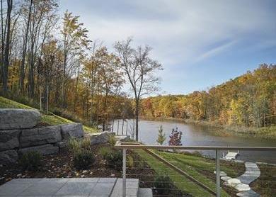
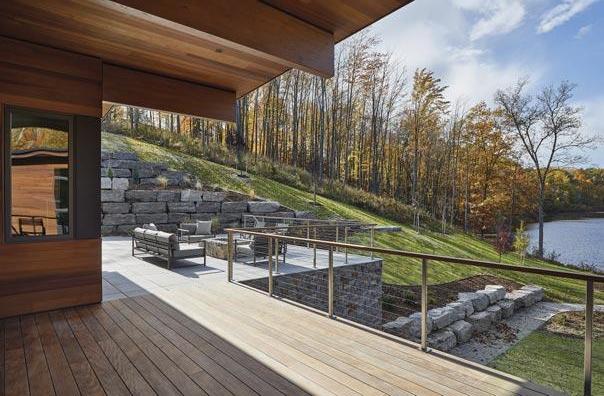
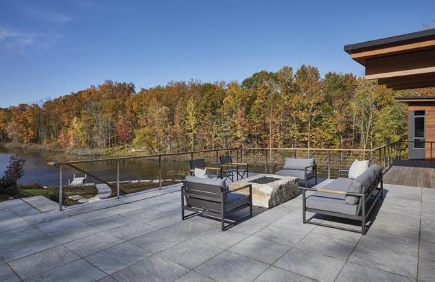
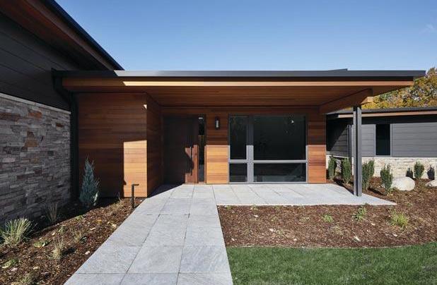
The outdoor living areas are an example of Lucid Architecture’s “layers of exposure” design strategy for Michigan living. The outdoor fire pit offers full exposure to an open sky; and in less inclement seasons of spring and fall, or for shade from the full summer sun, the big cantilevered roof creates a covered outdoor living area unencumbered by supports.

“Lucid” means expressed clearly or suffused with light, both perfectly descriptive of the architectural language spoken by Eric’s high-performance residential specialists. The homeowner fit Lucid Architecture’s unique profile: a client trusting enough to take architectural risks fully welcoming work as intentional and functional as it is beautiful and provoking.
The homeowner did his research and selected Via Design, Inc. for their skill and expertise in executing interior design details that cohesively integrate with exterior architecture.
MODERN DESiGN SOLVES PROBLEMS iN A SiMPLE AND ELEGANT WAY Emily VanderLaan, project manager/interior designer, and Matt Maher, product designer, complemented the team without a ripple and spearheaded so many of the home’s striking focal points.
Having an architect who can walk you through the design process from a blank sheet of paper to a finished project is invaluable. “Architects are responsible for more than just the exterior look,” explained Eric. “We work to ensure that the project is melding with the site perfectly, exceeding the client’s needs, is a high performance structure, all while making sure there are incredible moments and experiences within.
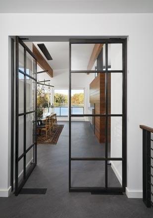
Edgy and minimalist, Crittall-style doors offer a sturdy, slim-profile way to cleverly partition open areas, without compromising on light or space. A charred poplar wood finish surrounds the ovens and refrigerator offering an almost metallic look that nicely complements the tile floor and walnut cabinets.
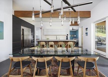
A custom-designed chandelier over the dining table utilizes handcrafted Hubberton Forge Lighting — an artistic complement to the sleek space.

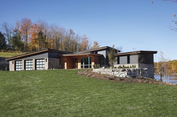
“On this project we balanced all of the inputs for an advantageous site orientation considering the driveway approach, roads, topography, privacy, and water views, all while factoring in the sun’s path to maximize solar panels exposure.
“Our client was concerned with the environmental aspects of his home, and that is something we are sensitive to on all of our projects,” continued Eric. “We like to use environmental design strategies that don’t cost the client anything to implement or maintain. It doesn’t increase costs at all to capture proper site orientation to the sun, utilize natural ventilation and breezes, or be strategic with the size of overhangs to provide shading.”
Due to the solar panels, the home needed a metal roof and that required Mark and his metal fabricator to engineer a custom, hidden gutter profile while keeping the solar panels parallel to the very low pitch roof for aesthetic reasons; just two examples of his ability to meet this project’s unique design challenges.
A GREAT TEAM WORKS iN CONCERT Via Design carried the exterior cedar wall into the home to seamlessly integrate the inside with the home’s exterior elements. Immediately, you appreciate the design team’s execution in home placement neatly capturing the lake view.
Edgy and minimalist, Crittall-style doors offer a sturdy, slim-profile way to cleverly partition open areas, without compromising on light or space. The homeowner wanted to be able to close off the lower level from the upper which would separate the foyer from the main living space.
Via Design imagined doors that hinge and rotate out resolving that function while adding visually to the space and used Elemental Artistry LLC, a Grand Rapids-based metal fabricator,to create the striking custom metal and glass door. Despite their on-trend, industrial appearance, Crittall made its first appearance in 1860 when Francis Henry Crittall, an ironmonger in Essex, used this method to create steel-framed windows.
“We work to eliminate extraneous detail providing very simple, elegant forms with a little bit of magic mixed in like this home’s large roof cantilevers.” – Eric De Witt, Lucid Architecture
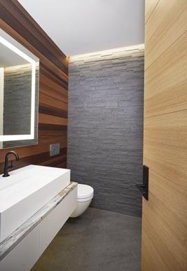
The powder room abuts the front entry so Via Design ran the same exterior cedar wall into the bathroom. The back wall tile is a version of the floor tile in a stacked format. “We were careful,” noted Emily. “We wanted to keep it simple while celebrating the natural materials.”
Similar to the fireplace, the kitchen island features walnut and a raised concrete bar top supported by a metal work piece.

Via Design’s detailed drawings of the cabinets came to life in the kitchen, laundry room, and powder room. The attention to detailing is reflected in the perfect veneer match-up and joinery. Integrated hardware from Progressive Hardware honored the craftsmanship allowing form to follow function.
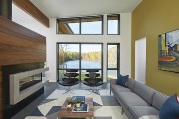
The centerpiece of the open floor plan is the fireplace that divides the main floor into separate zones. Essentially a big cantilever, the structure is supported with steel beams in the floor. Constructed of beautiful walnut, metal and visually seamless concrete, it is an impressive focal point.
A speaker system frames the TV surrounded by rift cut oak cabinets in the lower level family room. The stacked stone wall echoes the exterior architecture. Streamlined and free of bulkheads, this level has turned floor trusses to hide the HVAC in the floor system.
The powder room abuts the front entry and features the same cedar wall as the exterior. The back wall tile is a version of the floor tile in a stacked format. The space is simple and highlights natural materials. The walnut tread floating stairway, located off the entry, was an engineering feat as it is supported by individual metal plates 12 inches apart.

Rather than order expensive custom doors, Mark found rift cut white oak doors and his talented staff carpenters created horizontal cuts for a distinctive modern detail. Mark added, “One other thing that sets Raymar apart is that our carpenters are involved from start to finish. They get to know our clients and are very motivated and invested to do things right.”
The walnut tread floating stairway, located off the entry, was quite an engineering feat. Usually supported by a solid metal tube — or stringer — running through the center, the homeowner preferred individual metal plates 12 inches apart. It took a collaborative effort from the entire team, but the end result reveals the skill and dedication of all involved.
The centerpiece of the open floor plan is the fireplace that divides the area into separate zones. Essentially a big cantilever, it took Mark’s engineering to support the structure with steel beams in the floor. Matt’s design specs really made it the focal point. He dictated everything from the walnut species, to the reveals between the boards, the metal fabrication, and the concrete’s appearance. “Matt didn’t want any joints in that concrete surround so we built that shape out of two pieces with additional work done on site to make the seams disappear,” explained Mark. Mark’s carpenters executed the architectural millwork details and cabinetry that house the homeowner’s world-class audio system.



Guided by the homeowner’s knowledge, Raymar Homes isolated part of the floor from the rest of the house to limit unwanted vibration and several walls were treated with a soundabsorbing rubber membrane behind the drywall. A tile floor was used throughout the main floor because it doesn’t absorb any sound. Emily did quite a bit of research on that particular selection, and suggested 48- by 48-inch porcelain floor tiles; the oversized scale is a new trend emerging in tile. Matt worked on an exact layout of how the tiles should line up in the house aligning them with the front door. Mark’s tile setter was initially concerned having never worked with the product and specified when it should be installed to avoid having to cut around tight spaces.
“It was a good team effort and we each did our best at what we do best!” – Emily VanderLaan, Via Design
Underfoot is a horizontal loop or geothermal system with radiant distribution on both floors. Also in line with the homeowner’s desire for energy efficiency, the 20 kilowatt solar array roof system creates an amazingly efficient home. In keeping with the minimalist design, oversized windows eschew any fussy window treatments in favor of integrated, motorized window screens for privacy. Similar to the exterior elements, this lets the eye travel outside to take in the views.
The best team works in true collaboration and all worked hard to honor the architect’s design. Eric handled the architecture and drafted the interior; Emily and Matt fleshed out the cabinetry, millwork, interior finishes, and custom interior elements; and Mark’s team brought it to reality. No one had an ego at stake, and everyone was respectful of the expertise each brought to the project. “Lucid Architecture has a tight vision of how they design their homes, and we wanted to be sensitive to that to make sure that vision was cohesive through to the interior design,” added Matt.
Located through an office space and rotated so it feels like a separate wing of the main floor, the owner’s suite offers sweeping water views and was treated with the visual warmth of bamboo wood flooring. The owner’s en suite bathroom provides a spa-like oasis. The Kohler rain overhead panel in the shower enclosed by Glass Concepts creates everything from a gentle summer rain to an invigorating deluge.
12865 Poplar Grant, MI 49327 231.834.9576

ELECTRICAL SERVICE
Place your trust in 35 years of solid experience in residential and commercial electrical services. You can rely on our 24/7 emergency support.
GENERATORS
Get emergency power systems that can support your entire home or business effortlessly. Call the professionals at ENS Electric Inc. for a FREE estimate.
LANDSCAPE LIGHTING
Create a beautiful living space in your backyard with our lighting. Enjoy your landscape being lit up 24/7. Trust in a locally owned and operated company based in West Olive.

Many of the same natural elements were continued into the adjoining kitchen. Similar to the fireplace, the island features walnut and a raised concrete bar supported by a metal work piece also fabricated by Elemental Artistry. The island has a cooktop so the chef can interact with guests while preparing meals with a down vent nestled in the concrete slab for subtle ventilation.
Via Design’s detailed drawings of the cabinets in the kitchen, laundry room, and powder room were executed beautifully. The homeowner appreciated the attention to detailing reflected in the perfect veneer match-up and joinery. Integrated hardware honored the craftsmanship allowing form to follow function.
A charred poplar wood finish surrounds the ovens and refrigerator offering an almost metallic look that nicely complements the tile floor and walnut cabinets. “We wanted it to look rich and real, while keeping it modern, fresh and clean,” noted Emily. “That's why we also chose white upper cabinets for a minimalist feel.”

1140 Jackson Ave. • suite B • Grand Haven, MI 49417
“There’s nothing else you buy that has as much emotion as your home, but that’s also the beauty of being part of the process to create this for people; it wouldn’t be as rewarding if it wasn’t.” – Mark Pung, Raymar Homes
616.607.7373 www.pro-hardware.com
Home Never Felt so Good!
An oversized pantry off the kitchen serves as a functional prep area. Housing appliances and plenty of storage, this keeps the main kitchen space uncluttered and streamlined.
The homeowner was open to artistic lighting and since the ceilings were tricky to hang lighting from, Emily and Matt designed customized chandeliers over both the dining room table and the stairway using handcrafted Hubberton Forge Lighting. Hubberton Forge are modern American blacksmiths operating one of the country’s oldest commercial forges. They shared this project’s sensibilities with their respect for high-quality craftsmanship and an innate sense of form and function.
Emily had suggested the custom circular design of the Hubberton Forge stairway piece because it evokes bicycles and the homeowner is an avid road biker.
The advantageous site orientation was achieved by consideration to the driveway approach, road, topog raphy, privacy, and water views, while factoring in the sun’s path to maximize solar panels.
616.988.2115


Located through an office space and rotated so it feels like a separate wing of the main floor, the owner’s suite offers sweeping water views and was treated with the visual warmth of bamboo wood flooring. The owner’s en suite bathroom provides a spa-like oasis. Being an outdoorsy guy, the homeowner appreciated the oversized Kohler rain overhead panel that creates everything from a gentle summer rain to an invigorating deluge. The pebble shower floor has a trench drain and zero-step entry doors giving the space an open, seamless appearance. The floating teak cabinetry was crafted by Mark’s talented carpenters.
Although the staircase originally had a solid wall leading downstairs, it was decided to remove the wall to allow for more light to flood the downstairs family room. Here, the speaker system frames the TV screen within the lighter rift cut oak cabinets. The stacked stone wall echoes the exterior architec- ture. To keep the downstairs streamlined and free of bulkheads, Mark turned the floor trusses to hide the HVAC in the floor system.
The outdoor living area is an example of Lucid Architecture’s “layers of exposure” design strategy for Michigan. There is an outdoor fire pit for full exposure to an open sky; and in less inclement sea- sons of spring and fall, or for shade from the full summer sun, the big cantilevered roof creates a covered outdoor living area unencumbered by supports. Lastly, a large sliding door opens up the inside of the house to the outdoors. Eric added, “So this is our design language when we think about designing our spaces from the inside through to the outside with layers or levels of exposure.
“Our agenda is always in last place; it’s really about what the client wants. We want happy clients who are as thrilled to be living in their houses as we are thrilled for having been able to work on the proj- ect. It’s a success when everyone — including the entire project team and the tradespeople — are still excited to see each other at the end of the proj- ect as they were at the beginning.” ❂
BUILDER Raymar Homes ARCHITECT Lucid Architecture INTERIOR DESIGN Via Design
CLOSET SYSTEMS ORG West Michigan COUNTERTOPS Top of the World Granite ELECTRICAL ENS Electric FINISH HARDWARE Progressive Hardware INSULATOR Northwind Insulating Systems INTERIOR TRIM & DOORS Elenbaas Hardwood LIGHTING Kendall Lighting Center METAL ROOF/GUTTERS Versatile Roofing System STONE VENEER PAVER INSTALLER Ophoff

cosmogr.com SUBSCRIBE TODAY: 1 Year ONLY $ 15
Home Grand Rapids COSMOPOLITAN
Home Grand Rapids COSMOPOLITAN
ACCORDION house The 2019 Cosmopolitan
HOME OF THE YEAR
a NEWVIEWpublica
vision ACCOMPLISHED
07
a NEWVIEWpublication
Since 1948
JENISON 616-669-3085


KALAMAZOO 269-343-7791
• Manufacturers of Quality Wood Mouldings •Distributors of Plywood, Doors & Stairway Systems •Family owned and operated for 3 generations


Granite Solid Surface Engineered Stone Fabrication and Installation

616.791.7444 Top of the World GRANITE, Inc.
Topoftheworldgranite.com
At Top of the World Granite we focus on quality and customer satisfaction. From the beginning to the very end we work to make your dream countertop come to life. Our showroom staff has extensive knowledge on color and countertop design. We pride ourselves on having stock granite and quartz colors at price points that are affordable and can connect with any design or style that meets your needs. Looking to do a small remodel? No problem! We have a large selection of unique granite and quartz remnant pieces. We fabricate granite, quartz, and solid surface materials; we do kitchens, bathrooms, bars, outdoor grills and fire place surrounds. You can customize your counters to fit your needs with sinks, edge profiles and finishes. Our state-of-the-art fabrication equipment cuts and polishes your countertops with top notch quality. Every job is complete with the quality and satisfaction we would want in our own homes.

Building Your Dreams With A Craftsman’s Touch New Construction • Renovation

616.291.2329 6464 Bauer Rd. Hudsonville, MI. mark@raymarhomes.com

cosmogr.com SUBSCRIBE TODAY: 1 Year ONLY $ 15
Home Grand Rapids COSMOPOLITAN
Home Grand Rapids COSMOPOLITAN
a NEWVIEWpublica
ACCORDION house The 2019 Cosmopolitan
HOME OF THE YEAR
vision ACCOMPLISHED
07
a NEWVIEWpublication


