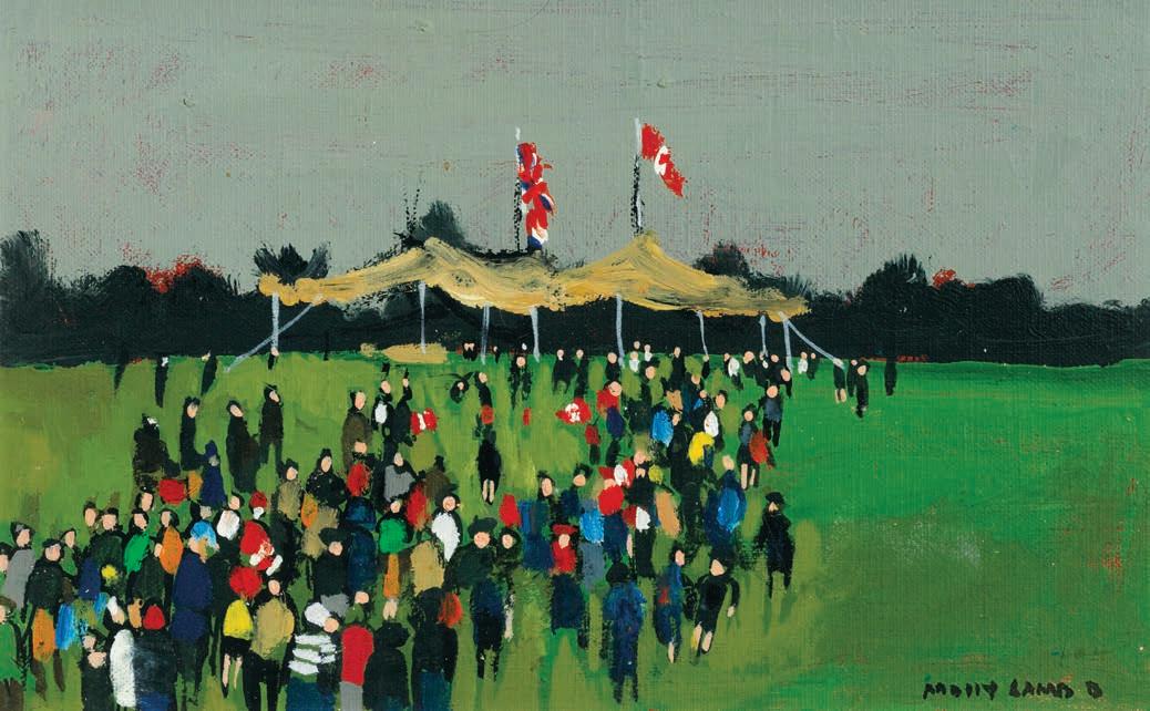
Fall 2024 Catalogue: Auction of Important Canadian & International Art
Auction of Important Canadian & International Art November 27th, 2024
Wednesday, November 27th at 7 pm EST
The Globe & Mail Centre
351 King Street East, 17th Floor, Toronto, Ontario
AUCTION OF IMPORTANT CANADIAN & INTERNATIONAL ART
PREVIEW EXHIBITIONS
Winnipeg
A selection of artworks will be on display.
Mayberry Fine Art
212 McDermot Avenue
October 17th to 19 th : 11:00 am - 5:00 pm
Calgary
A selection of artworks will be on display.
Norberg Hall
333b - 36 Avenue SE
November 7 th to 9 th : 11:00 am - 5:00 pm
Toronto
Cowley Abbott
326 Dundas Street West
November 15 th to 26 th
Monday to Friday: 9:00 am - 5:00 pm
Saturday and Sunday: 11:00 am - 5:00 pm
November 27 th : 9:00 am - noon
AUCTION PARTICIPATION
In‒Person Bidding
Please contact our offices to reserve your seat and to register for bidding.
Live Stream
A live stream of the auction will be available at CowleyAbbott.ca on November 27th .
Absentee & Telephone Bidding
Electronic submission of bids & printable bidding forms can also be found at CowleyAbbott.ca.
Online Bidding
Online bidding is available to our clients via Auction Mobility at live.CowleyAbbott.ca, allowing real‒time bidding via web browser or Apple/Google app.
Please note that purchases through the Auction Mobility online platform are subject to a 21% Buyer’s Premium.
With over a decade of exemplary service to the art market in Canada, Cowley Abbot contnues to exceed the expectatons of our clientele. Ofering aucton, private sale and appraisal services, the Cowley Abbot team has the experience, relatonships and reputaton to provide the highest level of assistance.
THE COWLEY ABBOTT TEAM
Lydia Abbot
Rob Cowley
Sydney Rodrigues
Eryn Brobyn
Katherine Meredith
Anna Holmes
Ryan Mayberry
Perry Tung
Catherine Lacroix
Peter Ohler
Nicole Plasket
Leah Carey
Julia De Kwant
Mathew Ohler
Patrick Staheli
Radek Costa-Sarnicki
Sierra Bailey
1
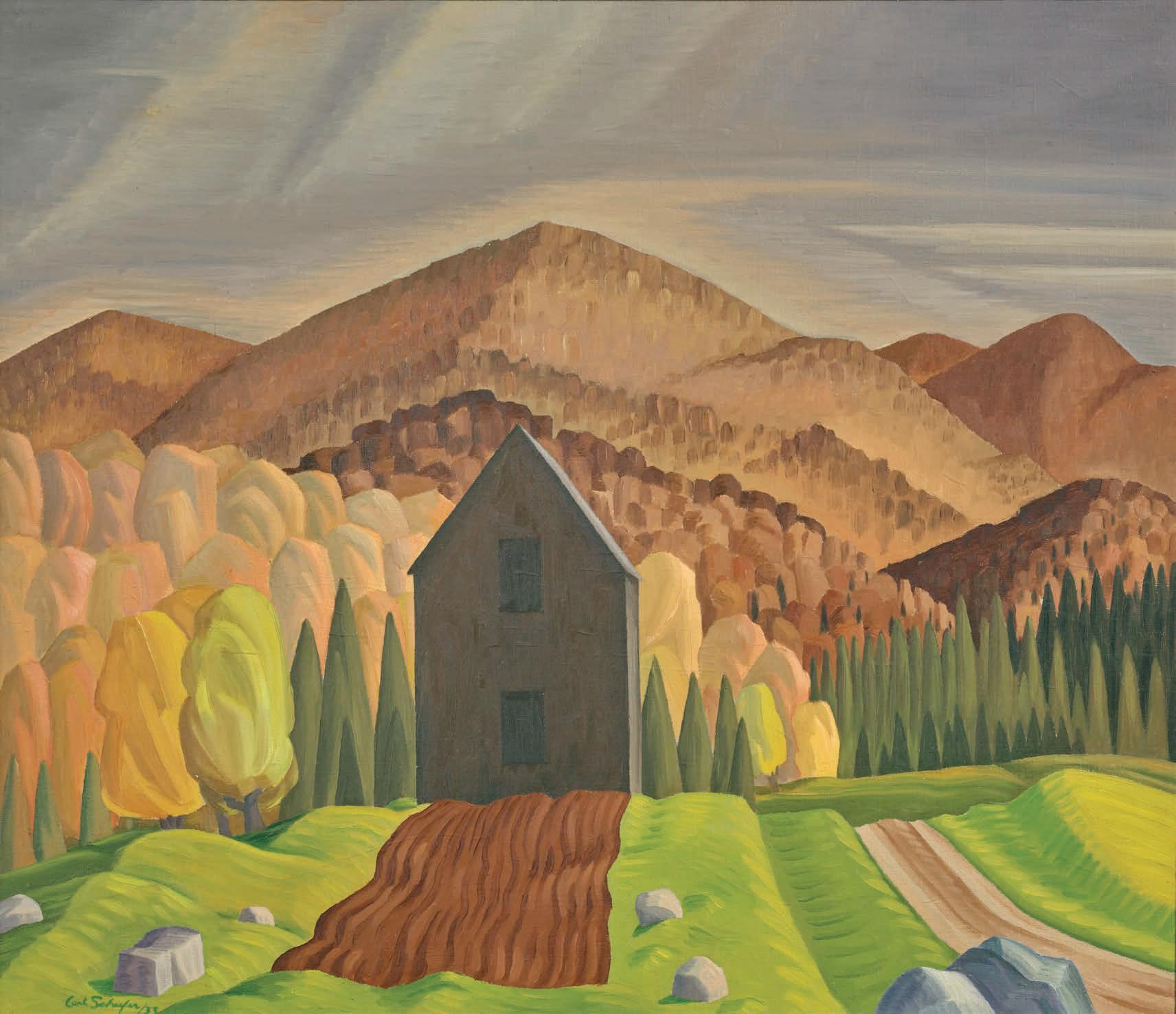
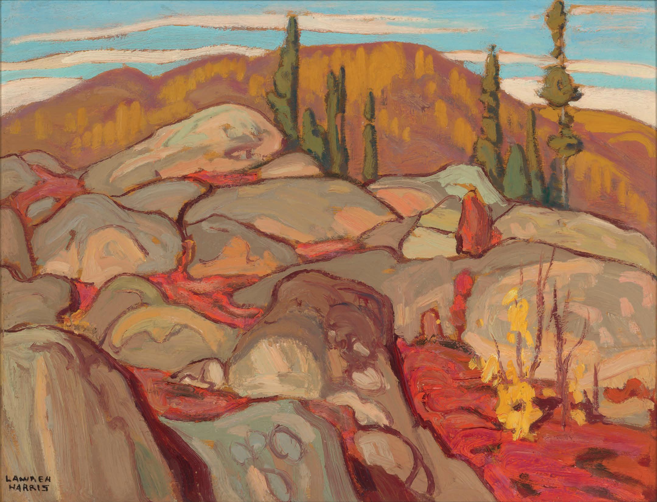
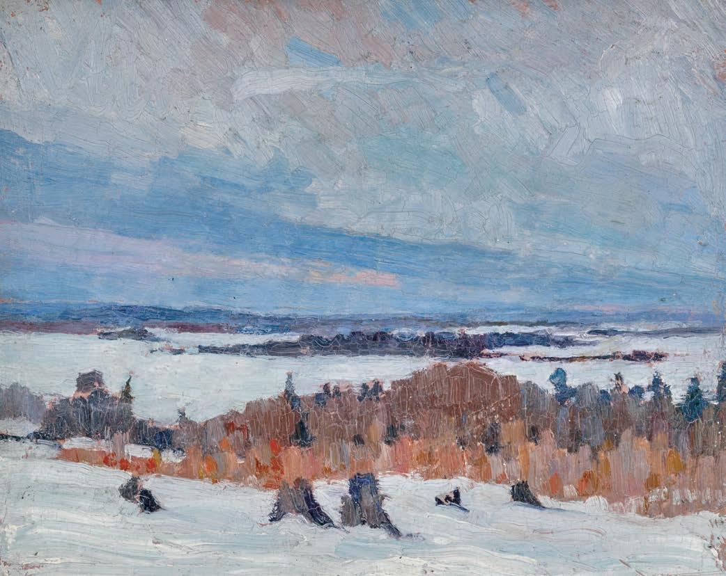
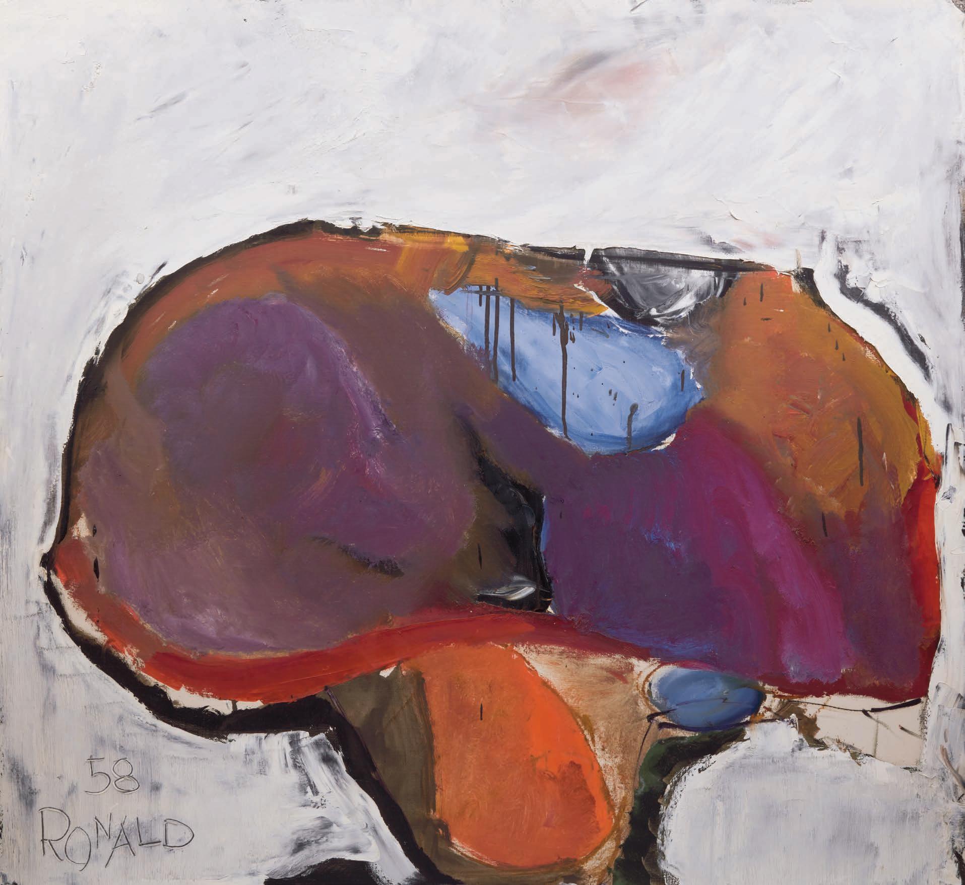
CARL FELLMAN SCHAEFER
Near Cranberry Lake, Haliburton (Hills, Haliburton), 1933 oil on canvas
signed and dated 1933 lower left; signed with artist's Toronto address with extensive inscriptions on the stretcher, including the original title, “Hills, Haliburton”
32.25 ins x 37.25 ins; 81.9 cms x 94.6 cms
PROVENANCE
Collection of the Artist
L. Bruce Pierce Collection (no. 234) Private Collection, Ontario
EXHIBITED
Exhibition of Canadian Group of Painters, Art Gallery of Toronto, November 1933, no. 113 as Hills, Haliburton
Carl Schaefer Retrospective Exhibition, 1926-1969, Sir George Williams University, Montreal; travelling to the Agnes Etherington Art Gallery, Queen’s University, Kingston; the Art Gallery of Hamilton; the London Public Library and Art Museum; the Art Gallery of Windsor, 30 November 1969-30 May 1970, no. 7
Permeable Border, Art of Canada and United States 1920-1940, Art Gallery of Ontario, Toronto, 28 October 1989-7 January 1990, no. 6, as Near Cranberry Lake, Haliburton
LITERATURE
Christine Boyanoski, Permeable Border, Art of Canada and the United States 1920-1940, Toronto, 1989, unpaginated, no. 6, reproduced
Carl Schaefer was forced by the Depression in the 1930s to re-establish himself and his family at Hanover, where he took up watercolour painting. A vigorous yet sensitive interpreter of rural southern Ontario scenery, he found the countryside around his birthplace particularly inspiring, especially during the lean years of the 1930s.
!e extensive notes found on the stretcher of this artwork provide a colourful history for the canvas. !e artist notes that he was an "invited contributor" to the Canadian Group of Painters " rst exhibition in 1933 at the Art Gallery of Toronto. Schaefer notes that the artwork's original title, Hills, Haliburton was used for this inaugural showing and he also inscribed his updated title, Near Cranberry Lake, Haliburton , indicating the added detail was implemented in October 1961.
$30,000–$50,000
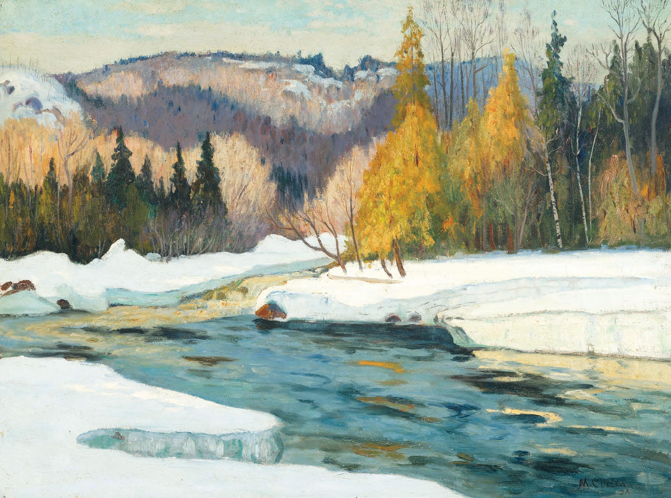
ALEXANDER YOUNG JACKSON
The Green House oil on panel signed lower right; titled on the reverse 8.5 ins x 10.5 ins; 21.6 cms x 26.7 cms
PROVENANCE
Loch Mayberry Fine Art, Winnipeg Private Collection, Manitoba He#el, auction, Toronto, 21 November 2018, lot 131 Mayberry Fine Art, Winnipeg Private Collection, Vancouver
A.Y. Jackson spent much of his career travelling throughout Quebec, visiting small villages along the north and south shores of the St. Lawrence River. !ese small, rural towns attracted Jackson and his companions because they retained the traditional way of life during a time when society was becoming increasingly modernized and
populous. Jackson created some of his most iconic works in these areas, capturing their charm and surrounding landscapes by painting directly on location. Sometimes he travelled alone, while other times he was accompanied by fellow artists. He often stayed with local families or in small hotels, where he was warmly welcomed by the predominantly Roman Catholic residents. Many of the locals spoke little English and had limited contact with the world beyond their close-knit communities.
! e Green House demonstrates Jackson’s strong sense of both colour and composition through its $uid, rhythmic lines of the snowy terrain, trees and hills, as well as the light green house and accents of aqua in the stream and sky. !e artist painted from an elevated vantage point, perched on a hill looking at the village below.
Recalling his many adventures in rural Quebec in his autobiography, A.Y. Jackson notes that, at the time, he had missed “only one season” in thirty years of painting in the region, caused by a teaching post at the Ontario College of Art.
$30,000–$40,000
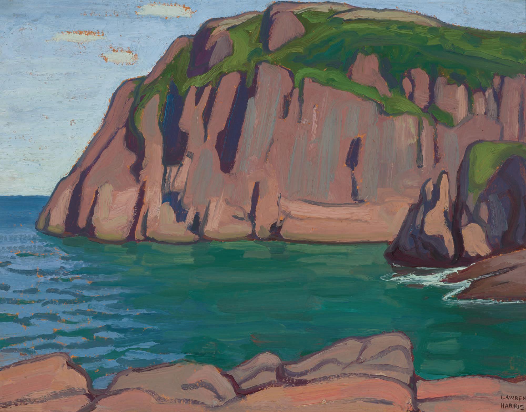
SIR FREDERICK GRANT BANTING
Inland Lake, Georgian Bay, 1932 oil on panel
signed lower right; signed twice, titled, dated "July 1932" and inscribed "To 'Hugh' In appreciation of his good services and many kindnesses" on the reverse; titled to the exhibition label on the reverse 8.5 ins x 10.5 ins; 21.6 cms x 26.7 cms
PROVENANCE
Gift of the Artist
Hugh M. Douglas
Private Collection, Toronto
EXHIBITED
Exhibition of Paintings by the Late Sir Frederick Banting, Hart House, University of Toronto, 13 February-1 March 1943 as Inland Lake
Our Visual Heritage, WKP Kennedy Gallery, North Bay, 3-26 August 2000
After winning the Nobel Prize in Physiology or Medicine in 1923, Sir Frederick Banting was able to devote time to his love of painting and over the years went on many sketching trips with A.Y. Jackson. He thoroughly enjoyed these outdoor painting experiences, including the visits to the Group of Seven haunt, Georgian Bay.
Painted in hues of orange, green, blue and gray, Frederick Banting’s Inland Lake, Georgian Bay depicts the beauty of rugged northern Ontario. !e normally rough waters of Georgian Bay appear calm and re$ective of the surrounding trees and landscape. !e orange-tinted sky assumes the beginning - or end - of the day. !e arched pine tree in the foreground combines with the smaller trees on the left to form almost a keyhole for the viewer to peer into the beauty of this natural landscape.
$15,000–$20,000
SIR FREDERICK GRANT BANTING
Homestead/Farm Landscape
double-sided oil on board
signed and dated indistinctly lower right; presented in a standing frame, to allow rotation
10.5 ins x 13.5 ins; 26.7 cms x 34.3 cms
PROVENANCE
Private Collection, Toronto
Known to many as the co-discoverer of insulin, Sir Frederick Banting’s artistic career, although lesser known, is equally notable. Upon his return to Canada after World War II he sought out Group of Seven artist A.Y. Jackson, also a war veteran, as he was interested in acquiring his work. Banting re" ned his practice under the tutelage of Jackson. !e artist looked to Jackson for guidance and advice to better develop what was " rst a pastime, into a career.
Banting was very familiar with farm life. !e youngest of six children, Banting grew up as part of a hard-working and prosperous farming family in the Alliston area, 60 kilometres north of Toronto. With bold swaths of paint, this double-sided oil encapsulates the artist's a % nity for tight compositions. Akin to Jackson's renderings of villages and landscapes, the importance of the daily lives of the inhabitants are equal to the natural landscape. Sleigh tracks, wisps of chimney smoke and " rewood piles all signal village life and labour integral to the development of rural villages and industry within Canada. Here, Banting paints this ideal subject - capturing the crisp autumn colours and mood of the changing seasons.
$20,000–$30,000
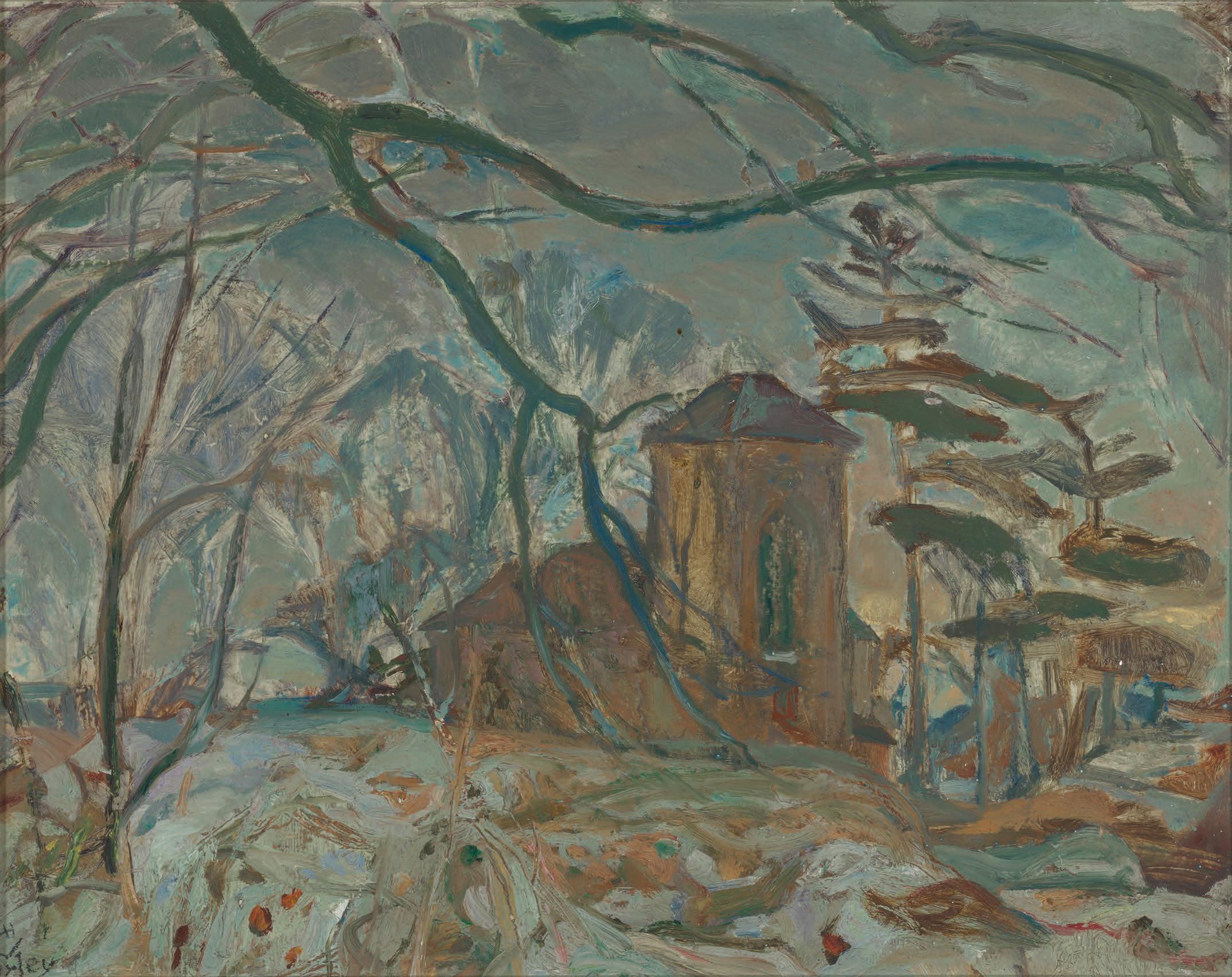
FREDERICK HORSMAN VARLEY
Winter Afternoon, Doon oil on board
signed lower left; Varley inventory stamp no. 1080 on the reverse 11.75 ins x 15 ins; 29.8 cms x 38.1 cms
PROVENANCE
Collection of the Artist
Acquired directly from the Artist by the present Private Collection, 1960s
Frederick Varley’s stylized landscapes underscore his skill in translating the essence of the subject through a warm and subtle palette. His personal use of colour became a trademark of his paintings and one that is still used by so many artists today, such was the lasting in $uence of his work. Here, the artist depicts a view of a church, seen through a screen of mostly bare trees. Taking into account the title of the work, the building can be identi "ed as the Doon Presbyterian Church, with its distinct large Gothic window in the tower. !e church opened in 1854 and still stands today in the Kitchener suburb of Doon.
As a teenager, the owner of this artwork provided " rewood to Frederick Varley during the 1960s, dropping o# the wood at the McKay family home. At the encouragement of his parents, the owner purchased Winter Afternoon, Doon from Varley, the painting hanging in his home for sixty years.
$15,000–$20,000
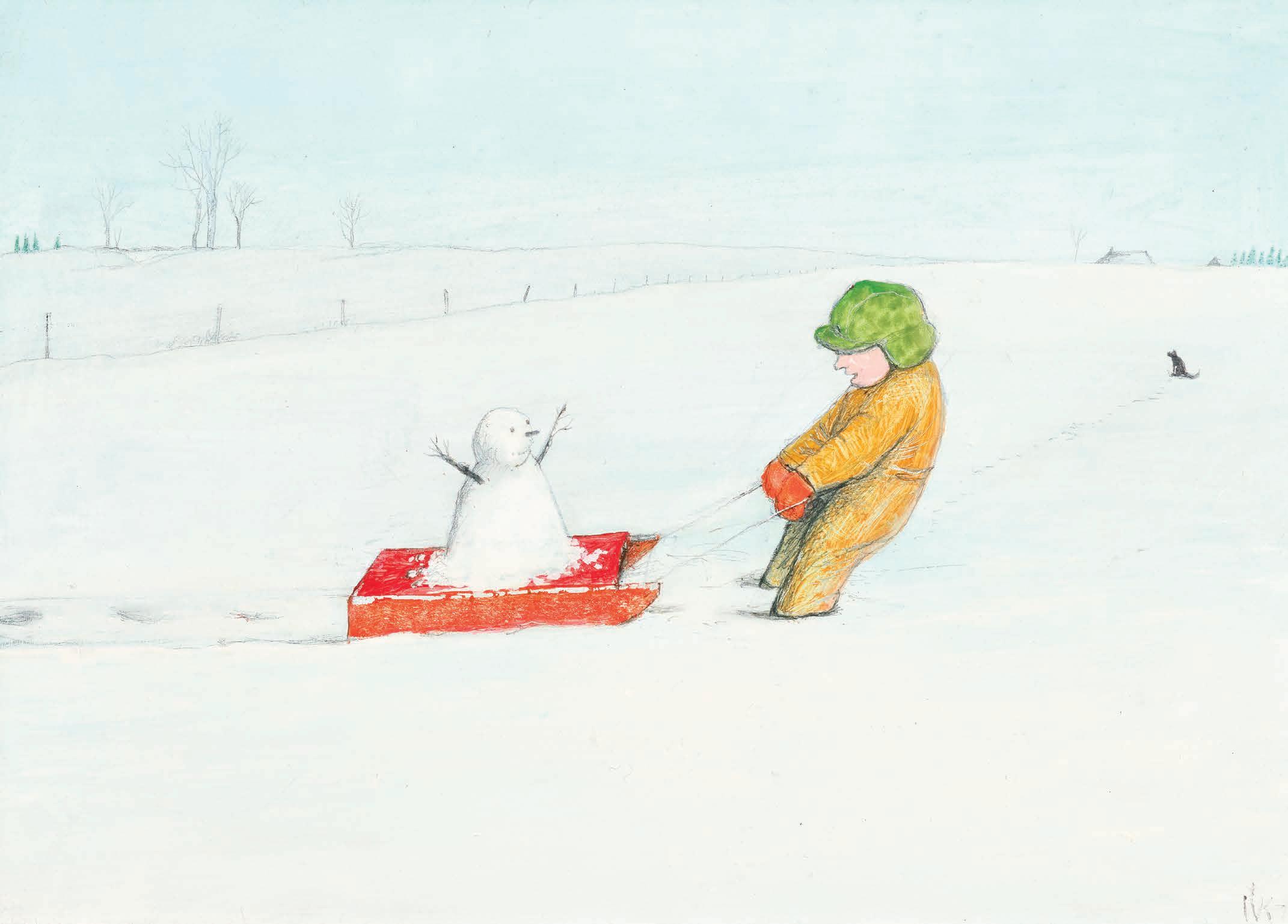
WILLIAM KURELEK
A Little Girl and Her Snowman, 1973 mixed media on board signed with monogram and dated 1973 lower right; inscribed " e painting expresses that endearing quality children have of investing inanimate things with life - even human life as you will note in the future when you have your own little ones. e child in the picture is addressing her little snow man once in a while as she pulls him along. - Bill Kurelek" on a wedding card a " xed to the reverse which is signed by the Kurelek family, "Bill, Jean, Barbara, Cathy, Steve, Tom" 9.5 ins x 13 ins; 24.1 cms x 33 cms
PROVENANCE
Wedding Gift of the Artist to the present Private Collection, 1973
LITERATURE
Wiliam Kurelek, A Prairie Boy’s Winter, Toronto, 1973, unpaginated
Born on a farm near Willingdon, Alberta in 1927, William Kurelek created paintings that explored the reality of farm life during the Depression. In the book, A Prairie Boy’s Winter by William Kurelek, the artist dedicates the book to “everyone who ever spent a winter on the prairies - and for all the others who wonder what it was like”.
Published in 1973, the same year he created A Little Girl and Her Snowman, Kurelek chronicles the advent of the " rst snowfall until the end of winter. Images depict children playing games in the snow and enjoying winter in the vast expanse of the prairie landscape.
Gifted by the artist to the owners for their wedding, Kurelek inscribed on the back of this painting his intent to express “that endearing quality children have of investing inanimate things with life”. A small child wrapped in a warm winter snowsuit pulls a snowman on a bright red sleigh in the snowy landscape. !e child and snowman are both smiling as they enjoy the bright, beautiful winter day.
$12,000–$15,000
7
MAURICE GALBRAITH CULLEN
River in Winter oil on canvas
signed lower right; Cullen inventory no. 1122 24 ins x 32 ins; 61 cms x 81.3 cms
PROVENANCE
Private Collection, Montreal
By descent to the present Private Collection, Toronto
LITERATURE
A.K. Prakash, Impressionism in Canada: A Journey of Rediscovery, Stuttgart, 2015, page 321
Having met during their respective studies in Paris, Canadian artists Maurice Cullen and James Wilson Morrice formed a close and collaborative friendship. Cullen had developed his skills painting in an Impressionist style, and was determined to introduce the new artistic idiom to a Canadian audience. When Morrice visited Canada in the 1890s, the two embarked on painting expeditions, travelling north to Quebec City and on to Beaupré. Cullen would repeat sketching trips up and down the St. Lawrence for years to come, gaining a deep familiarity with the scenic vistas of the Laurentians. Author A.K. Prakash observed, “He continually watched the ice and snow on the Laurentian rivers, noting the atmospheric e#ects at every hour of the day, during all weathers and in every changing season… !ey have an atmosphere of dreams and secret places that few other artists have been able to attain.”
River in Winter aptly demonstrates Cullen’s expert skill at capturing the subtle light and atmosphere of a crisp Quebec winter day. !e painting is luminous, with sunlight falling in patterns on the hills, trees, snow and river. Cullen taught private painting classes to artists such as A.Y. Jackson and Kathleen Moir Morris. Frequently, he brought his students with him on sketching trips. Cullen’s artistic in $uence proved crucial for a younger generation of Canadian artists.
$40,000–$60,000
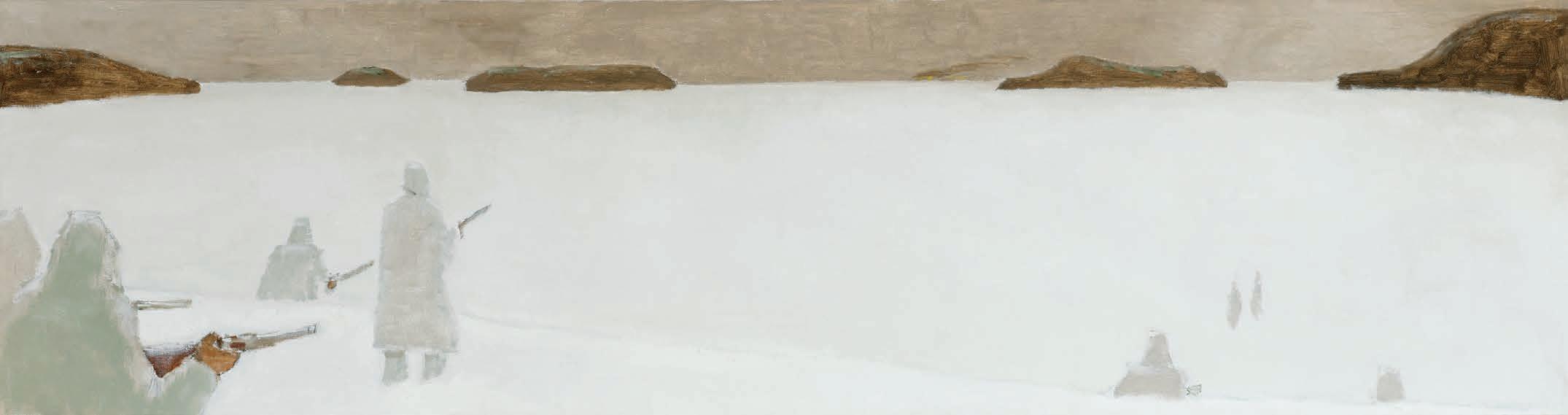
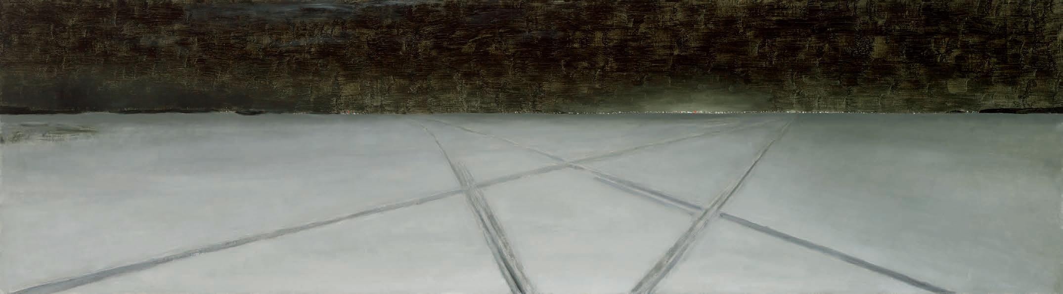
JEAN PAUL LEMIEUX
La chasse aux phoques, circa 1979-1980 oil on linen titled and dated circa 1979-1980 to the gallery labels on the reverse 21.75 ins x 81.75 ins; 55.2 cms x 207.6 cms
PROVENANCE
Mira Godard Gallery, Toronto Galerie Jean-Pierre Valentin, Montreal Private Collection, Montreal
LITERATURE
Jacques !ériault, "J.-P. Lemieux s’explique sur sa nostalgie," Le Devoir, Montreal, 18 September 1971, page 11 Michèle Grandbois, Jean Paul Lemieux: Life & Work [online publication], Art Canada Institute, Toronto, 2016, pages 54, 60, 63
A key " gure of Canadian modernity, Jean Paul Lemieux was an astute observer of the milieu in which he lived. His works are a re$ection patiently developed over more than seventy years of collective actions that stirred up the art world in this country. From the end of the 1920s to the artist’s death in 1990, the direction of his pictorial oeuvre was rooted in the free expression of his world vision, imbued with Nordic sensibility, melancholy and concern for the future of humanity.
Lemieux’s realm was the " gurative; therefore, he was detached from the immense wave of abstraction that rolled through North America in the 1940s and 1950s. During these decades and the years that followed, Lemieux remained faithful to the " gurative, viewing abstract art as the expression of a society in decline. From his perspective, the work of his contemporaries illustrated the stressed, mechanistic quality of the time they were living through and the frightening future it portended. “An anxious era will not produce tranquil art,” Lemieux stated. “Painting today is in transition. It is tormented, disturbed, and seeking, like contemporary humanity, new modes of expression.”
Lemieux carried his surrounding environment deeply within himself. “ !e world around me only interests me in as much as it allows me to paint my inner world,” he con "ded in 1971. Nearing his 70th birthday, the artist withdrew from modern life. Resisting the prevalent scientism, in which he saw a threat to the future of humankind, he drew much of his inspiration from memories of a bygone era in which Quebec traditions, customs, and popular and religious beliefs gave life and structure to his community.
Empty spaces and a bare horizon line crossing a plastic, $ at "eld were among the key features of Lemieux’s oeuvre, beginning during his classic period of the late 1950s. Michèle Grandbois elaborates, writing that “this puri "cation of imagery would develop further as the painter began to compose pictures using long diagonals, creating an unstable equilibrium. His deserted landscapes, most frequently staged in the winter, are charged with feelings of time passing, of death, of the human condition, and of the loneliness and smallness of human beings before the in " nite horizons of the vast landscapes of Canada.”
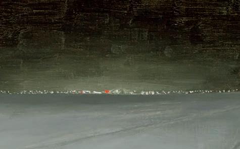
La chasse aux phoques presents Lemieux’s quintessential subject matter and panoramic format. Ri $es point toward an invisible prey hidden amid a blanket of freshly fallen snow. !e hooded hunters, their backs turned to the viewer, $ ank each side of the pictorial space, creating a kind of symmetry echoed by the barren islands in the distance. !e feeling of vastness re$ects Lemieux’s wonder and obsession with human nature and wilderness.
Up until the late 1950s, Lemieux had painted directly from nature and often outdoors. He then switched to working exclusively from inside his studio, without models, and using only daylight for illumination. !e artist declared: “I am painting … an interior world. I have stored up a lot of things.” He elaborated on his spontaneous approach that stemmed from his imagination, stating, “You are guided by the picture much more often than you guide it. And that can lead to results completely unlike what you may have intended or planned.”
$125,000–$175,000
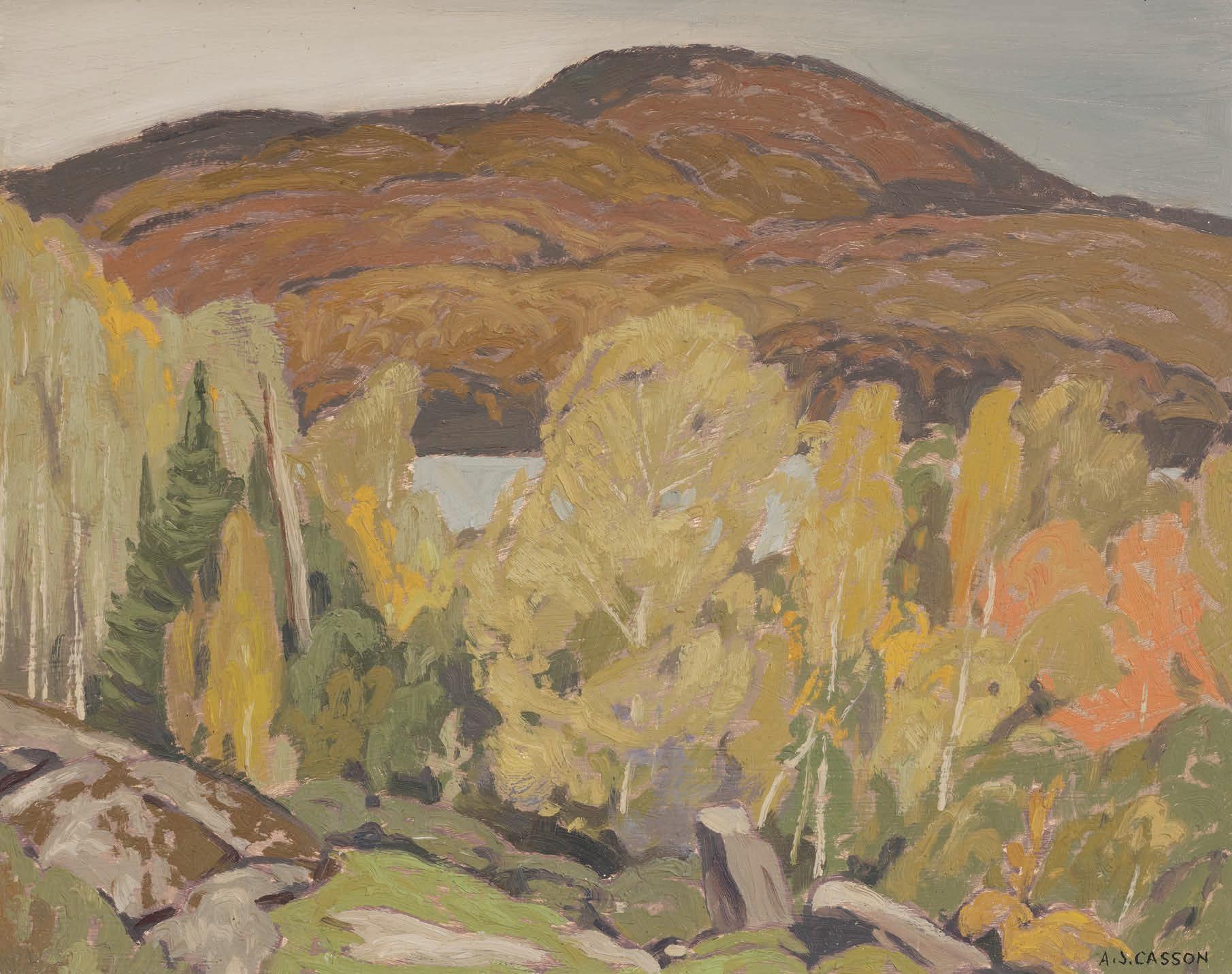
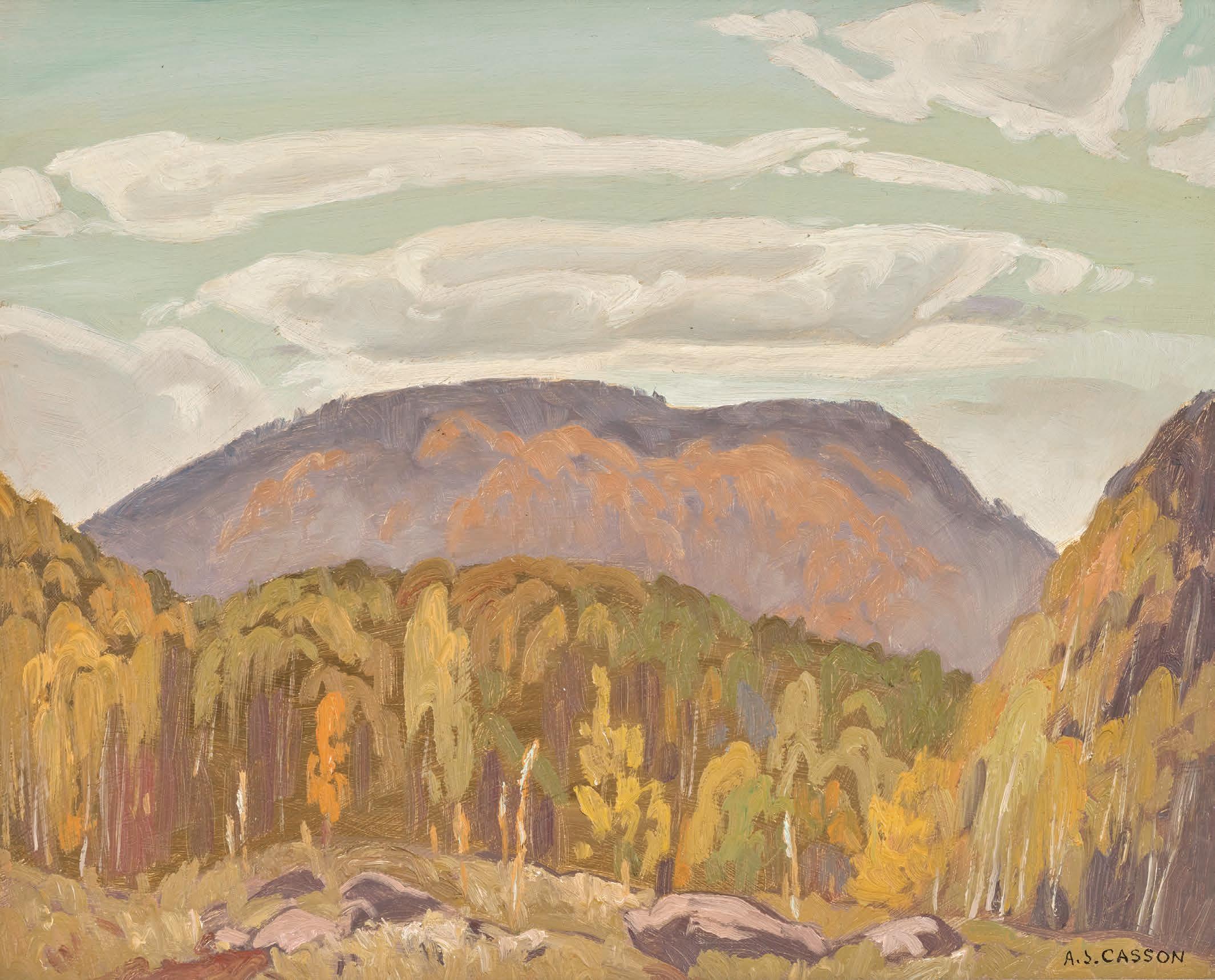
ALFRED JOSEPH CASSON
Log Barn, Haliburton, 1929 oil on board
signed lower right; signed and titled on the reverse; dated 1929 on two gallery labels on the reverse 9.5 ins x 11.5 ins; 24.1 cms x 29.2 cms
PROVENANCE
Roberts Gallery, Toronto Masters Gallery, Calgary Private Collection, Victoria
Log Barn, Haliburton was created at a point in A.J. Casson’s career when the primary subject of his paintings and larger canvases were drawn from the Lake Superior and Haliburton regions. Depicting a scene from rural Ontario, this work re$ects Casson’s interest in inserting uninhabited structures into landscapes, a choice that set him apart from his Group of Seven peers.
An abandoned log barn appears nestled among lush greenery, serving as an echo of the human life that once inhabited this space. Tracks lead the viewer to the empty building, conveying a sense of an occupation of the structure that has long since faded.
Beyond the subject of rural Ontario, Log Barn, Haliburton showcases Casson’s characteristic muted palette. !e subtle greens, earthy browns, and soft blues create an ambiance that draws viewers into the scene. ! is colour scheme enhances the tranquility of the landscape, while the interplay between the abandoned barn and the encroaching wilderness evokes a sense of melancholy for the remnants of human presence amidst nature’s persistence.
$25,000–$35,000
10
DAVID BROWN MILNE
Burch's Store, 1916
watercolour
titled on a label on the reverse; catalogue raisonné no. 107.28 11 ins x 15 ins; 27.9 cms x 38.1 cms
PROVENANCE
Estate of the Artist, 1996 Mira Godard Gallery, Toronto Private Collection, Toronto
EXHIBITED
Centenary Exhibition , Mira Godard Gallery, Toronto, 1982, no. 4 as Burche's Store
David Milne, Boston Corners, Mira Godard Gallery, Toronto, 1988, no. 11
LITERATURE
Paul Caul "eld, A Path of His Own: ! e Story of David B. Milne, " lm, 1979
David Milne Jr. and David P. Silcox, David B. Milne: Catalogue Raisonné of the Paintings, Volume 1: 1882-1928, Toronto, 1998, reproduced page 167, no. 107.28 as Burch's Store
! riving artistically yet struggling commercially, David Milne left New York City in May 1916, his home for the last thirteen years. Milne selected Boston Corners as his destination with careful deliberation, seeking out a location with ideal painting places but not too distant from the artistic community of New York. James Clarke, Milne’s close friend and patron, lived in Yonkers, which was also within reach by rail. With a population of less than a hundred, the village o#ered Milne little in the way of employment opportunities. Undeterred, Milne committed himself to painting with unwavering dedication. Re-invigorated creatively, Milne embarked on one of the most productive and experimental periods of his career.
Boston Corners was comprised of only a small number of buildings: a railway station, freight depot, church, school house, a few houses, and Charles Burch’s general store. Milne’s depiction of the store utilizes a dense composition which " lls the pictorial space, with areas of white paper rhythmically dispersed throughout. Omitting a clear horizon line, Milne bisects the picture with the bold horizontal of the railway, creating visual structure. Paint has been applied opaquely, eschewing the traditional watercolour technique of thin, layered washes. Milne has also experimented by radically limiting his palette only to sap green and black. Details such as the building’s outside stairway have been described with a few simple lines. Burch’s Store exempli "es Milne’s enthusiastic and experimental output of the period.
$20,000–$30,000
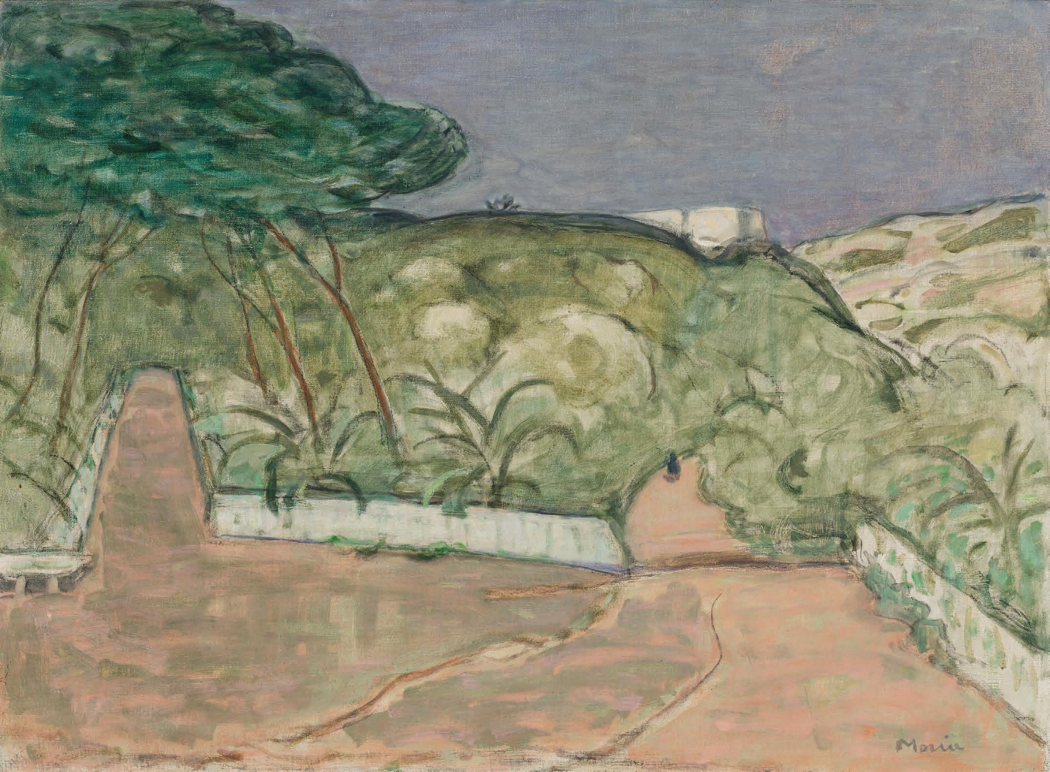
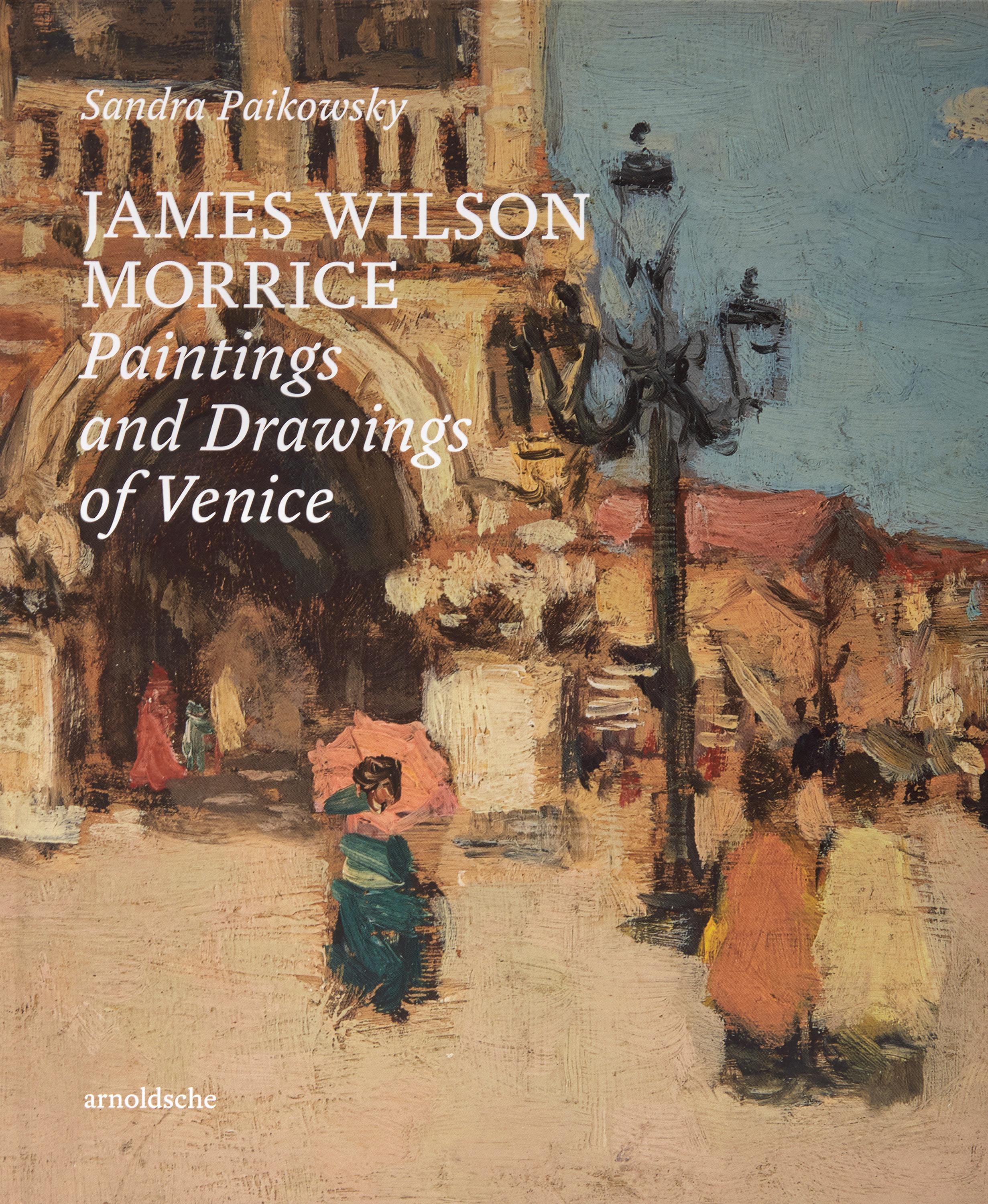
JAMES WILSON MORRICE
Venice Night, circa 1906
oil on canvas
signed lower right; titled "Moonlight, Venice" on a gallery label on the reverse
19.75 ins x 24 ins; 50.2 cms x 61 cms
PROVENANCE
Charles Pacquement, Paris, by 1910
Watson Galleries, Montreal, October 1924
Norman MacFarlane, Montreal, 4 November 1924
Watson Galleries, Montreal
Colonel and Mrs. G.M. Strong, Montreal, 15 February 1949
By descent to the present Private Collection, Toronto
EXHIBITED
Exposition de peintres et de sculpteurs sous la présidence d'A. Rodin (ancienne Société Nouvelle), Galerie Georges Petit, Paris, 9 March-4 April 1910, no. 102 as Venise. Nuit
Special Autumn Exhibition , Watson Galleries, Montreal, circa 10-20 October 1924 as Venetian Nocturne
Memorial Exhibition of Paintings by the Late James W. Morrice, R.C.A., Art Association of Montreal, 16 January-15 February 1925, no. 107 as Venice, Nocturne
James Wilson Morrice, Biennale Internazionale d'Arte di Venezia, Canadian Pavilion, Venice, 14 June-19 October 1958, no. 12 as Venezia di notte, circa 1908
LITERATURE
“Paintings to Suit All Tastes in Art”, ! e Gazette, Montreal, 16 October 1924, page 8
Sandra Paikowsky, James Wilson Morrice. Paintings and Drawings of Venice, Stuttgart, 2023, pages 109-111, reproduced page 110
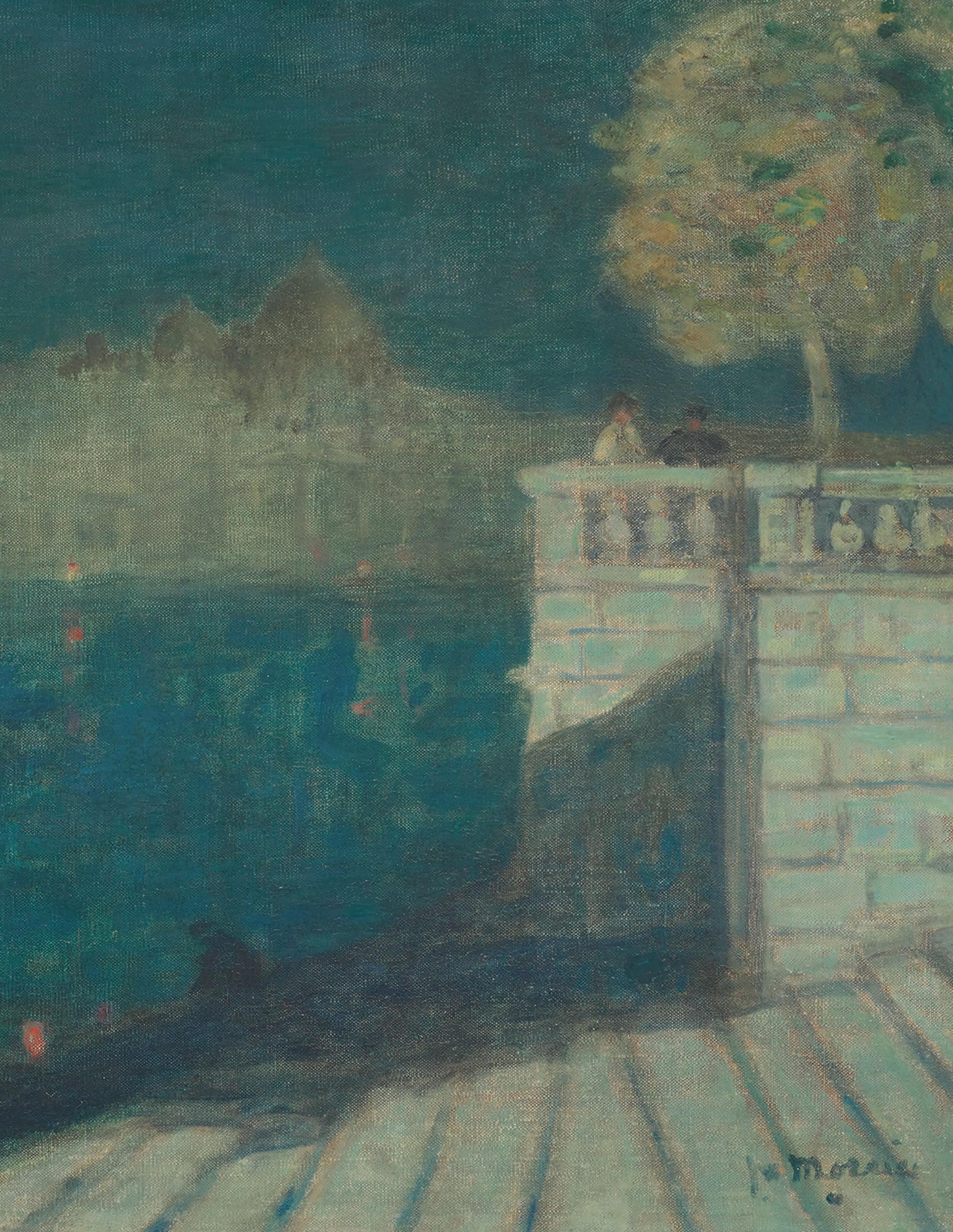
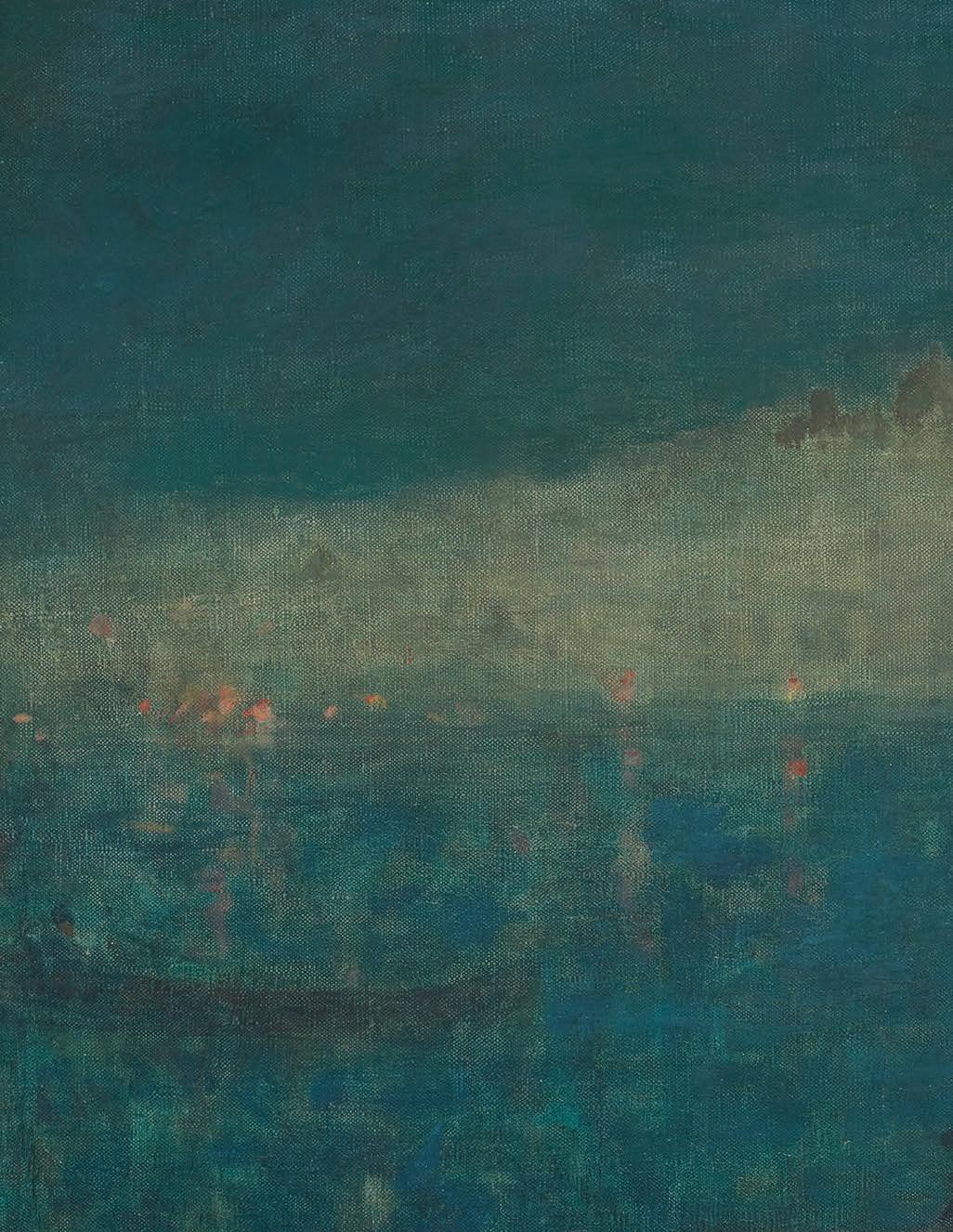
James Wilson Morrice visited Venice at least seven times between 1894 and 1907, often for weeks at a time. !e paintings of that period, from small pochades that he developed into substantial canvases, included views of the Grand Canal in evening. Venice Night is likely one of his later images of Venice and demonstrates Morrice's exceptional ability to combine an accurate representation of the city with tonal colour and light that evoke the sensual and haunting atmosphere of his Venetian night views.
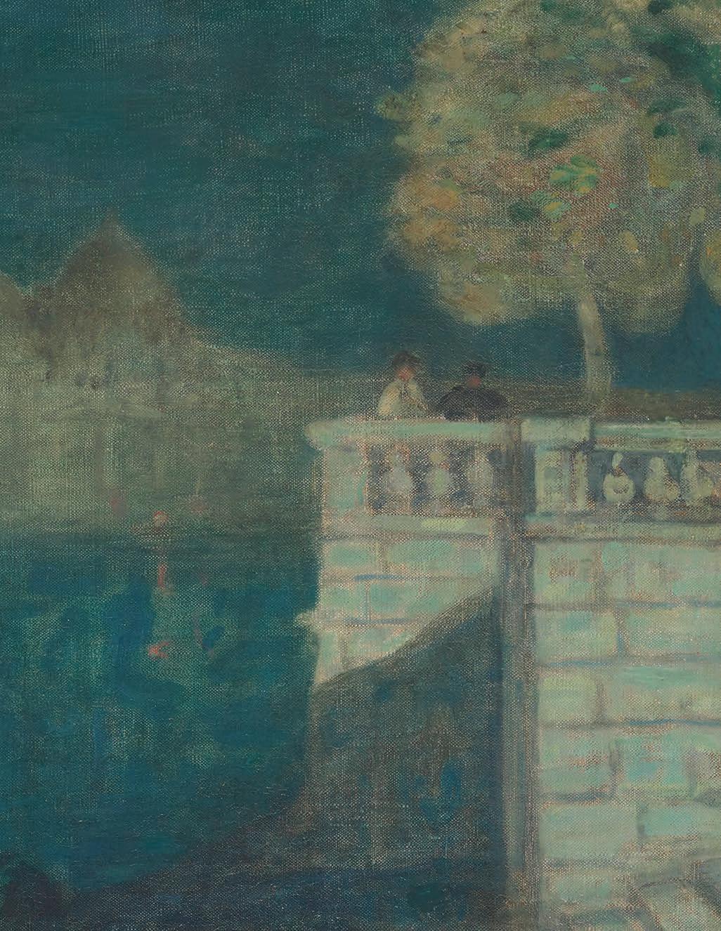
In this spectacular painting Venice Night, circa 1906, Morrice regards the scene from a low viewpoint and concentrates on the steps and railings along the edge of St. Mark's Basin (Bacino), with silent gondolas and a distant view of the Church of the Salute. !e attenuated water steps in Venice Night, the high stone wall, and the classical balustrade take up the right corner of the canvas, and with the Salute in the distance. !e Bacino is shown at low tide, which accounts for nearby boats waiting for customers to cruise the great waterway. Henrietta Perl, in her 1894 book Venezia , described similar scenes on the Grand Canal and Bacino at the end of day: "Everywhere in front of the broad $ ights of marble steps are to be seen the black gondolas, with their gilded prows."
Morrice painted a small oil panel, perhaps in preparation for Venice Night, depicting a similar view along the Grand Canal. Venice Night 's geometry, especially the parapet, is animated by the two onlookers who look in Morrice's direction, and the balloon-shaped tree that replicates the dome of the Salute Church. !e couple are likely popolani , Venetian citizens who are at home in the glorious setting without it distracting them from their conversation. !e height of the wall and extenuated steps of the canvas are almost the same design as the balustrade and parapet in Venice's Public Gardens. ! is suggests a di #erent setting from the Study for "Venice Night" . Instead, the panel closely resembles the Royal Gardens, near the foot of the Piazzetta San Marco at the western end of the Grand Canal where it becomes St. Mark's Basin. !e long curve of the Bacino ends at the Giardini Pubblici (to use its proper name.) In the canvas Venice Night, the marble structure near the Public Gardens becomes a belvedere rather than the railings of an urban park like the Royal Gardens. When the canvas was exhibited at
James Wilson Morrice
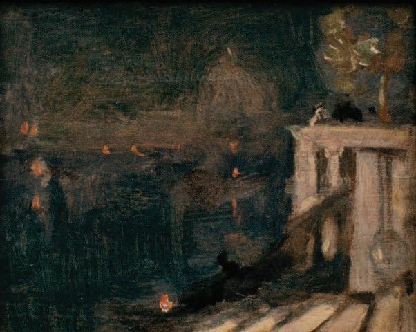
Study for “Venice Night”, circa 1906 oil on panel, 12.2 x 15.3 cms Collection of Pierre Lassonde Not for sale with this lot
the Venice Biennale in the Giardini Pubblici in 1958, it was dated circa 1908, suggesting it was among the last of Morrice’s Venetian images. Perhaps it is more accurate to consider the images of Venice Night as two independent pictures, with the panel inspiring the canvas rather than being its direct predecessor.
An extraordinary Baroque church from 1631, the Salute is shown in an accurate side view with its domes lined up in pro" le to balance the plane of the steps and balustrade. In the canvas, the church accurately appears more distant than in the panel, and Morrice has suggested it is now twilight. !e building and the surrounding structures hover over the Bacino like a mythical sea creature, and spread along St. Mark's Basin in a shimmering, diaphanous light rather than the black velvet of the panel painting. !e Salute divides the surface of Venice Night in half, with the sky a foil in scale and colour for the waters that surround the balustrade and steps. !e waterway is punctuated by gondolas and torch lights, with Morrice’s deliberate brushstrokes on the marble
balustrade and stairway almost mimicking the repeated motion of the gondoliers’ “pulling the water.” !e monumental canvas is " lled with plotted vignettes that create an almost collage-like image; at the same time, the range of colour is comparatively limited, and the spectrum of light to dark is relatively narrow, keeping everything in its carefully composed place, which was intrinsic to Venetian pictures by James Wilson Morrice.
We extend our thanks to Sandra Paikowsky, C.M., author of James Wilson Morrice. Paintings and Drawings of Venice (arnoldsche Art Publishers, 2023) for adapting the preceding essay from her book.
We extend our thanks to Lucie Dorais, Canadian art historian and author of J.W. Morrice (National Gallery of Canada, 1985), for her assistance in researching this artwork.
$400,000–$600,000
12
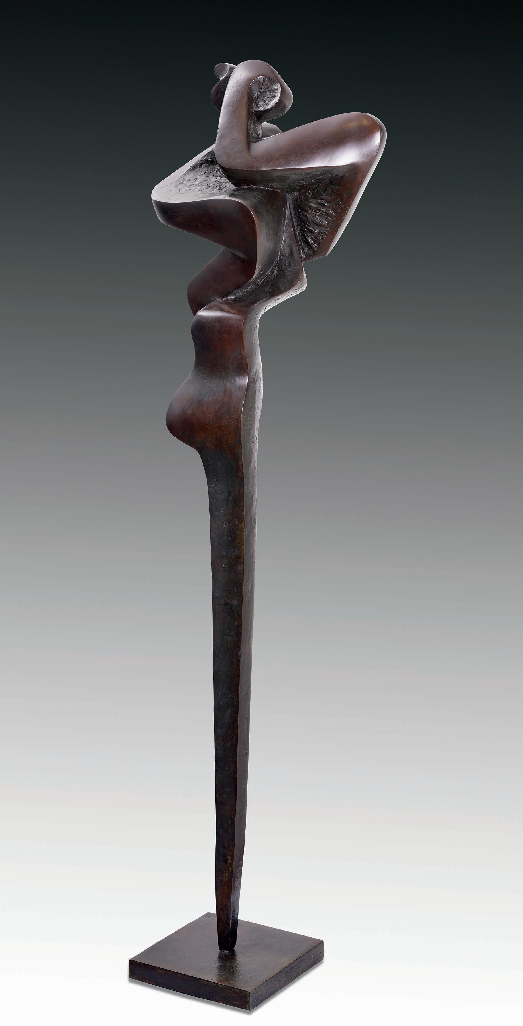
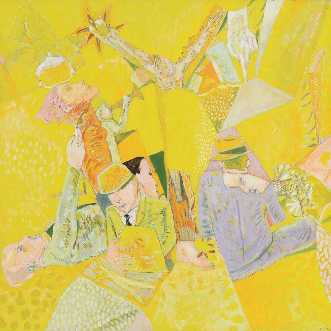
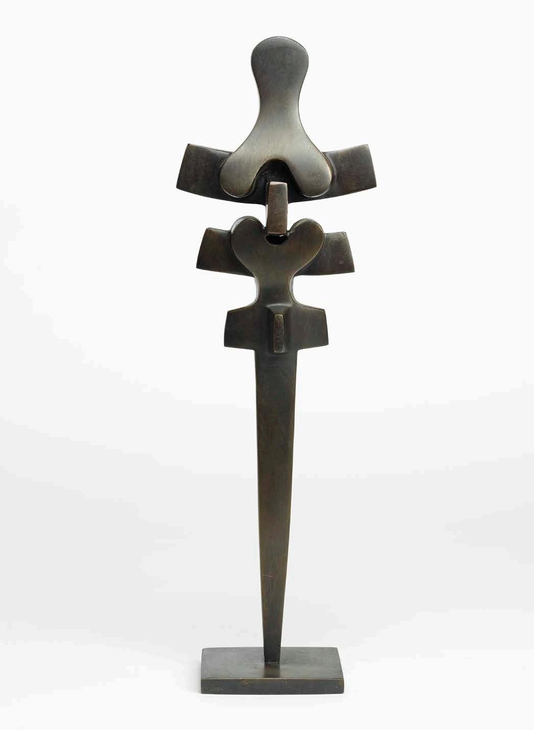
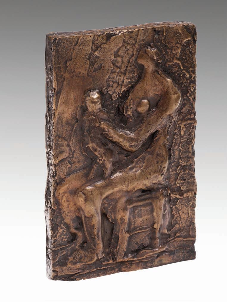
SOREL ETROG
Ritual Dancer, 1960-1962
bronze
stamped signature and numbered 3/7 on the base
57 ins x 15 ins x 9.5 ins; 144.78 cms x 38.1 x 24.1 cms
PROVENANCE
Private Collection, Toronto
LITERATURE
W. J. Withrow, Sorel Etrog: Sculpture, Verona, 1967, unpaginated, illustrated
While studying art at Tel Aviv’s Arts Institute for Painting and Sculpture in the 1950s, Sorel Etrog created three-dimensional paintings inspired by Cubist collage, modernist music and constructivist reliefs. In 1958, he received a scholarship to attend the Brooklyn Museum of Art School. Upon his arrival in New York City, Etrog was drawn to African and Oceanic art due to their expressive shapes and began incorporating these elements into his work. While trying to " nd gallery representation in New York City, Etrog befriended the prominent Jewish-Canadian art collector, Samuel J. Zacks. Zacks purchased one of Etrog’s paintings and invited him to spend the summer of 1959 on Lake Huron with him in Southampton. While on this sojourn, Etrog created his " rst sculptures, out of wood, plaster and later, bronze. Etrog was also becoming acquainted with the sculpture of Henry Moore, Barbara Hepworth and Constantin Brancusi–all artists whose works were collected by Sam Zacks. !e combination of these new sources of inspiration would in $uence Etrog’s work in the years to come.
Etrog’s " rst Canadian exhibition also took place in 1959, held on October 1st at Gallery Moos in Toronto. Gallery Moos gave Etrog a second exhibition in 1961, which caught the attention of the important American art collector Joseph Hirshhorn, who immediately purchased eight sculptures. ! is sale was unprecedented in the Canadian art world at the time and was newsworthy enough to be reported in all the major Toronto papers. Etrog’s work began to be recognized internationally as well, in part thanks to Zacks’s connections and unwavering support. In 1963, following Etrog’s " rst solo exhibition in New York, the Museum of Modern Art purchased Ritual Dancer. Other casts of the sculpture edition are in the collection of the Art Gallery of Ontario and the Musée d’art contemporain de Montréal.
$30,000–$50,000
13
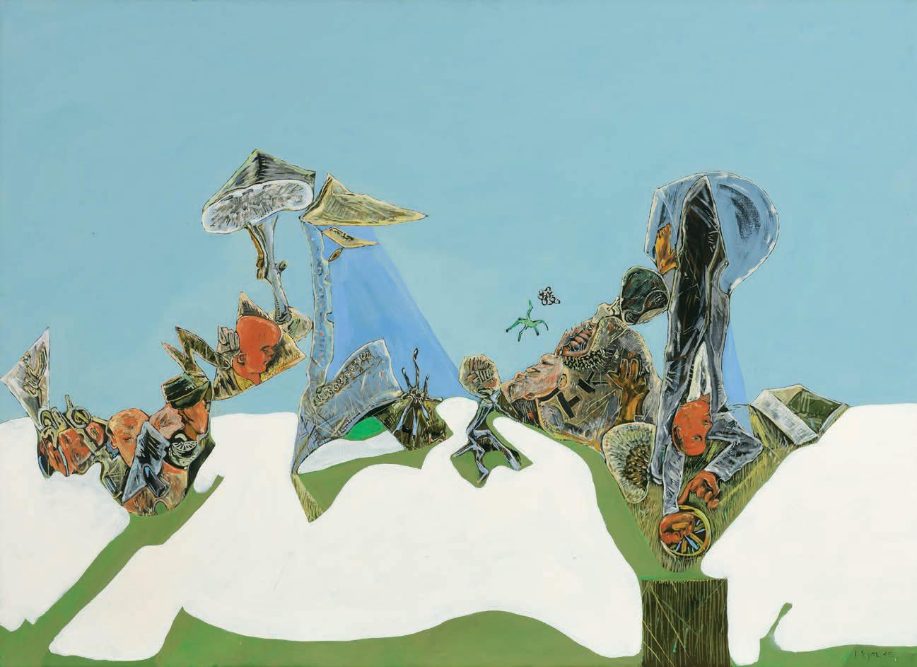
MICHAEL CRAIG-MARTIN
Hanging Up
mixed media
65 ins x 64.5 ins x 4.25 ins; 165.1 cms x 163.8 cms x 10.8 cms
PROVENANCE
Private Collection, Toronto
LITERATURE
Michael Craig-Martin, On Being an Artist, London, 2015, page 176
! is wall sculpture presents a monumental rotary dial phone, its shape outlined using thin iron bands, with bright red rectangular layers superimposed over it. !e densely clustered forms invade each other’s space, thus echoing M.C. Escher’s repetitive and interlocking patterns. As Michael Craig-Martin explains: “With the traditional telephone, it was clear what it was used for: there was a handle with a part you spoke into and a part you listened to. Its form was a picturing of the process involved, and you could understand how it worked. Nowadays, you can do practically anything with a phone… !e principal function is not expressed in the form.” ! rough this easily recognizable manufactured object, Craig-Martin o#ers a meditation on the transiency and inevitable obsolescence of modern technology.
$20,000–$30,000
14
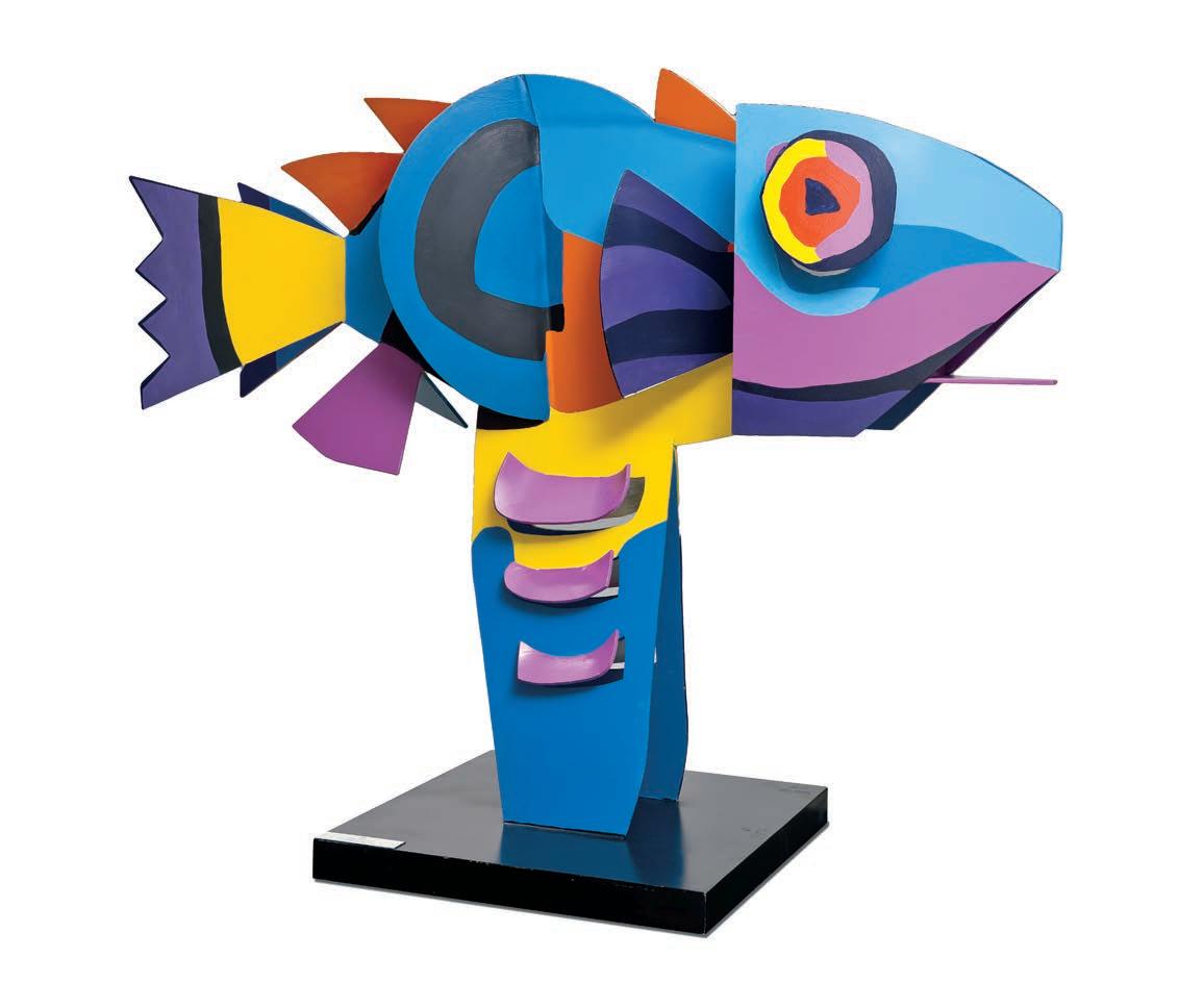
KAREL APPEL
Flying Fish, 1971 polychrome enameled aluminium stamped with the artist's name and dated "March 1971" on the base. Executed by Lippincott Company, North Haven, Connecticut 46 ins x 61 ins x 17 ins; 166.8 cms x 154.9 cms x 43.2 cms
PROVENANCE
Private Collection, Toronto
As one of the most illustrious Dutch artists of the twentieth century, Karel Appel is celebrated today for his vibrant, stylistic experimentation across a variety of mediums. His works are whimsical, created using a gestural application of paint, deriving from a combination of children’s art, primitive art and folk art. ! is sculpture represents a colourful "sh in shades of blue, purple, yellow, orange, and black. !e tones are repeated throughout the work, thus inviting viewers to trace all the di #erent planes of the interconnected aluminum sheets. Flying Fish captures the essence of the CoBrA group, whose art was characterized by intensely " gurative content drawn from the unconscious mind and expressed in radiant primary tones.
$12,000–$15,000
15
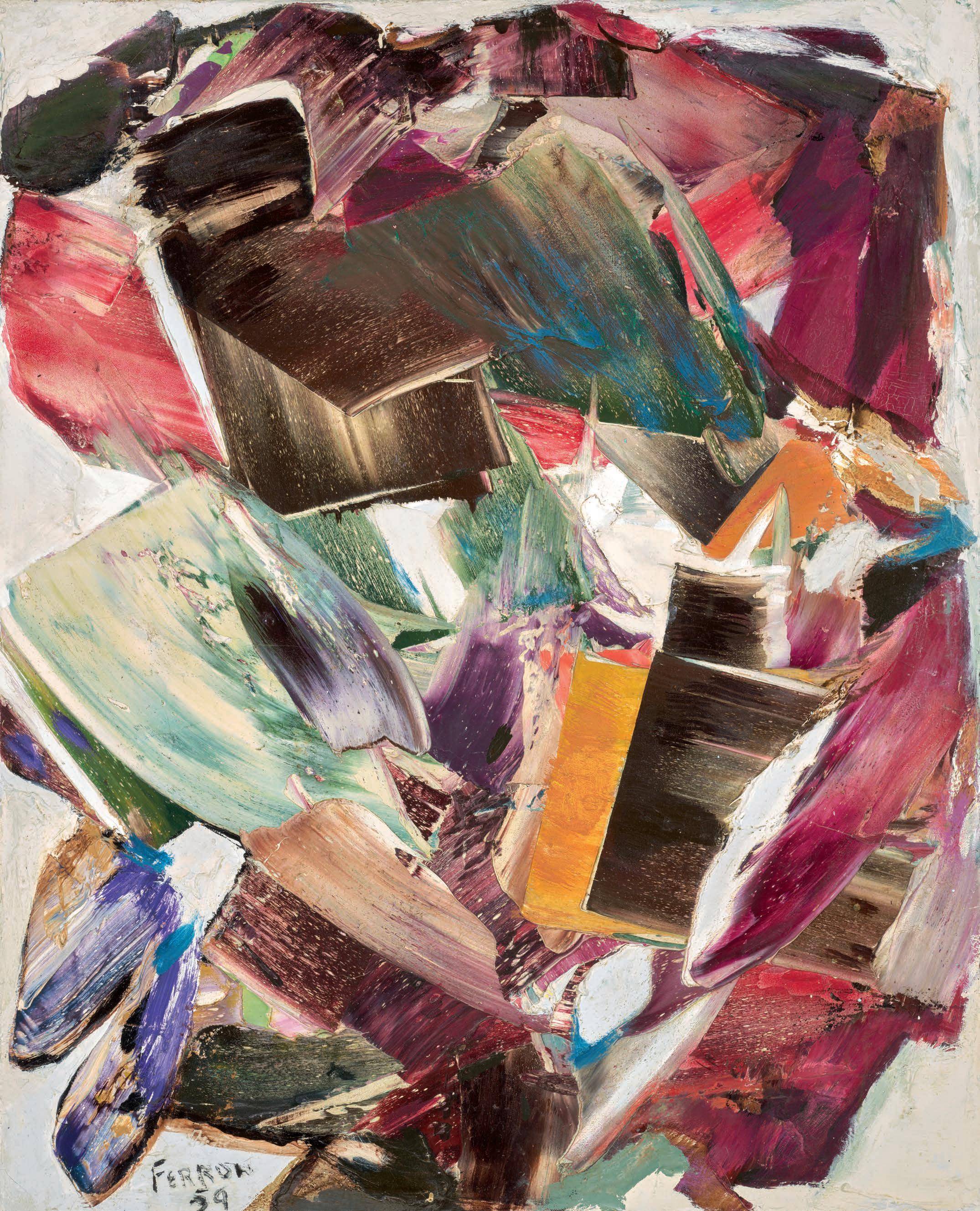
MARCELLE FERRON
Sans titre, 1959 oil on canvas
signed and dated 1959 lower left; signed on the reverse; titled on a gallery label on the reverse 39 ins x 32 ins; 99.1 cms x 81.3 cms
PROVENANCE
Masters Gallery, Calgary Mayberry Fine Art, Winnipeg Private Collection
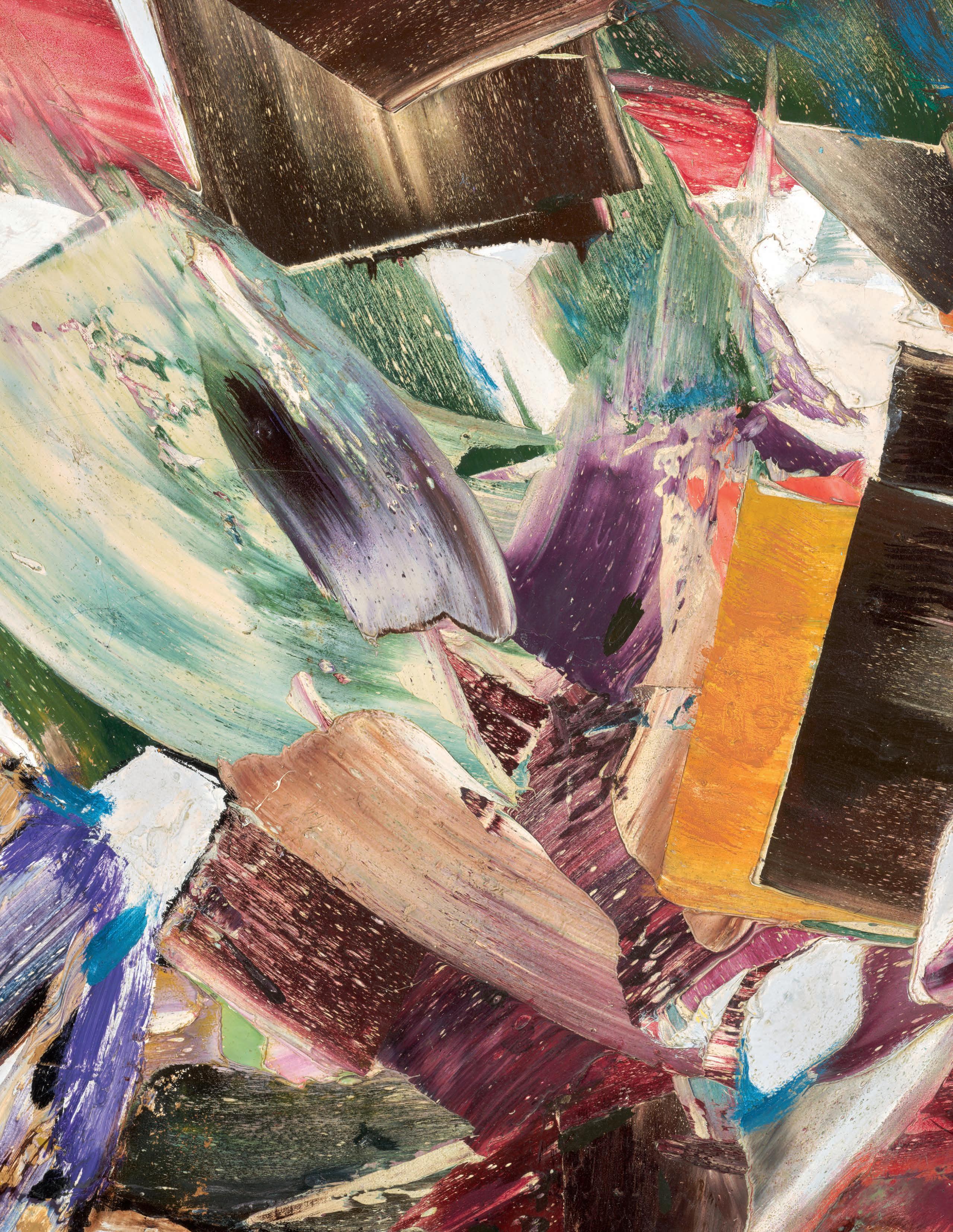
Bold textures, vibrant hues, and constant motion characterize this abstract by Marcelle Ferron, painted at the height of her creativity. Almost seventy years old, the painting’s freshness and visual appeal are a testament to the staying power of Ferron’s work and of the expressive form of abstraction that she practiced.
!e variety of hues, textures, and animated forms in this painting is truly special. While there are dominant emphases, no colour or shape commands the surface. Reds are prominent, for example, but a close look reveals that they are not the same reds across the painting, nor are they repetitive in shape or texture. Adding to the sense of $ux here, pigments are dragged through and into one another, some in a robust impasto manipulated with a palette knife, others with a delicate, almost transparent skein. In company with many prominent artists in Montréal in the 1940s, Ferron was mentored and directly in $uenced by perhaps the most signi "cant painter in Canada of this generation, Paul-Émile Borduas. She was an active member of Les Automatistes in Montréal from 1946 and signed the 1948 manifesto Refus global (“Total Refusal”) that Borduas initiated. We can see his signature in her use of heavily built-up whites in Sans titre. !ese areas suggest a perimeter for Ferron’s explosions of form and colour, but they are equal to one another and to the painting’s other forms in their texture, their physical presence. White is, therefore, not a background but rather a hue among others.
Refus global was a call to liberate artistic and cultural expression, both personally and in the province. Such changes often entailed a departure in more than artistic style. In 1953, Ferron moved to Paris, where she was active in a supportive community of expatriates, most notably Jean Paul Riopelle. Like him, she was favoured by the French avant-garde. Exhibiting in both France and Montreal from the mid-1950s on, Ferron returned to Québec in 1966.
While a painting cannot truly look forward in an artist’s trajectory, today it seems right to think about Ferron’s later mastery of stained glass when we see Sans titre. In France she had learned advanced stained-glass techniques from artist Michel Blum. In Montreal after her time in Europe, Ferron expanded her pictorial ideas into stained glass at Expo ’67’s International Trade Centre and in the spectacular roof of the Champ-de-Mars metro station (installed in 1968, the " rst non-" gurative art in the Montreal’s metro system was controversial amongst city o%cials at the time). She also designed the towering stained-glass Permanent Memorial for the Six Million Jewish Martyrs of the Nazi Holocaust for Concordia University in Montreal (1970). In 1983, she was the " rst woman to be awarded the prestigious Prix Paul-Émile-Borduas. Ferron became a Grand O %cer of the Ordre national du Québec in 2000. Accolades and awards notwithstanding, however, Ferron’s considerable legacy abides in her passionate yet delicate paintings and her ability to expand their appealing aesthetic into public art.
We extend our thanks to Mark A. Cheetham for contributing the preceding essay. Mark is the author of two books on abstract art: ! e Rhetoric of Purity: Essentialist ! eory and the Advent of Abstract Painting and Abstract Art Against Autonomy: Infection, Resistance, and Cure since the ‘60s. He is a professor of Art History at the University of Toronto and an independent curator and art writer.
$200,000–$300,000
16
JAMES WILSON MORRICE
Anvers (Antwerp)
oil on panel
inscribed "Anvers" lower right; inscribed "W. Scott & Sons/F. R. Heaton" and J.W. Morrice stamp on the reverse 6 ins x 4.75 ins; 15.2 cms x 12.1 cms
PROVENANCE
Estate of the Artist
W. Scott & Sons, Montreal (owned by F.R. Heaton) Marion and Alan O. Gibbons, Ottawa (acquired before 1977) He#el, auction, Vancouver, 23 May 2007, lot 165 Private Collection, Toronto
In this delicate oil sketch, the pigment is so lightly painted, it is almost evanescent. With only a few lines outlining the subject matter and a few patches of colour, we can only vaguely make out a church. !e location of Antwerp would not be discernible if Morrice had not written "Anvers" on the panel itself, which is something he did extremely rarely.
Antwerp’s cathedral was planned with two very tall spires on the facade overlooking River Scheldt; the left one was completed, but the right one was left truncated and covered by a small roof. From the placement of the spires, we can deduce that Morrice was looking at it from the side, standing near the Hotel de l’Europe, across the street from the Groenplaats / Place Verte. Perhaps he stayed at that hotel, which was "patronised by English and American travellers" (Baedeker, Belgium and Holland, 1905).
We know of only one trip by Morrice to Antwerp, documented in a sketchbook containing at least two drawings of the cathedral seen from across the river (one was later developed into a canvas); the inscription reading “11 July 1906” on another page, dates the sketchbook. !e artist's sojourn in Antwerp, the subject of only three painted sketches and one canvas, probably took place in early spring, given the very light foliage here. By the end of July he was in Concarneau in the south of Brittany, on his way to a long stay in nearby Le Pouldu. Antwerp seems to be the only Belgian town he visited, perhaps to meet his father or a brother travelling there on business; it was a short train trip from his home in Paris.
We extend our thanks to Lucie Dorais, Canadian art historian and author of J.W. Morrice (National Gallery of Canada, 1985), for contributing the preceding essay.
$14,000–$18,000
17
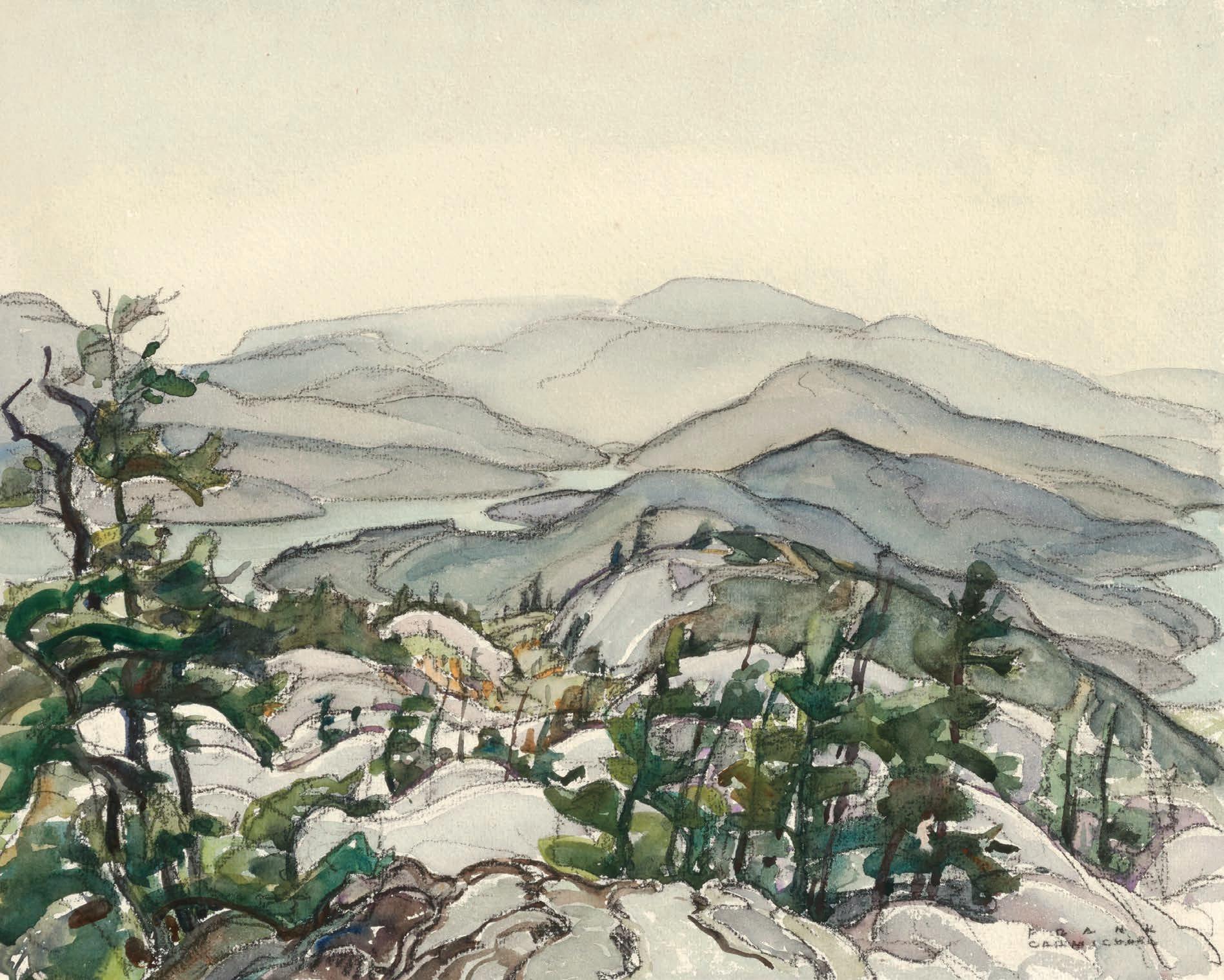
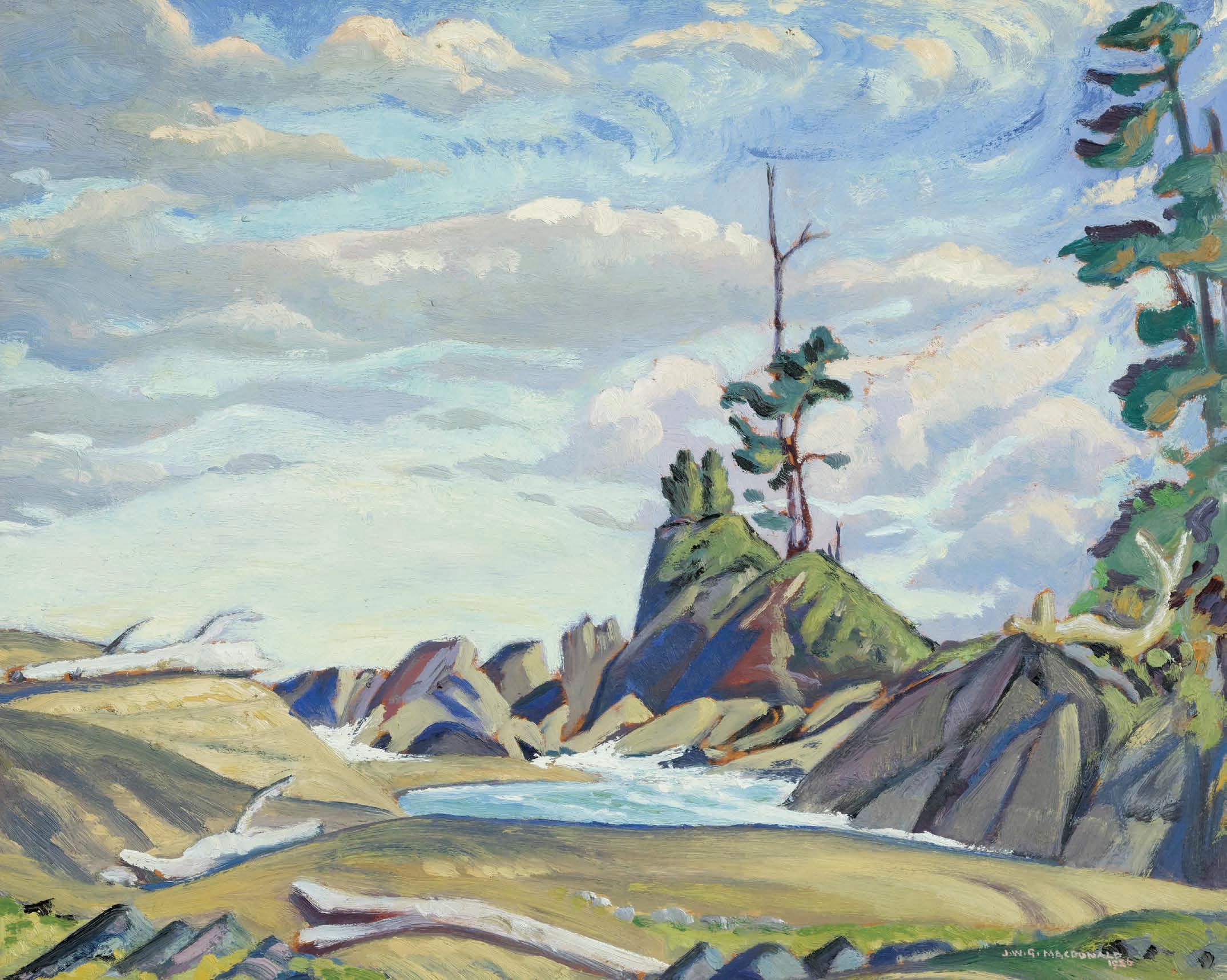
JAMES EDWARD HERVEY MACDONALD
Cathedral Mountain (Wiwaxy Peaks from Above Shäefer Lake), circa 1927 oil on board
signed and inscribed “c. 1927, Part of Cathedral Mt.” on the reverse 8.5 ins x 10.5 ins; 21.6 cms x 26.7 cms
PROVENANCE
Loch Gallery, Winnipeg Private Collection
Sotheby's, auction, Toronto, 22 November 2012, lot 101 Private Collection, Calgary
As we learn more about J.E.H. MacDonald’s painting sojourns to Lake O’Hara we " nd, quite pleasantly, the number of works depicting locations outside the O’Hara region proper is increasing. !ese works, created between Ban # and the Lake O’Hara watershed, include vistas at Ross Lake, Sherbrooke Lake, Yoho Pass, and views found near the Great Divide – a spectacular and geologically singular feature of the Canadian Rockies. All of these are within easy reach of the Hector Station train siding at Wapta Lake, B.C.
In MacDonald’s time, Wapta Lake would have been a destination stop, where guests of Lake O’Hara Log Cabin Camp (as it was " rst known) would have stayed. Wapta is a stunningly beautiful lake that sits on the
edge of a sheer mountain pass, just above the famous Spiral Tunnels, and was a destination for all things mountain, where guests could "sh, hike, climb, and enjoy the splendour of this gorgeous lake. Now bordered by the modern highway, our tendency is to speed by, missing a beautiful spot of historic signi "cance, the place in the mountains where things really started to get exciting for MacDonald. It was here that he would have met his pack horse, here that he met other guests with which he would share meals and trails, and here that his desire to “get painting” would have been at its height. By 1927, the year attributed to this work, MacDonald had a full understanding of the changeable mountain weather and light, and knew that an opportunity to sketch had to be quickly grasped. A con "dent scrambler, he only needed to gain a pleasing height of land and " nd an appealing view with a good place to sit. With his ready sketch box and mountain hued-palette at hand, MacDonald took advantage of even the small windows of time. It is easy to imagine him sitting on his coat, pipe in the corner of his mouth, hat pulled low to shade his eyes, sketching this view of Cathedral Crags, with two gnarled and wizened trees in the foreground. His con "dent and free brushwork is clearly visible in this delightful work, which is " lled with the joyous appreciation of the Canadian Rockies that permeates all of MacDonald’s mountain works.
We extend our thanks to Lisa Christensen, Canadian art academic and the author of four award-winning books on Canadian art, including ! e Lake O'Hara Art of J.E.H. MacDonald and Hiker's Guide (2003), for contributing the preceding essay.
$70,000–$90,000
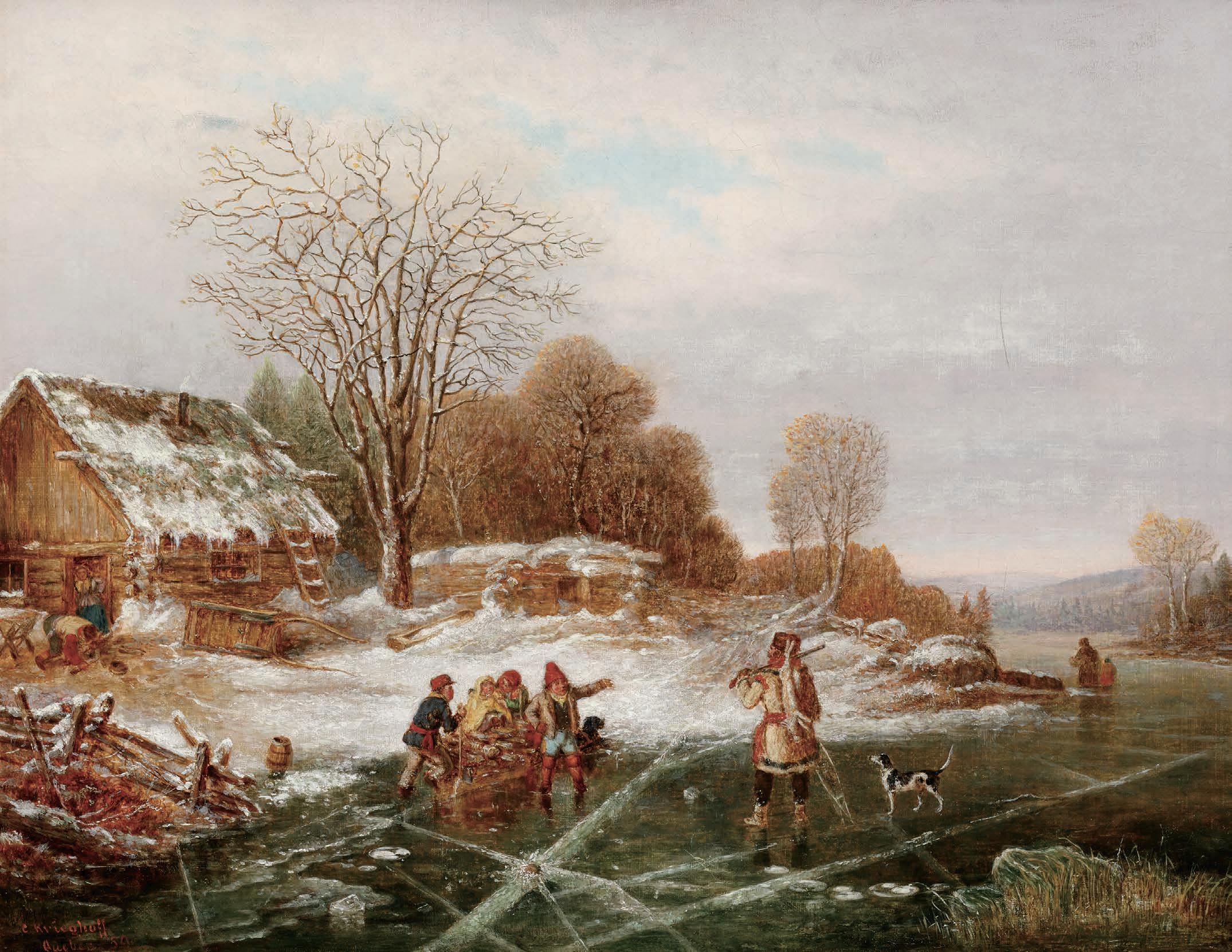
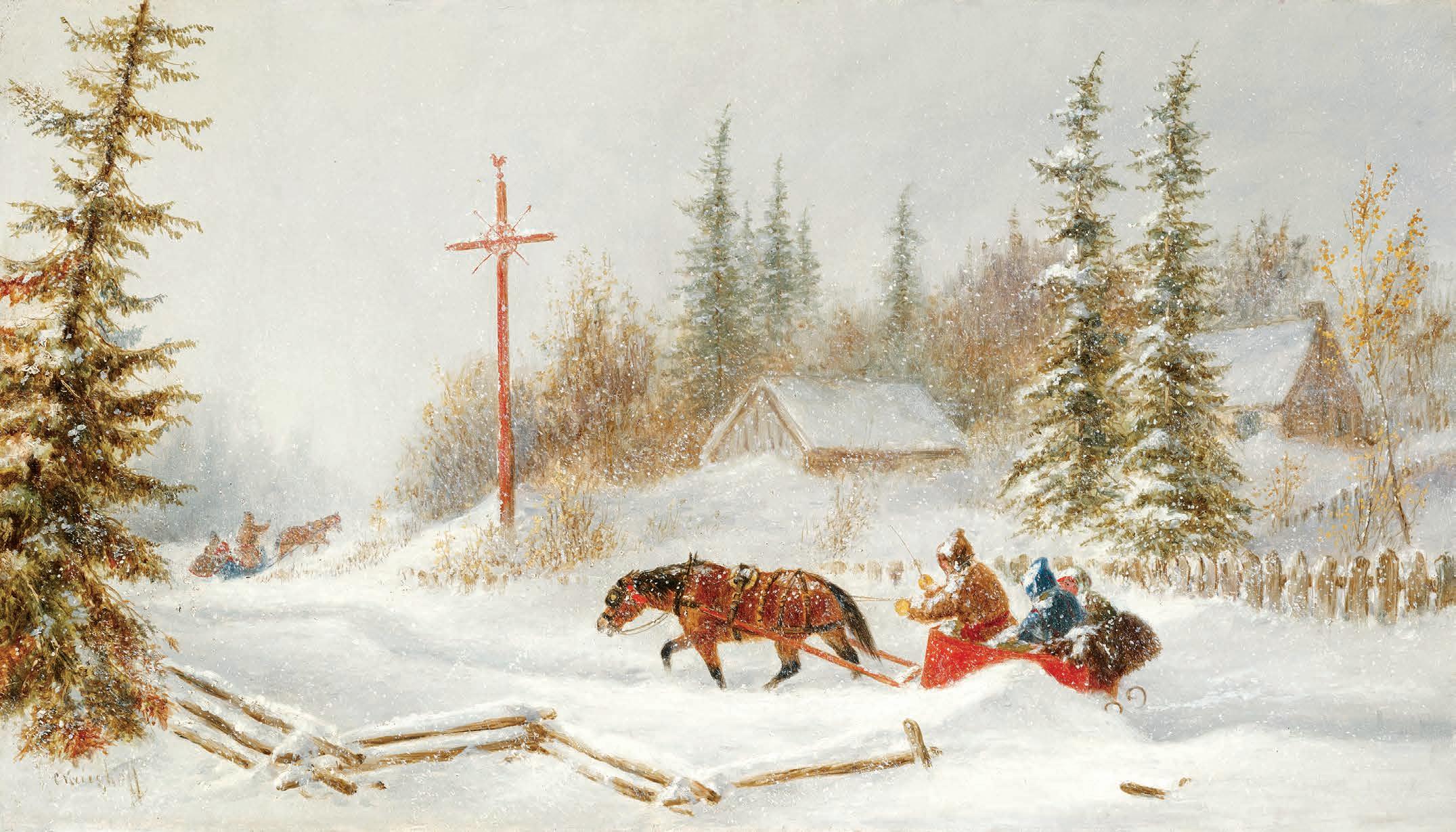
CORNELIUS KRIEGHOFF
Returning from the Hunt, near St. Césaire, 10 minutes from Chambly, Lower Canada, 1859 oil on canvas
signed and dated "Quebec 1859" lower left; titled on a label on the reverse 14 ins x 18 ins; 35.6 cms x 45.7 cms
PROVENANCE
Private Collection, Vancouver Kaspar Gallery, Toronto Private Collection, Toronto
By descent to the present Private Collection, Toronto
LITERATURE
Ramsay Cook, “ !e Outsider as Insider: Cornelius Kriegho# 's Art of Describing” in Dennis Reid, Kriegho " Images of Canada , Toronto, 1999, pages 155-156, 163
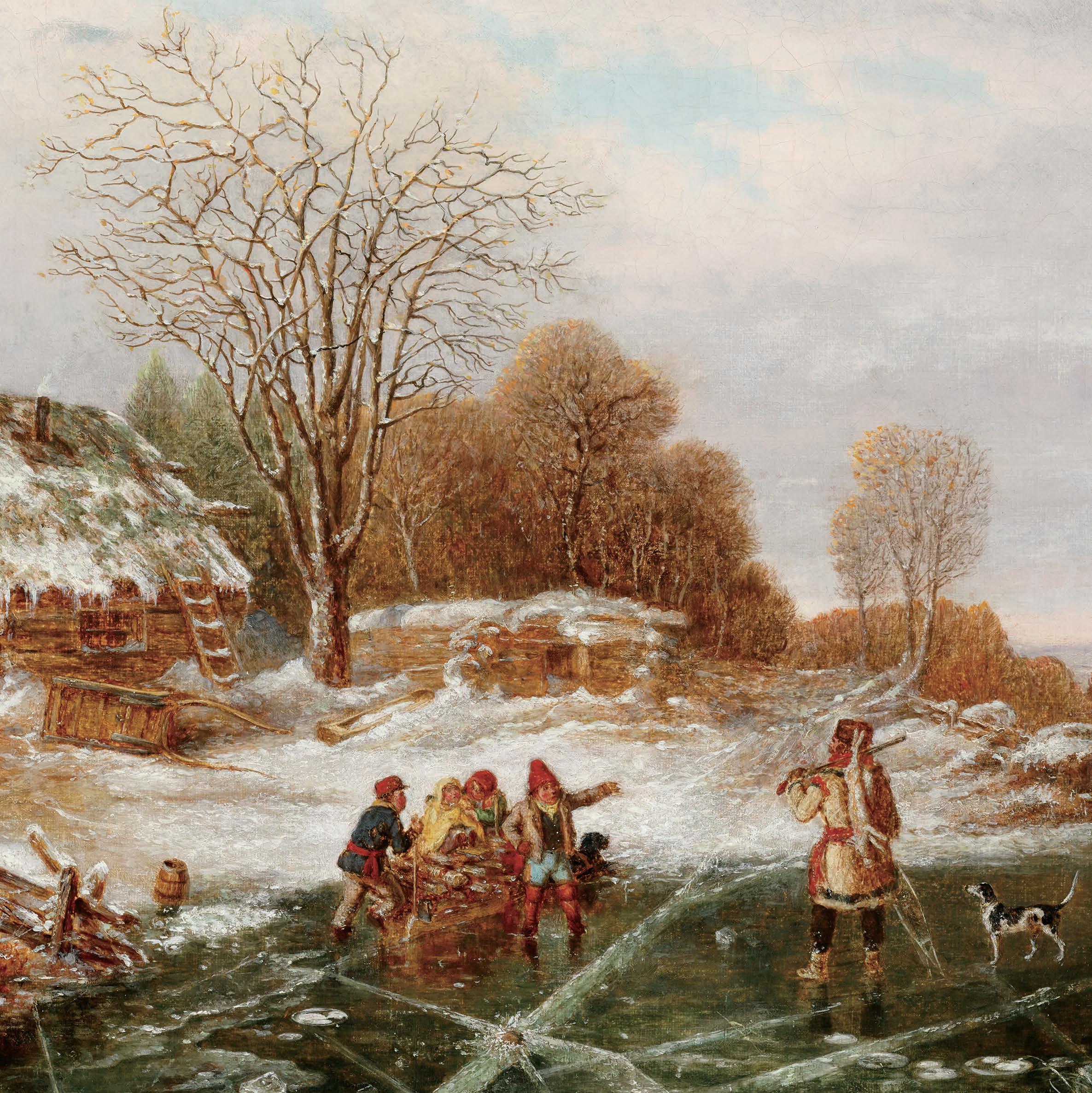
Cornelius Kriegho# specialized in genre paintings depicting the lives of the people of Quebec in the nineteenth century. Returning from the Hunt of 1859 is a remarkable anecdotal image of a settlement in the depths of winter in the Quebec region, " lled with fantastic and wry details. While pioneer life was rugged and precarious, it was also a productive and fruitful time for the artist as he recorded the industry and ingenuity of the people.
According to Dennis Reid, Kriegho# did not just depict rural families as groups of people, but as if they were a cohesive and coordinated unit. In Returning from the Hunt, Kriegho# tells several stories: a hunter con "dently stands in the foreground, gun in hand and a hare slung over his shoulder, accompanied by his loyal dog. Nearby, a family struggles to move a sleigh " lled with logs across the ice. A man wearing a ceinture # échée pushes the heavy load, assisted by a dog pulling the
sleigh. Another man greets the hunter, or perhaps is giving him directions to the nearest town. In the background a plume of smoke rises from a well-built log house. A couple tends to their chores—one man gathers logs while a woman stands in the doorway. ! is is an industrious, everyday scene of life in winter, recorded as taking place near Saint-Césaire and Chambly.
Kriegho# remains somewhat enigmatic in Canadian art history, as little is known about his formal education or what motivated him to focus so intensely on the lives of everyday Canadians. Historian Ramsay Cook suggests a few possibilities: Kriegho# may have been captivated by the uniqueness of Canadian life, or he may have tapped into a market among soldiers stationed in Quebec looking for souvenirs. Another possibility is that the artist drew inspiration from Dutch genre painting, a style he would have been familiar with due to his Dutch-German background. Cook notes that genre painting was already a key part of 17th-century Dutch visual culture, and Kriegho# ’s travels in America would have allowed him to study these works " rsthand. It is clear that Kriegho# brought the genre painting tradition to Canada in the 1840s and practiced it with great success throughout his career.
Unlike other artists of his time, such as Antoine Plamondon, !éophile Hamel, or Joseph Légaré, Kriegho# focused on everyday, often overlooked subjects. Cook argues that Kriegho# ’s goal was not to elevate his subjects, but to record and share the human condition. Returning from the Hunt is certainly one of these ambitious canvases representing early settlement in Canada. Kriegho# would have encountered these farmsteads up the St. Maurice and Shawinigan Rivers, in the hinterlands up the Montmorency and beyond Lake St. Francis. Kriegho# ’s paintings seem designed to draw the viewer into the scene, making them feel like participants rather than mere observers, solidifying the artist as a painter of early Canada.
$100,000–$150,000
19
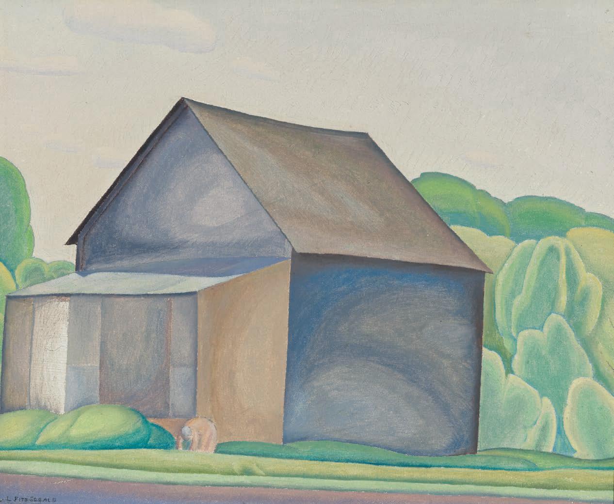
LIONEL LEMOINE FITZGERALD
Pastoral Landscape, circa 1914-1917
oil on canvas
titled and dated "c. 1919" to a label on the reverse 35 ins x 47 ins; 88.9 cms x 119.4 cms
PROVENANCE
Commissioned from the Artist for the Gardiner Funeral Home, Winnipeg Loch Art Gallery, Winnipeg Private Collection, Calgary, 1975
Joyner, auction, Toronto, 28 November 1989, lot 137 Private Collection
He#el, auction, Vancouver, 26 May 2011, lot 305 Private Collection
Winnipeg artist Lionel LeMoine FitzGerald’s " rst encounter with art was in grade three when he was introduced to reproductions of art masterpieces produced by the Perry Picture Company. After taking drawing lessons at A.S. Keszthelyi’s School of Fine Arts in 1909, FitzGerald hoped to work in a commercial art " rm. While he did not " nd employment during a brief stay in Chicago in 1910, the twentyyear-old no doubt spent time at the Art Institute of Chicago where contemporary American landscape paintings re$ecting Barbizon and Impressionist in $uences were on display.
By 1911, FitzGerald had met Glasgow-trained artist Donald MacQuarrie (1872-after 1932) who was to become the " rst curator at the Winnipeg Museum of Fine Arts in late 1912. During his tenure,
MacQuarrie was in charge of an exhibition of “Modern Scottish Art” which was so well received that Richardson Bros. organized a show of Scottish watercolours the following year. !ese pictures would have been conservative views of nature re$ecting MacQuarrie’s personal taste for the hazy atmospheric plein air landscapes of Camille Corot.
! is Barbizon in $uence appealed to FitzGerald when he shared studio space with MacQuarrie in 1914. !e two artists held a sale together in May 1914, and visitors included several well-known local collectors. ! is may be when FitzGerald came to the attention of the Gardiner Funeral Home in Winnipeg, founded by George Gardiner (1852–1912). When previously on the art market, Pastoral Landscape was identi "ed as a mural commissioned by the Gardiner Funeral Home, although no documentation has survived. !e large size of the painting, so unusual for FitzGerald at this point in his career, supports the notion that it was intended to decorate an architectural setting.
While FitzGerald is heralded as an artist who painted directly from nature, this charming picture was carefully constructed in his studio. !e remarkable composition, in which a central clump of trees divides the painting into a distant view of a lake with open sky (left) and a dense forest glade (right), suggests that the painting may well have been designed to harmonize with the architecture of a speci "c room. With pastel-like brilliance and dappled Impressionist brushstrokes, Pastoral Landscape conjures a lyrical vision of peace and tranquility.
We extend our thanks to Michael Parke-Taylor, Canadian art historian, curator, and editor of Some Magnetic Force: Lionel LeMoine FitzGerald Writings (Concordia University Press, 2023) for contributing the preceding essay.
$25,000–$35,000
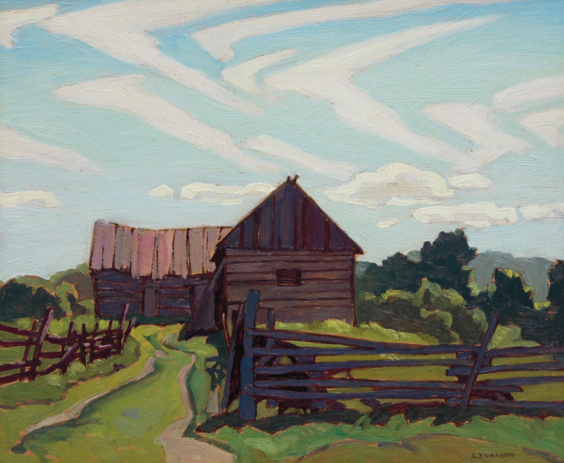
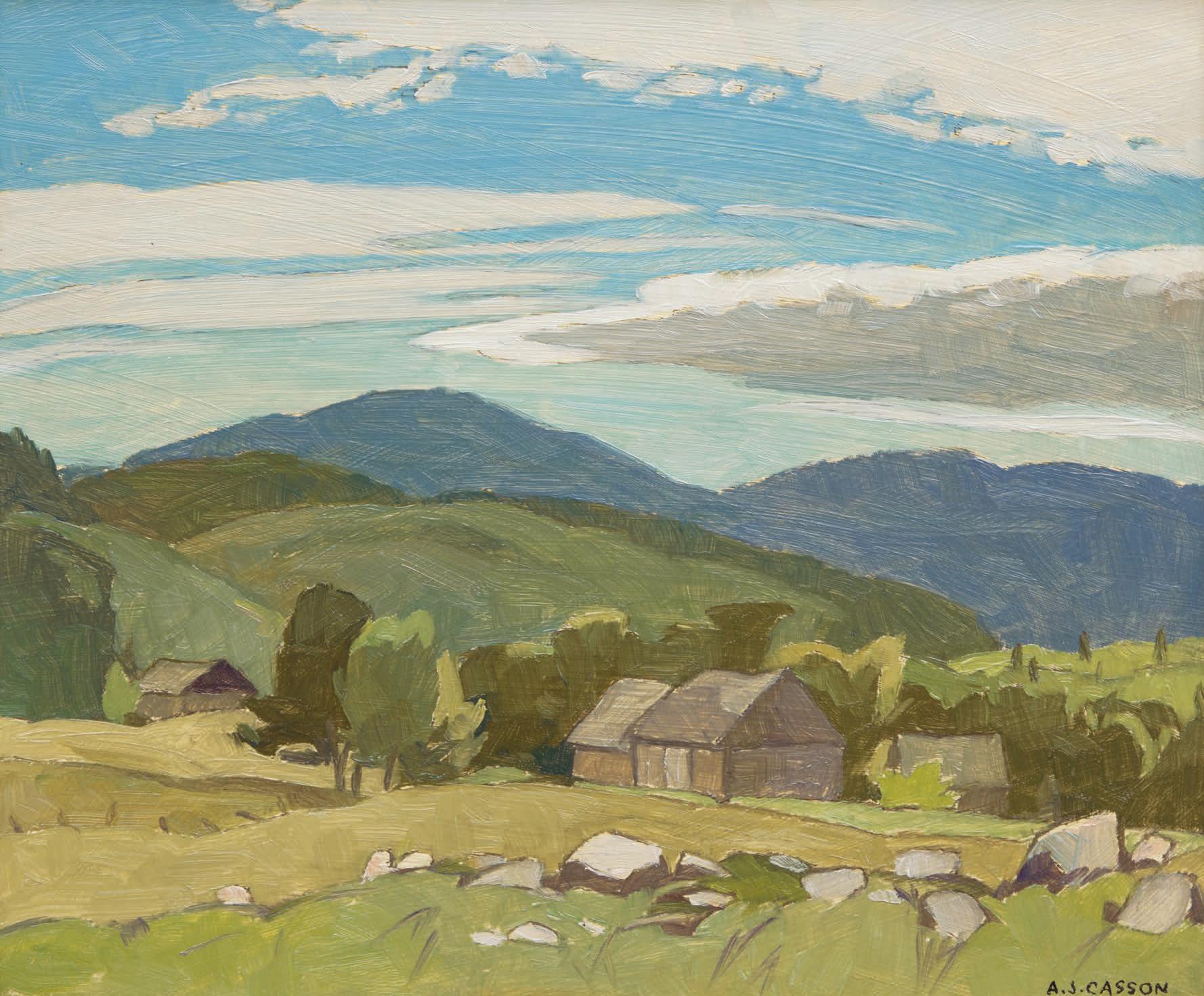
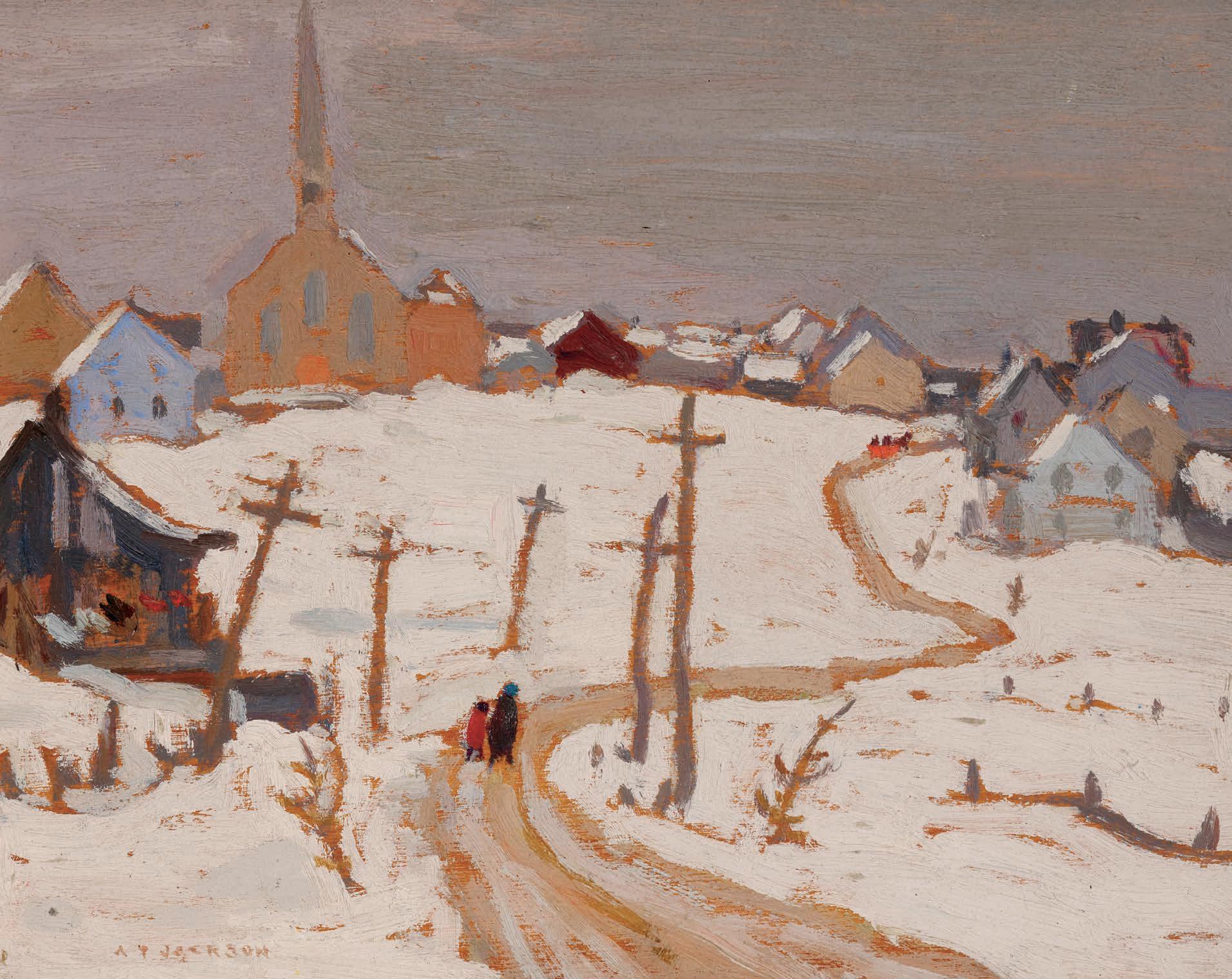
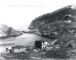
ALFRED JOSEPH CASSON
Boulter, Near Combermere, 1968 oil on board signed lower right; titled and dated 1968 on the reverse 9.25 ins x 11.25 ins; 23.5 cms x 28.6 cms
PROVENANCE
Private Collection, Toronto
A.J. Casson became a full-time artist after his retirement from his successful career as a commercial artist in 1957. During the 1960s, when this picture was completed, Casson exhibited regularly with the Roberts Gallery and was able to focus on his craft.
Boulter is near Maynooth, northeast of Bancroft, an area where Casson often painted. Famed for his depictions of the more settled areas of southern Ontario, Casson set himself apart from the other Group members by dedicating much of his artistic career to the continuously changing climes of rural Ontario. Boulter, Near Combermere features simple wooden outbuildings nestled in a valley surrounded by forests and hills, which hint at the presence of local villagers. Known as the youngest member of the Group of Seven, Casson’s work helped to shape the Group’s aesthetic through its simpli "ed forms and bold colours. Here we see the lush and rolling landscape typical of the area. A selective and distinct colour palette is synonymous with Casson’s work. !e greens, blues and variations of light brown evoke the warm sunlight of a summer day, while the stretching bands of cloud glide over the mountains in the background. Casson’s lines are graceful and clean and distinctively his own. !e artist captures a serene and re$ective moment in rural Ontario.
$20,000–$30,000
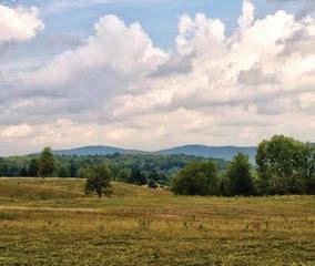
Present day Boulter, near Combermere Photograph courtesy of Jim Waddington Not for sale with this lot
21
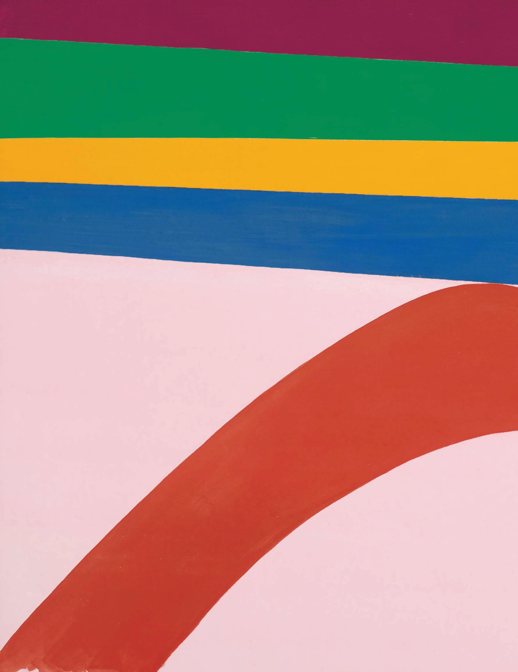
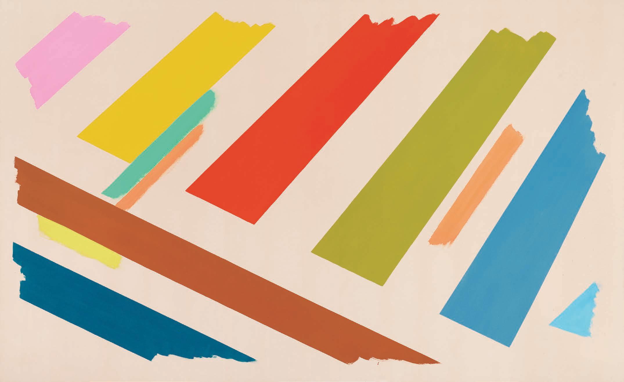
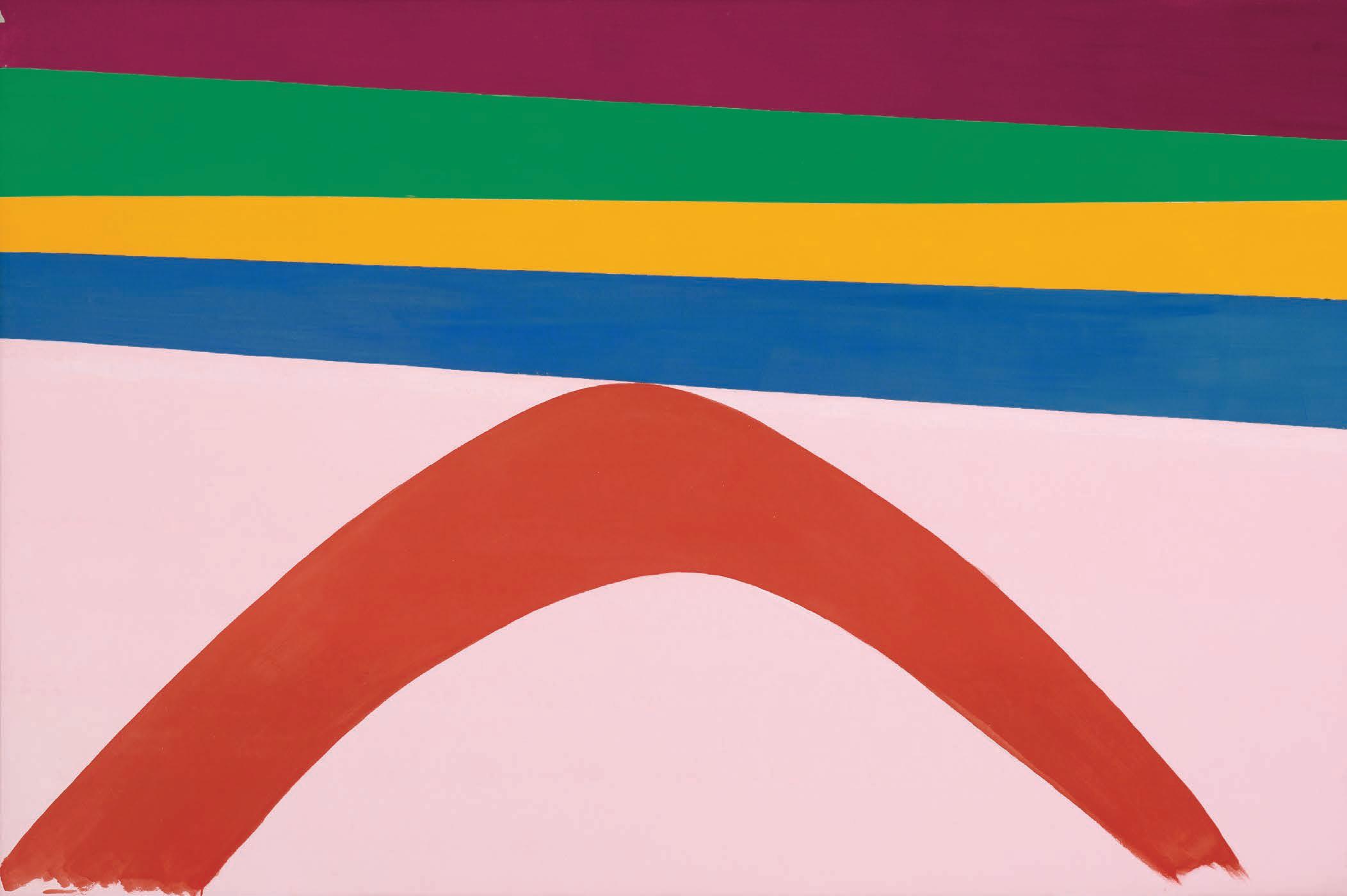
JACK HAMILTON BUSH
Arc, 1969
acrylic on canvas
signed, titled and dated "July 1969" on the reverse; catalogue raisonné no. 2.105.1969.49
56 ins x 84 ins; 142.2 cms x 213.3 cms
PROVENANCE
!e Artist, July 1969
Waddington Galleries, London, United Kingdom, December 1969 Waddington Galleries, Montreal
Private Collection, July 1974
LITERATURE
Sarah Stanners, Jack Bush Paintings: A Catalogue Raisonné, Volume 3, Toronto, 2024, reproduced pages 316-317, no. 2.105.1969.49
Jack Bush’s Arc, painted during the summer of ’69, is emblematic in character – presenting a timeless shape amid a riot of colours. He idolized calligraphic shapes at this time, setting q’s, $ ips, and arcs against monochrome grounds. It was the swinging sixties and London, England, was the painting’s " rst destination upon leaving the artist’s studio. ! is showstopper of a painting is con "dent and bold; a testament to Bush’s self-possessed attitude as an artist who had reached the age of 60 by the time Arc was painted.
It might seem surprising that a formalist painter like Jack Bush admired the Pop Art pioneer Andy Warhol, yet his work from the late 1960s re$ects this unlikely in $uence. When Warhol " rst showed his work in Toronto, at the Morris International Gallery on Bloor Street West, in 1965, Bush was taken by the young American’s bold shots of colour used to set o# familiar Hollywood stars like Marilyn Monroe, Elvis Presley, and Liz Taylor. !e poster for the exhibition featured the iconic Liz image against a hot cherry-red background; Bush prized this poster and pinned it up on his studio wall at home for many years.
Bush chased the Pow!-factor of a picture as early as 1960 when he began to paint simple shapes against unprimed canvas and, later, sexy thrusting shapes with illustrated bursts against backgrounds of singular, radiant colour. Fields of colour are, after all, the calling card for Color Field painters, but unlike Warhol, Bush never embraced explicit content like movie star icons. Instead, he made icons of shapes and swoops which he heralded against sail cloths soaked in colour. !e parts were di #erent but the power just the same.
!e comprehensive presentation of Jack Bush’s paintings in the recently released Jack Bush Paintings: A Catalogue Raisonné sheds light on the artist’s recurring use of select shapes across his " fty-plus years of painting. !e patterns and proclivities are all there, including evidence that the arc shape is prevalent in his abstract paintings. In Bush’s early abstract period, coinciding with his association with the Anglo-
abstract painters’ group, Painters Eleven, he was still grappling with religious themes as a focus in his work. Hymn to the Sun (catalogue raisonné no. 1.193.1955.223; Vol. 2, pp. 46–47), from the summer of 1955, is wholly abstract but there is an allusion to a " gure in a motion of adoration, hailing the sun overhead: A black arcing shape centres on a head-like circle of black. !e assemblage of shapes suggests a person in feverish prayer, singing hymns to the sun with their arms raised in praise. Biblical subjects were common in Bush’s works from the 1940s and even into the 1950s – a span of years that witnessed his transition to abstraction.
A few months after Bush painted Arc, he produced his " rst ever mottled ground paintings: Irish Rock #1 and Irish Rock #2 (catalogue raisonné nos. 2.107.1969.59 and 2.108.1969.60; Vol. 3, pp. 328–331). Aside from their stone-like rollered grounds, these two paintings are distinguished by the crosses they bear, literally; a bold white cross symbol occupies two-thirds of the picture space in each painting. Both also host a fringe of stripes along the bottom of the painting. Comparing the Irish Rock paintings to Arc underlines the function of their shapes as abstract icons, worthy of recurring contemplation. Revealingly, the original title for Arc was “A Time To Cry,” as noted in Bush’s record book of paintings. ! is may underline a biblical connection, possibly referring to Ecclesiastes 3: 4–5, “A time to cry and a time to laugh. A time to grieve and a time to dance. A time to scatter stones and a time to gather stones. A time to embrace and a time to turn away.” (New Living Translation)
! is strange initial title – “A Time To Cry” – draws another comparison to Warhol’s icons like Liz, Marilyn, and Jackie – the images of these women coincided with dark times in their lives, or even death, as was the case with Warhol’s Marilyn Diptych, which he made shortly after she passed away in 1962. ! is darker side (essentially unseen content) is contrasted by the brightly coloured backgrounds and highlights across their beautiful faces. !e unapparent context of Bush’s paintings made in the spring and summer of 1969 was the sickness growing in his coronary arteries. Despite his su #ering from angina, Bush’s paintings from the months immediately following his diagnosis are exuberant with colour and downright cheerful looking. Paintings like Arc served to conjure up the positive feelings he needed to feel at this time, like catalysts for faith in better days ahead – times of laughter to follow times of sorrow.
We extend our thanks to Dr. Sarah Stanners for contributing the preceding essay. Sarah is currently an Adjunct Professor at the University of Toronto’s Department of Art History and recently published the Jack Bush Catalogue Raisonné. From 2015 to 2018 she was the Chief Curator of the McMichael Canadian Art Collection, Co-Curator of the 2014/2015 national travelling exhibition, Jack Bush, Co-Author of the resulting 2014 exhibition catalogue ( Jack Bush) and guest curator and author for Jack Bush: In Studio, organized by the Esker Foundation in Calgary.
$250,000–$350,000
YVONNE MCKAGUE HOUSSER
The Sisters, circa 1955 oil on canvas
30 ins x 24.25 ins; 76.2 cms x 61.6 cms
PROVENANCE
A.K. Prakash & Associates, Inc., Toronto Masters Gallery, Calgary Private Collection, Alberta
EXHIBITED
Yvonne McKague Housser and Eric Goldberg, Montreal Museum of Fine Arts, 17 January-2 February 1958, no. 1 as ! e Sisters at $400
LITERATURE
Robert Ayre, “Housser and Goldberg: Contrasting Traditions,” ! e Montreal Star, 25 January 1958, page 23
A.K. Prakash, Independent Spirit: Early Canadian Women Artists, Richmond Hill, 2008, reproduced pages 174-175 as circa 1934 with the note: “While the identity of the sitters is not known, in all likelihood, the title of the work aside, the traditional typology of the double portrait suggests they were sisters.”
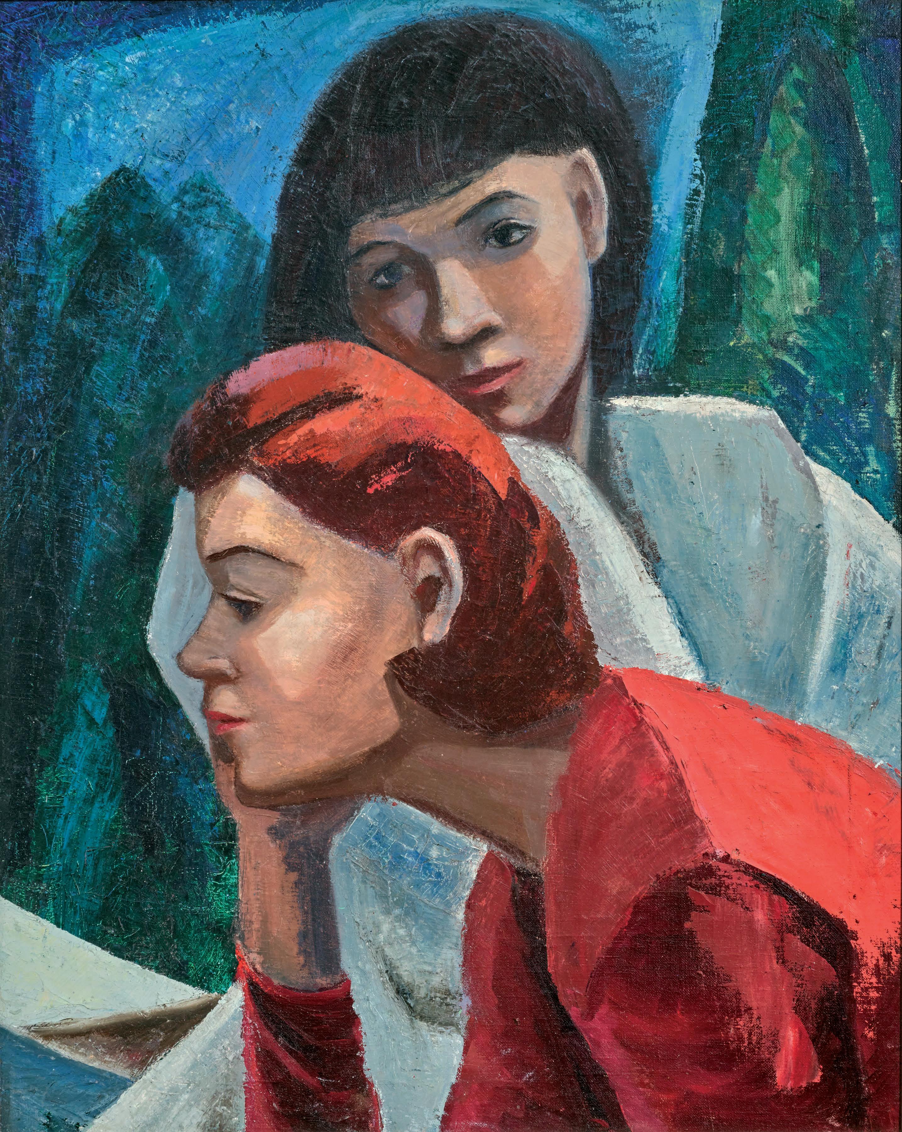
Yvonne McKague Housser’s ! e Sisters is a powerful painting which is both an evocation of the Canadian north and the people that live there and a study in what is now called, ‘gender relations,’ or to put it more succinctly, sisters. It is also a study in di #ering kinds of people – one standing, looking at the other with a caring, watchful glance, the other, bent over and secretive.
!e painting achieves what Arthur Lismer, Housser’s teacher, told students they had to do, “select the signi "cant and relative forms” and focus on them. His theme of landscape was meaningful to the Group of Seven and to his acolytes. But, of course, like every real artist, Housser wanted to be her own person, and explore her own pointof-view. In this painting, she chose a Canadian statement of a theme but went beyond that to something more progressive that re$ects new forms of expression, the very quality she found in the Canadian Group of Painters, the group she had helped found, in 1933.
Few would argue that through the " rst " fteen years of its existence, the CGP as it was called, served as a vital force on the scene. In a similar way, ! e Sisters, overtly, essayed energetically a northern scene. !e woods recall the woods in Housser’s portrait of a Canadian who lived in the north, Marguerite Pilot, who was a woman half First Nations, half French-Canadian from Lake Nipigon which she painted in around 1932. But in ! e Sisters, she strove for a new e#ect, which spoke of decade-long studies in the United States.
In 1949, her friend, Alexandra Luke, gave Housser Hans Hofmann’s book, Search for the Real (1948). She read it carefully, marking a passage in the introduction that said aesthetic meaning results from perceiving relationships. !ese words were important to her and stayed with her the rest of her life, particularly throughout the 1950s, when she was experimenting and growing as an artist. She studied with Hofmann in 1952 and 1958, going with Luke to Provincetown, Massachusetts to the successful summer school where he taught, the Hans Hofmann School of Fine Arts. He advocated improvisation and relied on empathy and feeling, both qualities that attracted her and she liked particularly his ideas of composition and colour but although she began to paint abstractly, she still returned often to representation but changed it to capture subjects of new interest to her, such as psychology.
When she was honoured with a show with Eric Goldberg at the Montreal Museum of Fine Arts in 1958 in the prestigious Gallery XII series (the museum’s exhibition area in which it showed modern art), she chose to make it an occasion for a representative showing of her work. She wanted something which demonstrated her Canadian art roots, so chose ! e Sisters as a starting point. It was No. 1 on her list of 24 works.
Robert Ayre, the pioneering art critic for the Montreal Star who wrote about Canadian art for 20 years (1950-1970), reviewed Housser " rst in his article about the show as be"tted her stature as a major Canadian painter who was a role model for younger women painters. He said there was something in Housser’s work of the Group of Seven, “for the kind of country she looks at and what she sees in it of simpli "cation and rhythm” but she soon “deviates into her own fantasy, setting out a decorative pattern…of spruce spires” and “formalizing nature”. He added that she makes her point “without getting sentimental about it” and concluded, in agreement with her paintings, “ !e austerity of the country is behind it”.
! e Sisters is a work that reveals the evolution in Housser’s approach to art. It captures something of the anxiety-" lled atmosphere that surrounds family relationships, but intertwined with it is a new way for Housser of addressing art, and particularly Canadian art, with its references to Cubism in the simpli "ed forms and the complex psychology of relationships. Housser in this painting spoke to the future and of her faith in feelings, empathy, and women’s complexities.
We extend our thanks to Joan Murray, Canadian art historian, for contributing the preceding essay. Joan, the Director Emerita of the Robert McLaughlin Gallery in Oshawa, has written many books on Canadian artists, including ! e Art of Yvonne McKague Housser, the catalogue for a 1995 retrospective exhibition on the artist.
$30,000–$40,000
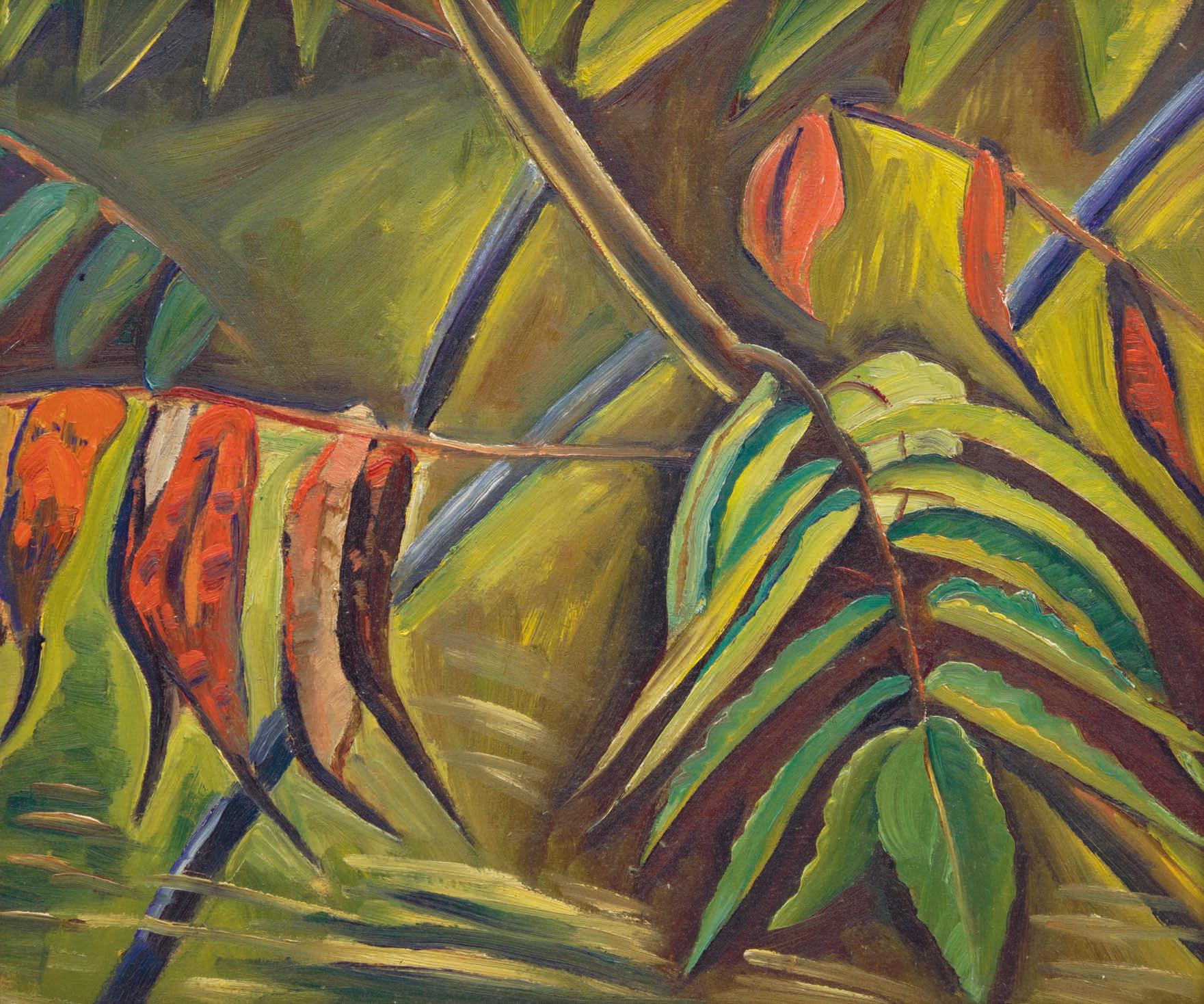
EFA PRUDENCE HEWARD
Sumachs - Study for Background of "Dark Girl" oil on board
titled on a gallery label and inscribed "5439" and " e Studio of E. Prudence Heward, A. Roug. Heward" on the reverse 12 ins x 14 ins; 30.5 cms x 35.6 cms
PROVENANCE
Continental Galleries, Montreal
Sotheby's, auction, Toronto, 13 May 1975, lot 199 as Sumach Private Collection, Toronto
EXHIBITED
Expressions of Will, Agnes Etherington Art Centre, Queen's University, Kingston; travelling to Concordia University Art Gallery, Montreal; McMichael Canadian Collection, Kleinburg; Mendel Art Gallery, Saskatoon, 1 March 1986-15 February 1987, no. 28
LITERATURE
Natalie Luckyj, Expressions of Will, Kleinburg, 1986, no. 28
Julia Skelly, Prudence Heward Life & Work [online publication], Art Canada Institute, Toronto, 2015, pages 41, 49
An a % liate of the Beaver Hall Group, the Canadian Group of Painters, and the Contemporary Arts Society, Prudence Heward was a crucial artist of her time, renowned for her portraits of female subjects in a variety of settings, from rural and public spaces to domestic interiors. Portrayals of black women feature prominently in the artist’s oeuvre. As the title indicates, this oil on panel is the landscape study for Heward’s 1935 painting, Dark Girl, depicting a seated nude black woman surrounded by lush foliage. “We do not know for certain Heward’s motivations for choosing to paint black women,” Julia Skelly writes, “but her decision to produce several paintings of them indicates that she had a particular interest in the black female subject.” Heward had painted her " rst depiction of a black woman with Dark Girl (Hart House Collection).
Although predominantly known for her " gure paintings, Heward produced many landscapes and still lifes throughout her career. !e artist often painted en plein air and would occasionally develop these landscape studies to serve as the background in her " gure paintings, as exempli "ed in Dark Girl, which incorporates the artist’s study of the sumach plant in vibrant shades of red, yellow and green.
$12,000–$15,000
24
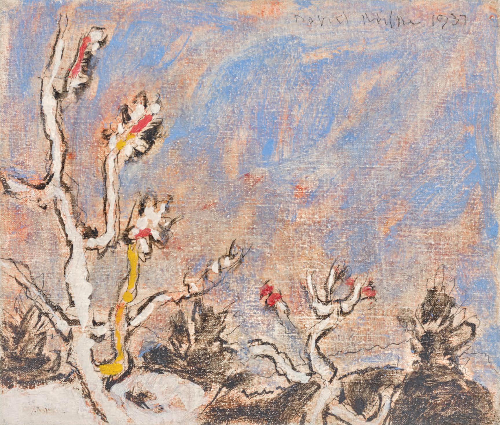
DAVID BROWN MILNE
Twigs in Winter, 1937 oil on canvas
signed and dated 1937 upper right; catalogue raisonné no. 305.6 12.25 ins x 14.5 ins; 31.1 cms x 36.8 cms
PROVENANCE
Estate of the Artist
Mira Godard Gallery, Toronto
Nicholas Metivier Gallery, Toronto Private Collection, Toronto
He#el, auction, Toronto, 23 November 2016, lot 150 Private Collection, Toronto
EXHIBITED
David Milne: City Streets and Northern Scenes, Mira Godard Gallery, Calgary, April 1981, no. 11
David Milne, 1882-1953: ‘Bright Garden’, Mira Godard Gallery, Toronto, 18 October-5 November 1986
Fifty Years of Canadian Landscape Painting, Grace Borgenicht Gallery, New York, 3 April-2 May 1987
LITERATURE
David Milne: City Streets and Northern Scenes, Calgary, 1981, no. 11
Christopher Hume, "Paintings of Genius," Toronto Star, 31 October 1986, D13
Karen Wilkin, Fifty Years of Canadian Landscape Painting, New York, 1987, page 26
David Silcox, Painting Place: ! e Life and Work of David B. Milne, Toronto, 1996, page 1
David Milne Jr. and David P. Silcox, David B. Milne: Catalogue Raisonné of the Paintings, Volume 2: 1929-1953, 1998, reproduced page 634, no. 305.6
In April 1933, David Milne parted ways with his wife Patsy and undertook a canoe trip on Lake Couchiching, before settling at the remote Six Mile Lake in Muskoka, Ontario in a cabin he constructed himself. It was during this time that the artist spent his days painting, journaling and maintaining a humble lifestyle in the seclusion of the wilderness. Twigs in Winter was completed towards the end of this period in 1937 and illustrates the artist’s unique approach to colour and composition during the 1930s. ! is delightful scene suggests an earlywinter day as indicated by the snow-encrusted twigs which are tipped with $owers beneath a lightly clouded blue sky. Milne’s intention was not simply to record a detailed representation of the land or a speci "c object but to transform his impression of nature into aesthetic emotion, which he conveyed through colour, texture and design. Milne observed that: “ !e painter gets an impression from some phase of nature … he simpli "es and eliminates until he knows exactly what stirred him, sets this down in colour and line and so translates his impression into aesthetic emotion.”
$30,000–$50,000
25
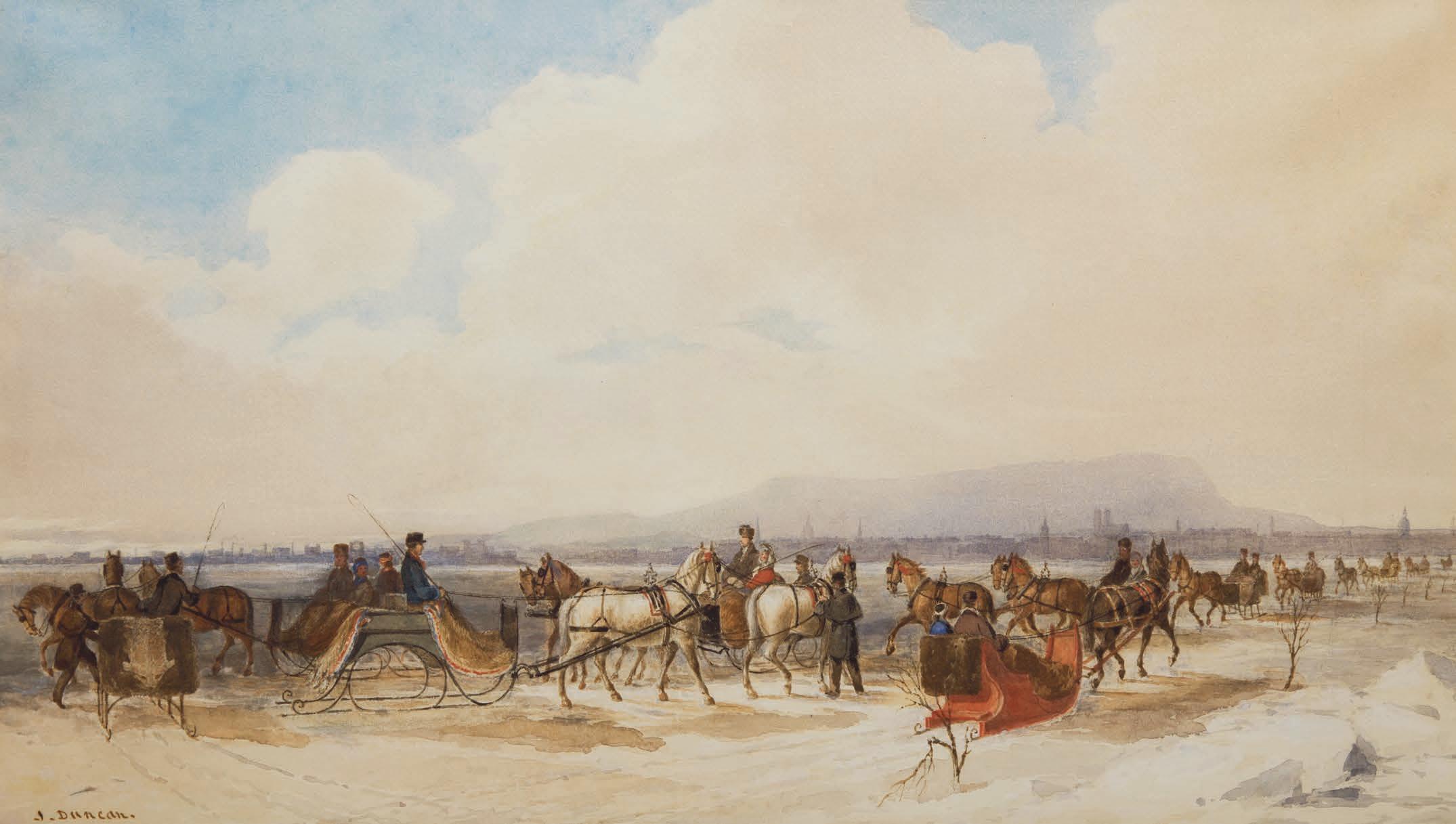
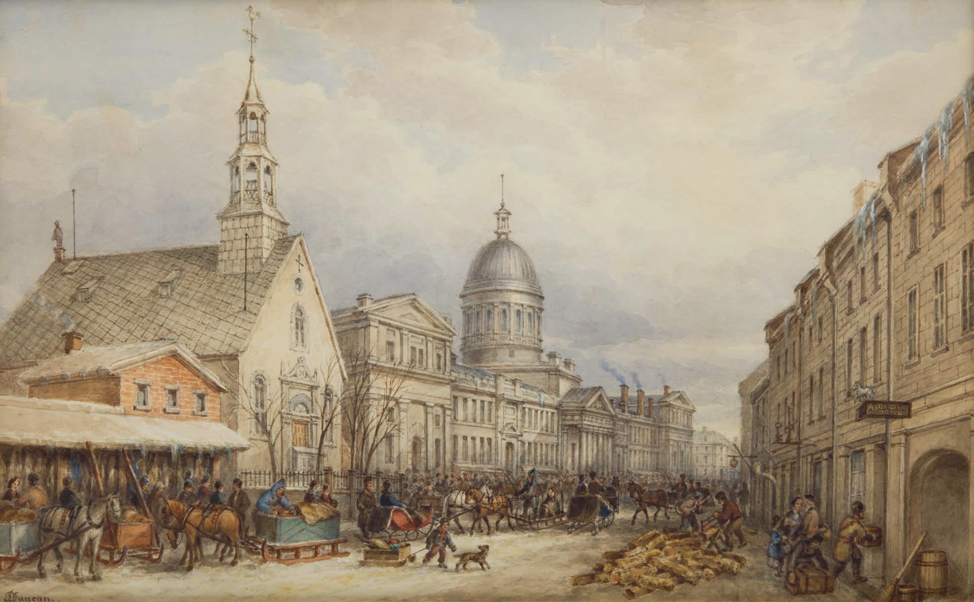
JAMES DUNCAN
Sleighing on the St. Lawrence, 1846 watercolour and gouache over graphite on paper signed lower left 15.5 ins x 26 ins; 39.4 cms x 66 cms
PROVENANCE
Walter Klinkho# Gallery, Montreal
Acquired by the present Private Collection, June 1981
EXHIBITED
Collector’s Canada: Selections from a Toronto Private Collection , Art Gallery of Ontario, Toronto; travelling to Musée du Québec, Quebec City; Vancouver Art Gallery; Mendel Art Gallery, Saskatoon, 14 May 1988 7 May 1989, no. 7 as Sleighing on the St. Lawrence, circa 1850 James Duncan (1806-1881), Painter of Montreal, McCord Stewart Museum, Montreal, 2023 as Sleighing on the St. Lawrence, 1846
LITERATURE
Dennis Reid, Collector’s Canada: Selections from a Toronto Private Collection , Toronto, 1988, no. 7, reproduced page 19 Laurier Lacroix and Suzanne Sauvage, James Duncan (1806-1881), Painter of Montreal, Montreal, 2023, reproduced pages 156-157
Sleigh riding was a favourite winter activity of the Montreal upperclass and military during the 19th century. It was expensive to acquire a team of two or four horses and a quality sleigh. !e owners formed clubs to organize group outings to parade through the city and across the frozen river, their route marked by branches. !ese outings provided additional occasions to socialize in winter while showing o# one’s sleigh as well as jingling bells, luxurious furs, and elegant out "ts.
James Duncan recruited many of his clients from among the city's elite, and was well-acquainted with their customs. ! is spectacular view portrays elegant sleighs "tted with " ne metal blades adapted for gliding on ice surfaces. !ey cross paths with low sleighs driven by local residents, unlike the others, which are led by a coachman.
! is panoramic view emphasizes Montreal’s diversity, showcasing the range of social classes demonstrated by the types of sleighs. !e residential and business areas of the city, with its dominant church steeples and the silhouette of Bonsecours Market, are juxtaposed with the industrial sector, where chimneys rise along the Lachine Canal on the left side of the composition.
We extend our thanks to Laurier Lacroix, C.M., art historian, for researching this artwork and for contributing the preceding essay.
$8,000–$12,000
JAMES DUNCAN
Bonsecours Market, St. Paul Street, about 1852 watercolour over graphite on paper signed lower left; titled and dated “circa 1848” on a label on the reverse 15.5 ins x 24 ins; 39.4 cms x 61 cms
PROVENANCE
Mr. and Mrs. W. Bryan, Ottawa, since 1920s Claude Gugeon, Ottawa, 1989 Private Collection, Toronto
A.K. Prakash & Associates, Inc., Toronto
Acquired by the present Private Collection, April 2009
EXHIBITED
James Duncan (1806-1881), Painter of Montreal, McCord Stewart Museum, Montreal, 2023 as Bonsecours Market, St. Paul Street, about 1852
LITERATURE
Laurier Lacroix and Suzanne Sauvage, James Duncan (1806-1881), Painter of Montreal, Montreal, 2023, reproduced pages 138-139
Upon his arrival in Montreal in the summer of 1830, the Irish-born artist James Duncan became known for depicting his adopted city. Over the course of his " fty-year career, he made Montreal one of his primary subjects, portraying it from the foot of Mount Royal or from Île Sainte-Hélène through panoramic views or by detailing the customs of its inhabitants in their daily activities throughout the seasons. His keen observational talent is demonstrated through the precision of his drawing, the vibrancy of his palette, and his mastery of watercolour, as shown by the contrast in the treatment of the sky in relation to the street.
! is truly exceptional view combines both approaches by o#ering a broad perspective of St. Paul Street along with all the details of its bustling activity on a business day. !e neoclassical elegance of the new Bonsecours Market (built in 1847) by architect William Footner competes with the vernacular architecture of the Bonsecours Chapel, rebuilt in 1773. In this setting, Duncan depicts the activities of a winter market in abundance. !e movement of the horse-drawn carriages harmonizes with the vendors, shoppers, delivery workers, and woodcutters. Elegant signs adorn the façades and complete the atmosphere of this lively street.
We extend our thanks to Laurier Lacroix, C.M., art historian, for researching this artwork and for contributing the preceding essay.
$8,000–$12,000
CORNELIUS KRIEGHOFF
Indian Encampment
oil on canvas
signed lower right; titled on a gallery label on the reverse 13 ins x 15 ins; 33 cms x 38.1 cms
PROVENANCE
G. Blair Laing Galleries, Toronto Kaspar Gallery, Toronto Private Collection, Toronto By descent to the present Private Collection, Toronto
LITERATURE
J. Russell Harper, Kriegho ", Toronto, 1979, page 44 Dennis Reid, Kriegho ", Images of Canada , Toronto, 1999, pages 58-61
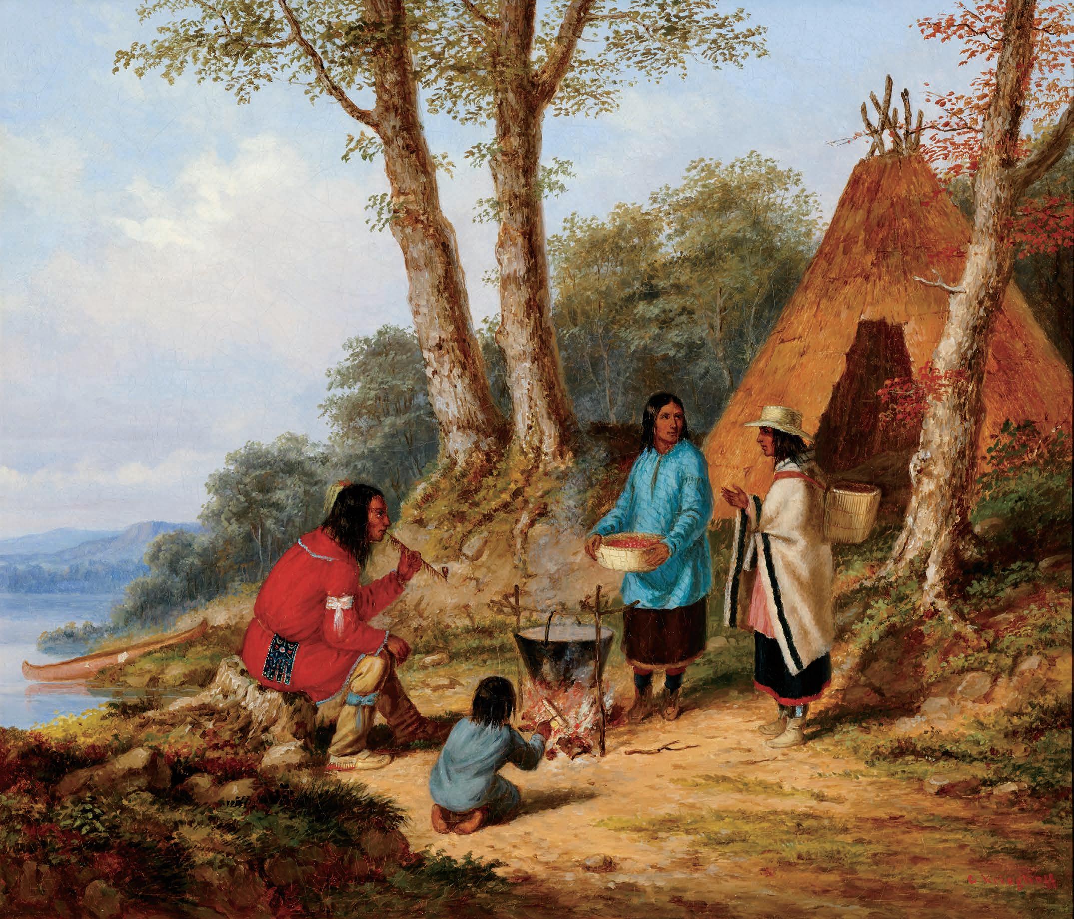
Cornelius Kriegho# is renowned for his depictions of Canada’s Indigenous peoples, which form a signi "cant portion of his diverse body of work. Approximately one-third of his known paintings focus on Indigenous subjects. As noted by J. Russell Harper, Kriegho# portrayed Indigenous " gures as “unspoiled by the complexities of arti "cial and unnatural civilization.” After settling in Montreal in 1846, he frequently painted the people of Caughnawaga, a reserve just south of the city. His work included large canvases for wealthy patrons as well as smaller ones for those of modest means. In 1853, he travelled to Quebec, revisiting this favoured subject in his works across the region, including at the Lorette Reserve.
Although Canada was undergoing signi "cant constitutional changes, industrialization, and urbanization during this time, Kriegho# ’s paintings rarely re$ected these transformations. Instead, he focused on rural life, portraying both French-speaking habitants and Indigenous peoples with a sense of humour and admiration. According to Dennis Reid, Kriegho# ’s German heritage likely fostered a deep respect for those who maintained a close connection to nature and resisted the pressures of “civilization”.
Reid also remarks that Kriegho# ’s most ambitious depictions of Indigenous life from his Montreal period show family gatherings around a " re during the summer, akin to traditional Canadian interior scenes. !ough only a few pieces are dated, this series likely spans from around 1848 to 1850. !ese compositions emphasize the bond of the Indigenous people to the land, with a focused study made to the arrangement of " gures and their dress, as well as detailed observations of plant life.
$70,000–$90,000
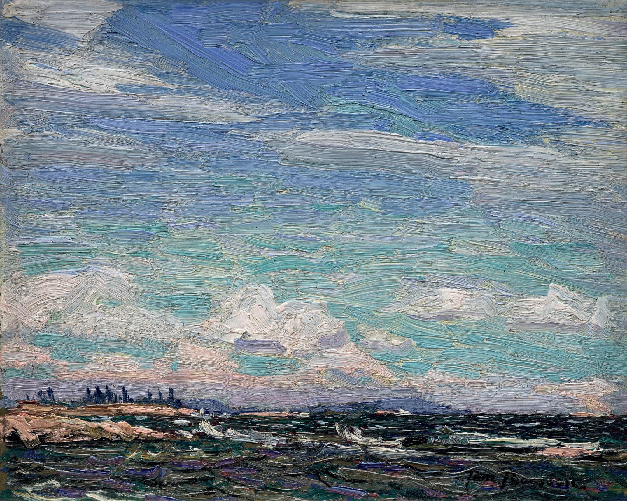
TOM THOMSON
Giant's Tomb, Georgian Bay, Summer 1914 oil on composite wood-pulp board signed lower right; catalogue raisonné no. 1914.23 8.5 ins. x 10.5 ins; 21.6 cms x 26.7 cms
PROVENANCE
Dr. James MacCallum, Toronto, 1914
Wedding Gift to Mr. and Mrs. George Lawton Ridout, 15 September 1914
Gift to Mrs. McColl, Chattanooga, Tennessee
Sotheby's, auction, Toronto, 18 November 1992, lot 72 Private Collection, Toronto Private Collection
EXHIBITED
Tom omson: North Star, McMichael Canadian Art Collection, Kleinburg, Ontario, 24 June 2023-12 January 2024
LITERATURE
“Capt. W. Ridout Dies in Malaya”, Globe & Mail, https://www. veterans.gc.ca/en/remembrance/memorials/canadian-virtual-warmemorial/detail/2142725
Tom omson to F. H. Varley, postmarked July 8, 1914. e omson Collection (PC-936), quoted in Joan Murray, “Tom omson’s Letters” in Dennis Reid and Charles C. Hill, Tom omson, Toronto/Ottawa, 2002, page 298
Charles C. Hill, “Tom omson: Painter” in Dennis Reid and Charles C. Hill, Tom omson, Toronto/Ottawa, 2002, page 125
Joan Murray, Tom omson Catalogue Raisonné (2016): https://www.tomthomsoncatalogue.org/catalogue/index.php, no. 1914.23
Sarah Milroy and Ian. A.C. Dejardin, Tom omson: North Star, Kleinburg, Ontario, 2023, reproduced page 66
Tom omson’s Giant’s Tomb, Georgian Bay is a painting of a breezy, light- lled summer day with an expanse of sky and racing clouds that have changing striations, curling masses, and di use edges. In the lower part of the panel, turbulent dark waters are rent by white-capped waves and at left, a partially visible rocky island juts into the lake. omson presumably stood on this island to paint – it was the place he was staying in Georgian Bay, Go-Home Island, owned by his host, Dr. James MacCallum, omson’s friend and patron. In the far distance, scarcely visible since it lies behind the shoreline of yet another island, is the sloping blue shape of the island inhabitants of Georgian Bay called the Giant’s Tomb. e painting has deft strokes in colours of cream, grey and blue and even peach and lavender as well as blues, white and green. It’s a seemingly simple picture painted with a light touch and yet, the e ect is one of sweeping grandeur.
omson painted the view at three di erent times – at dawn, dusk, and here, at mid-day. He was trans xed by the overarching sky, the fast water, the sparse trees of the distant island, and the far distant Giant’s Tomb Island, which from where he looked could hardly be seen. e slight indication of distant view seemed magical to him.
He had essayed the subject of skies previously in sketches he had brought down to Toronto from Canoe Lake in Algonquin Park in the fall of 1913 so likely it was a fellow worker at Grip Ltd. that year who told him of their potential to add veracity to a scene.
J.E.H. MacDonald, omson’s boss and mentor, is the main candidate for this advice. English-born, he worked in England at a top design studio from 1903 to 1907, and would have known of the great John Constable and his many sketches in which the English artist accurately observed clouds and weather conditions. While working at Grip, MacDonald had painted a series of cloud studies and if he and omson talked about painting clouds, they would have agreed wholeheartedly that skies were a keynote of landscape painting.
Or the idea of painting skyscapes may have come from Arthur Lismer, another ‘Brit’, and co-worker at Grip who camped with omson in May of 1914 about when omson began to paint skies in earnest. Or omson may have been encouraged to paint skies due to his success with selling cloud pictures. In 1914, the National Gallery of Canada bought his canvas of Moonlight, Early Evening.
omson painted Giant’s Tomb, Georgian Bay, not in Algonquin Park but in a subsequent locale to which he travelled in 1914, Georgian Bay. He arrived there by train in early June at the invitation of Dr. MacCallum who was keen to show him the landscape and camped with the doctor at French River, then journeyed with him to MacCallum’s cottage at Go-Home Bay and painted sketches in the region.
Early in August, having found cottage life too gentri ed for his taste (it had a ‘birthday cake and water ice’ atmosphere he wrote F. H. Varley), he paddled and portaged by canoe back to his base at Mowat Lodge in Algonquin Park, where he was joined by A.Y. Jackson. ere the joint journey began that resulted in the founding of the Group of Seven in 1920.
Skies painted in Algonquin Park and then Georgian Bay were a prelude for omson but an important one. Afterwards, he developed many sketches of transient skies and sky phenomena, sunsets and sunrises, thunderclouds, even lightning. It was a theme he explored at length. At the same time, he felt increasingly con dent of his medium, bolder, and his work shows it.
He probably gave the sketch to MacCallum who treasured it, giving it as a gift to Dr. G. Lawton Ridout of Toronto and his wife Dorothy on their wedding day, September 15th, 1914. Dr. Ridout must have gone overseas shortly afterwards – he served as a major with the Royal Fusiliers in the First World War, returning to Canada in 1919. MacCallum would have been moved by his young friend’s bravery in signing up for active service in the armed forces and given him a wedding gift that meant much to MacCallum personally and also spoke compellingly - and cheerfully, MacCallum would have felt - of the beauties of Canada.
Long afterwards, the painting was given as a gift to a Mrs. McColl of Chattanooga, Tennessee, then it was featured in Sotheby’s Auction in Toronto on the 18th of November 1992 lot 72 of “Important Canadian Art”. From there, it was treasured in a private collection in Toronto. Giant’s Tomb, Georgian Bay has always been a favourite, bespeaking summer skies and ne weather of a popular vacation spot for hardy outdoors adventurers in Canada painted by a Canadian master.
We extend our thanks to Joan Murray, Canadian art historian, for contributing the preceding essay. Joan, the Director Emerita of the Robert McLaughlin Gallery in Oshawa, has written many books on Tom omson and published the Tom omson Catalogue Raisonné.
$500,000–$700,000
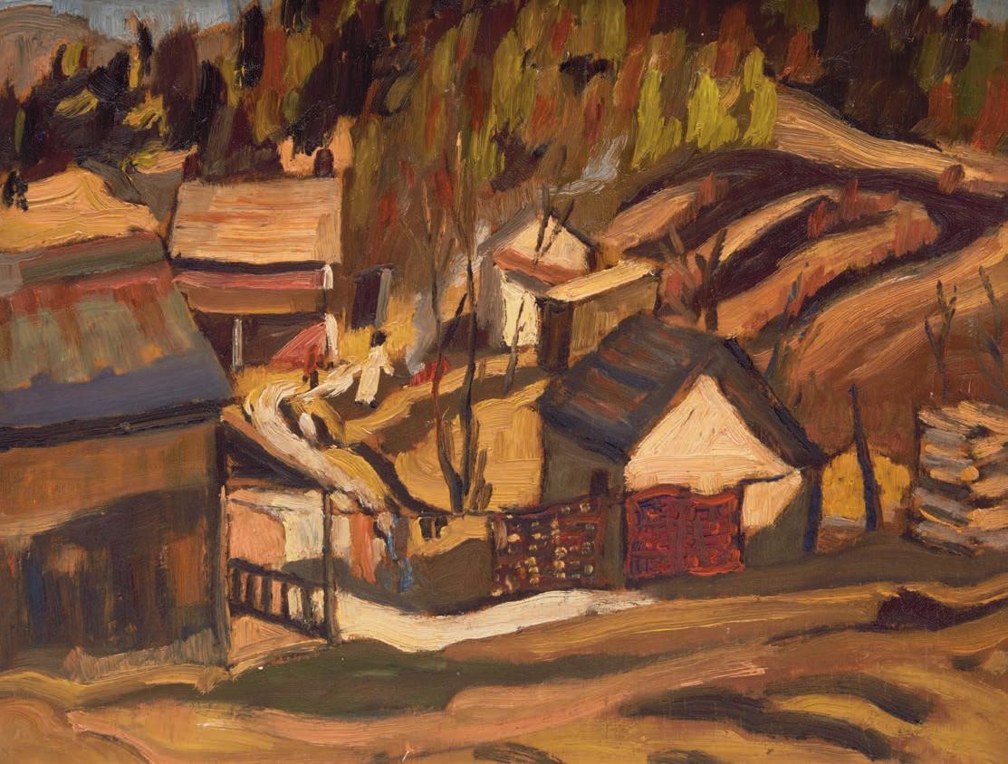
CLARENCE ALPHONSE GAGNON
Couleurs au coucher de soleil, Charlevoix, 1923 titled, dated 1923 and certi# ed by Lucile Rodier Gagnon (no. 147) on the reverse oil on panel 6.25 ins x 9.25 ins; 15.9 cms x 23.5 cms
PROVENANCE
Private Collection, Toronto
LITERATURE
Hélène Sicotte and Michèle Grandbois, Clarence Gagnon, 1881-1942: Dreaming the Landscape, Quebec City, 2006, page 116
In 1923, Clarence Gagnon was living in Baie-Saint-Paul, one of the now-famous painting locations along the north shore of the St. Lawrence River. Gagnon felt passionately about the inhabitants and the surrounding countryside, which o#ered the artist in " nite seasonal landscapes to capture. “With its unique topography and age-old culture,” Hélène Sicotte writes, “the region represented a rich aesthetic resource, and it was during these years that he truly discovered it and used it to develop the landscape form that would henceforth de" ne him.”
A sense of warmth prevails in this glowing scene of the Charlevoix countryside in autumn. Reduced to a blur of brushstrokes, the setting sun illuminates the hillside against the rich colours of the changing leaves, rendering a dynamic contrast between vertical and horizontal, dark and light. A master of ambience, Gagnon harnesses the warmth of human presence in his depiction of the traditional Quebec homestead, which grounds the composition. Flooded with sunshine and a $ ame with colour, Gagnon captures the autumn splendour of the Charlevoix landscape, a painting place central to the artist’s oeuvre.
$7,000–$9,000
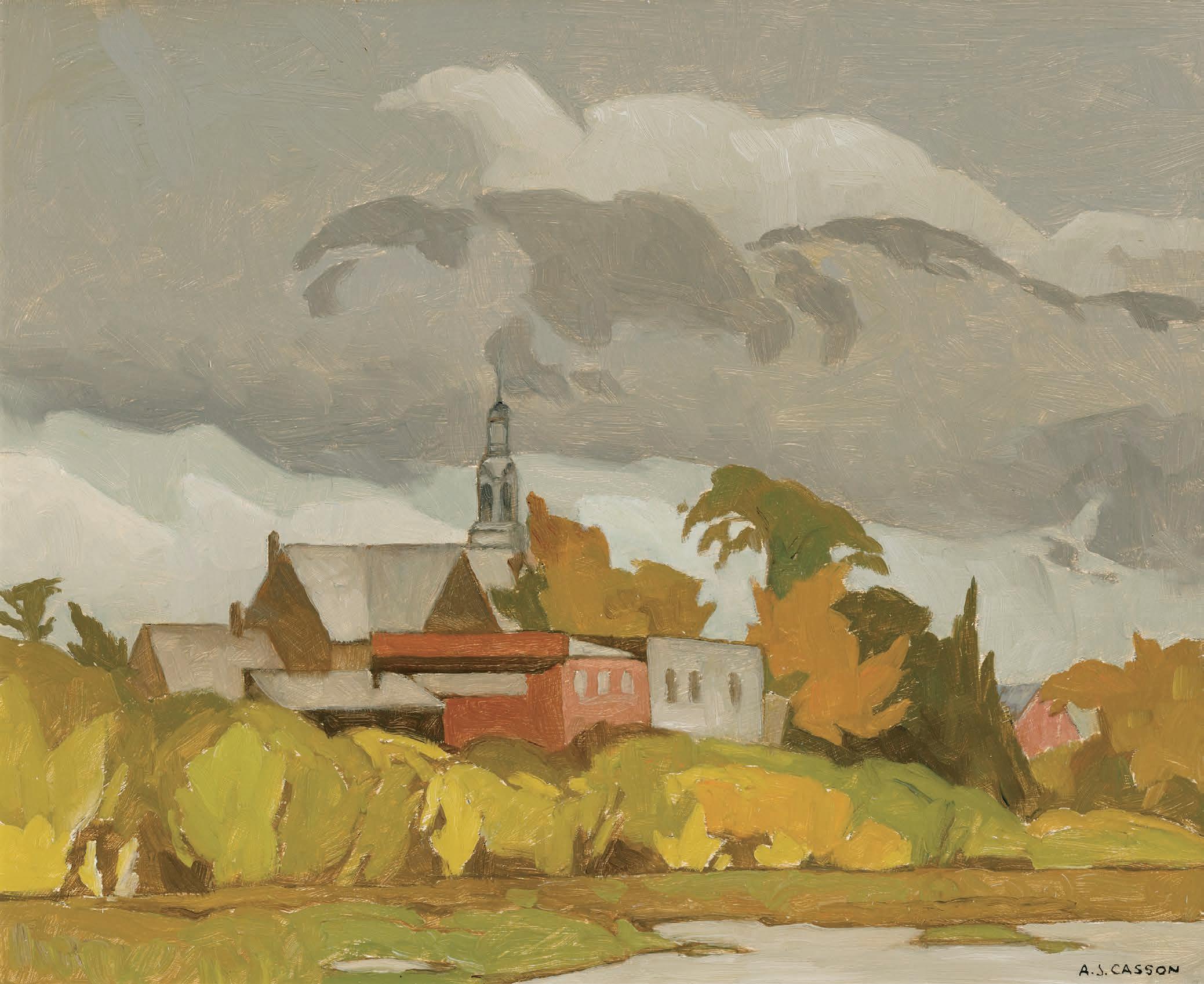
ALFRED JOSEPH CASSON
Grenville, Quebec, 1970 oil on board
signed lower right; signed, titled and dated 1970 on the reverse; also signed on the artist's label on the reverse 12 ins x 14.75 ins; 30.5 cms x 37.5 cms
PROVENANCE
Roberts Gallery, Toronto !e Art Emporium, Vancouver Private Collection, Montreal
A.K. Prakash & Associates Inc., Toronto Private Collection, Toronto
LITERATURE
Paul Duval, A.J. Casson, Toronto, 1951, unpaginated Hubert De Santana, “A Painter’s Life: A.J. Casson looks back on 60 years at the easel,” Canadian Art, Spring 1985, pages 64-69
Grenville, Quebec was painted during one of A.J. Casson’s rarer ventures into another province; the municipality of Grenville is situated on the Ontario-Quebec border along the Ottawa River. Casson painted extensively in Quebec from 1966 to 1975, staying with friends in the region.
Grenville, Quebec captures a scene in transition. !e green, yellow and ochre shrubbery suggest the shift from summer into fall. Common to Casson’s work throughout his career is a limited colour palette. In a 1985 interview, the artist recalls this strategy as being present since his early days with the Group of Seven, when “exhibitions were $ aming with colour. Well, I’ve always thought that if you want to stand out, don’t follow the herd.”
Speaking to Casson's village compositions, Paul Duval notes that, “even when no " gures ornament their architecture, this Canadian artist's townscapes are pregnant with mood. Like the contemporary American realist, Edward Hopper, he has the ability to crystallize a moment, to make concrete and eternal the passing vision. It is as though the time-machine has suddenly ceased to function, in a world where the wind had stopped breathing and the shadows no longer moved and every blade of glass and cloud were " xed forever.”
$20,000–$30,000
PETER CLAPHAM SHEPPARD
Old House, Winter (The Ward, Toronto), circa 1920-21 oil on board
signed lower right; titled, dated "1920-21" and stamped by the estate of the artist (LG205) on the reverse 8.5 ins. x 10.25 ins; 21.6 cms x 26 cms
PROVENANCE
Estate of the Artist
Private Collection, Ontario
LITERATURE
Mail and Empire, Toronto, 14 March 1925
Hector Charlesworth, “Ontario Society of Artists. Brilliant Portraiture the Outstanding Feature of ! is Year’s Show,” Saturday Night, 14 March 1925, page 3
Tom Smart, Peter Clapham Sheppard: His Life and Work , Richmond Hill/Bu #alo, 2018, reproduced page 142
In a 1925 review in the magazine Saturday Night of that year’s Ontario Society of Artists exhibition, the prominent art critic Hector Charlesworth singled out P.C. Sheppard from the crowded "eld of portrait painters by mentioning that he was the author of “some clever urban studies.” A more vociferous reviewer than Charlesworth, writing of the same exhibition in the rival Toronto Mail and Empire, declared that, “Peter C. Sheppard is becoming almost entirely an interpreter of cities and crowded commercial centres. !ere is a certain brutal strength in the colors that he uses which might be regarded as symbolic.” Old House, Winter (! e Ward, Toronto) interprets a dilapidated, bent and broken house from the downtrodden neighbourhood known as the “Ward”, which was demolished in the 1960s to make way for the construction of the City Hall.
!e composition’s open, welcoming nature provides easy visual and imaginative access to the subject. Despite its rundown nature and commonplace features, that no doubt rendered this undistinguished building invisible in its day, and anti-picturesque as a subject to paint, Sheppard gives it an attractive, sympathetic interpretation.
!e sketch blends Sheppard’s innate talents as a draftsman with his acutely sharp sensibilities as a colourist. He emphasizes the swaying rhythms of the windows and dormers, and the gentle degradation of the structure, which he sets down in lines that seem anthropomorphic. !ey appear to breathe and groan, lending the forlorn subject a human spirit. !e lyrical foreground passage of a sinuous white and grey wave of snow and slush, and the snow-covered roof in the middle ground, which frame the dull, dreary building, set up a dynamic charge of visual energy that animates the whole painting.
As a colourist, this sketch shows that Sheppard was as interested in capturing in paint the fugitive qualities of light, as he was in using colour as a vehicle for expressing mood and emotion, or for accentuating formal relationships in compositions. In the background of this sketch and of his other cityscapes of Montreal and New York, the optical blending of tinted hues may have been inspired by an Impressionist sensibility. Colour passages in a Sheppard painting are freighted both with the requirement to convey expressions and to capture impressions. By the early 1920s, Sheppard had feet in both camps; he made use of aspects of the Impressionist mode, but also saw colour as an instrument of making visible his feelings.
Old House, Winter (! e Ward, Toronto) also conveys a sharp social critique, subtly stated, but nevertheless evident in the way Sheppard valorizes what was certainly a marginal, invisible and impoverished segment of the bustling, growing metropolis in the " rst quarter of the twentieth century. By pointing to the neighbourhood’s harsh living conditions in sketches such as this, Sheppard casts light on the underclass that, while living in the shadows of the city, drives its engines of progress.
We extend our thanks to writer, curator and art gallery director Tom Smart, former Director of the Beaverbrook Art Gallery and the McMichael Canadian Art Collection, for contributing the preceding essay. Tom is the author of Peter Clapham Sheppard: Life and Work (2018).
$12,000–$15,000
32
PETER CLAPHAM SHEPPARD
Circus, 1919
oil on board
signed lower left; titled "Circus (Study)", dated 1919, stamped by the estate of the artist (LG143) and inscribed "Sketch by Peter C. Sheppard...Back Stage, Grand Stands [sic], Toronto Exhibition" on the reverse 8.5 ins. x 10.5 ins; 21.6 cms x 26.7 cms
PROVENANCE
Estate of the Artist
Private Collection, Ontario
LITERATURE
Bernice Fenwick Martin, C.P.E., Biographical data: Sheppard, Peter Clapham, R.C.A; O.S.A, (c. 1965), National Gallery of Canada Artists’ Files
“O.S.A. Annual Exhibition. Color, Vigor and Originality Chief Characteristics of the Works. Great War Records,” Globe, Toronto, 8 March 1919, page 8
Tom Smart, Peter Clapham Sheppard: His Life and Work, Richmond Hill/Bu #alo, 2018, reproduced page 115
Peter Clapham Sheppard’s artistic development in Toronto in the early years of the twentieth century came at a time of rapid change and growth in the nation’s artistic landscape. Sheppard’s artistic “creed”, according to his close friend Bernice Fenwick Martin, “was to observe and paint the world around him, without becoming a participator in the passing scene.” Believing that artists should stand apart, Sheppard roamed around his native Toronto capturing in paint and pencil sketches the lively urban scene and the characters of its neighbourhoods. A gang of men constructing the Bloor Street viaduct, a woman sitting contemplatively on a park bench, boys mucking around in a pond, stevedores unloading a steamer, all give evidence
of an artist comfortable with the role of watcher. Sheppard described what he saw with an objectivity that spoke of a curious chronicler of the vitality of the society in which he lived and worked.
In 1919, Sheppard occupied a studio near Toronto’s King and Yonge Streets, an address that was at the centre of city life. A contemporary review of his work singled out his predilection to choose “garish commonplace” subjects that caught his attention. Among these were scenes from the nearby Canadian National Exhibition. It was this interest that, no doubt, also drew Sheppard in 1918 to interpret the circus, the subject of a major canvas Arrival of the Circus (c. 1919, oil on canvas, 101.6 x 147.3 cm, private collection) in which a circus parade with its gaudily-clad performers, its gaily-caparisoned elephants, and its colour and allurements are all shown against a cityscape background of skyscrapers looming over a grey railway bridge veiled with wisps of lavender smoke that trails the jolly entourage making its way to the CNE grounds.
Circus (study), a plein air sketch that is one among many that he made of the CNE at the time, likely constitutes a preliminary study for Arrival of the Circus. !e view is backstage where Sheppard paused to paint elephants and " gures, some on horseback, set on a dais or stage where the elephants are grouped in a cluster at the composition’s centre, perhaps hauling the tent poles of the big top. As troubling as the subject is by today’s standards that ban the formerly barbaric treatment meted out to circus animals, particularly elephants, Sheppard approached his subject with a non-judgmental touch, more on-the-spot reportage, in which he records what he is witnessing.
We extend our thanks to Tom Smart, the author of Peter Clapham Sheppard: Life and Work, for contributing the preceding essay.
$7,000–$9,000
WILLIAM KURELEK
Lumberjacks Returning to Camp mixed media on board signed lower right 17 ins x 34 ins; 43.2 cms x 86.4 cms
PROVENANCE
Acquired directly from the Artist Private Collection
By descent to a Private Collection Joyner Waddington's, auction, Toronto, 25-26 November 2008, lot 68 Private Collection, Toronto
LITERATURE
William Kurelek, Lumberjack , Montreal, 1974, unpaginated William Kurelek and Joan Murray, Kurelek’s Vision of Canada , Edmonton, 1983, page 78
Patricia Morley, Kurelek: A Biography, Toronto, 1986, pages 52-54
Andrew Kear, William Kurelek: Life & Work [online publication], Art Canada Institute, Toronto, 2017, page 4
Before his career as an artist, William Kurelek worked as a lumberjack north of Lake Superior in 1947, then from 1951 to 1952 in a FrenchCanadian camp called La Tuque in Quebec and " nally in Fraserdale, Ontario. !e subject of the Canadian lumberjack was depicted extensively throughout Kurelek’s career with the most notable example being Lumberjack's Breakfast, 1973 (Art Gallery of Greater Victoria). Kurelek further describes his experiences in a picture book titled Lumberjack that was published in 1974.
Lumberjacks Returning to Camp is no di #erent. A line of lumberjacks trail away from their job site with axes and swede saws in hand, leaving behind remnant stumps as they gladly welcome the comfort
of their smoke billowing bunkhouses. Kurelek’s decision to work as a lumberjack occurred at a pivotal moment in his life. It was the " rst time he gained independence and freedom from his arduous home life and the job would also later fund his art studies in Europe.
!e lifestyle of lumberjacks was attractive to Kurelek for what it represented to him as a gateway to independence, and speci "cally how it connected people from various nationalities and backgrounds. !ere was also structure and community. As Kurelek describes, “at all the camps there was the same yarn-telling, backslapping, humor and feast-sized meals, the same admiration for physical prowess, skill and productivity.” Kurelek was struck by how rapidly the practice of lumberjacking had changed over time, both in living conditions and technologies, remarking, “as a few students arrived armed with new gadgets called ‘power chainsaws.’” As this was something not often written about or captured visually, Kurelek felt a responsibility to do so.
Lumberjacking was a decision largely unsupported by his father, whose anger Kurelek wrote, “lasted until the very morning I was to leave.” Andrew Kear explains in William Kurelek: Life & Work that his “mental anguish and a fraught relationship with his parents, especially his father, de" ned Kurelek’s journey into adulthood.” Perhaps Kurelek, whose artwork was often representational and full of meanings, depicted a bear with its cubs looking towards the $eeting lumberjacks as a symbol of his own family watching his departure. !e barrenness and solemness of the landscape, stripped of its trees, is being left behind for greener and more lush forests ahead.
Regardless of the meaning, William Kurelek felt “very lucky to have [had] experienced traditional lumbercamp living before it disappeared forever.” Kurelek kept this lifestyle alive through his images and through the legacy of his artistic career.
$70,000–$90,000
Works from the Collecton of The Winnipeg Art Gallery (WAG)-Qaumajuq
Cowley Abbot is delighted to be entrusted with another selecton of historical and post-war artworks from the collecton of the Winnipeg Art Gallery (WAG)-Qaumajuq, with an emphasis on artsts from the Winnipeg region. We have partnered with Mayberry Fine Art to assist and advise WAG-Qaumajuq towards the ofering of this curated assemblage of work this season.
This artwork is being sold to beneft the WAG-Qaumajuq in establishing an endowment fund to support more diverse representaton in the permanent collecton, beginning with contemporary Indigenous art. Cowley Abbot is pleased to donate our selling commission to the fund as part of the sale.
We extend our thanks to Mayberry Fine Art and to the community of curators, writers and academics who contributed to the research and writng for this collecton of artworks. We thank Stephen Borys, Lucie Dorais, Nicole Fletcher and Michael Parke-Taylor.
LITERATURE
Selected Works from the Winnipeg Art Gallery Collection, Winnipeg, 1971, reproduced page 129
DAVID BROWN MILNE
Road to Copake, 1916
gouache and graphite on paper dated “June 28 1916” at the right edge; an un#nished landscape on the reverse; catalogue raisonné no. 107.31 15.25 ins x 20.25 ins; 38.7 cms x 51.4 cms
PROVENANCE
Estate of Douglas M. Duncan, Toronto
Acquired by the Winnipeg Art Gallery, 1968
EXHIBITED
Paintings by David Milne, Monarch Life Assurance Building, Winnipeg, 1962
David Milne, Watercolours, Winnipeg Art Gallery, 3 October 19746 February 1975
Works of Lionel LeMoine FitzGerald and David Brown Milne, Southern Alberta Art Gallery, Lethbridge, Alberta, 4-26 June 1977
David Milne, Mendel Art Gallery, Saskatoon, Saskatchewan, 2 June6 July 1980, no. 11
David Milne (1882-1953), National Exhibition Centre, Swift Current, Saskatchewan, 18 June-18 July 1981
Historical Canadian Works from the Collection, Winnipeg Art Gallery, 31 May-19 October 1986
David Milne, Winnipeg Art Gallery (Exhibition Services); travelling to the Art Gallery of Southwestern Manitoba, Brandon; !under Bay Art Gallery, 8 January 1998-28 May 2000
David Milne (1882-1953), Swift Current, Saskatoon, 1981
David P. Silcox, Painting Place: ! e Life and Work of David B. Milne, Toronto, 1996, pages 70, 78
David Milne Jr. and David P. Silcox, David B. Milne: Catalogue Raisonné of the Paintings, Volume 1: 1882-1928, Toronto, 1998, listed and reproduced page 168, no. 107.31
David Milne’s move from New York City to the small town of Boston Corners in 1916 marked the beginning of a remarkably innovative and productive period for the artist. Located at the intersecting state lines of Massachusetts, New York and Connecticut, the village lies on the western $ ank of the Taconic Mountains. Iron ore had been mined in the area, with numerous ponds close by which were originally smelting pits. Two rail lines ran through Boston Corners, crucially allowing Milne to reach Manhattan when needed. Art historian David Silcox noted, “Almost at once Milne fell in love with Boston Corners, and throughout his life it remained a symbol of the perfect painting place. After the grime, hurry and anxiety of New York, he became reunited with his country origins. Here was his Walden, complete with ponds, a haven where he could live quietly and intensely, and where the chief purpose of his life could be pursued.”
$40,000–$60,000
! e Human Presence, Winnipeg Art Gallery, 19 August-12 November 1989
IVAN KENNETH EYRE
Mythopoeic Prairie II, 1965 oil on canvas
signed and dated 1965 lower right 46 ins x 50.5 ins; 116.8 cms x 128.3 cms
PROVENANCE
Collection of the Artist, 1965-1966
Gift of Mary H. Acheson in memory of her mother, Helen E. Acheson to the Winnipeg Art Gallery, 1966
EXHIBITED
Development of Canadian Art: 1900-1965, Winnipeg Art Gallery, 18 January-23 March 1975
Images of Woman, Winnipeg Art Gallery, 14 November 1975-4 January 1976
! rough Canadian Eyes: Trends and In#uence in Canadian Art, 1815-1965, Glenbow Alberta Institute, Calgary, 22 September-24 October 1976
Images of the Prairies, !e Saskatoon Gallery and Conservatory Corporation, 11 April-20 May 1979
! e Canadian Landscape, Winnipeg Art Gallery, 12 December 19807 June 1981
Trees of a ! ousand Kind and Tall, Winnipeg Art Gallery, 10 December 1983-1 April 1984
! e Figure in Canadian Art, Winnipeg Art Gallery, 5 June-19 September 1993
Stored Secrets, ! e Sequel: ! e Vault on View, Winnipeg Art Gallery, 2 December 1995-15 September 1996
Government House Selections, Government House, Winnipeg, 16 May 2001-23 April 2002
Ivan Eyre: Landscapes and Still Lifes, Winnipeg Art Gallery, 15 September-31 October 2017
LITERATURE
Ann Davis, Images of Woman, Winnipeg, 1975, unpaginated, reproduced Ann Davis, Images of the Prairies, Saskatoon, 1979, unpaginated, reproduced George Woodcock, Ivan Eyre, Markham, 1981, reproduced page 92
Drawing mostly on memory and dream imagery, Ivan Eyre created many surreal, post-apocalyptic scenes in the early 1960s, including Mythopoeic Prairie II. Dating to 1965, the oil on canvas depicts a prairie "eld with a broken car and other scraps of machinery. Aside from the shrubbery of the "eld, most of the objects are only somewhat discernible to the eye, as the forms are heavily stylized and tightly arranged. Eyre creates pathways for the eyes through his marvelous pointed shapes, which twist and overlap within the landscape.
$8,000–$12,000
FRANK HANS JOHNSTON
Early Evening, Winter, 1928 gouache on paperboard signed and dated 1928 lower left 29.25 ins x 19.25 ins; 74.3 cms x 48.9 cms
PROVENANCE
Peter Dobush, Montreal Gift to the Winnipeg Art Gallery, 1965
EXHIBITED
! e Peter Dobush Donation, Winnipeg Art Gallery, 16 November-1 December 1965
Trees of a ! ousand Kind and Tall, Winnipeg Art Gallery, 10 December 1983-1 April 1984
Founders’ Exhibition: ! e Peter Dobush Donation , Winnipeg Art Gallery, 26 April-7 July 1985
Canadian Historical Art from the Collection , Winnipeg Art Gallery, 6 April-16 July 1989
Stored Secrets: ! e Vault on View, Winnipeg Art Gallery, 11 September-27 November 1994
Canadian Mosaic: Selections from the WAG's 20th Century Canadian Collection , Winnipeg Art Gallery, 21 August 2004-6 March 2005
Diana ! orneycroft: Canada, Myth and History (Group of Seven Awkward Moments Series), McMichael Canadian Art Collection, Kleinburg; travelling to the Winnipeg Art Gallery, 12 June-22 August 2010
LITERATURE
Robert Burford Mason, A Grand Eye for Glory: A Life of Franz Johnston , Toronto, 1998, pages 40, 63
Franz Johnston is a renowned lyrical painter, as his skill in rendering the quality of light and shadow on snow is unsurpassed. Johnston’s treatment of the Canadian landscape in a decorative style sets him apart among Canadian artists. In a review of his " rst independent exhibition in 1920, ! e Globe and Mail commended his approach, remarking, “Mr. Johnston leans strongly to the decorative treatment of his subject, and with it he infuses much poetry and imagination.” Johnston exempli "es this approach in Early Evening, Winter, 1928. !e harmonious composition of crisp white snow and the snow-covered evergreen tree set before a radiant, dramatic sky is quintessential Johnston.
Following a lucrative commission in 1927 to paint nine murals for the auditorium of Pickering College in Newmarket, Johnston embarked on a painting trip to northern Quebec. On this trip Johnston studied the e#ects of various qualities of light on snow. ! is was the " rst of many painting trips Johnston would take in his search for the beauty of light e#ect. As Roger Burford Mason suggests, “perhaps the thrill of danger and the isolation were an integral and necessary part of Johnston’s heady experience of painting in the northland; numerous stories circulated in the press and among Toronto’s artistic community of his being lost in snow, or in impenetrable bush, or being snowed in with diminishing supplies. But whatever the case, he continued to study the nature of snow and light in painting trips.”
$15,000–$20,000
LIONEL LEMOINE FITZGERALD
The Barn, circa 1930 oil on canvas laid on board signed lower left 11.75 ins x 14.25 ins; 29.8 cms x 36.2 cms
PROVENANCE
Estate of Arnold O. Brigden, Winnipeg Gift to the Winnipeg Art Gallery, 1973
EXHIBITED
Fifth Annual Exhibition of the Manitoba Society of Artists, Galleries of Richardson Brothers, Winnipeg, 1–8
February 1930
! e Brigden Collection, Winnipeg Art Gallery, 30 May14 October 1974, no. 23
Manitoba Landscape, Winnipeg Art Gallery, 14 June-17
August 1986
FitzGerald in Rural Manitoba, Winnipeg Art Gallery Extension Services ArtReach Program; travelling to McCreary; Neepawa; Dauphin; Brandon; Virden; Holland; Leaf Rapids; Portage la Prairie, Manitoba, 6 March 1992-10 November 1993
Against Wind and Weather: ! e Barn in Canadian Art, Winnipeg Art Gallery Extension Services ArtReach Program; travelling to Neepawa, Manitoba; Tiger Hills Art Gallery, Holland, Manitoba; Portage Arts Centre, Portage la Prairie, Manitoba; Mennonite Heritage Village, Steinbach, Manitoba; Leaf Rapids National Exhibition Centre, Manitoba; Heritage North Museum, !ompson, Manitoba; Art Gallery of Swift Current, Saskatchewan, 25 November 1994-7
December 1997
Winnipeg Real Estate Board Citizens Hall of Fame induction ceremony for L.L. FitzGerald, Assiniboine Park Pavilion Gallery, Winnipeg, 7 October 2004
Around Here: Historical Scenes of Manitoba, Winnipeg Art Gallery, 4 July-16 November 2007
! e Collection on View: Tom ! omson and the Group of Seven, Winnipeg Art Gallery, 27 June 2015-2 April 2018
Into the Light: Lionel LeMoine FitzGerald, McMichael Canadian Art Collection, Kleinburg, Ontario; travelling to Winnipeg Art Gallery, 12 October 2019-6 September 2020
LITERATURE
W.J. Phillips, “Art and Artists,” Winnipeg Evening Tribune, 1 March 1930
Michael Parke-Taylor, Lionel LeMoine FitzGerald: Life & Work [online publication], Art Canada Institute, Toronto, 2019, reproduced page 83
Sarah Milroy, Ian A.C. Dejardin and Michael Parke Taylor, Into the Light: Lionel LeMoine FitzGerald, Kleinburg, 2019, reproduced page 43
From 1926 to 1941, the Winnipeg painter and printmaker Walter J. Phillips authored a column, “Art and Artists”, in the Winnipeg Evening Tribune. His lively texts typically covered a range of topics germane to local readers interested in the workings of the world of art. Phillips’s columns often re$ect his dogmatic and " rmly-held opinions. While not a close friend of Lionel LeMoine FitzGerald, Phillips paid a singular tribute to his fellow artist on 1 March 1930. ! at evening, his entire column in the Tribune was devoted to a painting he had seen exhibited at the annual exhibition of the Society of Manitoba Artists. !e picture discussed was FitzGerald’s relatively small oil ! e Barn. Phillips enthused that “its austere beauty was so appealing that I cannot get it out of my mind.” He described the role that light plays in the picture: “ !e sheer walls of the barn are wrapped in luminous shadow, within which subdued lights dance and play as they are projected from other and sun-washed surfaces. !e roof re$ects little invisible clouds; the strips of sward in the foreground mirror the sky. !e relation of one thing to another – universal interdependence – is symbolized. Light is the expositor.”
! e Barn was originally owned by Arnold Brigden, who managed Brigdens of Winnipeg Limited, one of Canada’s oldest commercial printing and graphic design " rms. While FitzGerald was never employed by Brigdens, many of his artistic contemporaries such as Charles Comfort, Eric Bergman, Caven Atkins, Fritz Brandtner, Philip Surrey, and Gordon Smith worked there for various periods during the 1920s and 1930s. Arnold Brigden served on the art committee that supervised both the Winnipeg School of Art and the Winnipeg Art Gallery. A close friend of FitzGerald, Brigden was able to choose some of the artist’s " nest works, including !e Barn, when building what has been called “the " rst modern collection in Winnipeg.”
We extend our thanks to Michael Parke-Taylor, Canadian art historian, curator, and author of Bertram Brooker: When We Awake! (McMichael Canadian Art Collection, 2024) and editor of Some Magnetic Force: Lionel LeMoine FitzGerald Writings (Concordia University Press, 2023) for contributing the preceding essay.
$14,000–$18,000
38
FRANKLIN CARMICHAEL
Mountainscape
watercolour
signed lower right
11.25 ins x 13.5 ins; 28.6 cms x 34.3 cms
PROVENANCE
Estate of Arnold O. Brigden, Winnipeg Gift to the Winnipeg Art Gallery, 1973
EXHIBITED
! e Brigden Collection, Winnipeg Art Gallery, 29 May-13 October 1974
Development of Canadian Art: 1900-1965, Winnipeg Art Gallery, 18 January-23 March 1975
Group of Seven: Works on Paper, Winnipeg Art Gallery, 1-15 October 1976
! e Canadian Landscape, Winnipeg Art Gallery, 12 December 1980-7 June 1981
Franklin Carmichael: Watercolours, Art Gallery of Greater Victoria, 3 September-30 October 1981
Stone and Sky: Canada’s Mountain Landscape, Audain Art Museum, Whistler, B.C., 10 November 2017-26 February 2018
After initially focusing on oil painting during the early years of the Group of Seven, Franklin Carmichael returned to watercolour in 1924. Between 1926 and the mid-1930s, he created some of his most signi "cant watercolours. In a talk during the 1930s, Carmichael expressed his deep enthusiasm for this medium, the artists who in $uenced his appreciation for watercolour, and his confusion regarding the early twentieth-century belief that the Canadian landscape was unsuitable for watercolour painting. As a versatile medium, Carmichael liked that watercolour could adapt to even the most subtle shifts in tone or emotion and that it possessed the ability to be clear and precise, yet also delicate and impactful, capturing all the nuances that exist in-between. In 1925, Carmichael, A.J. Casson and Frederick Brigden founded the Canadian Society of Painters in Water Colour, furthering the manifestation of Carmichael’s desire to install watercolour in its rightful place of importance.
Mountainscape is depicted from a high vantage point, showcasing many of the hallmarks of the artist’s iconic rendering of the landscape in watercolour. Jack pines and the dramatic rolling mountains leading into the distance were distinctive features of Carmichael’s watercolours. Mauve and green tones create an ethereal and calm scene. !e soft lavender hues of the rolling hills in the background provide a seamless backdrop to the more tactile green pines in the foreground. ! is harmonious colour palette evokes a sense of tranquility and serenity.
$30,000–$40,000
39
ALEXANDER
YOUNG JACKSON
St. Adele, Quebec, 1926 oil on panel signed lower left; signed, titled, dated "March 1926" and inscribed "Studio Building, 25 Severn St., Toronto" on the reverse 8.5 ins x 10.5 ins; 21.6 cms x 26.7 cms
PROVENANCE
Estate of Arnold O. Brigden, Winnipeg Gift to the Winnipeg Art Gallery, 1973
EXHIBITED
! e Brigden Collection , Winnipeg Art Gallery, 29 May-13 October 1974
Some Canadian Landscape Painters from the Winnipeg Art Gallery Collection , Winnipeg Art Gallery, 10 October 1981-28 February 1982
Little Pictures, Winnipeg Art Gallery, 19 February-17 April 1983
Stored Secrets: !e Vault on View, Winnipeg Art Gallery, 11 September27 November 1994
! e View from Here, Winnipeg Art Gallery, 20 May-31 December 2000
! e Collection on View: Tom ! omson and the Group of Seven, Winnipeg Art Gallery, 27 June 2015-2 April 2018
Salon Style: 20th Century Painting, Winnipeg Art Gallery, 12 October 2018-18 May 2020
LITERATURE
Naomi Jackson Groves, A.Y.’s Canada, Toronto/Vancouver, 1968, page 44 Mary Jo Hughes, ! e View from Here: Selections from the Canadian Historical Collection , Winnipeg, 2000, reproduced page 22 Tricia Wasney, Panoramas: ! e North American Landscape in Art, http://www.virtualmuseum.ca/panoramas, launched 3 April 2001
!e rural landscapes of Quebec came to be known as A.Y. Jackson’s hallmark subject matter. Although he had painted in the Eastern Townships prior to World War I, it was not until February and March of 1921 that Jackson began painting in the Lower Saint Lawrence region. In the following decades, Jackson made nearly annual trips in late winter and early spring, capturing the essence of the many small villages along both the north and south shores. !ese rural communities appealed to Jackson and his fellow artists, as they preserved a traditional way of life amidst a rapidly modernizing and growing society.
St. Adele, Quebec demonstrates Jackson’s skill at rendering the Quebec landscape, with its winding country road and the church steeple emerging from a row of farmhouses. Jackson expertly captured the heart of Quebec, and fondly recalled, “I have worked in villages on both the north and south shores of the St. Lawrence. I have happy memories of a great many places.”
$30,000–$50,000
ALFRED JOSEPH CASSON
Lake Kamaniskeg
oil on board
signed lower right; signed and titled on the reverse 12 ins x 15 ins; 30.5 cms x 38.1 cms
PROVENANCE
Roberts Gallery, Toronto
Peter Dobush, Montreal, 1958
Gift to the Winnipeg Art Gallery, 1965
EXHIBITED
! e Peter Dobush Donation, Winnipeg Art Gallery, 16 November-1 December 1965
Some Canadian Landscape Painters from the Winnipeg Art Gallery Collection, Winnipeg Art Gallery, 10 October 1981-28 February 1982
Little Pictures, Winnipeg Art Gallery, 19 February-17 April 1983
Founders’ Exhibition: ! e Peter Dobush Donation, Winnipeg Art Gallery, 26 April-7 July 1985
Stored Secrets: ! e Vault on View, Winnipeg Art Gallery, 11 September27 November 1994
! e Collection on View: ! e Modernist Tradition 1900-1950, Winnipeg Art Gallery, 19 August 2011-31 March 2013
! e Collection on View: ! e Modernist Tradition 1900-1950, Winnipeg Art Gallery, 27 September 2013-12 October 2014
! e Collection on View: Tom ! omson and the Group of Seven, Winnipeg Art Gallery, 27 June 2015-2 April 2018
A.J. Casson, the youngest member of the Group of Seven, was born in Toronto in 1898. He pursued his artistic education at the Ontario College of Art under the guidance of J.W. Beatty from 1918 to 1921 and participated in private lessons with Harry Britton between 1916 and 1918. In 1919, when the young A.J. Casson began his career as a design assistant to Franklin Carmichael at the Rous and Mann " rm, he could not have anticipated the extraordinary path his artistic journey would take. Carmichael, who was both demanding and friendly, became a close friend, mentor, and sketching partner. It was through Carmichael that Casson met the in $uential members of the Group of Seven at Toronto’s Arts and Letters Club. ! is connection allowed the passionate artist to showcase his work with the Group, ultimately leading him to succeed Frank Johnston in 1926 when Johnston chose to explore other pursuits.
Casson established his artistic voice through depictions of southern Ontario villages, rural landscapes, and the Ontario north. ! is oil depicts Lake Kamaniskeg, which is located just southeast of Algonquin Park in Ontario, near Barry's Bay. ! is area was frequented by Group of Seven members who embarked on both collective and independent sketching trips. As a result, Algonquin Park and the surrounding area have become an iconic visual reference in Canadian art history. Lake Kamaniskeg showcases Casson's expert ability to render the distinct seasons in Ontario and his exploration of the subtleties of the variations of green in the landscape.
$20,000–$30,000
41
IVAN KENNETH EYRE
Terrible & Sublime
acrylic on canvas
signed lower right; titled on two gallery labels on the reverse
29.75 ins x 29.75 ins; 75.6 cms x 75.6 cms
PROVENANCE
Collection of the Artist
Albert White Galleries, Toronto Yellow Door Gallery, Winnipeg
Acquired by the Winnipeg Art Gallery, 1970
EXHIBITED
Development of Canadian Art, Winnipeg Art Gallery, 13 March-14 June 1976
Stored Secrets, ! e Sequel: ! e Vault on View, Winnipeg Art Gallery, 2 December 1995-15 September 1996
$8,000–$12,000
42
IVAN KENNETH EYRE
Prairial Edge, 1965 oil on canvas
signed and dated 1965 lower right; signed and inscribed “Winnipeg Art Gallery“ on the stretcher 48.75 ins x 66.75 ins; 123.8 cms x 169.5 cms
PROVENANCE
Gift to the Winnipeg Art Gallery by Mary H. Acheson, in memory of her mother, Helen E. Acheson, 1966
EXHIBITED
Prairie Visions: Selections from the Collection of the Winnipeg Art Gallery, Winnipeg Art Gallery, 14-29
January 1984
Contemporary Art from the Winnipeg Art Gallery Collection, Winnipeg Art Gallery, 5-22 April 1984
$14,000–$18,000
43
JAMES WILSON MORRICE
Landscape, Algeria [Oran] oil and graphite on canvas signed lower right; inscribed "Paysage de Jamaïque" on the stretcher, titled "Morroccan [sic] Landscape" on a label a " xed to the stretcher, titled "Landscape, North Africa" on a label a " xed to the stretcher 21.25 ins x 28.75 ins; 54 cms x 73 cms
PROVENANCE
Marguerite Guichardaz, Paris (wife of art material dealer and agent César Guichardaz)
David R. Morrice (nephew of the artist), Montreal, 1929 Bequeathed to the Winnipeg Art Gallery, with usufruct in favour of his sister, F. Eleanore Morrice, Montreal (he died in 1978, she in 1981) Collection of !e Winnipeg Art Gallery, 1983
EXHIBITED
Salon d’Automne, Grand Palais, Paris, 1 November-16 December 1923, no. 1459 as Paysage (La Jamaïque)
Drawings and Paintings by J.W. Morrice, 1865-1924, 74th Annual Exhibition, Memorial Section, Royal Canadian Academy, Art Gallery of Toronto, 27 November-10 January 1954, no. 1 as Moroccan Landscape Acquisitions, Winnipeg Art Gallery, 1 December 1984-13 January 1985
Historical Canadian Works from the Collection , Winnipeg Art Gallery, 31 May-19 October 1986 as Landscape, North Africa
Canadian Historical Art from the Collection , Winnipeg Art Gallery, 6 April-16 July 1989
Stored Secrets: ! e Vault on View, Winnipeg Art Gallery, 11 September27 November 1994
! e View from Here, Selections from the Canadian Historical Collection, Winnipeg Art Gallery, 28 May-31 December 2000, no. 91 as Landscape, North Africa
LITERATURE
! e WAG MAG, Winnipeg, June/July 1986, reproduced page 11 as Landscape, North Africa
Mary Jo Hughes, ! e View from Here, Selections from the Canadian Historical Collection, Winnipeg, 2000, no. 91, reproduced page 52
James Wilson Morrice resumed his international travels after the First World War, visiting North Africa, Trinidad and, closer to home in Paris, the south of France and Corsica. ! is painting of a tranquil scene in Algeria was exhibited at the 1923 Salon d’Automne in Paris, with the incorrect title Paysage (La Jamaïque). Also included in the show was Paysage (Algérie) by Morrice, also incorrectly titled, as it was in fact depicting a beach in Trinidad. !e Salon ended on December 16, and the paintings were returned to César Guichardaz, his agent, until Morrice was able to pick them up. !e artist unexpectedly died in Tunis on January 23rd, 1924. Guichardaz kept the two paintings, and sold them to Morrice's nephew David in 1929.
David Morrice might have kept them there for a while, because when Donald W. Buchanan researched his 1936 Biography and Catalogue Raisonné, he did not see them in the Montreal family home. When he did, around 1940, he added their descriptions, in pencil, to his own copy of his book (NGC archives), according to Morrice’s titles: this painting in the West Indies section, the beach scene in North Africa But when he realized that the latter subject was not Algerian (and not Jamaican either!), and that Morrice, in his haste at sending his works to the Salon had switched the titles, he corrected both notes in ink, adding “Algeria” on page 177, and “Trinidad?” on page 175. He was right on both counts, and we have renamed the present canvas Landscape, Algeria, as Morrice himself had " rst intended.
!e 1921 Trinidad sketchbook was also used in 1922, notably in Algeria, in the capital and in Constantine, a much less Europeanized town in eastern Algeria. We " nd more images of Algiers in another sketchbook (#19, MMFA Dr.1981.11); after a careful study of its drawings and inscriptions, we concluded that Morrice had returned to Algeria in early 1923, this time accompanied by Léa. !e sketchbook tells us that they also visited Oran, the country’s second largest city, on the western coast: there is the classic view of Mount Murdjadjo,
Oran Algerien, La Promenade de Létang, Gehweg, postcard circa 1905-1910
Photo: Alamy Stock Photo Not for sale with this lot
James Wilson Morrice Untitled , 1923
graphite; Sketchbook no. 19, fol. 33 (detached) Montreal Museum of Fine Arts, David R. Morrice Bequest (Dr. 1981.11)
Photo: MMFA
Not for sale with this lot
with the Fort Santa Cruz, and another of the Mosquée du Pacha !e drawing that corresponds to the present painting is right after another view of the mosque, and before that of a road joining another one at the bottom of a hill. Could they also be Oranese?
A rare postcard shows the exact view that Morrice depicted, a photo taken before the short palm trees were planted; its legend reads Oran, Algerien - La Promenade de Létang. ! is large public park, established in 1837 by a French General of that name, is still in existence, renamed Promenade Ibn Badis after the 1962 Independence. Quite large, it is crisscrossed by many alleys, covering two slopes of a hill overlooking the port. After drawing his view of the Murdjadjo from a terrace in the park, Morrice likely walked down the hill behind him (the alley on the left here), reached a small open space near the eastern gate, then turned around: the decorative qualities of this quiet corner appealed to him. ! e Chateau Neuf, high on the hill, is far enough not to be distracting – it is almost invisible in the painting. Satis"ed with his drawing, the artist continued down the alley on the right, stopping at mid-slope to draw its junction with the main road below. ! is last drawing, and one of the mosque, were later developed into beautiful watercolours, but Landscape, Algeria is the only canvas from the second Algerian trip.
With its luscious vegetation and its mauve sky, the oil painting continues an artistic style Morrice had adopted in Morocco around 1919-20, and pursued in Trinidad the following year. !e $ at, decorative composition and the almost saturated palette show the in $uence of Gauguin more than that of Matisse. And from Cézanne, he borrowed the strong contours of the foliage, though freely and lightly enough to let the white ground show through. ! is technique is derived from watercolour, Morrice’s preferred medium at this point: after years of sketching rapidly in oil, he was pushing even further his simpli "cation of forms and colours. Given its date and its history, Landscape, Algeria is very likely his last canvas, making us wonder where his art would have led him, if not for his early passing.
We extend our thanks to Lucie Dorais, Canadian art historian and author of J.W. Morrice (National Gallery of Canada, 1985), for contributing the preceding essay.
$175,000–$225,000
44
JAN CYBIS
Untitled (Yellow Houses in Nowy Sacz), 1958 oil on canvas
signed lower right; signed, dated 1958 and inscribed “Zolte domy St. Sacz“ on the stretcher on the reverse 25.5 ins x 32 ins; 64.8 cms x 81.3 cms
PROVENANCE
C.R. Hiscocks, Winnipeg
Gift to the Winnipeg Art Gallery, December 1960
Jan Cybis was one of the leading " gures of the Colorist movement in Polish painting. ! is later work presents a street scene with a succession of colourful buildings of di #erent sizes beneath a cloudy sky and a church tower rising in the distance. !e artist’s colour range of predominantly matte tones is on full display—blending green, blue, beige, purple and vermillion—with a cool gray repeated throughout the work, a shade Cybis favoured especially.
$8,000–$12,000
45
ROBYN
DENNY
Into Colour, 1964-65 oil on canvas
83.5 ins x 71.5 ins; 212.1 cms x 181.6 cms
PROVENANCE
Mr. and Mrs. Henry Feiwel, before 1973
Samuel Nitikman, 1978
Gift to the Winnipeg Art Gallery, 1978
EXHIBITED
Robert Elkon Gallery, New York, date unknown
Robyn Denny, !e Tate Gallery, London, England, 7 March-23 April 1973, no. 6 ! e British Are Coming, DeCordova Museum, Lincoln, Massachusetts, 12 April-8 June 1975
Marcel Breuer: Furniture and Interiors, Winnipeg Art Gallery, 2 April-16 May 1982
Twentieth Century British Art from the Collection, Winnipeg Art Gallery, 28 July27 November 1988
LITERATURE
Robyn Denny, London, England, 1973, no. 46, reproduced page 39 as Into Colour, 1964-1965
Robyn Denny was one of the leading young artists who transformed British art during the late 1950s by rejecting the focus on landscape painting from the St Ives School and " nding instead in Abstract Expressionism, American culture and urban modernity a colourful source of inspiration. !e present work is strongly reminiscent of his Out-Line series, where vertical bands at the centre are framed by architectural lines, forming a gateway. Here, the linear shapes have been " lled in instead with a combination of dark hues set against a pale blue background. !e interplay of form, perspective and colour reveals the complexities of Denny’s vision as an artist.
$14,000–$18,000
46
FRANKLIN CARMICHAEL
Cranberry Lake, circa 1935 oil on beaverboard inscribed "Hills Cranberry", "96" and estate stamp on the reverse 10 ins x 12 ins; 25.4 cms x 30.5 cms
PROVENANCE
Family of the Artist
Collection of the Winnipeg Art Gallery
EXHIBITED
! e View from Here: Selections from the Canadian Historical Collection, Winnipeg Art Gallery, 20 May-31 December 2000
Into the Collection, Winnipeg Art Gallery, 23 July 2005-13 August 2006
! e Collection on View: Tom ! omson and the Group of Seven, Winnipeg Art Gallery, 27 June 2015-2 April 2018
Salon Style: 20th Century Painting, Winnipeg Art Gallery, 12 October 2018-18 May 2020
LITERATURE
Mary Jo Hughes, ! e View from Here: Selections from the Canadian Historical Collection, Winnipeg, 2000, reproduced page 60
Cranberry Lake is located southeast of Sudbury. Franklin Carmichael became synonymous with the area, as the artist had a personal connection to the region. Carmichael possessed a deep, re$ective spirit, and he was profoundly moved by the untouched beauty of the region. Over the course of two decades, he dedicated himself to sketching the landscape extensively. He explored the nearby hills and lakes, often capturing sweeping views from elevated vantage points. As the " rst member of the Group of Seven to immerse himself in this particular area, he quickly became an inspiration for others, including A.Y. Jackson and Arthur Lismer, who visited in the 1930s. In 1935, he constructed a cabin in the area and regularly visited with his family for extended stays.
!e vibrant strokes of colour on the hills capture a dynamic energy. !e landscape depicted is rich and fertile, with sunlight illuminating the rocky terrain. Beyond the captivating, atmospheric e#ects that Carmichael captures in this work, the artist masterfully communicates a profound sense of depth. !e mountains stretch into the distance, undulating gently and fading away at the edges of the canvas.
$40,000–$60,000
47
KENNETH CAMPBELL LOCHHEAD
Big Angel, 1971
acrylic on canvas
signed, titled and dated 1971 on the reverse 93.25 ins x 94.25 ins; 236.5 cms x 239.4 cms
PROVENANCE
Acquired directly from the Artist, Ottawa, 1978 Collection of the Winnipeg Art Gallery
EXHIBITED
Lochhead '72: Recent Paintings by Kenneth Lochhead , Winnipeg Art Gallery, 7 January-15 February 1972
Selected Contemporary Works from the Winnipeg Art Gallery Collection, Winnipeg Art Gallery, 3-16 February 1976
Kenneth Lochhead: An Exhibition of Paintings 1952-1975, Art Gallery of Windsor; travelling to the Winnipeg Art Gallery, 16 December 197712 February 1978
! e Development of Canadian Art, Winnipeg Art Gallery, 10 June 197828 January 1979
Contemporary Works from the Winnipeg Art Gallery Collection, Winnipeg Art Gallery, 20 January-10 February 1979
Contemporary Works from the Winnipeg Art Gallery Collection, Winnipeg Art Gallery, 16 August-31 October 1982
Contemporary Art from the Winnipeg Art Gallery Collection, Winnipeg Art Gallery, 5-22 April 1984
Canadian Historical Art from the Collection, Winnipeg Art Gallery, 6 April-16 July 1989
Untitled (Big Works from the Collection), Winnipeg Art Gallery, 29 October-19 November 1996
Kenneth Lochhead from the Collection, Winnipeg Art Gallery, 23 November 1999-16 March 2000
New Music Festival, Winnipeg Art Gallery, 27-31 January 2012
! e Collection on View (to accompany the 2013 Gallery Ball), Winnipeg Art Gallery, 11-20 October 2013
In the early 1970s, Kenneth Lochhead began to create paintings using a spray gun rather than paint brushes. Where his paintings of the 1960s had featured hard-edge shapes of free-$oating colour, his new work consisted of delicate curving wisps of atmospheric hues. ! is technique paralleled the poured and stained paint surfaces of artists Morris Louis and Helen Frankenthaler, also championed by Clement Greenberg. Big Angel features sensuous, curving forms in atmospheric, soft focus. !e monumental scale makes a grand visual statement, enveloping the viewer in cloudy colour.
$15,000–$20,000
48
IVAN KENNETH EYRE
Canal Square, 1992
acrylic on canvas
signed lower left; titled and dated 1992 on the stretcher bar on the reverse 87.75 ins x 87.75 ins; 222.9 cms x 222.9 cms
PROVENANCE
Gift of the Artist
Collection of the Winnipeg Art Gallery
EXHIBITED
Contemporary Manitoba Art from the Collection, Winnipeg Art Gallery, 4 February-15 March 1994
Into Our Collection: Sta " Picks, Winnipeg Art Gallery, 26 June-4 October 2008
LITERATURE
Michael Hartley, Senior I Art Interim Guide 1993, Manitoba Education and Training, 1993, reproduced page 133
Senior 3 English Language Arts (30S): Literary Focus: A Course for Distance Learning, Field Validation Version , Manitoba Education and Training and Youth, n.d., unpaginated, reproduced Denis Cooley, Amy Karlinsky and Mary Reid, Figure Ground: ! e Paintings and Drawings of Ivan Eyre, Winnipeg, 2005, page 19 MyWAG, Winnipeg Art Gallery, Spring/Summer 2018, reproduced page 12
Landscape painting is paramount in Ivan Eyre's art, with the scenery of Saskatchewan and Manitoba " guring prominently as works of imagination, an ode to the artist’s personal history. Commenting on the landscape genre of painting, the artist stated: “ !e subject is inexhaustible. In " nite possibilities exist. It’s still possible to make of a landscape a very personal statement even a radical one, di #erent from anything previous.”
Sometimes identi "ed as a Surrealist, Eyre would simply state that his work is characterized by his own personal mythology. Canal Square is a prime example of one of Eyre’s later large-scale cityscapes with a surrealist and dream-like quality. As the title suggests, it depicts a city square with tall buildings and highly stylized and distorted " gures. ! is realm of unidenti " able " guration, yet separate from abstraction, is a unique and intriguing characteristic of Eyre’s work.
$60,000–$80,000
49
ANDRÉ KERTÉSZ
Distortion #40, Paris, 1933
gelatin silver print signed, dated 1933 and inscribed #40 on the reverse; titled and dated on a label, further titled and dated on an exhibition label on the backing on the reverse. Printed later
7.38 ins x 9.62 ins; 18.7 cms x 24.4 cms
PROVENANCE
Collection of the Artist, New York Collection of the Winnipeg Art Gallery
EXHIBITED
André Kertész–Perception d'une vie entière/A Lifetime of Perception, !e Montreal Museum of Fine Arts, 24 September-14 November 1982, no. 15
André Kertész: A Lifetime of Perception , Canadian Centre of Photography, Toronto, 7 April-8 May 1983
! e Collection on View: André Kertész: Shadow Marks, Winnipeg Art Gallery, 12 February-2 October 2011
LITERATURE
Hilton Kramer "Introduction" in Nicolas Ducrot, Distortions: André Kertész, New York, 1976, unpaginated Ben Lifson and Jane Corkin, André Kertész: A Lifetime of Perception , Scarborough, Ontario, 1982, page 167
André Kertész’s Distortions series revolutionized modern art photography. In 1927, Kertész was experimenting with distortion in a series of portrait heads, of which only one image from the series survives, as Hilton Kramer describes: “a haunting image of a woman’s face, with strong, overlarge eyes, held in a hand that acts as a pedestal for the sculptural con " guration of her redrawn features”.
!ere is a direct link between his early experiments with portrait distortion and the distortions of 1933, as Kramer continues, “One notes with interest that the image is a tender one, without the slightest suggestion of anything cruel or grotesque, for this is a key to the Distortions of the early thirties.”
In 1933, when the racy French magazine Le Sourire commissioned him to make a series of " gure studies, his full exploration of a distorted body would be fully realized. As new French magazines, such as Vu, Voilà and Regards, gained popularity, they turned to pioneering photographers of the time to " ll their pages, including Kertész, Man Ray and Germaine Krull. Using a funhouse mirror from an amusement park, Kertész spent a month making about two hundred negatives.
Interestingly, it was feared that due to the severe oxidation of the original glass-plate negatives, they would be lost forever, but were eventually restored in the 1970s, honouring the artist’s devotion to his subject.
! is print was produced by the artist, André Kertész, and chosen from his collection in New York by Jane Corkin for the Toronto exhibition André Kertész: A Lifetime of Perception.
$8,000–$12,000
50
DAVID BROWN MILNE
Blue Bay, 1952
watercolour on paper titled and dated “February 1952” on the reverse; catalogue raisonné no. 503.36
14.5 ins x 21.5 ins; 36.8 cms x 54.6 cms
PROVENANCE
Picture Loan Society, Toronto, circa 1953
Douglas Duncan, Toronto
Acquired by the Winnipeg Art Gallery, 1961
EXHIBITED
Watercolours by David Milne, Picture Loan Society, Toronto, 28 February-13 March 1953, no. 13
David Milne (1882-1953), National Exhibition Centre, Swift Current, Saskatoon, 18 June-18 July 1981
Historical Canadian Works from the Collection , Winnipeg Art Gallery, 31 May-18 October 1986
David Milne, Winnipeg Art Gallery; travelling to Art Gallery of Southwestern Manitoba, Brandon; !under Bay Art Gallery, 8 January 1998-28 May 2000
LITERATURE
David P. Silcox, Painting Place: ! e Life and Work of David B. Milne, Toronto, 1996, reproduced page 367
! e Winnipeg Art Gallery, 1912-1962: An Introduction to the History, the Activities and Collection , Winnipeg, 1962, page 28
David Milne (1882-1953), Swift Current, Saskatoon, 1981, unpaginated, reproduced Amber Nasrulla, “Baptiste Lake: Big Rocks, Big Fish, A Big-Name Artist-and Bancroft Right Next Door”, Cottage Life, Vol 10.1, March 1997, reproduced page 85 David Milne Jr. and David P. Silcox, David B. Milne: Catalogue Raisonné of the Paintings, Volume 2: 1929-1953, Toronto, 1998, listed and reproduced page 974, no. 503.36
! roughout his life, David Milne was frequently on the move, restlessly seeking out new painting places. Milne " rst scouted out Baptiste Lake in the fall of 1947, travelling by rail from his home in Uxbridge to the strikingly picturesque area eight miles west of Bancroft, Ontario. On a later trip, the artist purchased a lot by the lake for $10 from the Department of Lands and Forests. In 1949, Milne built a cabin on the site, which would act as his studio for the next three years.
A keen observer of nature, Milne had an extraordinary ability to capture details in his surroundings with a radical economy of means. Blue Bay depicts the lake from a high vantage point, with cabins, docks and boats dotting the shores. In his late period, Milne often dampened the paper before applying watercolour paints, creating a delicate, soft-focus e#ect. Rapid, energetic lines help to de" ne the scene. With direct and deliberate wide swaths of blue, Milne e%ciently depicts sunlight on open water. Rather than complete his watercolours en plein air, Milne often sketched quickly from observation in pencil, working up his impressions in paints in the following days or even months later. Noted in the artist’s diary, Blue Bay was painted in February but wonderfully celebrates the brilliant hues of autumn.
$15,000–$20,000
KENNETH CAMPBELL LOCHHEAD
Huddle Colour, 1976
acrylic on canvas
signed, titled and inscribed "1976 18" on the reverse 57.5 ins x 65.75 ins; 146.1 cms x 167 cms
PROVENANCE
Gift of the Artist, 2000
Collection of the Winnipeg Art Gallery
EXHIBITED
Colour ! erapy, Winnipeg Art Gallery, June 2023-June 2024
LITERATURE
Kenneth Lochhead: Recent Works on Paper, Winnipeg, 1972, page 9
In $uential both as an artist and educator, Kenneth Lochhead is celebrated as one of the major " gures of Canadian post-war art. In 1975, Lochhead moved from Toronto to Ottawa to assume a teaching position at the University of Ottawa. !e move coincided with a shift in the artist’s preferred technique, from applying paint with an industrial spray gun to painting with viscous acrylic and wide brushes. Lochhead made expert use of the $uid properties of acrylic paint. !e artist commented, “I’ve worked in various media like oil and water-based paints as well as egg tempera and I " nd I like the water solubleness of paint. I like paint thin and this acrylic is a thin tempera. It comes right out of the tempera tradition. It’s not really that far removed from egg although its qualities are quite di #erent.”
With Huddle Colour, Lochhead has layered large swathes of intense hues with $uid strokes. High-key colours dance in orbit around a central mass. !e composition directs the viewer’s attention to a sunlike mass at the centre. !e pictorial space is charged with outward radiating energy. A central concern for the artist here is the interaction of colours. Lochhead stated, “Colour is of the senses. It must be felt and this is how I think about it. It is a way of life. I feel that colour through painting is primary. It is the one element in painting that gives meaning to light, line and space.”
$15,000–$20,000
52
WILLIAM GOODRIDGE ROBERTS
Still Life with Iris and Pears, 1962 oil on board
signed lower right; titled on a label on the reverse 48 ins x 60 ins; 121.9 cms x 152.4 cms
PROVENANCE
Walter Klinkho# Gallery, Montreal Gift of Duncan Jessiman, 1978 Collection of the Winnipeg Art Gallery
EXHIBITED
! rough the Eyes of a Child, Winnipeg Art Gallery, 31 March-21 April 1996
Goodridge Roberts Revealed, McMichael Canadian Art Collection, Kleinburg, Ontario; travelling to Musée du Québec, 31 January 1998-7 March 1999
Government House Selections, Government House, Winnipeg, 11 January 2018-January 2020
LITERATURE
Director's Choice with Michel V. Che ", Winnipeg Art Gallery Flyer, 20 November 1996
William Goodridge Roberts produced still life paintings over the course of his career. His work in this motif re$ected his changing painterly interests and preferred techniques over time. However what remained constant was Roberts’ diligent commitment to his studio practice and his emphasis on painting from direct, careful observation. Art historian Sandra Paikowsky noted, “the ready accessibility of their ‘raw ingredients’, the potential variety of images achieved by only minor changes in the arrangement of the objects, as well as the fact that the still life could be painted in any space appropriated as a ‘studio’, goes far in explaining why he constantly returned to the subject.” In contrast to painting landscapes en plein air, working from a carefully arranged studio still life allowed the artist great control over each element of his subject. Still Life with Iris and Pears is particularly notable for its monumental scale. Substantially larger than life, the size shows Roberts’ interest in exploring the formal concerns of painting, rather than adhering to the conventional still life as domestic and intimate.
$12,000–$15,000
WORKS FROM VARIOUS PRIVATE COLLECTIONS
ROY LICHTENSTEIN
This Must Be the Place (Corlett III.20), 1965
colour o set lithograph on wove paper printed signature, dated 1965 (as issued) and signed in the lower margin; titled and dated on a gallery label on the backing on the reverse. From an unknown edition size. Published by Leo Castelli Gallery, New York 21.38 ins x 16 ins; 54.3 cms x 40.6 cms (image)
PROVENANCE
Paul Petro Contemporary Art, Toronto Private Collection, Toronto
LITERATURE
Mary Lee Corlett, ! e Prints of Roy Lichtenstein: A Catalogue Raisonné, 1948-1997, Manchester, 2000, page 300, catalogue no. Corlett III.20
Roy Lichtenstein had already established himself as a cutting-edge artist, regularly exhibiting with Leo Castelli by the time he was asked to create ! is Must Be the Place as a promotional poster. !e futuristic cityscape Lichtenstein has represented is loosely based on the skyline of New York City, where the National Cartoonists Society 19th Annual Reuben Awards dinner was held at the Plaza Hotel in April 1965.
According to Mary Lee Corlett, “An undated NCS press release (found in the New York Public Library clipping " les) indicates that it was " rst published as a poster by the Society. Shortly thereafter the Leo Castelli Gallery republished the image as this print. !e press release states: ‘ !e Castelli Gallery in New York has arranged for a special limited edition of the drawing for the NCS poster, printed from the same plates, that will be sold at the Gallery for $15 a print’.”
For ! is Must Be the Place, Lichtenstein has returned to one of his most enduring colour schemes: red, yellow, blue and black " lled with Benday dots. !e remains of a rocket stream are visible at the top edge with the title of the work, mimicking a speech bubble commonly found in comic books, which Lichtenstein drew from for inspiration.
$15,000–$25,000
54
FRANCIS BACON
After Study for Bullfght #1, 1969 (Sabatier 10) colour lithograph on Arches wove paper signed and numbered 120/150 in the lower margin; titled “Untitled” on a gallery label on the reverse. Executed in 1971. Published by Musée du Grand Palais, Paris, on the occasion of the artist's retrospective exhibition in 1971
63 ins x 47.25 ins; 160 cms x 120 cms
PROVENANCE
Marlborough-Godard, Toronto Private Collection, Toronto
LITERATURE
Bruno Sabatier, Francis Bacon: ! e Graphic Work, Paris, 2012, catalogue no. 10
Mark Stevens and Annalyn Swan, Francis Bacon: Revelations, New York, 2020, page 519
! is work was inspired by Francis Bacon’s triptych of bull " ght paintings from 1969, in which he celebrates this ancient ritual that remains popular in Spain, Portugal, and southern France. ! is colour lithograph was initially issued as the main image on the poster advertising Bacon’s retrospective of paintings in October 1971 at the
Grand Palais in Paris. His close friend, the French author Michel Leiris, also appreciated bull " ghts and had sent Bacon in 1966 a copy of his novel Miroir de la tauromachie (Mirror of Bull " ghting), which would have spurred the artist to return to this motif.
Bacon’s characteristic fusion of " gures, amalgamation of colours, and dynamic action are on full display to represent the tussle between a raging bull and a matador. !e " gure stands upright with one leg held up in triumph above what appears to be a bull’s horn. !e man and the animal are nearly indistinguishable: the $esh-coloured tones merging with shades of brown, white, gray and crimson red. Despite the simplicity of the scene in the foreground—to better showcase the " ght—a rectangular panel in the background inevitably draws the viewer’s eye. Only upon a closer examination does one realize that the indistinct mass of forms represents a crowd of howling spectators. !e large throng ultimately breaks the rhythm of the sandy ground of the outdoor setting as well as the orange backdrop, reminiscent of the corrida Bacon would have encountered in his travels.
His series of bull " ght scenes pay homage to Bacon’s enduring interest in exploring the intersection of human and animal, of the wild brutality that animates all of us. By capturing the beauty within the liminal state between life and death, the Irish-born artist o#ers a poignant meditation on the true nature of mankind.
$30,000–$40,000
GLENN LIGON
Small Malcolm, 2006
vinyl-based paint, silkscreen ink and gesso on canvas laid on board signed, titled, inscribed “For Wayne with Much Love XO, Glenn” and dated 2006 twice on the reverse; unframed 10 ins x 8 ins; 25.4 cms x 20.3 cms
PROVENANCE
Gift of the Artist
Private Collection, Calgary
LITERATURE
Lauri Firstenberg, “Neo-Archival and Textual Modes of Production: An Interview with Glenn Ligon,” Art Journal, Spring 2001, page 47
Born in 1960, the American artist Glenn Ligon combines painting, photography, printmaking and conceptual practices to address issues of racial and sexual identity in his work. In a 2001 interview, Ligon described the Colouring Book project: “I was interested in expanding the range of material that I was using for my paintings to include more image-based source material. Black-themed coloring books from the seventies fascinated me because they were so clearly linked with the project of Black liberation. Any depiction of a Black person, from
Malcolm X to a boy swinging on a tire, was a little revolution because it meant that our histories, stories, images and heroes mattered. But our relationship to all that material is quite di #erent now and I wanted to think about that historical distance and issues of engagement and indi #erence.”
!e Colouring Book series was a project executed by the artist during a residency at the Walker Art Center in 2000. Ligon wanted to see the reactions of the children who were given these Afrocentric colouring books from the 1960s and 1970s. After all, the " gures depicted were largely unknown to them. In Small Malcolm , the African American civil rights leader has been turned into a clown-like " gure with pink lips, rosy cheeks and white hair. Ligon transforms images and words through reproduction and repetition, which became intrinsic to his practice.
Despite the repeated image of Malcolm X remaining the same, he is transformed, as each coloured work was created by a di #erent hand, thus becoming a unique work of art. As Ligon explained: “I decided to give the coloring book images to kids from three to nine years old, from all backgrounds, to color on them, then I made paintings based on their drawings. In essence, I commissioned my own source material.”
$70,000–$90,000
56
SHEPARD FAIREY
Johnny Ramone, 2016 stencil, silkscreen and collage on canvas signed and dated 2016 lower right; titled and dated on a gallery label on the stretcher on the reverse 42 ins x 30 ins; 106.7 cms x 76.2 cms
PROVENANCE
Yves Laroche Gallery, Montreal Private Collection, Toronto
EXHIBITED
Hey! Ho! Let's Go: ! e Ramones and the Birth of Punk, Queens Museum, New York, 10 April-31 July 2016
LITERATURE
Shepard Fairey, Johnny Ramone, Obey Giant, https://obeygiant.com/ prints/johnny-ramone
As one of Shepard Fairey’s favourite groups of all time, the Ramones enjoy an enviable place within the artist’s eclectic oeuvre. He has done portraits of each of the four original members. Fairey started listening
to the Ramones in 1984 and would later recall: “I saw them live in 1988 and 1989 and the shows were non-stop blistering action.”
Even though Fairey saw the Ramones three times live, in the end, it was the show at the Living Room in Providence, Rhode Island, in the fall of 1988 that he describes as the most intense: “ !e Living Room should have held 500, but in Providence clubs paid o# the cops and there were probably 1,000 people in the venue… !e Ramones played non-stop, no breaks between songs for about two hours. !e band was super tight. Johnny leaned into the crowd and didn’t even take his leather jacket o# for an hour even though it was sweaty as hell in there.”
Fairey was asked to design a logo for the Johnny Ramone Army, an organization which acts on behalf of the guitarist’s estate. !e American artist was subsequently asked to make a " ne art piece of the illustration, which was issued as a poster. !e artist has used his characteristic mixed media techniques to capture the aggressive stance of the rhythm guitarist mid-downstroke. Fairey has incorporated decorative symbols, text about the band and emblems surrounding Johnny Ramone to create a vibrant energy that best represents the iconic musician.
$40,000–$60,000
57
EDWARD BRIAN SEAGO
Shepherds Hut on the Panoramica, Costa Smeralda oil on masonite signed lower left; titled on the reverse 20 ins x 29.5 ins; 50.8 cms x 74.9 cms
PROVENANCE
Private Collection, Toronto
LITERATURE
James W. Reid, Edward Seago: ! e Landscape Art, London, 1991, page 205
Following the end of the Second World War, Edward Seago began exploring far-$ung painting grounds, " rst in his small sailboat, then in his yacht Capricorn , discovering northern France and Holland, and eventually on the Royal Yacht Britannia and later by air. He worked brie$y in various parts of Italy, from Rome to Lake Como, Venice, Chioggia, Sardinia and Corsica. In 1968, Seago purchased a villa apartment at Porto Cervo in Sardinia, a stylish yachting resort located between Olbia and Arzachena known as the Costa Smeralda. He later purchased the apartment above to be converted into a studio, and his terrace o#ered an unobstructed view of the harbour and the jetty.
As in the present work, Seago’s paintings of Sardinia are both cheerful and tranquil, evoking the relaxed spirit of the island. !e brilliant white and vivid blue of the sky stretch into the distance while juxtaposing with the more earthy tones surrounding the little hut in the foreground. !e composition seems almost e#ortless, capturing the light and atmosphere surrounding the scenery in e%cient brushstrokes. After all, Seago was fascinated by the socalled “‘in-between’ times of day, those moments of transition and metamorphosis fraught with mystery when the sharply de" ned contours of the day are softened in that evening light which evokes the magic of the Mediterranean world—of Scylla and Charybdis to the south, of the Levant to the East.” Under Seago’s brush, this vignette of land, sea, and sky is transformed into a contemplative meditation on the simplicity of life and the breathtaking beauty of nature.
$25,000–$35,000
EDWARD BRIAN SEAGO
Fleet Dyke, Ludham-Norfolk oil on masonite signed lower left; titled on the reverse 22 ins x 36 ins; 55.9 cms x 91.4 cms
PROVENANCE
Laing Galleries, Toronto Private Collection, Toronto
EXHIBITED
Edward Seago, Laing Galleries, Toronto, May 1967, no. 11
LITERATURE
Edward Seago, A Canvas to Cover, London, 1947, page 133
In this vast and atmospheric landscape, the composition is divided between light and dark: a pale blue sky with passing banks of clouds overlooks a spacious landscape in which cattle can be glimpsed grazing in the distance. Edward Seago’s oeuvre is characterized by the interaction of the sky, the land and the sea, which testi "es to the profound attachment that he and other Norwich School artists had for East Anglia. !e cool tones and patches of light found in Norfolk and Su #olk fascinated these artists, who drew inspiration from the simplicity of everyday country life. As Seago describes: “ ! at is where each of us must go… right to the very beginning, in the very smallest things.”
Similar to the Romantic landscape artists John Constable, Joseph Mallord William Turner and Richard Parkes Bonington, Seago learned to derive the subject matter for his art from his environment. Here, the artist’s lifelong appreciation for the ever-changing e#ects of cloud formations is on full display. Billowing milky clouds dominate the expansive landscape, nearly " lling the entire surface of the canvas. However, patterns of light and shadow illuminate the rural scene in the foreground, depicted in shades of mossy green, beige, taupe and black. !e curving lane and the leaning tree stretching towards the sky inevitably draw the viewer’s eye to the middle ground, where white and brown cattle dot the pastures in light and dark specks. Seago’s brushstrokes ultimately paint an image of a vanishing rural England, serving as a reminder that man and nature can coexist despite the gradual encroachment of modernity.
$35,000–$55,000
ROBERTO MATTA
Untitled, 1990 oil on canvas
signed lower right; titled on the stretcher, dated 1990 and inscribed “ 90/77 ” on the reverse
38 ins x 40.25 ins; 96.5 cms x 102.2 cms
PROVENANCE
Skot Foreman Fine Art, Miami Private Collection
LITERATURE
Elizabeth Goizueta, Matta: Making the Invisible Visible, Boston, 2004, page 31
!e Chilean artist Roberto Matta is widely acclaimed for his contributions to Surrealism and Abstract Expressionism through his dynamic and vibrant paintings. He was born in Santiago, Chile, in 1911 before moving to Paris in the 1930s and working as a draughtsman in Le Courbusier’s architecture studio.
With the outbreak of the Second World War, like many other European modern artists in Paris, Matta left for the United States, arriving in New York in the winter of 1939. During family visits to Spain, Matta became acquainted with the Spanish poet Frederico García Lorca, who would provide an introduction to Salvador Dalí,
who, in turn, would refer him to the father of surrealism, André Breton. As well as being associated with the surrealism movement, after arriving in New York, Matta befriended abstract expressionists, including William Baziotes, Jackson Pollock, Robert Motherwell, and Arshile Gorky.
In her essay, Roberto Matta: International Provocateur, Mary Schneider Enriquez captures the essence of the artist’s intention, “Critical to Matta’s work from the outset was the use of spontaneous expression as a means to articulate a reality unseen—meaning the place beyond the visible where time and space merge.” ! is is a later painting by the artist, reminiscent of his earlier works. Here, Matta pursues his exploration of anthropomorphic shapes interacting and $owing throughout the composition by pouring, wiping, spraying and brushing bright colours across the canvas. Enriquez explains further, “Even when Matta’s art lacks obvious visual references, his themes link to human beings and their place in the universe, in which the natural world plays a central role.”
Matta’s works feature prominently in public and private collections, including !e Museum of Modern Art in New York, the Walker Art Center in Minneapolis, the Tate Gallery in London, and the Peggy Guggenheim Collection in Venice.
We are grateful to !e Matta Archives for con " rming the authenticity of this work.
$30,000–$50,000
ANDY WARHOL
Mick Jagger (F&S II.142)
colour screenprint on Arches Aquarelle (Rough) paper signed by the artist, numbered 16/250 and signed by Mick Jagger in the lower margin; printed by Alexander Heinrici, New York; published by Seabird Editions, London, England, with their inkstamp on the reverse 43.5 ins x 29 ins; 110.5 cms x 73.7 cms
PROVENANCE
PI Fine Art, Toronto Private Collection, Toronto
LITERATURE
Frayda Feldman and Jörg Schellmann, Andy Warhol Prints: A Catalogue Raisonné 1962-1987, 4th edition, Milan, 2003, catalogue no. II.142 Christopher Andersen, Mick: ! e Wild Life and Mad Genius of Jagger, New York, 2012, page 66 Stuart Lenig, ! e Many Lives of Andy Warhol, London, 2021, page 91
!e pop art sensation Andy Warhol " rst met the Rolling Stones frontman at “ !e Mods and Rockers Ball” held at the American photographer and " lmmaker Jerry Schatzberg’s Park Avenue South apartment. While Mick was inescapably drawn to this white-blond painter of Campbell’s soup cans, Warhol “was beguiled by Jagger’s unique blend of raw, unschooled talent and gender-bending glamour.” ! is fateful meeting between two pioneering " gures during the revolutionary cultural moment of the 1960s is signi "cant, o#ering us a glimpse into what animated the zeitgeist at the time.
!eir friendship would not only last until Warhol’s death twenty-four years later but, most importantly, lead to the production of one of the most captivating celebrity portfolios. !e series captures Mick’s sexual charisma in ten poses, all gamely playing it up for the man behind the lens. Here, Mick is shown in pro" le with crinkled eyes, his wide mouth
open in laughter. !e work focuses primarily on his joyful expression framed by unruly locks of hair curling around his forehead and ear. His slopping, naked shoulders are merely traced and shadowed, covered by shimmery fragments of silver, gold, and midnight blue Color-Aid paper. Mick appears almost godlike. With the right side of his face meticulously outlined on a glistening gold sheet, the singer’s idealized persona has been layered onto the subject’s actual features captured on a Polaroid. !e e#ect is mesmerizing, immortalizing Mick’s outsized personality in print.
During the 1970s, Warhol regularly attended the party circuit in New York, meeting people of wealth and stature who were all too $ attered to have such a famous artist in their midst. Even though he was an inveterate socialite who enjoyed gossiping and having a good time, Warhol also attended these events with a singular purpose: " nding the right patrons to commission celebrity portraits. !e artist would then arrange a photo session with the subject, often going through ten rolls of " lm while snapping informal shots. !ey would review the day’s work together, choosing the perfect shot, which would be sent to a photo lab to be enlarged to poster size before being delivered to Warhol’s studio. Once received, the artist would “attach it to an easel, dab it with acrylic transparent paint, often in subtle pastel colors that would retain all the elements of the original portrait with a dash of color, and " nish the work. !e completed standard-sized, portrait poster artwork would be framed, the work packaged and delivered to the customer with an invoice for $25,000 to $40,000.”
! rough his celebrity portraits, Warhol reclaims the stars themselves, whether Mick Jagger, Marilyn Monroe, Jackie Kennedy, or Liz Taylor, and replaces the star in the public’s mind. Ultimately, Warhol has preserved the aura of the Rolling Stones frontman in his series of repetitive and glamorous representations, ensuring that Mick Jagger— as both a celebrity to be worshiped and a commodity to be consumed— can live on eternally.
$100,000–$150,000
FRANCIS BACON
Metropolitan Museum of Art, after early state of the centre panel of 'Triptych 1974-77' (Sabatier 11) lithograph on Arches vellum paper signed and numbered 74/200 in the lower margin; titled "Triptych, May/June 1974" and numbered on a gallery label on the backing on the reverse. Published by the Metropolitan Museum of Art, New York, printed by Alexis Manaranche, Paris 62.5 ins x 43.25 ins; 158.8 cms x 109.9 cms
PROVENANCE
Circle Arts International, Toronto
Private Collection, Toronto
LITERATURE
Bruno Sabatier, Francis Bacon: ! e Graphic Work, Paris, 2012, catalogue no. 11
! is colour lithograph is based on the middle panel of a triptych Francis Bacon painted for a 1974 retrospective exhibition at the Metropolitan Museum of Art in New York. Here, a distorted " gure is poised for action, crouching on a sandy beach as if preparing to leave a violent arena. !e beaten " ghter’s musculature strongly evokes Michelangelo’s powerful sculptures of human " gures and Eadweard Muybridge’s late 1870s photographic studies of wrestling men. However, this vast open space is a mere illusion, since the " gure appears stranded while facing a pitch-black canvas in the background.
!e " gure can be identi "ed in the righthand panel of the original triptych as George Dyer, who met the artist in 1963. He became his muse and lover until he tragically passed away two days before the opening of the artist’s most extensive retrospective at the Grand Palais in Paris. Bacon would obsessively represent Dyer in numerous portraits both during his life and after his untimely death. In this stirring work, the defeated, striped-bare " ghter pays tribute to Dyer, inching ever closer to a dark abyss with no possibility of return.
$9,000–$12,000
62
KIM DORLAND
The Lost, 2008 oil and acrylic on canvas signed, titled and dated 2008 on the reverse; unframed 60 ins x 72 ins; 152.4 cms x 182.9 cms
PROVENANCE
Acquired directly from the Artist Private Collection, Portland, Oregon
LITERATURE
Katerina Atanassova, Robert Enright and Je# rey Spalding, Kim Dorland, Vancouver/Kleinburg, 2014, page 120
Contemporary painter Kim Dorland’s work engages in a rich dialogue with the established traditions of Canadian landscape painting. Drawing from art history, personal experience, and his imagination, Dorland has developed an idiosyncratic art practice by pushing the materiality of oil painting to the extreme.
Famously appearing in the work of Tom !omson, one of Dorland’s favourite artists, the northern lights make for compelling subject matter. Dorland has also witnessed the natural phenomena in person: “We would spend a month or two every year in my wife’s family cabin in northern Saskatchewan. I don’t go deep into the landscape, or hunt, or anything like that. But every time I was there, I would take hundreds of photographs and bring back the experience with me. !ere’s a painting from 2007 of the northern lights that is a direct experience in nature.” Painted in 2008, ! e Lost continues his investigation of this motif. In ! e Lost, the dark sky contrasts with the eerie glow of the lights, which $ow in tendrils above the nocturnal scene. Aloof " gures, themselves highlighted with neon orange and pink, stand gathered yet isolated. !e painting's surface is brashly littered with sculptural mounds of oil paint, squeezed directly from the tube. Ominous, spiky trees line the horizon, placing the setting in or near a mysterious forest. !e word “lost” has repeatedly appeared in Dorland’s titles, likely referring both to the physical and psychological sense of the word. !e painting creates a formal and emotional tension between harmony and unease.
$20,000–$30,000
DAVID LLOYD BLACKWOOD
Ephraim Kelloway's Night Door, 1989-1990 oil on canvas
signed and dated 1990 lower left; signed, initialled (twice), titled, dated 1989-1990 and inscribed "painted Feb 18 1990" on the reverse 48 ins x 40 ins; 121.9 cms x 101.6 cms
PROVENANCE
Collection of the Artist
Acquired directly from the Artist by the present Private Collection, Ontario
LITERATURE
Lisa Moore, “David Blackwood: Memory and Light”, Newfoundland Quarterly, Vol. 98-3, 2006
Abbozzo Gallery, David Blackwood Illumination: Ephraim Kelloway’s Door, Toronto, 2010, pages 3, 4, 12 Communications with Anita Blackwood, September 2024
David Blackwood and his family were neighbours to Ephraim Kelloway and his brothers, Jacob and Alpheus, in Wesleyville, Newfoundland in the 1950s. !e Kelloway property, known as “Fi "eld’s Point”, was a shed with a wooden door that Ephraim would frequently paint in bright colours. !e Kelloway’s had close ties with the artist’s family, members of the neighbouring family having worked on Blackwood schooners, Tweedsmuir and Flora S. Nickerson , as well as serving as sealers on the S.S. Eagle and Imogene under Captain A.L. Blackwood.
In the late 1950s, Ephraim Kelloway painted his shed door green. In a 2006 interview with Lisa Moore, Blackwood remembered: “A couple of weeks later he painted it again. Once he used stovepipe paint and the door was silver. Another time it was $uorescent pink. Gradually he began to add bits and pieces to the surface, a horseshoe and lettered tin. !e surface paint peeled, and the texture became a part of the overall e#ect.” When David Blackwood left Newfoundland in September 1959 to attend the Ontario College of Art in Toronto, Ephraim Kelloway stopped painting the shed door and the artist recalled, “the elements
took over where he had left o# – transforming the door slowly over the next several years as it shed its coats of many colours.”
When the painter’s brother Edgar decided to try and become a lobster "sherman, Ephraim Kelloway sold the Blackwood family the small shed for $25, a place for Edgar to store his lobster gear. !e shed was moved o# the Kelloway land and onto the Blackwood property, close to David Blackwood’s Wesleyville studio. Blackwood’s summer visits to Newfoundland led him to examine the door more closely, recalling its long, layered and colourful history. !e artist composed his " rst drawings, and an etching inspired by the door in 1981. Watercolours followed, and eventually the " rst paintings in 1985.
A devoted and celebrated printmaker for years, Blackwood recalled his teacher, artist Jock Macdonald telling him that “every artist needs a subject.” It dawned on him suddenly that “here it was, in front of me… the door became my gateway into an exploration of large-scale painting – and the results were an epiphany.”
Blackwood recalls: “I embarked on a major series of paintings that were exhibited in Toronto in 1990. By the year 2000 a signi "cant amount of work had been devoted to the door in a variety of media, and its image had been widely reproduced in exhibition catalogues and posters. Strangely, the door was attracting a following, and people began visiting Wesleyville to look at it, photograph it, and even write about it.” After it was removed from the shed during an unsuccessful theft in 2002, the door moved into David Blackwood’s studio, where it remained for the rest of his life.
In an interview, Blackwood relayed the importance of the Kelloway shed door to his life and work, saying, “After years of contemplation, it has become a touchstone for me, an object dense with layers of both personal and universal meaning that is so very symbolic of Newfoundland. It is something I relate deeply to; an icon of unlimited potential that continues to provide me with an architectural framework on which to hang all the components of painting.”
As Ken Forsyth suggests, “ !e image of any door carries with it a host of symbolic references and associations, suggesting a passage or journey from one place to another.” Ephraim Kelloway’s Night Door summons mystical elements with the simple "sherman’s charms
! e Kelloway Shed with David Blackwood's Wesleyville Studio in the background Not for sale with this lot
David Blackwood with the Kelloway Shed Door Not for sale with this lot
decorating the door. !ese charms were meant to ward o# possible evil and misfortune at sea. A universal symbol of good luck, the horseshoe, hangs protectively over the half-model cut-out of a boat. !e appearance of these features in the works of the Door series highlights Blackwood’s awareness of the conjunction of magic and meaning, invoking a form of protective magic.
Mrs. Anita Blackwood has noted that the artist, “Enjoyed depicting the night skies. He was fascinated by light, light of the landscape, moonlight, starlight, clouds, the way the sun breaks… it was an interest that we shared; while driving we would discuss the light on the landscape, clouds, movement, wind and rain. While sitting on our terrace in Port Hope, we would look at the sky and wind in the trees.
David was raised in an environment where weather was a primary focus… his mother always fretted about his father being at sea when the weather turned threatening. I think the focus of weather was something ingrained in him from childhood.”
Decades of fascination with the simple object of a door has resulted in a series of monumental and pivotal works by Blackwood. !e works in the series allow time, memory and experience to $ow together through the door as a relic or reliquary, while simultaneously granting the past, present and future to exist in a transcendent reality.
$80,000–$120,000
JWG Macdonald, “Art in Relation to Nature” reproduced in Joyce Zemans, Jock Macdonald: Life & Work [online publication], Art Canada Institute, Toronto, 2022, pages 106-116
JAMES WILLIAMSON GALLOWAY MACDONALD
The Fringe of the Coast, Nootka, B.C., 1936 oil on board
signed and dated 1936 lower right; signed and titled on the reverse 12 ins x 15 ins; 30.5 cms x 38.1 cms
PROVENANCE
!e Art Emporium, Vancouver
Miss A. Bonnycastle, Vancouver, May 1936
Mr. and Mrs. G. A. Parker, Victoria Gift to the present Private Collection, Ontario, 25 December 1984
EXHIBITED
!e Art Emporium, Vancouver, April-May 1936 as ! e Fringe of the Coast
Ian !om, Jock Macdonald: Evolving Form , Vancouver/London, 2014, page 161
Born in !urso, Scotland in 1897, artist/designer educator Jock Macdonald was a trailblazer in Canadian art. A graduate of the Edinburgh College of Art and experienced designer, Macdonald emigrated to Canada in 1927 to become head of design and instructor in commercial advertising at the newly established Vancouver School of Decorative and Applied Arts (now the Emily Carr University of Art + Design). Macdonald fell in love with the B.C. landscape and often joined his colleague, Group of Seven member, Frederick Varley, who was head of drawing, painting, and composition at the VSDAA, on sketching and camping trips in the mountains. When the Depression forced severe salary cuts in the VSDAA budget, Macdonald and Varley founded the innovative and pioneering B.C. College of Art.
! ree years later, after announcing the College’s bankruptcy, Macdonald, his wife and daughter, along with his colleague, Harry Täuber and Täuber’s friend and lover, Les Planta, boarded the S.S. Princess Maquinna for the remote island of Nootka, home of the Nuu-chah-nulth. (In March 1778, Captain James Cook became the " rst European to set foot on British Columbian soil when he visited Friendly Cove [Yuquot] on Nootka Island.)
Macdonald was hoping that, in leaving behind the economic reality of life during the Depression in Vancouver, he could explore his growing interest in the spiritual essence of art within the natural environment. He was also hoping to establish an artists’ colony. !ey took up residence in an abandoned cabin, three miles from the village of Friendly Cove, primarily eking sustenance from the land and the sea.
In the end, despite the hardships, his time at Nootka became a pivotal experience during which Macdonald con " rmed his belief in the relationship between art and nature and evolved an artistic practice that included both representational work and experimentation with abstraction. !e Nootka work, based both on his theoretical readings and the experience of working directly in nature, would become the basis for his artistic evolution.
Fascinated by the experience of the landscape and the sea, Macdonald worked at all times of day, recording the changing weather conditions and the experience of living in this remote and often challenging environment. He would come to know the shoreline well, from every vantage point, as he rowed to Friendly Cove to pick up provisions and mail.
In ! e Fringe of the Coast, Nootka, B.C. we observe, through the artist’s eye, the desolate shoreline, the bleached and broken driftwood, the pools of water, the forlorn pine in the center of the work and the somewhat threatening clouds through which sunlight is " ltered. But the painting is not just a literal interpretation of the scene, it is
65
MOLLY LAMB BOBAK
Afternoon at Woolastook oil on canvas board
signed lower right; titled "Afternoon at Woolostook" [sic] on the reverse 7 ins x 10.75 ins; 17.8 cms x 27.3 cms
PROVENANCE
Private Collection, Fredericton
LITERATURE
Michelle Gewurtz, Molly Lamb Bobak: Life & Work [online publication], Art Canada Institute, Toronto, 2018, pages 64, 97
Molly Lamb Bobak has depicted the jubilation and communal excitement of Queen Elizabeth II’s visit to Fredericton, New Brunswick on July 15th, 1976, in Afternoon at Woolastook. Following the o%cial welcome at the Legislative Assembly Building and a brief stop at City Hall, !e Queen and Prince Philip travelled to Woolastook Provincial Park. Here they toured the Boy Scout Jamboree campsite, picnicked with an estimated 3,500 schoolchildren, and viewed a cultural panorama that included performances by Les jeunes chanteurs d’Acadie and the Kiwanis Steel Band. A tour of Kings
dominated by a strong rhythmic energy. Macdonald wrote: “Art is not found in the mere imitation of nature, but the artist does perceive through his study of nature the awareness of a force which is the one order to which the whole universe conforms… !e interpretation of emotional feeling and emotional understanding is the problem of the artist… ! e Fringe of the Coast, Nootka, B.C. embodies the artist’s emotions, capturing its viewers, and pulling them into the surging atmosphere of the painting.”
While he created few major canvases during this period, Macdonald sent a number of smaller paintings back to his dealer, Harry Hood, at the Art Emporium in Vancouver. Revenues from these sales would help to sustain the family’s life on Nootka. ! e Fringe of the Coast, Nootka, B.C., probably painted on April 13th, 1936, was sent to Vancouver that month, along with a number of other oil on panel works which Barbara Macdonald, the artist’s wife, recalled “sold right away.” ( !e artist noted in his diary that this painting was sold to Miss A. Bonnycastle in May 1936.)
We extend our thanks to Joyce Zemans, art historian, curator, professor at York University, former director of the MBA Program in Arts, Media & Entertainment Management at the Schulich School of Business, and curator of the exhibition: Jock Macdonald: ! e Inner Landscape (AGO, 1981) and author of several publications on J.W.G. Macdonald, for contributing the preceding essay.
$25,000–$35,000
Landing Historical Settlement, a provincial dinner, and " reworks rounded out the " rst day’s activities. As Bobak recalls, “I’ve never been so excited as on that day. I think the whole of Fredericton felt that way. I was really excited by the crowd and the joy in the town, the $ ags. I was laughing, I was crying…at the sheer pleasure everyone was having – the dancers, the pipers, everyone that was there… every place I looked there was a subject for me… to paint.”
$7,000–$9,000
66
JACK HAMILTON BUSH
Series 'D' Tan Slant, 1970
acrylic on canvas signed, titled and dated "Toronto May 1970" on the reverse 79 ins x 129.25 ins; 200.7 cms x 328.3 cms
PROVENANCE
Collection of the Artist
David Mirvish Gallery, Toronto, 1971 Private Collection, Toronto
EXHIBITED
Jack Bush / Series ‘D’, David Mirvish Gallery, Toronto, 1971
Jack Bush: Paintings and Drawings, 1955-1976, Talbot Rice Art Centre, University of Edinburgh; travelling to the Serpentine Gallery, London; Ikon Gallery, Birmingham, 15 August-23 December 1980, no. 18
LITERATURE
Michael Greenwood, “Jack Bush, !e David Mirvish Gallery, March 1971”, artscanada , June/July 1971, page 71
Duncan Macmillan, “Introduction” in Jack Bush: Paintings and Drawings, 1955-1976, London, 1980, no. 18, reproduced on the inside cover, page 10
Martin Hammer, "Jack Bush”, Art Monthly, no. 40, 1980, page 10
Karen Wilkin, Jack Bush on Paper, Toronto, 1986, reproduced page 14, " gure 4
Marc Mayer and Sarah Stanners, Jack Bush, Ottawa, 2014, reproduced page 29
Sarah Stanners, Jack Bush Paintings: A Catalogue Raisonné, Volume 3, 1966-1971, Toronto, 2024, reproduced page 389, no. 2.116.1970.23
Tan Slant is one of only ten Series ‘D’ paintings in the artist’s painted oeuvre, which numbers 1,850 paintings. Named ‘D’ for David of the David Mirvish Gallery (DMG), this highly distinct series of paintings were produced in anticipation of his 1971 solo exhibition at DMG. !ough discrete number, these ten largescale acrylic works on stained canvas are mighty in size and style. In fact, the Series ‘D’ paintings are downright conspicuous, leaving no room for misidenti "cation (unlike the Sash paintings which have, in my experience, prompted heated arguments about what is and isn’t a Sash).
All but two of the Series ‘D’ paintings sold upon their showing at DMG in 1971. !e present owner of Tan Slant purchased the painting from this same show and cherished it for 53 years. Since three more Series ‘D’ paintings were held just as tightly – being purchased in 1971 and kept o# the market to this day – the appearance of a Series ‘D’ at auction is extraordinary, just like the paintings.
One art critic who reviewed the Series ‘D’ exhibition at DMG found the paintings particularly thought provoking, especially considering Bush’s progression as an abstract painter; in an article for artscanada , Michael Greenwood observed:
“In a number of recent paintings [Bush] appears almost deliberately to throw a wrench into the delicate mechanism of visual balances and harmonies which formerly he was at such pains to contrive. For example, he now frequently leaves either one or sometimes both ends of his broad swathes of color 'open' and ragged, a hybrid of geometry and gestural brush stroke. By this device ascendancy is given to the value of color over structure in the form, but at the same time a sense of ambiguity is introduced by the confrontation of dissimilar realities - the formal and the spontaneous.”
While Greenwood’s language (e.g., ‘throw a wrench’) doesn’t give enough weight to Bush’s intentions in welcoming di %culties in his work, it is essentially what he tended to do with all his abstract paintings. If a composition was too pat, or too good-looking, he would strive to complicate matters in a way to purposefully extend the viewing experience. Perfectly beautiful paintings get passed by all the time. Adding something like the rough and skinny strokes of colour as footnotes to the bold bars of colour in Tan Slant is a device that makes us stop and wonder. Greenwood saw the contrast between the rigid bars and the slimmer, freestyle strokes as “dissimilar realities –the formal and the spontaneous.” ! is move by Bush earned him the a #ectionate status of “eccentric” among Color Field artists.
!e larger bars in Tan Slant, and all the Series ‘D’ paintings for that matter, are formal in the sense that they are spaced out in a calculated manner, and much more precisely painted than the minor strokes that seem to simply invade an already complete picture. However, the ragged edge that appears at one or both ends of many of these formal bars disturbs their perfection. What they hint at is a not-so-formal source of inspiration: the nature of the magic marker.
Jack Bush
Sketch for "Tan Slant" marker on paper
Jack Bush: Paintings and Drawings, 1955–1976 (London, 1980) Not for sale with this lot
An exhibition titled Jack Bush: Paintings and Drawings, 1955–1976, which was organized by the Arts Council of Great Britain in 1980, pointed out the signi "cance of the marker sketches used to plan out the Series ‘D’ paintings. !e marker sketch for Tan Slant appears at the top left corner of a sheet full of studies for this series. Writing about Tan Slant and its related marker sketch, the exhibition’s curator, Duncan Macmillan, called the painting “a tremendously energetic picture.” He also keenly noted that “ !e painting follows the drawing precisely, except for one or two small additional elements [i.e., the smaller strokes of colour], and the feathered ends of the colour bars preserve the spontaneity of the original pen movement.”
Back in the mid-to-late 1960s, Bush made hundreds of coloured marker sketches for the purpose of working out colour combinations and formats for his paintings, yet, as Macmillan pointed out, “now the relationship between painting and drawing is explicit.” Essentially, the ragged edge that is created when colouring-in a bar with marker is represented exactly in the larger painting. Macmillan continued to praise Tan Slant in relation to Bush’s prowess for including drawing in abstract painting, stating: “ !e simple and immediate energy of
drawing is combined with the scale, colour density, surface presence and formal design of painting, and opens up the whole composition. !e e#ect is dramatically animated.”
It takes time to look at, and appreciate, Tan Slant ; aspects of its nature as a painting are bothered by representations of drawing in paint. It is a perfect assembly of not-quite-rightness, as Bush does it best.
We extend our thanks to Dr. Sarah Stanners for contributing the preceding essay. Sarah is currently an Adjunct Professor at the University of Toronto’s Department of Art History and recently published the Jack Bush Catalogue Raisonné. From 2015 to 2018 she was the Chief Curator of the McMichael Canadian Art Collection, Co-Curator of the 2014/2015 national travelling exhibition, Jack Bush, Co-Author of the resulting 2014 exhibition catalogue (Jack Bush) and guest curator and author for Jack Bush: In Studio, organized by the Esker Foundation in Calgary.
$250,000–$350,000
67
GERHARD MARCKS
Laufende Katze (Running Cat) bronze incised with monogram, numbered 2/8 and with the foundry stamp “ GUSS BARTH BLN. MARIENDORF ” to the underside; modelled in 1956 6.25 ins x 16 ins x 9 ins; 15.9 cms x 40.6 cms x 22.9 cms
PROVENANCE
Gift of Mrs. O.D. Vaughan, 1983 Collection of the Art Gallery of Ontario
Gerhard Marcks was born in Berlin in 1889 and apprenticed with the sculptor Richard Scheibe in 1907. Marcks was also an acquaintance of the German-American architect Walter Gropius, whom he met while he was a member of the November Group and !e Workers Council for Art.
Marcks then moved to !e School of Applied Arts, but with the Nazi occupation, he was " red since his work was deemed Entartete Kunst (degenerate art). In 1937, some of his works were included alongside those of other Bauhaus artists, notably Paul Klee and Wassily Kandinsky, in the Degenerate Art exhibition in Munich, which included 740 modern works meant to teach the general public about the “art of decay.” He continued to live in Germany during the occupation, even though he was forbidden to exhibit in any German state-owned museums.
Along with female " gures inspired by mythology, Marcks also sculpted animals whose features were inspired by his travels to Greece and antique sculpture. He relocated to Cologne in 1950 after teaching for four years at the State School of Arts in Hamburg, where he continued to explore the medium of sculpture. In Running Cat, the stylistic in $uences of antique sculpture are undeniable: in the elongation of the body, perked-up ears and simple facial expression highlighted by the cat's mischievous smile.
$12,000–$16,000 68
IRAN DO ESPÍRITO SANTO
Vela (Candle), 1998
stainless steel
incised with initials, dated 1998 and numbered 7/10 to the underside 13 ins x 3 ins x 1.25 ins; 33 cms x 7.6 cms x 3.2 cms
PROVENANCE
Private Collection, Calgary
Iran do Espírito Santo worked in photography laboratories in his youth, where he explored the limits of light on photosensitive papers. When industrial design came into his sculptural practice, he began to reconstruct objects that produce light such as, $uorescent bulbs, light " xtures, and candles. With the artist’s candle, the viewer is forced into a meditative experience, realizing that an everyday candle is a temporary object, diminishing as it burns. By fashioning a candle out of polished stainless steel, the multidisciplinary artist invites the audience to consider questions of permanence and temporality.
$10,000–$15,000
SOREL ETROG
Pagoda Figure Study, 1974
bronze
stamped signature on the base, edition of 10 12.5 ins x 4 ins x 2.75 ins; 31.8 cms x 10.2 cms x 7 cms
PROVENANCE
Acquired directly from the Artist Private Collection, Toronto
LITERATURE
Sorel Etrog et La France: A Tribute to the French Masters, Toronto, 1996
When this sculpture was completed in 1974, Sorel Etrog was in a highly experimental phase in his career. !e artist was transitioning from the Screws and Bolts into the Hinges series, as well as a new period primarily characterized by works that he labelled Extroverts and Introverts Pagoda Figure Study bears similarities to the formal qualities of all of these series, as well as a reference to the tiered and curved roofs of pagodas in eastern Asia.
$10,000–$15,000
70
SOREL ETROG
Don Giovani, 1967
bronze (hollow)
stamped signature and numbered 1/7 on the base 27.5 ins x 22 ins x 5.75 ins; 69.9 cms x 55.9 cms x 14.6 cms
PROVENANCE
!e ! ree Schools Art Auction, Toronto Private Collection, Toronto
LITERATURE
Carlo L. Ragghianti, Sorel Etrog, Italy, 1968, illustrated page 30
Pierre Restany, Sorel Etrog, Munich, 2002, page 77
! roughout the Links period of Sorel Etrog's work, which includes Don Giovani, the preoccupation of linking di #erent parts of the body seamlessly was paramount for the artist. Deeply in $uenced by ancient carving and sculpture techniques, Etrog notes: “I was lucky to have discovered the Etruscan links which showed me how to join the multiple shapes organically. !e Link created a tension at the point where they joined, where they pulled together or pulled apart.” Etrog was developing a new visual language of the body, wrapped in internal and external tensions with the use of the linking of body parts.
$20,000–$30,000
LAWREN STEWART HARRIS
In From North Shore of Lake Superior, 1921 oil on wood
signed lower left; signed, titled and inscribed "7" in a circle on the reverse, titled "North Shore, Lake Superior" on a gallery label on the reverse 10.5 ins x 13.75 ins; 26.7 cms x 34.9 cms
PROVENANCE
Collection of the Artist, Vancouver Dominion Gallery, Montreal
!eodosia Dawes Bond !ornton, Montreal, 29 May 1951 at $250 Estate of !eodosia Dawes Bond !ornton, Montreal
He#el, auction, Toronto, 24 November 2011, lot 159 as circa 1921-1926
!eodosia Dawes Bond !ornton, Personal Art Collection Catalogue, unpaginated, reproduced, no. R30
A.Y. Jackson, postmarked Port Coldwell, to Florence Clement, Kitchener, 12 October [1922], Box 95, Naomi Jackson Groves Fonds, MG30-D351, Library and Archives Canada, Ottawa
Lawren S. Harris, “ !e Group of Seven in Canadian History,” ! e Canadian Historical Association Report of the Annual Meeting Held at Victoria and Vancouver, June 16-19, 1948, Toronto, 1948, pages 34, 35 Bess Harris, Vancouver to Max Stern, Montreal, 22 January 1951 and L. S. Harris, Vancouver to Max Stern, Montreal, 29 April 1951, both in Box 391, File 8: Emily Carr, Dominion Gallery papers, Library and Archives, National Gallery of Canada, Ottawa “Art: Interesting works by Lawren Harris,” ! e Gazette, Montreal, 26 May 1951
In 1948 Lawren Harris wrote about his " rst sketching expedition with A.Y. Jackson on the north shore of Lake Superior in 1921. “ !ere…we found new and inspiring subjects, both in the hills along the shores of the great lake and inland in the high country with its rugged scenery, rocky streams, and innumerable lakes. In the autumn of each of the next four years we camped on or near the shores of Lake Superior from Heron Bay to Rossport, and usually remained there until the end of October.”
!e two artists returned to the north shore in October 1922 and on 12 October Jackson wrote to his cousin Florence Clement in Kitchener, “A week from tomorrow we will probably board the Toronto train. Yesterday we moved from Port Munro where nobody lives to Pike Lake where nobody lives…. It has been very foggy …. Color has not been bright but the weather has. We got fed up on sunshine, and want something rough.” !e cold light and restrained palette of Harris’ oil sketch Lake Superior Country (McMichael Canadian Art Collection, 1972.7), dated October 1922, clearly shows the artist’s sensitivity to the varying e#ects of light and colour resultant from the changing weather, while the bright autumn colour in this sunlit sketch suggests a possible date of fall 1921 and can be compared to Harris’ sketch confusingly titled Country North of Lake Superior, Algoma Sketch LIII, sold by He#el Fine Art, (28 May 2014, lot 147) and catalogued as dated October 1921.
Ever since he had organized a small Group of Seven exhibition in May 1944, Max Stern hoped to be able to obtain paintings from Harris for sale at the Dominion Gallery in Montreal. Finally on 22 January 1951, following a visit to the newly opened gallery on Sherbrooke Street, Bess Harris wrote from Vancouver that they had recently received about thirty Algoma, Lake Superior and Rockies sketches that had been in storage in Toronto. On 29 April, Harris sent Stern twenty-one unframed sketches, “numbered 1 to 21 on the back of each in a circle.” Harris’ framer, Alfred Boughton of Toronto, would send him frames for the sketches. !e paintings were exhibited at the Dominion Gallery at the end of May when the noted Montreal collector !eodosia Dawes Bond !ornton purchased seven sketches, including In From North Shore of Lake Superior, that is still housed in its Boughton frame.
We extend our thanks to Charles Hill, Canadian art historian, former Curator of Canadian Art at the National Gallery of Canada and author of ! e Group of Seven‒ Art for a Nation , for his assistance in researching this artwork and for contributing the preceding essay.
$175,000–$225,000
JEAN PAUL RIOPELLE
Sans titre, 1964 oil on canvas
signed and dated 1964 lower right; titled and dated to a gallery label on the reverse; catalogue raisonné no. 1964.037H.1964 25.5 ins x 32 ins; 64.8 cms x 81.3 cms
PROVENANCE
Gallery Moos, Toronto
Private Collection, Toronto
LITERATURE
Yseult Riopelle, Jean Paul Riopelle: Catalogue Raisonné, Volume 3, 19601965, Montreal, 2009, reproduced page 221, no. 1964.037H.1964
A Jean Paul Riopelle painting is part of several important histories of art. Internationally, he was in his lifetime – and arguably remains – the most internationally recognized artist from Canada, especially for the period after World War II until the 1970s. Riopelle’s work was a touchstone for debates about the increasingly wide and sometimes testy gap between post-World War II European and American abstract painting. His recognition and acclaim included appearances at the Bienal de São Paulo in 1951 and 1955, in the Younger European Painters exhibition at the Solomon R. Guggenheim Museum in 1953, and at the Venice Biennale in 1954 and 1962. In these contexts, he was received more as a French, and speci "cally a Parisian artist, than as a Québecer or a Canadian.
Riopelle’s readily identi " able manner of abstract painting is also signi "cant in the long history of that form, both aesthetically and institutionally. By showing with the Pierre Matisse Gallery in New York City from 1954 on, Riopelle promoted that gallery’s explicit mandate to reintroduce then-contemporary European art to an ascendant American context. By the 1960s, he had successfully navigated frequent, if perhaps arti "cially manufactured, comparisons between European and American abstraction in the 1950s.
First and last, Riopelle is central in the history of art in Quebec, especially its powerful turn to abstract expression in the 1940s and after. A pupil of Paul-Émile Borduas in Montreal, he was a signatory to the manifesto Refus Global (1948), this country’s most famous and in $uential proclamation of artistic and cultural liberty. He was a prominent member of the avant-garde group Les Automatistes before moving to France in 1947, where he initially became part of the Surrealist circle.
In his work of the 1960s, Riopelle often sought new directions against the backdrop of his worldwide recognition at this time and the signature style he had pioneered. Overall, this painting shows a much cooler palette than his work of the 1950s, in which red typically dominated. Light greens streaked with white appear at the top right, only to be overlaid along the right part of the surface by his white abstract calligraphy. !ere is an overall array of light blue areas and accents. !e painting provides in " nite visual intrigue.
Sans titre of 1964 is enmeshed with the pedigree and legacy of Riopelle’s painting in general. As if to recall his most acclaimed period and style, for example, a 1950s mosaic-like passage is remembered though much modi "ed in the top left, only to be eclipsed in scale, hue, and presence by a more assertive play of bold white and black lines. Pushed through thick black paint, the white forms are bounded for contrast with black and dominate the surface with their snaking tracery. !ese arabesques in white can seem like the outline of an object, a form straining to appear in Riopelle’s painterly cosmos. But it never quite does. ! at said, while never " gurative, the arc of his work after he returned permanently to Quebec in 1972 was indeed towards more descriptive content.
We extend our thanks to Mark A. Cheetham for contributing the preceding essay. Mark is the author of two books on abstract art: ! e Rhetoric of Purity: Essentialist ! eory and the Advent of Abstract Painting and Abstract Art Against Autonomy: Infection, Resistance, and Cure since the '60s. He is an independent writer, curator and professor of Art History at the University of Toronto.
$150,000–$250,000
73
JACK HAMILTON BUSH
Nude, March 1954
oil on masonite
signed and dated 1954 lower right; titled and dated 1954 on three labels on the reverse; catalogue raisonné no. 1.191.1954.204
52.25 ins x 17 ins; 132.7 cms x 43.2 cms
PROVENANCE
!e Artist
Estate of Jack Bush, 1974
Roberts Gallery, Toronto
Miriam Shiell, Toronto
Terry Bush (son of the Artist)
LITERATURE
Sarah Stanners, Jack Bush Paintings: A Catalogue Raisonné: Volume 1: 19201954, Toronto, 2024, reproduced pages 448-449, no. 1.191.1954.204
Jack Bush created approximately 250 paintings during his Painters Eleven period (October 1953 to 1960). !ese works are known for their bold, often audacious abstractions, and Nude stands out as the only full-length depiction of a nude female " gure from this pivotal phase in his career.
!e contrast in Nude between the abstracted rendering of the breasts and the lifelike curve of the " gure’s hips is captivating. Just as the forms diverge, so do the colours: $ ashes of $esh tone are interspersed with distinct sections of green and blue. !e background, " lled with multiple hues, frames the " gure and lends the composition a sense of theatricality. !e nude takes centre stage, con "dently poised, fully aware of the attention she e#ortlessly holds.
We extend our thanks to Dr. Sarah Stanners for contributing the preceding essay. Sarah is currently an Adjunct Professor at the University of Toronto’s Department of Art History and recently published the Jack Bush Catalogue Raisonné
$40,000–$50,000
74
PAUL
RAND
Untitled (Penticton) oil on canvas signed lower right 34 ins x 38 ins; 86.4 cms x 96.5 cms
PROVENANCE
Estate of the Artist
Helena Rand, wife of the Artist Private Collection, Vancouver
EXHIBITED
Possibly 13th Annual B.C. Artists' Exhibition, Vancouver Art Gallery, 23 September-22 October 1944, no. 79, as Clay Banks, Penticton, 1944, at $300
$20,000–$30,000
JEAN PAUL LEMIEUX
Le croisement, 1967 oil on canvas signed and dated 1967 lower right; titled on the stretcher 19.5 ins x 70.25 ins; 49.5 cms x 178.4 cms
PROVENANCE
Galerie Agnès Lefort, Montreal
Edgar and Dorothy Davidson, Montreal/Ottawa, 1972 He#el, auction, Toronto, 24 November 2011, lot 32 Private Collection, Toronto
LITERATURE
Michèle Grandbois, Jean Paul Lemieux: Life & Work [online publication], Art Canada Institute, Toronto, 2016, pages 55, 61, 63
In a world that was rapidly changing around him, Jean Paul Lemieux responded with a body of work in which time seems to stand still, inviting the viewer to pause for contemplation and meditation. !e artist explained that he had needed to “change environment, to get out of the country to get to know it better by observing it from a distance”. In 1955, upon returning from a one-year sabbatical in France as a grant recipient from the Royal Society of Canada, Quebec’s territory appeared to him in all its vastness and northernness. He came to grips
with the fragility – and futility – of the human destiny when faced with the in " nite horizons of the immense country that he called home. Jean Paul Lemieux’s work thus entered its classical period (1955-1970), which is the most familiar to art lovers and the general public. Using minimal form and colour, the artist succeeded in maximizing the expression of the Nordic Expressionist tradition: endless expanses of whiteness glisten with light under a horizon; characters of all ages cast a steady and penetrating gaze upon the viewer, exhibiting solitude and human frailty. From this point on, Lemieux’s vision of his world becomes austere, bare and masterful.
During the 1950s and 1960s, as Quebec was experiencing a period of artistic innovation with $ourishing avant-garde abstract movements, Lemieux turned away from narrative to focus on the $ at space of the picture plane. He never fully embraced abstraction, however; the artist rather painted large, empty landscapes with a bare horizon line or a " gure in the foreground. !ese features came to be the de" ning traits of Lemieux’s “classic period”, categorized as dating between 1956 and 1970. Michèle Grandbois writes that the artist’s deserted landscapes from this time, which include Le croisement dating to 1967, “are charged with feelings of time passing, of death, of the human condition, and of the loneliness and smallness of human beings before the in " nite horizons of the vast landscapes of Canada.” !e oil painting presents a view of a snow-covered "eld at night, barren of any human presence save for some overlapping tracks along the ground. !ese tracks are also the main element that keeps the composition in the " gurative realm, though on the edge of abstraction. !e soft brushstrokes and very limited and muted colour palette is calming, yet almost eerie. !e colour scheme is also in keeping with the period: Grandbois remarks that “his palette was now limited to just a few pigments: olive green, white, shades of ochre, earth colours, and red. [...] Lemieux used subdued, in-between shades that accorded with the meditative nature of these canvases. !e softened tones parallel the evocation of memory, and the monochrome or oligochrome (reduced) palettes add to the e#ect of immensity created by the horizontal format.”
$100,000–$150,000
Detail of Le croisement
76
CORNELIUS KRIEGHOFF
Falling Down, 1856 oil on canvas, framed as an oval signed and dated "Quebec 1856" lower right 9 ins x 13.5 ins; 22.9 cms x 34.3 cms
PROVENANCE
Private Collection, Edmonton
LITERATURE
Albert Robson, Cornelius Kriegho ", Toronto, 1937, pages 5-7
Hugues de Jouvancourt, Cornelius Kriegho ", Toronto, 1971, reproduced page 60 as Falling Down , 1855 (oil, 9 x 11 ins)
Hugues de Jouvancourt, Kriegho ", Montreal, 1979, reproduced page 93 as La Culbute, 1856 (9 x 11 ins)
Winter sports were popular in Quebec in the nineteenth century and were part of the social season in the cold, snowy months. !ese sports and pastimes included moose hunting, sleigh driving, snowshoeing and tobogganing. !e habitant way of life in Quebec was unique and the artist found parallels, as well as a comfortable familiarity with his own native rural Dutch traditions.
Kriegho# often depicted the exuberant pleasures of pastimes in this period, such as the rowdier side of social life in the Merrymaking
paintings. Albert Robson noted that it was in Quebec that Kriegho# “published his " nest and most signi "cant work” and that “without question, Kriegho# fell in love with French Canada and the Canadian people... His keen mind and fertile imagination enjoyed to the fullest the picturesque life of the habitant, the Canadian winters with sleighing and tobogganing. His wide-awake intelligence overlooked nothing of signi "cance, and has left a valuable record of a picturesque people and a passing age.” Robson discusses the varied subjects that Kriegho# captured in his work and, although the painter created many depictions set in the autumn, “it was the snow-covered landscapes of winter, with the bright Quebec sleighs and the colourful costumes of the habitants, that he painted with the greater artistic success. He realized that winter was the most typical and picturesque season, as it was also the period of sleighing parties, snowshoeing and dances, and it was with these subjects that he reached his highest levels of excellence.”
Falling Down is a rarity, as it is both a lively, amusing scene and a depiction of a casual mishap. !e " gures are in a heap at the foot of the hill, " nding merriment in the calamity of falling o# the toboggan into the cold snow. ! is cheerful painting is a representation of innocent everyday fun and signi "es the exhilarating pleasure of social winter activities. !ese playful winter scenes were a highly sought-after subject matter in this period and one the artist would return to often. !ey continue to be a coveted token of early Canadian art, culture and life.
$40,000–$60,000
77
JOHN WILLIAM BEATTY
Winter, Baie St. Paul, Quebec, 1931 oil on canvas
signed and dated 1931 lower right; titled to a gallery label on the reverse 30 ins x 38.25 ins; 76.2 cms x 97.2 cms
PROVENANCE
Laing Fine Art Galleries, Toronto Private Collection, Toronto
A forerunner in the movement which became the Group of Seven, John William Beatty was central to the establishment of a distinctly Canadian style of painting. Beatty was both an in $uential painter and a visionary art educator, having taught at the Ontario College of Art for almost thirty years. Dorothy Farr describes Beatty’s teaching as seeking to sharpen the vision and technique of young painters, imploring his students to “simplify to structural basics what they saw before them and to be sensitive to their perceptions of light.” As an educator, Beatty mentored a number of up-and-coming Canadian artists including George Pepper, Alan Collier, and Peter Clapham Sheppard.
Beatty was among the pioneering artists who ventured into the northern Ontario wilderness to capture its natural beauty on canvas. Beatty was inspired by the raw landscape, and his artistic journey brought him closer to well-known artists Tom !omson and A.Y. Jackson, with whom he formed lifelong friendships. Although older than the emerging members of the Group of Seven with whom he sketched at famous locations, including the Laurentians and Algonquin Park, Beatty shared their enthusiasm and nationalist pride in depicting the landscape with a new, distinctly Canadian identity.
! is sizeable canvas o#ers viewers a serene glimpse into the winter landscape of the Charlevoix region of Baie-Saint-Paul, a renowned painting place on the north shore of the St. Lawrence River. At the centre, two cottages sit behind a line of thin crimson trees, providing the viewer with a clear view of the traditional Quebec homestead. Beneath the open sky, tinged by the setting sun, rolling hills of alternate blues and mauves contrast with a dense tree line of vibrant shades of red, green and yellow. As Helen Bannerman observes, “ !ere is a cheerful zest about Beatty’s work that is most refreshing in these jaded times, when most artists, particularly young ones, are obsessed with a ‘message’. Beatty bothers with no message except perhaps an unconscious one urging us to glory in the beauties of Canadian landscape as he does.” Painted with precision and skillful brushwork, this delightful rendering serves as an outstanding example of Beatty’s academic approach to composition, colour and atmospheric e#ects as he captures the quiet serenity of a cold winter’s day in Canada.
$40,000–$60,000
78
FRANKLIN CARMICHAEL
Winter Landscape
oil on board
"Estate of Franklin Carmichael" stamp and inscribed "OS-4-S" on the reverse
8 ins x 10 ins; 20.3 cms x 25.4 cms
PROVENANCE
Estate of the Artist
By descent to a Private Collection, Ontario Private Collection
In the fall of 1914, Franklin Carmichael took up residence in the Studio Building, eventually sharing the space with Tom !omson during the winter season. !omson had only that year left the commercial art " rm, Rous and Mann, in order to devote his full energies to his art, spending as much of the year as possible in Algonquin Park. Carmichael profoundly respected !omson’s abilities as an outdoorsman and greatly admired !omson’s painting. For Carmichael, !omson and the other artists in their circle, life in the wild was an integral part of their visual expression of the landscape, and !omson’s close relationship with the wilderness deeply impressed Carmichael.
In the fall of 1915, !omson invited Carmichael to accompany him on a sketching trip to Algonquin Park. Carmichael was unable to go, as his time was already occupied with plans for his upcoming wedding. During this time, Carmichael was balancing his personal life with his passion for art and eagerness to bring change to the Canadian art tradition. !e drawings and paintings created between 1915-1919 show Carmichael’s continuing interest in the “untouched” Canadian landscape, foreshadowing the groundbreaking movement that was soon to come. Carmichael was known to sketch on small panels from 1915 to 1916, before changing to a 10 x 12-inch format.
$25,000–$35,000
ROBERT WAKEHAM PILOT
March Mist
oil on canvas signed lower right; titled in pencil to the stretcher 21 ins x 28 ins; 53.3 cms x 71.1 cms
PROVENANCE
Continental Galleries of Fine Art, Montreal, circa 1965 By descent to the present Private Collection, Connecticut, USA
A pioneer of Canadian Impressionism, Robert Pilot’s most renowned work focuses on the urban scenes and rural landscapes of Quebec. !e artist famously painted the Laurentian landscapes, executed numerous views of Montreal, and sketched the villages of Baie St. Paul, depicting this region of Canada through the sentimental eyes of a local who considered it home. Pilot often painted en plein air and during these sketching trips, observed all the nuances of light and colour that de" ne a Canadian winter.
!e artist captures the soft ambience of the winter season in this scene of a bustling Montreal street, perhaps depicting a south view of Sherbrooke Street towards the Roddick Gates of McGill University. !e in $uence of Impressionism is evident in the artist’s muted palette of pastel greys and mauves, which casts a cold mist over the frosttipped trees. Textural brushwork also lends a sense of authenticity to the scene, where thick snowbanks frame the slush-laden street with tracks made by the runners of horse-drawn sleighs. As a renowned practitioner of Impressionism in Canada, Pilot’s scenes of winter serve as an expression of this style in a quintessentially Canadian context.
$10,000–$15,000
JACK HAMILTON BUSH
Highways, circa 1958 oil on board
signed lower left; titled and inscribed " is painting is the 'original sketch' used for the painting 'Highways' painted for the Imperial Bank of Canada and used on their 1959 calendar" on the reverse of the framing 12 ins x 16 ins; 30.5 cms x 40.6 cms
PROVENANCE
Private Collection, Ontario
Highways is a relatively large oil sketch created in preparation for a commission Jack Bush received from the Imperial Bank of Canada (now CIBC). ! is preliminary painting, likely executed en plein air, served as a reference for Bush when he completed the larger " nal work for the bank, now known as Road Building Scene (catalogue raisonné no. 0.0.1949.1; Vol 1, pp. 362–363).
Although Jack Bush's talent as a commercial artist is remarkable, it is often underappreciated in art history. He built an award-winning career in commercial art, establishing his reputation as a master illustrator, particularly through his work with his largest client during the late 1930s and 1940s: the International Nickel Company of Canada. For this company, Bush created industrial scenes—depicting mining, clear-cutting, and road-building—designed to encourage Canadian investment in industries supporting the war e#ort.
Highways re$ects the postwar ethos of celebrating modern progress. As the Imperial Bank of Canada noted in the description accompanying the calendar that featured Bush’s work, “super highways” were seen as vital investments for a rapidly growing nation.
We extend our thanks to Dr. Sarah Stanners for contributing the preceding essay. Sarah is currently an Adjunct Professor at the University of Toronto’s Department of Art History and recently published the Jack Bush Catalogue Raisonné.
$6,000–$8,000
Works from the Collecton of Robert Noakes
A leading natonal and internatonal professional designer, Robert Noakes’ career spanned over ffy years, a beloved and colourful character whose eye, passion and expertse enriched the lives of his clients, family and friends.
Robert established Robert Noakes Design in a small coach house in Toronto in 1970. Robert’s frm and stature grew steadily, and not before long, Robert Noakes Internatonal Limited was founded. The showroom at Davenport and Avenue Road became a destnaton in Toronto’s design world.
Noakes’ extensive research, insight and internatonal travel connected his clients with rare and exquisite art, furniture and fabrics. Robert was known for his impactul talent incorporatng difering styles from the traditonal to the modern, creatng tmeless setngs. Clients from Toronto to New York, to London to France, to Switzerland and beyond, had their lives enriched by Robert’s unique touch and talents.
Describing his vision, Robert said in an interview, “Everything is yin-yang to me. Complimentary opposites working together to create a whole. Dark/Bright. Feminine/ Masculine. Negatve/Positve. Full/Empty. One creates the other and one needs the other. One element doesn't overpower the other. The closer all the elements are in tune with one another, the closer you are to perfecton. Some people can approach this balance within a mile and some people can approach it within a millimeter: It is the pursuit of balance, this harmony of elements, that is the perfect expression of yinyang.”
Like his eclectc and vibrant showroom, Robert’s home was a sight to behold. His extensive personal collecton of fne furniture, decoratve items and artwork flled each room, providing not only a sense of spectacle but also warmth, his prizes chosen with the same desire and knowledge that served his clients for decades.
Robert’s partcular passion for art led him to create a substantal collecton of Canadian and internatonal work. Cowley Abbot is privileged to be entrusted with artworks from the Art Collecton of Robert Noakes, beginning with a selecton in our fall live aucton.
LAWREN HARRIS
Houses, University Ave., Toronto ink drawing
signed lower right; signed and titled on the reverse, inscribed "Ink HousesSumac St. Toronto" on a label a" xed to the frame 8.5 ins x 10.75 ins; 21.6 cms x 27.3 cms
PROVENANCE
Estate of Howard K. Harris
Joyner, auction, Toronto, 30 May 2006, lot 108 as Sumac (sic) St., Toronto
Estate of Robert Noakes
EXHIBITED
British Empire Exhibition, Canadian Section of Fine Arts, Fine Arts Galleries, Wembley Park, London, 9 May-31 October 1925 as Houses, University Avenue
LITERATURE
Paul Duval, Lawren Harris: Where the Universe Sings, Toronto, 2011, page 26
In 1910 Lawren Harris returned to Toronto after completing his artistic training in Berlin and travelling in the Middle East. His " rst studio was located above Giles grocery store, north of Bloor and Yonge Streets. He now saw his hometown with a new perspective. His colourful “house portraits” were considered out of the ordinary and even controversial at the time. Paul Duval writes that “[Harris] had been fascinated with drawing houses since his teenage years when he " rst showed an interest in becoming an artist. “I suppose I just liked the shapes, the architecture of di #erent houses and their colour,” Harris later recalled of his early fascination with the subject.
From 1910 to 1918, Harris painted the buildings and streets of Toronto. In 1913, an exhibition of modern Scandinavian painting at the Albright Gallery in Bu #alo had a profound e#ect upon him, due to its bold expression of the raw northern landscape. After this, the artist began to broaden his subject matter to include the landscape that surrounded the urban and suburban houses.
As no " gures are present, the scene stands as a portrait of houses and a Toronto street. For Harris, it was not merely an exercise in depicting what he saw, but incorporating what he conceived should be reality. In this respect, the artist captures the feeling of home and a token of Toronto's past, a glimpse into the urban history and development of the metropolis.
$15,000–$20,000
82
CAMILLE PISSARRO
Landscape pencil on paper signed with initials lower right 5.25 ins x 9 ins; 13.3 cms x 22.9 cms
PROVENANCE
Doyle, auction, New York, 4 May 2011, lot 62 Estate of Robert Noakes
EXHIBITED
Pissarro Exhibition, Schoneman Galleries Inc., New York, 1959, no. 8627
At the age of twenty-"ve, Camille Pissarro settled in Paris after leaving the Caribbean island of Saint !omas, where he was born. !ere, he met Claude Monet and Paul Cézanne at the Atelier Suisse, a walk-in studio school. Cézanne and Pissarro would develop a close relationship, painting together en plein air in villages on the outskirts of Paris.
!ere is a certain level of sensitivity in Pissarro’s works that is apparent in his meticulous inspection and interpretation of clouds, trees, foliage, buildings, and light, but also in his rendition of workers, peasants and crowds. For him, the natural environment and human condition are equally worthy of attention. In the present work, a simple landscape has been rendered in quick, short pencil strokes, the cross-hatching especially visible in the foreground to depict dense vegetation. !e scene opens up onto an open "eld, with a mound rising in the background underneath a cloudy sky.
Pissarro followed in the footsteps of Jean-Baptiste-Camille Corot, who could imbue a mundane motif with the most skilled artistic qualities. In his late 60s, he would reminisce on his awe at seeing one of Corot’s works in person at the Universal Exhibition of 1855: “One can make such beautiful things with so little… Old Corot made lovely things at Gisors: two willows, a bit of water, a bridge—like the picture in the Universal Exhibition, what a masterpiece! Happy are those who see beautiful things in modest places, where others see nothing. Everything is beautiful, the whole thing is knowing how to interpret.”
We are grateful to Dr. Joachim Pissarro and Alma Egger for con " rming the authenticity of this work. !e work will be included in the forthcoming catalogue raisonné of drawings and watercolours by Camille Pissarro.
$15,000–$20,000
HAROLD BARLING TOWN
Variation on a Variation, 1957 oil and Lucite on board
signed and dated 1957 lower right; titled and dated 1957 to an exhibition label on the reverse
48.25 ins x 45 ins; 122.6 cms x 114.3 cms
PROVENANCE
Mrs. O.D. Vaghan, Toronto Estate of Robert Noakes
EXHIBITED
Painters Eleven Exhibition, Park Gallery, Toronto, 31 October-16 November 1957
Harold Town: A Retrospective, Art Gallery of Ontario, Toronto, 16 May-6 July 1986
LITERATURE
David Burnett, Harold Town: A Retrospective, Toronto, 1986, reproduced page 96, listed page 218
During the early stages of his artistic career, Harold Town was keenly attuned to the gestural action paintings of the New York Abstract Expressionists. Along with fellow members of Toronto’s Painters Eleven, Town found this spontaneous, process-based approach to painting an inspiring model of creative liberation. American artist William de Kooning was a signi "cant in $uence on Town and his close friend and collaborator Oscar Cahén. Variation on a Variation is a vigorous action painting executed in a warm palette of yellow, orange and earthy ochres. Densely layered central forms sit below hovering, balloon-like forms, creating an unsettling, ambiguous image. !e painting features striped areas, reminiscent of Pablo Picasso’s work, another life-long in $uence for Town. !e linear black strokes at the lower middle have a deft, calligraphic quality, a feature the artist would go on to explore more deeply through his varied output. Shortly after its creation, Variation on a Variation was exhibited at the groundbreaking Painters Eleven Exhibition at Toronto's Park Gallery in 1957. Town’s career was in ascendancy in the late 1950s. Terri "cally proli "c and inventive, Town would earn international recognition while remaining " rmly rooted in Toronto.
$18,000–$22,000
84
WILLIAM RONALD
The Judge, 1958 oil and acrylic on canvas
signed and dated 1958 lower left; titled three times on the reverse; titled and dated 1958 to a label on the reverse; William Ronald Authentic Inventory WRAI.1958.0032
48 ins x 52 ins; 121.9 cms x 132.1 cms
PROVENANCE
Kootz Gallery, New York
Christie’s, auction, New York, 6-7 September 2006, lot 136 as Judge, 1958
Estate of Robert Noakes
Proli "c Canadian abstract painter William Ronald was the youngest member of the Painters Eleven. His studies of the Abstract Expressionists in New York in the 1950s left a long-lasting in $uence on the artist’s work for the remainder of his career. Ronald quickly caught the attention of New York gallery owner Samuel Kootz, who exhibited his work in 1956. ! is support provided " nancial security
and wide exposure for Ronald, enabling further acceleration of his career. He became friendly with fellow abstract painters of the New York School, including Mark Rothko and Franz Kline. Also in 1956, Painters Eleven was invited to exhibit in the annual exhibition of the American Association of Abstract Artists at the Riverside Museum in New York City. ! is exposure would introduce Ronald and his peers to a wider audience and give them an international standing.
Ronald would have seven solo exhibitions at the Kootz Gallery in New York from 1957 to 1963. He carefully crafted each show to be a unique, artistic evolution. On April 15th, 1957, Ronald's debut New York exhibition, Insurgent, won critical acclaim. With his innovation of the central image in Abstract Expressionism, his artistic signature was established. By the end of 1957, William Ronald had works in major public galleries, including the Museum of Modern Art, the Guggenheim Museum, the Art Gallery of Toronto (now the Art Gallery of Ontario) and the National Gallery of Canada. ! e Judge dates to 1958, during these fruitful New York years when Ronald was painting a large central image that hinted at representation but remained true to total abstraction.
$20,000–$30,000
RONALD ALBERT MARTIN
Mass Plane Black, One in the Series, 1976-1977
acrylic on canvas
24 ins x 18 ins; 61 cms x 45.7 cms
PROVENANCE
Private Collection, Toronto
Private Collection, Vancouver
Sotheby’s, auction, Toronto, 23 November 2010, lot 138 as Mass Plane Black, One in the Series, 1976-1977
Estate of Robert Noakes
LITERATURE
Walter Klepac, Ron Martin, To Foil Oils Phase III and IV, Toronto, 1999, unpaginated
Born and raised in London, Ontario, Ron Martin has been associated with the London Regionalism group of artists, which included Greg Curnoe, Jack Chambers and Paterson Ewen. In $uenced by Curnoe’s interest in Marcel Duchamp and Kurt Schwitters, Martin developed a strategic and conceptual approach to abstract painting.
Ron Martin paints in series, exhausting his objective before moving on to the next. In his artist statement, Martin remarks: “the idea of realising in a group of serial abstract paintings a multiplicity of mental perspectives rooted to the speci "cation of the medium through its relation to colour, material, and sensation provides viewers with the means to appreciate a rich and inexhaustible mother load of perception.” In 1974, Martin began painting black paintings, a colour that he focused on until 1981. !e gestural paintings shared a consistent and pre-de" ned method of working. Martin would constrain himself to a speci "c size of canvas, a speci "c amount of black paint and a " xed amount of time to make each black painting.
$7,000–$9,000
MICHAEL SNOW
OH, 1957 oil on canvas
signed and dated 1957 upper right; signed, titled and dated 1957 to a gallery label on the reverse 48 ins x 36 ins; 121.9 cms x 91.4 cms
PROVENANCE
!e Isaacs Gallery, Toronto Estate of Robert Noakes
LITERATURE
James King, Early Snow: Michael Snow 1947-1962, Hamilton, 2020, page 30
!e soaring prominence of the New York-based Abstract Expressionist painters in the 1950s deeply impacted a young generation of artists in Toronto. Along with his contemporaries, Michael Snow was eager to explore the new artistic territory o#ered by engaging in largely spontaneous, gestural “action painting”.
With its loose but assertive blocky swathes of paint, OH alludes to the in $uence of American painter Franz Kline. !e stacked, box-like forms come close to " lling the pictorial space, accented with painterly drips and jagged edges. Dominated by lively cadmium orange, contrasting colours line the upper and lower edges. As an accomplished pianist who was playing in several jazz bands, Michael Snow found creative parallels between jazz and painting. Author James King observed, “Snow made the point that his interest in jazz was directly ‘related to my painting; not in the end result, but in the procedure of working out a painting. In both, one starts with a theme and through improvisation and organization one places his personal stamp on the work’.” !e amusing title OH echoes the directness of the composition with an exclamation of enjoyment or surprise.
$20,000–$30,000
Artwork displayed in the home of Robert Noakes
ELISABETH FRINK
Horse and Rider, 1974 pencil on paper signed and dated 1974 lower left 33 ins x 23.25 ins; 83.8 cms x 59.1 cms
PROVENANCE
Christie's, auction, London, 26 March 1993, lot 92 Estate of Robert Noakes
!e English sculptor and printmaker Elisabeth Frink developed an enduring a #ection for horses after spending her childhood in the Su #olk countryside. She learned to ride at the age of four, with her father being a skilled horseman and polo player. Her passion for these noble animals only grew when she moved in 1967 to the South of France, where she admired wild horses living in the salt marshes and wetlands of Camargue. !ere, she began sculpting horses and would return to this subject throughout her career. In the present work, a nude male rider sits atop a rearing horse while clutching its neck. !e athletic agility and the spirited energy of the horse is depicted using simple lines to emphasize its muscular body, stretched neck and nimble legs. !e relationship between the horse and rider is stirring, reminding us of the transformative experience of horseback riding.
$10,000–$15,000
88
HENRY MOORE
Seated Woman: Torso (HMF 82(317)), 1982 chalk and graphite on paper signed lower right; titled and dated on a gallery label on the backing on the reverse 11 ins x 9.25 ins; 27.9 cms x 23.5 cms
PROVENANCE
Raymond Spencer Company Limited, United Kingdom Dominion Gallery, Montreal Christie’s, auction, London, 21 November 2001, lot 174 Estate of Robert Noakes
LITERATURE
Ann Garrould (ed.), Henry Moore, VI: Complete Drawings 1982-83, London, 1994, page 86
In Henry Moore’s early life drawings, the British artist uses a rapid, quick line and watercolour wash to capture the essence of a " gure on the page while simultaneously creating something modern and timeless. At the beginning of his artistic career, Moore would often draw his mother on newsprint at the kitchen table, enabling him to examine the weight and proportion of a human body more closely. His technique was in $uenced by the French sculptor Auguste Rodin, who recorded the spontaneous movements of his subjects by drawing in a continuous line to capture fully the dynamism of their bodies. Moore would have been introduced to his oeuvre during his art studies in Leeds in 1919. In this later work, the artist depicted a nude woman at rest, the outline of her form delineated by thick graphite marks on the sheet. Shown at close range, the contours of her graceful form and their shadows dominate the composition.
! is work is recorded in the Henry Moore Foundation Archive as no. HMF 82 (317).
$15,000–$20,000
FERNAND LÉGER
Composition au Tournesol, 1953
gouache on paper laid on canvas signed with initials and dated 1953 lower right 11.5 ins x 9.75 ins; 29.2 cms x 24.8 cms
PROVENANCE
Jacob Goldschmidt, New York
By descent to a Private Collection, France
Sotheby's, auction, Olympia, 23 October 2002, lot 694 Private Collection
Sotheby's, auction, New York, 15 February 2007, lot 111 Estate of Robert Noakes
During the Second World War, the French artist Fernand Léger was in exile in the United States, where he became a teacher at Yale University and at Mills College in Oakland. He would only return to France in December 1945, drawing inspiration from geometric abstraction to combine " guration and abstraction in his own works.
Sun $owers would become an enduring theme for Léger, who dedicated his Tournesols series to his second wife, Nadia Khodossievitch-Léger. Of Russian origin, Nadia loved nibbling on sun $ower seeds, leading her to plant the $owers in their garden. But Léger thought otherwise. Treating their garden as an outdoor exhibition space for some of his monumental works, he requested the gardener to remove all the $owers without consulting Nadia " rst. ! is series was initially developed by a remorseful artist seeking forgiveness from his wife. ! is work pays homage to this series, depicting a vibrant sun $ower in golden yellow tones with drooping leaves in shades of green, blue, and yellow. !e $ower is surrounded by what appears to be machine-made parts, drawing the viewer’s eye upward and testifying to Léger’s enduring fascination with modern life and transcending the limitations of two-dimensional representations.
We are grateful to the Comité Léger for con " rming the authenticity of this work.
$20,000–$30,000
Artwork displayed in the home of Robert Noakes
GORDON RAYNER
The Knave, 1957 oil on board
signed and dated 1957 upper left; signed, titled and dated "Oct. '57" on the reverse; titled to an exhibition label on the reverse 47.25 ins x 47 ins; 120 cms x 119.4 cms
PROVENANCE
Estate of Robert Noakes
EXHIBITED
86th Annual Exhibition, Ontario Society of Artists, Art Gallery of Ontario, Toronto, 1958
Gordon Rayner’s art practice was notable for its constant reinvention and refusal to commit to a rigid visual mode or ideology of art. Rayner was raised in an exceptionally artistic milieu, but opted against formal art training. His father was a commercial artist and close friends with painter Jack Bush. With his friend and fellow artist Dennis Burton, Rayner attended the " rst solo exhibition of William Ronald at the University of Toronto’s Hart House in 1954. !e show proved pivotal for the young artists. Burton reminisced, “Rayner and I went back to our studio that Sunday and painted our " rst nonobjective abstract painting and vowed … never to paint representationally again.”
! e Knave is comprised of exuberant, painterly gestures which swirl and swoop across the surface. !ere are rich contrasts in the paint surface, from the glossy black of the background, thick impasto at the centre and delicate washes of blue at the top left. !e in $uence of Ronald is clear in the way the gestural brushwork coalesces into a central image. !e anthropomorphic title imbues the abstract image with presence and personality. A highly accomplished work for a young painter, ! e Knave would be exhibited at the annual exhibition of the Ontario Society of Artists in March 1958.
$6,000–$8,000
91
JAMES WILLIAMSON GALLOWAY MACDONALD
The Butterfy, 1957 oil and Lucite on board signed and dated 1957 lower left; titled on the reverse 20 ins x 24 ins; 50.8 cms x 61 cms
PROVENANCE
Private Collection, Ontario
By descent to a Private Collection, British Columbia Waddington's, auction, Toronto, 21 November 2016, lot 99 Estate of Robert Noakes
Joyce Zemans, Jock Macdonald: Life & Work [online publication], Art Canada Institute, Toronto, 2016, page 61
Jock Macdonald’s teaching commitments at the Ontario College of Art, Toronto, during the mid-1950s left him with limited time for painting. However, art historian Joyce Zemans notes that during the
summer of 1956, Macdonald was able to fully dedicate himself to his art. It was during this period that he discovered DUCO, a material that allowed him to paint with greater $uidity, though it came with a signi "cant downside—the product had a strong odour that made Macdonald feel sick, forcing him to work with his windows wide open. He continued experimenting with DUCO until fellow artist Harold Town introduced him to Lucite 44, which o#ered the same $uidity without the unpleasant smell. Zemans describes Lucite 44 as “$uid and fast-drying,” which allowed Macdonald to work in oil on canvas or masonite.
In 1957, Macdonald created ! e Butter #y, inspired by a watercolour and ink piece of the same name that he had painted a year earlier. He was able to achieve nearly the same e#ect in this new medium. Macdonald himself remarked that “using Lucite with oil allowed me to paint with a $ow and speed, but without being careless.”
Zemans also recounts that in January 1958, the renowned New York art critic Clement Greenberg, a mentor to many Color Field painters, praised Macdonald’s recent work, saying it was “reaching the highest levels.” ! e Butter #y emerged from this pivotal period in which Macdonald experienced newfound creative freedom.
$10,000–$15,000
WORKS FROM VARIOUS PRIVATE COLLECTIONS
KENT MONKMAN
Study for “The Deluge”, 2018 oil on canvas signed and dated 2018 lower left; unframed 40 ins x 34 ins; 101.6 cms x 86.4 cms
PROVENANCE
Private Collection
LITERATURE
! e Deluge: Kent Monkman [video], Kent Monkman Studio, 11 September 2019, https://www.youtube.com/watch?v=OqbhG4BX6oU Shirley Madill, Kent Monkman: Life & Work [online publication], Art Canada Institute, Toronto, page 87 A Di "erent Take on the Deluge, AGO Insider, Art Gallery of Ontario, 18 August 2021, https://ago.ca/agoinsider/di #erent-take-deluge
Ontario-born Cree artist Kent Monkman is known for recasting popular " gures and scenes from art history with Indigenous peoples and perspectives. ! is oil painting is a magni "cent, earlier version of his monumental and widely-exhibited 2019 work ! e Deluge !e painting presents a narrative of an allegorical $ood of settler cultures displacing Indigenous people from the lands to which they belong. Despite the many losses and adversity caused by dispossession, the resilience of the original people of Turtle Island and their connection to their culture has endured. !e ancestors reach down to pull Miss Chief Eagle Testickle, a recurring character in Monkman’s work, and two children up to safety. Miss Chief, Monkman’s alter ego, is a “two-spirit” person, a " gure who ful " lls a traditional ceremonial role as a member of the “third gender” in many Indigenous cultures. She is a strong " gure who breaks with stereotypical depictions and turns the underlying colonial power relations upside down. She celebrates the resilience of Indigenous peoples and their unbroken bonds with the land and their culture.
“! e Deluge is a metaphorical image to imply the $ood of European settlers displacing Indigenous people,” says Monkman in a video produced by the Kent Monkman Studio. “But what it depicts is Miss Chief lifting up Indigenous children who are then being handed up to adults who are clinging to a rock. !ese adults are dressed in traditional attire representing our ancestors.”
As in previous works, Monkman pulls references from a myriad of historical and contemporary sources to add new perspective and meaning to a traditional Western story. ! e Deluge was inspired by a visit to the Crystal Bridges Museum in Arkansas. ! is state is the traditional territory of the displaced Quapaw, Caddo, and Osage and was traversed by the Cherokee, Chickasaw, Choctaw, Muscogee, and Seminole, and as a result, there remain no federally recognized tribes in the state of Arkansas today. Similar colonial policies across North America led to the forced removal of Monkman’s great-grandmother’s community at St. Peter’s, Manitoba. Her family was relocated multiple times before she " nally settled o#-reserve.
!e painting also takes inspiration from the art of historical American painters John Mix Stanley and Martin Johnson Heade, included
in the collection of Crystal Bridges. Monkman comments on these in $uences: “I was also looking at the paintings of Stanley and Martin Johnson Heade. Heade was a botanical and natural painter, and I really just loved his paintings of hummingbirds and orchids, so I used those in this painting.”
Miss Chief’s surprisingly fashion-forward out "t is also an engaging contemporary juxtaposition. Her intricate $oral beaded dress is an homage to the collaboration between Métis artist Christi Belcourt and Valentino. !e Italian designer transferred images from Belcourt’s iconic 2010-11 painting Water Song onto clothing for his 2016 Resort collection. In the Art Canada Institute’s Kent Monkman: Life & Work , the author Shirley Madill writes: “ !e act of cultural appropriation is signi "cant in the fashion industry, which is often guilty of the explicit use of Indigenous pattern traditions in commercial clothing design without consideration of the meaning behind them. Forever 21, Urban Out "tters, and other fast fashion brands have used Indigenous aesthetics as ‘inspiration,’ sometimes leading to horrible ends. !e majority of these labels have had little to no collaboration with members of Indigenous communities or with Indigenous fashion designers. One rare exception was the collaboration between [Valentino and Belcourt].” Monkman commented on this unique and successful partnership, saying, “I wanted to celebrate that collaboration because it was a very sensitive and thoughtful collaboration between a mainstream fashion house and an indigenous artist.”
! e Deluge was loaned to the Art Gallery of Ontario for the 2021 exhibition entitled European Art on First Nations Land. Paintings and sculptures made in Europe in the 1600s and 1700s hung alongside paintings by Indigenous artists Norval Morrisseau and Kent Monkman. Together, these works showed the AGO’s past and present, with a look towards its future. “ !e presence of ! e Deluge in the AGO’s European galleries invites us to re$ect on the history of settler colonialism and its continued impact,” says Caroline Shields, AGO Associate Curator and Head of European Art. “Monkman’s work helps us to understand this reality as an integral part of the history of European art.” European Art on First Nations Land invited visitors to consider the role European Art plays in the history of colonization and the making of Canada. Hanging near Monkman’s painting was another monumental landscape, Luca Giordano’s Battle of the Gods and the Giants (circa 1692). Made centuries apart, the pairing of these two works served as a reminder of the power of art to express timeless tales of struggle and resilience.
! e Deluge and Study for “ ! e Deluge” are important examples from Kent Monkman’s body of work and contemporary art; the lively and detailed compositions serve as metaphors to address the violent displacement of the Indigenous peoples of North America by European settlers. As Monkman summarizes, “ ! is painting celebrates resiliency, and a lot of my work is to honour and commend indigenous people for their incredible resiliency through acts of genocide, like the dispossession of our people from our territories. ! is painting is really celebrating the e#orts of many people to hang on to our languages, to reclaim our languages and to " nd inspiration in our creativity from our own traditions.”
$140,000–$180,000
93
THOMAS SHERLOCK HODGSON
Blue Leotard, 1961 oil on linen
signed and dated 1961 lower right; titled and dated on a label on the reverse 72 ins x 59.25 ins; 182.9 cms x 150.5 cms
PROVENANCE
Christopher Varley Art Dealer Inc., Toronto Private Collection
EXHIBITED
90th Annual Exhibition, Ontario Society of Artists, Art Gallery of Toronto, 31 March29 April 1962, no. 32
Tom Hodgson belonged to the eclectic and in $uential group of abstract artists calling themselves Painters Eleven. Under a banner that happily rhymes with ‘Group of Seven,’ they came together in 1953 to promote then-new forms of largely gestural abstraction by Canadian artists from Ontario. Collectively and individually successful in New York, by 1960 they had nonetheless disbanded. In addition to painting in an abstract idiom, Hodgson continued to work as a professional graphic artist and taught at the Ontario College of Art.
Like many other members of this loose collective, he was weaned on American Abstraction in the 1950s. He showed in the prestigious Carnegie International in Pittsburgh in 1955 and often praised the large scale of work there. In the context of New York City, he was particularly a #ected by the freely expressive painting of Abstract Expressionist Willem de Kooning. Hodgson has stated that he was most concerned with the physical process of painting; the advertised subject was secondary. Without its title and Hodgson’s predilection for painting the female nude, we might appreciate exactly those qualities of gestural expression and innovative colouration in this painting. Rivulets of pigment in various hues and viscosities $ow downwards in the top left, centre, and lower right of the surface. In some very delicate passages, we can almost see through these skeins of paint. By contrast, Hodgson also gives us large opaque areas, as in the top right and the pink and white circular forms just below. !e lower parts of the surface are given over to intense blues, some in diaphanous streaks, others suggesting solid patterns, such as the blue and green rectangular form at the bottom centre.
American Abstract Expressionism also went by the name “Action Painting,” coined in 1952 by New York writer Harold Rosenberg to emphasize the physical and emotional activity focused within the con " nes of the painterly support. While the artist’s physical actions while painting are emphasized in Hodgson’s work, so too are ‘actions’ on the body of the woman, presumably, wearing the blue leotard. Masked but not hidden by gesture, her form is visible: torso in the upper right with her lower body extending at a slight angle down the surface. !ough less explicit, Hodgson’s painting is reminiscent of de Kooning’s famous Women paintings, prominent in the early 1950s (with some precedents in his earlier work). !ey share subject matter and a passionate working of the surface. De Kooning’s Women were controversial in New York at the time because he had reverted, in $uential commentators such as Clement Greenberg thought, to an earlier and eclipsed type of " gurative painting. Others accused de Kooning of misogyny, a complaint that persists. In the work of both painters, do we see passion or violence, adoration or aggression? !e comparison with de Kooning has the virtue of keeping such controversies alive, in art and beyond.
We extend our thanks to Mark A. Cheetham for the preceding essay. Mark is an independent writer, curator and professor of Art History at the University of Toronto.
$30,000–$50,000
94
KENNETH CAMPBELL LOCHHEAD
Yellow Centre (AC-33), 1963
acrylic on canvas
signed, titled and dated 1963 on the reverse 80 ins x 72 ins; 203.2 cms x 182.9 cms
PROVENANCE
Dunkelman Gallery, Toronto Private Collection, Toronto
Kenneth Lochhead moved to Regina in 1950 to teach art at the University of Saskatchewan. Because of his art, teaching and active role in the contemporary art world, Lochhead helped to give the Regina arts scene national status and inspired generations of artists across Canada in the second half of the twentieth century. !e artist’s cubist path to abstraction resulted in a colourful geometric abstract style, with clean, straight lines and shapes, as well as a large scale, as exempli "ed in Yellow Centre (AC-33)
!e early sixties were highly active and successful for the painter on a national and international level. Lochhead had been painting in an entirely non-representational manner since the beginning of the decade, and was included in the 1961 National Gallery exhibition,
Five Painters from Regina, who were considered to be at the forefront of Canada’s modern art movement. He had been participating in the Emma Lake Professional Artists’ Workshops since 1955, with guest workshop leaders including Abstract Expressionist painters and critic Clement Greenberg. Lochhead’s abstract work of the 1960s and 1970s, such as Yellow Centre (AC-33), bear resemblances to the Colour Field painting movement, which had recently established itself in New York. !e irregular blue, green and red rectangles hover and gently link around the central yellow square. !e white column anchors the imagery to the edge of the canvas, suggesting the formation of a $ower or tree, amid a blue-black background. !e white area also brings attention to the fact that Lochhead has left the in-between areas of the canvas bare a common trait of Color Field painting.
Toward the end of 1963, Lochhead had abandoned using masonite as a support in favour of adjustable rolls of cotton duck canvas. Lochhead also abandoned textural enamel paint for the new transparency of water-based acrylic, a preferred medium among Color Field painters. !e artist corresponded frequently with Clement Greenberg during 1963-64, discussing formalism, the international art scene, and exhibition opportunities. Lochhead and Kenneth Noland were both featured in Clement Greenberg’s 1964 in $uential exhibition, PostPainterly Abstraction , curated for the Los Angeles County Museum of Art, and subsequently the Walker Art Center and the Art Gallery of Toronto.
$30,000–$50,000
95
RONALD LANGLEY BLOORE
Untitled, 1960-1961
oil on masonite
signed and dated "December-January 60-61" on the reverse 47.75 ins x 77.5 ins; 121.3 cms x 196.9 cms
PROVENANCE
Moore Gallery Ltd., Toronto Private Collection
Ronald Bloore’s vibrant abstract is composed of thickly applied fragments of black, yellow, and turquoise paint. Mostly angular but never geometrical, it is clear that these forms were rendered by hand. !ey $oat in a white space whose textures mimic those of the coloured shapes and are distributed equally across the hard, masonite surface. Nowhere do they coalesce into " gures; the forms are instead cut o# at the edges of the painting, suggesting that we are looking at a much larger panoply of colour and form. While Bloore’s surface suggests perpetual motion and change, the behaviour of his forms is less random than it might at " rst appear. Whether we track the yellow, turquoise, or black elements, we see independent forms in their own space but also occasional overlaps and linkages between elements of di #erent colours. In the bottom left, for example, two yellows are joined by a turquoise. !e largest shapes are no more than three or four times bigger than the smallest. What we see is painterly thought in motion.
Ronald Bloore—and thus this painting from his early career—are part of the storied history of abstract art in Canada, its aesthetic, institutional, and interpersonal dimensions. A signi "cant painter
who, from 1963, focused for decades almost exclusively on the uses of white pigment in his compositions, Bloore was also at the centre of the in $uential collection of artists that came to be called the Regina Five following the National Gallery of Canada's nationally touring exhibition, Five Painters from Regina in 1961. !e exhibit included Bloore, Kenneth Lochhead, Arthur McKay, Douglas Morton, and Ted Godwin. !e artists were committed to a then new and radical program of abstract painting. As is more often than not the case with art groups, however, the members were not uni "ed or singleminded. !ey disbanded in the '60s, but not before creating bodies of signi "cant painting and, on the institutional side, creating a prominent international forum for advanced abstract art, the Emma Lake Artists Workshop (founded by Lochhead and McKay in 1955). !ese yearly workshops included artists from across Canada and session leaders from both this country and the USA, most famously and in $uentially, Barnett Newman in 1959 and the powerful art critic Clement Greenberg in 1962. Crucially for Bloore and his colleagues, abstract art thus became central in professional art circles in Anglophone Canada and the work coming initially from Regina took on an international bearing. !e Regina Five years were only the beginning for Bloore, who took up a teaching position at York University in Toronto in 1966. He in $uenced many students and colleagues in this role for over twenty years.
We extend our thanks to Mark A. Cheetham for contributing the preceding essay. Mark is the author of two books on abstract art: ! e Rhetoric of Purity: Essentialist ! eory and the Advent of Abstract Painting and Abstract Art Against Autonomy: Infection, Resistance, and Cure since the '60s. He is an independent writer, curator and professor of Art History at the University of Toronto.
$40,000–$60,000
96
JEAN PAUL RIOPELLE
Escalades, 1961
oil on canvas
signed lower right; titled and dated 1962 on a gallery label a " xed to the stretcher on the reverse; catalogue raisonné no. 1961.026H.1961 9.5 ins x 13.75 ins; 24.1 cms x 34.9 cms
PROVENANCE
Pierre Matisse Gallery, New York
Galerie Claude La "tte, Montreal Private Collection, Montreal
LITERATURE
Guy Cogeval and Stéphane Aquin (eds.), Riopelle, Montreal, 2006, page 85
Yseult Riopelle, Jean Paul Riopelle: Catalogue Raisonné, Volume 3, 19601965, Montreal, 2009, reproduced page 124, no. 1961.026H.1961
Among the avant-garde Quebec abstract artists, Jean Paul Riopelle was the most celebrated " gure on the international scene. He " rst travelled to France in 1946 and returned to Montreal for only a few months before settling in Paris until the 1970s. Riopelle soon met the Parisian art dealer Pierre Loeb, owner of Galerie Pierre, who promoted major Surrealist and Cubist artists, including Pablo Picasso and Joan Miró. It was through Loeb that Riopelle met André Breton, who invited Riopelle to participate in the major Surrealist exhibition of June 1947 held at Galerie Maeght.
!e following decade brought further success for Riopelle due to increased contact with prominent members of the New York School and international art scene. In 1951 his work was shown in the international exhibition, Véhémences confrontées (Confronted Vehemence), alongside Jackson Pollock, Willem de Kooning and others. He was then discovered by the art dealer Pierre Matisse (grandson of Henri Matisse), who held regular solo exhibitions of Riopelle’s art in New York in the mid-to-late 1950s.
Escalades, completed in 1961, illustrates a new direction Riopelle began to take in his paintings of the late 1950s. !ough maintaining aspects of his mosaic-like paint application known as tachisme, Riopelle abandoned an all-over structure and atomized brushstrokes in favour of lines. Created during a vital and transitional period, Escalades highlights the artist’s consistent and rapid evolution in oil painting, which has been described as “startling in both its lightninglike progression and its consistency: no degree of success seemed to detain the young painter or restrain his absolute desire to explore the medium’s possibilities even further.”
! is oil painting also dates to a signi "cant period in Riopelle’s personal life. By 1959, Riopelle had " nalized his divorce from his wife, Françoise Lespérance and began a romantic relationship with American abstract painter Joan Mitchell. In the same year, Mitchell settled permanently in Paris to live with Riopelle. !ey travelled together and in $uenced each other’s artwork throughout the following decade. !ere is no doubt that Mitchell’s intellectual and artistic presence inspired Riopelle’s rapidly evolving style of the late 1950s and early 1960s, as seen in works such as Escalades, which led him from abstraction back to " guration.
$60,000–$80,000
!e still lifes of Guillermo Muñoz Vera are both technically masterful and hauntingly deceptive, mimicking the realism of large-scale photographs. In his works, the simple arrangements of ordinary objects on a raised surface—vases, bottles, books, fruits and vegetables, mortars and pestles—are elevated to high art, reminiscent of Giorgio Morandi’s subject matter.
In Libros antiguos y palmatoria II, Muñoz Vera has depicted well-thumbed manuscripts on a stone-based wooden table alongside rolls of parchment, metal canisters, loose sheets of paper and an ivory candle in what appears to be an ornate copper and marble candlestick at right. !e pages of the manuscripts can almost be touched: they are wrinkled, the covers are peeling along the edges, and the bindings are visibly worn. Unlike Morandi, however, Muñoz Vera uses stronger tonal contrasts between the painted objects and the muted background to elevate the ordinary into art.
His approach follows in the footsteps of Spanish realist painters, dating to Diego Velázquez in the seventeenth century, whose interplay of light and shadow in $uenced the Chilean artist. Here, the assortment of items laid out on the table is contrasted by several areas of shadow along the left edge of the tabletop, in between the rolled-up sheets of parchment and beneath the book lying face-down, for instance. By juxtaposing an almost luminous surface, in the pale backdrop and
97
GUILLERMO MUÑOZ VERA
Libros antiguos y palmatoria II, 2002 oil and alkyd on canvas laid on to board signed with monogram and dated 2002 lower left; titled and dated on an artist's label on the reverse, titled on a gallery label on the frame on the reverse 39.5 ins x 59 ins; 100.3 cms x 149.9 cms
PROVENANCE
Gary Nader Fine Art, Miami Private Collection
$15,000–$20,000
98
GUILLERMO MUÑOZ VERA
Cantimploras chinas, 2002 oil and alkyd on canvas laid on to board signed with monogram and dated 2002 lower left; titled and dated on an artist's label on the reverse 39.5 ins x 59 ins; 100.3 cms x 149.9 cms
PROVENANCE
Gary Nader Fine Art, Miami Private Collection
$15,000–$20,000
the pages of the manuscripts, with small shadowy areas, Muñoz Vera ultimately presents a modern exploration of realism.
!e artist begins each painting with a gesso base before layering a grisaille paste, colour and translucent glazes to convey the remarkable textural e#ects he is renowned for. In Cantimploras chinas, Muñoz Vera has meticulously depicted "ve Chinese canteens of various sizes, resting on an antique wooden chest with shiny metal " xtures. !e surface of the stone canteens is remarkably textured, appearing worn, discoloured, and even $ aking in some places, to create the illusion of age. !e canteens have small round necks, corks and ring handles from which dangle frayed ropes. However, his little mise-en-scène is not entirely perfect, with the fallen canteen at the centre disrupting the unity of the composition.
Muñoz Vera’s detailed exploration of form is poetic and atmospheric, with his precise brushstrokes transforming everyday objects into works of art.
LI CHEN
All in One, 1998
bronze signed, signed in Pinyin and dated 1998 twice on the lower reverse
58.5 ins x 22 ins x 21 ins; 148.6 cms x 55.9 cms x 53.3 cms
PROVENANCE
Goedhuis Contemporary, London/New York Private Collection
LITERATURE
Li Chen: Bronze Sculptures, De Buck Gallery, New York, n.d., unpaginated
Despite Li Chen having initially begun his artistic career by producing traditional Buddhist statues, his practice would later evolve by merging Eastern and Western sculptural traditions. His serene sculptures, expressed through ample, voluptuous forms, are evocative of Buddhist and Taoist philosophies. His work ultimately “aspires to a spiritual arts therapy, as it uncovers a wealth of joy amidst the simple pleasures of life, innovating a spiritual space through humorous metaphors of worldly a #airs.”
An ink-black " gure is shown praying with eyes closed, wrapped in a simple robe while standing barefoot on a raised base. Chen has masterfully carved the " gure using simple lines in order to convey his exalted state of enlightenment. Despite its monumental size, the " gure appears both heavy and weightless, an aura of peacefulness emanating from him. !e spiritual and the material seamlessly merge together in this statue as the meaning of the work vacillates between contemporary and timeless.
$60,000–$80,000
ROY KIYOOKA
Strang, 1963
enamel and aqua-tex on paper glazed with polymer signed and dated 1963 lower right; titled and dated "December 1963" on an artist label on the reverse
45.5 ins x 35 ins; 115.6 cms x 88.9 cms
PROVENANCE
Douglas Gallery Limited, Vancouver George and Angela Bowering, Vancouver Catriona Je# ries Gallery, Vancouver Private Collection, Vancouver Private Collection
EXHIBITED
Possibly Twenty Canadians, Douglas Gallery, Vancouver, 1967, no. D2
Roy Kiyooka: 25 Years, Vancouver Art Gallery; travelling to University of Calgary; Art Gallery of Windsor; the Robert McLaughlin Gallery, Oshawa, 21 November 1975-April 1976, no. 54
LITERATURE
Christopher Varley, Roy Kiyooka: 25 Years, Vancouver, 1975, unpaginated, no. 54, listed
For Roy Kiyooka, the early 1960s were a bold and experimental period during which the artist explored a range of styles and techniques. Kiyooka had attended the Emma Lake Workshops in Saskatchewan in the late 1950s, absorbing the in $uence of American critic Clement Greenberg and painter Barnett Newman. In 1960, Kiyooka moved to British Columbia to teach at the Vancouver School of Art.
Working in a variety of mediums, Kiyooka became interested in seeking new ways of combining disparate modes of image-making. Applying enamel paints on glass, and then pressing them to paper allowed the artist to employ methods of painting and printmaking simultaneously. !e resulting “monotype improvisations” of paint on paper could then be collaged into bold new re-con " gurations. Strang exempli "es this playful and idiosyncratic combination of techniques. Resembling a window, the hard-edge geometric structure contains the startling view of a twisting, knot-like central form. Like the visual approximation of an abstract expressionist gesture, the knot is both painterly and graphic. !e $ at enamel ground of the pictorial space provides a bold textural contrast. Building on these experiments, Kiyooka would go on to earn acclaim for his inventive and personal approach to visual expression.
Strang was previously in the collection of Canadian novelist and poet George Bowering. Like his good friend Bowering, Kiyooka wrote poetry in addition to his visual art practice. Commenting on the writing of his contemporary, Bowering stated, "I admire in Roy Kiyooka’s writing what I have always admired in his painting, sculpture, photography and conversation — his accuracy. Accuracy of perception and accuracy of rendering it. In all we are met by a high " nish, a " nal clarity of line, perfect rest, that is not statement but spirit, a knowing that whatever has been moving has come to centre exactly."
$9,000–$12,000
JEAN ALBERT MCEWEN
Et m'arrache toujours une nouvelle mort Plus précieuse que la vie (Valéry), 1966 acrylic on canvas titled on the reverse; titled to a gallery label on the reverse 39 ins x 39 ins; 99.1 cms x 99.1 cms
PROVENANCE
Gallery Moos, Toronto Private Collection, Toronto
Between 1965 and 1969, Jean McEwen experimented with hard-edge abstraction and acrylic paints, moving away from his practice of layered oil paints. Prevalent in the New York art scene, hard-edge abstraction was also picked up in Montreal with non-" gurative painters as many of the artists either had gallery representation or cross-over with their American counterparts. With a decidedly more graphic style, McEwen employed this technique in Et m’arrache toujours une nouvelle mort Plus précieuse que la vie (Valéry). A solid vertical strip of black occupies the centre of the canvas, $ anked by bands of deep orange with $ecks of black pigment suggesting a sense of depth, in stark contrast to the central black panel. Devoted to exploring the power of colour, tones, texture and the sensation that colour can create, McEwen delivers works in keeping with period experimentation while maintaining his true core artistic purpose.
!e title inscribed on the reverse of the painting references the last two lines from a poem by French poet and philosopher Pierre Valéry, titled La Fausse Morte.
$20,000–$30,000
GERSHON ISKOWITZ
Untitled oil on canvas
Gershon Iskowitz Foundation stamp (numbered B33) on the stretcher; unframed
40 ins. x 33.75 ins; 101.6 cms x 85.7 cms
PROVENANCE
Collection of the Artist
Gershon Iskowitz Foundation
LITERATURE
Dennis Reid, A Concise History of Canadian Painting, third edition, Toronto, 2012, page 375
Roald Nasgaard, Abstract Painting in Canada, Toronto/Vancouver, 2007, page 244
Gershon Iskowitz gained international acclaim when he was chosen to represent Canada at the Venice Biennale in 1972. By 1976, his artwork showcased stunning, vivid shapes in contrasting colours which were meticulously arranged on intricately painted surfaces. Dennis Reid
provides insight into Iskowitz's creative process, stating: “Iskowitz worked only at night under arti "cial light, in oils... He would gradually build up a painting, applying a layer of colour, and once it had dried, adding another on top. ! is technique allowed him to leave parts of previous layers visible, lightly covering others, or completely obscuring certain areas.”
! roughout the 1960s and 1970s, Iskowitz focused on exploring light from a fresh perspective. However, in 1981, he faced a new challenge: Roald Nasgaard noted that, “He wished to convey ‘a feeling of the night, a feeling of mystery with lots of depth, unity and composition.’ Iskowitz transitioned from the age of light to the era of electricity. In the 1980s, Iskowitz elevated his approach by electrifying his colours, amplifying their contrasts, and sharpening the contours of his forms.” ! is untitled painting further exempli "es Iskowitz's remarkable skill in handling colour harmonies, textures, and patterns.
Proceeds from this sale will bene"t the charitable not-for-pro"t Gershon Iskowitz Foundation, which awards an annual prize to a professional Canadian visual artist for their ongoing research and artistic production.
$8,000–$12,000
103
MANUEL MENDIVE
El pez de oshún, 2004 acrylic on canvas signed and dated 2004 lower right; titled on a label on the reverse 33 ins x 39 ins; 83.8 cms x 99.1 cms
PROVENANCE
Gary Nader Fine Art, Miami
Private Collection
LITERATURE
Begin/Again: Marking Black Memories, Chapman University [online exhibition], 2020
!e colourful and evocative works of Afro-Cuban artist Manuel Mendive celebrate the historical and religious art forms of Africa and Cuba, bringing new insights into the impacts of the African diaspora in Latin America. Mendive draws upon African, Spanish and Indigenous in $uences, which he then fuses with European painting techniques to present a rich array of mythical " gures.
In the present work, various amorphous and dotted " gures stand in an indistinct landscape, some of their bodies morphing into bird-like shapes, surrounded by colourful "shes. !e $uid lines and sense of movement—in the $ apping bird wings, pointing " nger and leaning hand—serve to invoke “áse (spelled aché in Cuban), a sacred ancestral energy and representation of the Supreme Power that unites the aesthetic vision of Africans and their descendants.”
His works are held in private and public collections, such as the National Museum of Fine Arts in Havana, the Museum of Modern Art in Paris and the Museum of Ethnography in Budapest.
$20,000–$30,000
104
RENÉ PORTOCARRERO
Head and Shoulder, Study of a Man gouache on paper signed lower right 19 ins x 14 ins; 48.3 cms x 35.6 cms
PROVENANCE
Private Collection
As one of the leading " gures of Cuba’s vanguardia movement, René Portocarrero rejected the academic style prevalent in the late 1920s and adopted instead a modern visual language to express his national identity. Modern Cuban artists like Portocarrero, Víctor Manuel García, Amelia Peláez and Wifredo Lam explored new visual ideas by looking abroad and applying them to the Cuban context, focusing primarily on national iconography and everyday life.
Portocarrero’s abstracted, polychrome paintings explore a variety of subjects rooted in the culture, religion, and architecture of his native country. His most celebrated works are portraits of Mujer, or Cuban women, whose bodies are either shown geometrically or covered in lush vegetation. !e present work is reminiscent of this recurrent motif, showcasing the portrait of a man with black lines and geometric shapes delineating his form in shades of blue, red, and white set against a vivid red background.
Portocarrero has participated in the Bienal de São Paulo of 1957 and 1963 and the Venice Biennale of 1952 and 1966. His works feature prominently in public and private collections, including the Museum of Modern Art, New York; the San Francisco Museum of Modern Art; the National Gallery of Canada, Ottawa; and the Museum of Modern Art of São Paulo.
$8,000–$12,000
SAUL STEINBERG
Aluminium Drypoint Table, 1978 mixed media on wood signed and dated 1978 middle centre; titled and dated on a gallery label on the reverse 16 ins x 21 ins; 40.6 cms x 53.3 cms
PROVENANCE
Posner Gallery, Milwaukee Private Collection, Toronto
Saul Steinberg was a highly regarded illustrator for the New Yorker Magazine, whose View of the World from 9th Avenue is perhaps one of his most well-known illustrations, presenting a caricature of the provincial perception that Manhattanites had of life beyond the Hudson River. It originally appeared on the March 29th cover of ! e New Yorker in 1976. After serving in the Second World War, Steinberg started publishing his work in other major publications, such as Vogue, Harper’s Bazaar, and Fortune, while continuing to illustrate for ! e New Yorker.
Aside from his illustrations, Steinberg was also a multifaceted artist who produced and exhibited work in a variety of media, including textile, photo-based work and sculpture. Known as the Table Series, Steinberg began showing these conceptual works at Betty Parsons and Sidney Janis galleries in the early 1970s. !ese upright compositions show the various implements of his trade, " lled with carved and painted trompe-l’oeil wood objects, including items found in his studio, which sometimes even contained representations of present or past works and the food he ate.
In Aluminium Drypoint Table, the featured objects include the following: an etching plate showcasing a modern composition, the resulting print alongside it, a stylized ruler, brush, pencil and a row of coloured stamps across the top. As in similar table works, these objects all serve to visually represent the iconology and practice of the artist.
$20,000–$30,000
106
RITA LETENDRE
Éclatement, 1963 oil on canvas
signed and dated 1963 lower right; signed, titled and dated “Paris 1963” on the reverse
18.25 ins x 21.75 ins; 46.4 cms x 55.2 cms
PROVENANCE
Acquired directly from the Artist Private Collection, Montreal, 1963
By descent to a Private Collection, Montreal He#el, auction, Toronto, 1 June 2022, lot 24 Private Collection, Toronto
LITERATURE
“Remembering Rita Letendre,” AGOinsider, Art Gallery of Ontario, 26 June 2017, https://ago.ca/agoinsider/remembering-rita-letendre
Rita Letendre’s artistic journey began in Montreal, shaped by the in $uence of Paul-Émile Borduas and the Automatiste movement. Born in 1928 in Drummondville, Quebec, to Abenaki and Québécois parents, Letendre started her painting career in the vibrant art scene of 1950s Montreal. She is celebrated for her striking and expressive style, which challenges traditional notions of colour, light, and space. Utilizing a variety of tools—including paintbrushes, airbrushes, palette knives, and even her hands—Letendre captures the essence of life in her work. Her art re$ects her continuous pursuit of connection and understanding.
Éclatement vibrates with intensity and a sense of frenetic movement. Letendre creates this gestural work by laying down bold, expressive oil paint with her palette knife. As Letendre stated, “I had started doing a series of black and white wedges, the wedge that became more and more arrows. !en at one moment I made lots of lines near the arrow to create a feeling of vibration, that must vibrate into space, the eternal space…that vibration of a space that moves...these arrows are moving through space. I wanted, by the speed of it, to create vibration around.” Éclatement is a testament to Letendre's ability to create dynamic and engaging works of art.
$25,000–$35,000
107
NORVAL MORRISSEAU
Sacred Trout 2, 1985
acrylic on canvas board signed in syllabics lower right; titled on the reverse 30 ins x 36 ins; 76.2 cms x 91.4 cms
PROVENANCE
Acquired directly from the Artist by EA Studios, Calgary
EXHIBITED
Norval Morrisseau , Manulife Place, Edmonton, Alberta, December 1985
LITERATURE
Norval Morrisseau, Norval Morrisseau: Return to the House of Invention , Toronto, 2005, pages 30, 118
Norval Morrisseau was a member of the Indian Group of Seven, a group of Indigenous artists including Daphne Odjig, Jackson Beardy, Eddy Cobiness, Alex Janvier, Carl Ray, and Joseph Sanchez. After the formation of the group in 1973, exhibitions of the artists’ work travelled from Vancouver to Ottawa to Montreal, where they introduced an Indigenous voice to the discourse of " ne art and Canadian art history.
Norval Morrisseau’s complex visual language was rooted in cultural traditions which included the Shaman artists of the Midiwewin scrolls, the Agawa Bay rock paintings and the Peterborough petroglyphs. Morrisseau’s innovative and expressive artistic vision would provide an essential in $uence for these Indigenous artists.
Drawing on his Anishinaabe culture, "sh " gured prominently in the sustenance of these First Nation peoples, given the geographical location around the Lake Nipigon-!under Bay region extending North and West from the Lake Superior region. Morrisseau explained, “a "sh represents the human soul - one turns into a "sh as the astral body journeys into the land of his supernatural totemic existence”. !e thick black $uid contour lines connect to encircle the "sh as a visual representation of the interconnectivity of all living beings.
However, Morrisseau found equal importance in the colours used in his artworks as he remarked that, “People tell me all the di #erent meanings in my paintings. I don’t like to tell them that this is not so. If they think it’s a loon, if they think it’s a hawk, well, " ne. What kind of "sh is that? Oh, it could be a salmon, but that’s not the important thing. It’s the colour. I’m still going to emphasize the colour.”
In recognition of Norval Morrisseau’s rich heritage and their longstanding partnership with him during his sponsorship with EA Studios, Calgary, the " rm will donate a portion of the proceeds of the sale of this canvas directly to the Orange Shirt Foundation. ! is donation notes Morrisseau’s survival of the residential school system while supporting and honouring the painter’s legacy.
!e purchaser of this artwork will also receive a copy of A Picasso in the North Country: ! e Wild Journey of Canadian Artist, Norval Morrisseau by James R. Stevens and a catalogue from the December 1985 one-man exhibition at Edmonton’s Manulife Place (although not reproduced in the catalogue, Sacred Trout 2 was included in the exhibition which Morrisseau attended personally).
$30,000–$40,000
Norval Morrisseau with Sacred Trout 2
Photo: Courtesy of EA Studios, Calgary Not for sale with this lot
Spectralia (Axsom and Kolb 226), 1994 colour lithograph, etching, relief, aquatint, engraving and screenprint on white TGL handmade paper signed, dated 1994 and numbered 7/75 lower left, with the printer’s blindstamp lower right; titled, dated 1995, and numbered on a gallery label on the backing. Printed and published by Tyler Graphics Limited, Mount Kisco
27 ins x 32.5 ins; 68.6 cms x 82.6 cms
PROVENANCE
Leo Castelli Graphics, New York Private Collection
Collection of Art Windsor-Essex
LITERATURE
Richard H. Axsom and Leah Kolb, Frank Stella Prints: A Catalogue Raisonné, 1st edition, New York, 2016, page 330, catalogue no. 226
Most of the titles for the prints that make up the Imaginary Places Series were lifted from ! e Dictionary of Imaginary Places by Alberto Manguel and Gianni Guadalupi. Written in the format of a nineteenth-century traveller’s guide, it o#ers a catalogue of "ctional locations taken from
the world of literature. However, Richard Axsom, the senior curator at the Madison Museum of Contemporary Art, explains that the title for the work, Spectralia , came directly from chapter thirty-four in Godfrey Sweven’s 1901 Riallaro: ! e Archipelago of Exiles
Axsom describes the visual aspect of the series: “ !e prints of the Imaginary Places stand alongside the paintings and reliefs of the Imaginary Places Series (1994-2004). Begun in the same year, they are recognizable for their teeming compositions of twisting, colliding, and knotted forms, held in check by their squared, elongated horizontal, circular and near-elliptical formats. Shapes often spill out of these formats, seeming to escape, even obliterate their containers”. Relief printing for the artist was extremely important, and according to Axsom, “Relief, which had always been a chief concern of Stella’s in his paintings and prints, was a means to extend pictorial space into our own—an insistence on our immediate visual and physical engagement with a work of art.”
By relying on various printmaking media in Spectralia , including lithography, etching, relief printing, aquatint, engraving and screenprinting, Stella ultimately pushes the boundaries of traditional printmaking practices beyond the conventional and into bold abstraction.
$7,000–$9,000
109
PHILIP PEARLSTEIN
Two Models with Grifn and Lion, 1993 watercolour
signed and dated 1993 lower left; titled and dated 1991 on a gallery label and further titled and dated 1993 on a second gallery label on the backing on the reverse 41 ins x 29.5 ins; 104.1 cms x 74.9 cms
PROVENANCE
Robert Miller Gallery, New York RoGallery, New York
Private Collection
Born in 1924 in Pittsburgh, Pennsylvania, Philip Pearlstein is considered one of the leading masters of " gural painting and contemporary realism. Forging his own path, after studying at the Carnegie Institute with Andy Warhol, he returned to studio painting and relied on live nude models in unusual, jarring compositions. In the early 1960s, Pearlstein devised a new practice where he assembled strange scenes with his nude models, often posing for several hours over many weeks. A collector in his own right, the artist would then mix furniture, patterned carpets, vintage toys, African sculptures and various odds and ends to complete his tableaux ! is work showcases two nude female " gures resting against intricately carved sculptures of a gri % n and a lion. An ornate rug with intricate $oral patterns and an irregular-shaped mirror are the only other adornments. Pearlstein focuses primarily on the naturalistic representation of the anatomical form of his subjects—manipulating the lines, proportions and planes of the body—resulting in an uncompromising image that subverts narrative interpretation. Ultimately, Pearlstein’s commitment to realism o#ers a new perspective on portraiture, challenging academic conventions while expanding the notion of ideal beauty.
$15,000–$20,000
110
ANTONY DONALDSON
Modern Girl, 2010 oil on canvas on panel signed, titled, dated 2010 and inscribed "Boileau" on the reverse 26 ins x 15.25 ins; 66 cms x 38.7 cms
PROVENANCE
Private Collection
LITERATURE
Renaud Faroux, Antony Donaldson Up to Now, Lewes, 2020, page 47
!e leading " gure of pop art in England, Antony Donaldson, attended the Slade School of Fine Art from 1958 to 1962. While still in school, he began exhibiting his works with !e London Group and Young Contemporaries. His friendship with Allen Jones and Patrick Caul "eld, in particular, put him " rmly within the emerging pop art movement in London during the early 1960s.
Modern Girl is reminiscent of Donaldson’s early work, where one of his most common subjects was the pin-up girl. As Renaud Faroux explains: “What Antony Donaldson paints embodies those days of young beauties displaying their charms in the colour supplements of ! e Sunday Times, Queen Magazine and Playboy.”
!e female torso cropped within a shaped frame enhances the photographic quality of the work, relying on Donaldson's customary array of bright colours. However, with Modern Girl, the artist has moved away from a simpli "ed $ at decorative style, to more focused attention on detail, suggesting a deeper level of intimacy with the subject.
$10,000–$15,000
111
LAWREN STEWART HARRIS
Entrance, Quidi Vidi: Newfoundland Sketch II, 1921 oil on beaver board
signed lower right; signed and titled on the reverse, dated 1921 on a label on the reverse, with a cross in a circle in black ink on the reverse 10.75 ins x 13.75 ins; 27.3 cms x 34.9 cms
PROVENANCE
Collection of the Artist
Private Collection
Christie’s, auction, Montreal, 24 October 1974, lot 95 Walter Klinkho# Gallery, Montreal Private Collection
EXHIBITED
Small Pictures Exhibition by Members of the Ontario Society of Artists, Art Gallery of Toronto, 20 October 1923, no. 59 as Newfoundland Sketch II at $60
Lawren Harris Paintings 1910-1948, Art Gallery of Toronto, OctoberNovember 1948, no. 117 as Entrance to Quidi Vidi, Newfoundland (Collection of the Artist)
Lawren Harris Retrospective Exhibition of His Painting, 1910-1948, Vancouver Art Gallery, 1-20 March 1948, possibly one of the sketches nos. 71-90
LITERATURE
! e Paintings of Lawren Harris Compiled by Mrs. Gordon Mills July-December 1936, Miscellaneous Sketches Group 5, no. 32 as Newfoundland Sketch
Steep cli # s rise from the water that laps at the shore on the right, the foreground rocks providing the artist’s viewpoint. One immediately thinks of Lawren Harris’ paintings of Port Coldwell on Lake Superior, most notably the exceptional Entrance to Coldwell Harbour, Lake Superior of the late twenties donated to the Art Gallery of Ontario in 2022. Yet this is not a Lake Superior subject, but an oil sketch painted in Newfoundland in the spring of 1921, months before Harris " rst painted on Lake Superior. ! is sketch is one of approximately " fteen oil sketches Harris painted in Newfoundland that spring, a body of work of great interest, though little studied.
In the early spring of 1921, Harris travelled to Halifax, his interest possibly stimulated by conversations with Arthur Lismer who taught in Halifax from 1916 to 1919 and by the paintings of A.Y. Jackson who painted in and around Halifax from February to April 1919. From this trip came two exceptional canvases, Black Court, Halifax (National Gallery of Canada) and Elevator Court, Halifax (Art Gallery of Ontario) depicting frame tenement buildings on Barrington Street east of Cornwallis Street. Interestingly no oil sketches or drawings of Halifax by Harris have been identi "ed and no canvases appear to have resulted from his Newfoundland sketches.
Harris didn’t travel far in Newfoundland as all his paintings depict the village and port of Quidi Vidi, within walking distance and north of Signal Hill in Saint John’s. His sketches focus on the houses and "shing stages around the harbour or the undulating landscapes of the nearby hills. !e most dramatic sketches focus on the Gut or entrance to Quidi Vidi Harbour as in this work here. !e cli # s are crowned by green grass as in the more distanced view depicted in the McMichael Canadian Art Collection sketch, Newfoundland Coast (1968.16.2). In Newfoundland Coast (sold at Sotheby’s Ritchies’s, Toronto, 31 May 2004, lot 86) the foreground rocks play a greater role as they do in Entrance to Quidi Vidi, Newfoundland (sold at He#el Fine Art Auction House, 27 May 2015, lot 116) in which Harris cropped the top of the cli #
Lawren S. Harris
Entrance to Coldwell Harbour, Lake Superior, c. 1925 oil on canvas, 82.6 x 101.9 cm
Quidi Vidi Village, View of the Village Looking Towards the Gut Historical Photographs of Newfoundland and Labrador, Geography Department, Memorial University of Newfoundland (8015.jp2) Not for sale with this lot
In Entrance, Quidi Vidi: Newfoundland Sketch II each of the boulders on the top of the cli # and the curving vertical form centre right take on an abstract quality, one further enhanced in the later canvas Entrance to Coldwell Harbour. !e rich colouring and emphatic brushwork of this oil sketch de" ne it as a precursor of one of Harris’ most famous body of work, his Lake Superior canvases, and a major work among his understudied Newfoundland paintings.
We extend our thanks to Charles Hill, Canadian art historian, former Curator of Canadian Art at the National Gallery of Canada and author of ! e Group of Seven‒ Art for a Nation , for contributing the preceding essay.
$70,000–$90,000
112
GEORGE HERIOT
War Dance #1
watercolour over graphite on paper, laid down on card 10.5 ins x 14.5 ins; 26.7 cms x 36.8 cms
PROVENANCE
Kennedy Galleries, New York
Mrs. E.K. Burnett
Private Collection
Collection of Art Windsor-Essex
$1,000–$1,500
113
GEORGE HERIOT
Dance of Indian Women
watercolour over graphite on paper, laid down on card signed, initialed and titled in the lower margin 8.5 ins x 12.75 ins; 21.6 cms x 32.4 cms
PROVENANCE
Private Collection
Collection of Art Windsor-Essex
EXHIBITED
George Heriot, Painter of the Canadas, Agnes Etherington Art Centre, Queen's University, Kingston; travelling to the National Gallery of Canada, Ottawa; McCord Museum, Montreal; Art Gallery of Windsor; the Royal Ontario Museum, Toronto, 12 November 1978-14 July 1979, no. 90
LITERATURE
Gerald E. Finley, George Heriot, Painter of the Canadas, Kingston, 1978, no. 90, reproduced page 46 as Indian Dance, page 47
$1,000–$1,500
Born in Haddington, Scotland, George Heriot studied at the Royal Military Academy in Woolwich, England before arriving in Quebec in 1791. Heriot served as a Deputy Post-Master General of British North America from 1800-1816. Heriot ran an ambitious program to improve mail facilities in Upper and Lower Canada and across Nova Scotia and New Brunswick, recording pictorial details while he travelled. As Gerald E. Finley shares, Heriot produced “a series of watercolours documenting Canadian life: its cultures, its animals and its insects. Heriot was especially attracted to the society of Indians and he began to create a number of complex compositions.”
Cowley Abbott is pleased to work with Art Windsor-Essex (AWE) to support their new endowment fund by o ering this work at auction this fall season. is fund was established to support the care and diversi cation of the collection at AWE.
114
SIR FREDERICK GRANT BANTING
Etah
ink drawing
signed lower right; titled in the lower margin with further notations in the margins
4.75 ins x 6 ins; 12.1 cms x 15.2 cms
PROVENANCE
Collection of the Artist
Miss Sadie Gairns, Toronto Family of the Artist (a gift from Sadie Gairns)
LITERATURE
Naomi Jackson Groves, A.Y. Jackson, ! e Arctic, 1927, Moonbeam, Ontario, 1982, unpaginated
Michael Bliss, Banting: A Biography, Toronto, 1984, pages 170-172 D.B.G. Fair, Banting & Jackson, An Artistic Brotherhood , London, Ontario, 1997, pages 9-10
$4,000–$6,000
115
SIR FREDERICK GRANT BANTING
Bylot Island
ink drawing
signed lower right; titled in the lower margin with further notations in the margins
4.75 ins x 6 ins; 12.1 cms x 15.2 cms
PROVENANCE
Collection of the Artist
Miss Sadie Gairns, Toronto Family of the Artist (a gift from Sadie Gairns)
$4,000–$6,000
A.Y. Jackson and Frederick Banting spent from mid-July to September of 1927 travelling throughout the Arctic on board the Beothic, a supply ship that served the eastern Arctic. !e two friends encountered a variety of weather and light conditions in the Arctic landscape. Banting was accommodated as a guest, receiving a telegram from Ottawa less than a week before sailing, stating, “Can o#er nothing luxurious. If you are prepared to face the hazards of the north and assume the responsibility Department will be glad to have you.”
! is government icebreaker supplied remote settlements and RCMP posts on Ba % n and Ellesmere Islands and other such areas, which are still remote to most Canadians. !e " rst stop along this arctic route was in Godhavn, Greenland, the last Port Burwell. D.B.G. Fair describes this as “perhaps the most signi "cant of both artists’ careers.” Immediately upon their return, Jackson exhibited his oil sketches and ink drawings at the Art Gallery of Toronto (now the AGO) and published ! e Far North in 1928.
Banting celebrates the grand drama of the Arctic in Bylot Island and Etah, writing, “Sketching was done under considerable di %culty; cold and wind would have chilled the enthusiasm of a less ardent worker. !e barren wastes proved to be rich in form and colour, strange rhythms and unexpected vistas.” Jackson and Banting could not keep up with capturing the passing landscape from the moving ship and reverted to pencil drawings instead of oil on small wooden panels.
Banting’s biographer, Michael Bliss, describes the men as, “fascinated by the forms and colours of the Arctic, especially the stark rocks and the interplay of light and ice. For Jackson, however, the trip seems to have meant more in the development of his sense of Canadian geography and nationalism than his evolution as a painter. Neither artist was particularly interested in the fauna of the Arctic, although Banting did procure a long narwhal tusk which still resides in the Arts and Letters Club as his gift from the North.” Over the years Banting accompanied Jackson on many sketching trips. At di #erent times, they returned to the North shore of the St. Lawrence, travelled to the Great Slave Lake area, and visited the Group of Seven haunt, Georgian Bay.
116
CORNELIUS KRIEGHOFF
Winter, the Wayside Shrine oil on canvas signed lower left 11.75 ins x 20.75 ins; 29.8 cms x 52.7 cms
PROVENANCE
Possibly Mrs. W.B. Messon, Quebec, before 1872 Possibly by descent to Mrs. F.L. Messon, Spring "eld, Massachusetts Possibly by descent to Mrs. Emily B. Finley, Montreal Private Collection, Montreal By descent to the present Private Collection, Toronto Private Collection, Toronto
LITERATURE
Marcel Barbeau, Cornelius Kriegho " : Pioneer Painter of North America , Toronto, 1934, possibly listed on page 114 as Winter Landscape (11 x 19 ins)
Cornelius Kriegho# ’s sharp intellect and vivid imagination fully embraced the picturesque life of the habitants, along with the Canadian winters " lled with sleighing and tobogganing. His keen attention to detail captured the essence of a bygone era and its people, leaving behind a valuable record of that time. Robson highlights the diversity of subjects in Kriegho# ’s paintings. However, it was the winter landscapes—covered in snow, featuring brightly coloured sleighs, and the colourful attire of the habitants—that brought Kriegho# the most artistic success. He understood that winter was the most iconic and visually stunning season, a time " lled with sleighing parties, snowshoeing, and dances. It was with these winter scenes that he achieved his highest artistic acclaim.
In several of his paintings, Kriegho# portrays travellers in sleighs braving harsh winter blizzards. In Winter, the Wayside Shrine, a habitant and his wife ride in a sleigh, bundled up as they journey through a blinding snowstorm, possibly heading to town or mass. !eir path is marked by a wayside cross alongside rail fences and evergreen trees. !ousands of these wayside crosses were erected throughout rural Quebec, beginning in 1534 when Jacques Cartier placed the " rst crosses to assert his claim to the land. ! is practice was later continued by explorers and missionaries and eventually adopted by settlers who erected crosses when opening new roads or staking land claims. !ese crosses are a recurring symbol in Kriegho# ’s work. !e winter sleighing scene became a highly sought-after subject during this time, one that Kriegho# revisited often, and it remains a cherished representation of early Canadian art, culture and life.
$50,000–$70,000
PAUL PEEL
Maternal Pride, 1888 oil on canvas
signed and dated "Paris 1888" lower right 39.5 ins x 29.5 ins; 100.3 cms x 74.9 cms
PROVENANCE
Private Collection, New York
By descent to the present Private Collection
Canadian historical painter Paul Peel was born in London, Ontario in 1860. His early art training was provided in London by his father, John Robert Peel, and William Lees Judson, then at the Academy of Fine Arts in Philadelphia under !omas Eakins. He launched his professional career in France, and continued throughout his short career to seek his o%cial credentials by means of idealized domestic genre paintings after the prevailing academic manner. Paul Peel met his wife, Isaure Franchette Verdier, in Pont-Aven in 1884 and married in January 1886. In 1887 and 1888, Peel returned to his formal studies in Paris, attending the Académie Julian.
Peel exhibited a pastel in the Salons of 1887 and 1888 (both works are now lost) and continued his formal training. Beginning in 1887 he spent four years studying with Benjamin Constant, who in $uenced his awakening interest in exotic, foreign subjects. When Constant was hired in the fall of 1888 to teach at the Académie Julian, Peel followed him there and brought along his new Canadian friend, the recently arrived George Agnew Reid. !ey found a large, friendly coterie of young artists, including several other Canadians. Peel’s work from 1888 and 1889 demonstrates con "dence and sophistication, and it was at the time that he introduced the daring subject of the nude. He revisited very traditional academic subjects in his production. Maternal Pride is an example of his narrative genre paintings of the time, inspired by a recent trip to Italy and the stylistic in $uence of Benjamin Constant. Italianate elements are introduced in this studio-based piece, including the women’s clothing and surrounding anecdotal features, such as the earthenware jug, in deference to the popular contemporary taste for pictures of Italian peasantry at the time.
!e priority given to the human " gure in this and most of Peel’s artwork demonstrates an ongoing aesthetic allegiance to the French academic style
teacher Jean
His frequent displays of technical virtuosity, especially in the depiction of the human body, his adherence to the conservative tenets of the juste milieu , and his fascination with domestic scenes of women and children perfectly re$ect 19th-century European bourgeois values and the artistic concerns of most of his generation. Peel’s creative output made him Canada’s best-known painter in Europe at the time.
Maternal Pride draws attention to a newborn baby in a cradle, gazed at lovingly by two women. An interest in children as preferred painting subjects is traceable throughout Peel’s career and e#ectively became the artist’s “brand” with the public success of After the Bath at the Paris Salon of 1890. !e charm of children would remain a primary selling point of the artist’s production.
We extend our thanks to Victoria Baker, Canadian art historian and author of Paul Peel: A Retrospective, 1860 ‒1892 for her assistance in researching this artwork.
$60,000–$80,000
introduced by his
Léon Gérôme (1881 1883).
HENRY MOORE
Small Mother and Child Relief (LH 916) bronze signed with incised signature and numbered 4/9 on the underside. Cast at the Fiorini Ltd., London, United Kingdom 6 ins x 3.75 ins x 0.5 ins; 15.2 cms x 9.5 cms x 1.3 cms
PROVENANCE
Private Collection
LITERATURE
John Hedgecoe and Henry Moore, Henry Spencer Moore, Nashville, 1968, page 61
Alan Bowness (ed.), Henry Moore: Complete Sculpture, Volume 6, Sculpture 1980-86, London, 1988, catalogue no. 916, page 63
! roughout his career, Henry Moore produced a vast number of sculptures of mother and children, as well as family groups. Following the chaos of the Second World War, Britain turned to the subject of the family, in particular, as the focal point for destroyed communities and an embodiment of a national identity. Moore developed a preoccupation with mother and child works drawn from the art historical canon, which he described as having “been a universal theme from the beginning of time and some of the earliest sculptures we’ve found from the Neolithic Age are of a Mother and Child”. In this representational work, the British sculptor and Modernist artist o#ers a touching scene of parenting: a seated mother holds her child upright on her lap as they gaze at each other. She is protective, grasping " rmly the child’s upper arms to keep him steady. Despite the simplicity of the work, its signi "cance is personal and universal and testi "es to the enduring bonds of familial love.
! is work is recorded in the Henry Moore Foundation Archive as No. LH 916 cast 0.
$15,000–$20,000
119
FERNAND LÉGER
Maternité
painted ceramic signed lower right 11 ins x 7.5 ins x 2 ins; 27.9 cms x 19.1 cms x 5.1 cms
PROVENANCE
Private Collection
To create this plaque, Fernand Léger worked with his pupil, the ceramicist Roland Brice, who was active in Biot in the late 1940s, where the artist had purchased a villa. Two editions of plaques—one of them featuring this mother and child motif—were produced during the artist’s lifetime for the World Congress of Intellectuals for Peace held in 1948 in Wroclaw, Poland. In this painted ceramic, a woman in a vibrant orange top with a pearl necklace cradles a young child dressed in a dotted yellow shirt in her arms. !e " gures are shown holding hands, conveying notions of peace and unity through this simple gesture. !eir expressions are serene, their facial traits thickly outlined in black paint. While the female " gure dominates almost the entire surface of the plaque, the viewer’s eye is inevitably drawn to the thin leafy branch stretching at an angle towards the upper left.
$12,000–$16,000
120
THÉO TOBIASSE
Femme porteuse de rêves oil on canvas
signed lower middle and titled upper left 25.5 ins x 32 ins; 64.8 cms x 81.2 cms
PROVENANCE
Private Collection
LITERATURE
Catherine Tobiasse, Tobiasse: 50 ans de peinture: Catalogue raisonné de l'œuvre peint, Milan, 2024, catalogue no. 3651
As a survivor of the Nazi occupation of Paris, !éo Tobiasse explores painful childhood memories through vibrant, joyful works, relying on religious iconography and biblical allusions. His colours are luminous, and his " gures not only dominate the composition but are also in a constant state of movement—either dancing, embracing, or wandering. Here, a woman is shown reclining on the knees of a " gure wearing a top hat as a smiling " gure with undulating black hair cycles across the length of her body. She serves as a visual metaphor for the French title of the work, signifying the woman bearing dreams, thus alluding to her role as a symbol of hope and resilience. !e scene is humorous and airy, celebrating a newfound joie de vivre in a fusion of red, pink, brown, orange and black shades.
We extend our thanks to Catherine Tobiasse for con " rming the authenticity of this work. !e work will be included in the forthcoming catalogue raisonné under the inventory number 3651.
$10,000–$15,000
121
MARC-AURÈLE DE FOY SUZOR-COTÉ
Old Pioneer/Jean-Baptiste Cholette, 1918 oil on canvas
signed and dated 1918 lower right 27 ins x 20 ins; 68.6 cms x 50.8 cms
PROVENANCE
!e Artist
Eugénie Farmer Saint-Jean, niece of the Artist, Montreal Private Collection, Toronto
EXHIBITED
35th Annual Spring Exhibition , Art Association of Montreal, 4 27 April 1918, no. 341 as Type canadien, étude at $500
40th Royal Canadian Academy of Arts Exhibition , Art Association of Montreal, 21 November 21 December 1918, no. 186 as Type canadien, étude
42nd Annual Spring Exhibition , Art Association of Montreal, 2 26 April 1925, no. 264 as Jean-Baptiste Cholette at $1,000
Exhibition of Canadian Art, Whitechapel Art Gallery, London, 26 November 23 December 1925, no. 89 as Jean-Baptiste Cholet
British Empire Exhibition of Canadian Art, Corporation Art Gallery, Oldham, 12 June 10 July 1926, no. 88 as Jean-Baptiste Cholet
Manchester Exhibition of Canadian Pictures, Queen’s Branch Art Gallery, Manchester, 28 August 9 October 1926, no. 180 as JeanBaptiste Cholet
50th Royal Canadian Academy of Arts Exhibition , Art Gallery of Toronto, 29 November 1927 8 January 1928, no. 148 as J. B. Cholet, Old Pioneer
4th Annual Exhibition on Canadian Art, National Gallery of Canada, Ottawa, 28 January 28 February 1929, no. 151 as J. B. Cholet, Old Pioneer
Royal Canadian Academy of Arts Exhibition , Imperial Art Gallery, South Kensington, 6 April 29 June 1929, no. 132 as J. B. Cholet, Old Pioneer
Rétrospective Suzor-Coté, École des beaux-arts de Montréal, 3 20
Laurier Lacroix, Suzor-Coté: Light and Matter, National Gallery of Canada, Ottawa, 2002
Katerina Atanassova, Canada and Impressionism: New Horizons, 18801930, Ottawa, 2019, no. 83, reproduced page 201
Arthabaska remains the focal point of inspiration for Marc-Aurèle de Foy Suzor-Coté on his " nal return from France in the summer of 1907. Not only does he celebrate his native country in sublime winter landscapes, but he creates a gallery of portraits of the settlers who cleared out the region. !e " rst one whom he depicted is Esdras Cyras in 1908. He is undoubtedly the best known, having been the subject of many drawings, paintings and sculpture works.
If he exposes this kind of subject from 1910, he only uses generic titles (for example, One of Arthabaska’s Settlers, Old French Canadian Pioneer, Portrait of a Habitant) to designate them. He thus seeks to name a “race” of pioneers without distinguishing between their character. Only beginning in 1925 do we see the appearance of the proper names of its models, which identify several of the models depicted from the elderly population of Arthabaska.
Expanding his circle of models, Suzor-Coté took advantage of a stay with his brother Eugène Côté in Curran, Ontario, to sketch the features of Jean-Baptiste Cholet (or Cholette) in pro" le in 1916. !e grid drawing was used to produce this oil painting and a pastel work (MNBAQ). !e same model poses, this time from the front, for another pastel drawing dated 1922 (repr. Lacroix, 2002, page 257). It bears mentioning that the subject attracts attention because of his large sideburns, which surround his face and characterize its physiognomy. !e furrowed and sun-chiselled features, as well as the bushy eyebrows de" ne the personality of this otherwise austere man.
!e artist featured this composition on one of his business cards during the 1920s when it was featured in several exhibitions. It also hung high on a wall of a room during the major retrospective of 1929 at the École des beaux-arts de Montréal.
We extend our thanks to Laurier Lacroix, C.M., art historian, for his assistance in researching this artwork and for contributing the preceding essay.
$25,000–$35,000
122
HENRI BEAU
Untitled (View from a Lookout), 1911 oil on canvas signed and dated 1911 lower left 27 ins x 42 ins; 68.6 cms x 106.7 cms
PROVENANCE
Private Collection, Quebec
By descent to the present Private Collection, Quebec
!e Montreal-born Henri Beau arrived at age twenty-"ve in Paris, where he sought to further his artistic education under the French Academic Jean-Léon Gérôme and broaden his experience. Like many of his fellow Canadian artists who crossed the Atlantic during the 1890s, Beau was greatly in $uenced by Impressionism, which he was introduced to in commercial galleries and at the Salon d’Automne and the Salon des Indépendants.
Inspired by the works of Claude Monet and Camille Pissarro, Beau studied the e#ects of light and atmosphere on the natural landscape. ! is oil painting is a large and rare composition of the Montreal lookout at the top of Mount Royal. !e foreground is populated by
a well-to-do couple and a young girl sitting on a bench; on the steps in front of them are small children playing, and behind them is a maid holding a baby. A gardener is tending to the well-maintained landscaping of the famous park, and behind the " gures is a picturesque view of the city, with the towers of Notre Dame Basilica in the centre left and St. Patrick’s Church to its right. !e painting dates to 1911, a few years after the terrace on Mount Royal was designed by the Maxwell brothers, in association with the " rm Marchand & Haskell, in 1906. !ey designed the lookout and a pavilion, as well as a small shelter for Mount Royal Park. !e Maxwell brothers worked extensively with urban planners and landscape architects as they did with artists and craftsmen. !e projects for Mount Royal Park were developed in accordance with Frederick Law Olmstead’s earlier work on the park.
! is painting has an ethereal French Impressionist feel, coupled with a distinctly Montreal subject. By applying small dabs of pigments in pastel tones, Beau created a richly textured surface and delineated the areas of light and shade on the canvas. !e artist’s evocative en plein air paintings would contribute to establishing the foundation of modernism in Canadian art, emphasizing one’s subjective interpretation of nature and exploration of the transitory e#ects of light.
$7,000–$9,000
123
EDWARD JOHN HUGHES
Steamer in Grenville Channel, 1952 graphite on illustration board signed lower left 14 ins x 18 ins; 35.6 cms x 45.7 cms
PROVENANCE
Dominion Gallery, Montreal Private Collection, Montreal
LITERATURE
Ian !om, E. J. Hughes, Vancouver, 2003, page 108 Jacques Barbeau, A Journey with E. J. Hughes: One Collector’s Odyssey, Vancouver/Toronto, 2005, page 15
In 1947 E. J. Hughes was awarded the Emily Carr scholarship by Lawren Harris. ! is award provided the means for him to take a reconnaissance trip on the CPR steamship Princess Adelaide to investigate possible painting subjects.
!e 290 foot long Princess Adelaide was the " rst and the largest of the Princess steamships, built in 1919. !e artist boarded the ship in Victoria for a week-long trip to Prince Rupert along the Inside Passage.
Working from a moving vessel was not ideal for Hughes, who was prone to seasickness. Even so, the practice which he had re" ned as a Canadian war artist – "eld notes and pencil sketches - provided what he would need in his studio. Later, in 1952, while living at Shawnigan Lake, Hughes acquired a photograph of the Princess Adelaide from the Canadian Paci "c Steamships company. Combining this with his sketch of Grenville Channel, he developed a full tonal rendering in preparation for the ultimate oil painting. ! is detailed study, which he called a cartoon, is here o#ered for sale for the " rst time in more than half a century. !e repeated re" nement of the image is what gives to Hughes’s paintings their iconic force.
!e resulting oil painting, Steamer in Grenville Channel, B.C., 1952 is now the centrepiece of the Barbeau Foundation’s collection displayed at the Audain Museum in Whistler.
On May 13, 1952 Max Stern, Hughes’s exclusive dealer, wrote to the artist: “I received today your painting Steamer in Grenville Channel and like it very much, especially the design of the boat with its details, its charming " gures and the view which leads us very far into the picture.”
In his book which accompanied the Hughes retrospective exhibition in 2003, Ian !om wrote: “Steamer in Grenville Channel (1952) is a visionary painting that employs light in a way that is almost baroque. !e boat itself is brilliantly lit against a brooding dark hillside. ! is light has a revelatory quality to it… ! is painting has a power that is quite beyond the conventions of the standard marine piece.”
Jacques Barbeau, who owned the oil painting which resulted from this " ne drawing, described it as “a truly majestic painting. It is undoubtedly the most arresting of all the ferry series. It commands respect. It is more than just a grand depiction of a small sturdy ship confronting the harsh and sombre coastal waters. It hints at mysticism.”
Other stages in the evolution of this image can be found in E. J. Hughes Paints British Columbia (TouchWood Editions, 2019) and ! e E. J. Hughes Book of Boats (TouchWood Editions, 2020), both by Robert Amos.
We extend our thanks to Robert Amos for contributing the preceding essay. Robert is the o%cial biographer of E. J. Hughes and is compiling the catalogue raisonné of this artist’s work.
$25,000–$35,000
E.J. Hughes
Steamer in Grenville Channel, B.C., 1952 oil on canvas, 71.1 x 91.4 cm
Barbeau Owen Foundation Collection, Audain Museum Not for sale with this lot
ALFRED JOSEPH CASSON
Autumn Near Bancroft oil on board
signed lower right; signed and titled on the reverse 12 ins x 15 ins; 30.5 cms x 38.1 cms
PROVENANCE
Private Collection, Toronto
LITERATURE
Margaret Gray, Margaret Rand and Lois Steen, A.J. Casson: Canadian Artists 1, Ontario, 1976, page 27
A.J. Casson joined the Group of Seven painters in 1926 at the invitation of Franklin Carmichael. Casson was a design assistant to the artist, and eventually Carmichael became a friend, mentor and sketching companion. Casson is best known for his depictions of landscapes, forests and farms of southern Ontario. His love of nature was rooted in his childhood spent exploring the countryside around Guelph. As Casson once stated, “I love travelling, but I can’t paint in a strange place. So why run all over?”.
A small, picturesque town nestled in the York River Valley on the southern edge of the Canadian Shield, Autumn Near Bancroft depicts the radiant autumnal colours in the hills near Bancroft, a town located on the York River and a popular destination for cottagers in Hastings County. Autumn and winter were the artist’s favourite painting seasons. Leaves change from green to orange and gold. !e rocky terrain of the area is softened by the foliage of the forest. !e depiction of a crisp, clear autumn day fosters a sense of appreciation from the viewer of the landscape's seasonal transformations.
!e simpli "ed forms of the clouds and trees in Autumn Near Bancroft harken back to Casson's commercial training and experience. While commercial artists were often stigmatized by the art world academicians, Casson used his training to his advantage by creating clear, uncluttered compositions which were to become a hallmark of his work.
$20,000–$30,000
125
MAURICE GALBRAITH CULLEN
Winter, Mont Tremblant oil on canvas
signed lower right; Cullen inventory no. 1603 24 ins x 32 ins; 61 cms x 81.3 cms
PROVENANCE
Private Collection, Toronto
LITERATURE
A.K. Prakash, Impressionism in Canada: A Journey of Rediscovery, Stuttgart, 2015, pages 302, 313
In 1888, Maurice Cullen moved from Montreal to Paris to study at the École des Beaux-Arts. Cullen also pursued his training at Académie Julian, where he encountered fellow Canadian painters George A. Reid, William Brymner and James Wilson Morrice. While in Paris, Cullen met several French Impressionist artists, viewing their exhibitions and absorbing their in $uence. Cullen exhibited at the Salon in 1895 and was the " rst Canadian to be o#ered an associate membership to the Societé nationale des beaux-arts. Despite his
growing success in France, the artist chose to return to Montreal that same year. Cullen sought to expose Canadians to Impressionist painting, while adapting his artistic approach to the Canadian landscape. Author A.K. Prakash noted, “Particularly after he returned to Canada, he realized he had to modify the Impressionism he had learned in France to suit the bold colours and de" ned forms that stood out in the crisp atmosphere of the cold Canadian winter.”
With " xed determination, Cullen sketched outdoors, often while standing in frigid temperatures on snowshoes. !e painter would make and prepare his own small painting boards, on which he would sketch on-site. Cullen would then work them up to larger canvases in his studio during the summer months. Later, the same methodology would become the core practice of the artists of the Group of Seven. Winter, Mont Tremblant wonderfully exempli "es Cullen’s mastery at capturing the subtle play of sunlight on snow. !e Laurentian mountain rises grandly in the distance, deftly rendered in shifting, warm hues. Prakash observed, “He excelled in crisp winter landscapes in the radiant northern light… He was determined to record the texture and varied colours of his country in impasto layers of paint - and no other Impressionist artist did it better.”
$40,000–$60,000
WILLIAM KURELEK
Fog on the Barn, 1969 mixed media on board signed with monogram lower right; titled and dated 1969 on a label on the reverse
12 ins x 9.75 ins; 30.5 cms x 24.8 cms
PROVENANCE
Isaacs Gallery, Toronto Private Collection, Toronto
William Kurelek was the son of Ukrainian immigrant farmers, raised during the challenging times of the Great Depression. He spent his early years on a grain farm in Alberta before moving to a dairy farm in Manitoba. ! rough his artistic vision, Kurelek brought to life the vibrant scenes of prairie farms and landscapes.
In 1959, he caught the attention of Av Isaacs from Isaacs Gallery, who initially hired him as a framer. Kurelek's " rst exhibition at the gallery took place in 1960, marking the beginning of an 18-year partnership. By the end of the 1960s, he had established himself as one of Canada's prominent artists.
Fog on the Barn was painted in 1969, during what Patricia Morley describes as Kurelek’s “Dark Prophet” period in her biography of the artist. Kurelek was expanding his plans for a large underground structure meant to withstand a nuclear blast that year as well. Kurelek’s faith, his sense of artist’s intuition and his perspective that society was in moral decline led to fears about the future.
! is painting portrays a small boy glimpsed through the doorway of a barn. !e child has accessed a tin and covered his mitts in the substance contained within. Kurelek leaves the interpretation of the picture open as the title references the fog surrounding the barn, which captivates the young child.
$15,000–$20,000
DAVID BLACKWOOD
Loss of the Flora S. Nickerson, 1993 etching and aquatint signed, titled, dated 1993 and numbered 8/75 in the lower margin 33 ins x 21 ins; 83.8 cms x 53.3 cms
PROVENANCE
Private Collection, St. John's, Newfoundland
David Blackwood came from a family with a long seafaring history. Growing up in Newfoundland, the artist spent his childhood summers "shing o# the Labrador coast aboard his father’s schooner, the Flora S. Nickerson. Blackwood’s sharp focus on Newfoundland's history and culture positions his body of work in a unique space within the Canadian art historical dialogue.
In his signature grand narrative style, Blackwood's aquatint etching Loss of the Flora S. Nickerson poses questions of one's scope and scale within their environment. !e rich monochromatic blue pigments of this work highlight a dramatic tone to the story unfolding.
!e whale in the foreground arches protectively around the younger. In the distance, the Flora S. Nickerson $ounders in the unforgiving waters as its crew and passengers row to safety. !e sorrow of the loss is ingrained in the solemn down-turned expressions of the men aboard the lifeboat. Mirroring what is taking place below water, a father protectively holds his young boy above water. !e sublime power of the composition highlights the notion of one's mortality within a moment of loss, compassion and comfort.
$10,000–$15,000
Additional images, details and extended essays related to the works of art included in the auction can be viewed at cowleyabbott.ca
Sandra Paikowsky. James Wilson Morrice. Paintings and Drawings of Venice Stuttgart: arnoldsche Art Publishers, 2023. 304 pages, 205 illustrations.
Available through Amazon and Indigo, as well as bookstores.
Jack Bush Paintings: A Catalogue Raisonné – the ultimate resource on the artist Featuring 1,600+ colour images across 2,160 pages in four clothbound volumes.
Authored by Sarah Stanners, with original contributions from David Mirvish, Michael Fried, Karen Wilkin, and Clement Greenberg’s 1980 essay, “Jack Bush.” Design by Barr Gilmore. Published by David Mirvish Books in partnership with Coach House Press www.jackbushcatalogue.com | 647-323-6459 | UTP Distribution
!e provisions of these Terms and Conditions of Sale shall govern any proposed or actual transaction between Cowley Abbott (aka Consignor Auctions Limited) (“CAL”) and the prospective buyer/ bidder (“Bidder”). CAL is acting as agent for the person who has consigned the property to CAL for sale, whether as principal, owner or agent (“Consignor”).
1. !e descriptions of items o#ered by CAL (“Property”), including artist, title, medium, size, date of execution, provenance, exhibition history, inclusion/reproduction within literature sources, attribution and genuineness, are subject to change leading to the " nal sale of said Property (including the process during which bidding is active for the Property during CAL online auctions). Descriptions of Property provided by CAL are not meant to stand as a representation to Bidders and no guarantee or warranty of complete accuracy of the provided descriptions is intended or should be assumed. Bidders are provided the opportunity to view and inspect all Property o#ered for sale by CAL through public and/or pre arranged private viewings prior to a sale’s completion. No sale shall be rescinded due to a lack of correspondence between the provided description of the Property by CAL and the Property itself, including the illustration of the Property provided by CAL. It is the sole responsibility of a Bidder to make arrangements for the inspection of the Property of interest (by the Bidder itself and/ or by the Bidder’s advisers) prior to sale, and to bid in accordance to this actual inspection and/or reliance upon their advisers’ guidance.
2. !e Bidder who has successfully bid on Property (the “Successful Bidder”) con " rms that any claims relating thereto shall be claims against Consignor, without recourse to CAL. CAL represents the Consignor exclusively and makes no representation or warranty, express or implied, regarding legal title or ownership of the Property o#ered by CAL and has relied upon the Consignor con " rming same to CAL, without further independent investigation. !e Bidder shall be solely responsible for satisfying itself of the legal title or ownership of the Property and liens or encumbrances a #ecting same and the capacity of the Consignor to sell the Property o#ered.
However, notwithstanding the stipulations listed above, the Successful Bidder may make arrangements for a recognized and fully quali "ed authority, who is accepted by CAL, to inspect the Property prior to collection by the Successful Bidder from CAL’s premises. Should this authority submit in writing to CAL a statement regarding the challenge of genuineness and/ or authenticity of the lot in question, the sale can be rescinded by CAL and a full refund will be provided to the Successful Bidder. !e above process must take place within seven days of the " nal sale of the Property.
3. CAL is pleased to o#er a service of providing condition reports on the lots which are o#ered through its auctions. Please note that these reports are matters of opinion and are prepared by CAL specialists and are not a substitute for a physical inspection of the artwork by the Bidder or their advisors. CAL specialists are not trained restorers and the provided condition reports are not meant to equal a comprehensive report created by a professional restorer. !e reports provided by CAL are meant to provide assistance to the Bidder through observations of the artwork and the report will not disclose any imperfections which might be revealed through the process of subsequent restoration. In all cases, the Bidder is advised to consult their own conservator for a complete report with regard to condition (CAL is happy to provide access to the artwork by conservators through public previews and private pre arranged appointments). Bidders should be aware that CAL’s warranties with regard to the Property o#ered through their auctions are limited to the terms listed in the Terms and Conditions of Sale and in no case extend to the condition of the artwork.
4. A buyer’s premium of 20% of the successful bid price is to be paid by the Successful Bidder to CAL as part of the purchase price (a buyer’s premium of 21% of the successful bid price is to be paid by the Successful Bidder to CAL as part of the purchase price where the Auction Mobility technology is used to bid successfully during a live/catalogue auction). In addition, 13% HST (Harmonized Sales Tax) is applied to the successful bid (hammer) price and buyer’s premium. However, HST will not be charged on purchased Property which is shipped outside of Canada. Where purchased Property is shipped outside of the Province of Ontario but within Canada, the applicable HST or GST will be charged based on the tax applications within the province or territory of destination. In both cases, the Property must be collected from the o%ces of CAL with a waybill provided indicating the destination. It is the sole responsibility of the Purchaser to provide acceptable details and make the necessary arrangements to meet the requirements for altered tax responsibilities based on the destination of the shipped Property. Alterations of invoices and/ or crediting of tax payments will not be completed once CAL has released the Property.
5. !e Bidder acknowledges that CAL may collect a commission and associated fees through its agreement with the Consignor of a lot included in a CAL auction.
6. Purchases completed through CAL auctions are not represented to necessarily include copyright allowances to the Successful Bidder for the purchased Property.
7. CAL reserves the right to withdraw any Property from sale for any reason whatsoever and without liability. ! is withdrawal may occur up to the close of bidding for the Property. CAL also reserves the right to divide lots of Property into smaller lots or to combine individual lots of Property into larger lots. !e above can be carried out at the sole discretion of CAL and can occur without notice.
8. Each Bidder must register with CAL, agreeing to the Terms and Conditions of Sale. Registered Bidders represent that they are bidding on their own behalf and are responsible for those lots in which they are the successful high bidder (becoming the Purchaser or Successful Bidder). In the event that a registered Bidder is representing another party, CAL must be contacted regarding this arrangement at least twenty four hours prior to the opening of bidding for a particular auction and CAL reserves the right to refuse this arrangement for any reason whatsoever. Failure to abide by this provision shall entitle CAL to deem the Bidder as bidding on its own behalf. Splitting of and/or transferring of an invoice to an individual and/or organization other than the registered Bidder can only be completed at the discretion of CAL and must meet the requirements of such an amendment, including written authorization from both the registered Bidder and its bene"cial buyer and the individual or representative of the individual who will become the new invoiced client in such an arrangement.
9. CAL reserves the right to refuse any bid and/or bidd ing registration application at their absolute discretion. Further, CAL also reserves the right to suspend or cancel any account used for bidding at their sole and absolute discretion. CAL also reserves the right to refuse any bid which is not in relation to the provided pre sale auction estimate provided by CAL and also reserves the right to not accept a bid recognized to not fall within the set bidding increments during sale. Additionally, CAL reserves the right to accept any bid which does not meet any pre established reserve. In no instance may a Bidder withdraw or alter their submitted bid.
10. CAL reserves the right to accept and execute absentee or telephone bids on behalf of prospective purchasers, unable to directly participate in the particular auction. In such a case, CAL provides the service of absentee or telephone bidding as a privilege and shall not be responsible for failure to execute the absentee bid(s)
for any reason whatsoever and shall also not be responsible for errors and/or omissions related to the process. Bidders who wish to employ CAL in the process of absentee or telephone bidding must complete and sign the required documentation (absentee/ telephone bidding form) prior to the start of bidding for the particular auction. In the event that two identical absentee bids are submitted to CAL, the bid which is received earlier (and which has been submitted through a completed and signed absentee bidding form) will take precedence over the later bid(s), allowing the earlier submitted bid(s) to potentially purchase the lot(s) at bid level submitted.
CAL reserves the right to request and charge a deposit to a Bidder submitting an absentee or telephone bid, in relation to the value of the artwork, to a maximum of $10,000 CAD. CAL reserves the right to hold and apply this Deposit to the invoice, should the Bidder become the Successful Bidder. In the event that " nal payment and invoice settlement is not made within 30 days following the completion of the live auction, then CAL shall have the right to rescind the purchase and the Deposit shall be retained by CAL as liquidated damages. In the event that the Bidder is not successful, the Deposit will be refunded within 10 business days following the completion of the auction.
11. CAL is pleased to provide the opportunity for bidders to participate through online bidding during live auctions via Auction Mobility, a third party provider of these services. Please be aware that CAL is not responsible for errors or issues associated with this service which may have an adverse e#ect on the Client’s ability to bid. A buyer’s premium of 21% of the successful bid price is to be paid by the Successful Bidder to CAL as part of the purchase price where the Auction Mobility technology is used to bid successfully during a live/catalogue auction.
12. At the completion of the sale, the Successful Bidder shall be recognized as the Purchaser and shall then take on complete responsibility and risk for the purchased Property, adhering to all of the Terms and Conditions of Sale. In the event of a dispute between the Successful Bidder and any other Bidder regarding the result of the auction, CAL will have absolute discretion to rescind any transaction with the Successful Bidder and designate a new winning buyer or to withdraw the Property from the auction. In such a case, CAL may choose to re o#er the Property in a future auction or private sale. In all such cases, " nal decision shall be made solely by CAL.
13. !e Successful Bidder shall make arrangements with CAL for the payment of the whole invoiced amount following the immediate close of the auction, unless alternate arrangements are agreed by CAL for payment of a portion of the invoiced amount. Until full and " nal settlement of the invoice is completed by the Successful Bidder, the purchased Property will not be released to the Successful Bidder. Failure to pay for purchases may lead to the cancellation of the sale with no promise of re o#ering in a future auction. In the event of failure of payment by the Successful Bidder, CAL reserves the right to suspend and/or delete the bidding account of the Bidder and/or their representatives, all at the sole discretion of CAL. !e artwork must be collected by the Successful Bidder or his/her representative or delivered to the shipping destination within 14 days of the invoice date.
14. Immediately following the completion of a CAL online auction, the Successful Bidder shall be charged 10% up to a maximum of $10,000 of the hammer price (the “Deposit”), which amount will be held as a deposit against payment for the Property purchased. !e Successful Bidder hereby authorizes CAL to charge the Successful Bidder’s registered credit card with the Deposit. !e Successful Bidder shall settle " nal payment and collect their purchase(s) from CAL within "ve business days following the completion of any CAL auction. Failure to settle payment and/ or collect the property from CAL within "ve business days may lead to monthly interest charges of 1.5% in addition to the invoice
amount and/or storage charges for the Property being held on the premises of CAL. Property being held by CAL is being stored at the sole risk of the Successful Bidder and may be stored either on the premises of CAL or at a secondary storage location. In the event that " nal payment is not made within 30 days following the completion of the auction, then CAL shall have the right to rescind the purchase and, if it is in an online CAL auction, the Deposit shall be retained by CAL as liquidated damages.
15. CAL, its employees or agents, shall not be liable for the loss or damage of any Property purchased through a CAL auction (through negligence or otherwise) while the Property remains in the possession of CAL and once the allowed "ve business days following an auction closure or completion of a private sale has passed.
16. In any event resulting in failure by the Successful Bidder (Purchaser) to pay for Property purchased either through the de" ned auction process or a private sale within the "ve day period following the sale, CAL, in its sole discretion, may re o#er the Property in question without limiting the terms in place with the Consignor of the Property. Should CAL reo#er the Property, the original Successful Bidder (Purchaser) shall be responsible to CAL and the Consignor for the following: any di #erence marked as a de"ciency between the price achieved and amount invoiced upon the re sale of the Property versus the price achieved and amount invoiced to the Purchaser upon the original sale of the Property; any storage charges to CAL for the holding of the Property between its original o#ering and the reo#ering; and the total in sales commissions which CAL would have collected had the original sale of the Property been completed.
17. CAL accepts payment by cash, certi "ed cheque, wire transfer, VISA, Mastercard and/or American Express (AMEX) for the settlement of invoices. Credit card purchases are limited to a maximum of $25,000 CAD and the credit card holder must be present at the time of payment. Artwork purchased with a certi "ed cheque will not be released by CAL until the clearance of the cheque has been con " rmed by CAL’s bank. Payments arranged by wire transfer may be subject to administrative charges related to the transfer and banking processes.
18. CAL is pleased to assist clients in arranging for the shipment of their artwork from our Toronto premises. However, it is the responsibility of the Successful Bidder to make these arrangements in full, including the packing, insuring and actual shipment of the Property. Assistance provided by CAL in this regard is provided as a service and CAL carries absolutely no liability through this courtesy. CAL carries absolutely no liability to possible damage of framing (including glass) during shipment arranged by CAL or otherwise.
19. Without limitation, the Purchaser accepts that any lot (Property) purchased through CAL may be subject to provisions of the Cultural Property Export and Import Act (Canada).
20. CAL reserves the right to refuse admission, enrolment and/ or participation in any of their events and/or auctions. Further, CAL reserves the right to refuse admission to their premises to any individual or group of individuals.
21. !ese Terms and Conditions of Sale and all agreements related to the business of CAL shall be construed under the laws of Ontario and the parties hereby attorn to the exclusive jurisdiction of the Ontario Courts.
22. ! is agreement may be executed and delivered in a number of counterparts, each of which when executed and delivered is an original but all of which taken together constitute, as applicable, one and the same instrument.
Appel, Karel (1921-2006) 14
Bacon, Francis (1909-1992) 54, 61
INDEX OF ARTISTS
Banting, Frederick Grant (1891-1941) 3, 4, 114, 115
Beatty, John William (1869-1941) 77
Beau, Henri (1863-1949) 122
Blackwood, David Lloyd (1941-2022) 63, 127
Bloore, Ronald Langley (1925-2009) 95
Bobak, Molly Lamb (1922-2014) 65
Bush, Jack Hamilton (1909-1977) 21, 66, 73, 80
Carmichael, Franklin (1890-1945) 38, 46, 78
Casson, Alfred Joseph (1898-1992) 9, 20, 30, 40, 124
Chen, Li (b. 1963) 99
Craig-Martin, Michael (b. 1941) 13
Cullen, Maurice Galbraith (1866-1934) 7, 125
Cybis, Jan (1897-1972) 44
Denny, Robyn (1930-2014) 45
Donaldson, Antony (b. 1939) 110
Dorland, Kim (b. 1974) 62
Duncan, James (1806-1881) 25, 26
Espírito Santo, Iran do (b. 1963) 68
Etrog, Sorel (1933-2014) 12, 69, 70
Eyre, Ivan Kenneth (1935-2022) 35, 41, 42, 48
Fairey, Shepard (b. 1970) 56
Ferron, Marcelle (1924-2001) 15
FitzGerald, Lionel LeMoine (1890-1956) 19, 37
Frink, Elisabeth (1930-1993) 87
Gagnon, Clarence Alphonse (1881-1942) 29
Harris Stewart, Lawren (1885-1970) 71, 81, 111
Heriot, George (1759-1839) 112, 113
Heward, Efa Prudence (1896-1947) 23
Hodgson, Thomas Sherlock (1924-2006) 93
Housser, Yvonne McKague (1898-1996) 22
Hughes, Edward John (1913-2007) 123
Iskowitz, Gershon (1919-1988) 102
Jackson, Alexander Young (1882-1974) 2, 39
Johnston, Frank Hans (1888-1949) 36
Kertész, André (1894-1985) 49
Kiyooka, Roy (1926-1994) 100
Krieghof, Cornelius (1815-1872) 18, 27, 76, 116
Kurelek, William (1927-1977) 6, 33, 126
Front Cover
Tom Thomson, Giant's Tomb, Georgian Bay, Summer 1914 (Lot 28)
Back Cover
Jack Hamilton Bush, Arc, 1969 (Lot 21)
Inside Front Cover
James Wilson Morrice, Venice Night, circa 1906 (detail) (Lot 11)
Inside Back Cover
Jean Paul Riopelle, Sans titre, 1964 (detail) (Lot 72)
Artwork Features
Page 1: Marcelle Ferron, Sans titre, 1959 (detail) (Lot 15)
Page 2: Cornelius Krieghof, Returning from the Hunt, 1859 (detail) (Lot 18)