
History: A Collective Research Effort
The University of North Carolina at Charlotte Design Research (ARTG 4182)
Instructor: Christina Singer Volume 1, Fall 2021
below: a collaborative Miro board of a timeline with students’ design research and image links


2011 1970 south park mall opens. Early year mall directory
October 17th, 1915 Charlotte Observer, NEWSPAPER Hannah Ephemera Lili Barrientos mall layout over the years Angelina Carowinds Planet Snoopy around March 2010 Features 13 Jada 1965 https://www.charl otteobserver.com aroundtown/article23626 8913.html Observer%20Historical%20&sort=YMD_date%3AA&pag Sinister Wisdom, the nation’s oldest lesbian literary journal was founded Charlotte, NC. Founded Native Catherine Nicholson Harriet Ellenburger (Desmoines) who resided CLT. Charlotte, NC 1976 Sinister Wisdom UNCC, located on traditional Sugeree peoples. 1969 1960 1968 1909 Jada May 30, 1775, MAP http://speci alcollection s.uncc.edu Mecklenburg County (Charlottesburg) was made 144,000 1973 right features Moi Typography Advertisment 1882 1850-1870 Brianne 1924 Brianne Postcard from Hotel Charlotte Hotel Charlotte opened doors 1924 West Trade Street. Standing stories high, building contracted J.A. Jones Construction Company and designed architect William Stoddart. The hotel closed good December 1973 point known from the North Carolina State Preservation Kevin http://www.nc Markers.aspx? My shots from UNC Library files clear images found https://themeparkreview.com/forum/topic/20310-shanes-amusementattic/page/18/?tab=comments#comment-497831 was renamed Queens College 1912 before nally settling Queens University Charlotte 2002. Advertised Boarding School Young Ladies," Institute ered courses subjects such philosophy, chemistry, and painting. Reverend Robert Burwell served the rst principal institution. The story.html 1992 1973 1950 May 27, 1791, EPHEMERA https://founders .archives.gov/do cuments/Washi ngton/01-06-020002-0004-0027 Interesting Speculation the Origin Name Probably From Abounding MD_date%3AA&page=8& Newspaper Tags*: newspaper, editorial, publications, news https://digital.s cetv.org/teachi ngAmerhistory /pdfs/nationsf ord.pdf Treaty Nations Catawba and the Carolina, 1840 Catawbas relinquish land provided 1763 Treaty Augusta). Skyler Skyler Category: Ephemera Description*: Tags*: May 1775 Description*: object) (upload images) more carowinds brochure https://themeparkreview.com/forum/topic/20310-shanes-amusementattic/page/18/?tab=comments#comment-497831 The very rst issue published from Observer on December 11th, 1888. the current events the town Angelina Angelina ephemeral publications typography 1994 1976 1998 more maps https://cpfoodblog.com/park-food-guides/carowinds-diningguide/carowinds-historical-maps/ published: One Newspaper .gov/lccn/sn91068 digitalnc/
Skyler
Table of Contents 4: Introduction 5: Lili Barrientos 10: Bethany Bates 15: Brianne Dameron 20: Melissa Hernandez 25: Wesley Jory 30: Kevin Ku 35: Amelia Marafioti 40: Hannah Martin 45: Vishal Nair 50: Angelina Palacios 55: Skyler Parrow-Strong 60: Jada Pompey 65: Kelly Starnes 70: Moi Tanchico 75: Thank you typeface: Aktiv Grotesk
IntroductionThis book is a collective effort to share stories from Charlotte’s history by analyzing historical graphic design artifacts from the city. This project aims to illuminate a wide range of design styles, designers, and works.
4


5 Lili Barrientos Links to my contributions to the People’s Graphic Design Archive from my research of graphic design artifacts from Charlotte’s history: 1. Eastland Mall Concept Plan 2. Bank of America Logo: https://www.notion.so/Bank-of-America-Original-Logo-b30205b3818b49849dad9d0ec254dcca 3. WBTV Original Logo : https://www.notion.so/WBTV-Logo-5c672dd7b5e84e41827adada1cb13e7c
Eastland Mall Concept Plan
Cover for Eastland Mall Concept plan, 2003, Charlotte Mecklenburg Planning Commission, (Eastland Area plan - Charlottencgov.com)
A Charlotte Mall that was once filled with commerce and family fun, but tragically closed due to crime
The Eastland mall opened in the year1974 (Katie Peralta Soloff). It was a popular shopping area. After a rise in shootings developers felt the Eastland mall took a turn for the worse. The city council created a concept plan to get the mall area back on track. This concept plan was first proposed in 2003 (Eastland Area plan - Charlottencgov.com). The image to the left was the front cover of the concept plan. The graphic image takes on a sketching style, featuring hatch marks and shading. The figures are also not finished but instead only proportioned by block
shapes The concept plan was only a proposed idea. The unfinished sketching of the city matches the concept of an unfinished or proposed idea.
In the year 2000, crime in the Eastland mall area rose by 25% (Eastland Area plan - Charlottencgov.com)
Developers created a plan to improve the area. They wanted to save the community by creating a mixed town center. The plan had three main goals protect the current neighborhoods, public transportation for the residents, and create public gathering spaces . Although the plan goal was to protect and develop the area. It greatly contradicted itself.
shops would not be successful for long unless new shoppers are added to the area to commerce the shops. Eastland was once the largest mall in the state; it was the first mall in the state to be of two levels. It even had an indoor skating rink. It was also one of the only malls to hold multiple department stores (J.t. “Eastland Mall ). Its demise began once these large stores began to leave and ultimately it stood as an empty building.
In present day, East Charlotte is seen as a Latine area. The concept plan proposed to embrace the rise of international residents and brand the area as so. The plan also proposed to redevelop the streets and make them pedestrian-friendly and bring them to have more commerce aesthetics by adding new shops and retails spaces. The plan states that retail


After the rising crime, declining sales, the mall closed. In 2012 the city bought the mall and then demolished it (Axios Charlotte) . After the area was cleared it turned into a staple for skating and a swap meet was created. Currently, the area is in the process of being developed to become Charlotte’s soccer team training facility and headquarters.

6
The original logo created for Bank of America First ,1874, “BANK OF AMERICA LOGO.”
Bank of America Logo
Charlotte was once a textile mill town but after financial companies set their eyes on the city it soon
Transforms into a banking hub
Bank of America can trace its roots back to the city of Charlotte in the year 1874. With only $50,000 in equity, the bank was founded in Charlotte (“Bank of America.”). At a time when every Carolina bank had failed. Charlotte was quickly becoming a major Textile hub and a railroad had just been installed. With only 4,000 residents in population, the Community needed a local bank.
Charlotte has grown tremendously from the textile mill town it once was. Today Charlotte thrives off Being one of the nation’s Financial and banking capital. Bank of America established itself as the city’s top bank in 1922. When the Bank of America corporate skyscraper was completed. At 871 ft it still stands as Charlotte’s highest building (“Bank of America Corporate Center”). Currently, 93,000 People in Charlotte work in the banking financial sector. And 16,000 of those workers are employed by Bank of America (Industry Insights).
a point of focus for the eye. The emblem becomes a monogram of the letters B and A merged. The letters merge and become smooth and thick lines, with complementary serifs.

Overall the logo was simplistic and elegant. It communicated well what the bank stood for. In the modern-day the logo has become progressive and modern, matching well what the bank is today.
The original logo was created in 1969 (“BANK OF AMERICA LOGO.”). In contrast to the BOA current color-filled logo, it was created in a gray scale. The typeface was a custom style created specifically for the logo. Importance is placed on the words ‘Bank’ and ‘America; enlarging them. The letter ‘of’ is made smaller. Playing with the sizing Creates contrast and
What started as a small Carolina bank is now one of the nation’s biggest banks. With a yearly revenue of $86 billion it well deserves the title. (“Bank of America.”)

7
The first ever created logo for the most trusted news station of Charlotte, WBTV original logo, 1948, “WBTV.” Logopedia
WBTV Channel 3 Logo
WBTV a station made for Charlotte
Weather Briefing Television station, must commonly known as WBTV. Founded and licensed in the city of Charlotte. It has been the city’s oldest news station, but also delivers information to all of the Carolinas.
At the time of airing it was the nation’s thirteenth station to be established. The station first went live on July 15, 1948 (“WBTV: The First 60 Years”). Twelve thousand people crowded into Charlotte’s Armory to see the transmission. The gestalt design principle of continuity is used to create closure for the eye. Symmetry is also used to create an even shape. There is text placed with in the middle of the
eye to distinguish the station number. The text is a bold block face style. The symbolism between the eye and news is a cleaver connection made with imagery. Thus showing how this channel delivers eye-opening news for the people of Charlotte. It is also play-full nod to the WBTV slogan ‘Eye Witness’. Although the WBTV logo came long before the Eye Bee M logo by Paul Rand (Quito, Anne) there is a similar eye style. Taking on a simple pictograph feel.
test the TV pattern with the time and temperature screen. Nonetheless, the city of Charlotte was enthralled with its TV station.
The current WBTV logo still features an image of an eye for its logo alongside the number 3. In the modern day logo the eye takes second place to the number 3. The color choice is a cool tone blue. WBTV remains one of Charlotte’s largest news channels and will forever remain that way.

TV was still relatively new and not many families could afford one. On the day of the airing, there were only 1,000 tv sets in the Carolinas (Staff, WBTV). A TV set could cost as much as a month’s salary. A year after the TV station launched 19,000 TV sets where sold in Charlotte. It is no coincidence that this exponential sales in TV sets happened only after the creation of the Carolina’s WBTV station. The first transmission lasted for five hours and it was only to
8
References
• J.t. “Eastland Mall (Farewell Part 1): Charlotte, NC.” Sky City: Retail History, 1 Jan. 1970,
• http://skycity2.blogspot.com/2010/06/eastland-mall-farewell-part-1-charlotte.html.
• Katie Peralta Soloff | January 20, 2020 Views: “How Eastland Evolved from Charlotte’s Coolest Mall to the Future Home of the City’s Third Major-League pro Sports Team.” Axios Charlotte,
• https://charlotte.axios.com/193250/how-eastland-evolved-from-charlottes-coolest-mall-to-the-future-home-of-the-citys-third-pro-sports-team/.
• Eastland Area Plan - Charlottenc.gov. https://charlottenc.gov/ED/Development/Documents/EastlandAreaPlan.pdf.
• “Bank of America.” Charlotte Museum, https://charlottemuseum.org/bank-of-america/.
• “BANK OF AMERICA LOGO.” 1000logos, 4 Aug. 2021, https://1000logos.net/bank-of-america-logo/.
• “Industry Insights: Financial Services in the Charlotte Region.” Charlotte Regional Business Alliance, https://charlotteregion.com/blog/2021/02/25/research-data/industry-insights-financial-services-in-the-charlotte-region/.
• “Bank of America Corporate Center.” Academic Dictionaries and Encyclopedias, https://en-academic.com/dic.nsf/enwiki/273390.
• “WBTV.” Logopedia, https://logos.fandom.com/wiki/WBTV.
• Staff, WBTV Web, et al. “WBTV News.” Https://Www.wbtv.com, https://www.wbtv.com/.
• “WBTV: The First 60 Years.” Https://Www.wbtv.com, https://www.wbtv.com/story/9947127/wbtv-the-first-60-years/.
• Quito, Anne. “How to Design an Enduring Logo: Lessons from IBM and Paul Rand.” Quartz, Quartz, https://qz.com/461040/how-to-design-an-enduring-logo-lessons-from-ibm-and-paul-rand/.
9


 Right: The Charlotte Observer, 1960,

References
Charlotte News 16 Jan. 1985, p. 4. Readex: America’s Historical Newspapers, infoweb-newsbank-com.eu1.proxy.openathens.net/apps/readex/doc?p=EANX&docref=image/v2%3A1126167831380960%40EANX-16F6E4D85912AEBE%402446082-16F6230A52442DB4%403. Accessed 14 Sept. 2021. (UNC Cadaver)
Charlotte Observer, vol. 83, 13 Apr. 1969, p. 4. Readex: America’s Historical Newspapers, infoweb-newsbank-com.eu1.proxy.openathens.net/apps/readex/ doc?p=EANX&docref=image/v2%3A11260DC9BB798E30%40EANX-15E250447483510F%402440325-15E24EB74EA6AEF9%403. Accessed 14 Sept. 2021 (The Map)
Charlotte Observer, vol. 97, 10 Feb. 1960, p. 1. Readex: America’s Historical Newspapers, infoweb-newsbank-com.eu1.proxy.openathens.net/apps/readex/ doc?p=EANX&docref=image/v2%3A11260DC9BB798E30%40EANX-15E24F1C9912597C%402436975-15E24A06650B65A8%400. Accessed 14 Sept. 2021. (Sit Ins)
Harris, Karen. “The First Sit-in at A Greensboro Woolworth’s, 1960 (PHOTOS).” Groovy History, 19 Mar. 2019, groovyhistory.com/woolworth-sit-in-photos Accessed 16 Sept. 2021.
History.com Editors, “Greensboro Sit-In.” History.com A&E Television Networks, 4 Feb. 2010, www.history.com/topics/black-history/the-greensboro-sit-in. Accessed 16 Sept. 2021.
Hohenstein, Kurt. “Sit-in movement”. Encyclopedia Britannica, 22 Jul. 2020, https://www.britannica.com/event/sit-in-movement. Accessed 16 Sept. 2021.
14
Brianne


15
Dameron Links to my contributions to the People’s Graphic Design Archive from my research of graphic design artifacts from Charlotte’s history:
1. Charlotte Female Institute Advertisement: https://www.notion.so/Charlotte-Female-Institute-1b0fcc7d1a2144eb 9c72a0b3b55c23e2
2. Hotel Charlotte Postcard: https://www.notion.so/Hotel-Charlotte-Postcard-3aadb2f4b5dd47c9a39150bcb61add01 3. Morris Costumes Shop Sign: https://www.notion.so/Morris-Costumes-Shop-Sign-a3b425a5c89a43aaa88c 6048ca92e2bd
Charlotte Female Institute Advertisement, 1859-1870


(Duke University Library, David M. Rubenstein Rare Book and Manuscript Library: Broadsides and Ephemera Collection)
Charlotte Female Institute Advertisement
Exemplifying the Victorian Era, this advertisement employs antiquated, decorative typography.
Created sometime between 1859 and 1870, this advertisement for the Charlotte Female Institute is a product of the Victorian style of graphic design. The elegant and decorative typefaces employed in this composition are characteristic of advertisements
and posters of the time period, which were often dominated by loud typography. These letter forms were likely set with wood type, which was popular ized in American printing in the 1830s (Jury 70). The 1850s were prosperous years for Charlotte due to the arrival of its telegraph office and first passenger train along with the success of the local textile in dustry. Throughout the country there was a demand among young women for higher education (“History Timeline”). Charlotte’s first womens’ college, The Charlotte Female Institute, was founded in 1857 on College Street in Uptown. Advertised as “A Board ing and Day School for Young Ladies,” the Institute offered courses on subjects such as philosophy, chemistry, and oil painting. Reverend Robert Burwell served as the first principal of the institution. The Reverend’s eldest son, John Bott Burwell, took the assistant principal position at the Institute in 1859 (Engstrom). This advertisement would have been
mailed out to prospective students of the institute to provide them with information regarding “Officers and Instructors” as well as available courses and their “expense[s] per term of twenty weeks,” and is signed “Rev. R Burwell & Son.”
All of the progress of the 1850s would be brought to a screeching halt in the following decade when the Southern states—totally demolished, physical ly and economically—began the long struggle of Reconstruction (“History Timeline”). The Institute withstood the devastation from the war and its name was changed in 1891 to the Seminary for Girls and again in 1896 to the Presbyterian College for Women. The campus relocated to its present location in Myers Park and was renamed Queens College in 1912 before finally settling on Queens University of Charlotte in 2002 (“History of Queens”).
16
Hotel Charlotte Postcard
Touting industrial opulence, this 1920s postcard from the stationary of the Hotel Charlotte embodies the principles of the Art Deco movement.
This postcard from the historic Hotel Charlotte was designed sometime in the mid-1920s and continually distributed throughout the following two decades. The Hotel Charlotte opened its doors in 1924 at 327 West Trade Street. Standing 13 stories high, the building was contracted by J.A. Jones Construction Company and designed by
architect William Stoddart. The hotel closed for good on December 31, 1973 .
It was listed in the National Register of Historic Places on July 2, 1979, by which time the building had been abandoned. The hotel was demolished in 1988. True to its time, this postcard displays various formal elements characteristic of the Art Deco style that was adopted by both fine artists and graphic designers alike in the 1920s and ‘30s. The color-blocking that vertically divides the golden ground of the composition with a sense of futuristic geometry and the large photo of the opulent hotel itself displays the strong interest at the time in industrialism and modern technology (Friedman et al. 43).
The city of Charlotte was no stranger to this prosperity as its economy was growing quickly,
particularly in the banking industry. The sleek, geometric typeface reading “Hotel Charlotte; Charlotte, NC; The Largest Hotel in the Carolinas” is characteristic of Art Deco design sensibilities in its simple sophistication and avant-garde nature. The letter forms maintain tall x-heights and a consistent stroke weight, as is characteristic for the modernistic sans serif typefaces of the time.
17
Hotel Charlotte Postcard, 1924-1945 (Charlotte-Mecklenburg Library; Carolina Room Archival Collections)
Morris Costumes Shop Sign
The sophisticated and bold typefaces on the sign of their costume shop conveys the Morrises’ dedication to showmanship.

in eclectic typeface design driven by new develop ments in typesetting technology. During this period there was a renewed appreciation for script type faces as well as a new fascination with sans serifs (Jubert 352).
A family-owned start-up founded by Philip Morris and his wife Amy in their basement in 1965, Morris Costumes is now the world’s largest costume dis tributor. The sign of their costume shop, designed in the mid- to late-1960s, features bold typography characteristic of the time. The 1960s saw an interest
Philip Morris was a stage illusionist, circus ringmas ter, and theatrical producer and his wife Amy trav eled with him, performing in his shows and handling the costumes. The couple’s showmanship extends to the signage of their shop through the choice of an ostentatious script typeface for their name and the bold sans serif declaring their “costumes, dance wear” and “tuxedos.” The Morrises bestowed a touch of mystery and infamy on the city of Charlotte with their costumes. Their specialty was handmade gorilla suits which were used in carnival sideshows for acts in which a beautiful young woman would transform into a brutish primate (Morris Costumes).
In 1967 two filmmakers, Roger Patterson and Bob Gimlin, bought one of Morris’s gorilla suits which was allegedly used in the famous footage of what appeared to be Bigfoot tramping through the Cali fornia wilderness. Patterson called Morris to ask for advice on making the costume look more realistic to which he replied “use a stick to extend the arms, brush the fur to cover the zipper and wear football pads to make the shoulders bigger.” Morris had no idea about the film—over which there was a decades-long debate regarding its legitimacy—at the time and did not address his connection to it until after Patterson’s death so as not to expose a fellow illusionist’s trick (Piscitelli).
18
Morris Costumes Shop Sign, c. 1965 (Charlotte True Crime Stories)
References
“About Us.” Morris Costumes https://www.morriscostumes.com/about-us.
“Display Typefaces: American Wood Type.” Graphic Design Before Graphic Designers: The Printer as Designer and Craftsman 1700-1914, by David Jury, Thames & Hudson, 2012.
Engstrom, Mary Claire. “Burwell, Robert Armistead.” NCpedia, [www.ncpedia.org/biography/burwell-robert-armistead](http://www.ncpedia.org/biography/burwell-robert-armistead).
“History Timeline.” Charlotte Mecklenburg Story, Charlotte Mecklenburg Library, www.cmstory.org/history-timeline#272](http://www.cmstory.org/history-timeline#272.
“History of Queens.” Queens University of Charlotte, Queens University of Charlotte, [www.queens.edu/about/history.html](http://www.queens.edu/about/history. html).
“Hotel Charlotte.” Charlotte Mecklenburg Story, Charlotte Mecklenburg Library, https://www.cmstory.org/exhibits/robinson-spangler-north-carolina-room-im age-collection-charlotte-postcard-collection-494.
“Modernistic vs. Modern.” Graphic Design in America: A Visual Language History by Mildred Friedman, et al. Walker Art Center, 1989.
Pickens, Cathy. “The Hornet’s Nest.” Charlotte True Crime Stories: Notorious Cases from Fraud to Serial Killing, The History Press, Charleston, SC, 2019.
Piscitelli, Jonathan. “The 50-Year History of Morris Costumes: An Original Charlotte Startup Story.” Axios Charlotte, 30 Oct. 2015, https://charlotte.axios. com/23407/the-50-year-history-of-morris-costumes-an-original-charlotte-startup-story/.
19
Melissa Hernandez
Links to my contributions to the People’s Graphic Design Archive from my research of graphic design artifacts from Charlotte’s history:

1. https://www.notion.so/John-King-s-Gravestone-f89c087d61ee4cd880ce15ac22a8ffe9


2. https://www.notion.so/Reginald-Hawkins-Bombing-Letters-2d06a7f136c54c54967cf202647ff1b3
3. https://www.notion.so/Nahum-Arbel-s-Grave-Marker-cd361f12ed704bc58b2daba67629511c
20
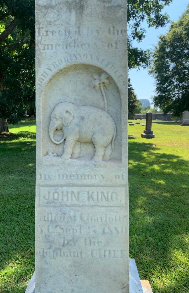
John King’s Grave
John King was an elephant trainer who on one fateful night in Charlotte, 1880 was crushed by Chief, his own elephant.

into the stone with a palm tree behind it, this creates an interesting focal point. It tells the story of how an elephant named chief killed his trainer, but that can not be easily inferred at first glance. At first glance it looks like the favorite animal of the person buried there was the elephant. Instead, it is to commemorate a tragic event that resulted in the death of the person buried there.
This gravestone is from 1880 and shows use of hierarchy in the way the words are displayed and has a unique composition. The words are all in a sans serif typeface except for the name of the deceased man John King. It is done in white stone and is tall, standing out amongst the other in the People’s Design Archive because of the material used and the overall design of it. The elephant itself is carved smoothly

In big letters at the top, it details who planned the gravestone and arranged for it to be there which were his circus companions(charlotteonthecheap. com). It stands out how big these words are, they are the same size as the words at the bottom that tell the viewer who the elephant is and what’s the story. This keeps the design simple, but it also makes it seem like the people who erected the gravestone are just as important as telling the story of his death.
Overall, this gravestone design stood out to me because of its uniqueness and how the type was displayed. All the text is placed linearly except for the circus name. After the unfortunate death of John King, Chief the elephant was relocated. In his new location he went on to kill two more trainers and was then taken out of the circus life. He was killed by a shotgun and then taxidermied. He was served as patties to elite people of Pennsylvania(Rhew, 2019). It is known that Elephants are not well treated in circuses and Chief was said to have been beaten multiple times and mistreated. The story of Chief the elephant and John King is just a small part of Char lotte’s history that is hidden in the cemetery.
21
John King’s Gravestone
1880 Mace, Jody. “A Photo Guide to Visiting Char lotte’s Historic Cemeteries.”
The Charlotte Bombings
In November 1965 the houses of four civil rights activists were bombed
of John F. Kennedy’s death. The houses bombed were those of Reginald Hawkins at 1703 Madison Ave in McCrorey Heights, City Councilman Fred Alexander at 2140 Senior Drive and his brother Kelly, President of the state NAACP, at 2128 Senior Drive in University Park, and civil rights lawyer Julius Chambers at 3208 Dawnshire Drive in the North wood Estates neighborhood(westendcharlotte.org).
trying to clean up rather than fix.
This piece is labeled as a letter from Reginald Haw kins, one of the activists whose house was bombed. It depicts the arm of a man rolling up his sleeves with the word Charlotteans on it. He is using a buck et that is labeled “attendance at interracial meeting today at ovens auditorium” to clean up a spill with the word “bombings” on it. It looks hand drawn and is almost like a political cartoon because of the mes sage behind it.


The bombings occurred on the second anniversary
The case still remains open by the FBI and no arrest has been made. This exposed the racism that was going on in the city during that time.
This piece visually contrasts other pieces because of how it’s drawn and the message behind it. The history and story about this is a very important part of Charlotte’s history that is not talked about or taught as much. The message behind this piece is accurate since the Charlotte bombings are some thing very few people know about, showing it was indeed “cleaned up”.
The meaning behind this seems to be about people trying to cover up what happened in the bombings and make it so it almost never happened. It has strong imagery since it is simple by only includ ing the arm not the face of the person so it adds anonymity and sort of generalizes the people of Charlotte. It shows the bombings as a mess they are
22
“Sidebar Images.” Charlotte’s Histor ic West End, 2019,
Nahum Arbel’s Grave


An Israeli born artist’s grave marker and its unique qualities
Nahum Arbel was born in Israel and then moved to the United states. He was a painter and a sculptor, he studied with Sigard Avni Institute, Tel Aviv Elull Koso, sculpture, continuing education Paris, sculp ture, advanced studies(mutualart.com). Since 2014 the record price for this artist at auction is $519 USD for 2 Works : Wailing Wall ; Jerusalem, sold at Clarke Auction in 2014(mutual art.com).
Prolific, Professional Artist, & a model of success in life”. All of the words are in a sans serif typeface and his name is in all caps. The piece above the marker with words looks like it is engraved metal. It looks like it is a man’s face, maybe Nahum’s. Other details of it are lines criss crossing showing movement. The hatching lines give detail to the man’s face and the birds around it. This piece is unique and shows that the person buried there was a creative.
This piece visually contrasts other design pieces because of the materials used and its overall com position. The words and type are secondary to the main image/engraving. Not much information can be found about Nahum Arbel but he was a great artist who will be forever remembered.
His grave marker says “a dynamic, wise, empathetic man of character. Founding member, State of Israel,
23
PHOTOGRAPH BY MARG
“Nahum Arbel (1928-2010) - Find a Grave Memorial.”
References
“Chief the Elephant’s Fateful Visit to Charlotte, 1880.” Medium, July 2019, medium.com.
Rhew, A. (2019, September 30). That time an Elephant escaped in Uptown. Charlotte Magazine. Retrieved September 16, 2021, from https://www.charlottemaga zine.com/that-time-an-elephant-escaped-in-uptown/.
Mace, Jody. “A Photo Guide to Visiting Charlotte’s Historic Cemeteries.” Charlotte On The Cheap, 5 July 2021, www.charlotteonthecheap.com/charlotte-historic-cemeteries.
“Nahum Arbel.” RoGallery, 2009, www.rogallery.com/artists/nahum-arbel.
“Sidebar Images.” Charlotte’s Historic West End, 2019, www.westendcharlotte.org/sidebar-images/2019/1/8/reginald-hawkins-letters-about-bombings.
Smith, Andy. “Beneath These Stones: Charlotte’s Hebrew Cemetery.” Charlotte Magazine, 30 Sept. 2019, www.charlottemagazine.com/beneath-these-stones-charlottes-hebrew-cemetery.
Nachum Arbel | Art Auction Results - Mutualart.com. https://www.mutualart.com/Artist/Nachum-Arbel/B56A6A35E2E4D536.
“Nahum Arbel (1928-2010) - Find a Grave Memorial.” Find a Grave, https://www.findagrave.com/memorial/101735796/nahum-arbel.
24


25
First
Wesley Jory Links to my contributions to the People’s Graphic Design Archive from my research of graphic design artifacts from Charlotte’s history: 1. THE HIVE IS ALIVE!: https://www.notion.so/THE-HIVE-IS-ALIVE-4d94886b6ad54e4b8d3e9f47621a2bbd 2.
Annual World 600: https://www.notion.so/First-Annual-World-600-a7f2ca93be0d4989bcba69baade2caa8 3. 1969 Jimi Hendrix Concert: https://www.notion.so/1969-Jimi-Hendrix-Concert-9323ecb5117c48ae80cb8568b 5058dc6
1988-89 Magazine Cover for the Charlotte Hornet’s first season in the Charlotte Coliseum (Staff, 2019).

THE HIVE IS ALIVE!
1988 Charlotte Hornets Magazine Cover
This design is from the first season of the Charlotte Hornets professional basketball team in 1988-89 (Staff, 2019). The design itself was placed on the cover of a promotional magazine meant to advertise the team and hype up the region for their season.
exploding or emerging out of the coliseum. Around the edited imagery is an illustrated night sky with stars and rays of sunlight reaching from the figures to the edges of the page. At the top of the design, the title is characterized by large uppercase type “THE HIVE IS ALIVE!” is stylized in the team’s colors and in a very late 80s early 90s patterning. Given the time period, software such as Adobe Photoshop couldn’t have been used to create this work as it was created in 1990.


fans and Charlotteans to their new team as well as some of the team’s branding, colors, and mascot. The team portrayed themselves as energetic, excit ing, and ultimately, worth going to see in person.
The cover consists of edited photography, illustration and typography. Also, The Charlotte Coliseum is pictured at the bottom, where the team played. Im ages of players, coaches, and even the team’s mascot Hugo the Hornet, are edited to look as if they are
The imagery used in the promotion conveys a sense of excitement and energy. The title of the piece also speaks to the energy meant to be conveyed by the design as “alive.” It is clear that the Hornet’s office wanted to lure fans to the games for their first season to show the NBA executives that choosing Charlotte as a destination for an expansion team was worth it. It also serves to introduce potential
Promotional material like this seemingly worked for the Hornets. November 4, 1988 the Hornets played their first game, in the Charlotte Coliseum. They played for a sold out crowd of 24,000 fans and pro ceeded to lead the NBA in attendance 7 times, and eventually sold out 364 consecutive games (1988 Charlotte Hornets Started off with a Bang, Became Wildly Popular with Their Fans, 2009).
Furthermore, this design is an example of success ful graphic design in Charlotte’s entertainment industry. It succeeded in getting fans hyped for the Hornet’s first season, and sold out arenas to see the team play.
26
First Annual World 600
1960 Program Cover from the First World 600 Stock Car Race at Charlotte Motor Speedway

From the first ever 600 mile stock car race comes an official race program cover that was handed out for $1.00 on race day, June 19, 1960.


At first glance, the cover utilizes Charlotte Motor Speedway’s first logo in the center, a checkered flag and the words “Home of the World 600” around the globe illustration pictured in the flag. The entire center logo for the speedway is at an angle to convey speed. At the bottom of the cover is text that states
it is an official program and the price of it. Towards the top the text reads “The First Annual World 600.” More importantly, the typeface choices are differ ent for almost every word of the title. A serif typeface was chosen for the words “The” and “Annual,” though the word “First” is printed in script type. In the word-mark of the race itself, the “World” type is designed in a circular fashion to mimic the shape of the globe. In “600” the zeros are illustrated as fast moving tires with wings attached at their tops.
The design is done in three-color print, likely to save money as many speedways went bankrupt shortly after they opened in this time period. Charlotte Mo tor Speedway was no different, however the track remains open today.
the use of color, but given the three-color print for mat, there are only so many combinations of color that can be used.
In 1949, Charlotte held the first ever professional stock car race. Ten years later they built Charlotte Motor Speedway. Following some delays for con struction the 600 mile long race was finally held a year later (Track History). The “World 600” was a huge hit in Charlotte, with 35,462 fans in attendance. It was so much of a hit that the race still runs today, but under a different name, the “Coca-Cola 600.” With Charlotte’s deep history of motorsports, and NASCAR specifically, it is still one of the biggest areas for racing. 90% of NASCAR racing teams are located in the Charlotte area, as well as the NASCAR Hall of Fame (Russell, 2018).
The imagery and use of typography doesn’t have much visual connection between them other than
27
Program cover for the 1960 World 600 (WorthPoint)
1969 Jimi Hendrix Concert
Concert Poster Promoting a Jimi Hendrix Concert at the Charlotte Coliseum in 1969 (Jimi Hendrix / Buddy Miles Express / Cat Mother and the All Night) Newsboys).


Poster for Jimi Hendrix 1969 Show at the Charlotte Coliseum
This design comes from Jimi Hendrix’s 1969 North American tour. The poster would have been displayed around the city of Charlotte in order to get the word out about the show,
importance. The biggest thing the designer wanted the audience to see is the Jimi Hendrix name as it is large and bold in the upper and lower sections of the design. At the top in bolder text is the date and location, May 9, at the Charlotte Coliseum. As for color, it is very limited to only black and white, given the time period and how many of these posters were probably printed, it was likely done in black and white to save some money on printing. While the design is relatively simple, it does it’s job of attracting Hendrix fans to the bold type that says his name, then engaging them with the rest of the poster, and ultimately the concert.
go Transit Authority (WilsonShow48, 2019). Fur thermore, along with Chicago not mentioned on the poster, the set list advertised actually differed from the set list that Hendrix played (The Jimi Hendrix Experience Setlist at Charlotte Coliseum, Charlotte).
The poster mostly consists of typography, along with a photo of Hendrix and two others in the center. There is a clear typographic hierarchy utilized here as larger, bolder text is used on words of more
There is also type on the poster describing what songs he would play, along with who else would be preforming at the Coliseum that night. Among Hen drix was Buddy Miles Express, The Cat Mother, and an unadvertised guest performance from the Chica
Jimi had just had a great year in 1968 as he was voted the number one artist for the year by Billboard and Cashbox Trade Magazines. Also he was the leading album seller that year. That being said, one of the most popular artists of the time was coming to Charlotte to perform. Charlotte was undoubtedly excited to see Hendrix play, as the Coliseum sold out all 13,000 of the concert tickets that night, with the cheapest ticket being only three dollars (Wilson Show48, 2019).
28
References
“1988 Charlotte Hornets Started off with a Bang, Became Wildly Popular with Their Fans.” The Times-Picayune - NOLA.com, 15 Mar. 2009, web.archive.org/ web/20120905123227/blog.nola.com/hornetsbeat/2009/03/1998_charlotte_hornets_started.html.
“Jimi Hendrix / Buddy Miles Express / Cat Mother and the All Night Newsboys.” 05/09/1969: Jimi Hendrix / Buddy Miles Express / Cat Mother and the All Night Newsboys @ Charlotte Coliseum | Concert Archives, www.concertarchives.org/concerts/jimi-hendrix-f083cd20-97ed-44f8-8541-994b2c0def10.
“The Jimi Hendrix Experience Setlist at Charlotte Coliseum, Charlotte.” Setlist.fm, www.setlist.fm/setlist/the-jimi-hendrix-experience/1969/charlotte-colise um-charlotte-nc-3bddcc30.html.
“Misc Stats - Racing-Reference.” Racing Reference, 4 Mar. 2021, www.racing-reference.info/misc-stats/?id=89&trk=t0&series=W&cn=1& yr=1960.
Russell, Shawndra. “A Brief History of Car Racing in Charlotte, North Carolina.” Culture Trip, The Culture Trip, 7 Feb. 2018, theculturetrip.com/north-america/usa/ north-carolina/articles/brief-history-car-racing-charlotte-north-carolina/.
Staff, Magazine. “Where Are They Now?: The 1988-89 Charlotte Hornets.” Charlotte Magazine, 30 Sept. 2019, www.charlottemagazine.com/where-are-they-nowthe-1988-89-charlotte-hornets/.
“Track History.” Fans | Charlotte Motor Speedway, www.charlottemotorspeedway.com/fans/track-history/.
WilsonShow48. “May 9, 1969 Jimi Hendrix #TDICMH.” YouTube, YouTube, 8 May 2019, www.youtube.com/watch?v=H7JVzDAa71o&ab_channel=Wil son%E2%80%99sWorld.
WorthPoint. “1960 Charlotte First Annual World 600 NASCAR Program.” WorthPoint.com, worthpoint.com/worthopedia/1960-charlotte-first-annu al-world-600-109604758
29
Kevin Ku
Links to my contributions to the People’s Graphic Design Archive from my research of graphic design artifacts from Charlotte’s history:
1. Charlotte Speedway, “Strictly Stock” race: https://www.notion.so/Strictly-Stock-Race-00f2f0b6a8884471b 4c37d1379412485


2. Green’s Lunch: https://www.notion.so/Green-s-Lunch-03c46c10d44d4972ba8ad0fc387106f3
3. Charlotte Hornets Logo: https://www.notion.so/Charlotte-Hornets-Logo-122e22cfef084603b9be8267bccc20a8
30
“Strictly Stock” race, June 19, 1949, launched NASCAR sanctioned series. 3/4-mile dirt track was 200 yds. W.
(North Carolina Office of Archives and History)
Charlotte Speedway “Strictly Stock” Race
which caused him to be disqualified from the race, thus allowing Jim Hoper to move from second to first place. Historically, this sign signifies the first NASCAR race that took place in Charlotte. Because of this “strictly stock” race, it led to 7 more races, finally establishing the official NASCAR motor speedway organization (NC DNCR).
NASCAR’S first race launched on June 19, 1949.
NASCAR’S first race was launched on June 19, 1949 at the three fourths-mile dirt track. There were a total of 33 drivers, and they were required to drive specific late model sedans with low modifications to it. Lee Petty had rolled his car on the 107th lap and Glenn Dunnaway finished 1st place on the 151st lap, but did not count. Dunnaway had altered his vehicle
The North Carolina Office of Archives and History has multiple fliers and signs that look like the shown above. There are multiples signs scattered around the city of Charlotte. These signs represent all the different historical monuments that occurred in this city. I decided to choose this specific artifact because NASCAR is recognizably popular in Charlotte. The popularity of NASCAR has generated a regional economic impact of approximately $450 million annually (Charlotte Motor Speedway).
The design of this sign is straightforward, however it is hard to read because of the justified text and levels of hierarchy. On the other hand, the black to white contrast allows for easy legibility. The font itself has the same serif qualities as the border of the sign. Having “CHARLOTTE SPEEDWAY” in all caps clearly tells us that it is the generalized title of the monument. The North Carolina Office of Archives and History decided to have the text fully justified across the sign, which is objectively not a great design choice to have words because the spacing between the words varies, making it harder to read. The words are also made to pop out and have a three-dimensional texture to make it seem clearer. It may seem as though the designer behind this sign was also afraid of showing negative space on the sides of the context.

31
Green’s Lunch Logo
The oldest restaurant in Charlotte.
In 1926, Green’s Lunch hot dog stand was made by Robert Green, because he felt like the community needed a quick lunch spot (Sands). It is considered the oldest restaurant in Charlotte. Once they got traction, they received a brand new building but with no official sign (Mulvihill). It is unsure who made the mural but they drew the logo on the side of the wall and used it as their store sign because the sign in front of their store was too small to visually see.

to capture the eyes of a broader audience. Its hu man-like features like the face, arms, and legs, tells the viewer that hot dogs are meant for people. The idea was to grab the attention of the entire Charlotte community, those who are in the area that need a quick bite before returning to work (Mulvihill).
The hot dog man was made to show a friendly, positive character icon that is recognizable and familiar,
The colorful art is designed to capture the eyes of customers since the front sign is not legible. Back in 1926, computers and digital technology had not been created yet and so there was no way to offi cially design a logo digitally and have it displayed in front of their restaurants. Having it drawn out as a giant mural is technically all they had to work with, and it works well because it shows a sense of how old Green’s Lunch really is. This piece was very in tentional in its craft. The color palette uses comple mentary colors like red and green to have it pop out and clearly show each word. The designer/painter
uses green for Robert’s last name, and red to com pare it to the hot dog man. The hot dog man’s action and expression is inviting the viewer to recognize that this is Green’s Lunch. It gives off a very welcom ing feeling due to its hands that are pointing to wards the title. The graffiti-like font is sans serif and rounded to give off a more friendly and soft tone. The checkerboard background resembles restau rant tiles you would see in old fashioned restaurants and they also colored it green to have consistency throughout the artwork.
The photo on the left is what the catering system would look like. The small sign is also drawn out because of the lack of technology but it works the same way as the mural on the side of the building. To this day, they still use the same logo and mural to represent their historical fact of being Charlotte’s oldest restaurant.
Green’s Lunch, 1926
A mural stands in for the original sign.
(Barbara B)
32
Charlotte Hornets Logo History
The logo progression of NBA’s Charlotte Hornets.

In the late 80s, entrepreneur George Shinn want ed to bring professional basketball to the city of Charlotte. After receiving the approval from NBA ‘s commissioner, David Stern, Charlotte became the 24th club to play in the NBA. The basketball team was named “Charlotte Hornets” because of Charlotte’s historical battle and how General Cornwallis called Charlotte, “a nest of rebellious hornets”.
The original logo was created in 1988 and lasted one year before they gave it a redesign. The logo was very two dimensional and flat. The designer attempted to show movement in the logo by spread ing the wings of the hornet while holding the bas ketball. It may seem symmetrical but the stinger of the hornet is shown only towards the right side of the hornet. The typeface style they choose is slab serif and it isn’t very cohesive with the illustration’s strokes. The contrast between negative space and thickness of the strokes are all different in weight which causes the logo to not look proportionate (Charlotte).
really shows due to it’s raised antennae, piercing gaze, spread wings, and sharp sting. The colors of the logo is consistent with teal and purple to stick with the idea of being fierce and active. The type style is also consistent with the slab serif font but they added color to it instead of keeping it plain black to add something more energetic to the over all logo (Charlotte).
The redesign showed movement in a better way by using small strokes. It also gave the hornet more character by adding a condescending grin to it. The posture of the new character design showed a “readiness to attack”. The Hornets’ fierce nature
The name Bobcats was chosen because North Carolina is known to have the leading number of red lynxes during the time. The logo was made by Chris Weiller. He completely switched it to a lynx that is facing right. The feline has an aggressive grin and sharp teeth to maintain the fierceness of the team. The bobcat also represents athleticism, speed, and fearlessness, with good hunting skills. The logo kept the blue from the previous logo and incorporated orange to mimic the color of a basketball (Charlotte).
33
Evolution of Charlotte Hornets Logos
(Alexander Julian)
References
“Charlotte Hornets Logo.” BASKETBALL LOGOS, Logos-World, 21 Apr. 2021, https://logos-world.net/charlotte-hornets-logo/.
“L-105.” Marker, http://www.ncmarkers.com/Markers.aspx?MarkerId=L-105.
Mulvihill, Carolyn. “The Oldest Restaurant In Charlotte Has a Truly Incredible History.” OnlyInYourState, 13 Oct. 2017, https://www.onlyinyourstate.com/north-carolina/charlotte/oldest-restaurant-charlotte/.
Sands, Alexandria. “A Green’s Lunch Hot Dog Is Forever.” Creative Loafing Charlotte, Creative Loafing Charlotte, 22 Sept. 2021, https://clclt.com/charlotte/agreens-lunch-hot-dog-is-forever/Content?oid=9112436.
“Serving Charlotte since 1926.” Greens Lunch, http://greenslunch.com/.
“Speedway Facts.” Track Facts | Fans | Charlotte Motor Speedway, https://www.charlottemotorspeedway.com/fans/track-facts/speedway-facts.html.
“Springs Altered Race History.” NC DNCR, 19 June 2016, https://www.ncdcr.gov/blog/2016/06/19/springs-altered-race-history.
34


35
Links to my contributions to the People’s Graphic Design Archive from my research of graphic design artifacts from Charlotte’s history: 1. Charlotte Hornets Baseball Team Patch 2. Hornet’s Nest Auto Fair, 25th Anniversary Plaque 3. WBT and WBTV Radio and TV Sign
Amelia Marafioti
CLT Hornets Baseball Team Patch
Illegal leagues, ideal patches, ample iterations, awkward arson, and several affiliations.
The Charlotte Hornets first came to life in minor league baseball in 1892. They would bounce between 10 different leagues, and would even help found the Carolina League. They played as the Charlotte Hornets, the Presbyterians, the Rocky Mount Red Sox, and the Hornets. For one season in 1936, the Hornets were a member of the “outlaw” Carolina League, an independent league that had
no membership in the National Association. Many players were threatened with not being allowed to return to ‘legal’ baseball if they played, but many ignored this since the Carolina League had no pay cap. (Coston) During the second half of the season, the team was managed by Charles Mars “Struttin’ Bud” Shaney, who was known for eating baseballs and allegedly putting phonographic needles in the balls he pitched. The team had a fantastic season, placing 2nd in the league. In 1985, the stadium the Hornets would soon play in (Crockett Stadium) was destroyed in a massive arson fire (more in Vishal Nair’s “Charlotte Ballpark Blaze”). It is unknown who set it aflame, although there is speculation that Jim Crockett, the owner, may have had some unpaid debts. In any case, a new stadium was built for the current team before being sold to the Hornets in 1987, when they were renamed to the Knights. This patch is a straightforward design (Moxley). It’s
a later iteration of the team patch, which had before had been a hornet’s nest so large it took up over half of the player’s chest. (Coston) The tri-color scheme is in-line with most sports team’s logos and patch es, and serves the embroidery well. It’s definitely machine embroidery. The imagery is whimsical, with a literal hornet’s nest serving as the player, wear ing a little baseball cap. There’s a baseball bat and ball behind the nest, reminding you what sport it’s for, just in case you forgot mid-game. perhaps the best detail here is the small “C” embroidered on the cap, signifying that this is for the Charlotte Hornets, since “Charlotte” is written nowhere on the patch, only “HORNETS” beneath the main illustration. There is no influence of this design to the design of the Knight’s logo, but there is some to be found in the Hornet’s basketball team logo, where a hornet can be seen playing ball, just like the nest’s hat.

36
Hornets Patch, 1965, Rawlings Manufacture (Moxley)
Hornet’s Nest Auto Fair, 25th Anniversary Plaque
Scripts, logos, dash plaques, and the AACA.
culture for a long time- one that shows no sign of stopping any time soon.
This dash plaque is small and silver colored. De signed as a yearly collectible, usually for show-win ning car owners. This one is extra special- the 25th anniversary of the Hornet’s Nest region AACA’s first auto show. In keeping with the rules of the AACA, cars that are 25 years and older are considered ‘antique’ and eligible for shows and activities within the AACA. This means that for the first time, there are cars as old as the Hornet’s Nest region that are eligible, something I’m sure many collectors are excited about.
theatrical thick-and-thins giving off the air of an old play brochure. Again, a good choice for am antique cars show. The rest of the text is less notable, with some coming from the Charlotte Motor Speedway’s logo, some coming from the AACA’s logo, and a nice sans-serif some forming the date of the show.

The illustrated cars make for a nice match to the large fonts, both in terms of age and in terms of the line weight and color choices. Both illustrations are just detailed enough to be instantly recognizable, without being overwhelming. They point the view er’s eye straight into the middle of the dash plaque, where the AACA Hornet’s Nest Region logo rests.
The Antique Automobile Club of America (or the AACA ) has had one goal since 1935: The preservation and enjoyment of automotive history of all types. The Hornet’s Nest Region of the AACA opened up in 1967, 32 years after the original AACA began. They’ve had an unremarkable history, but have been a steady and charming part of Charlotte’s
The flowing script chosen for “Charlotte Auto Fair” screams age and car. A suitable choice for an an tique car restoration and upkeep show. The letters flow into one another and overlap, creating whorls of interest to drag the eye along the text. The words “Auto Show” are similarly well thought out. The bold,
It looks out of place due to the color choices and visual style, but the centering makes it feel almost intentional. An interesting visual choice, likely borne of an amateur designer.
37
Charlotte Hornets Nest AACA 25th Anniversary Dash Plaque1992 (eBay)
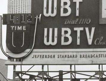
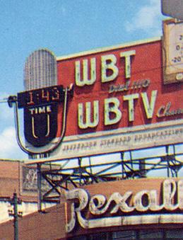
WBT and WBTV Radio and TV Sign
From chicken coup broadcasting to the first million watts station.
First founded in 1992, WBT was one of America’s first radio stations. Before licensing, it was an amateur broadcaster’s hobby. Fred Laxton, Earl J. Gluck, and Frank Bunker would begin broadcasting audio in 1919, after the radio ban was lifted (put in place due to WW1). Most broadcasters of the time could only broadcast morse, but Laxton managed to get a then-rare vacuum tube from General Electric, which made audio transmissions possible. The trio
then began transmitting from an abandoned chicken coup behind Laxton’s home, with the microphone running inside the house to the living room. They transmitted phonograph records, which got atten tion from other amature broadcasters as well as the general public, and a consistent schedule was set up (Coston). In 1920 the station was given an experimental radio station license, call sign 4XD. In 1921, the Southern Radio Corporation was founded by Laxton, Bunker, and J.B. Marshall. They installed a new transmitter on the roof of the building they were in, the Realty Building, and within a year founded the WBT. (WBTV)
The station grew at exponential speeds, with the comedy and live music routines bringing in plenty of avid listeners. In the late 1950s, a giant red billboard was put up above the Rexall building. Many residents and people who frequented the area liked the sign. Somewhere in the late 1960s, the sign was taken

down. Many former people of the area as well as old WBT / WBTV employees mourn the loss of the sign, as well as the square where it sat (BT Memories). The square is now ‘gone,’ no longer a shopping and entertainment area, now only surrounded by the banking buildings of uptown Charlotte.
The WBT/WBTV billboard hung over the corner of North Trade and East Tryon, also known as Indepen dence square (Coston). It was massive, eye-catch ing, and for the time, pretty cool. The large light-up letters filled the sky, and a huge temperature read out added interest. A giant microphone with a digital clock was an added excitement. Together, the time and temperature displays reminded you of what they advertised- a radio and tv station that would tell you the same information on the hour, every hour. The billboard is bold and bright red, and stood out on the corner while still feeling a part of the area.

38
WBTV/WBT Sign, 1955 (BT Memories)
References
“AACA Car Show at Charlotte MOTOR Speedway.” Charlotte AutoFair. 10 Sept. 2014. Web. 14 Sept. 2021.
AACA CHARLOTTE AUTO FAIR AUTO SHOW 25TH ANNIVERSARY APRIL 4 1992 EMBLEM PLAQUE. eBay. Web. 14 Sept. 2021.
“BT Memories.” BT Memories. Web. 14 Sept. 2021.
Coston, Daniel. “The Briarhoppers.” Charlotte Museum. Charlotte Museum of History. Web. 14 Sept. 2021.
Harris, Peter. “Charlotte Hornets.” Qcbaseballhistory. 2019. Web. 14 Sept. 2021.
Mims, Bryan. “The History of CHARLOTTE’S Wbt Radio Station.” Our State. 02 Apr. 2020. Web. 14 Sept. 2021.
Moxley, Christopher. “The ORIGINAL Charlotte Hornets.” 704 Shop. Charlotte Museum of History, 08 Apr. 2016. Web. 14 Sept. 2021.
WBTV. “Chronology of WBTV.” WBTV. 15 June 2009. Web. 14 Sept. 2021.
39


An 1800’s Stereoscope is shown in the top left, looking at what was the original building.
Souvenir Magazine, Volume 1, March 1968, pg. 27
North Carolina National Bank Advertisement
A advertisement to honor the humble beginnings for the NCNB.
The North Carolina National Bank had survived for almost one hundred years when this ad came out. They had grown a huge customer base over that time and were very successful in Charlotte and in North Carolina as a whole. So successful in fact that only a few years after this ad in souvenir magazine, they would be bought out and transitioned into a company which is now Bank of America (Pleasants). In this ad, the NCNB wanted to appeal to their loyal
patrons. They used two contrasting images to do this. The top photo is a skewed angle of an 1800’s stereoscope viewing images of the original banking build ing. On the bottom half of the ad, the photo shows the modern skyscraper in 1968 in the same angle as the older building. These two contrasting photos offer the viewer a look back into the past to show a sense of trust worthiness, integrity and values. Hon oring their humble beginnings but acknowledging the company’s great success and growth. This would appeal to a customer whose family had perhaps used the NCNB for generations or an entire new customer looking for a bank with good values.

ally, color was not really needed to add to the design, and related back to the historical theme of the ad, the “looking back”.
The composition is eye catching and it is easy to understand the message. The interesting image of the Stereoscope engages the viewer and is the first thing the eye is drawn to. Then the eye is drawn to the second photo and the text. It has a nice sense of hierarchy. The serif typeface is an open, friendly yet integral choice. A close variation of Baskerville.
This advertisement was typical in some ways of an ad in the late 60’s to early 70’s. Black and white was still prevalently used. This ad was in several different pub lications for a few years running, so it is possible they chose black and white to cut down on cost. Addition
41
Charlotte Sanatorium Postcard
A 1909 post card to celebrate the new, state of the art, Charlotte Sanatorium.

skill, was very time intensive and expensive.
The Charlotte Sanatorium was opened to the public in 1907 by thirty surgeons and doctors. It offered 100 patient beds with five stories and fire proof infrastructure. At first glance, the image on the postcard seems like an illustration and in a sense, it is. In the early 1900’s, photographs were taken in black and white, then hand colored to add a more life-like element. Sometimes artistic liberties would be taken and more was added to the composition. This would take great
The composition of this scene is bustling with life; cars and carts waiting outside with people standing about. The building is shown in a two point perspec tive for view of multiple sides, showing off the impressive architecture for that time. Healthy green trees surround the building and landscape, with a happy blue sky overlooking it all. The postcard beckoned at families to send their sick loved ones here. Reflected was a feeling of trust and wellness, a thriving, healthy hospital. On the right hand corner is written, the North Carolina Toast which was made popular a few years before this photo was taken. Including the line, “Where the weak grow strong and the strong grow great” (Martin 1).
Although there are not many documented post cards listed from this early in the People’s Archive, this piece
does align with other postcards from this time and area of the U.S. One thing to point out that is rather different is the heaviness of the illustration. You can hardly tell that this is in fact a photograph underneath. The richly detailed work by the artist (not document ed) is intricate and layered. It is unclear if the artist has taken some liberties with the true scene and has added some elements like the cars or people. This coloring technique was also fairly expensive, giving the hospital another layer of the prestigious quality.
The closest post card to compare is a Hotel Charlotte postcard from the 1920’s-40’s printed by Tavern Press. This is another example of color being added to a black and white photo. Here, it is much more stylized. It uses an overlay of blocky color to create a modern and very graphic feeling. Color is used as negative space to draw the eye to the central photo.
Hand colored, black and white photo taken by C.C Moon. The now, North Carolina official State Toast included in right hand corner.
Stone and Barringer Publishers. (n.d.). Charlotte sanatorium. Charlotte Sanatorium | Charlotte Mecklenburg Story. Retrieved September 13, 2021,
42
First Issue of Charlotte Messenger, 1882. Charlotte Messenger. NO. 1. VOL 1. June, 17, 1882. Edited and Published by William C. Smith.

One of the first African American ran Newspapers in North Carolina.

The Charlotte Messenger Newspaper was issued weekly starting in 1882 running to at least 1891.

It was one of the first African American ran newspaper’s in North Carolina. The founder and editor of the Charlotte Messenger was William C. Smith. Smith, was one of the founders of The Fayetteville Educator, the first newspaper edited and published by black men in North Carolina. Republican in sentiment, the Messenger’s content included, news from big city newspapers and from other areas in the south, short stories, poetry and advice found
The Salutatory message in the first issues reads as this, “In presenting this little sheet to our people, it is hoped that they will appreciate it as an honest effort on our part to promote the moral, intellectual and material standing of our people. We are aware of the difficulties and responsibilities attending the publication of a newspaper; but seeing the great need of an organ in this section to defend the principles of the Republican party; the need of an exponent of the rights of the colored people, we have undertaken the task and shall depend upon the wisdom and kindness of our friends to encourage and support us” (Smith 2).
The format of this publication is fairly standard for other newspapers around this time period. It is very saturated an abundance of justified text and use of thin lines to divide sections. The title heading typography uses a flat face variation which is ex emplary of typography in newspaper headings and titles during that time. Different typefaces and vari ation of tracking, kerning and leading are used to distinguish different sections or themes for articles and advertisements.
In terms of formatting and also it’s temperance, christian morality and republican sentiments, this paper was very much trying to support views of NC Republican party, as to not lose it’s patronage. This lose of patronage had been the downfall for Smith’s previous paper, The Fayetteville Educator
43
References
Charlotte Messenger. NO. 1. VOL 1. June, 17, 1882. Edited and Published by William C. Smith.
Charlotte messenger [volume 1] (CHARLOTTE, Mecklenburg CO., N.C.) 188?-18??, June 17, 1882, image 1,2,3 from https://chroniclingamerica.loc.gov/lccn/sn91068242/1882-06-17/ed-1/seq-1/
Chris. (2020, March 13). Fact Friday 238 - Commercial National Bank. 704 Shop. Retrieved September 13, 2021, from https://www.704shop.com/blogs/fact-friday/fact-friday-238-commercial-national-bank.
Garland, Irvine. The Afro-American Press and Its’ Editors. Springfield, Mass., Willey & co. 1891. From, https://archive.org/details/afroamericanpre00penngoog/page/n276/mode/2up
Gregory, L. (2019, September 12). Earliest NC African American Newspapers added to digitalnc. DigitalNC. Retrieved September 13, 2021, from https://www.digitalnc.org/blog/earliest-nc-african-american-newspapers-added-to-digitalnc/.
Here’s to the land of the long-leaf pine. NC DNCR. (2016, May 21). Retrieved September 13, 2021, from https://www.ncdcr.gov/blog/2016/05/21/heres-to-the-land-of-the-longleaf-pine.
Pleasants, J. M. (2006). Bank of America. NCpedia. Retrieved September 13, 2021, from https://www.ncpedia.org/bank-america.
Ross, K. N. (2021, May 9). Before colored photographs, there were colored postcards. The Mountaineer. Retrieved September 13, 2021, from https://www.themountaineer.com/news/haywood_history/before-colored-photographs-there-were-colored-postcards/article_cb856392ae77-11eb-8c36-dbc57c638738.html.
Souvenir Magazine, Volume 1, March 1968, pg. 27
Stone and Barringer Publishers. (n.d.). Charlotte sanatorium. Charlotte Sanatorium | Charlotte Mecklenburg Story. Retrieved September 13, 2021, from https://www.cmstory.org/exhibits/robinson-spangler-north-carolina-room-image-collection-charlotte-postcard-collection-461.
44
Vishal Nair
Links to my contributions to the People’s Graphic Design Archive from my research of graphic design artifacts from Charlotte’s history:
1. Mid-Atlantic Championship Wrestling - https://www.notion.so/Mid-Atlantic-Championship-Wres tling-4e8819671e0c42d4b365ec43b7d54dff

2.Charlotte Knights Inaugural Season Ticket - https://www.notion.so/Charlotte-Knights-Inaugural-Season-Game-1-Ticket-e987dea70baa4823affdb2a65b2090d5
3. Fernando Ramsey Baseball Card - https://www.notion.so/Fernando-Ramsey-Baseball-Card-2cdd68bb7728489796b8c14a35c4d18c


45
Jim Crockett Sr. was involved in buying a team from Baltimore and bringing them to Charlotte as our baseball team.
(Jim Crockett Sr. Park, MidAtlanticWrestling.net)
Mid-Atlantic Championship Wrestling

Poster
Poster made to promote the anticipated match-up between Ric Flair and Ole Anderson for the Championship belt.

Two posters were made and shared to promote the wrestling matchup between Ole Anderson and Ric Flair. The event was hosted at Jim Crockett Me morial Park. Jim Crockett Sr, sports enthusiast who
brought the Knights to Charlotte, had been very involved in professional wrestling before buying the Knights team. (Main Event Memory: Flair vs Ole, Atlantic Wrestling Gateway) This park was mainly used by the Charlotte Knights but sometimes featured wrestling fight cards. This venue was used for Charlotte Knights baseball but was shared for professional wrestling events after his passing (Classic Venues, MidAtlanticWrestling.net) Both posters share information about the event including the main card, as well as preliminary card fights leading up to the main event. The header contains the details for the event as well as the Mid Atlantic Wrestling Logo. Type used to present the location and date for the event were colored red to stand out against the light yellow background used for the flyer. The text was formatted similarly throughout the poster, with main event fights shown with bright red text as well. The two main card fights take up
the most space on the poster while under-card fights are set right underneath with small black text in a smaller space. Visual hierarchy is set with this structure and guides the viewers’ eyes. Accompanying images are included next to fight titles but only for fighters who are considered to be bigger names. When comparing this design to other submissions from Charlotte, the use of color in the wrestling poster stands out. The colored wrestling poster used a vibrant yellow as a background for text and images to be set against. Although it was a very saturated color, contrast with accompanying elements worked well to set up the visual hierarchy. Posters or flyers using vibrant colors throughout the entire design were not a common occurrence in design for Charlotte back in the day. This can be seen as a way to present their brand; an exciting and fun wrestling promotion.
46
Mid-Atlantic Championship Wrestling Poster june 1977
Jim Crockett Sr.
Fernando Ramsey Baseball Card

(1991 Charlotte Knights ProCards, Ebay.com)
Baseball card made to promote the Charlotte Knights roster and include the team in the baseball card trade.
The baseball card presents the viewer with a picture of Fernando Ramsey posing as if he’s waiting for a pitch. Accompanying text is set below in team colors. Enclosing the caption and photo, is a yellow back ground with lines running horizontally across the entire card under the photo and caption. This design decision was made to make the card appear as if it is a notepad. The idea of having the card represent a note
card is not a random choice, as notepads were often used to keep track of game statistics in game, especially by scouts. Since the early 1900’s, baseball cards have been traded and collected by fans and collectors all around the US. They are collectibles with unique information pertaining to players on certain teams; they’re personalized and customizable. Keeping this idea in mind, the choice to represent the card as a notepad can be seen as another way to customize cards. The back of the card displays game statistics of Fernando Ramsey throughout his career. The same background and lines are used to format and struc ture the information.

products increases the appeal, especially if the brand is well-known in their industry. The Charlotte Knights logo and MLB logo were included on the back side to associate the card and player. Text on the back of the card was made to look like a table made to display player statistics throughout his career. General information like weight and height are structured and set on top of the card while career performance statis tics are set in the table below.
When looking at the baseball card, three logos are presented. One on the main page, and two on the back side of the card. The logo on the front page belongs to the brand ProCards, a household name in the baseball card industry. Placing brand logos on
Baseball cards as collectibles are made to present information as well as being visually appealing for fans. When looking at other designs made in Char lotte, this piece stands out as a design that serves more to share this information than to be visually appealing. The back side of the baseball card is filled with game stats regarding Fernando’s per formance and also includes his health information; weight, height, etc.
47
Fernando Ramsey Baseball Card Baseball Card 1991 ProCards Inc.
Cards from inaugural seasons can be seen as valu able due to their exclusive release.
Charlotte Knights Inaugural Season Ticket 1990

Charlotte Knights Ticket Office
Tickets sold for the first game the Charlotte Knights played in the Knights Castle Stadium.
(Charlotte Knights Inaugural Season EBay.com)
Charlotte Knights Inaugural Season Game One Ticket
First tickets sold for the Knights’ first game in their Knights Castle stadium.
This artifact was one of the first tickets printed for the first game the Charlotte Knights played in their new stadium, The Knights Castle. The ticket was printed with a long vertical layout with an image set on the center. The top of the ticket is sectioned off to identify itself as the Game One ticket with a bold serif font. The location, season, and year are listed right
below the game title and centered to set up visual hierarchy. Below the location and date, the 1990 Charlotte Knights logo is presented with orange and tan colors (Chris Creamer, Charlotte Knights Logo and Uniform History).The logo is small and centered, used to serve as a break between information blocks. The ticket layout progresses, an image of the Knights Castle stadium is presented sideways. The margins and space in which the image is set is also used to set margins and boundaries for accompanying captions and text below and above the image. On the left side, above the stadium image, text referring to the location, season, and date are used again to accom pany the image and provide context. Text below the image serves to inform and present the matchup taking place on the day of the game. Text is centered between the image’s boundaries. The orientation of the stadium image and accompanying text breaks the entire layout up into three different sections; top,
middle and bottom. Below the stadium image section are logos of the sponsors and companies associated with the team; a radio station and news channel logo are included. The last two lines of text used on the ticket include the specific date and time, along with the Opening Day text. The Opening Day text and Game One are stretched and serve as a border for all the information contained in the ticket.
Design choices made on the ticket design are unique to itself and aren’t seen in designs from Charlotte around this time. One noticeable design choice is the stadium picture and accompanying type. The text and picture framed in the middle of the ticket is rotated and in turn sets itself apart from the rest of the ticket. The information in this section contains the most important dates and locations pertaining to the baseball game.
48
References
“1991 Charlotte Knights Procards #1701 Fernando Ramsey Panama Baseball Card.” EBay, Mcvikes, https://www.ebay.com/itm/402246760817?chn=ps&norover=1&mkevt=1&mkrid=711-117182-37290-0&mkcid=2&itemid=402246760817&targetid=1263104805286&device=c&mktype=pla&googleloc=9009981&poi=&campaignid=13918139433&mkgroupid=125629576780&rlsatarget=p la-1263104805286&abcId=9300613&merchantid=7872314&gclid=Cj0KCQjwwNWKBhDAARIsAJ8Hkhe7P1dV2HeyWDmzVui6pL-J1C8qb No0_W0_e0E-PhWGPnwvb5tHd7AaAtqsEALw_wcB.
“A History of Baseball in Charlotte.” A History of Baseball in Charlotte | Charlotte Mecklenburg Library, Charlotte Mecklenburg Library, 15 Aug. 2019, www.cmlibrary.org/blog/history-baseball-charlotte.
“Atlantic Wrestling Gateway: Classic Venues.” Mid-Atlantic Wrestling Gateway, Jim Crockett Promotions, www.midatlanticwrestling.net/resourcecenter/venues/crockettpark/crockett_park.htm.
“Charlotte Knights Inaugural Season Knights Castle Opening Day Unused Ticket.” EBay, Southfork Bay Traders, https://www.ebay.com/itm/264611513224.
Creamer, Chris. “Charlotte Knights Logo and Uniform History.” Charlotte Knights Logos - International League (IL) - Chris Creamer’s Sports Logos Page - SportsLo gos.Net, www.sportslogos.net/logos/list_by_team/925/Charlotte_Knights/.
“Crockett Memorial Park.” Crockett Park / Calvin Griffith Park - Charlotte North Carolina - Former Charlotte Hornets, www.digitalballparks.com/Southern/Crockett1.html.
Mid-Atlantic Wrestling. (1970, January 1). Main event memory: Flair vs. ole in a Bullrope match! Main Event Memory: Flair vs. Ole in a Bullrope Match! Retrieved September 28, 2021, from http://www.midatlanticgateway.com/2015/09/main-event-memory-flair-vs-ole-in.html.
49
Angelina Palacios
Links to my contributions to the People’s Graphic Design Archive from my research of graphic design artifacts from Charlotte’s history:
1. The Charlotte News | Edition 1: https://www.notion.so/The-Charlotte-News-Edition-1-aae83ed167f24b1ab7a8c8e76d f2a5e5


2. Charlotte-Mecklenbug County Crest: https://www.notion.so/Charlotte-Meclenburg-Crest-11ec1c248608474484a3ae587b55e596
3. Charlotte Highway Map Proposal: https://www.notion.so/Redlined-Charlotte-Highway-Map-Proposal-01465083ebfb4efcbefb18ce0945dcd2
50
The Charlotte News | Edition 1
This newspaper is the very first print of local news in Charlotte, North Carolina. It plays a big role in delivering current events to citizens.
The very first edition of The Charlotte News is a content-heavy text layout that consists of colloquial speech as well as ads in the paper of local shops geared towards the Charlotte reader. The audience of the time would most likely be white men with mo ments of leisure as this is what the ad in the upper right section of the ad would suggest. It uses a mix of typefaces that work rather well with a consider able amount of text.

Typographical elements that jump out to the read er in ads play an important part in determining the hierarchy of the layout after the tile of the news paper itself. It differs from the newspaper we know today because viewers are typically used to seeing a headline, subheadline and then a story with ads focused around the article. In this edition, there is more emphasis placed on the ads, making the con tent of the piece feel less important.
This newpaper is presently known as The Charlotte Observer. It would come to shape the idea of the way news would be delivered to the people of Char lotte. This was the main source of evening news for citizens (Charlotte Papers Merged). It played a pivotal role in in laying out the news in not only a visual, but digestible way that readers could understand what is happening in Charlotte.
A notable section found in the center of this de sign is about a problem that the city is having with “tramps” in town. This term, which is presently known to be about a woman who is sexually promiscuous, means something different in the 1800’s. This was a term given to long-term homeless people that were in a permanent position of being out of work and home.
The bulk of the content that the reporters of the time were writing about does however, use the most accepted form of journalistic reporting that is even used today. The structure used is the inverted pyramid method to report information from most to least relevant for the reader (Spainhour). This is reflected in the design by the hierarchy of stories that appear at length at the beginning to the end of the columns of text.
51
The Charlotte News Volume 1 pub lished on December 11, 1888.
CharlotteMecklenburg county Crest

The sybolic design created by Harvey Boyd represents the past, present, and future of Chalotte.
In the 50s and 60s, The Chamber of Commerce sent out a call for artists to create the county crest. In this contest, the main concept was to focus on the past, present, and future (704shop). Each element is symbolic in nature and follows the prompts outlined in the contest directions. Harvey Boyd, an African-American artist working in the art department of the charlotte Observer won the design contest.
The symbols include an inkwell, quill pen, and paper that represents the Mecklenburg Declaration signed on May 20, 1777. This element signifies the past in the design. The famous hornet’s nest depiction is meant to represent the community (present) and refer to the past from British General Charles Corn wallis’ famous analogy of the community rebellion during the Revolutionary War. The farm buildings represent agriculture and the history of Charlotte’s involvement in the industry. The offices represent the growth of urban areas and the future of the banking capital of America (704shop).
Boyd kept this in mind as he designed a way to bring a community with odds together by representing something that we all share. This is why the meta phor for the hornet’s nest becomes important. This shows how people in the community were able to fight off oppressors despite obvious differences like skin color.
This crest was inspired by Crispus Attucks (704shops). He was the first man killed in the Boston Massacre. Sharing African descent, Attucks and Boyd used the Ideals of freedom to express them selves in the midst of adversity.
Harvey Boyd worked in a field of adversity where a lot of his work is said to be inspired by African Amer ican heroes. This field of adversity takes place in the 60s, where segregation and hate towards people of color fills the community and creates a divide.
52
Mecklenburg County Crest digital illustration and seal.
Charlotte highway map proposal scan. The heavy black lines dis played in color are red lines meant to separate communities with the highway.
Charlotte Highway Map Proposal
Scanned map of initial I-85 highway construction displays more plans for segregation of Charlotte redlined communities
This map is a scanned image where there were literally red lines that divided areas where black and white neighborhoods would then be separated by a highway.
color in the intent of creating this map proposal.
After the demolition of the thriving Black community, Brooklyn, in Charlotte, many people were relocat ed to West End Charlotte. Right as the community starts a rebuild, the city begins redlining and targeting the community by building the highway in the middle of the area they were now living in.
The design is a scan of the original map outline that was proposed to the city, so this image lacks the direct visual of red lines that separated communities from each other with the highway. The supplemental text that says “Follow the Red Lines also insinuates that a viewer would have seen them on the map. The purpose was mainly to serve as reinforcement to the “racial divisions and economic stagnation that had been created by enforced segregation of housing and education (West End Charlotte).

The 1960s marks a time period of heavy civil rights violations against Black people in America. The designer of this map held segregation of people of
This map is very similar to Charlotte maps in 2021 by comparison to street names and highway place ment. The division of people of color in Charlotte is still evident by the invisible red lines that were structured by maps such as this that are upheld 80 years later.
53
References
“Charlotte Papers Merged.” The Miami News. Newspapers.com, 6 Apr. 1959, 14 Sep 2021 www.newspapers.com/clip/66571394/charlotte-papers-merged/.
EDUCALINGO. Tramp [online]. Available https://educalingo.com/en/dic-en/tramp. 16 Sep 2021
Spainhour, Cheryl. Advanced News Writing and Reporting. Lecture. 9 Sep 2021.
“Fact Friday 283 - the Origin of the Mecklenburg County Seal and It’s Designer.” 704 Shop, https://704shop.com/blogs/fact-friday/fact-friday-283-the-origin-ofthe-mecklenburg-county-seal-and-its-designer.
“Highway.” Charlotte’s Historic West End, https://www.westendcharlotte.org/highway.
54
Wa x ha w F a m o us O ld S e c t io n o f C o un t r y . I n t e r e s t in g C ha r lo t t e O b s e r ve r ( p ub lis he d a s C ha r lo t t e c to b e r 17 19 15 | Ch a r l o tte O b s e r v e r p u b l s h e d a s Ch a r o tte Da i y O b s e r v e r | Ch a r l o tte No r th Ca r o i n a | Ne w s Ar ti c e |


An Accurate Map of North and South Carolina with Their Indian Frontiers

This artifact is one of the first documented maps of Charlotte, North Carolina. It displays the provincial lines that created boundaries between the Native American tribes that lived among the land. The land was split amongst large groups of Native Americans such as the Catawba, Cherokee, Sugaree, Cheraw, Waxhaw, and many more.
can be seen specifically in Georgia’s territory. The land around Georgia was considered “Fertile Good Land” as the state had not yet been claimed (Mouzon).
This map shows all the Mountains, Rivers, Swamps, Marshes, Bays, Creeks, Harbors, Sandbanks, and Soundings on the East Coast from 1775
The bottom left corner of the map denotes that the Catawba Nation owned 144,000 acres of land where the Charlotte area is located and stretched across both North and South Carolina (Mouzon). Charlotte was previously known as Charlottesburg and ran along the formerly known, “Catawbaw River”. The map was made by Henry Mouzon and others based on surveys that were taken by colonists who traveled to North America. Additionally, the map functioned as a tool for propaganda in which colonists used to acquire more land in Georgia and South Carolina. This
Another distinct feature of the map was the dec orative, personalized illustrations. They included detailed drawings of boats, arrows to symbolize wave patterns, topographical mountain ranges, and dotted sandbanks (Mouzon). The map’s signage contains illustrations throughout the piece that give it a cohesive design, although the features may vary from one another. For example, the boats are all the same size and have the same visual appeal, but are illustrated at different perspectives. Also, the typographical hierarchy was clearly defined as counties, Native American Nations, and mountain ranges were small caps, larger and bold whereas river names were smaller and italicized (Mouzon).

56
An Accurate Map of North and South Carolina with Their Indian Frontiers, 1775 (Mouzon)
Treaty of Nations Ford between the Catawba and the State of South Carolina
Paying off and displacing the Catawba Nation for settlers to take ownership of the land
Prior to the Treaty of Nations Ford, the Catawba Nation was promised to keep their land by the state of North Carolina. According to the 1763 Treaty of Augusta, the Catawba Nation was guaranteed a 15 square mile portion of land that ran across from North Carolina to South Carolina. This was a drastic change because they originally owned about 144,000 acres and were only left with 9,600 acres, which was noted in the map that was discussed in the last slide (Mouzon). Also, the region branched from the Catawba River to present day Fort Mill and Rock Hill, South Carolina (Treaty ). As colonists grew in number, they began to lease the land from the Catawba. However, this unsettled the Native Americans because they were worried the settlers would overtake the land. In hope of keeping the land that they have had for centuries, the Catawba appoint ed representatives to appeal to the Continental Con gress and South Carolina’s federal government (Treaty ). Unfortunately, Congress did not have the power
to resolve the conflict at hand and placed the problem on South Carolina’s state legislature. This shows the hypocrisy of the country because the colonists went against their own written agreement which allegedly safeguarded the land of the Catawba Nation.
As a result, North Carolina did not intervene and al lowed South Carolina to make the decision regarding the future of the allotted land. After, South Carolina stipulated that the Catawba relinquish their land and offered to pay the Catawba $5,000 to buy land else where of their choosing or $2,500 in cash if they left their land with an additional $1,500 for 5 years (Treaty ).
However, the Cherokees did not want the Catawba to join them as they had already lost many of their free doms and land. The Treaty of Nations Ford utilized formal, handwritten typography with a sense of hier archy. The title was larger and included indented body paragraphs (Treaty ).
Treaty of Nations Ford between the Catawba and the State of South Carolina, 1840 (Treaty )
57
Commissioner Carry into Effect the Treaty Nations Ford. Appointment, treaty, and correspondence. 1840. 124001. Department of Archives and History. Columbia, SC.
Waxhaw, Famous Old Section of Country
Charlotte’s vast history of coloniza tion and the downfall of the Catawba Nation

Within this 1915 newspaper print, G. L. Nisbet discussed the various Native American tribes that inhabited the land that is presently known as Char lotte. More specifically, The University of North Carolina at Charlotte is located on the traditional

). There have been many questions regarding the origin of the Waxhaw’s name. In contrast, Nisbet believes the name stemmed from a well known rock from England (Nisbet). This information allows us to understand the history of Charlotte’s land and its inhabitants.
In regards to the design of the print, the typesetter used justified text with very little leading. The overall print is dense and is heavily based on type. For instance, the headline utilizes a large, condensed, sans serif typeface whereas the body text is composed of a smaller, serif typeface that is slightly more legible for viewers to read (Nisbet). I also find it interesting that the designer used left aligned, centered, and right aligned text. Nowadays, most newspaper prints typically use left justified throughout the layout to
W x h w F m o u O d e c o C n r n e e s Ch O s v b e d s Cha o e D y O b e e O c o b 7 9 5 p a g 2 O b 7 1 h O b b h d a h D O b h No a N w A P Wa x ha w F a m o us O d S e c io n o Co un y I n t e r e t n g Cha r o e O b s e ve ( p ub s he d a s Cha r o e D y O b s e ve O c o b e r 7 1 9 5 p a g e 25 ] O o be 1 9 15 Cha o e O b r e pub he d s Ch r t Da O b e v e | C a r o e No h Ca o a | Ne w s r e P a g e 2 5 C T A T O N ( A
T
C S YL
Waxhaw, Famous Old Section of Country, 1915 (Nisbet)
G L C S
YL E C A
Waxhaw amo u O d S ec o n o Co unt y n eres ng S p ec u a o n as o he Or g n Charlotte Observer o n ne 17 O t 1915 2 5 h tp s / nfo web news b ank c o m eu1 p ro xy o p ena hens net ap p s news /d o c umen v ew? p =WORLDNEWS & d o e = mag e/v2 % 3A112 60 DC9BB7 98 E30 % 4 0 WHNPX 114 6164 66B3A8 7 4 0 % 4 0 2 4 2 0 7 8 8 114 6164 B8 2 957 7 F0 % 4 0 2 4 114 6165399EDA2 60 % 4 0 Waxhaw% 2 52 C% 2 BFamo us % 2 BO d % 2 BS ec o n% 2 Bo f% 2 BCo un ry % 2 B n eres ng % 2 BS p ec u a o n% 2 Bas % 2 B o % 2 Bthe% 2 BOr g n © s n p o du a nd o po o n he e o a e o py g h e d y Ne w s B k n / r e Am e n An q a r a n S o e y 2 0 0 4
References
“[Diary entry: 27 May 1791],” Founders Online, National Archives, https://founders.archives.gov/documents/Washington/01-06-02-0002-0004-0027. [Original source: The Diaries of George Washington, vol. 6, 1 January 1790 – 13 December 1799, ed. Donald Jackson and Dorothy Twohig. Charlottesville: University Press of Virginia, 1979, pp. 149–150.]
Mouzon, Henry. An Accurate Map of North and South Carolina with Their Indian Frontiers. Map and Print-Fellas, No 53 in Fleet Street, specialcollections.uncc.edu.
Nisbet, G L. “Waxhaw, Famous Old Section of Country.” 17 Oct. 1915. NewsBank , https://infoweb-newsbank-com.eu1.proxy.openathens.net/apps/news/ document-view?p=WORLDNEWS&t=favorite%3ACOH%21Charlotte%20Observer%20Historical%20&sort=YMD_date%3AA&page=8&fld-base-0=all text&maxresults=20&val-base-0=catawba%20indians¤t=&docref=image/v2%3A11260DC9BB798E30%40WHNPX-114616466B3A8740%402420788-1 146164B829577F0%4024-1146165399EDA260%40Waxhaw%252C%2BFamous%2BOld%2BSection%2Bof%2BCountry.%2BInteresting%2BSpeculation%2Bas%2Bto%2Bthe%2BOrigin.
Treaty of Nations Ford between the Catawba and the State of South Carolina, 1840, https://digital.scetv.org/teachingAmerhistory/pdfs/nationsford.pdf.
“Waxhaw Indians.”, 29 May 2017, https://museumofthewaxhaws.org/local-history/waxhaw-indians/.
59
Jada Pompey
Links to my contributions to the People’s Graphic Design Archive from my research of graphic design artifacts from Charlotte’s history:

1. Belk’s Advertisement: https://www.notion.so/Belk-s-Advertisement-0e992bf0ec0545219d45b9dff1967127
2. Ivey’s New Years Advertisement: https://www.notion.so/Ivey-s-New-Years-Ad-a995581845fc4a05b50535399e3e8166

3. Ivey’s Christmas Sale Advertisement: https://www.notion.so/Ivey-s-Christmas-Sale-cd676c06f4ea4877afc4a0afb1d 8d88e

60
The Belks Sportempos Advertis ment, Feburay 14,1965, Charlotte Observer, vol. 79, 14 Feb. 1965, p. 5
Belk’s Advertisement
A fashion newspaper advertisement for Sportempos in the 1960’s.

The 1965 Belks advertisement shows black and white illustrations of middle-class white women posing in Sportempos, a popular clothing item during the ‘60s with sophisticated font captions. I suggest this advertisement’s target audience was a white middle-class housewife that loves to shop and look their best.
store chain in the United States. Opened in 1888 by William Henry William, the stores are in North and South Carolina, but headquarters are in Charlotte, NC” (Belk). The 1960s was the high of segregation. In contrast, this advertisement showcases the illustration of white women posing in Sportempos feeling sophisticated and fashionable on February 14, 1965. also, during this same day, “Malcolm X, 39, whose surname is Little; his wife, Betty, 37, and their four daughters fled to safety at 2:35 A.M. from their blazing one-family brick and shingle house at 23-11 97th St.
States. It showed during this time that the problems didn’t matter to the White Americans.
The Belks Advertisement for Sportempos aligns with these on the timeline between the years 1960-1969. In addition, the Belk Advertisement for Sportempos shows similar elements to the pieces on the timeline by having an illustration and having san-serif font to tell the information of the advertisement. The Belks Advertisment for Sportempos also has no color.
The Belks Advertisement for Sportempos was published in Charlotte Observer on February 14, 1965. Belks is the largest privately held department
The house was severely damaged by a Molotov cocktail thrown through a living room window. Frag ments of a second bottle bomb were found in the rear of the house”(Mallon). The Belk Advertisement shows and feels happy, but issues during this time were far from these Black Americans in the United
The Belk Advertisement imagery has an unrealistic connotation of what they depict as the ideal wom en’s body size. The women in this ad show resemble barbie dolls, which are non-natural, thin, and white. This example shows that body image today has changed dramatically over time since 1960. The cul ture of body positivity has grown and still growing.
61
Ivey’s New Years Advertisement, Janurary 1, 1944, Charlotte Observ er, vol. 75, 1 Jan. 1944, p. 5.
Ivey’s New Year Advertisement
The Ivey’s promotional ad for News Years in 1944.
The 1944 Ivey News Years ad shows a black and white illustration of a baby ringing the bells of celebration to a new year. The different typefaces in this ad compliment each caption, giving hierarchy in the composition of the ad. According to Onlyin yourState”The Ivey’s Department Store was one of Charlotte’s first-ever department stores, founded in 1900 by Joseph Benjamin Ivey. Located at 127 N. Tryon St., Ivey’s was in business for more than 90 years and was considered one of the most premier department stores in the QC “(Mulvihill). On January


1, 1944, I suggested the Ivey department store use a baby that collates with Baby New Year. Good housekeeping article states, “Baby New Year is a popular personification of the start of the new year, symboliz ing the “rebirth” of the past year into the next” (Jeon). The captions in this ad repeat the word Victory.
advertisements from a severe approach; however, the 1974 Ivey Christmas Sale Advertisement offers a less intense approach using color, type of font, and composition.
I indicated that during 1943 of WW2, the United States Pacific fleet led its best victory by defeating the Japanese forces, the Battle of Guadalcanal. History Article finds that “On Guadalcanal, one of the southern Solomon Islands, the Allies also had suc cess against Japanese forces in a series of battles from August 1942 to February 1943, helping turn the tide further in the Pacific” (History). This quote shows that after the long battle that the New Year of 1944 is a victorious one. The 1944 Ivey New Year ad contrasts with the 1974 Ivey Christmas Sale Advertisement because it shows the evolution of store
Being in World Wars for several dictates, I suggest that The Ivery New Year Advertisement imagery and symbolism have a merry and bright atmosphere to look towards the New Year of 1944. It shows hope, faith, happiness, and a new beginning.
62
Ivey’s Christmas Sale Advertisement
A store postcard ad to promote Christmas Sale in 1973
The 1973 Ivey Christmas sale advertisement shows people lined up in front of the Ivey department store waiting for the Christmas Sale to start. This advertisement has a warm-col ored hue with a scripted font to complement a message that states, “Half a Million for Christmas.” I propose that the elements of this advertisement represent Thanksgiving. The Ivey Christmas Sale ad seems as though it

collates with the Black Friday Sale, which we all have taken part in once during Thanksgiving.
According to NCpedia, “The first Ivey store was located at 231 North Tryon Street in Charlotte and subsequently moved to various addresses on that street” (William). The NCpedia history on the Ivey store location also collates with another graphic design artifact, the Ivery New Year’s store advertisement.
show Charlie Browm aired its Thanksgiving de but, A Charlie Brown Thanksgiving. “Based on the popular “Peanuts” comic strip by Charles M. Schulz, the holiday special has aired every year since its 1973 debut”(Rosenberg).
According to the University of North Caroli na at Charlotte Akins Libary archive through 1973–1974, The Ivey Christmas sale postcard advertisement was featured in home living magazines such as Better Home, Southern, and Mademoiselle, which is still popular today. The Ivey Christmas Sale Ad was a famous advertise ment during this time. While the Ivey Christmas sale was happening, on the same day, the popular
The ad looks and feels like Thanksgiving festivi ties. The 1973 Ivery Christmas Sale Advertisement imagery has a warm and inviting connotation of the ad presenting the Autumn theme almost like it brings chocolate and pumpkin taste to the compo sition. Queen City Printing Company printed it but looking closely at the image, and it appears to be hand-painted. With the appearance being handpaint, it gives an authentic feel instead of a commer cial machine appearance.
63
Ivey’s Christmas Sale Advertise ment, November 20, 1973, University of North Carolina at Charlotte Atkins library Archive
ReferencesBelk. newsroom. 2021. https://newsroom.belk.com/newsroom?item=29929.
Charlotte Observer, vol. 79, 14 Feb. 1965, p. 5. Readex: America’s Historical Newspapers, infoweb-newsbank-com.eu1.proxy.openathens.net/apps/readex/ doc?p=EANX&docref=image/v2%3A11260DC9BB798E30%40EANX-15E24FE3A27B60A5%402438806-15E3472F97719148%404. Accessed 29 Sept. 2021.—.
Charlotte Observer, vol. 75, 1 Jan. 1944, p. 5. Readex: America’s Historical Newspapers, infoweb-newsbank-com.eu1.proxy.openathens.net/apps/readex/ doc?p=EANX&docref=image/v2%3A11260DC9BB798E30%40EANX-15E3F0C8DB8AA499%402431091-1604901FC74AAC5F%404. Accessed 29 Sept. 2021.
Editors, History.com. World War II. 29 October 2009. September 2021. https://www.history.com/topics/world-war-ii/world-war-ii-history.
Jeon, Hannah. What Is Baby New Year? The Fascinating History Behind This Popular New Year’s Symbol. 16 December 2020. https://www.goodhousekeeping.com/holidays/a29849067/baby-new-year-trend-facts/>.
Mallon, John. “Malcolm X’s home is firebombed in 1965.” Daily News (1965). https://www.nydailynews.com/news/crime/malcolm-x-home-firebombed-1965article-1.2529655.
Mulvihill, Carolyn. 9 Store That Anyone Who Grew Up In Charlotte Will Undoudtedly Remember. 4 November 2017. https://www.onlyinyourstate.com/north-carolina/charlotte/iconicstores-charlotte
Rosenberg, Sari. November 20, 1973: “A Charlie Brown Thanksgiving” Premiered. November 20 2017. https://www.mylifetime.com/she-did-that/november-20-1973-a-charlie-brownthanksgiving-premiered.
University of North Carolina at Atkins Library Archives
Williams, Wiley J. Ivey’s Stores. 2006. https://ncpedia.org/iveys-stores.
64
Kelly Starnes


65
1. Better
2. Invisibility
3. Sinister
Links to my contributions to the People’s Graphic Design Archive from my research of graphic design artifacts from Charlotte’s history:
Homos & Gardens:
to Equality:
Wisdom Literary Journal: https://www.notion.so/Sinister-Wisdom-f5632c6147bb4e3799a57e5ae39dd22c
Semiotics Reclaimed with Pride
power by using it as a symbol of perseverance and strength. The pink flamingo is also symbolic as it is commonly represents charity; important to the poster’s context as it is supporting OUT Charlotte, an organization supporting Charlotte’s gay commu nity with events such as a garden tour.
A poster communicates a deeper message through design elements.
This expressive poster promotes an LGBTQ event in Charlotte, NC. The decorative typeface is a Celtic style, similar to Mason Serif OT Bold. The type is placed over a pink triangle– a reclaimed symbol within the gay community. The pink triangle dates back to Nazi Germany in the early 1900’s where homosexuals were marked with the symbol, imprisoned and killed due to their sexual identity. In the 1980’s the gay community took away the symbols’
This poster uses layout, imagery, and typography to visually communicate the purpose of the event and aligns with the late 90’s aesthetic with bold typography and neon pink. More importantly, the pun used within the title of the event, “Better Ho mos & Gardens”, is a play on the hetero-normative garden magazine. A study found that “Queer activism frequently responds to Religious Right framing with satire” (Stone 463). The trauma endured by the gay community throughout the AIDS epidemic has resulted in attacks from the Religious Right across the U.S. but heightened within the South.
TV evangelist, Jerry Falwell and NC Senator Jesse Helms waged violence on the community by blaming the crisis on the victims due to their anti-gay agen da. Falwell spoke on television to thousands stating, “AIDS was not only God’s judgment on gay men, but also that divine judgment extended to all of society” (Jonsen et. al., 5) The epidemic began in June of 1981 and 2 months before this poster was created, on April 24, the CDC issued the “first national treat ment guidelines for the use of antiretroviral therapy in adults and adolescents with HIV” (A Timeline of HIV & AIDS) Due to stigma and inaction, more than 700,000 people have died from AIDS to date. This poster connects how brave and resilient the LGBTQ community is, even when who they are is criminal ized, queer expression and pride has always been the resounding answer.

66
Better Homos & Gardens Tour
Poster, June 1998, unknown.
“
Seal of Hope: A Symbolic icon for the Queer Community
queen sitting down and extending both arms holding various items such as flowers and a smoking candle which appear to be symbolic. There is a silhouette of a bird behind the throne which can denote hope or freedom. The seal can be interpreted in various ways, leaving it up to the reader’s judgment. By understanding the historical context, it reveals a deeper understanding.
A seal was created for the Nation’s oldest Lesbian Literary Journal.
This seal is an illustrative symbol designed for the nation’s oldest lesbian literary journal in Charlotte, NC, called Sinister Wisdom. The journal was created by two Charlotte residents, Harriet Desmoines and Catherine Nicolson. Graphic designer Marianne Lieberman designed the seal that was published in 57 journals until it was retired. The seal shows a

Less than 20 years prior to the first publication, the U.S. Postal service and the FBI found “One: The Homosexual Magazine” to be salacious and refused to distribute it resulting in a lawsuit that went to the supreme court where the magazine won. The case is the first supreme court ruling in history that was granted in favor of the gay community (PBS). Although this was a victory, the creators knew that they were lesbians living in the South which motivated them to “challenge public consciousness and
create materials for a lesbian-feminist revolution” (Enszer). They knew how important it was to combat sexism and the patriarchy, as it creates hardships and danger for queer women in the past and pres ent, and thus the journal was born.
It was their hope that the journal could inspire, challenge, and bring about political change. The journal was a watershed publication in the early lesbian-feminist movement of the U.S. as many felt it was “a vital entry into the landscape of lesbian print culture” (Enszer). The seal represents how queer women are multi-faceted humans who are creative, political thinkers and expressionists who can share a like-philosophy. Sinister Wisdom was able to ignite “lesbian print culture” and organize women in the fight for equality and self reliance.
67
Sinister Wisdom Seal”, July, 1976. Marianne Lieberman
Pride Grows From Pain
ephemera and newspaper ads were published using a logo from “an invitation card provided by Darryl Logsden.” (Comer). The logo consists of gender icons such as gay, lesbian, and hetero symbols that are linked together to show a sense of community.
Perseverance in the face of hate shows the kindred spirit of the LGBTQ community.
Charlotteans were granted approval to host the 1994 Charlotte Lesbian and Gay Pride Parade. This pride event was the first one allowed in the Charlotte area. This event was out of necessity, as the gay community were being silenced and targeted many–including right-wing religious activists who tried to combat the gay agenda by “producing anti-gay laws” (Stone, 459). The gay community place a bid to host a queer positive event within the bible belt. To promote the event,


The logo is the largest scaled visual on the page, communicating the events’ focus. Helvetica font was potentially used to help draw attention to the symbols and create contrast between the decorative nature of the logo and the information. Although the gender symbols are typically colorful to declare representation,the ephemera shown was xeroxed, showing the need for mass production to garner attention and attendance for the event. The title of the poster, “Invisibility to Equality–Never Turning Back” also brings to focus the new law signed into effect by Bill Clinton in December of 1993, “Don’t Ask Don’t Tell”. The federal policy effected military
service members who were lesbian, gay, and bisex ual. “The rule was discrimination in its purest form and prevented service members from being openly queer without threat of being discharged” (Hu man Rights Campaign) . The copy writing is a clear reflection of the policies taking place leading up to the event. LGBTQ members were actively silenced, discriminated against, and even killed due to their orientation and this poster was created as a call for justice and demonstrates the perseverance of the queer community in Charlotte, NC.
68
Invisibility to Equality Ephemera Poster, Charlotte Pride, 1994
References
Desmoines et. al, Harriet. “Charlotte Pride Through the Ages.” QNotesCarolinas, 16 Aug. 2013, https://qnotescarolinas.com/charlotte-pride-through-the-ages/.
De La Canal, Nick. “FAQ CIty: Why is Charlotte Pride in August, Not June?” WFA
Enszer, Julie R. “Night Heron Press and Lesbian Print Culture in North Carolina, 1976–1983.” Southern Cultures 1 June 2015, https://www.southerncultures.org/ar ticle/night-heron-press-and-lesbian-print-culture-in-north-carolina-1976-1983/.
“Library of Congress About.” Library of Congress https://www.loc.gov/lgbt-pride-month/about/.
Marianne Lieberman. “Sinister Wisdom Seal.” Sinister Wisdom, Martha Nell Smith, Dickinson Electronic Archives, Shayne Brandon at the IATH at UVa 1 July 1976, http://www.sinisterwisdom.org/sites
“Milestones in the American Gay Rights Movement.” PBS Charlotte, https://www.pbs.org/wgbh/americanexperience/features/stonewall-milestones-ameri can-gay-rights-movement/.
National Research Council (US) Panel on Monitoring the Social Impact of the AIDS Epidemic; Jonsen AR, Stryker J, editors. The Social Impact Of AIDS In The United States. Washington (DC): National Academies Press (US) 1993. 5, Religion and Religious Groups. Available from: https://www.ncbi.nlm.nih.gov/books/ NBK234566/
Sinister Wisdom, “About.”Sinister Wisdom. Martha Nell Smith, Dickinson Electronic Archives, Shayne Brandon at the IATH at UVa 1 July 1976, Web. 30 Sep. 2021
Stone, A. L. (2016) The Impact of Anti-Gay Politics on the LGBTQ Movement. Sociology Compass, 10: 459– 467. doi: 10.1111/soc4.12373.
“The Introduction of Don’t Ask Don’t Tell.” Human Rights Campaign, https://www.hrc.org/our-work/stories/repeal-of-dont-ask-dont-tell.
“Timeline of HIV & AIDS.” U.S. Department of Health & Human Services and Supported by the Minority HIV/AIDS Fund, https://www.hiv.gov/hiv-basics/overview/his tory/hiv-and-aids-timeline.
“Together in LGBTQIA+PRIDE 2021, Let’s Celebrate!” VIIV Healthcare, https://viivhealthcare.com/en-gb/our-stories/partnerships-key-populations/pride-aroundthe-world/
Unknown. “Better Homos & Gardens Tour Ephemeral Poster.” Facebook, 13 June 1998, https://www.facebook.com/CharlottelgbtqArchive.
Unknown. “Invisibility to Equality Ephemeral Poster, Charlotte Pride 1994.” King Henry Brockington LGBTQ+ Archive Project, 3 June 1994, http s://www.face book.com/CharlottelgbtqArchive.
69


70
Moi Tanchico Links to my contributions to the People’s Graphic Design Archive from my research of graphic design artifacts from Charlotte’s history: 1. Carowinds Logotype: https://www.notion.so/Carowinds-Logotype-ab009815d83044a9b9a0cc931cc7514d 2. 2010 Carowinds Park Map: https://www.notion.so/2010-Carowinds-Park-Map-430aeb920dfc4c77b27881b6f162f018 3. Carowinds County Fair Brochure: https://www.notion.so/Carowinds-County-Fair-Brochure-5f716e32133b4090a4045c ff49396664
Carowinds Logotype and Color Scheme
Guidelines
Carowinds claims they are the best place in the Carolinas (Amusement Park Charlotte). With a bold statement being presented as the “best place” in the Carolinas, reminds us where Carowinds stands in popularity. With shared access between the two states, we can see why the theme park has many visitors. Trust and Safety is their top priority because Carowinds strives for a thrilling yet secure experience.
Logotype and pantone colors used specifically for Carowinds
This logotype embodies an idea from communities sharing a space called Carowinds. The name comes from two combined words which are Carolina and winds. The significance of the name Carowinds allows us to identify the states of North Carolina & South Carolina (Amusement Park Charlotte).

Carowinds has been a notable attraction or theme park for quite some time. It was first opened on the season of spring, March 31, 1973, on a rainy day. Despite a terrible season opener they managed to have a huge crowd attendance of about 1.2 million visitors (Carowinds Early Years). With a huge turn out of park guests, Carowinds gains popularity over the years because of their family friendly park rides. Earl Patterson Hall, the mastermind behind the idea
of Carowinds planned to create seven themed park areas which covered 200 years of colorful Carolina History (Carowinds Early History).
Besides, the kinetic display font presented on the logo, we can see that color is a very prominent design principle used for the logotype. The colors visually display a kid friendly color scheme for their roller coasters. The use of bright colors such as red, blue, and yellow signifies a common theme of a family friendly entertainment place. Primary colors were also very prominent for all the rides in the theme park. The use of recognizable colors promote the safety and security of the rides. Earl says that even if Carowinds never made any money he still wants to help make people happy, to make families happy. A place where families can spend time together was his message. This just shows how compassionate Earl was (Carowinds Early Years).
71 Carowinds Logo type and Color Guides 1973 (UNCC Library Collection)
Planet Snoopy introduced to Carowinds map
A guide to Carowinds theme park attractions and what makes them so recognizable.
Exploring the map in depth, you can see the visual importance of colors chosen for the images which use greens, blues, reds, and yellows, similar to the logo of Carowinds. The significance of color also help organize the busy scenes of the theme park. Purple represents entertainment, light blue represents dining, green represents shopping, and red represents the games and stalls.
The Peanuts themed rides are all slower-paced to provide kids and certain adults a ride that they will be more comfortable on. This resulted with a more favorable experience for families. Using the same concept of primary colors used within the park it enables the parks aesthetic theme to be cohesive.
While inspecting the elements of the 2010 map of Carowinds, we can spot many elements related to graphic design. You can see many aspects of design including color, hierarchy, typography, illustrations, etc. Each design characteristic play a key role to supporting the components and composition of the map.
Planet Snoopy was an Ephemeral experience because it only lasted 8 years. Camp Snoopy was added recently improving it for more thrills, new amenities, and better experiences for all ages. With the expansion of Carowinds they decided to change the name to Camp Snoopy to provide more kid-friendly rides.(Planet Snoopy Carowinds). Planet Snoopy featured peanut themed rides such as Snoopy’s Junction, Character Carousel, and Flying Ace Balloon Race (Planet Snoopy at Carowinds).
Hierarchy is a major visual design principle used in the map brochure. The use of thick and thin fonts allows us to see the major attractions compared to the minor ones. Looking at the illustrations we can see a lot of action and movement in each one showing how thrilling and exciting Carowinds can be. Many of the icons displayed work well with the color coded pattern, to make the experience of The audience more thrilling, and easier to navigate. Attaching colors to a specific landmark allows guests to plan a path to follow for easier access.
72
Carowinds Park Map 2010 Color Coded (Elite Cafe Media)
There’s more to love here in the Carolinas
Welcome to new county fair 1979 where we feature our new rides and attractions.


Carowinds extends it’s theme park map with an expansion and renovation that added a new section to the map. With the addition of the County Fair they introduced four new attractions: Wild Bull, Whirling Dervish, Scream Weaver, and Dodge ‘Ems Bumper Cars (Foshee).
The park expansion also features attractions which include stalls for dining, carnival games, and events for music. Specifically, forms of entertainment were added like gypsies, jugglers, and mimes to enhance the atmosphere and customers experience. With the addition of the County Fair, the rides became more inclusive in terms of accessibility for all ages. The brand new attractions features activities that are family oriented increasing the comfort level of the theme park (Carowinds 1979). The purpose of the expansion helps attract more local people, out of state guests, and possible new guests. Overall, the new experiences in the park help generate revenue for the company.
The design elements featured in the County Fair brochure have a common theme of happiness. We can see a family being featured with bright smiles, colorful outfits, and iconic items a carnival holds.
Additionally, we can recognize how energetic and busy the attractions in Carowinds are because the brochure features rides filled with children that look cheery and contented. “More park, more rides, music, more magic, more fun than ever (Shane). The company aims to appeal to older audiences. Through the use of repeated words such as “more”, we can see the comprehensible and clear message the company wants audiences to see. Carowinds added more because the park was getting old and guests seem to be getting tired of the same thing. The expansion helped grasp many older audiences attention because it helped not only them but their children. It gave a fun experience for all. By using the theme of happiness and family friendly environment it opened up the park to a larger target Audience to increase sales and attendance of the park.
73
Carowinds county fair brochure(left)
Carowinds expands park(right)
1979 Cedar Fair Entertainment Company (Carowinds 1979)
References
“Amusement Park Charlotte, North Carolina & South Carolina.” Carowinds, Cedar Fair Entertainment Company, 2021, www.carowinds.com/.
“Carowinds Early Years(CEY).” Carowinds Early Years, Charlotte Observer, 1978, carowindsearlyyears.com/.
“Carowinds: Everything You Need to Know to Have a Blast!” Allen Tate Realtors, MARKETING@ALLENTATE.COM, 19 Aug. 2021, https://www.allentate.com/blog/carowinds/.
“Carowinds expands Park for 1979.” The Johnsonian, 26 Feb. 1979, pp. 1–13.
ELITE CAFE MEDIA. (n.d.). Theme Park Review. Carowinds - 2010 Park Map. Retrieved September 21, 2021, from https://www.themeparkreview.com/parks/p_224_8851_carowinds_2010_park_map.
Elkins, K. (2018, March 22). Carowinds opens Saturday with expanded Peanuts-themed kids’ section. Bizjournals.com. Retrieved September 21, 2021, From https://www.bizjournals.com/charlotte/news/2018/03/22/carowinds-opens-for-season-with-expanded-peanuts.html.
Foshee, Chris. “History Repeats: County Fair.” Carowinds, 3 Apr. 2017, https://www.carowinds.com/blog/2017/history-repeats-county-fair.
George. (2018, April 5). Planet snoopy at Carowinds in Charlotte, NC. ImagiNERDing. Retrieved September 21, 2021, from http://www.imaginerding.com/2016/08/30/planet-snoopy-carowinds/.
Shane. (n.d.). 1979 Park Brochure. Carowinds - 1979 Park Brochure - Shane’s amusement attic. Retrieved September 30, 2021, From https://www.themeparkreview.com/parks/p_224_7043_carowinds_1979_park_brochure_-_shanes_amusement_attic.
Stillwell, Andrew. “See You at the Fair: Inside Carowinds’ New ‘County Fair.’” Coaster101, 2 May 2017, https://www.coaster101.com/2017/05/02/inside-carowinds-county-fair/.
74
Thank you.
Thanks to all the designers and educators working to create a space to share graphic design artifacts in The People’s Graphic Design Archive. Thanks to Randi Beem for giving the class an amazing Special Collections tour in the J. Murrey Atkins Library. Thanks to the students in this class for working diligently on their design research proj ects in the midst of a global pandemic. Ya’ll rock.
75
The University of North Carolina at Charlotte College of Arts + Architecture Department of Art & Art History