LEARNING RESOURCE

 Music by Harold Arlen • Lyrics by E.Y. Harburg • Additional Music by Andrew Lloyd Webber • Additional Lyrics by Tim Rice • Adaption by Andrew Lloyd Webber and Jeremy Sams • From the Book by L. Frank Baum Based upon the Classic Motion Picture owned by Turner Entertainment Co. and produced with the permission of Warner Bros. and EMI Music Publishing • By arrangement with The Really Useful Group Ltd
DIRECTOR NIKOLAI FOSTER
2
CHOREOGRAPHER SHAY BARCLAY MUSICAL DIRECTOR AND MUSICAL SUPERVISOR GEORGE DYER SET DESIGNER COLIN RICHMOND PROJECTION DESIGNER DOUGLAS O’CONNELL COSTUME AND PUPPET DESIGNER RACHAEL CANNING LIGHTING DESIGNER BEN CRACKNELL SOUND DESIGNER ADAM FISHER MAGIC CONSULTANT SCOTT PENROSE CASTING DIRECTOR KAY MAGSON CDG
THE WIZARD OF OZ LEARNING RESOURCE

Welcome to The Wizard Of Oz Learning Resource. This pack contains interviews with key creatives, video links and two design based workshop plans to enhance learning from the Made at Curve 2022 Christmas production of The Wizard Of Oz. The pack focuses on the unique costumes and set designs within Curve’s production, drawing inspiration from Curve’s inside out architecture, giving you and your learners a chance to explore your own ideas and interpretation through creative activities.
This production comes out of our lived experiences of a pandemic that bought life as we knew it to a standstill, through a lockdown. Although the production of The Wizard Of Oz was put on hold, the creatives were able to re-think and build on the type of production this classic story could communicate to us all in 2022. Notably, the strength of a female lead, whose journey allows her to find herself and help others to do the same, and provides us with hope at the end of a rainbow.
This pack will allow you and your learners to explore your own artistic intention and vision through design aspects based on our 2022 production of The Wizard Of Oz.
3 CONTENTS Made at Curve – The Wizard Of Oz Overview ................... 4 Themes and Issues .................................................................... 4 Research Video........................................................................... 6 WORKSHOP 1 – Costume and Characterisation 8 Being a Theatre Designer 14 WORKSHOP 2 – Creating Your Own Set 16 Printable worksheets ....................................................... 20-21 Follow the Yellow Brick Road...
MADE AT CURVE – THE WIZARD OF OZ

Curve’s production of The Wizard Of Oz, hopes to bring this classic story to new audiences, but also challenge people’s perception of how this story should be told today. Artistic Director Nikolai Foster asked himself the question “How can we release this story to a new generation?” Theatre often tries to make connections to the world we are living in and draw on contemporary parallels and societal concerns and values. He goes on to say, “Whilst it is our job to challenge, excite and entertain, we wanted to tell the story with wit, imagination and courage”
The delay of the production from 2020, has given the creative team time to consider this and how best to execute it live on stage. Not only through the performances, but through dynamic visual designs that will draw the audience in, in the same way the original film did for audiences seeing some of these cinematic techniques for the first time. How can Curve wow contemporary audiences in the same way?
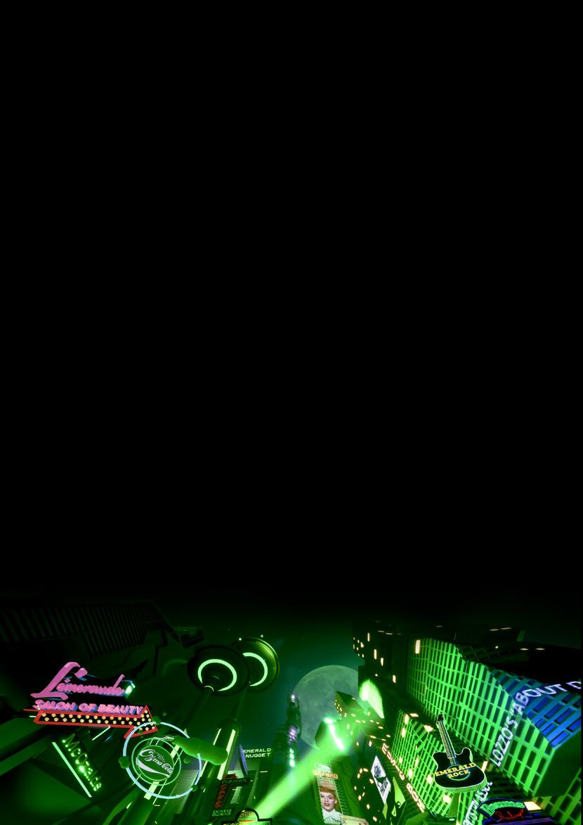
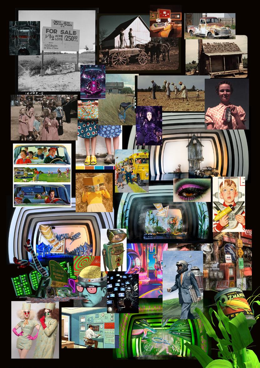
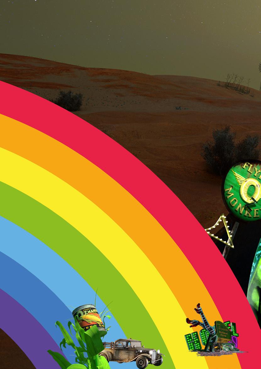
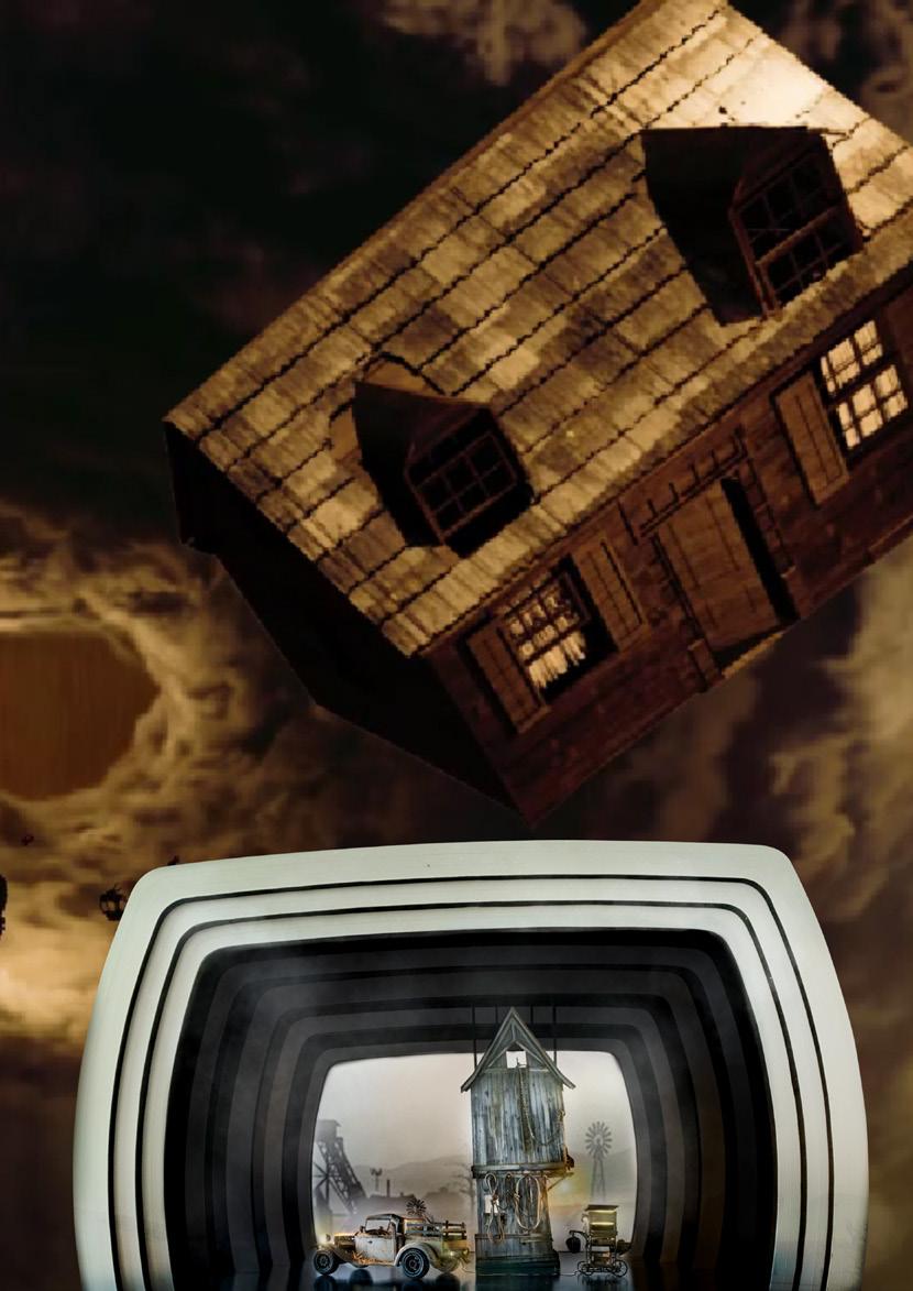
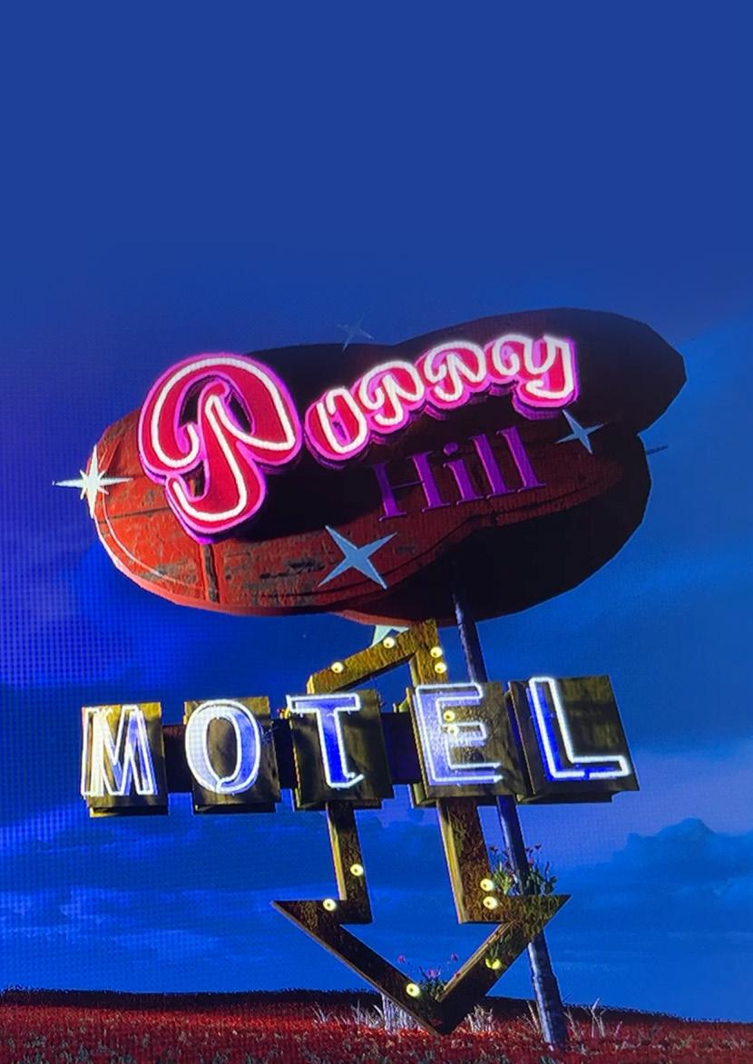
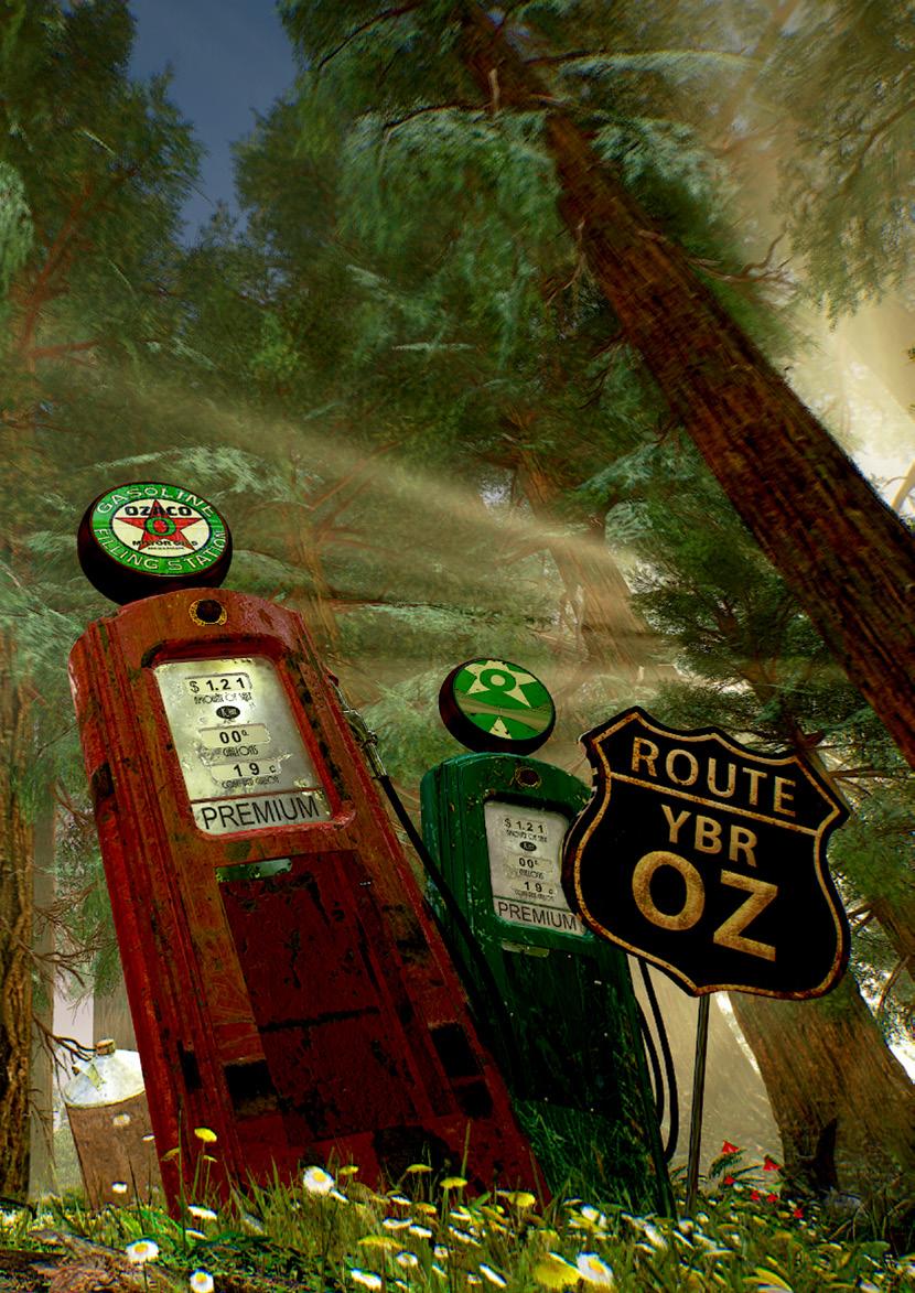
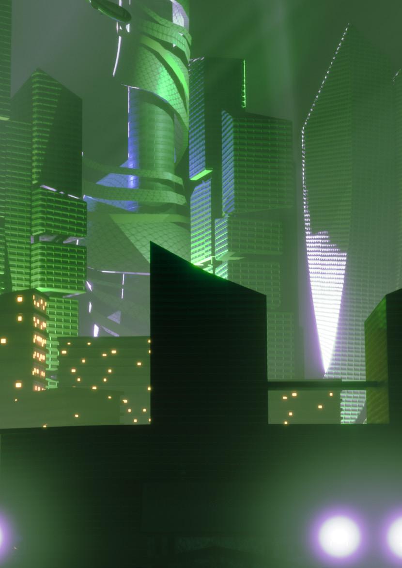
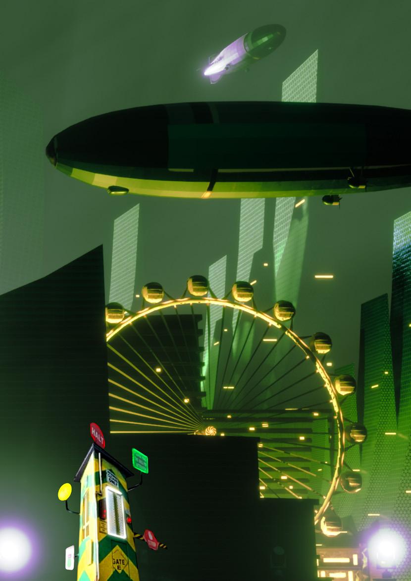
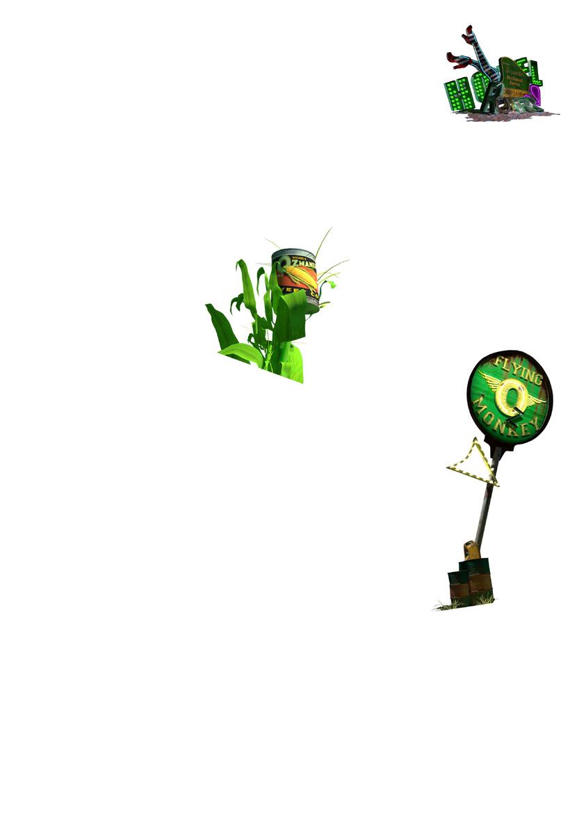
Set through the lens of 1930’s and 1950’s Americana. The initial design in 1930’s Kansas offers a dull, sepia toned colour palette that tells the narrative of the struggles of the farming communities facing drought and barren lands. The set design for Oz contrasts this and leads the audience on a journey down the yellow brick road, which takes inspiration from America’s famous Route 66. This is presented on stage by a set resembling iconic 1950’s signage and objects, alongside abstract projections such as sweetcorn plants with canned sweetcorn on top. An LED screen upstage paired with projections on the downstage proscenium work together to create significant depth and perspective on stage.

THEMES AND ISSUES
There are key themes and issues raised in the production; Democracy – when Munchkin land is destroyed. Feminism – through the young, strong, female lead, who helps three lost characters, find themselves as they all travel on a journey of self-discovery. Climate change – how our environment is being attacked through oil, gas and disasters. Good and Evil – are there such things as bad people? Resilience – understanding the strengths we carry inside ourselves to find our Home, within. These are reflected in some of the design choices made by creatives, in the final ideas presented on stage. How can you and your learners reflect your concerns about the world and some of the themes and issues in your design ideas?
Follow the Yellow Brick Road...
4


5
RESEARCH VIDEO
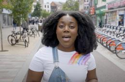
Some thoughts from our Artistic Director, Nikolai Foster on the design for The Wizard Of Oz

We started about 4 years ago, and I think The Wizard Of Oz is quite an overwhelming title to get your head round as a director. There have been so many versions of this play, so many different interpretations. I think because the play deals a lot in fantasy and Dorothy visits this magical world of Oz and the Emerald City, and is swept up in tornados and meets these incredible characters… I think there can be a temptation for a director and the creative team to feel that in order to elevate, and to set that material free, you need to be even more magical, even more imaginative and lay on extra layers of imagination and magic on to a story which is already very magical and very broad in its imaginative canvas. And so what I did as director very early on in the process was go back to the novel, back to the source material, and to really dig down into what the writer was saying originally, and think about the political landscape, the ideas, the humanity that is already inherent in the source material, so that when you are building a visual language for the play, and when you’re trying to tell that story in a three dimensional way on stage, we were remaining true to the source material and enhancing it rather than imposing on to it a directors vision or a designers vision, which might stifle what is already a really imaginative and wildly creative story. It also feels really important that the play speaks to us today and has something to say possibly about our communities, our society, that world we live in today. Sadly in many ways it felt the reflection, the mirror back on the Great Depression and recession, it felt like it had a key and a link to our world today... Many of the challenges around poverty and foodbanks and the environment that we are faced with in the 21st century, and how the characters in this play both at the turn of the 19th century and during the Great Depression in the 1930’s, how all of those things are sort of linked and they have an interesting resonance.

6
These quotes are an extract from our Research Video. Hear how the team developed the set design in the full video. This video is useful for educators to watch prior to delivering workshops or can be shared with learners.

Follow the Yellow Brick Road...

7
ICE BREAKER AND STARTER

1 COSTUMES AND CHARACTERISATION
WORKSHOP
story?
story?
the Rainbow task to gauge prior or no knowledge of the production. Please find printable worksheets at the end of this document
page 20, or offer learners the option to draw their
RED – Characters ORANGE – Plot / Story line YELLOW – Location / Place GREEN - Costumes BLUE – Set design INDIGO – Themes / Ideas VIOLET - Music 8 WORKSHOP 1
Leaders / Teachers – what do you already know about the
What do you learners know about the
Complete
on
own rainbow.
STILL IMAGE
Ask learners to show you a...
1. Group of friends
2. Friends on a journey far away
3. A barrier or something that stops them on their journey
4. The friends at the end of the journey
Run the still images in order and add a transition so that they flow smoothly from one to the other.
Explain how their still images connect to the production. Read the short synopsis of the story below and share the pictures of the main characters from the Made at Curve production.
Dorothy and her dog Toto are swept up in a tornado from sepia-soaked Kansas and transported over the rainbow to the technicolour wonderland of Oz.
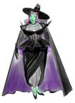
On her adventure down the Yellow Brick Road Dorothy meets new friends Scarecrow, Tinman and Lion who help her on her way, but the villainous and frightfully glamourous Wicked Witch has other plans for Dorothy, and in Oz – nothing is quite as it seems.
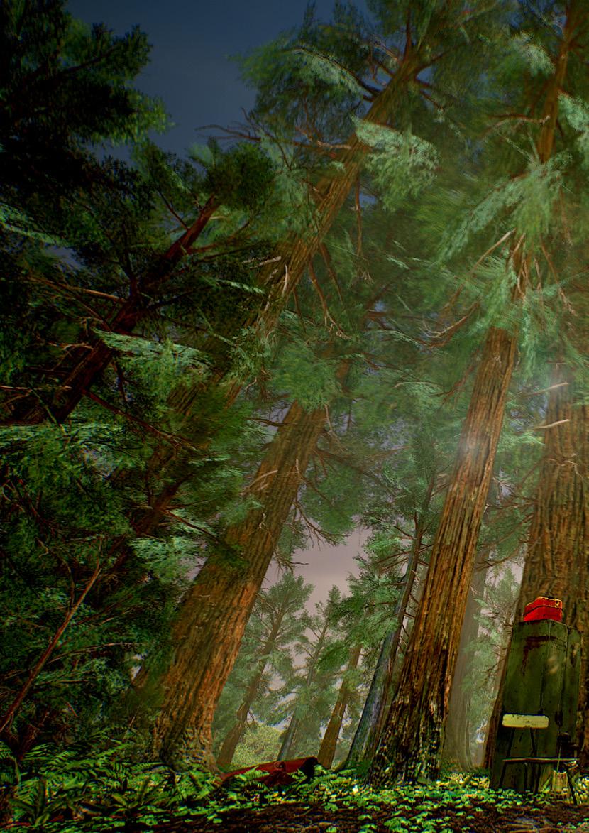
Through the deep Dark Forest to the bright neon lights of Emerald City, Dorothy and her friends search for the powerful and mysterious Wizard of Oz, the only person who can grant their hearts desires, and maybe even a way home.

WORKSHOP 1 9
WALK THE SPACE
• Ask the learners to find a space in the classroom.
• They are now going to walk the space and follow the instructions given. No talking, and eyes off the floor, keep their energy and eyeline up and out into the space and seeing everyone in the room. They must make eye contact with you, the leader, at least twice.

• They must not walk in a circle, and not walk with friends, but keep changing direction and try to fill any gaps in the space.
• Instructions: Stop, Go, Clap (and then carry-on walking), Touch (touch the floor, and then carry-on walking) Jump (and then carry-on walking) Freeze.
• Build up to every time they freeze, they have to hold for 5 seconds a pose as one of the characters in The Wizard Of Oz

• Final freeze ask the learners to stay as their favourite character from the production.
• Ask why they chose that character?
• Can they say a line of dialogue as that character?
Examples to use if needed: Dorothy “I’m sorry Aunty Em, I’m sorry I didn’t listen to you and Uncle Henry.”
Tin Man “I don’t know how I feel, oh, how I wish I had a heart!”
SPIDER DIAGRAM AND MIND MAPS
I wonder what they are like?
Choose one of the 6 characters from the production to create a spider diagram, that shows what they are like. Refer back to the images of the cast shared at the start and the short synopsis they have heard. See the example below.
BraveYoung
FiestyCaring 10 WORKSHOP 1
StrongMotherly
Dorothy PositiveBright
A heart is shown not by how much you love, but by how much you are loved by others.

WORKSHOP 1 11
CREATING A COSTUME DESIGN FOR YOUR CHOSEN CHARACTER
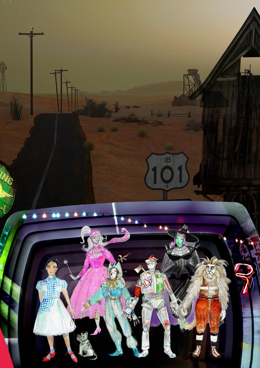
Rachel Canning is the Costume Designer for The Wizard Of Oz. Hear director Nikolai Foster talk about the costume designs in the video on page 7 and look at some of the images of the final ideas for some of the characters. The costumes range from Glinda’s bubble gum pink scooter to the Tin Man’s resemblance to a retro Gas Station. The Poppies at Poppy Motel, are dressed in 1950’s swing dresses all in red, that double up as motel furniture items to set the scene.
Take a look at the costume design images on page 9. How do the costumes make you feel as an audience member? What do you know about this character and what they are like in the production? Are they a likeable character?
Is there something unique about their costume? What colours, shapes or patterns have been used to portray this character?
TASK
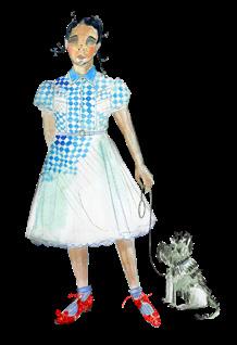
Using the character outline in the resources and materials, create a costume design for your chosen character. Consider the following:
• Who are they and what do they do in Oz?
• What did you find out in the Spider Diagram or Mind Map you created?
• Items of clothing
• Colour

• Patterns, shapes and symbols
• Props or object they need to have Annotate your design (explain through notes and points to say what you are trying to do)
Please find printable worksheets at the end of this document on page 21.
EVALUATION AND FEEDBACK
When you have finished your designs, be ready to share it with someone else and possibly the whole group.
Prepare a short speech 3-4 lines. Tell them your character, and why you chose them? What does your design communicate to the audience, about the character? What is the best bit and why?
Share all work as an exhibition in your classroom or somewhere in school to show all the different design ideas for the characters.
12 WORKSHOP 1
CHALLENGE AND EXTENSION TASK
• Bring your ideas to life by using some found and recycled materials to create your own designs. Get someone to model your design and take some photos of the designs as it is being built, as well as that final finished product.
• Can you add a new character to the cast of the Wizard of Oz? Who would they be? Give them a name. How would they add to the plot/ story? Are they a good or bad character? What are they hoping to get at the end of their journey? Create a design to show how this new character could be included in a future production.
Follow the Yellow Brick Road…

WORKSHOP 1 13
BEING A THEATRE DESIGNER
INTERVIEW WITH COLIN RICHMOND – SET DESIGNER
How did you get in to set design? I was always interested in design and making theatre from a young age. So, when I found out I could study it at university, I applied for drama school and got in. I ended up getting a first from the Royal Welsh College of Music and Drama in Cardiff. It was like I had come home finally and found my tribe there.
Can you tell us about your initial concepts and artistic visions for Curve’s version of Oz? It’s been a long time in the making, we started initial ideas during the first lock down if not a little before in 2020. I think we were always interested in seeing the world through Dorothy’s eyes. Then the idea of looking through a lens slightly too, whether it be an old Kodak photograph and then a morph into full Technicolor… The frame on stage and the shape of the portals started with an idea of looking through an old TV monitor... and then it developed from there. Each scene has a carefully considered item to transport us. We always knew we would be heavily involving projection in the visuals, so Douglas O’Connell (Projection Designer), Nikolai Foster (Director) and myself along with Rachael Canning (Costume and Puppet Designer), have worked closely together to make sure all our disciplines are seamless. We wanted the vision for the show to be fun and fresh and sometimes irreverent, or at least a little cheeky. Big bold colourful images and ideas and arresting visuals were key to us and making sure our movement on the journey to Oz was fun too.
Once a few ideas had been conceived and agreed on we were able to piece other images into the show. The wizards head for example was a very early idea. Quite anarchic and fun and really using video and scenic items together to make a whole image. Lots of perspectives change throughout too – purposefully giving us a warped view sometimes both as the audience member and as if we’re seeing the world through Dorothy’s eyes.
Do you feel there are any successes and challenges when designing a set for an inside out theatre such as Curve?
It’s a wonderful space in terms of its size and its stage machinery. We wanted to really pull the show out into the auditorium as much as we could so we’ve built out in front of the existing proscenium. We are able to do a lot of large set pieces pushing in from the wings due to the space off stage, so this is brilliant for us as designers, being able to shape shift endlessly, not so fun for the crew however.
What tips would you give to someone who would like to pursue a career in set design? Don’t ever underestimate the hard work and discipline it takes to get ahead in theatre. It’s a hard and long slog and there’s a lot of voices and judgements to contend with. Try to know your own true worth, both in terms of your work style and work ethic. It’s a privilege to do something that feels like fun for work, so it’s easy to forget it still is work and you need to make a living from it. You’re being employed to be creative most of the time and it’s sometimes hard to be that, we all have off days, so be kind to yourself on those occasions. It’s amazing though to share your work with other people and see the excitement it brings to them in seeing new worlds come to life, and hopefully it gives people what it was that inspired you to get into it in the first place. Above all, be nice to everyone... A theatre should be a solace for us all.
14
We wanted the vision for the show to be fun and fresh and sometimes irreverent, or at least a little cheeky.

Lots of perspectives change throughout too – purposeful giving us a warped view sometimes both as the audience member and as if we’re seeing the world through Dorothy’s eyes.
It’s amazing though to share your work with other people and see the excitement it brings to them in seeing new worlds come to life...
15
WORKSHOP 2 CREATING YOUR OWN SET
ICE BREAKER AND STARTER
Group
Game – Make an Object Skills Focus – Team Work and Collaborative Ideas

WALK THE SPACE
• Ask the learners to find a space in the classroom.
• They are now going to walk the space and follow the instructions given. No talking, and eyes off the floor, keep their energy and eyeline up and out into the space and seeing everyone in the room. They must make eye contact with you, the leader, at least twice.
• They must not walk in a circle, and not walk with friends, but keep changing direction and try to fill any gaps in the space.
• Instructions: Once learners are in groups, call out an object that the learners have to create an abstract image of using their bodies as a team. An example could be “groups of 6” and “make a car”. You can use objects from The Wizard Of Oz “Group of 3 make a sweetcorn plant”. You can encourage the use of their imagination by then giving just a letter and a number – “groups of 4 make an object beginning with S.”
THE DESIGN APPROACH
Definition – A Model Box is a scaled down 3D model of what a designer thinks the stage will look like. Often these are in the ratios of 1:100, 1:50 or 1:25. Designers will use white card to make this model first, before moving on to making a model box with as much detail of the set as possible.
TASK
Creating a
Model Box Set Design Using Recycled Objects.
In the late 1930’s, when The Wizard Of Oz first came out as a film, America was facing The Great Depression. This austerity led to a new slogan being used across America “Use it up, wear it out, make it do or go without”
This task looks at how recycled objects can be repurposed to develop creative ideas. Made at Curve’s production of The Wizard Of Oz blends themes from 1950’s Americana culture with ideas from present days, which allows the set to sit outside of a specific timeline. A contemporary twist on the characters is also realised in the costumes, props and set; witches ride bikes not broomsticks, everything is focused on consumerism, like ready to go corn in a can, and the branding of different oil companies destroying the environment.
16 WORKSHOP 2
Someplace where there isn’t any trouble. Do you suppose there is such a place, Toto? There must be.
Offer learners a variety of recycled materials, including things like newspaper, lollipop sticks, cotton wool, washed out juice cartons, milk tops. Use any materials that are easily accessible and offer multiple options to redesign.


Below we have included some of our own ideas as to how materials can be reused and recycled into set and props for a model box. These can be shown to learners after they have thought of their own ideas as to not influence their creative process or can be used to prompt learners prior to the task to think creatively. Offering prompts that reflect on Curve’s production may be useful to learners, for example how would the colours vary between a scene set in 19030’s Kansas and a scene set in the Emerald City, would there be a dullness to the colours of Kansas and a vibrancy to the colours in Oz?

WORKSHOP 2 17
Some of our ideas include;
• A Yellow Brick Road made from lollipop sticks

• Collaging images from magazines on a piece of paper to make an abstract backdrop
• Pickett fences made from lollipop sticks, these could be perfect or be made to look worn and broken dependant on the set
• Giant corn made from straws and tissue paper
• A tornado made from cotton wool

EVALUATION AND FEEDBACK
Set up a clear table or cardboard box turned on its side at the front of the room that learners can use to set out their props and set in. Offer learners the opportunity to pitch and share their ideas with peers and discuss what makes their props unique.
CHALLENGE AND EXTENSION TASK
Curve is an inside out theatre, meaning no backstage area, no wings and side walls of the theatre that raise to expose the full set. The production uses projection on to the proscenium, which is built forward using additional large scale set pieces into the auditorium space and resembles a portal. Ask learners how could this be encompassed in their set design to add the Made at Curve uniqueness to it, could they design in front of their model box or to the sides to bring the stage and design into the auditorium space and beyond the traditional stage?
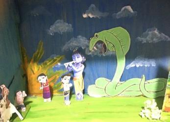
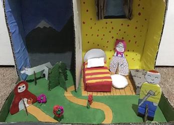
Some examples of model boxes can be found above. These were model boxes reflecting students own cultural stories. Thanks to Year 7 and 8 students at The City of Leicester College for sharing this work.

18 WORKSHOP 2

19
WORKSHOP 1
COSTUMES AND CHARACTERISATION
ICE BREAKER AND STARTER
Leaders / Teachers – what do you already know about the story? What do you learners know about the story?
Complete the Rainbow task to gauge prior or no knowledge of the production.
RED – Characters
ORANGE – Plot / Story line
YELLOW – Location / Place
GREEN - Costumes

BLUE – Set design
INDIGO – Themes / Ideas
VIOLET - Music
20 WORKSHOP 1 – PRINTABLE WORKSHEET
WORKSHOP 2
CREATING A DESIGN FOR YOUR CHOSEN CHARACTER
TASK
Using the character outline in the resources and materials, create a costume design for your chosen character.


Consider the following:
• Who are they and what they do in Oz?
• What did you find out in the Spider Diagram or Mind Map you created?
• Items of clothing
• Colour
• Patterns, shapes and symbols
• Props or object they need to have
Annotate your design (explain through notes and points to say what you are trying to do).
21 WORKSHOP 2 – PRINTABLE WORKSHEET
Follow the Yellow Brick Road...

How to remember the colours of the rainbow
From a very early age, we’re taught how to remember the colours of the rainbow using what is known as a mnemonic.
This is a phrase that takes the first letter of each colour and makes up a new word which, in turn, creates a phrase that’s easy to remember.
One of the traditional mnemonics is Richard Of York Gave Battle In Vain, but it’s easy to make up one that’s relevant to you.

 Music by Harold Arlen • Lyrics by E.Y. Harburg • Additional Music by Andrew Lloyd Webber • Additional Lyrics by Tim Rice • Adaption by Andrew Lloyd Webber and Jeremy Sams • From the Book by L. Frank Baum Based upon the Classic Motion Picture owned by Turner Entertainment Co. and produced with the permission of Warner Bros. and EMI Music Publishing • By arrangement with The Really Useful Group Ltd
DIRECTOR NIKOLAI FOSTER


