Architecture and Aura: Embodied Narratives of the Sensuous Architectural Space
 Daniel Berende
Contents
Introduction: 1-3
Chapter 1- The Chapel in the Field, Stories from within the cave: 4-11
Chapter 2- Reconnection with the Gothic: 12-16
Conclusion:17
Bibliography and Webography:18-19
Figures List:20
Introduction:
Could an architect be a blind? Surely, you’re thinking not, yet some of the greatest musical masterpieces were composed by a then deaf Beethoven. Is architecture made for the eye, or is there a deeper connection between the inhabitant and the inanimate space?
Currently, with the rise of social media and the digitalisation of our daily life, we are further immersing society’s views on architectural quality into ocular bias perceptions and standards, an architecture of aesthetics. The architecture of our time is tempered for the picture, deprived of the qualities that cater for physical interaction and the embodied experience. The ocularcentric ethos of contemporary architecture was arguably catalysed by the ideologies of the dignitary Modernists such as Le Corbusier who advocated for architecture as an art for the eye ‘I exist in life only if I can see’; 1 and ‘I am and I remain an impenitent visual-everything is in the visual’; 2 in extracts like these Corbusier, not only separates the other senses from architecture but seemingly regards the building as a mere visual artefact in space, disconnected from humanity which involves so much more than sight ‘Man looks at the creation of architecture with is eyes, which are 5 feet and 6 inches from the ground’;3 Bias emphasis on the visual is evident in case studies such as Farnsworth House, where the building is regarded as a masterpiece among the architectural community and popular culture. However, it did not seem to cater for the daily life of the client, eventually suing Mies van der Rohe as she considered the building to be defective and not compatible with daily living4 There is a bizarre trend among modern architectural practices, particularly big firms, to publish their work right after construction, before the building is inhabited. The fixation for the render-like aesthetic presents the building as empty, hygienic,lifeless and ageless as it fails to regard the reality of time or, ‘the unavoidable and mentally significant process of aging’;5
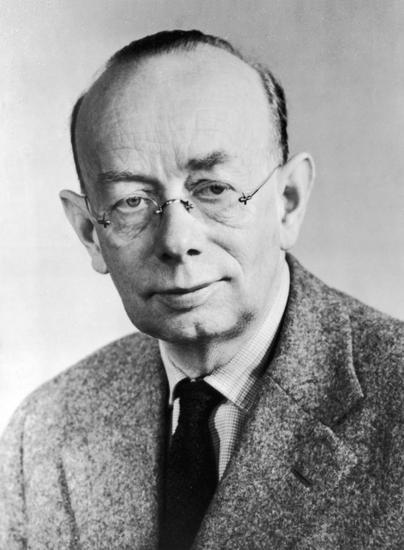
In the 1959 Steen Eiler Rasmussen Danish architect and professor at the Royal Danish Academy, wrote Experiencing Architecture in hopes of reconnecting his students and the fellow colleagues in the architectural field with the pure and fundamental qualities of successful architecture. This text is seemingly alerting the problematic loss of architectural quality by outlining fundamental,
1 Le Corbusier- Precisions, MIT Press (Cambridge MA), 1991, Pg.7.
2 Le Corbusier- Precisions, MIT Press (Cambridge MA), 1991, Pg.231
3 Le Corbusier- Towards a New Architecture, Architectural Press (London) and Frederick A Praeger (New York),1959, Pg.164.
4 https://www.thoughtco.com/mies-van-der-rohe-edith-farnsworth-177988
5 Pallassma, Juhani- The Eyes of the Skin, (New York, USA: John Wiley and Sons Inc, 1996), Pg.34.
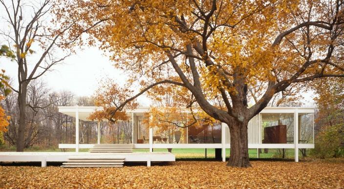 Figure 2: Farnsworth House beautified by the autumn landscape.
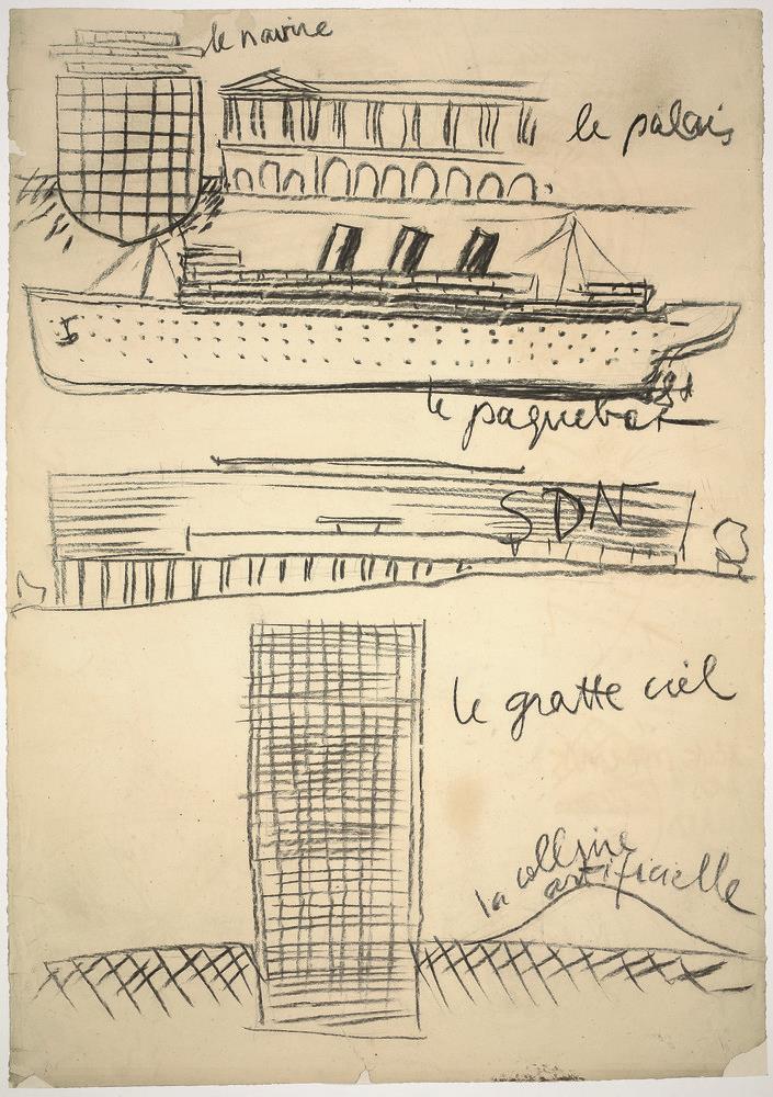
Figure 1: Le Corbusier sketch depicting the transformation of a ship to the skyscraper.
yet intellectually exciting features successful architecture has and must retain in the future. In essence one of his main arguments which he makes evident from the first page is that “On the whole, art should not be explained; it must be experienced’6 and taking this even further, considering architecture is a form of art ‘It is not enough to see architecture, you must experience it’;7. Indeed, this ‘experience’ outlined by Rasmussen involves a direct, multi-sensory physical experience of the space. We learn more about the building as we interact with its premises and dwell within its walls.
Rasmussen, regards this this sensory, intimate experience between man and building as a vital relation in order to be able to understand architecture and fully appreciate its qualities, hence if a building fails to evoke these emotions it simply lacks essence as ‘the object of good architecture is to create integrated wholes’8 The building is a place of exchange notexclusively in regards to its function i.e.a market, and this exchange is not limited to the exchange between humans, it is an emotional interaction between the inanimate and the living. For those able to see, the process starts with observation. This visual exercise is simplified by Rasmussen through an analogy, explaining the mental process of observing someone passing by on the street from the seam of their jeans, after observing certain details our attention is driven on to the next until we picture the whole thing, we are looking at9. The interesting thing about the exercise described, that is often the case with architecture, is that our initial pre-formed opinion changes once we observe it fully. Initially the subject in the example observes the seam of the jeans and immediately believes that he has seen a man, however as he moves up detail by detail, he establishes in fact that it is a girl wearing the jeans.
Interestingly, this also happens with architecture, as we initially observe a building, we piece out various visual elements and begin to understand how they work By observing more and more and engaging with it visually our initial concept of it shifts and becomes more concrete. However, this is solely a visual exercise, hence our experience remains limited to the visual. Therefore, the profound interaction of the senses with the building can only happen by experiencing the building physically Not through picture. Then, visual exercise transcends and starts to integrate other organs responsible for other senses, the eye invites touch, the touch creates movement, the movement creates sound. This is how we begin communicate with the inanimate space.
6 Rasmussen, Stein Elier- Experiencing Architecture, (Cambridge, Mass, USA: MIT Press Ltd, 1959), Pg.7.
7 Rasmussen, Stein Elier- Experiencing Architecture, (Cambridge, Mass, USA: MIT Press Ltd, 1959), Pg.33.

8 Rasmussen, Stein Elier- Experiencing Architecture, (Cambridge, Mass, USA: MIT Press Ltd, 1959), Pg.33.
9 Rasmussen, Stein Elier- Experiencing Architecture, (Cambridge, Mass, USA: MIT Press Ltd, 1959), Pg.35.
Figure 3: Steen Elier Rasmussen
Figure 4: The Eye by Salvador Dali depicting how ‘we perceive our reality and amazingly embody our experience’. The landscape depicted can be seen as architectural yet, sensuous.
One sees a surface from a distance, we touch it with our eyes we can conceive an idea of how that surface is Indeed, the eye touches, as Pallassma argues ‘Vision reveals what the touch already knows…. our eyes stroke distant surfaces, contours and edges, and the unconscious tactile sensation determines the agreeable or unpleasantness of the experience’; 10 however, ‘Regardless of our prioritisation of the eye, visual observation is often confirmed by our touch’11 ; and this synergy of the ocular and the haptic can only happen within the physical inhabitation of space. As the mere visual experiences ‘separate us from the world the other senses unite us with it’; 12 hence the visual needs to be in constant interaction with the other senses. This multi-sensory gaze is what allows one to fully engage with the inanimate and allow this emotive exchange previously mentioned to take place ‘the work projects itsaura, and we project our own emotions and precepts on the work’;13
The picture is not enough. Rasmussen argues ‘Seeing demands a certain activity on the part of the spectator. It is not enough passively to let a picture form itself on the retina of the eye’ we cannot fully engage with the architecture from pictures Marco Frascari, Italian architect and theorist mentions in his essay “The Tell-the-Tale Detail”, that details ‘can be regarded as minimal units of signification in the architectural production of meaning’14 which in essence this means that meaningful architecture is comprised of carefully selected components that orchestrate its meaning and effect on the inhabitant. This is similar to Rassmussen’s concept of “integratedwholes” that characterise successful architecture, the word integrated suggests the ‘combination of two or more things in order to become more effective’15 This concept of orchestrating architectural atmosphere by using a series of carefully considered “minimal units” to evoke a harmonious, intentional sensory reaction is prioritised in the work of Peter Zumthor, particularly in Bruder Klaus Field Chapel. However, in order to fully understand the building and establish a deeper connection, beyond the visual comprehension from the pictures of it, I must experience it and allow it to speak to me, ‘when analysing the work of a poet, an architect, there is no better indication of intentionality than the experienced work itself: the building speaks’16
10 Pallassma, Juhani- The Eyes of the Skin, (New York, USA: John Wiley and Sons Inc, 1996), Pg.46.
11 Pallassma, Juhani- The Eyes of the Skin, (New York, USA: John Wiley and Sons Inc, 1996), Pg.27.
12 Pallassma, Juhani- The Eyes of the Skin, (New York, USA: John Wiley and Sons Inc, 1996), Pg.28.
13 Pallassma, Juhani- The Eyes of the Skin, (New York, USA: John Wiley and Sons Inc, 1996), Pg.74.
14 Frascari, Marco- The Tell-the-Tale Detail (1981), extract from, ‘Theorising New Agenda for Architecture: An Anthropology of Architectural Theory 1965-1995 (Michigan, USA: Priceton Architectural Press, 1996) Pg.500
15 https://dictionary.cambridge.org/dictionary/english/integrate
16 Castro, Ricardo Leon- Syndesis III: Architecture Place and Landscape (Bogotá, Colombia, Universidad Piloto de Colombia, 2018) Kindle Edition, Ch.2, Pg.6.
 Figure 5: Exterior of Zinc Mine Museum designed by Peter Zumthor.
Chapter 1:
The Chapel in the Field
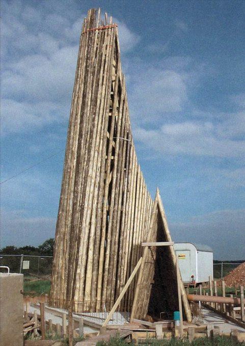
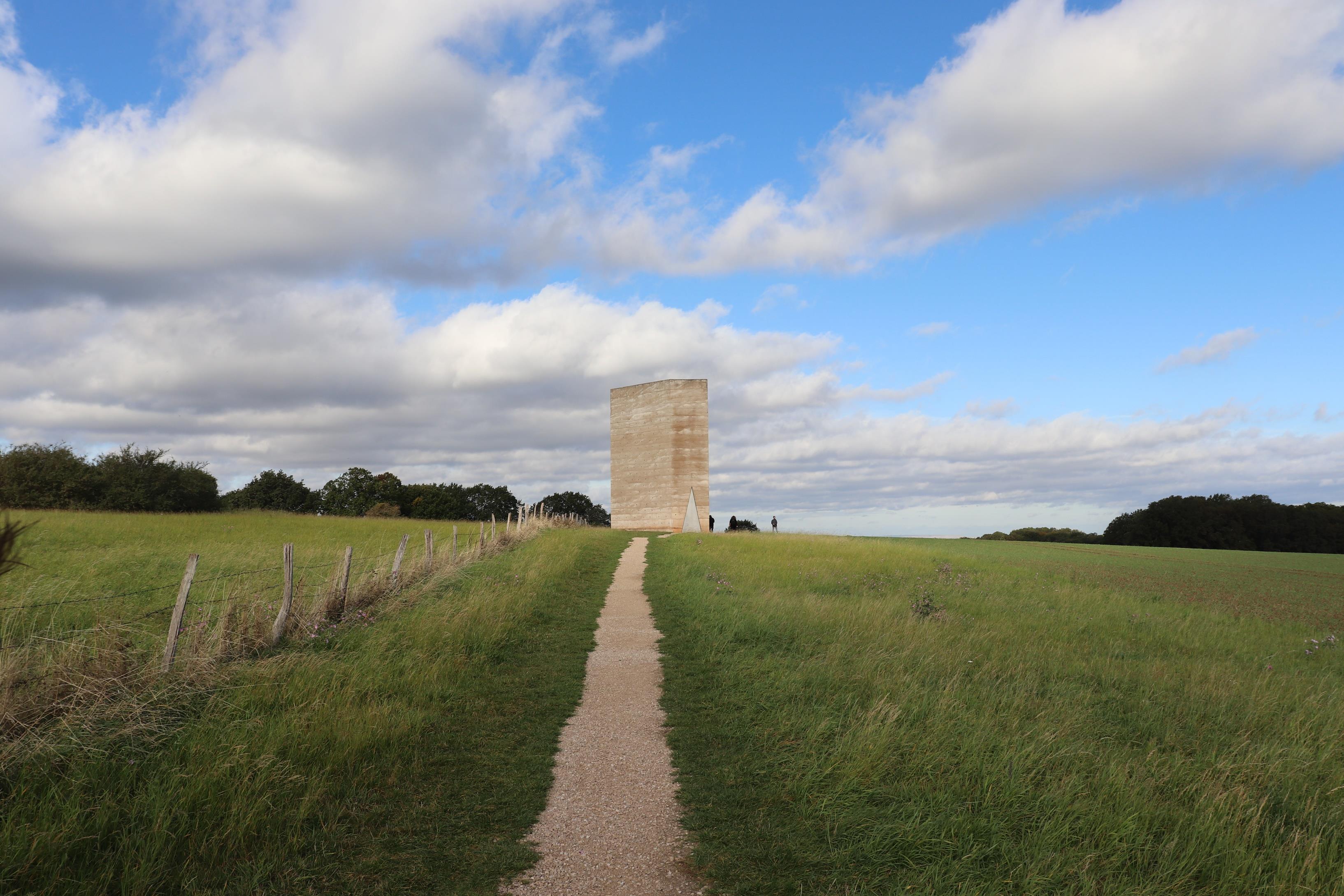
Nested between the patches of forest and agricultural fields of Wachendorf, stands neatly against the lush green of the forest canopy and the silky blues of the sky, the Bruder Klaus Field Chapel. The chapel becomes the beacon of the fields, ‘a new point of reference; landscape and tower start to connect…it defines the place, giving it a left and a right, an upper and a lower, something it never had before’17. The chapel was designed by Peter Zumthor and commissioned by two local farmers Hermann-Josef and Trude Scheidtweiler. After the design stage, left solely to the architect, the clients wanted to be involved in the construction process and do as much of the construction work as possible by themselves to keep its costs low. The clients themselves, cut and trimmed 112 trees from a local forest and then with help of friends and guidance of a carpenter, created a wooden tent. Around which, in each of the twenty-four work days, they packed a fifty-centimetre-high layer of rammed concrete made from clay, sand and cement into a pentagonal prism that towers twelve-metres from the ground. After the final layer is packed, the client set a slow fire to the wooden tent, which acted as the inner formwork. When the fire finally went out, the scorched tree trunks were removed, leaving behind their imprint and the lingering smell of smoke;18. The holes which were used to hold the inner formwork (the tree tent) to the exterior formwork were then capped with glass balls that dot the interior with tiny penetrations of light.
The ritualistic and unorthodox design and construction process gave birth to a complex space that offers an intimate and sensuous experience. Although a space of meditation, the chapel offers the sentiment of comforting protection similar to that of a shelter integrated gracefully with the inviting mystery of a cave. The shelter quality of the space might also stem from the fact that it was constructed by the very people that were going to use it. This intent for a personal intimate experience is also suggested by the lack furniture on the interior, which only offers seat for one person or two people willing to seat very close to each other but also by the triangular door that only allows room for one person to go through. The clients clearly wanted an atmosphere that is personal and intimate and this atmosphere also seems to be effective in captivating even the tourists. The fact that the clients wanted to build something of their own is present in the atmosphere of the place.
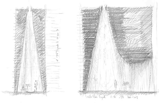 Figure 8: Initial wood tent build by the clients to act as the inner formwork.
Figure 7: Initial sketches for Bruder Klaus chapel by Peter Zumthor
17 Zumthor, Peter- 1998-2001 Building Projects (Zurich, Switzerland, Scheidegger Spiess, 2014) Pg.121
18 Zumthor, Peter- 1998-2001 Building Projects (Zurich, Switzerland, Scheidegger Spiess, 2014) Pg.121 -122
Rassmussen writes ‘At a certain stage most children have the desire to build some sort of shelter. It might be a real cave dug into a bank, or a primitive hut of rough boards. But often is no more than a secret nook hidden among the bushes, or a tent made with a rug draped over two chairs. This “cave game” can be varied in a thousand ways but common to them all is the enclosing of space for the child’s own use’19 Perhaps, it is the cave-like experience of the place that subconsciously awaken the dormant childish curiosity within us, while animating the primal sentiment of being in a primitive shelter
Bruder Klaus Chapel gained reputation for housing a complex aura that is effective in inducing a powerful meditative state. The intent of the trip to Wachendorf via Cologne was discovering and comparing the differences between the preconceived or assumed experience of the building, informed by observations made though the medium of pictures and the internet. In comparison to the haptic, multi-sensory experience, informed by the physical embodiment and interaction of space within the building and its premises. The visit would to confirm how effective this orchestrated sequence of details by Zumthor was and also settle the mystery of inhabiting its walls, provoked by its pictures. Zumthor defines successful architecture in its ability to ‘move me’ 20, hence can I really determine the architectural quality of a space unless I experience it?
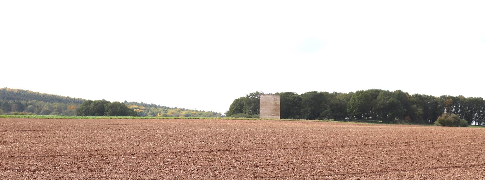
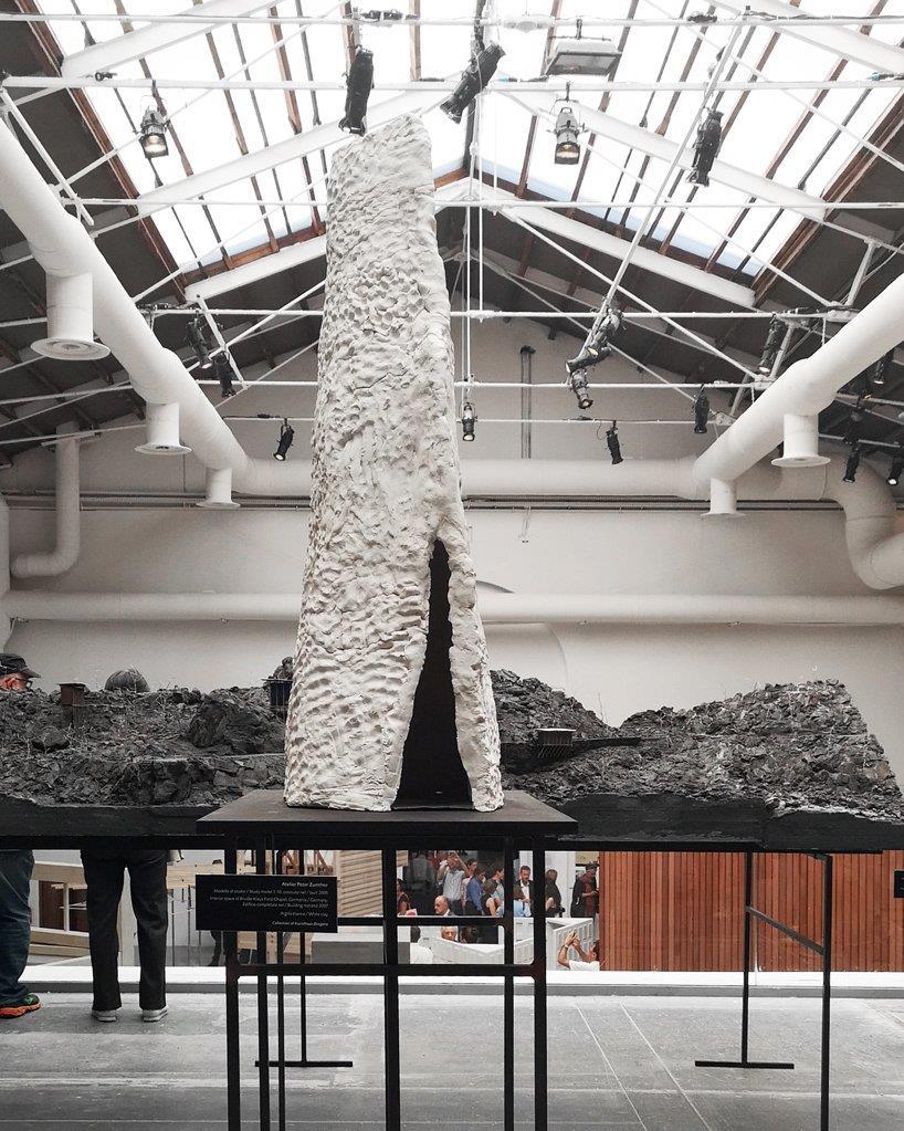 Figure 9: 1:10 Clay Model of Bruder Klaus on ehibition at Venice Architecture Biennale.
Figure 10: The chapel’s exterior texture seemingly camouflaging with the ploughed lines of the field as one approaches from the distance.
19 Rasmussen, Stein Elier- Experiencing Architecture, (Cambridge, Mass, USA: MIT Press Ltd, 1959), Pg. 34.
20 Zumthor, Peter- Atmospheres: Architectural Environments, Surrounding Objects, (Basel, Switzerland: Birkhauser, 2006) Pg.11
Stories from within the cave
This narrative is a development of the notes and voice recordings I took while on site, in an attempt to present how powerful this experience was. As I climb the gentle sloping trail to the block in the distance, the contoured layers of rammed concrete seem to blend themselves with the lines of the plough in the fields surrounding it. As the trail bends around the fields, the sides of the tower seem to distort and indicate a different form geometry as I get closer and closer to the chapel. It seemed that I wasn’t the only one that noticed the ability of the geometry to transform and shift. After the visit, I came across an article that documents the visit of British architect John Pawson, he says ‘Zumthor’s five-sided structure has a shapeshifting quality, its appearance morphing with every twist and turn of the footpath that winds its way between the fields’21. It’s only when I arrive adjacent to the field that contains the chapel that I notice it is actually pentagonal like the plan says.
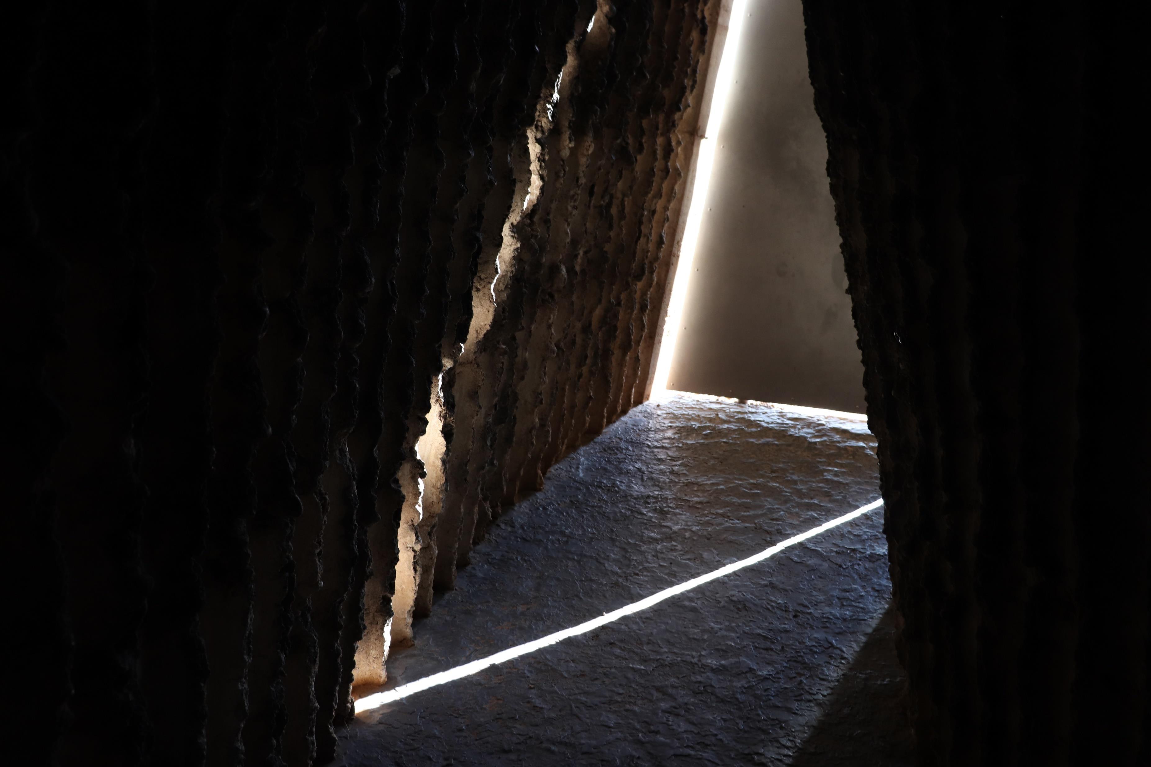
As I climb towards the sharp metal door, I notice people opening and closing it and I immediately observe its exaggerated thickness The shock prepares the muscles in the arms for the strain of opening such a seeming dense block of metal. The minuscular knob-shaped handle makes the prospect of moving the door and entering the space seem exhausting. As I press the handle, the door proactively pivots open with the lightness of a butterfly and realise the door is actually hollow. ‘The door handle is the handshake of the building’22, and to extend this further the ease to open it, is what greets and invites. The first peak reminds me there was a fire here. Under which, the lead that covers the floor melted and the smoke of the trees blacked the ridged cave like-walls of the tunnel that leads to even more darkness. Yet it’s this darkness that generates mystery and invites the visitor; teases. From the door there is no direct view to the main space, as the tight tunnel to it folds and undulates, creating a visual, physical and emotive suspense.
21 https://uk.phaidon.com/agenda/architecture/articles/2013/september/26/john-pawson-visits-zumthors-bruder-klaus-chapel/

 Figure 11: Earthy tower neat against the skies.
Figure 12: A timid handshake.
22 Pallassma, Juhani- The Eyes of the Skin, (New York, USA: John Wiley and Sons Inc, 1996), Pg.62.
This effect of multi-sensory suspense is heightened by the black ash on the wall and lack of light as the door is shut behind. The darkness forces a slower more cautious walk extending the time spent within the threshold and extending the time of suspense. Within this transition other two particular effects take place. As the feet press against the surface of the floor the soles can feel the slight flexible attribute of the molten lead as the feet give the impression of sinking Absorbing and muting the sound of the steps as you walk towards the core.
‘Gravity is measured by the bottom of the foot; we trace the density and texture of the ground though our soles.’23


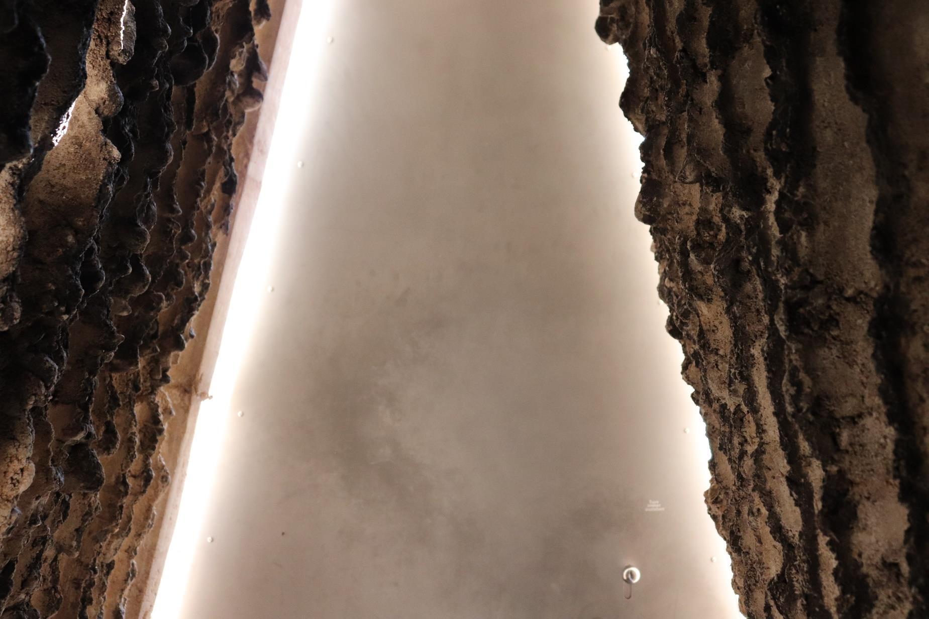
The darkness and suspense of the tunnel mutes, preparing for the seemingly compulsorysilence within the main space. This silence and darkness awaken a primal instinct of alertness, mystery and anticipation, which is abruptly released as one enters the interior core and looks up at the oculus opening to the sky. As light is absorbed by the black ash that covers the walls, the hand is invited to touch and feel the imprints left by the scorched trees.
‘A powerful architectural experience silences all external noise; it focuses our attention on our very existence…it makes us aware of our own solitude’24
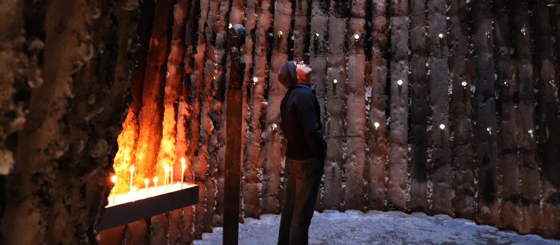 Figure 13: Molten Carpet.
Figure 14: Imprints of trees.
Figure 15: The gaze to heavens
23 Pallassma, Juhani- The Eyes of the Skin, (New York, USA: John Wiley and Sons Inc, 1996), Pg.62.
24 Pallassma, Juhani- The Eyes of the Skin, (New York, USA: John Wiley and Sons Inc, 1996), Pg.55.
A meditative silence dominates, as the limbic system with the cerebral cortex race to make sense of the space which surrounds the body. The sky which we stare at in apprehension though the small opening at the top of the core is the same sky as before entering the building. Yet, the regained visual access to light from the darkness of the tunnel is what grips the attention as we subconsciously frame the heavens though the opening that connects the interior to the outside but more importantly to the sky. The presence of the burned trees remains within the space. In the silence of voices and noise, the sound of branches moving tree branches, emitted by the forest they were taken from. Their presence also, in the notes of smoke within the air

that fills the chapel. The textures of the whole composition invite tactile interaction. The flutes in the tapering walls where the tree trunks were, are asking to be caressed. The fine white sand where the candles are planted, still show the finger marks of those who planted them and demand more imprints to be made. Sunlight, distorted by the glass balls scattered around the dark core like stars on a night sky, temp the eye, teasing what the outside world looks like through its pupils. Like a fortune telling orbuculum they beg for a soft touch to reveal its mysteries. The tactile and interactive invitation of the space to the hands is also evoked in the sculpture of the Nicholas of Fluhe (Bruder Klaus), whom the chapel is dedicated too, where the sculptor Hans Josephsohn, has purposefully expressed the movement of the moulding marks in the textural quality of the bust. The sculpture itself teases touch as initially it seems to be made out of a flexible or ductile material similar to that of clay but upon touch, its temperature suggests the coldness of cast metal While exiting, I was captivated by the way light framed the sharp outline of the door. The tunnel reminded me of the Biblical story illustrating the Raising of Lazarus A transition from the dead of darkness into the light of life.

 Figure 18: Dotted Orbculums.
Figure 17: Moulding of Hands.
 Figure 19: Rising Lazarus

Chapter 2: Reconnection with the Gothic
En-route to Wachendorf, it would have been a hugely missed opportunity to not experience one of the greatest examples of Gothic architecture, Cologne Cathedral. Initiated in 1248, the cathedral, a 600-year long construction endeavour, created the tallest building in the world after its completion in 1880, still the largest Gothic cathedral in Northern Europe. The colossal height is credited to the 157-metre tall twin towers that mark the cathedral’s dominant presence within the city’s skyline25 Gothic architecture is characterised by its verticality via the use of the flying buttress which allowed taller buildings to be constructed The flying buttress in Gothic churches allowed the interior space to have access light, something that the preceding Romanesque style was ineffective at doing. Openings, especially the windows, were made to be much larger and offer constant sunlight, filtered through illustrated stained-glass windows surrounding the walls. This penetration of sunlight allowed the interior space to be ultimately connected to the heavens but also illustrate the scriptures for the illiterate congregation of the time. Also, in comparison to the less efficient, Romanesque barrel vault, Gothic architecture typically used the pointed arch, which was more effective at supporting load especially, when these were crossed to create ribbed vaulted ceilings. This was more efficient than its Romanesque, groin vault counterpart and allowed taller ceilings to be supported by thinner columns. The methods of construction used in Gothic architecture allowed for more holisticinterioratmospheres tobe created.Theseatmospheres unlike the Romanesque, were more sensuous and appealed to the emotive rather than the intellect.
The columns at Cologne Cathedral, like other typical Gothic columns, were grooved for decoration but this also allowed them to appear slender and take up less interior space. This along with the weathering of the stone, both on the interior and exterior, immediately created an affinity with the burned, fluted walls of the Bruder Klaus Chapel. Although Zumthor’s minimalist approach omits the graceful stone decoration of the Gothic marvel, Bruder Klaus Chapel can still be seen as an attempt to reconnect the modern with the Germanic Gothic or at least reference it. This can be observed in Zumthor’s choice of rammed concrete which when set is reminiscent to the textural quality of unweathered sandstone used at Cologne

25 https://www.britannica.com/topic/Cologne-Cathedral
 Figure 21: One of the spires at Cologne Cathedral.
Figure 22: Collage of the reminiscent textures from Cologne Cathedral and Bruder Klaus Chapel
Cathedral. Similarly, to how blocks of carved stones are stacked on top of each other vertically, the chapel expresses the vertical
contours of the layered rammed concrete used for its construction. This parallel with the Gothic is also present within the spatial principles of the chapel, which shifts vertically in height and like Gothic architecture, creates a hierarchy by using ceiling height to assert importance. This shifting verticality of the Gothic becomes present as one visualises the section of Bruder Klaus Chapel. Initially, there is a lower, seemingly vaulted tunnel that leads to the main space which, like the ambulatory that houses the altar in Cologne Cathedral, elongates further upwards towards the sky. However, instead of housing an altar, the main space in the chapel opens to the heavens. These delightful orchestrations of details with light, darkness, scale, smell and textures are deeply potent and dynamic, and forge a holistic atmosphere that conceptualises the presence of the divine. While drawing the similarities to the experience of Bruder Klaus Chapel, I reached the conclusion that Cologne cathedral was similarly effective at inflicting a powerful multi-sensory experience.


The prospect of Zumthor addressing the qualities of Cologne Cathedral within Bruder Klaus Field Chapel, is very plausible. This can be noticed in the visual homage he pays to the cathedral in Kolumba Museum, situated in proximity to the cathedral. Instead of restricting the views to it, Zumthor opens a massive window that frames the whole cathedral as a great artefact in the museum’s exhibition. This becomes more evident as seating stool is placed adjacent to it. (see figure 21)
As the senses are becoming more disconnected and disregarded within the context of contemporary architecture, we must regain this connection by looking back at fundamental spatial principles and spaces designed to evoke emotion and reconnect us with the intimate emotive qualities’ architecture must have. Pallasmaa writes ‘The timeless task of architecture is to create embodied and lived existential metaphors that concretise and structure our being in the world. Architecture reflects, materialises and eternalises ideas and images of ideal life…In memorable experiences of architecture, space, matter and time fuse into a singular dimension, into basic substance of being, that penetrates our consciousness’26. In synergy with its function and the regard to the intellect, a building should connect to the sensuous and emotive self.
Figure 23: Section of Bruder Klaus showing the spatial correlation between hierarchical importance and vertical height.
Figure 24: Section of Cologne Cathedral, showing the huge height difference of central nave containing the altar, compared to side aisles.
26 Pallassma, Juhani- The Eyes of the Skin, (New York, USA: John Wiley and Sons Inc, 1996), Pg.76.
One typology of building that was designed to do so are places of worship, as they have been developed over centuries to impose a sense of presence by a superior entity. Using careful details and spatial devices, these spaces makes us question humanity; permanence, ephemerality and place in the universe. While I’m not arguing that all buildings should be designed to be like places of worship, I believe that every building should have an aura, a sense of character, a presence that allows humans to engage with it in an appropriate way at a multi-sensory level and connection deeper than that of one made at a visual level especially through pictures. Although inanimate, it must react to the animated lives of those who dwell within their walls.

Even seen from the periphery of Cologne, on the roads that flow towards the heart of the city. The two mighty towers of Cologne Cathedral, seemed almost threatening due to their size and their unexpectedly deep black colour which already from the outside seemed to impose a sense of inferiority. Intrigued by the charcoal black hues on the stone, I was immediately curious to touch the stone to see if the colour would transfer onto the tips of my finger, it did not Upon climbing up to the steps of the plaza surrounding the majestic cathedral I could see how this was a beacon, a symbol of place and home representing the city and its history The cathedral seemingly at the heart of every activity taking place that that moment in time. This collage of activities within the premises of the church allowed me to almost blend in with the cityand even associate myself with every person in the square at the time. I was not a stranger, I was a ‘Kölsche’27 like every other person around me. I realised the cathedral was actually the gate of the city although sitting right at its core. Welcoming despite its intimidating black colour and head tilting height.
Upon entering though the portal situated at the centre of the mighty towers, a whole new vast space opened up held up immense stone columns like gigantic trees of stone. Although this immensity imposed a feeling of inferiority, it somehow managed to present itself as a place of safety. The bright light of the midday sun was dimmed down by the cavities in the stone filled with colourful stained glass, somehow forcing the heads of the congregations to look up and forward, towards the central altar spot-lit by the windows like a play set. The colossal nave, forced me to take the less intimidating and lower, side aisles to access the seating area in the centre of the cathedral. The sounds of prayers and whispers were all diluted by the vastness of the space into one unfiltered, unified reverberation that transcended the silence of the space, towards the celling, seemingly
 Figure 25: Cologne Cathedral framed by Zumthor at Kolumba Museum.
Figure 26: Height Ratio of nave to its side aisles.
27 Kölsche- a resident of the city of Cologne, https://www.cologne.de/events/cologne-carnival/cologne-mentality.html
trying to connect with the sky and reach its destination. The lingering whistle reminded me of the sound of the trees heard from inside the Bruder Klaus Chapel.
Subconsciously one realises that, as light reflected in the glossy patches of stone, brushed by the thousands, millions of hands through the centuries of usage, there was a clear presence of time, a reminder of death and I was made to think of the multitude of bodies that sat in the very place I was standing, meditating. The slight tang of the incense infused into the stones that frame the space found its way to my nose and even to my tongue; reminding me of my ephemeral physical self and the permanent continuity of rituals though time Those that will happen and have happened in my absence.
 Figure 27: Ribbed ceiling and decorated stained-glass windows surrounding the altar
Conclusions
Within the context of contemporary architecture, the absolute imperative role of the sensuous experience should not be neglected as it has been over the last century due to the prioritisation of the eye. Its role sits at the very centre of the role of architecture itself. It enables the inanimate to communicate to the animate. Currently, the ocular centric bias of architecture over the last century, made for the eye, has given way to buildings that disregard the dimension of time and aim for a visually sterile and ageless perfection. The role of the render has inverted, the building is now made to represent the render. Pallasmaa alerts, ‘contemporary culture at large drifts towards a distancing, a kind of chilling de-sensualisation and de-erotization of the human relation to reality…These works speak to the intellect and conceptualising capacities instead of the undifferentiated embodied responses’28, a naïve mirage that paints immortality to satisfy the ego, at the cost of the sensual and embodied essence of what makes us human Even the modern parameters of judging architectural quality are reduced to what can be seen and not what is felt, what the space communicates. This ocularcentrism is exclusive towards the human senses, far from addressing what makes us human ultimately dehumanising progressively. As architects we must battle this shift, create spaces that are integrating and responding to our humanity, dimensions of time and the sensory. This implies orchestration of the minimal units, details that work as a whole. God is not in the detail, God is in the integrated whole of the embodied experience within a space that, although inanimate manages to communicate to us emotionally.
Architecture should be experienced; not watched. Yet in order to do so we must design spaces that cater and understand the human condition. Elier Rasmussen concludes ‘Experiencing Architecture’ beautifully by stating, ‘It is possible to get as much pleasure from architecture as the nature lover does from plants. He cannot say whether he prefers the desert cactus or the swamp lily. Each of them may be absolutely right in its own locality and own clime. He loves all growing things, familiarises himself with their special attributes and therefore knows whether or not he has before him a harmoniously developed example or a stunted growth of that particular variety. In the same way we should experience architecture’29. From here one can conclude, in order to understand and enjoy architecture it must be able to communicate to us, and for this to happen the building must be experienced.
28 Pallassma, Juhani- The Eyes of the Skin, (New York, USA: John Wiley and Sons Inc, 1996), Pg.35.
29 Rasmussen, Stein Elier- Experiencing Architecture, (Cambridge, Mass, USA: MIT Press Ltd, 1959), Pg. 237.

Bibliography:
1. Le Corbusier- Precisions, MIT Press Cambridge MA, 1991
2. Pallassma, Juhani- The Eyes of the Skin, New York, USA: John Wiley and Sons Inc, 1996)
3. Rasmussen, Stein Elier- Experiencing Architecture, Cambridge, Mass, USA: MIT Press Ltd, 1959
4. Zumthor, Peter- Atmospheres: Architectural Environments, Surrounding Objects, Basel, Switzerland: Birkhauser, 2006
5. Zumthor, Peter- 1998-2001 Building Projects (Zurich, Switzerland, Scheidegger Spiess, 2014
6. Castro, Ricardo Leon- Syndesis III: Architecture Place and Landscape (Bogotá, Colombia, Universidad Piloto de Colombia, 2018) Kindle Edition, Ch.2 (Enhanced Experience by “Authorial Instuction”)
7. Frascari, Marco- The Tell-the-Tale Detail (1981), extract from, ‘Theorising New Agenda for Architecture: An Anthropology of Architectural Theory 1965-1995 (Michigan, USA: Priceton Architectural Press, 1996)
Webography:
1. https://www.thoughtco.com/mies-van-der-rohe-edith-farnsworth-177988
2. https://dictionary.cambridge.org/dictionary/english/integrate
3. https://uk.phaidon.com/agenda/architecture/articles/2013/september/26/john-pawson-visitszumthors-bruder-klaus-chapel/
4. https://www.britannica.com/topic/Cologne-Cathedral
5. https://www.britannica.com/art/Gothic-architecture
6. https://www.cologne.de/events/cologne-carnival/cologne-mentality.html
List of Figures and Images:
• Cover pages- Authors own
• Figure 1-Le Corbusier’s Sketch for League of Nations Projects 1929, https://www.archdaily.com/617466/le-corbusier-ideas-andforms/5522c379e58ecea9f8000027-le-corbusier-sketch
• Figure 2- Frarnsworth House designed by Mies van der Rohe https://farnsworthhouse.org/#iLightbox[gallery4678]/4
• Figure 3-Portrait of Steen Elier Rasmussen https://en.wikipedia.org/wiki/Steen_Eiler_Rasmussen#/media/File:Steen_Eiler_Rasmussen.jpg
• Figure 4-The Eye,1945 by Salvador Dali https://www.dalipaintings.com/the-eye.jsp
• Figure 5-Zinc Museum, Sauda Norway by Peter Zumthor, https://www.dezeen.com/2017/06/02/peter-zumthor-stilted-zincmine-museum-buildings-aldo-amoretti-photography-norway/ ,Photo by Aldo Amoretti
• Figure 6- Tower in the fields of Wachendorf, Author’s Own
• Figure 7- Initial Concept Sketch for Bruder Klaus Chapel by Peter Zumthor, from Zumthor, Peter- 1998-2001 Building Projects (Zurich, Switzerland, Scheidegger Spiess, 2014
• Figure 8- Beginning of the Ritualistic Construction Proccess, from Zumthor, Peter- 1998-2001 Building Projects (Zurich, Switzerland, Scheidegger Spiess, 2014
• Figure 9- 1:10 Concept Model for Bruder Klaus Project by Peter Zumthor Atelier https://www.designboom.com/architecture/peterzumthor-models-venice-architecture-biennale-05-28-2018/gallery/image/peter-zumthor-models-venice-architecture-biennaledreams-promises-designboom-g2
• Figures 10- Ploughed Fields of Wachendorf against the Rammed Earth of the chapel, Author’s Own
• Figure 11- Bruder Klaus Vertical, Clean-Cut Form, Author’s Own
• Figure 12- Seemingly Heavy, Thick Metal Door and Minuscular Door Handle, Author’s Own
• Figure 13-Molten Lead Floor, Author’s own
• Figure 14- Flues Created by the Burned Trees, Author’s Own
• Figure 15- A Man Stares at the Heavens in Silence though the Oculus of the Chapel, Author’s Own
• Figure 16- The Oculus of the Chapel, Author’s Own
• Figure 17- Bust of Bruder Klaus by Hans Josephson, Author’s Own
• Figure 18-View to the Oculus of the Chapel from the Metal Bench, Author’s Own
• Figure 19- Tunnel Towards the Door, Author’s Own
• Figures 20-Cologne Cathedral and Surrounding Plaza, Author’s Own, photo shot by Ionut Oiegas
• Figure 21- One of the Spires at Cologne Cathedral, Author’s Own
• Figure 22-Cologne Cathedral Grooved Columns and the Similar Fluted Texture of the Walls at Bruder Klaus Chapel, Author’s Own
• Figure 23- Section Drawing of Bruder Klaus Chapel, https://en.wikiarquitectura.com/building/bruder-klaus-fieldchapel/#bruder-klaus-alz
• Figure 24- Section Drawing of Cologne Cathedral, Showing the side Aisles and the Central Nave, https://en.wikipedia.org/wiki/Cologne_Cathedral#/media/File:Jahrbuch_MZK_Band_03_-_Gew%C3%B6lbesystem__Fig_75_Chordurchschnitt_des_Domes_zu_C%C3%B6ln_-_S%C3%BCdseite.jpg
• Figure 25- Cologne Cathedral as Seen from One of the Huge Windows at Kolumba Museum, Designed by Zumthor, Author’s Own
• Figure 26- Picture of the North, Side Aisle at Cologne Cathedral, Author’s Own
• Figure 27- Ceiling Above the High Altar and the Huge Stained-Glass Windows Surrounding the Ambulatory, Author’s Own
• Figure 28-Door at Bruder Klaus Chapel, Seen as One Exits the Mystical Interior Space, Author’s Own

 Daniel Berende

 Figure 2: Farnsworth House beautified by the autumn landscape.
Figure 1: Le Corbusier sketch depicting the transformation of a ship to the skyscraper.


 Figure 5: Exterior of Zinc Mine Museum designed by Peter Zumthor.


 Figure 8: Initial wood tent build by the clients to act as the inner formwork.
Figure 7: Initial sketches for Bruder Klaus chapel by Peter Zumthor
17 Zumthor, Peter- 1998-2001 Building Projects (Zurich, Switzerland, Scheidegger Spiess, 2014) Pg.121
18 Zumthor, Peter- 1998-2001 Building Projects (Zurich, Switzerland, Scheidegger Spiess, 2014) Pg.121 -122

 Figure 9: 1:10 Clay Model of Bruder Klaus on ehibition at Venice Architecture Biennale.
Figure 10: The chapel’s exterior texture seemingly camouflaging with the ploughed lines of the field as one approaches from the distance.
19 Rasmussen, Stein Elier- Experiencing Architecture, (Cambridge, Mass, USA: MIT Press Ltd, 1959), Pg. 34.
20 Zumthor, Peter- Atmospheres: Architectural Environments, Surrounding Objects, (Basel, Switzerland: Birkhauser, 2006) Pg.11


 Figure 11: Earthy tower neat against the skies.
Figure 12: A timid handshake.


 Figure 13: Molten Carpet.
Figure 14: Imprints of trees.
Figure 15: The gaze to heavens
23 Pallassma, Juhani- The Eyes of the Skin, (New York, USA: John Wiley and Sons Inc, 1996), Pg.62.
24 Pallassma, Juhani- The Eyes of the Skin, (New York, USA: John Wiley and Sons Inc, 1996), Pg.55.


 Figure 18: Dotted Orbculums.
Figure 17: Moulding of Hands.
 Figure 19: Rising Lazarus


 Figure 21: One of the spires at Cologne Cathedral.
Figure 22: Collage of the reminiscent textures from Cologne Cathedral and Bruder Klaus Chapel


 Figure 25: Cologne Cathedral framed by Zumthor at Kolumba Museum.
Figure 26: Height Ratio of nave to its side aisles.
 Figure 27: Ribbed ceiling and decorated stained-glass windows surrounding the altar
