


SELECTED WORKS 2022-2024

Kensington Market, Toronto, Canada
Completed Fall 2022
Project Type Academic
Advisor(s) Petros Babasikas
Nestled on a compact site of 3m by 11m within the vibrant Kensington Market district of Toronto, Opera House serves as a residence for a couple - both of whom are musicians. The architectural composition features a residential volume elevated above the bustling street, while a modest, publicly accessible concert hall is situated in the basement, grounding the structure.
Kensington Market is characterized by its rich auditory tapestry—a polyphonic environment where diverse sounds intersect and compete. The design of Opera House emerges from a meticulous analytical assessment of this sonic context. A comprehensive survey of ambient sounds and noise levels was
conducted throughout the neighborhood to inform the design strategy. Positioned adjacent to a laneway and a major thoroughfare, Opera House confronts significant acoustic challenges. The project’s perforated aluminum facade not only mitigates external noise intrusion, but also functions as a privacy shield. Internally, the home features adjustable panels that can be retracted to modulate acoustic conditions, allowing for a controlled auditory experience.
These design strategies exemplify a thoughtful integration of environmental and acoustic considerations, meticulously crafting a harmonious balance between public engagement with the structure and a private retreat.
RIGHT: South East View from Augusta Avenue
NEXT: Reimagined landscape of Kensington using sound as topography
AFTER: A sound study of the neighbouring context


SOUNDSCAPE: the project began with a sound study of Kensington Market, specifically in the blocks adjacent to the project site. The sound study involved recording audio levels at various points within the site context, taken at various times of day over multiple days and averaged out to determine where noise pollution is most apparent.


The project occupies a site that measures 3m x 11m, and is nestled between a laneway and a neighbouring house.

The public volume is dug out of the ground to create intimate conditions for public concerts and other events.

The private volume of the house is extruded from the plot constraints, containing three storeys.

The two volumes are connected via a void which acts as a lightwell and to transmit sound out to the street.

The private volume is lifted off of the ground to create a public gathering space below the home.

The private facade is wrapped in a perforated metal facade to further insulate from sound and act as a privacy screen.

SOUTH FACE
Minimal Perforation
Medial Perforation
Maximal Perforation
EAST FACE
NORTH FACE WEST FACE
PERFORATION: Portions of the facade feature a denser perforated pattern depending on their adjacency to the loud street below.


PROGRAM: The Opera House is comprised of two main volumes – an elevated private residence that hovers over the sidewalk, and a publicly accessible concert hall dug into the earth. The two volumes are connected via a void that acts as a spine for the project’s vertical circulation while transmitting light into the two separate volumes.


CONCERT HALL: The concert hall is designed as an intimate space with high ceilings. Able to hold up to 40 audience members, this space is used for small public concerts. The lower portion of the walls contains concealed storage space for instruments and extra seating. Above the stage, the light-well illuminates the musician(s).
PRACTICE ROOM: The second storey of the private volume is entirely dedicated to the owners’ practice room. The double height practice room opens up from a long dark corridor containing a built in storage that spans the length of the house. Within the storage is a massive collection of music scores, and other books belonging to the owners.
ABOVE: Rendered vignette of the public concert hall
Rendered vignette of the two-storey practice room


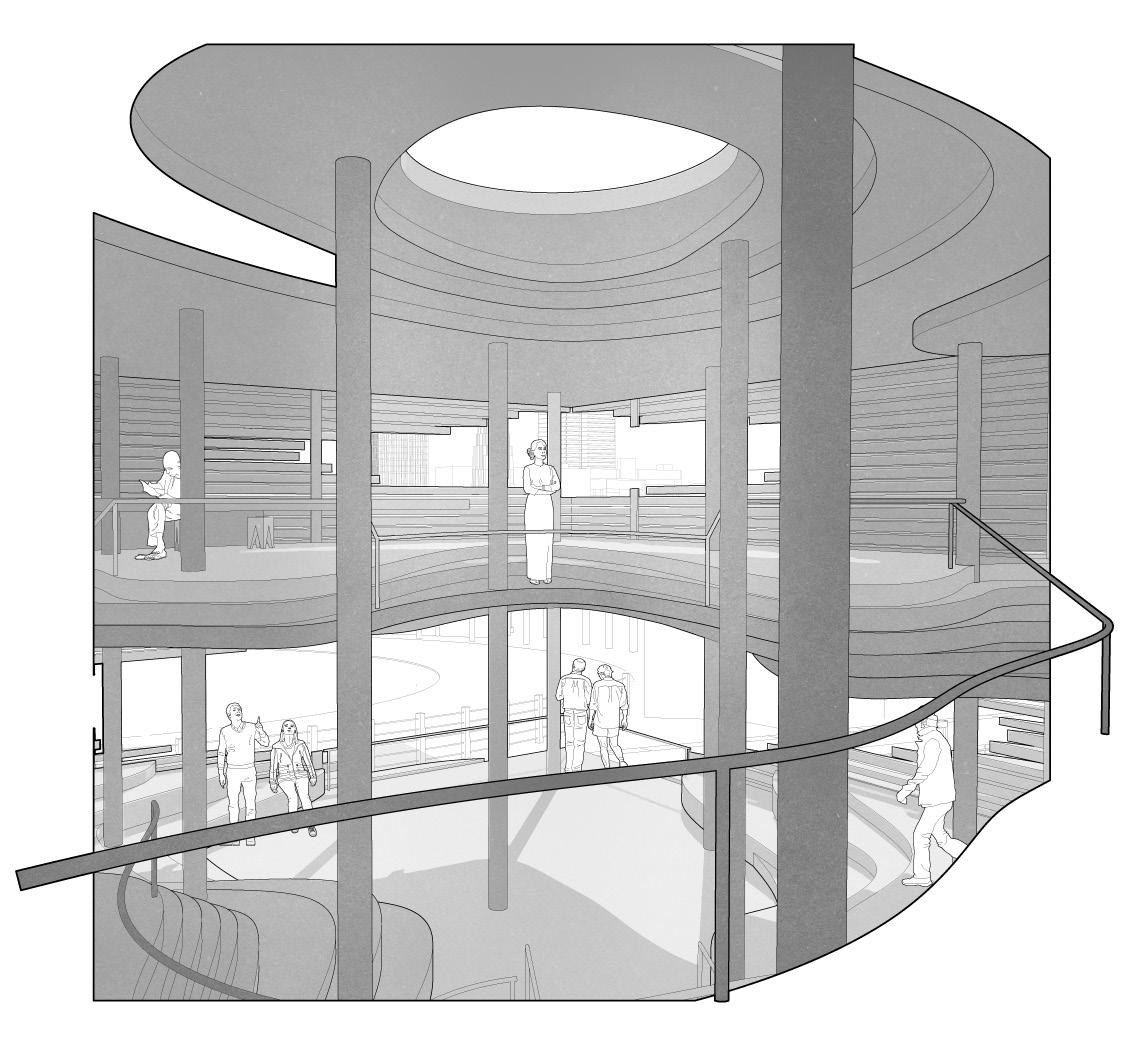
Yokohama, Japan
Completed Fall 2022
Project Type Academic
Advisor(s) Petros Babasikas
Yokohama Apartment, designed by ON Design Partners, is a residential complex for four artists, featuring four elevated private residences that serve as a canopy over a vibrant semi-public courtyard. This two-storey structure fosters a unique relationship between public and private spaces, allowing residents to maintain their individuality while promoting communal engagement.
The two-storey atrium invites local residents to partake in various activities, blurring the lines between private living and public interaction. Each artist enjoys their own private unit, designed with abundant natural light and flexible spaces ideal for creative work. The shared common area within the atrium doubles
as a studio and gallery, fostering collaboration and artistic expression among residents. The lifted private residence gives rise to a series of four triangular columns which act as transition spaces between the public and private. The volumes that comprise the building are stacked in odd - and at times, awkward - orientations. The playful stacking of volumes reflects Yokohama’s unique topography, adding visual intrigue to the project.
This design strategy strikes a balance between seclusion and community, making Yokohama Apartment a compelling case study in contemporary architecture that seamlessly integrates individual expression with collective experience, enhancing the neighborhood.
RIGHT: Two section perspectives taken along the North-West axis mirroring each other
NEXT: Axonometric drawing highlighting the building’s connection to city streets
AFTER: Exploded axonometric drawing


MAZE: This concept model is designed to exemplify how arbitrary stacking has created a maze of staircases.
STACKING: This concept model plays off of the theme of arbitrary stacking; each of the four triangular pillars are stacked and oriented to exaggerate this distinctive design theme.

University of Toronto, Toronto, Canada
Completed Fall 2021
Project Type Academic
Advisor(s) Jennifer Kudlats
Tasked with designing a student center for the University of Toronto campus, this project utilizes “erosion” as a core design driver, envisioning a speculative vernacular architecture for a post-apocalyptic civilization. Erosion, defined as the progressive disintegration of materials through natural forces such as wind, water, and other agents, serves as the conceptual underpinning for the design approach. This idea guided the development of several preliminary study models which were subsequently integrated into the final design.
The student center is organized within a nine-square grid, with structural columns placed at each intersection to support the building’s spatial structure. The
design accommodates a diverse range of spaces, including expansive areas for large gatherings, compact study rooms for small groups of two or three, and private study niches for individual use. A key feature of the design is the sunken amphitheater, which functions as the primary entry point and transitions users into the building from below grade.
The interior spaces are designed to evoke the visual and tactile qualities of eroded landscapes, mimicking the forms of weathered hills and cliff faces. This approach not only reflects the conceptual theme of erosion but also creates a compelling and immersive environment that blends aesthetic appeal with functional versatility.


MATERIAL ANALYSIS: The project began with a series of material analyses which documented the effects of erosion on various surfaces including foam, concrete, and more. These studies informed my understanding of how spaces can be designed using a form of decay as reference. This project ultimately leaves design up to the laws of nature.
FORM: The final form of the student center took inspiration from the remnants of various material erosion experiments. The remnants of eroded surfaces provided a series of parti models that informed the design of the interior spaces of the project. Naturally occurring forms influenced the layouts of floor plans, sections, and important moments throughout the design.
ABOVE: Parti model that informed the design of the student center
RIGHT: Various vignettes of the student center from the top floor down to the amphitheater, with their respective inspiration


PROGRAM: A sunken entrance threshold contains a series of stairs and benches that allow the space to act as an ampitheatre. The second floor contains study spaces for groups of two or three persons. Individual study areas and meditation volumes fill the third floor. Students may pace freely between studying and processing in these spaces.
FACADE: The project facade was developed to replicate the decay of natural materials in a controlled manner, similar to the erosion of a river bank whose position is maintained to alter existing topography. The decay of the facade specifically correlates to sightlines in the surrounding context, with the largest opening facing directly towards the adjacent sport stadium.
ABOVE: Exploded axonometric drawing showcasing each floor and its program
RIGHT: Eastern elevation and floor plans


IDEA: After producing a series of erosion test models, I began to combine various iterations to begin developing a formal logic for the project. Ultimately, I landed on the combination seen on the left side, which determined the program to be a two-storey project with wide open views that hovers above a void in the earth, and including several balconies throughout.
REALIZATION: The final, partial model is reminiscent of earlier formal studies. Each “floor” is comprised of stacked layers that produce the sense that visitors are walking through eroded valleys and across hills. Integrated into the topography are steps, tables, benches, and other programmatic elements that aid in the movement of students and support a studious environment.
ABOVE: Final model showcasing various elements of the project in detail
LEFT: Initial sketch model to determine formal properties

Completed Spring 2024
Project Type Personal
Partner(s) Hyunsu Kim, Spencer Bezruki
Carve(d) House was conceived as an entry for Buildner ’s 2024 Microhome Competition , addressing Toronto’s escalating housing crisis exacerbated by soaring market costs. To combat this issue, this project proposes a simple and innovative intervention leveraging the underutilized laneways of the city.
In Toronto, where 55% of residents do not own cars, many laneway sheds and garages have become neglected storage areas. Carve(d) House strategically reclaims these laneways, transforming them into viable living spaces that address the housing shortage. This design repurposes the modest laneway structure into a pivotal component for creating dense, affordable neighborhoods.
Originally developed to respond to the unique typology of Toronto’s laneways, Carve(d) House has the adaptability to be implemented in other metropolitan areas facing similar housing challenges.
The project integrates a self-sustaining approach through the use of grey water systems. An inwardly tapered roof directs rainwater to a central collection point, where it is filtered and recycled. The inwardly tapered roof encourages residents to implement solar panels to power the structure’s electrical components. This water management system and potential for solar energy systems supports the overall structure while enhancing the environmental sustainability of the project.
LANEWAY: The Microhome is designed to fit within a typical Downtown Toronto residential backyard, facing a laneway. The Microhome fits nicely within its context due to its simple and unassuming rectangular facade, blending in with adjacent garages.


CARVING: The Microhome is designed around the principles of carving. The structure is both created from the intentional carving of space within the dense fabric of Toronto’s laneways and operates as a carved form that allows for an increase of light and water into the space.

Carve(d) House is designed to fit within the footprint of a typical laneway garage; it is crucial that the plot fit specific perimeters.

Carving into the box provides a courtyard and sloped roof to collect rain for a garden and light into the small space.

Constructing the microhome requires the removal of the existing garage to create ample space for occupants.

Additional windows are placed strategically on the exterior to avoid strangers looking into private areas of the microhome.

The microhome begins with a humble box of specific perimeters and dimensions to fit humbly within the context.

The microhome is cladded, elevated, and given a staircase for entry so to make it a distinct structure within the laneway.


1.

COURTYARD: There is a courtyard and garden space at the centre of the Microhome which doubles as a light well. Below the garden space is an intricate water collection and processing system which helps minimize water consumption and allows inhabitants their own private oasis within the dense urban fabric.
CONSTRUCTION: Carve(d) House utilizes hidden gutters to redirect rain and snow fall towards the courtyard. The structure is raised on several footings that can be adjusted in height to accommodate various terrains. Lastly, a series of pipes are concealed beneath the garden space that direct water in and out of the sink, shower, and toilet, while also feeding the garden.
GREY WATER: The Microhome houses an effective grey water system that recycles water throughout the structure. Water is first collected through the centre of the structure which nourishes the garden. It then goes through a three-part filtration and treatment process, and is utilized for the sink and shower, and then through the toilet before being sent to sewage lines.


GARDEN: With a lack of access to green space, Carve(d) House utilizes the light well in the centre of the structure to house a garden where residents can grow whatever plant they wish. The garden can be viewed from the kitchen and living room areas.
PRIVACY AND LIGHT: The Microhome is designed to maximize privacy without sacrificing light; this is achieved through the implementation of a large picture window to the structure’s rear as well as a claristory window above its storage wall. Smaller windows around the structure allow for selective views of the public laneways, allowing for increased privacy
FLEXIBLE: Given the size constraints of the project, it was necessary that the layout be flexible. Furniture is built into storage units, which in turn house multiple purposes including concealing desks, clothes, kitchen equipment, and more. A murphy bed can be tucked away to create a flex space adjacent to the large picture window at the back of the home.


