8 minute read
London Designers and curators collaborate to create a calm and comfortable interior
Careful consideration
A thoughtful collaboration between designers and curators brings comfort and calm to this London home
Words / Kate Jacobs Images / Jake Curtis
“When we’re designing a house, we always envision the end user and how they’ll interact with the space. We want our homes to feel welcoming, calm and full of possibilities,” says Iwan Halstead, co-founder with Emily
Potter of Daytrip Studio. Their architectural design practice may have the most pleasingly carefree of names, but they pull no punches when it comes to ambitious intent. Daytrip’s body of work spans wellness environments, workspaces and retail, for clients including
Turner Contemporary and Liberty of London, as well as a new focus on residential. “Houses weren’t part our plan, but when clients asked us to look at their own homes, it took us on a journey, with each new project exploring different ways of living,” says Halstead.
It was at the open house for another of Daytrip’s retrofits that Halstead met developer Pete Monaghan, who works with his father, Richard, under the name of Mon Projects, finding and renovating interesting properties to balance their historic character with modern additions, with hotspots in Clapton and Cornwall. “The Monaghans have been creating and building in Hackney since the early 20th century, when my grandfather opened his upholstery and cabinetry workshop here,” says Monaghan. “When I was a child my parents bought a derelict house and we lived in the attic while they slowly restored it. I loved living around the action, it’s in my blood.”
The open house that Monaghan so admired was a collaboration between Daytrip, Sophie Pearce of Béton Brut and Laura Fulmine of M.A.H (Modern Art Hire) gallery. “Daytrip have an ability to select and combine materials which beautifully complement each other and Sophie and Laura have a natural talent for elevating spaces with perfectly chosen furniture and art,” enthuses Monaghan. He decided to bring the whole team on board for the renovation of this early Victorian terrace in east London’s Clapton. “The space felt honest and somehow humble and that informed our approach to the design. We knew we didn’t want anything showy or ostentatious,” explains Halstead, “and Clapton is such an interesting, creative place, so that came into play too.” Daytrip’s vision for this apartment on the lower floors was to create a calming, minimalist sanctuary with a sense of comfort and ease and an aesthetic that mixed “Victorian minimalism with avant-garde pieces from eighties and nineties Japan. These unexpected combinations excite me and make for a unique and compelling project.”
The work began by extending the space, pushing out to the rear to create a new room on each floor. The entrance is on the upper ground floor – the most authentically Victorian part of the apartment, where the largely lost original plaster coving has been remoulded and reinstated by a local craftsman. Here there’s a wonderfully serene living room and behind it, a contemplative study. To the rear, the new kitchen and dining area creates a bracing contrast. This space is defined by its material palette; a poured concrete floor that Halstead took pains to have buffed to exactly the right soft sheen “for a cloudy, ethereal quality”; and the pleasingly austere brickwork. “We ordered a lot of samples of different grey bricks, looking for tonal variation as well as a sense of age,” remembers Halstead.
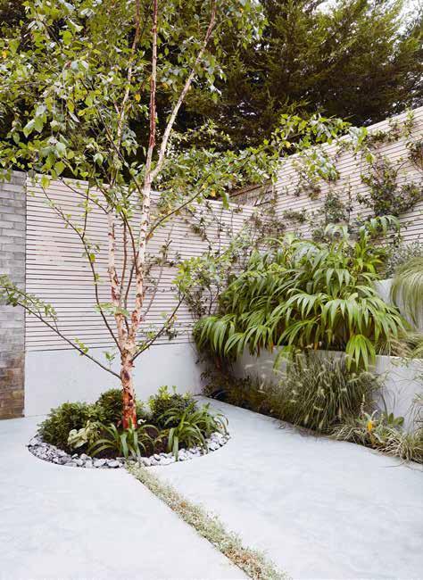
This room also takes its energy from the adjoining garden, linked as they are by the brick wall and concrete floor that extend across both spaces. The garden, designed by Tyler Goldfinch, is a masterclass in what can be achieved in a modest outside space, with textural grasses lolling over tiered concrete terraces, while a multi-stemmed river birch in a circular well of pebbles nods to Japanese garden aesthetics. The kitchen cabinetry was kept ultra simple, to avoid competing with the other elements in this room. It’s a study in clean lines that contrasts with the subtly
Previous page The restored living room, a serene study in light and off-white tones
Facing page An early-1990s chair (one of a pair in the house) by Jane Dillon and Peter Wheeler, alongside a Haxch stool, all supplied by Béton Brut


Facing page The kitchen in the newly extended rear of the property has a more austere look than the original Victorian fabric, with tadelakt walls and a concrete floor Above A rustic antique dining table has been paired with a set of cream 1980s dining chairs. The exposed grey brick wall extends into the garden beyond

mottled tadelakt splashback and Bauwerk lime-painted walls. The pared-back colour palette throughout the house combines warm cream tones with cooler pale greys, such as the cream tubular Allmilmö chairs, grouped around an unpretentious 19th-century Alpine table in bleached wood.
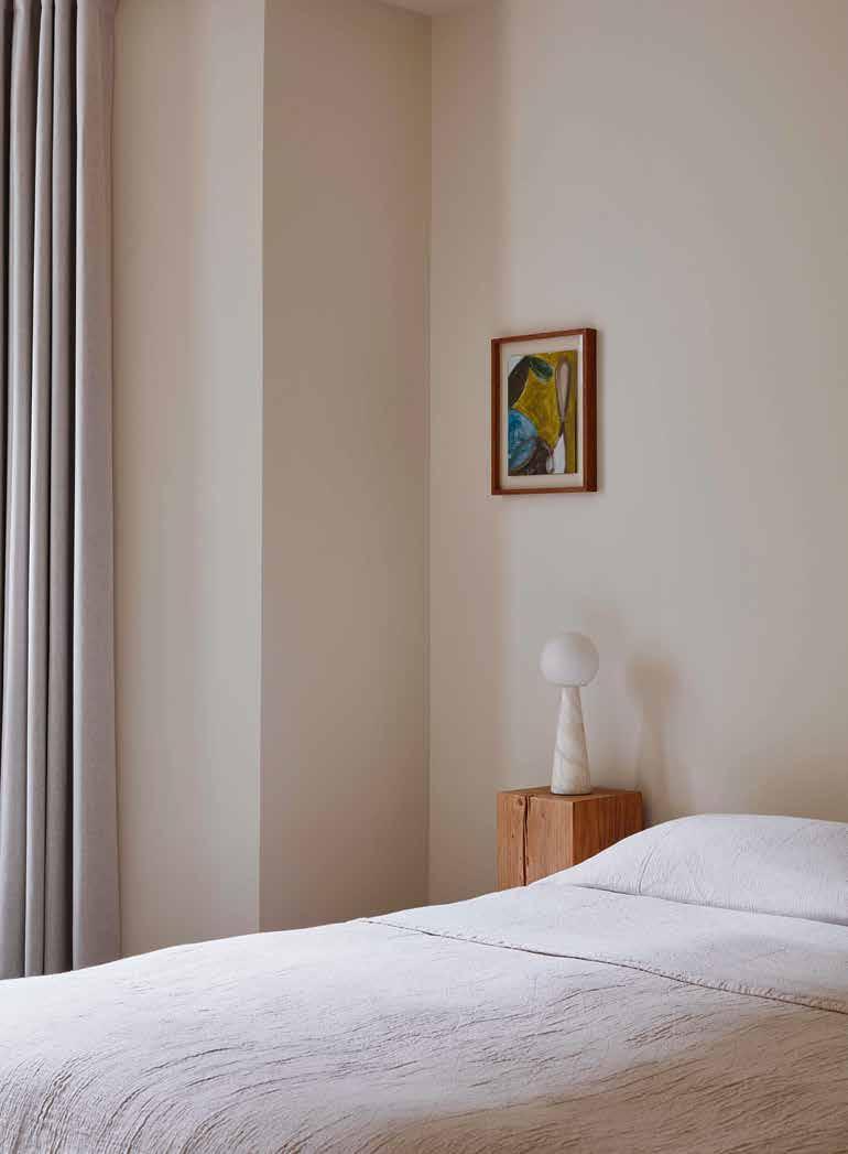
Downstairs, where once there was just a lowceilinged coal cellar and larder, there are two tranquil bedrooms and a bathroom, all with a calm and restorative air. “A good night’s sleep sets the tone for the whole day, so we wanted these rooms a to feel like a soothing retreat,” says Halstead. The tadelakt, which also makes an appearance in the bathroom, was a labour of love, with Monaghan taking a deep dive into researching this traditional Moroccan material. “It can be problematic in the UK climate, so I wanted to become an expert in applying it authentically, while using modern technologies to seal and protect it.”
These carefully considered materials merited a proportional level of thought when it came to furnishing the apartment, and Béton Brut and M.A.H each stepped up to add their own dynamic yet harmonious layers to the aesthetic. Sophie Pearce’s design store Béton Brut has found its niche sourcing rare and unexpected 20th-century design pieces, with an aesthetic that’s minimal, sculptural and architectural. She places a focus on European and Japanese design and Béton Brut’s pull lies in this juxtaposition, which she has brought to this space through pieces such as the Cornaro sofa by Carlo Scarpa in the living room, with its plush alpaca upholstery, encased in an ebonised wooden frame knotted together by leather ties, which explores the space between Japanese minimalism and Italian rationalism.
Pearce selected many light and off-white pieces for this apartment, chosen to sync with the architectural scheme, but also to bring youth to the Victorian bones of the house, with novel forms and materials: in the study, the Kazuhide Takahama desk lamp looks as if a cloth has been nonchalantly tossed on to a brass frame while, in the living room, metal tentacles extrude from Ron Arad’s Treetop lamp, alongside a prototype coffee table by Faye Toogood, as well as work by local makers, including stools by Marc Bell of Haxch.
To provide the art and objets for the project, M.A.H was the natural choice. Sharing sister showrooms with Béton Brut in east London under the umbrella name 50 Vyner, the company is the progeny of industry-leading stylist and creative director Laura Fulmine. With her astute eye, Fulmine nurtures the talents of over a hundred artists and designers from around the world – both established names and emerging talent – offering their work for sale or hire (work that, crucially, if it’s being included in commercial photo shoots or films, is licensed). She works closely with interior designers, property developers and stylists, as well as private clients, to find diverse and exciting pieces to elevate interior projects to the next level. For this apartment, Fulmine also used pieces by local artists, including several paintings by Scott Licznerski. She sought to bring graphic depth to the pale and ethereal surroundings and introduce elements of the experimental and unexpected, while striving to balance that with an overall atmosphere of deep calm, which she achieved by using single pieces, rather than groups, to tell their own story.
The inclinations of the trio are aligned but even their differences play well together and the finished effect is alchemical, somehow more than the sum of its already impressive parts. As Halstead puts it: “It is always exciting working with Sophie and Laura. As these rooms were adorned with furniture and art, they slowly took on a character and persona of their own. We’ve created a clean sanctuary for living, where personal touches can flourish.”
Facing page M.A.H supplied art and objects across the project; the painting on the wall of the study is 2017’s Scribble by Scott Licznerski

Above The basement, carved from what was a coal cellar and larder, now houses two bedrooms and two bathrooms Facing page A solid oak side table sits next to the simply presented bed, topped with a conical alabaster lamp


Facing page In the Japanese-inspired garden designed by Tyler Goldfinch, grasses spill informally over concrete terraces Above A planted gap in the concrete leads the eye to a multi-stemmed river birch tree within a circle of pebbles


