designing lighting global
PLUS: THE BEST IN HOSPITALITY PROJECTS

1 designing lighting global 1 designing lighting DECEMBER 2020 ISSUE NO. 3 OF COVID-19 DARK SKY PROJECTS SOCIAL INCLUSION ANDRE TAMMES INNOVATIONS ART EXPERT DAVID SAUNDERS INNOVATORS IN RESIDENTIAL CARE SIX LIGHTS FROM THE FUTURE LIGHTING THE WILLIAM KENTRIDGE EXHIBITION
VOLUME I ISSUE 2
BUILDINGS OF Lighting FAITH
Pharos Architectural Controls is an award-winning and independently owned British manufacturer of dynamic lighting control solutions for Places of Worship and other applications. All our products are designed and built in-house, backed by a 5-year warranty, and supported by an experienced technical team.
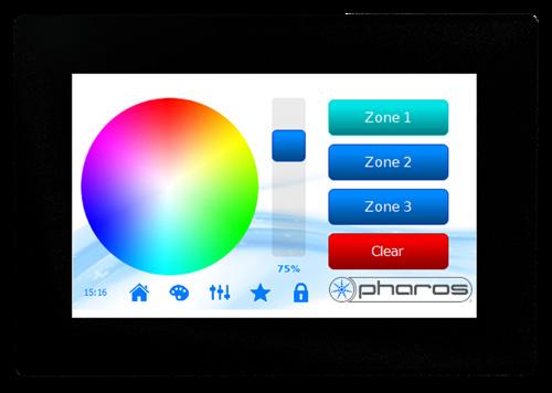
Pharos Designer is a feature-rich range of scalable and highly versatile lighting controllers with powerful programming tools and comprehensive show control capabilities that provide the ultimate flexibility in dynamic lighting control.

sales@pharoscontrols.com
pharoscontrols.com

2 designing lighting global
Hallgrímskirkja Reykjavík, Iceland
Image: © Örn Erlendsson
LPC
TPS 5
+44 (0)20 7471 9449
272 Gunnersbury Avenue London, W4 5QB United Kingdom
@pharoscontrols
CONTENTS table of CONTRIBUTORS
6 EDITOR’S NOTE
An introduction from our editor Ray Molony.
8 SPECIAL FEATURE: Lighting Buildings of Faith
‘God is light’ writes John in his gospel, and for millennia, humankind has used this powerful metaphor in religious building. Today, lighting design plays a crucial role in enhancing the spiritual and aesthetic ambiance of buildings of faith, such as churches, mosques, and synagogues.
16 PROJECT FILE
Some striking projects from around the world.
18 COVER STORY: Crystal Orange Hotel Shanghai
Lighting was always going to be a key design component in the Crystal Orange Hotel Group’s latest opening in the Pudong shopping and entertainment district of Shanghai.
36 CONTROLS: Bamboo Beauty
How wireless control is the key to the revamped lighting scheme at the John Hardy Boutique in Bali, a majestic structure crafted from bamboo.
38 CIRCULARITY: Six Lights from the Future
We round up half-a-dozen exemplars of low impact lighting which we believe challenge the current take-make-waste norms of luminaire manufacturing and point to an alternative sustainable future.
40 INNOVATIONS
We curate the stand-out designs this quarter.
42 DARK SKY PROJECTS: Innovative Dark Sky Project Takes Top Award

An innovative exterior project featuring dark sky technologies and dynamic colour temperatures has been awarded a top award. Ray Molony reports.
44 SOCIAL INCLUSION: Why Designers Should Do Pro Bono Work
22
ART AND LIGHTING: A Work of Light and Shade
David Atkinson Lighting Design used bold, high contrast illumination to underscore the dramatic work of artist William Kentridge at the Royal Academy of Arts in London.
26 ART AND LIGHTING: The Art of Illumination
In a thought-provoking dialogue, designing lighting global editor Ray Molony talks to lighting and conservation expert David Saunders about striking the right balance in lighting design for invaluable art pieces.
Lighting designer Thomas Paterson, director of Lux Populi, challenges his peers to bring their knowledge to those who can’t afford it. It benefits the community, and it’ll benefit your practice too.
45 ORGANISATION NEWS
The latest reports from the lighting design community and its representative bodies.
46 AWARDS DATES
Looking to enter your project for recognition and glory? We’ve got you covered. All the key dates you need to know about for all the major awards programmes.
30
THE BUSINESS OF LIGHTING DESIGN™: Collaboration by Design
Vinod Pillai, design director at Dubai-based Studio Lumen, discusses the process of how lighting designers work collaboratively with interior designers and the ways in which lighting impacts overall project design.
32 LIGHTING AND HEALTH: A Human Approach in Melbourne
How do we want to work today? Over the past years, the requirements for modern working environments have changed rapidly – flexibility and comfort have become key factors when designing workspaces at the pulse of time. We explore one of Australia’s first lighting-forwellbeing installations.
47 TRADE SHOW CALENDAR
We mark your diary with all the big events in lighting design right into 2024.
48 NEXT ISSUE
We give you a heads up on what you can look forward to the next issue of designing lighting global.

49 AD INDEX
50 UP CLOSE: Andre Tammes
We meet award-winning product designer Andre Tammes.
4
designing lighting global
VOLUME 1 ISSUE 2 2023
Vinod Pillai
David Saunders
On The Cover Crystal
Dr. Shelly James
Orange Hotel Shanghai
Photo Credit: Wu Jian Quan
Tiny wonder
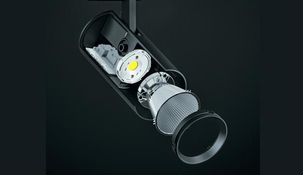
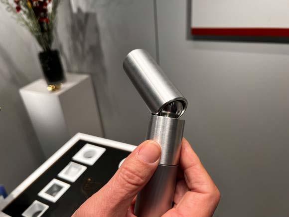
FINCH offers a variety of sizes, drivers, and customization options to infuse vitality into any aesthetic, including your hospitality projects. Dual-tone bevel finishes. Patent-pending 50-degree aiming angles. Toolless light engine replacement. And subtle sophistication.
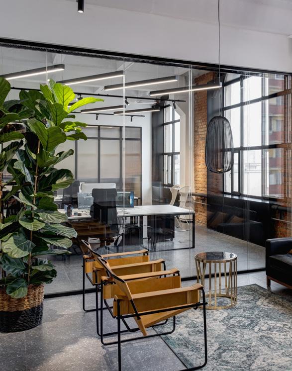
Whether mounted on ceilings, along walls or across the ground, FINCH blends into its interior and exterior surroundings, ensuring your timeless design remains forever at the forefront.
Take beauty by the wings. Fly with Finch in late August.
Visit bestlight.amerlux.com/hospitality-products to explore this and other new collections today.

This engineering marvel, with a 1-inch aperture, has been named a Top 10 Must-See by EdisonReport. It outshines the competition by emitting up to 1500 lumens of soft, comfortable light from its well-crafted and fashionable cylinder. Be seen in the best light.


5 designing lighting global
Patent pending aiming angle 50°
Editor: Ray Molony
Publisher: Randy Reid
Associate Publisher, Advertising: Cliff Smith
Director of Audience Development: Angie Hullfish
Staff Writers: Parker Allen
Published by EdisonReport
1726C General George Patton Drive Brentwood, TN 37027 Phone: +1 615 371 0961 www.designinglightingglobal.com
designing lighting global is focused on the Business of Lighting Design™ and provides business information to the lighting design community across the world. In addition to the website, designing lighting publishes bi-monthly online magazines featuring original content, interviews within the community and highlights successful and awardwinning lighting designs.
ISSN 2837-2352

The opinions expressed in this publication are those of the authors. They do not purport to reflect the opinions or views of designing lighting global or its management. The designations employed in this publication and the presentation of material therein do not imply the expression of any opinion whatsoever on the part of designing lighting global magazine concerning the legal status of any country, area or territory or of its authorities, or concerning the delimitation of its frontiers. © designing lighting global 2023.
Reproduction of the material contained in this publication may only be made with the written permission of designing lighting global.
WHY THE WORLD NEEDS EXPERTS
First off, thank you to all the readers who got in touch with their experiences of using artificial intelligence platforms following our special feature in the last issue.
It’s great to see so many designers experimenting with this exciting new technology even if a significant proportion agree with our contributor Thomas Patterson that it can never really take over the role of a creative lighting designer creating a bespoke scheme for a client.
My view, for what it’s worth, is that it will become another useful tool in the toolbox, handy for creating unique imagery and removing some of the drudgery in creating specifications. But, crucially, not an existential threat.
I believe that, despite having access to all human knowledge at our fingertips, a true expert is the place to go for thought-provoking insights and inspiration.
And we have a true expert in this issue in the shape of lighting and art specialist David Saunders.
I had the pleasure of interviewing David in London recently, and I was struck by how lightly he wears his learning, and how much thought he has given to the role of curator of precious objects.
David is an honorary research fellow at the British Museum, having been keeper of conservation and scientific research there for ten years, until 2015. He was previously in the Scientific Department at the National Gallery in London.
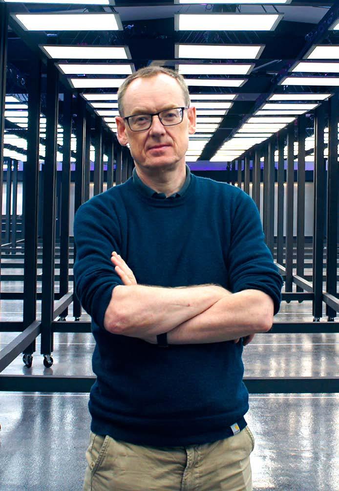
His insights into the role of lighting in showcasing important art and objects for this and future generations are highly instructive, and I highly recommend this issue’s feature.
Another expert I’m delighted to include in this issue is Andre Tammes, an OG of lighting design, who features in our Up Close slot on the back page. His journey into lighting is extraordinary. When you read how dangerous the lighting in his childhood home was, you’ll appreciate that we’re lucky to have him around!
Ray Molony EDITOR
6 designing lighting global EDITORIAL DIRECTOR’S NOTEPAD


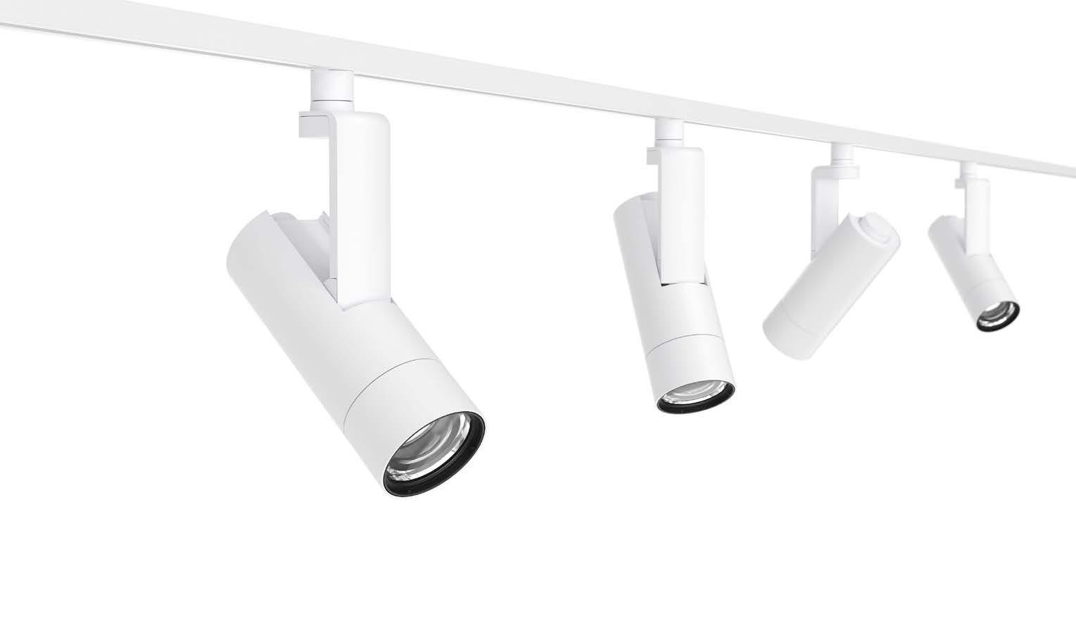
Lighting Services Inc +1 845 942- 2800 www.LightingServicesInc.com ZOOM Integrating Control Simplicity
ZOOM
Lighting Services Inc The premier specialty lighting manufacturer
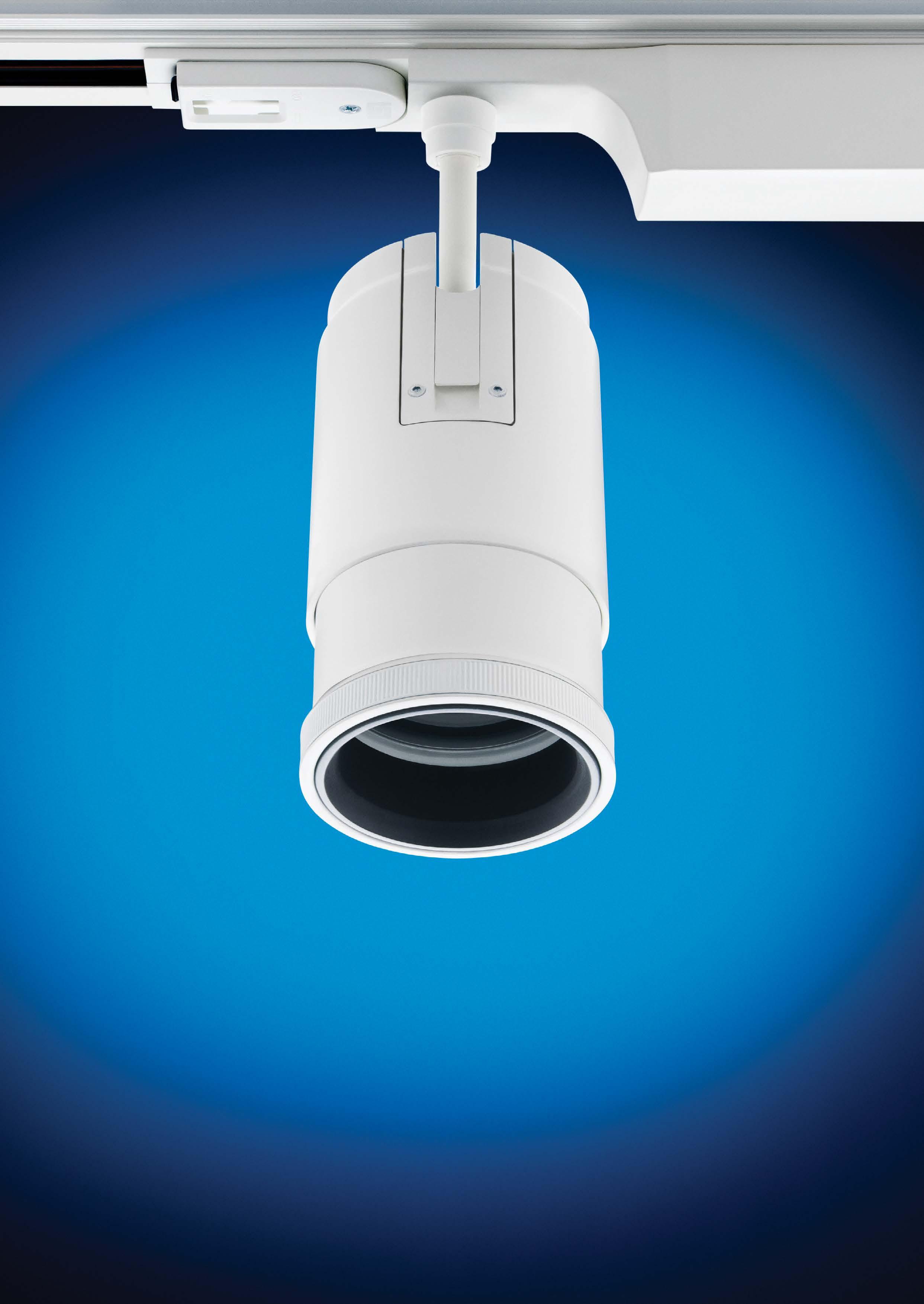
SPOTLIGHT 120/277V Beam Angles From 5º to 50º Up To 25,000 CBCP 83mm DIA, 140mm - 176mm Length COB, 19 Watts, 1856 Lumens
The
Series is a compact
spotlight designed with a locking lens grip to adjust the beam spread from
a 5 degree narrow
spot to a
50
degree flood. Powered by COB LED technology, the ZOOM Series has
exceptional narrow field beam performance
up to 25,000 CBCP from
just 19 watts.
ADJUSTABLE
BUILDINGS Lighting of Faith

8 designing lighting global
‘God is light’ writes John in his gospel, and for millennia, humankind has used this powerful metaphor in religious building. In a special round-up, we explore creative interpretations of this metaphor using modern design and technology.
Studio N has created a subtle exterior lighting scheme for the Gargash Mosque in Dubai
Today, lighting design plays a crucial role in enhancing the spiritual and aesthetic ambiance of buildings of faith, such as churches, mosques, and synagogues. These sacred spaces are designed to inspire and uplift worshippers, and lighting design is an integral component in achieving this objective. By carefully considering the interplay of light and architecture, lighting designers can create an atmosphere that encourages contemplation, reverence, and a connection to the divine.
One of the key considerations in lighting design for buildings of faith is the understanding of the building's architectural features and the specific requirements of the religious community it serves. Each religious tradition has unique symbolism, rituals, and customs, which can influence the lighting design. For example, in churches, the focal point is often the altar, where the Eucharist is celebrated. Here, lighting may emphasize the sacredness of the space, using warm and gentle illumination to create a sense of intimacy and reverence.
In mosques, the emphasis is on the unity of the divine, and lighting design should reflect this principle. Soft, diffused lighting is often employed to create a serene and meditative
environment. Special attention is given to the illumination of the mihrab, the niche that indicates the direction of Mecca, as well as the area of the prayer hall where the imam leads the congregation in prayer. The use of decorative lighting fixtures, such as intricately designed chandeliers, can enhance the overall aesthetic of the mosque.
Synagogues, on the other hand, often place significance on the Ark, which contains the Torah scrolls. Lighting in synagogues is designed to emphasize the Ark and its surrounding space, creating a focal point for worship. Additionally, lighting design should accommodate the rituals and traditions associated with the Jewish faith, such as the lighting of candles during Shabbat or the festival of Hanukkah.
In all these religious spaces, natural light is highly valued and often incorporated into the lighting design. Large windows or skylights can create a connection between the divine and the natural world, as well as provide a sense of openness and spaciousness. The changing qualities of natural light throughout the day can also symbolise the passage of time or spiritual transformation.
The
Gargash Mosque Dubai, UAE STUDIO N
Dubai-based lighting design consultancy Studio N has created a subtle exterior and interior lighting scheme for The Gargash Mosque, also known as The Mosque of Light.

Designed by Dabbagh Architects, The Mosque of Light is a remarkable piece of architecture where form, materiality and the use of controlled natural light help to prepare the worshipper for an inner experience. The lighting design serves to elevate the architecture and contributes to the tranquillity of the space.
Inside the prayer hall, concealed cove lighting within narrow openings emphasises depth and height, whilst creating a sense of natural illumination. The vertical walls are washed with light and the minbar subtly accentuated. The pale tone of the interior walls and ceiling allow the lighting to be reflected to create a soft glow – this low contrast effect is soothing to the eye and increases overall light levels. Backlighting behind the mihrab creates a gentle glow that draws attention to the direction of prayer.
In the open courtyard, light is projected upwards to illuminate the perforated golden canopy. The effect creates an inviting warmth within the holistic white structure and is complemented by the reflective surface of the courtyard water feature.
The lighting design highlights this intricate triangular detailing through recessed narrow linear grazers. Located along the periphery, the uplighting creates a beautiful play of light and shadow across the carved detailing of the walls, as well as creating an illusion that the structure is floating.
SPECIAL FEATURE
Photographs: Gerry O’Leary
Designed by Dabbagh Architects, the Mosque of Light is a remarkable piece of architecture
Cavan Cathedral Ireland
ZUMTOBEL, THORN AND CALLAGHAN
Completed in 1942, the historic and spectacular Cathedral of Saint Patrick and Saint Felim is the most dominant building in Cavan Town. The monumental neo-classic architecture impresses externally with its 68m spire and flanking domes and is easily one of the town's most impressive and eyecatching buildings.
Zumtobel and its sister brand Thorn worked with contractors Callaghan to design a new lighting scheme for one of the most substantial Catholic cathedrals in Ireland.
Internally subtlety was key. Despite the size, the interior of the cathedral is adorned with a rich mix of craftsmanship and artistry, such as intensely detailed stucco ceilings, statues, the mosaic sanctuary floor, apse mural and stained-glass windows
by Collie and Harry Clarke Studios.
Conor Brannelly of Zumtobel Group says: ‘We needed optimal effect to reflect all the cathedral's beauty so we decided to hide the interior lighting by using our colour service via My Product to blend in with the building.’

The subtle introduction of Zumtobel’s colour-matched contemporary VIVO 2 LED spotlights and slim Linelight luminaires complement the restored historic brass pendants, revealing and enhancing the design and craftsmanship of the original building's interior.
Externally the lux levels have been optimised at the front façade and spire to enhance the cathedral’s architectural beauty, with Thorn’s Contrast RGBW architectural floodlights with DMX controls. This will allow the cathedral to configure many different scenes to complement religious days and Irish events.
10 designing lighting global
Photographs: Adrian Donohoe
Subtlety was key for the lighting design team at Cavan Cathedral
Newcastle Cathedral UK
TGA SPECIALIST LIGHTING
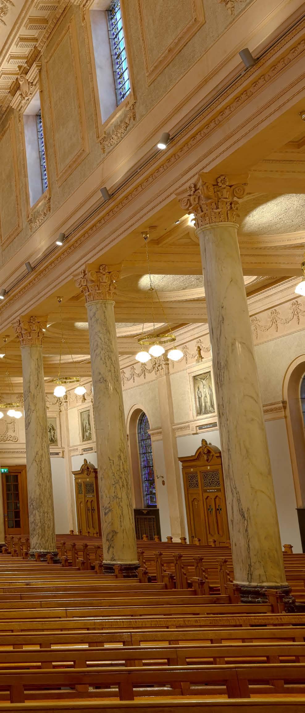
Newcastle Cathedral is a magnificent Grade I listed building, dating back to the early 14th century. TGA Specialist Lighting delicately illuminated this spiritual and cultural architecture, bringing new light to this awe-inspiring place of contemplation. Modern LED and Bluetooth control technology enable the light to be controlled at the touch of a button via a smartphone or tablet, bringing this historic building into the 21st century.
The TGA team worked with ERCO and Casambi to ‘create an energyefficient, effective and user-friendly lighting scheme.’ Newcastle Cathedral, certainly presented its challenges for the lighting scheme. With intricate architecture, both high and low ceilings and stone walls the lighting design, luminaires and Bluetooth controls had to be carefully considered to bring the right light to the space and its multiple functions. Aligned with the lighting scheme, was the need for flexibility. The cathedral is a place for worship, weddings, concerts and community celebrations. With the Casambi app, individual ERCO spotlights and floodlights can be dimmed at any time and without effort by a smartphone or tablet. This automatically directs the gaze of the visitors to the open and perfectly illuminated sections of floor, ceiling and exquisite architectural features.

'The app is instinctive and simple to use for basic functions - and yet sophisticated enough to create multiple scenes. We can now create subtle and really beautiful effects of light and darkness throughout the building, whether we're hosting a rock concert or Midnight Mass,’ said Canon Clare MacLaren.

11 SPECIAL FEATURE
Photographs: Rob Parrish
The window reveal at Newcastle Cathedral
The lighting controlled via Bluetooth using an iPad

12 designing lighting global SPECIAL FEATURE
Hallgrímskirkja Reykjavik, Iceland LISKA
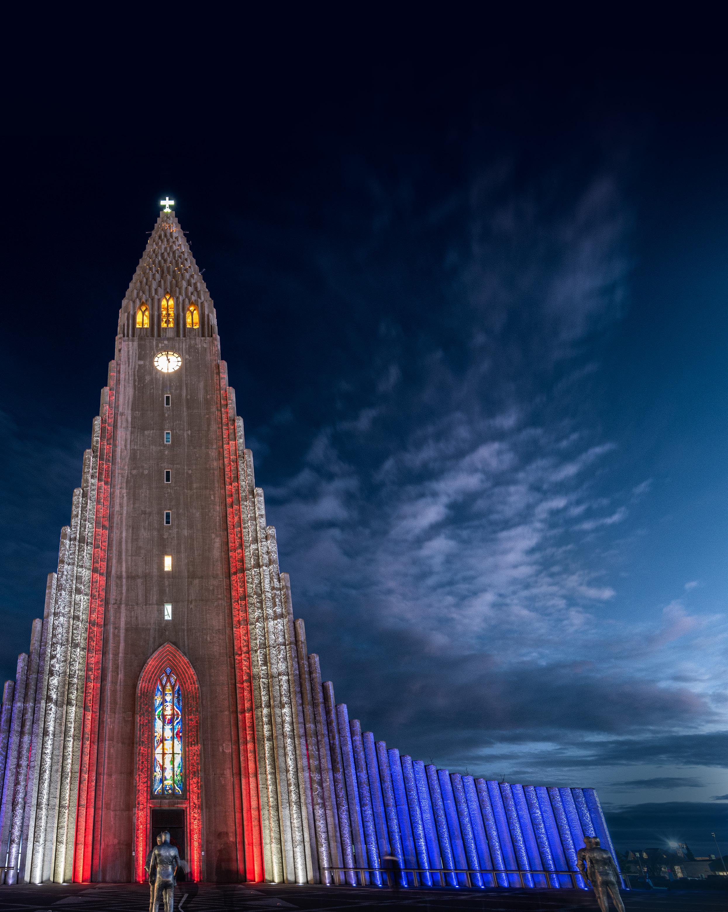
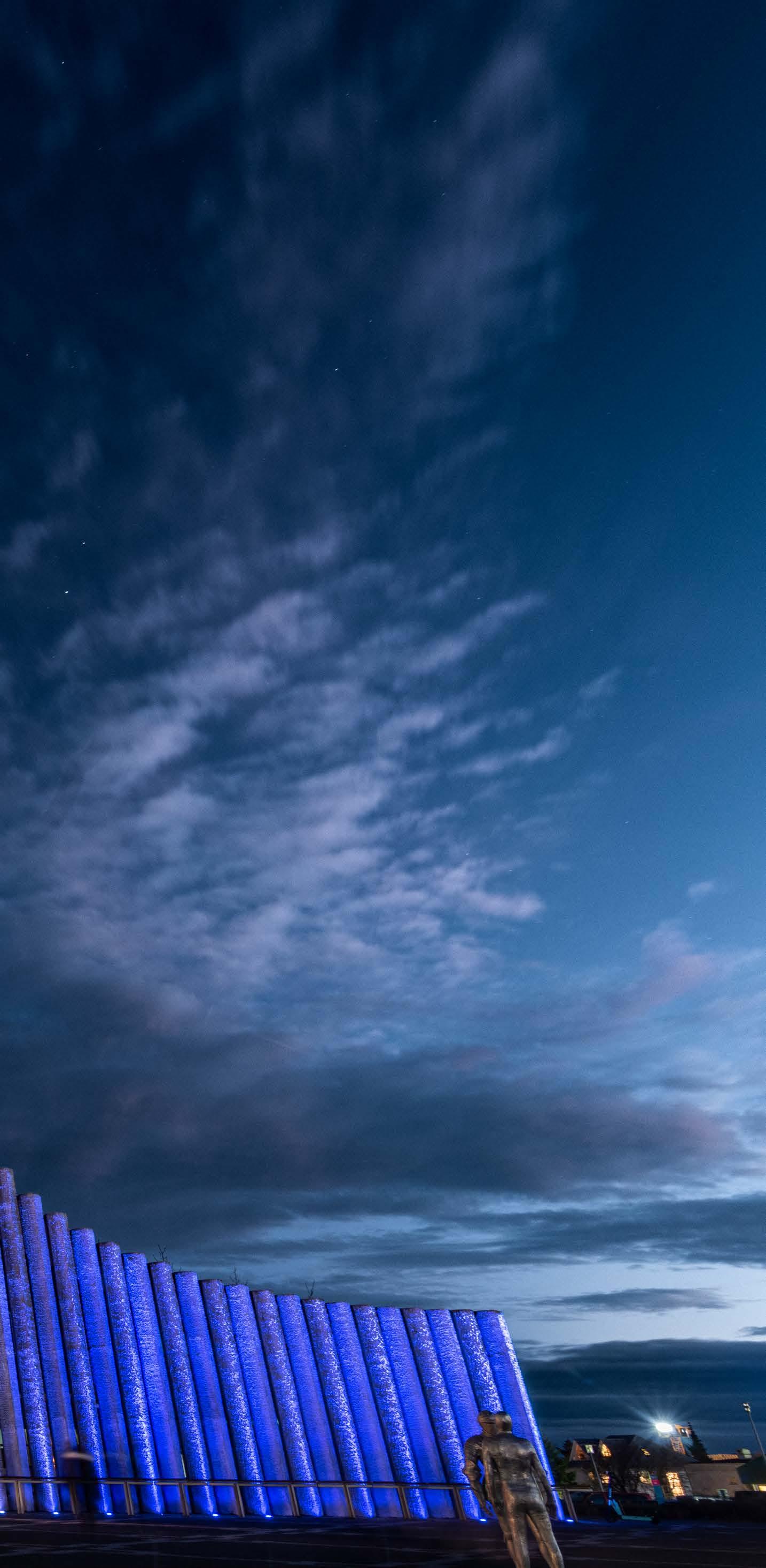
Hallgrímskirkja is a world-famous landmark in Iceland’s capital, Reykjavik. Visible from almost anywhere in the city due to its 73-metre-high tower, the cathedral is instantly recognisable by its striking façade of descending pillars. A project was recently undertaken to redesign and improve the cathedral’s outdated and inadequate external lighting which had reached the end of its useful lifetime. Liska was appointed as the lighting designer to deliver the scheme, with a brief to ensure the new LED fixtures were as unobtrusive as possible, and interventions to the building’s structure were minimal. This was delivered through a number of partnerships, including the selection of Pharos Architectural Controls to realise the lighting control requirements. Pharos provided its Designer Lighting Playback Controller 2 and one Designer Touch Panel Station.
The lighting design comprises exterior lighting that grazes the façade, roof and tower with colour, including options to use colder tones to offset the warm lighting of the interior and clock tower. Carefully planned placement of the light fixtures with considered positioning has enhanced the three-dimensional surface and added contrast to the beautifully flowing texture of the façade. In addition, the luminaires are strategically located so they do not visually disrupt the architecture and surrounding public spaces. Their placement also avoids glare to passers-by. To aid sustainability, an automatic lighting cycle adjusts to the Nordic winter darkness, while saving energy through the brighter periods by applying dimming profiles.
Photographs: Örn Erlendsson
13 designing lighting global
SPECIAL FEATURE
Liska's striking external scheme for Hallgrímskirkja
Musalla at KAPSARC
Riyadh, Saudi Arabia
OFFICE FOR VISUAL INTERACTION
The King Abdullah Petroleum Studies and Research Center (KAPSARC) is a global centre for international energy analysis, environmental research and policy studies. The architectural design, by Zaha Hadid, features a series of interlocking, cellular structures—dune-like forms rising from the desert landscape. Hexagonal in plan and sectioned with varying heights, these structures encompass a multitude of different architectural elements including folded ceiling planes, hexagonal skylights, open atria, canted walls, triangulated niches, sloped ceilings, and shard-like panels that wrap walls and ceilings. Office for
Visual Interaction (OVI) used light to emphasise these unique geometries, while being integrated into the architecture. As a spiritual centre, the Musalla is a symbolic embodiment of light, and the illumination is an experiential journey for worshipers. A three-storey, windowless space accommodating 300 people, the interior is characterised by a large, organic structural web. Keyed to times of prayer throughout the day, the lighting gradually shifts from luminous white light of midday to golden tones of dawn and dusk, subtly suggesting the passage of time. Highlighting the adjacent golden walls and the use of a more intense glow of coloured light at the front of the room, creates a powerful focal point for the Imam to lead prayer, accentuating his mystical presence. A control system with pre-set scenes balances the lighting levels and layers of light to enhance focal points and echo the meditative atmosphere of the space.

14 designing lighting global
Photograph: Hufton+Crow












15 designing lighting global E Light is the fourth dimension of architecture Invia The modular 48V light structure Experience and configure Invia online: www.erco.com/invia-site
Nulty FitnGlam
DUBAI HILLS MALL, UNITED ARAB EMIRATES

International lighting design studio Nulty created a bold, experiential lighting scheme for FitnGlam’s latest SuperClub. The workout and fitness spaces for women have the feel of a high-octane nightclub. In the highintensity areas of the club, light is undeniably right at the centre of the action. Dynamic lighting reinforces a stimulating and uplifting atmosphere in the open-plan gym and can be synchronised with the music for a multisensory experience.

16 designing lighting global PROJECT FILE
Elektra Lighting Virgin Hotel EDINBURGH, SCOTLAND
Matrix Design
China Merchants Zhanjiang
International Cruise Terminal
ZHANJIANG CITY, CHINA
Matrix Design was tasked with creating ‘a dramatic and sculptural space’ with light for the ‘Life Experience Hall’ at the terminal. The concept is the geometric modern design vocabulary of the architectural form ‘Sailing with Wind’ so the Matrix Design team curated the entire scene, manipulating light and shadow, and achieving what it terms ‘seamless integration’ with the building.
Elektra has designed an inclusive and dynamic lighting scheme for the first Virgin hotel in Europe. The designers used circadian lighting to change colour temperatures and reinvent the spaces throughout the day. There is bright daylight during the day which shifts through the later hours towards warm, then sexy candlelight during the night. They also created a series of individual spaces which the guests can discover for themselves, and a set of unique lighting schemes which create an exploratory guest experience.


17 designing lighting global PROJECT FILE
Photograph: Shi Xiang Wan He
THE CRYSTAL PALACE
Lighting was always going to be a key design component in the Crystal Orange Hotel Group’s latest opening in the Pudong shopping and entertainment district of Shanghai.

18 designing lighting global COVER STORY
The brief to acclaimed design practice Vermilion Zhou Design Group was for the interior to be ‘like a polished gentleman leading guests into an exclusive club’.
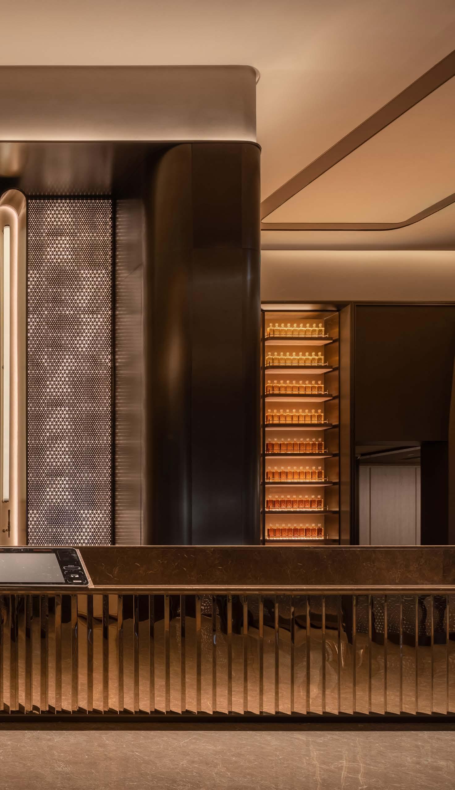
The textures and materiality in the open and private spaces are conceived to exude a quality that’s reflected in both visible and touchable textures, infusing guests with positivity when entering the hotel.
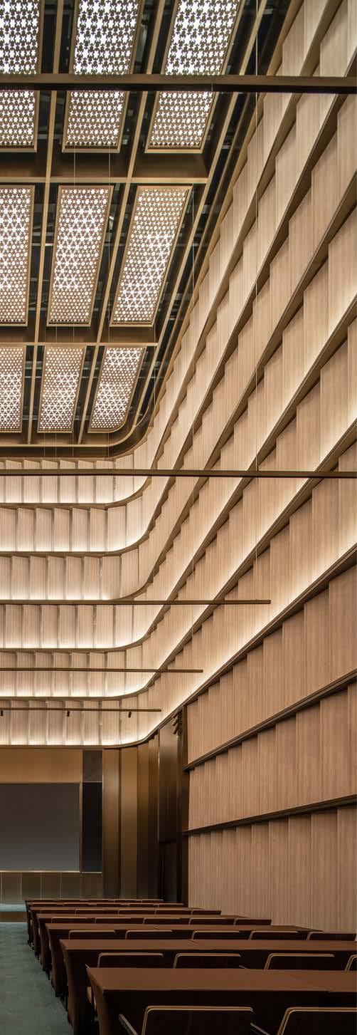
The whiskey theme of the hotel is reflected in the warm tones and use of crystal.

This texture comes from 'purity and penetration, without impurities’. Under solid light, a crystal reflects the colours of a rainbow, with a gradually refined texture over its life that, when polished, is brilliant and lustrous.
The brief to acclaimed design practice Vermilion Zhou Design Group was for the interior to be ‘like a polished gentleman leading guests into an exclusive club’
The bottle display is gently backlit with ultra warm LED illumination while metallic mesh and glass are exploited to maximise the power of light
COVER STORY
The dazzling starlight of the infinity mirror box provides a sense of washing away external stress, invoking liberation and relaxation between the open and private areas.
By removing outdated spaces, refracting the light of crystals, and radiating new brilliance, the Shanghai-based Vermilion Zhou transformed the the original building into a more functional and dramatic space. In the new version of Crystal Orange Hotel, the firm's design returns to the simplicity of essence and purity.
Vermilion Zhou's goal was to infuse the guest experience with high quality and practicality. The lighting design team of Vera Chu and Chia Huang Liao were tasked with creating a
lit environment to match these values.
In their hand, restrained and sophisticated lighting guides guests into the hotel, where the transformational powers of different objects and spaces instantly disperse the pressures of a busy life.
The bottle display is gently backlit with ultra warm LED illumination while metallic mesh and glass are exploited to maximise the power of light to transform hotel guests into a luxurious and calming world, that stays this side of extravagant. The refraction and dispersion of light is designed to filter out noise and the effects of jet lag, providing guests with unparalleled tranquility. ■

20 designing lighting global
Vermilion Zhou's goal was to infuse the guest experience with high quality and practicality
PROJECT CREDITS
Interior Design: Vermilion Zhou Design Group

Creative Director: Kuang Ming (Ray) Chou
Concept Design: Ting Ho
Interior Design: Garvin Hung, Jim Wang, Chen Hu, Jing Yi Xu, Chang Song Li, Bo Liu, Yu Xuan Li
Lighting Design: Vera Chu, Chia Huang Liao
Furniture, Fixtures and Equipment: Sundi
Photographs: Wu Jian Quan
Vermilion Zhou transformed the the original building into a more functional and dramatic space
The textures and materiality in the open and private spaces are conceived to exude a quality that’s reflected in both visible and touchable textures

21 designing lighting global COVER STORY
A WORK OF LIGHT and Shade
David Atkinson Lighting Design used bold, high contrast illumination to underscore the dramatic work of artist William Kentridge at the Royal Academy of Arts in London.

22 designing lighting global
Over the last decade, William Kentridge shows have captured the imagination of the public.


Always large in scale, ambitious in scope and astonishing in execution, he is South Africa’s most celebrated living artist.
Kentridge’s globally acclaimed practice spans across etching, drawing, collage, film and sculpture to tapestry, theatre, opera, dance and music.
world.
23 designing lighting global
The Johannesburg-born artist developed his early work during the apartheid regime of the 1980s, and his electrifying large-scale productions and animations have since been shown across the
Gallery view of the William Kentridge exhibition at the Royal Academy of Arts, London © William Kentridge.
Photo: © Royal Academy of Arts, London / David Parry
Gallery view of the William Kentridge exhibition at the Royal Academy of Arts, London, showing miniature theatre model and props for Waiting for the Sibyl, 2019-2022. Scenography: Sabine Theunissen; collapsing chairs engineered by Jonas Lundquist. Loan courtesy William Kentridge Studio, Johannesburg. © William Kentridge. Photo: © Royal Academy of Arts, London / David Parry
PROJECT CREDITS
Lighting Design: David Atkinson Lighting Design
Lighting Team: Mark Strange, Michael Lynch, Jason Tuffin, Quentin Jarman, Anita Sidoruk
Lighting Suppliers: Enliten, iGuzzini, Prolights
Lighting Control: Casambi
Exhibition Design: Sabine Theunissen of Squatelier with Julie Vandendael, Juliette Cavenaile and Aurelie Ranalli
Graphic Design: Daly & Lyon
Curators: Adrian Locke with Rose Thompson
Exhibition Manager: Flora Fricker with Belén Lasheras Díaz and Helena Cooper
For his latest ‘blockbuster’ show at Royal Academy of Arts in London, the biggest exhibition of the artist’s work in the UK, David Atkinson Lighting Design (DALD) was tasked with developing a lighting strategy to match his striking works.
After all, many pieces have never been seen before, and some have been made specifically for the show.
Spanning a 40-year career, there are large 4-metre wide tapestries, his signature charcoal trees and flowers, and the breath-taking three-screen film, ‘Notes Towards a Model Opera,’ 2015.
The visitors watch as typewriters turn into trees, a hunted rhino somersaults with a megaphone, and a coffee plunger drills into the depths of a goldmine.
The Royal Academy and exhibition designer Sabine Theunissen’s brief to DALD was for the lighting to create a theatrically immersive yet sensitive quality to the exhibition, as well as adhering to any conservation constraints.
On entering the Vestibule the visitors are presented with Kentridge’s large immersive sculpture ‘Action, 2019’.
The exhibit is lit by tightly controlled zoom profile fixtures positioned at a steep angle to accentuate its form and texture.
A cool 4000K LED source was chosen to give high contrast between the exhibit and dark background.
Most of the galleries were either lit by medium or broad wall wash optic track fixtures subject to the scale of works being exhibited and, in some cases, fitted with warm or cool colour correction filters.
Control of the lighting throughout the exhibition was critical to help offset the exhibits within the galleries as well for the audio-visual projections which play an important part in the immersive experience.

DALD utilised the Royal Academy’s stock of iGuzzini Palco fixtures with various accessories along with a supplement of LED zoom profiles and practical fixtures, which were all controlled via Casambi.
The ‘William Kentridge’ exhibition has received outstanding five-star acclaim from the world’s press. ■
24 designing lighting global
Gallery view of the William Kentridge exhibition at the Royal Academy of Arts, London © William Kentridge.
Photo: © Royal Academy of Arts, London / David Parry





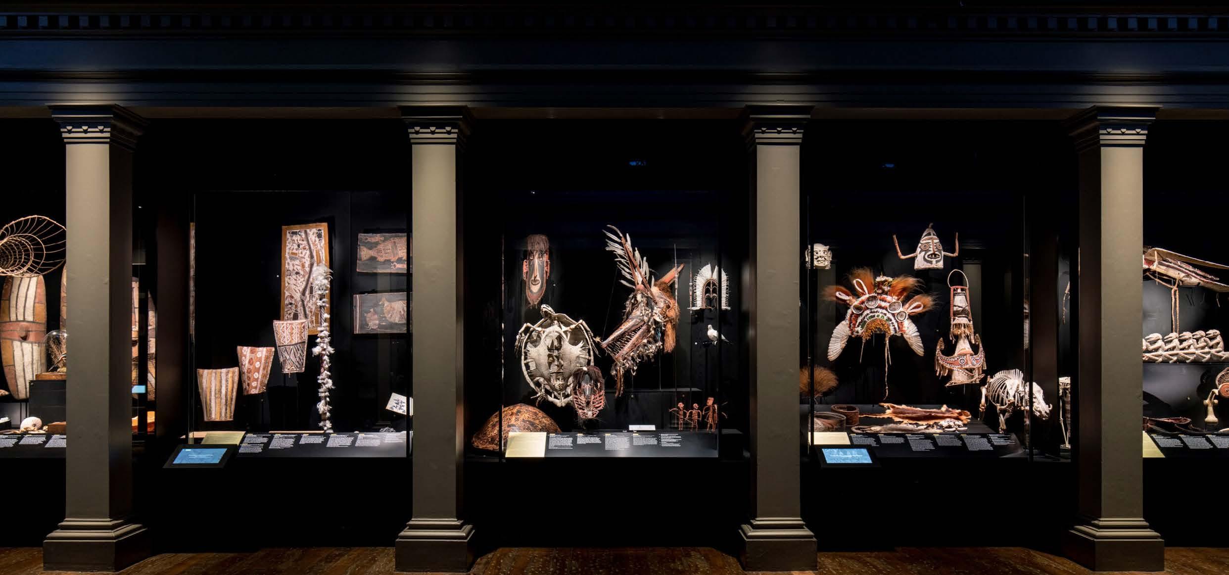
25 designing lighting global Providing advanced museum lighting products & services with Fiber Optic and LED technology. • Conservation • Functionality • Color & Focus quality 12201 NW 35 Ste 534 Coral Springs, FL 33065 info@luxam.com For more information visit L UX A M . C O M 954-775-7254 C ORA L SPR I NG S • L O NDO N • P A RI S • S H ANG H A I LUX A M SP EC IAL I Z I N G I N D I SPLA Y CAS E LI G HTIN G WO RLD W ID E S IN C E 199 5 Providing advanced museum lighting products & services with Fiber Optic and LED technology. • Conservation • Functionality • Color & Focus quality 12201 NW 35 Ste 534 Coral Springs, FL 33065 info@luxam.com For more information visit L UX A M . C O M 954-775-7254 C ORA L SPR I NG S • L O NDO N • P A RI S • S H ANG H A I LUX A M SP EC IAL I Z I N G I N D I SPLA Y CAS E LI G HTIN G WO RLD W ID E S IN C E 199 5 Providing advanced museum lighting products & services with Fiber Optic and LED technology. • Conservation • Functionality • Color & Focus quality 12201 NW 35 Ste 534 Coral Springs, FL 33065 info@luxam.com For more information visit L UX A M . C O M 954-775-7254 C ORA L SPR I NG S • L O NDO N • P A RI S • S H ANG H A I LUX A M SP EC IAL I Z I N G I N D I SPLA Y CAS E LI G HTIN G WO RLD W ID E S IN C E 199 5 Academy
Museum of
Motion Pictures
© Joshua White
Australian Museum @ Rosie Hastie
Bavarian National Museum @ Raffael Pollak
 David Saunders is an honorary research fellow at the British Museum, having been keeper of conservation and scientific research there for ten years, until 2015.
Photograph: David Iliff
‘I've seen framing spotlights used in a way that makes two dimensional works of art look like they're back lit’ − David Saunders
THE AR T O F ILLUMINATION
In a thought-provoking dialogue, designing lighting global editor Ray Molony talks to lighting and conservation expert David Saunders about striking the right balance in lighting design for invaluable art pieces.
You famously once said that ‘the objects in the British Museum won't last forever’. Was that remark just another way of restating this philosophy?
It was a controversial thing to say, but I said it because I wanted to make a point.
It’s not just light that does the damage. For many objects, light is not the key agent in their deterioration.
It might be moisture. It might be pests. It may simply be that if they're stored at room temperature for any length of time, they’re going to deteriorate.
Plastics are a very good example. We know that light deteriorates plastics.
But putting them in the dark is no guarantee that they won’t deteriorate.
I’d qualify that comment by saying that it might be millions of years before some of those objects finally turn to dust. But they will.
So we have a responsibility to think about that lifetime.
We have to think how what we do might accelerate that loss. How do we apportion out that loss so that we split the enjoyment and appreciation of objects across generations.
In my book, I emphasise that we have to know our collection. We have to know its vulnerabilities. We have to know our audience because that is also going to tell us how much light is needed to appreciate it. But perhaps the toughest thing is that we need to know our own mind.
We have to make a decision about how long we want or expect a collection to last because without that, you can't join the future and the present together. You can't make that balance if you don't have a view as to where the risks lie.
A few research groups have made digital copies of objects and added a degree of change, such as fading, and they go to a panel of people and say: ‘Here's the object as it is now, and here's what it might look like in the future after some change has occurred. Over what period of time would you feel comfortable with that change occurring?’
That's the way that it tends to be done. Most of the discussions come down to a 50-year region where people are comfortable. They expect to pass it to the next generation and maybe the generation after that.
Would you take a different approach for the iconic works?
Well a number of paintings by Van Gogh were actually part of the studies. There are some pretty sensitive pigments in them. There's a pigment called eosin, known also by its commercial name of Geranium Lake, which was used a lot by Van Gogh, which is so fugitive that most of it's gone by now. When the Van Gogh Museum did this study they actually changed their lighting policy as a result of it because they realised that they weren't going to meet those expectations.
So for every object, you're making a decision – whether consciously or not – to strike a balance between illuminating it for a visitor and preserving it for future generations?
You are. But a way of thinking about it that doesn't make it such a dichotomy is to think of it as either illuminating it for the visitor now, or having it for the visitor in the future. It's visitor enjoyment and appreciation now versus visitor enjoyment and appreciation in the future.
That's quite an awesome responsibility for a curator to make that call.
It absolutely is. But it allows the curator, for example, to say, ‘Well, I'm not going to display this object at a low light level where no one can see it because that benefits no one. We’re taking away some of its lifetime for no benefit because no one can see it and appreciate it’.
Can you recall a specific example where that discussion went on?
I recall a decision by the Getty with some handcoloured daguerreotypes where they put them in display cases which were only illuminated when the visitor kept their finger on the button.
Many galleries these days opt for general wall washing and it’s seen as very practical approach as you can move artworks around. Is it a cop out in your opinion?
It’s not new. You can trace back the idea of trying to wash a wall with light in a very even way to the
27 designing lighting global
interwar period at least.
That was when a lot of the big American museums built these gallery spaces, which had laylights and lights in the roof space so the light in the room was extremely diffuse.
Wall washing democratises things as it gives equal weight to all objects. Large paintings often look quite good in this type of light because it doesn't produce a huge amount of glare.
Other things look terrible. With works with low relief, you just lose all sense of it. So for anything with three dimensionality, wall washing can sell you short.
At the other end of the extreme, spotlighting or framing something can produce a very strange impression. I've seen framing spotlights used in a way that makes two dimensional works of art look like they're back lit.
Maybe we're so used to seeing backlit things like computers, that there’s a kind of receptivity to it now, but it does produce a very strange result.
There will always be objects that the public and the curator consider more important, which they might want to highlight. If the lighting could draw visitors to the key objects in the room, then maybe that is a good thing for people whose time is short or whose background knowledge is not great.
So in your view highlighting is a key component?
I believe the right approach is to provide a base wash of light so that an object is visible, and then you add directional light to show the three dimensionality.
Two dimensional objects definitely look better if there's a degree of accent lighting because they can look very flat in flat light.
But it’s important to use a relatively even light over them because you don't want the centre of a large object to be very bright compared to the periphery.
And remember too that sometimes the most interesting or the most telling features of an object or artwork are not always at the centre.
The Dulwich Gallery in London recently engaged Star Wars cinematographer Peter Suschitzky to dramatically illuminate works by Rembrandt to emphasise the painter’s relationship with light. Are you a fan of this type of innovation?

Unfortunately, I didn't get to see the show but I don't regard the use of light in this way as a kind of heresy or anything like that. I think it needs to be thought about carefully and I think you need to explain what you're doing and why you're doing it so that people understand that they’re seeing the paintings in a rather different way.
There was an example at Kelvingrove [Art Gallery and Museum, Glasgow, Scotland] of a painting where lights illuminated certain parts of it to guide you through what was happening in the composition. After a period, the painting was then lit normally so you could see it as a whole object. I think this is good as it’s educating people about the object and the thoughts going through the artist’s head.
In the case [of Dulwich Gallery], I think it was really justified because it was talking about how light was used in
Rembrandt's work.
Another example is [Mark] Rothko’s series of paintings for the Harvard Art Museum, which they lit with a structured light that attempted to recreate the colour before fading. Using very scientific principles, they projected coloured light onto the object which compensated for the colour loss. So it looked as it might have appeared when it came out of Rothko’s studio.
They would turn the light off periodically so you could see it in its current state and there was a lot of signage around so that visitors were aware of what had been done.
It has been done with tapestries as well, by projecting light with the colour that's faded away.
These approaches are all fine providing they’re not done to deceive.
Do curators have any responsibility to the original intentions of the artist? If a painting was originally intended to be seen in certain setting, are we being inauthentic if we display it differently?
One of the examples that's often given is pieces that were intended to be seen in churches and they'd often be in side chapels in candlelight. And they would be seen quite poorly, frankly.
We could recreate that poor lighting and sometimes we do, as an experiment or a demonstration of how they might be seen. And you can gain something from that as well. If it’s candlelight, you get a certain atmosphere, but actually it’s a very poor way of seeing an object. So I think we would lose more than gain by doing this.
28 designing lighting global
The exhibition at Dulwich Gallery in London traced Rembrandt’s mastery of light and shadow, revealing how he used it both for dramatic effect, from evoking different moods in religious and mythological stories, to depicting raw human emotion.
However, if there was good documentary evidence that, say, an object was lit from the left in its original setting, then we could go along this route, but occasions when you have evidence like this is relatively rare.
If we were to take authenticity further, we would end up putting everything in daylight or in some warm, artificial electric light because most things were created in either daylight or in candle, flame or possibly gas, until you get to the very late nineteenth century.
Do you think curators are well served by current lighting metrics such as the colour rendering index? After all, under incandescent light, it’s possible to confuse dark blue and black, for instance.
The colour rendering calculations are a bit weighted towards certain types of lighting. Daylight and incandescent sources are theoretically perfect so what you're seeing there is not a colour rendering issue, but potentially something called matamarism, where colours don't look the same under different lights because of the way they behave in different parts of the spectrum.
This has always been the enemy of the restorer. There was an example of a Canaletto painting at the National Gallery [in London] that was very painstakingly retouched in daylight in the studio. When it was taken into the galleries – which at that time were lit with fluorescent lights – all the repairs in the sky appeared pink!

So the painting spent just a month on the wall and then went back to the studio again where it had to be redone.
The problem arose partly because of the difference between daylight and fluorescent light – with its spiky spectrum – and partly because the pigment that had been used in the original sky was something called Prussian Blue.
And it had been retouched with the ‘wrong’ blue. This blue had a ‘kick’ at the red end, which you didn’t notice when it was in daylight but you noticed it when it went into the gallery.
Has the adoption of LEDs reduced these colour issues?
They haven't gone away. I think that LEDs have rather better colour properties than fluorescent. Some fluorescents were pretty spiky, particularly the higher efficacy triphosphor lamps.
It’s better now with LEDs, and restorers are now taught about matamarism more thoroughly and are a bit more careful about the pigments they use.
Do you believe we’re changing our cultural taste for colour temperatures because of digital screens?
There’s a preference for warmer light in an interior setting at lower levels and cooler light in an external setting. I'm sure that's built into our cultural and evolutionary history.
DAVID SAUNDERS: BIOGRAPHY

But if you look at some of the experiments that give people a choice of different colour temperatures of light there does seem to be a shift towards higher colour temperatures. In some cases, there are quite extreme shifts up into the 5000K region.
At the National Gallery, colleagues showed 8,000 visitors objects lit with four different colour temperatures. I think one was candlelight, one was incandescent, one a 4000K source and finally a daylight source.
It was quite a robust study, although it’s still unpublished. They switched around the order the visitors saw them in etcetera, so they were able to take out a lot of statistical noise.
Remember too that the visitors had just come out of a gallery that was probably lit in the 3000K range.
I don't have the exact figure, but 70 to 80 per cent of the visitors went for one of the two cooler sources as their preference.
- This interview with David Saunders first appeared in Erco Lichtbericht magazine
David Saunders is an honorary research fellow at the British Museum, having been keeper of conservation and scientific research there for ten years, until 2015. He was previously in the Scientific Department at the National Gallery in London. He is a fellow of the Society of Antiquaries of London and vice president of the International Institute of Conservation. In 2015-16, he was a guest scholar at the Getty Conservation Institute, conducting the research that underpins much of his book, Museum Lighting: A Guide for Conservators and Curators (Getty Publications/Yale).
29 designing lighting global
The Dulwich Gallery in London recently engaged Star Wars cinematographer Peter Suschitzky to dramatically illuminate works by Rembrandt
Collaboration BY DESIGN
Vinod Pillai is one of the leading lighting designers in the Middle East, boasting a portfolio of projects that spans all sectors of the built environment. Having started his career as an architect working on predominantly hospitality projects, his introduction to lighting design was incidental. Lighting design has taken a focal point in his work since, and the mission at Studio Lumen is the creative integration of light and shape to compliment the architecture.
This transition from architect to lighting designer allows Pillai to understand the impact that lighting has on a space, its architectural features and its interior design.

He believes that one of the most important factors for a successful design collaboration between lighting designers and interior designers is an innate synergy and trust.
‘If the two firms are receptive to each other’s ideas, it can become a seamless process to identify how the lighting will enhance the interior design,’ says Pillai. ‘It’s key that interior designers have an appreciation for lighting design, understand the process, and acknowledge that lighting goes hand in hand with the vision that the interior design is creating.
‘The process of any design project will first begin with interior designers, who appoint lighting designers at the schematics stage to request their input on visuals and concepts for lighting.
‘A benefit of collaboration at this early stage is that lighting designers can ensure the right light is produced on visuals to be shown to the client, which presents a coordinated and well-thought-out design. Clients are increasingly starting to understand the importance of lighting and the role it plays in scene setting, mood lighting, and creating atmosphere.
‘If the lighting is not correct, it can make a perfect interior design redundant by causing guests to feel uncomfortable.
‘Creating a memorable experience depends on the five senses coming together seamlessly. For example, the music
and lighting in a restaurant must gel seamlessly with the décor and the food. The right balance between colours, architecture, furniture and finishings can set the tone and atmosphere of a space.’
Pillai believes that a space always has a story to tell, and lighting brings this out by highlighting who the main and supporting characters are. The way that objects and areas are lit draws attention to the foreground or the background to guide people’s senses and emotions in a space. ■
30 designing lighting global
Vinod Pillai, design director at Dubai-based Studio Lumen, discusses the process of how lighting designers work collaboratively with interior designers and the ways in which lighting impacts overall project design.
THE BUSINESS OF LIGHTING DESIGN™


31 designing lighting global
By incorporating lighting design into the architectural plan at the very earliest stages, they were able to deliver light of the right colour temperature and brightness exactly where the people using the space needed it, using fewer luminaires.
A HUMAN APPROACH IN MELBOURNE
The combination of vertical lighting, flexible ambient lighting and accent lighting can be easily adapted to special lighting tasks and activity.


LIGHT & HEALTH
At the 14,000sqm new-build VicRoads Ringwood Customer Hub, with more than 1,000 public visits per week, service facilities are often bustling. Key to making the facility effective was to instil a sense of professionalism, calm and welcome.

According to Laurent Deleu, of multi-faceted engineering consultancy ADP, there was a major challenge his team faced in designing the lighting for the multiple office spaces: meeting the changing needs of the workplace environment and contemporary customer service, whilst adhering to tight sustainability targets set by the department for the entire project.
A human centric approach to lighting was the key. By incorporating lighting design into the architectural plan at the very earliest stages, they were able to deliver light of the right colour temperature and brightness exactly where the people using the space needed it, using fewer luminaires.
‘All the light fittings chosen are flicker-free, high quality and highly efficient LEDs. They are controllable via a programmable, fully addressable lighting control and management system. Pre-set programs have been
Vertical illuminance contributes significantly to the impression of brightness in a space and aids visual tasks in the vertical plane.
implemented along with presence detection to ensure lights are only on when needed. Distinct areas incorporate lighting control panels, and perimeter lighting adjacent to windows is connected to daylight sensors.’
The predominance of screen-based activity has changed the nature of work entirely. US research in 2022 found we now spend approximately 13 hours per day on screens – a considerable part of which is in the office. This work, conducted at a desk, demands looking ahead at a back-lit screen rather than down onto a desk surface. Bright walls have always played an important role in defining space, but with this change in the way we work, they are more important in an office space than ever.
By keeping walls uniformly bright – as ADP have done here with ERCO recessed compact wallwashers – the screen-torear contrast is reduced, which is easier on the eyes.
Two further benefits of a perimeter lighting scheme are the ability to light what is on the wall – in this case whiteboards for brainstorming, storage cupboards, and artwork – and effective orientation. Vertical illuminance contributes
33 designing lighting global
LIGHT & HEALTH
How do we want to work today? Over the past years, the requirements for modern working environments have changed rapidly – flexibility and comfort have become key factors when designing workspaces at the pulse of time. We explore one of Australia’s first lighting-for-wellbeing installations.
significantly to the impression of brightness in a space and aids visual tasks in the vertical plane.
Accent lighting onto work surfaces remains an important complement to the ambience created by wallwashing. ADP chose ERCO’s Jilly downlights for track, for flexibility, light quality, and glare-free louvre optics. Linear track with Jilly is installed above the permanent workstations in the openplan office space; a complete rectangle of track means Jilly luminaires in the collaboration space can be moved around according to the needs of the users. This future-proofs the space should requirements change in keeping with the department’s commitments to sustainability and whole-oflife product use.
Starting from scratch on this new-build, ADP had the luxury of instilling cohesiveness into the lighting design. Light colour temperature and strength are consistent as you move throughout the space. As ADP’s Michael Abdilia adds: ‘Concealed light fittings and light sources create a high level of visual comfort, important to maintain staff wellbeing.’
Even dedicated spaces continue the aesthetic of the main office. The combination of vertical lighting, flexible ambient lighting and accent lighting can be easily adapted to special

lighting tasks and activity: in the Board Room, Jilly for track illuminates the table surface gently while Optec spotlights define the traffic areas.

To line the locker room, a small but super-clever inclusion in the end-of-trip facilities is the use of double focus Compact wallwashers. This allows you to illuminate two opposite walls with just one fixture. Clean, useful light is directed on the lock mechanisms and locker contents, but the absence of direct light from above leaves the space comfortable for staff to chat and enjoy their casual moments at either end of the day.
The selected lighting design delivers the quintessential layers of light defined by Richard Kelly. Parscan wallwashers for track and discreet recessed Compar downlights provide general ambient light. Additional Parscan spotlights accent the service staff work surfaces as well as handy standing desks where customers can complete paperwork.
In conclusion, Deleu compares the outcomes for VicRoads with office lighting typical of the last 50 years. Challenging the typical lighting approach was uncomfortable, but working with ERCO and visiting some exemplar projects helped cement that this was the right approach for VicRoads and lighting offices for the 21st century.’ ■
PROJECT CREDITS
Architecture: peckvonhartel
Lighting design: ADP Consulting
Luminaires: Compar, Jilly, Optec, Parscan, all from Erco
Photographs: Jackie Chan
34 designing lighting global LIGHT & HEALTH
By keeping walls uniformly bright, the screen-to-rear contrast is reduced, which is easier on the eyes.
Starting from scratch on this new-build, ADP had the luxury of instilling cohesiveness into the lighting design. Light colour temperature and strength are consistent as you move throughout the space.
35 designing lighting global STEP INTO THE… The UK’s only dedicated lighting specification exhibition 21 & 22 November 2023 • Business Design Centre • Islington • London www.lightexpo.london REGISTER FOR FREE
BAMBOOBeauty
How wireless control is the key to the revamped lighting scheme at the John Hardy Boutique in Bali, a majestic structure crafted from bamboo.

High-lumen 4000K lighting in the jewellery displays, while the night-time scene increases overall brightness to balance out the high contrast between the 4000K lighting in the displays and the 3000K ambient lighting.
The John Hardy Boutique in Mambal, Bali has undergone a stunning transformation. The world-renowned artisan jewellery maker’s establishment is now a stunning celebration of lighting and iconic bamboo architecture.

The lighting design at the John Hardy Boutique in Mambal, Bali is a testament to the importance of attention to detail. The majestic bamboo structure is illuminated by the thoughtful use of bespoke pendant lighting and carefully designed lighting in the jewellery showcases.

The use of two different colour temperatures – 4000K for the jewellery displays and 3000K for the ambient lighting – creates a contrast that highlights the natural beauty of the bamboo structure.
This creates a warm and welcoming atmosphere that perfectly complements the boutique’s luxurious and elegant feel.
To ensure that customers have the most welcoming experience possible, the boutique uses both daytime and evening lighting scenes. During the day, the lighting is dimmed to create an intriguing balance between sunlight and the high-lumen 4000K lighting in the jewellery showcases.
This creates a sensational effect that draws attention to the stunning jewellery on display.
To eliminate the lighting control wiring process for the existing bamboo structure, a Casambi Bluetooth dimming system was chosen.
At night, a different lighting scene is used to increase the overall brightness and create a warm and inviting ambiance. This balances out the high-contrast 4000K lighting in the jewellery showcases, and 3000K lighting used to highlight the bamboo structures, which creates a stunning visual effect.
The lighting design is carefully curated to create a striking experience for customers, highlighting the beauty of the jewellery and the architecture of the space.
To achieve maximum sustainability and energy efficiency for the revamp project, only three Casambi nodes were installed to control the entire lighting design.
The first node is used to control all indirect lighting, while the second node is used to control all direct lighting. The third node is a user-friendly interface remote, allowing for easy control of the lighting scenes. By using two different lighting scenes for daytime and night-time, they were able to minimise energy consumption while still achieving the desired lighting effect.
The daytime scene features a dimmed light to balance the sunlight and high-lumen 4000K lighting in the jewellery displays, while the night-time scene increases overall brightness to balance out the high contrast between the 4000K lighting in the displays and the 3000K ambient lighting. The use of the Casambi nodes and lighting scenes not only creates a visually stunning and energy-efficient space, but also showcases the beauty of the bamboo structure and exquisite jewellery on display.
For a revamp project involving an existing bamboo structure, the Casambi system proved to be the perfect choice for lighting control – with its ease of installation and user-friendly interface. Here, the existing bamboo structure required a lighting control system that could easily integrate into the space. The system’s wireless control capability eliminates the need for complex wiring, making it a cost-effective and efficient choice for the project. The result is a lighting design that perfectly complements the beauty of the bamboo structure, showcasing the jewellery on display in a way that is both sophisticated and visually stunning.
The revamped space showcases John Hardy’s dedication to craftsmanship and sustainability. From the moment you step inside, you are transported to a world of beauty, creativity and elegance. ■
PROJECT CREDITS
Lighting design:
Studio Nimmersatt
Interior Fit-out: blancostudio Bali
Furniture: Kalpataru
Lighting and control supply:
Ascendo Lighting
Control platform: Casambi
Photographs: Indra Wiras
37 designing lighting global CONTROLS
To achieve maximum sustainability and energy efficiency for the revamp project, only three Casambi nodes were installed to control the entire lighting design.
The lighting design is carefully curated to create a striking experience for customers, highlighting the beauty of the jewellery and the architecture of the space.
SIX LIGHTS FROM the f uture
We round up half-a-dozen exemplars of low impact lighting which we believe challenge the current take-make-waste norms of luminaire manufacturing and point to an alternative sustainable future.
These inspiring developments in materials, modularity, upgradability, replaceability, demountability, and reuse point to a future where the lighting industry addresses its responsibilities towards the planet and its climate. They point to an exciting future where luminaires are made from sustainable materials to innovative designs that take into account their environmental impact.
THE LUMINAIRE MADE OF WOOD, WOOL AND HEMP
An innovative luminaire made from wood, wool and hemp is ‘challenging traditional luminaire design’ by omitting diffusers. Instead, US firm Lightly uses two light sources aimed at an arch finished in highly reflective eco-friendly paint to deliver a low-glare glowing illumination without needing plastic diffusers. It says this method delivers 100 per cent direct optical distribution. Since there are no diffusers, the light distribution is created by the internal shape—the profile—of the fixture itself. Its Butterfly fixture has the internal shape of a butterfly, and it creates a butterfly/batwing distribution.

The Butterfly fitting is also the world’s first commercial LED luminaire with a fixture housing that is free of metal, plastic and glass, according to the company. The material in the Butterfly luminaire is 95 per cent biodegradable, 3 per cent recyclable and a mere 2 per cent goes to landfill.
Butterfly delivers an 80 per cent indirect / 20 per cent direct distribution with a distinctive open-web optical profile finished in highly reflective matte white ecofriendly paint.
3D PRINTED PENDANTS ARE BIODEGRADABLE
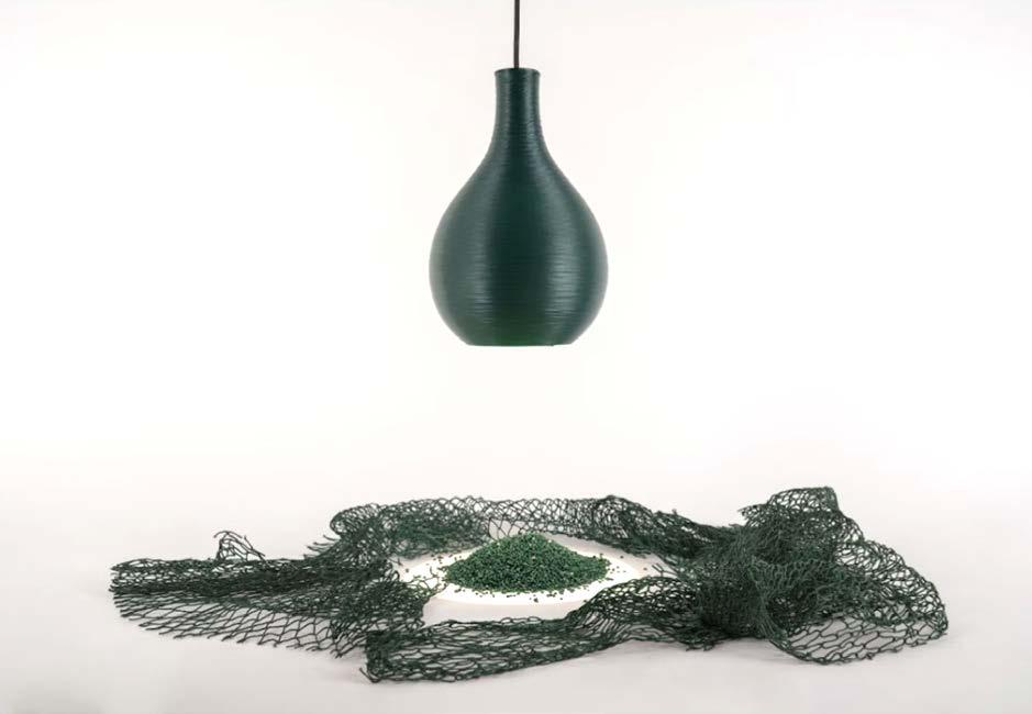
UK start-up LumiAdd has unveiled a range of luminaires printed in biodegradable plastic. The Origin series of pendants is made from polyhydroxyalkanoate, or PHA, a bioplastic that ‘fades back into nature’.
PHA is created by a naturally occurring process called fermentation. It's 100 per cent bio-based and biodegradable and results in no microplastics.
The company says the material is particularly good for translucency. PHA in white gives a ‘beautiful warm glow’ when lit whereas PHA natural is more translucent and has a ‘warm pearl-like’ finish. The range is also available in a standard polylactic acid, or PLA, in 150 RAL colours including matte black.
The Origin pendant is available in a wide range of proportions and forms ranging in size from 100mm diameter to 300mm and from 200mm height to 400mm. Standard finish options are white PHA, natural PHA or white PLA and matte black PLA. RAL colours and other unusual finishes are also available. Built around the

38 designing lighting global CIRCULARITY
1 2
firm’s range of light engines, the luminaires feature passive LED thermal management using an aluminium extruded heatsink with electrophoretic paint finish.
FABRIC SHADES CREATED WITH MUSHROOMS

Danielle Trofe has just ‘grown’ her first range of fabric shades from mycelium, the root system of fungi. Trofe compares the manufacture of the MushLume luminaires to gardening, which requires hands-on work, trial-and-error, and ‘most importantly, plenty of TLC’. ‘A lot of designers shop for the materials they design with, but I’m actually growing an organism that’s a living entity,’ she told the Circular Lighting Report. ‘You form a symbiotic relationship with the materials, and become more mindful of the production process from start to finish. It took a while to formalise the production line,’ she admits. ‘I had to learn about the electrical component of lighting, which, had I known ahead of time, may have steered me in a different direction—so it’s a good thing I was naive.’
If it’s to dramatically increase its sustainability, it’s clear that the lighting industry needs to think creatively about bio materials made from natural and compostable materials.
products much higher up the value chain.
Together with a PMMA monomer binder and, if desired, granulated acrylic waste, PLP is a decorative addition to the ZTA.50 range.
The powder waste consists of 12 per cent captured fine powder waste and 88 per cent clear acrylic.
RETAIL SPOT MADE FROM 68% BIO PLASTIC
Signify has unveiled a retail luminaire with a housing made of more than 68% bio-based plastics.The Philips-branded StoreFlow was created for illuminating shopping aisles so that they are lit the brightest at eye level and have a smooth vertical gradient, while maintaining good illumination from the top of the shelf to the bottom. The company describes it as ‘high contrast’ lighting which delivers an engaging lit environment for shoppers.
StoreFlow is designed for lowest weight and lowest volume to limit transportation-related CO2 emissions. It’s also been engineered to be easy to dismantle at the end of its life. No glue or potted electronics are used.
It also boasts a high-efficacy light engine with luminous efficacy of 120 lm/W for all configurations, with some as high as 140 lm/W. The company also says that as its optics provide optimal light distribution, its design reduces the number of luminaires that are needed in a space and therefore overall installed power.


Serviceable drivers connect the StoreFlow to different Interact systems, enabling features such as multisite management, scene management and lighting management. It’s upgradable, reusable, recyclable and easy to repair and replace thanks to the Service tag QR.
THE MODULARS CRAFTED FROM WASTE WOOD
THE PLASTIC LIGHT THAT’S ENVIRONMENTALLY FRIENDLY

A plastic light pendant version of Stoane Lighting’s ZTA50 has achieved a TM66 environmental rating of 2.6, putting it in the excellent category.
The company says the pendant blends excellent light quality, circularity and flexibility whilst repurposing waste acrylic. It functions as a decorative pendant, some capturing granulated acrylic waste. Stoane says it is also able to make use of the mixed fine powder overspray collected from its finishing processes to make opaque ‘PW’ versions of ZTA.50 PLP.
The company says it is also planning a range of bold colours for the product.
It says the PLP was ‘born from an opportunity to put waste to use’. The powder finish gives a durable protective coating to the aluminium luminaire housings. The overspray was previously collected and disposed of but now it’s being used to create
A French company has begun manufacturing what it terms ‘technical luminaires’ made from waste wood. Kraken Lighting, based near Nantes, uses reclaimed windows and doors to make light fittings such as 600x600 modular ceilings panels. The founders say the business is based on their ecological, social and societal convictions, but there is a commercial motive as the use of reused wood is a rare differentiator in a crowded commercial lighting market. Kraken co-founder Nicolas Forget says the company designs its products so that they are repairable and can be partially or fully assembled by disabled workers. The company originally used regular timber but were encouraged by the French waste agency, ADEME, to develop the products based on waste wood that would otherwise be buried or incinerated.
‘In our creative process, we always keep in mind the consistency, aesthetics and lighting quality of our products,’ says Forget, ‘but we take care to simplify and optimise our manufacturing.
‘Our lights can be assembled by anyone, and an easy-toassemble product is also an easy-to-repair product.’
39 designing lighting global CIRCULARITY
3
5 6 4
INNOVATIONS
New architectural lighting products available for specification

UNISCAN ERCO
With its new Uniscan spotlights, ERCO focuses on maximum quality of light combined with a compact, reduced design. Uniscan thus particularly targets the demands of art galleries and museums. The consistently modular design of the spotlights enables both highly individual configurations and extremely flexible all-rounders, for example with tunable white, zoom optics and wireless Casambi Bluetooth control. The Uniscan range enables precisely matching product solutions for individual requirements with three sizes consisting of XS (32mm) S (60mm) and M (92mm), six fixed light colours, lens units in twelve light distributions and various dimming options.

www.erco.com
ARTUS MSU Future Designs
This innovative unit combines an advanced patented air conditioning system, intelligent lighting and best-in-class acoustics. Artus Multi Service Unit is a rare example of cross-disciplinary cooperation and development that brings compelling benefits. First, the Artus AC unit cuts fan input power by 89 per cent. It earns three additional BREEAM credits when compared to ducted fan coils. It uses 90 per cent less ceiling area and is 60 per cent shallower than fan coils. It is complemented by an intelligent ultra-efficient LED lighting system from Future Designs and Class A acoustic performance.

www.futuredesigns.com
VIVO II Zumtobel
The VIVO II from Zumtobel has been designed for circularity, longevity and a minimised environmental footprint. Zumtobel teamed up with innovative industrial design practice EOOS to create what it terms a conscious counter-trend to the many ‘one-short-life’ spotlights on the market. Over 90 per cent of the material used in the luminaire can be reused. It’s built to order in a high efficiency automated process, with short end-to-end supply routes. The housing and optics are specially treated for longevity and re-use at the end of its first life. All electronic components are easily replaceable and upgradeable.
www.zumtobel.com
DAMIER COLLECTION Meljac
Meljac, the French manufacturer of luxury electrical fittings, offers the option of personalising its switches by adding engravings to the push buttons. This solution retains the sleek design and finish of the brass plate. Clients can combine several functions (lighting, blinds, audio, home automation, etc.) on a single plate, while easily identifying the function of each control. Meljac’s solid brass models, like the Damier collection, can include push buttons with the same finish as the plate. In fact, there are 30 shades to choose from. The buttons can be raised or flush and are available in various shapes: square, round, triangular, rectangular, oblong, etc.

www.meljac.com
TO-TIE Flos
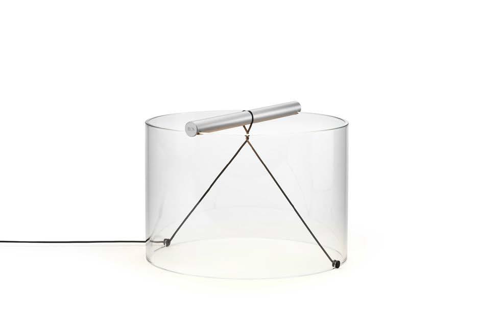
Italian lighting design giant Flos has joined the trend towards minimalist luminaires with the launch of a range of adhesivefree table lamps which are easily demounted and recycled. The To-Tie light has been reduced to its minimal components, says its designer Guglielmo Poletti. It comprises three distinct parts: a solid aluminum bar that contains the LED light source, a borosilicate glass body and a textile-wrapped cable that ties everything together through mechanical tension alone. The handle doubles as the light source. Instead of fixings or glue, it’s held in place by mechanical tension of the conductors.
www.flos.com

40 designing lighting global
SEA FOAM LightArt
A range of pendant luminaires made from beach waste such as fishing nets and washed-up plastic bottles has been unveiled by US firm LightArt. The Coil Seagrass and Sea Foam pendants represent an expansion of the company’s sustainable design manufactured from waste. LightArt is something of a pioneer in sustainability. It launched its first flagship product with recycled content 17 years ago. Last year, it introduced a product with 75 per cent recycled content from its factory scraps, ‘seeking to close the loop’ on linear manufacturing. ‘This is one of several steps we’re taking towards creating net-positive products,’ says the firm.

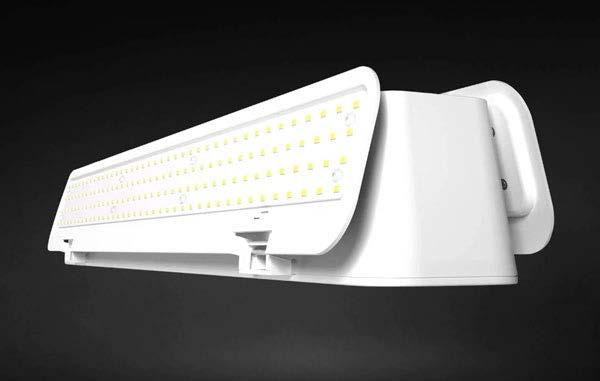
L34 RAB Lighting
A high bay luminaire which folds up to save on space and packaging and is partly made with waste plastic, has been unveiled by RAB Lighting. The L34 features a collapsing wing design made up of two articulating panels that house the LEDs


on either side of the main body. When retracted, the L34 has a more compact shape which reduces the space and materials needed when packaging and shipping the high bay light. Adjusting the wing angles also allows the light to target specific areas, reducing the number of lights needed to fill up a space. The compact design not only optimises the space that the luminaire uses but also shrinks the packaging.
www.rablighting.com

DISCOVERY Fagerhult
Fagerhult has reformulated its popular Discovery luminaire, replacing much of its traditional plastics with materials based on renewable biological oils from pine trees and industrial frying. The Discovery Evo features reduced fossil raw material in the production of polycarbonate plastic. Instead, an ISCC-certified material based on biologically renewable oil (tall oil and frying oil) is used, both of which are residual products from the forest industry and the restaurant industry. As Discovery consists of 73 per cent polycarbonate plastic, the replacement of plastic materials means that the company can reduce its yearly CO2 footprint by about 90 tonnes.
www.fagerhult.com
GEO Gantri
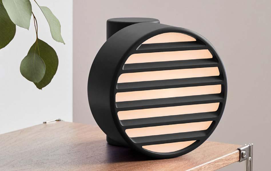
A design studio and lighting manufacturer Gantri have partnered to design 3D-printed wall sconces and lamps made from a corn-based material.
Ammunition and Gantri's series comprises the Signal, Geo and Carve, which each include designs for wall fixtures, table lamps and floor lights that easily assemble and fit in any environment. The American duo's 3D-printed collections comprise wall fixtures, table lamps and floor lights The lights are made from plastic-like material polylactic acid, or PLA. To manufacture the fixtures, the PLA is fed through Gantri's in-house 3D printers, a process that the team claims is more sustainable than other methods.
gantri.com
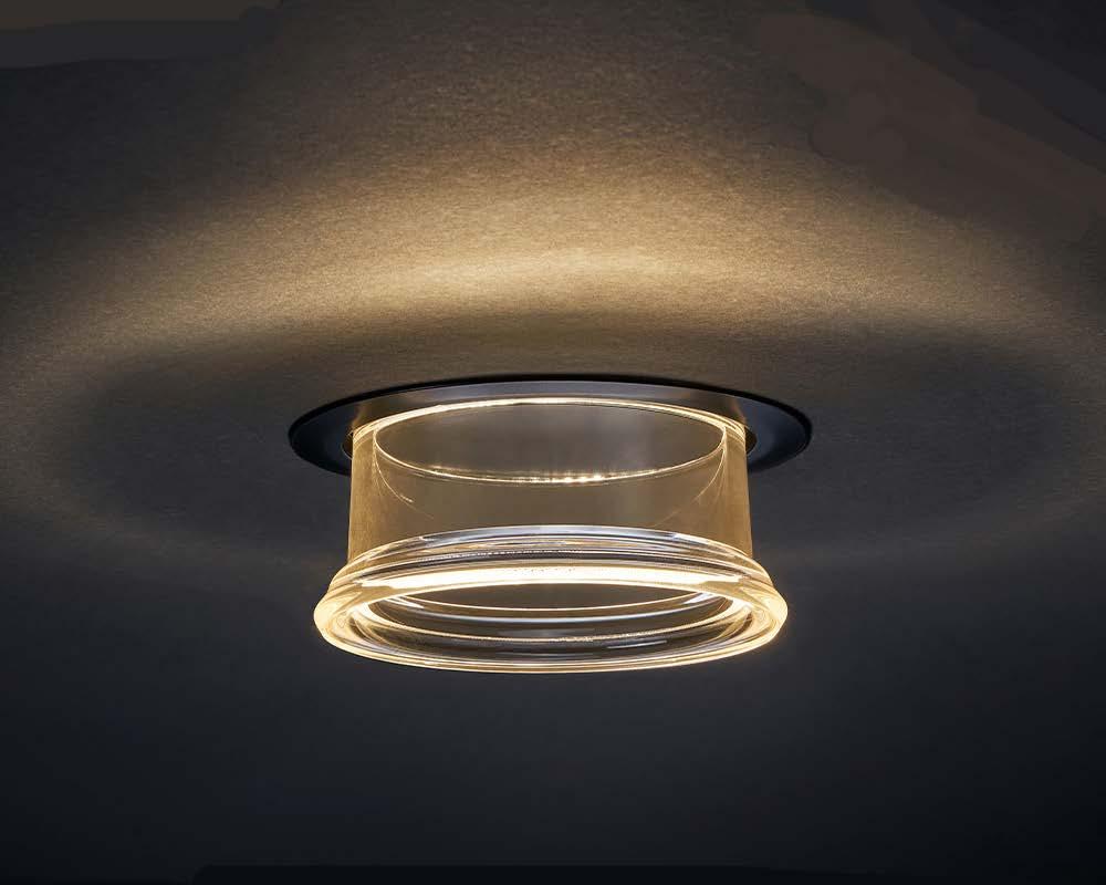
EQUINOX Concord
The Concord Equinox LED downlight boasts no central visible light source, allowing the user to experience the effect and not the impact of the luminaire. The product features an adjustable optical system which allows light to be emitted not only downwards but also upwards, creating a halo effect on the ceiling. This direct and indirect architectural lighting creates a unique atmosphere and enhances space. Concord Equinox has been developed in partnership with QuarkStar, who provided the optical technology for this project. QuarkStar’s system of light refraction allows, for the first time, an indirect component to be integrated into a downlight without supplementary optics.
www.sylvania-lighting.com
41 designing lighting global
An innovative exterior project featuring dark sky technologies and dynamic colour temperatures has been awarded a top award, Ray Molony reports.
Awarding a rare ‘green’ rating in the Build Back Better Awards to Thorn Lighting and Cumbria County Council, the judges cited the duo for their ‘sensitive and thoughtful’ dark-sky scheme in Cumbria in the north of England.
Thorn worked with Cumbria County Council to create a lighting environment that protects dark skies, supports wildlife, improve perceptions of safety and encourages social interaction.


42 designing lighting global
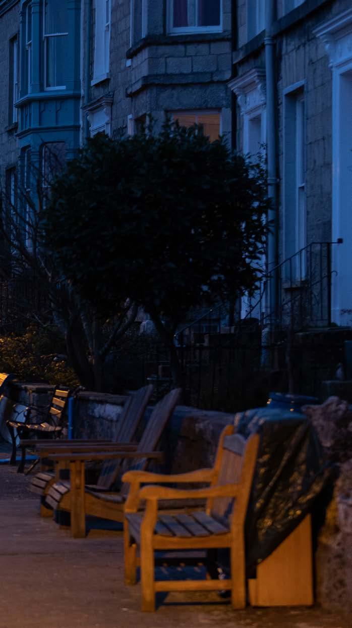
The EP 145 (2200K) luminaire was used to replace existing lighting illuminating Kendal’s historic Cliff Terrace.
In the sensitive and historic Cliff Terrace in Kendal, Thorn’s EP 145 luminaire with a 2200K source replaced the existing fitting. This has eliminated spill light into gardens and homes and led to a reported return of nocturnal wildlife activity.
Many of the fittings feature the innovative NightTune technology, which reduces light levels and adjusts to a wildlife-friendly warmer colour temperature later in the night.
In the sensitive and historic Cliff Terrace in Kendal, Thorn’s EP 145 luminaire with a 2200K source replaced the existing fitting.
This has eliminated spill light into gardens and homes and led to a reported return of nocturnal wildlife activity.
Residents were engaged throughout the process from inception to installation.
The EP 145 lantern allows easy access to a replaceable LED module and driver, offering replacement opportunities for the future rather than wastage.
After a series of successful pilot schemes, dark sky friendly luminaires including Thorn’s EP 145 and Plurio lanterns – both recipients of the International Dark-Sky Association’s Fixture Seal of Approval – have been installed at locations including Glenridding, Kendal, Whitehaven and Workington.


At three of those locations, the Plurio lantern has been installed with NightTune technology which is a system that automatically adjusts the level of light emitted by the light fitting, and its colour temperature, throughout the night.

In Glenridding, the Plurio luminaires have been used on a residential cul-de-sac.
During the night when
outdoor activity is reduced, the level of light is lowered and the temperature becomes warmer, creating a more hospitable environment for wildlife and residents.
In Whitehaven and Workington, the same luminaires have been installed in parks where night-time lighting is needed for people using footpaths. By reducing the output and using a warmer colour temperature, surrounding wildlife and dark skies are protected.
The EP 145 (2200K) luminaire was used to replace existing lighting illuminating Kendal’s historic Cliff Terrace. Numerous residents who spoke to Thorn Lighting for a case study explained that the previous luminaires lit areas extending beyond the footpath. The replacements have resulted in a reversal of this with light now illuminating the pathway, but not their gardens and homes. They also reported a return of nocturnal wildlife activity.
The Cumbria County Council team deserve special recognition for this particular scheme for their community collaboration, engaging residents throughout the process from inception through to installation, and for their extra efforts in sourcing refurbished heritage-style columns to use along the terrace to ensure the luminaires were aesthetically well-matched to their surroundings.
Promoting and improving wellbeing was another factor when Thorn and Cumbria County Council set about this project. The indirect version of Plurio was used as a critical factor was reducing glare. Extra steps were taken, for example, at the Glenridding site, to add shields to the luminaires, further reducing light spill to grassed areas behind the luminaires where lighting was unnecessary.
Having firstly installed the luminaires as part of a pilot scheme, residents reported to the Council that the new lighting installations were much more calming, exceeding initial expectations for the project. Other residents have reported that the dark-sky friendly luminaires have got the potential to unlock a dark-sky economy, providing economical benefits to the county.
Throughout the project, luminaires were chosen for their ability to achieve the appropriate lighting classes for the various spaces they were installed in, be that residential areas or urban green spaces. ■
43 designing lighting global
Many of the fittings feature the innovative NightTune technology, which reduces light levels and adjusts to a wildlifefriendly warmer colour temperature later in the night.
During the night when outdoor activity is reduced, the level of light is lowered and the temperature becomes warmer, creating a more hospitable environment for wildlife and residents.
WHY EVERY LIGHTING DESIGNER SHOULD DO PRO BONO WORK

How does the world of lighting design care for the wider community?
Many of us have been advocates for green projects, for the circular economy, for energy efficiency, for better working environments.
And that's awesome. But where else can we contribute? How could we get our knowledge to those who can't afford us? To those in the community who need lighting design thinking – but who don't know how to acquire it? To the areas of our communities that could benefit from better spaces but who we don't run into in our working lives?
So, what kind of projects should we be doing? Where could we have an impact? And is it worth our time? After all, as design practices, we're not charities!
First and foremost, the answer is: ‘whatever would bring you pride and joy’. My team and I have designed respite homes for kids with disabilities, schools for kids with Asperger’s and other disabilities, offices for an educational charity, food banks, a seminary school, even a pilot store environment for Muslim shopkeepers serving underserved poor communities in Atlanta and Chicago.
That's us – we have an interest in care environments and community programs. Those were projects that we cared about. But you get to choose.
So what are our responsibilities when doing this kind of work? First, you don't need to do it pro bono, but good for you if you do. Sometimes charging a little (in our case, US$5,000, or £3,500, per project) has advantages for everyone. It makes our insurance kick in (protecting them and us), and it means that the client values our time more and understands that we are a finite asset.
Beyond that, our responsibilities are the same as on a regular project, though you are rarely expected to document as heavily or communicate as much. We deliver excellent design thinking of projects within their budgets and serving their missions. And that's it.
The skills are a little different, however. You need to think a lot about stakeholders, and who you're impacting.
Making a food bank look like the swankiest place in town IS GOOD for the clients of the bank, bringing pride to people who can otherwise be made to feel like second class citizens. But it's hard to convince a donor that their money is better spent on
pretty lighting than on feeding another four hundred people. So maybe you need to find the cool-casual ways of making it look great. We lit one project entirely with fluorescent tubes concealed on tops of furniture, behind ducts (pseudo-coves) and plywood bench seats.
You also need to know more about commodity products. What can you light with kit from B&Q? What can you achieve with a simple strip light? Could we just step up the ceiling (a simplified cove) and moderately hide a cheap light? Would a ‘Flavinesque’ arrangement of strips bring light to the space, quickly and cheaply?
And do you have leftovers from past projects? Working with distributors who regularly supply our projects, we're often able to beg, borrow and steal great kit –and design with what we have.
The Rural Studio in Alabama, a university programme, has twenty years of lights sitting on pallets, thanks to Weidenbach Brown. The students will build projects every year and they'll be well lit!
We do need to have the humility to know what we're not good at. Often we talk to the electricians about what they use when there isn't a designer involved in a project; they often know more about what cost effective lighting products are out there than we ever will.
And the operators of these buildings have experiences that you or I will hopefully never have.
Completing a respite home for kids with a wide range of disabilities (often coming with cognitive and psychological issues too), we had to confront issues of kids attempting suicide using lights, of kids in distress needing safe, padded cool-down spaces.
Designing yachts for the super-rich doesn't expose you to that kind of environment. So there's a learning, listening and observation phase.
How much impact can we really have? That's where some careful thought about where you place your time is valuable.
Our project for the Inner City Muslim Action Network (IMAN) is great; we're prototyping a store to resolve all sorts of
community challenges.
It's to address food deserts by providing access to healthy food in poor neighbourhoods, but it's also about improving the relations between business owners and the communities they serve. So a prototype is a great thing; it can showcase lighting design thinking and be turned into a repeatable model.
Our primary question is how we can make the space feel positive and the food look great while not making the scheme look like gentrification which excludes the community.
Similarly, our work with Ealing Council in London to make better spaces for kids with disabilities provides a prototype for spaces that treat children leading somewhat institutionalised lives with the respect not shown by grids of anti-ligature ceiling fixtures glaring down upon them.
So what do you know that you can share? What can you contribute? If this all seems intimidating, don't worry. It's just like any new project.
Give it some time, patience and thought, and do it with humility. It’s a fascinating experience.
And finally, if you're responsible for the bottom line, for profit, I'll tell you straight: you're going to lose money on this. You will.
But you'll also gain happier staff, better staff retention, more experience and a slew of new skills that will help you VE even the wealthiest project.
My challenge to you? Every studio, every ten lighting designers? You should be doing one charitable job a year.
Call it pro bono, call it low-fee. But go out and find it.
44 designing lighting global
Lighting designer Thomas Paterson, director of Lux Populi, challenges his peers to bring their knowledge to those who can’t afford it. It benefits the community, and it’ll benefit your practice, too.
Lux Populi donated its lighting design services to the creation of a headquarters for non-profit organisation DonorsChoose.org in New York. The project was a collaboration with design practice Eight Inc. Picture: Scott Morris Architects
Thomas Paterson is the Australian founder and director of lighting design practice Lux Populi, based in Mexico City.
ORG NEWS
LIGHTS IN ALINGSÅS 2023
The lighting festival Lights in Alingsås, Sweden attracts around 70,000 visitors every year. Established in 1998 and now run by Alingsås Energi, the much-loved event is an important meeting place for professional lighting designers, aspiring students in lighting design and architecture, and businesses.
Lights has become a world-class lighting design event that many people want to participate in. Internationally active designers apply to become Workshop heads and to lead a group of international students, that also apply to be part of the workshop. They get valuable “hands on” experiences of lighting design and the creation of the installations, which can otherwise be difficult to obtain. The workshop week itself is intensive and starts with lectures and presentations. Then sketches and prototypes are made. They are tested, discussions are held and reports are made. Finally, the finished installations are displayed.
The workshop – which this year takes place from 6 October to 5
November 2023 – offers a wide range of theory and practice. Immediately after the opening ceremony, the exhibition begins. For five weeks, the installations are up and running and Alingsås is filled with visitors every night in October who want to walk the light trail, on their own or with a guided tour. Cafes and restaurants have extra opening hours, shops organize shopping events and associations and companies arrange events for their customers. Running races, exhibitions and concerts are other activities that are added each year. 2020 was slightly different, due to the current pandemic.
www.lightsinalingsas.se
Photograph: Patrik Gunnar Helin
LIGHTING GOES CIRCULAR
Details of Recolight’s flagship sustainable lighting event have been revealed.


Circular Lighting Live 2023 is a one-day conference and exhibition taking place on Thursday 21 September 2023 at the Royal College of Physicians in London. Free to specifiers, Circular Lighting Live 2023 will feature leading experts, specifiers and policy makers who will share their insights into forthcoming standards and legislation, emerging technologies and new business models. For 2023, the organisers have moved to a much bigger venue with more expansive exhibition floor and included a dedicated track for lighting designers. It was an instant success on its debut last year, when it brought together 250 of the lighting industry’s top executives and specifiers to consider how our sector can become part of the circular economy. For 2023, the organisation has moved to a much bigger venue with a dedicated and expansive exhibition floor. They have also added a dedicated track for lighting designers and architects.
www.circularlighting.live
45 designing lighting global
LIGHTING AWARDS COMPETITION
LIT Design Awards

FINAL SUBMITTAL DATE 22 October 2023
ANNOUNCEMENT DATE EST November 2023
iF Design Award 2023
FINAL SUBMITTAL DATE 10 November 2022
ANNOUNCEMENT DATE mid-April 2023

AWARD NIGHT 15 May 2023, Berlin
Light Middle East Awards
FINAL SUBMITTAL DATE EST November 2023
ANNOUNCEMENT DATE EST January 2024
Build Back Better Awards

(Lighting Category)
OPEN FOR ENTRIES 15 May 2023
EARLY BIRD ENTRY PRICE DEADLINE 28 July 2023
ENTRIES CLOSE 8 September 2023
46
The Theatre Royal Drury Lane in London won a Build Back Better Platinum Award for BDP in last year’s lighting category. BDP’s lighting team worked closely with Haworth Tompkins Architects to celebrate the full drama of the restored spaces.
Picture: Philip Vile/Tom Niven
BANFF, CANADA


47 designing lighting global TRADE SHOWS 21-22 NOV 2023 LONDON 28 FEB - MAR 3 2024 TOKYO 2-8 MAR 2024 FRANKFURT 16-21 APR 2024 MILAN 6-9 AUG 2024 SAO PAULO 21-22 NOV 2023 LONDON 27-30 OCT 2023 HONG KONG 21 SEP 2023 LONDON 3-5 SEP 2023 LONDON 16-18 JAN 2024 DUBAI 47 designing lighting global 6 OCT – 5 NOV 2023 ALINGSÅS, SWEDEN 2-4 NOV 2023
In your next issue of designing lighting global…

Wireless Controls

Wireless lighting controls are quietly revolutionising the way lighting systems are managed and operated. By eliminating the need for complex wiring, these controls provide flexibility, convenience, and scalability in adjusting and automating lighting settings. They allow for easy installation and reconfiguration, enabling quick adjustments to accommodate changes in space usage or preferences. With wireless connectivity, lighting controls can be remotely accessed and monitored, offering enhanced control and energy efficiency.
Lighting, Sustainability and the Circular Economy
In the next issue, we’ll explore the crucial role that lighting plays in sustainability and the circular economy. Implementing smart lighting controls, such as occupancy sensors and daylight harvesting, can really enhance energy efficiency. The circular economy is supported by choosing sustainable lighting solutions that are designed for longevity, recyclability, and easy repair. By embracing sustainable lighting practices, we minimise waste, conserve resources, and contribute to a more environmentally friendly and economically sustainable future.
Retail Lighting
Retail lighting plays a vital role in creating an enticing and immersive shopping experience. Thoughtful lighting design enhances product visibility, highlights displays, and sets the desired ambiance. Retailers are increasingly using dynamic lighting solutions to adapt lighting schemes to different areas or promotional events, maximising visual impact. We’ll look at some exemplar installations from around the world.

48 designing lighting global PUBLISHED IN NOVEMBER 2023. EDITORIAL AND ADVERTISEMENT COPY DEADLINE: 23 OCTOBER 2023.
salutes and thanks its advertisers for their support. We applaud the achievements of lighting practitioners and recognize the importance of their work in architecture and design.


49 designing lighting global
page 5 page 15 page 3 page 51 page
page
page
page
25 page 31
2
35
7
UP CLOSE ANDRE TAMMES WITH
I think the genesis of my interest in lighting was from my childhood in a house with no electricity. I grew up in Newton House, outside Edinburgh, Scotland, which was built in 1580. The light was generated by a mysterious machine in the shed. Every night my father and the gardener had to each turn a side of this handle and it would go click click click. Meanwhile, outside on the gable end of the house, this great weight would go up on a pulley, bit by bit, to the top.
In the ensuing 24 hours it would drop and operate a compressor which sucked in, believe it or not, high octane aircraft fuel. It mixed air with the fuel and pumped the vapour to various burners around the house. So we basically had kerosene-based gas lighting.
One day, the airport authorities arrived and were aghast at our fuel storage facilities, so they halted our supply and we went back to candles, Tilley lamps and Aladdin lamps. My whole fascination with light grew from that early childhood experience.
Later I got into the theatrical world. My first role was at the Palace Theatre in Watford as an unpaid assistant stage manager. I had a walk-on part which I hated and it convinced me that I wanted to be the bloke who sat in the shade, in the stalls, in the dark, throwing light at the stage.

The first lights I worked with were Strand Pattern 49s, a massive box and you just screwed a whacking great 1kW incandescent lamp into it.
Another job I had to do was to top up the water dimmers. When a heavy load warmed them up, the water evaporated and to prevent them drying out, my task was to literally pee into them!
In the 1980s, the establishment of the National Lottery led to
a boom in the building of theatres, and I went freelance as an independent theatrical lighting consultant. And then one day I got a phone call from a Scottish architect who was designing the new Cameron Toll shopping centre in Edinburgh. And he said: ‘Well, I believe that with your background, you might add a wee bit of a certain touch to the job.’ And that was how I moved into architectural lighting.
I created the distinctive red lines around the building, which turned into a landmark.
The next significant phone call I got was from a young man who was doing his architectural thesis on the relationship between stage lighting and architectural lighting, and he wanted to interview me for it. His name was Jonathan Speirs.
Jonathan turned up, interviewed me, and then said ‘in the summer holidays,, can I come and work for you?’. He could draw, and I couldn’t, so I said ‘absolutely!’. And that, in 1983, was the start of the Lighting Design Partnership.


It was a glorious time. I looked around the UK market in lighting design and there was nobody else, apart from Derek Phillips who was doing lighting design and architecture. I called up Derek and told him that we had started a fee-based lighting design service, he said: ‘well, Andre, if you want to do it, that’s great, but don't expect to ever make any money at it. And by God, he was right.
My advice to young lighting designers today would be: You have to burn brightly. You have to burn with enthusiasm about the subject.
Lighting is vital because what you see – your perception of your surroundings – is entirely conditioned by the way it’s lit. ■
50 designing lighting global
UP
CLOSE
WITH ANDRE TAMMES • UP CLOSE WITH ANDRE TAMMES • UP CLOSE WITH ANDRE TAMMES

51 designing lighting global BANFF, CANADA | 2 - 4 NOVEMBER 2023
EdisonReport.tv serves as a hub for all digital content in the lighting industry. A premier source for critical information surrounding lighting, EdisonReport.tv is dedicated to delivering industry news by way of video and serving its audience by spotlighting product launches and up-to-date educational videos, as well as information about upcoming webinars.

Thought Leaders at LEDucation 2023: Keith Eagle, VP + General Manager, Signify
Simon Fisher Workshops - How to Get a Better TM66
Build Back Better Awards interview: Innerscene A7 Virtual Sun - Is this the Ultimate LED Skylight?


LightPitch™ at LEDucation 2023: Optique
LightPitch™ at LEDucation 2023: Fluxwerx

‘It’s a lie that we can’t balance people and carbon’ says top designer


 David Saunders is an honorary research fellow at the British Museum, having been keeper of conservation and scientific research there for ten years, until 2015.
Photograph: David Iliff


