
24 minute read
lots 17


Despite being rightly known and celebrated for his paintings and drawings, Brett Whiteley always extended his art beyond the frame, working in three dimensions when both the idea and its realisation demanded it. Across the artist’s oeuvre, forms occasionally explode from the canvas – in the visual and surface chaos of the multi-panelled painting The American Dream, 1968-69, (Art Gallery of Western Australia) for example, with its collaged objects and built-up shapes, and aspects of the natural world, such as branches, birds’ eggs and nests, sometimes represent themselves rather than being depicted by the artist, as if the beauty of their real-life forms defy transcription. Over his relatively short but highly productive career, Whiteley created sculptures from found objects, while also displaying mastery of more traditional techniques such as carving and casting. Indeed, over time, his large-scale sculptures such as Almost Once, 1968/1991 (otherwise known as ‘The Matchsticks’), sited near the Art Gallery of NSW, and Newcastle Art Gallery’s Black Totem II have become instantly recognisable and much-loved public art works.1
Whiteley arrived in London in 1960 after a 10-month stay in Italy following his awarding of the Italian Travelling Scholarship at the Art Gallery of NSW by judge Russell Drysdale in October 1959. He was quickly embraced by the London art scene as a new talent to watch, spearheaded by the inclusion of three of his paintings in Bryan Robertson’s 1961 ‘Recent Australian Painting’ exhibition at the Whitechapel Gallery and the acquisition of his Untitled Red Painting, 1960, from that show, by the Tate Gallery.2
The Whiteleys initially moved into an apartment at Ladbroke Grove in the west London borough of Chelsea and Kensington, a then workingclass area filled with British and expatriate Australian artists. Their home was not far from 10 Rillington Place, Notting Hill – the address where renowned serial killer John Christie murdered at least eight women (including his wife) during the 1940s and early 1950s, hiding their bodies in the garden, and in the walls and under the floorboards of his house. Whiteley became obsessed with the macabre story and undertook extensive research for his series on the case. Drawing obvious influence from the powerfully visceral compositions of his mentor, Francis Bacon (who he met in 1961), Whiteley’s Christie works unflinchingly investigate violence, psychosis, and the nature of evil itself; capturing the fear, pain and anguish of Christie’s victims in the contorted, writhing forms of female bodies, distorted to the point of abstraction.
Whiteley created and exhibited his Regent’s Park Zoo works – comprising paintings, sculptures and the screenprint portfolio, My Relationship between Screenprinting and Regent’s Park Zoo between June and August 1965, 1965 – at the same time as the Christie series, its more prosaic subject matter providing a very real antidote to the intensity of the Christie saga. The idiosyncratic juxtaposition of these two very different bodies of work was a bold move for the

Brett Whiteley (Zoo series), Installation view, Marlborough New London Gallery, 1965 documentary photograph in artist’s ‘orange velvet’ notebook (compiled c.1975) Art Gallery of New South Wales, Sydney
young artist, driven entirely by personal need rather than a desire for exhibition coherence. Within the exhibition, the animals provided a positive counterpoint to Christie’s depravity and evil, yet the pent-up energy contained within their physical forms and their appearance, at times, behind the wires of a cage, highlight their role as sentient beings and humankind’s complicity in their ongoing confinement. As Kathie Sutherland has commented: ‘Whiteley’s giraffes, baboons, and apes are alert and express extremes of emotions, seemingly human: melancholy, wariness, anger and curiosity. As a body of work their vitality and awareness of life communicates with the viewer in a way that Christie’s doomed victims, who are silenced, cannot.’3 The Regent’s Park Zoo works also allowed Whiteley to express his extraordinary draughtsmanship and facility of line as he quickly captured the animals in motion.
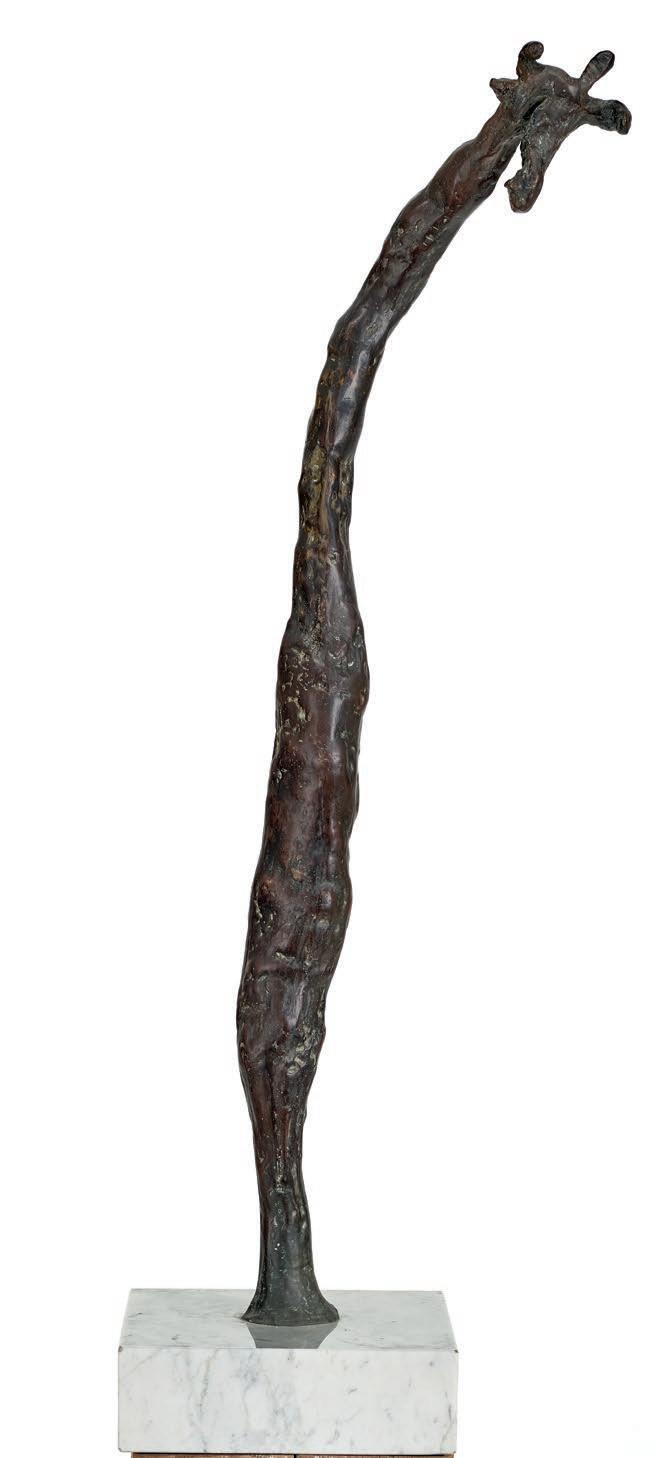
Giraffe No. 1, 1965 was a key part of the exhibition’s menagerie; its thin, abstracted form embodying, rather than simply depicting the animal’s unusual gait and the slow, swinging motion of the giraffe’s body as it moves. The sculpture clearly shows the influence of Giacometti in its expressive modelling and teetering slender form, as the marks of Whiteley’s fingers impress and shape the giraffe and its exquisitely modelled head; imbuing the animal with a sense of inquisitiveness and charm. Whiteley has seemingly captured the personality of this harmless beast in the graceful curve of its neck and body and the elegant tilt of its head. As time has shown, the artist’s interest in animals was certainly no flash in the pan; Whiteley returned to the animal kingdom as subject throughout his career, with the giraffe appearing in different guises across painting, drawing, prints and sculpture. As Giraffe No. 1 – one of the artist’s first sculptures of this gentle giant, clearly demonstrates, Whiteley’s fascination with animals came from a place of connection, and a lifelong quest for understanding. As he remarked: ‘To draw animals, one has to work at white heat because they move so much, and partly because it is sometimes painful to feel what one guesses the animal ‘feels’ from inside.4
1. Black Totem II was created by Whiteley and completed by Wendy Whiteley OAM after his death. 2. Whiteley had a second work acquired by the Tate in 1964 –Woman in a Bath II, 1963 from his solo exhibition Brett Whiteley at Marlborough New London Gallery. The Collection now numbers 18 works. 3. Sutherland, K., Brett Whiteley: A Sensual Line, 1957 – 67, Macmillan Art Publishing,
Melbourne, 2010, p. 123 4. McGrath, S., Brett Whiteley, Bay Books, Sydney, 1979, p. 62
KELLY GELLATLY
(1951 – 1999) HIGH FENCED, 1996 synthetic polymer paint on canvas 203.0 x 153.0 cm signed and dated verso: Howard Arkley / 1996
ESTIMATE: $500,000 – 700,000
PROVENANCE
Tolarno Galleries, Melbourne at Art Cologne, Germany Gould Galleries, Melbourne, acquired from the above in 1996 Private collection, London, acquired from the above in 2000
EXHIBITED
Tolarno at Art Cologne, Art Cologne, Germany, 10 – 17 November 1996
LITERATURE
Crawford, A., & Edgar, R., Spray: The Work of Howard Arkley, Craftsman House, Sydney, 1997, p. 130 Howard Arkley Online Catalogue Raisonné: [https://www.arkleyworks. com/blog/2009/11/24/high-fenced-1996/] (accessed 26/8/22)
RELATED WORK
High Fenced, 1995, synthetic polymer paint on paper, 160.0 x 121.0 cm, private collection, illus. in Crawford, A., and Edgar, R., Spray: The Work of Howard Arkley, Craftsman House, Sydney, 2001, p. 121

© The Estate of Howard Arkley. Licensed by Kalli Rolfe Contemporary Art

Howard Arkley, pictured in the Melbourne suburbs photographer: Martin Kantor © Estate of Howard Arkley
By the time Howard Arkley created High Fenced, 1996, he was beginning to receive international attention for his work, culminating in his representation of Australia at the 48th Venice Biennale in 1999. This classic Arkley of a squat suburban house for example, was exhibited by Tolarno Galleries in Germany in 1996 at the prestigious art fair Art Cologne, and his work was also included in group exhibitions in Korea and Singapore that same year.
Curated by Timothy Morrell, then Curator of Contemporary Australian Art at Queensland Art Gallery, Brisbane, Arkley’s The Home Show at Venice comprised three major bodies of work – Residential Subdivision, 1994 – 99, Fabricated Rooms, 1997 – 99, and Outside – Inside – Out, 1995, which filled, and seemingly reflected, the low-slung Australian beach house aesthetic of Paul Cox’s Pavilion.1 On entering the space, nine of the artist’s signature paintings of house exteriors were hung to form the imaginary streetscape of ‘Residential Subdivision’, brought together, as the exhibition unfolded, with the door-sized panels of Outside – Inside – Out, whose abstracted designs were inspired by the patterns of domestic security doors and fly screens.2 The exhibition culminated in the multi-panelled interior scene of Fabricated Rooms, with its characteristic use of explosive colour and its slightly off-kilter, tessellated sense of space, as the viewer moved from left to right, effectively entering, and exploring the rooms of a strangely empty home. As John Gregory has noted, ‘In conception and design, the show was the culmination of Arkley’s suburban enterprise, fulfilling a long-standing ambition to transform an entire exhibition into a stylised simulacrum of an Australian suburb …’3
Catalogue contributor Marco Livingstone, emphasising the psychedelic look and experience of Arkley’s paintings of suburban houses, described the artist’s images as ‘gloriously, elegantly, deliriously uncouth’ and as a ‘springboard for a heightened sensual and pictorial experience, born of fantasy, daydreaming and escapism.’4 Clearly written with the aim of establishing a sense of connection, recognition and understanding between an international art audience and the artist’s quintessentially Australian images, Livingstone also highlighted Arkley’s connection to familiar Pop artists such as Patrick Caulfield and Richard Hamilton. However, given the positive reception of the exhibition on this global stage, it is fair to assume that an audience well-versed in postmodernism easily recognised and responded to the equivalence of Arkley’s high- and low-brow sources, to his investigation of formal concerns with colour, line and pattern, to his experimental nature, and to his deft handling of his materials. As Arkley’s first wife, artist Elizabeth Gower has remarked: ‘He had such control of the airbrush, it was like the sixth finger on his hand. His concentration was intense. One can only marvel at his ability to sustain it.’5

‘The Home Show’ installation, Australian Pavillion, Venice Biennale, 1999 photographer unknown
As the 2011 acquisition by the State Library of Victoria of the substantial Howard Arkley Archive has demonstrated, Arkley was a prodigious collector of references and source material. Clippings of images from magazines, and the artist’s own photographs, collages, doodles and notes fill the pages of countless notebooks, revealing the artist’s seemingly endless capacity for creative juxtaposition and reinvention as forms and patterns appear and are re-worked in different guises, across his oeuvre. Figuration and abstraction sit side by side, and his abiding interest in the construction and presentation of our lives through ‘the home’ is treated with a lightness of touch that has at times been misconstrued as either critique or indifference. As Arkley once said to his long-term studio assistant and fellow artist Constanze Zikos, ‘make what you know, make what you understand.’6 Arkley recognised that life in the suburbs was the reality of most Australians, and he knew them from firsthand experience, having grown up in Surrey Hills and after living in the inner-city for many years, moving to the Melbourne suburb of Caulfield with his partner Alison Burton in 1991.
Arkley often based paintings like High Fenced on real estate advertising images, where properties literally put on their ‘best face’ for purchase; their carefully constructed sketches or photographs framed to obscure less attractive features and delete any unnecessary distractions. The unusual angles and compressed space of the work mirror and exaggerate this effect, only allowing the audience a view of the property over the top of the imposing fence and physical access through the slice of driveway to the right of the composition. Howard Arkley painted his first house painting in 1983 and remained captivated by this embodiment of the suburban dream until his untimely death in July 1999, just one month after the opening of the Biennale. As he enthused: ‘Ordinary houses are full of pattern... the different bricks on the different houses, and the pattern between the gutter, the nature-strip, the footpath, then you have the fence, then you have the lawn, the house, the tiles, then you have the beautiful sky... and I missed the bushes in between... it’s rich.’7
1. The Australian Pavilion was constructed as a temporary building in 1988 to house the exhibition Arthur Boyd: Paintings 1973 – 1988. Australia was allocated the then last site available in the Giardini della Biennale and is now one of only 29 national pavilions within the
Biennale Gardens. Despite being a temporary structure, prefabricated in Australia using local materials and shipped to Venice for construction, the Pavilion was used for 26 years. 2. Livingstone, M., ‘Some Kinds of Love: Howard Arkley’s Urban Suburban Environment’,
Howard Arkley: The Home Show, Australian Pavilion, 48th Venice Biennale 1999, ex. cat.,
Australia Council, Sydney, 1999, p. 9 3 Gregory, J. ‘Howard Arkley: The Home Show, Venice Biennale, June – November 1999’,
Arkley works: https://www.arkleyworks.com/blog/2009/11/21/howard-arkley-the-homeshow-venice-biennale-june-nov-1999/, accessed 17 October 2022 4. Livingstone, M., op. cit., p. 8 5. Gower, E., ‘Elizabeth Gower statement’, 2006, email to Victoria Lynn, October 2015 in
Fitzpatrick A. & Lynn, V., Howard Arkley and Friends, Tarrawarra Museum of Art, Healesville, 2015, p. 43 6. Zikos, C., conversation with Victoria Lynn, July 2015 in Fitzpatrick A. & Lynn, V., op .cit., p. 59.
Constanze Zikos was Arkley’s studio assistant from 1984 to 1994 and a postgraduate student of Arkley’s at the Victorian College of the Arts, Melbourne from 1984 to 1986. 7. Gregory, J., Carnival in Suburbia: The Art of Howard Arkley, Cambridge University Press,
Melbourne, 2006, p. 9
KELLY GELLATLY
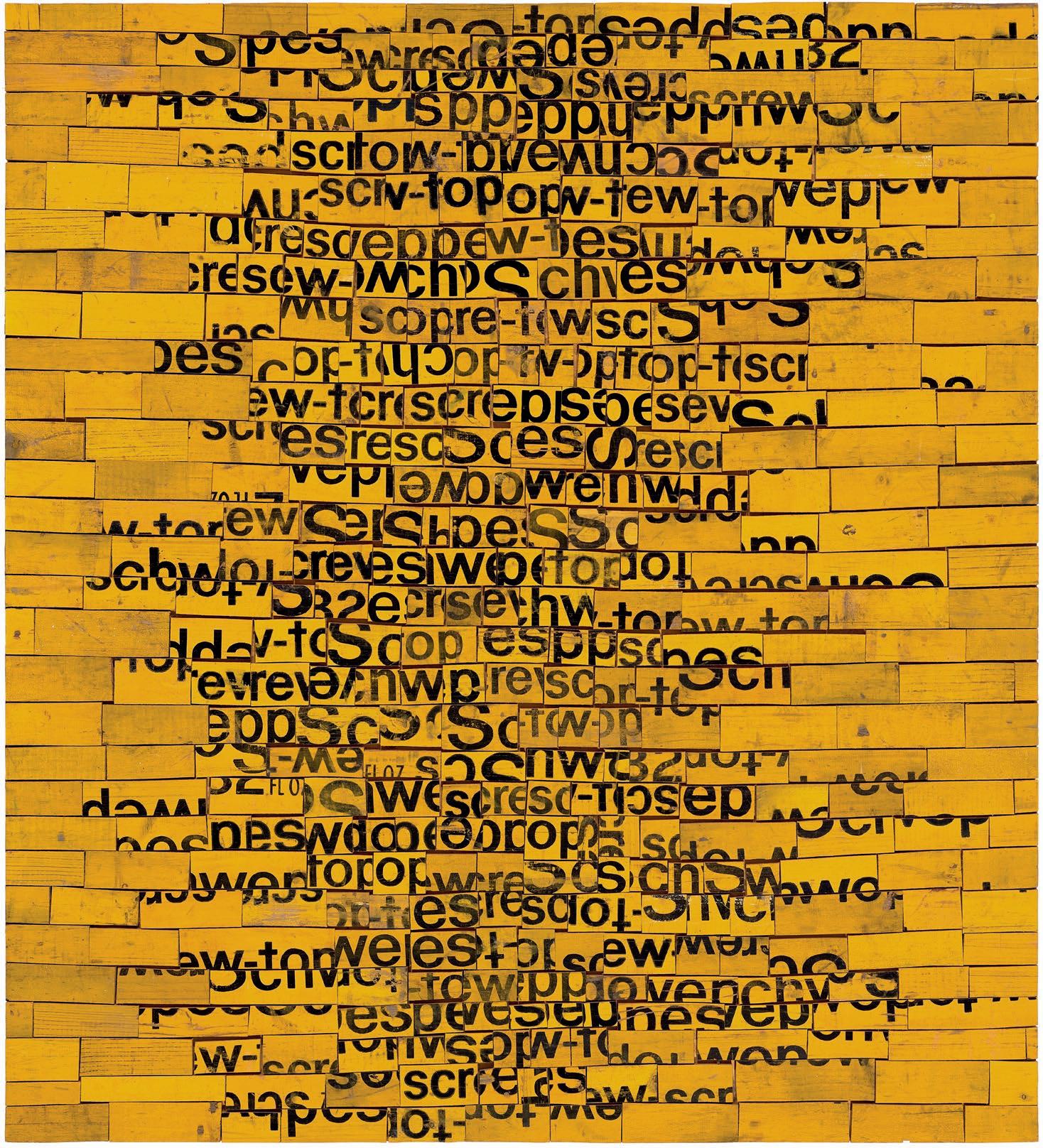
(1917 – 1999) BEATEN TRACK, 1992 sawn wood soft drink crates on plywood 122.0 x 110.0 cm signed, dated and inscribed with title verso: Rosalie Gascoigne / 1992 / BEATEN TRACK signed and dated verso [inverted]: Rosalie Gascoigne / 1992
ESTIMATE: $400,000 – 600,000
PROVENANCE
Roslyn Oxley9 Gallery, Sydney (label attached verso) Private collection, acquired from the above in 1992 Christie’s, Sydney, 24 May 2005, lot 38 Private collection, London
EXHIBITED
Rosalie Gascoigne, Roslyn Oxley9 Gallery, Sydney, 15 April – 2 May 1992, cat. 10 Toi Toi Toi, Three Generations of Artists from New Zealand, Museum Fridericianum, Kassel, Germany, 23 January – 5 April 1999; Auckland Art Gallery Toi o Tāmaki, Auckland, New Zealand, 22 May – 4 July 1999, cat. 67
LITERATURE
Toi Toi Toi, Three Generations of Artists from New Zealand, Auckland Art Gallery Toi o Tāmaki, Auckland, 1998, cat. 67, p. 84 (illus.) McDonald, V., Rosalie Gascoigne, Regaro Pty Ltd, Sydney, 1998, pl. 31, pp. 69 (illus.), 114 Gascoigne, M., Rosalie Gascoigne. A Catalogue Raisonné, ANU Press, Canberra, 2019, cat. 428, pp. 10, 253 (illus.), 337, 380, 413
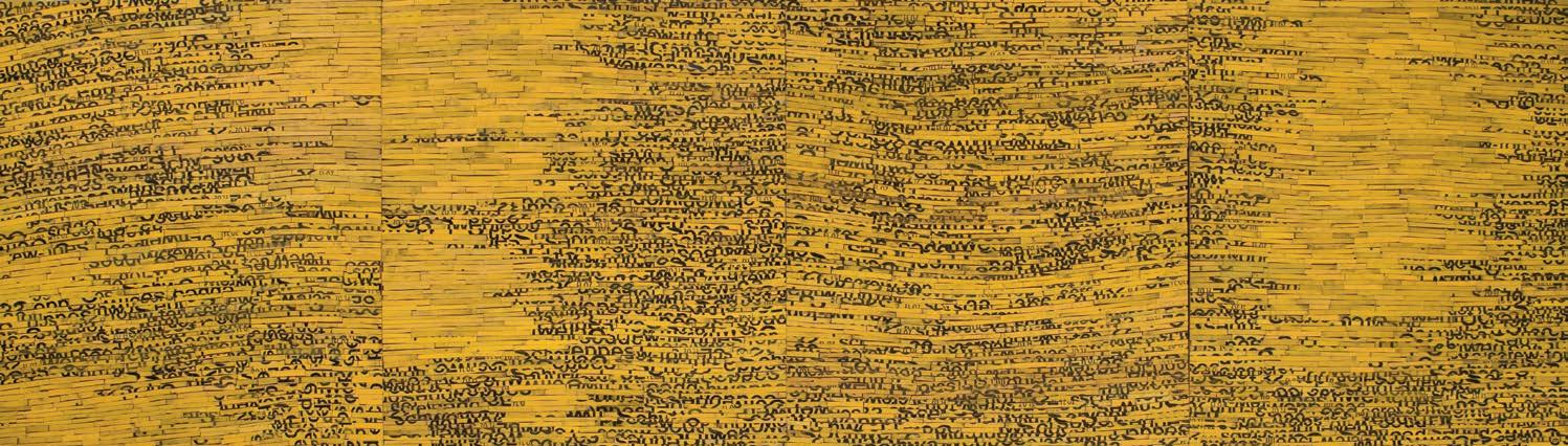
Rosalie Gascoigne Monaro, 1989 sawn and split soft-drink crates on plywood 131.0 x 457.0 cm (overall) The State Art Collection, The Art Gallery of Western Australia, Perth © Rosalie Gascoigne Estate / Copyright Agency 2022
‘Second hand materials aren’t deliberate; they have sun and wind on them. Simple things. From simplicity you get profundity.’1
With her training in the formal discipline of Ikebana complementing her intuitive understanding of the nature of materials, her deep attachment to her environment and later interest in modern art, Rosalie Gascoigne remains one of Australia’s most unique and beloved contemporary artists. Bespeaking a staunchness and scrupulous eye, her works are artful and refined, yet always betray a tangible connection to the outside world, powerfully evoking remembered feelings or memories in relationship to the landscape – they are ‘instances of emotion recollected in tranquillity’ to quote a phrase of Wordsworth’s which was so dear to her. Notwithstanding her formidable reputation today as one of the most significant artists of the twentieth century however, remarkably Gascoigne’s career as a professional artist did not begin until the age of 57 when she exhibited four assemblages in a group show in Sydney. Immediately attracting enthusiastic praise from collectors and critics alike, she was soon offered her maiden solo exhibition at a public institution in 19782, and in 1982, was selected as the inaugural female artist to represent Australia at the Venice Biennale where she unveiled, among other works, Scrub Country, 1981 – the first of her now-famous creations constructed from weathered soft-drink crates.
A magnificent example of these shimmering ‘black-on-gold’ assemblages fashioned from hand sawn Schweppes wooden crates, significantly Beaten Track, 1992 was first exhibited in the artist’s seminal solo exhibition held at Roslyn Oxley Gallery, Sydney in April – May of that year. Heralding Gascoigne’s transition from busy, brightlycoloured works employing several materials towards calmer, more meditative pieces in natural wood, the show remains widely recognised as one of the most ground-breaking of her unconventional career – attested by the fact that at least nine of the works exhibited have subsequently entered prestigious collections internationally including the Metropolitan Museum of Art, New York; the Art Gallery of New South Wales; the National Gallery of Victoria; and the Macquarie Bank Collection.
Bearing striking stylistic affinities with Gascoigne’s celebrated fourpanel masterpiece, Monaro, 1989 in the collection of the Art Gallery of Western Australia, Beaten Track similarly draws its inspiration from the artist’s immediate surroundings – namely the spacious grazing lands of the Monaro region on the outskirts of Canberra with their seasonal variation, diverse topography and myriad traces of history and use. Yet despite their specific impetus, such compositions notably do not depict or symbolise the local landscape; rather the deft arrangement and tonal variation of the wooden slivers eloquently conveys a larger, more universal sense of place that is, paradoxically, ‘both nowhere and everywhere at once.’3 Eschewing the use of iconography to present the viewer with openings to a number of worlds – and not simply the land as a conventional visual essay where form and subject correspond – thus Gascoigne creates exquisite distillations of the landscape that resonate with a virtually endless allusive power.

Rosalie with her stockpile of soft-drink boxes Photograph by Richard Briggs/Fairfax Syndication
With their rhythmic pattern composed of letters – ‘text transformed into texture’ – such assemblages have, not surprisingly, been described as ‘concrete stammering poems’4, a perceptive analogy given the artist’s predilection for poetry from Shakespeare to Plath. Nevertheless, Gascoigne reiterates that the flickering word fragments, though carefully arranged, are not intended to be read literally: ‘Placement of letters is important, but it’s not a matter of reading the text – it’s a matter of getting a visually pleasing result.’5 Similarly, her titles are also not prescriptive but rather, ‘leave room for the viewer’6, imbued with various levels of meaning to be deciphered according to the nature of one’s experiences.
Accordingly, while ‘Beaten Track’ may seem a fitting description for this unruly path of black lettering laid out against the promise of ‘a yellow brick road’, what also springs to mind is the expression ‘off the beaten track’ – a concept whose appropriateness becomes all the more apparent the longer one gazes at the work. For that is precisely what Beaten Track encapsulates – redolent with poetic possibility, it is a catalyst for ideas not yet encountered, an invitation to venture to places not yet explored. As John McDonald elucidates, Gascoigne’s art ‘…awakens associations that lie beneath the surface of consciousness, inviting a higher degree of sensitivity and attentiveness to the world around us…’7 Indeed, it is this higher awareness, the ability to recognise beauty in the most humble and unprepossessing of materials that Gascoigne demands of her audience. For, as the eye moves through this skilful arrangement searching for information within the weathered components, and the mind attempts to place different rules of perspective or build upon the suggestion of the marks, ‘in time we recognise that the only solution is to stop trying to navigate through the forest of symbols and to enjoy the beauty of the trees.’8
1. The artist cited in Edwards, D., Rosalie Gascoigne: Material as Landscape, Trustees of the Art
Gallery of New South Wales, Sydney, 1998, p. 11 2. Survey 2: Rosalie Gascoigne, National Gallery of Victoria, Melbourne, 29 April – 4 June 1978 3. Cameron, D., What is Contemporary Art?, exhibition catalogue, Rooseum, Malmo, Sweden, 1989, p. 18 4. Hilty, G., Art Monthly, United Kingdom, September 1997, p. 46 5. The artist cited in MacDonald, V., Rosalie Gascoigne, Regaro, Sydney, 1998, p. 3 6. The artist, cited ibid. 7. McDonald, J., ‘Introduction’, in MacDonald, op. cit., p. 7 8. ibid.
VERONICA ANGELATOS
(1939 – 1992) DAISIES, 1975 – 76 oil on canvas 65.0 x 53.0 cm signed lower right: brett whiteley original Lichtenstein frame
ESTIMATE: $180,000 – 240,000
PROVENANCE
Australian Galleries, Melbourne Barry Stern Galleries, Sydney, acquired from the above in February 1978 Private collection, Sydney, acquired from the above in 1978
EXHIBITED
Fine Paintings, Tapestries & Sculpture, Australian Galleries, Melbourne, 19 April – 3 May 1977, cat. 71
LITERATURE
Sutherland, K., Brett Whiteley: Catalogue Raisonné, Schwartz Publishing, Melbourne, 2020, cat. 203.75, vol. 3, p. 315 (illus.), vol. 7, p. 347
RELATED WORK
When You Look at Daisies You Look at a Daisy, 1975, pen, ink and collage on paper, 59.0 x 45.0 cm, private collection, illus. in Sutherland, K., ibid., cat. 156.75, vol. 6, p. 314
‘The still life thing only became real the more I wanted to be alone… it was the furthest thing from humans – inanimate objects.’1
Exuding lyricism and sensuousness, Daisies, 1975 – 76 encapsulates well the elegant still life paintings executed by Whiteley during the mid to late seventies which – alongside his grand Matissian interiors and sparkling Sydney Harbour views – represent a highpoint in the formidable oeuvre of this revered Australian artist. Although a genre not commonly embraced by contemporary artists at the time, for Whiteley still life painting offered enormous potential – not only in compositional terms and intellectual challenge, but more poignantly, as a temporary refuge of tranquility for his famously extravagant and troubled psyche. As the artist himself mused, ‘…I see still life as an interim period in which I don’t have any ambition to paint a new subject, or to travel, or to be involved with politics. I don’t have any interest or ambition to impress or to be the last to leave a party… I am interested in a point of trying to restart, restate again… which has always been the way.’2 More modest in scale than his signature Lavender Bay panoramas and noticeably lacking in any artifice or hint of menace, arguably such compositions are among the most exquisitely beautiful of Whiteley’s myriad achievements, imbued with an endearing intimacy, calm and tangible joie de vivre. As Barry Pearce elaborates, paying ‘…tribute to a medley of artists including Bonnard and Morandi… these are the most intensely private of all his paintings, with the momentary perfection of flowers and fruit counterpoised by beads, vases and platters from the day-to-day surroundings of the family.’3 Echoing the gentle, pared-back aesthetic of Giorgio Morandi, here Daisies presents a simplicity that is both absolute and deceptive – at one level the work contains nothing but Buddhist opiate emptiness, at another, it is rich in allusions. For example, the predominantly red and yellow palette may be construed as an homage to the artist’s hero, Vincent Van Gogh, while the Derek Smith footed vase – one of the forms that Whiteley decorated so memorably in oriental blue brushwork – suggests both the bulbous shapes of the Sigean paintings and the curves of a female nude, even the hand-held mirror in the artist’s Archibald Prize-winning magnum opus from the same period, Self Portrait in the Studio, 1976. More abstractly perhaps, the vase may even be perceived as a kind of metaphorical self-portrait – an emptied head topped with a shock of yellow daisy curls.
Significantly, when eight such still lifes were first exhibited in Whiteley’s solo exhibition at Australian Galleries, Melbourne in October 1976 – together with several windowscapes, interiors and self-portraits all inspired by his Lavender Bay sanctuary – the show was universally hailed as the most accomplished success of his career. Heralding the artist’s marked departure from art as a reforming medium – from politics, social consciousness and the Rimbaudian notion of life as a contest between good and evil – towards pictures ‘…of balance, purity and serenity’4, indeed the exhibition was described by The Age critic, Maureen Gilchrist, as ‘a headlong plunge into a vision of joy’5 , while even the stolid, unflappable Jeffrey Makin felt compelled to extol it as ‘outrageously brilliant’, proclaiming Whiteley ‘the only one unquestionable genius in contemporary Australian art.’6
1. The artist, cited in McGrath, S., Brett Whiteley, Bay Books, Sydney, 1979, p. 185 2. The artist, cited in Pearce, B., Brett Whiteley: Art and Life, Art Gallery of New South Wales,
Sydney, 2000, p. 48 3. ibid., p. 36 4. Matisse, cited in McGrath, op. cit., p. 181 5. Maureen Gilchrist cited in McGrath, ibid., p. 186 5. Jeffrey Makin, cited ibid.
VERONICA ANGELATOS

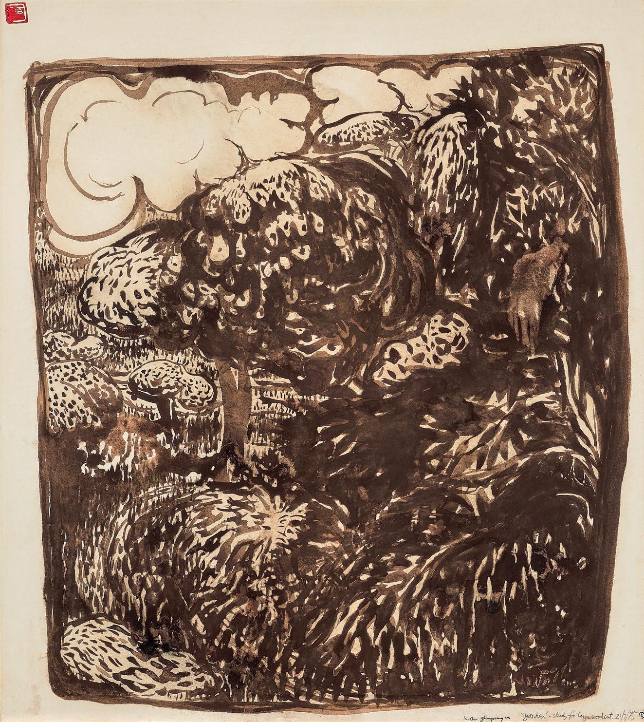
(1939 – 1992) GARDEN, 1975 brush and sepia ink on paper 84.5 x 75.0 cm stamped lower right in black ink with artist’s monogram stamped upper left in red ink with artist’s chop inscribed and dated lower right: further glimpsing in ‘Garden’ – study for large woodcut 21/7/75
ESTIMATE: $60,000 – 80,000
PROVENANCE
Bonython Art Gallery, Sydney Robin Gibson Gallery, Sydney Company collection, Victoria Sotheby’s, Sydney, 7 May 2007, lot 73 Company collection, New South Wales Private collection, Melbourne Private collection, New South Wales, acquired in 2009
EXHIBITED
Brett Whiteley: Thirty six looks at four sights on three themes: recent paintings, drawings and carvings, Bonython Art Gallery, Sydney, 24 October – 15 November 1975, cat. 11 (as ‘The Garden’)
LITERATURE
Sutherland, K., Brett Whiteley: Catalogue Raisonné, Schwartz Publishing, Melbourne, 2020, cat. 141.75, vol. 3, p. 302 (illus.), vol. 7, p. 336
RELATED WORK
The Blue Garden, 1975, oil and watercolour on canvas, 75.5 x 61.0 cm, formerly in the collection of Dr Peter Elliott, Sydney
Drawing was the cornerstone of Brett Whiteley’s artistic practice, and his diverse works on paper informed and supported the major paintings and sculptures he produced throughout his lifetime, often exploring alternate compositional emphases. Garden, 1975 is a large drawing in sepia ink of a neighbouring garden viewed from Whiteley’s home in Sydney’s Lavender Bay, ostensibly a design for a future woodcut that was never executed.1 Garden was first exhibited at Bonython Gallery in Sydney, in an exhibition called ‘Thirty Six Looks at Four Sights on Three Themes’, alongside other large works all drawn with brush and ink on paper. Garden was the only one painted using the warm tones of sepia ink.
In 1975, Brett Whiteley moved from his studio space in Waverton to a house on the foreshore of Sydney Harbour in Lavender Bay. This now famous house’s panoramic views on to the harbour provided the artist
8 220928
with a new format for artworks, which he called ‘windowscapes’, and through which he could claim this patch of Sydney as his own private domain. These close views of verdant gardens, atmospheric rain-soaked harbour views, and stepped rows of rooftops, provided Whiteley with a restorative change of pace. Far from the political and philosophical angst of his earlier works, Nancy Borlase noted, Whiteley’s works from this period were imbued with contemplative quality, ‘a fresh appraisal of nature, reflecting a domestic tranquillity and a lifestyle in harmony with the bay.’2 Whiteley described this new impetus as ‘recording… points of optical ecstasy, where romanticism and optimism overshadow any form of menace and foreboding’.3 Described by the artist within the Bonython exhibition catalogue as ‘immediate landscapes’, these ‘Window’ paintings used the structure of a window frame to isolate only a section of the spectacular view. Whiteley’s flattened perspective and a graphic stylisation gave the finished image the appearance of a patterned screen, reminiscent of the Asian calligraphic art he so admired.
Whiteley’s introspective focus was informed by his admiration for Zen Buddhist philosophy and the meditative process of brush-and-ink calligraphy. Whiteley described Zen as the ‘theology of drawing’4 and viewed this ancient medium as ‘the great unalterable’ 5, its application requiring the utmost confidence and mindfulness. The resulting works on paper bear a spontaneous and fluid quality, swirling with watery primordial and metamorphic potential. Garden, 1975 is a dense and luxuriant view of the leafy environs of Lavender Bay. Compressed into a single plane, the brick confines of this Eden are barely discernible amongst the stippled brushstrokes for each blade of grass and tree leaves of the foreground. In contrast to the ultramarine nocturne of its related painting, Blue Garden, Whiteley uses the white paper to evoke strong sunlight hitting the trees’ canopies. Presenting a lyrical tableau of crowded abundance beneath whimsical billowing clouds, Whiteley’s Garden captures a fleeting vision, and evokes the possibility of contemplative peace within his idyllic environs.
1. Sutherland, K., Brett Whiteley: Catalogue Raisonné, Schwartz Publishing, Melbourne, 2020, cat. 141.75, vol. 7, p. 336 2. Borlase, N., ‘An Unexpected Whiteley’, The Bulletin, Sydney, 23 November 1974, p. 57 3. McGrath, S., Brett Whiteley, Bay Books, Sydney, 1979, p. 168 4. ibid. 5. Drawing and How to Get it On, 1975, illus. in McGrath, ibid., p. 183
LUCIE REEVES-SMITH
Important Works by Lin Onus


