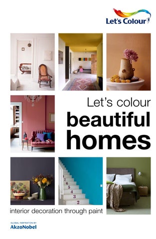
Let’s colour
beautiful
homes interior decoration through paint
welcome Appreciating colour is one of life’s greatest joys Decorating a house, inside or out, makes life better. It’s an act of renewal, driven by fresh ideas and aspiration. Decorating with colour in particular can do miracles for a house. Colour has the power to turn a former playroom into a cool space where your teenagers love to hang out. Or a blank canvas, like the one on the left, into an inviting dining room. It offers bathrooms, kitchens and bedrooms a complete new lease of life, merely by refreshing the mood. And the house that previously went unsold? A few brushstrokes will give it plenty of curb appeal. If you’re looking to be inspired, just turn over a new leaf and enjoy.
00 01
White
page 06 - 23
Yellow
page 24 - 37
Orange
page 38 - 51
Red
page 52 - 67
Purple
page 68 - 83
Blue
page 84 - 99
Green
page 100 - 117
Warm neutral
page 118 - 133
Cool neutral
page 134 - 151
02 03
Choosing colour with confidence How to pick the right colour
There are many ways to distinguish different types of colours, and yet it isn’t always easy to define them. To convey the right image, it’s essential to describe colour in a universal way. After all, it would be hard enough to put the perfect yellow or blue into words for your own benefit, let alone if you need to describe it to a painter or decorator who is going out to buy it for you. To lend a hand, The Language of Colour specifies four colour moods according to grayscale and intensity: Rich, Fresh, Warm and Calm. • Rich colours are striking and strong and can be used to add drama. • Fresh colours are clean and pure and bring a sense of light and energy. • Warm colours are mellow and make a room feel welcoming. • Calm colours are subtle and muted, often with a misty note. Which kind of colour works best in the room you’ve intended it for, depends on a few more details, like the size of the space, the amount and quality of sunlight and the general purpose of the room. Not sure if a colour will work? Paint an A4 sized square of colour on the wall and let it dry well before you decide, or use a colour-a-room program on the internet for a virtual impression, like Dulux MousePainter.
How to combine the colours of your choice
While planning a redecorating project, you’ll probably look for inspiration by leafing through magazines, books and websites on interior design. It’s a great and fun way to find out what you like, but there’s more to it. Analysing the pictures will help you establish a functional palette. This is because every well-decorated room has a limited colour scheme at its base, usually consisting of two or three main colours. Dimensions and proportions are next. If you take note of the amounts of colour used, you’ll notice the hues on the wall, floor and curtains usually take up a larger surface area than the ones used for pillows, lampshades and picture frames. This means a taupe, sand and white colour scheme will probably not be equally proportioned. Deciding early on which colours you’d like to appoint to larger surfaces and which are the accent colours, will give you a clear mental picture of where the project is heading.
If you need some extra theory to back up your choices, the Language of Colour comes in handy once again. It describes three approaches to combining colour – Toning, Contrasting and Harmozing. • Toning
is choosing different hues of the same colour to create an overall mood, like combining poppy red with powder pink and burgundy, which are essentially all some form of ‘red’. • Contrasting is choosing colours from the opposite ends of the colour wheel, such as the one shown here. Blue and orange, for example. In a grown-up setting, that would translate into something like sea blue combined with a rusty tone. • Harmonizing means combining colours adjacent on the colour wheel. A strutting peacock with its blue, green and purple gleaming feathers has mastered this technique, but in a project slightly less extravagant like decorating a living room, this could mean matching beige, taupe and dark wood.
How to pick the best quality
When it comes to decorating with paint, stand-out quality is its own reward. After all, paint is not a seasonal item, not even for those who like to redecorate often. You’d rightly expect it to last several years and still look as good as it did on the first day. That is why we proudly recommend our paints. For colours with the perfect intensity, finish and durability. AkzoNobel cares about health, the environment, sustainability and innovation, and is committed to the highest international standards. Be sure to order our paints for perfect results every time.
04 05
GN.00.88 30GY 88/014
let’s colour
white bright clean fresh tender basic pure
06 07
ON.00.86 30GG 83/006 FN.02.82 30YY 72/018
Contrary to popular belief, white doesn’t create a minimalist space per se. Variations of white are ideal for the soft shapes and muted decorations that make this bedroom cosy and laid back. Adding black and charcoal accents has a grounding effect.
08 09
GN.01.88 81YY 87/031
White Rules
Any fashion stylist would be happy to reveal to you one of the secrets of a successful single-hue combination: a broad variety in textures makes all the difference. The same goes for interior decorating. Glossy and matte surfaces, straight, curvy and angular lines, and materials ranging from shiny and rigid to soft and squishy, together create a lively scene. Since colour doesn’t get in the way of tactile perception, you’ll be acutely aware of the abundance surrounding you. It’s the artsy variety of stealth luxury.
10 11
HN.02.85 30GG 83/013
White leaves room for improvisation. Once you venture out into off-white and cream territory, a whole new set of opportunities arises. Be as playful as you like – the result, after all, still qualifies as a white wall.
vtwonen
G4.04.88 53YY 87/070
GN.00.88 30GY 88/014
12 13
vtwonen
C0.03.86 10YR 83/040
‘A vocabulary of truth and simplicity will be of service throughout your life’ Winston Churchill
14 15
16 17
White meets wood
White is not only a blank canvas or a stand-alone entity, it is also a gracious backdrop and a natural companion for wood. Wooden picture frames, a wall-mounted desk or a chest of drawers seldom look better than against a simple white wall. The light draws out the depth of colour in the wood, emphasizing the beauty of the grain and complementing the quality of the workmanship.
vtwonen
F6.03.87 29YY 84/067
FN.02.57 30YY 33/047
Mature style
Isn’t it interesting? When contrasted with white, neutral tones seem even more neutral, especially the ones easily mistaken for white, like light grey and cream. Mixing white with a number of either cool or warm neutrals will create a calming, light interior with a crisp, grown-up vibe.
18 19
GN.00.88 30GY 88/014
EN.02.90 10YY 83/057
Cause and effect
A black-and-white makeover deserves clever planning. What will you allow these colours to do, in terms of spatial sensation? In the left room, the ceiling appears even higher than it is, while the hallway on the right is just as dramatic as it is directive. The only way is up, indeed.
SN.02.85 50BG 83/009
ON.00.15 00NN 05/000
20 21
VN.02.85 70BB 73/030
ON.00.21 30BB 05/022
ON.00.86 30GG 83/006
G1.57.79 54YY 69/747
C8.10.40 30YR 15/112
White meets colour
For those who feel that bright, rich, saturated colours may be too much of a commitment: think again. Just consider limiting the proportion you use. The single mustard yellow bookshelf, the emerald back wall, mint green wainscoting, magenta carpet and electric blue staircase are kept in check by large expanses of white. Enough to put even a polar bear at ease.
22 23
F6.60.70 40YY 48/750
let’s colour
yellow playful zesty shiny vivacious alert assertive
24 25
F6.60.60 30YY 33/613
Internationally popular for interiors, yellow can be anything from traditional to modern. This bright yellow is used to both disguise and accentuate the industrial sparseness of the space. Colour can be a powerful tool.
26 27
Creating a zone
Yellow attracts our attention like no other colour. It’s frequently used as a warning signal, or to delineate public spaces, but it can also be put to good use in your house. Below, yellow identifies a low passageway, lengthening and brightening it at the same time. A great solution for what would otherwise have been a dark corner with near-invisible doors. On the right, the ceiling has become part of the routing, ushering us through a hallway. A coloured ceiling may sound intimidating, but if you choose a hue that fits the space and plays well with other colourful objects, there’s really no problem. This interior proves it.
F6.41.75 40YY60/519
28 29
F6.60.70 40YY 48/750
H2.07.87 90YY 83/107
H1.18.84 89YY 78/269
A special, new role is reserved for fizzy lemonsorbet yellow. It is the perfect colour for back walls that need a little something, particularly when you don’t want that ‘something’ to eat up the whole space. Just a polkadot or stripe, for instance.
30 31
G9.13.85 86YY 85/174
‘A light wind swept over the corn, and all nature laughed in the sunshine’ Anne Brontë
32 33
All-out yellow
Ready to throw caution to the wind? Refreshing and conducive to creativity, yellow is a wonderful statement colour. It will do anything from freshening up black furniture, to happily mixing and matching in several tints and shades, to brightening a narrow stairway. Yellow simply packs a punch. Just be sure to find a shade that matches the available daylight for optimum results.
34 35
The unexpected
One of the old ‘rules’ was that colours should never clash or sit uncomfortably together in terms of grayscale or value. Ignore these rules, and you’ll discover that gold, pink and burgundy actually look bejewelled and glorious together.
F6.50.70 30YY 46/608
B6.40.40 90RR 18/450
36 37
Z8.23.27 50RR 10/229
G0.25.85 53YY 83/348
AN.02.80 70RR 74/051
E4.40.60 90YR 41/472
let’s colour
orange strong comforting energetic ripe playful tangy
38 39
C0.30.60 25YR 34/473
What is orange? Any mixture of red and yellow, be it almost coral, near salmon or a zippy tangerine.
40 41
Putting it to work
Because it reflects the light warmly, imparting a sense of comfort, orange is a good colour for interior as well as exterior walls. But that cosiness can turn slightly oppressive if a very bright tone of orange is applied to a large area. With orange, it is all a matter of matching the hue and the purpose. To the left, a reassuring, earthy shade has been set to work in a high, cool living room. The terracotta walls beckon us closer to the fire, inviting us to snuggle up. On the right, a space for gathering becomes a cheerful, open place where you are encouraged to speak your mind.
C8.30.60 50 YR 32/460
42 43
Natural, earthy tones are like a friendly hug. They turn any space into a welcoming guest room. Relax and make yourself comfortable, they say.
D6.40.60 70YR 44/378
E8.35.65 10YY 45/419
44 45
C8.40.50 50YR 26/461
‘When I admire the wonders of a sunset, my soul expands’ Mahatma Ghandi
46 47
E4.60.60 97YR 44/642
C4.04.84 51 YY 83/060
Evocative
Like yellow, orange can be used to help us understand the dynamics of a place. In the apartment on the left, orange has been given the job to tell us where the doors are between communal (white or grey) and private (orange) space. On the right, it brings out the warm tones in a room full of neutrals.
48 49
E8.25.80 25YY 70/365
D6.50.60 78YR 39/593
Blush to life
Somewhere on the colour wheel, orange comes close to red. It’s that zone where peach, pink and coral all start to overlap. These colours bring out the best in cool neutrals, like the icy grey on the left, or the clay tone to the right. It’s almost like magic.
ON.00.90 00NN 83/000
D6.50.50 70YR 29/559
50 51
GN.01.88 81YY 87/031
C8.40.50 50YR 25/556
G4.15.65 70YY 46/160
C6.65.35 19YR 13/558
let’s colour
red
power joy awareness ardour enthousiasm fortune
52 53
B6.30.50 light 10YR 26/462 B0.35.35 dark 80RR 12/516
Bright reds and pinks are such stand-alone colours, they transform any space. Here, red tones turn a palatial hallway into something decidedly more playful.
54 55
The power of red
A little red is a lot of red, and a small red surface has lots of impact. Because red has this talent to draw our gaze, it’s perfectly suited for special effects. In terms of amount, there’s not that much red in this kitchen, but because the colour echoes around the room – appearing in a painting, the barstools, a dishcloth – it makes a big impression. On the left, two floors are connected by a band of red, guiding our eyes upwards to a unique roof window.
B8.35.45 10YR 21/436
C2.53.40 16YR 16/594
56 57
Like its big brother red, pink has many faces. It can be sweet with a hint of irony, demure and classic, or surprisingly modern.
C0.07.82 32YR 78/106
B2.20.50 90RR 28/245
58 59
B6.30.50 10YR 26/462
‘I love red so much that I almost want to paint everything red’ Alexander Calder
60 61
Pure playfulness
Red can be a very strait-laced colour (when it’s an alarm button, or military uniform), but it can be playful as well. When red is combined with, or diluted into pink, it becomes positively irreverent. Fresh floral pink is the colour of joy and fun, perfect for experiments. The cartoonesque effects of the dotted line, the partial polkadots and the trompe l’oeuil square shown on these pages are undeniably uplifting. Sometimes, making light of things is just what’s needed.
vtwonen
62 63
vtwonen
CN.02.88 60 YR 83/017
E4.15.55 90YR 33/167
Z8.05.81 30RR 67/093
For a poet
Tender, sensitive, almost hesitant – these pale, powdery pinks lend a poetic touch to an interior. Instead of the happy-go-lucky colours on the previous page, these whispery hues are harder to pinpoint, and more sophisticated because of it.
64 65
C0.03.86 10YR 83/040
C0.05.75 10YR 57/080
The bright type
Don’t knock bold statements. The combination of cobalt blue and poppy red may seem too startling for anything but sports jerseys and toys, but it can look amazing. Here, additional white surfaces balance out the proportions.
C0.50.40 05YR 15/555
HN.02.88 70YY 83/037
66 67
U0.40.30 62BB 08/369
C4.60.40 30YR 20/595
W0.20.30 10RB 11/250
let’s colour
purple mysterious floral eccentric magical imperial rich
68 69
Generally perceived too dark a colour to use in larger quantities, big stretches of purple actually can look fresh and welcoming. This hallway and staircase are decorated in classic lavender, which works wonders with the crisp white trim and the light wooden floor.
W7.07.34 50RB 13/107
70 71
V0.25.25 90BB 09/186
Purple embrace
When picturing warm colours to complement a palette of cool neutrals, many people imagine variations of brown, yellow and orange. In fact, purple, especially plum and blueberry tones, can have a similarly soothing effect.
72 73
V0.25.35 90BB 14/242
Floral shades of purple are easy to incorporate in any interior, because of their muted character. Heather, eggplant and foxglove go well with olives, greys and tans, creating rooms filled with writerly serenity.
W0.05.55 10RB 36/082
W7.08.24 50RB 09/087
74 75
Z0.20.50 30RR 23/270
‘Each time dawn appears, the mystery is there in its entirety’ René Daumal
76 77
Illusion
Lilac is a tiny drop of purple in a sea of white, a colour that only blooms to life once a paintbrush touches a wall. Because shadows in rooms often take on a lilac tinge at sunset and at dawn, lilac adds a touch of the illusionary. Is it really there, or just a faint shadow? And is it truly lilac, or rather pink, or blue, or even grey? Decorating a room with lilac is a promise to surprise yourself.
78 79
Tone-on-tone tranquillity
No matter whether the night sky or a butterfly’s wing is your reference, matching purple with closely related colours always creates a peaceful, magical setting.
W0.10.40 10RB 17/122
0N.00.15 00NN 07/000
S2.07.80 90BG 72/088
80 81
W0.10.20 10RB 08/125
W6.05.72 50RB 52/107
T0.20.40 30BB 17/158
U0.05.75 50BB 63/066
F6.45.75 40YY 58/565
W0.10.30 10RB 10/116
Suiting yourself
That tiny element of the unpredictable gives you creative licence when it comes to creating a colour scheme with purple. What works best? Whatever pleases you most. The room on the left aims for contrast, the one on the right for harmony.
82 83
Z9.30.35 50RR 13/343
W7.08.24 50RB 09/087
R6.56.36 back 72BG 12/296 V9.26.33 10RB 11/250 T6.39.52 25BB 30/318 X0.10.20 front 30RB 07/107
let’s colour
blue
cool wise boundless stable trustworthy fresh
84 85
Many associate blue with sky and water. Instead of toning this wonderful colour down into pastel shades, why not honour the natural elements surrounding you? The intensity of this wall sings praise of the water outside.
86 87
S4.43.49 98BG 26/393
Architectural blue
Much has been made of blue’s special property to retreat and make objects in lighter or warmer colours against it appear closer. The owners of this house decided on a playful approach and chose a pretty royal blue to take on a double role, that of forefront and background at the same time. A careful application of blue at steady intervals leads the eye down the hallway; whereas the white walls take on a supporting role and give the blue a graphical edge.
U0.40.20 50BB 08/257
88 89
U0.40.30 50BB 11/321
S6.09.77 01BB 69/098
R0.50.40 50BG 18/350
From airy and fresh to tropical and exciting, to inky and velvety, blue isn’t just for bedrooms and bathrooms.
90 91
U0.30.16 50BB 08/171
‘Nothing is softer or more flexible than water, yet nothing can resist it’ Lao Tzu
92 93
A touch of wood
On the colour wheel, variations of blue are more or less opposite to orange and tertiary colour brown. That makes blue a natural partner for wood and leather, in whatever shape, size or proportion. These pictures all have blue and white as base notes, mixed up with warm and natural objects. Anything goes!
94 95
GN.00.88 30GY 88/014
G4.07.80 40YY 69/112
Q0.20.60 10BG 39/219
Graphic design
Blue walls all around may not be everyone’s choice for a living room, but partially blue walls are an interesting option. Wonderful for contemporary interiors filled with modern design. In these rooms, wall colour transcends its usual application and becomes pattern, illustration, and architectural element.
T0.50.30 10BB 11/350
GN.01.88 81YY 87/031
96 97
C8.05.75 50YR 58/093
Z0.19.20 13RR 06/179
PN.02.82 04BG 74/037
Ethereal blue
Floaty, airy, boundless blue is a natural choice for bathrooms and bedrooms. The picture on the left shows a harmonizing combination of colours. while the bedroom on the right demonstrates a contrasting palette. Still, both are beautifully tranquil.
98 99
S6.09.77 01BB 69/098
F2.05.65 20YY 43/083
N0.05.85 50GG 83/034
K7.60.30 90GY 13/375
let’s colour
green natural restorative peaceful new growth
100 101
L5.47.52 dark 10GG 33/483 H2.55.65 light 94YY 46/629
It’s almost impossible to compete with nature. So instead of imitating it, the owners of this house sought to celebrate it, with a cocktail of amazing lime, mint and olive.
102 103
Lively green
Unlike blue or yellow, green occupies a fairly large section of the visible colour spectrum. Which is probably why a lot of almost-yellows and nearly-blues are perceived as some sort of green. That certainly broadens the horizon when combining green hues. In the room on the right, every colour, apart from the band of dark brown, belongs to a different family of green, used to provide an interesting backdrop for a vertical garden. On the left, classic sports green is the main event in this boy’s bedroom.
K2.60.40 70GY 18/576
104 105
L0.07.82 top 70GY 73/124 A0.20.12 78RR 06/137 G4.40.50 70YY27/418 K7.60.30 bottom 90GY 13/375
Muted greens are soothing and calming. Nevertheless, covering a whole room in them can create a spectacular effect.
L0.04.78 90GY 73/059
J0.30.30 10GY 12/225
106 107
G0.10.30 50YY 12/095
‘He had that curious love of green, which is the sign of a subtle artistic temperament’ Oscar Wilde
108 109
vtwonen
Making it work
Yellow, grey and blue greens go together in charming and wildly different ways. Sometimes, all a room needs is a modest touch of green here and there. A band of sage along a hallway or soft linden green alongside a window will connect other elements like plants, candles and carpets. When we opt for bolder greens, it is to make a statement. Like in the workspace below, with its active bamboo and teal combo, or the bedroom on the left, where serenity rules supreme.
110 111
Look at this!
To fully enjoy the bright essence of yellow green, it’s enough to use it as you would a highlighter pen in a textbook. This colour is so adept at catching our eye, that a guest appearance here and there will suffice to transform the whole space.
C4.60.70 70YY 48/700
H2.03.90 66YY 85/045
E4.15.55 90YR 33/167
112 113
GN.00.88 30GY 88/014
G4.50.70 70YY 55/613
N0.10.80 50GG 69/134
S1.37.25 81BG 09/241
J0.15.85 10GY 79/231
N0.30.40 50GG 18/261
Oceanic delights
In contrast with the popsicle freshness of yellow green, blueish greens like absinth, teal and peacock have a mesmerizing quality. They wow as a small accent, and yet fade outwards on a large wall, blurring corners and hard edges into something pleasingly indefinite. These will make you think fondly of an old house where no two walls are straight. Or a new house where the walls are almost reproachfully straight.
H2.45.45 10GY 21/375
P0.20.60 90GG 38/242
114 115
A perfect backdrop
Subtle, everyday greens naturally look good in the home. It’s the green in the edge of a mirror, the celadon green of a ginger jar, the ‘there’s not much happening here’-green cartographers used on maps for giant areas of no man’s land. Healthy greens, all of them.
G8.10.50 90YY 28/067
L0.05.65 90GY 46/061
S2.07.80 90BG 72/088
116 117
J0.05.75 00YY 00/000
GN.00.88 30GY 88/014
L8.30.40 10GG 15/261
FN.02.82 30YY 72/018
C8.05.75 37YR 49/086
let’s colour
warm neutral lavish soft understated natural easy‑going
118 119
F2.10.80 20YY 71/156
Welcoming and comfortable, a room decorated in warm neutrals will make anyone feel at home. Dark, textured accessories add visual interest and depth.
FN.02.88 50YY 83/029
120 121
This neutral means business
‘Neutral’ – an interesting word when it comes to colours. In fact, neutrals can be full of meaning and character. The room on the previous page, while distinctly neutral, is devoted to offer the utmost in creature comforts and relaxation. These spaces are no less neutral, but their dark colours, linear aspect and choice of materials – wood, stone, metal – suggest a different, more sober function. Neutral may just be another word for multipurpose.
E0.03.84 98YR 78/041
122 123
E4.15.25 10YY 06/100
D2.15.15 50YR 06/081
E4.25.65 00YY 43/304
Warm neutral also means: the glow of polished wood, the sheen of gold, bronze or copper, the deep terracotta tan of sun-drenched earth. Easy to achieve and surprisingly modern.
124 125
F2.40.60 20YY 35/456
‘I advise students on the subject of colour as follows: If it looks good enough to eat, use it’ Abe Ajay
126 127
Wood’s best friend
Cream, caramel and chocolate go naturally with wood. So naturally, in fact, that it makes you wonder if it won’t turn out too predictable. But that is where your creativity comes in. Add a hint of green, soft pink, taupe or metal. Put the wood centre-stage and use the colours as a backdrop. No room will ever look ‘too beige’ as long as you are there to mix it up.
128 129
F6.05.30 30YY 10/038
E4.25.65 10YY 43/304
E4.15.55 90YR 33/167
Blush and smile
As soon as a warm neutral moves into red territory, magical things start to happen. Suddenly, beige, tan and powdery pink are happy to mix with cool heathers and greys. And before you know it, orange is your new best friend.
130 131
E8.50.50 10YY 24/467
D6.05.45 50YR 22/052
C8.10.70 50YR 53/160
Desert sands
Contrary to the neutrals on the previous pages, these cappuccinos, creams and greys are closer to yellow than to red. The effect is sandy and serene, with a completely different atmosphere.
GN.02.90 61YY 89/040
F6.07.77 30YY 62/127
F2.20.50 20YY 24/177
132 133
F6.20.70 30YY 47/236
G0.05.88 50YY 83/086
G0.10.30 50YY 12/095
L0.05.45 10GG 21/050
let’s colour
cool neutral timeless calm misty enigmatic flowing
134 135
Balancing on the edge between blue and grey, these icy and cloudy neutrals go very well with the smoky wooden floor and the white trim. Like a painting of a northern shore.
S0.04.78 90BG 63/043
S0.10.50 90BG 30/073
136 137
F2.05.55 30YY 33/047
Looking for subtlety
The previous chapter made it very clear that cool and warm neutrals mix well. On the left, a cream-coloured stone floor, wooden beams and an olive door are united by a soft grey wall, while on the right, a purple wall and papery white floor are balanced out by a cream-coloured fireplace. Balance is the key word: the bedroom on the left might have felt too drowsy if the walls were beige; the room with the fireplace overly arctic done in only cool hues.
138 139
G0.03.86 99YY 83/036
‘The fundamental grey is the soul of all colour’ Odilon Redon
140 141
The abundance of colours hidden in cool neutrals can be teased out with just a touch of contrast. There it is: a rainbow of greys for you to choose from.
ON.00.60 00NN 37/000
CN.02.37 50YR 13/032
142 143
FN.02.47 30YY 20/029
Cool neutrals and white
To make a cool neutral come alive, black and white are its ideal companions, because they are a great, graphic help at expressing ideas. Will the grey of your choice be industrial, basic, romantic, or daringly modern?
144 145
D2.50.55 orange 50YR 26/461 ON.00.69 grey 50YR 53/011
This simple and effective wall design accentuates the architectural particulars of the room, but there’s more. Interplaying with the colours and materials of the soft furnishings and fabrics, it brings natural hues of metal and ore to mind. Behind copper and silver pillows and a pewter couch, a grey-and-orange wall will transform into a zinc-and-copper wall. Never forget, your imagination can do wonders.
146 147
H2.03.90 66YY 85/045
ON.00.21 30BB 05/022
Embellishment
Who says neutrals are no-nonsense colours? Sometimes a touch of whimsy is exactly what a room needs, and cool neutrals can be the perfect background for it.
148 149
vtwonen
ON.00.15 00NN 07/000
HN.02.88 70YY 83/037
Charcoal chic
While full-on black paint on walls is hard to pull off in most rooms, shades that are just a few steps removed from black can look truly magnificent. Steel grey, charcoal and blackberry all have that hushed quality that creates a chic or dramatic mood, but still leaves room for your personal interpretation. It is your castle, after all.
ON.00.76 50YR 53/011
ON.00.55 00NN 31/000
150 151
X0.08.15 46RB 06/074
GN.00.88 30GY 88/014
Let’s colour beautiful homes © 2012 AkzoNobel Decorative Paints Editor Global Aesthetic Center Global Colour Marketing AkzoNobel Decorative Paints Concept Heleen van Gent AkzoNobel Decorative Paints Art direction & Graphic design Marieke van der Bruggen AkzoNobel Decorative Paints
This book is an execution of the Akzonobel Decorative Paints mission statement “Adding colour to people’s lives”. Thanks to all the photographers and colour designers who with great effort produced these images for Akzonobel brands through the years. And special thanks to vtwonen magazine. The colour codes indicated throughout the book are from our Dulux CP4/Sikkens 4041 fandecks.
Graphic design support Haiko Oosterbaan AVM Amsterdam
We have reproduced paint colours as faithfully as printing will allow. However, the shape, size and lighting of a surface can influence the appearance of the final colour.
Text Christine van der Hoff
Published by AkzoNobel Decorative Paints © 2012
Text corrections Louise Smith AkzoNobel Decorative Paints
AkzoNobel Decorative Paints Rijksstraatweg 31, Postbus 3, 2170 BA Sassenheim The Netherlands
152 153
Let’s Colour
Ready to redecorate, freshen up the kitchen, make your living room more stylish and inviting than ever before? Colour is all your house needs to bring the make-over of your dreams to life. And this book is all you need for inspiration!