3 minute read
of a renovated chapel has been given a naturalistic feel
from ggcghj
by Dosnaosya22
KEY ELEMENTS
What Small city garden. Where Central London. Soil New topsoil mixed with recycled soil from excavation. Size 14m x 7m. Aspect North facing. Special features Level changes following a basement extension. Designed by Cameron Landscapes & Gardens (camerongardens.co.uk).
Advertisement
ost garden designers talk about getting to know a site before they set to work, but few can hope to know a space as well as Alasdair Cameron did when tackling this project just off High Street Kensington in London.
Alasdair originally designed the garden in 1998 and has maintained it ever since, even when the house was sold and new owners moved in. When, 13 years later, they decided on a major refurbishment, lowering the basement to enlarge the kitchen, it was clear the garden would need remodelling too, and Alasdair was the obvious choice.
“So often garden design is bolted on at the end of a house renovation,” says Alasdair, “but the amazing thing about this project was that I was involved pre planning permission. The clients co-ordinated everything brilliantly so that we could work closely with the architects and ensure that we had everything in place to make the garden a success.”
As with most city basement extensions, the challenges were chiefly around linking the wildly different levels of the garden; ensuring there was enough light to the lower storey and, since the new walls are made of glass, in forging a connection between outside and in. “The garden makes a huge contribution to the wellbeing of the clients and their family and they wanted something relaxed and calming,” says Alasdair, “a sanctuary that would look good throughout the year.”
Steps were clearly going to be needed from the small terrace outside the kitchen to the main garden level and, to prevent the ascent being too high, Alasdair decided to lower the latter by about 600mm; a huge undertaking. But there was a problem –
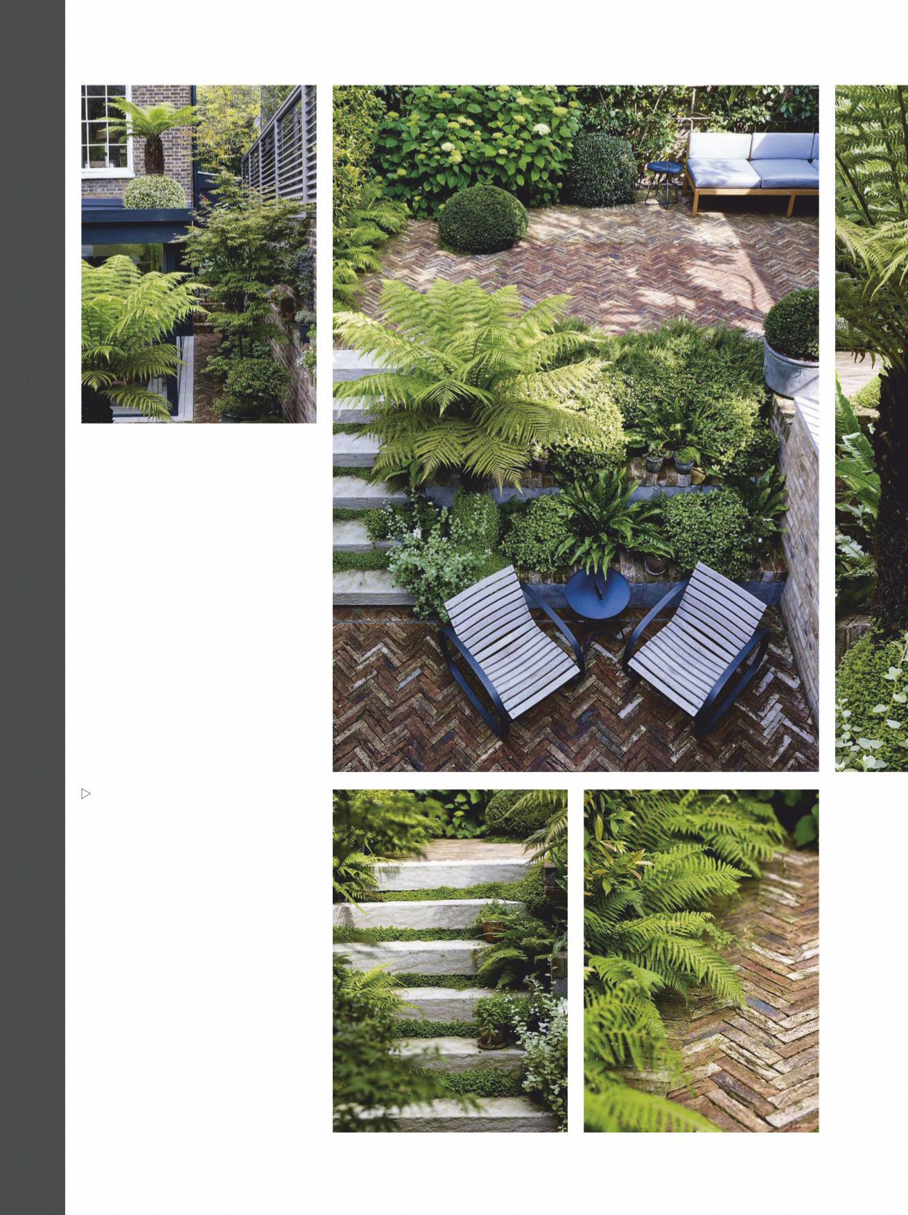
A series of stepped raised beds – filled with a lush mix of planting that includes Asplenium scolopendrium , Rosmarinus officinalis Prostratus Group and is dominated by a striking Dicksonia antarctica tree fern, create an enclosed and intimate seating area outside the new kitchen extension.
Urban sanctuary
In this city garden, designer Alasdair Cameron has made the most of wildly differing levels to create a dynamic yet tranquil space – a refuge from London’s busy streets
WORDS NATASHA GOODFELLOW PHOTOGRAPHS JASON INGRAM

SMALL GARDEN 3
This page Above Grey louvred panels on the wall create privacy while allowing light into the basement kitchen. Pots in the side return are used to add seasonal interest.
Right Different levels help create distinctive areas that are linked by the repeat planting of striking plants. Below left Limestone steps leading to the lower level are softened by ribbons of Soleirolia soleirolii. Below right Clay bricks laid in a herringbone pattern are fringed by fresh-green Dryopteris filix-mas . Facing page The planting uses a predominately green palette, playing with different foliage shapes and textures. Alastair also adds annuals, such as ammi and orlaya, to add colour. A grey pigment used on walls and planters helps to brighten the green and tie the planting in with the furniture and the kitchen’s decor.

an established Magnolia grandiflora, which neither Alasdair nor the client was prepared to lose. Working closely with an arborist and the architect, they were able to preserve the roots and incorporate it into the design. Further collaboration brought other benefits too. Having been able to specify the correct drainage at the planning stage, Alasdair was able to build in raised beds planted up with a shade-loving mix of Asplenium scolopendrium , Pittosporum tenuifolium ‘Golf Ball’ and a tree fern ( Dicksonia antarctica ), thereby considerably reducing the impact of the retaining wall.
Throughout the space, Alasdair has ensured cohesion by using a limited palette of materials. Clay bricks laid in a herringbone pattern echo the wooden floor within, while the limestone of the steps matches that into which the glass doors are set. “In such a small space, I like to keep things simple, otherwise it gets too busy and makes the space look


